

拆分按钮:规格
拆分按钮可打开菜单,提供与某个操作相关的更多选项。
变体

| 变体 | M3 | M3 Expressive |
|---|---|---|
| 拆分按钮 | -- | 可用 |
配置
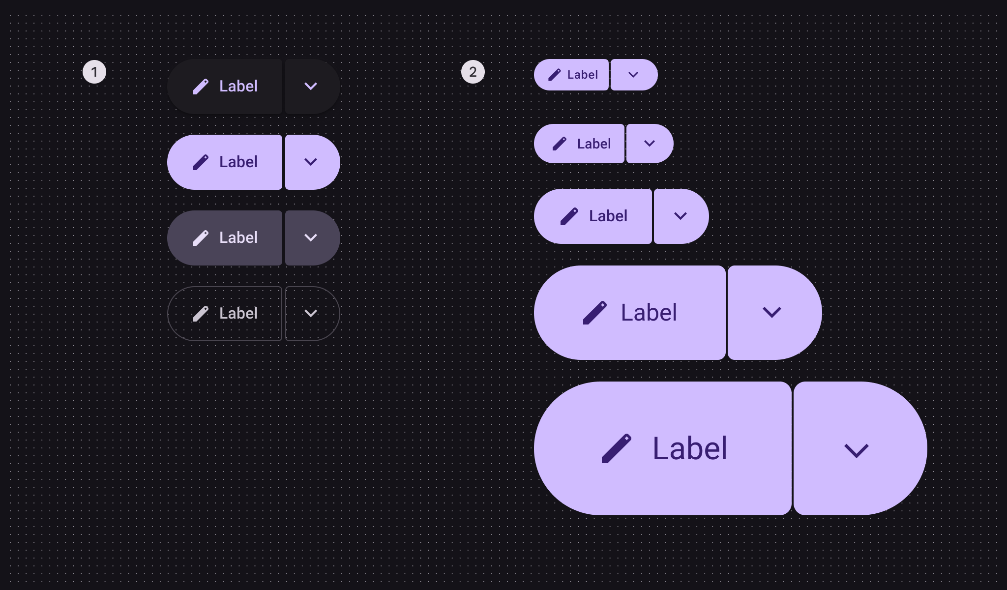
- 颜色配置:凸起、填充、色调、描边
- 尺寸配置:XS、S、M、L、XL
| 类别 | 配置 | M3 | M3 Expressive |
|---|---|---|---|
| 尺寸 | XS、S、M、L、XL | -- | 可用 |
| 颜色 | 凸起、填充、色调、描边 | -- | 可用 |
令牌与规格
使用表格中的菜单选择所需的令牌集。拆分按钮的令牌集按尺寸分类组织。了解设计令牌
拆分按钮 - 尺寸 - 超小
| Token | 取值 |
|---|---|
| Split button xsmall container height | 32dp |
| Split button xsmall between space | 2dp |
| Split button xsmall container shape | Circular |
| Split button xsmall inner corner size | 4dp |
| Split button xsmall outer corner size | 50% |
| Split button xsmall leading button leading space | 12dp |
| Split button xsmall leading button trailing space | 10dp |
| Split button xsmall trailing button icon size | 22dp |
| Split button xsmall trailing button leading space | 13dp |
| Split button xsmall trailing button trailing space | 13dp |
| Split button xsmall inner corner hovered size | 8dp |
| Split button xsmall inner corner pressed size | 8dp |
| Split button xsmall trailing button inner corner selected size | 50% |
拆分按钮 - 尺寸 - 小
| Token | 取值 |
|---|---|
| Split button small container height | 40dp |
| Split button small between space | 2dp |
| Split button small container shape | Circular |
| Split button small inner corner size | 4dp |
| Split button small leading button leading space | 16dp |
| Split button small leading button trailing space | 12dp |
| Split button small trailing button icon size | 22dp |
| Split button small trailing button leading space | 13dp |
| Split button small trailing button trailing space | 13dp |
| Split button small inner corner hovered size | 12dp |
| Split button small inner corner pressed size | 12dp |
| Split button small trailing button inner corner selected size | 50% |
拆分按钮 - 尺寸 - 中
| Token | 取值 |
|---|---|
| Split button medium container height | 56dp |
| Split button medium between space | 2dp |
| Split button medium container shape | Circular |
| Split button medium inner corner size | 4dp |
| Split button medium leading button leading space | 24dp |
| Split button medium leading button trailing space | 24dp |
| Split button medium trailing button icon size | 26dp |
| Split button medium trailing button leading space | 15dp |
| Split button medium trailing button trailing space | 15dp |
| Split button medium inner corner hovered size | 12dp |
| Split button medium inner corner pressed size | 12dp |
| Split button medium trailing button inner corner selected size | 50% |
拆分按钮 - 尺寸 - 大
| Token | 取值 |
|---|---|
| Split button large container height | 96dp |
| Split button large between space | 2dp |
| Split button large container shape | Circular |
| Split button large inner corner size | 8dp |
| Split button large leading button leading space | 48dp |
| Split button large leading button trailing space | 48dp |
| Split button large trailing button icon size | 38dp |
| Split button large trailing button leading space | 29dp |
| Split button large trailing button trailing space | 29dp |
| Split button large inner corner hovered size | 20dp |
| Split button large inner corner pressed size | 20dp |
| Split button large trailing button inner corner selected size | 50% |
拆分按钮 - 尺寸 - 超大
| Token | 取值 |
|---|---|
| Split button xlarge container height | 136dp |
| Split button xlarge between space | 2dp |
| Split button xlarge container shape | Circular |
| Split button xlarge inner corner size | 12dp |
| Split button xlarge leading button leading space | 64dp |
| Split button xlarge leading button trailing space | 64dp |
| Split button xlarge trailing button icon size | 50dp |
| Split button xlarge trailing button leading space | 43dp |
| Split button xlarge trailing button trailing space | 43dp |
| Split button xlarge inner corner hovered size | 20dp |
| Split button xlarge inner corner pressed size | 20dp |
| Split button xlarge trailing button inner corner selected size | 50% |
结构

- 前导按钮
- 图标
- 标签文本
- 尾随按钮
拆分按钮中的前导按钮可以包含图标、标签文本,或同时包含两者。尾随按钮应始终包含菜单图标。
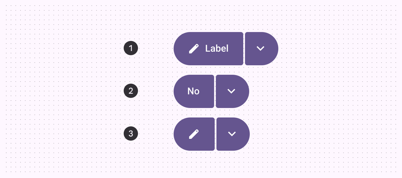
- 标签 + 图标
- 标签
- 图标
颜色
颜色值通过 设计令牌 实现。对设计师而言,这意味着使用与令牌对应的颜色值;在实现中,颜色值将是一个引用具体取值的令牌。
拆分按钮使用与标准 按钮 相同的配色方案。但与切换按钮不同,拆分按钮被选中时不会改变颜色,只会叠加状态层。
如下方令牌模块所示,拆分按钮使用与按钮相同的颜色和状态层。前往按钮了解更多详情。
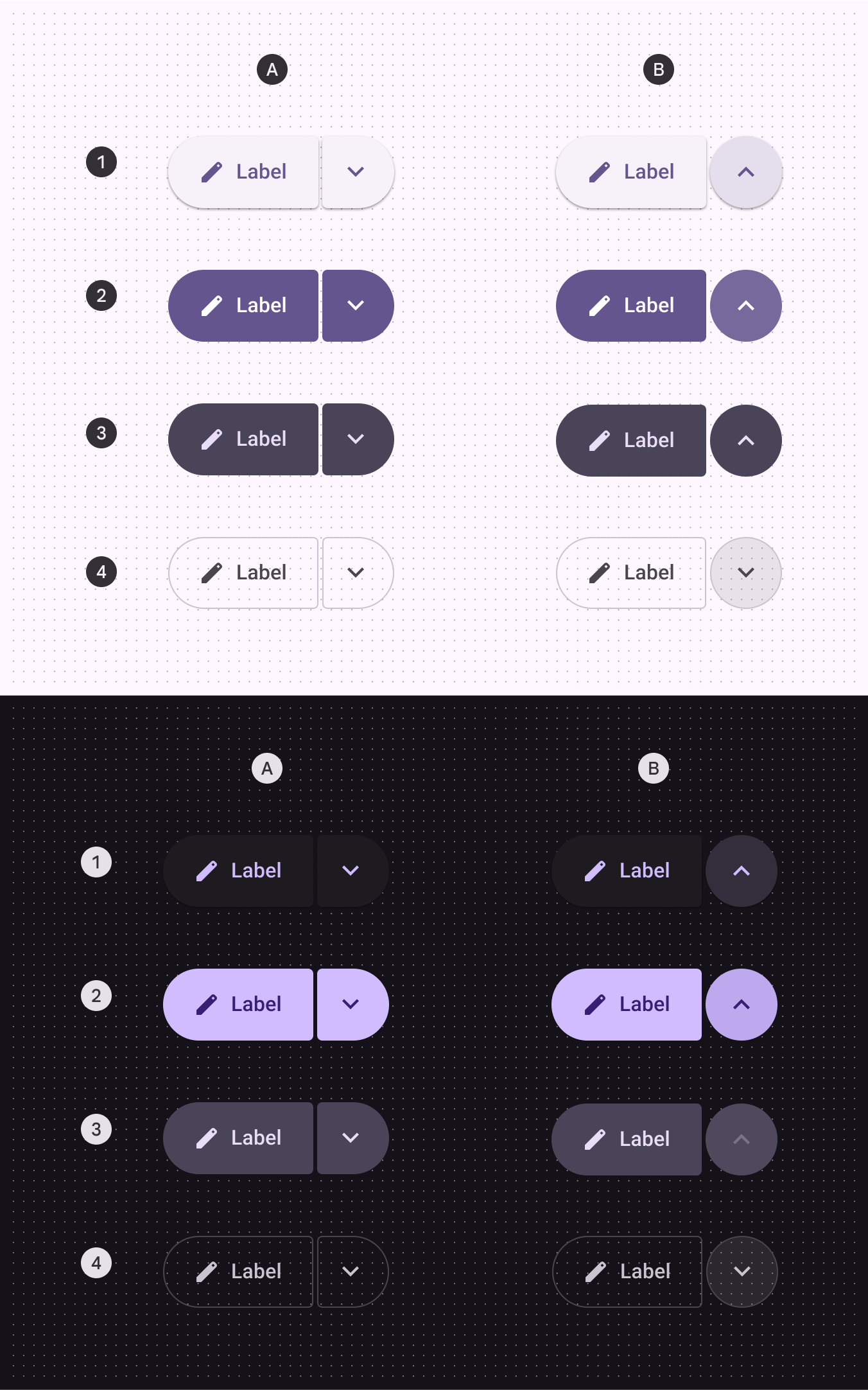
A:未选中,B:选中状态的尾随图标
- 凸起
- 填充
- 色调
- 描边
按钮 - 颜色 - 凸起
按钮 - 颜色 - 填充
按钮 - 颜色 - 色调
按钮 - 颜色 - 描边
状态
状态 是表示组件或交互元素当前状况的视觉表现。拆分按钮的状态使用与 按钮 和 图标按钮 相同的颜色和状态层。详情请参阅按钮和图标按钮规范。
前导按钮形状
在悬停、聚焦和按下状态下,内侧圆角形状会发生变化。
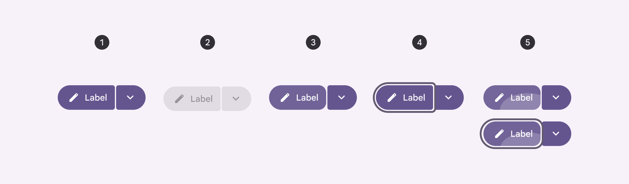
- 启用
- 禁用
- 悬停
- 聚焦
- 按下、聚焦时按下
尾随按钮形状
在悬停、聚焦和按下状态下,内侧圆角形状会发生变化;选中时,图标居中显示。
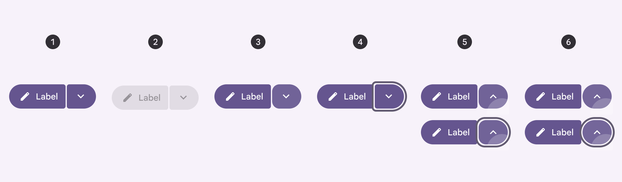
- 启用
- 禁用
- 悬停
- 聚焦
- 按下、聚焦时按下
- 选中、聚焦时选中
尺寸测量
当按钮不对称时,文本和图标采用光学居中;当按钮对称时,则采用常规居中。
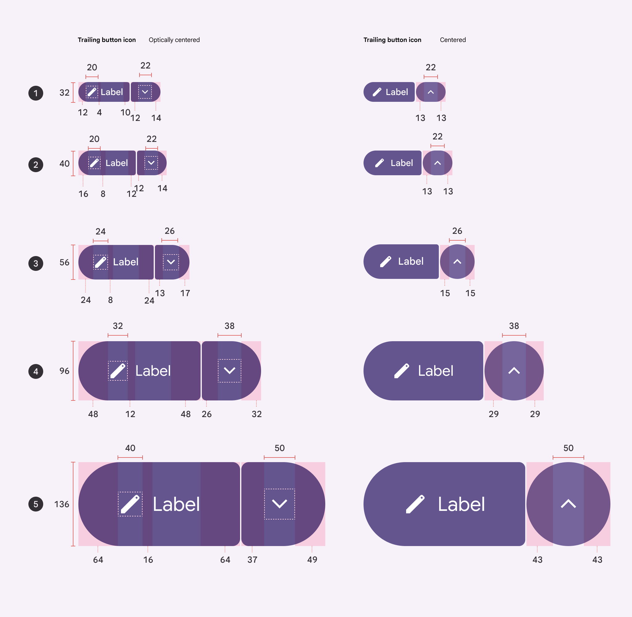
未选中状态下,菜单图标相对于中心的偏移量:
- XS:相对中心偏移 -1dp
- S:相对中心偏移 -1dp
- M:相对中心偏移 -2dp
- L:相对中心偏移 -3dp
- XL:相对中心偏移 -6dp
内侧圆角半径随按钮尺寸变化。前导按钮与尾随按钮之间的间隙应始终为 2dp。
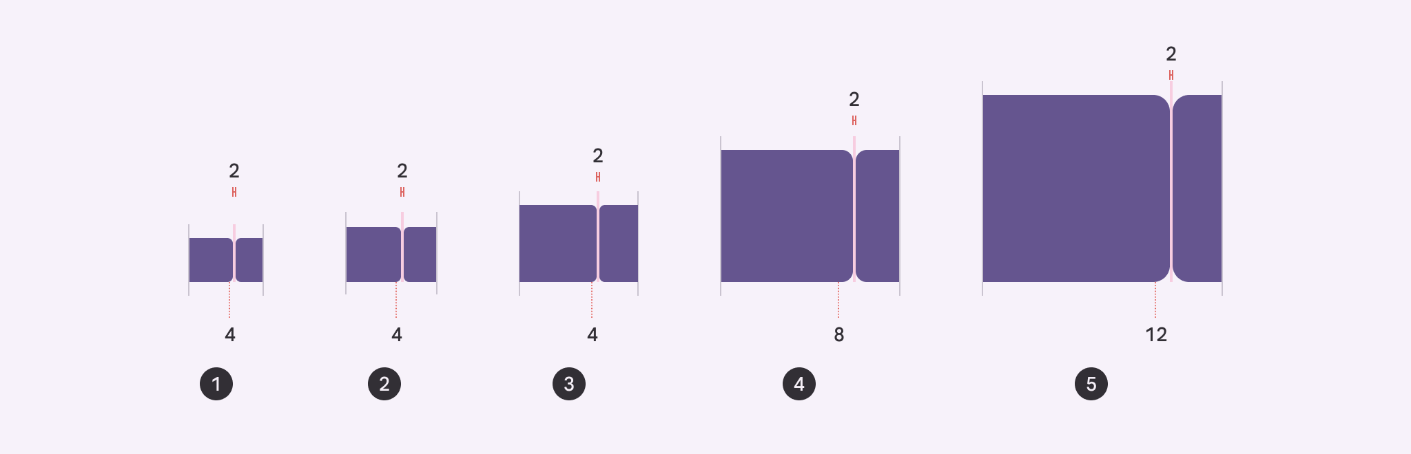
- 超小:4dp
- 小:4dp
- 中:4dp
- 大:8dp
- 超大:12dp