

图标按钮:规格
图标按钮允许用户通过单次点按执行操作。
变体

- 默认图标按钮
- 切换图标按钮
| 变体 | M3 | M3 Expressive |
|---|---|---|
| 默认 | 可用 | 可用 |
| 切换(选择型) | 可用 | 可用 |
配置
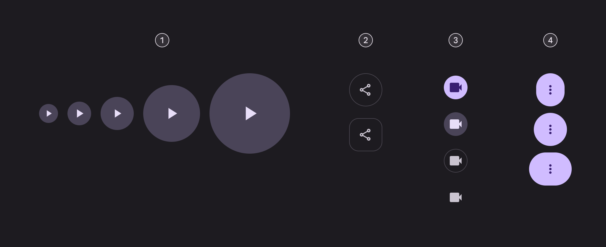
- 五种尺寸
- 两种形状
- 四种颜色样式
- 三种宽度
| 类别 | 选项 | M3 | M3 Expressive |
|---|---|---|---|
| 尺寸 | 小(默认) | 可用 | 可用 |
| XS、M、L、XL | -- | 可用 | |
| 形状 | 圆形(默认) | 可用 | 可用 |
| 方形 | -- | 可用 | |
| 颜色 | 填充(默认)、色调、描边、标准 | 可用 | 可用 |
| 宽度 | 默认 | 可用 | 可用 |
| 窄版、宽版 | -- | 可用 |
令牌和规格
图标按钮令牌集分为通用令牌、颜色和尺寸三类。使用表格中的菜单选择令牌集。了解设计令牌
图标按钮 - 颜色 - 填充
图标按钮 - 颜色 - 色调
图标按钮 - 颜色 - 描边
图标按钮 - 颜色 - 标准
图标按钮 - 尺寸 - 特小
| Token | 取值 |
|---|---|
| Icon button xsmall container height | 32dp |
| Icon button xsmall icon size | 20dp |
| Icon button xsmall narrow leading space | 4dp |
| Icon button xsmall narrow trailing space | 4dp |
| Icon button xsmall default leading space | 6dp |
| Icon button xsmall default trailing space | 6dp |
| Icon button xsmall wide leading space | 10dp |
| Icon button xsmall wide trailing space | 10dp |
| Icon button xsmall container shape round | Circular |
| Icon button xsmall container shape square | 12dp |
| Icon button xsmall outline width | 1dp |
| Icon button xsmall shape pressed morph | 8dp |
| Icon button xsmall shape spring animation damping | 0.9 |
| Icon button xsmall shape spring animation stiffness | 1400 |
| Icon button xsmall selected container shape round | 12dp |
| Icon button xsmall selected container shape square | Circular |
图标按钮 - 尺寸 - 小
| Token | 取值 |
|---|---|
| Icon button small container height | 40dp |
| Icon button small icon size | 24dp |
| Icon button small narrow leading space | 4dp |
| Icon button small narrow trailing space | 4dp |
| Icon button small default leading space | 8dp |
| Icon button small default trailing space | 8dp |
| Icon button small wide leading space | 14dp |
| Icon button small wide trailing space | 14dp |
| Icon button small container shape round | Circular |
| Icon button small container shape square | 12dp |
| Icon button small outline width | 1dp |
| Icon button small shape pressed morph | 8dp |
| Icon button small shape spring animation damping | 0.9 |
| Icon button small shape spring animation stiffness | 1400 |
| Icon button small selected container shape round | 12dp |
| Icon button small selected container shape square | Circular |
图标按钮 - 尺寸 - 中
| Token | 取值 |
|---|---|
| Icon button medium container height | 56dp |
| Icon button medium icon size | 24dp |
| Icon button medium narrow leading space | 12dp |
| Icon button medium narrow trailing space | 12dp |
| Icon button medium default leading space | 16dp |
| Icon button medium default trailing space | 16dp |
| Icon button medium wide leading space | 24dp |
| Icon button medium wide trailing space | 24dp |
| Icon button medium container shape round | Circular |
| Icon button medium container shape square | 16dp |
| Icon button medium outline width | 1dp |
| Icon button medium shape pressed morph | 12dp |
| Icon button medium shape spring animation damping | 0.9 |
| Icon button medium shape spring animation stiffness | 1400 |
| Icon button medium selected container shape round | 16dp |
| Icon button medium selected container shape square | Circular |
图标按钮 - 尺寸 - 大
| Token | 取值 |
|---|---|
| Icon button large container height | 96dp |
| Icon button large icon size | 32dp |
| Icon button large narrow leading space | 16dp |
| Icon button large narrow trailing space | 16dp |
| Icon button large default leading space | 32dp |
| Icon button large default trailing space | 32dp |
| Icon button large wide leading space | 48dp |
| Icon button large wide trailing space | 48dp |
| Icon button large container shape round | Circular |
| Icon button large container shape square | 28dp |
| Icon button large outline width | 2dp |
| Icon button large shape pressed morph | 16dp |
| Icon button large shape spring animation damping | 0.9 |
| Icon button large shape spring animation stiffness | 1400 |
| Icon button large selected container shape round | 28dp |
| Icon button large selected container shape square | Circular |
图标按钮 - 尺寸 - 特大
| Token | 取值 |
|---|---|
| Icon button xlarge container height | 136dp |
| Icon button xlarge icon size | 40dp |
| Icon button xlarge narrow leading space | 32dp |
| Icon button xlarge narrow trailing space | 32dp |
| Icon button xlarge default leading space | 48dp |
| Icon button xlarge default trailing space | 48dp |
| Icon button xlarge wide leading space | 72dp |
| Icon button xlarge wide trailing space | 72dp |
| Icon button xlarge container shape round | Circular |
| Icon button xlarge container shape square | 28dp |
| Icon button xlarge outline width | 3dp |
| Icon button xlarge shape pressed morph | 16dp |
| Icon button xlarge shape spring animation damping | 0.9 |
| Icon button xlarge shape spring animation stiffness | 1400 |
| Icon button xlarge selected container shape round | 28dp |
| Icon button xlarge selected container shape square | Circular |
结构

- 图标
- 容器
颜色
颜色通过 设计令牌 实现。对设计师来说,这意味着使用与令牌对应的颜色值;在代码实现中,颜色值则是一个引用实际值的令牌。
组件内置四种颜色样式:填充、色调、描边和标准。每种样式中,默认按钮和切换按钮使用不同的颜色角色。
TIP
这些颜色角色用于保持设计的一致性和熟悉感。只要容器和文本的对比度达到 3:1,也可以使用其他颜色角色。例如,tertiary(第三色)和 on tertiary(第三色之上)。
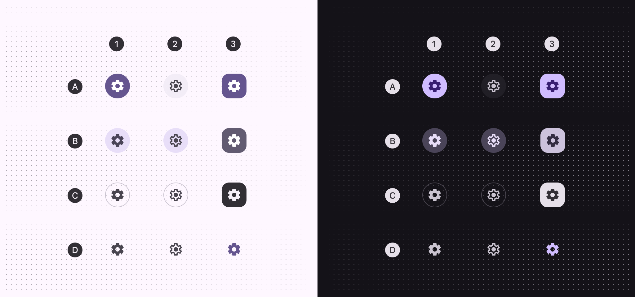
A:填充;B:色调;C:描边;D:标准
- 默认
- 切换,未选中
- 切换,选中
| 1. 默认 | 2. 切换,未选中 | 3. 切换,选中 | |
|---|---|---|---|
| 填充容器 填充图标 | 主色 主色之上(on primary) | 表面容器 表面变体之上(on surface variant) | 主色 主色之上(on primary) |
| 色调容器 色调图标 | 次色容器 次色容器之上(on secondary container) | 次色容器 次色容器之上(on secondary container) | 次色 次色之上(on secondary) |
| 描边容器 描边图标 | 轮廓变体(outline) 表面变体之上(on surface variant) | 轮廓变体(outline) 表面变体之上(on surface variant) | 反向表面 反向表面之上(inverse on surface) |
| 标准图标 | 表面变体之上(on surface variant) | 表面变体之上(on surface variant) | 主色 |
状态
状态 是组件或可交互元素当前状态的视觉呈现。状态层会略微改变按钮颜色。禁用状态使用不同的基色。查看令牌以了解详情填充按钮状态
默认
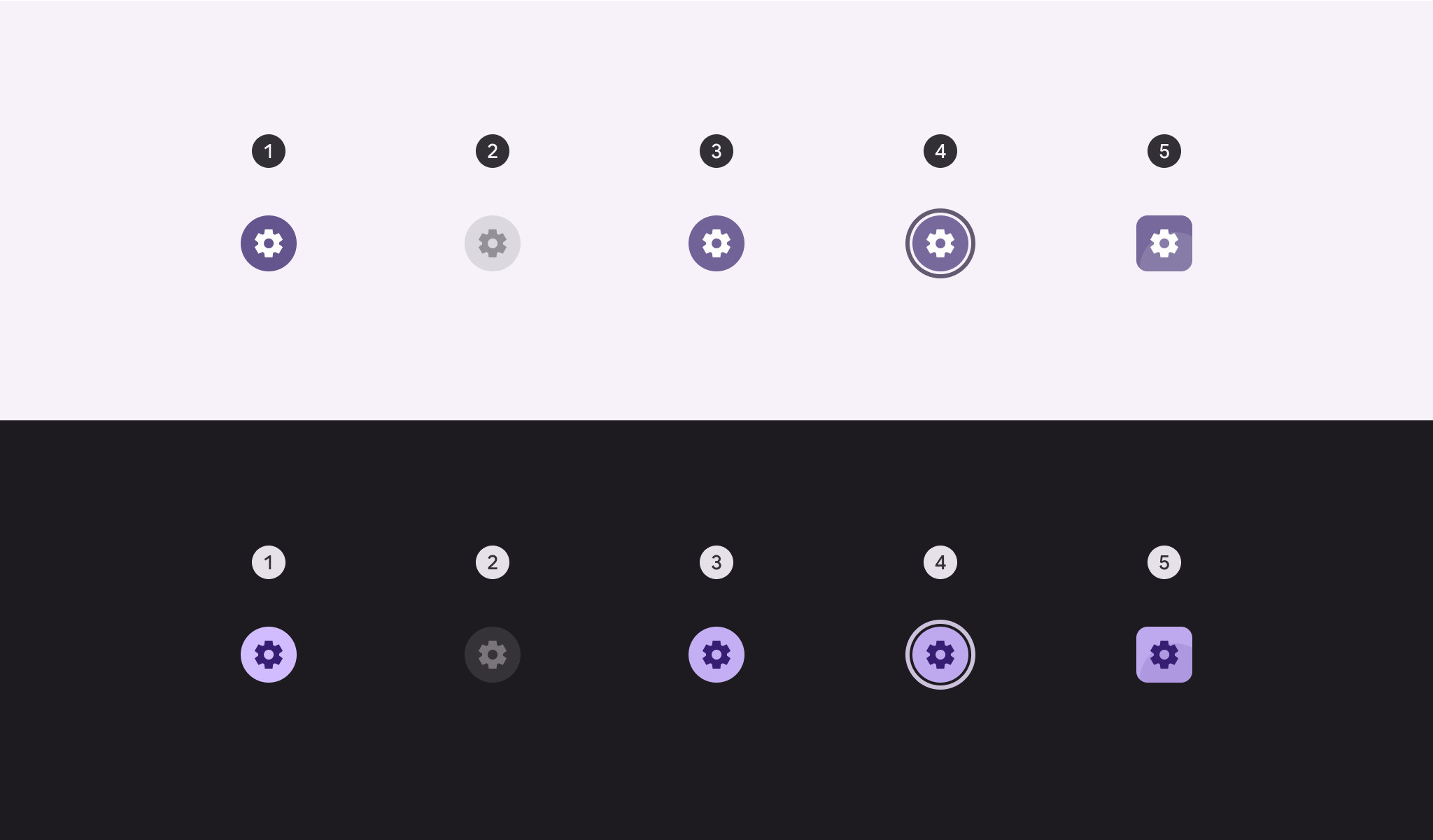
- 已启用
- 已禁用(10% 状态层)
- 悬停(8% 状态层)
- 聚焦(10% 状态层)
- 按下(10% 状态层)
切换
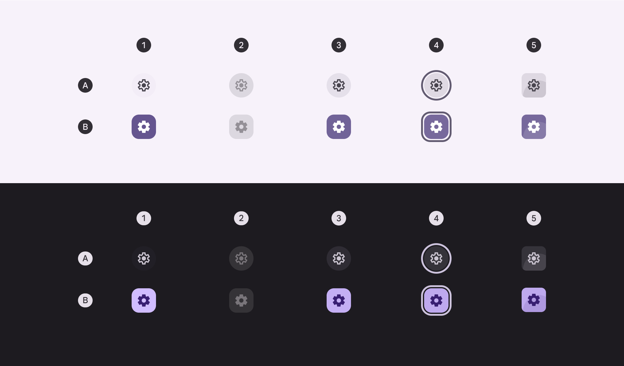
A:未选中。B:选中。
- 已启用
- 已禁用(10% 状态层)
- 悬停(8% 状态层)
- 聚焦(10% 状态层)
- 按下(10% 状态层)
色调按钮状态
默认
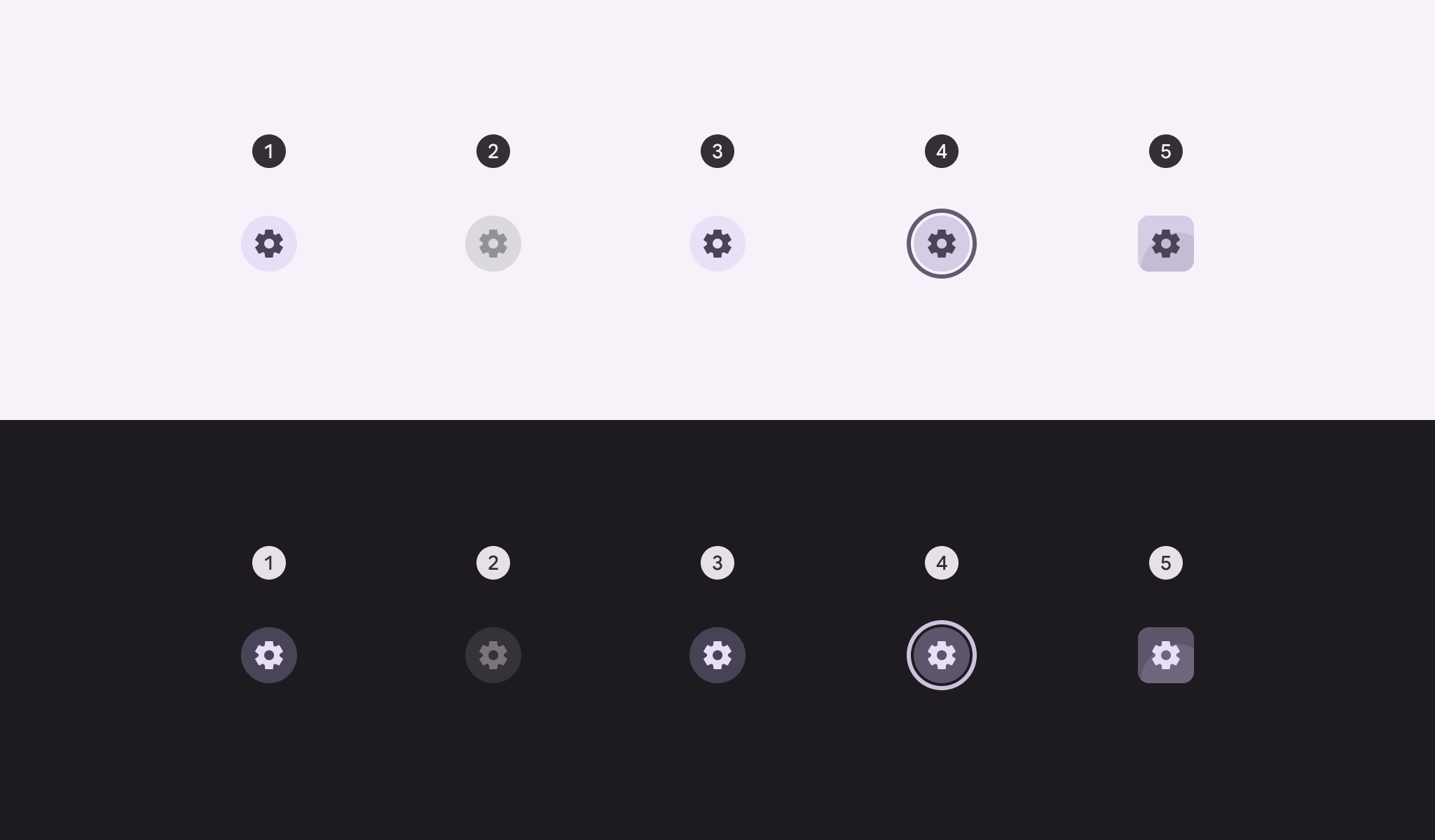
- 已启用
- 已禁用(10% 状态层)
- 悬停(8% 状态层)
- 聚焦(10% 状态层)
- 按下(10% 状态层)
切换
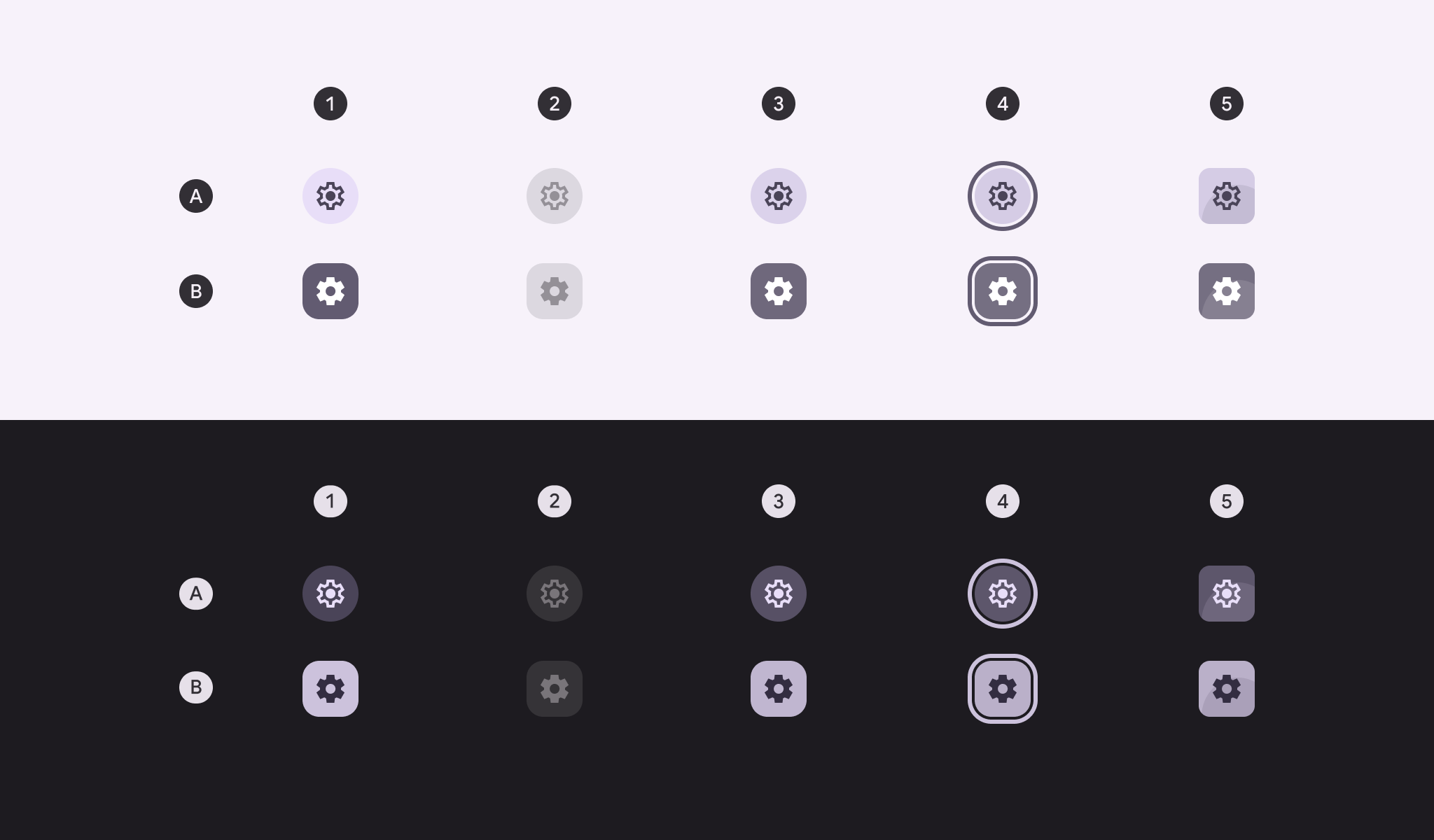
A:未选中。B:选中。
- 已启用
- 已禁用(10% 状态层)
- 悬停(8% 状态层)
- 聚焦(10% 状态层)
- 按下(10% 状态层)
描边按钮状态
默认
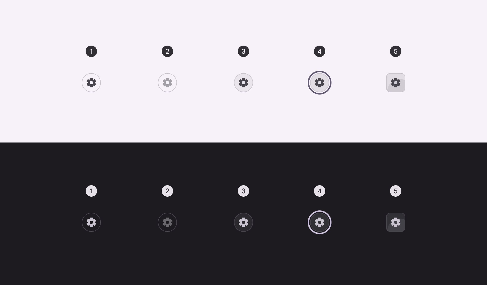
- 已启用
- 已禁用(10% 状态层)
- 悬停(8% 状态层)
- 聚焦(10% 状态层)
- 按下(10% 状态层)
切换
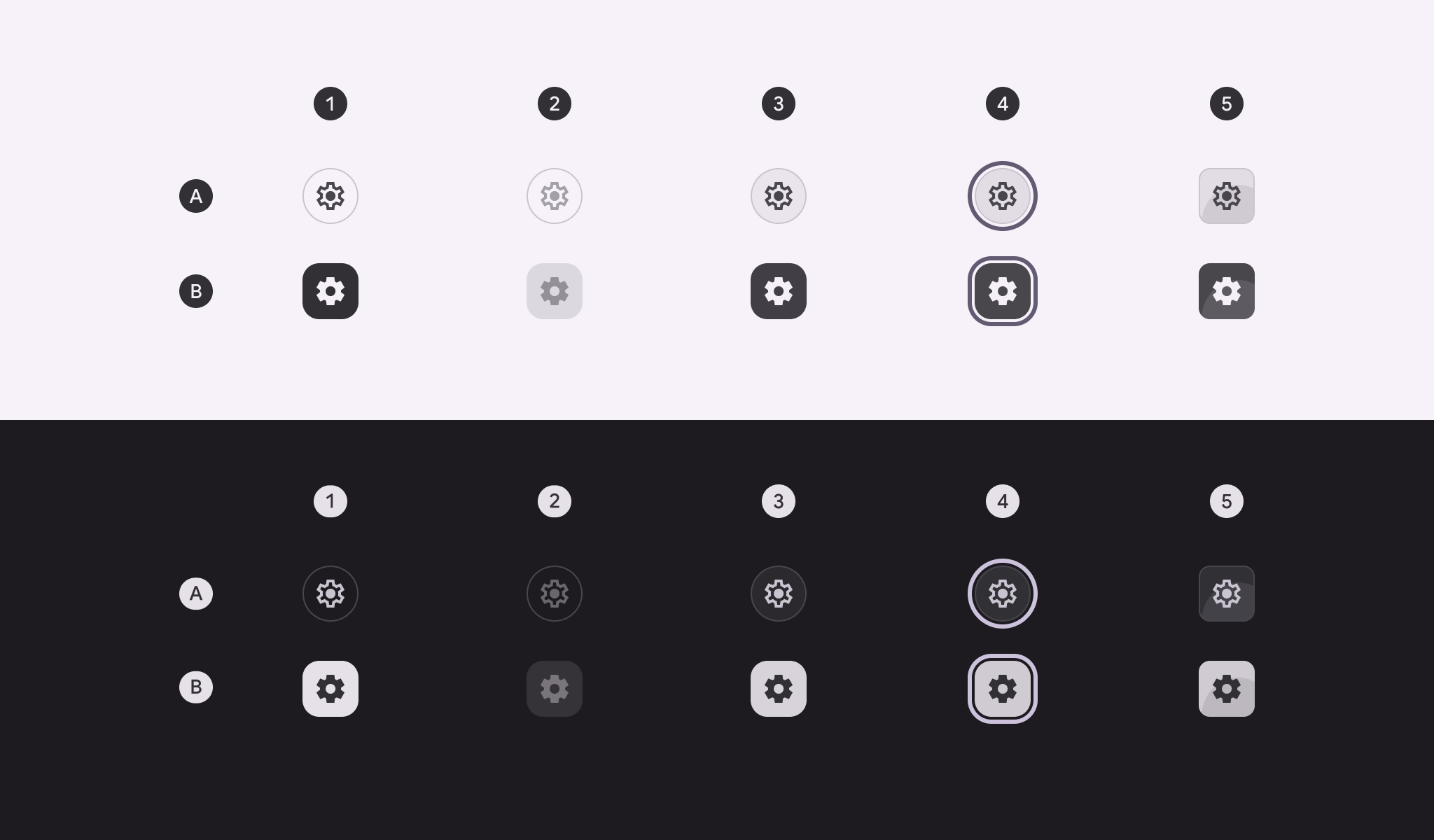
A:未选中。B:选中。
- 已启用
- 已禁用(10% 状态层)
- 悬停(8% 状态层)
- 聚焦(10% 状态层)
- 按下(10% 状态层)
标准图标按钮状态
标准图标按钮的容器在默认状态下不可见,仅在应用状态层后才会显示。
默认
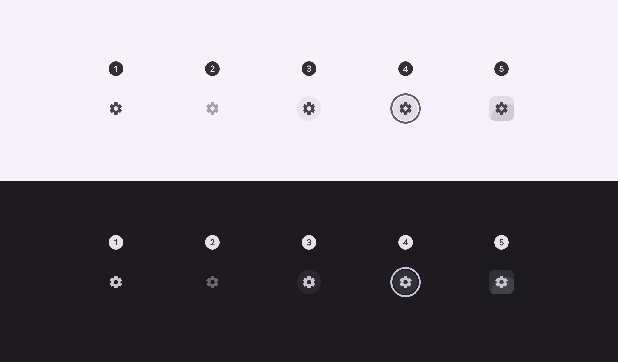
- 已启用
- 已禁用(10% 状态层)
- 悬停(8% 状态层)
- 聚焦(10% 状态层)
- 按下(10% 状态层)
切换
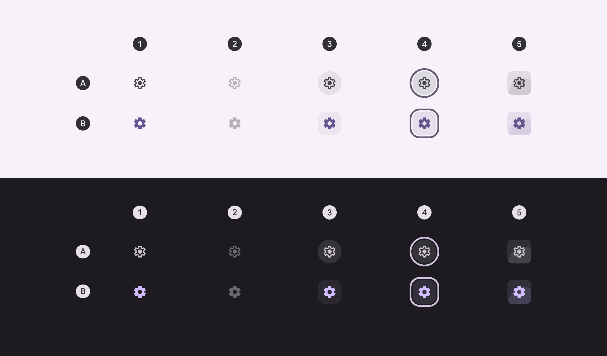
A:未选中。B:选中。
- 已启用
- 已禁用(10% 状态层)
- 悬停(8% 状态层)
- 聚焦(10% 状态层)
- 按下(10% 状态层)
形状变形
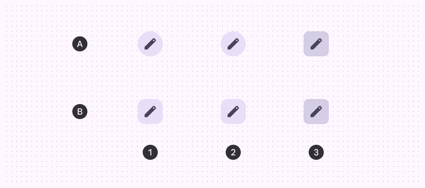
A:圆形;B:方形
- 已启用
- 悬停
- 按下
选中时
除按下时改变形状外,默认情况下,切换图标按钮的常态形状会从未选中的圆形变为选中的方形。
如果常态形状为方形,则选中后的形状应为圆形。
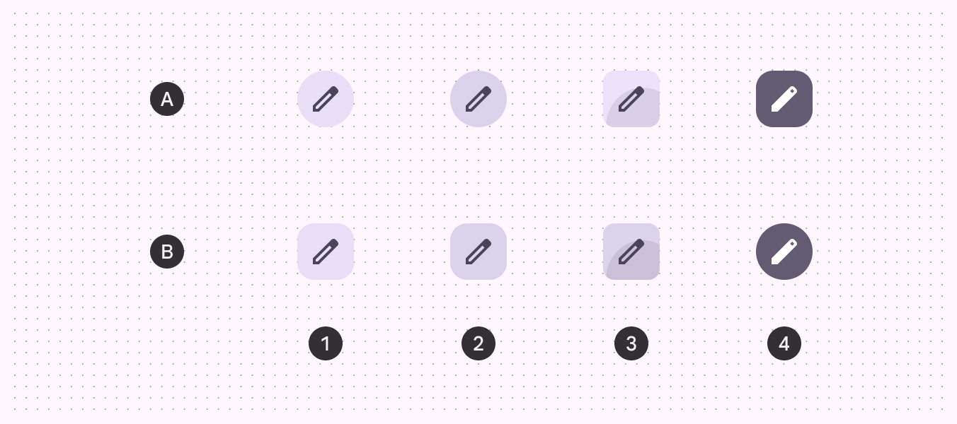
A:圆形;B:方形
- 已启用
- 悬停
- 按下
- 选中
测量
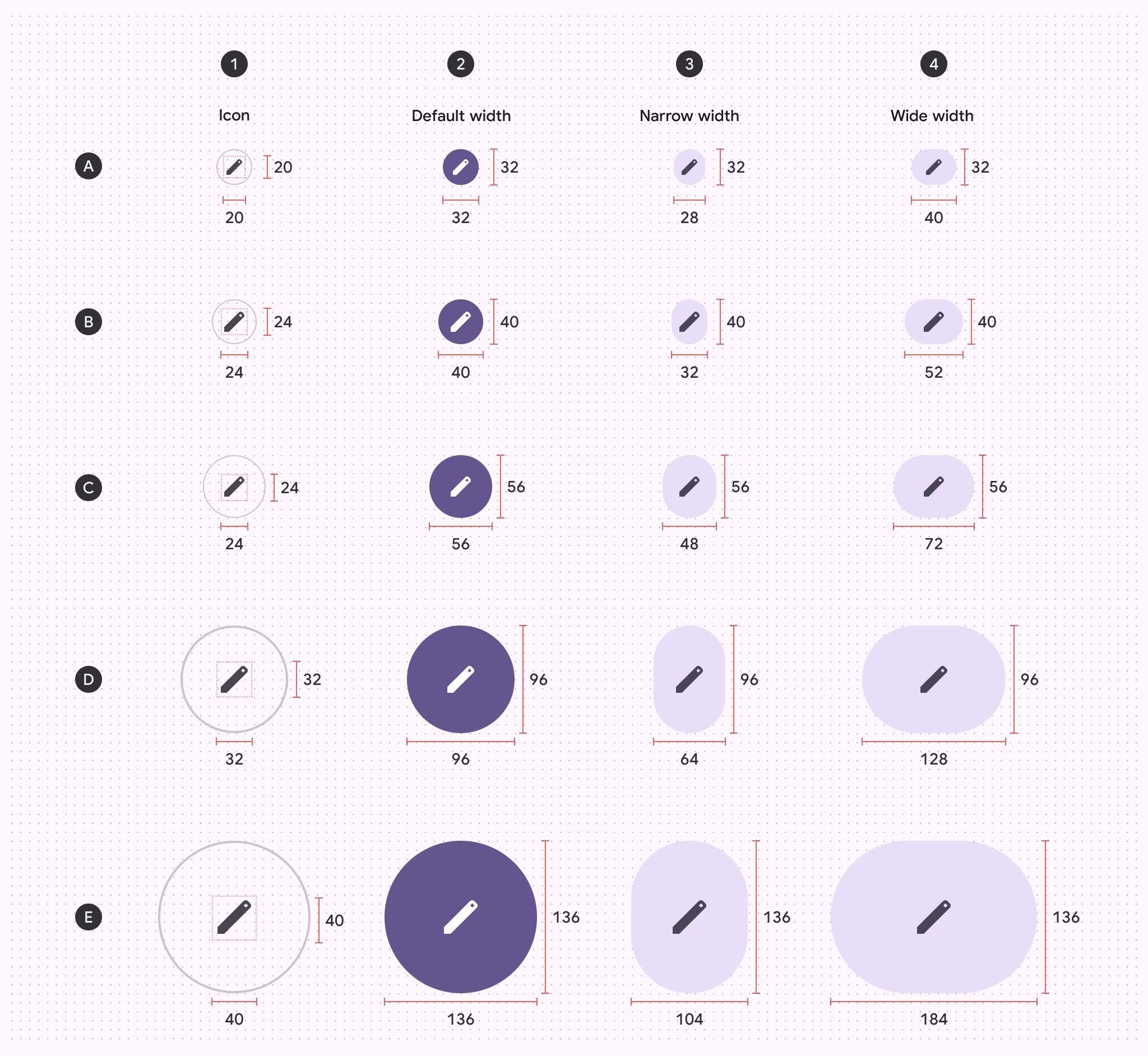
A:特小;B:小;C:中;D:大;E:特大
- 图标尺寸
- 默认宽度
- 窄版宽度
- 宽版宽度
目标尺寸
为满足无障碍要求,特小和小图标按钮的目标尺寸必须至少为 48×48dp。
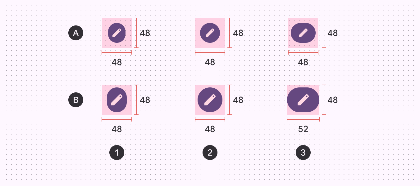
A:特小图标按钮尺寸;B:小图标按钮尺寸
- 窄版宽度
- 默认宽度
- 宽版宽度
按钮圆角半径
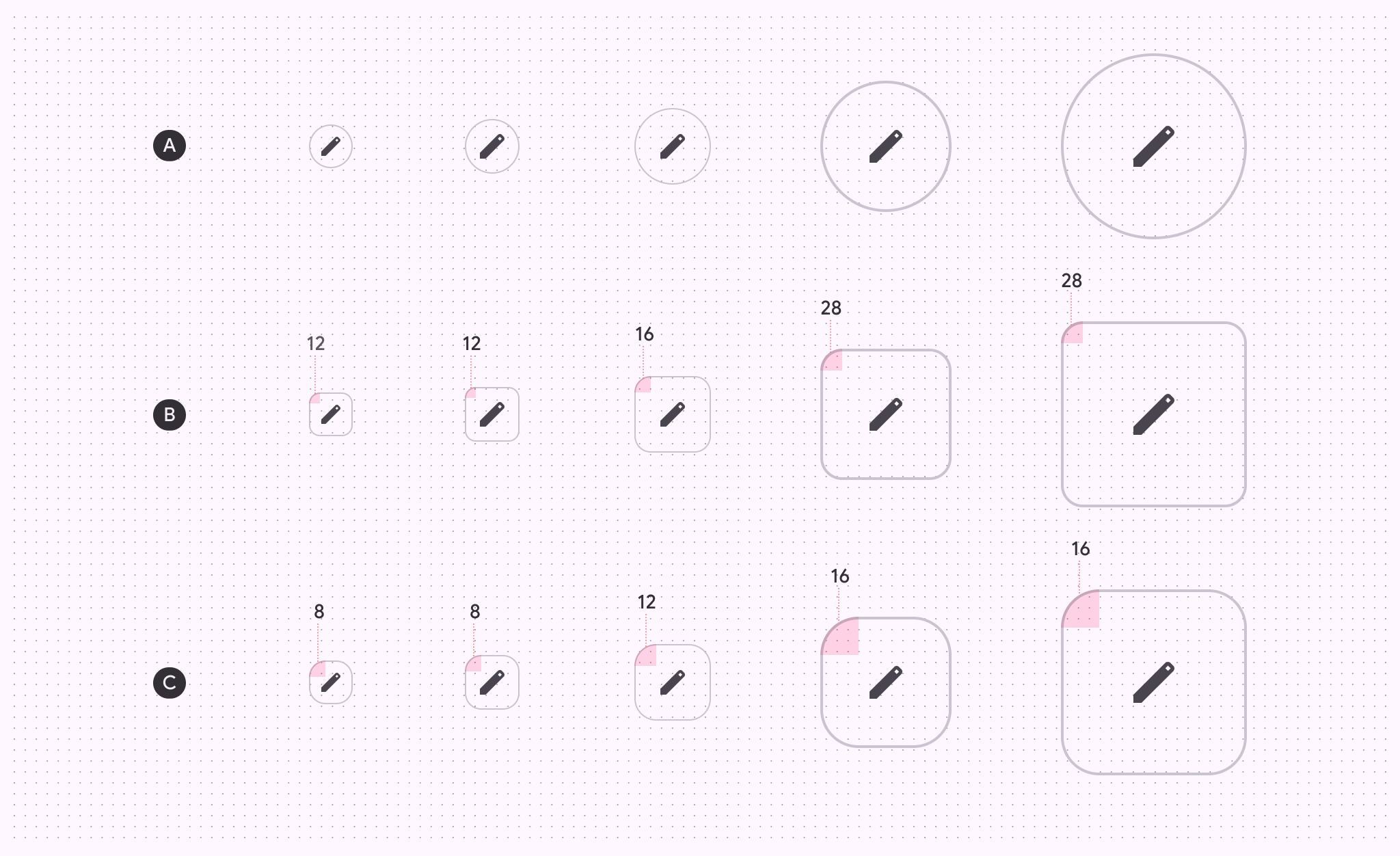
| XS | S | M | L | XL | |
|---|---|---|---|---|---|
| A:圆形按钮 | 全圆角 | 全圆角 | 全圆角 | 全圆角 | 全圆角 |
| B:方形按钮 | 12dp | 12dp | 16dp | 28dp | 28dp |
| C:按下状态 | 8dp | 8dp | 12dp | 16dp | 16dp |
基线令牌
使用表格中的菜单选择令牌集。填充、色调和描边图标按钮令牌已弃用,请改用新的令牌集。其他令牌仍可在本页顶部的令牌模块中找到。