

Split buttons: Specs
Split buttons open a menu to give people more options related to an action
Variants

| Variant | M3 | M3 Expressive |
|---|---|---|
| Split button | -- | Available |
Configurations
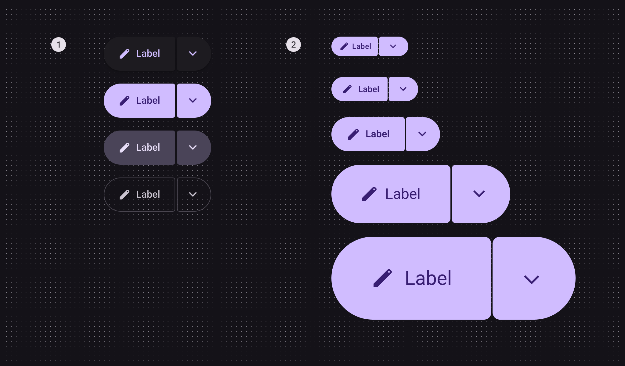
- Color configurations: Elevated, filled, tonal, outlined
- Size configurations: XS, S, M, L, XL
| Category | Configuration | M3 | M3 Expressive |
|---|---|---|---|
| Size | XS, S, M, L, XL | -- | Available |
| Color | Elevated, filled, tonal, outlined | -- | Available |
Tokens & specs
Use the table's menu to select a token set. Split button token sets are organized by size. Learn about design tokens
Split button - Size - Xsmall
| Token | Value |
|---|---|
| Split button xsmall container height | 32dp |
| Split button xsmall between space | 2dp |
| Split button xsmall container shape | Circular |
| Split button xsmall inner corner size | 4dp |
| Split button xsmall outer corner size | 50% |
| Split button xsmall leading button leading space | 12dp |
| Split button xsmall leading button trailing space | 10dp |
| Split button xsmall trailing button icon size | 22dp |
| Split button xsmall trailing button leading space | 13dp |
| Split button xsmall trailing button trailing space | 13dp |
| Split button xsmall inner corner hovered size | 8dp |
| Split button xsmall inner corner pressed size | 8dp |
| Split button xsmall trailing button inner corner selected size | 50% |
Split button - Size - Small
| Token | Value |
|---|---|
| Split button small container height | 40dp |
| Split button small between space | 2dp |
| Split button small container shape | Circular |
| Split button small inner corner size | 4dp |
| Split button small leading button leading space | 16dp |
| Split button small leading button trailing space | 12dp |
| Split button small trailing button icon size | 22dp |
| Split button small trailing button leading space | 13dp |
| Split button small trailing button trailing space | 13dp |
| Split button small inner corner hovered size | 12dp |
| Split button small inner corner pressed size | 12dp |
| Split button small trailing button inner corner selected size | 50% |
Split button - Size - Medium
| Token | Value |
|---|---|
| Split button medium container height | 56dp |
| Split button medium between space | 2dp |
| Split button medium container shape | Circular |
| Split button medium inner corner size | 4dp |
| Split button medium leading button leading space | 24dp |
| Split button medium leading button trailing space | 24dp |
| Split button medium trailing button icon size | 26dp |
| Split button medium trailing button leading space | 15dp |
| Split button medium trailing button trailing space | 15dp |
| Split button medium inner corner hovered size | 12dp |
| Split button medium inner corner pressed size | 12dp |
| Split button medium trailing button inner corner selected size | 50% |
Split button - Size - Large
| Token | Value |
|---|---|
| Split button large container height | 96dp |
| Split button large between space | 2dp |
| Split button large container shape | Circular |
| Split button large inner corner size | 8dp |
| Split button large leading button leading space | 48dp |
| Split button large leading button trailing space | 48dp |
| Split button large trailing button icon size | 38dp |
| Split button large trailing button leading space | 29dp |
| Split button large trailing button trailing space | 29dp |
| Split button large inner corner hovered size | 20dp |
| Split button large inner corner pressed size | 20dp |
| Split button large trailing button inner corner selected size | 50% |
Split button - Size - Xlarge
| Token | Value |
|---|---|
| Split button xlarge container height | 136dp |
| Split button xlarge between space | 2dp |
| Split button xlarge container shape | Circular |
| Split button xlarge inner corner size | 12dp |
| Split button xlarge leading button leading space | 64dp |
| Split button xlarge leading button trailing space | 64dp |
| Split button xlarge trailing button icon size | 50dp |
| Split button xlarge trailing button leading space | 43dp |
| Split button xlarge trailing button trailing space | 43dp |
| Split button xlarge inner corner hovered size | 20dp |
| Split button xlarge inner corner pressed size | 20dp |
| Split button xlarge trailing button inner corner selected size | 50% |
Anatomy

- Leading button
- Icon
- Label text
- Trailing button
The leading button in split buttons can have an icon, label text, or both. The trailing button should always have a menu icon.
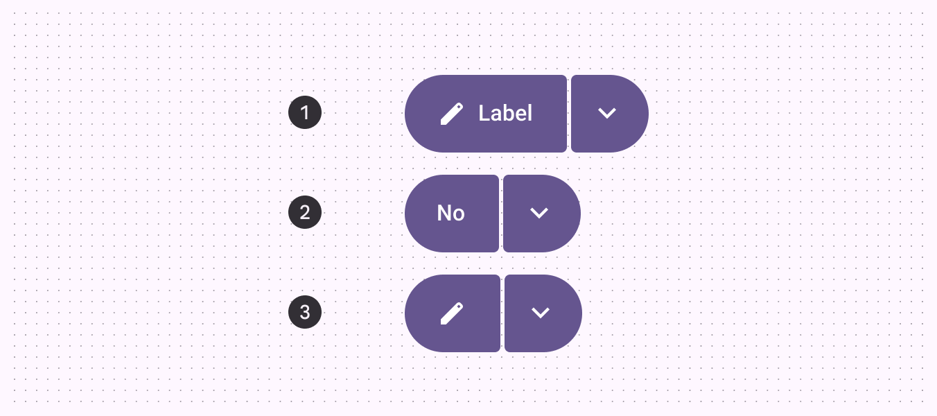
- Label + icon
- Label
- Icon
Color
Color values are implemented through design tokens. For designers, this means working with color values that correspond with tokens; in implementation, a color value will be a token that references a value.
Split buttons use the same color schemes as standard buttons. However, unlike toggle buttons, the split button color doesn’t change when selected—only a state layer is applied.
Split buttons use the same colors and state layers as buttons, shown in the following token module. Go to buttons for more details.
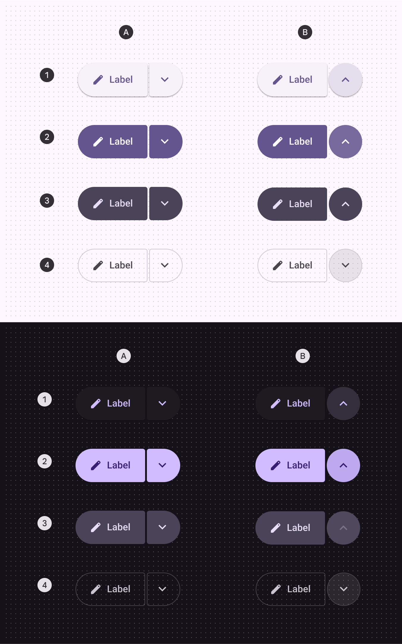
A: Unselected, B: Selected trailing icon
- Elevated
- Filled
- Tonal
- Outlined
Button - Color - Elevated
Button - Color - Filled
Button - Color - Tonal
Button - Color - Outlined
States
States are visual representations used to communicate the status of a component or an interactive element.Split button states use the same colors and state layers as buttons and icon buttons. Go to those specs for details.
Leading button shape
The inner corners change shape for hovered, focused, and pressed states.
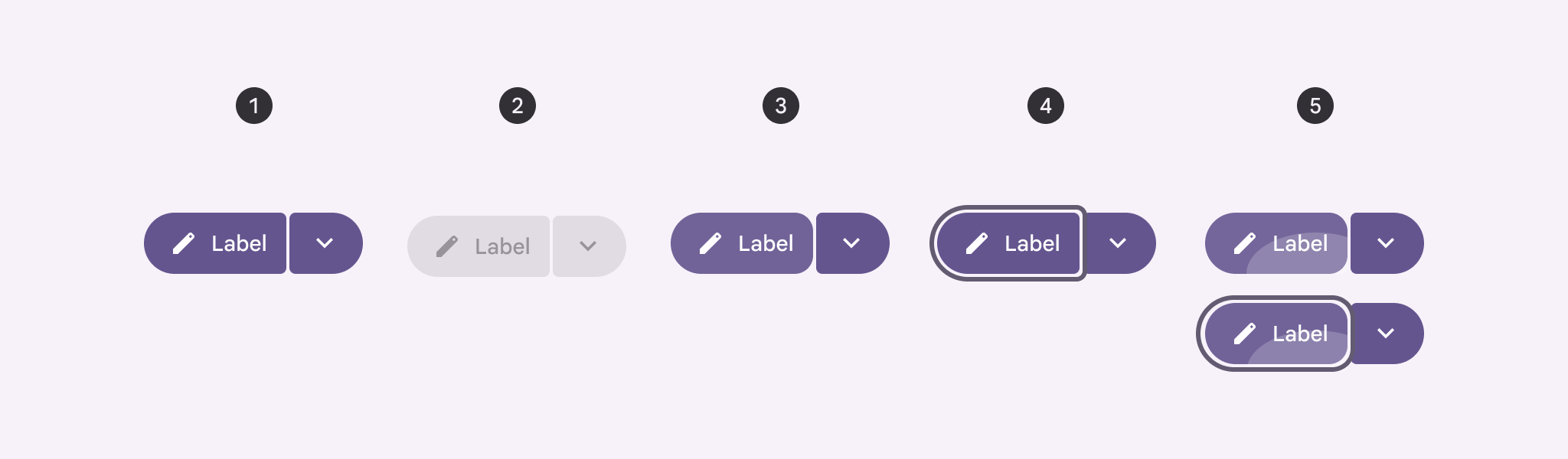
- Enabled
- Disabled
- Hovered
- Focused
- Pressed, pressed with focus
Trailing button shape
The inner corners change shape for hovered, focused, and pressed states, and the icon becomes centered when selected.
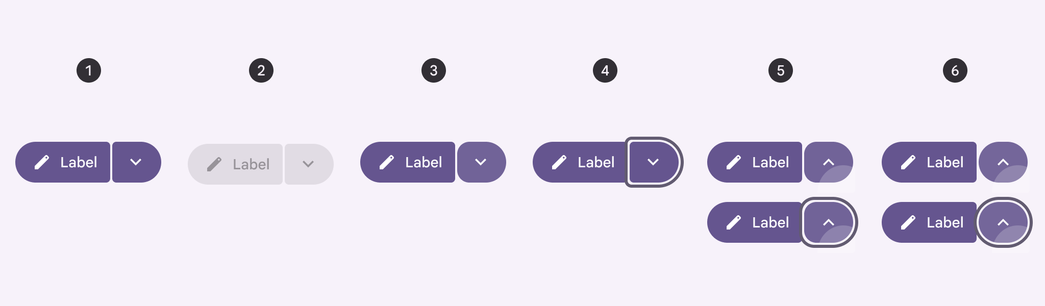
- Enabled
- Disabled
- Hovered
- Focused
- Pressed, pressed with focus
- Selected, selected with focus
Measurements
Text and icons are optically centered when the buttons are asymmetrical. They’re centered normally when symmetrical.
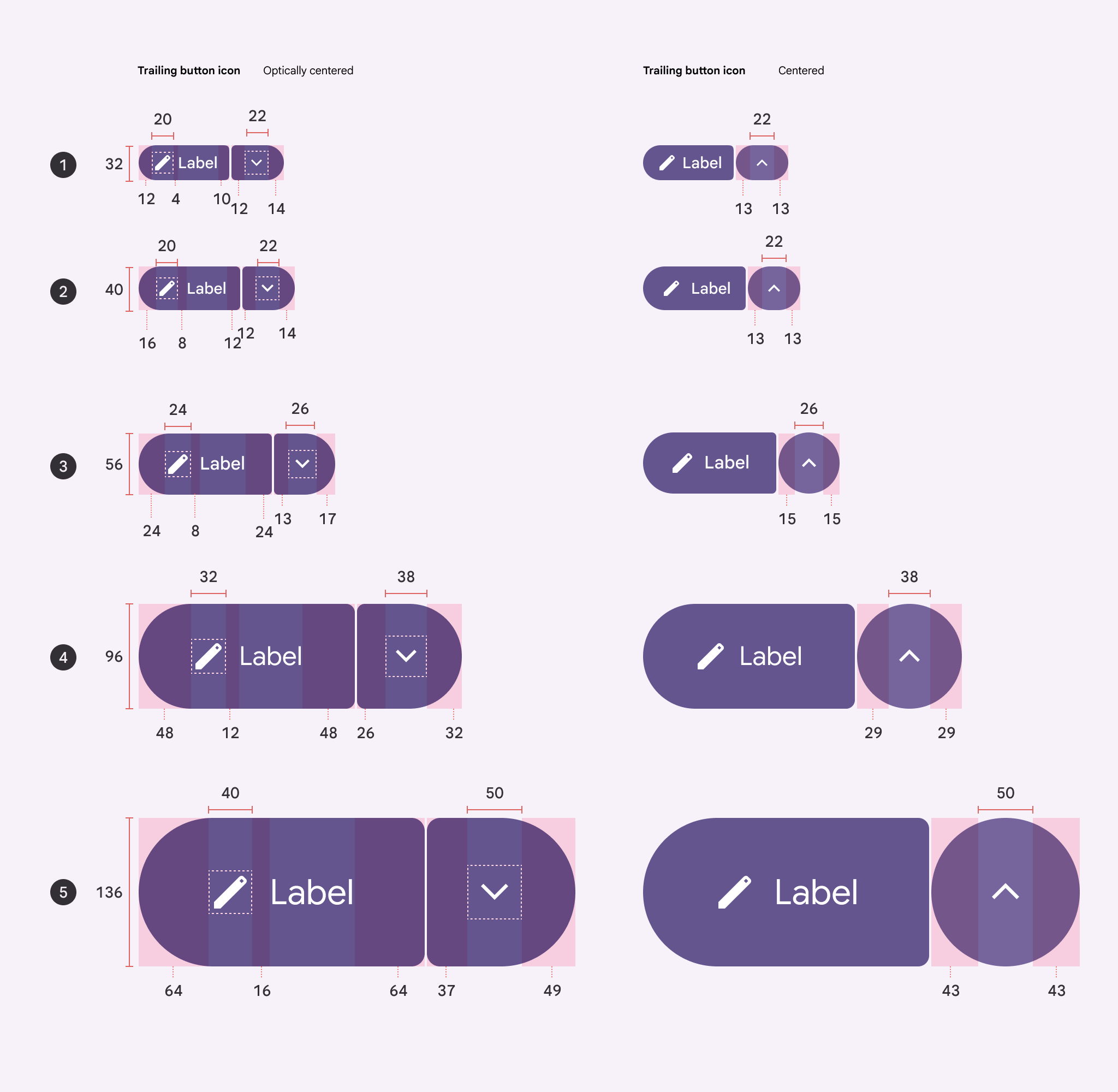
Menu icon offset when unselected:
- XS: -1dp from center
- S: -1dp from center
- M: -2dp from center
- L: -3dp from center
- XL: -6dp from center
The inner corner radius changes depending on button sizing. The space should always be 2dp.
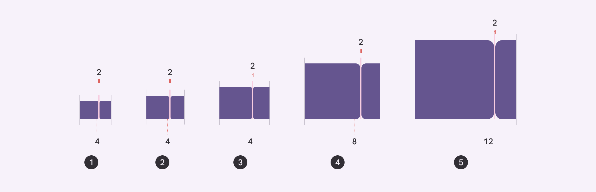
- Extra small 4dp
- Small 4dp
- Medium 4dp
- Large 8dp
- Extra large 12dp