Skip to content
Material Design 1
Main Navigation
v3
v2
v1

English

简体中文
繁體中文
Español
Français
Русский
Português – Brasil
Deutsch
日本語
한국어
Italiano
Polski
Türkçe
čeština
magyar

English

简体中文
繁體中文
Español
Français
Русский
Português – Brasil
Deutsch
日本語
한국어
Italiano
Polski
Türkçe
čeština
magyar

Appearance

Sidebar Navigation

Material Design

Environment

Material properties

Elevation & shadows

What's new

Motion

Material motion

Duration & easing

Movement

Transforming material

Choreography

Creative customization

Style

Color

Icons

Imagery

Typography

Writing

Layout

Principles

Units & measurements

Metrics & keylines

Structure

Responsive UI

Split screen

Components

Bottom navigation

Bottom sheets

Buttons

Buttons: Floating Action Button

Cards

Chips

Data tables

Dialogs

Dividers

Expansion panels

Grid lists

Lists

Lists: Controls

Menus

Pickers

Progress & activity

Selection controls

Sliders

Snackbars & toasts

Steppers

Subheaders

Tabs

Text fields

Toolbars

Tooltips

Widgets

Patterns

Confirmation & acknowledgement

Data formats

Empty states

Errors

Fingerprint

Gestures

Help & feedback

Launch screens

Loading images

Navigation

Navigation drawer

Navigational transitions

Notifications

Offline states

Permissions

Scrolling techniques

Search

Selection

Settings

Swipe to refresh

Growth & communications

Introduction

Onboarding

Feature discovery

Gesture education

Usability

Accessibility

Bidirectionality

Platforms

Platform adaptation

Android

Resources

Color palettes

Devices

Layout templates

Roboto & Noto fonts

Sticker sheets & icons

Shadows

On this page

Chips ​

Chips represent complex entities in small blocks, such as a contact.

A chip may contain entities such as a photo, text, rules, an icon, or a contact.

Contact chips may represent contact information in a compact way.

Behavior
  • Selecting a chip opens a full detail view.
  • Chips may be deleted if they display a delete icon.

Specs
  • Height: 32dp
  • Label: 13sp Roboto Regular, 87% black
Material Design chips represent complex entities in small blocks

Usage ​

A chip may contain a photo, short title, and brief information.

Types of chips

Chips can be used for various types of entities, including free form text, predefined text, rules, or contacts. Chips may also contain icons.
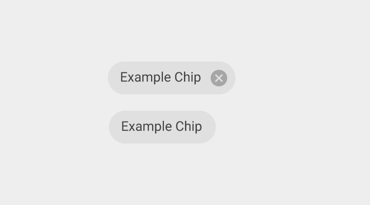
Material Design chips with text
Chips with text

Chip label
  • 13sp Roboto Regular
  • 87% black
Material Design chips with text and icon
Chips with text and an icon

Behavior ​

Opening chips ​

Touching a chip opens a full detailed view (either in a card or full screen) or a menu of options related to that chip.

Deleting chips

Chips can be deletable or non-deletable. Display a delete icon if a chip is deletable.

Users may press the delete icon or use the keyboard “Delete” button to remove a chip.

Contact chips ​

Contact information that users have for people may be represented in a compact way using contact chips. The chips are invoked and inserted into a text field (usually the “To” field) when the user starts typing a contact’s name, sees the contact’s addresses, and selects the correct one. Contact chips can be added directly to a text field from a menu of contacts.

Contact chips efficiently confirm that the user will be sending their message to the correct person.

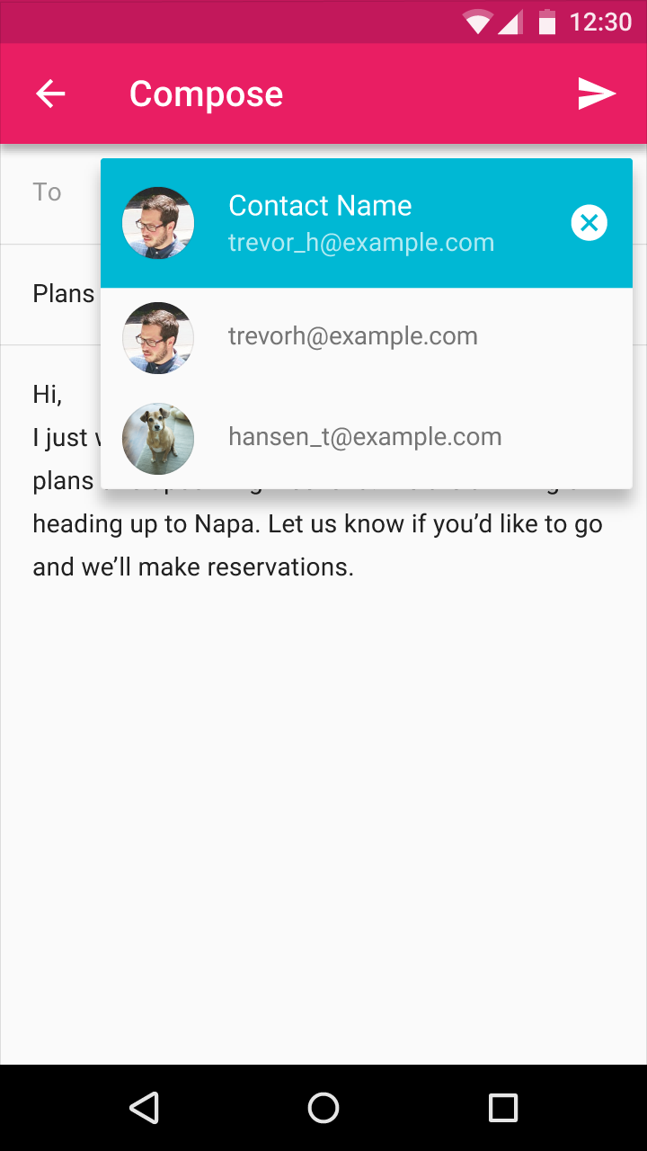
User confirms email recipient names on contact chips
The user confirms the name(s) of the email recipient(s) on the contact chips.
User confirms email on Material Design contact chip
The user confirms which email address to select on the contact chip.
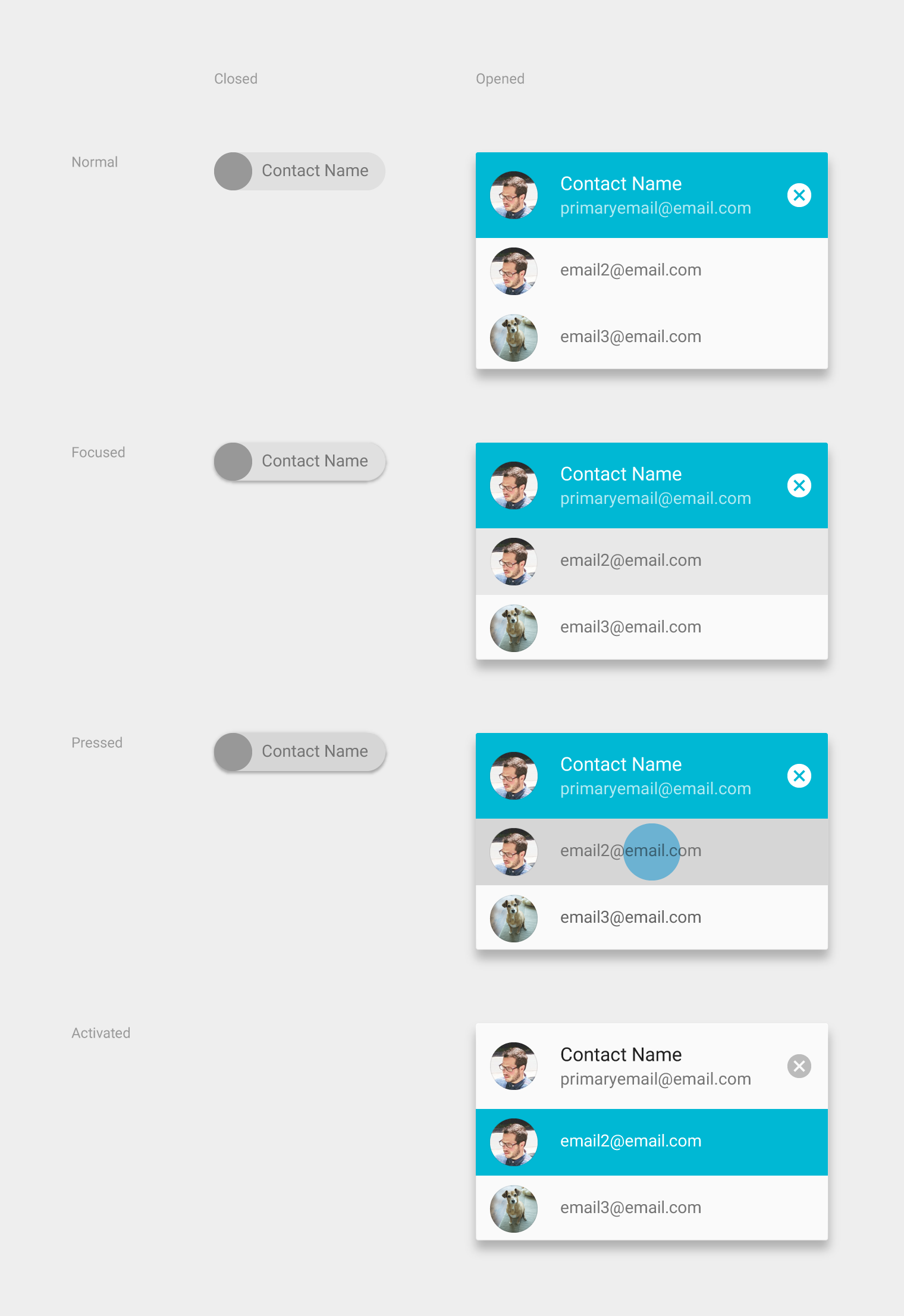
Material Design contact chip states: Normal, Focused, Pressed
The contact chip has different states: Normal, Focused, Pressed, and Activated.

Specs ​

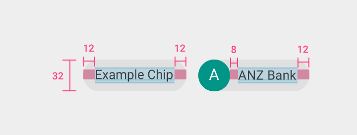
Single-line chips

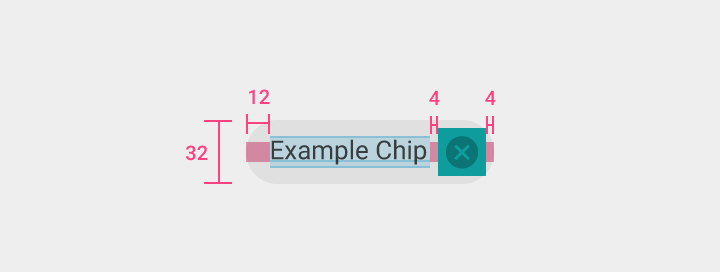
Material Design single-line chips specs
Deletable chip

Height: 32dp
Label left padding: 12dp

Remove icon

Size: 24dp x 24dp
Color & opacity: 54% black
Margin: 4dp

On desktop, the “Remove” icon is persistent.
Material Design single-line chips specs
Non-deletable chip

Height: 32dp
Label left and right padding: 12dp

Contact chip

Height: 32dp
Label left padding: 8dp
Label right padding: 12dp

Contact chips

Closed contact chip

  • The contact name text is Roboto Regular 14sp
  • Upon focus, the chip rises to an elevation of 2dp. When pressed, it expands to show alternative addresses for the contact.

Open contact chip

  • Contact name text: Roboto Regular 16sp
  • Address text: Roboto Regular 14sp
  • Elevation of the open contact chip is 8dp
  • On press, the contact chip closes automatically
  • By default, the top field is activated and focused

Material Design contact chip element
Contact chip

Height: 32dp
Title top, bottom, and left padding: 8dp
Title right padding: 12dp
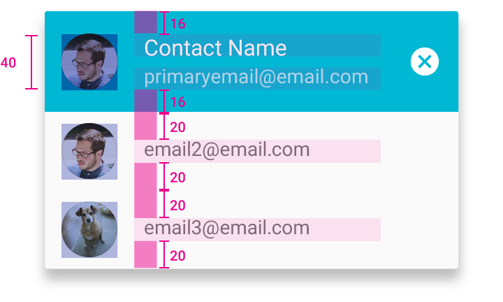
Material Design focused contact chip
Focused and activated contact chip

Height: 40dp
Top and bottom padding: 16dp

Unfocused contact chips

Top and bottom padding: 20dp
Pager
Previous pageCards
Next pageData tables

Released under the Apache-2.0

Copyright © 2014-Present Google

https://m1.material.io/components/chips.html

Released under the Apache-2.0

Copyright © 2014-Present Google