Fingerprint
Android only
Fingerprint detection may be used to unlock a device, sign in to apps, and authenticate purchases using Google Play and some third-party apps.
To authenticate purchases using Fingerprint, display the Fingerprint authentication dialog.
Fingerprint is not as secure as a strong PIN or password. Authentication alternatives include a user’s account password, an app PIN, and device credentials.
When to use
Upon opening the app
During your app’s purchase flow
In your app settings
After enrollment
Icon
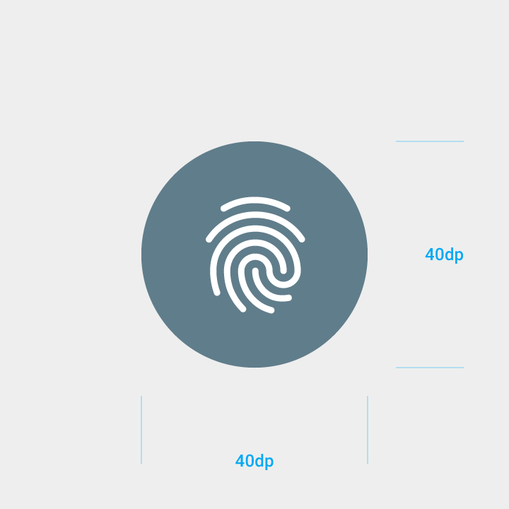
Fingerprint icon size: 24dp
Circle surrounding icon: 40dp

Enrollment
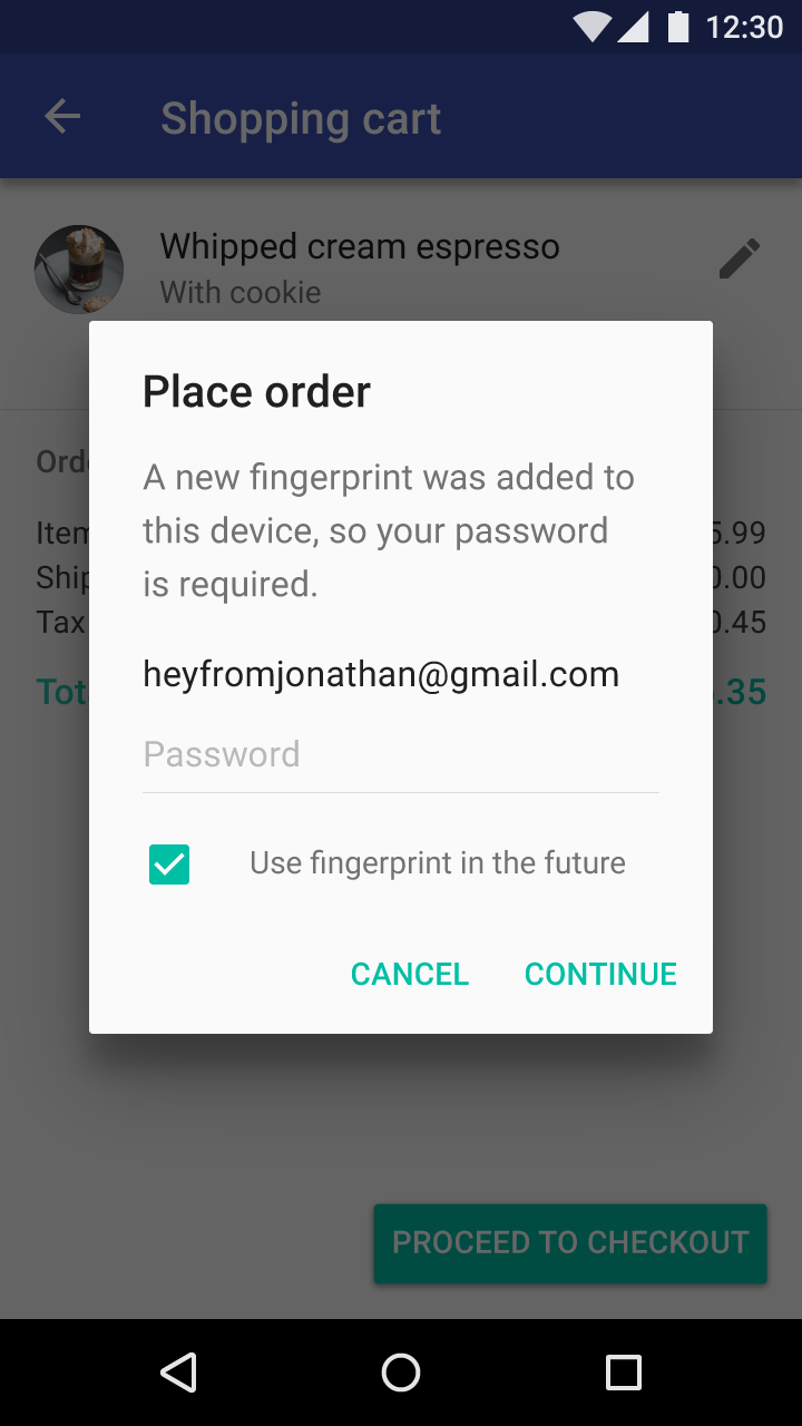
Before invoking Fingerprint in your app, you must get consent from the user that they want to use Fingerprint as an alternate way of authenticating themselves.
Possible times to invite users to try Fingerprint include:
- Upon opening the app
- During your app’s purchase flow
- In your app settings
- After enrollment
Upon opening the app
During your app’s purchase flow
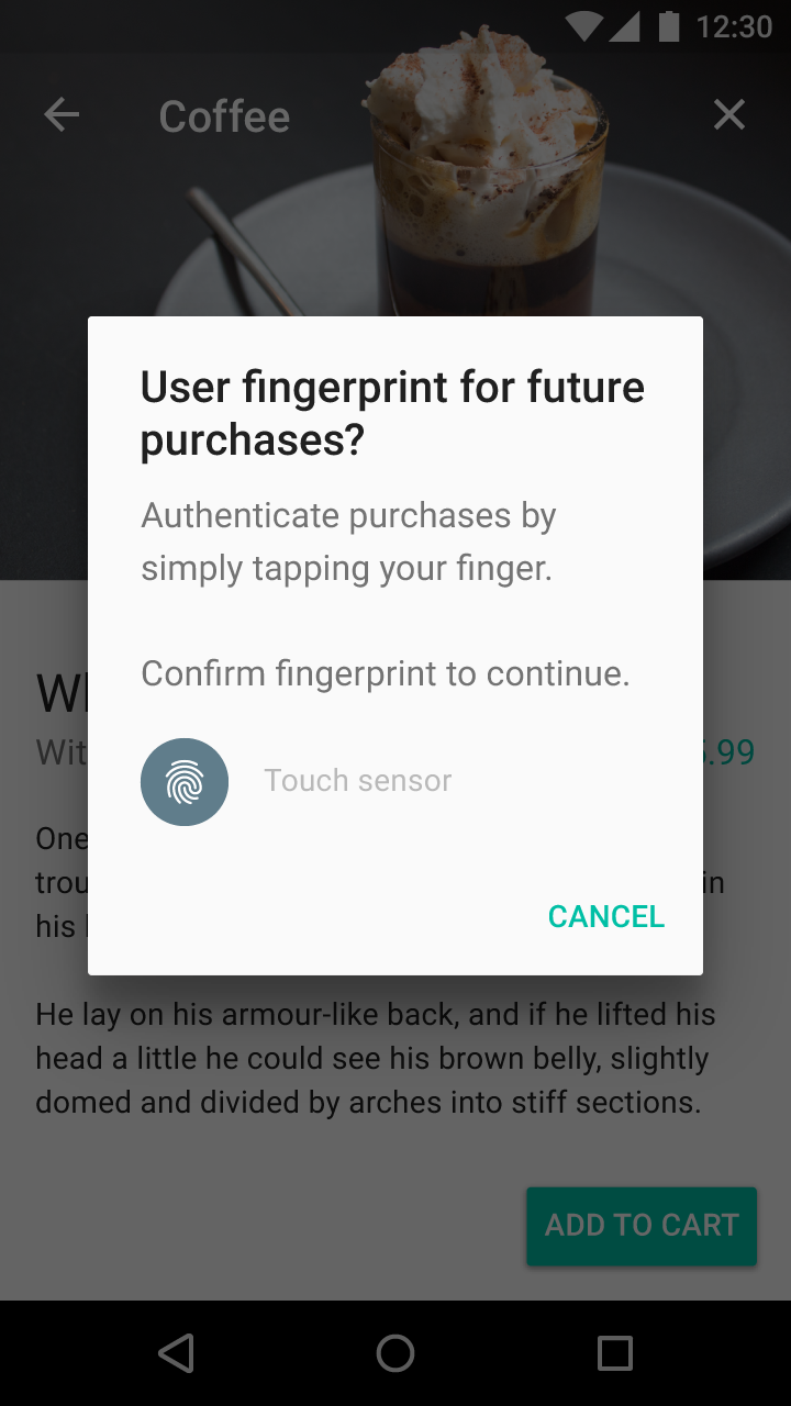
In your app settings
After enrollment
Authentication
Your app’s users can set up the option to log in or authenticate purchases using Fingerprint.
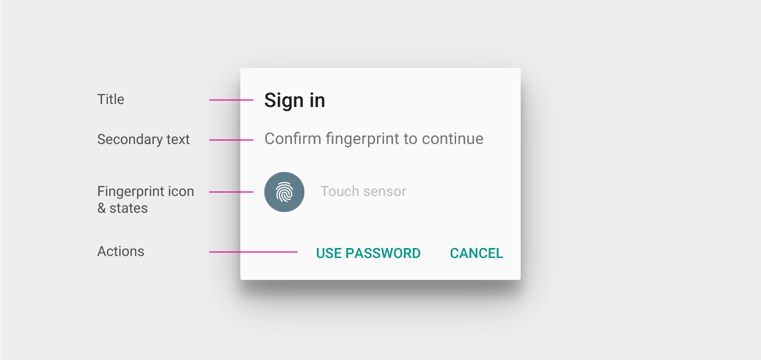
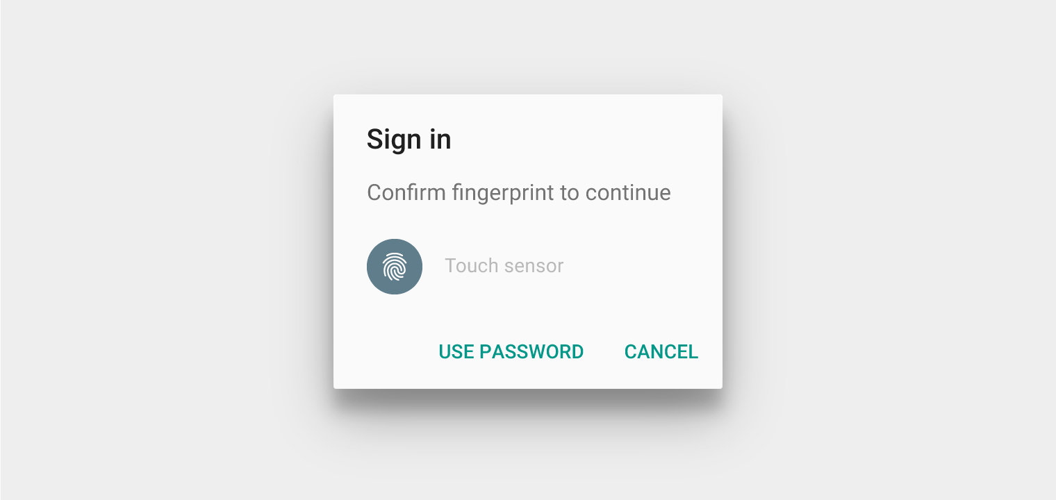
When a user action needs to be authenticated, display the Fingerprint authentication dialog in place of your login screen.
Title
Use the title to describe the action being performed, such as “Sign in.” The title should not be used to introduce Fingerprint.
Secondary text
Use the phrase “Confirm fingerprint.” This wording maintains consistency with Android Settings.
You may combine the above text with the associated user action, such as “Confirm fingerprint to complete purchase.”
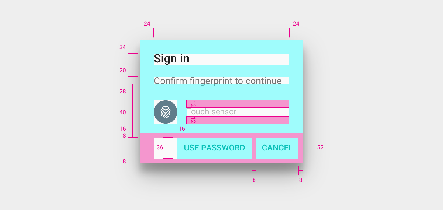
Dialog left and right padding: 24dp
Dialog top padding: 24dp
Title bottom margin: 20dp
Subtitle bottom margin: 28dp
Fingerprint icon right margin: 16dp
Touch sensor height: 40dp
Touch sensor call to action top and bottom padding: 12dp
Button container height: 52dp
Button container bottom padding: 8dp
Button height: 36dp
Button right and left padding: 8dp
Behavior
Default state
Ask the user to put their finger on the sensor.
Success state
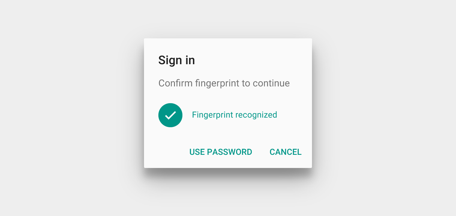
Once the fingerprint is recognized, change the dialog to a success message and the image to the fingerprint icon with the check mark.
Specification:
- Use your app’s primary color for the success text and icon, or Teal 500 (#009688)
Success states should avoid:
- Displaying two success states simultaneously
- Extensive transitions between default and success states
Failure state
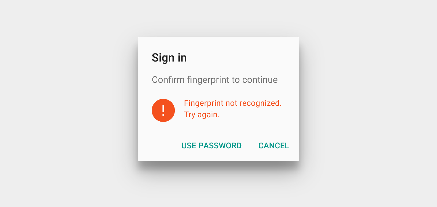
Upon failure, provide a clear indication that the user’s fingerprint was not recognized and that they should try again, using the error icon either with or without a status message.
Specification:
- Use your app’s color assigned to failure states, or Deep Orange 600 (#F4511E)
Failure states should avoid:
- Extensive transitions between default and failure states
Exiting
Provide alternative ways to exit the dialog. At minimum, provide an affordance to close the Fingerprint dialog, such as a “Cancel” button.
Authentication alternatives
Fingerprint should not be the only way to authenticate. Provide alternative authentication methods, such as:
- User’s account password
- App PIN
- Device credentials
Fingerprint icon
Usage and size
The Fingerprint icon should be displayed at the standard system icon size, 24dp, within a 40dp circle.
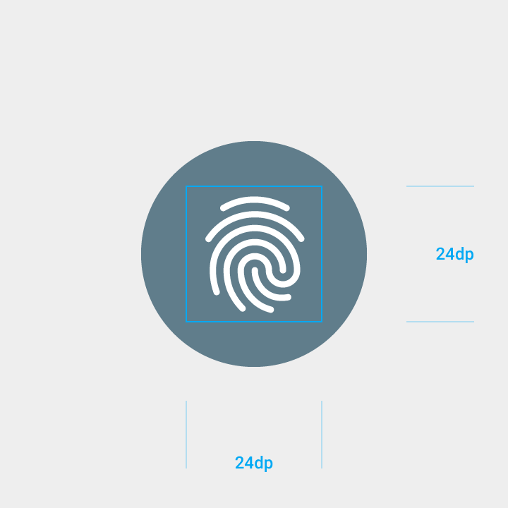
Default icon
Users will be asked to look for this icon for places where they can use Fingerprint.
Specifications:
- Circular background color: #607D8B
- Works on white backgrounds

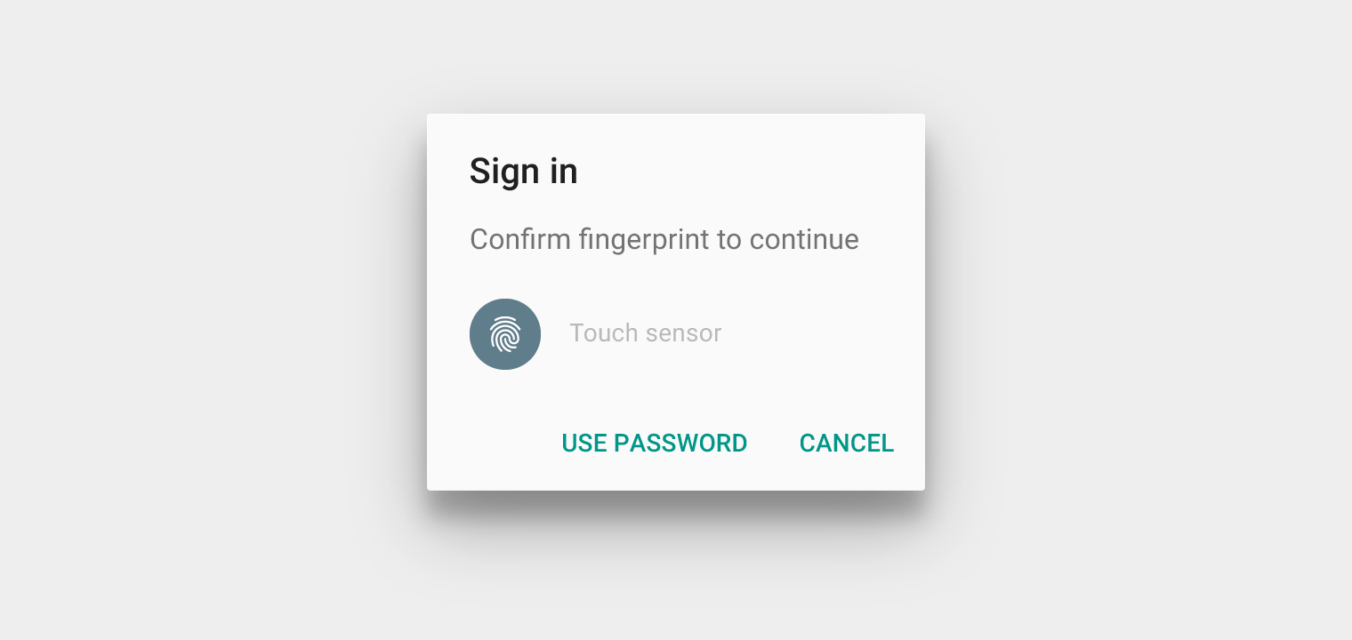
Tinted icon
The circle surrounding the icon can be customized with a color that provides appropriate contrast against the lines of the Fingerprint icon.


Don’t.
UIs with light backgrounds
Use the Fingerprint icon with a dark circle background.
Specifications:
- Color: #FFFFFF
- Opacity: 100%
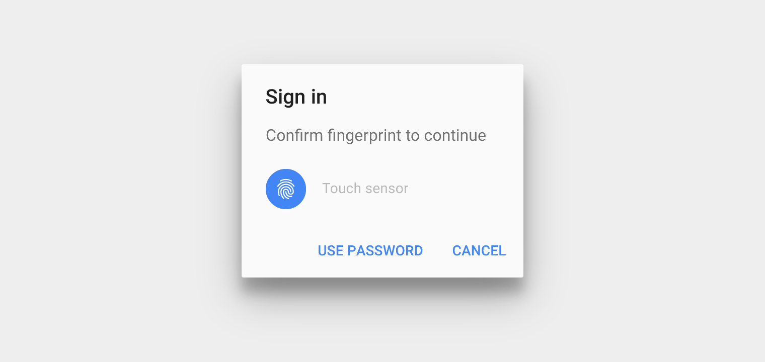
UIs with dark backgrounds
Use the Fingerprint icon with a light circle background.
Specifications:
- Color: #000000
- Opacity: 54%
Icon with no circular background
Apps requiring a more versatile Fingerprint icon may eliminate the circular background.

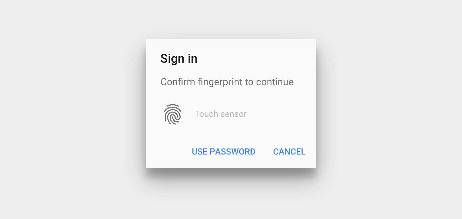

Don’t.
Reauthentication
Reauthentication applies when users need to confirm their identity before continuing.
Reauthentication uses:
- To prevent unauthorized viewing of sensitive information
- To guard against unauthorized purchases
- When cryptographic keys expire and users are asked to reconfirm their identity
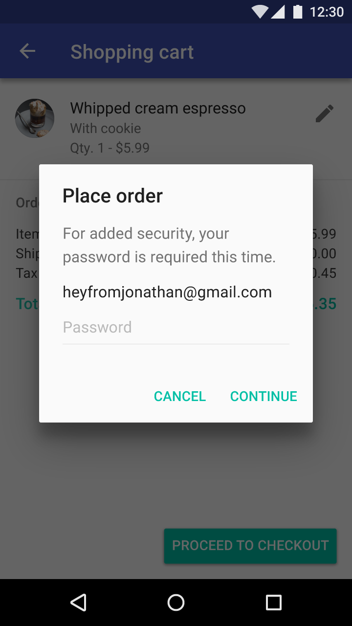
Alternatively, if a user forgets about Fingerprint authentication, you can ask users to use their backup password and remind them of the Fingerprint option next time.