

Cards
A card is a sheet of material that serves as an entry point to more detailed information.
Cards may contain a photo, text, and a link about a single subject. They may display content containing elements of varying size, such as photos with captions of variable length.
A card collection is a layout of cards on the same plane.
Usage
Cards display content composed of different elements whose size or supported actions vary.
Supported gestures
Swipe
Pick-up-and-move
Related components
For developers

Usage
Cards are a convenient means of displaying content composed of different elements. They’re also well-suited for showcasing elements whose size or supported actions vary, like photos with captions of variable length.
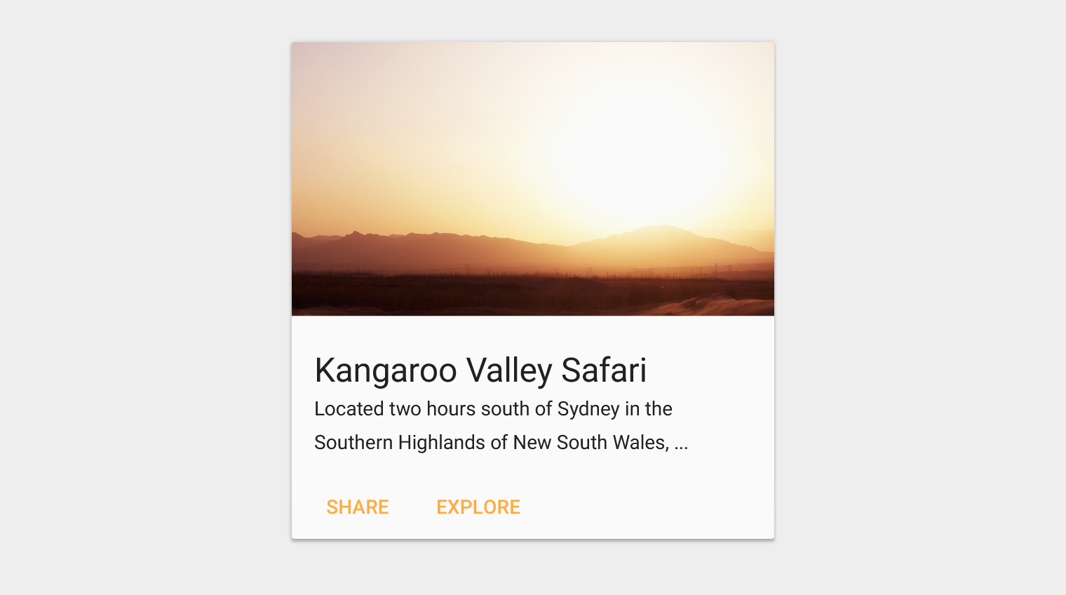
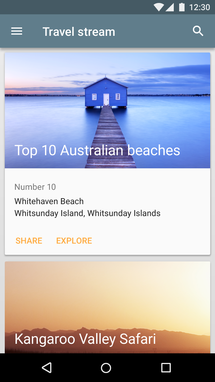
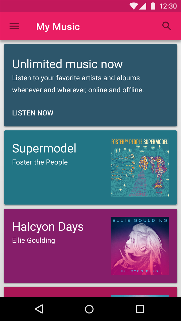
A card collection is coplanar, or a layout of cards on the same plane.
When to use
Use a card layout when displaying content that:
- As a collection, comprises multiple data types, such as images, movies, and text
- Does not require direct comparison (a user is not directly comparing images or text)
- Supports content of highly variable length, such as comments
- Contains interactive content, such as +1 buttons or comments
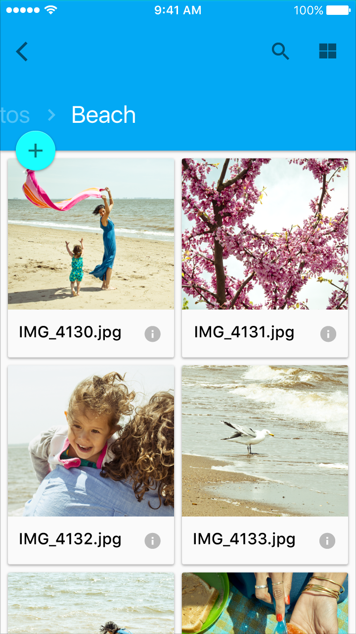
- Would otherwise be in a grid list but needs to display more content to supplement the image
Do.
2. Cards can have multiple actions.
3. Cards can be dismissible and rearranged.
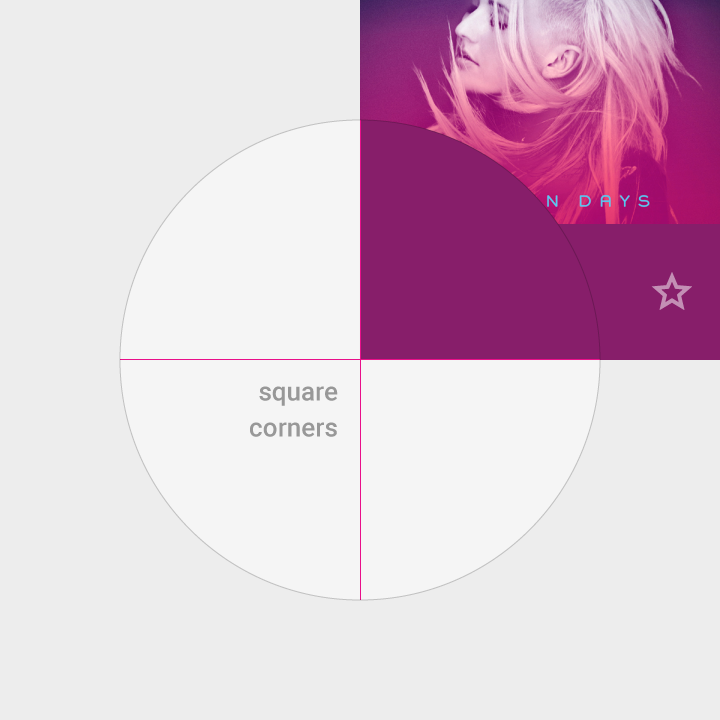
Don’t.
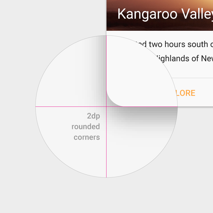
1. Tiles have square corners.
2. Tiles have no more than two actions.
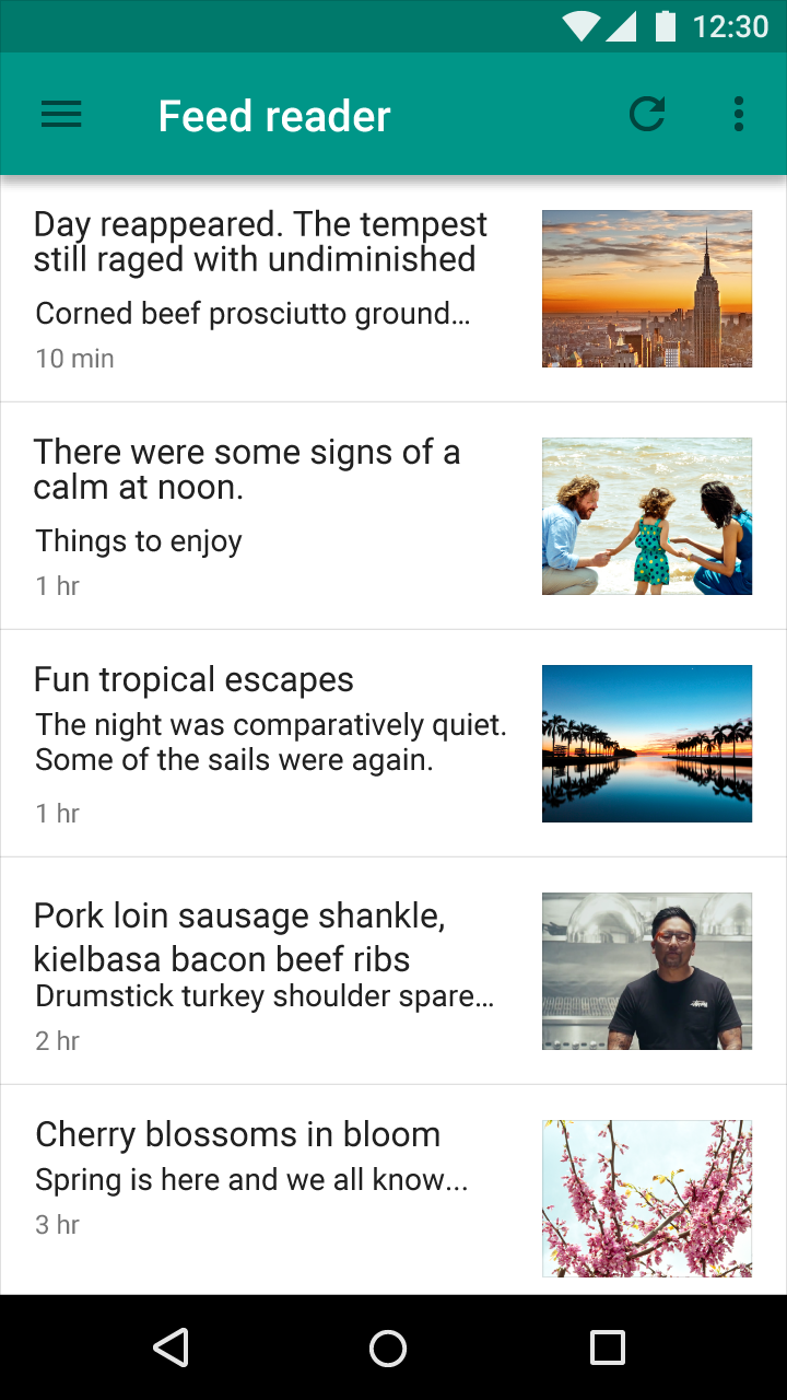
Do.
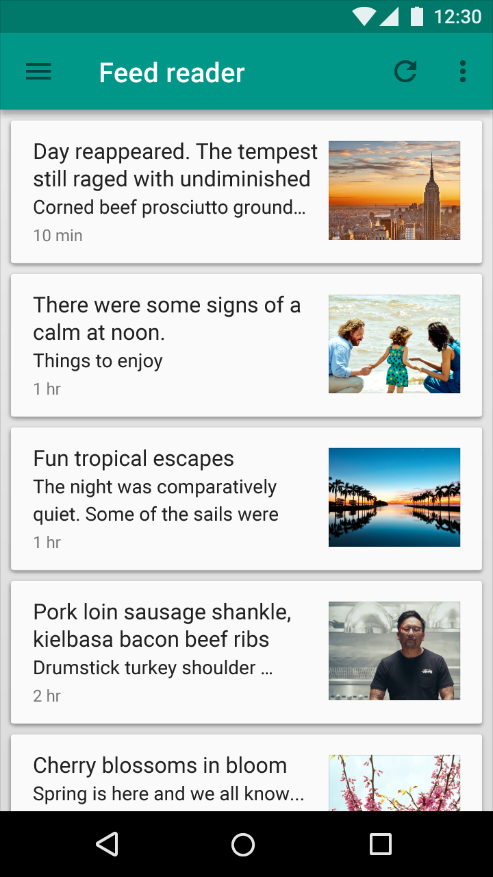
Don’t.
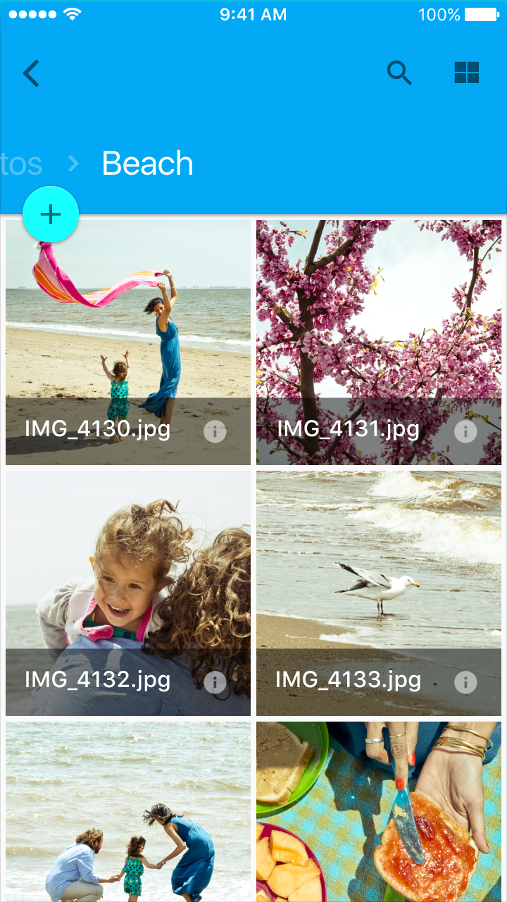
Do.
Don’t.
Content
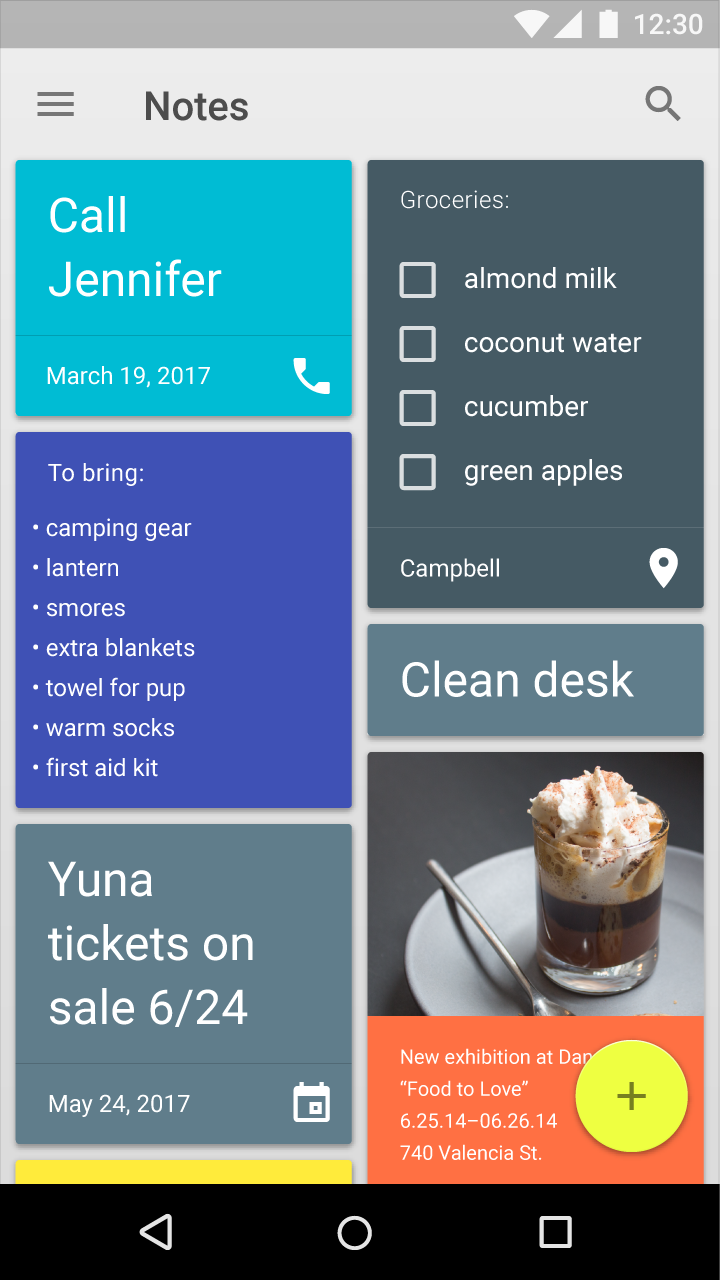
Cards provide context and an entry point to more robust information and views, and their content and quantity can vary greatly. Cards within a card collection can each contain a unique data set, such as a checklist with an action, a note with an action, and a note with a photo.
Don't overload cards with extraneous information or actions.
Content hierarchy
Use hierarchy within the card to direct users’ attention to the most important information. For example, place primary content at the top of the card, or use typography to emphasize primary content.
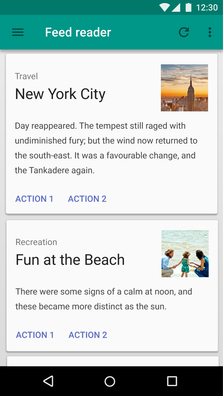
Images can reinforce other content in a card. However, their size and placement within the card depends on whether images are the primary content or are being used to supplement other content on the card.
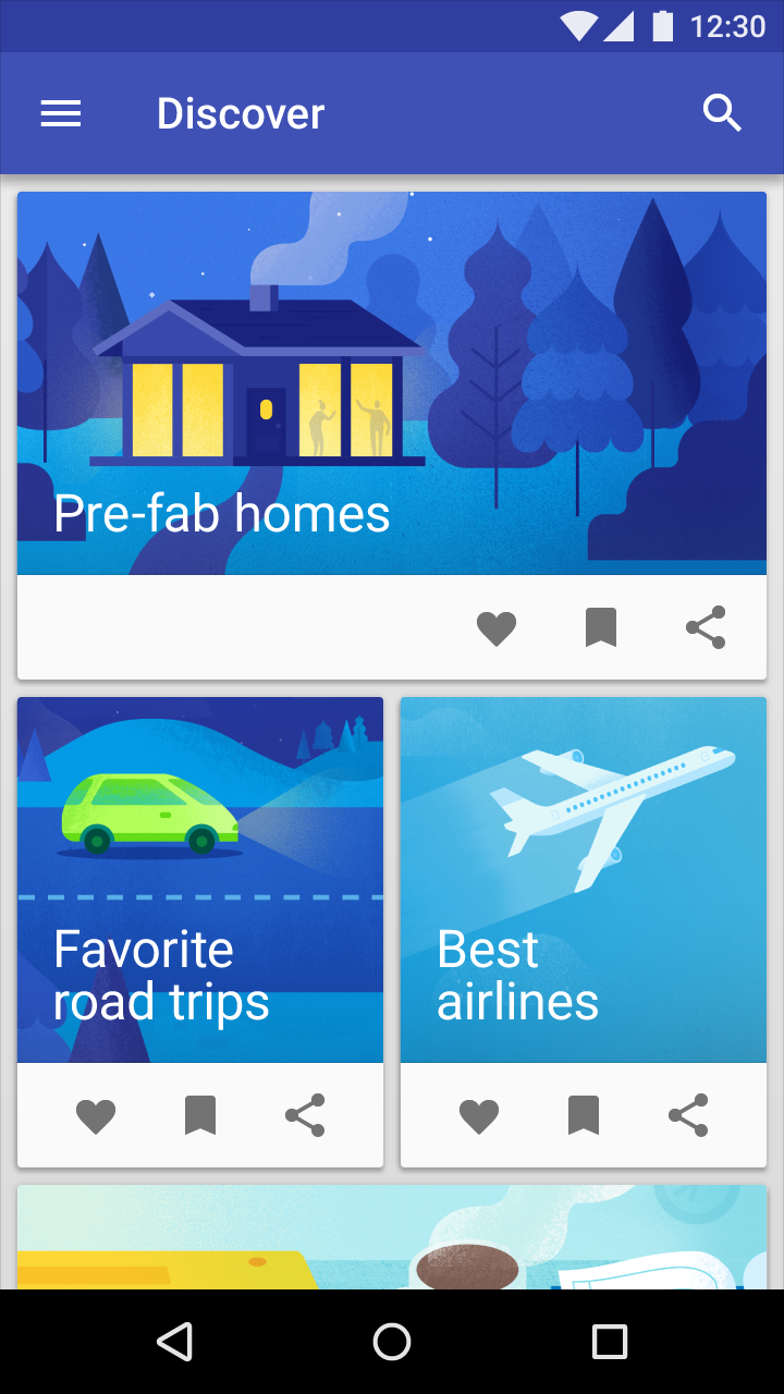
Background images
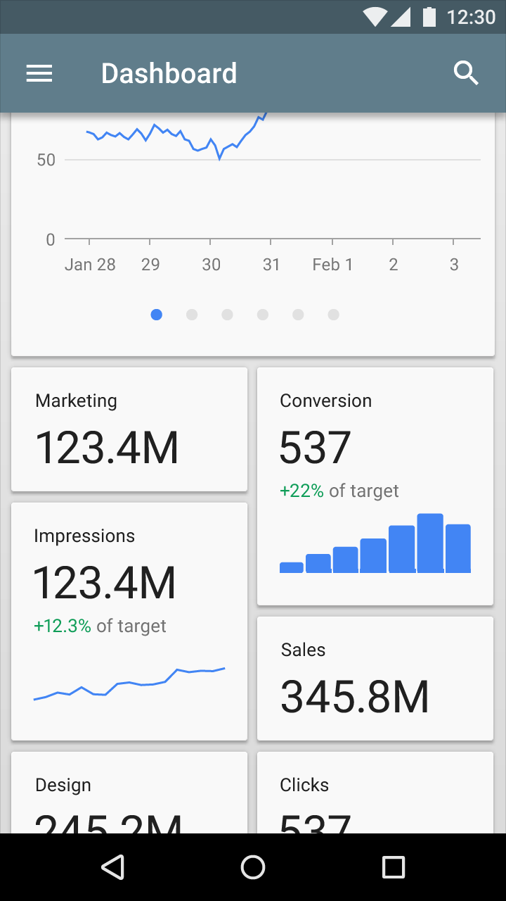
Text is most legible when placed on a solid color background with a sufficient contrast ratio to the text. Text placed on image backgrounds should preserve text legibility.
Behavior
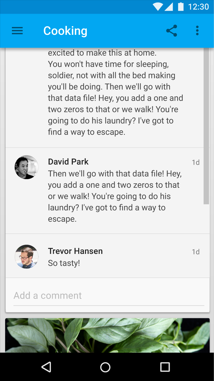
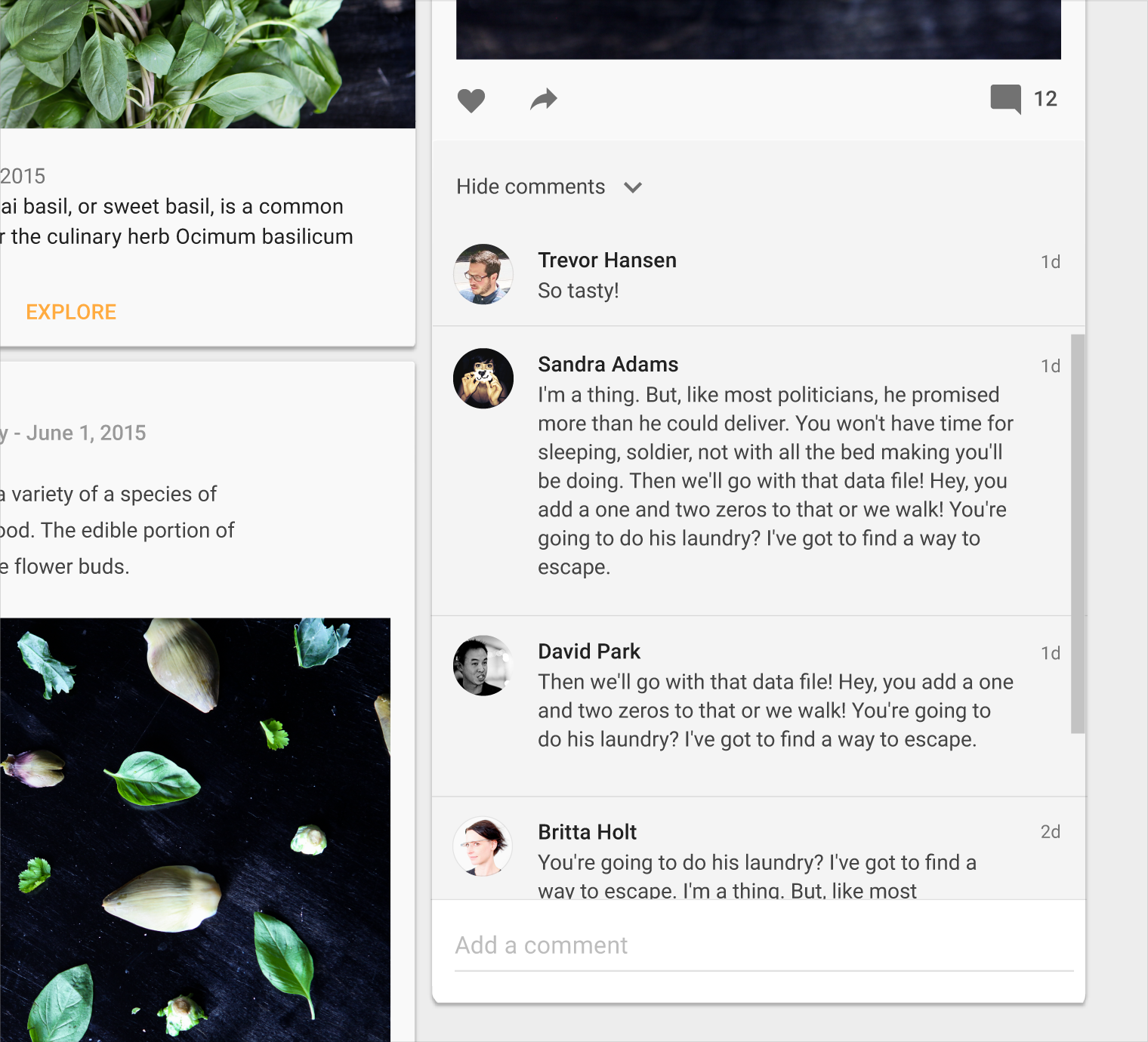
Cards have a constant width and variable height. The maximum height is limited to the height of the available space on a platform, but it can temporarily expand (for example, to display a comment field).
Cards do not flip over to reveal information on the back.
Supported gestures
Card gestures should be consistently implemented within a card collection.
Supported gestures include:
- The swipe gesture may be used on a per-card basis. Limit swipe gestures within a view so that they don’t overlap with one another. For example, a swipeable card should not contain a swipeable image carousel, so that only a single action occurs when the card is swiped.
- The pick-up-and-move gesture may be used if it is important for the user to be able to sort cards within a collection. But consider if filtering or sorting would better organize the content.
Card collection filtering and sorting
Card collections can be programmatically sorted or filtered by date, file size, alphabetical order, or other parameters.
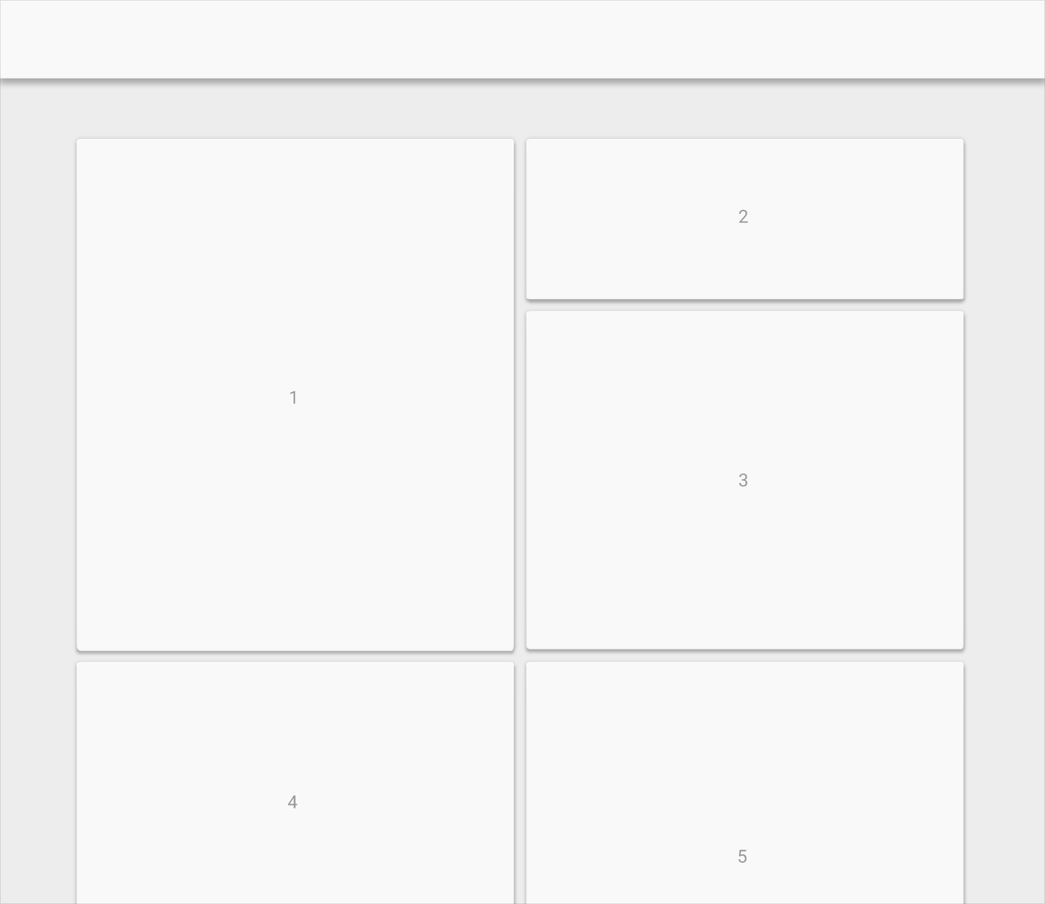
- The first item in the collection is positioned at the top left
- The order proceeds left to right and top to bottom
Scrolling
Card collections only scroll vertically.
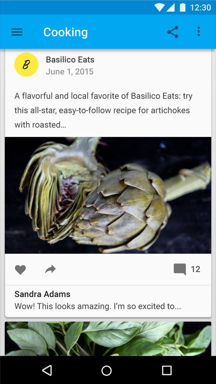
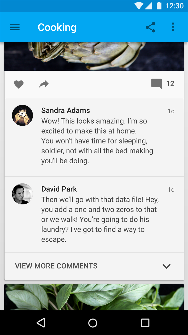
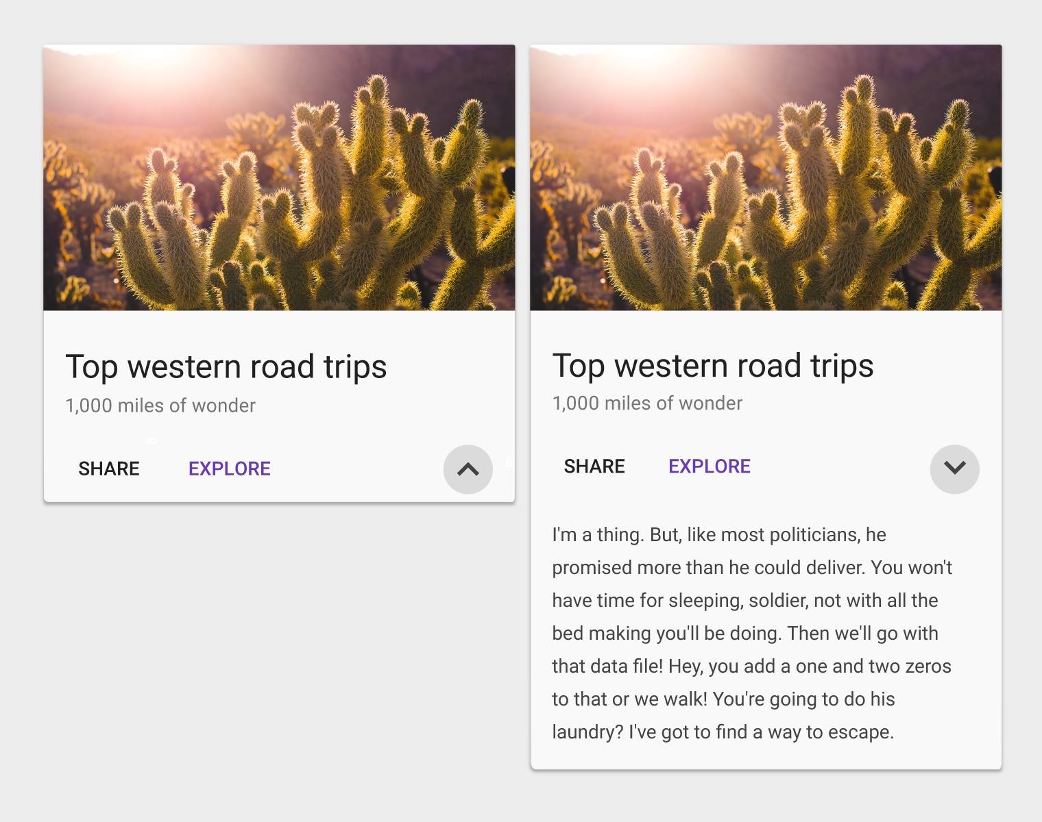
Card content that exceeds the maximum card height is truncated and does not scroll, but the card can be expanded. Once expanded, the card may exceed the maximum height of the view. In this case, the card will scroll with the card collection.
Do.
Don’t.
Card focus
When traversing through focus points on a card, all focusable elements are visited before moving to the next card.
For interfaces that depend on focus traversal for navigation (D-pad and keyboard), cards should have either a primary action or open a new view containing primary and supplemental actions.
Actions
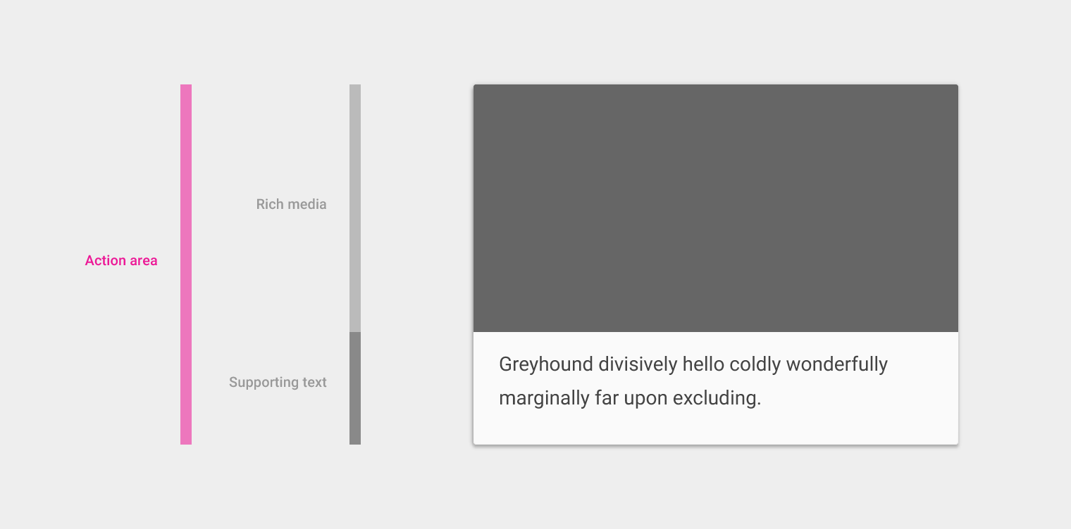
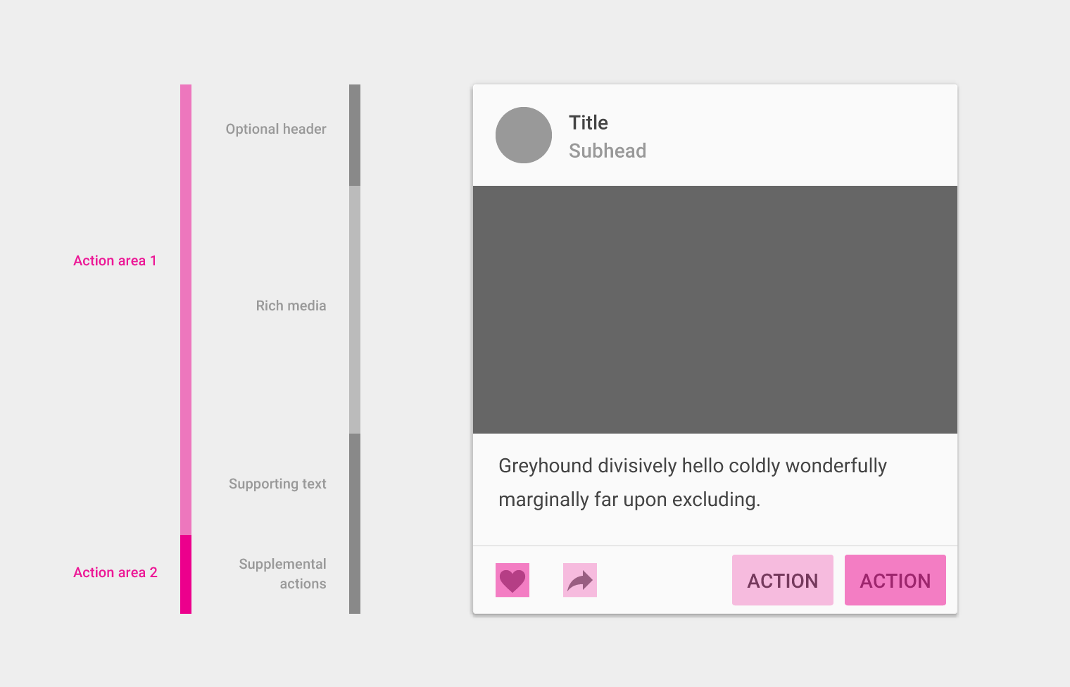
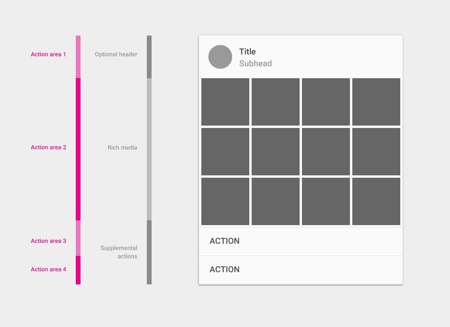
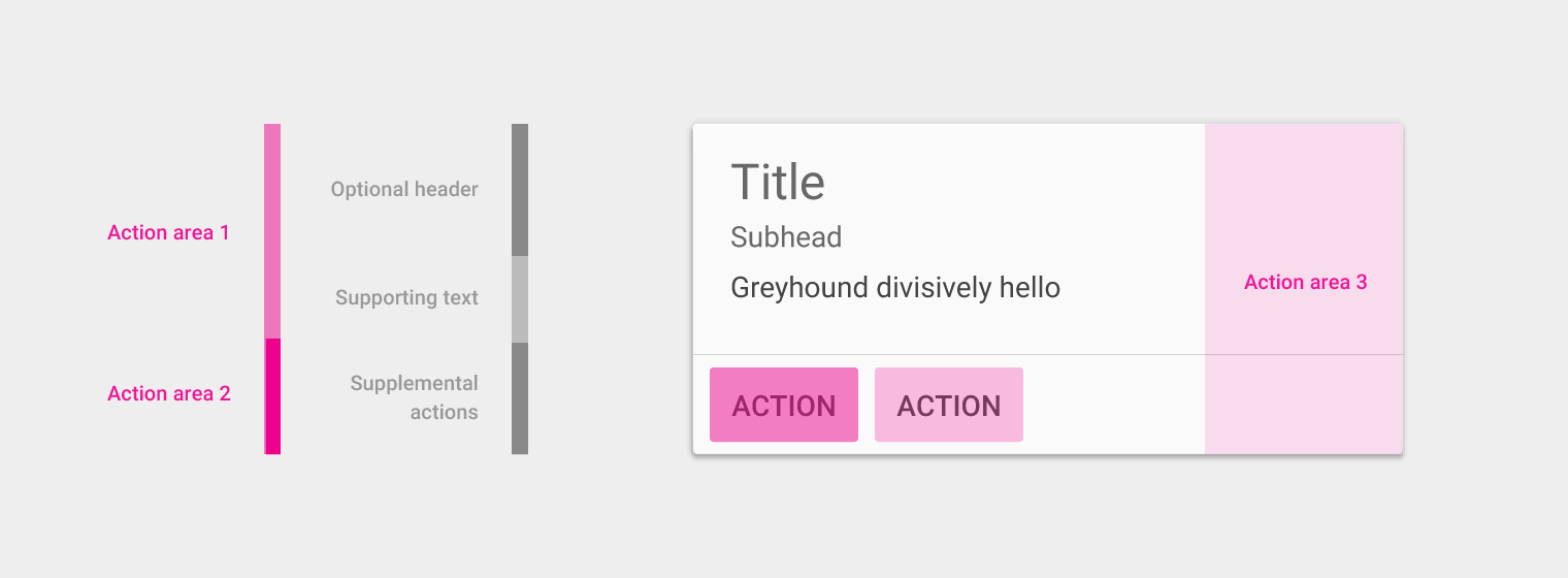
The primary action in a card is typically the card itself.
Supplemental actions can vary from card to card in a collection, depending on the content type and expected outcome; for example, playing a movie versus opening a book. Within cards in a collection, position actions consistently.
Supplemental actions
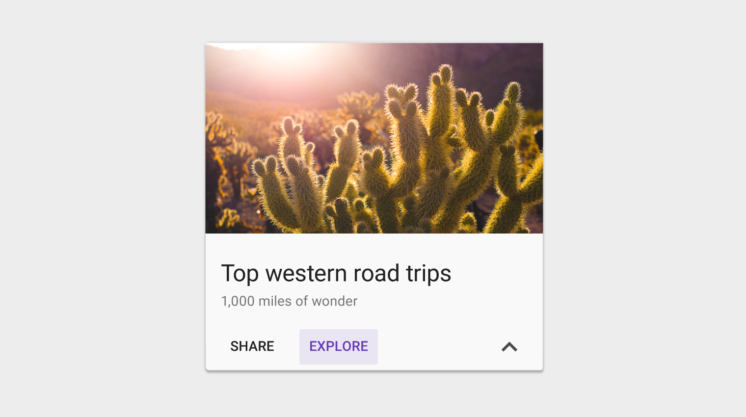
Supplemental actions within the card are explicitly called out using icons, text, and UI controls, typically placed at the bottom of the card.
Limit supplemental actions to two actions, in addition to an overflow menu.
UI controls
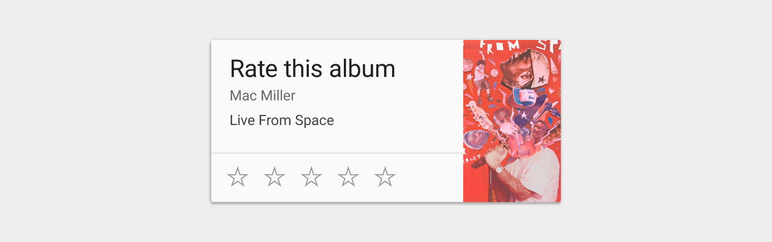
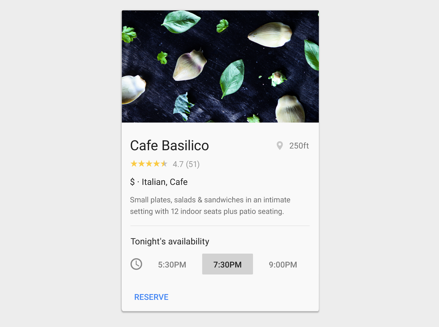
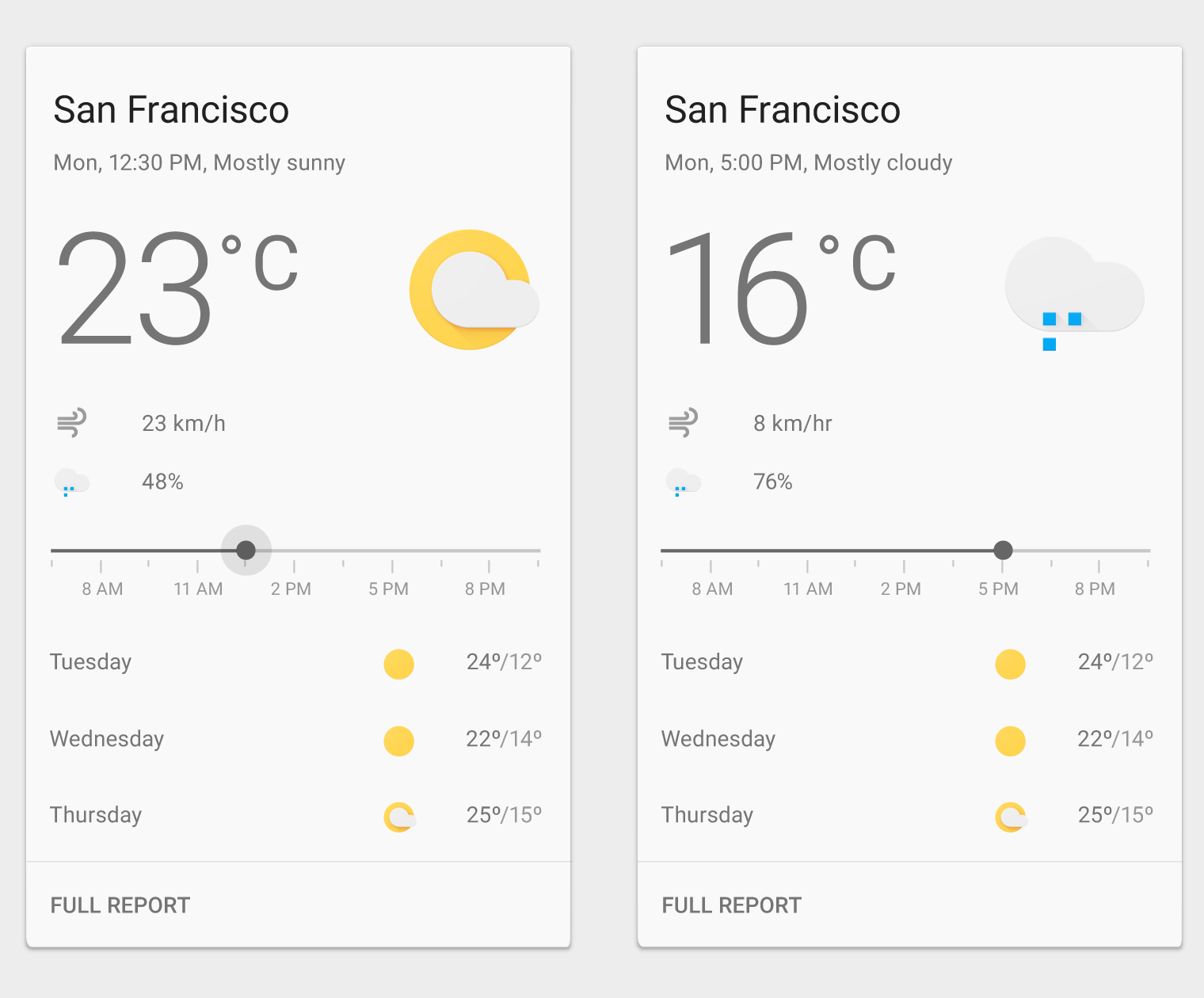
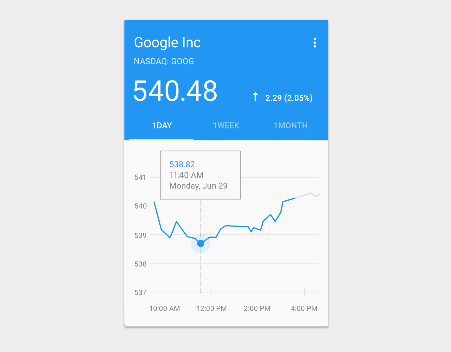
UI controls, like a slider, placed inline with primary content can modify the view of the primary content. For example, a slider to choose a day, stars to rate content, or a segmented button to select a date range.
Overflow menu (optional)
An overflow menu is typically placed in the upper-right corner of a card, but can be placed in the lower-right corner if doing so improves content layout and legibility.
Take care not to overload an overflow menu with too many actions.
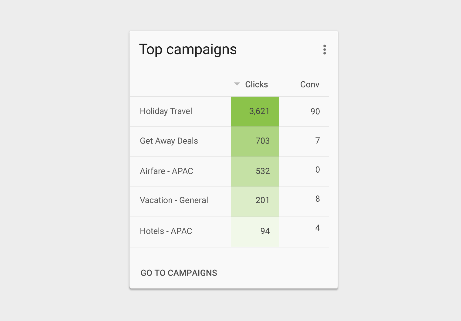
Additional actions
Inline links within text content are strongly discouraged.
Although cards can support multiple actions, UI controls, and an overflow menu, use restraint and remember that cards are entry points to more complex and detailed information.
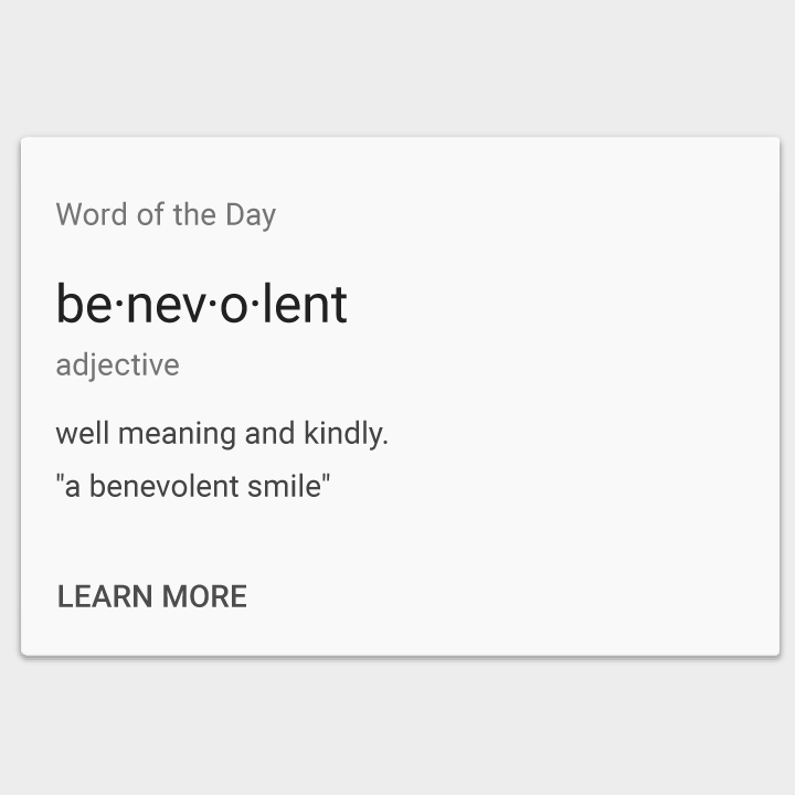
Do.
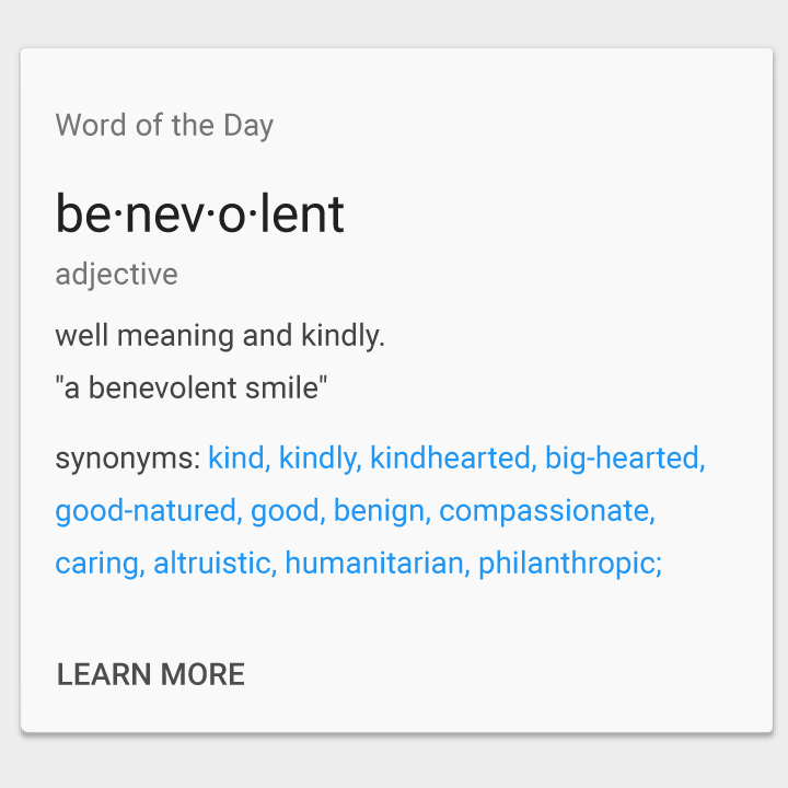
Don’t.
Content blocks
Cards can be constructed using blocks of content which include:
- An optional header
- A primary title
- Rich media
- Supporting text
- Actions
These blocks can be organized to promote different types of content. For example, numbers may be emphasized by increasing their typographic scale.
On tablet/desktop, cards should follow the 24dp keyline. See Metrics & Keylines for more information.
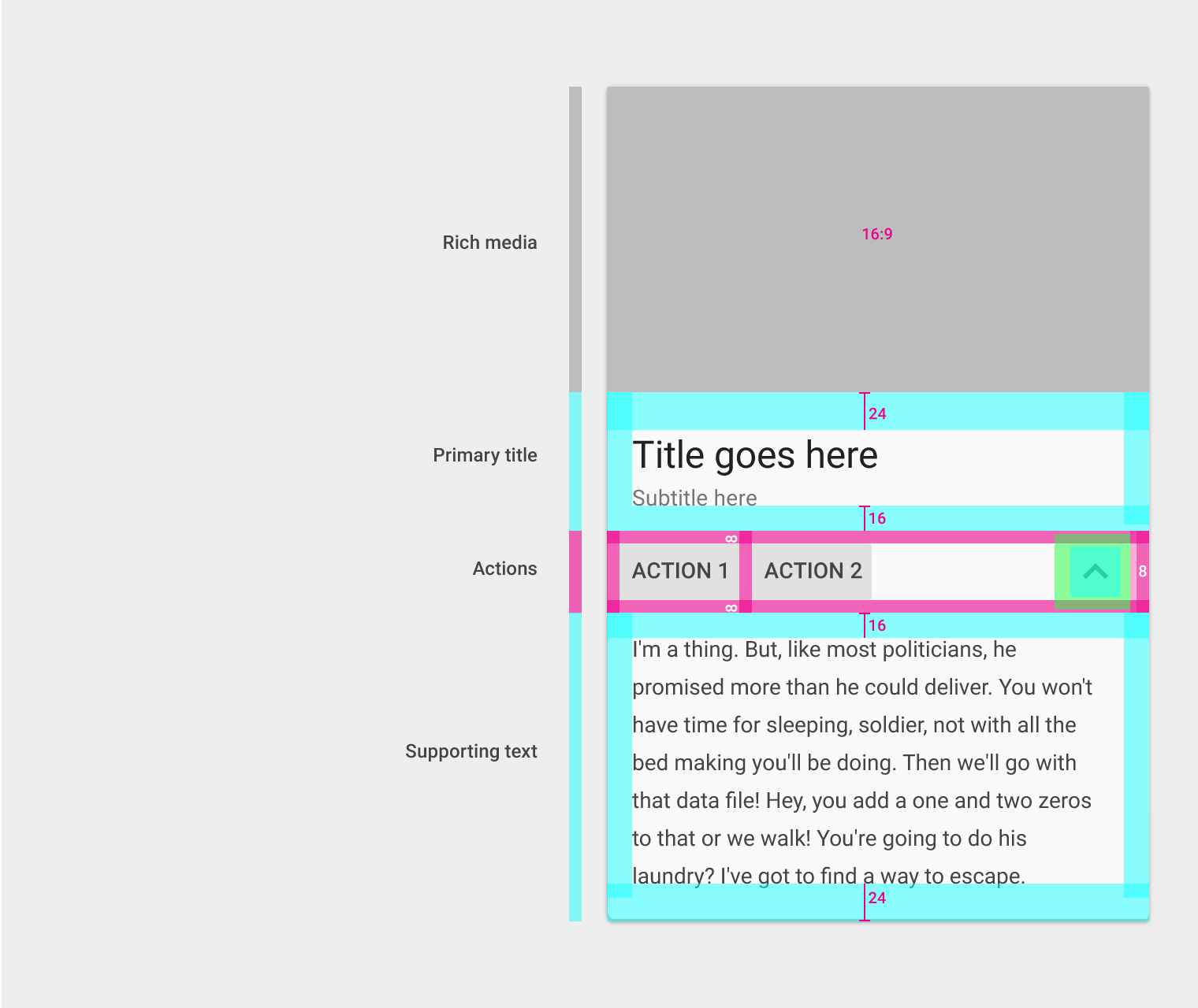
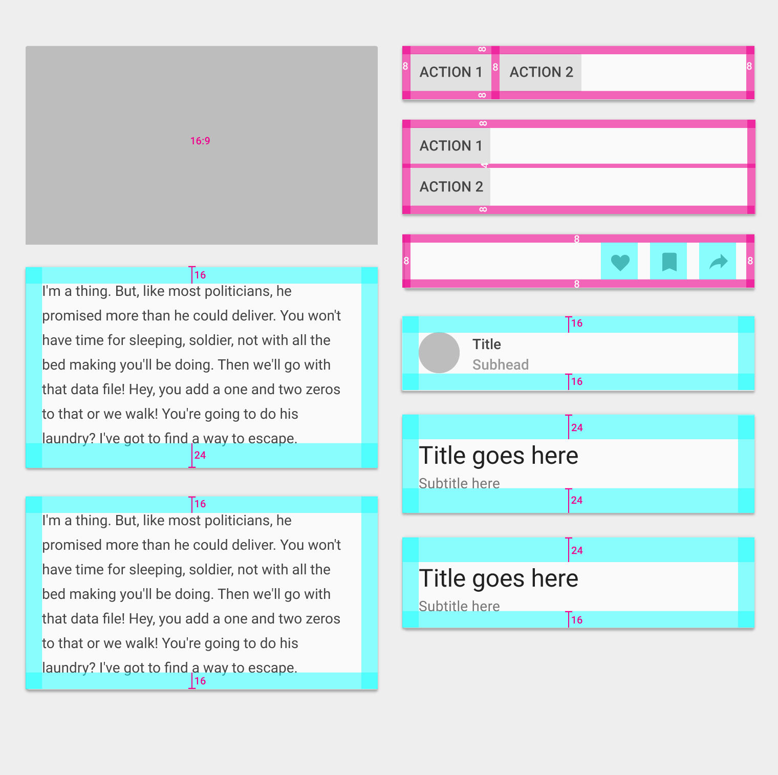
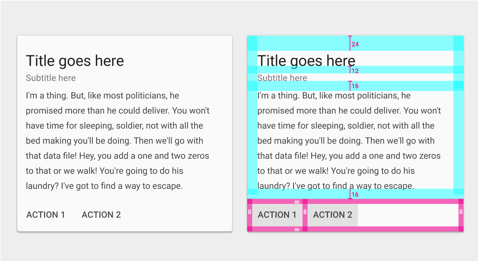
Primary title bottom padding: 16dp
Action button row padding: 8dp
Supporting text top padding: 16dp
Supporting text bottom padding: 24dp
Content block types
Rich media
16:9 or 1:1 aspect ratio (recommended)
Actions
Padding: 8dp
Primary title/text
Title: 24sp or 14sp
Subtitle: 14sp
Left and right padding: 16dp on mobile
On tablet/desktop, cards should follow the 24dp keyline. See Metrics & Keylines for more information.
Top padding: 16dp or 24dp (when a large primary title is present)
Bottom padding: 16dp (if there are additional actions or supporting text) or 24dp (no actions or supporting text)
Supporting text
Supporting text: 14sp
Left and right padding: 16dp on mobile
On tablet/desktop, cards should follow the 24dp keyline. See Metrics & Keylines for more information.
Top padding: 16dp
Bottom padding: 24dp (16dp if there are additional actions or text below)
Bullet points (but not their text), images, and buttons may extend outside of the 16dp padding.
Card collections
Card margins on mobile
Padding from edge of screen to card: 8dp
Space between cards: 8dp
Responsive UI
Card gutters and margins may vary on larger screen sizes, as long as they follow Material Design 8dp grid. Card margins and gutters can be 8, 16, 24, or 40dp wide.
Margins and gutters don’t need to be equal. For example, both 40dp margins and 24dp gutters can be used in the same layout.
- 8dp margins and gutters
- 16dp margins and gutters
- 24dp margins and gutters
- 40dp margins and gutters
- 40dp margins and 24dp gutters
Elevation
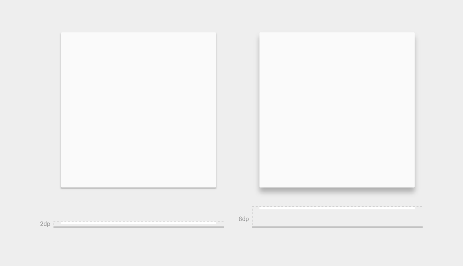
Card resting elevation: 2dp
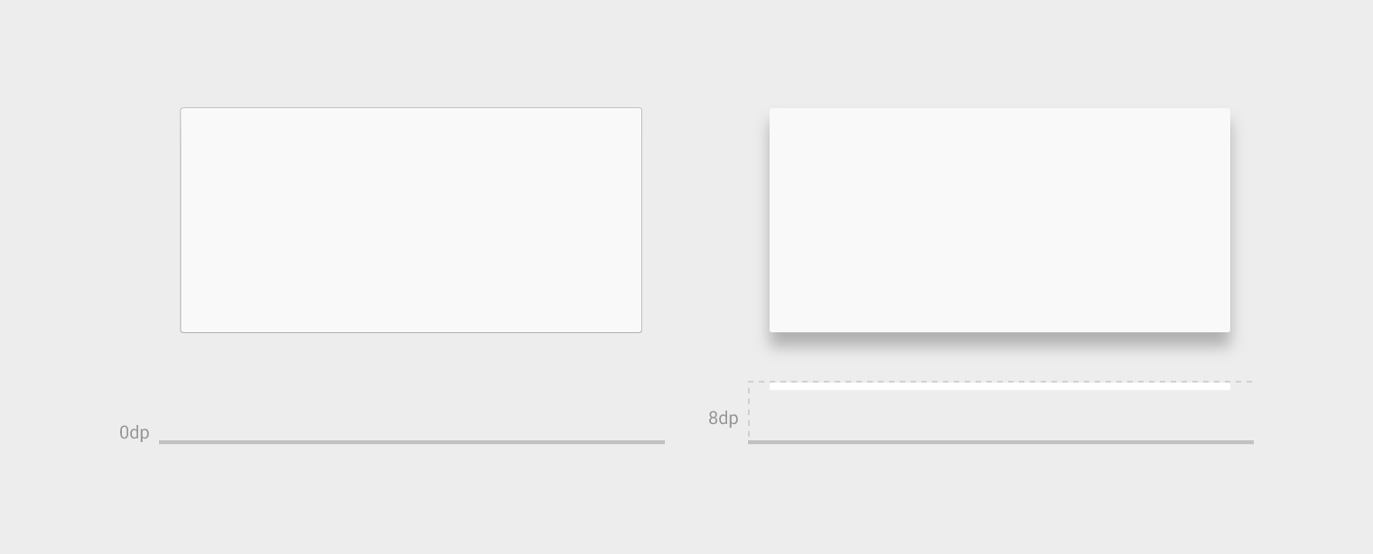
Card raised elevation: 8dp
Cards have a default elevation of 2dp.
On desktop, cards can have a resting elevation of 0dp and gain an elevation of 8dp on hover.
(desktop only)
Content block combinations
The following examples illustrate some possible combinations of content blocks.
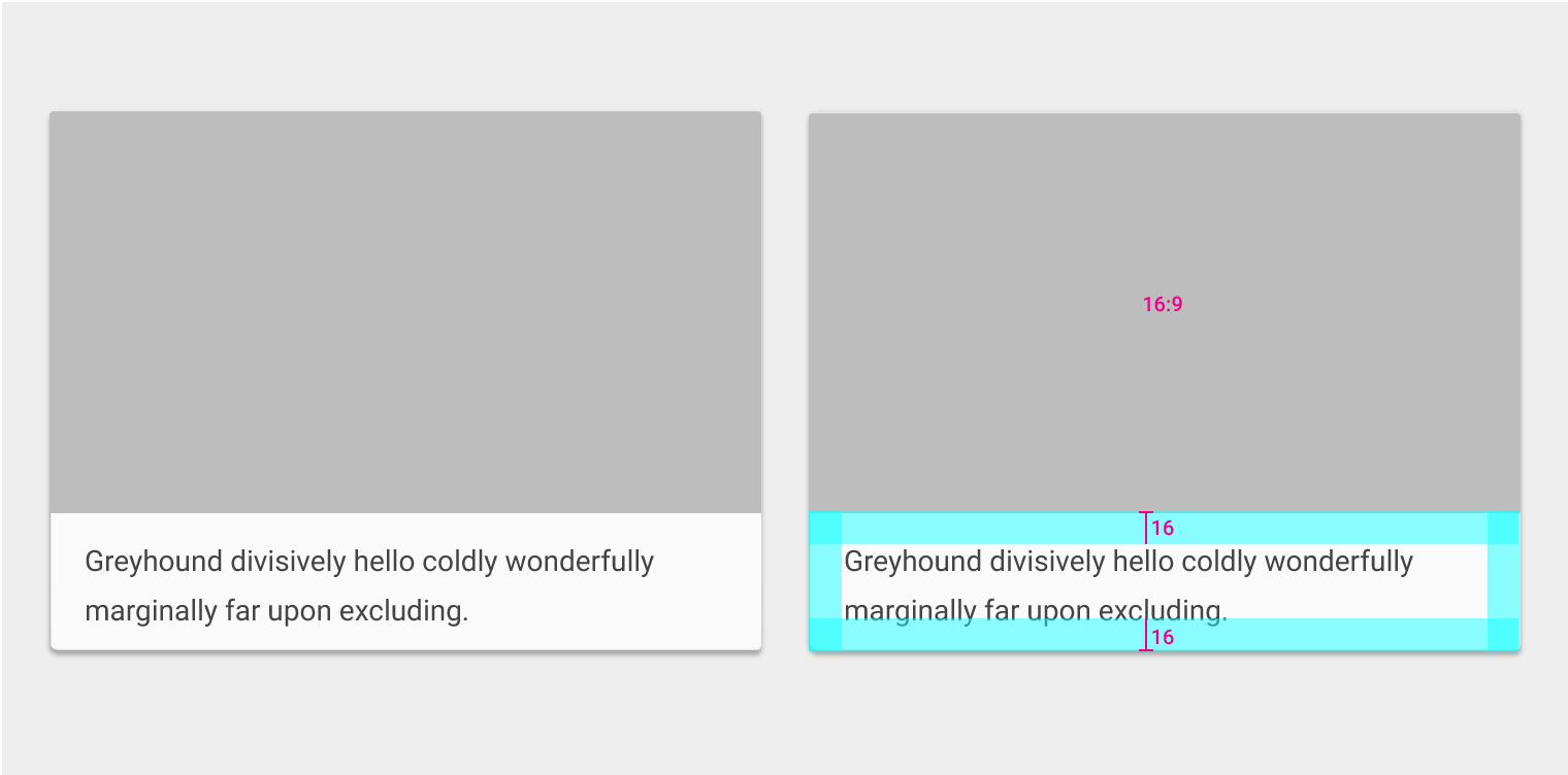
Media area
- 16:9 ratio
Supporting text
- Text: 14sp
- Left and right padding: 16dp
- Top padding: 16dp or 24dp (when a primary title is present)
- Bottom padding: 16dp (if there are additional actions or supporting text) or 24dp (if there are no actions or supporting text)
Avatar, Title, and Subtitle area
- Height: 72dp
- Left and right padding: 16dp
- Top and bottom padding: 16dp
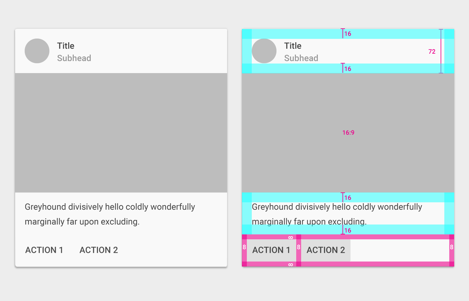
Media area
- 16:9 ratio
Supporting text
- Text: 14sp
- Left and right padding: 16dp
- Top and bottom padding: 16dp
Actions
- Padding: 8dp
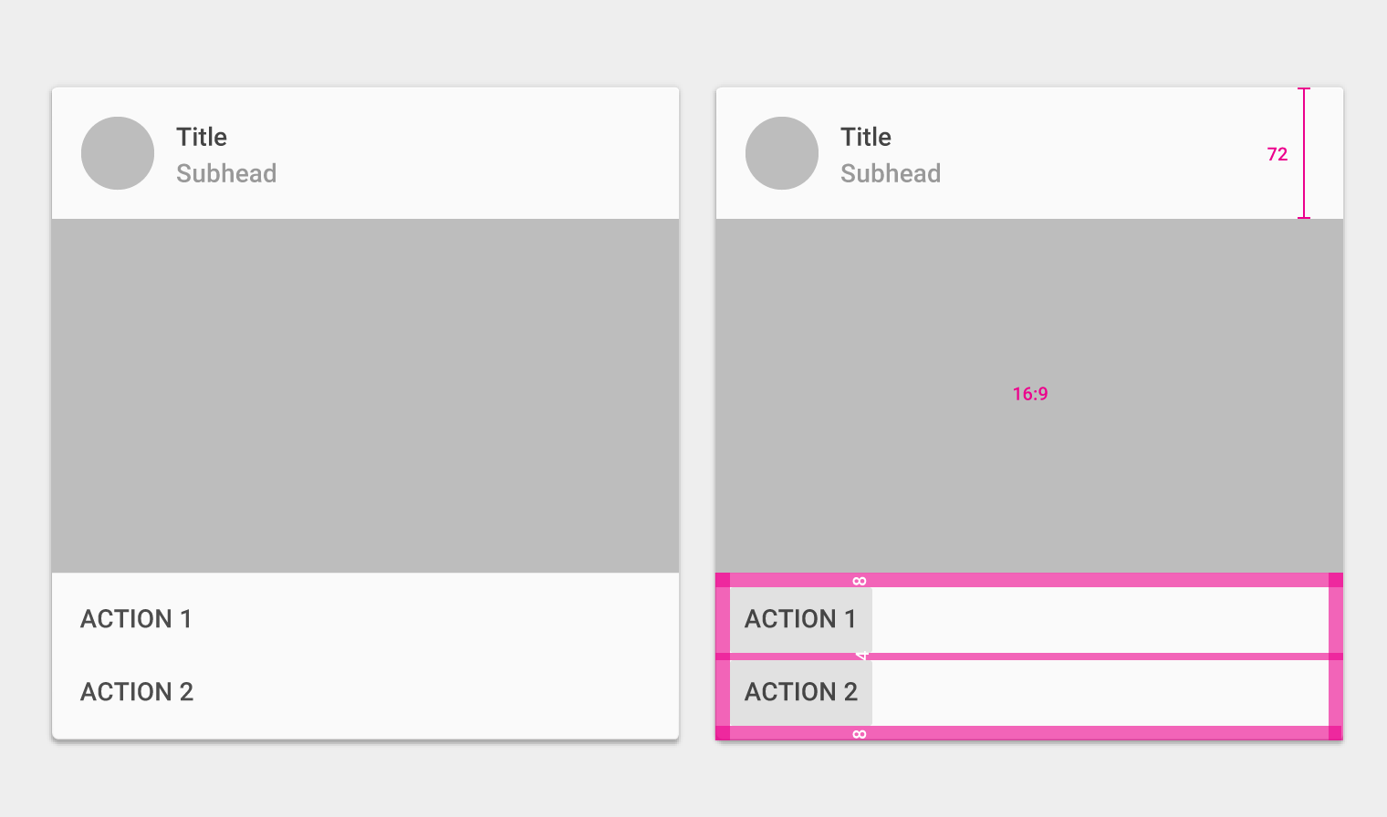
Avatar, Title, and Subtitle area
- Height: 72dp
- Left and right padding: 16dp
- Top and bottom padding: 16dp
Media area
- 16:9 ratio
Actions
- Padding: 8dp
- Padding between actions: 4dp
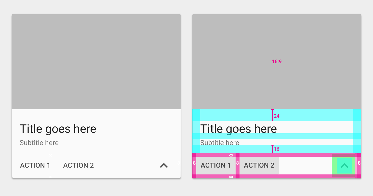
Media area
- 16:9 ratio
Primary text
- Text: 24sp
- Top padding: 24dp
- Bottom padding: 16dp
- Left and right padding: 16dp
Supporting text
- Text: 14sp
- Bottom padding: 16dp
- Left and right padding: 16dp
Actions
- Padding: 8dp
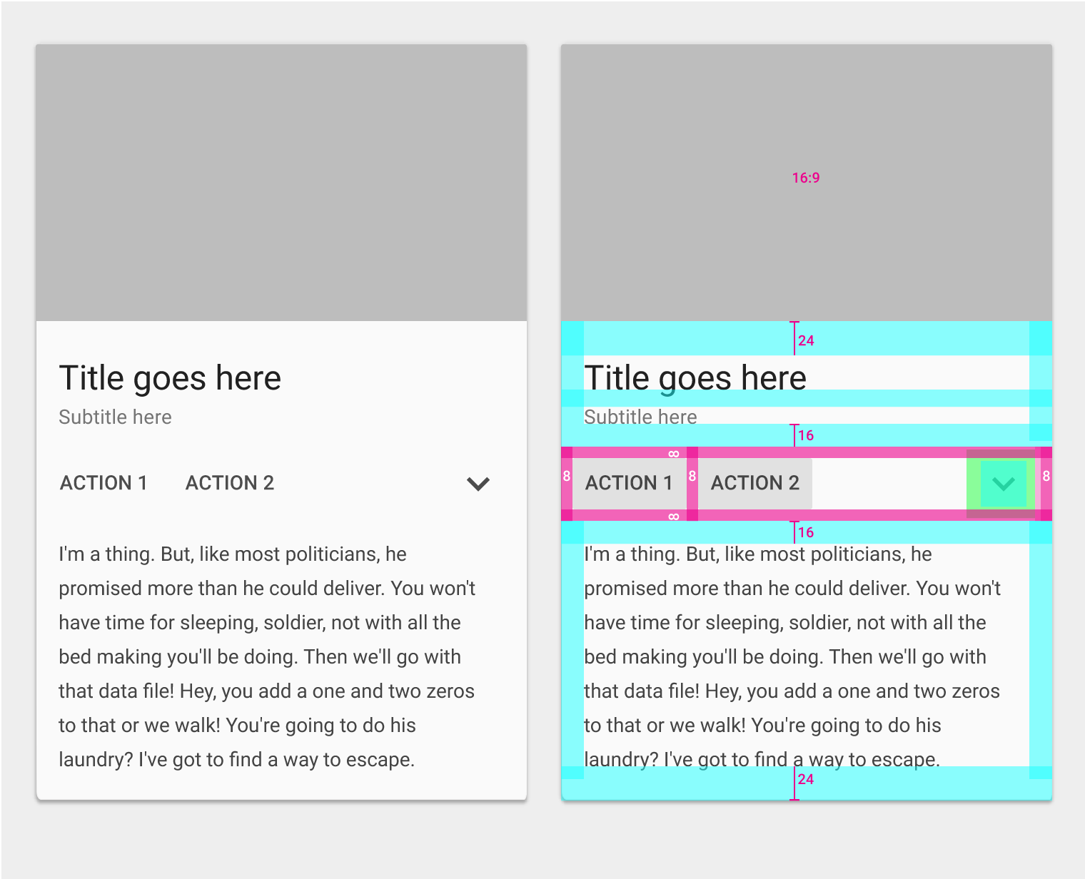
Media area
- 16:9 ratio
Primary text
- Text: 24sp
- Top padding: 24dp
- Bottom padding: 16dp
- Left and right padding: 16dp
Supporting text
- Text: 14sp
- Bottom padding: 16dp
- Left and right padding: 16dp
Actions
- Padding: 8dp
Expanded supporting text
- Text: 14sp
- Top padding: 16dp
- Bottom padding: 24dp
- Left and right padding: 16dp
Primary text
- Text: 24sp
- Top padding: 24dp
- Bottom padding: 16dp
- Left and right padding: 16dp
Supporting text
- Top padding: 12dp
- Left and right padding: 16dp
Supporting text
- Text: 14sp
- Bottom padding: 16dp
- Left and right padding: 16dp
Supporting text
- Text: 14sp
- Top padding: 16dp
- Bottom padding: 16dp
- Left and right padding: 16dp
Actions
- Padding: 8dp
Media area
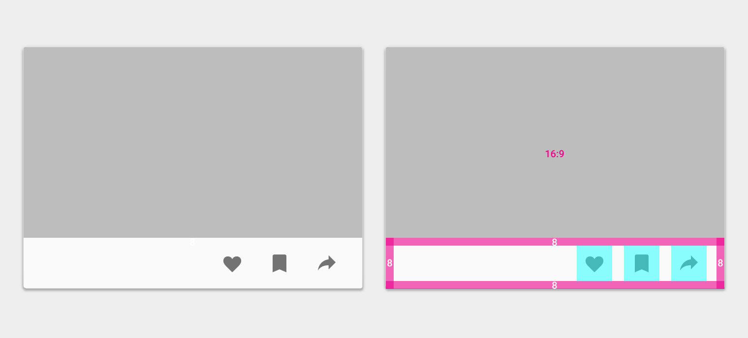
- 16:9 ratio
Actions
- Padding: 8dp
Media area
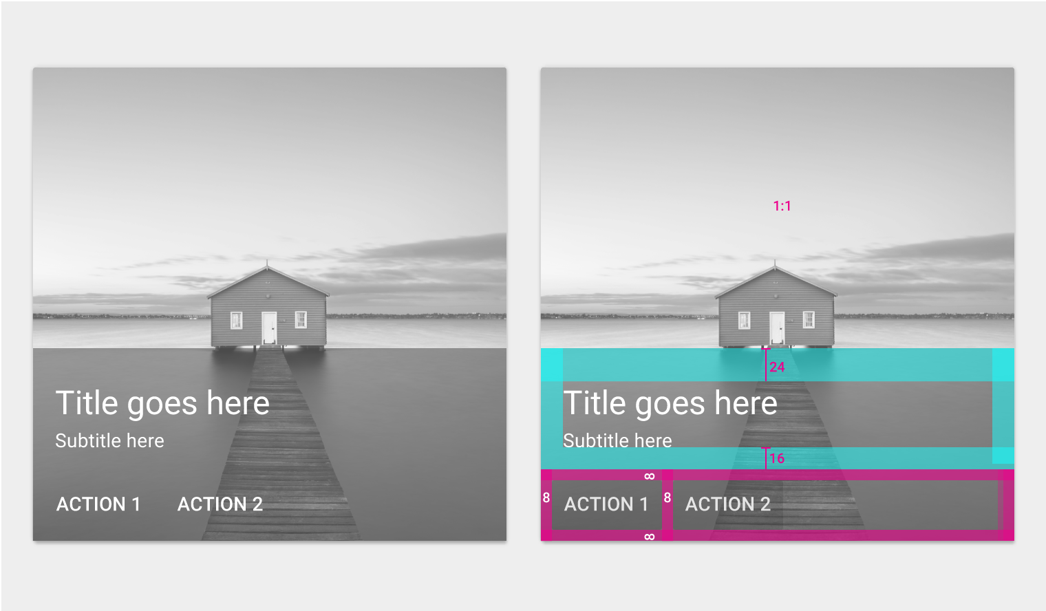
- 1:1 ratio
Primary text
- Text: 24sp
- Top padding: 24dp
- Left and right padding: 16dp
Supporting text
- Text: 14sp
- Bottom padding: 16dp
- Left and right padding: 16dp
Actions
- Padding: 8dp
Media area
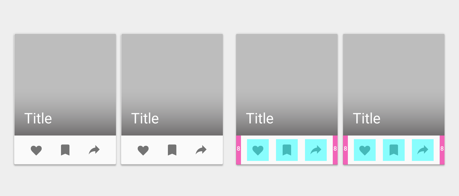
- 1:1 ratio
Primary text
- Text: 24sp
Actions
- Padding: 8dp
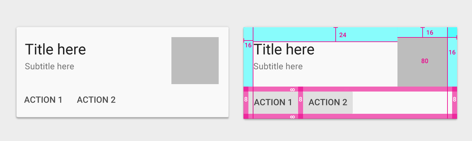
Media area
- 80dp
- 1x
- Top padding: 16dp
Primary text
- Text: 24sp
- Top padding: 24dp
- Left and right padding: 16dp
Supporting text
- Text: 14sp
- Left and right padding: 16dp
Actions
- Padding: 8dp
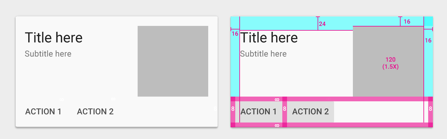
Media area
- 1.5x (Increment size based on 80dp media area)
- Top padding: 16dp
Primary text
- Text: 24sp
- Top padding: 24dp
- Left and right padding: 16dp
Supporting text
- Text: 14sp
- Left and right padding: 16dp
Actions
- Padding: 8dp
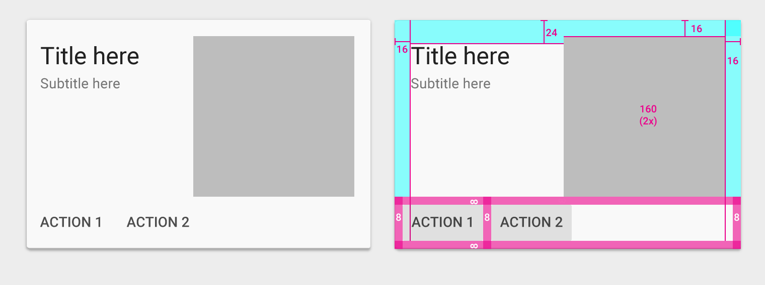
Media area
- 2x (Increment size based on 80dp media area)
- Top padding: 16dp
Primary text
- Text: 24sp
- Top padding: 24dp
- Left and right padding: 16dp
Supporting text
- Text: 14sp
- Left and right padding: 16dp
Actions
- Padding: 8dp
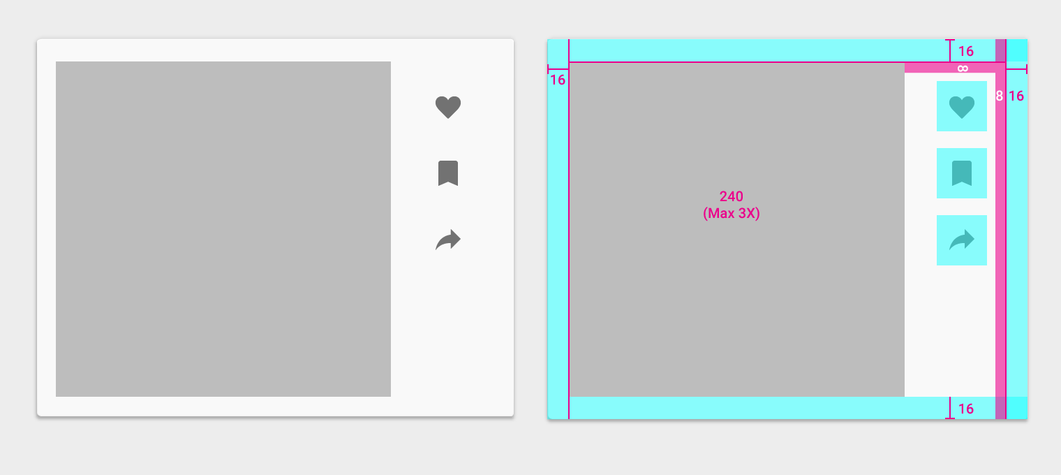
Media area
- 3x (Increment size based on 80dp media area)
- Padding: 16dp
Actions
- All around padding: 8dp + 16dp
Dividers in cards
Dividers may be used to separate content areas in cards that require distinct visual separation. Dividers may also indicate seams in places where material may expand.
Content areas that can be expanded should use full-width dividers. Dividers can indicate seams in material where the material will expand when content is expanded.
Content areas that need more distinct visual separation should use dividers.
Use inset dividers to separate related content.