Bottom sheets
Bottom sheets slide up from the bottom of the screen to reveal more content.
Modal bottom sheets are primarily for mobile and can also present deep-linked content from other apps.
Persistent bottom sheets integrate with the app to display supporting content.
Interaction
Bottom sheets are displayed only as a result of a user-initiated action.
Elevation
Modal bottom sheets: Higher than the app
Persistent bottom sheets: Same elevation as the app
Alternatives

Usage
There are two major types of bottom sheets:
- Modal bottom sheets are alternatives to menus or simple dialogs. They can also present deep-linked content from other apps. They are primarily for mobile.
- Persistent bottom sheets present in-app content
Elevation distinguishes modal from persistent bottom sheets. Modal bottom sheets rest at a higher elevation than the app’s content; whereas persistent bottom sheets rest at the same elevation as the app and integrate with its content.
On larger screens, where space is less constrained, using alternative surfaces and components such as simple dialogs and menus may be more appropriate than bottom sheets.
Persistent Bottom Sheets
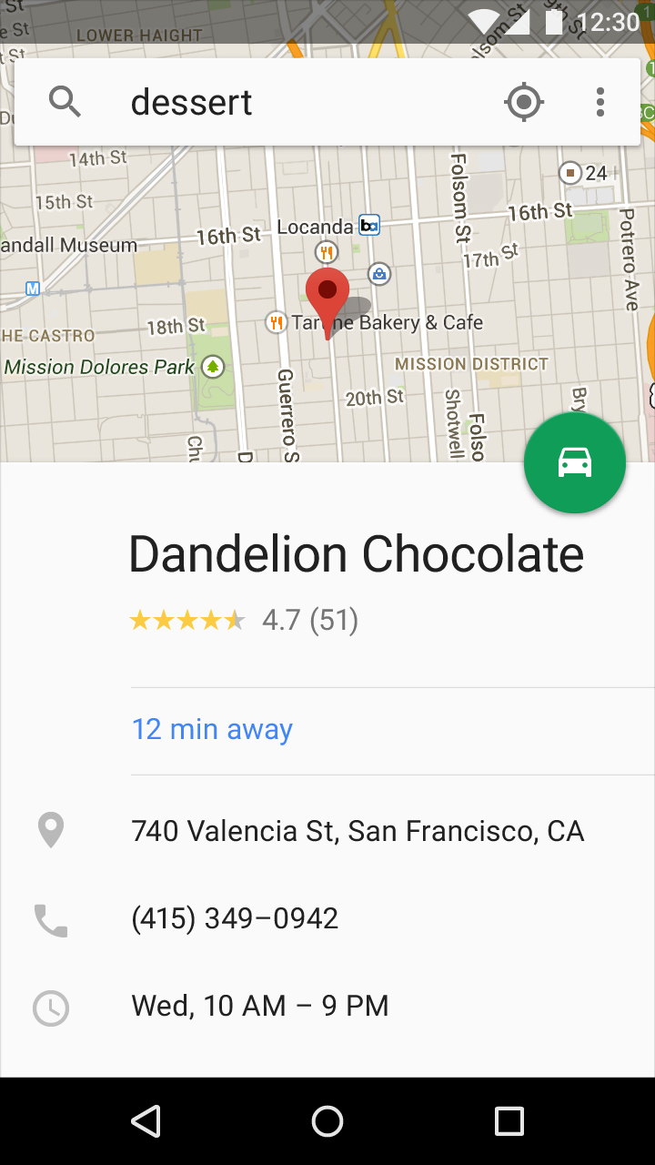
Persistent bottom sheets display in-app content that supplements the main view. It remains visible even when not actively in use, resting at the same elevation as an app and integrating with its content.
Usage
- To introduce new content on a unique surface
- To display content equal in value to the primary content
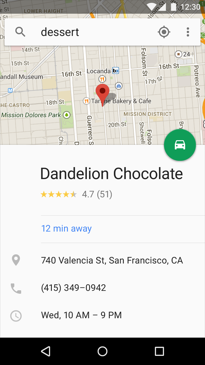

Mobile
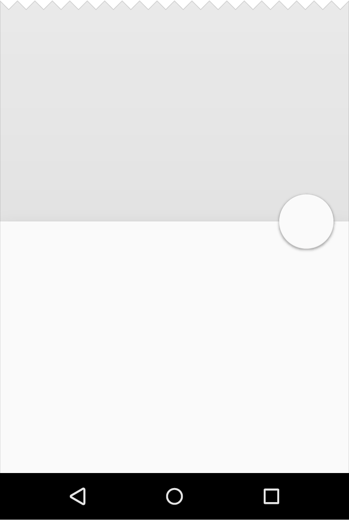
Mobile persistent bottom sheets are full width in both portrait and landscape view.
Tablet/Desktop
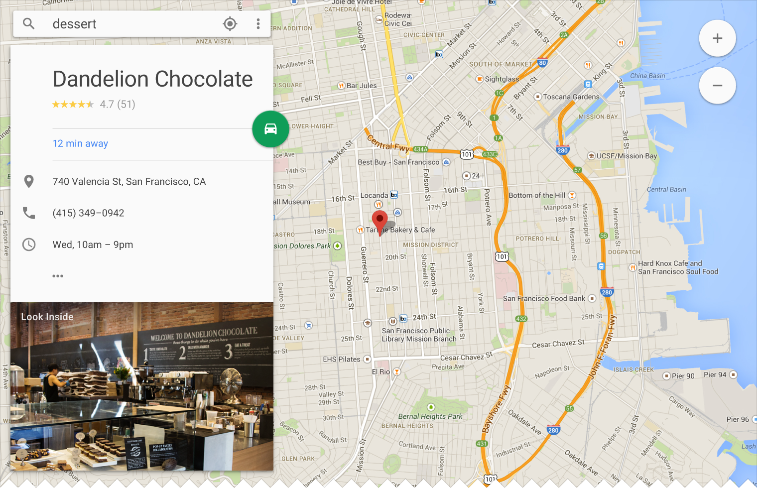
Persistent bottom sheets are either full width or inset, as determined by the width of the content they contain, overall UI, underlying content, and stylistic choices.
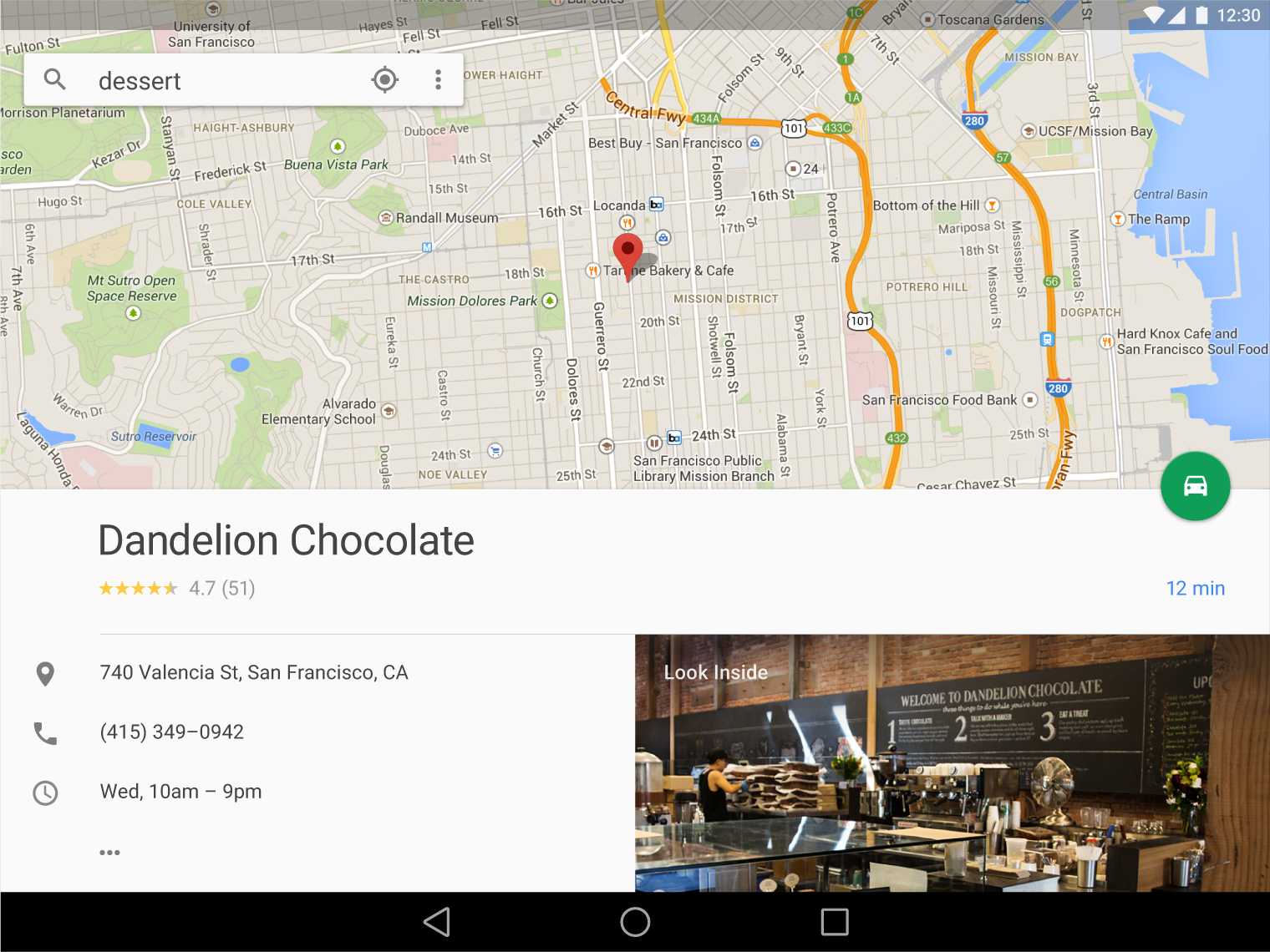
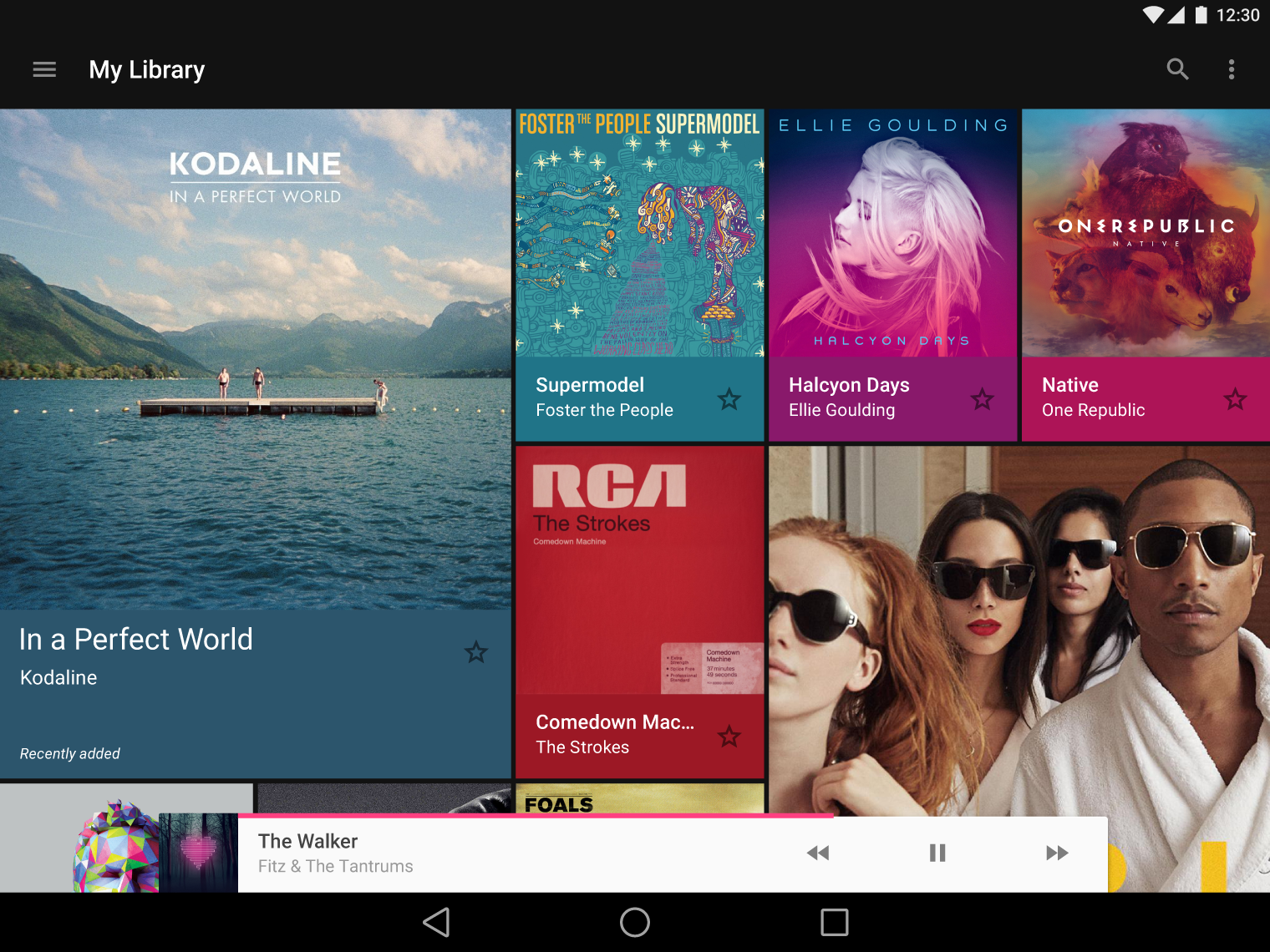
On desktop, a persistent bottom sheet may transform into another surface or sheet of material.
Modal bottom sheets
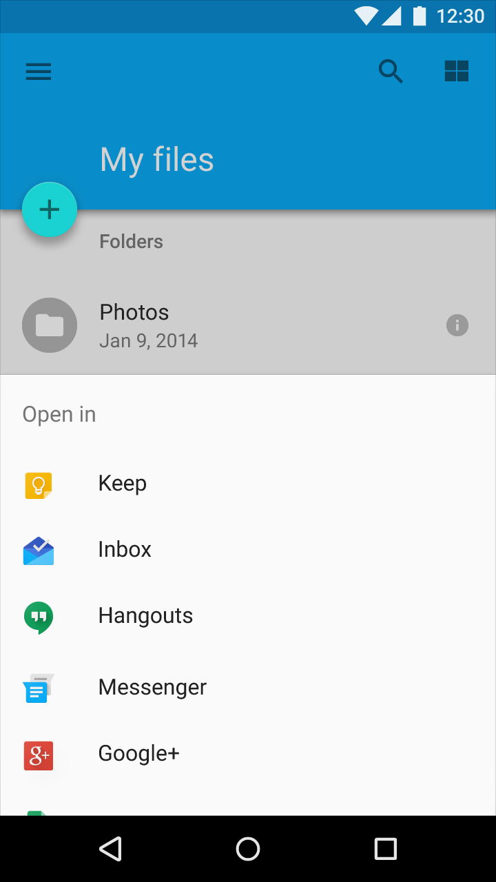
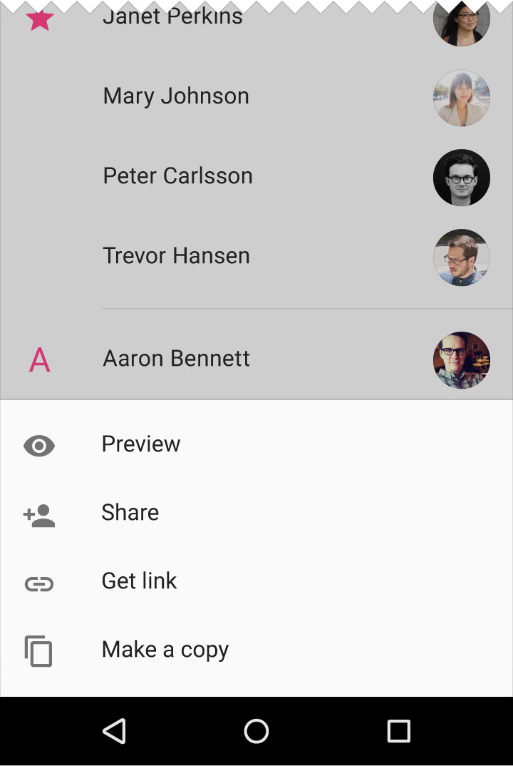
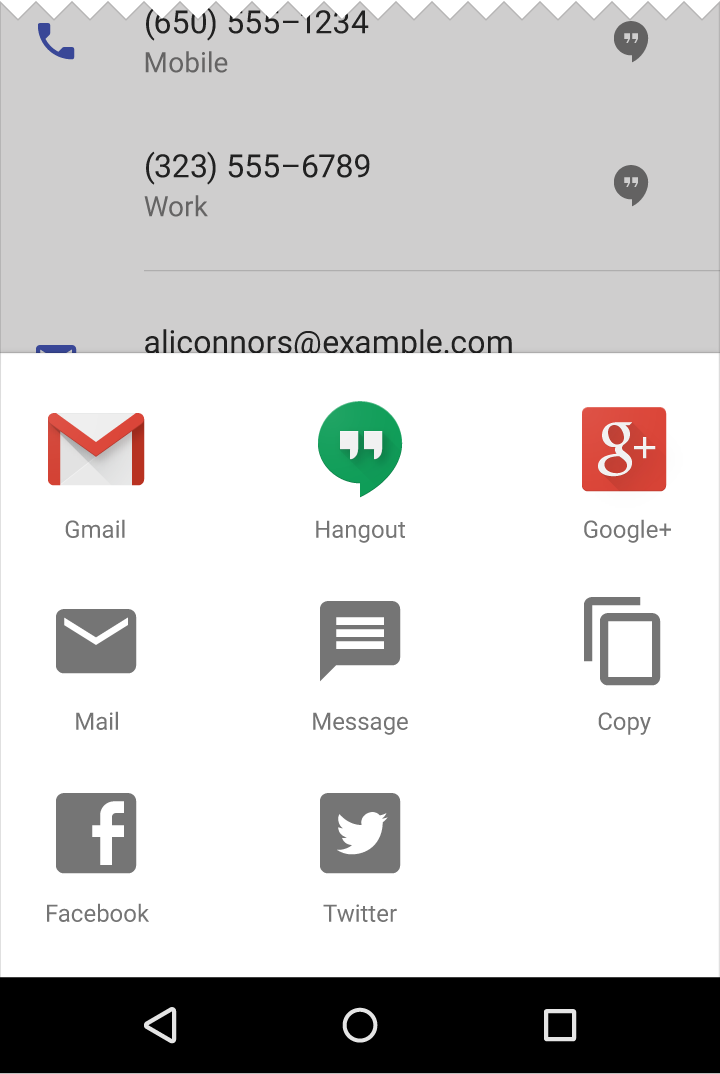
Modal bottom sheets are alternatives to menus, or simple dialogs, and can display deep-linked content from another app. They appear above other UI elements and must be dismissed in order to interact with the underlying content. When a modal bottom sheet slides into the screen, the rest of the screen dims, giving focus to the bottom sheet.
Usage
Modal bottom sheets may:
- Present actions in a list or grid as an alternative to menus or simple dialogs
- Display a contextual menu, when there is no obvious entry point for a menu
- Prioritize the visibility of the elements they contain
Modal bottom sheets can display long menu item names, menu items with subtext, and icons associated with menu items.
When displaying menu items, fully-expanded modal bottom sheets maintain a minimum 8dp distance from the bottom of the app bar.
Deep linking
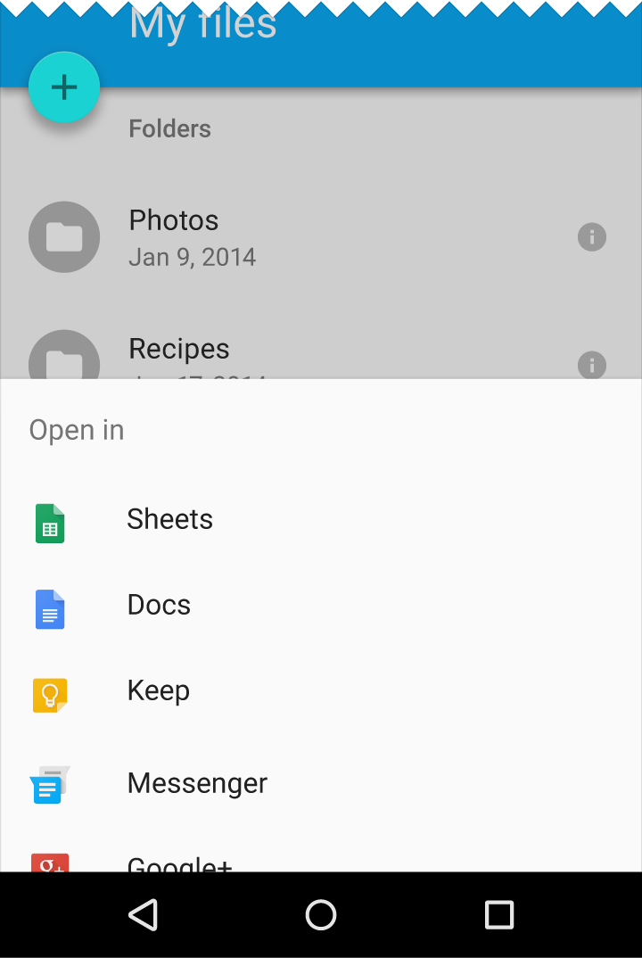
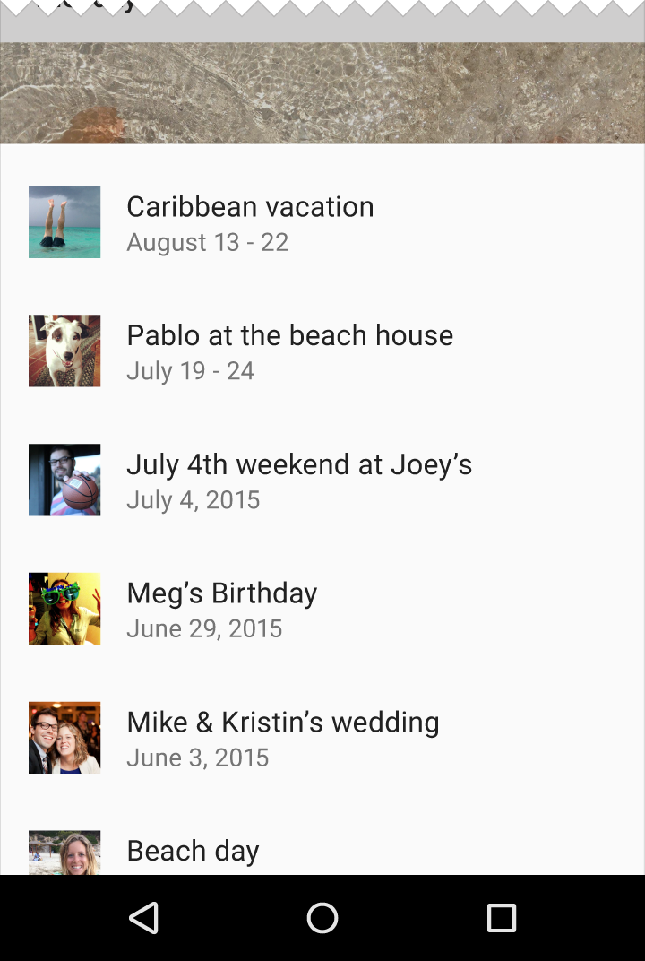
Modal bottom sheets may be used to provide deep links to content or controls from another app. These span the full screen width.
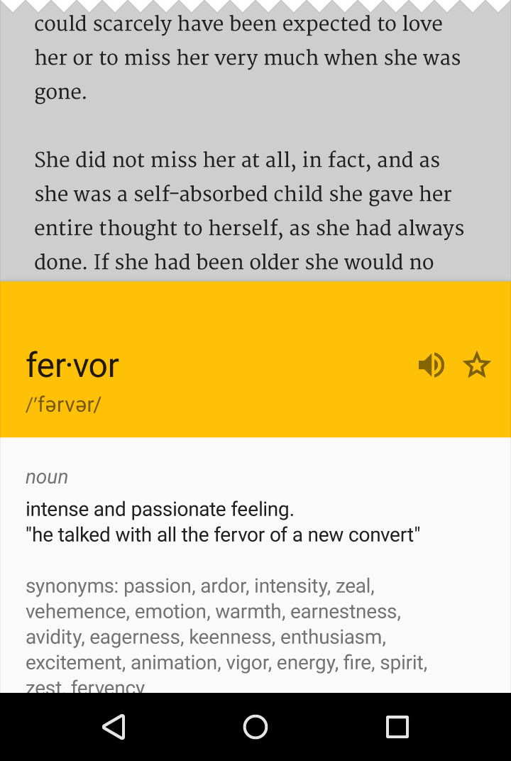
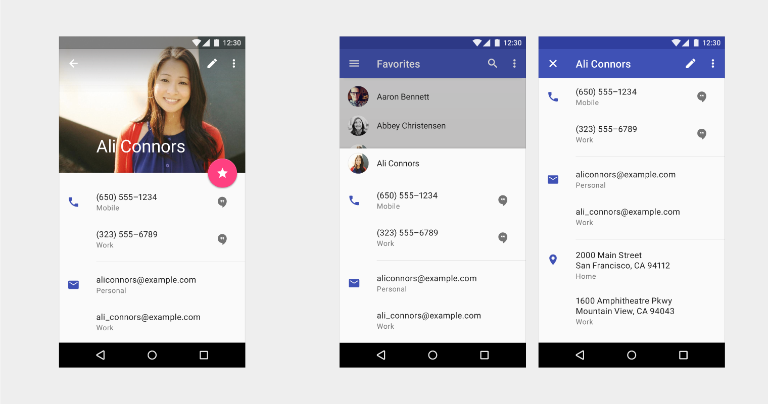
Bottom sheets may contain links that perform deep navigation within another app. These links may:
- Allow the user to travel multiple levels deep within another app
- Return to the level on which they started
However, these deep links may not allow the user to navigate upward in the hierarchy: they may only stay at the initial level, go deeper, or travel back to the initial level.
Alternatively, deep links may navigate the user away from the bottom sheet entirely, into another view.
To enable upward navigation from the bottom sheet’s deep links, offer an explicit link to open the application via an overflow menu. Actions within the deep-linked bottom sheet may result in opening the parent application, such as with an “add contact” action.
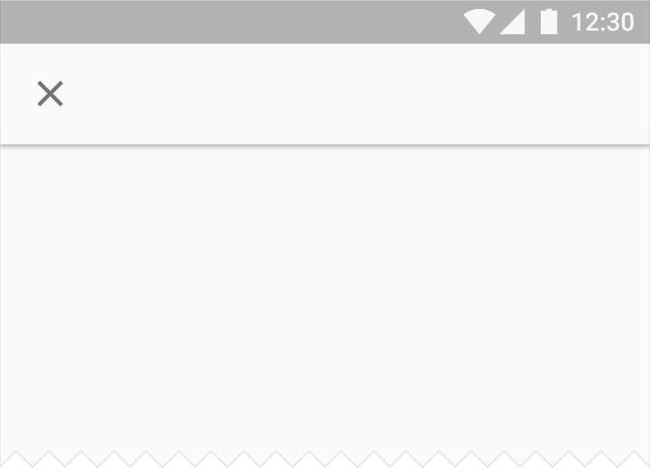
Do.
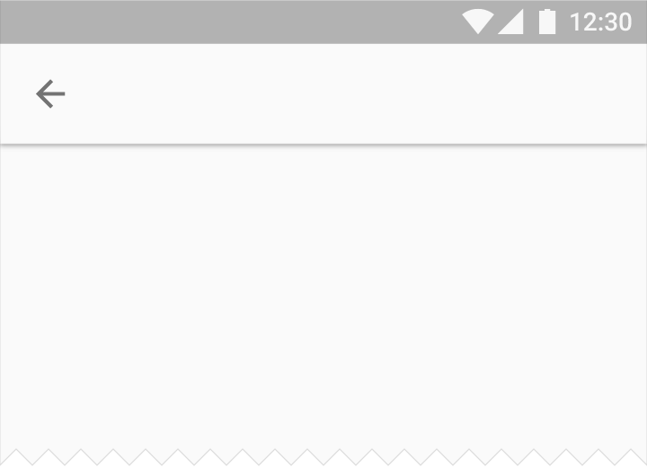
Don’t.
Mobile
Modal bottom sheets are primarily a mobile component, where they span full screen width in both portrait and landscape views.

Do.
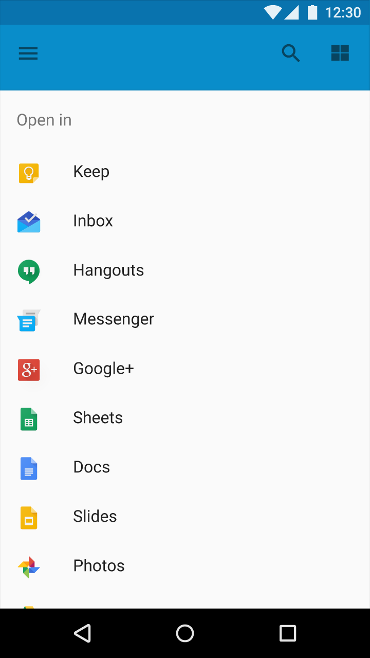
Do.
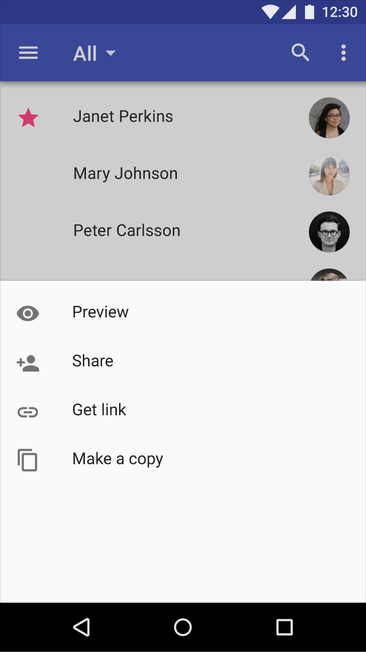
Don’t.
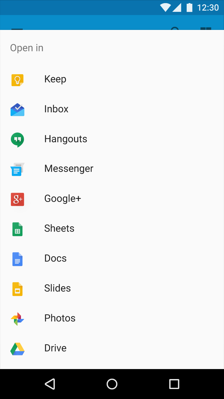
Don’t.
Tablet/Desktop
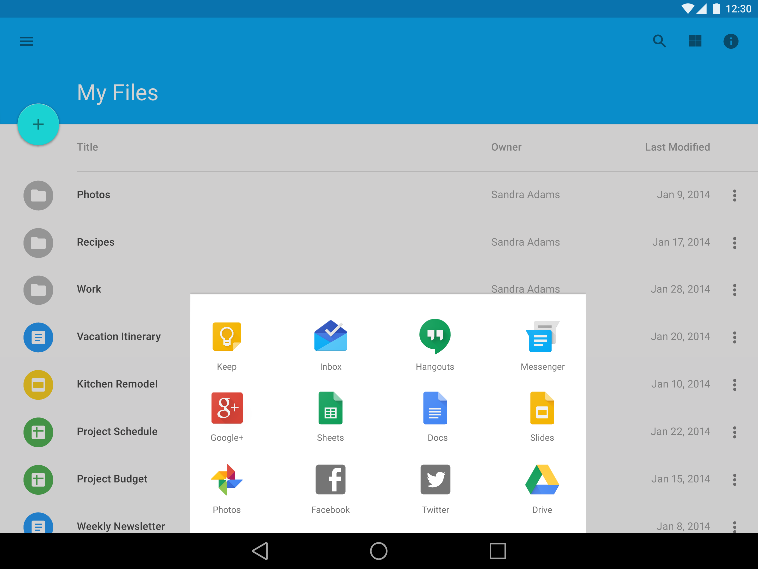
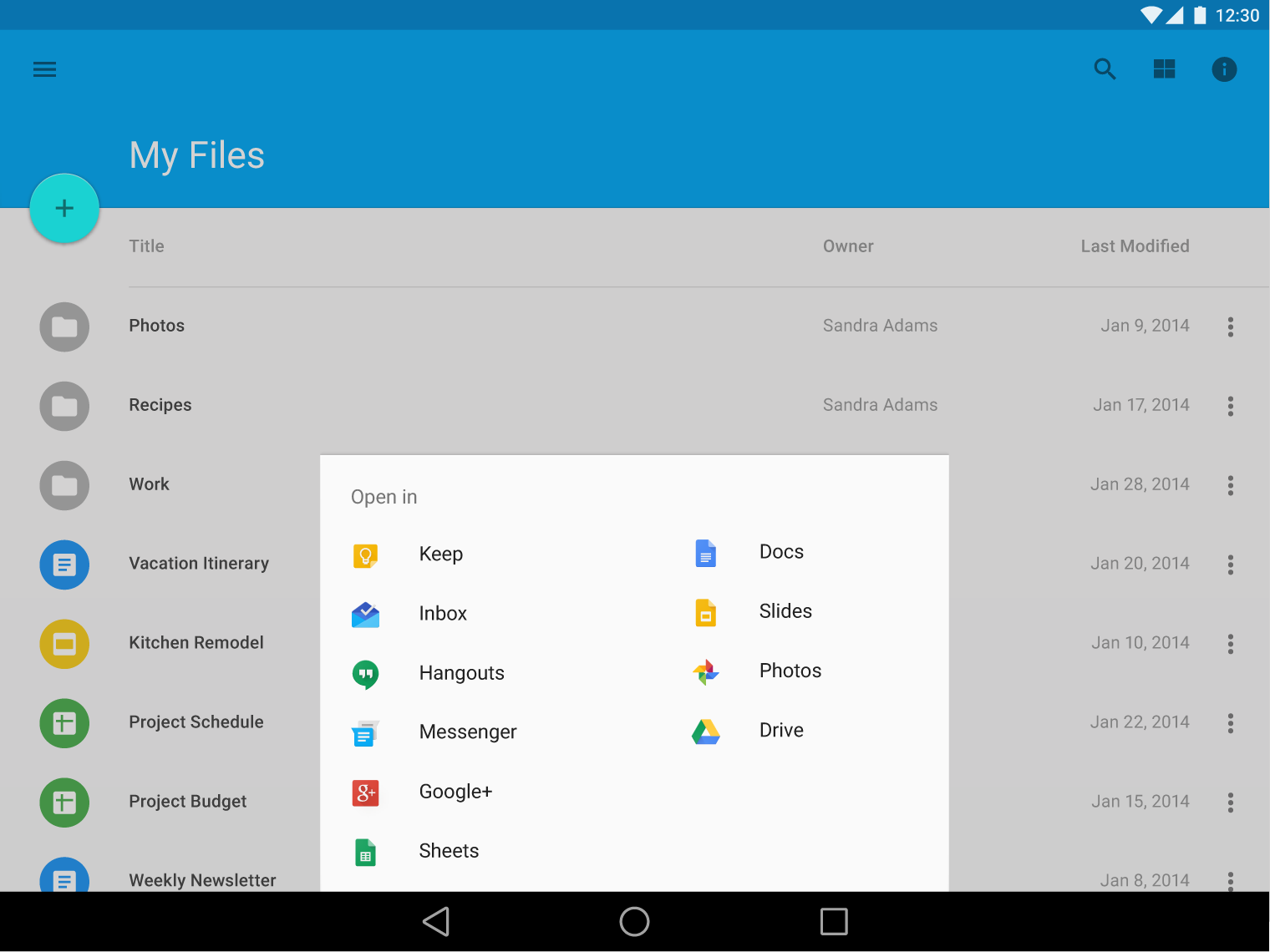
Consider alternatives to modal bottom sheets on larger screens. Because bottom sheets may appear far from the place where the user clicked or touched to summon them, it splits the user’s attention across two different parts of the screen.
Because desktop space is less constrained, it can support several alternatives to modal bottom sheets.
| Bottom sheet alternative | Benefit |
|---|---|
| Menu | Keeps action choices close to the point of interaction |
| Simple dialogs | Strongly interrupts the user’s current context |
| Inline expansion within the same view | Is not as interruptive as a menu or dialog |
| Showing all options as a persistently accessible element | Does not require a button press to access them |
| Opening a new browser window | Flexible sizing and layout independence |
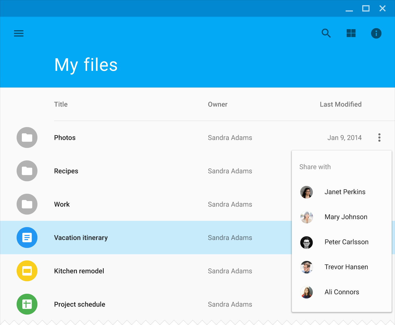
Make modal bottom sheets on large screens use appropriate layouts for the amount of extra space.
Behavior
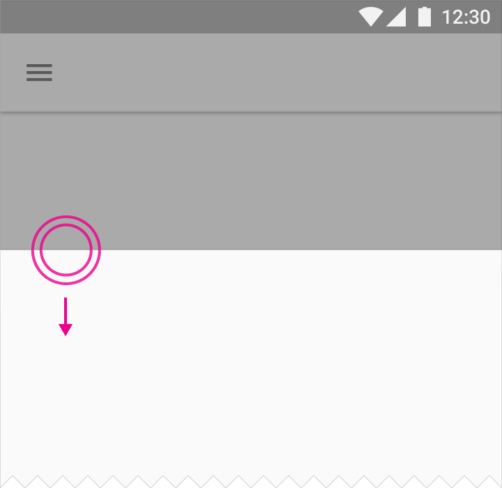
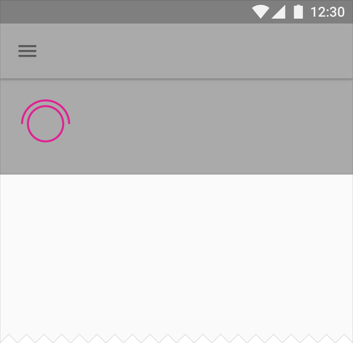
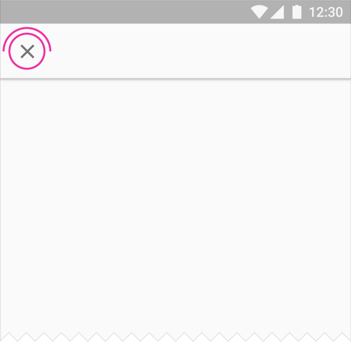
Bottom sheets can be dismissed by swiping the bottom sheet down, by touching an explicit control such as an X in the app bar, or by touching the system back button (Android).
Modal bottom sheets can also be dismissed by touching outside of the bottom sheet.
Specs
The following specs are provided for mobile apps.
Font and color
- Text: Roboto Regular 16sp, #000 87%
- Title (optional): Roboto Regular 16sp, #000 54%
- Default bottom sheet background fill: #FFF
- Transparent overlay fill: #000 20%
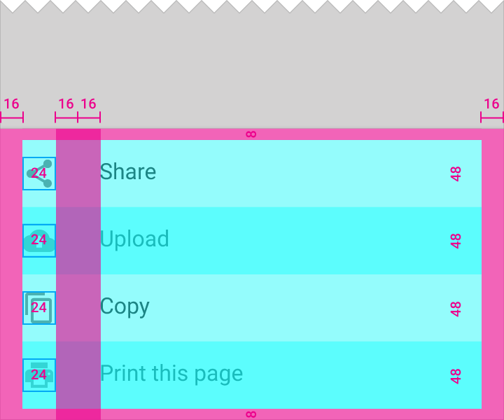
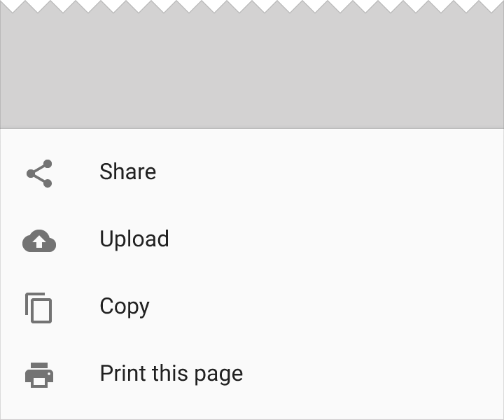
List-style bottom sheet
Screen edge left & right margins: 16dp
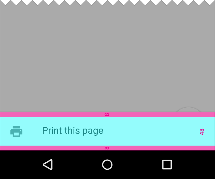
Top and bottom margins: 8dp
List-item height: 48dp
List icons: 24x24dp, middle vertical alignment
Text associated with icon: 32dp horizontal padding
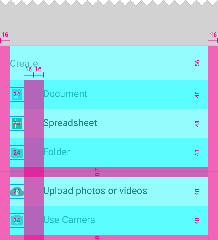
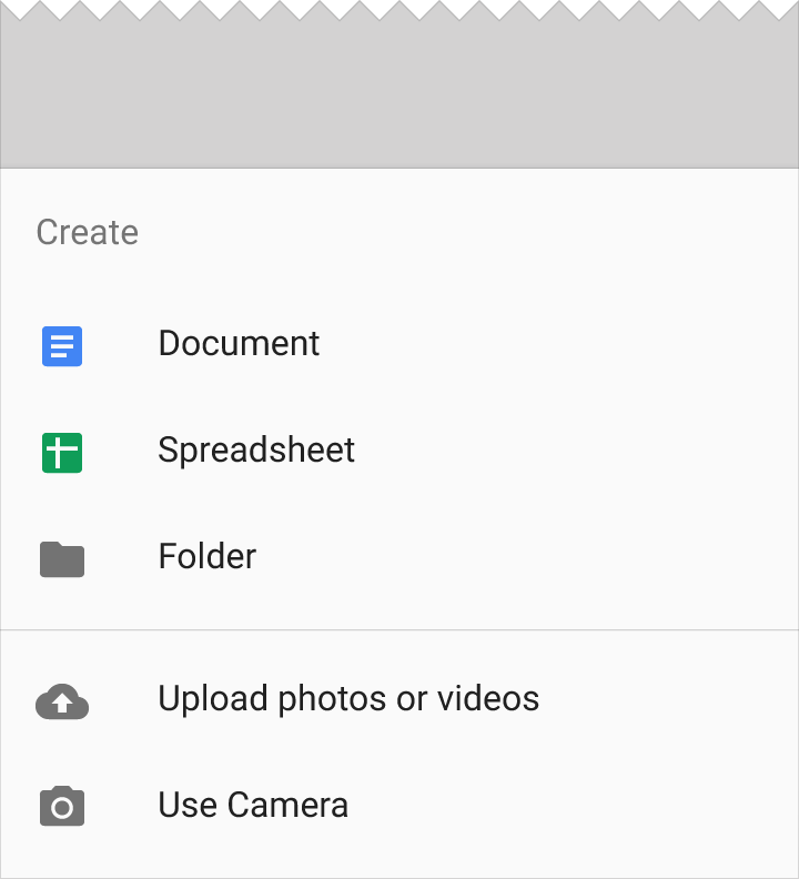
List-style sheet with header
Screen edge left & right margins: 16dp
Space below the top list item: 7dp
Divider line: 1dp
Space above second bottom sheet: 8dp
List-item height: 48dp
List icons: 24x24dp, middle vertical alignment
Text associated with icon: 32dp horizontal padding
List title height: 56dp
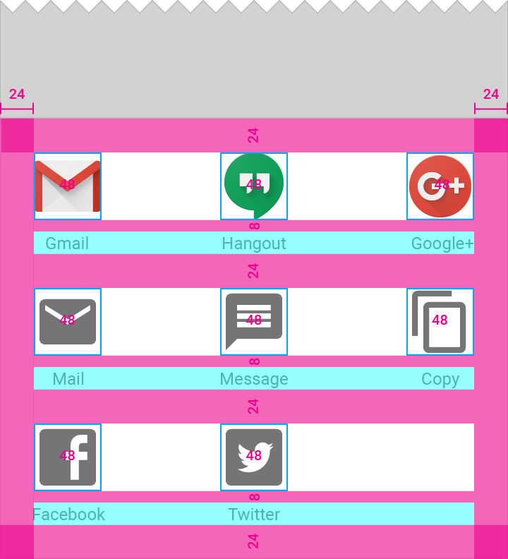
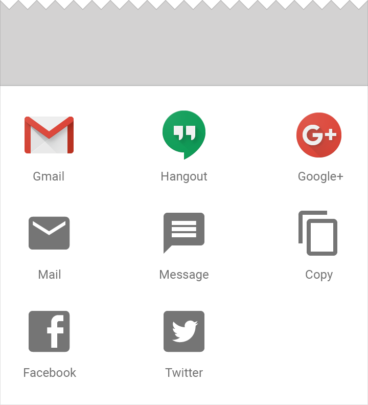
Grid-style bottom sheet with icons
Margin on all sides of grid: 24dp
Space between grid list rows: 24dp
Grids list icons: 48x48dp, equally spaced across each row
Grid list label: 16dp tall, center-aligned below each icon
Margin below icon: 8dp
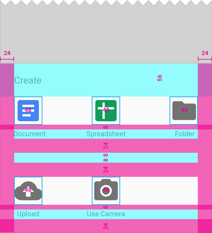
Grid-style bottom sheet with header
Screen edge left & right margins: 24dp
Space below list row: 8dp
Divider line: 1dp
Space above and below divider line: 8dp
List icons: 48x48dp, middle vertical alignment
Grid list label: 16dp tall, center-aligned below each icon
List title height: 56dp
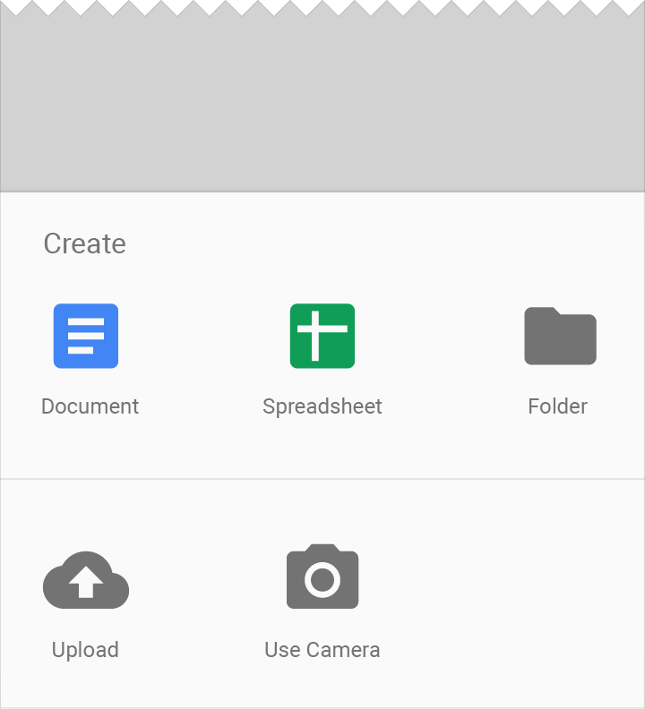
Bottom sheets slide up from the bottom of the screen and initially cover a portion of the screen.
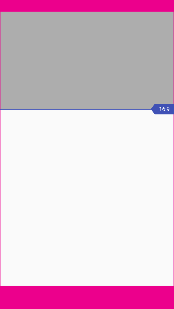
The initial height of a bottom sheet is relative to the height of the list items (or grid rows) it contains. A bottom sheet should not initially have a height beyond its 16:9 ratio keyline, depending on how much content it contains. Bottom sheets may be swiped up to fill the height of the screen, with content that then scrolls internally.
Specs for desktop and tablet apps
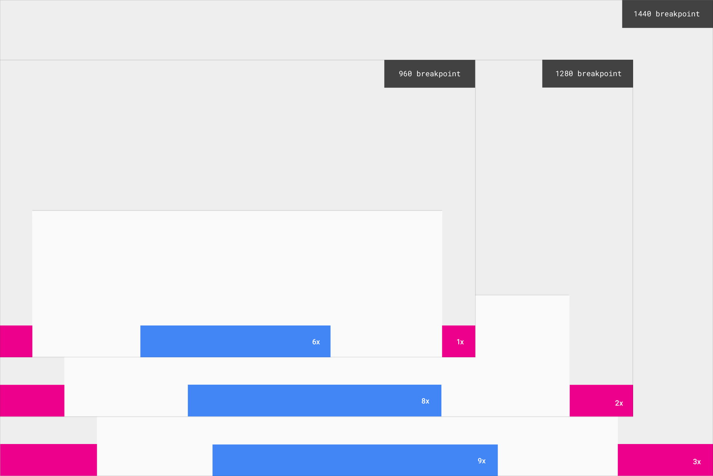
Modal and Inset persistent bottom sheets on desktop and tablet use these minimum and maximum widths.
The width of a bottom sheet is determined by the structure of the overall interface, which is typically based on increments. On a page grid, the maximum width of the bottom sheet is relative to the page grid and content it rests on.
For example, on a 960dp wide screen, if you use the height of the app bar (64dp) as your increment, it would result in fifteen total increments wide. A minimum of one increment should separate your bottom sheet from the screen edge, and the bottom sheet itself should be at least six increments wide.
| Screen width | Minimum distance from screen edge (in increments) | Minimum sheet width (in increments) |
|---|---|---|
| 960dp | 1 increment | 6 increment |
| 1280dp | 2 increment | 8 increment |
| 1440dp | 3 increment | 9 increment |