

Icons
Material icons use geometric shapes to visually represent core ideas, capabilities, or topics.
Product icons are the visual expression of a brand’s products, services, and tools.
Product icons are the visual expression of a brand’s products, services, and tools.
Sizing
Product icons are 48dp; system icons are 24dp
Icons on light backgrounds
| Icon state | Opacity |
| Active + focused | 87% |
| Active + unfocused | 54% |
| Inactive | 38% |
Icons on dark backgrounds
| Icon state | Opacity |
| Active + focused | 100% |
| Active + unfocused | 70% |
| Inactive | 50% |
Product icons
Product icons are the visual expression of a brand’s products, services, and tools. Simple, bold, and friendly, they communicate the core idea and intent of a product. While each product icon is visually distinct, all product icons for a given brand should be unified through concept and execution.
Use these guidelines as a starting point to ensure that your product icon colors and key elements reflect your brand identity.
Material icons are easy to use in your web, Android, and iOS projects.

Design approach
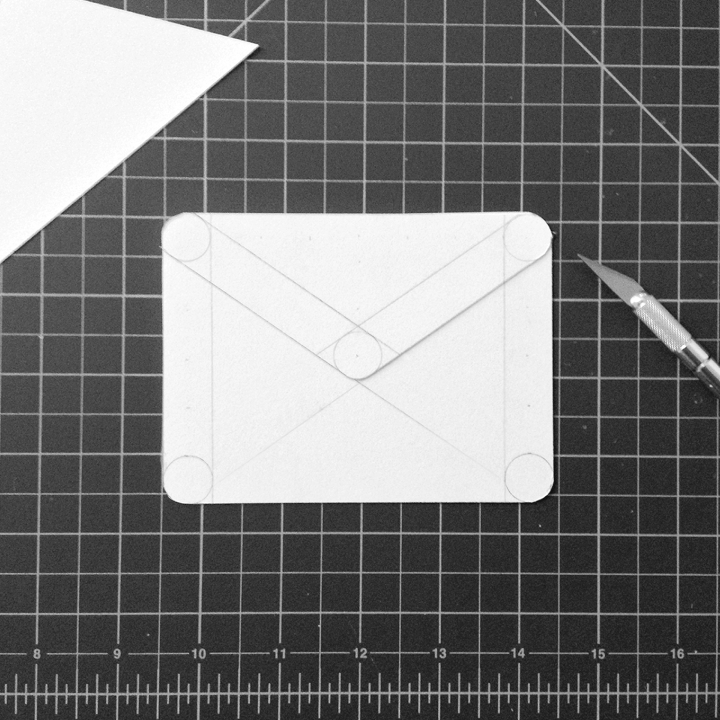
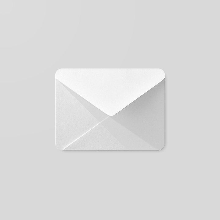
Product icon design is inspired by the tactile and physical quality of material. Each icon is cut, folded, and lit as paper would be, but represented by simple graphic elements. The quality of the material is sturdy, with clean folds and crisp edges. The matte-like finish interacts with light through subtle highlights and consistent shadows.


Product icon grid
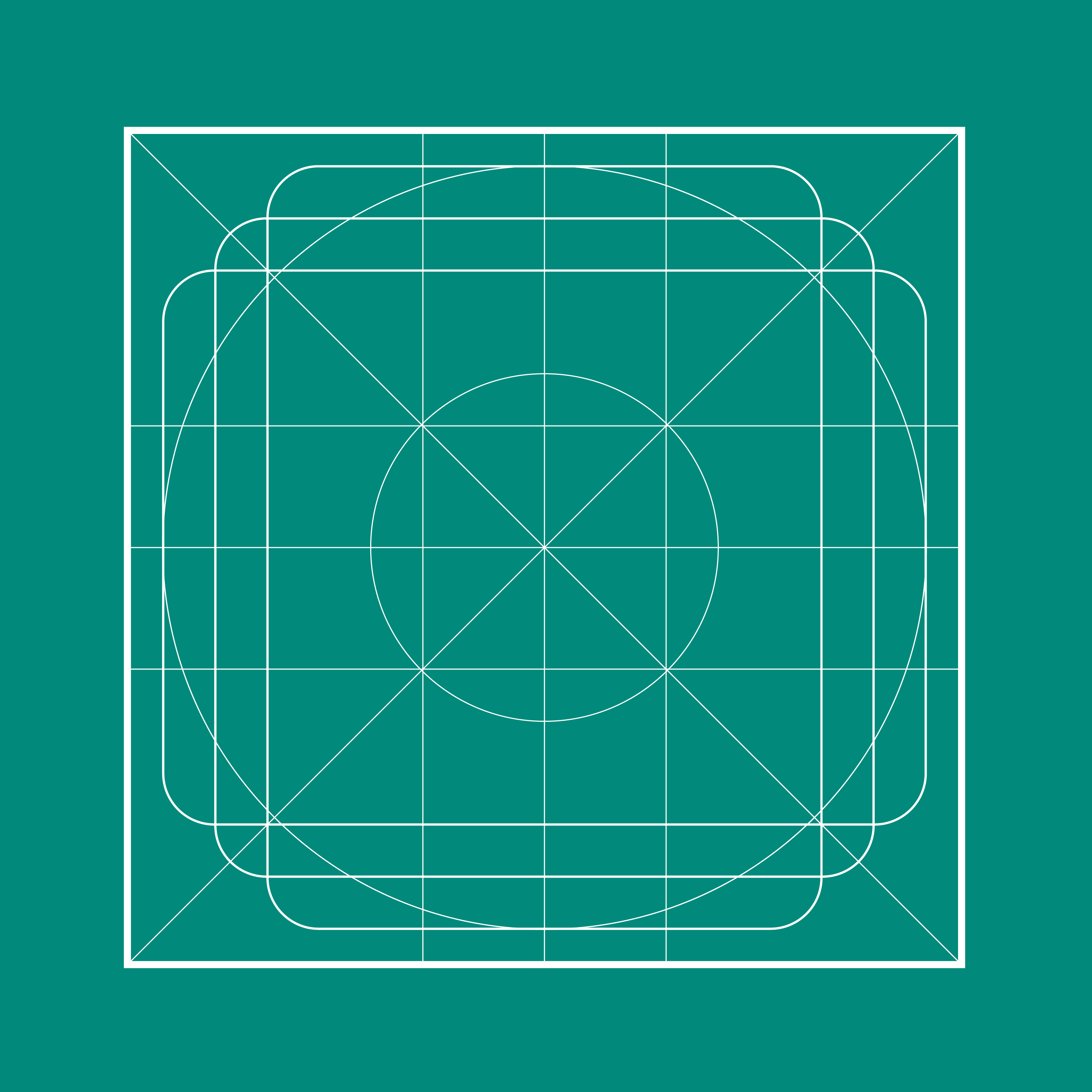
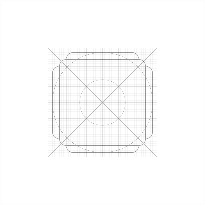
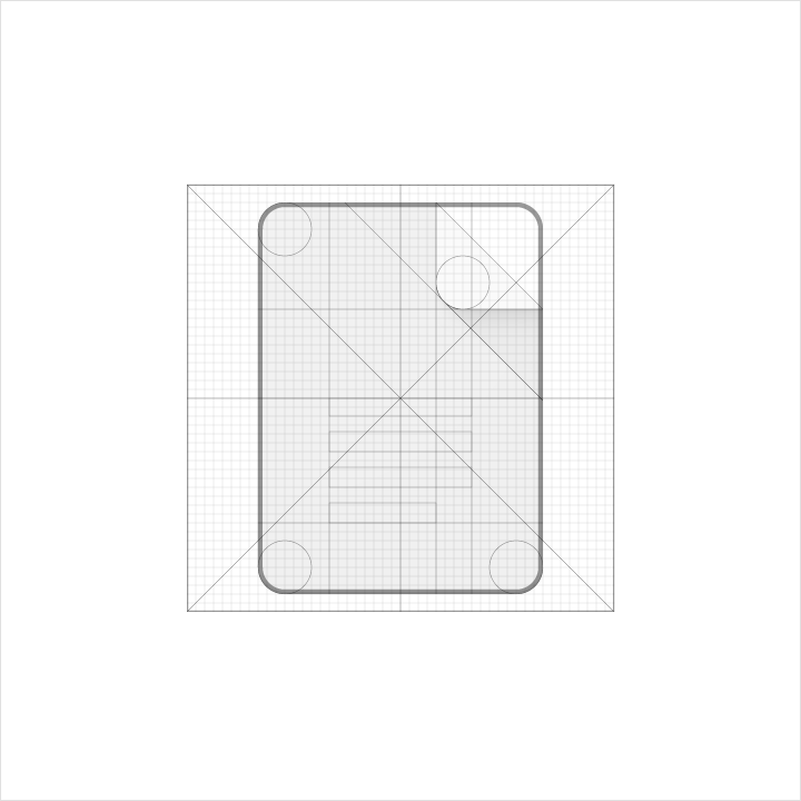
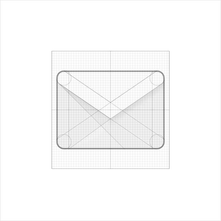
The product icon grid has been developed to facilitate consistency and establish a clear set of rules for the positioning of graphic elements. This standardization results in a flexible but coherent system.
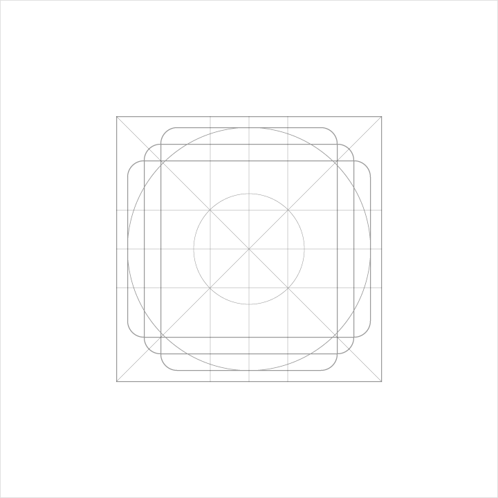
Keyline shapes
Keyline shapes are the foundation of the grid. By using these core shapes as guidelines, you can maintain a consistent visual proportion across related product icons.
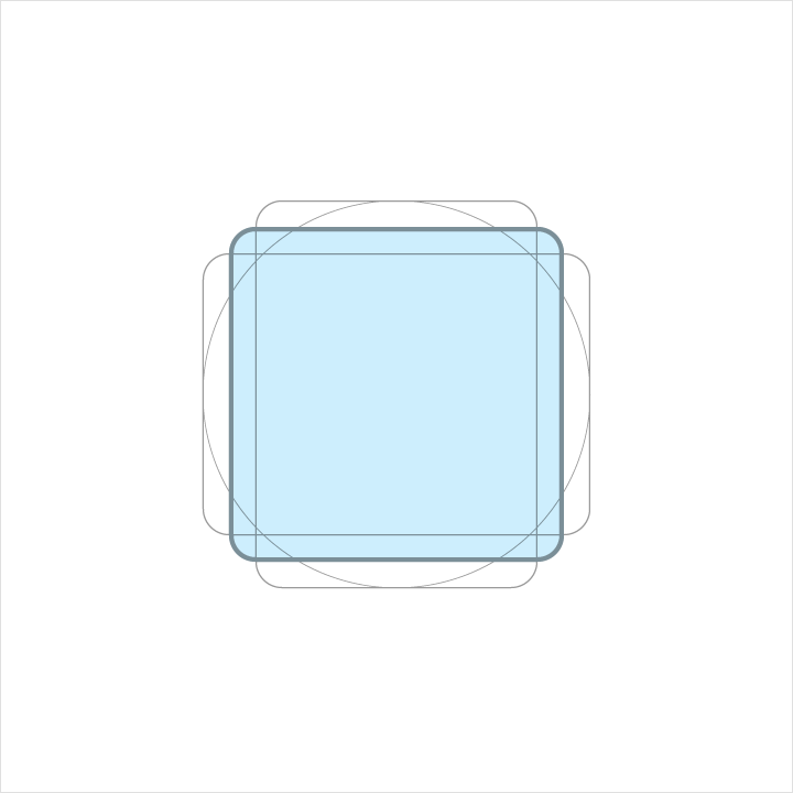
Height: 152dp
Width: 152dp
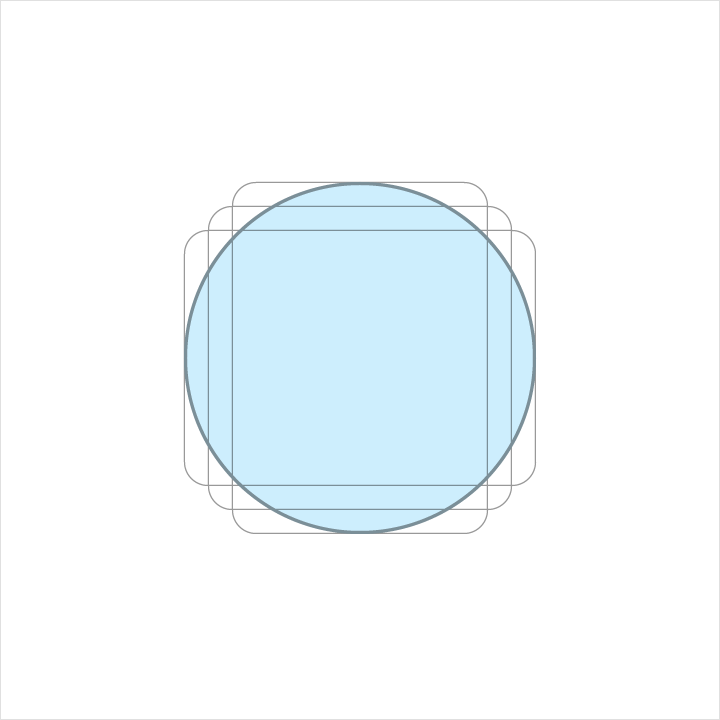
Diameter: 176dp
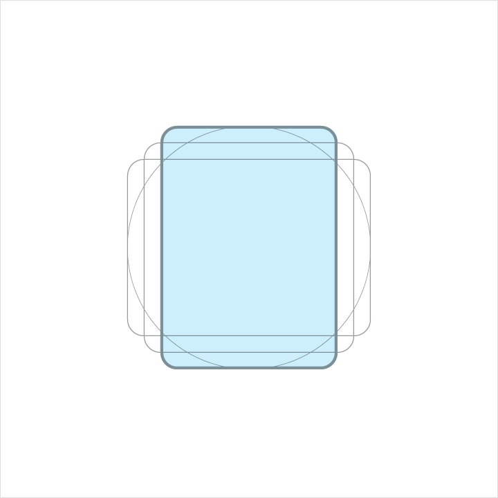
Height: 176dp
Width: 128dp

Height:128dp
Width:176dp
DP unit grid
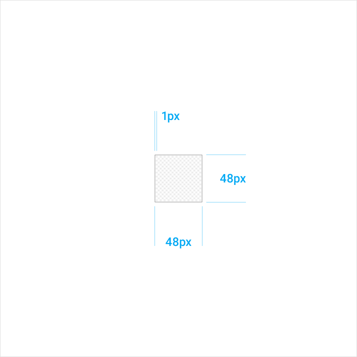
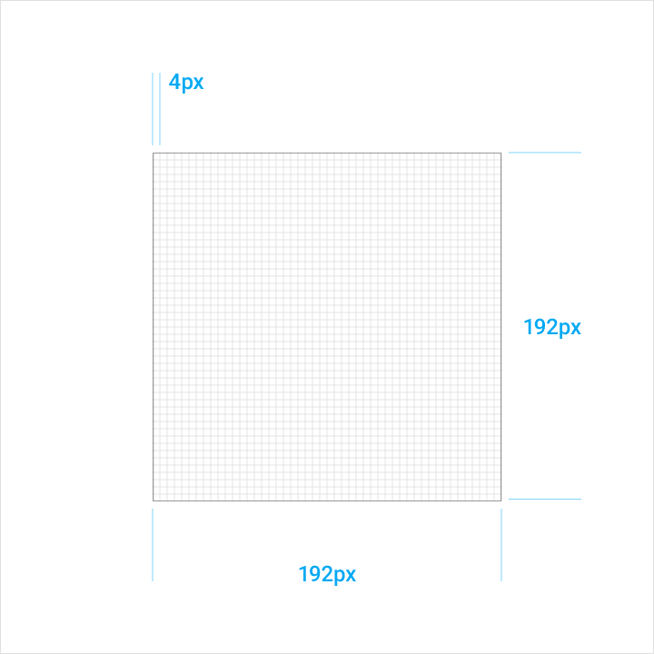
Android expects product icons to be provided at 48dp, with edges at 1dp. When you create the icon, maintain the 48-unit measure, but scale it to 400% at 192 x 192 dp (the edge becomes 4dp).
Any scaling done to the original will scale the image up or down proportionally. By maintaining the unit ratio, you preserve sharp edges and correct alignment when the scale is reduced.
Geometry
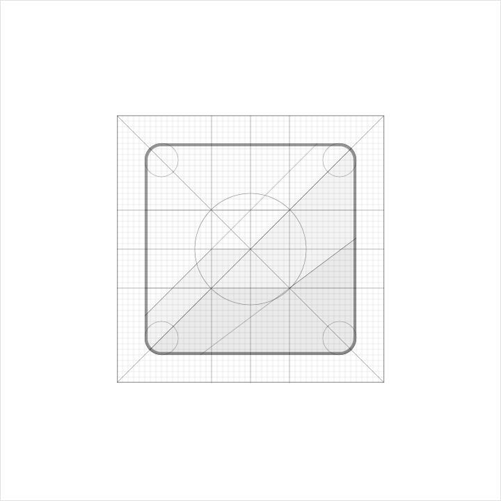
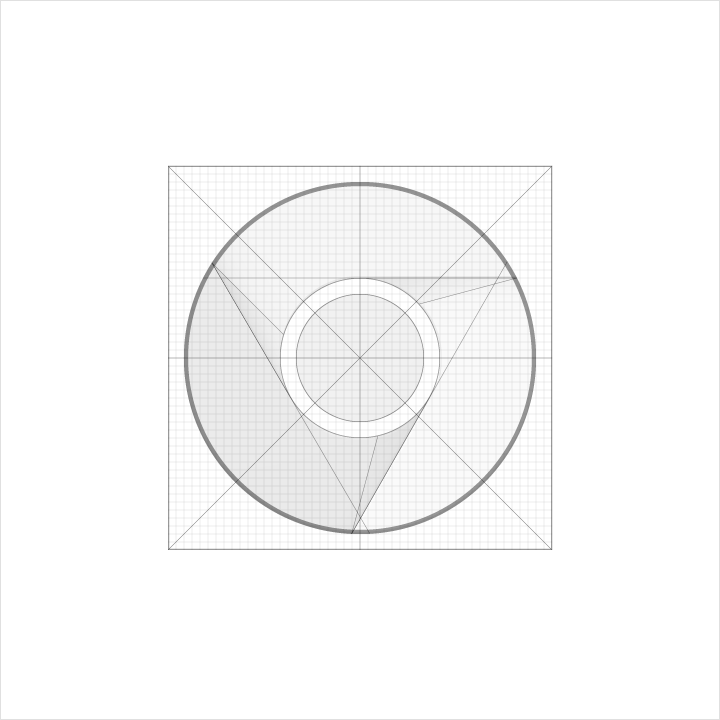
Preset standards have been determined for specific keylines: circle, square, rectangle, orthogonals, and diagonals. This small palette of universal and simple elements has been developed to unify product icons and systemize their placement on the grid.
Product icon anatomy
Product icon anatomy describes the graphic elements that make up a product icon. The consistency of these elements across icons for a given brand is critical in maintaining a shared visual language. Familiarity with these elements makes it easier to understand characteristics of each logo and subtle differences between them. It will also help educate your eye to recognize the underlying structure of logo designs.
1. Finish
2. Material background
3. Material foreground
4. Color
5. Shadow
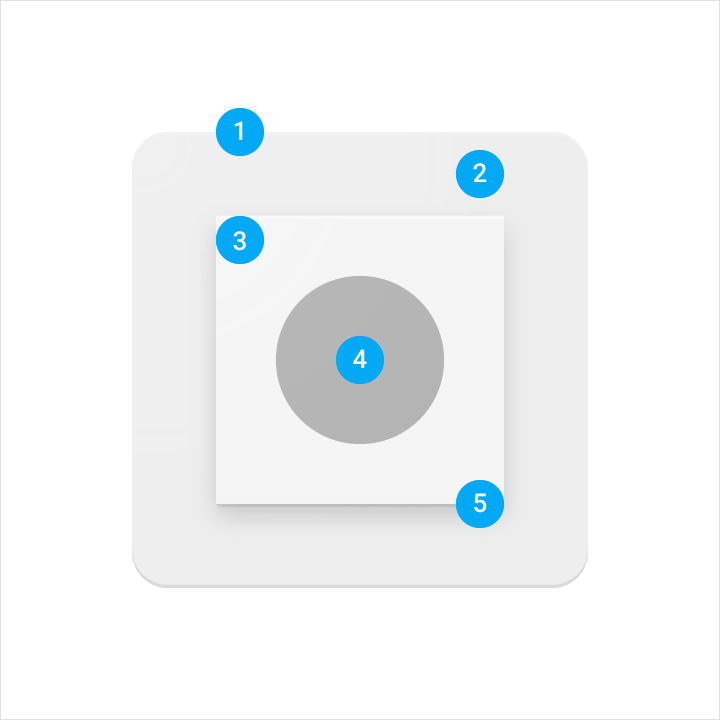
Each component is positioned on top of the previous one, always viewed from straight above.
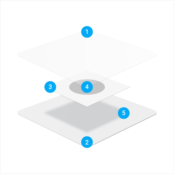
An exploded perspective example illustrating the context of each component of the logo construction.
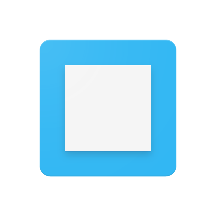
The back-most material element
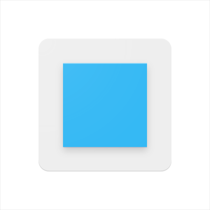
A material element raised above, and casting a shadow upon, the material background.

Color applied to a small portion of an element.

Color applied to an entire element, edge-to-edge.

The top edge of a material element. A tint is the mixture of a color with white, which lightens the original color.

The bottom edge of a material element. Shade is the mixture of a color with a darker hue, which darkens the original color.
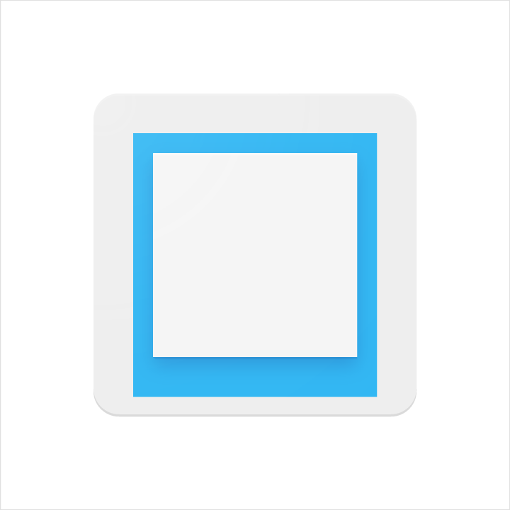
A soft shadow around all edges of a raised material element.

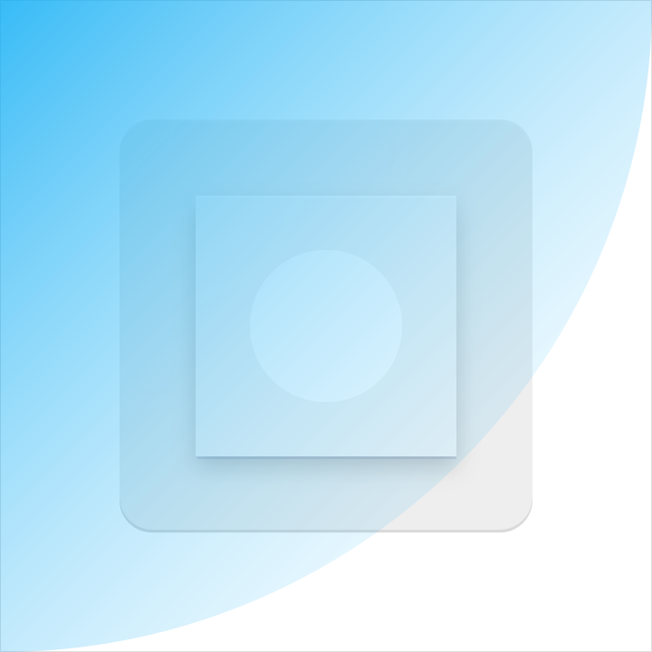
A soft tint above all elements to provide surface lighting, fading from upper-left to lower-right.
Product icon metrics
Lighting
Within the material environment, virtual lights illuminate the scene and allow objects to cast shadows. A top light cast on material elements creates a contact shadow while highlighting the top and bottom edges. An angled light reinforces the sense of surface across the elements.
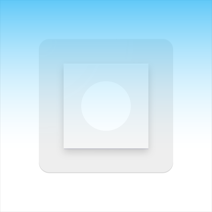
Shadows
For a product icon, the top light from above casts a soft shadow surrounding an element lightly on the top and left. The shadow is slightly heavier below and to the right. This shadow is always contained within the icon’s silhouette.
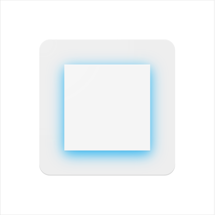
Mode: Normal
Opacity: 20%
X Offset: 0dp
Y Offset: 4dp
Blur: 4dp
Color: Refer to Tint, shade and shadow values
Edge tint and shade
The top and bottom edges of material elements provide a sense of depth and surface. Material elements have a standard 1dp thickness. All edge distances are measured from an element's interior edge.
Tint highlights the top edge of all elements. The left, right, and bottom edges do not have a tint applied.
Shade darkens the bottom edge of all elements. The left, right, and top edges do not have a shade applied.
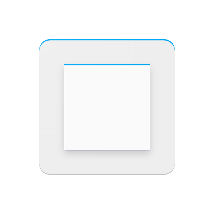
Height: 1dp
Opacity: 20%
Color: White (#FFFFFF)
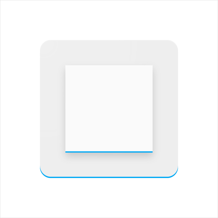
Height: 1dp
Opacity: 20%
Color: Refer to Tint, shade and shadow values
Finish
The finish layer is a result of the virtual 45º light source. It extends from the top-left corner to the exterior edge of the icon’s silhouette. The finish is always contained within these boundaries.
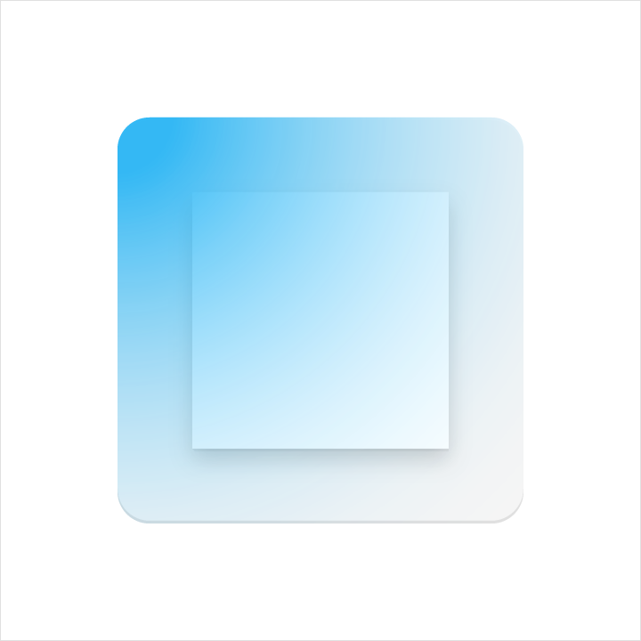
Type: Radial
Angle: 45º
Color: White (#FFFFFF)
Midpoint Location: 33%
Slider 1
Opacity: 10%
Location: 0%
Slider 2
Opacity: 0%
Location: 100%
Tint, shade, and shadow values
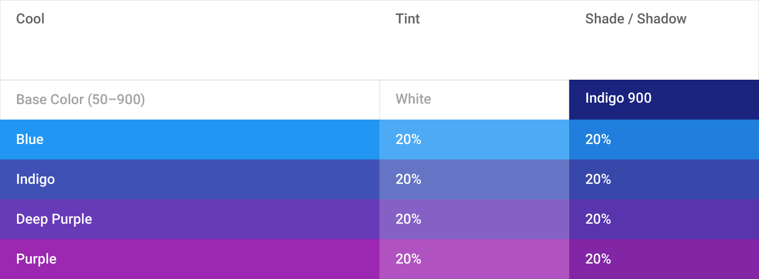
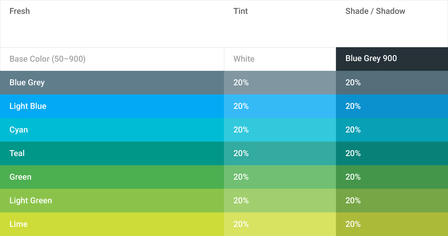
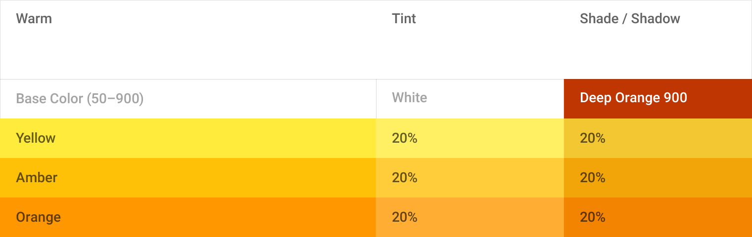
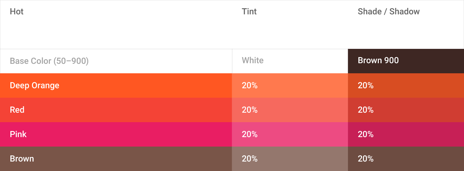
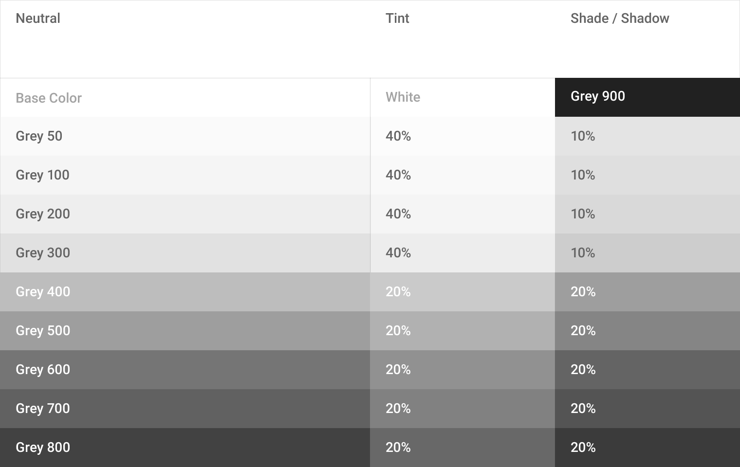
Each color reacts differently when tints and shades are added. The color of every edge tint, edge shade, and shadow needs to be adjusted for each color that lies behind it. To ensure color harmony, follow the appropriate value for each.
Product icon patterns
Influenced by the behavior of physical material, simple conventions provide a sense of surface and tactility. The interactions of material and color allow for numerous unique compositions.
Color
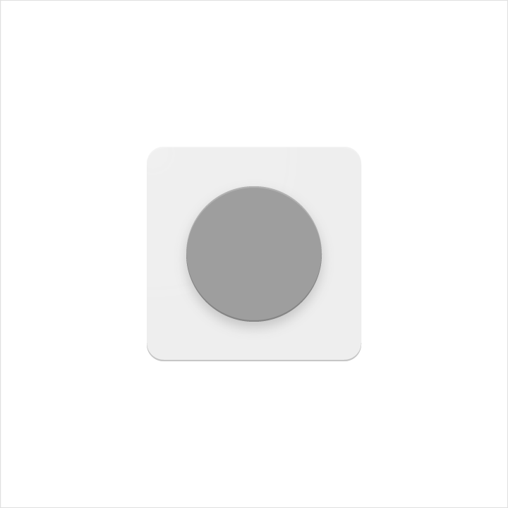
Colored elements are flush with the paper’s surface.
Don’t embellish colored elements with any edges or shadows.

Do.
Don't.
Layer
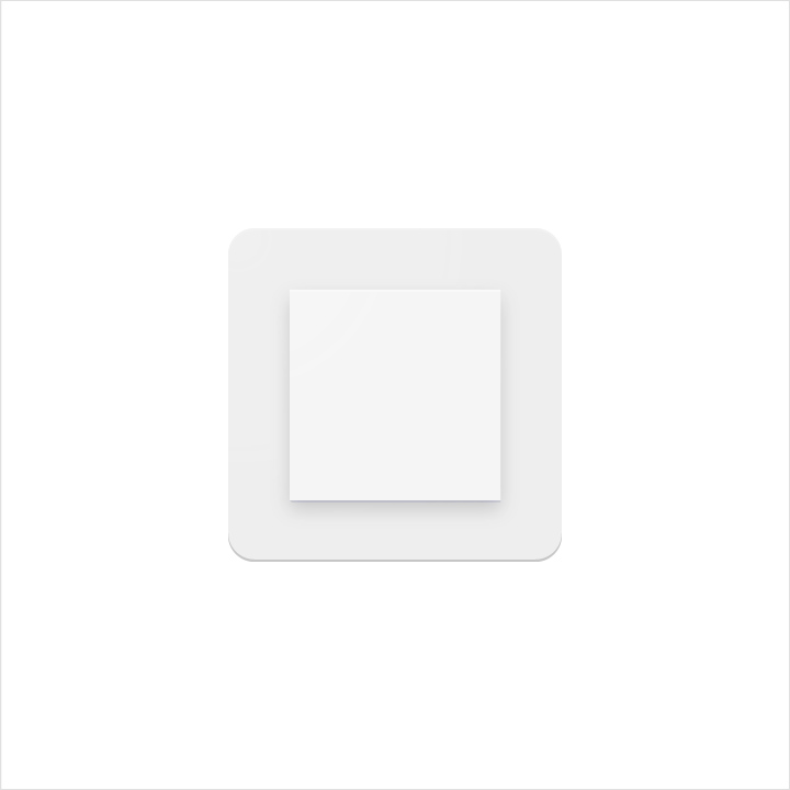
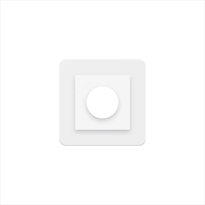
Layered paper elements create depth through edges and shadows.
Be cautious with the quantity of overlapping surfaces. Having too many complicates the icon and lacks focus.
Do.
Don't.
Elevate
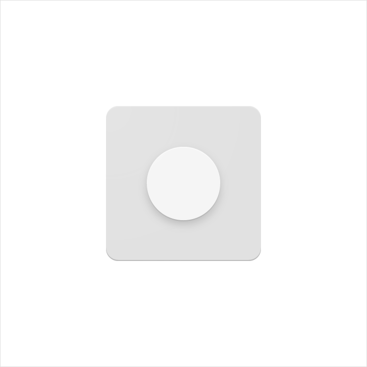
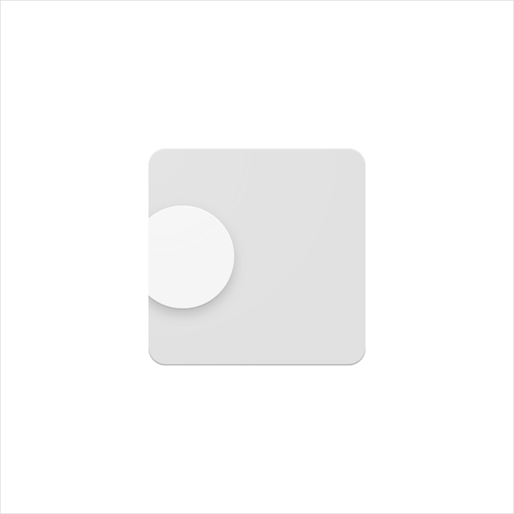
Elevating a key material element atop a simple background silhouette focuses attention to the center.
Don’t crop elevated material elements within another shape.
Do.
Don't.
Score
Scored material elements have the illusion of depth without losing their geometric form. Scores should be centered on symmetrical shapes.
Don’t use multiple scores, or position a score off-center.

Do.

Don't.
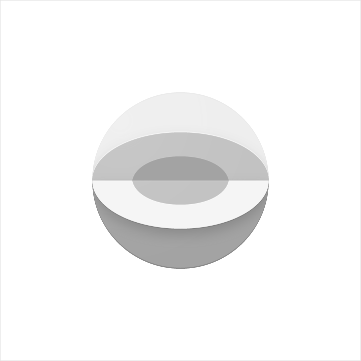
Fold
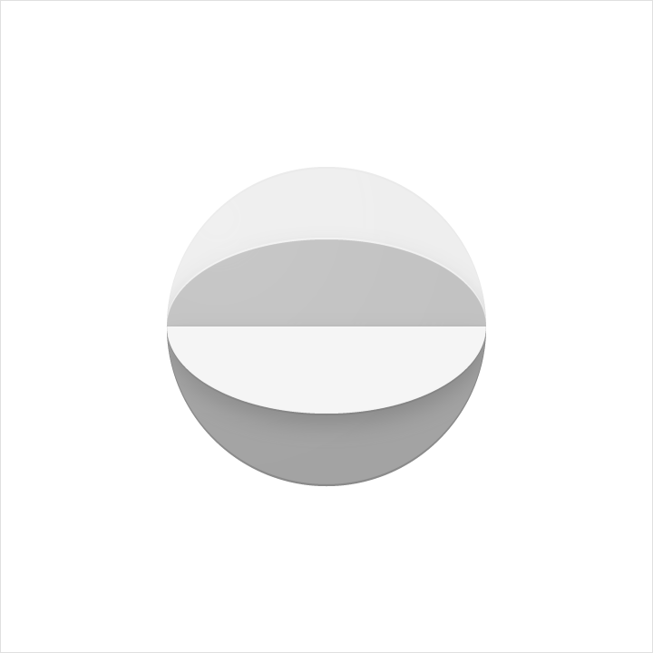
Folded material elements are skewed, having greater dimension. Spot colors should be avoided, so as to avoid altering or misrepresenting key elements.
Do.
Don't.
Overlap
Overlapped material elements create unique silhouettes. All elements, edges, and shadows are confined to the interior of the silhouette.
Don’t exceed more than two overlaps. Having too many complicates the icon and lacks focus.

Do.

Don't.
Accordion
Accordion folded material elements are adjoined by a connecting fold, used to add dimension to a single material element.
Don’t exceed more than two accordion folds. Having too many complicates the icon and lacks focus.

Do.

Don't.
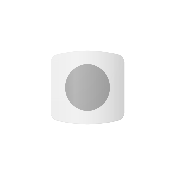
Distort
Product icons should never be distorted or transformed. Elements should remain in their geometric form, and not be skewed, rotated, bowed, warped, or bent.

Don't.
Don't.
Human iconography
The below guidelines and examples illustrate best practices for incorporating human iconography into your UI.
Form


Keyline shapes


Paper vs color


Gestures


Human icon rules

Do.

Don't.

Do.

Don't.
System icons
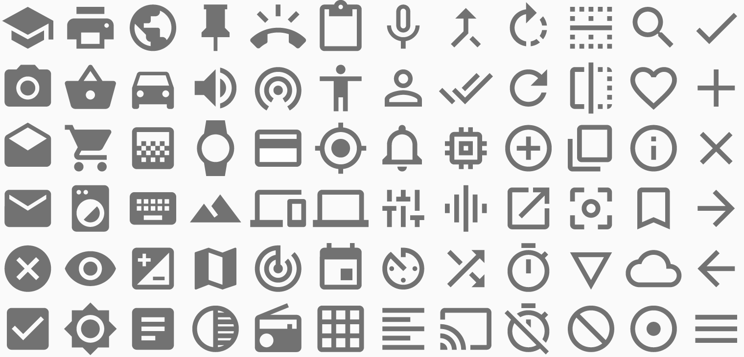
A system icon, or UI icon, symbolizes a command, file, device, or directory. System icons are also used to represent common actions like trash, print, and save.
The design of system icons is simple, modern, friendly, and sometimes quirky. Each icon is reduced to its minimal form, with every idea edited to its essence. The designs ensure readability and clarity even at small sizes.
Download our system icons
Design principles
Shapes are bold and geometric.
Symmetry and consistency of shapes give the icons a unique quality, while keeping them simple and bold.



Grid, proportion, and size
DP unit grid
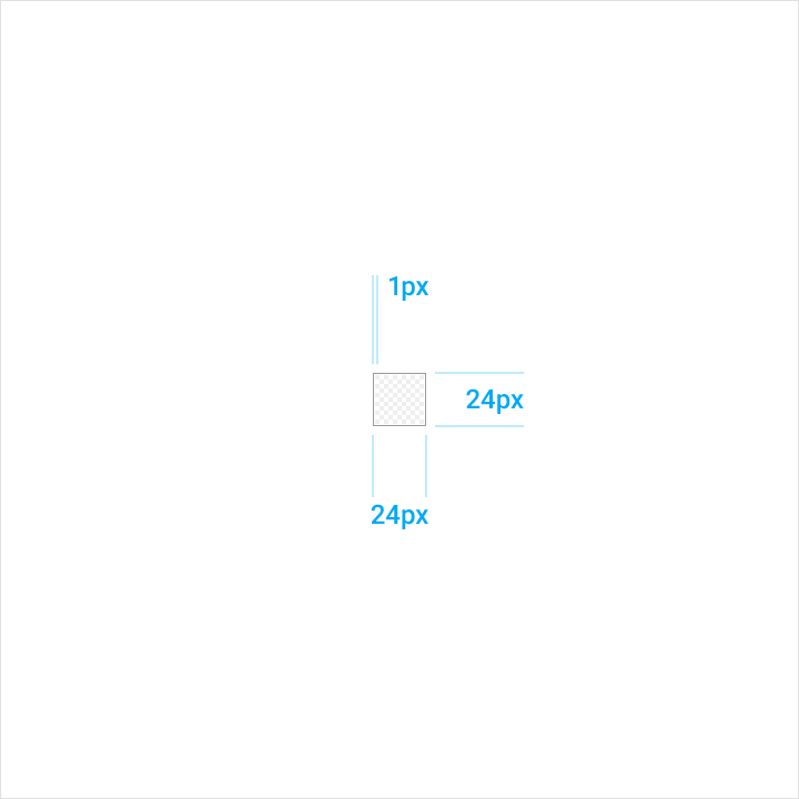
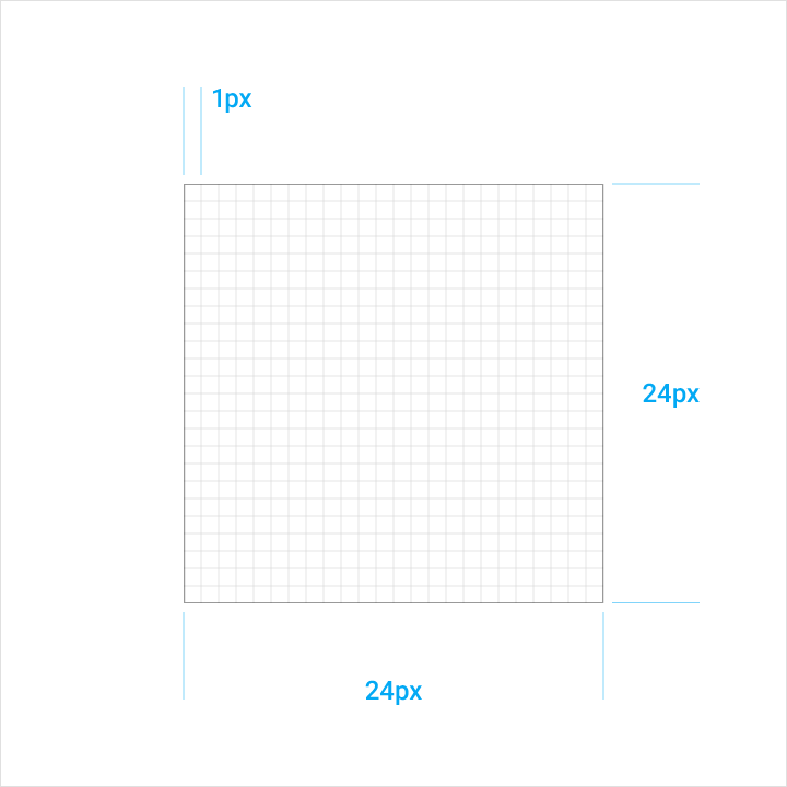
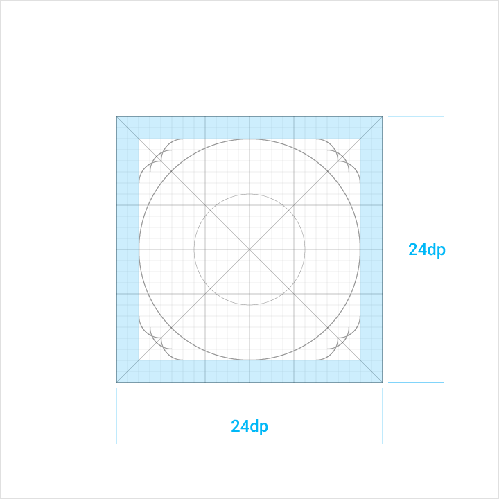
System icons are displayed at 24dp. When creating icons, it’s important to design at 100% scale for pixel-perfect accuracy.
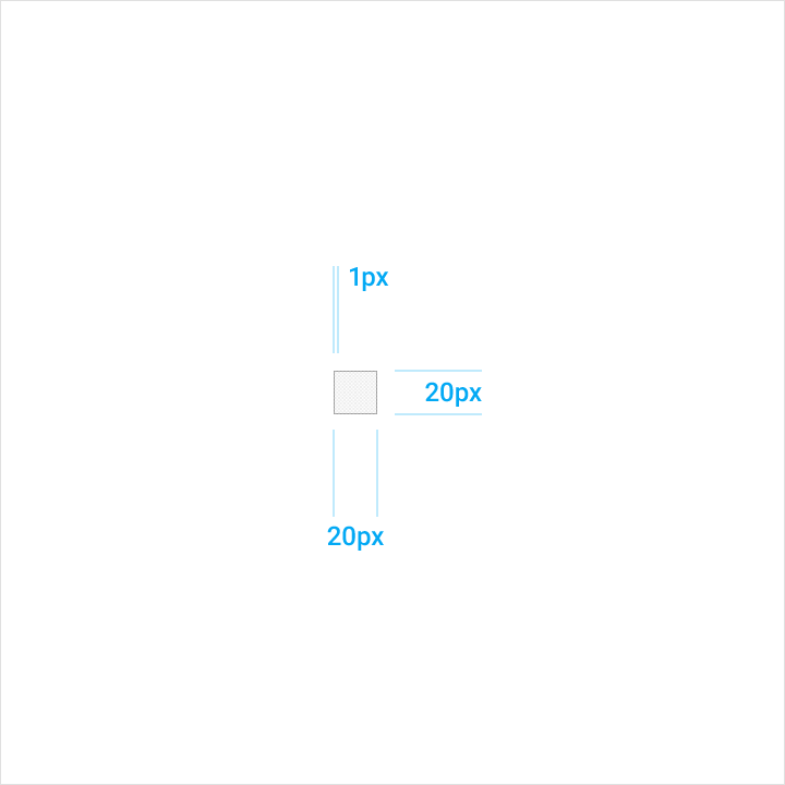
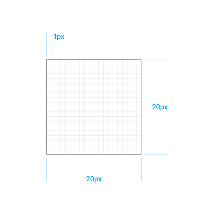
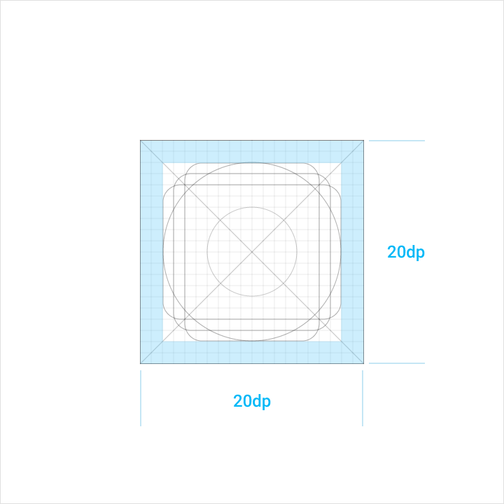
When the mouse and keyboard are the primary input methods, measurements may be condensed to accommodate denser layouts. For dense layouts on desktop, icons can be scaled down to 20dp.
Icon grid
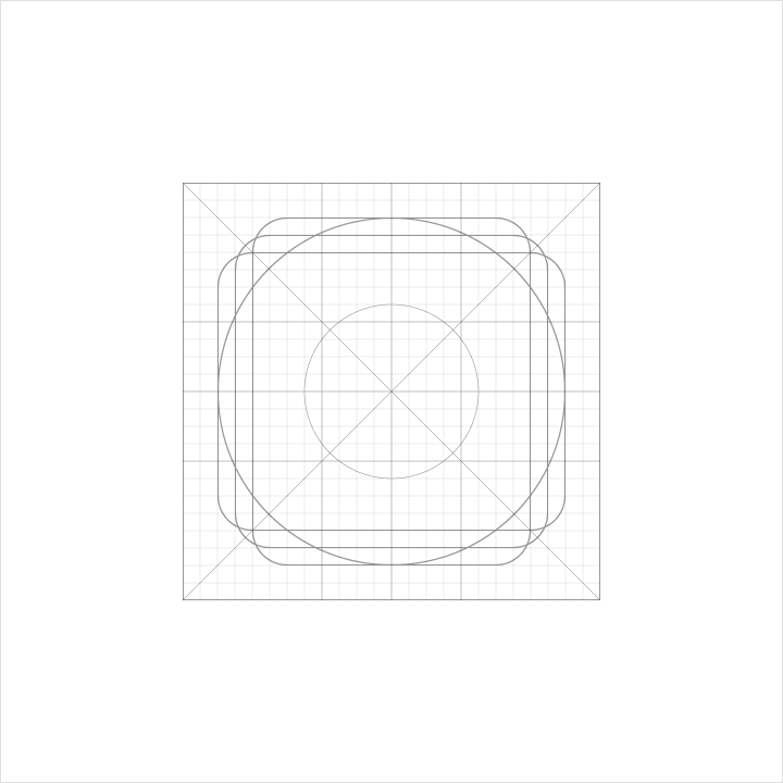
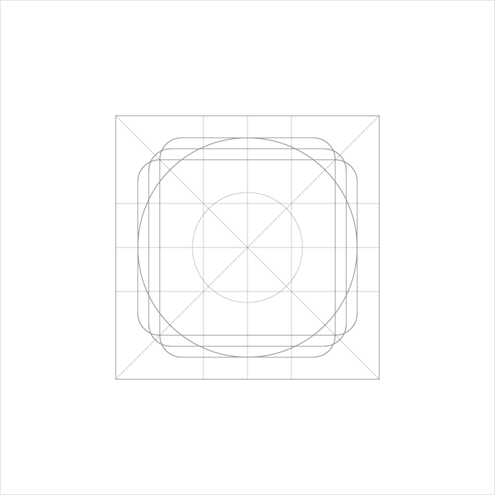
The icon grid has been developed to facilitate consistency and establish a clear set of rules for the positioning of graphic elements. This standardization results in a flexible but coherent system.
Content area
The content of an icon should remain inside of the live area. The live area is a safe zone of an image, in which graphics have sufficient display room and are unlikely to be cut off from view (such as when sidebars appear upon scrolling).
The trim area refers to the final size of a graphic file.
Content should only extend into the padding between the live and trim areas if additional visual weight is needed. Do not place any part of the icon outside of the trim area.
Dense layouts
For dense layouts on desktop, icons may be scaled down to 20dp with 2dp of padding surrounding the icon.
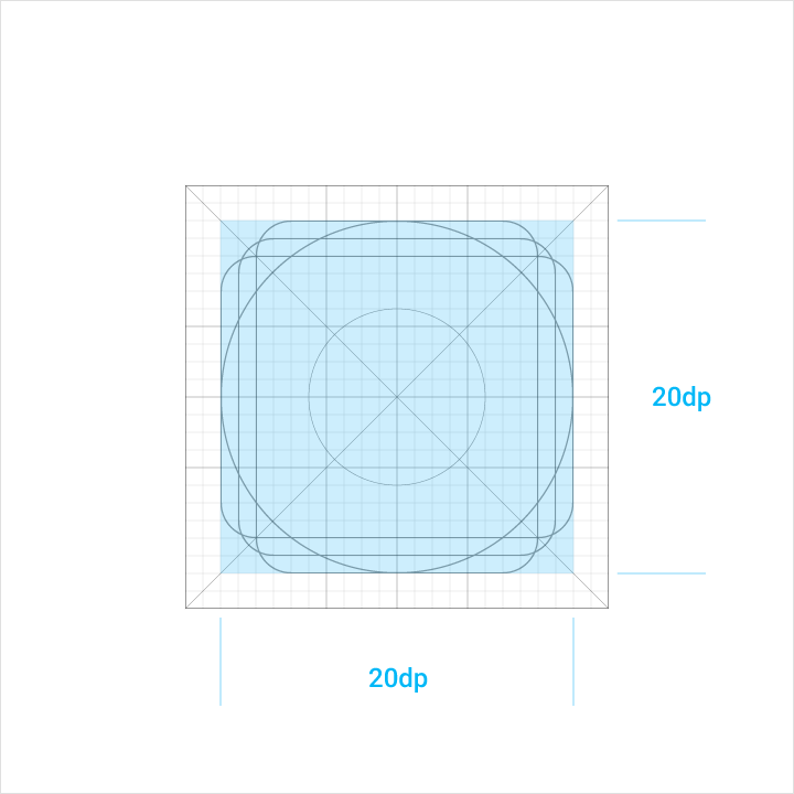
Icon content is limited to the 20dp x 20dp live area, with 4dp of padding around the perimeter.
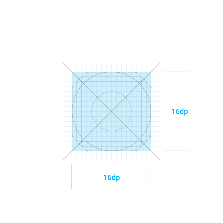
Icon content is limited to the 16dp x 16dp live area, with 2dp of padding around the perimeter.
4px of empty space makes up the padding surrounding the 20dp x 20dp live area.
The 2dp of padding surrounds the live area.
Keyline shapes
Keyline shapes are the foundation of the grid. By using these core shapes as guidelines, you can maintain a consistent visual proportion throughout the system icons.
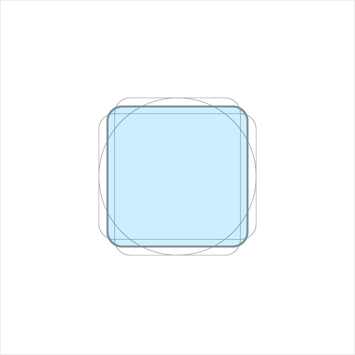
Height: 18dp
Width: 18dp
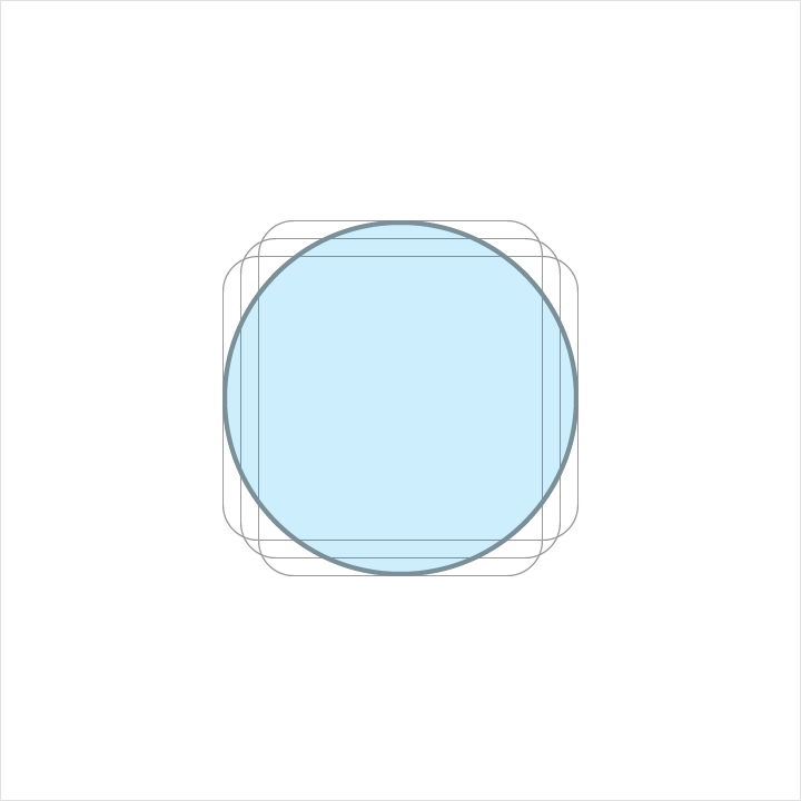
Diameter: 20dp
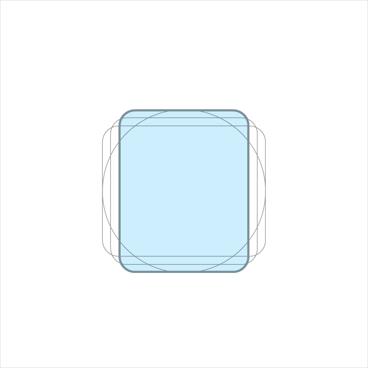
Height: 20dp
Width: 16dp
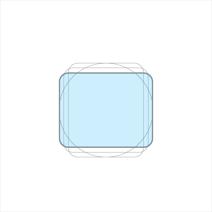
Height: 16dp
Width: 20dp
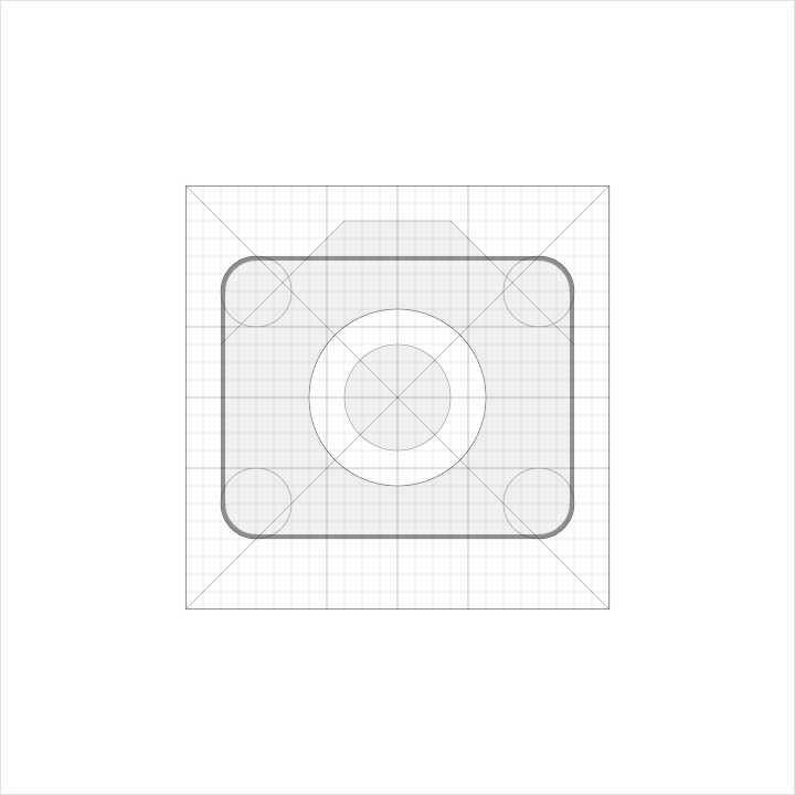
Geometry
Preset standards have been determined for specific keylines: circle, square, rectangle, orthogonals, and diagonals. This small palette of universal and simple elements has been developed to unify Google system icons and systemize their placement on the icon grid.

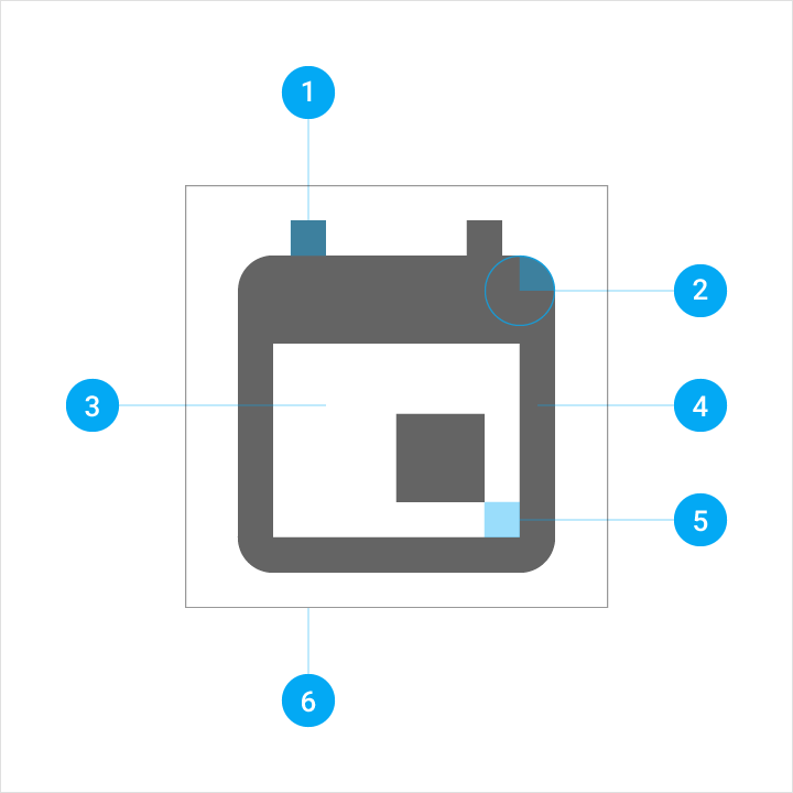
System icon anatomy
1. Stroke terminal
2. Corner
3. Counter area
4. Stroke
5. Counter stroke
6. Bounding area
Corners
Consistent corner radiuses are key to unifying the overall system icon family. A 2dp corner radius is used on the silhouette form of the icon. Do not round the corners of strokes (shapes 2dp wide or less).
Interior corners should be square. Do not round the corners of interior shapes.

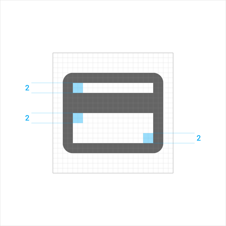
Strokes
Consistent stroke weights are key to unifying the overall system icon family. Maintain a 2dp width for all stroke instances, including curves, angles, and both interior and exterior strokes.
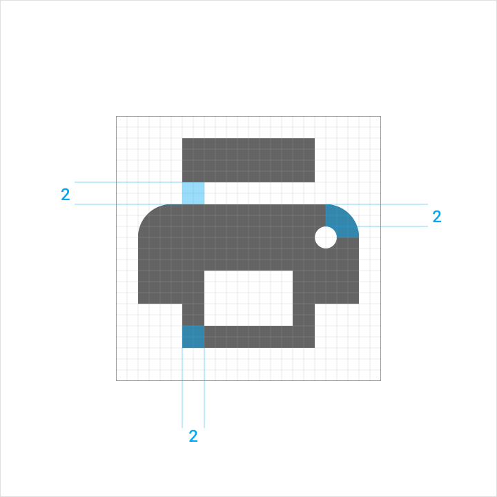


Optical corrections
Extreme scenarios that call for subtle tweaks add to the legibility of an icon. Instances where complex details are unavoidable require adjusting metrics.
If optical corrections are necessary, only use the consistent geometric forms on which all other icons are based. Don’t skew or distort the forms.
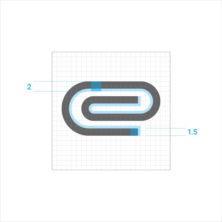
The paperclip icon in this example is only using 1.5dp of the possible 2dp stroke area to fit multiple curves within the 24 x 24dp icon space.
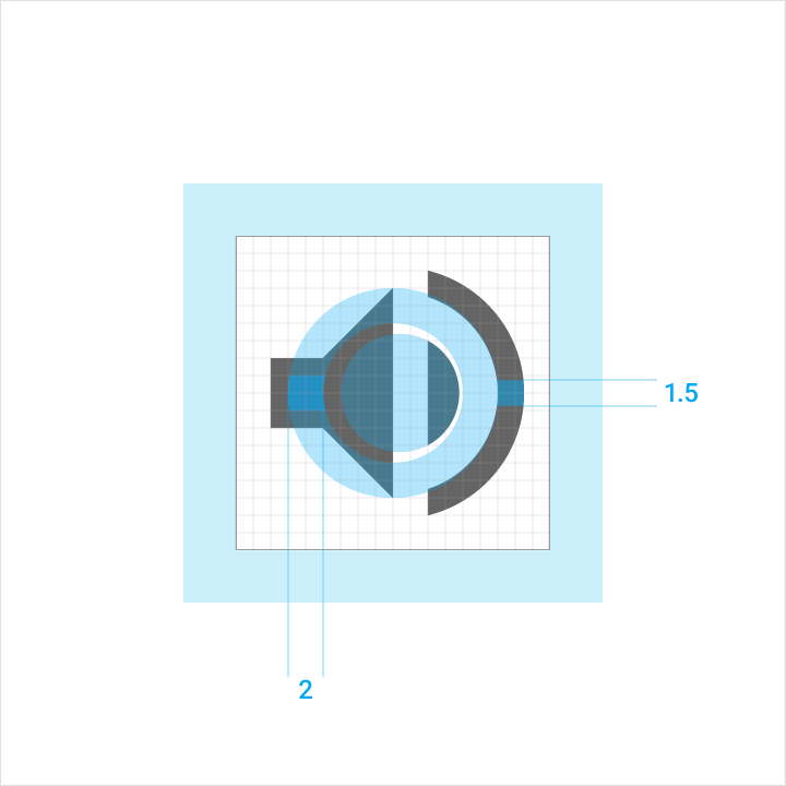
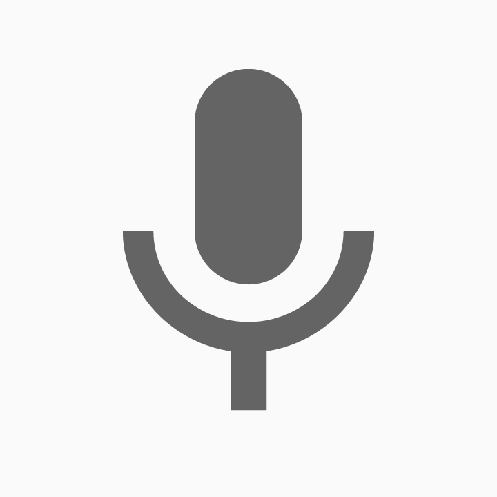
The microphone icon in this example is using a 1.5dp stroke to indicate microphone sound waves within the 24 x 24dp icon space.
Clearance
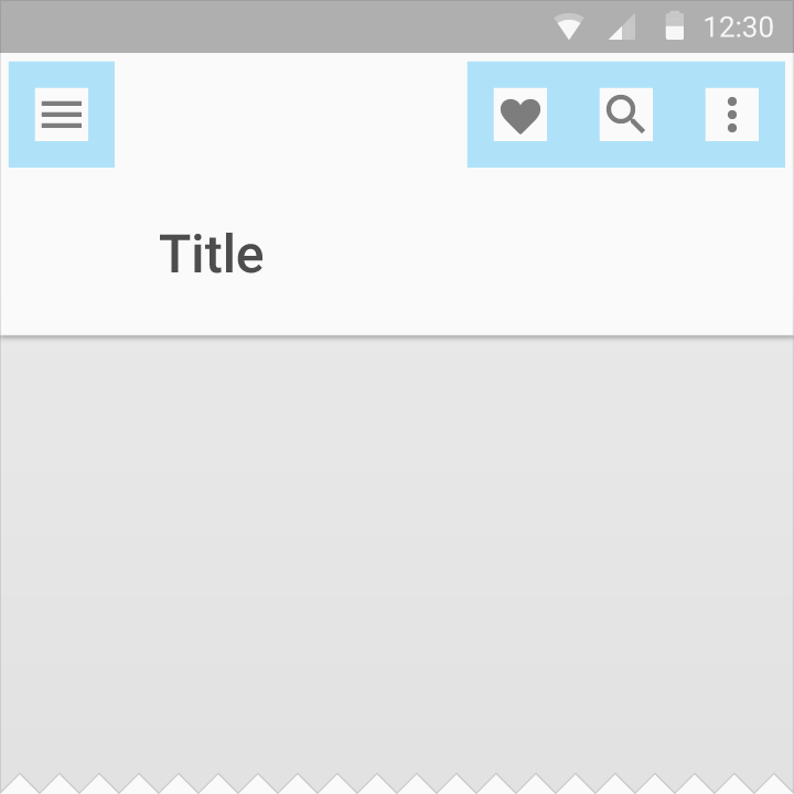
Adequate space around the icon is needed to allow for legibility and touch.
When the mouse and keyboard are the primary input methods, measurements may be condensed to accommodate denser layouts.

Icon: 24dp
Touch target: 48dp

Icon: 20dp
Touch target: 40dp
Best practices
Consistency aids user comprehension of icons. Use the existing system icons whenever possible and across different applications.
Do.
Don't.

Do.

Don't.

Do.
Don't.

Do.

Don't.

Do.

Don't.
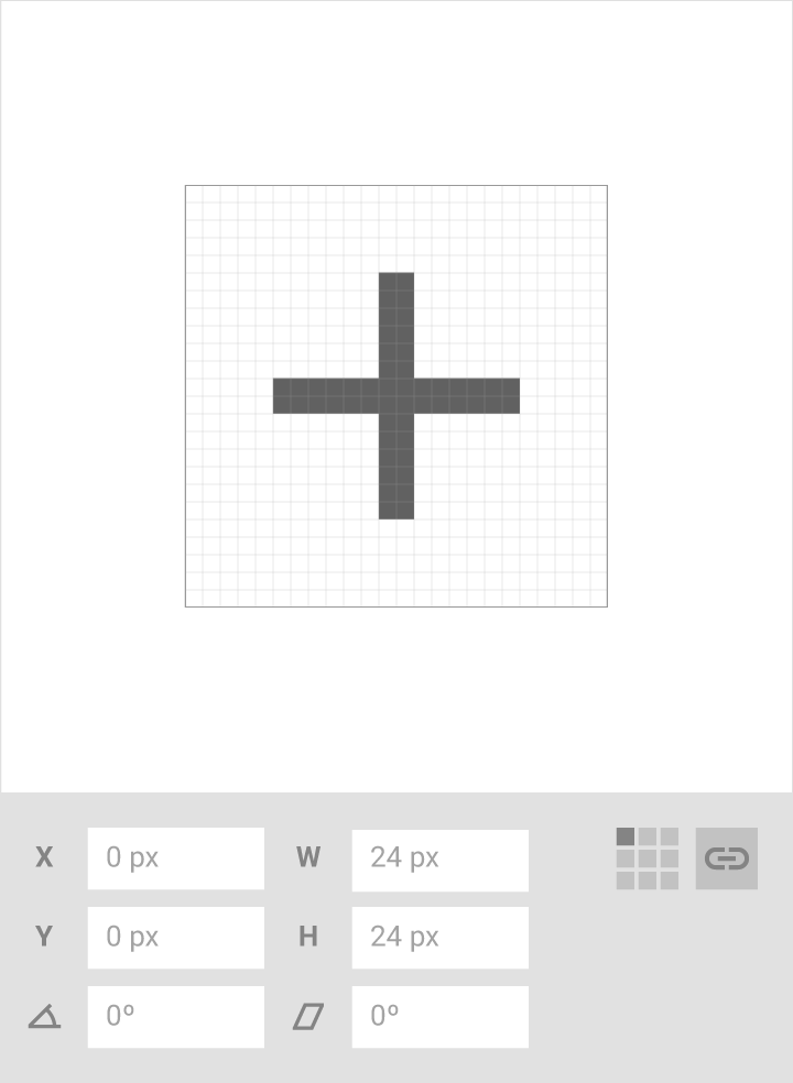
Do.
Icons should have equal width and height (e.g. 24x24) to avoid distorting the icon.
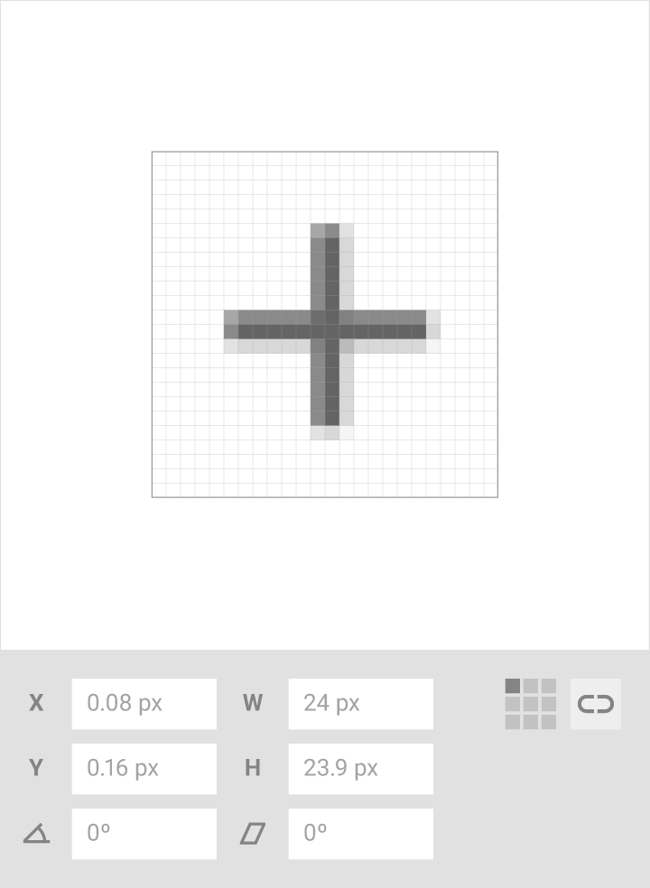
Don't.
Don’t distort the icon by having unequal width and height values.
Human iconography
Human icon anatomy
1. Head
2. Neck
3. Upper body
4. Arm
5. Leg
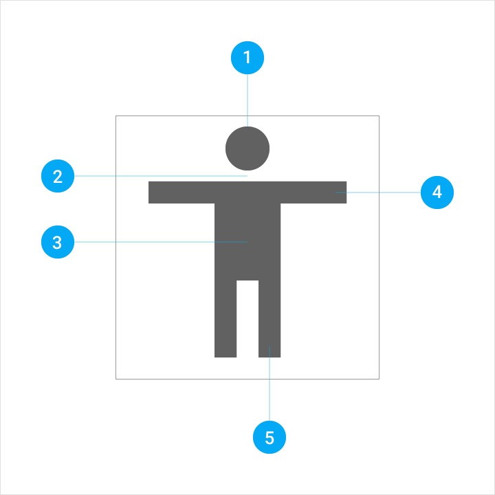
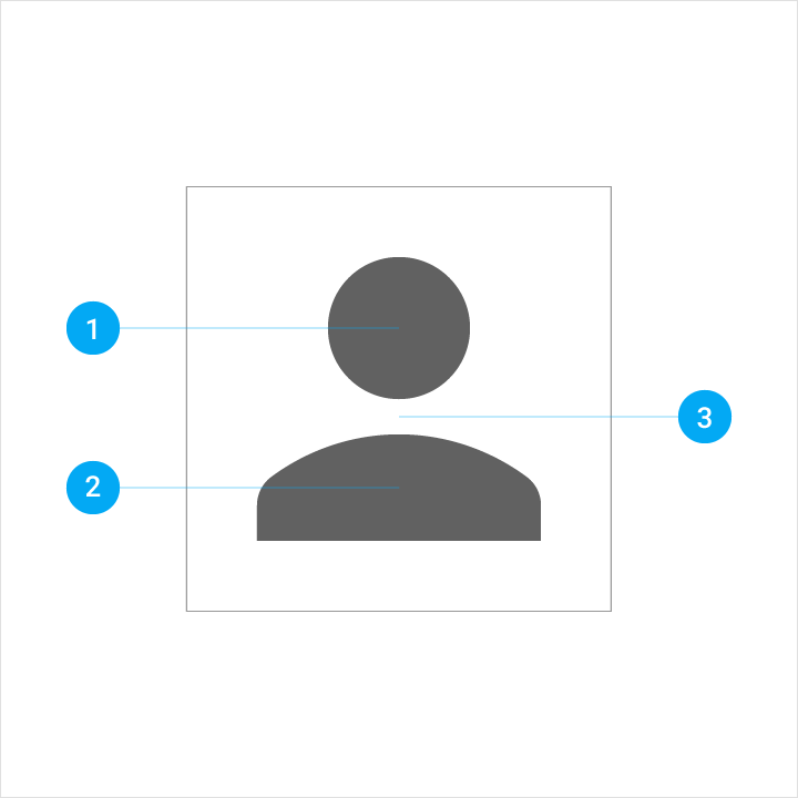
Form
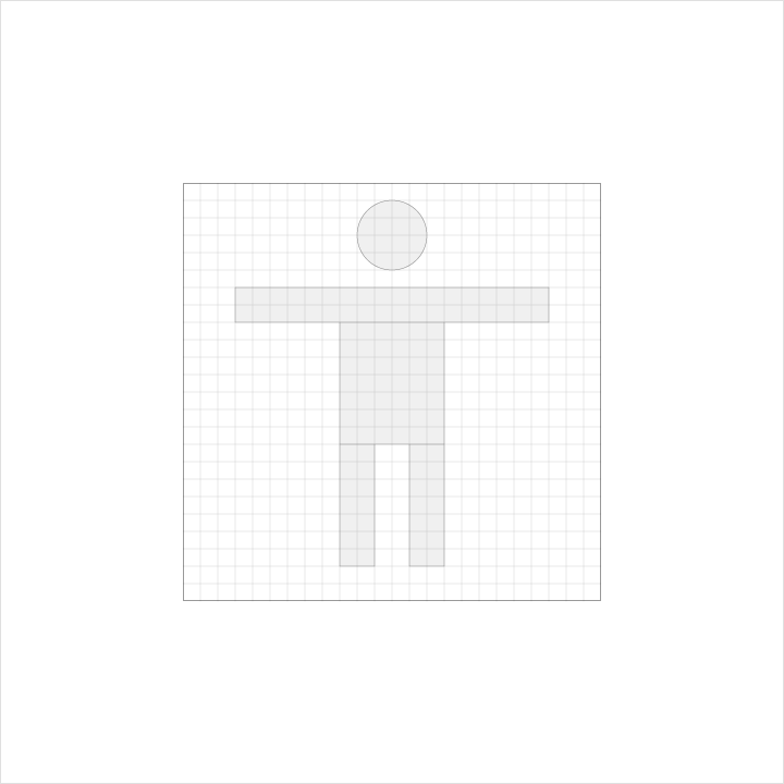
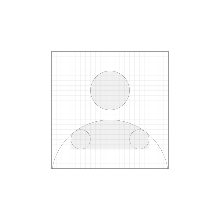
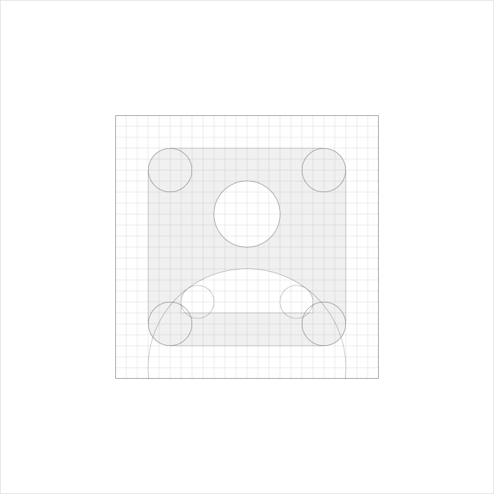
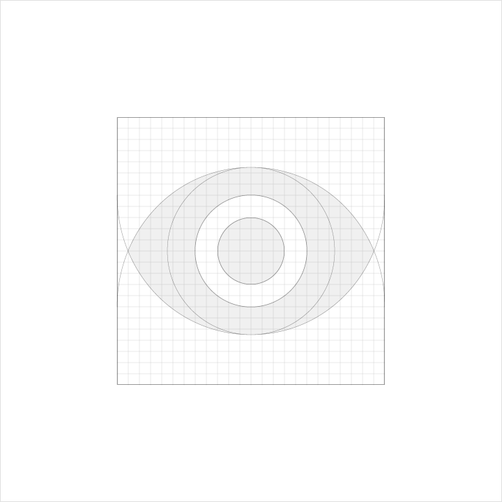
Full body

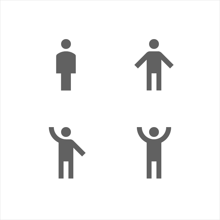

Upper body


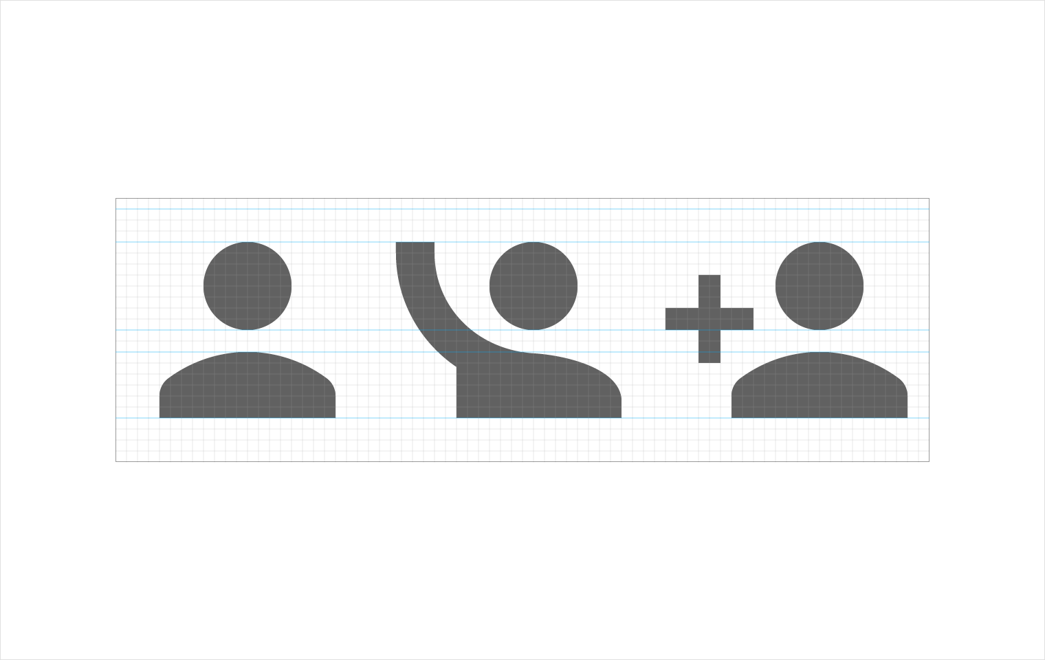
Contained


Detailed parts


Human icon rules
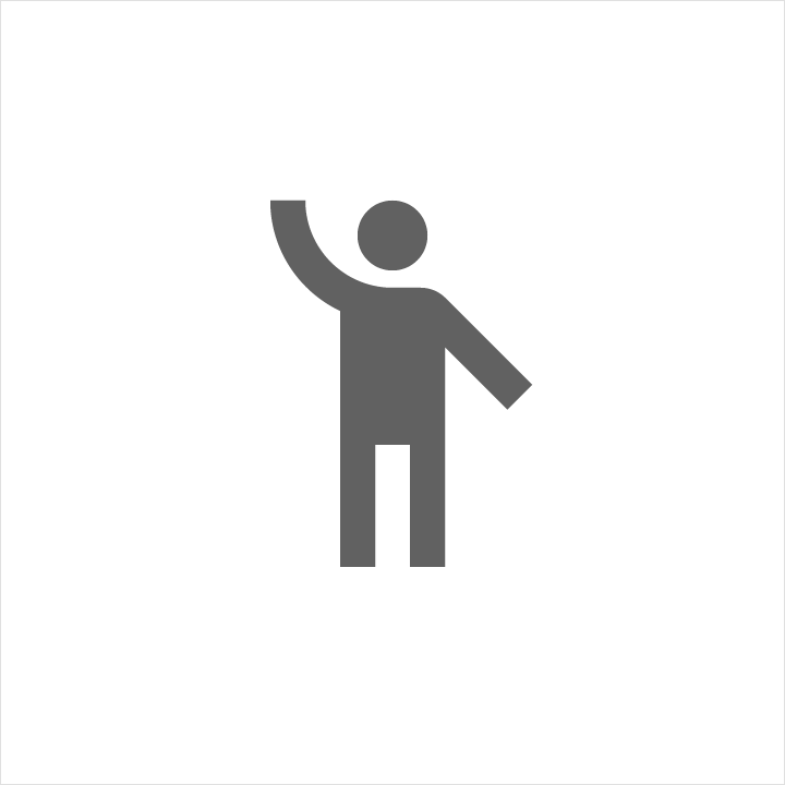
Do.
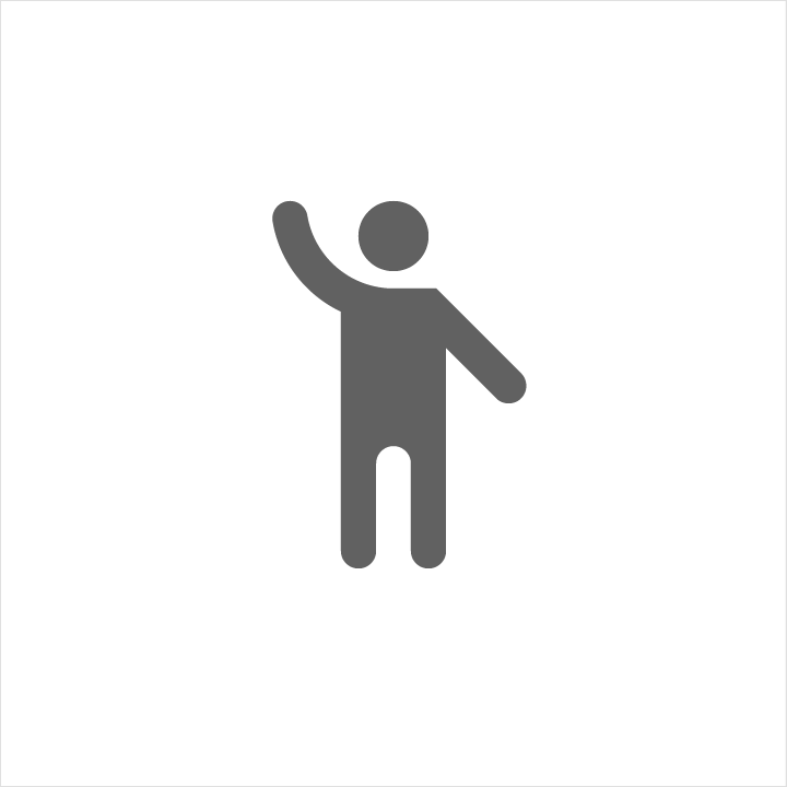
Don't.

Do.

Don't.

Do.

Don't.

Do.

Don't.

Do.

Don't.
Color
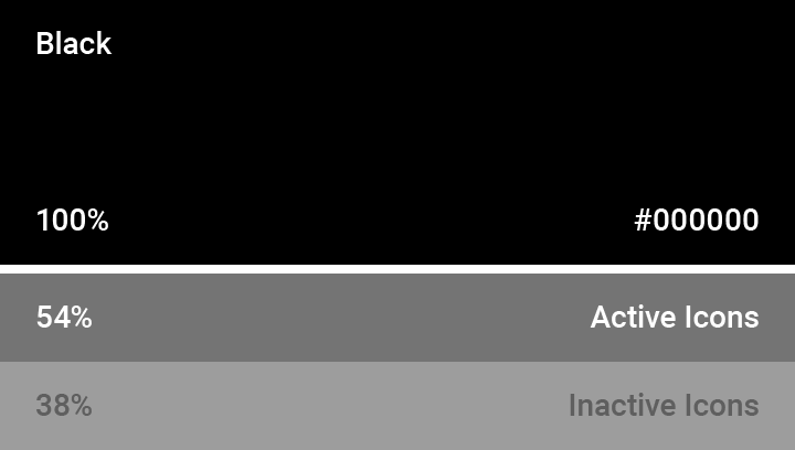
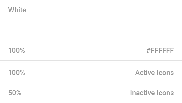
The standard opacity for an active icon on a light background is 54% (#000000). An inactive icon, which is lower in the visual hierarchy, should have an opacity of 38% (#000000).
The standard opacity for an active icon on a dark background is 100% (#FFFFFF). An inactive icon, which is lower in the visual hierarchy, should have an opacity of 50% (#FFFFFF).
App shortcut icons
App shortcuts give users quick, easy access to up to four of your app’s actions. Each action can also be added to the home screen.
Shortcut actions are displayed depending upon the location of your app’s icon. For example, app icons near the left edge of the screen will display actions wherever there is available space.
These guidelines will help you create app shortcuts using standard icons, single avatars, and group avatars.

Shortcut icon
App shortcut icons are circular. They contain a standard system icon, or at least one avatar. Icon content must remain inside of the trim area (the total area of the graphic).
Sizing
- Live area: 44dp circle
- Total area: 48dp circle
2dp of padding must surround the 44x44dp live area
Color
Live area: Solid fill of Material Grey 100 (#F5F5F5)
Shadow
Shortcut icons do not include shadows

All icon content should remain in the 44dp live area, with a solid background color fill of Material Grey 100 (or #F5F5F5).

2dp of padding must surround the live area, making the total icon size 48dp.
Standard shortcut icons
Standard shortcut icons have a Material system icon centered within the live area.
Sizing
- Live area: 44dp circle
- Total area: 48dp circle
- System icon: 24dp
Color
The system icon should have the same color as the app’s primary color or app icon (with enough contrast against the circular background).
File format
Standard icons should be provided in SVG, which allows icons to be scaled automatically. You may also use vector drawables, tinted bitmaps, or layer lists.
Do not use non-vector drawables, as they have specific dimensions that do not scale in this context.

The system icon should have equal width and height: 24x24dp.

The 24dp icon should be centered vertically and horizontally within the live area circle.

Do.

Don't.
Single avatars
Single avatars contain one image. They must be created at XXXHDPI.
Sizing
- Live area: 44dp circle
- Avatar area: 44dp circle
- Total area: 48dp circle
File format
Provide PNG files at all densities.
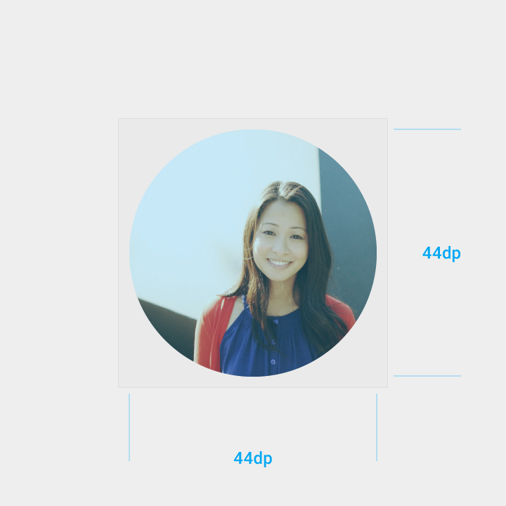
The avatar should fill the entire live area circle. These assets must be created in XXXHDPI.
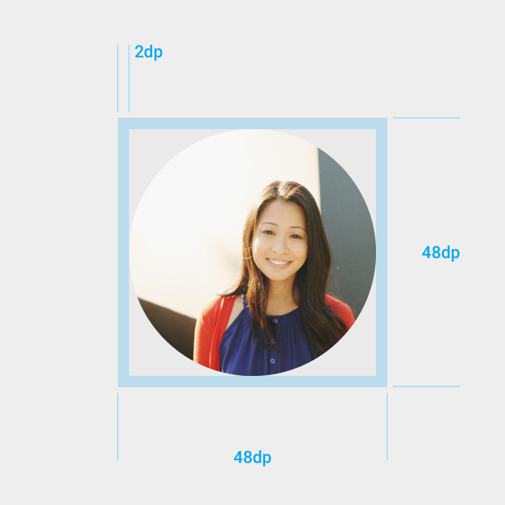
2dp of padding must surround the 44dp live area circle for a total area of 48dp.
Group avatars
Group avatars contain 2-4 images on a circular background. They must be created at XXXHDPI.
Sizing
- Live area: 44dp circle
- Avatar area: 30dp
- Total area: 48dp
Color
Live area: Solid fill Material Grey 100 (#F5F5F5)
File format
Provide PNG files at all densities.
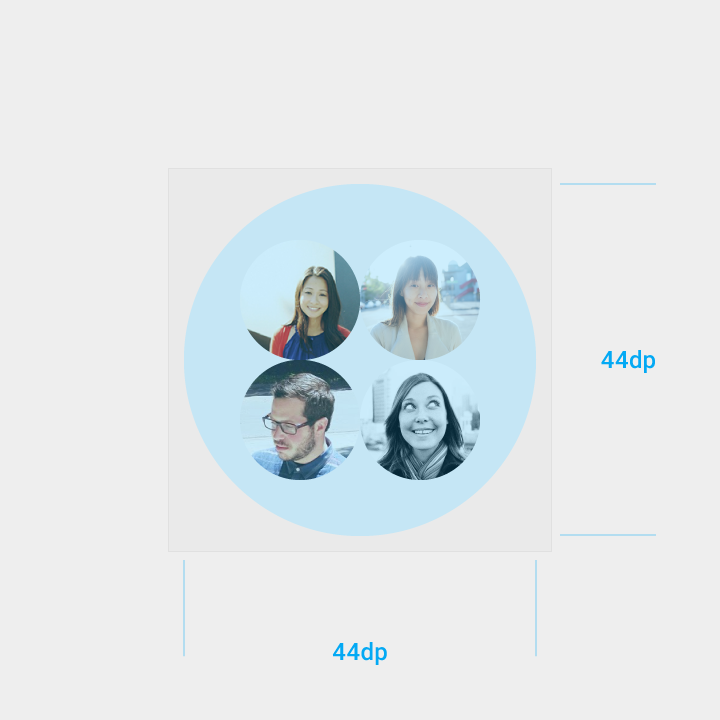
The live area circle should have a color fill of Material Grey 100 (#F5F5F5).
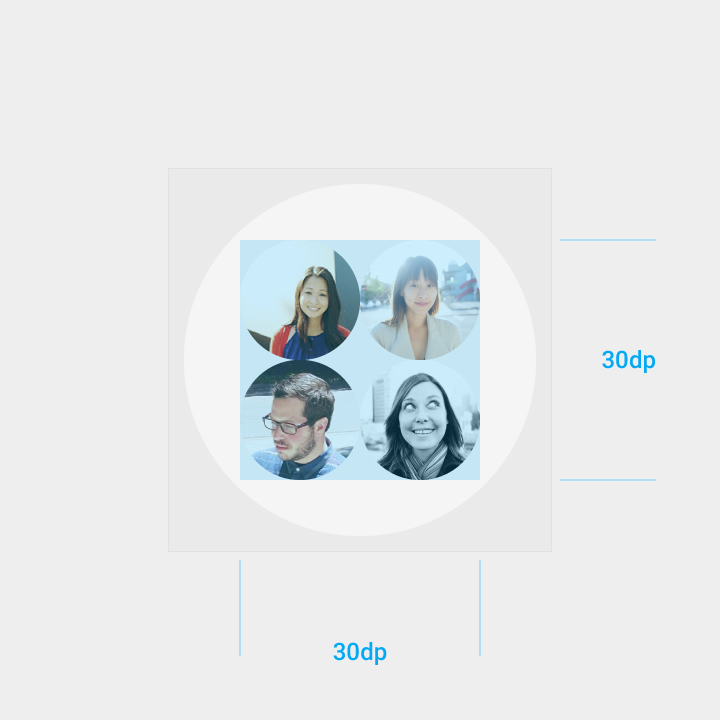
Avatars must fit within the 30x30 dp space and be centered, vertically and horizontally, within the live area.
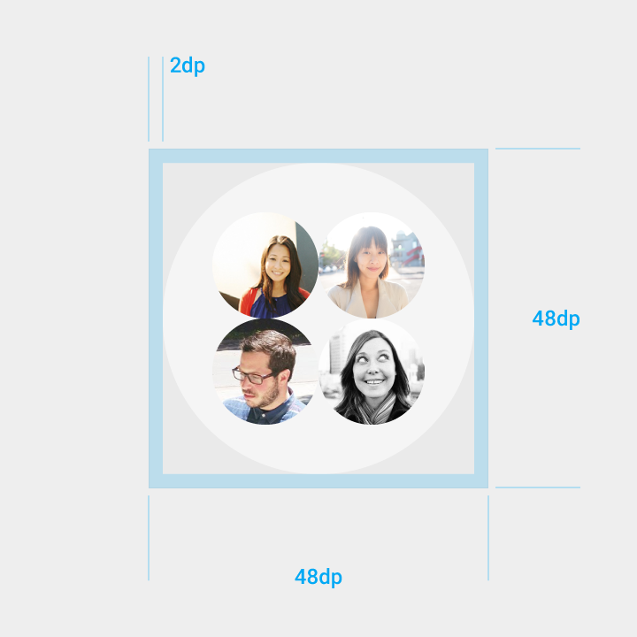
2dp of padding must surround the 44dp live area for a total area of 48dp.
Icons for Android
Android O and beyond
Android O icons represent your app on a device's Home and All Apps screens. The following guidelines describe how icons can receive unique visual treatments, animations, and behaviors.
Providing icons
Launcher icons are provided to the Google Play store.
Icon file requirements
- Icon drawables in a PNG or vector format
- Background and foreground layers (without masks or background shadows)
- All layers must exceed the base icon shape by 50%
OEM requirements
- A shape for masking any icons that are displayed on their platform
- An outer shadow (optional)
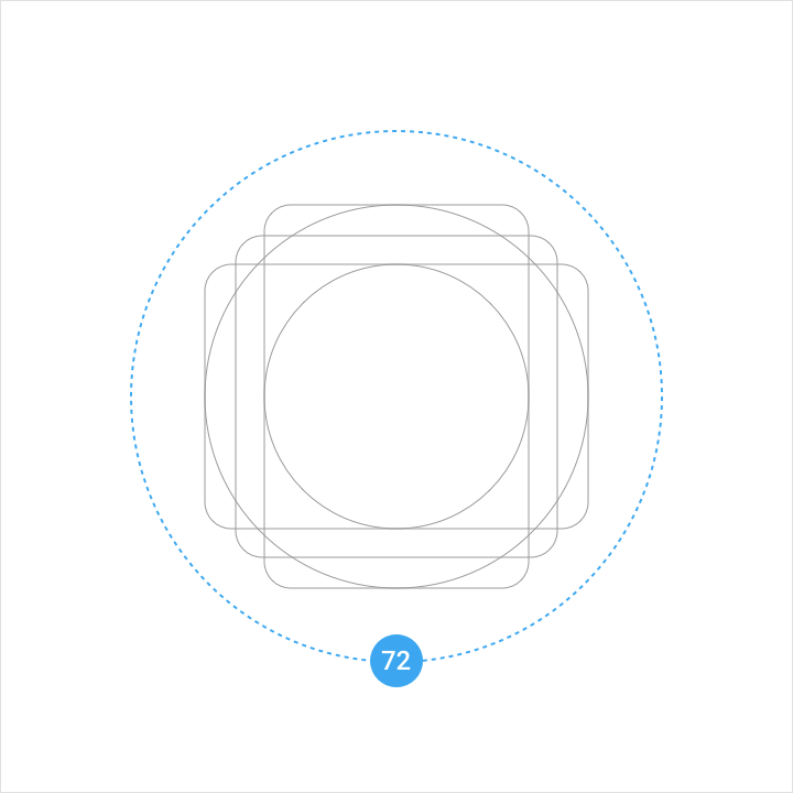
Layer specs
Icons consist of two layers: a foreground and a background. Each layer can animate and receive treatments independently from the other layer.
Foreground (scrolling parallax)
- 108 x 108 dp
- 72dp masked section
- Transparency recommended (optional)
Background (subtler parallax)
- 108 X 108 dp
- 72dp masked section
- Must be opaque
Keyline shapes
Keyline shapes are used across all app icons to maintain consistent visual proportions.
Square
Height: 44dp
Width: 44dp
Corner radius: 4dp
Circle
Diameter: 52dp
Vertical rectangle
Height: 52dp
Width: 36dp
Corner radius: 4dp
Horizontal rectangle
Height: 36dp
Width: 52dp
Corner radius: 4dp
OEM masks
OEMs can apply their own custom masks to icons without affecting icon layout.
Specs:
- 72 x 72 dp masked area
- A convex shape
- Both a circular mask and a square mask
Lighting and shadows
When designing new icons, lighting and shadow effects should be consistent with other icons on the platform.
Shadows
Icons contain two types of shadows: cast shadows and contact shadows.
A cast shadow is a sharp 45º shadow that extends from an element’s edge to the foreground boundary.
A contact shadow is a soft shadow surrounding an element.
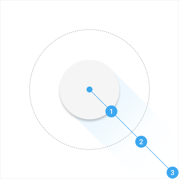
Color: Refer to product icon tint, shade and shadow values
| Illustrator gradient tool | Opacity | Location |
| Slider 1 | 15% | 32% |
| Slider 2 | 2% | 62% |
| Slider 3 | 0% | 100% |
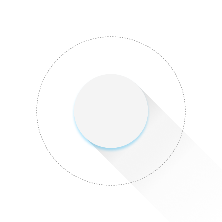
Illustrator mode: Normal
Opacity: 20%
X Offset: 0dp
Y Offset: 4dp
Blur: 4dp
Color: Refer to tint, shade and shadow values
Edge tint and shade
To provide a sense of depth, treatments are applied to the top and bottom edges of Material Design elements.
Tinted edges highlight the top edge of elements (the left, right, and bottom edges are not tinted).
Shaded edges apply dark bottom edges to elements (the left, right, and top edges are not shaded).
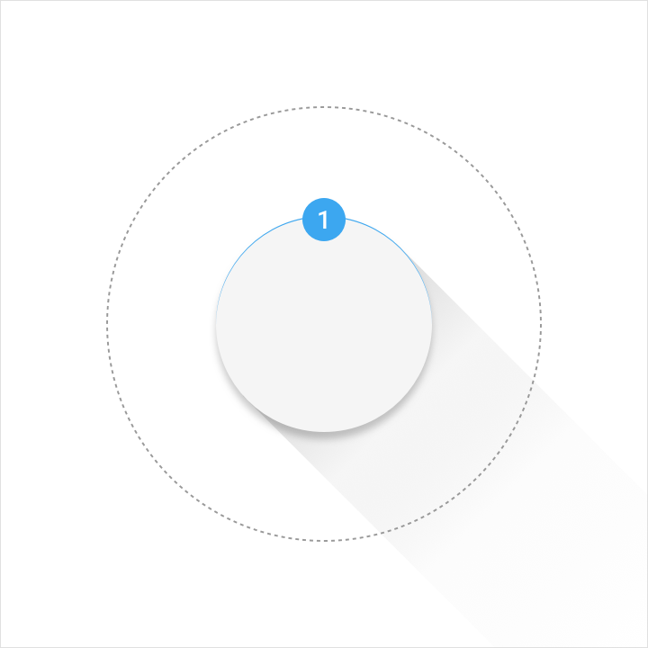
Height: 1dp
Opacity: 20%
Color: White (#FFFFFF)
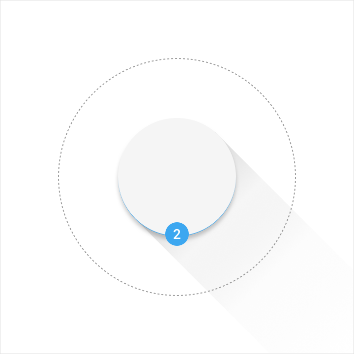
Height: 1dp
Opacity: 20%
Color: Refer to product icon tint, shade and shadow values
Finishing layer
A finishing layer is placed above the foreground layer.
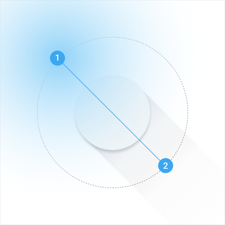
Angle: 45º
Midpoint: 32%
Color: Refer to tint, shade and shadow values
| Illustrator gradient tool | Opacity | Location |
| Slider 1 | 10% | 0% |
| Slider 2 | 0% | 100% |
Resources
The sticker sheet provides guidance on applying layers and shapes within the Android launcher icon grid.
Icons for Android sticker sheet for Adobe Illustrator — 0.36 MB (.ai)