

Tabs
Tabs make it easy to explore and switch between different views.
Tabs enable content organization at a high level, such as switching between views, data sets, or functional aspects of an app.
Present tabs as a single row above their associated content. Tab labels should succinctly describe the content within.
Because swipe gestures are used for navigating between tabs, don't pair tabs with content that also supports swiping.
Types
Fixed
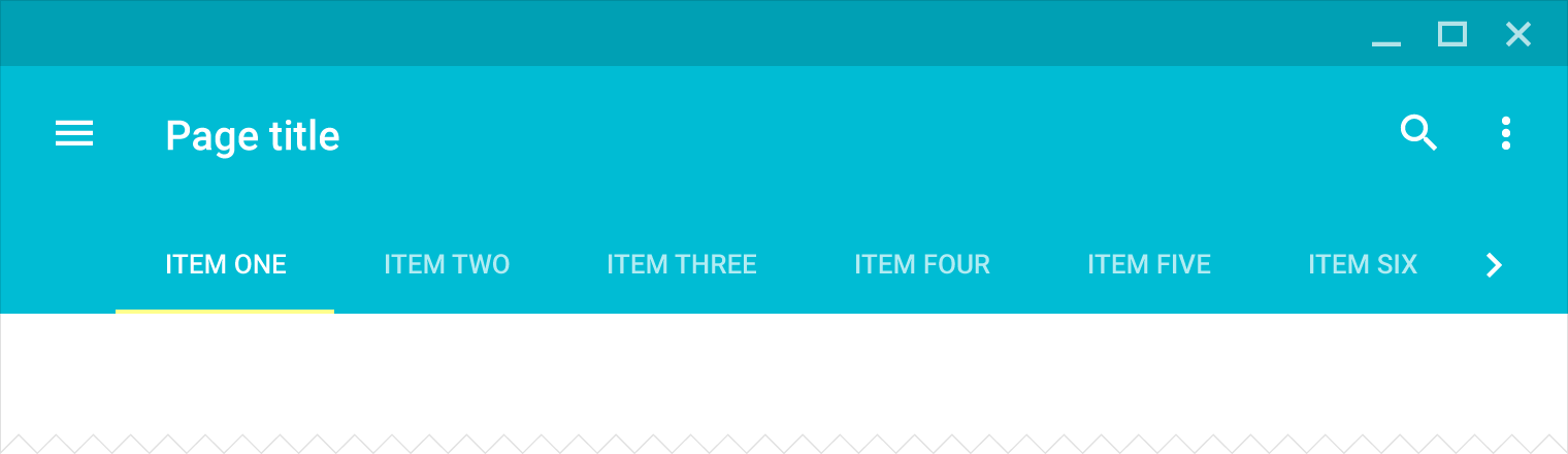
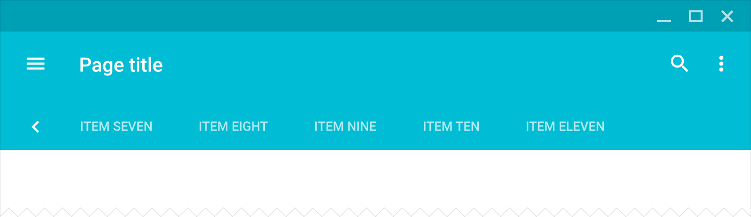
Scrollable
Tab labels
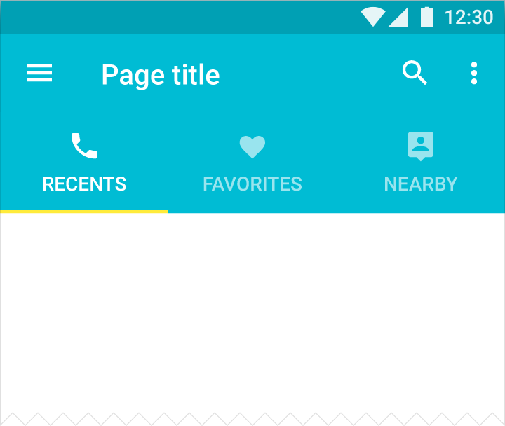
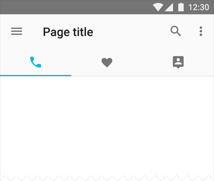
Tab labels may include icons and text.
Color
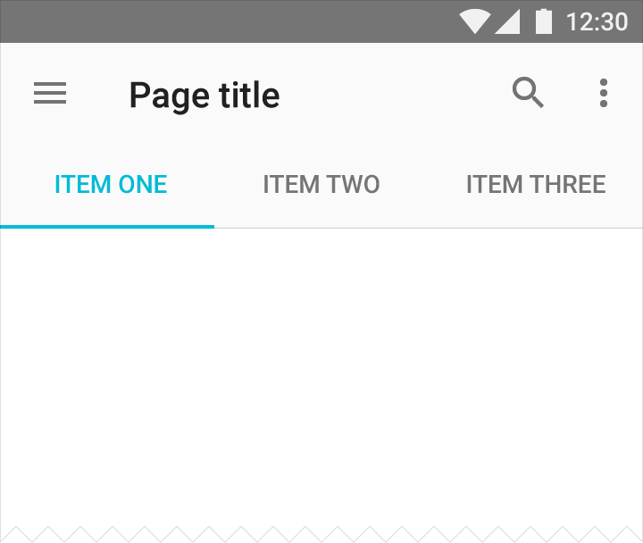
Apply your app’s accent color, or a contrasting color, to text fields and the text field cursor.
Usage
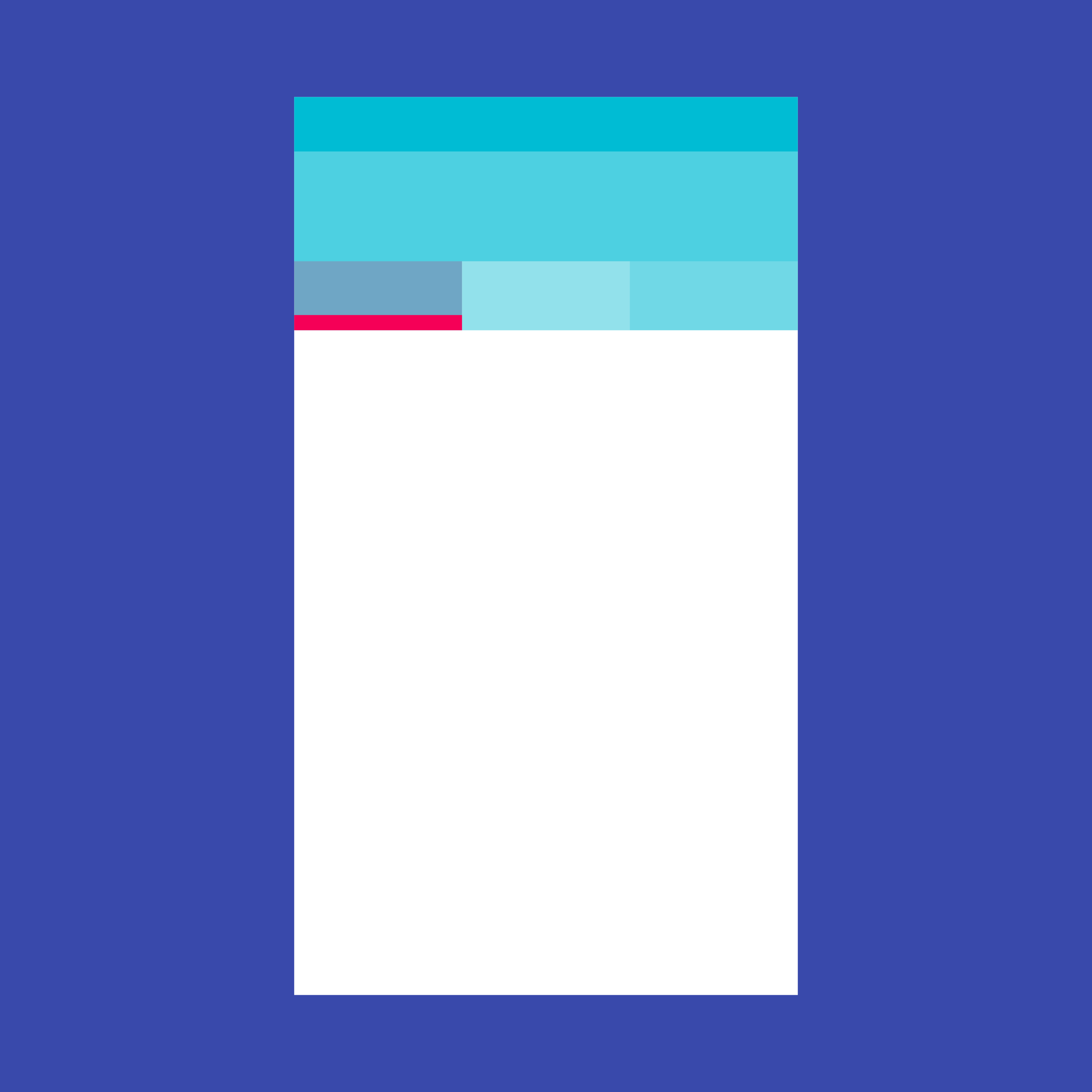
A tab provides the affordance for displaying grouped content. A tab label succinctly describes the tab’s associated grouping of content.
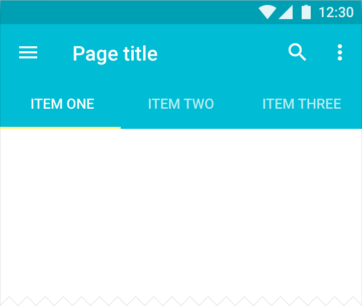
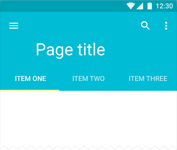
Mobile tabs
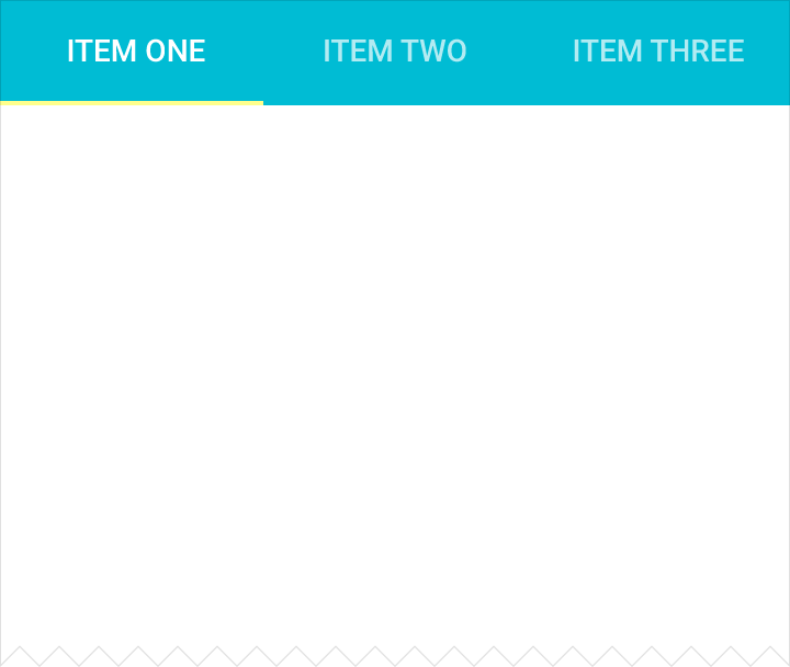
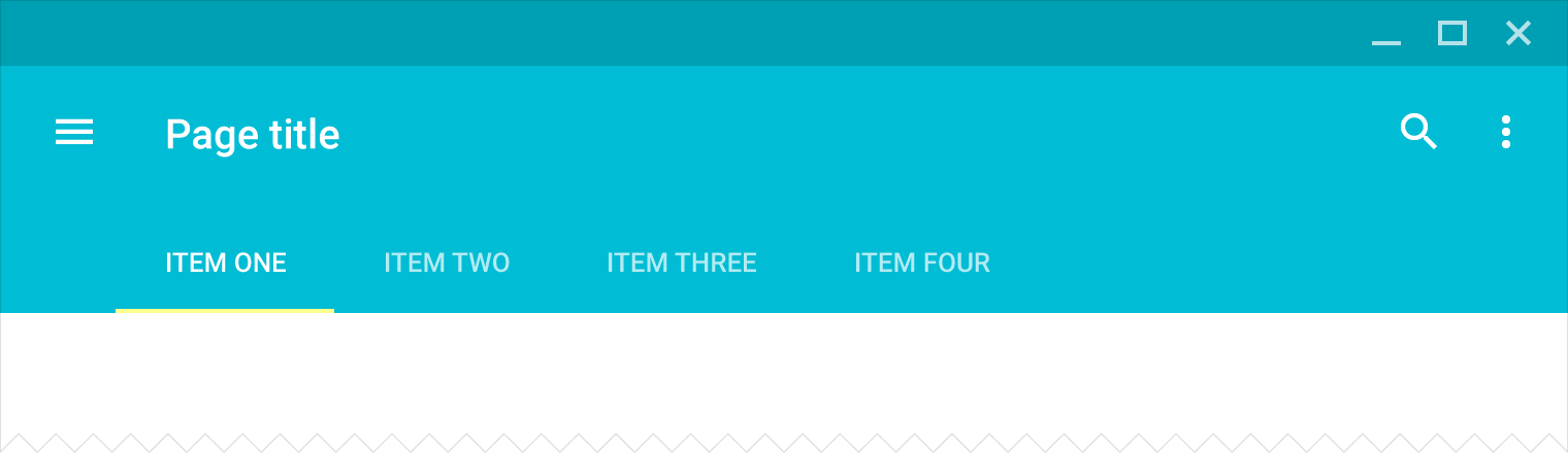
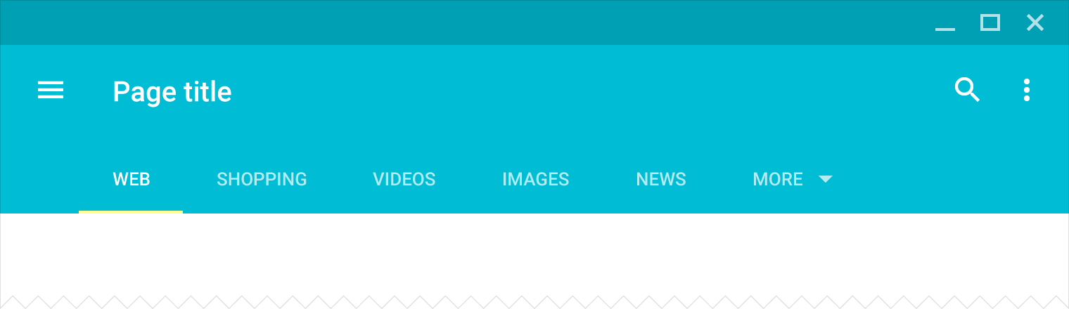
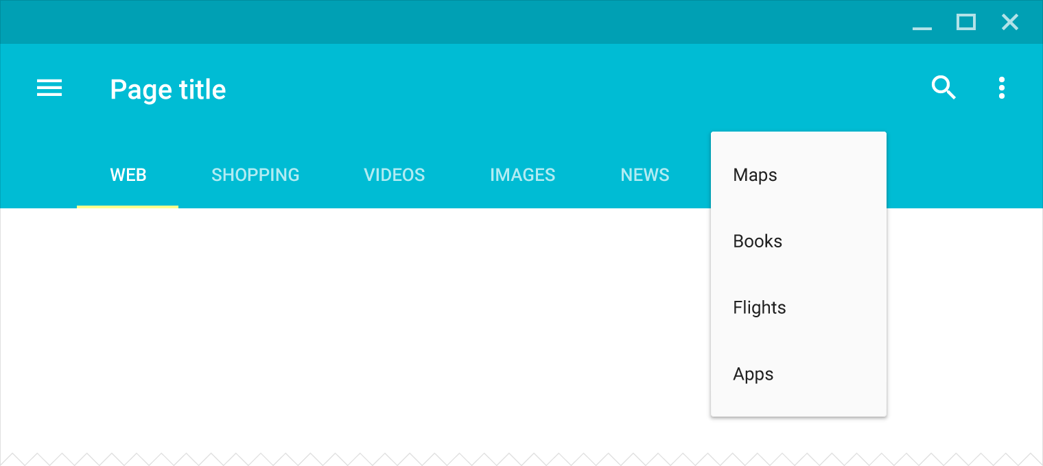
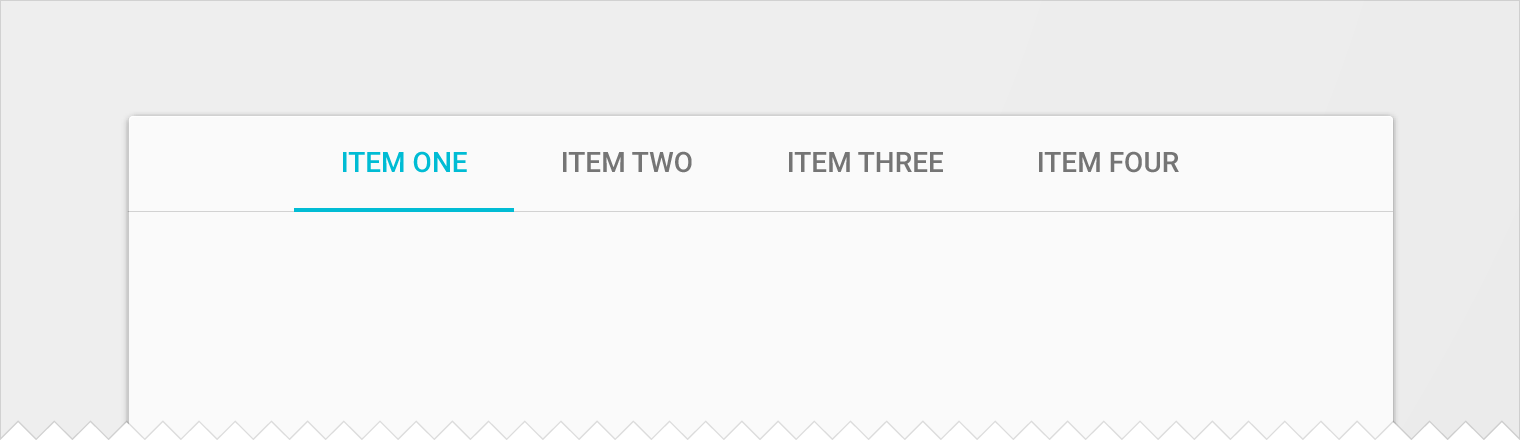
Desktop tabs
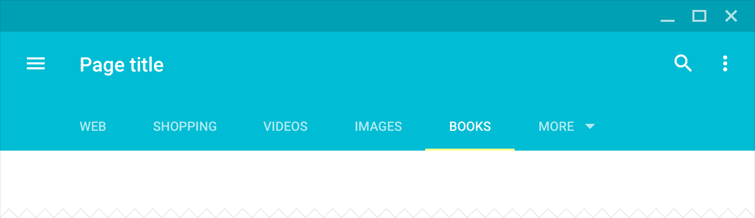
When to use
Use tabs to organize content at a high level, for example, to present different sections of a newspaper. Don’t use tabs for carousels or pagination of content. Those use cases involve viewing content, not navigating between groups of content.
For more detail about using tabs for navigating top-level views, see “Tabs” in Navigation - Patterns.
Don't use tabs with content that supports the swipe gesture, because swipe gestures are used for navigating between tabs. For example, avoid using tabs in a map where content is pannable, or a list where items can be dismissed with a swipe.
Fixed tabs should be used with a limited number of tabs and when consistent placement will aid muscle memory. Scrollable tabs should be used when there are many or a variable number of tabs.
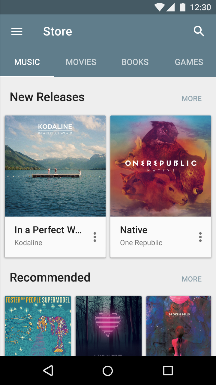
Do.
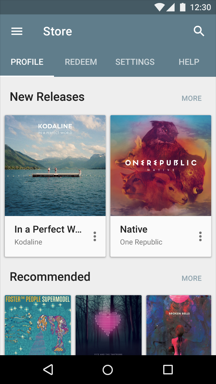
Don’t.
Tab characteristics
Tabs control the display of content in a consistent location.
Formatting specifications:
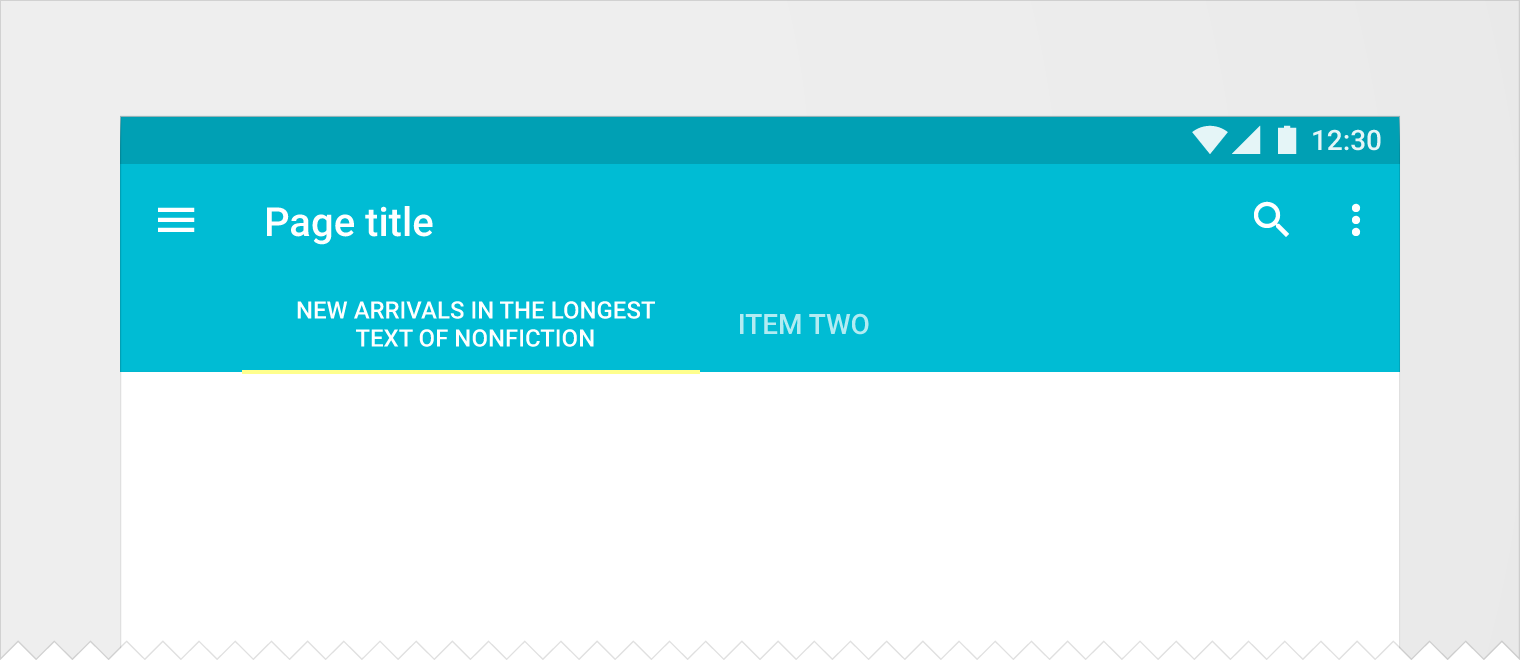
- Present tabs as a single row. Wrap tab labels to a second line if needed, and then truncate.
- Do not include a set of tabbed content within a tab
- Highlight the tab corresponding to the visible content
- Group tabs together hierarchically. Connect a group of tabs with its content.
- Keep tabs adjacent to their content to maintain the relationship between the two
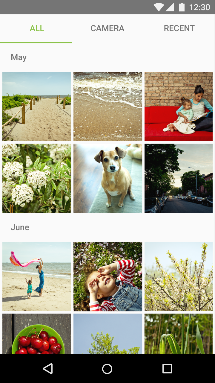
Do.
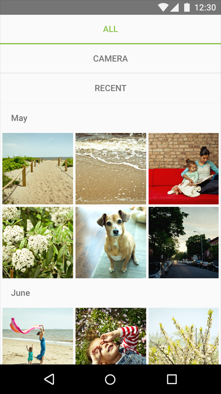
Don’t.
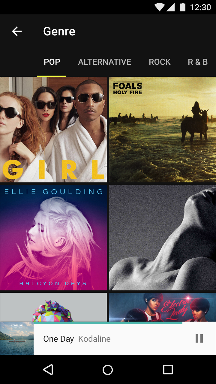
Do.
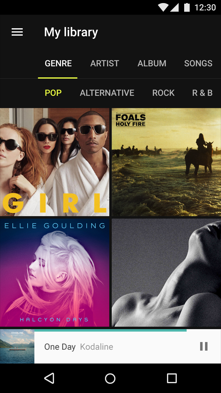
Don’t.
Content
Content presented in tabs can vary widely, even between tabs. For example, tabs showing different years of an artist’s portfolio or tabs containing different types of settings.
All content within a set of tabs should be related under a larger organizing principle (for example, Settings or Directions), with each tab’s content mutually exclusive of the others'.
Tab labels should provide meaningful distinctions that logically organize associated content.
Tab labels may include icons and text. When choosing a text label, use short titles.
Avoid the need for cross-tab comparison of content. Significant cross-tab comparison may indicate the content would benefit from a different organization or presentation that places the content closer together.

Do.

Don’t.

Don’t.

Don’t.
Types of tabs
Depending on the platform and the context of use, tabbed content can be presented as either fixed tabs or scrollable tabs.
Fixed tabs
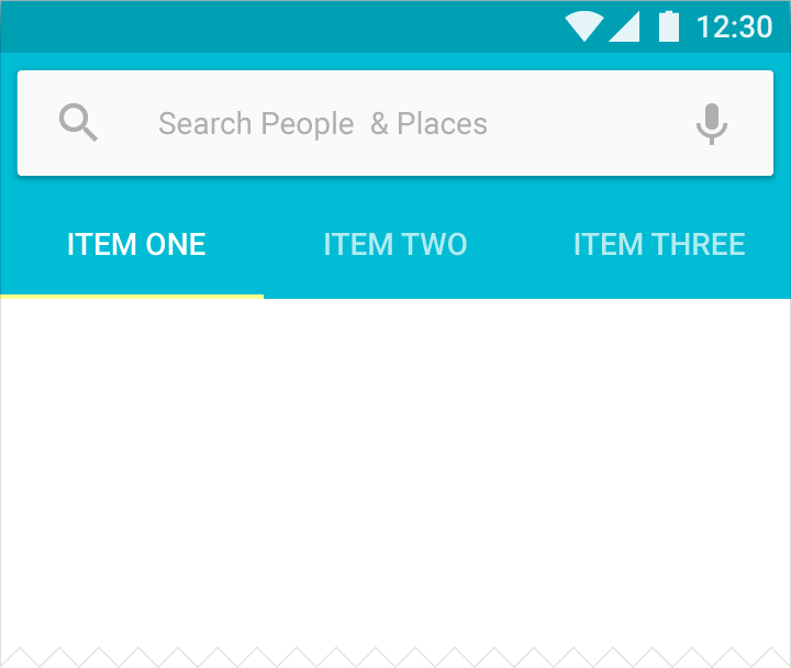
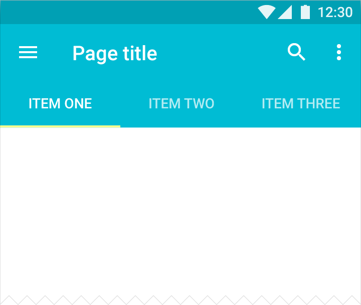
Fixed tabs display all tabs concurrently and are best used with content that benefits from quick pivots between tabs in fixed positions, such as switching transportation methods for directions in Google Maps.
Fixed tabs have equal width, calculated either as the view width divided by the number of tabs, or based on the widest tab label. To navigate between fixed tabs, touch the tab or swipe the content area left or right.
Scrollable tabs
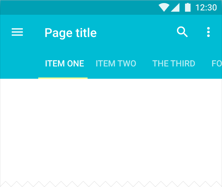
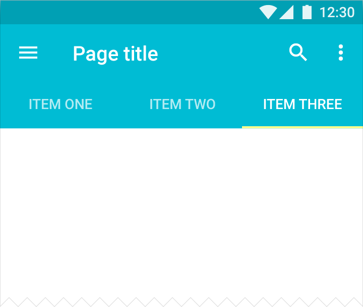
Scrollable tabs display a subset of tabs at any given moment. They can contain longer tab labels and a larger number of tabs than fixed tabs. Scrollable tabs are best used for browsing contexts in touch interfaces when users don’t need to directly compare the tab labels.
To navigate between scrollable tabs, touch the tab or swipe the content area left or right. To scroll the tabs without navigating, swipe the tabs left or right.
Specs
Fixed tabs
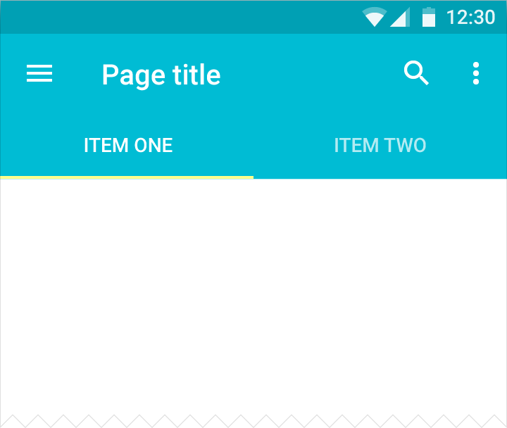
The width of each tab can be calculated by taking the width of the view and dividing it by the number of tabs. Alternatively, make all tabs the width of the largest tab.
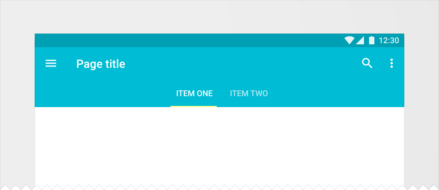
If the margin between the tab edge and view edge is 16dp or less, use full-width tabs instead of centered tabs.
Width minimum and maximum (inclusive of padding)
- Maximum: 264dp
- Minimum: 160dp for larger views, 72dp for smaller views
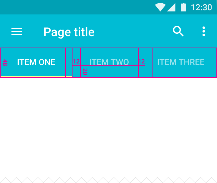
Height
- 48dp
Padding
- 12dp left and right of text
- 20dp from bottom for a single line of text, 12dp from bottom for two lines of text
Alignment
- Full-width for smaller views
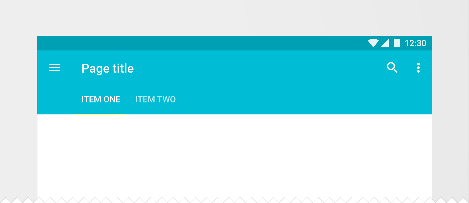
- Centered for larger views
Indicator
- Height: 2dp
- Color: #fff or accent color
Tabs with text only
Text
- 14sp Roboto Medium
- 12sp when wrapped across a maximum of two lines
- All caps
- Horizontally and vertically centered
- Active color: #fff or accent color
- Unfocused tab color: #fff 70%
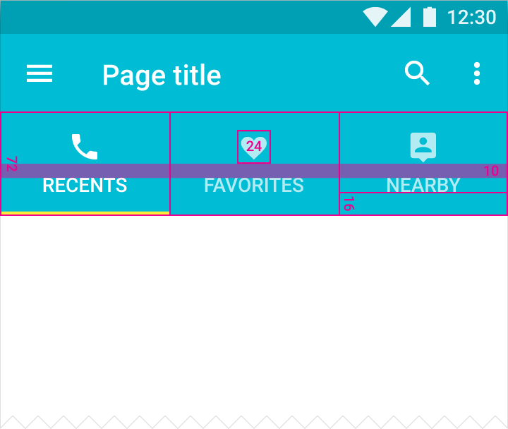
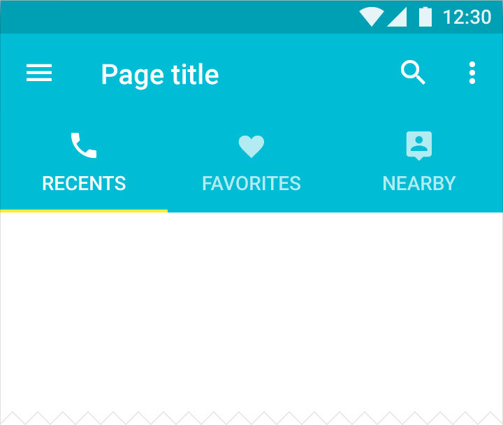
Tabs with icons and text
Height
- 72dp
Icon
- 24 x 24dp
Content alignment
- Text and icon are centered horizontally in the tab
Padding
- 10dp between icon and text
- 16dp under text
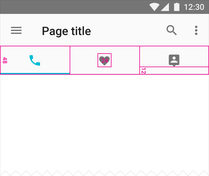
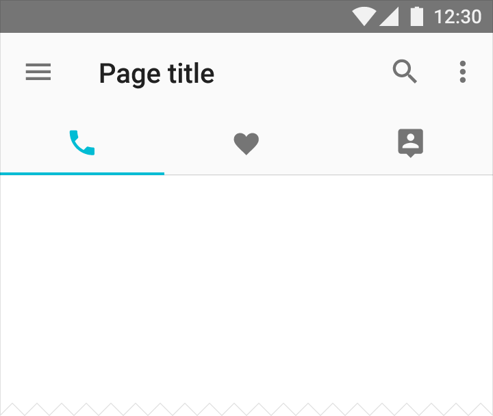
Tabs with icons only
Height
- 48dp
Icon
- 24 x 24dp
Content alignment
- Icon is centered horizontally and vertically in the tab
Padding
- 12dp under icon
Scrollable tabs
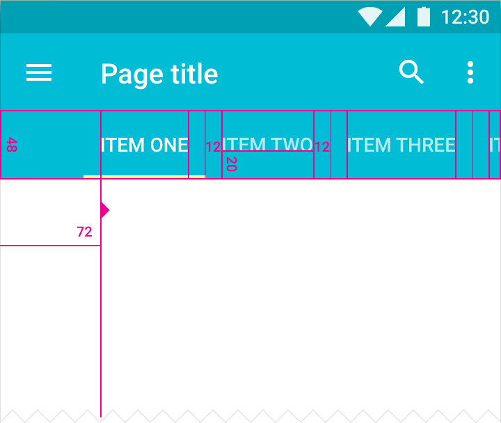
The left-most tab content aligns with the keyline. Alignment varies between landscape and portrait to match the different keylines.
The width of each tab is independently calculated.
Width minimum and maximum (inclusive of padding)
- Maximum (whichever fits and is smaller): 264dp or (the value of view size minus 56dp)
- Minimum: 160dp for larger views, 72dp for smaller views
Height
- 48dp
Padding
- 12dp left and right of text
- 20dp from bottom for a single line of text, 12dp from bottom for two lines of text
Indicator
- Height: 2dp
- Color: #fff or accent color
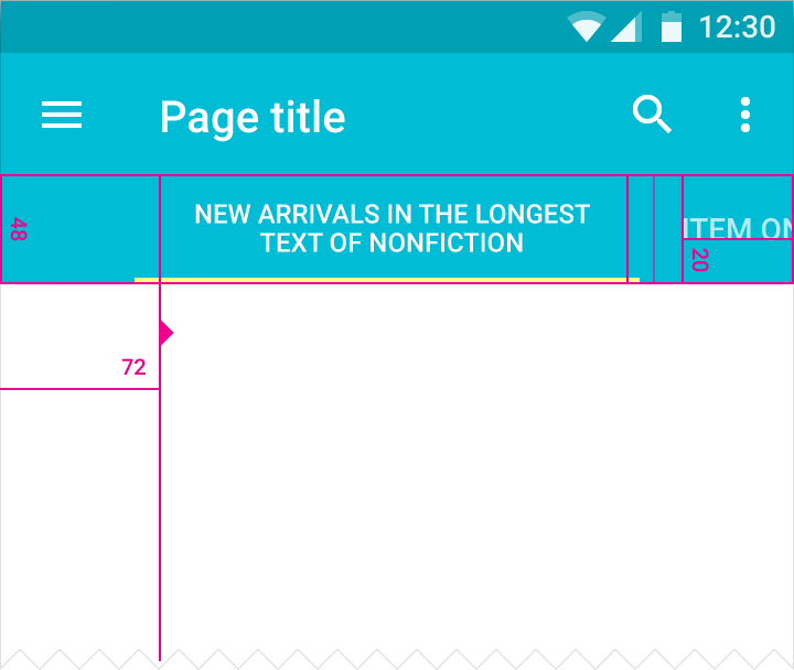
Text
- 14sp Roboto Medium
- 12sp when wrapped across a maximum of two lines
- All caps
- Vertically and horizontally centered
- Active color: #fff or accent color
- Unfocused tab color: #fff 70%
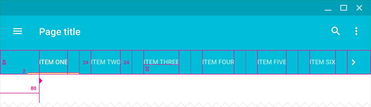
Desktop
Width minimum and maximum (inclusive of padding)
- Maximum (whichever fits and is smaller): 264dp or (the value of view size minus 56dp)
- Minimum: 160dp for larger views, 72dp for smaller views
Height
- 48dp
Alignment
- Centered or aligned with left keyline
Text
- 13sp Roboto Medium
- All caps
- Horizontally and vertically centered
- Wraps across a maximum of two lines
- Active color: #fff or accent color
- Unfocused tab color: #fff 70%
Padding
- 24dp left and right of text
- 20dp from bottom for a single line of text, 12dp from bottom for two lines of text
- First tab text left padding: 80dp
Indicator
- Height: 2dp
- Color: #fff or accent color
Tab touch target animation
Note: Implementations of this component may vary by platform. By using standard platform implementations, you will receive related future improvements.