Navigation drawer
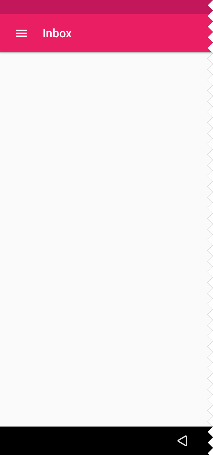
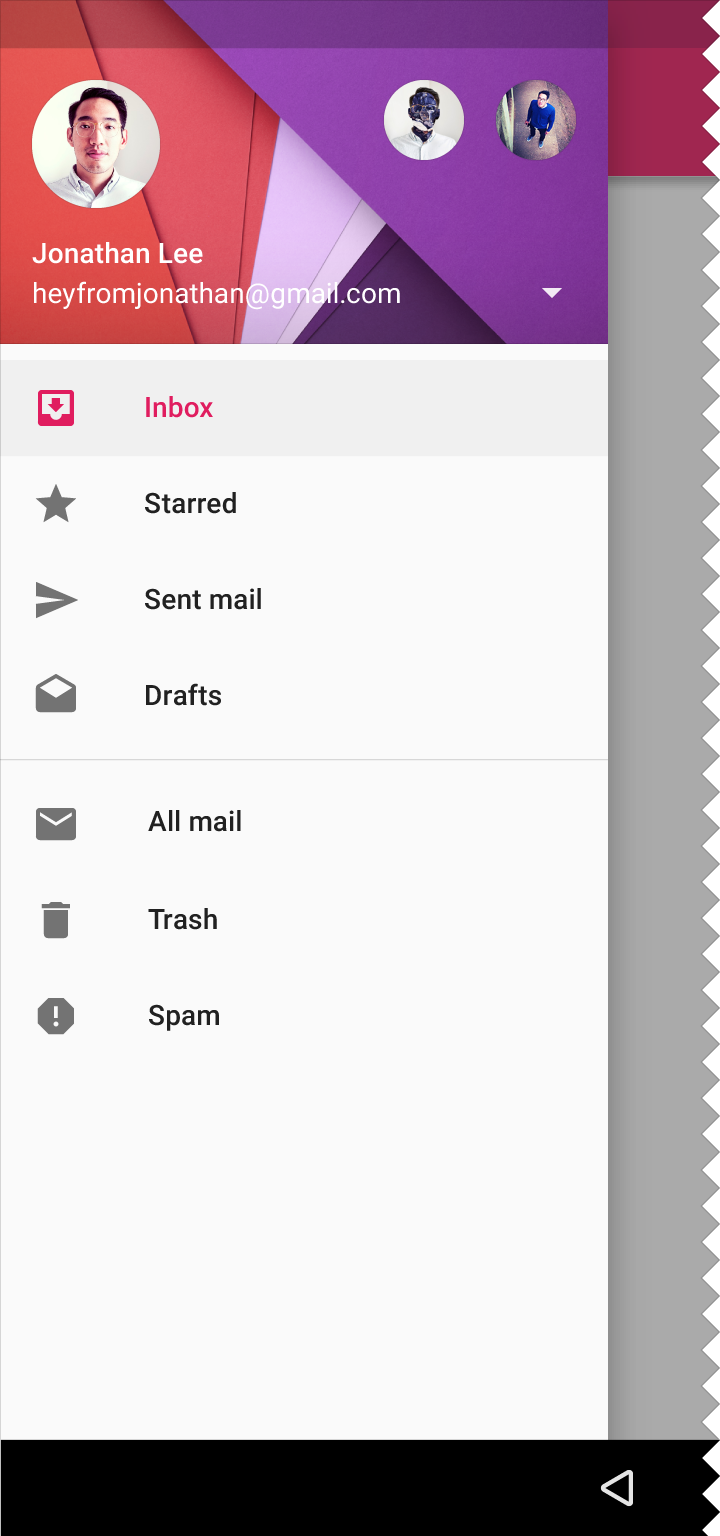
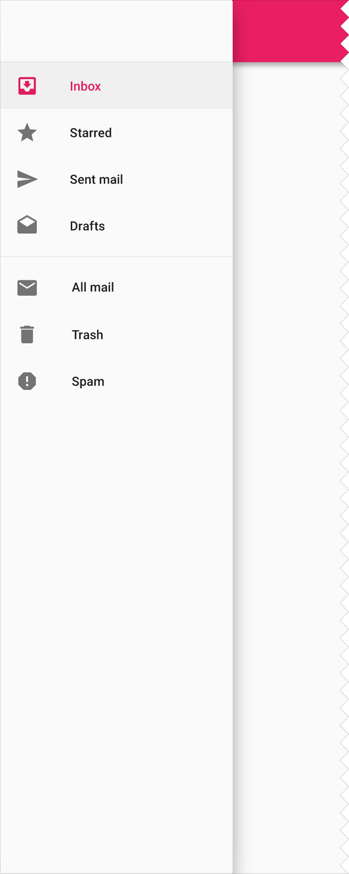
The navigation drawer slides in from the left and contains the navigation destinations for your app.
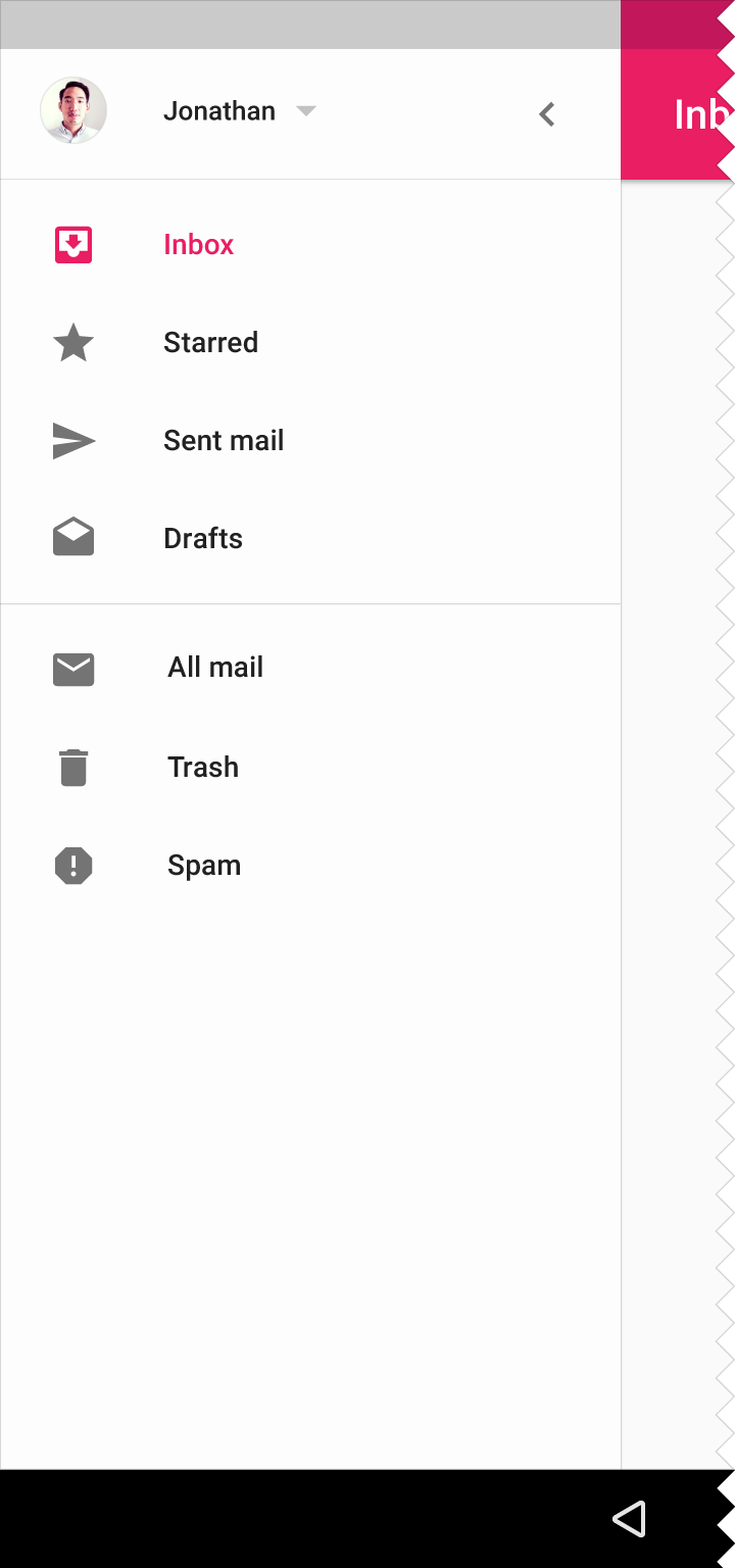
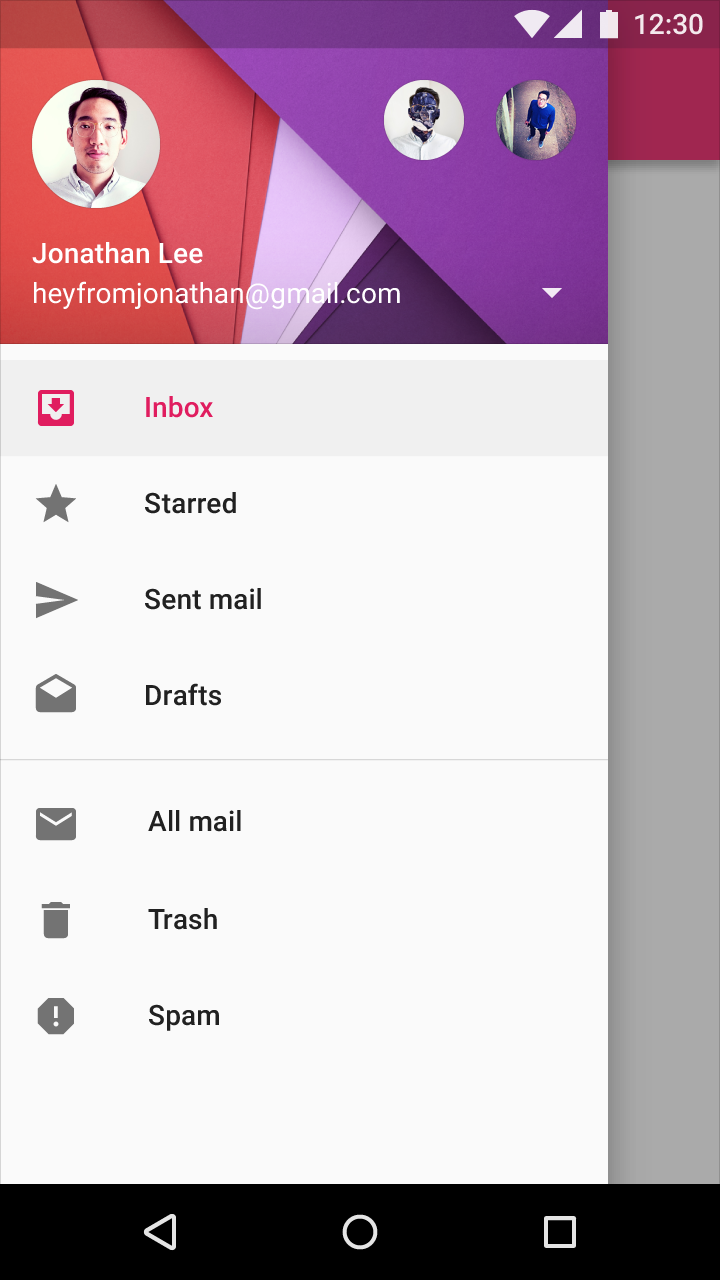
The nav drawer spans the height of the screen, with everything behind it visible but darkened by a scrim.
The navigation drawer follows the keylines and metrics for lists.
Resting elevation
16dp
Navigation drawer types
Permanent
Persistent
Mini variant
Temporary

Specs
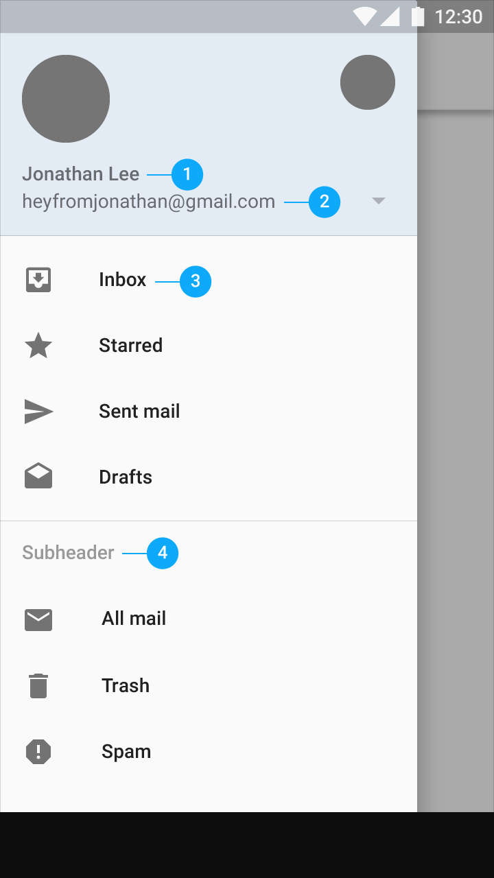
- Name: Roboto Medium, 14sp, #FFFFFF
- Email address: Roboto Regular, 14sp, #FFFFFF
- List item: Roboto Medium, 14sp, 87% #000000
- Subheader: Roboto Medium, 14sp, 54% #000000. It aligns to the 16dp keyline.
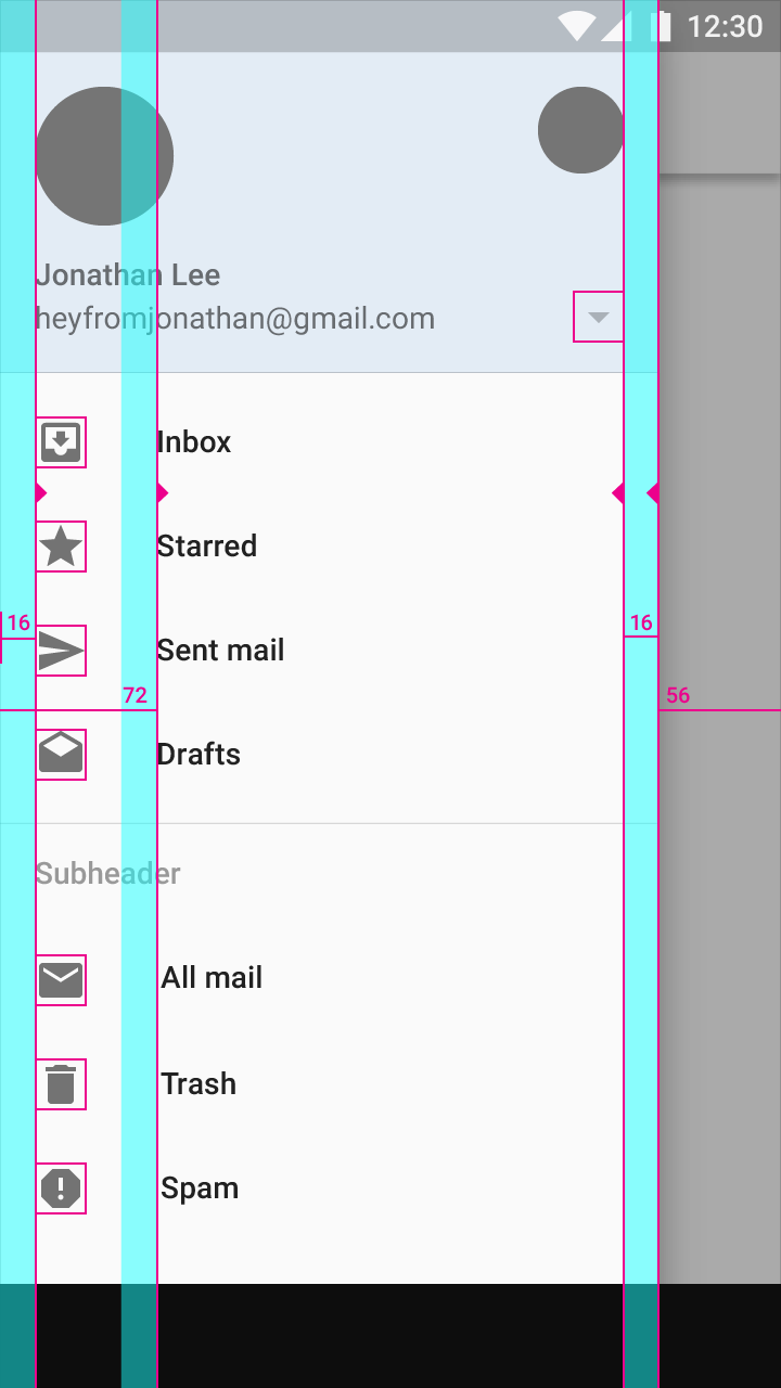
Icons align at screen left and right margins: 16dp
Icon values: 54% #000000
Content associated with an icon or avatar left margin: 72dp
Side nav width: Equal to the screen width minus the height of the action bar. In the example shown above, the nav drawer is 56dp from the right edge of the screen.
Maximum width: The maximum width of the nav drawer is 280dp on mobile and 320dp on tablet. This is calculated by multiplying the standard increment by five (the standard increment is 56dp on mobile and 64dp on tablet).
Use 16dp horizontal margins on mobile and 24dp on tablet
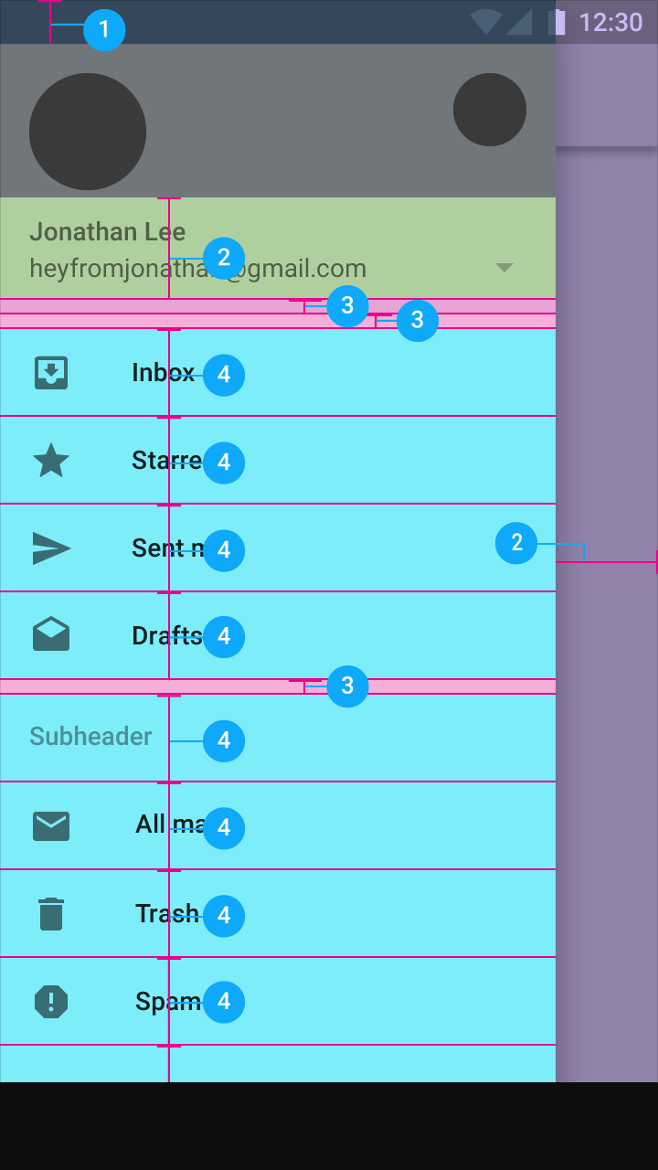
- Status bar: 24dp
- Subtitle: 56dp
- Space between content areas: 8dp
- Subtitles and list items: 48dp
Add 8dp padding at the top and bottom of every list grouping. One exception is at the top of a list with a subheader, because subheaders contain their own padding.
Content
Elevation
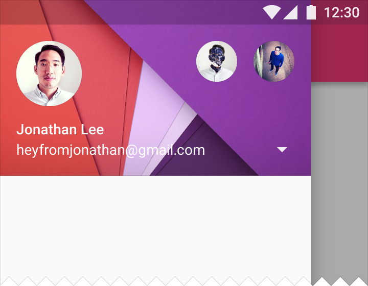
The nav drawer spans the full height of the screen, including behind the status bar, at a resting elevation of 16dp. Everything behind the drawer is still visible but darkened by a scrim.
Selection state
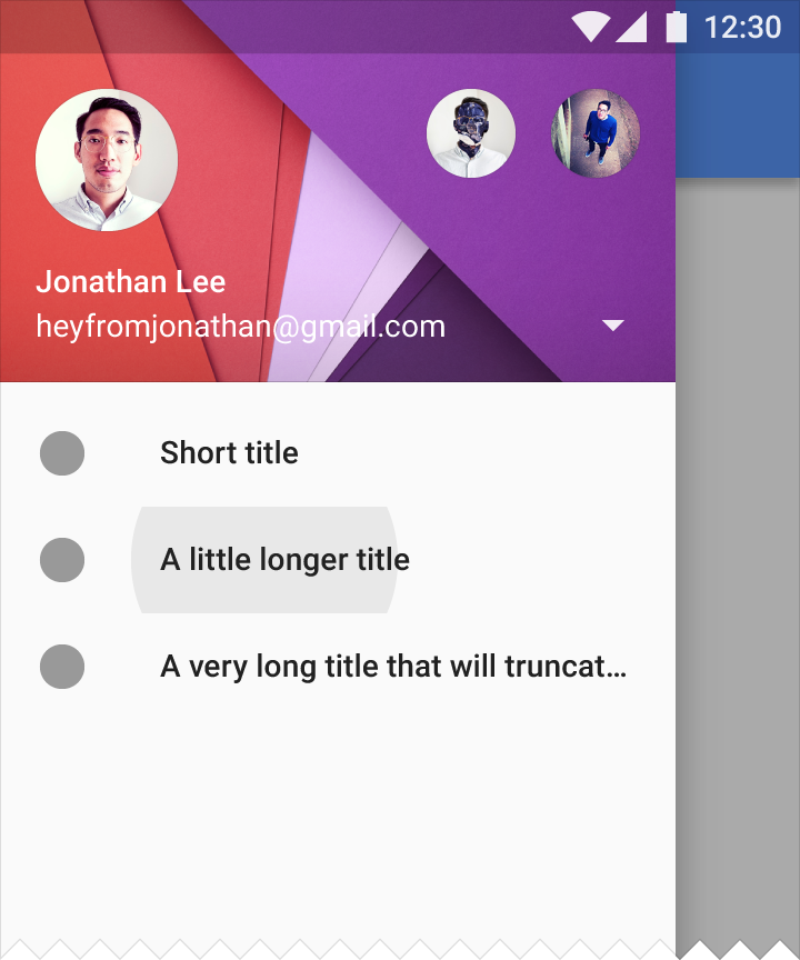
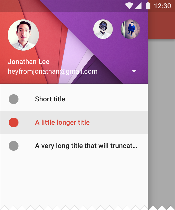
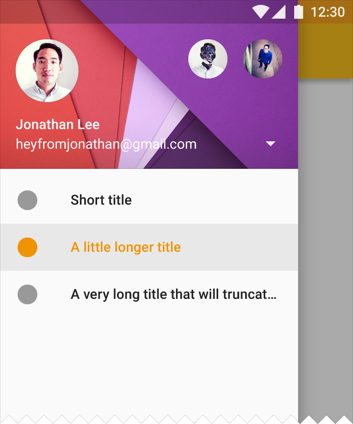
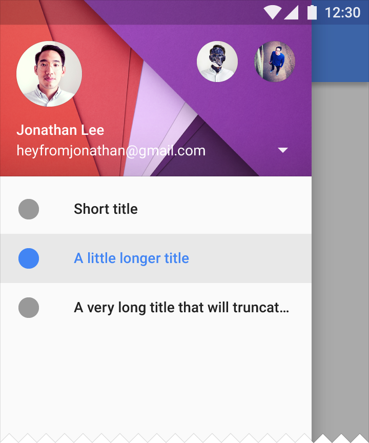
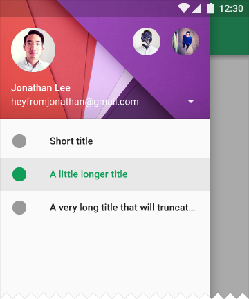
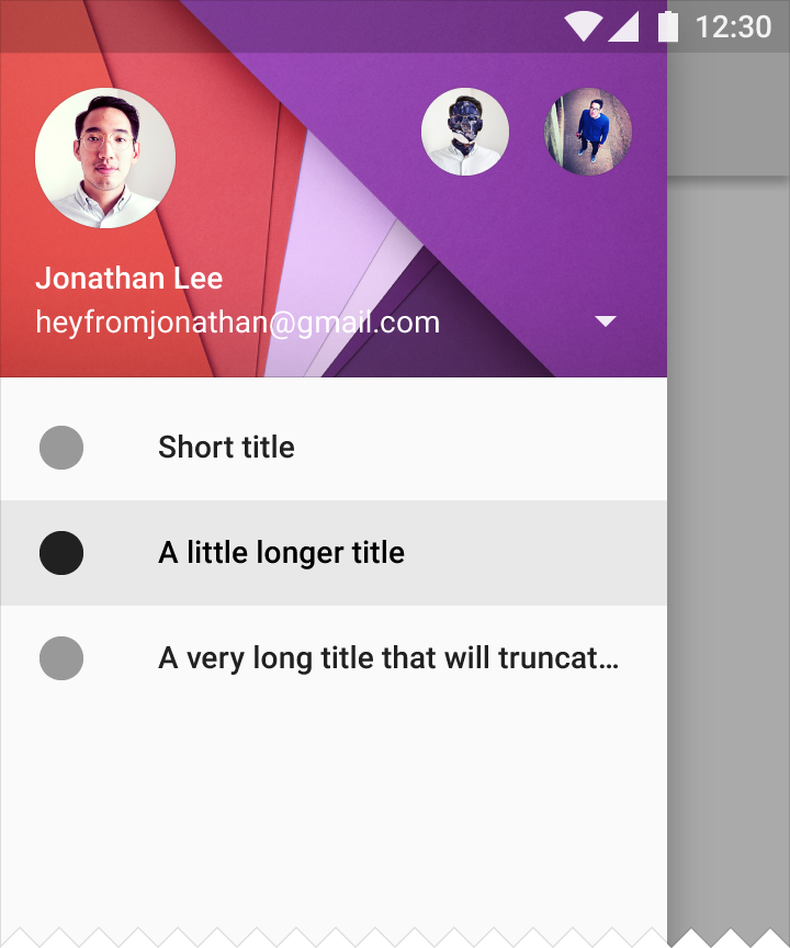
After a list item is selected, that item changes color to match the app’s primary color (or #000000 100%) to indicate selection. Additionally, the touch ripple highlights the row of that list item.
If the color of the touch ripple/highlight doesn’t contrast enough with your primary color, use a darker tint of the primary color.
Dividers
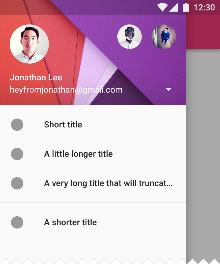
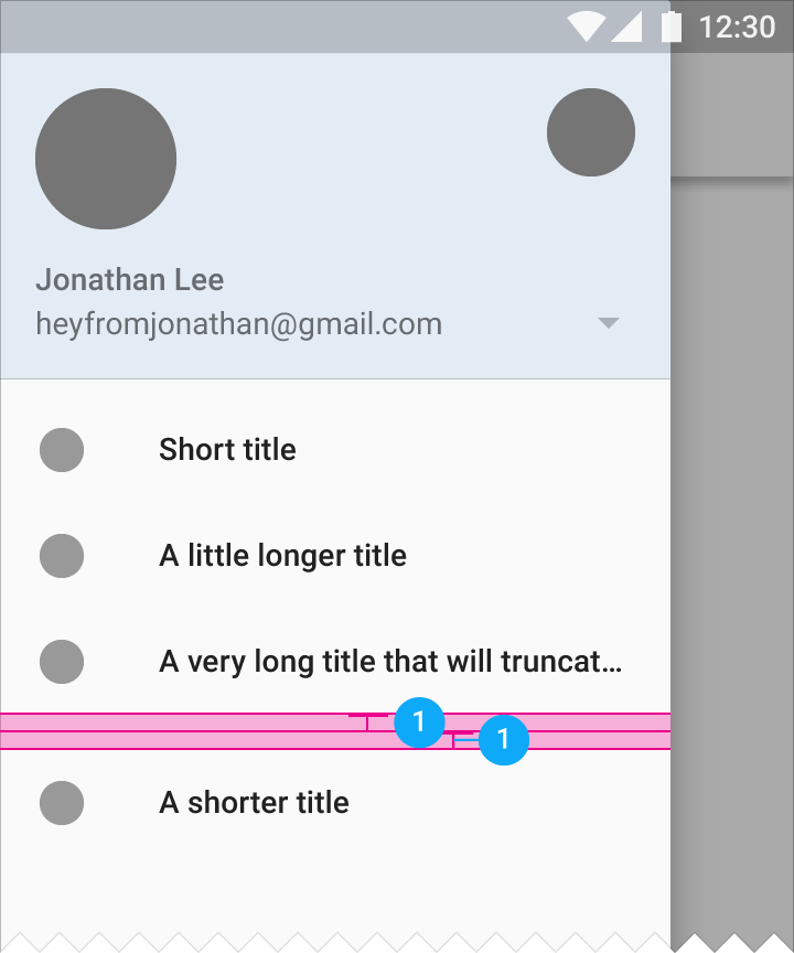
All dividers in the nav drawer are full-bleed within the drawer with 8dp padding above and below each divider.
Scrolling
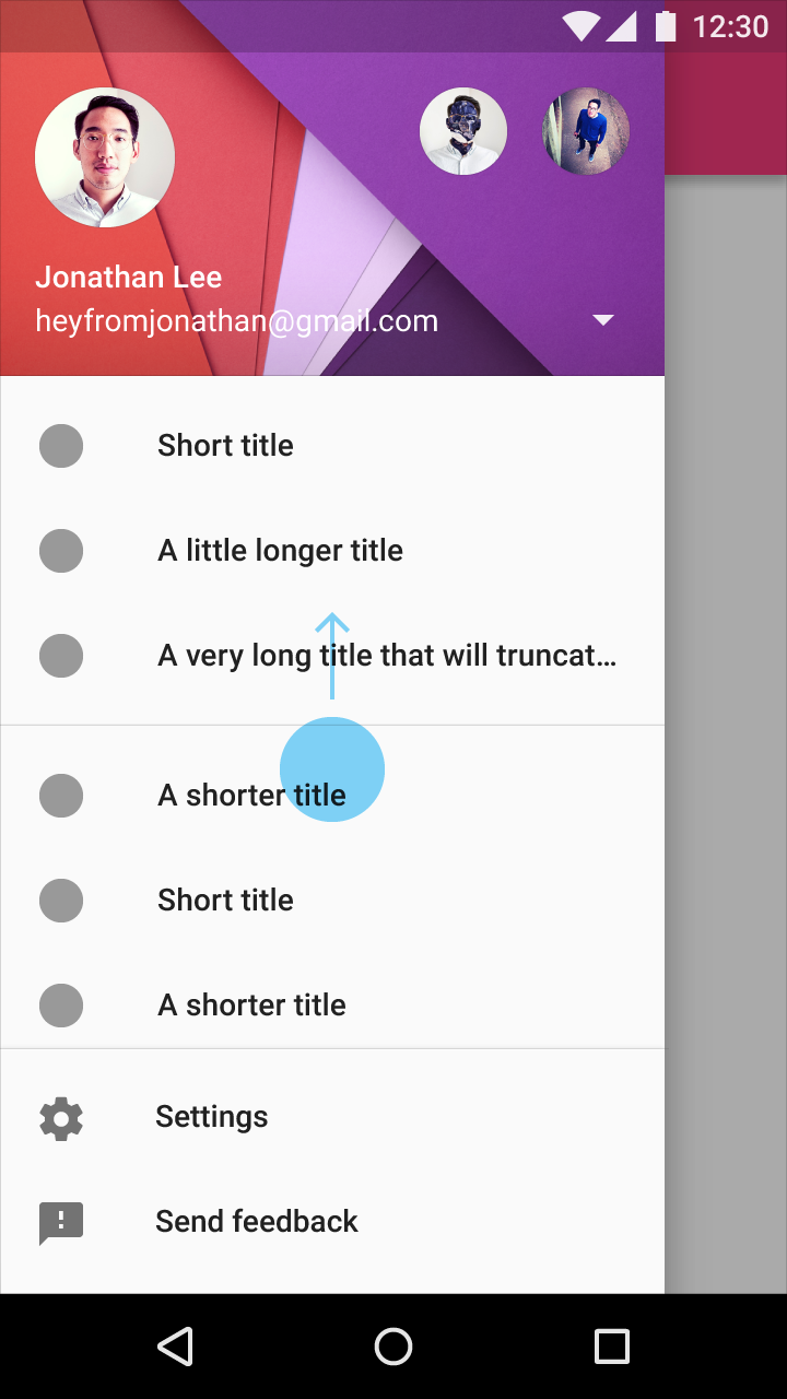
The navigation drawer scrolls in the same way a view scrolls.
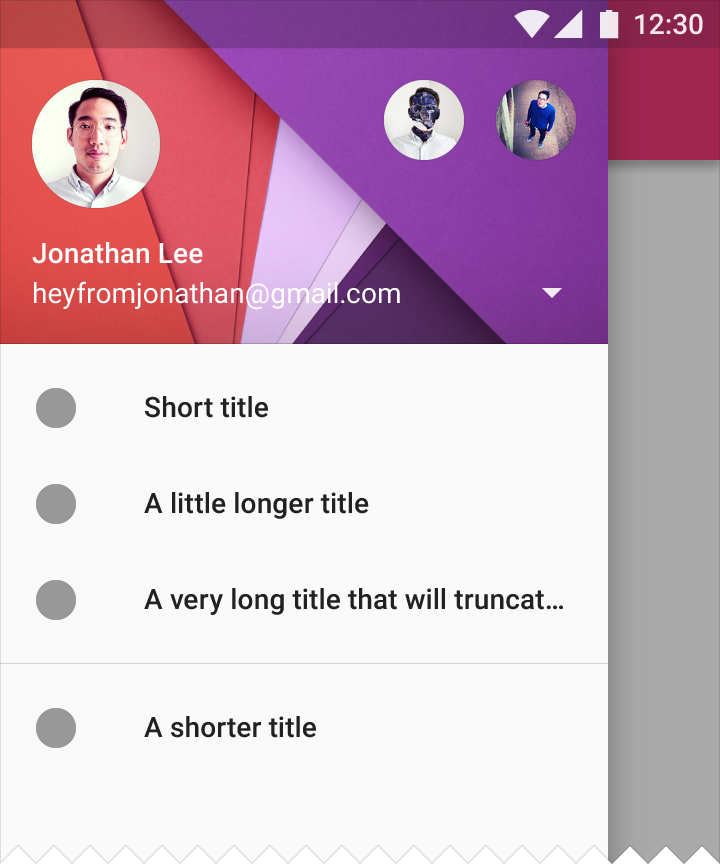
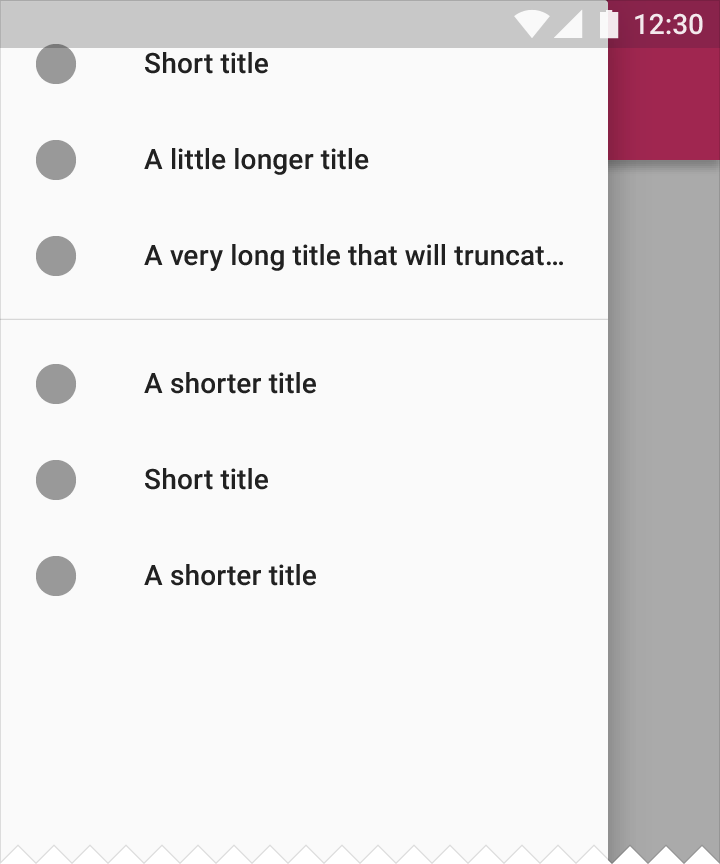
Settings and support
Settings and support are located at the bottom of the scrolling list, inline with the rest of the list content. They refer to Help, Feedback, or Help & feedback, depending on what your product offers.
Behavior
Permanent
Recommended default for desktop
Permanent navigation drawers are always visible and pinned to the left edge, at the same elevation as the content or background. They cannot be closed.
The threshold for pinning is calculated using these minimum values:
1. Side nav width
2. Content width
3. Content padding
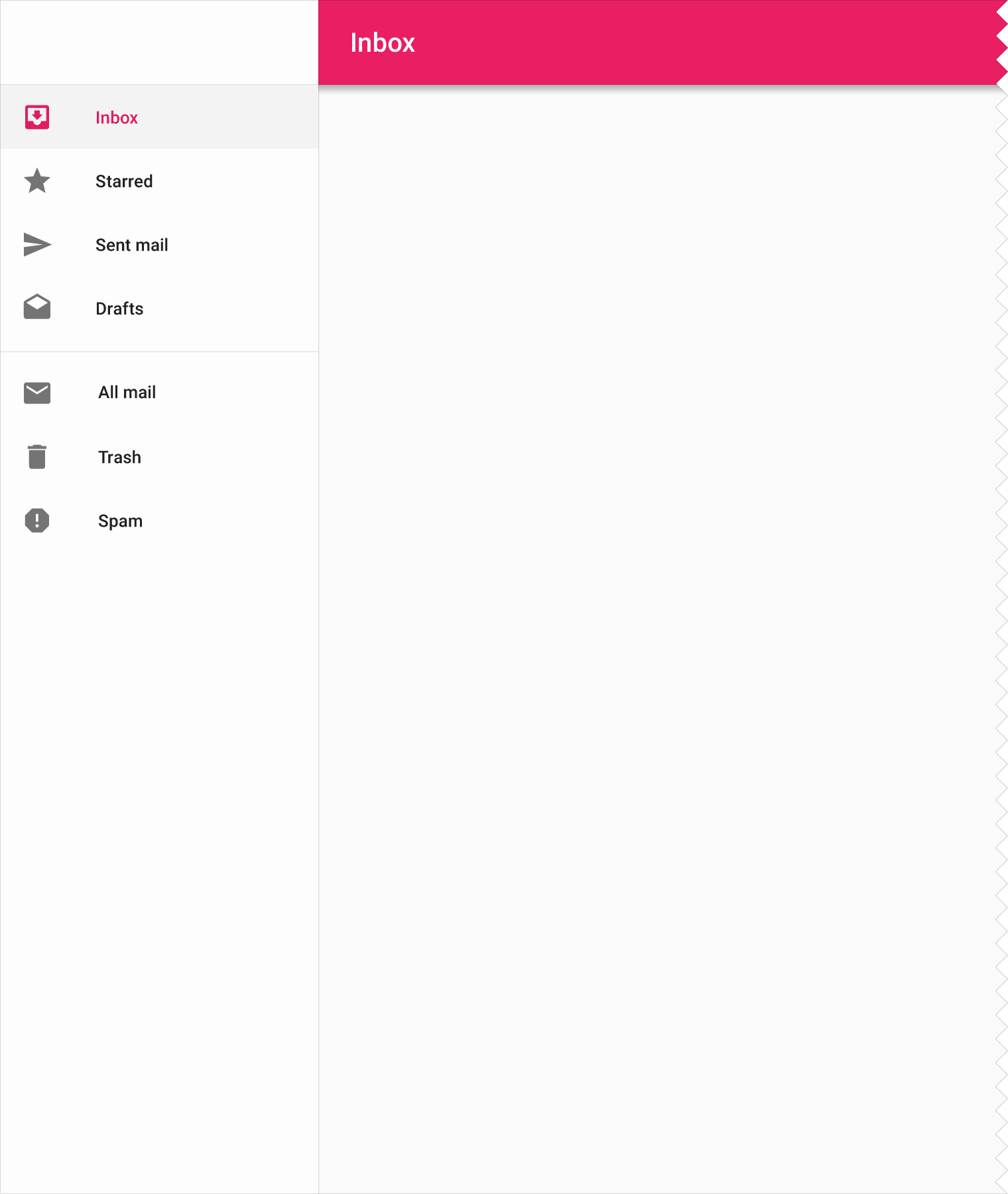
Types of permanent navigation drawers
The structure and behavior of the overall interface determines which type of permanent navigation drawer to use:
- Full-height navigation drawer: Apps focused on information consumption that use a left-to-right hierarchy
- Navigation drawer clipped under the app bar: Apps focused on productivity that require balance across the screen
- Floating navigation drawer: Apps that require less hierarchy
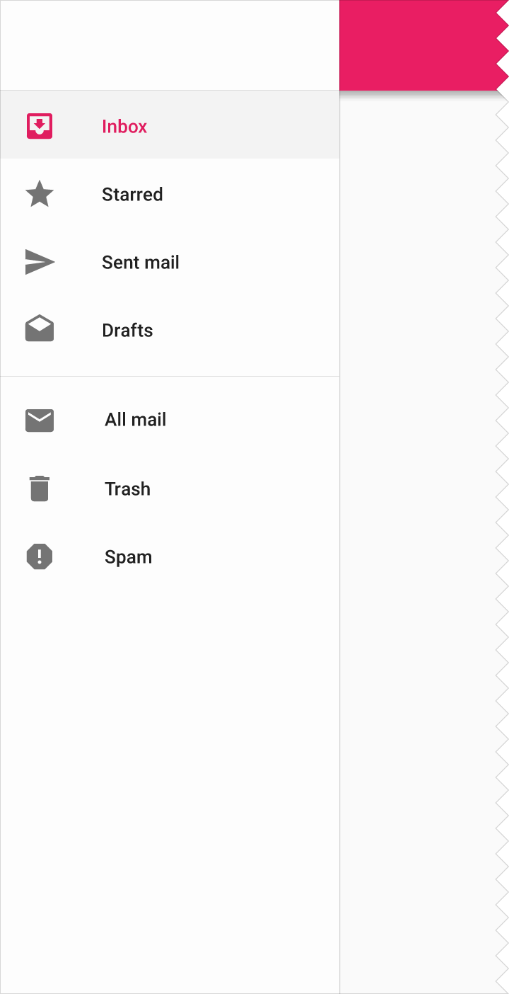
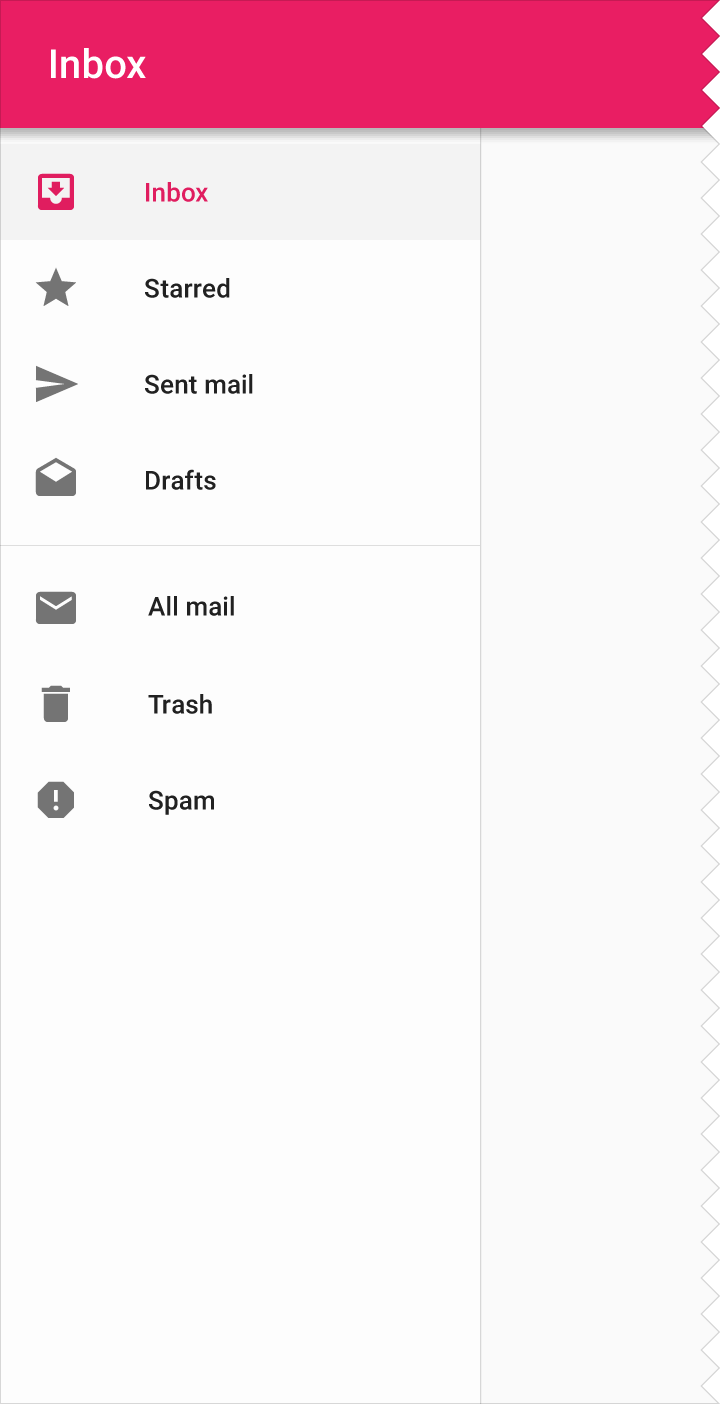
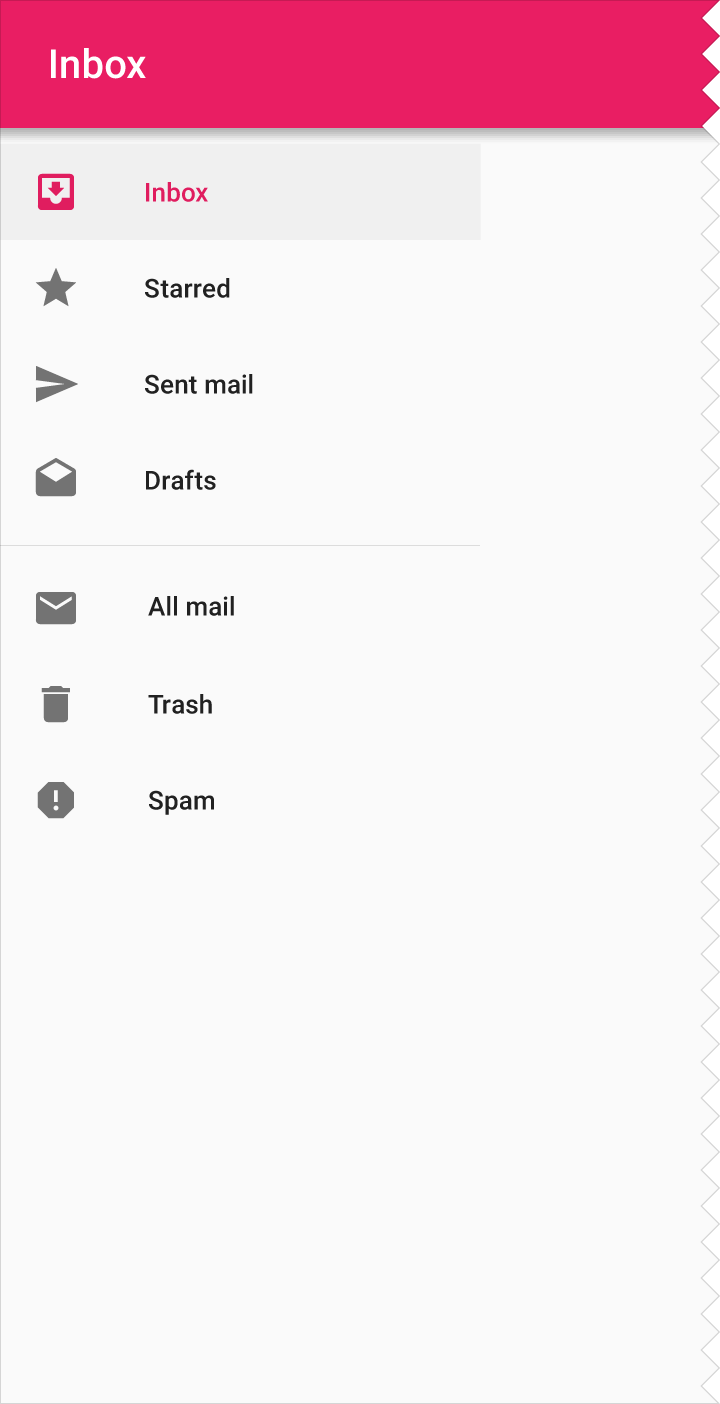
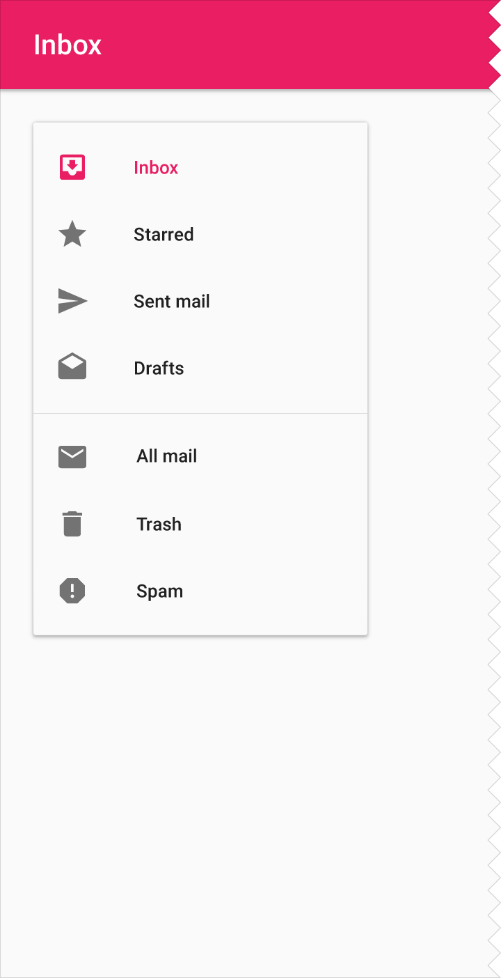
Persistent
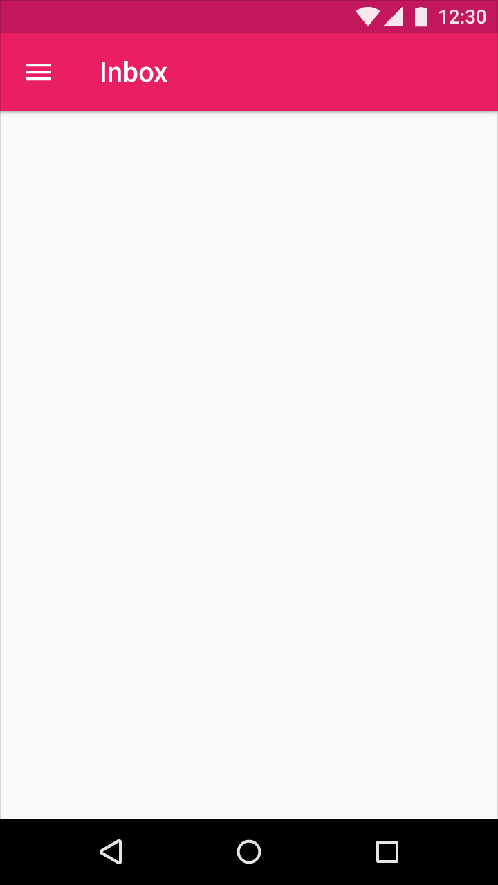
Persistent navigation drawers can toggle open or closed. The drawer sits on the same surface elevation as the content. It is closed by default and opens by selecting the menu icon, and stays open until closed by the user. The state of the drawer is remembered from action to action and session to session.
When the drawer is outside of the page grid and opens, the drawer forces other content to change size and adapt to the smaller viewport.
Persistent navigation drawers are acceptable for all sizes larger than mobile.
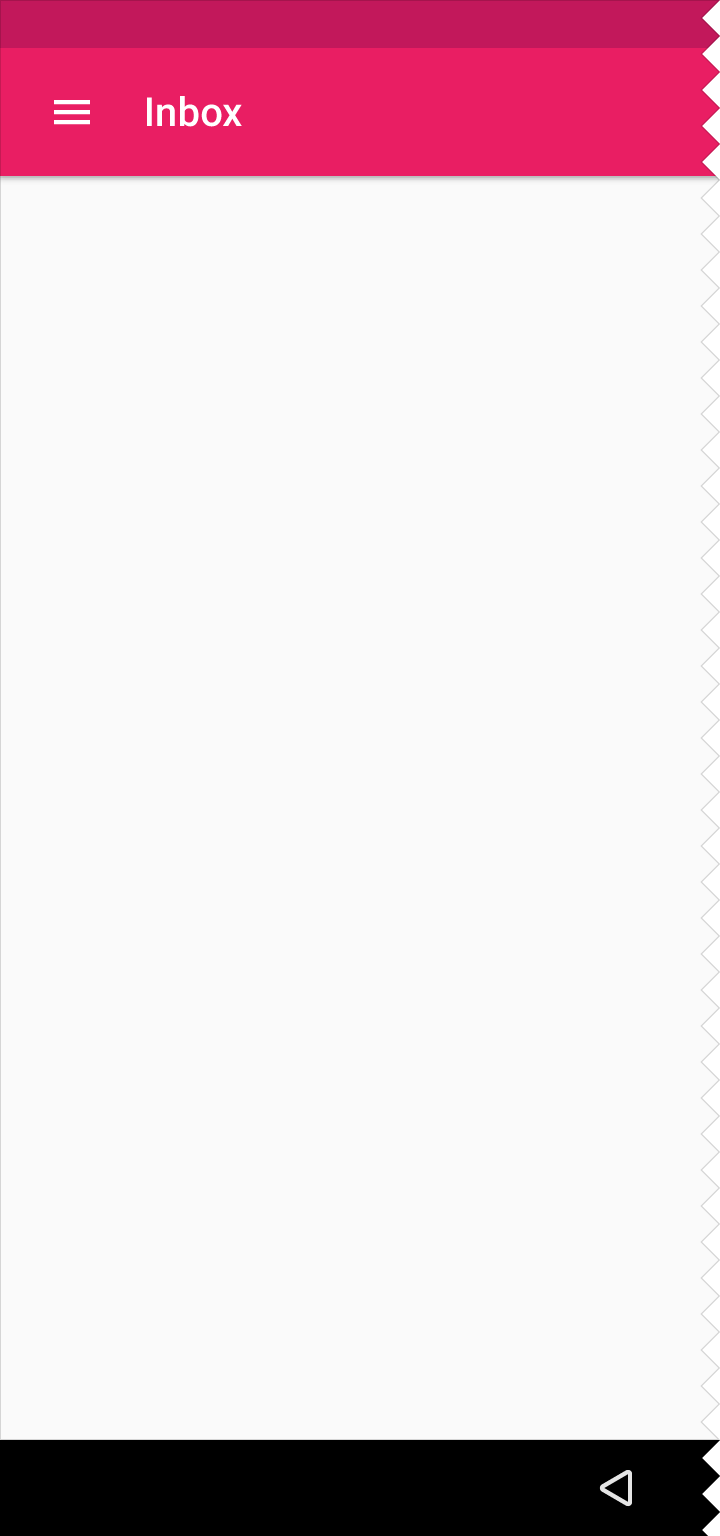
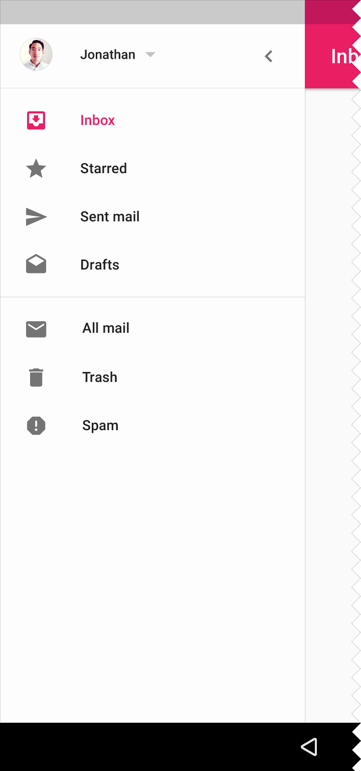
Persistent navigation drawers are not recommended for apps with multiple levels of hierarchy that require using an up arrow for navigation.
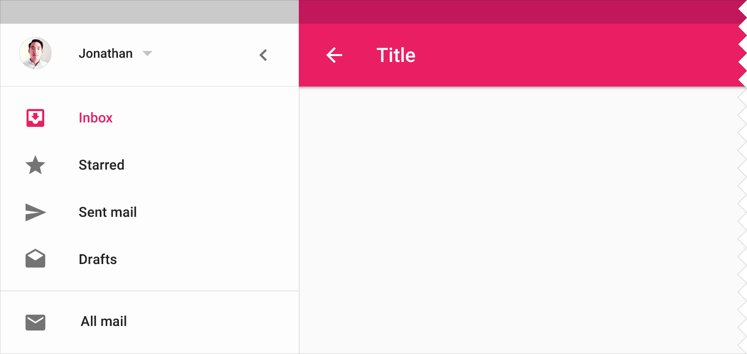
Don't.
Mini variant
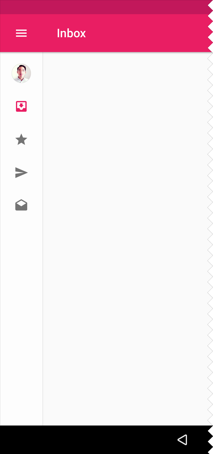
In this variation, the persistent navigation drawer changes its width. Its resting state is as a mini-drawer at the same elevation as the content, clipped by the app bar. When expanded, it appears as the standard persistent navigation drawer.
Recommended for:
Apps with sections that need quick selection access alongside content
Temporary
Temporary navigation drawers can toggle open or closed. Closed by default, the drawer opens temporarily above all other content until a section is selected.
Recommended for:
Tablet
Required for:
Mobile
The mini variant is also an acceptable closed state for a temporary navigation drawer.