Skip to content
Material Design 1
Main Navigation
v3
v2
v1

English

简体中文
繁體中文
Español
Français
Русский
Português – Brasil
Deutsch
日本語
한국어
Italiano
Polski
Türkçe
čeština
magyar

English

简体中文
繁體中文
Español
Français
Русский
Português – Brasil
Deutsch
日本語
한국어
Italiano
Polski
Türkçe
čeština
magyar

Appearance

Sidebar Navigation

Material Design

Environment

Material properties

Elevation & shadows

What's new

Motion

Material motion

Duration & easing

Movement

Transforming material

Choreography

Creative customization

Style

Color

Icons

Imagery

Typography

Writing

Layout

Principles

Units & measurements

Metrics & keylines

Structure

Responsive UI

Split screen

Components

Bottom navigation

Bottom sheets

Buttons

Buttons: Floating Action Button

Cards

Chips

Data tables

Dialogs

Dividers

Expansion panels

Grid lists

Lists

Lists: Controls

Menus

Pickers

Progress & activity

Selection controls

Sliders

Snackbars & toasts

Steppers

Subheaders

Tabs

Text fields

Toolbars

Tooltips

Widgets

Patterns

Confirmation & acknowledgement

Data formats

Empty states

Errors

Fingerprint

Gestures

Help & feedback

Launch screens

Loading images

Navigation

Navigation drawer

Navigational transitions

Notifications

Offline states

Permissions

Scrolling techniques

Search

Selection

Settings

Swipe to refresh

Growth & communications

Introduction

Onboarding

Feature discovery

Gesture education

Usability

Accessibility

Bidirectionality

Platforms

Platform adaptation

Android

Resources

Color palettes

Devices

Layout templates

Roboto & Noto fonts

Sticker sheets & icons

Shadows

On this page

Empty states ​

Empty states occur when an item’s content can’t be shown.

A list that doesn’t contain any items, or a search that doesn’t display any results, are examples of empty states. Although these states aren’t typical, they should be designed to prevent user confusion.

For content that cannot be displayed because of a system failure, see app errors.

Alternatives to empty states

Starter content
Educational content
Best match


Content for empty states

Text tagline
Non-interactive image

Empty states in Material Design show no item content

Displaying empty states ​

The most basic empty state displays a non-interactive image and a text tagline.

Use an image that:

  • Is subtle and neutral with respect to the background
  • Conveys the purpose and potential of the app in a lively way, such as your app's icon

Include a tagline that:

  • Has a positive tone
  • Is consistent with your brand
  • Conveys the purpose of the app without appearing to be actionable
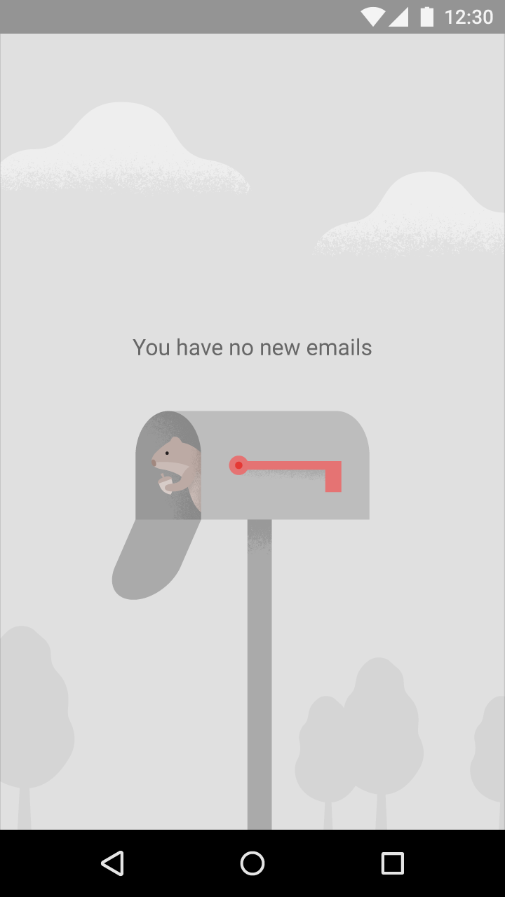
Neutral background image related to Material Design app purpose

Do.

The image is neutral and clearly part of the background. The tagline conveys the purpose of the app without coming across as a call to action.
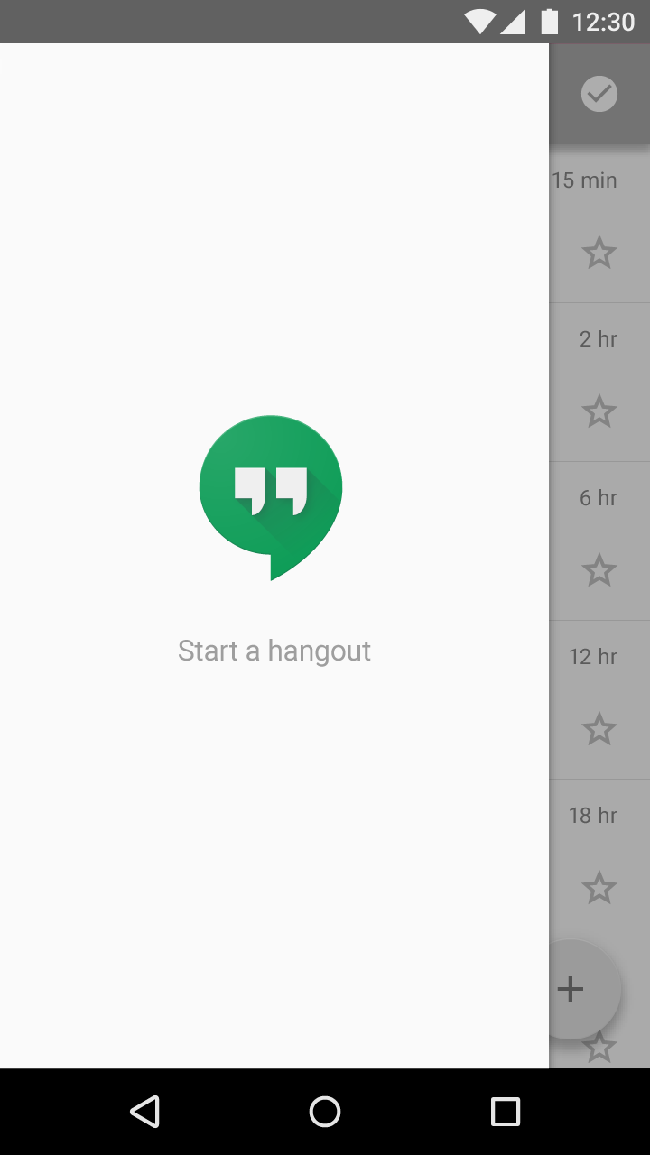
Bright image with a call to action in Material Design

Don’t.

The image is bright and the tagline is worded like a call to action, which may encourage users to touch either the image or the tagline to start a hangout.

Avoiding completely empty states ​

There are several situations in which you can provide users with alternatives to truly empty states.

Starter content

The most compelling way for new users to learn and get excited about your app is by using it. Consider providing starter content that will allow users to explore your app right away.

Recommendations:

  • Use content that has broad appeal and demonstrates primary features
  • Give users the ability to delete and replace this content
  • If possible, provide content that's personalized
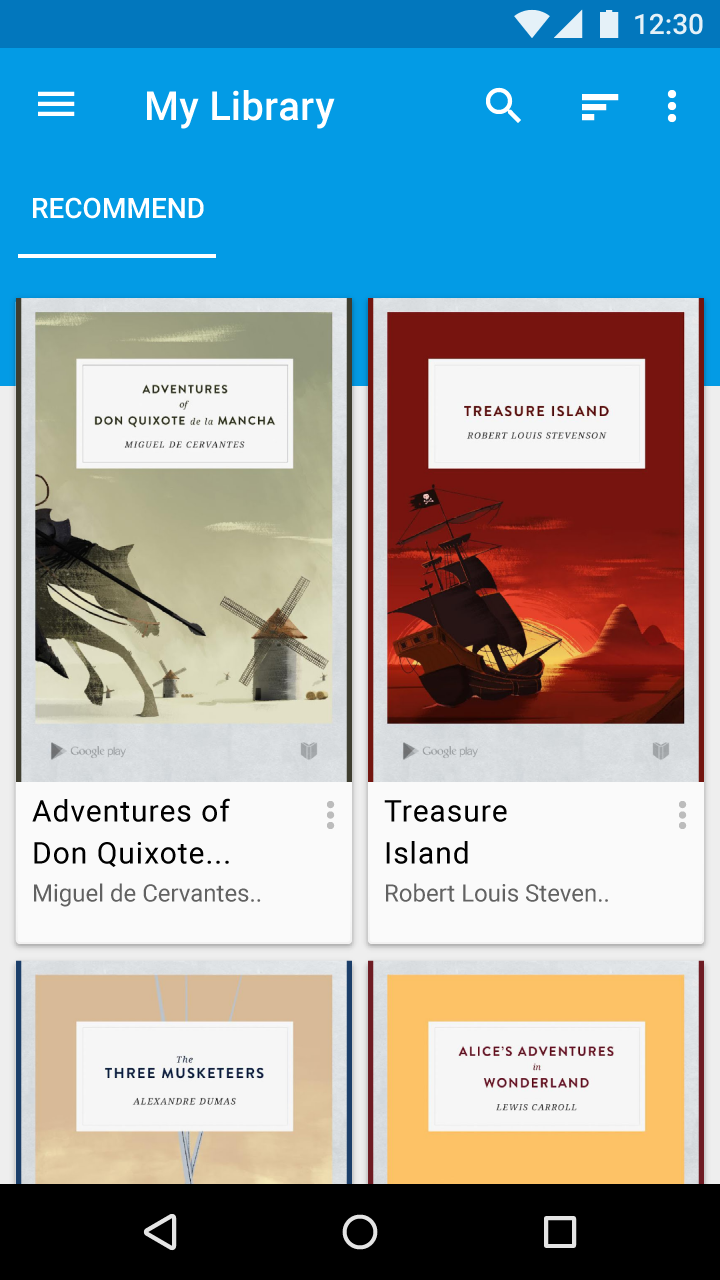
Material Design book app with free popular titles
A book reading app might provide all users with a few free popular books to immediately start exploring the app.

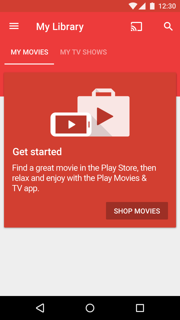
Educational content

If the purpose of the screen isn't easily conveyed through an image and a tagline, consider showing educational content instead.

Recommendations:

  • Help users understand what they'll be able to do on this screen once it has content
  • Make it possible to dismiss or skip this content
  • Keep it brief
Material Design card explaining features before video playback
Before a user watches a video in the movies app, a dismissible card is shown to explain the features and benefits of the service.

Best match

If nothing exactly matches the user's query, are there any results for a query spelled slightly differently? If so, then show the results, as they may help a user find what they're after.

With this approach, clearly convey in a heading above the results that this content shouldn't be mistaken for a match to actual query results.
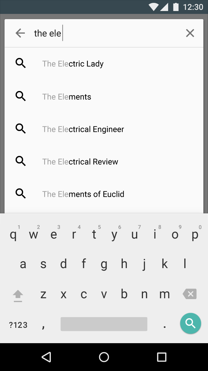
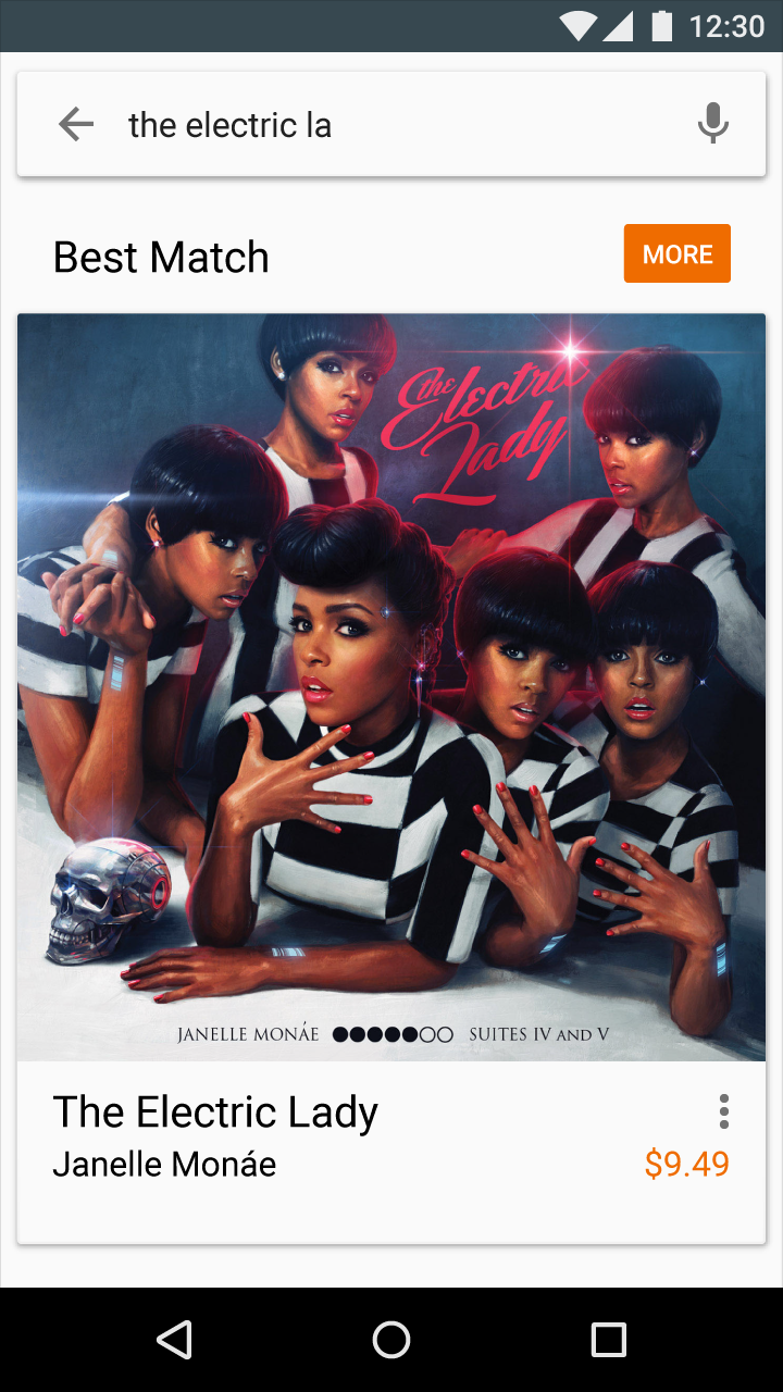
Best matches in Material Design
Example of best matches
Material Design: Best matches for misspelled queries
Offering best matches is a great way to handle a misspelled query without explicitly placing blame on the user.
Pager
Previous pageData formats
Next pageErrors

Released under the Apache-2.0

Copyright © 2014-Present Google

https://m1.material.io/patterns/empty-states.html

Released under the Apache-2.0

Copyright © 2014-Present Google