

Scrolling techniques
Scrolling techniques affect how content scrolls in relation to the app bar.
The following patterns describe the elevations at which content should scroll, how to size flexible space, and when to anchor specific elements.
App bar scrollable regions
Status bar
Toolbar
Tab bar/search bar
Flexible space

App bar scrollable regions
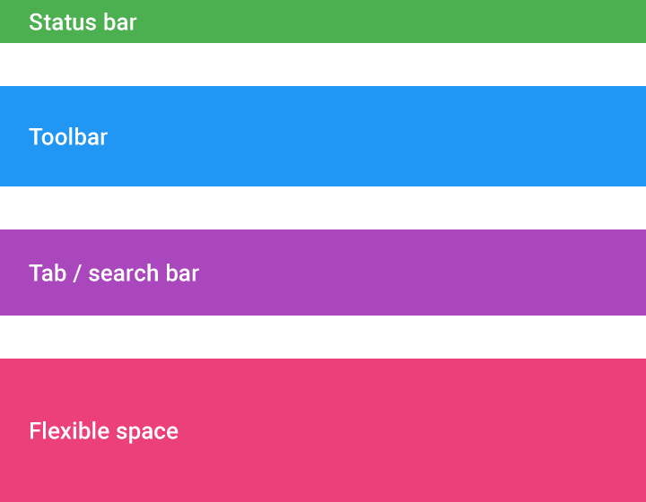
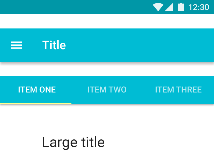
When designing scrolling behavior, app bars contain four main regions (referred to as blocks) that comprise the scrolling structure:
- Status bar
- Tool bar
- Tab bar/search bar
- Flexible space: space to accommodate a desired aspect ratio for images or extended app bars
Behavior
Standard app bar
Specs:
The standard app bar height is 56dp on mobile and 64dp on larger screen sizes.
The app bar has two scrolling options:
- The app bar can scroll off-screen with the content and return when the user reverse scrolls
- The app bar can stay fixed at the top with content scrolling under it
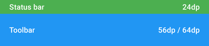
Status bar height: 24dp
Toolbar height: 56dp / 64dp
App bar with tabs
The standard app bar component that can include the following blocks: a toolbar, tab bar, or flexible space.
Tabs may have one of these behaviors:
- The tab bar stays anchored at the top, while the toolbar scrolls off
- The app bar stays anchored at the top, with the content scrolling underneath
- Both the toolbar and tab bar scroll off with content. The tab bar returns on reverse-scroll, and the toolbar returns on complete reverse scroll
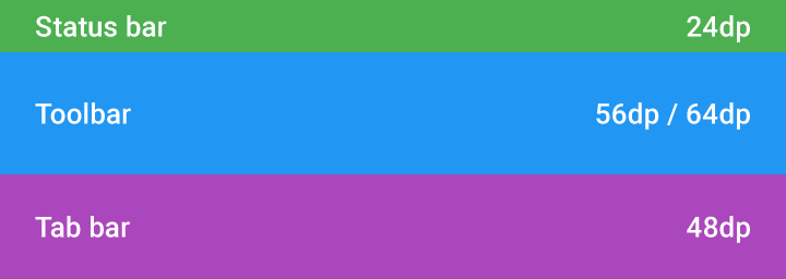
Status bar height: 24dp
Toolbar height: 56dp / 64dp
Tab bar height: 48dp
Flexible space
Because the app bar is flexible, it can be extended to accommodate larger typography or images. To extend the app bar, add a flexible space block.
Flexible space may be displayed one of two ways:
- The flexible space shrinks until only the toolbar remains. The title shrinks to 20sp in the navigation bar. When scrolling to the top of the page, the flexible space and the title grow into place again.
- The whole app bar scrolls off. When the user reverse scrolls, the toolbar returns anchored to the top. When scrolling all the way back, the flexible space and the title grow into place again.
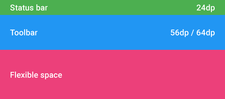
Status bar height: 24dp
Toolbar height: 56dp / 64dp
Flexible space with image
Use flexible space to accommodate images in the app bar with the desired aspect ratio.
In this example, the aspect ratio is 4:3. When scrolling, the content pushes up the image, which shrinks the flexible space. At the end of the transformation, the image gets tinted with the primary color, independent of scrolling.
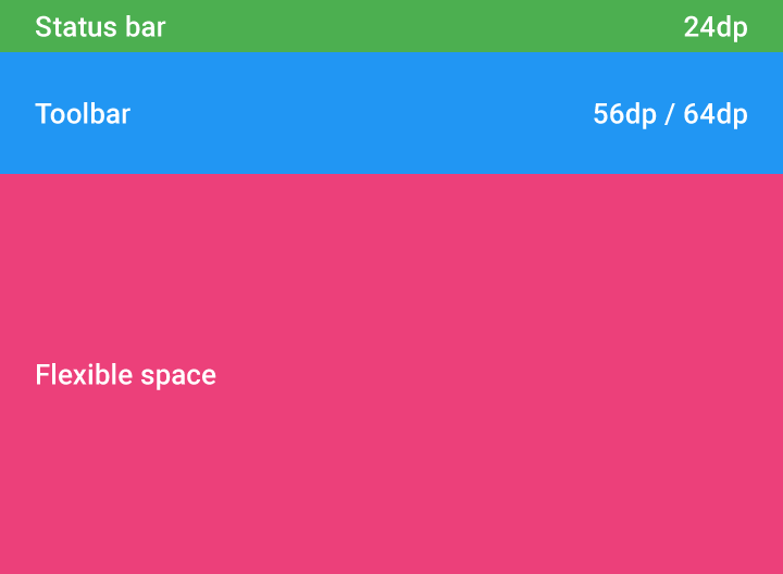
Status bar height: 24dp
Toolbar height: 56dp / 64dp
Flexible space with overlapping content
Content can overlap the app bar.
The app bar has two scrolling options:
- The app bar is initially positioned behind the content. Upon upward scroll, the app bar should scroll faster than the content, until the content no longer overlaps it. Once anchored in place, the app bar lifts up for content to scroll underneath.
- The app bar can scroll off-screen with the content and return when the user reverse scrolls
In this interaction, the app bar cannot include tabs.
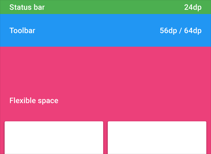
Status bar: 24dp
Toolbar: 56dp/64dp