Text fields
Text fields allow users to input, edit, and select text.
Text fields typically reside in forms but can appear in other places, like dialog boxes and search.
Usage
Text fields validate input, help users fix errors, autocomplete words, and provide suggestions.
Field types
Single-line
Multi-line
Text area
Input types
Formatted inputs
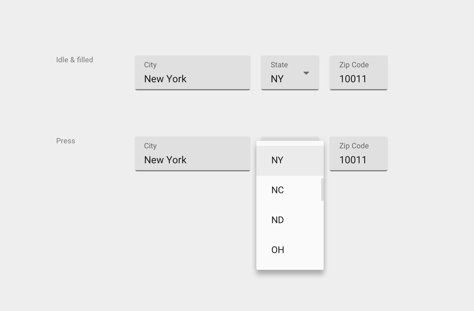
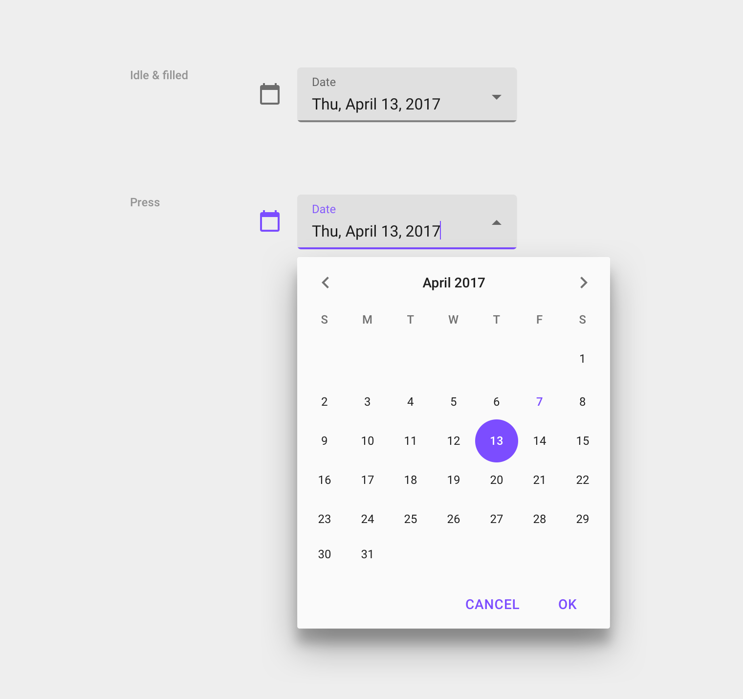
Nested menus & pickers
Principles
Text fields should have the following characteristics:
Identifiable
Using a tappable touch target, text fields should indicate that users can enter information.
Findable
It should be easy to find a text field among other elements.
Legible
Text fields should indicate their state – whether enabled or disabled, empty or filled, valid or invalid – with clear label, input, and assistive text.
Layout
Text fields contain the following elements:
Label
Text field labels display the type of input a field requires. Every text field should have a label.
Labels are aligned with the input line and always visible. They can be resting (when a field is inactive and empty) or floating.
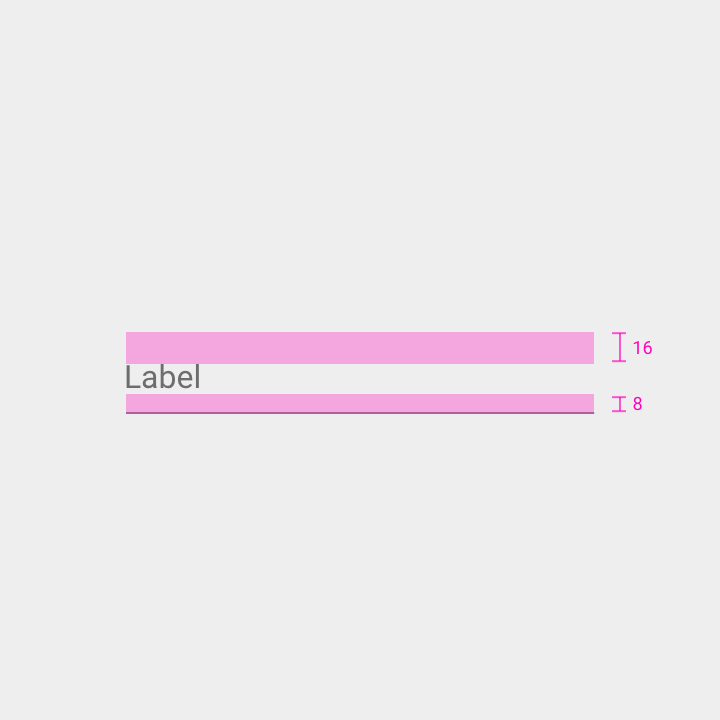
Top padding: 16dp
Bottom padding: 8dp
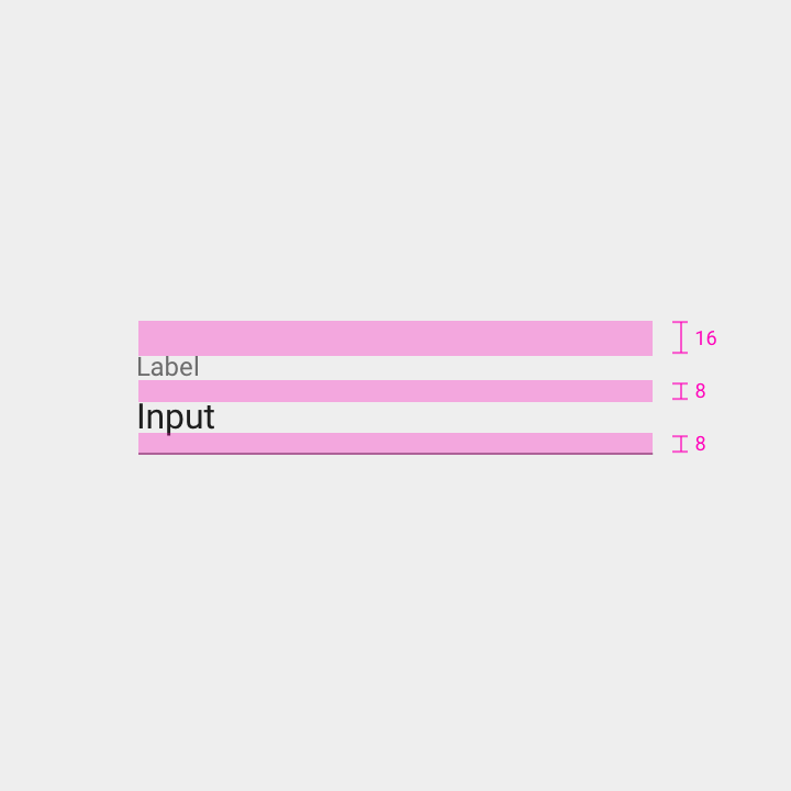
Top padding above label: 16dp
Bottom padding below label: 8dp
Bottom padding below input: 8dp
Input line
The input line indicates where to enter text, displayed below the label.
When a field is active or contains an error, the line’s color and thickness vary.
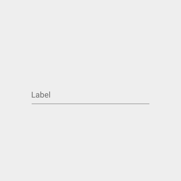
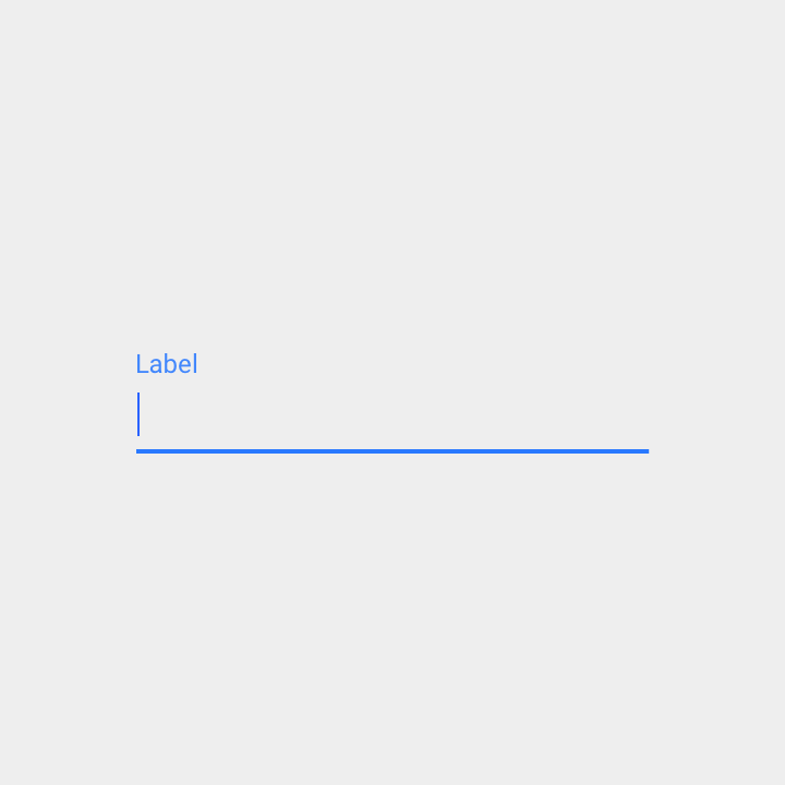
Cursor
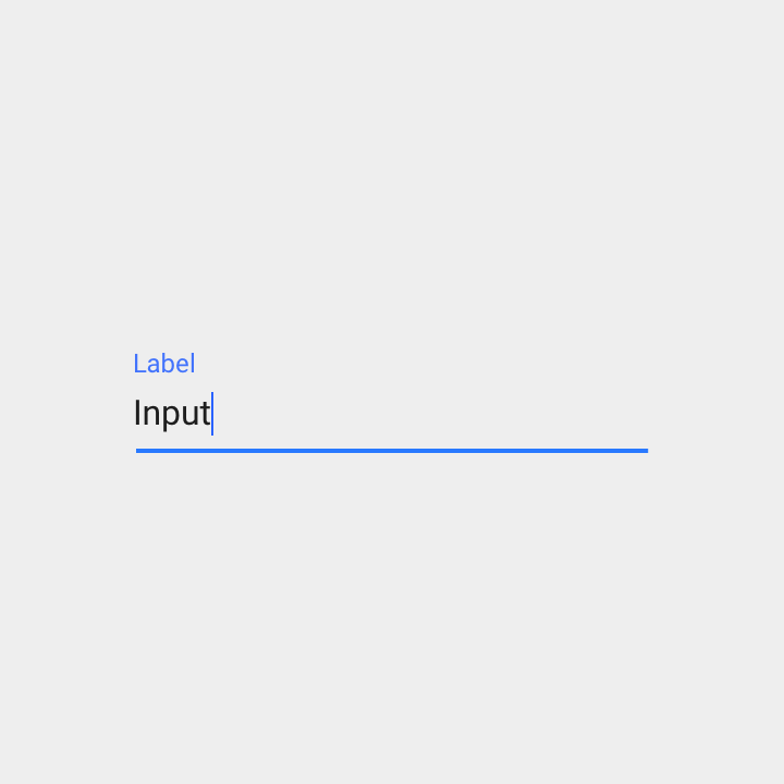
The cursor indicates the user’s current input position.
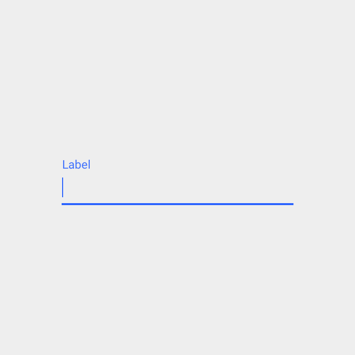
Input text
Text entered into a text field is called input text.
The first letter of input text (and each sentence in a field) should be capitalized where appropriate. Such as text that:
- Names something, like an alarm
- Contains phrases, like a text message
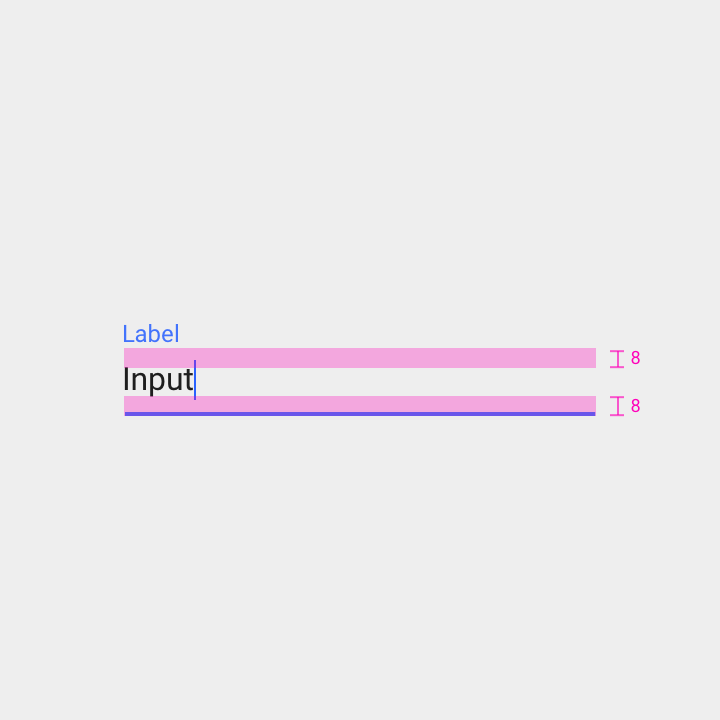
Top padding: 8dp
Bottom padding: 8dp
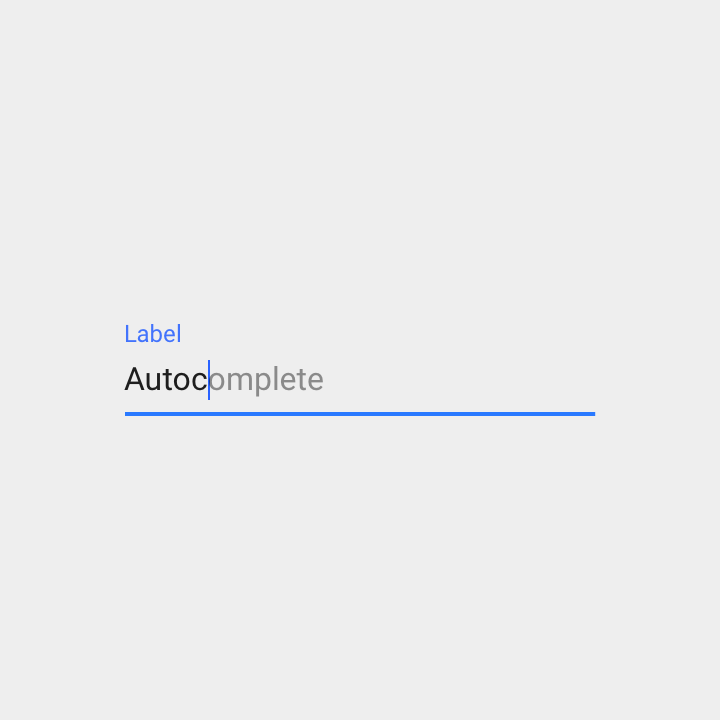
Input text can be used with autocomplete to help users who have limited literacy or who write in a foreign language. For example, autocomplete can:
- Suggest input as it’s typed (refreshing suggestions with each keystroke)
- Fill a field with default input text
Pressing the return button accepts the current autocomplete suggestion.
Placeholder text (Hint text)
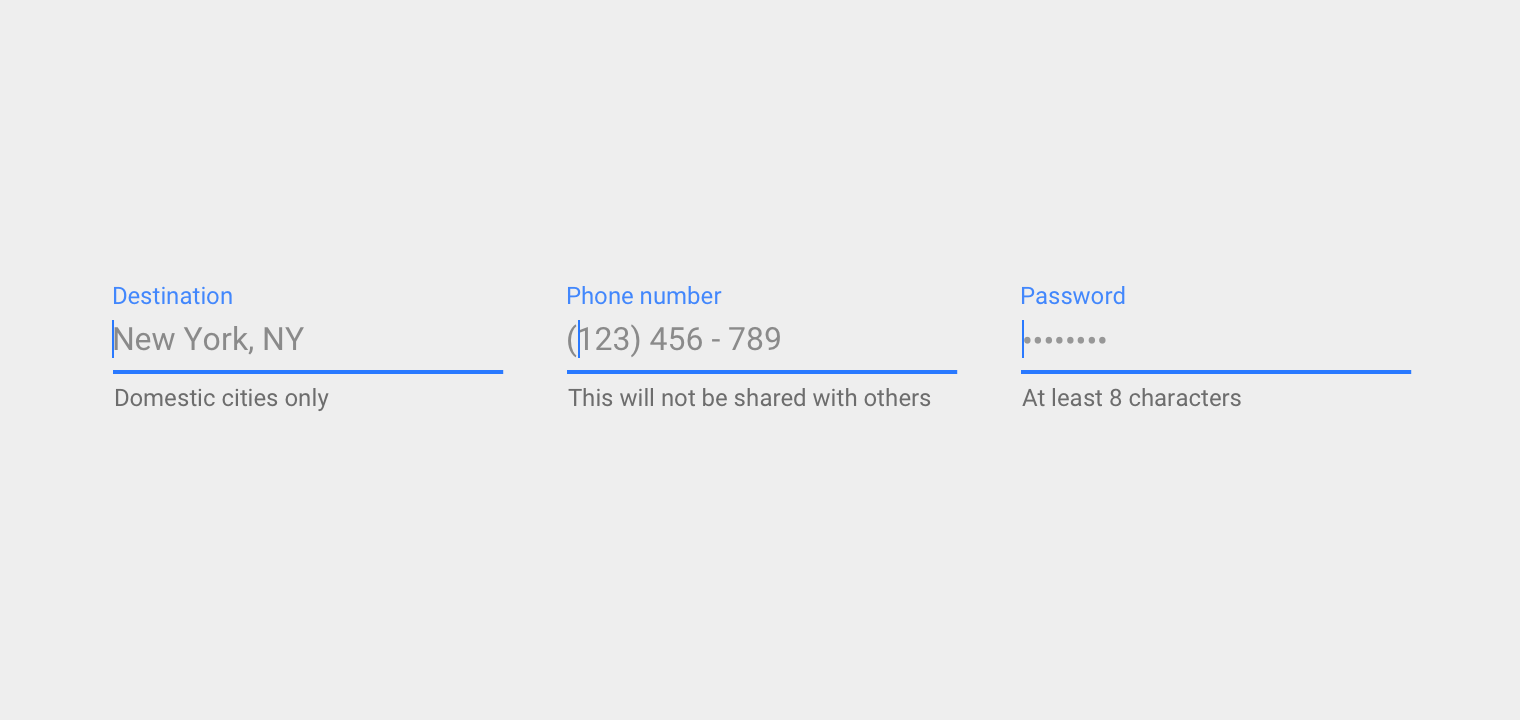
Placeholder text rests in the input field until the user starts entering text. It may contain an action or an example, such as a phone number or email address.
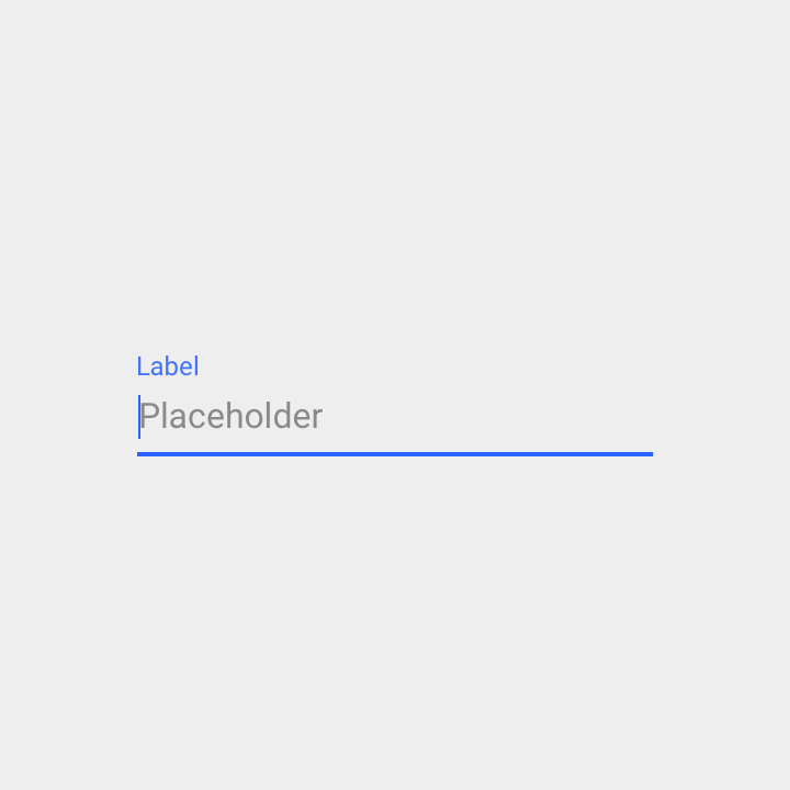
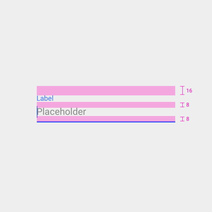
Padding above label: 16dp
Padding above placeholder text: 8dp
Padding below placeholder text: 8dp
Helper text
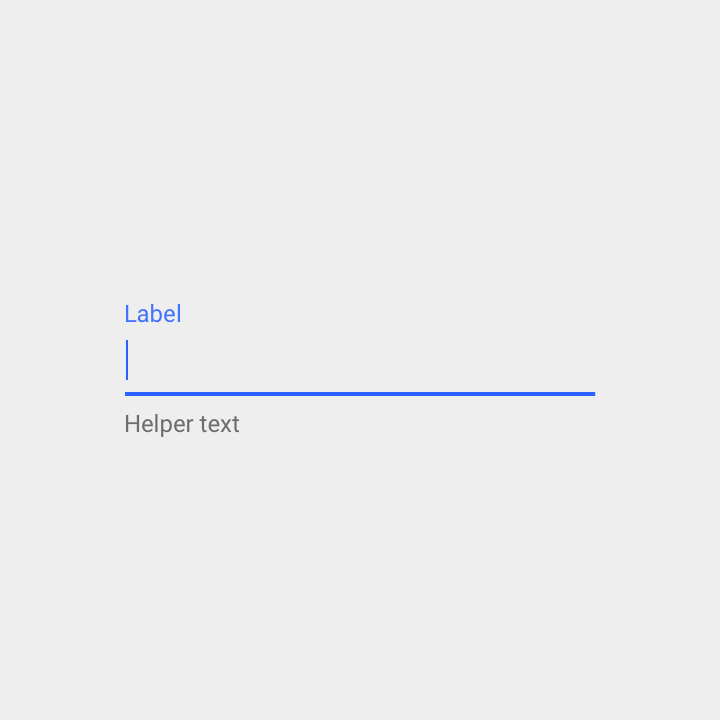
Helper text gives context about a field’s input, such as how the input will be used.
It should be visible either persistently or only on focus.
Specs:
- Left justified
- On a single line if possible, or with text wrapping (if multiple lines)
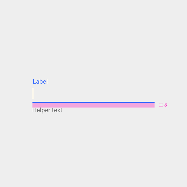
Padding above helper text: 8dp
Error message
When input isn’t accepted, text fields can display an error message below the input line, with instructions on how to fix the error. Until the error is fixed, the error replaces the helper text.
An error message should appear on a single line, if possible.
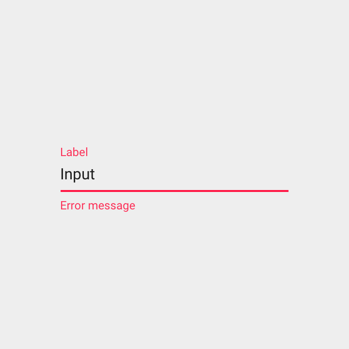
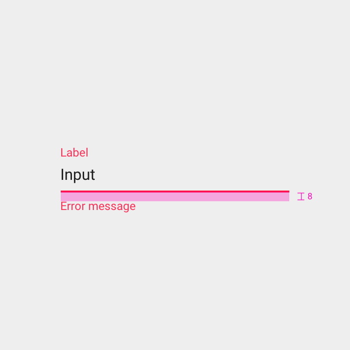
Padding above the error message: 8dp
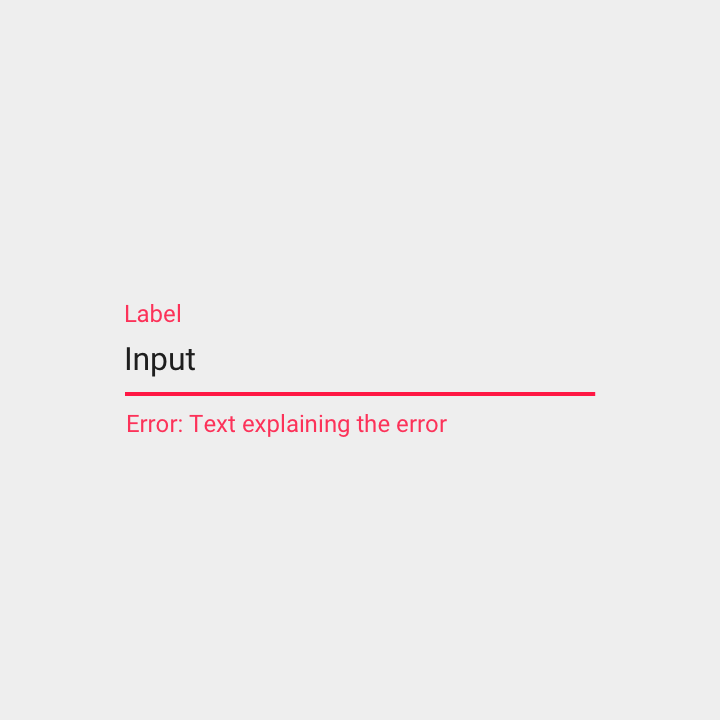
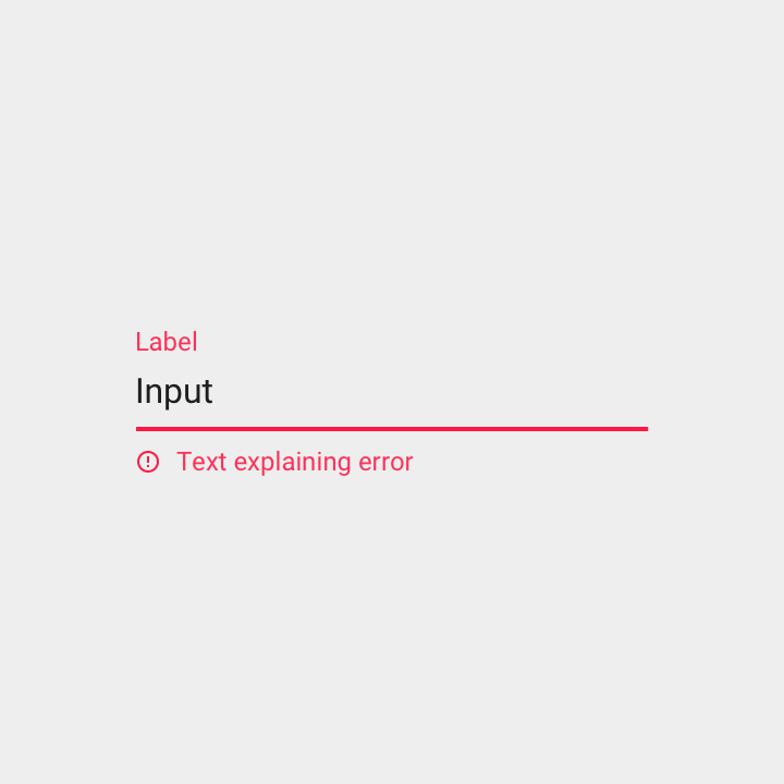
An error message is preceded by the word “Error” (or an error icon) to make the error state more distinct to colorblind users.
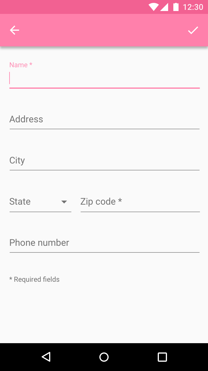
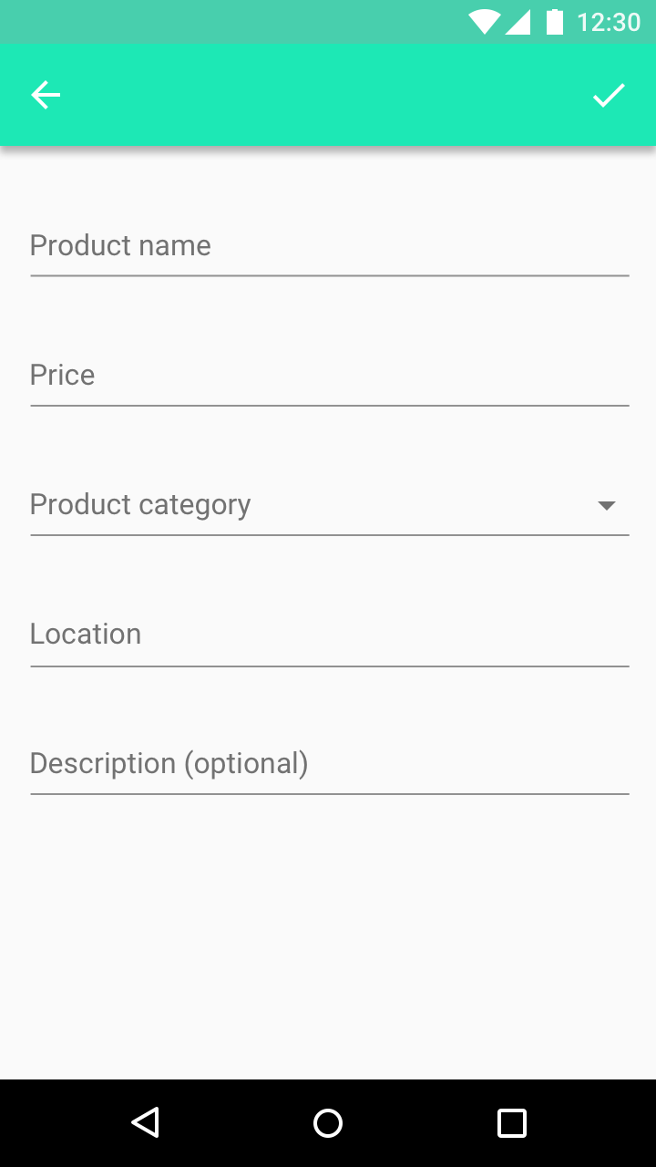
Required field
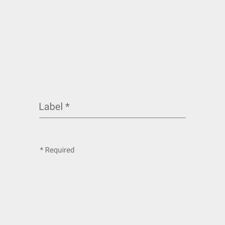
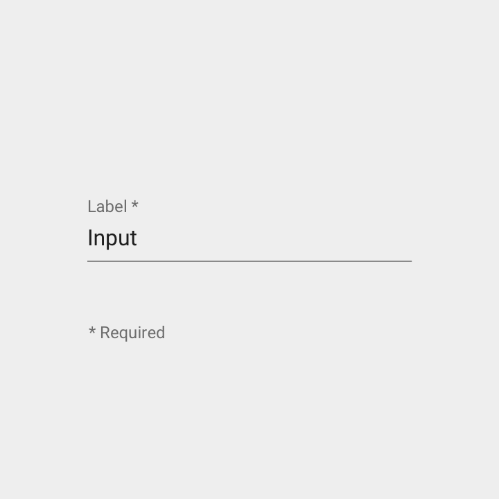
To indicate that a field is required, display an asterisk (*) next to its label. At the bottom of the form, mention that asterisks indicate required fields.
To indicate that a field is optional, display the word “optional” in parentheses next to the field label.
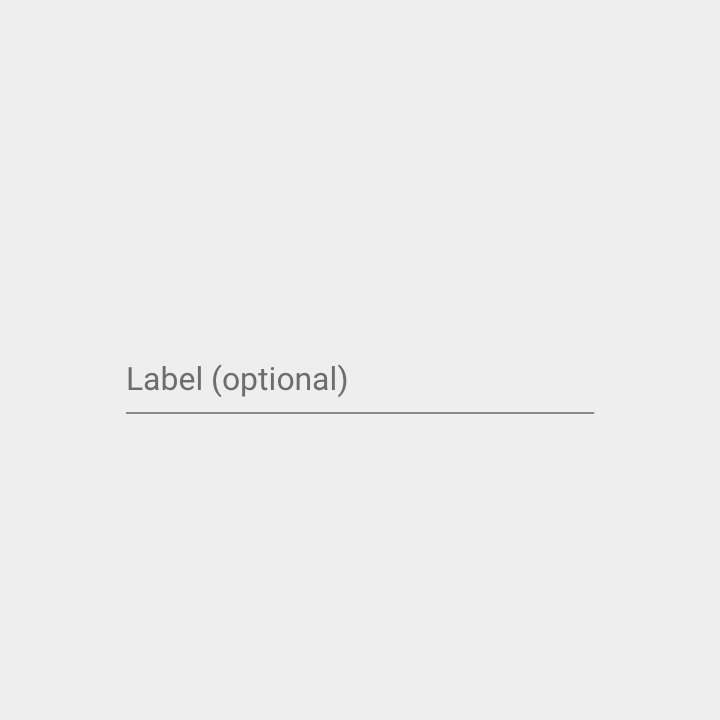
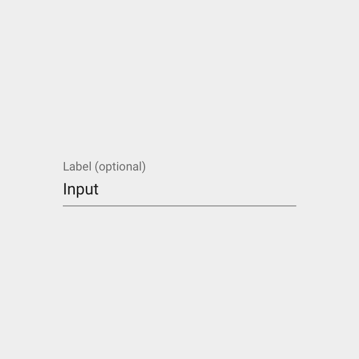
In forms with some required fields, indicate all of the required ones. However, if there are fewer optional fields, indicate those instead.
Character or word counter
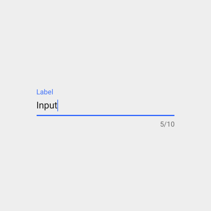
Use character or word counters where there is a character or word limit.
Specs:
- Right justified
- Displayed as a ratio of characters used and the character limit (formatted as: characters used / character limit)
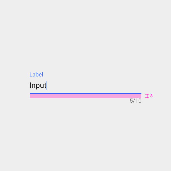
Padding below the text input line: 8dp
Icon signifier
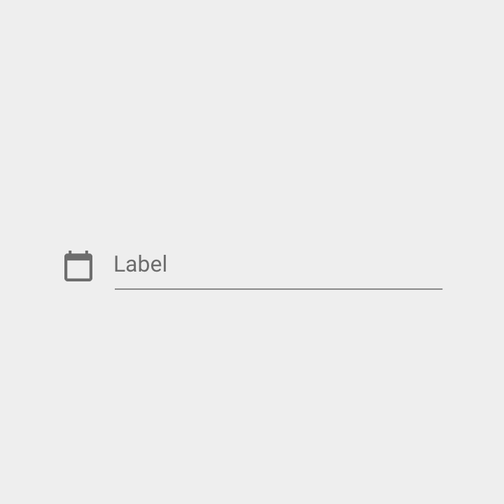
Icons describe the type of input a text field requires. They are displayed to the left of the text field.
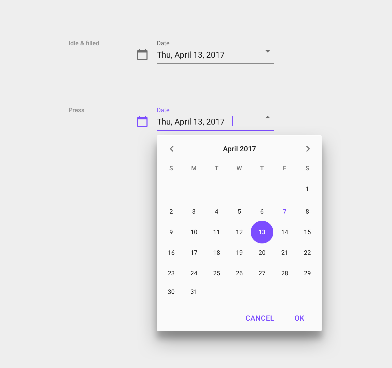
Icons can also be touch targets for nested components. For example, a calendar icon may be tapped to reveal a date picker.
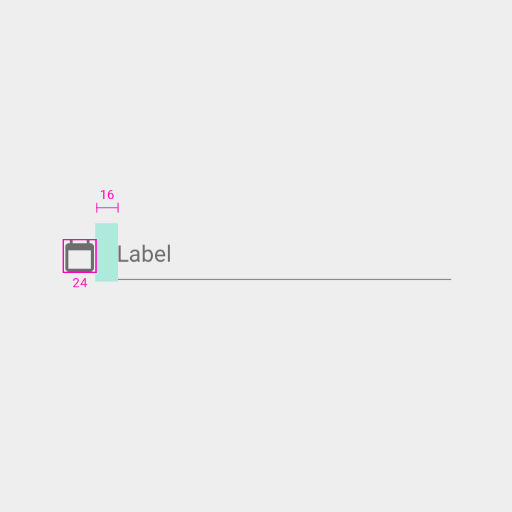
Width: 24dp
Padding between icon signifier and label: 16dp
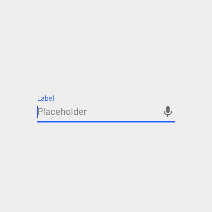
Voice input icon
A microphone icon signifies that users can input characters using voice.
Voice input icons are right justified, and always enabled.
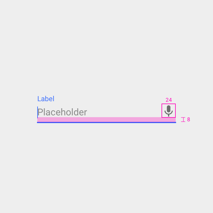
Width: 24dp
Padding below icon: 8dp
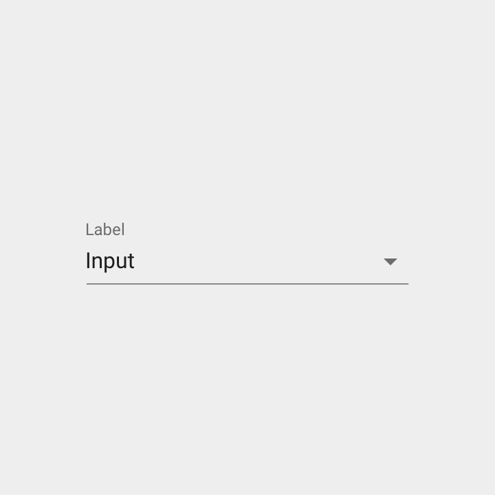
Dropdown icon
A dropdown arrow indicates that a text field contains nested selections.
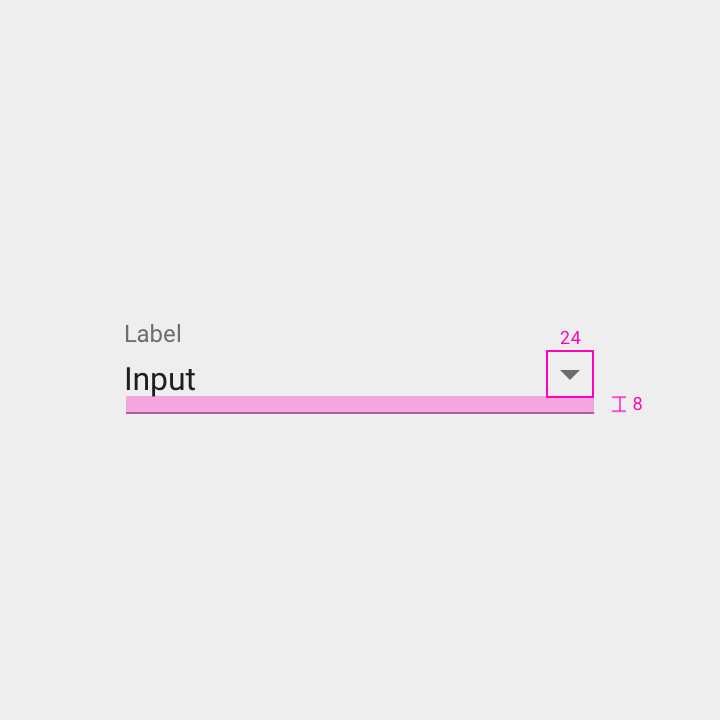
Width: 24dp
Height: 24dp
Padding below icon: 8dp
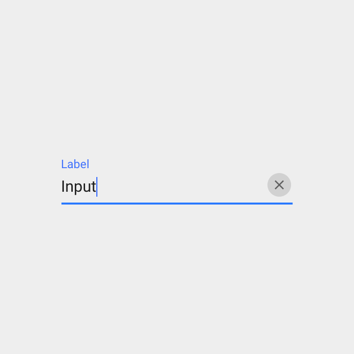
Clear button
Clear buttons let users empty an entire input field.
They are right justified in the field.
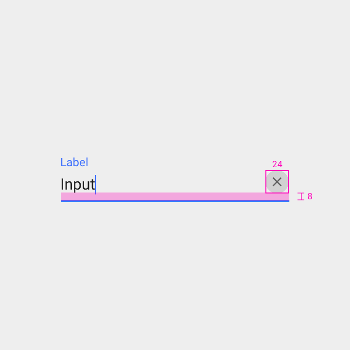
Width: 24dp
Height: 24dp
Padding below icon: 8dp
In forms with many or crowded fields, text fields may be made shorter.
Specs:
- Input text: 13sp
- Reduce space between the label and input text
- Reduce space between the input line and help text by 50%
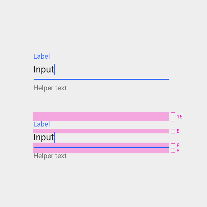
Padding above label: 16dp
Padding below label: 8dp
Padding above text input line: 8dp
Padding below text input line: 8dp
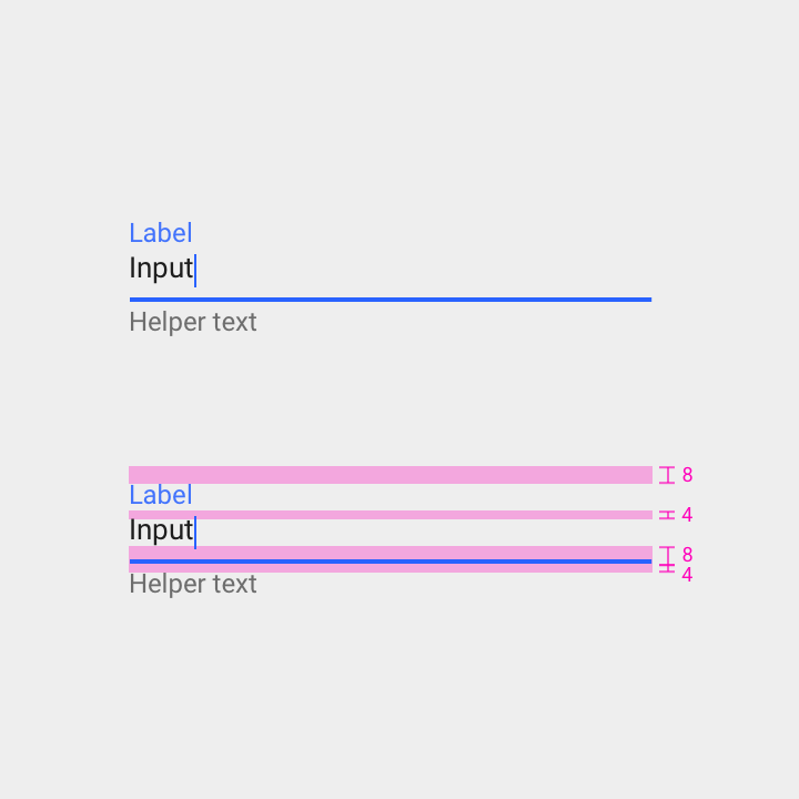
Padding above label: 8dp
Padding below label: 4dp
Padding above text input line: 8dp
Padding below text input line: 4dp
States
Text fields have two major states: enabled or disabled.
In the enabled state, these user interactions are available:
- Idle
- Hover
- Pressed
- Focused
Text field input can be either:
- Empty or filled
- Valid or invalid
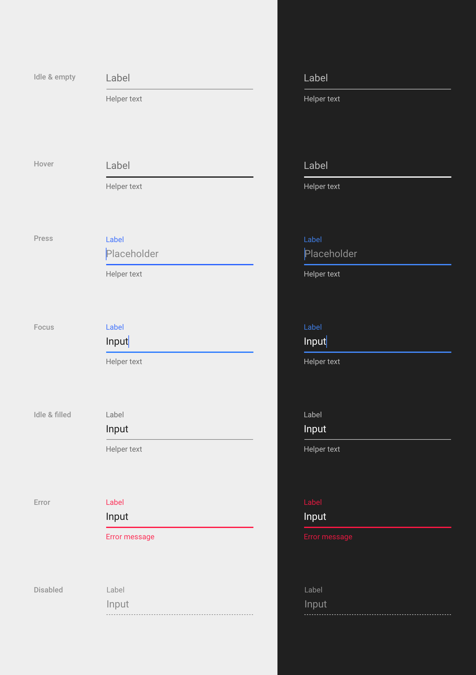
Text field states
Enabled
Enabled text fields are empty by default.
Specs
- Labels have 8dp of padding above the input line
- Label text is the same size as input text
Accessibility
The line should have a 3:1 contrast ratio to improve identifiability, the same AA accessibility standard as large text.
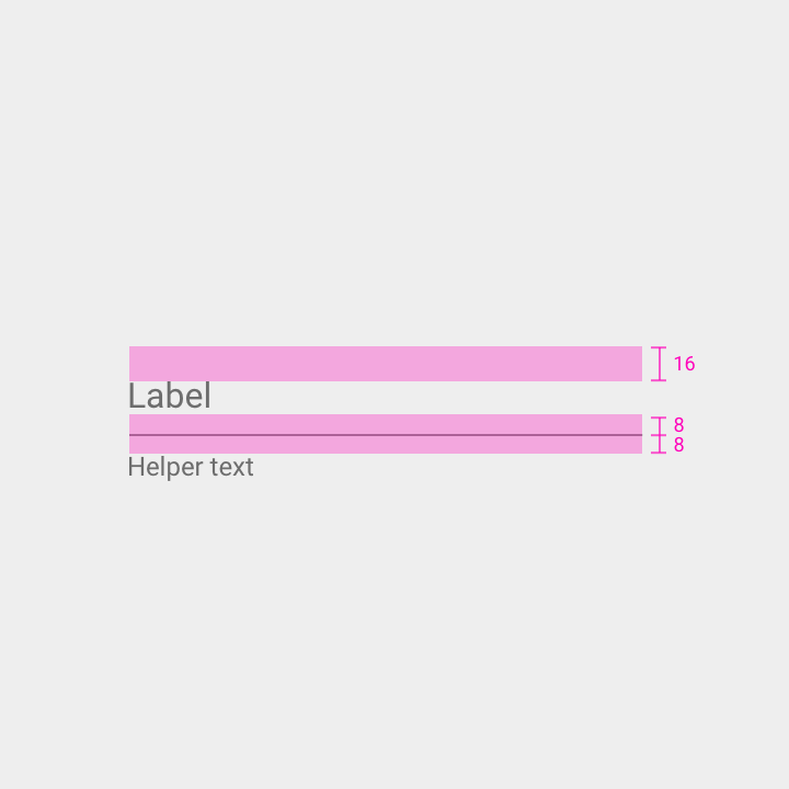
Bottom line
- Thickness: 1dp
- Color: 42% black (3:1 contrast ratio)
Label text
- Type: Roboto 16sp
- Color: 54% black (4.5:1 contrast ratio)
- Spacing: 16dp top padding, 8dp bottom padding, inset with bottom line
Helper text (optional)
- Type: Roboto 12sp
- Color: 54% black (4.5:1 contrast ratio)
- Spacing: 16dp left padding, 8dp top padding
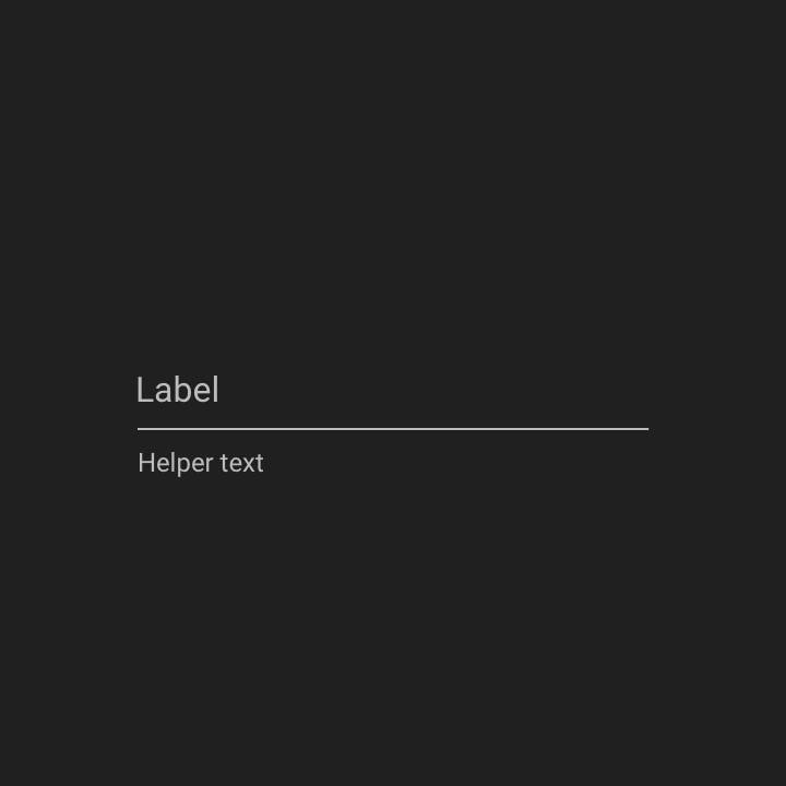
Bottom line
- Thickness: 1dp
- Color: 70% white (7:1 contrast ratio)
Label text
- Type: Roboto 16sp
- Color: 70% white (7:1 contrast ratio)
- Spacing: 16dp top padding, 8dp bottom padding, inset with bottom line
Helper text (optional)
- Type: Roboto 12sp
- Color: 70% white (7:1 contrast ratio)
- Spacing: 16dp left padding, 8dp top padding
Disabled
Disabled text fields are uneditable. They have a dotted input line and less opacity so that they appear less tappable.
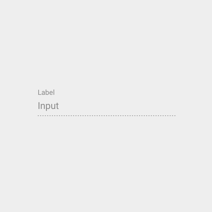
Bottom line
- Thickness: 1dp
- Color: 42% black
- Dotted
Label text
- Type: Roboto 12sp
- Color: 38% black (2.21:1 contrast ratio)
- Spacing: 8dp bottom padding, inset with bottom line
Input text
- Type: Roboto 16sp
- Color: 38% black (2.21:1 contrast ratio)
- Spacing: 8dp top padding, inset with bottom line
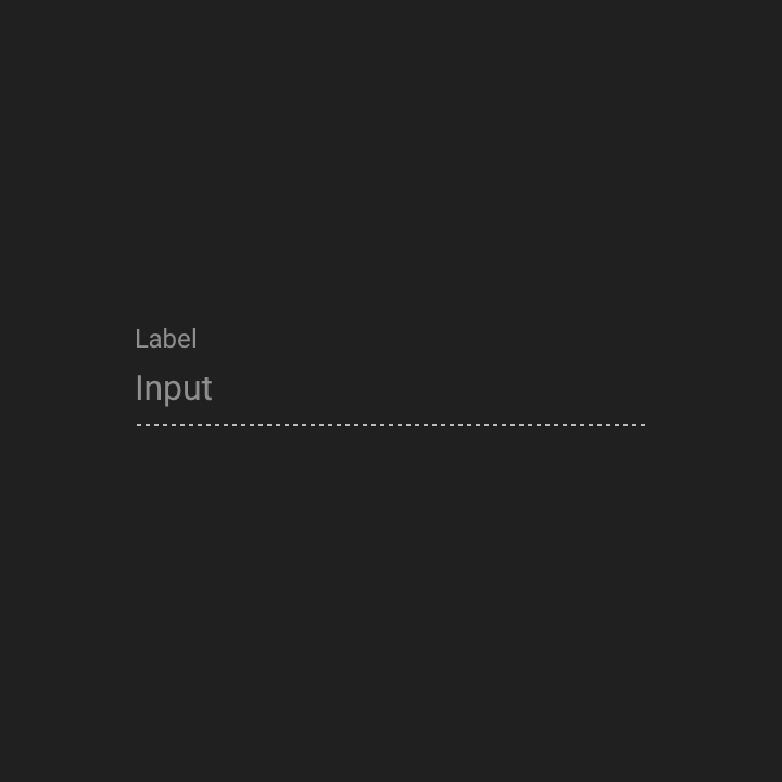
Bottom line
- Thickness: 1dp
- Color: 70% white
- Dotted
Label text
- Type: Roboto 12sp
- Color: 50% white (4.5:1 contrast ratio)
- Spacing: 8dp bottom padding, inset with bottom line
Input text
- Type: Roboto 16sp
- Color: 50% white (4.5:1 contrast ratio)
- Spacing: 8dp top padding, inset with bottom line
User interactions
Hover
Hover states give the input line more opacity, helping make text fields more noticeable on desktop.
Bottom line
- Thickness: 2dp
- Color: 87% black (15:1 contrast ratio)
Label text
- Type: Roboto 16sp
- Color: 54% black (4.5:1 contrast ratio)
- Spacing: 8dp bottom padding, inset with bottom line
Helper text (optional)
- Type: Roboto 12sp
- Color: 54% black (4.5:1 contrast ratio)
- Spacing: 8dp top padding, inset with bottom line
Bottom line
- Thickness: 2dp
- Color: 100% white (13:1 contrast ratio)
Label text
- Type: Roboto 16sp
- Color: 70% white (7:1 contrast ratio)
- Spacing: 8dp bottom padding, inset with bottom line
Helper text (optional)
- Type: Roboto 12sp
- Color: 70% white (7:1 contrast ratio)
- Spacing: 8dp top padding, inset with bottom line
Press
Upon press, the text field label shrinks and floats above the field, revealing the cursor and any placeholder text.
To signal that the field is active, the primary color of the UI is applied to the input line, label text, and cursor.
Bottom line
- Thickness: 2dp
- Color: 100% primary color (Dark A700)
- Motion: Ripple & wash
Label text
- Type: Roboto 12sp
- Color: 87% primary color (Dark A700)
- Spacing: 8dp bottom padding, inset with bottom line
Placeholder text (optional)
- Type: Roboto 16sp
- Color: 42% black (3:1 contrast ratio)
- Spacing: 8dp bottom padding, inset with bottom line
Helper text (optional)
- Type: Roboto 12sp
- Color: 54% black (4.5:1 contrast ratio)
- Spacing: 8dp top padding, inset with bottom line
Bottom line
- Thickness: 2dp
- Color: 100% primary color (Light A200)
- Motion: Ripple & wash
Label text
- Type: Roboto 12sp
- Color: 100% primary color (Light A200)
- Spacing: 8dp bottom padding, inset with bottom line
Placeholder text (optional)
- Type: Roboto 16sp
- Color: 50% white (4.5:1 contrast ratio)
- Spacing: 8dp bottom padding, inset with bottom line
Helper text (optional)
- Type: Roboto 12sp
- Color: 70% white (7:1 contrast ratio)
- Spacing: 8dp top padding, inset with bottom line
Focus
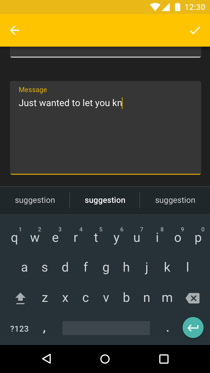
As the user types into the text field, input text replaces any placeholder text. Autocompleted text is displayed to the right of the cursor, using the same font size and color as placeholder text.
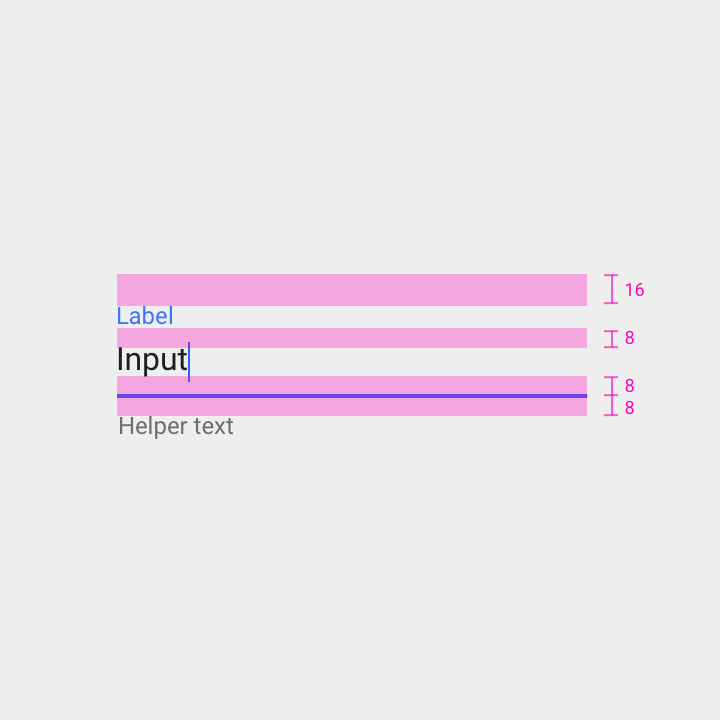
Bottom line
- Thickness: 2dp
- Color: 100% primary color (Dark A700)
Label text
- Type: Roboto 12sp
- Color: 87% primary color (Dark A700)
- Spacing: 16dp top padding and 8dp bottom padding
Input text
- Type: Roboto 16sp
- Color: 87% black (15:1 contrast ratio)
- Spacing: 8dp bottom padding, inset with bottom line
Helper text (optional)
- Type: Roboto 12sp
- Color: 54% black (4.5:1 contrast ratio)
- Spacing: 8dp top padding, inset with bottom line
Bottom line
- Thickness: 2dp
- Color: 100% primary color (Light A200)
Label text
- Type: Roboto 12sp
- Color: 100% primary color (Light A200)
- Spacing: 16dp top padding and 8dp bottom padding
Input text
- Type: Roboto 16sp
- Color: 100% white (13:1 contrast ratio)
- Spacing: 8dp bottom padding, inset with bottom line
Helper text (optional)
- Type: Roboto 12sp
- Color: 70% white (7:1 contrast ratio)
- Spacing: 8dp top padding, inset with bottom line
Text field input
Idle & filled
When the user shifts focus to another element, entered input text remains visible.
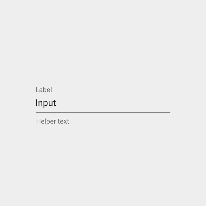
Bottom line
- Thickness: 1dp
- Color: 42% black (3:1 contrast ratio)
Label text
- Type: Roboto 12sp
- Color: 54% black (4.5:1 contrast ratio)
- Spacing: 16dp top padding and 8dp bottom padding
Input text
- Type: Roboto 16sp
- Color: 87% black (15:1 contrast ratio)
- Spacing: 8dp bottom padding, inset with bottom line
Helper text (optional)
- Type: Roboto 12sp
- Color: 54% black (4.5:1 contrast ratio)
- Spacing: 8dp top padding, inset with bottom line
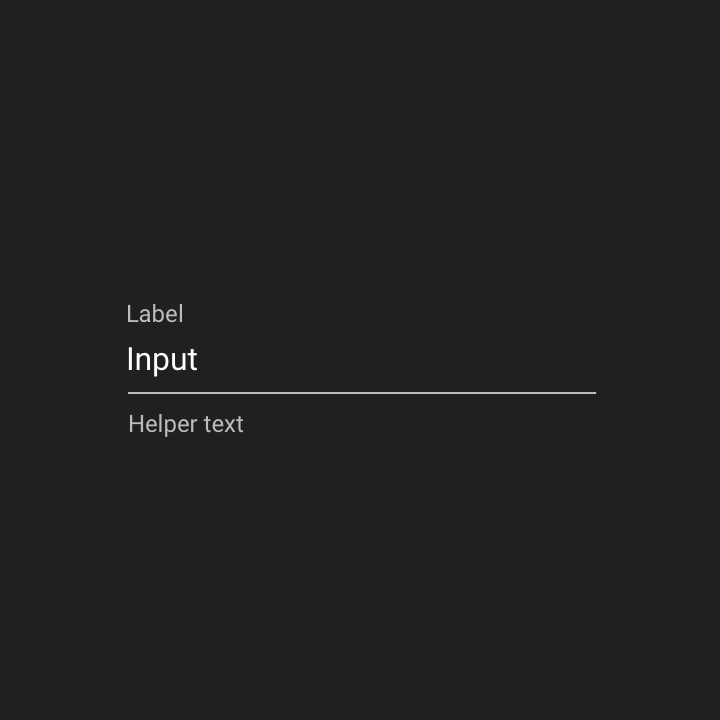
Bottom line
- Thickness: 1dp
- Color: 70% white (7:1 contrast ratio)
Label text
- Type: Roboto 12sp
- Color: 70% white (7:1 contrast ratio)
- Spacing: 16dp top padding and 8dp bottom padding
Input text
- Type: Roboto 16sp
- Color: 100% white (13:1 contrast ratio)
- Spacing: 8dp bottom padding, inset with bottom line
Helper text (optional)
- Type: Roboto 12sp
- Color: 70% white (7:1 contrast ratio)
- Spacing: 8dp top padding, inset with bottom line
Text field content
Error
If a text field is invalid, an error message is displayed when the user shifts focus to another element. To indicate an error, the input line and label use a color with a warmer hue, such as red or orange.
Specs
- Display an error message below the text field, replacing any helper text
- Briefly state the reason for the error and how to fix it
- Place the word “Error” (or an error icon) before the error message
- Remove the error once fixed by the user
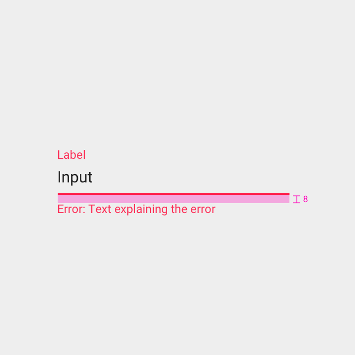
Bottom line
- Thickness: 2dp
- Color: 100% red (A400)
Label text
- Type: Roboto 12sp
- Color: 100% red (A400)
- Spacing: 16dp top padding and 8dp bottom padding, inset with bottom line
Input text
- Type: Roboto 16sp
- Color: 87% black (15:1 contrast ratio)
- Spacing: 16dp left padding, 8dp bottom padding
Error text
- Type: Roboto 12sp
- Color: 87% red (A400)
- Spacing: 8dp top padding, inset with bottom line
Bottom line
- Thickness: 2dp
- Color: 100% red (A400)
Label text
- Type: Roboto 12sp
- Color: 100% red (A400)
- Spacing: 16dp top padding and 8dp bottom padding, inset with bottom line
Input text
- Type: Roboto 16sp
- Color: 100% white (13:1 contrast ratio)
- Spacing: 16dp left padding, 8dp bottom padding
Error text
- Type: Roboto 12sp
- Color: 100% red (A400)
- Spacing: 8dp top padding, inset with bottom line
Field types
There are several types of text fields:
- Single-line
- Multi-line
- Text area
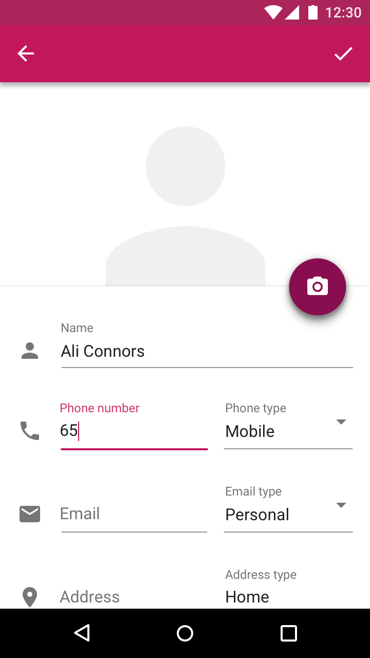
Single-line fields
When the text entered is longer than the input line, it automatically scrolls left as the cursor reaches the right edge of the field.
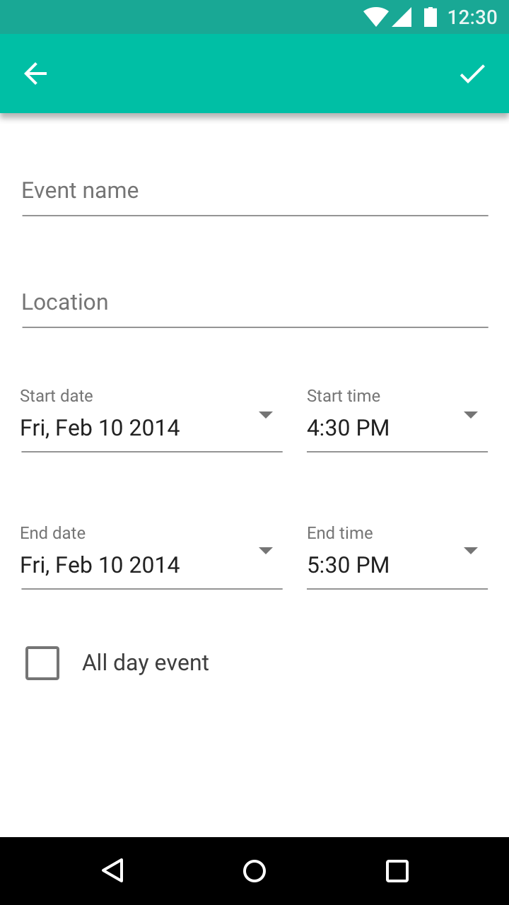
Multi-line fields
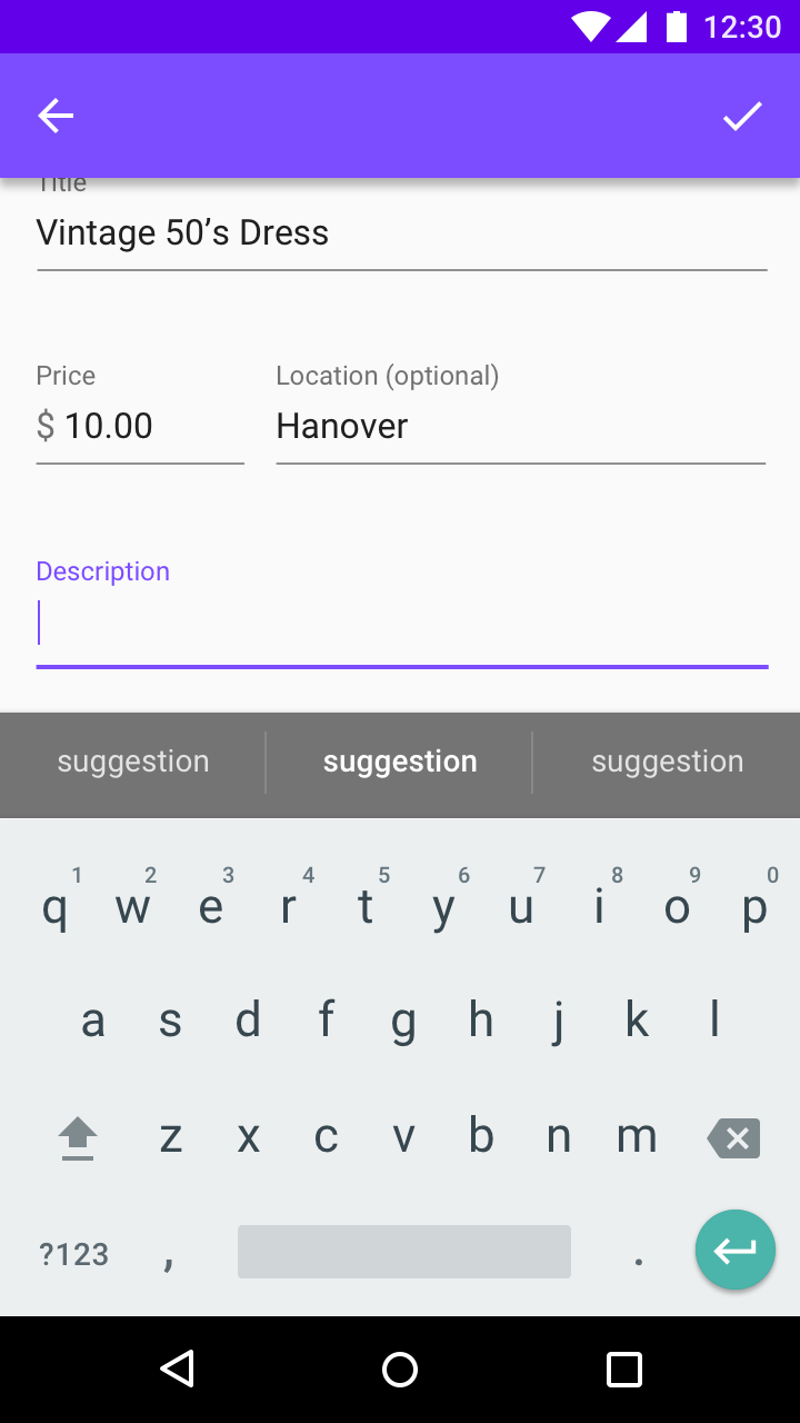
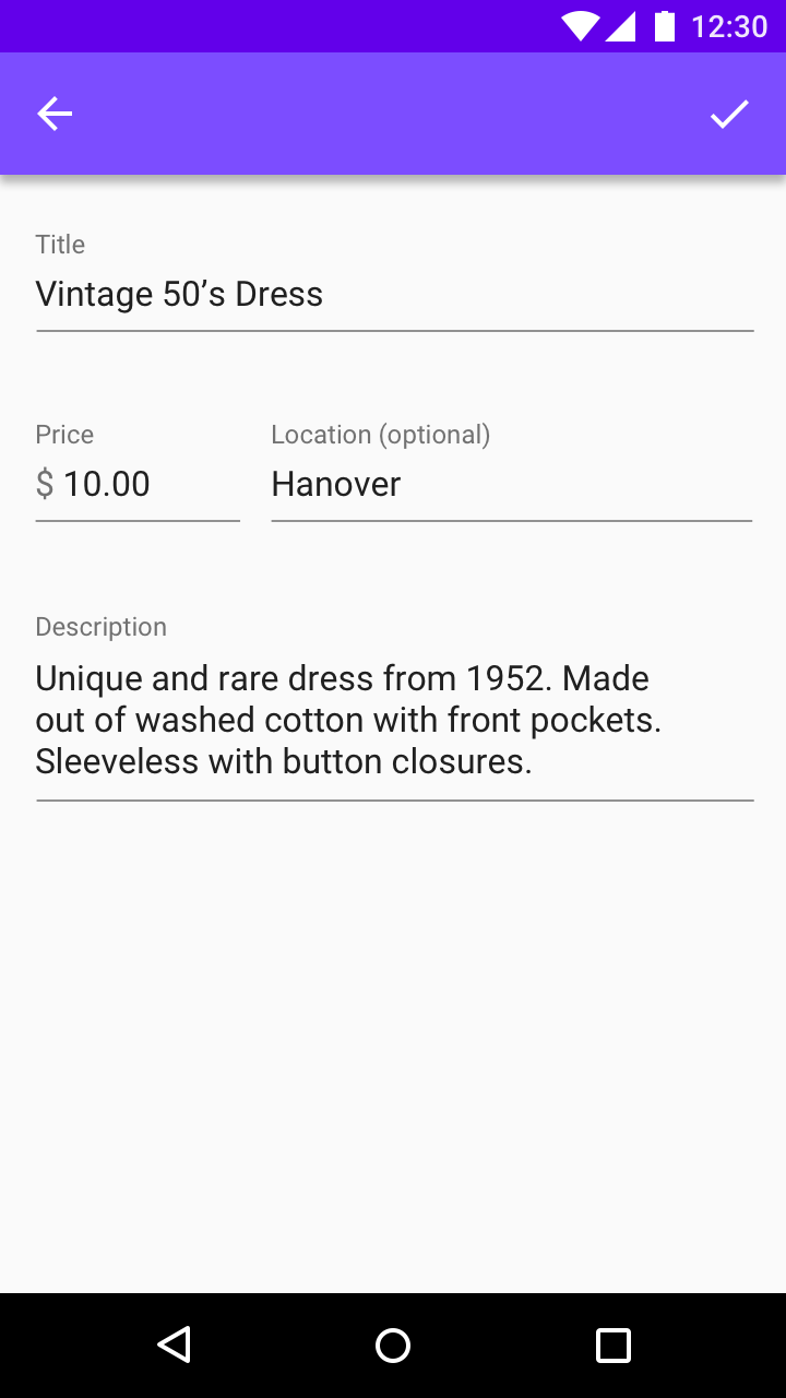
Multi-line text fields wrap text onto a new line by expanding the bottom of the field, shifting screen elements downward.
Multi-line text fields allow users to see everything they input at once.
Text area
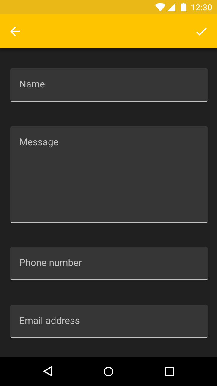
Text areas are taller than text fields and wrap overflow text onto a new line. They scroll vertically when the cursor reaches the bottom of the field.
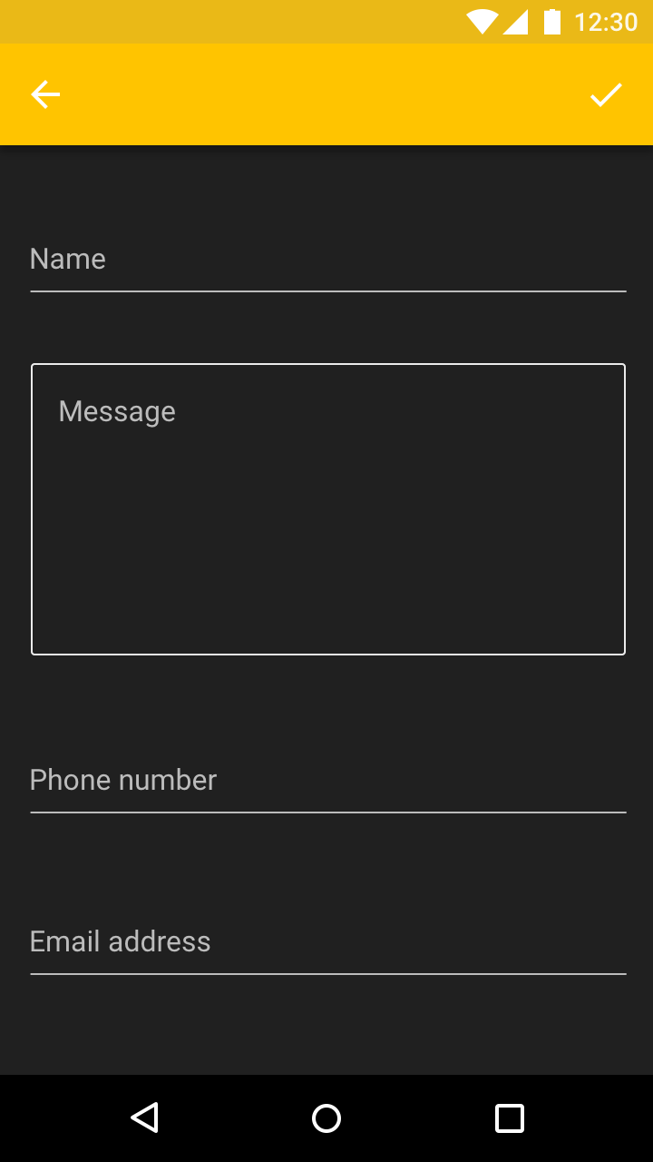
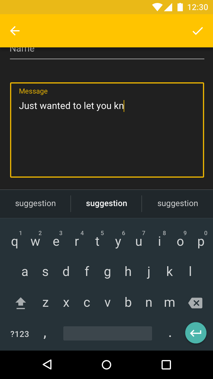
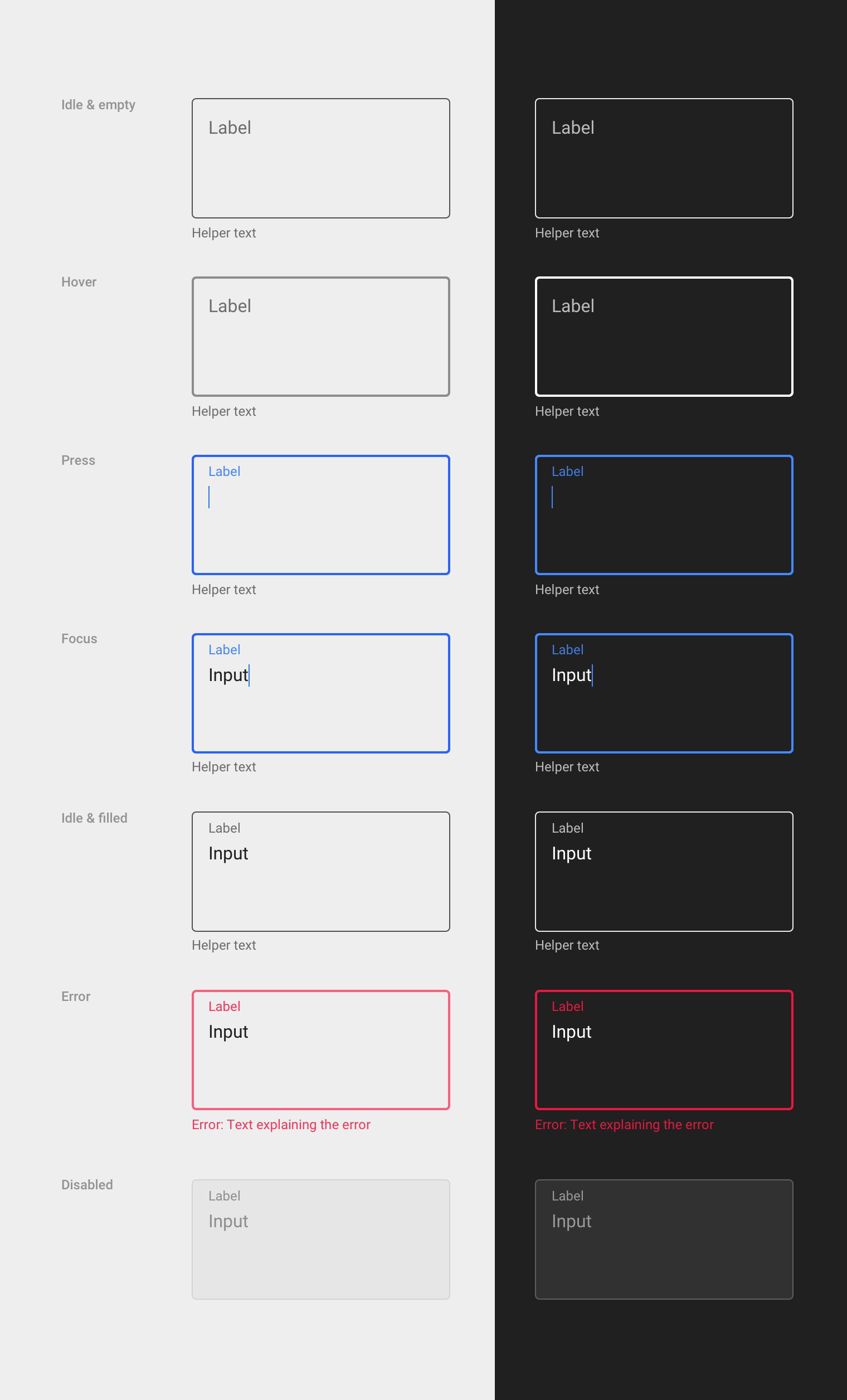
Text areas should have a visible border, using the same color and thickness as the input line.
Input types
Formatted inputs
Text fields can be formatted to indicate the types of data a field accepts, using placeholder text, preset layout, and character limits. Text formatting should be displayed only when the field is pressed, focused, or filled.
Characters can be formatted using:
- Grouped characters
- Prefixes and suffixes
- Password redaction
Grouped characters
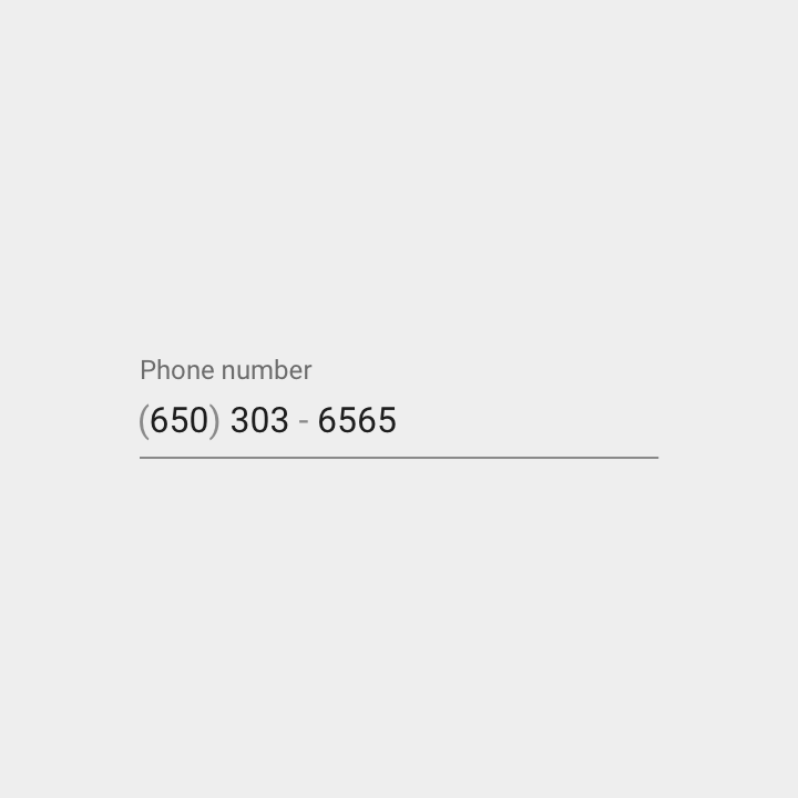
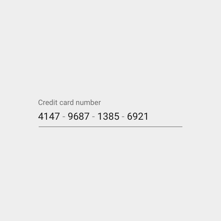
Input text can be grouped in different ways, with special characters added in appropriate places, such as hyphens added to a phone number. Once the first special character is reached, the cursor automatically jumps to the next group.
Prefixes & suffixes
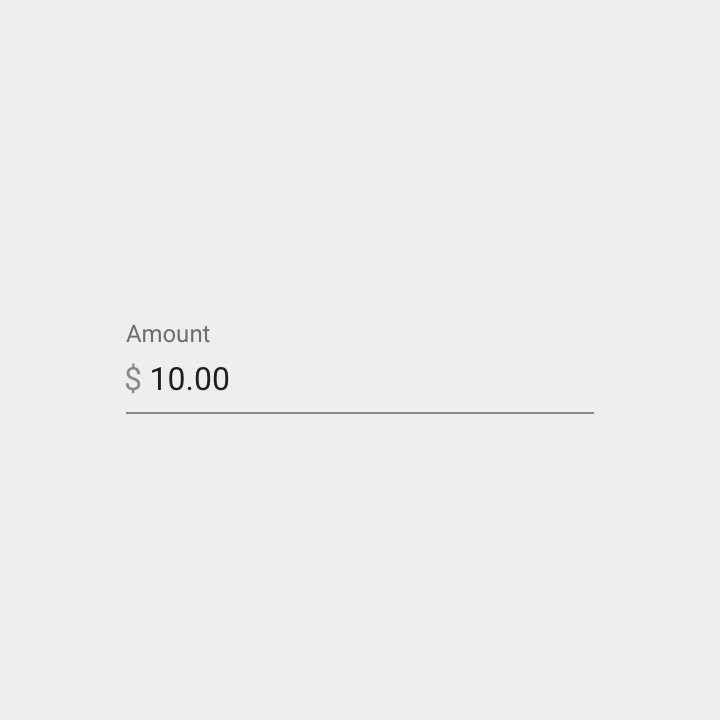
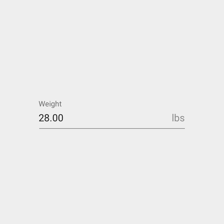
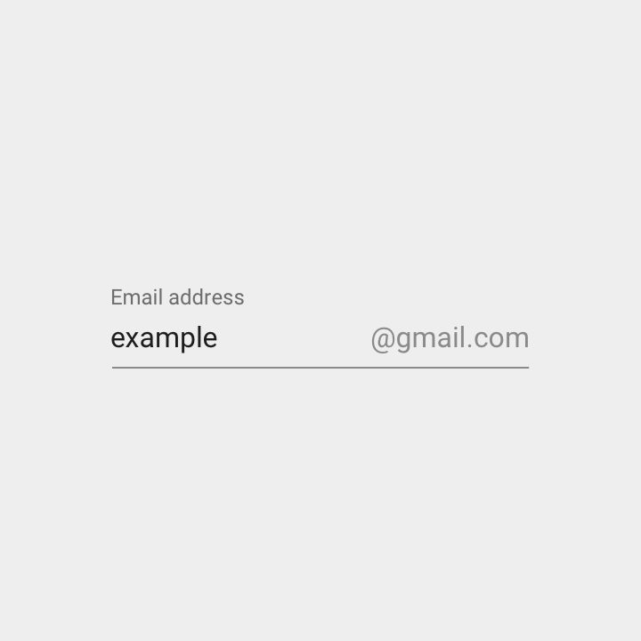
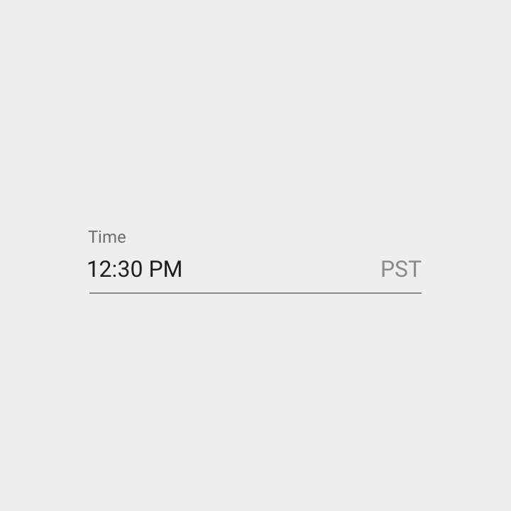
Prefixes and suffixes can be used to clarify units or to add input in advance. Prefixes are left justified in the text field; suffixes are right justified. Text fields can have both prefixes and suffixes.
Password redaction
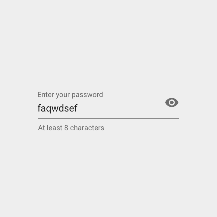
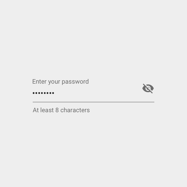
Password input is disguised by default. Midline ellipses are displayed to represent each character of a password entered (such as •••••••).
When the visibility icon is displayed with a text field, it indicates whether or not that field’s input is visible. A text field’s visibility may be toggled on or off using the icon.
Other inputs
Menus and pickers
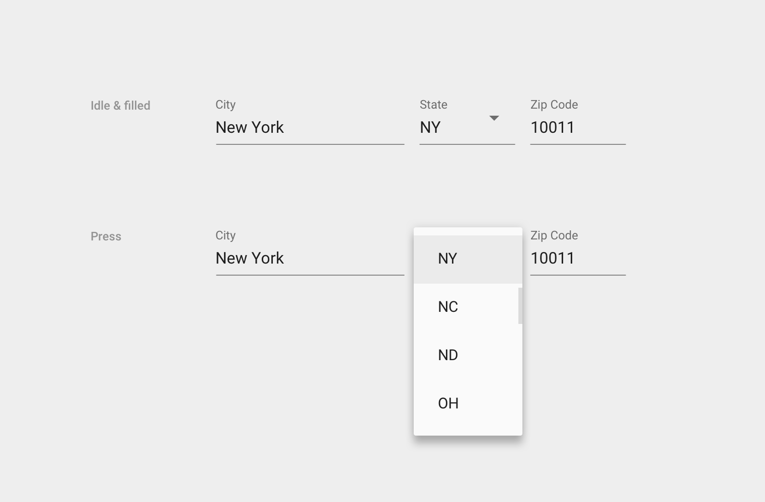
Other components such as dropdown menus and pickers can be nested in text fields to make input easier.
Field variations
Draw additional focus to text fields using these style variations:
- Labels as headings
- Solo fields
- Full-width fields
Labels as headings
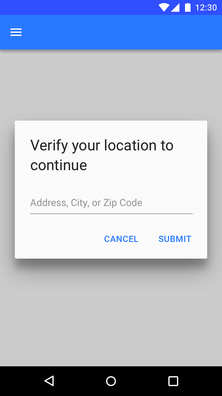
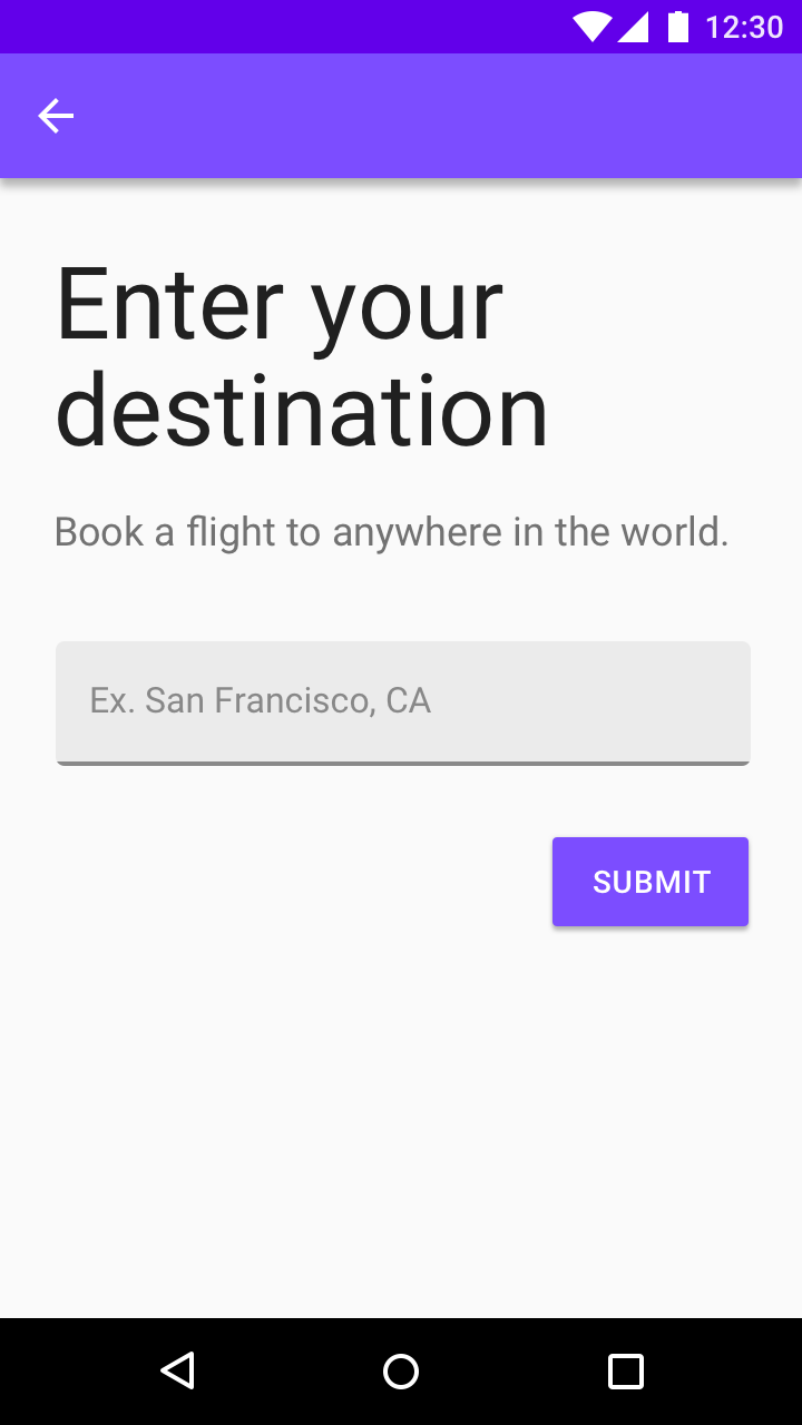
When a text field is the primary action on a screen, its label can be removed or become a heading.
Placeholder text appears in the idle state and is replaced with input text as the user enters text.

Solo fields
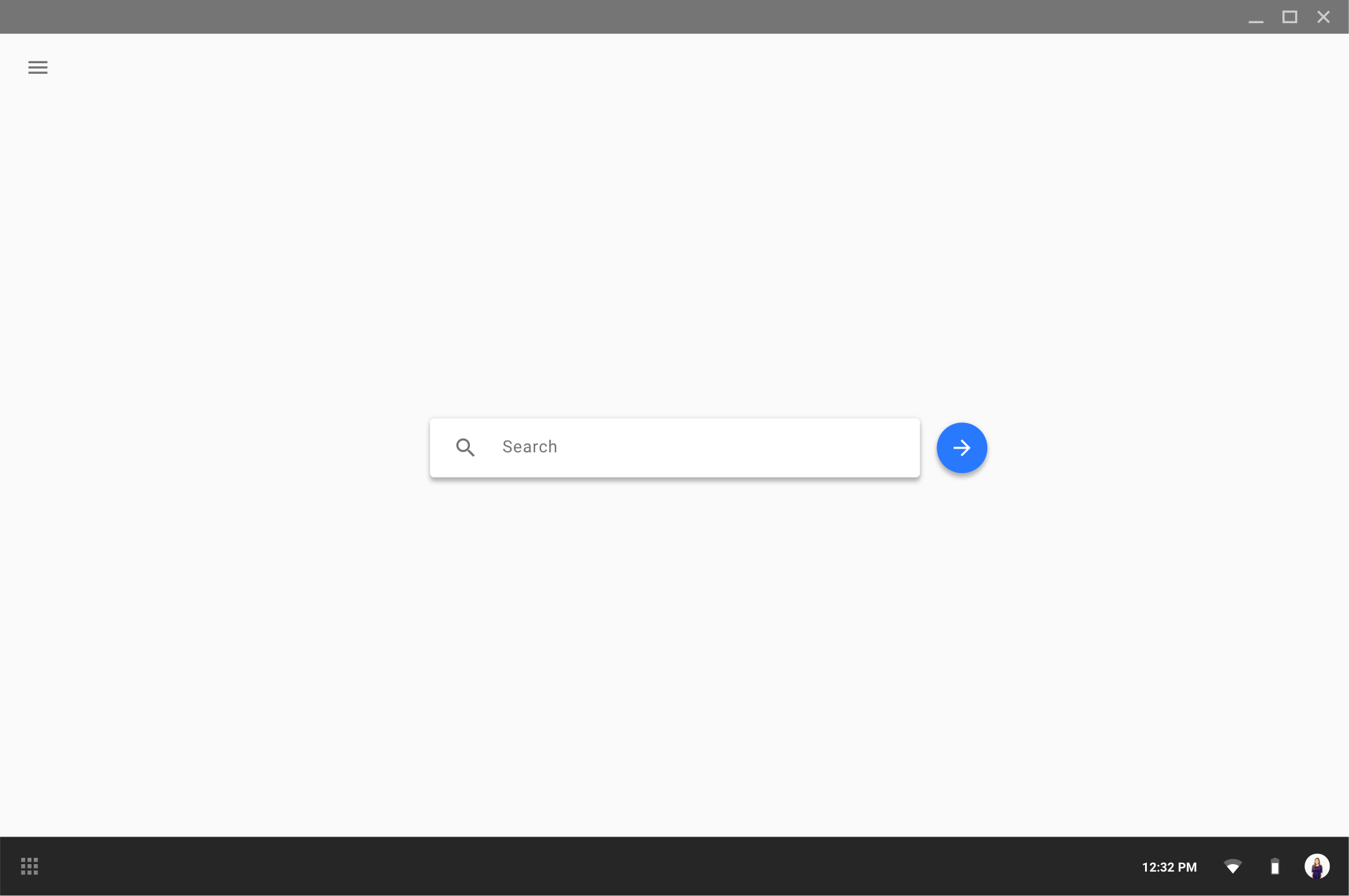
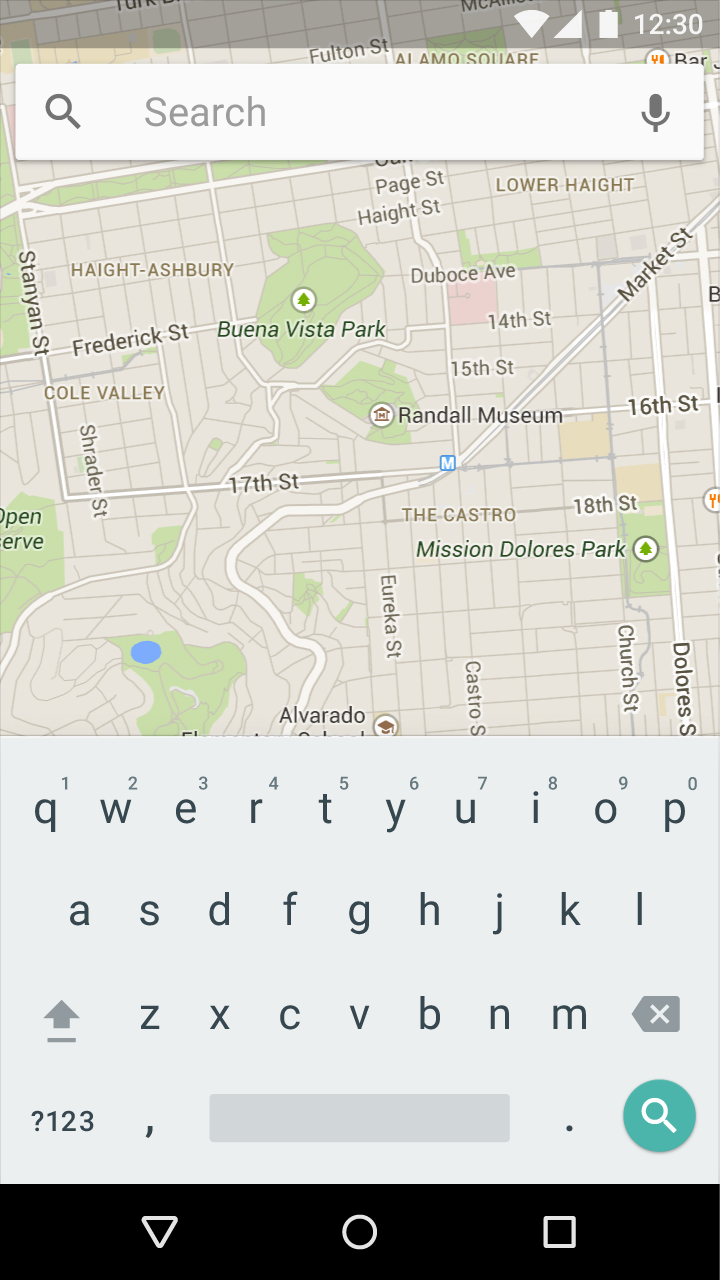
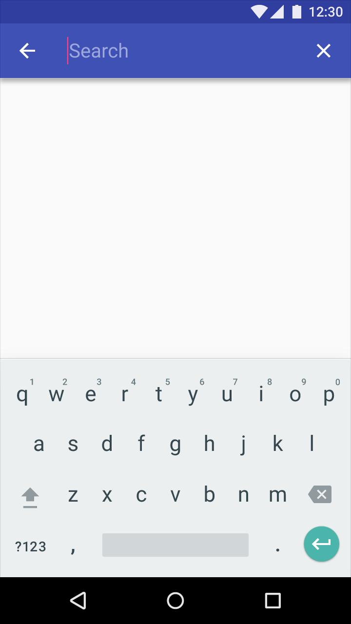
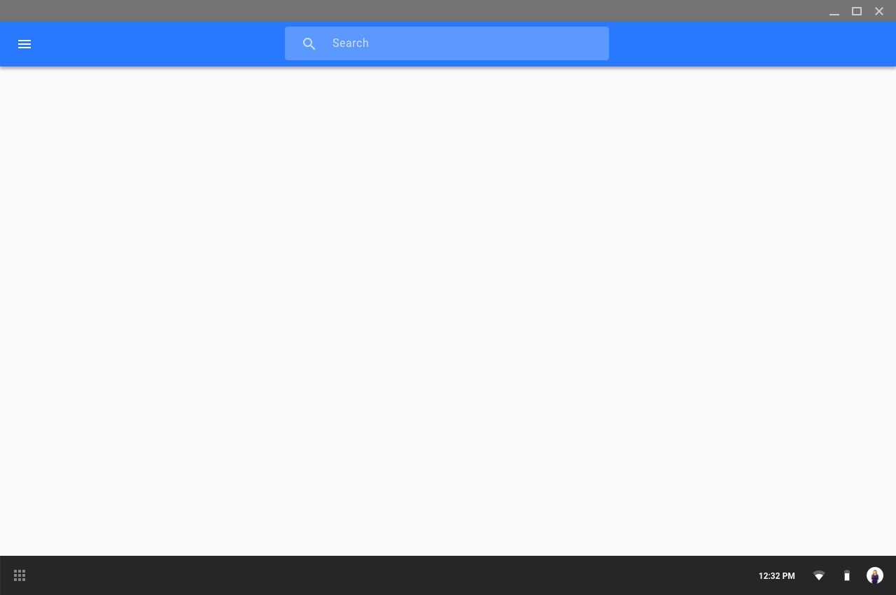
When a text field is used for a single action such as search, the text field may be elevated, with associated icons placed within it. An input line is not required.
On desktop, a raised search button should appear to the right of the search field.
Full-width field
Full-width text fields are useful for in-depth tasks or entering complex information.
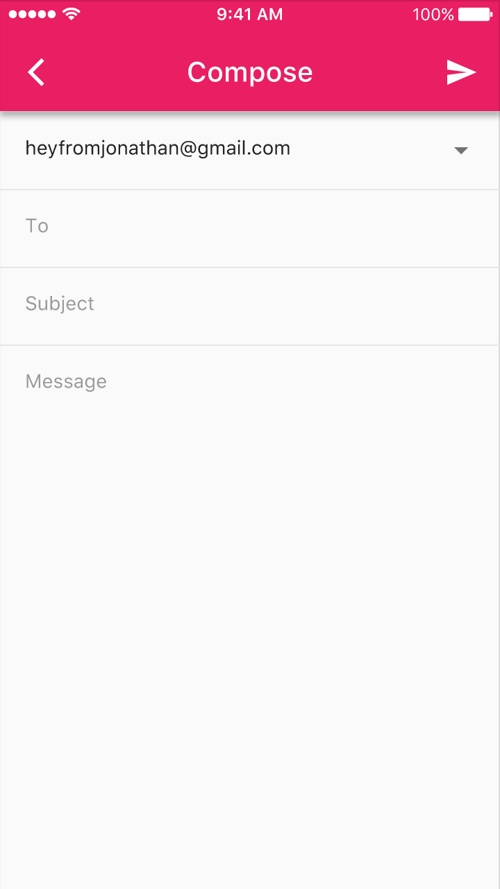


Height: 56dp
Top padding: 20dp
Bottom padding: 20dp

Height: 48dp
Top padding: 16dp
Bottom padding: 16dp
Text field boxes
Text field boxes increase text field identifiability and scannability by using a transparent rectangular fill to enclose the label and input text.
States
A text field box uses a rectangular fill as a primary affordance, masking the ends of the input line. A ripple motion occurs in the hover and press states.
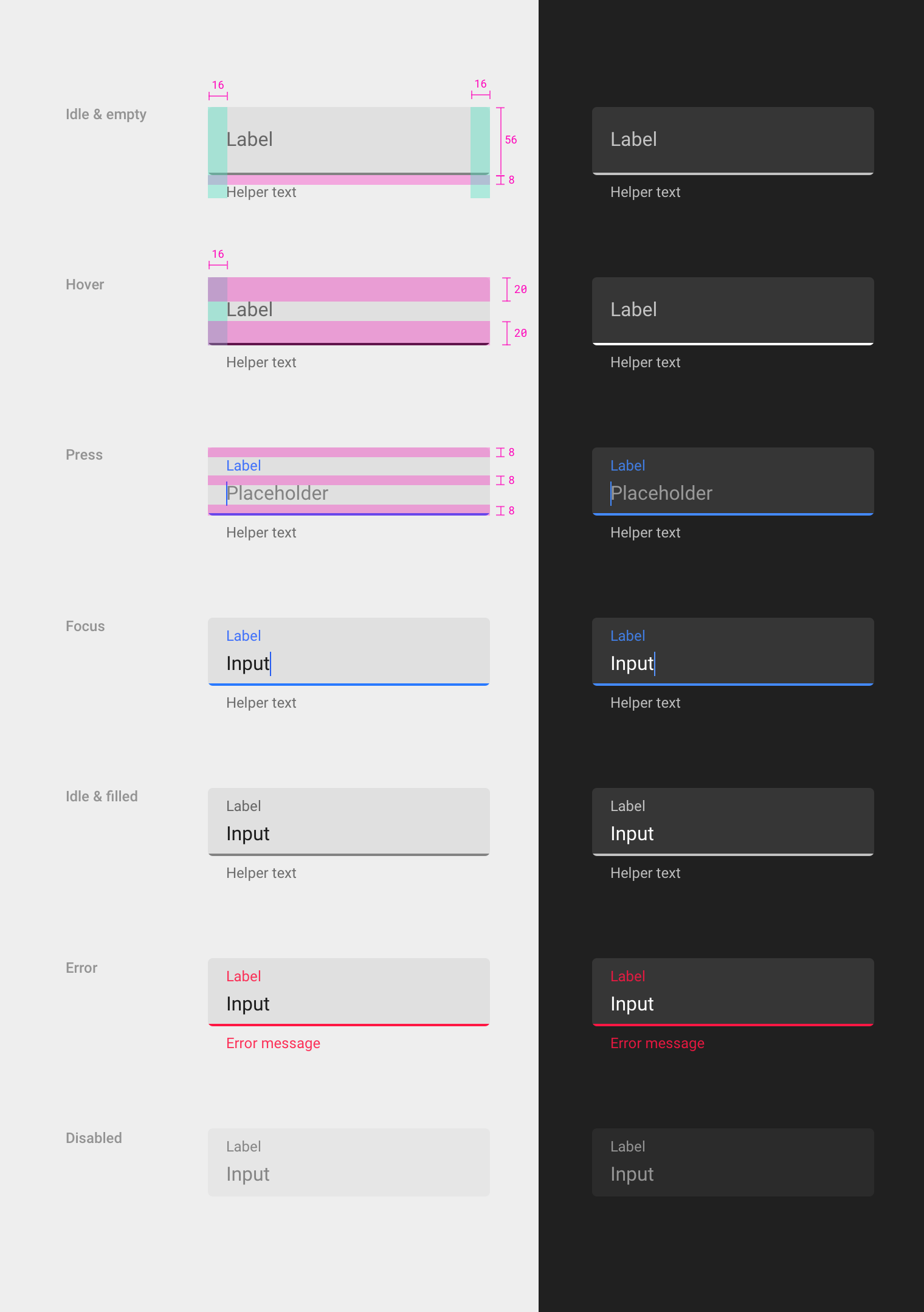
Rectangular fill
- Height: 56dp
- Corner radius: 4dp
- Color (light theme): 6% black
- Color (dark theme): 10% white
Bottom line
- Thickness: 2dp
- Masked by rounded corners of rectangle
Idle & empty
- Left padding: 16dp
- Right padding: 16dp
- Padding above label: 8dp
Hover
- Left padding: 16dp
- Padding above label: 20dp
- Padding below label: 20dp
Press
- Padding above label: 8dp
- Padding below label: 8dp
- Padding below placeholder: 8dp
Spacing for focus, idle & filled, error, and disabled states are the same as the press state.
Dense layouts
Text field boxes make dense layouts easier to read.
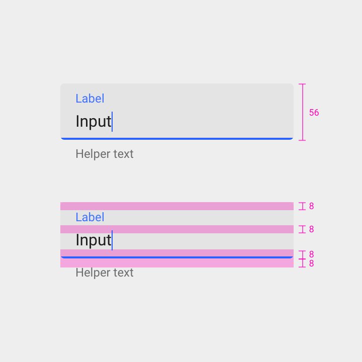
Height: 56dp
Padding above label: 8dp
Padding below label: 8dp
Padding below text field: 8dp
Padding above helper text: 8dp
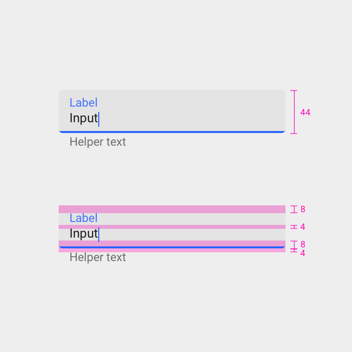
Height: 44dp
Padding above label: 8dp
Padding below label: 4dp
Padding below text field: 8dp
Padding above helper text: 4dp.
Single-line text field box
Multi-line text field box
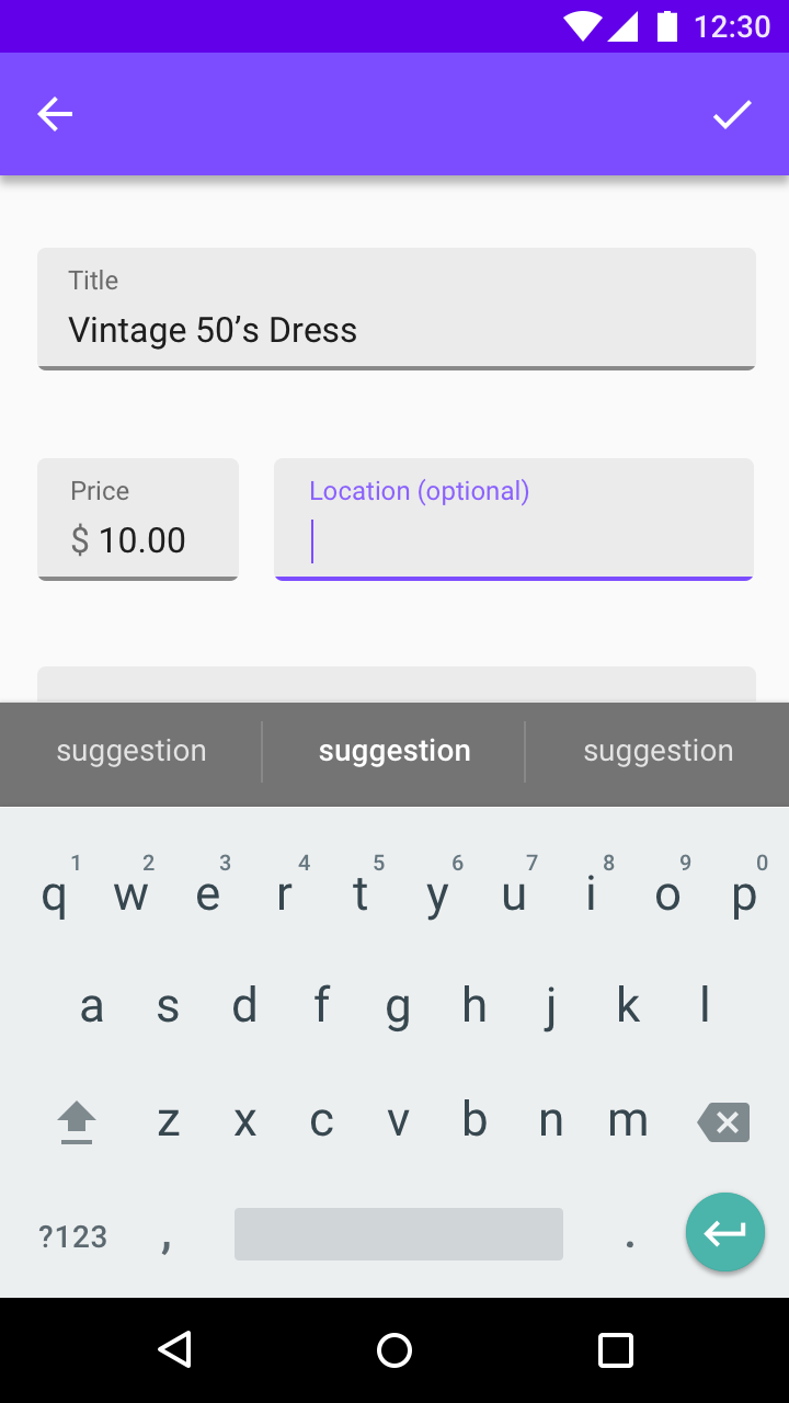
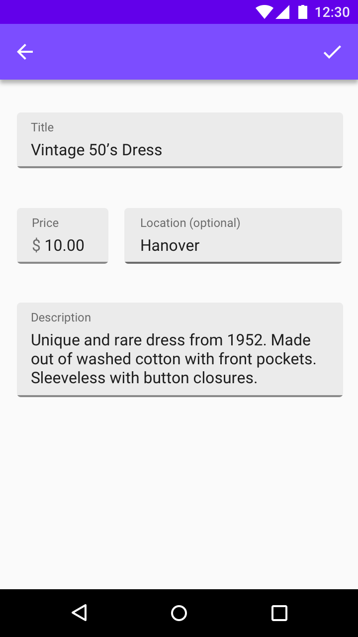
Text box area
Menus & pickers