Bottom navigation
Bottom navigation bars make it easy to explore and switch between top-level views in a single tap.
Tapping on a bottom navigation icon takes you directly to the associated view or refreshes the currently active view.
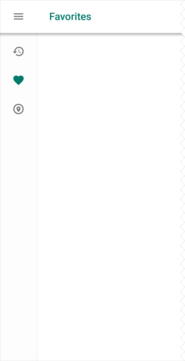
Bottom navigation is primarily for use on mobile. To achieve a similar effect for desktop, use side navigation.
Usage
- Three to five top-level destinations
- Destinations requiring direct access
Color
Tint the active icon with the app’s primary color. Use black or white if the bottom navigation bar is already colored.
Specs
- Width of each action: The width of the view divided by the number of actions (with a max of 168dp and a minimum of 80dp)
- Height: 56dp
- Icon: 24 x 24dp
Usage
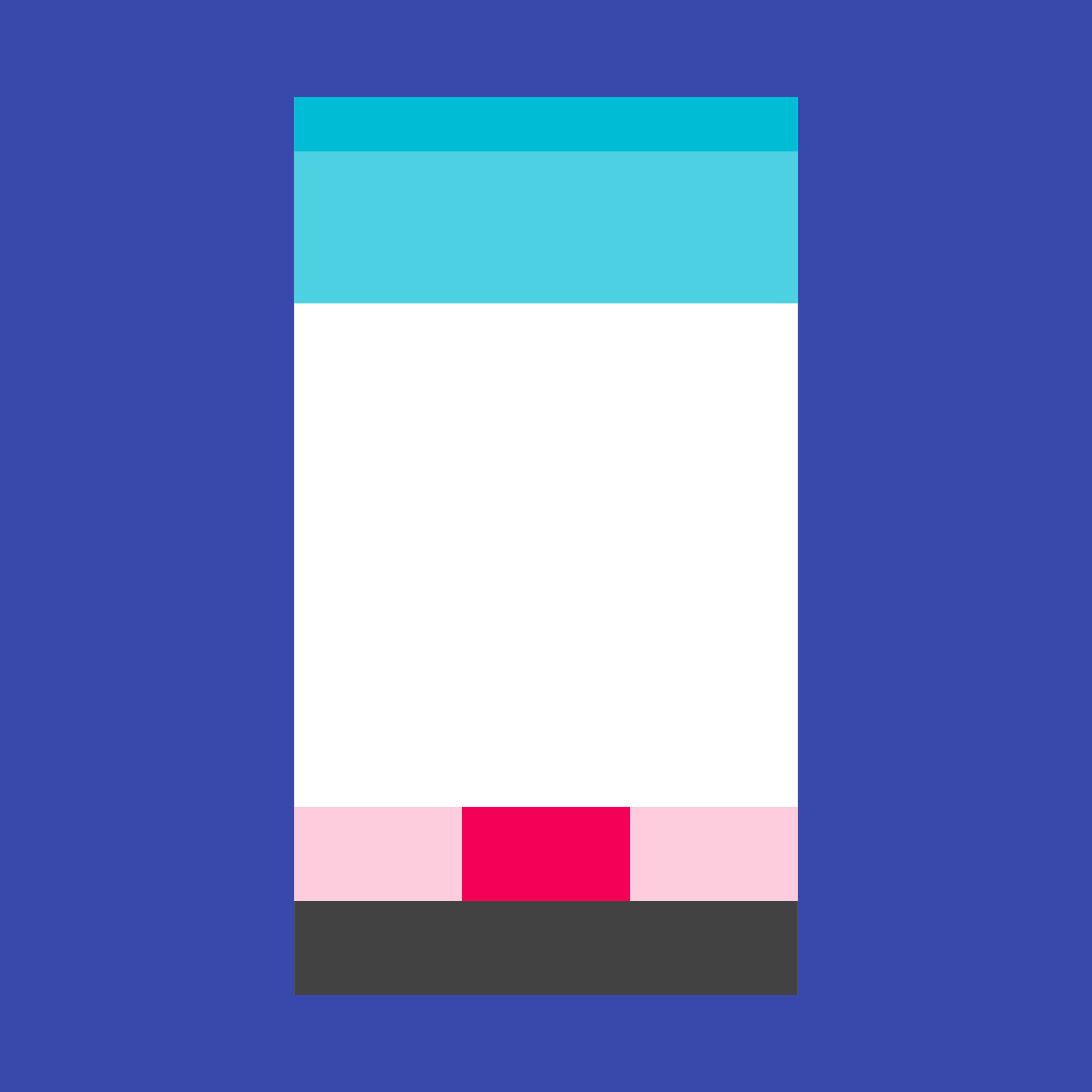
Bottom navigation provides quick navigation between top-level views of an app. It is primarily designed for use on mobile.
Larger displays, like desktop, may achieve a similar effect by using side navigation. For instance, the compact “rail” treatment displays navigational icons by default.
When to use
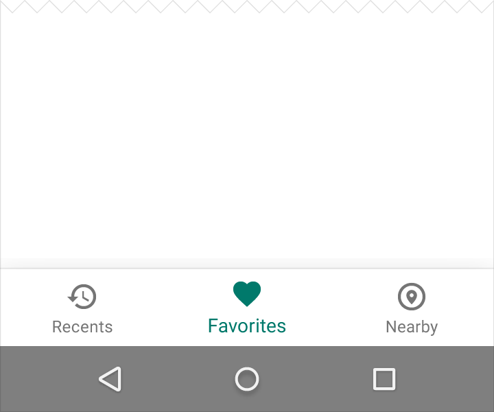
Bottom navigation should be used for:
- Three to five top-level destinations of similar importance (alternative: a persistent navigation drawer accessible from anywhere in the app)
- Destinations requiring direct access from anywhere in the app (alternative: tabs for only one or two destinations)
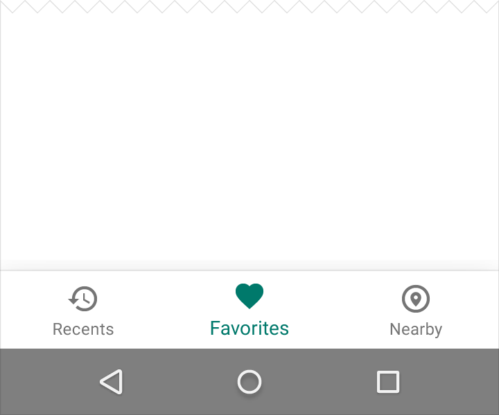
Do.
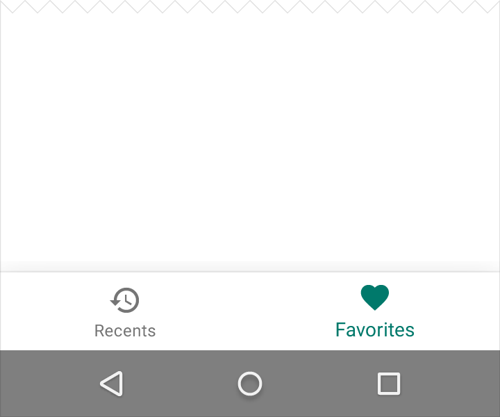
Don’t.
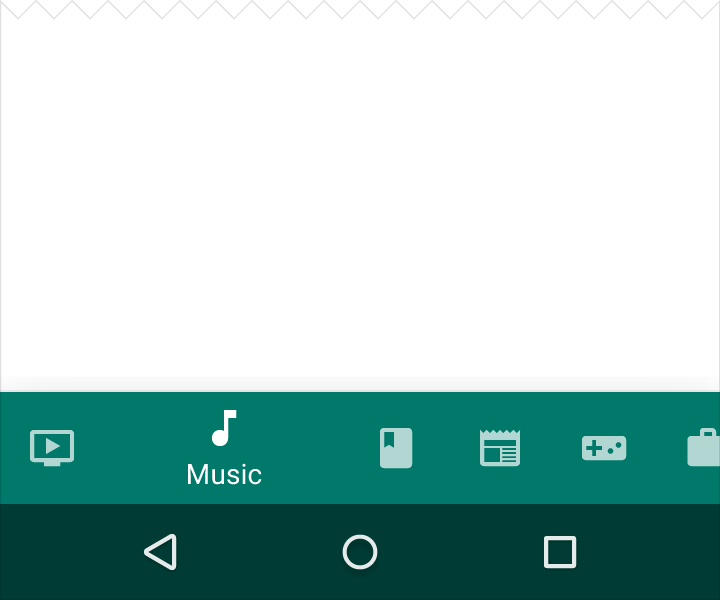
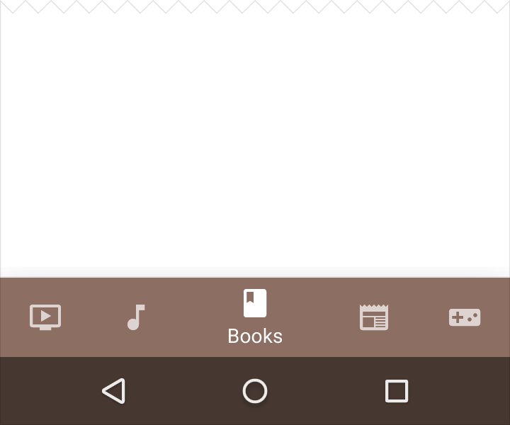
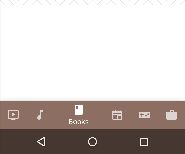
If your top-level navigation has more than six destinations, provide access to destinations not covered in bottom navigation through alternative locations, such as a navigation drawer.
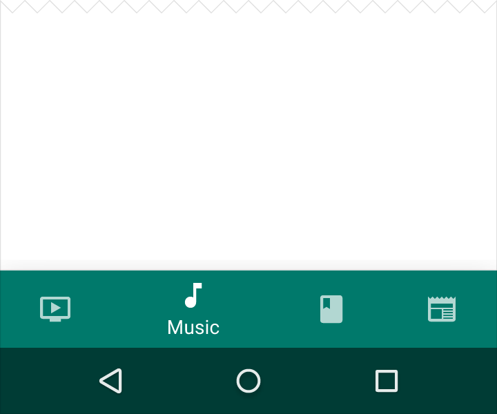
Do.
Don’t.
Do.
Don’t.
Bottom navigation and tabs
Be cautious when combining bottom navigation with tabs, as the combination may cause confusion when navigating an app. For example, tapping across both tabs and bottom navigation could display a mixture of different transitions across the same content.
Style
Icons and text
Because bottom navigation actions are presented as icons, they should be used for content that can be suitably communicated with icons.
Style each action according to the following conditions:
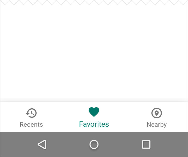
- When the view is in focus, display that view’s icon and text label
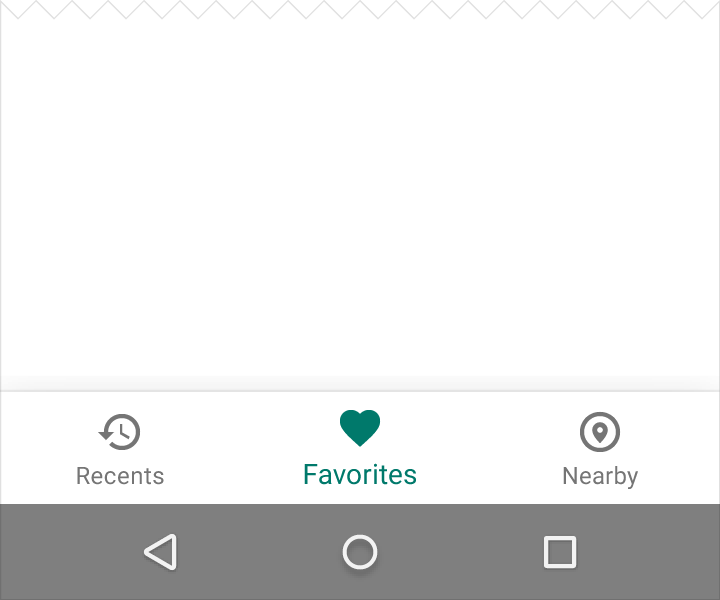
- When there are only three actions, display both icons and text labels at all times
- If there are four or five actions, display inactive views as icons only
Color
Tint the current bottom navigation action (including the icon and any text label present) with the app’s primary color.
Do.
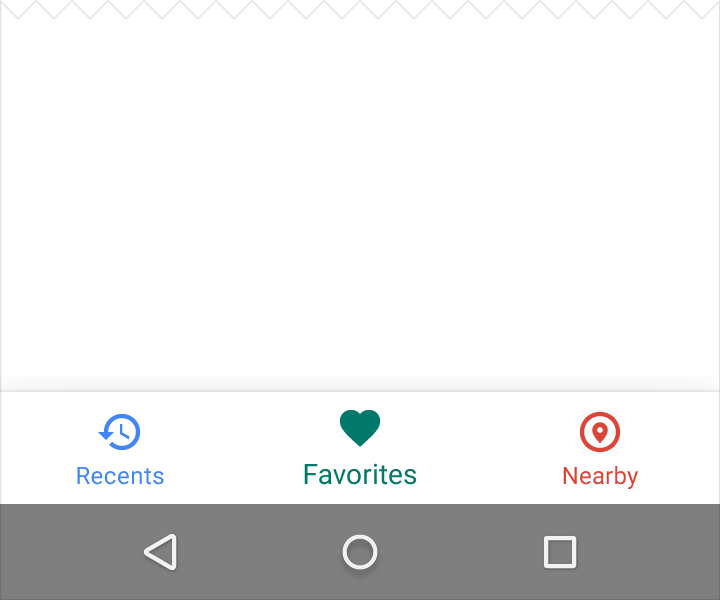
Don’t.
If the bottom navigation bar is colored, make the icon and text label of the current action black or white.
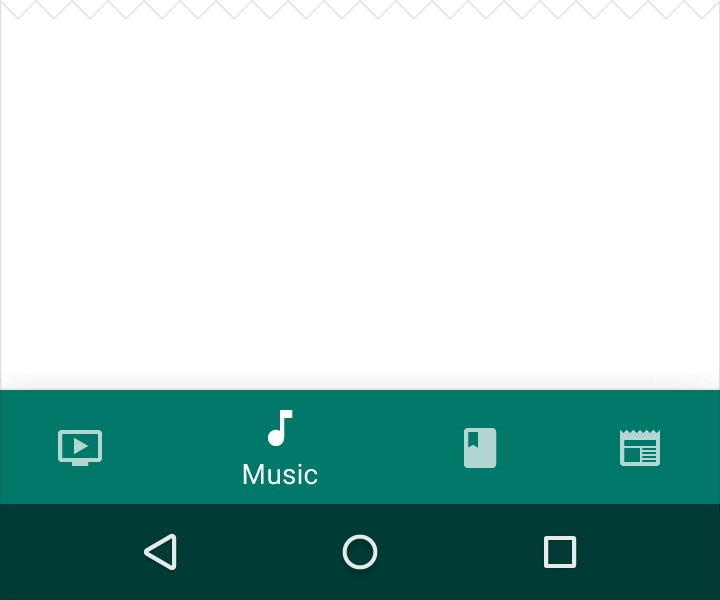
Do.
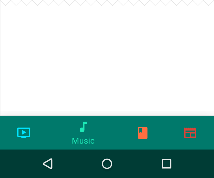
Don’t.
Text Labels
Text labels provide short, meaningful definitions to bottom navigation icons. Avoid long text labels as these labels do not truncate or wrap.
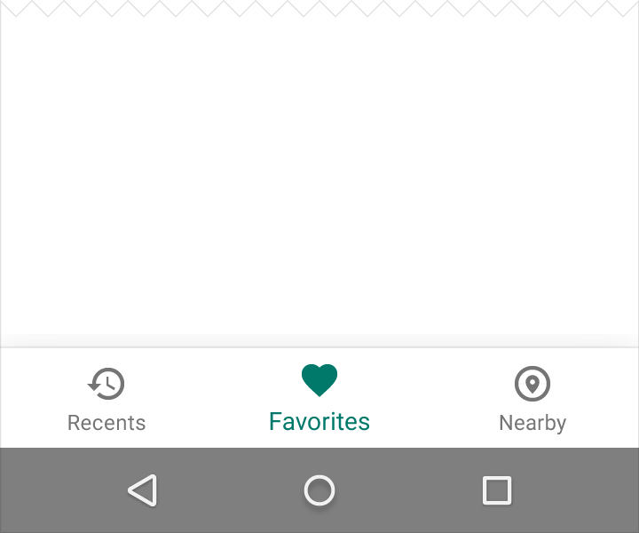
Do.
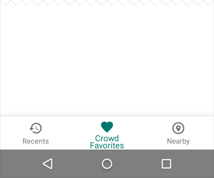
Don’t.
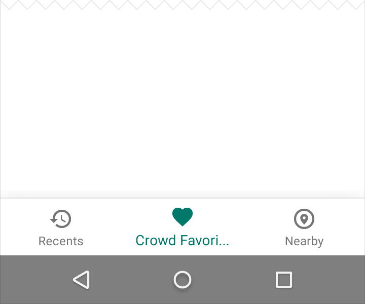
Don’t.
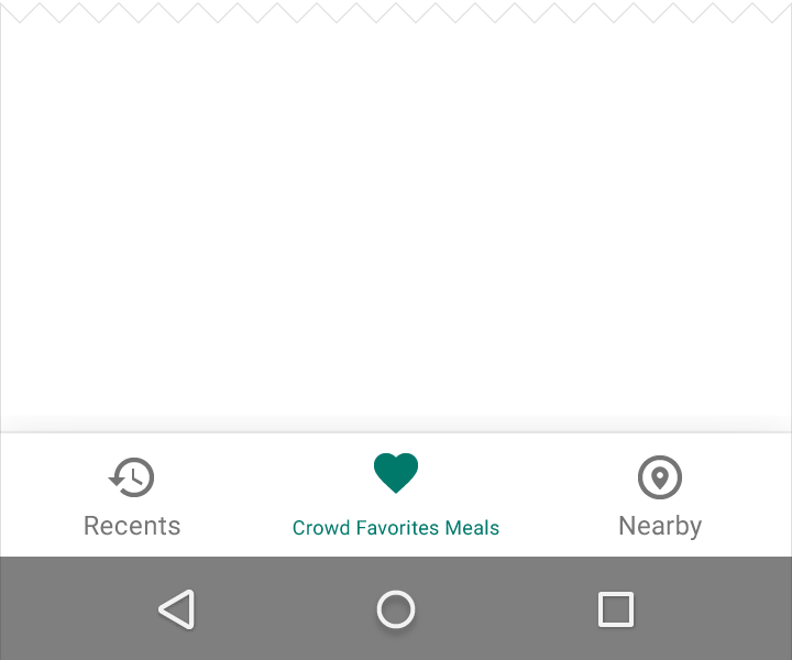
Don’t.
Behavior
The bottom navigation bar enables quick movement from deep in one topic to the top of another topic. Keep it available as the user descends the hierarchy, either by showing it persistently, or by concealing and revealing it upon scroll.
The bottom navigation bar shouldn’t be used for:
- Views focused on a single task, such as an email “Compose” screen
- Views containing user preferences or settings
On Android, the Back button does not navigate between bottom navigation bar views.
Bottom navigation icons
Tapping on a bottom navigation icon takes you directly to the associated view, or refreshes the currently active view. Each icon must lead to a destination, and may not open menus or dialogs.
Scrolling
The bottom navigation bar can appear and disappear dynamically upon scrolling:
- Scrolling downward hides the bottom navigation bar
- Scrolling upward reveals it
Using swipe gestures on the content area does not navigate between views.
Do.
Don’t.
Specs
Fixed bottom navigation bar
To calculate the width of each bottom navigation action, divide the width of the view by the number of actions:
Width of action = Width of entire view / Number of actions
For example, if a view is 360dp wide, and there are three actions, each action should be 120dp wide.
Desktop and larger views
Alternatively, make all bottom navigation actions the width of the largest action.
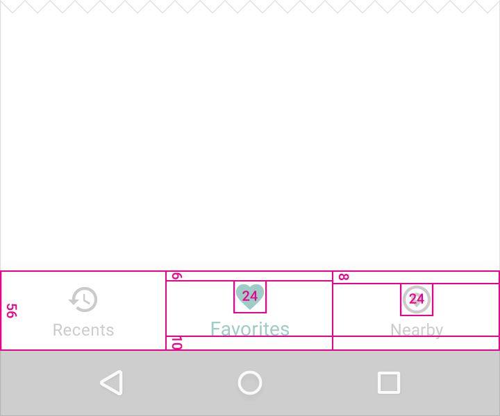
Width minimum and maximum (these values include padding):
- Maximum: 168dp
- Minimum: 80dp
Height:
56dp
Icon:
24 x 24dp
Content alignment:
Text and icon are centered horizontally within the view.
Padding:
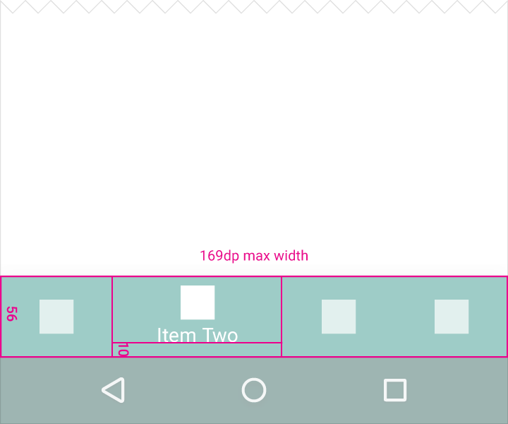
- 6dp above icon (active view), 8dp above icon (inactive view)
- 10dp under text
- 12dp left and right of text
Text label:
- Roboto Regular 14sp (active view)
- Roboto Regular 12sp (inactive view)
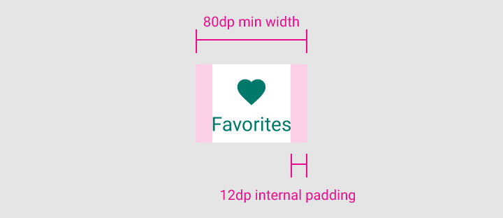
12dp padding
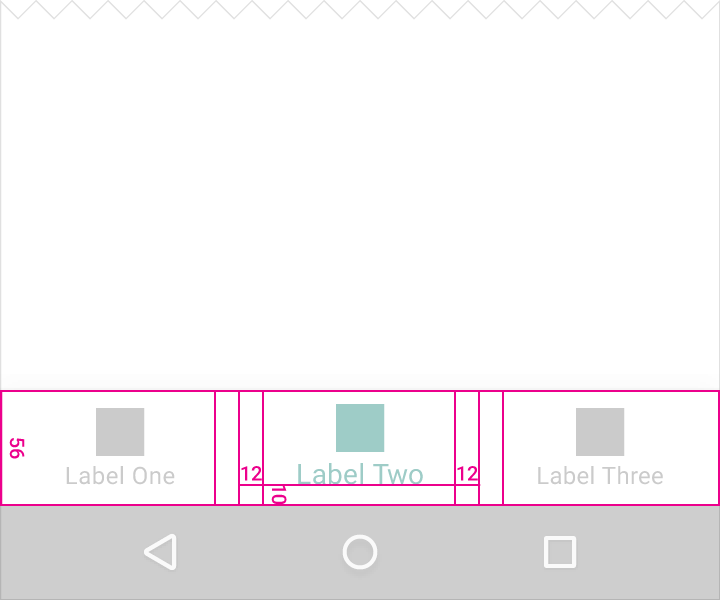
12dp left and right of text
10dp under text
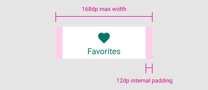
12dp padding
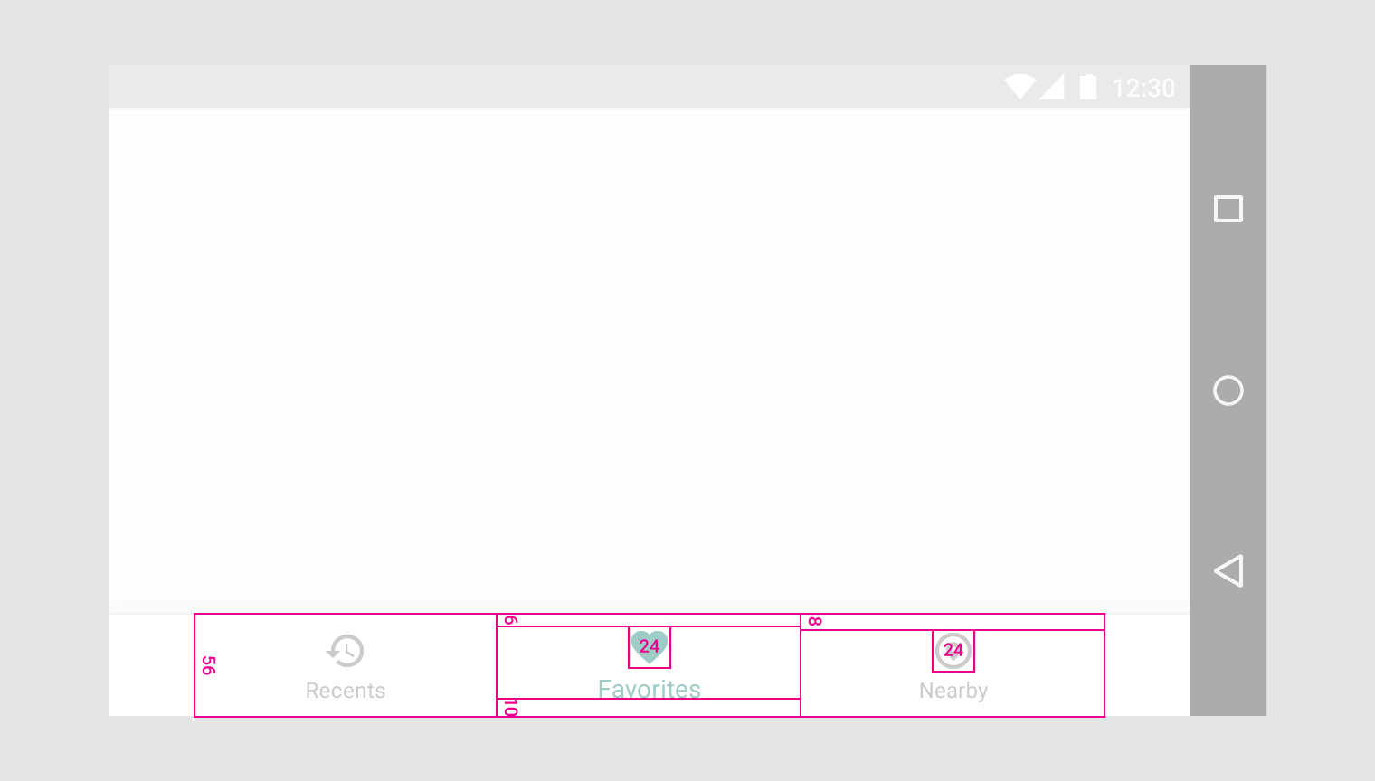
56dp height
24 x 24dp icon
6dp above icon (active view)
8dp above icon (inactive view)
10dp under text
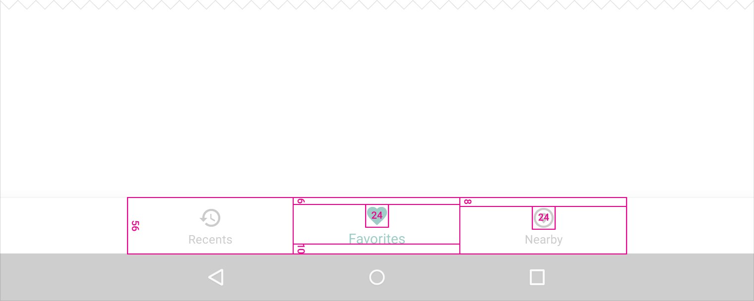
56dp height
24 x 24dp icon
6dp above icon (active view)
8dp above icon (inactive view)
10dp under text
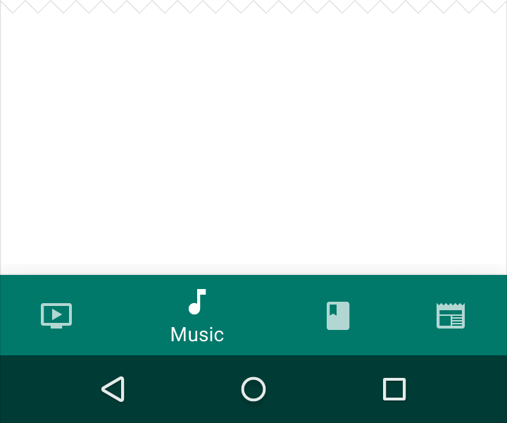
Shifting bottom navigation bar
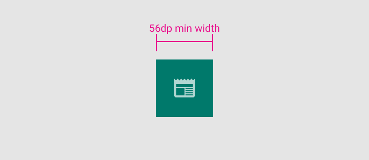
Width minimum and maximum (this includes padding):
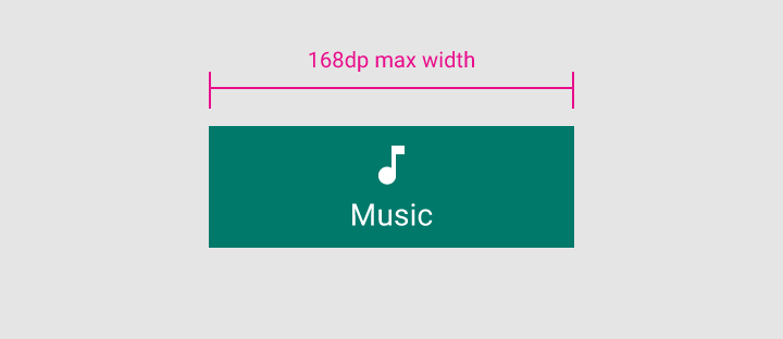
Active view
- Maximum: 168dp
- Minimum: 96dp
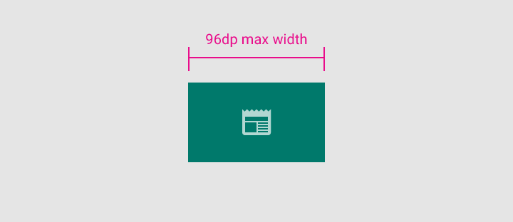
Inactive view
- Maximum: 96dp
- Minimum: 56dp
Height:
56dp
Icon:
24 x 24dp
Content alignment:
Text and icon are centered horizontally within view.
Padding:
- 6dp above icon (active view), 16dp above and below icon (inactive view)
- 10dp under text
Text label:
Roboto Regular 14sp (active view)
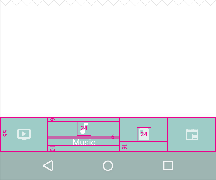
56dp height
24 x 24dp icon
6dp above icon (active view)
10dp under text
6dp below icon
16dp below icon with no title
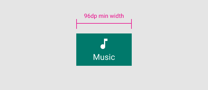
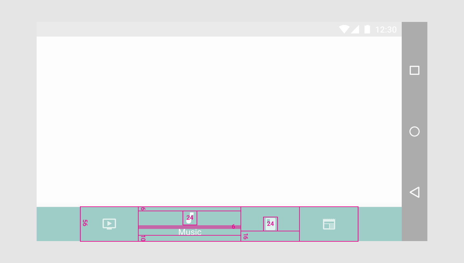
56dp height
24 x 24dp icon
6dp above icon (active view)
10dp under text
6dp below icon
16dp below icon with no title
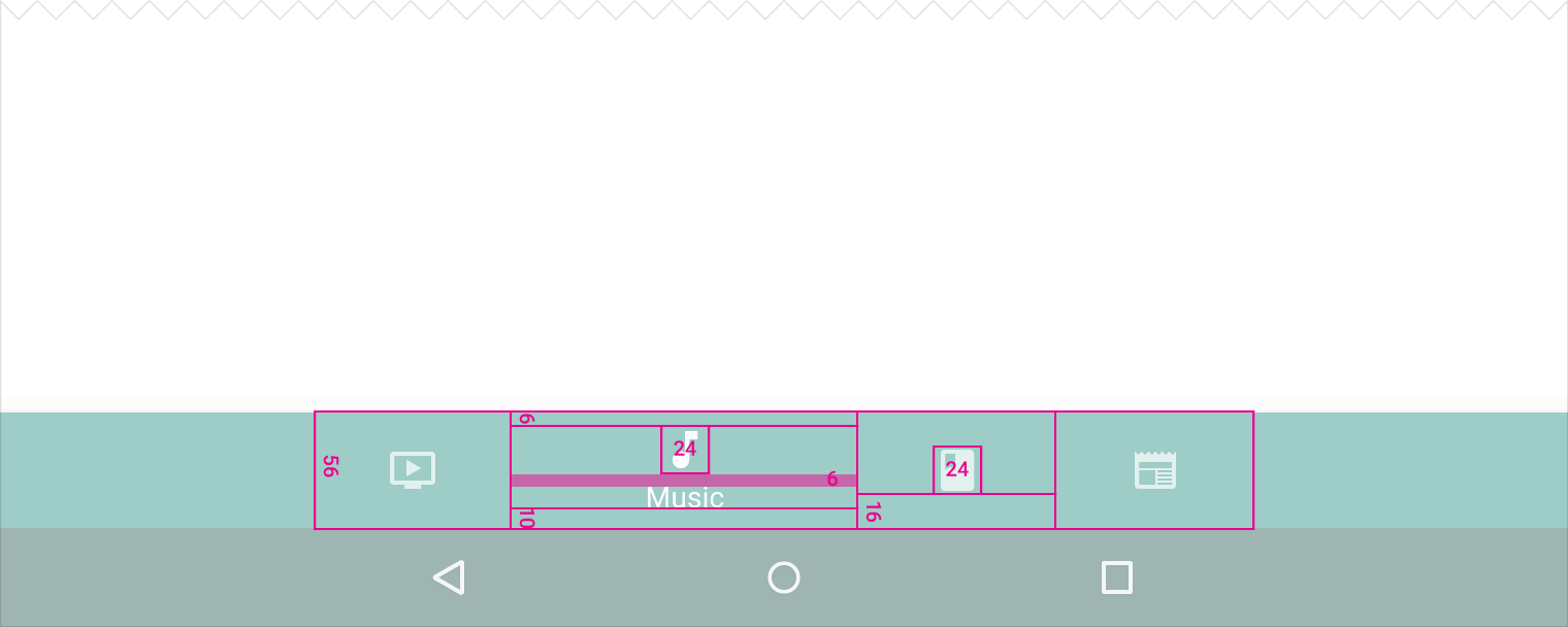
56dp height
24 x 24dp icon
6dp above icon (active view)
10dp under text
6dp below icon
16dp below icon with no title
Elevation
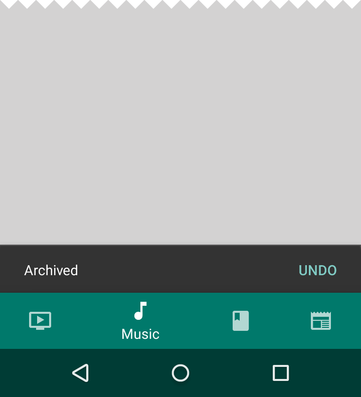
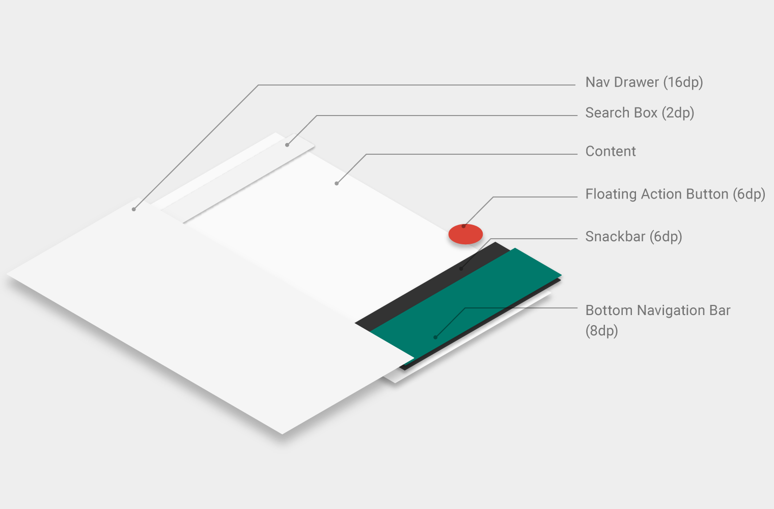
Because snackbars have a lower (6dp) elevation, they appear behind the bottom navigation bar (8dp elevation).
Bottom sheets, navigation drawers, and keyboards appear in front of the bottom navigation bar, temporarily covering it.