Metrics & keylines
Baseline grids
All components align to an 8dp square baseline grid for mobile, tablet, and desktop. Iconography in toolbars align to a 4dp square baseline grid.
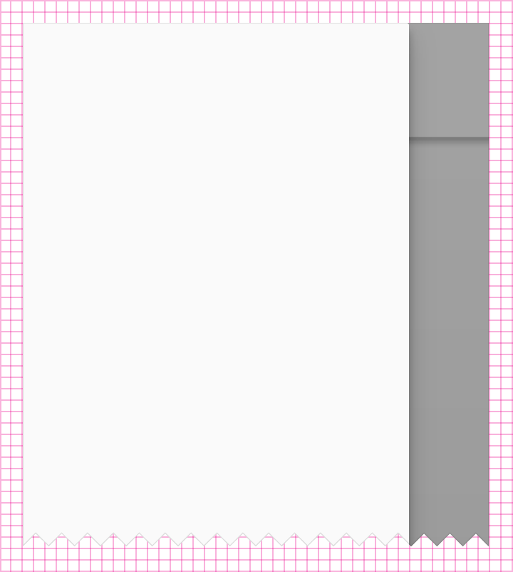
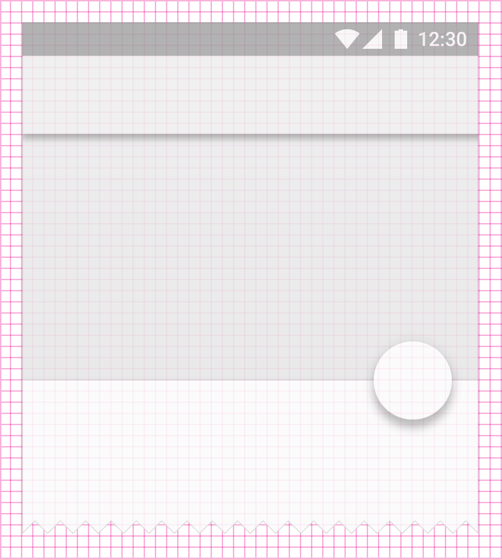
Type aligns to a 4dp baseline grid. See detailed information on typography.
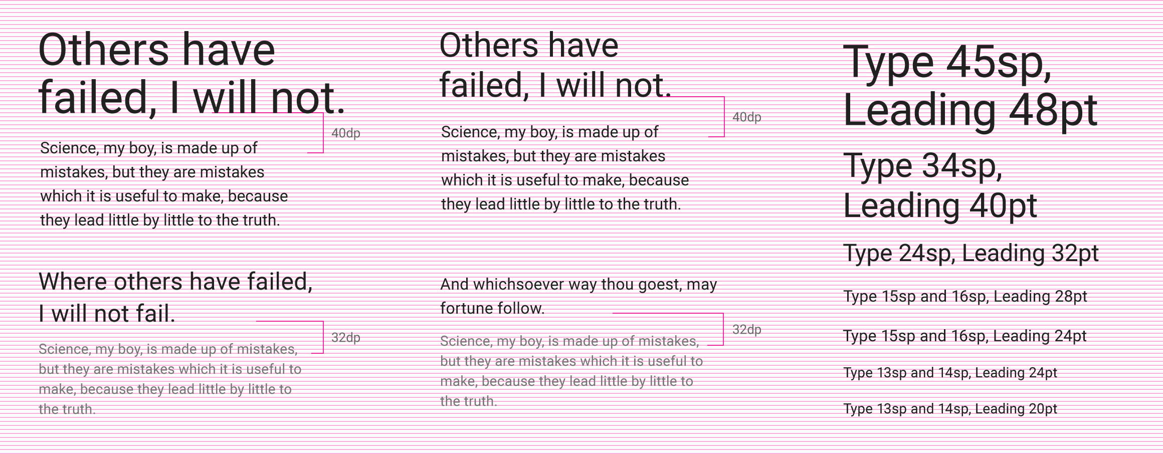
Keylines and spacing
The following templates and examples contain keylines, spacing guidance, and sample screens for elements on mobile, tablet, and desktop.
Templates
- Mobile layout template 2.23 MB (.ai)
- Tablet layout template 1.39 MB (.ai)
- Desktop layout template 89.40 MB (.ai)
Mobile
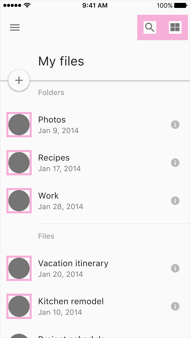
List
A two-column, left-aligned list with a 56dp floating action button.
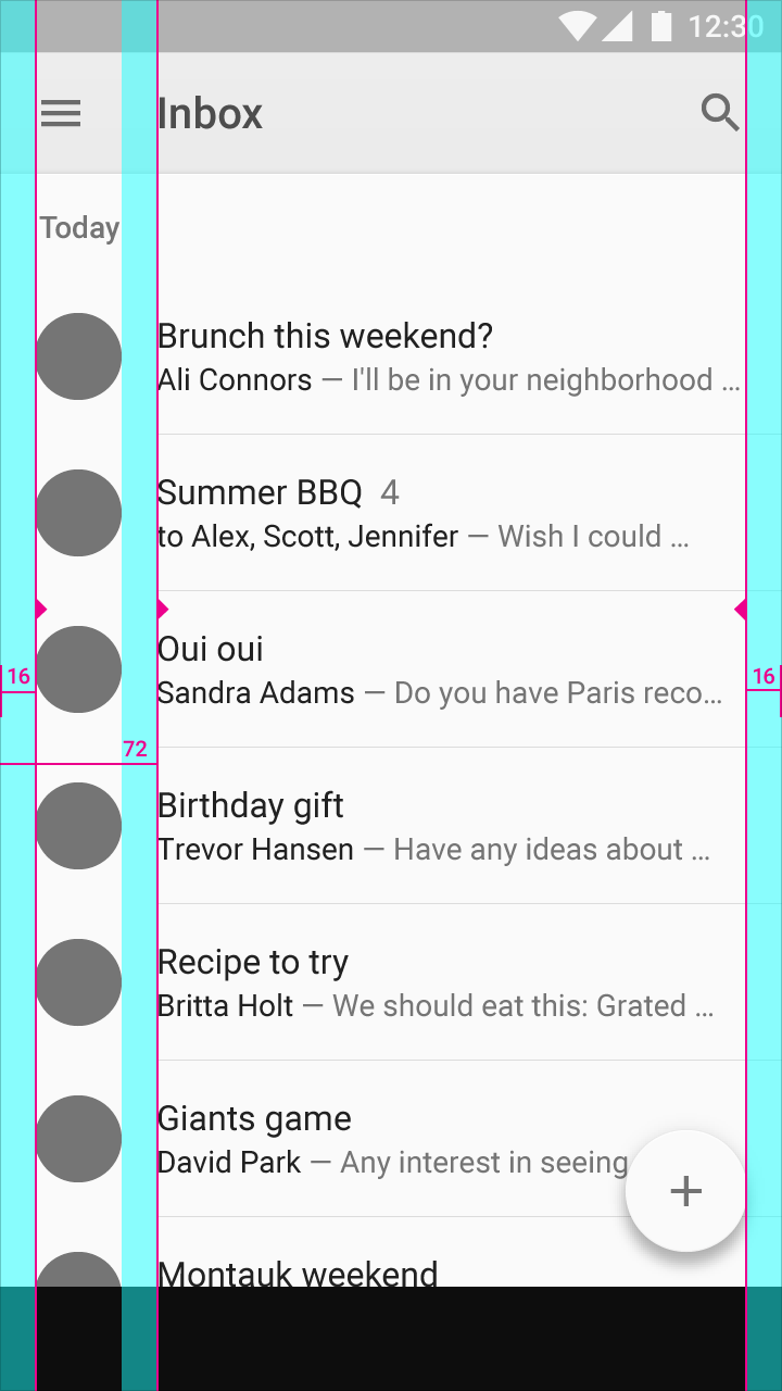
Screen edge left and right margins: 16dp
Content associated with an icon or avatar left margin: 72dp
Horizontal margins on mobile: 16dp
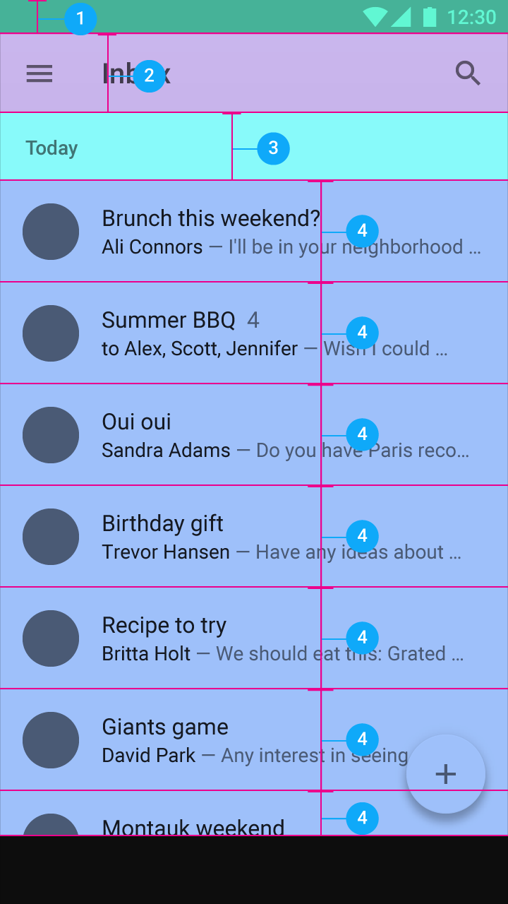
- Status bar: 24dp
- Toolbar: 56dp
- Subtitle: 48dp
- List item: 72dp
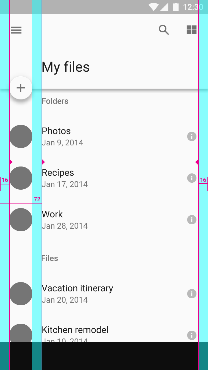
Screen edge left and right margins: 16dp
Content left margin from screen edge: 72dp
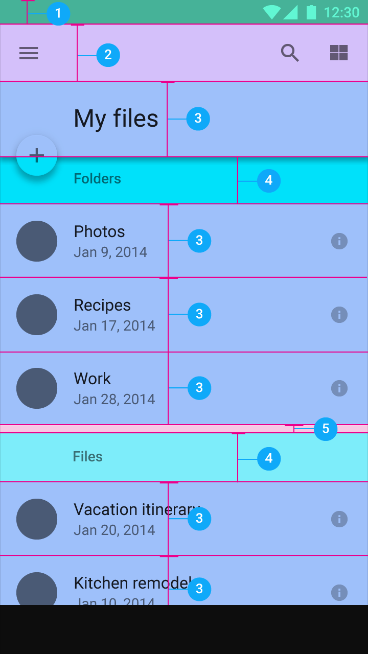
- Status bar: 24dp
- Toolbar: 56dp
- Title and list items: 72dp
- Subtitle: 48dp
- Space between content areas: 8dp
Detail view
A detail card with a 56dp floating action button.
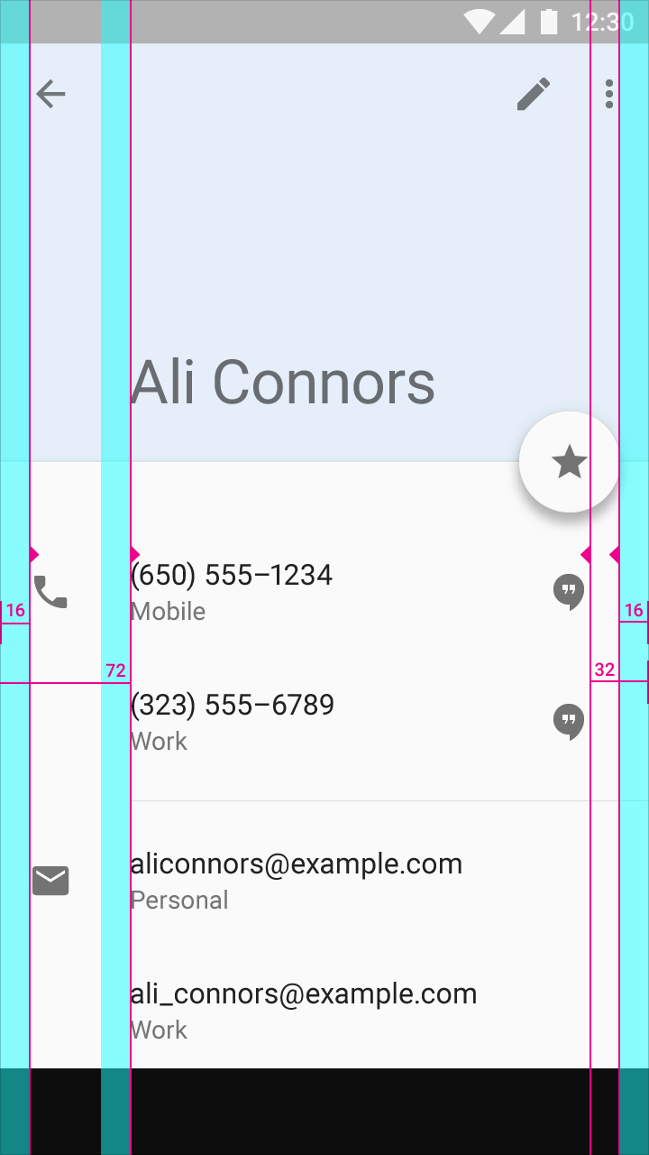
Screen edge left and right margins: 16dp
Content left margin from screen edge: 72dp
Right-side icons align 32dp from the right edge to coordinate with the floating action button.
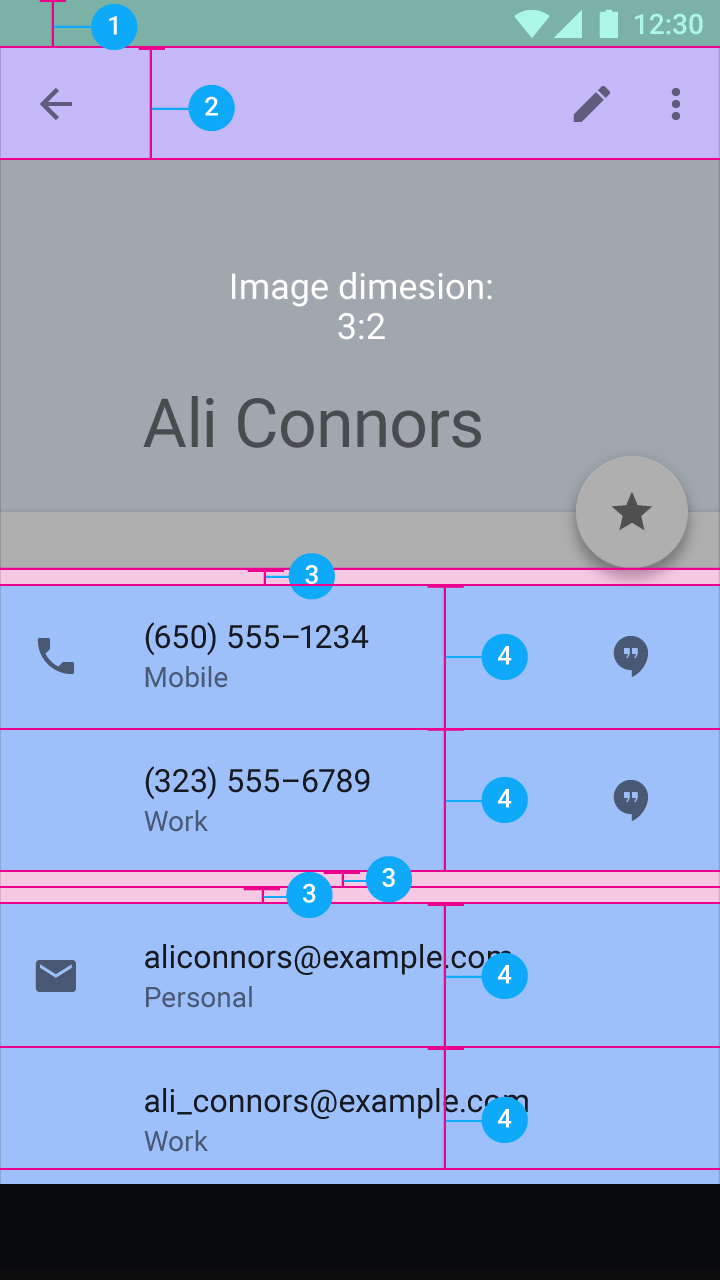
- Status bar: 24dp
- Toolbar: 56dp
- Space between content areas: 8dp
- List item: 72dp
Navigation drawer
A side navigation menu with icons, avatars, and text aligned on the left. Other icons align on the right.
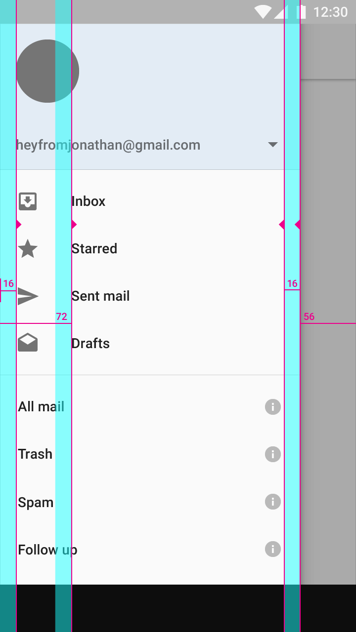
Screen edge left and right margins: 16dp
Content associated with an icon or avatar left margin: 72dp
Side nav width: The screen width minus the height of the action bar. Here, the width is 56dp from the right screen edge.
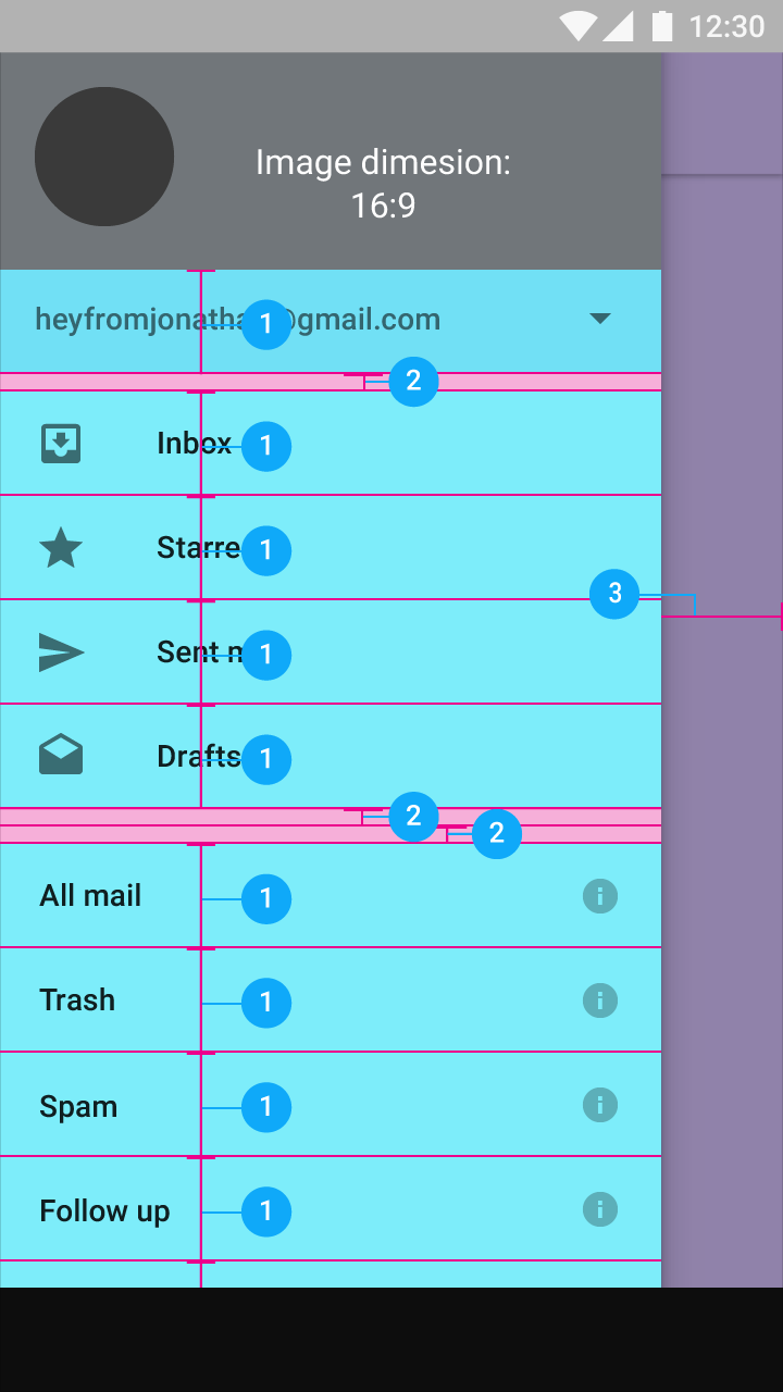
- Account menu and list items: 48dp
- Space between content areas: 8dp
- Navigation right margin: 56dp
Tablet
List with detail view
Left-aligned list with a right-aligned floating action button
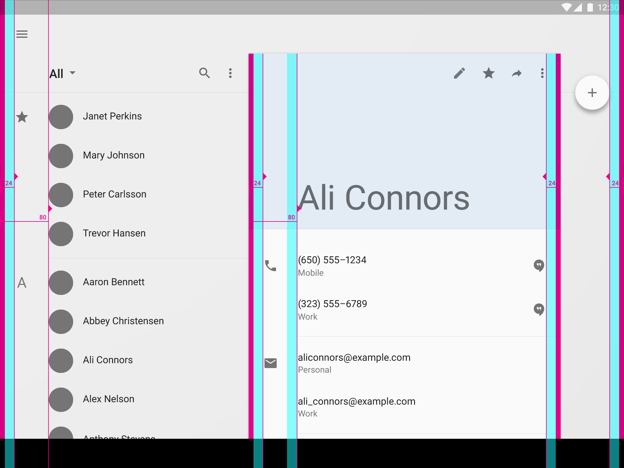
Screen edge left and right margins: 24dp
Content left margin from screen edge: 80dp
Card left and right padding: 24dp
Card content left padding: 104dp
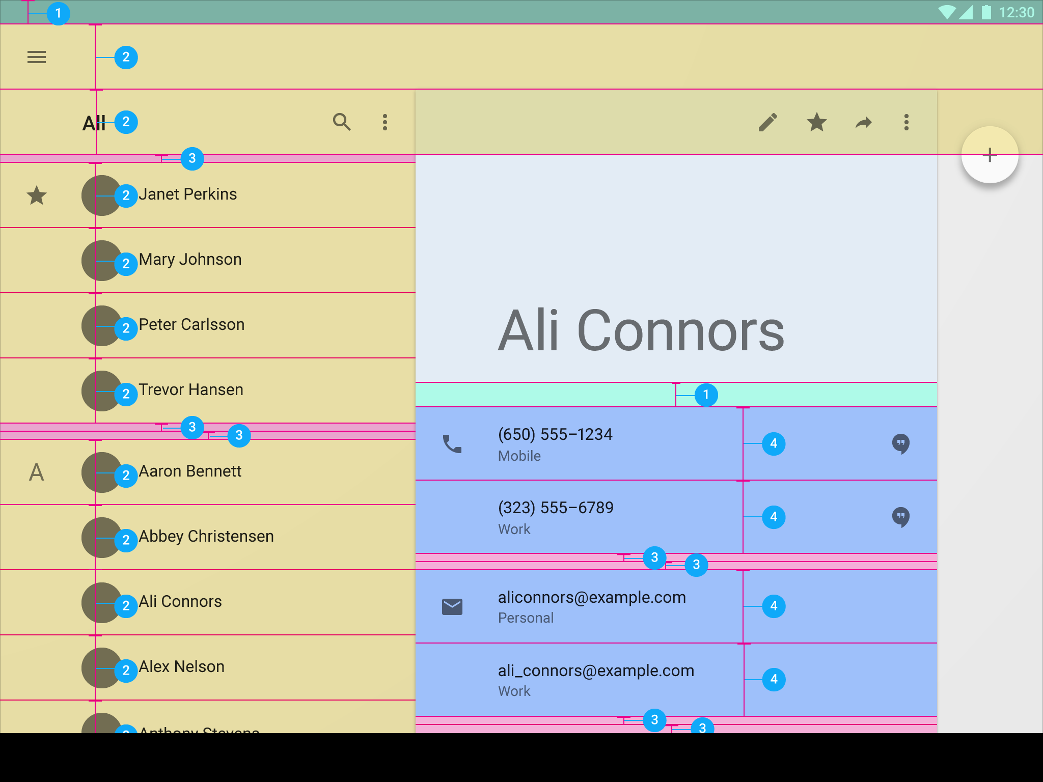
- Status bar and space above list: 24dp
- List item: 64dp
- Space between content areas: 8dp
- List item: 72dp
List with detail view
Left-aligned list with a left-aligned floating action button
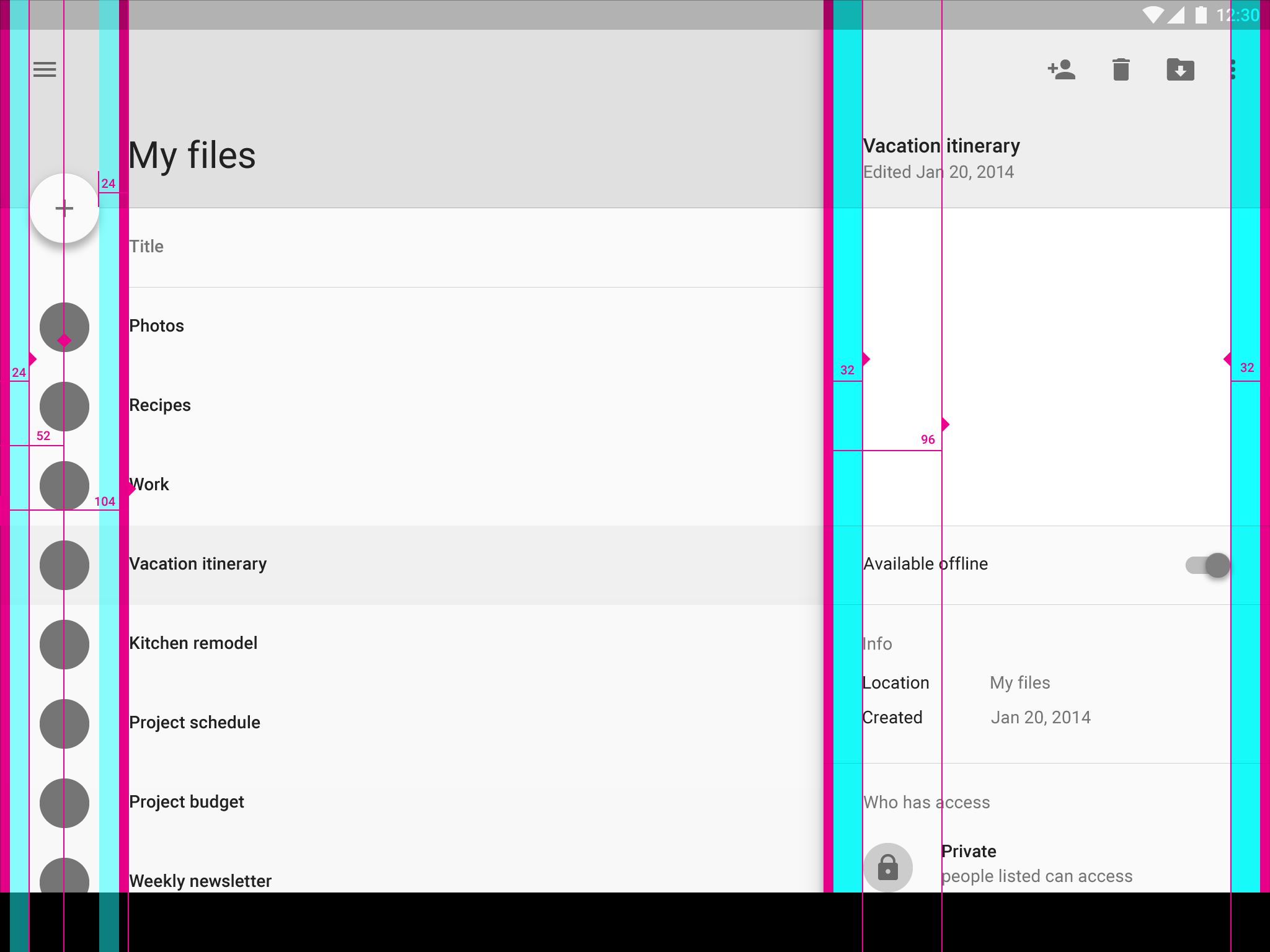
Screen edge left and right padding: 24dp
Icons’ vertical center distance from screen edge: 52dp
Nav item left padding from screen edge: 104dp
Content left margin from screen edge: 80dp
Card left and right padding: 32dp
Card nav item left padding: 96dp
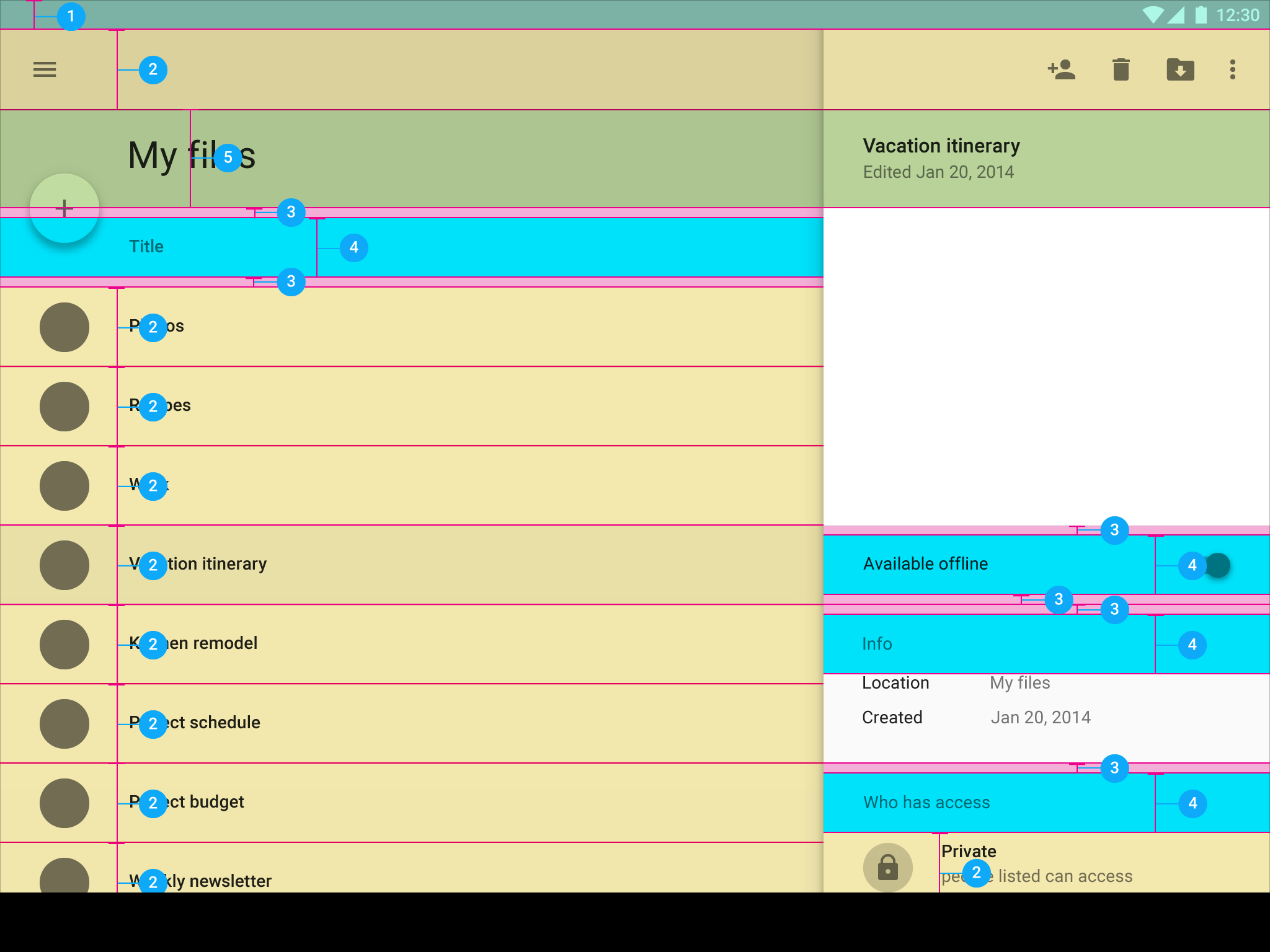
- Status bar: 24dp
- Toolbar and list item: 64dp
- Space between content areas: 8dp
- Subtitle, list item, and slider: 48dp
- Title: 80dp
Desktop
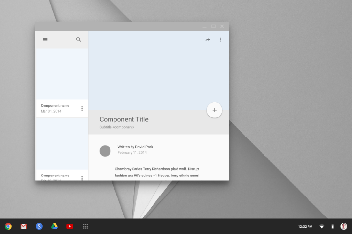
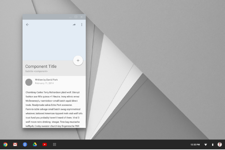
Keylines and spacing blocks for desktop inherit grid rules from tablet and mobile, depending on window size.
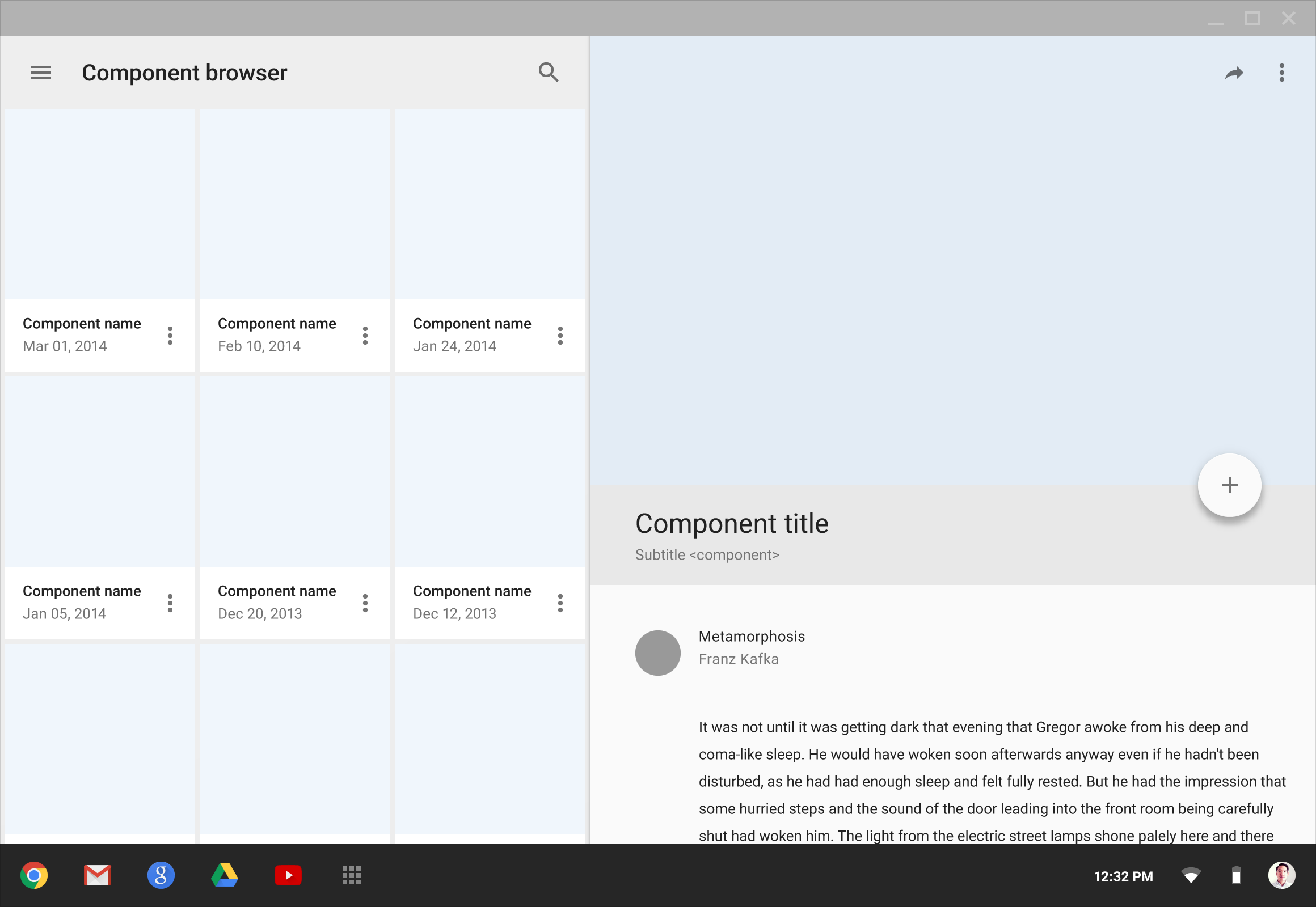
Resized windows
Ratio keylines
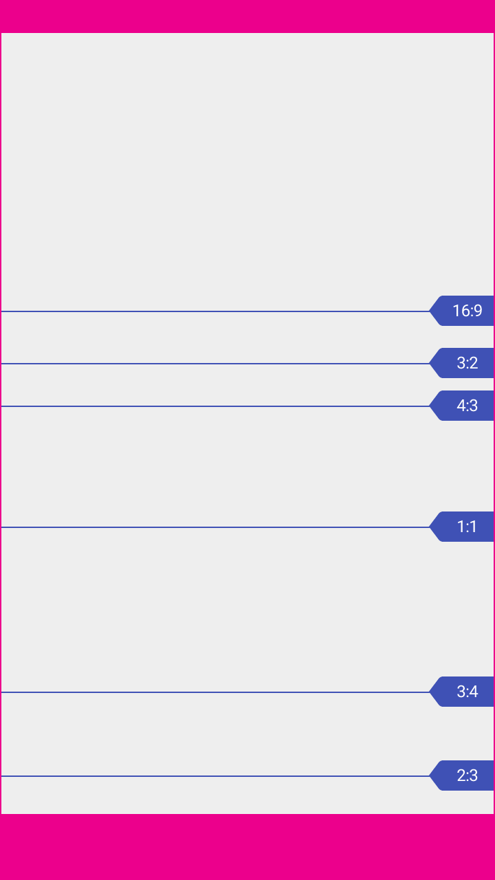
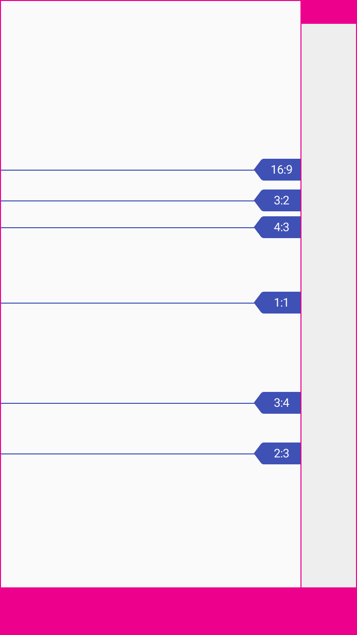
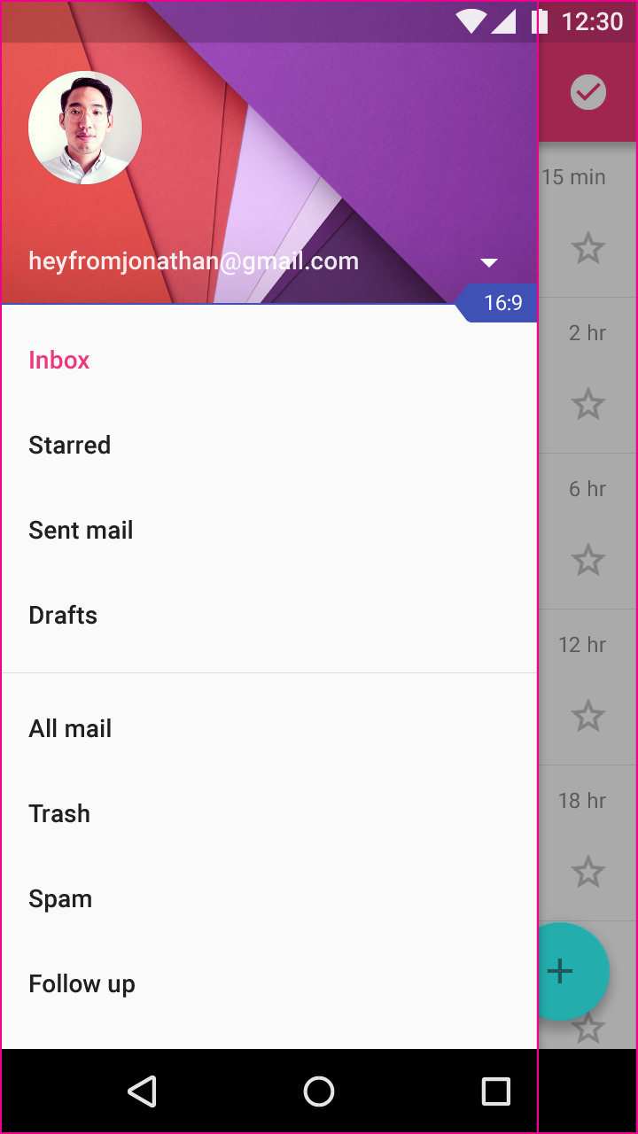
The proportion of an element’s width to its height (called the aspect ratio) applies to both UI elements and screen size. It is written as width:height.
These aspect ratios are recommended:
- 16:9
- 3:2
- 4:3
- 1:1
- 3:4
- 2:3
For example:
- A 1:1 aspect ratio means an element has equal height and width
- A 360dp wide image with a 2:3 aspect ratio has a height of 540
Determine the width or height of your element for a chosen aspect ratio using the below formulas. The aspect ratio is always expressed as a fraction. For example, 3:2 is treated as 3/2.
Width = Aspect ratio * Height
Height = Width/Aspect ratio

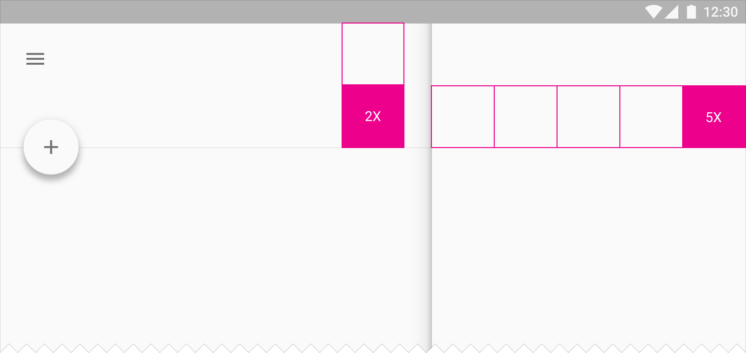
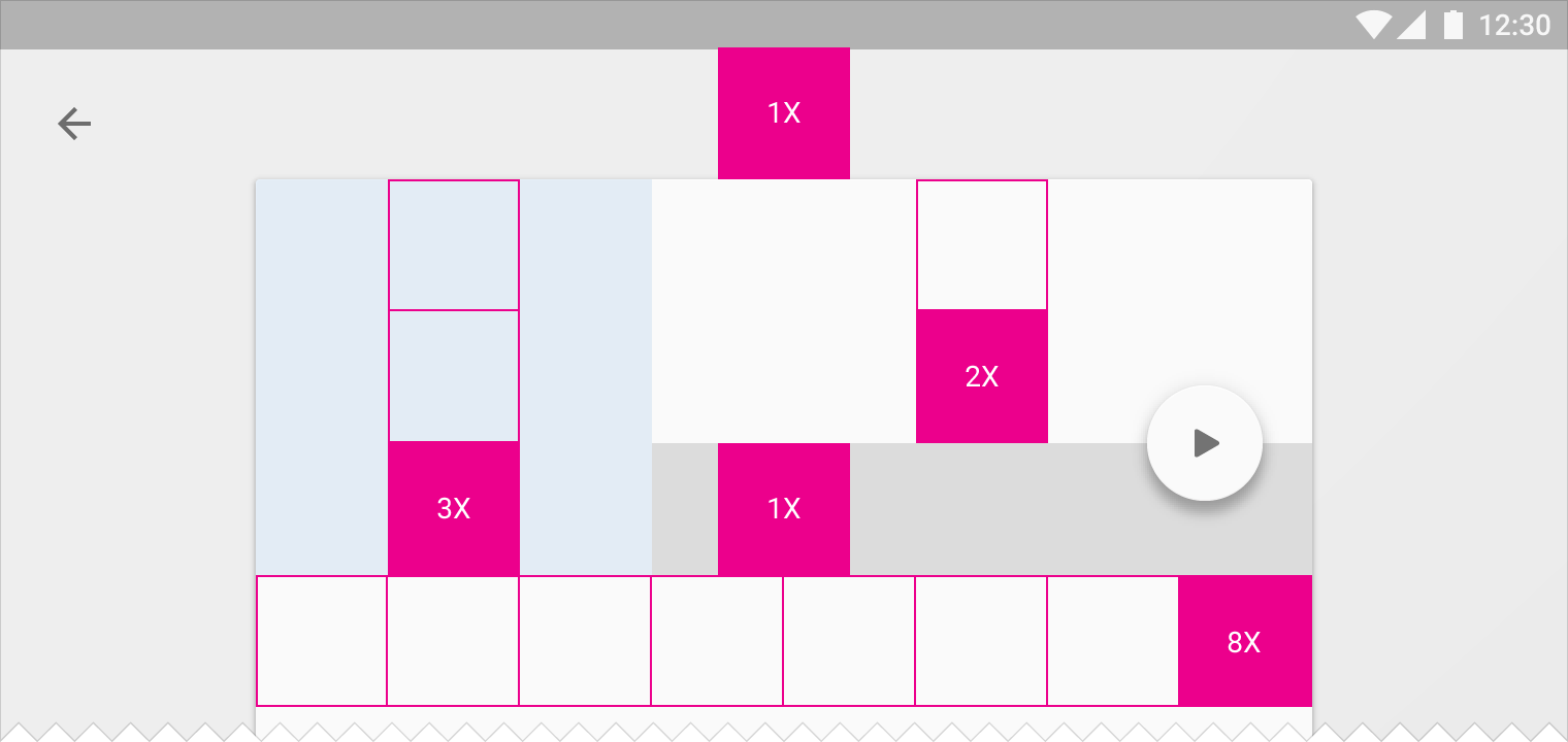
Sizing by increments
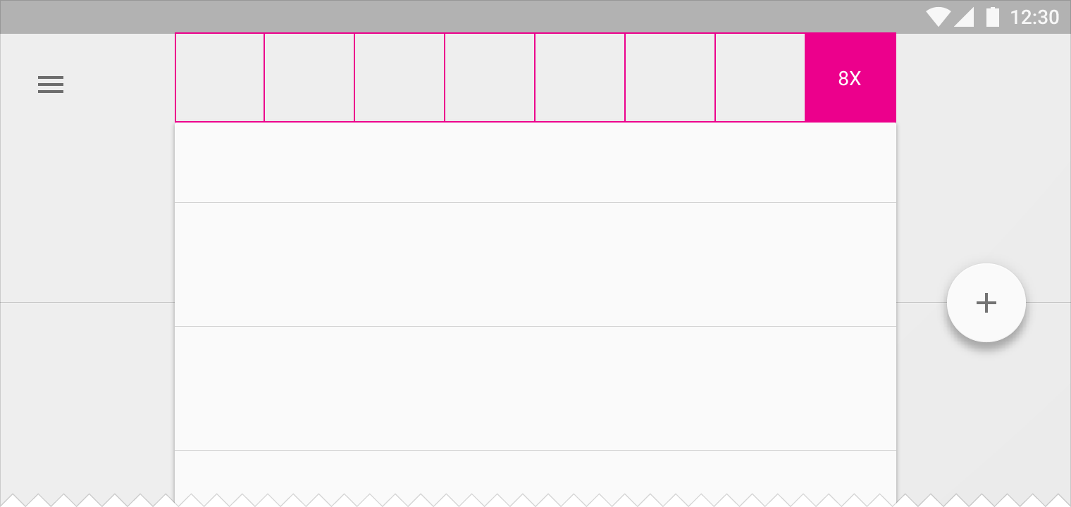
An increment is a measurement used to determine the size and position of other elements in the app.
For example, you can define an increment as the height of a standard element, such as the action bar. If the action bar is 56dp tall, you may define one increment as equal to 56 x 56dp. Determine the size of other elements by how many 56dp increments wide or tall an element should be.
If an element is 8 increments wide, using 56dp as the increment size, the width is equal to 448dp.
Incremental keylines apply mostly to desktop, often to tablet, and infrequently to mobile. The number of increments varies based on window size.
Touch target size
To ensure balanced information density and usability, touch targets should be at least 48 x 48 dp. In most cases, there should be 8dp or more space between them.
Size elements at least 48dp high and wide to ensure a physical size of about 9mm regardless of screen size. The recommended target size for touchscreen objects is 7-10mm.
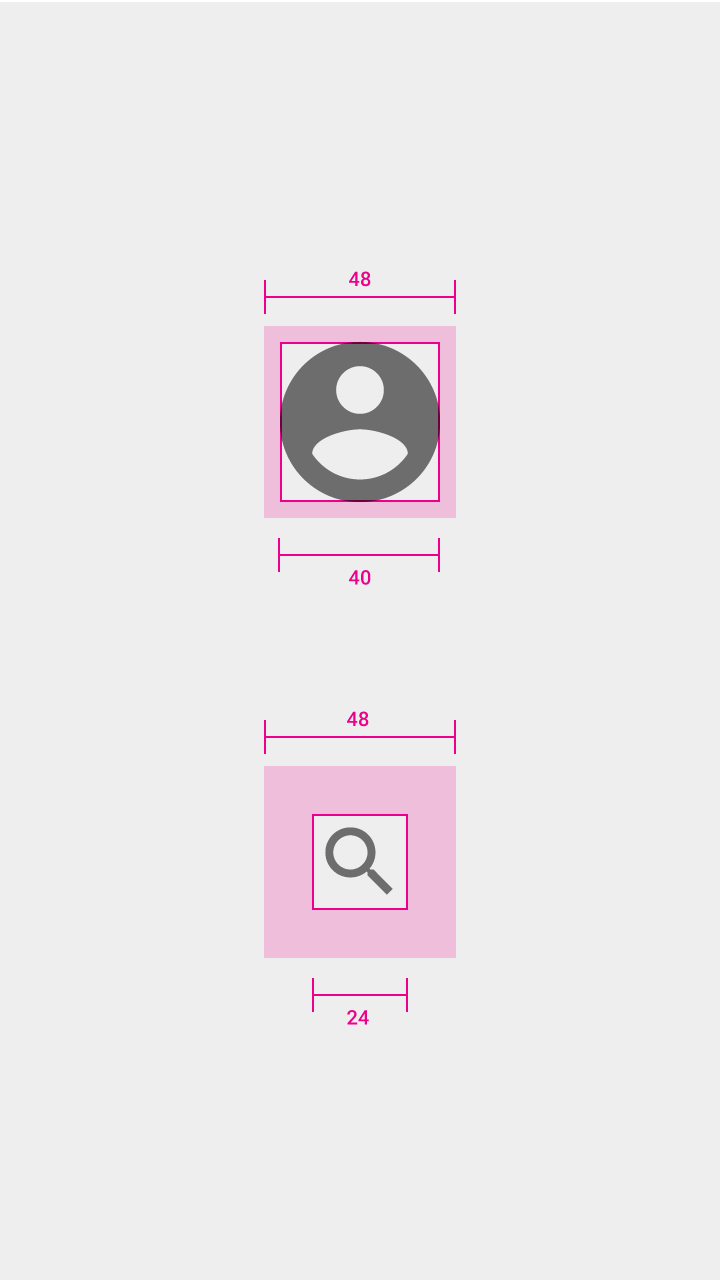
Icon: 24dp
Touch target on both: 48dp
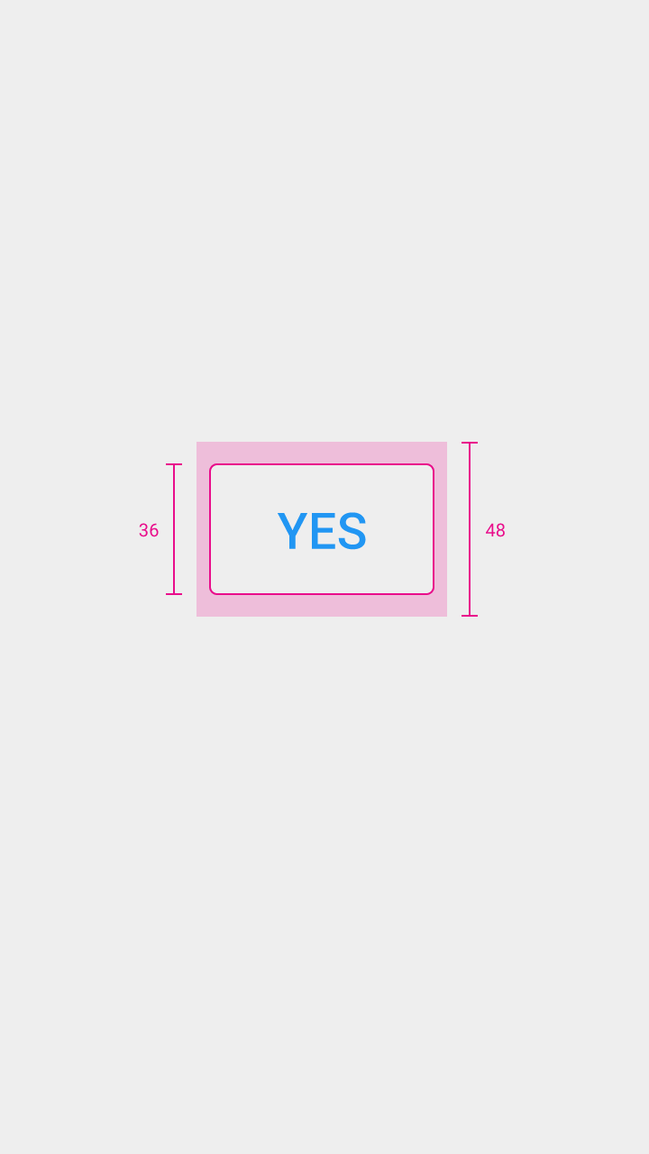
Button height: 36dp