

Snackbars & toasts
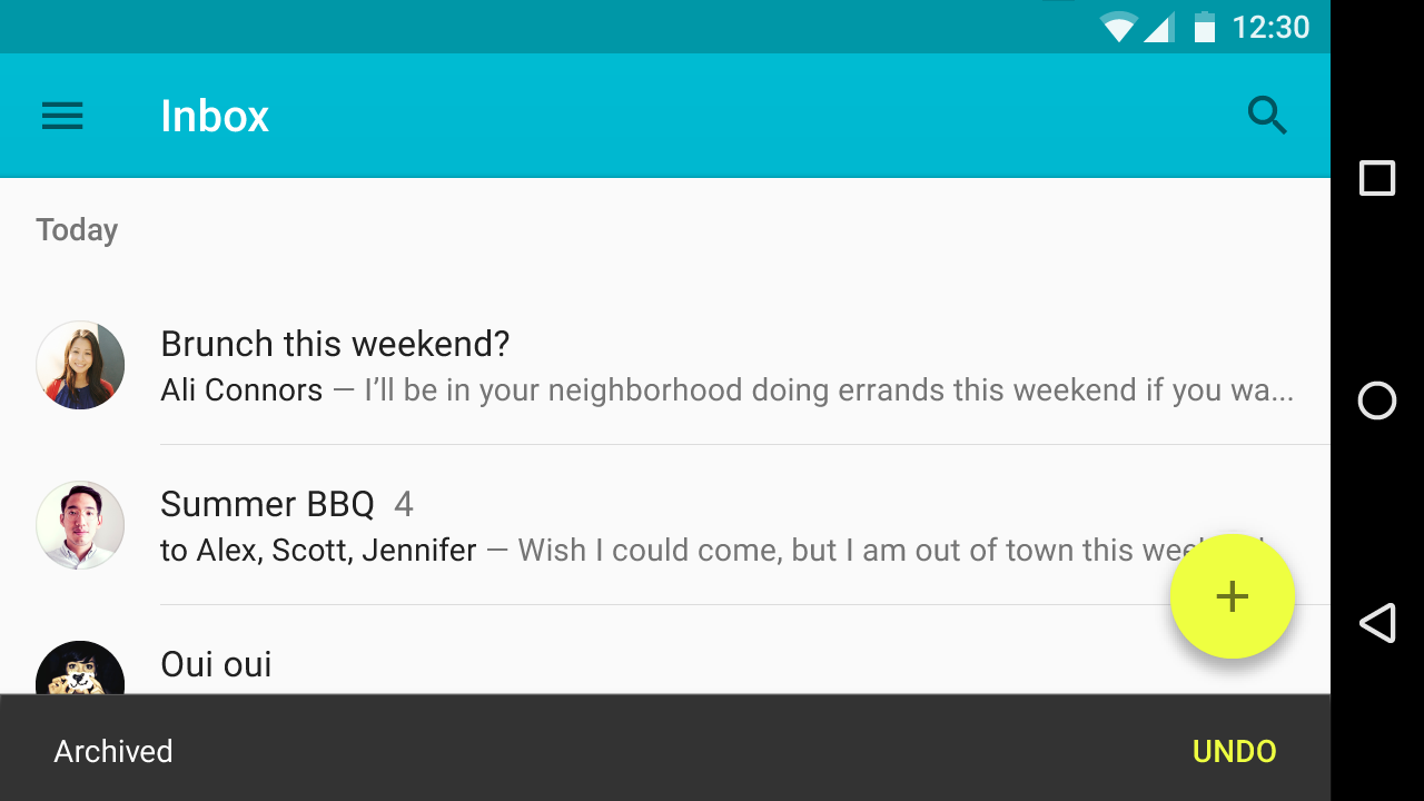
Snackbars provide brief feedback about an operation through a message at the bottom of the screen.
Snackbars contain a single line of text directly related to the operation performed. They may contain a text action, but no icons.
Toasts (Android only) are primarily used for system messaging. They also display at the bottom of the screen, but may not be swiped off-screen.
Usage
Only one snackbar may be displayed at a time. Each snackbar may contain a single action, neither of which may be “Dismiss” or “Cancel.”
Behavior
Snackbars animate upwards from the bottom edge of the screen.
Snackbar specs
- Action button: Roboto Medium 14sp, all-caps text
- Mobile height: 48dp (single-line), 80dp (multi-line)
- Desktop snackbar height: 48dp

Usage
Show only one snackbar on screen at a time.
Placement
Snackbars appear above most elements on screen, and they are equal in elevation to the floating action button. However, they are lower in elevation than dialogs, bottom sheets, and navigation drawers.
Behavior
Upon entrance, snackbars animate upwards from the bottom edge of the screen. When they appear, they do not block input.
They exit by being swiped off-screen or automatically disappear after a timeout or user interaction elsewhere (such as summoning a new surface or activity).
Very short text strings
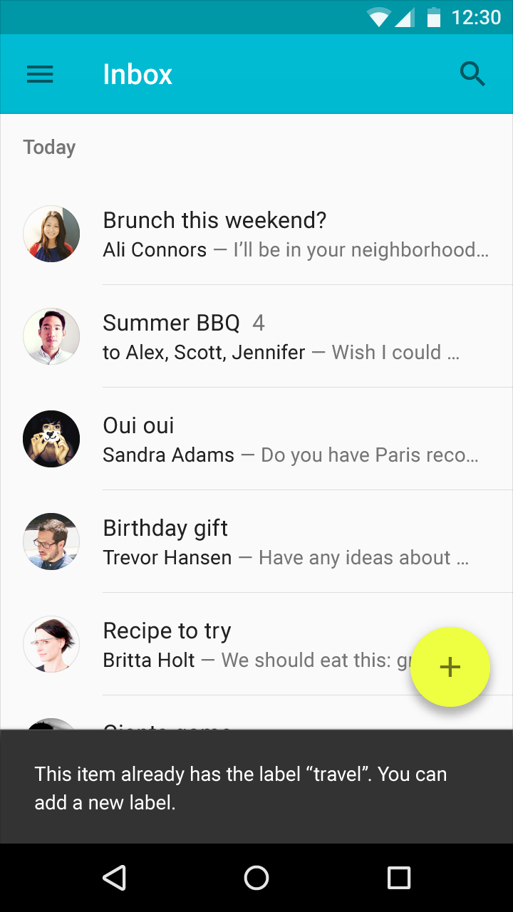
Snackbars should contain a single line of text directly related to the operation performed. They may contain a text action. They cannot contain icons.
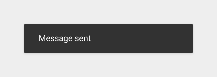
Do.
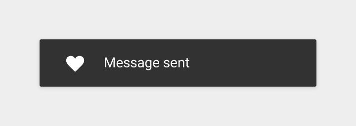
Don’t.
Transient
Snackbars automatically time out from the screen. For usability reasons, snackbars should not contain the only way to access a core use case. They should not be persistent or be stacked, as they are above other elements on screen.
On Android, when an unrelated dialog or popup occurs while the snackbar is up, the snackbar timeout will reset upon the window focus being regained. This is to ensure that the user will be able to read the snackbar for the full intended duration.
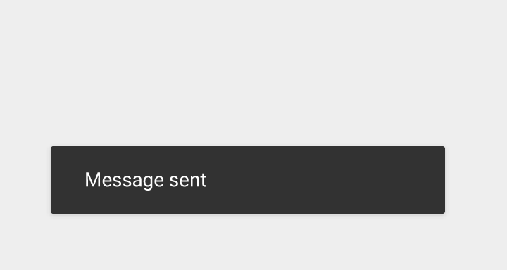
Do.
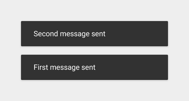
Don’t.
0-1 actions, not dismiss or cancel
If an action is present, comply with dialog spacing and affordance rules. For two or more actions, use a dialog, not a snackbar, even when one of the actions is a dismiss action. If the action described in the snackbar is important enough to block the use of the screen, it should be a dialog.
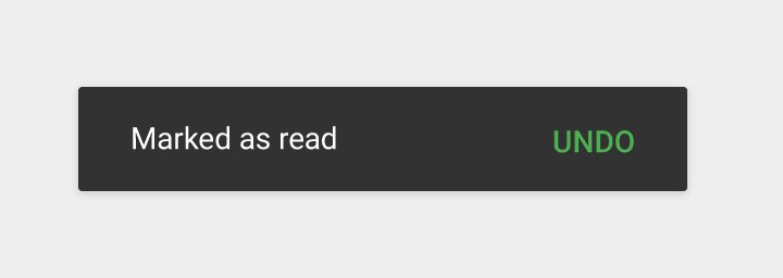
Do.
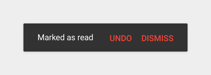
Don’t.
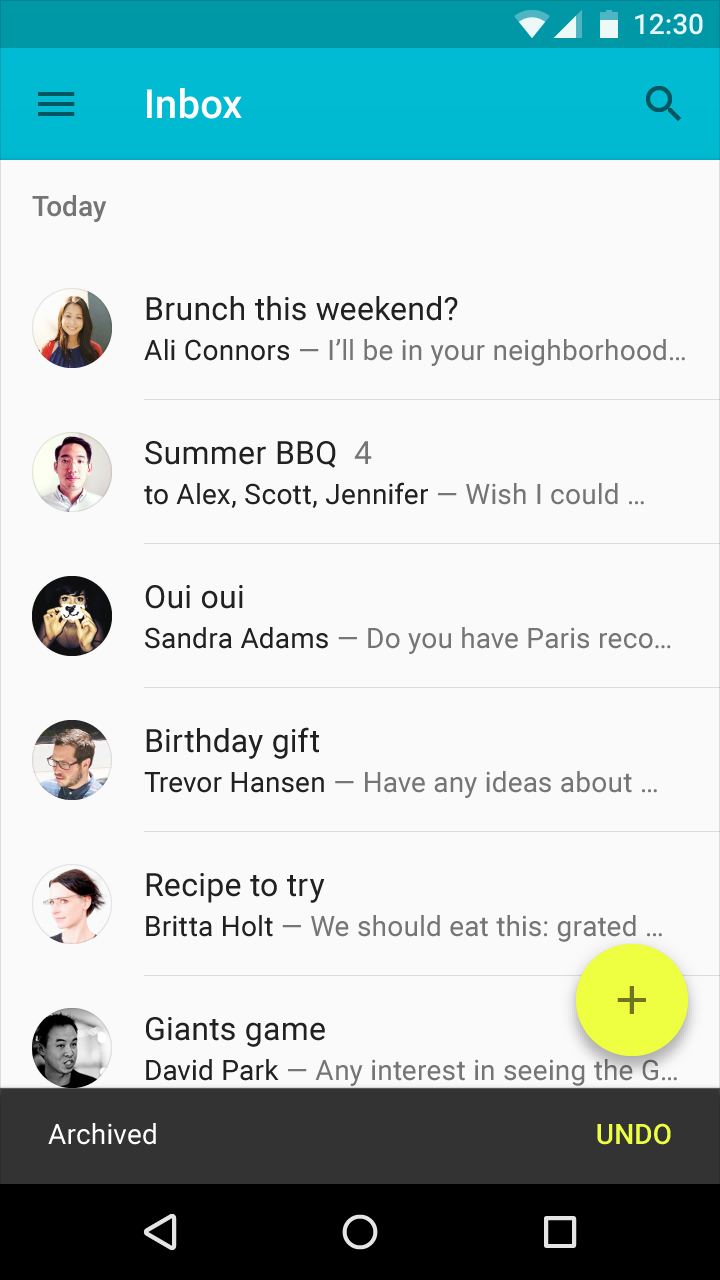
Don’t block the floating action button
Move your floating action button vertically to accommodate the snackbar height.
Do.
Don’t.
Consecutive snackbars
There is only ever one snackbar displayed. When a second snackbar is triggered while the first is displayed, the first should start the contraction motion downwards before the second one animates upwards.
Specs
Mobile
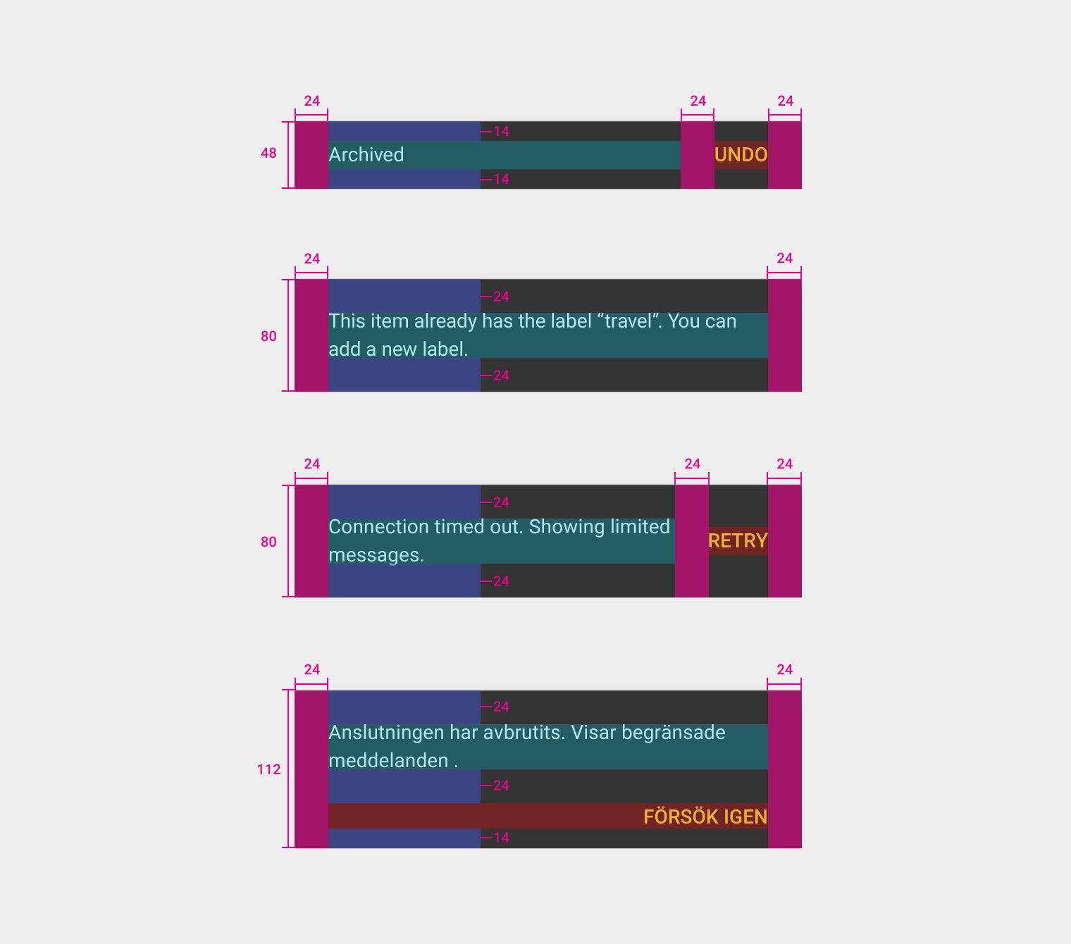
- Single-line snackbar height: 48dp
- Multi-line snackbar height: 80dp
- Text: Roboto Regular 14sp
- Action button: Roboto Medium 14sp, all-caps text
- Default background fill: #323232 100%
Tablet/desktop
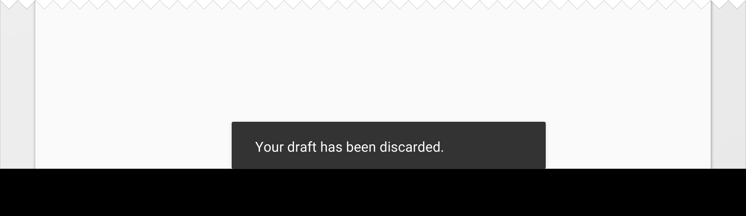
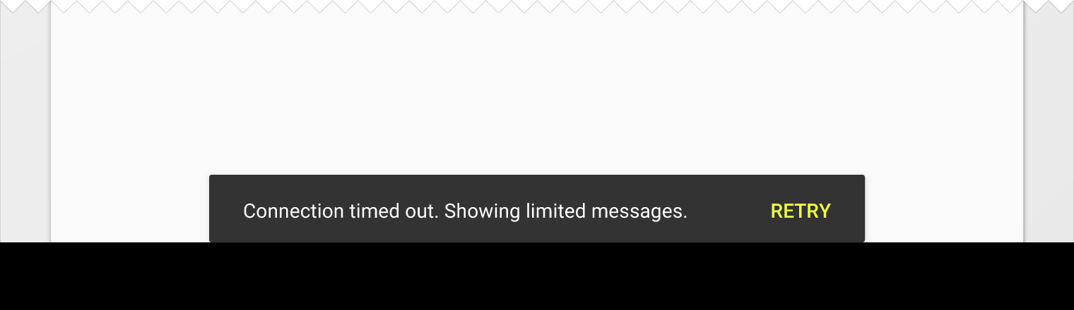
- Single-line snackbar height: 48dp
- Minimum width: 288dp
- Maximum width: 568dp
- 2dp rounded corner
- Text: Roboto Regular 14sp
- Action button: Roboto Medium 14sp, all-caps text
- Default background fill: #323232 100%
- Alignment: Centered or left-aligned 24dp from the left and bottom edges of the screen
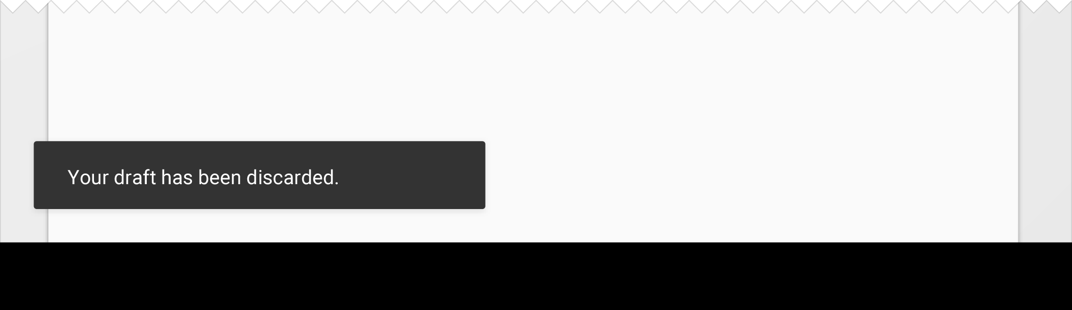
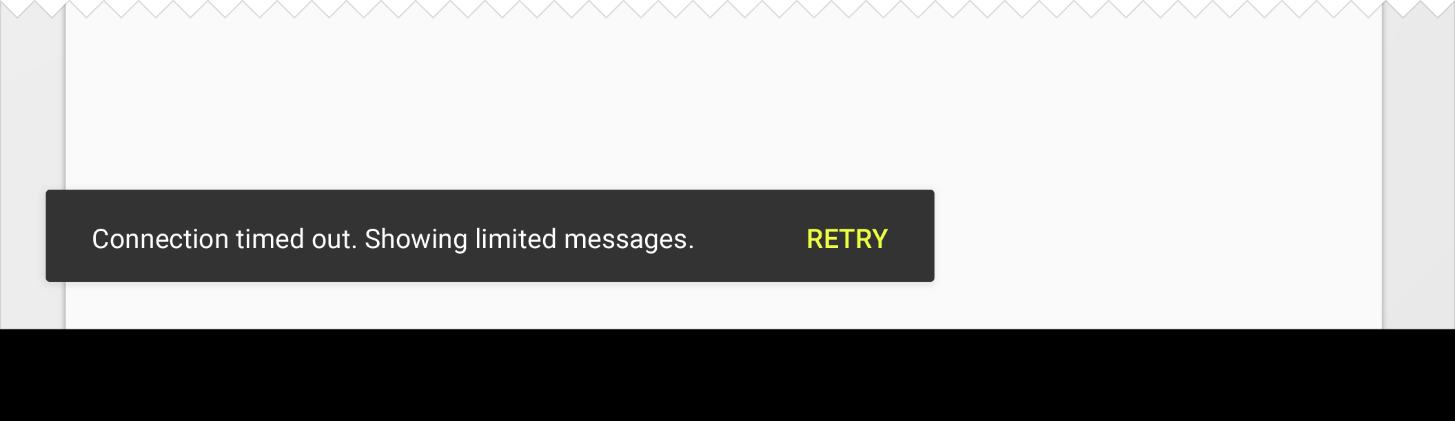
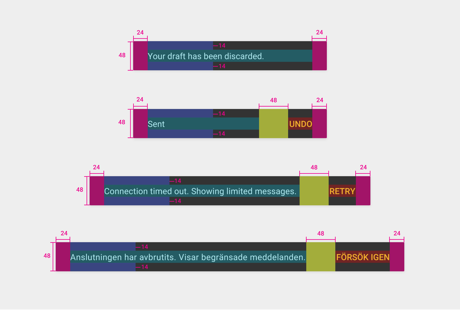
Snackbar height: 48dp
Snackbar left and right padding: 24dp
Snackbar top and bottom padding: 14dp
Snackbar button left padding: 48dp