Skip to content
Material Design 1
Main Navigation
v3
v2
v1

English

简体中文
繁體中文
Español
Français
Русский
Português – Brasil
Deutsch
日本語
한국어
Italiano
Polski
Türkçe
čeština
magyar

English

简体中文
繁體中文
Español
Français
Русский
Português – Brasil
Deutsch
日本語
한국어
Italiano
Polski
Türkçe
čeština
magyar

Appearance

Sidebar Navigation

Material Design

Environment

Material properties

Elevation & shadows

What's new

Motion

Material motion

Duration & easing

Movement

Transforming material

Choreography

Creative customization

Style

Color

Icons

Imagery

Typography

Writing

Layout

Principles

Units & measurements

Metrics & keylines

Structure

Responsive UI

Split screen

Components

Bottom navigation

Bottom sheets

Buttons

Buttons: Floating Action Button

Cards

Chips

Data tables

Dialogs

Dividers

Expansion panels

Grid lists

Lists

Lists: Controls

Menus

Pickers

Progress & activity

Selection controls

Sliders

Snackbars & toasts

Steppers

Subheaders

Tabs

Text fields

Toolbars

Tooltips

Widgets

Patterns

Confirmation & acknowledgement

Data formats

Empty states

Errors

Fingerprint

Gestures

Help & feedback

Launch screens

Loading images

Navigation

Navigation drawer

Navigational transitions

Notifications

Offline states

Permissions

Scrolling techniques

Search

Selection

Settings

Swipe to refresh

Growth & communications

Introduction

Onboarding

Feature discovery

Gesture education

Usability

Accessibility

Bidirectionality

Platforms

Platform adaptation

Android

Resources

Color palettes

Devices

Layout templates

Roboto & Noto fonts

Sticker sheets & icons

Shadows

On this page

Expansion panels ​

Expansion panels contain creation flows and allow lightweight editing of an element.

An expansion panel is a lightweight container that may either stand alone or be connected to a larger surface, such as a card.

They may be used for a variety of tasks, such as:

  • To edit a setting
  • To create a tool for ad campaigns
Usage

Editing
Creating flows


Behavior

Expand
Collapse
Focus

Material Design expansion panels for creation flows and editing

Usage ​

An expansion panel is a lightweight container that may either stand alone or be connected to a larger surface, such as a card.

Editing

Expansion panels are best used for lightweight editing of an element, such as selecting a value for a setting.

For example, an app that contains tables may use expansion panels to adjust settings on table elements.

Creation flows

Expansion panels may be displayed in a sequence to form creation flows.

For example, a tool for creating ad campaigns may display a series of expansion panels to collect campaign details.
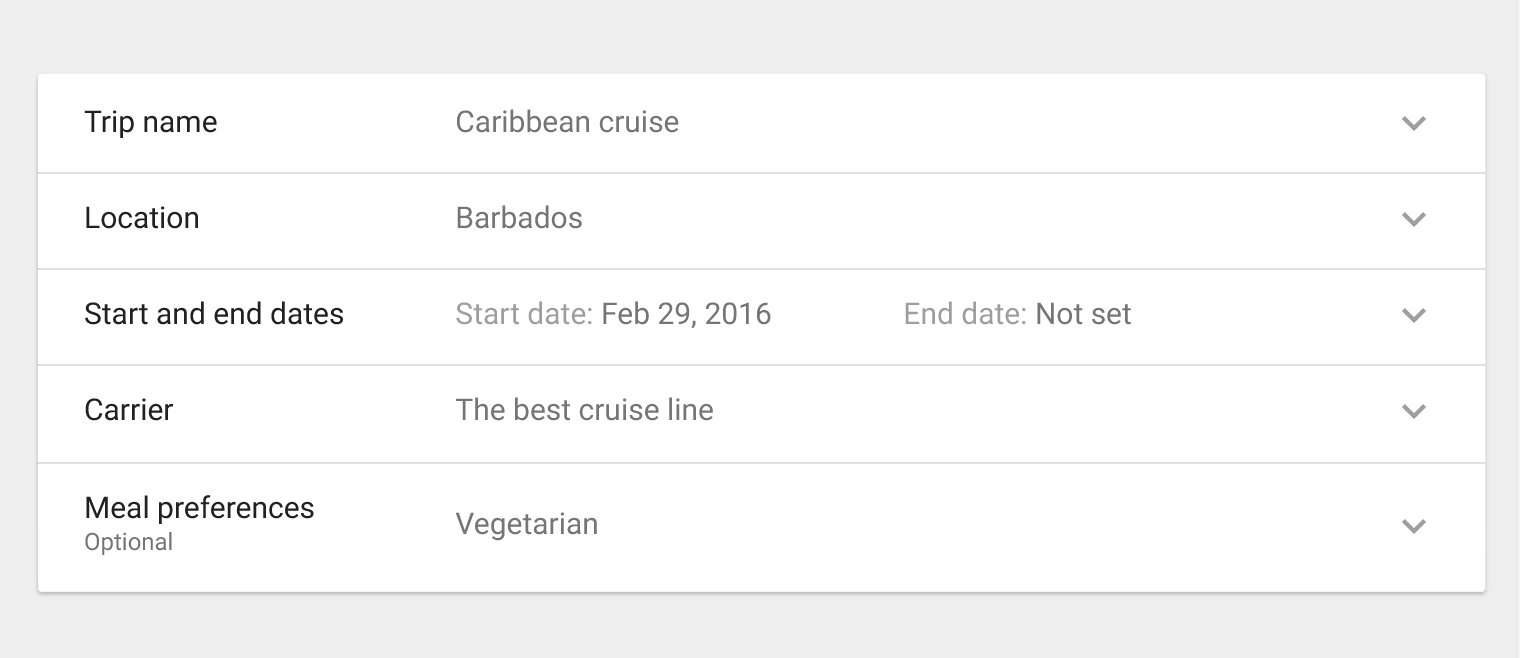
Material Design various expansion panels
Various expansion panels
List contentDivider
15sp Roboto Regular
87% black

Secondary content

12sp Roboto Regular
54% black
1dp border
12% black

Expand icon

24dp x 24dp
38% black

Behavior ​

Collapsed panel

A collapsed panel displays summary information. Upon selecting the collapsed panel, it expands to display the full expansion panel.
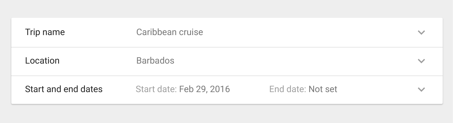
Collapsed panel example in Material Design
Example of a collapsed panel

Expanded panel

Upon selection, a collapsed panel expands, allowing users to add or edit information.

Helper text may be added to the panel to assist the user.
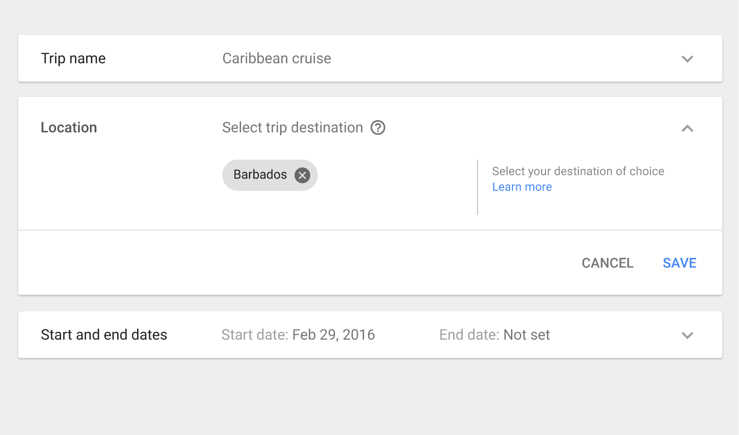
Expanded panel example in Material Design
Example of an expanded panel

Focus state

An expansion panel may use a focus state (by using a grey background on the list item) to provide focus to individual list items.

On a keyboard, users may traverse through list items by using the Tab key.
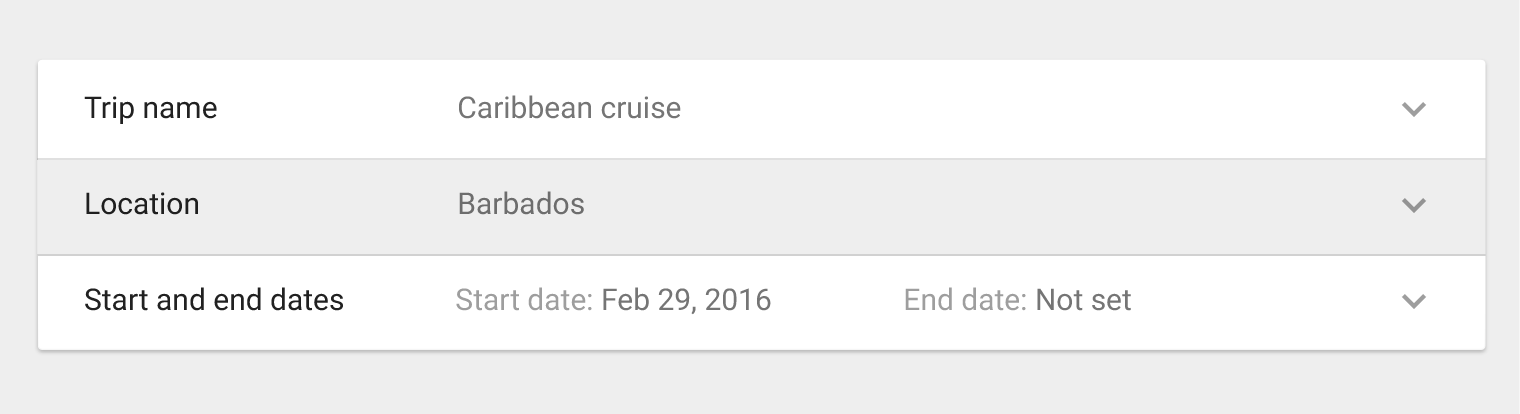
Material Design focus state in expansion panels
Background
Grey 200

Expand icon on hover and pressed
24dp x 24dp
54% black

Specs ​

Label

  • Font: Roboto Regular 15sp

Padding

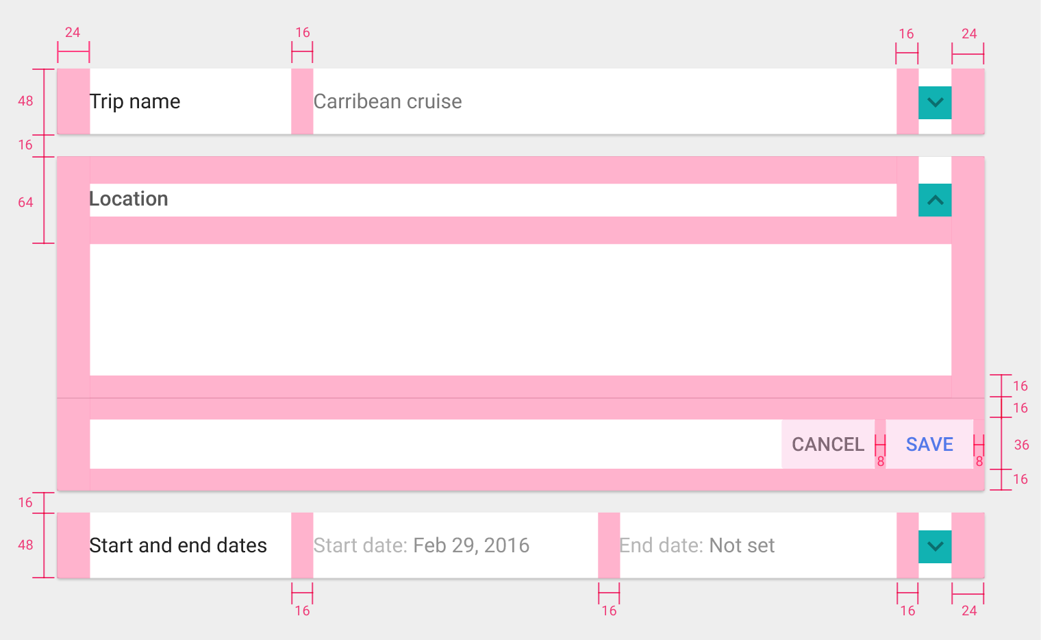
  • Top and bottom padding: 16dp
  • Left and right padding: 24dp
Specifications for Material Design expansion panels
Pager
Previous pageDividers
Next pageGrid lists

Released under the Apache-2.0

Copyright © 2014-Present Google

https://m1.material.io/components/expansion-panels.html

Released under the Apache-2.0

Copyright © 2014-Present Google