Skip to content
Material Design 1
Main Navigation
v3
v2
v1

English

简体中文
繁體中文
Español
Français
Русский
Português – Brasil
Deutsch
日本語
한국어
Italiano
Polski
Türkçe
čeština
magyar

English

简体中文
繁體中文
Español
Français
Русский
Português – Brasil
Deutsch
日本語
한국어
Italiano
Polski
Türkçe
čeština
magyar

Appearance

Sidebar Navigation

Material Design

Environment

Material properties

Elevation & shadows

What's new

Motion

Material motion

Duration & easing

Movement

Transforming material

Choreography

Creative customization

Style

Color

Icons

Imagery

Typography

Writing

Layout

Principles

Units & measurements

Metrics & keylines

Structure

Responsive UI

Split screen

Components

Bottom navigation

Bottom sheets

Buttons

Buttons: Floating Action Button

Cards

Chips

Data tables

Dialogs

Dividers

Expansion panels

Grid lists

Lists

Lists: Controls

Menus

Pickers

Progress & activity

Selection controls

Sliders

Snackbars & toasts

Steppers

Subheaders

Tabs

Text fields

Toolbars

Tooltips

Widgets

Patterns

Confirmation & acknowledgement

Data formats

Empty states

Errors

Fingerprint

Gestures

Help & feedback

Launch screens

Loading images

Navigation

Navigation drawer

Navigational transitions

Notifications

Offline states

Permissions

Scrolling techniques

Search

Selection

Settings

Swipe to refresh

Growth & communications

Introduction

Onboarding

Feature discovery

Gesture education

Usability

Accessibility

Bidirectionality

Platforms

Platform adaptation

Android

Resources

Color palettes

Devices

Layout templates

Roboto & Noto fonts

Sticker sheets & icons

Shadows

On this page

Selection controls ​

Selection controls allow the user to select options.

Three types of selection controls are covered in this guidance:

  • Checkboxes allow the selection of multiple options from a set.
  • Radio buttons allow the selection of a single option from a set.
  • Switches allow a selection to be turned on or off.
Color

Selection controls use an app’s accent color.


Themes

Selection controls are available in both dark and light themes.
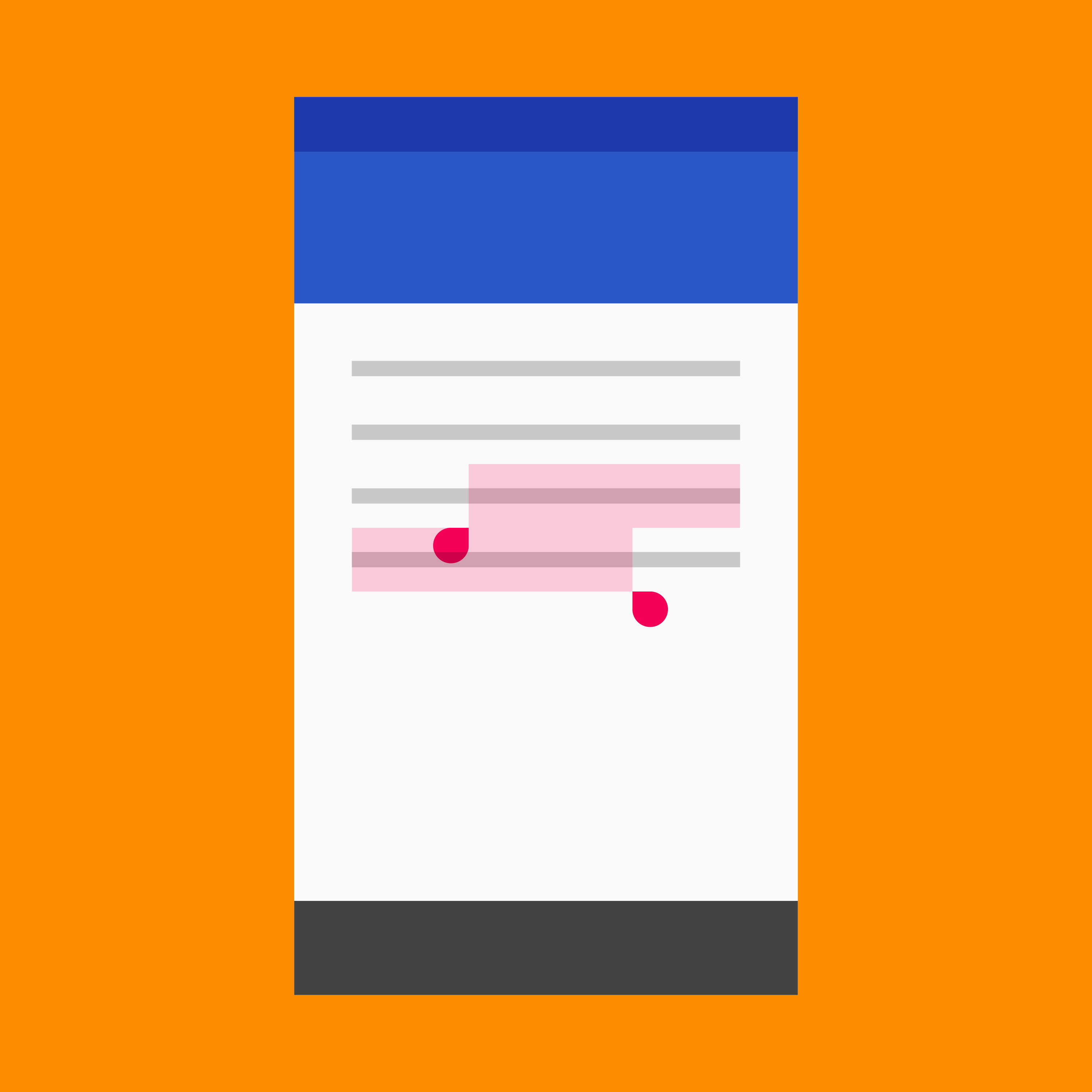
Material Design selection controls for user options

Checkbox ​

Checkboxes allow the user to select multiple options from a set.

If you have multiple options appearing in a list, you can preserve space by using checkboxes instead of on/off switches.

If you have a single option, avoid using a checkbox and use an on/off switch instead.
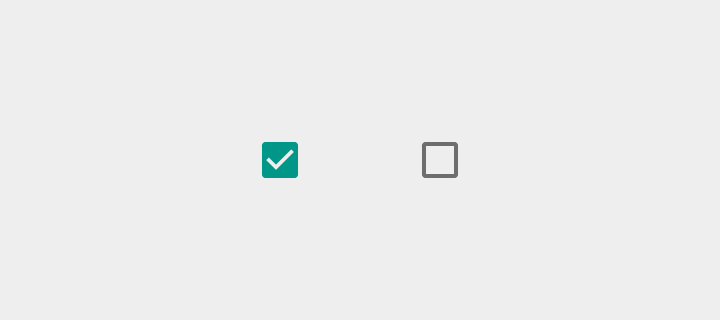
Material Design light theme checkbox
Light theme
Material Design dark theme checkbox
Dark theme

Light

On: Swatch 500, Opacity 100%
Off: #000000, Opacity 54%
Disabled: #000000, Opacity 26%
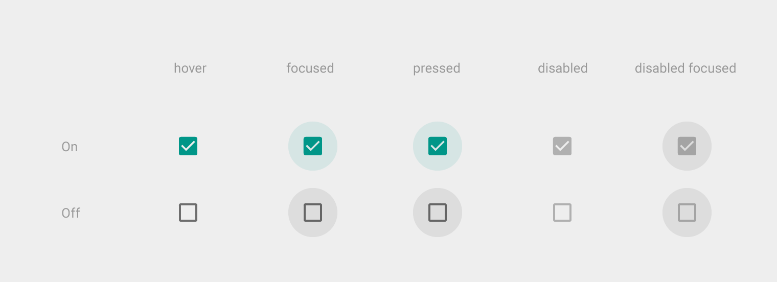
Material Design light theme for checkbox states
Light theme for checkboxes in hover, focused, pressed, disabled, and disabled focused states.

Dark

On: Swatch 500, Opacity 100%
Off: #FFFFFF, Opacity 70%
Disabled: #FFFFFF, Opacity 30%
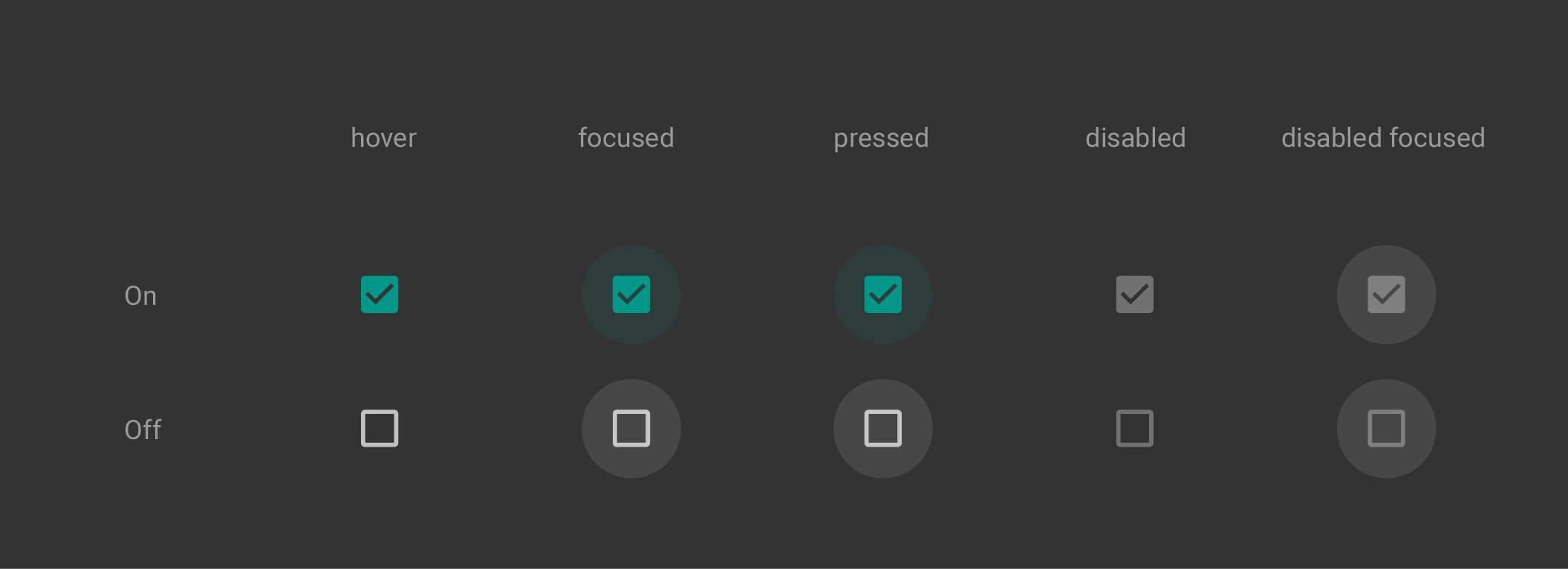
Material Design dark theme checkboxes states
Dark theme for checkboxes in hover, focused, pressed, disabled, and disabled focused states.

Radio button ​

Radio buttons allow the user to select one option from a set. Use radio buttons for exclusive selection if you think that the user needs to see all available options side-by-side.

Otherwise, consider a dropdown, which uses less space than displaying all options.
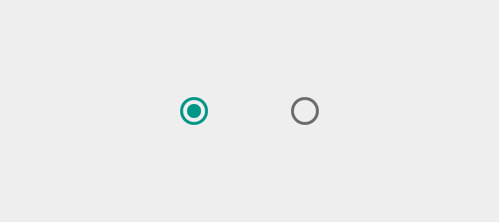
Light theme radio buttons in Material Design
Light theme for radio buttons
Dark theme radio buttons in Material Design
Dark theme for radio buttons

Light

On: Swatch 500, Opacity 100%
Off: #000000, Opacity 54%
Disabled: #000000, Opacity 26%
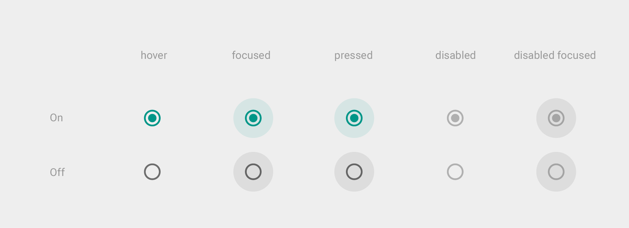
Material Design radio buttons in light theme states
Light theme for radio buttons in hover, focused, pressed, disabled, and disabled focused states.

Dark

On: Swatch 500, Opacity 100%
Off: #FFFFFF, Opacity 70%
Disabled: #FFFFFF, Opacity 30%
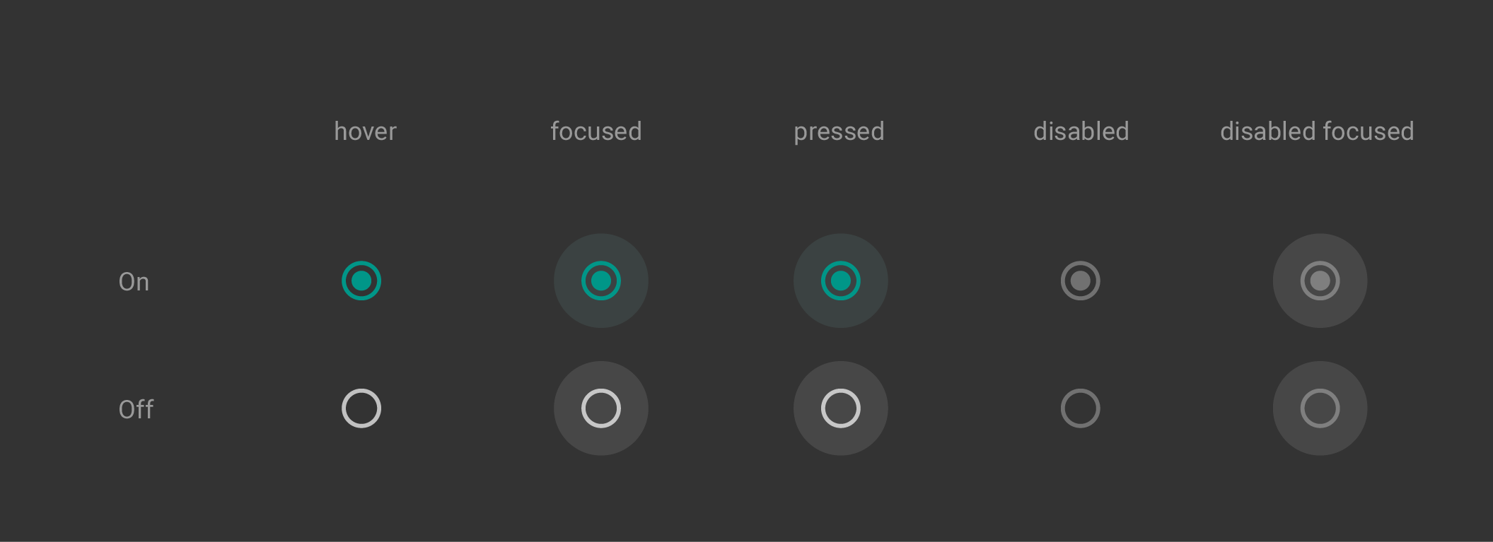
Dark theme radio buttons in Material Design states
Dark theme for radio buttons in hover, focused, pressed, disabled, and disabled focused states.

Switch ​

On/off switches toggle the state of a single settings option. The option that the switch controls, as well as the state it’s in, should be made clear from the corresponding inline label. Switches take on the same visual properties of the radio button.

The on/off slide toggle with the text “on” and “off” included within the asset is deprecated. Use the switch shown here instead.


Material Design light theme switch
Light theme
Material Design dark theme switch
Dark theme

Light

Thumb On: Swatch 500, Opacity 100%
Track On: Swatch 500, Opacity 50%

Thumb Off: Grey 50, #FAFAFA, Opacity 100%
Track Off: #000000, Opacity 38%

Thumb Disabled: Grey 400, #BDBDBD, Opacity 100%
Track Disabled: #000000, Opacity 12%
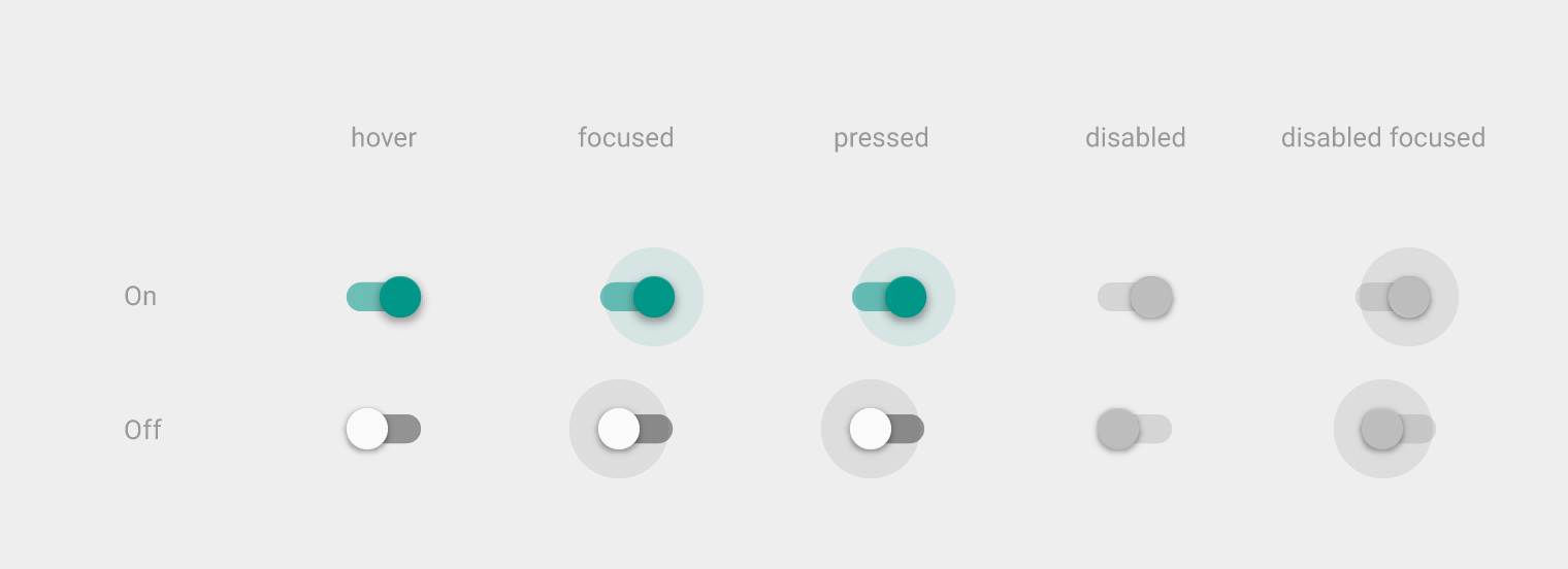
Material Design light theme switches in various states
Light theme for switches in hover, focused, pressed, disabled, and disabled focused states.

Dark

Thumb On: Swatch 200, Opacity 100%
Track On: Swatch 200, Opacity 50%

Thumb Off: Grey 400, #BDBDBD, Opacity 100%
Track Off: #FFFFFF, Opacity 30%

Thumb Disabled: Grey 800, #424242, Opacity 100%
Track Disabled: #FFFFFF, Opacity 10%
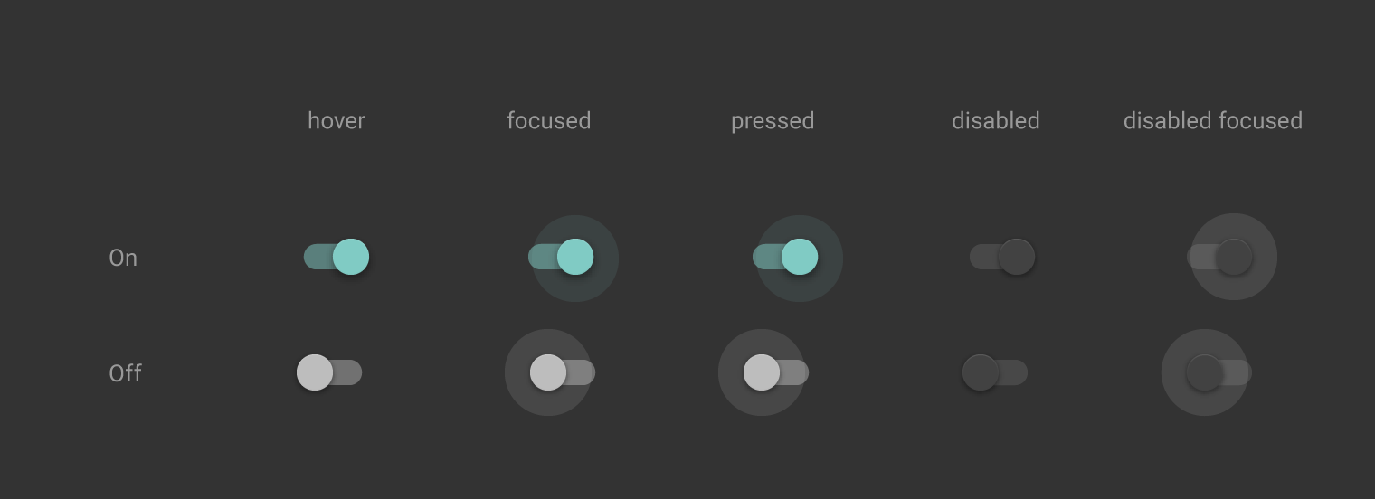
Dark theme for Material Design switches in various states
Dark theme for switches in hover, focused, pressed, disabled, and disabled focused states.

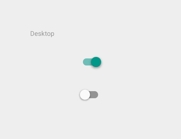
Use the outer radial reaction only on form factors that favor finger touch, where interaction may obstruct the element completely. For desktop usage with a mouse, you do not need this extra indication.
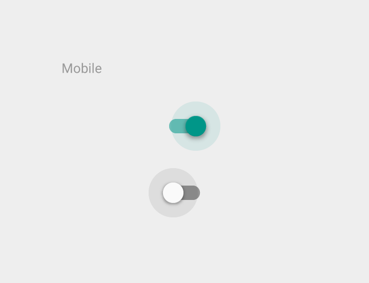
Radial reaction for switches on mobile in Material Design
Radial reaction on mobile
No radial reaction for switches on desktop in Material Design
No radial reaction on desktop
Pager
Previous pageProgress & activity
Next pageSliders

Released under the Apache-2.0

Copyright © 2014-Present Google

https://m1.material.io/components/selection-controls.html

Released under the Apache-2.0

Copyright © 2014-Present Google