Navigation
Navigation guides users through different parts of your app.
Organize your app's structure according to the content and tasks you want users to see. Focus attention on important destinations by displaying them in tabs or in the side navigation, and de-emphasize inessential content by displaying it in less prominent locations.
Navigation patterns
Embedded navigation
Tabs
Bottom navigation bar
Navigation drawer
Nested navigation
Expanding navigation drawer
Cascading navigation drawer (desktop)
Gestural
Combination navigation patterns
In-context navigation
Side navigation and tabs
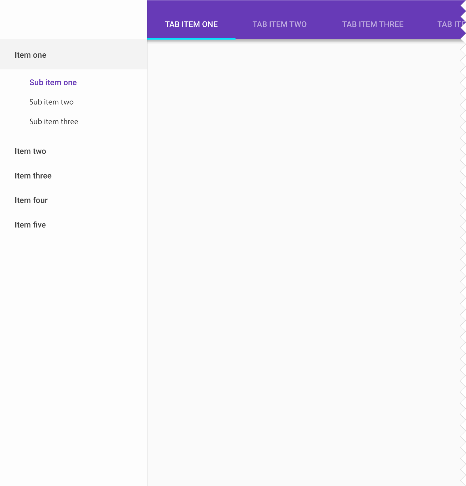
Nested navigation drawer and tabs (desktop)

Usage
Navigation through your app should be intuitive and predictable. Both new and returning users should be able to figure out how to move through your app with ease. When users move from one view to the next, they observe scenes containing imagery, actions, and content. These scenes work together to tell a story about the content they contain, leading users down paths that emphasize certain actions.
For information on movements between states, see navigational transitions.
Related: Implementing Effective Navigation
Communicate relationships & context
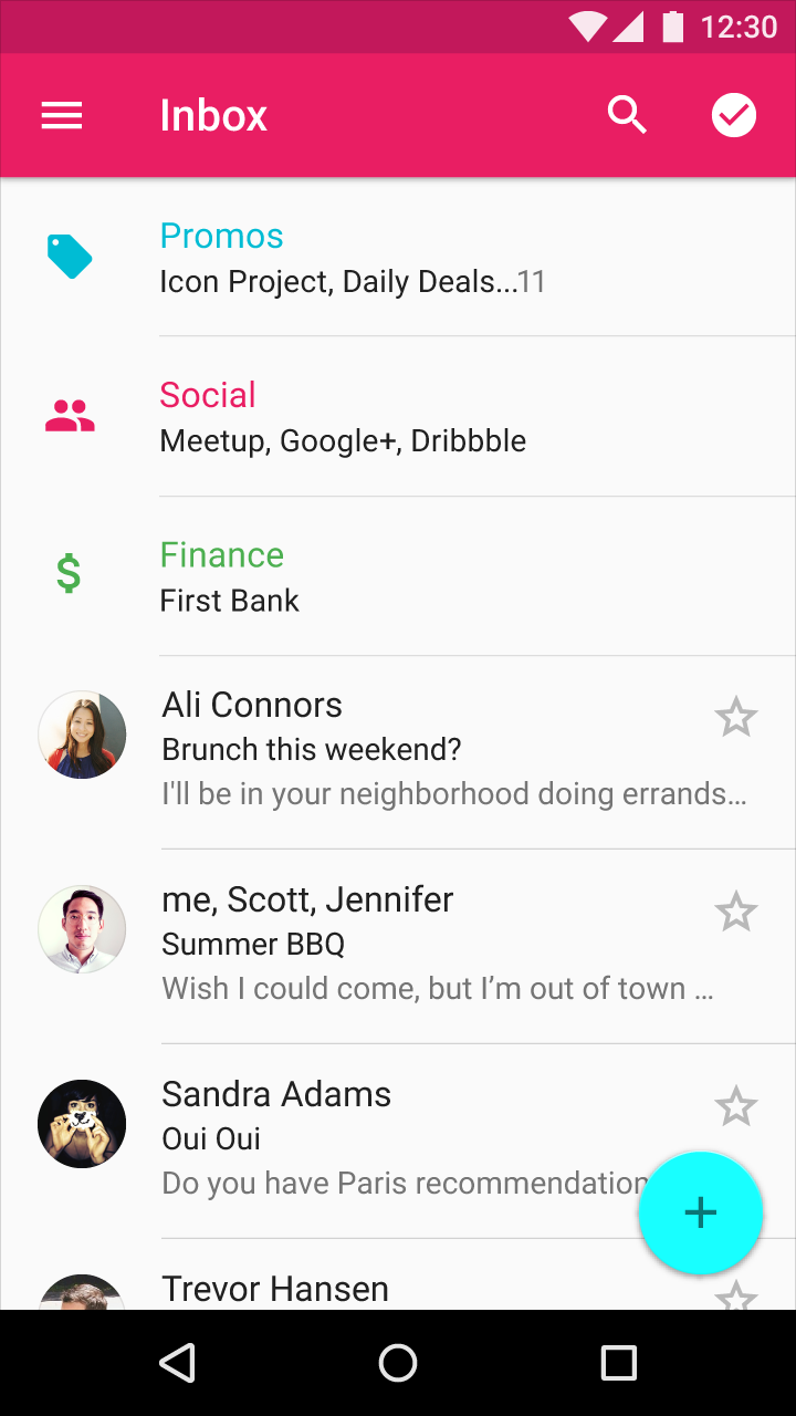
Group content into logical and relatable chunks that show clear relationships between items.
Illuminate actions
Guide users from one scene to the next using paths that encourage specific choices or freer exploration.
Focus attention
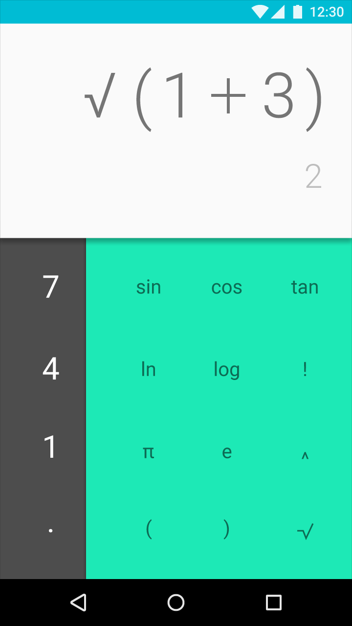
Tailor your app's navigation to promote important content and tasks.
Defining your navigation
Navigation organizes content so that it's easier to find important destinations in your app. Navigation may include frequently visited places, contain settings, or encourage specific actions.
To determine the type of navigation best suited to your app, identify your app's users, typical paths they might take through your app, and actions you want them to perform.
For instance, if your app is a restaurant guide, your users may want to make reservations, post menus, or write reviews. By identifying the goals most users will have, you'll be able to better define a navigation structure that meets their priorities.
Take inventory
Identify your app's users and their potential roles, such as consumer, business owner, or journalist. Identify the most common tasks they may want to perform.
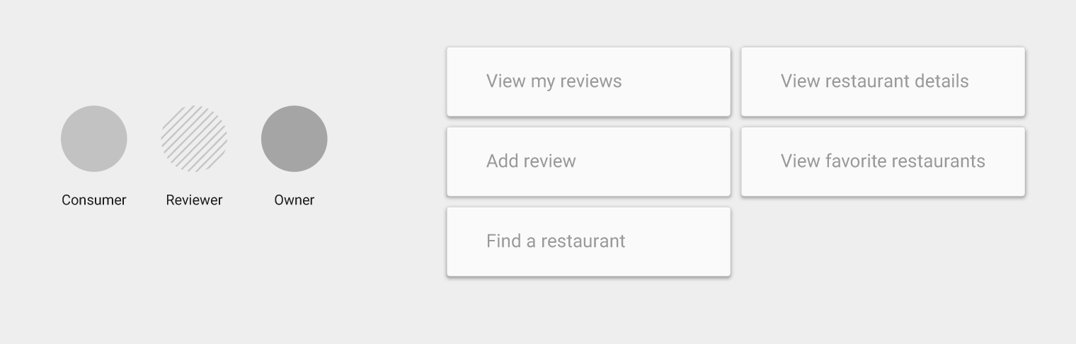
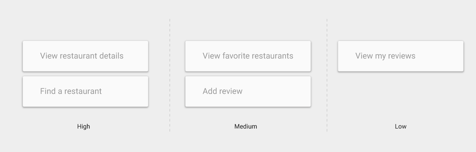
Prioritize
Assign priority levels of high, medium, or low to common user tasks. Give prominence in the UI to paths and destinations with high priority levels and frequent use.
Adjust priority levels as user needs change over time.
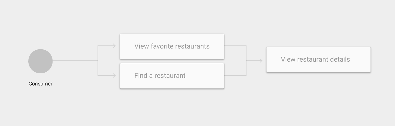
Sequence
Identify the different paths that users take through your app and use those paths to define your navigation:
- List frequent destinations prominently in your navigation
- Group related tasks together and use those groupings to structure your navigation
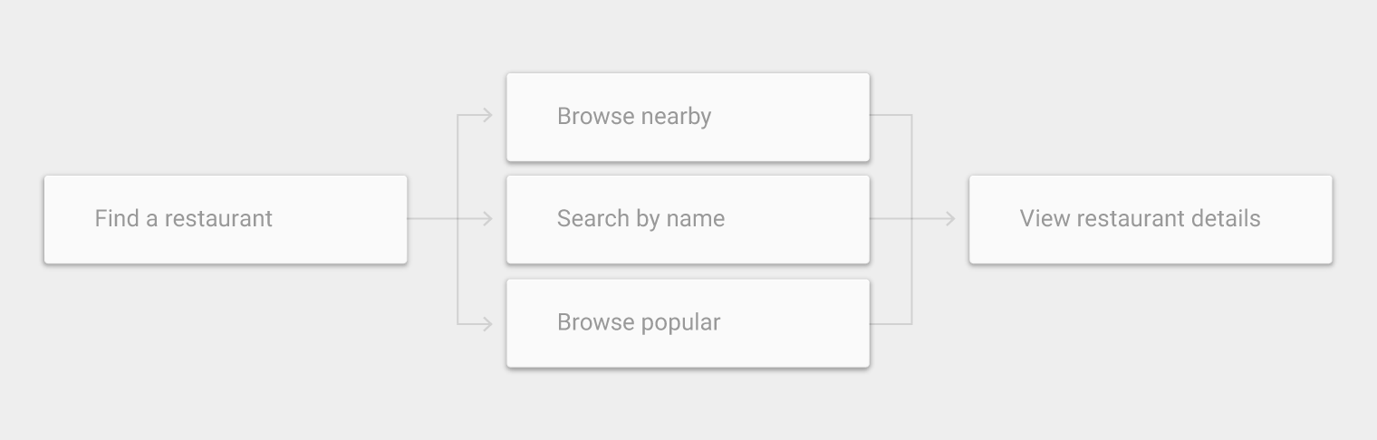
Deconstruct
Divide complex, broad, or vague use cases into smaller activities. These smaller tasks may be frequently used, more easily understood, or better meet user goals.
For example, dividing search into smaller activities that differentiate searching by name, location, or popularity may reveal the need to surface those smaller activities as part of navigation.
Up and Back buttons
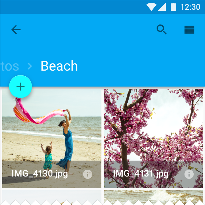
App bars provide basic navigation through the Up and Back buttons.
The Up button
The Up button returns users to the previous screen they viewed. It navigates upward in the app's hierarchy until the app's home screen is reached.

The Back button
The Back button navigates in reverse chronological order through the history of recently viewed screens.
Whereas the Up button ensures the user remains in your app, the Back button may take the user back through recent screens outside of your app.
The Back button also:
- Dismisses floating windows (such as dialogs or popups)
- Dismisses contextual action bars, and removes the highlight from the selected items
- Hides the on-screen keyboard (IME)
Related: Tasks and Back Stack
Activities performed by users are arranged in a stack in the order in which each activity is opened
Make navigation more predictable by inserting the navigation path the user took to the app's topmost screen

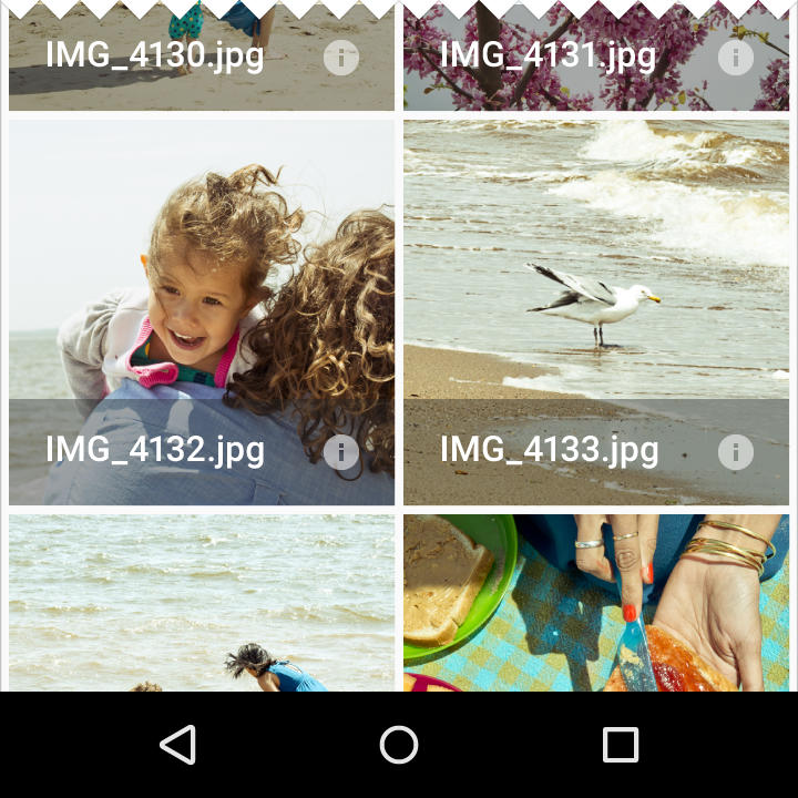
Changing views within a screen
Navigation history is not affected by these types of screen changes:
- Switching views using tabs, swiping, or a dropdown
- Filtering or sorting a list
- Changing display characteristics (such as zooming)
Exception: Navigation history is created by following links from related detail views (not unified by a list), such as browsing Play Store albums by the same artist.
Navigating between apps (Android)
Navigate directly from one app to another to create a consistent experience for common actions. For example, an app may activate the Camera app to capture a photo.
Activities, tasks, and intents
- In Android, an activity includes an app's screen and the associated actions available to the user. Your app is a collection of activities you create and reuse from other apps.
- A task is the sequence of activities a user follows to accomplish a goal
- An intent allows an app to signal it would like another app's assistance in performing an action, such as "Share." Apps can indicate which intents to respond to through activities.
Hierarchy
Navigation organizes content by placing it within a hierarchy. Scenes at the top of the hierarchy are the most prominent and accessible, connecting users to scenes lower in the hierarchy.

Home
The home scene is the entrance to the app. It introduces the app and its navigation.
The home scene may vary the content it displays. A stateful home contains indications of a user's previous interaction with the app.

Parent and child
A higher level of navigational hierarchy is called a parent, and the level (or levels) below are referred to as children.
For example, the home screen is the parent to all other screens in an app.
Navigation
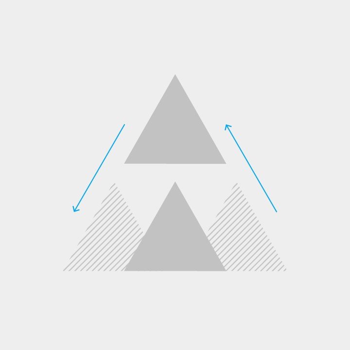
When you navigate more deeply into an app, you descend from a higher level of hierarchy to a lower one.
Moving from a parent scene to a child scene is descending navigation. Moving from child to parent is ascending navigation.
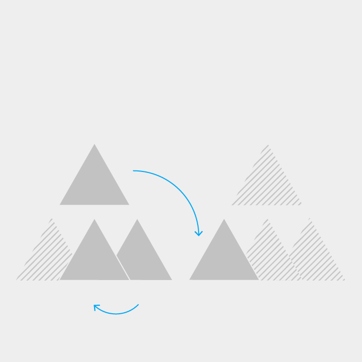
Siblings
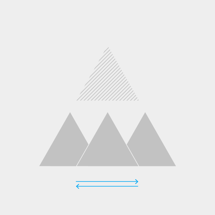
Scenes that have the same parent are called siblings. Apps that have multiple use cases, all of equal priority, usually contain many sibling scenes.
Lateral navigation is movement between siblings.

Collections
Collections include multiple items that share the same parent.
Links
Links allow users to move quickly between scenes that aren't navigationally adjacent.
Crosslinks are links that take users anywhere within your app.
External links are links from sources outside your app, including notifications and home screen widgets. They take users directly to scenes deep within your app.
Patterns
Navigation should best accommodate the needs of the majority of your app's users. Apps with complex and deep hierarchies (that require switching between multiple views) have different navigation requirements than apps with a single primary view.
The following navigation patterns are designed to:
- Promote engaging and responsive layouts
- Anchor navigation and actions
- Highlight important destinations and de-emphasize infrequent ones
- Promote a primary action with the floating action button
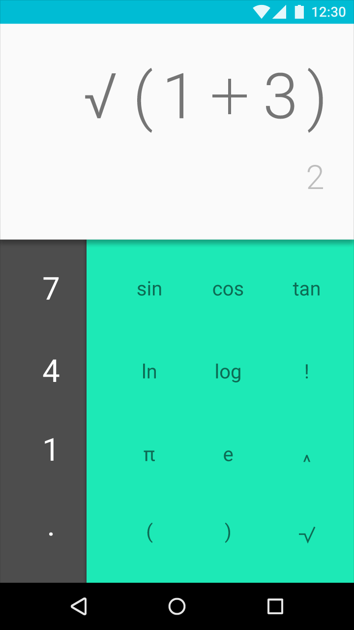
Embedded navigation
Apps with simple navigation may embed navigation inside app content, but doing so reduces the available space to display that content.
Recommended for:
- Apps with a strong primary view, and few alternate views
- Apps that perform common tasks in the main view
- Infrequently used apps
Tabs
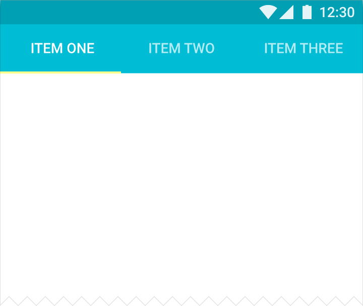
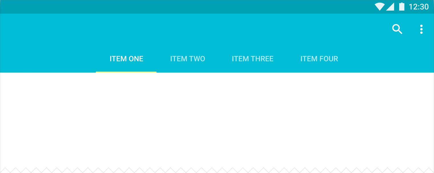
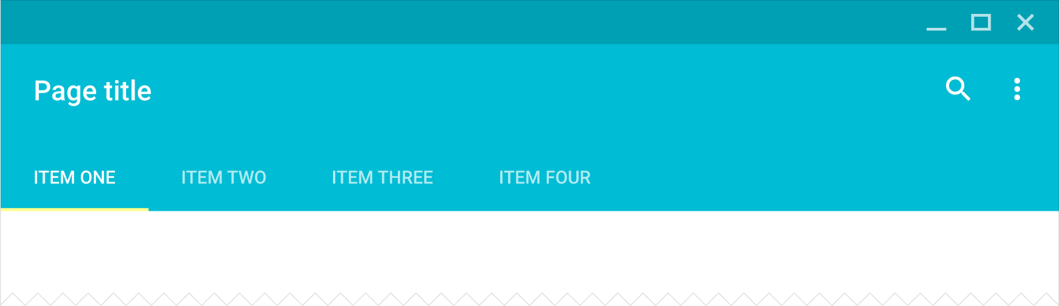
Tabs allow users to quickly move between a small number of equally important views.
Appropriate for these hierarchies:
- Parents with embedded child views
- A group of sibling views
Recommended for:
- Frequent switching between views
- Apps with few top-level views
- Promoting awareness of alternate views
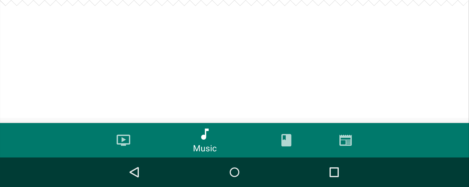
Bottom navigation bar
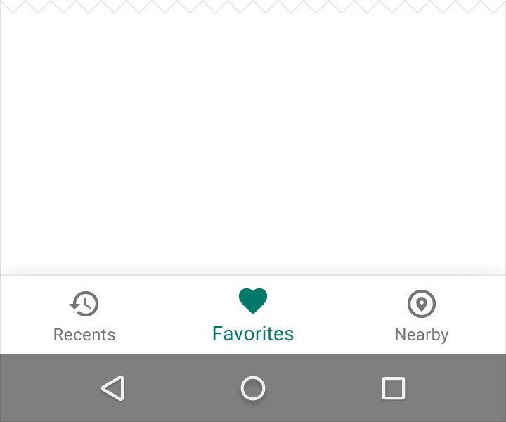
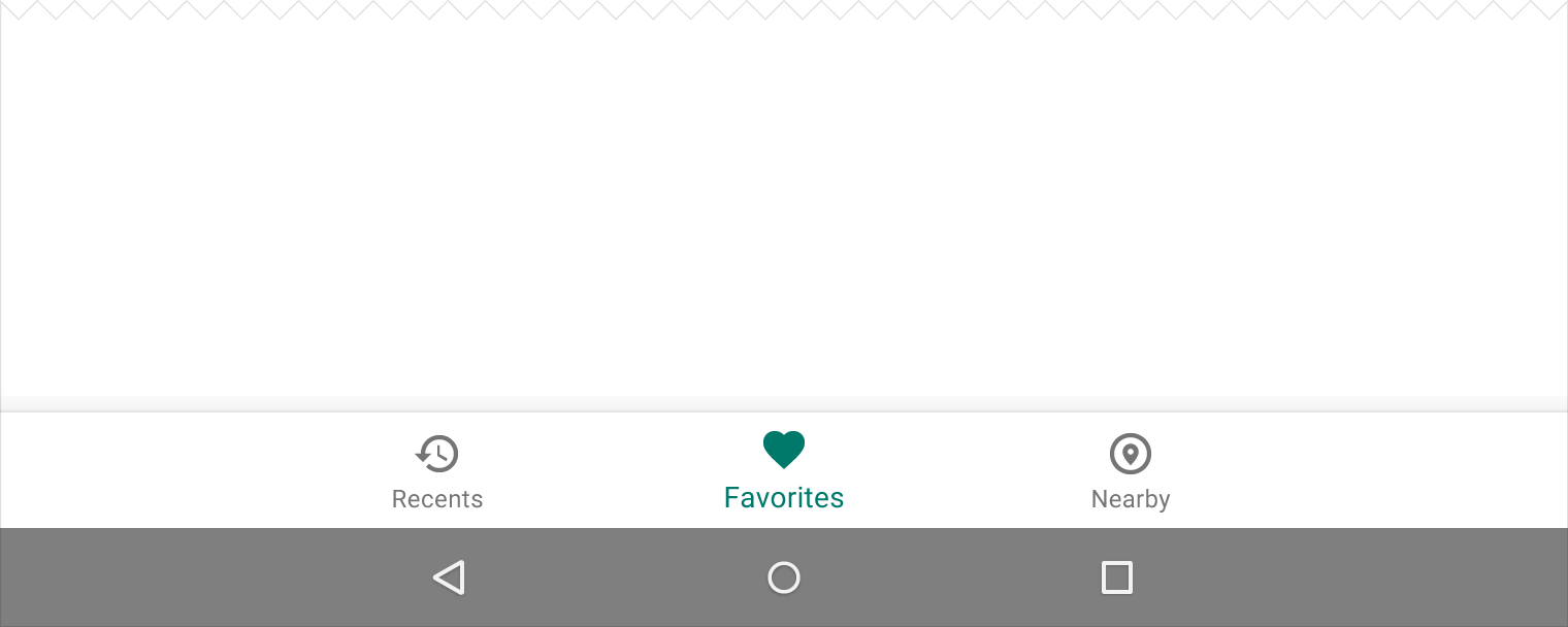
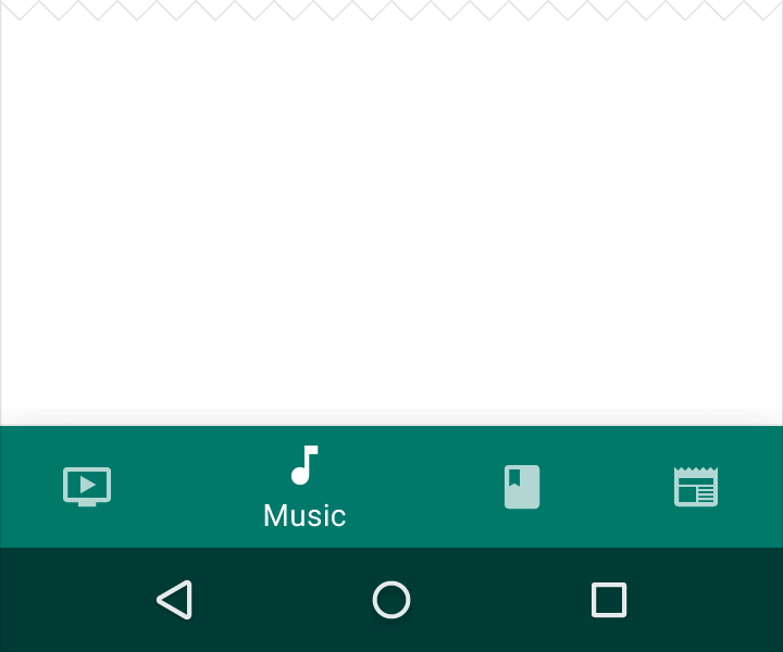
A bottom navigation bar allows users to quickly move between a small number of top-level views.
Appropriate for these hierarchies:
- Parents with embedded child views
- A group of parent views
Recommended for:
- Frequent switching between views
- Apps with few top-level views
- Promoting awareness of alternate views
- Mobile devices, as bottom navigation is located in a more ergonomic location
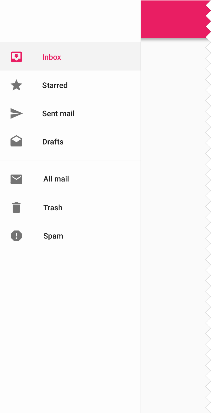
Navigation drawer
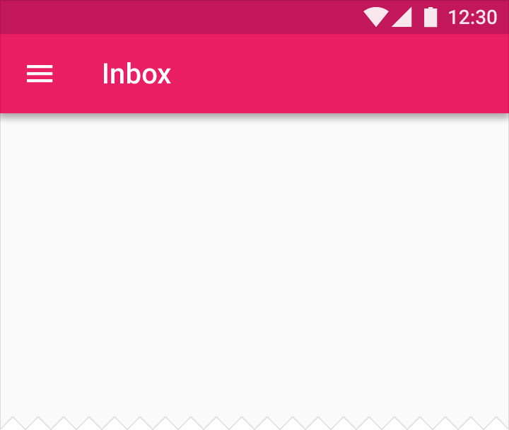
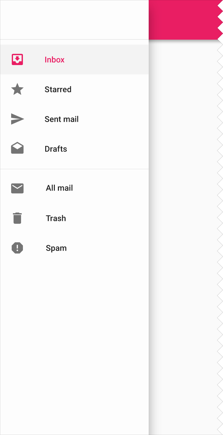
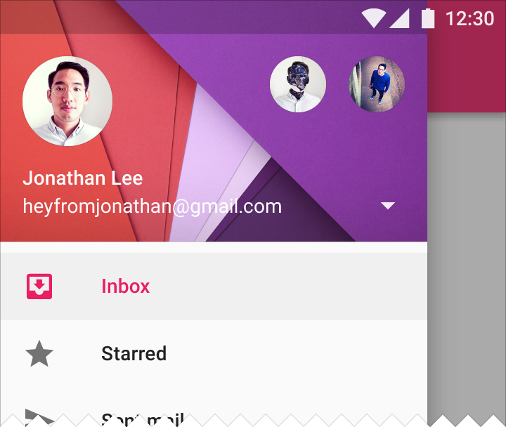
When there is insufficient space to support tabs, side navigation is a good alternative. Side navigation can display many navigation targets at once. A drawer remains hidden until invoked by the user.
Apps with a single "home" should list the most frequently accessed destinations at the top of side navigation.
Side navigation may appear either with or without a navigation drawer.
Appropriate for these hierarchies:
- Lateral navigation
- Parents with siblings or peers
Recommended for:
- Apps with many top-level views
- Enabling quick navigation between unrelated views
- Deep navigation structures
- Reducing visibility of infrequent destinations
Nested Navigation
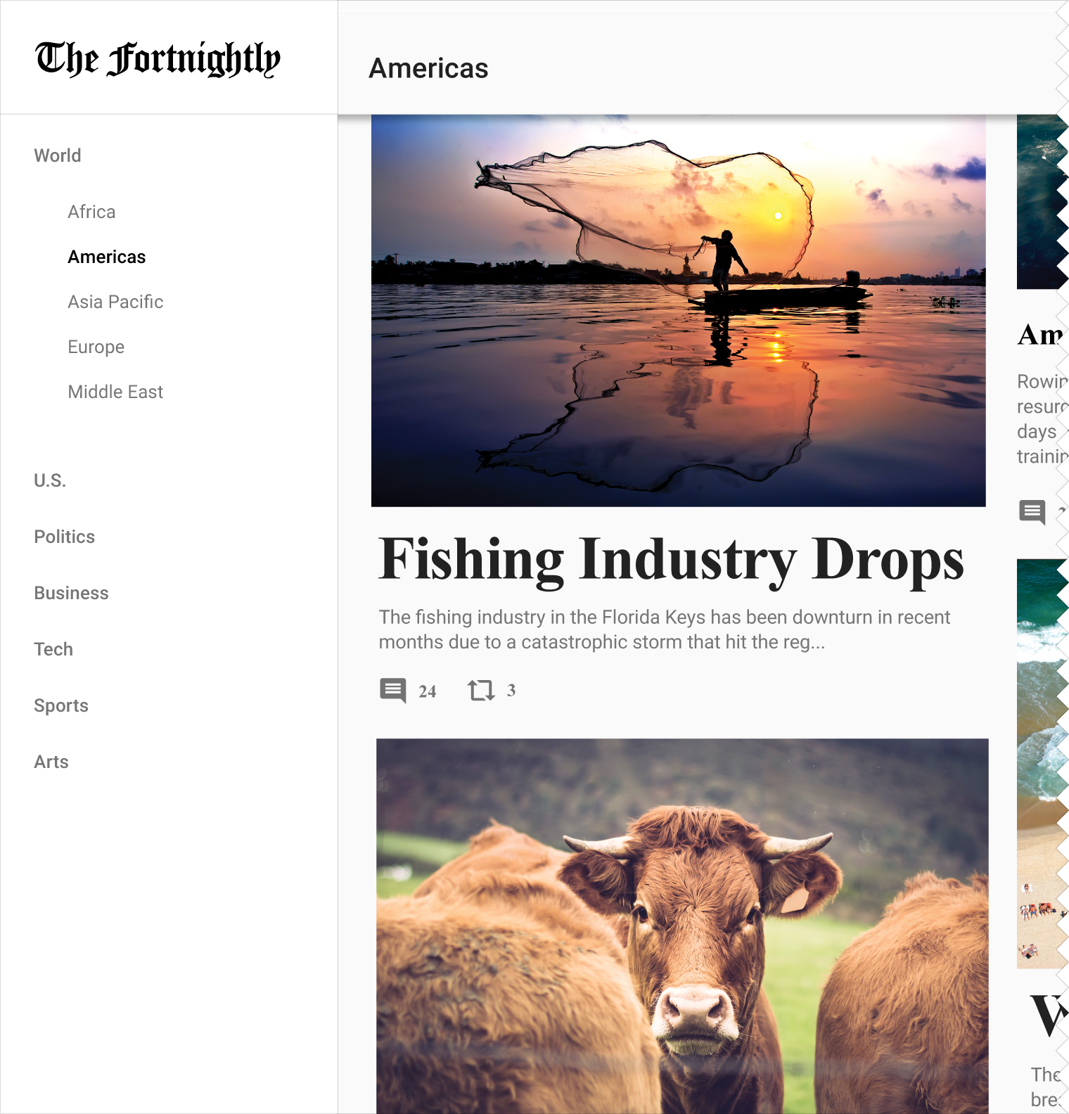
When you have multiple levels of navigation, sibling views should be nested underneath their parent.
On desktop, a secondary level of navigation may be nested within the navigation drawer.
Appropriate for these hierarchies:
- Lateral navigation
- Parents with siblings or peers
Recommended for:
- Deep navigation structures with many views
- Enabling quick navigation between unrelated views
Expanding navigation drawer
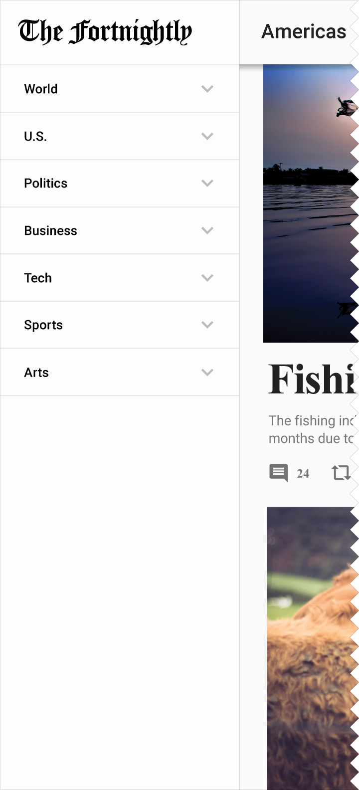
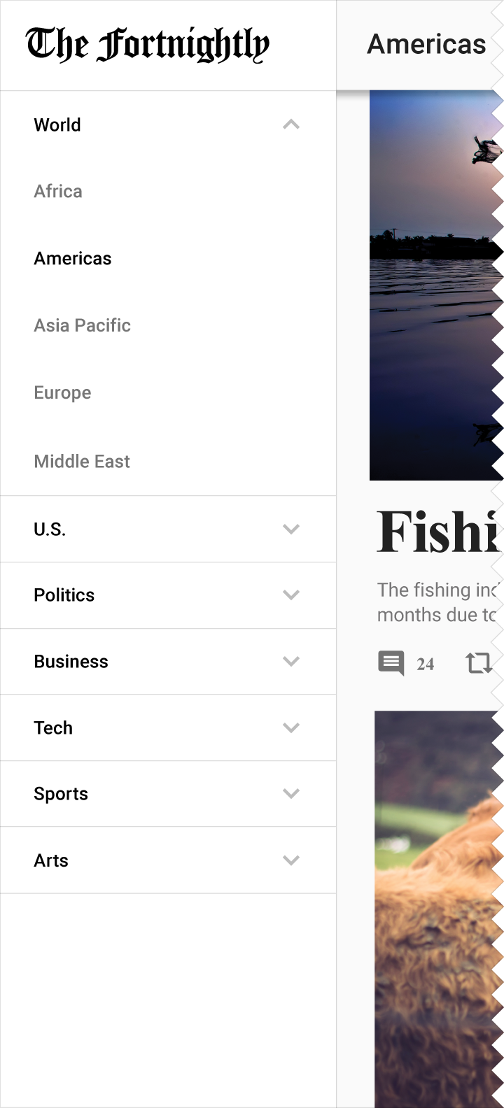
If you have a deep navigational hierarchy, you may expand that hierarchy within the navigation drawer. Upon selecting a level, the level of navigation below is revealed. Selecting a collapsed section expands that level in-line, hiding all levels outside of it.
Cascading navigation drawer (Desktop only)
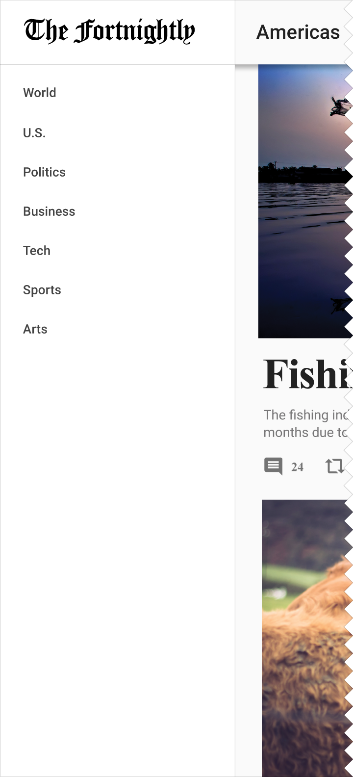
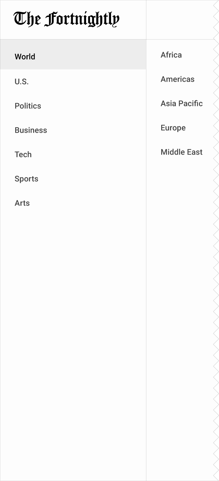
If you have a deep navigational hierarchy, you may use cascading menus to expand navigation drawer content horizontally. Each collection of views is presented in its own panel, and a level closes when a subsection is selected.
Gestural
Gestural navigation allows users to use swipe gestures to navigate between sibling or peer views. Supported gestures include: touching and dragging the screen horizontally (left/right), vertically (up/down), or while zooming in or out.
Recommended for:
- Naturally ordered relationships, such as pages representing consecutive calendar days
- Views with few siblings
- Views with similar content types
See Navigational transitions for more information on hierarchical journeys between scenes.
Combined patterns
In-context navigation
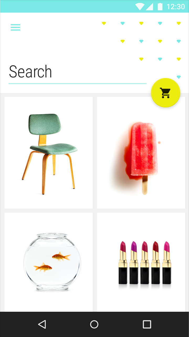
In-context navigation (used with tabs or navigation drawers) allows nimble movement between related sets of data.
In-context navigation integrates into an app's content and is typically less linear in nature. When moving through in-context navigation, navigating to a new scene will display navigational controls specific to that view.
Appropriate for these hierarchies:
- Parents with siblings
Recommended for:
- Showing large sets of child scenes
- Focusing attention on a specific set of tasks
- Apps with a strong primary view, and few alternates
Example uses:
- Link a song to an artist
- Move between recent items and a complete history
- Connect a user's post to their profile page
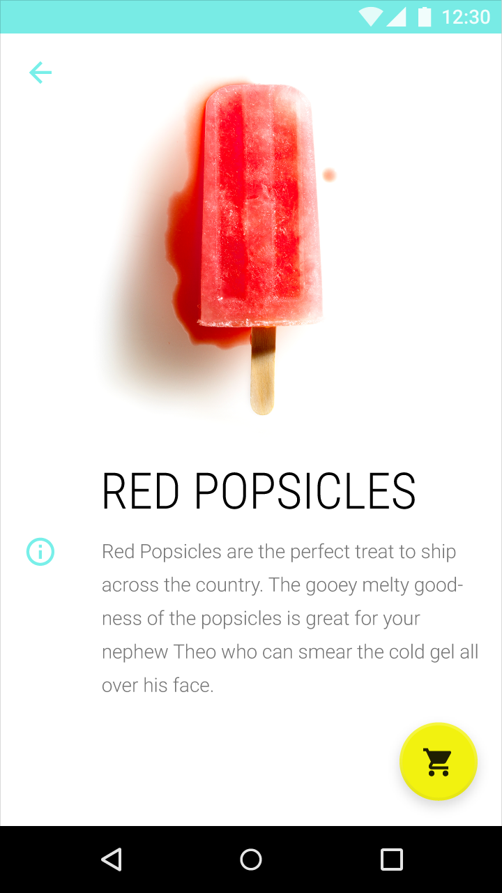
The up arrow is used to return to the previous level.


Side nav and tab combinations
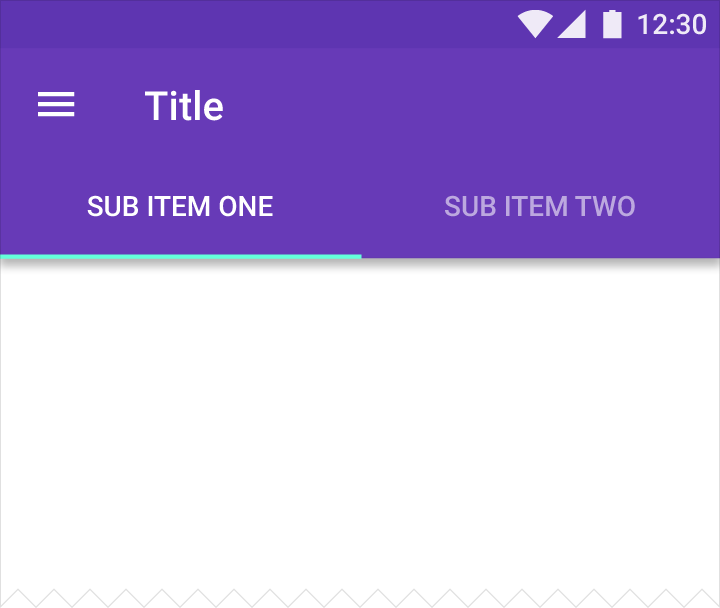
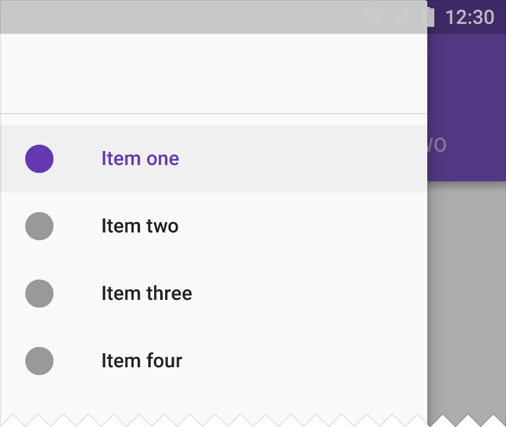
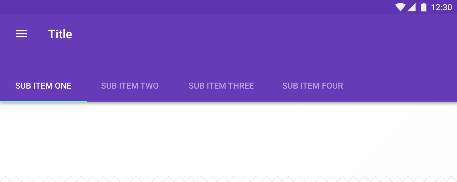
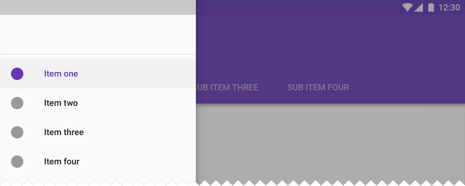
Products with two levels of navigation may pair a left navigation drawer with tabs.
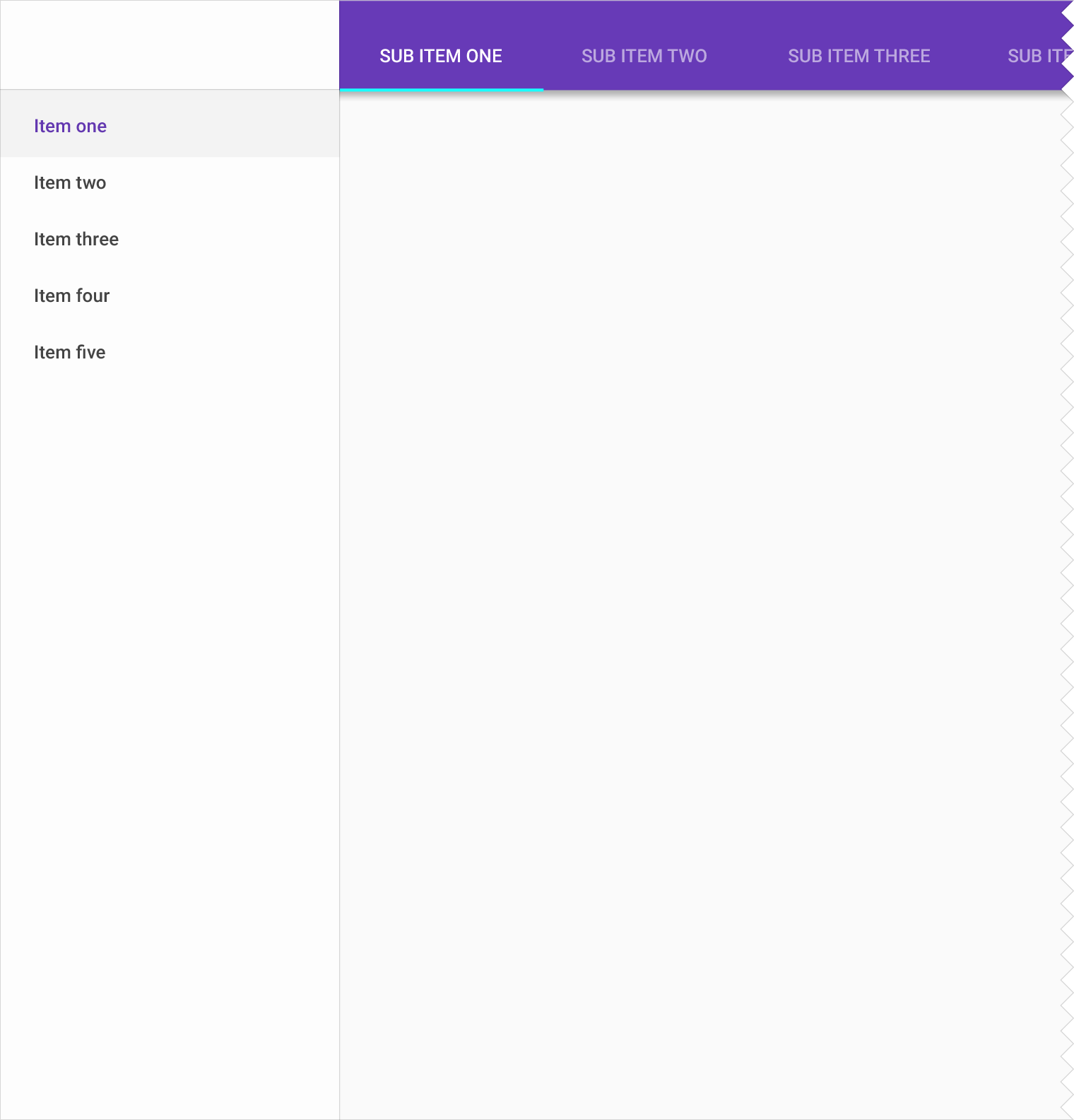
Nested navigation drawer + tabs (Desktop only)
If your product has three levels of navigation, pair a navigation drawer with nested navigation and tabs.