

Bidirectionality
UIs for languages that are read from right-to-left (RTL), such as Arabic and Hebrew, should be mirrored to ensure content is easy to understand.
UI mirroring overview
The main difference between left-to-right (LTR) and right-to-left (RTL) language scripts is the direction in which content is displayed:
- LTR languages display content from left to right
- RTL languages display content from right to left
RTL content also affects the direction in which some icons and images are displayed, particularly those depicting a sequence of events.
In general, the passage of time is depicted as left to right for LTR languages, and right to left for RTL languages.
| Element | LTR | RTL |
|---|---|---|
| Text | Sentences are read from left to right. | Sentences are read from right to left. |
| Timeline | An illustrated sequence of events progresses left to right. | An illustrated sequence of events progresses right to left. |
| Imagery | An arrow pointing left to right indicates forward motion: → | An arrow pointing right to left indicates forward motion: ← |
The passage of time is depicted from left to right for LTR languages, and from right to left for RTL languages.
When a UI is changed from LTR to RTL (or vice-versa), it’s often called mirroring. An RTL layout is the mirror image of an LTR layout, and it affects layout, text, and graphics.
When a UI changes from one direction to another, these items are not mirrored:
- Numbers
- Untranslated text (even if it’s part of a phrase)
Text should always be in the correct direction for the language it’s in. For example, any LTR words, such as a URL, will continue to be shown in an LTR format, even if the rest of the UI is in RTL.
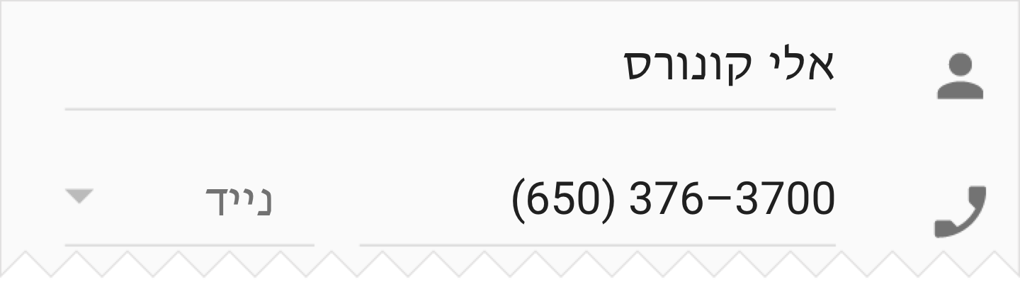
Do.
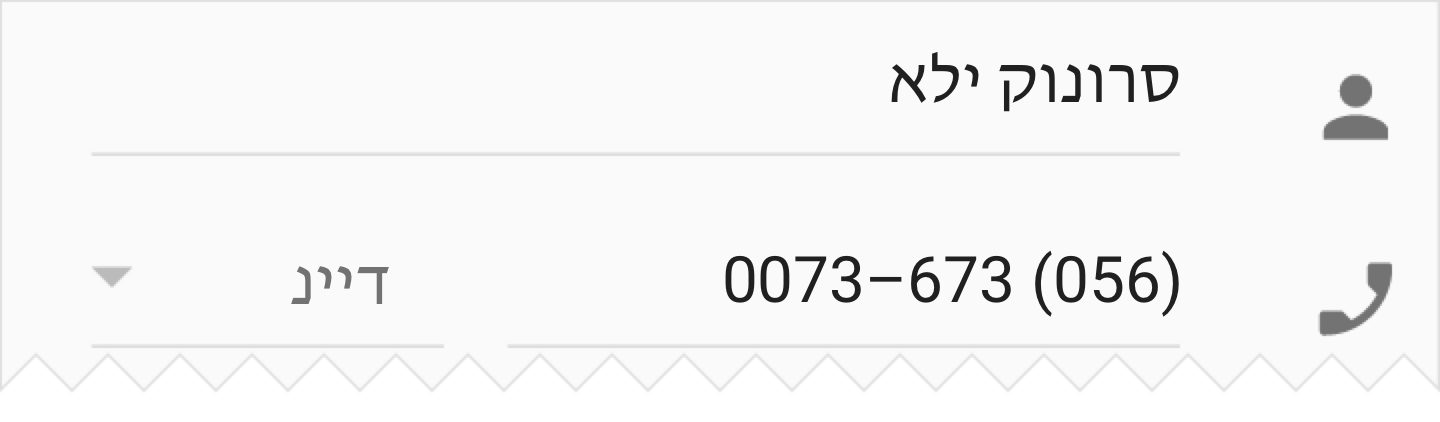
Don’t.
When a UI is mirrored, these changes occur:
- Text field icons are displayed on the opposite side of a field
- Navigation buttons are displayed in reverse order
- Icons that communicate direction, like arrows, are mirrored
- Text (if it is translated to an RTL language) is aligned to the right
These items are not mirrored:
- Icons that do not communicate direction, such as a camera
- Numbers, such as the clock and phone numbers
- Charts and graphs
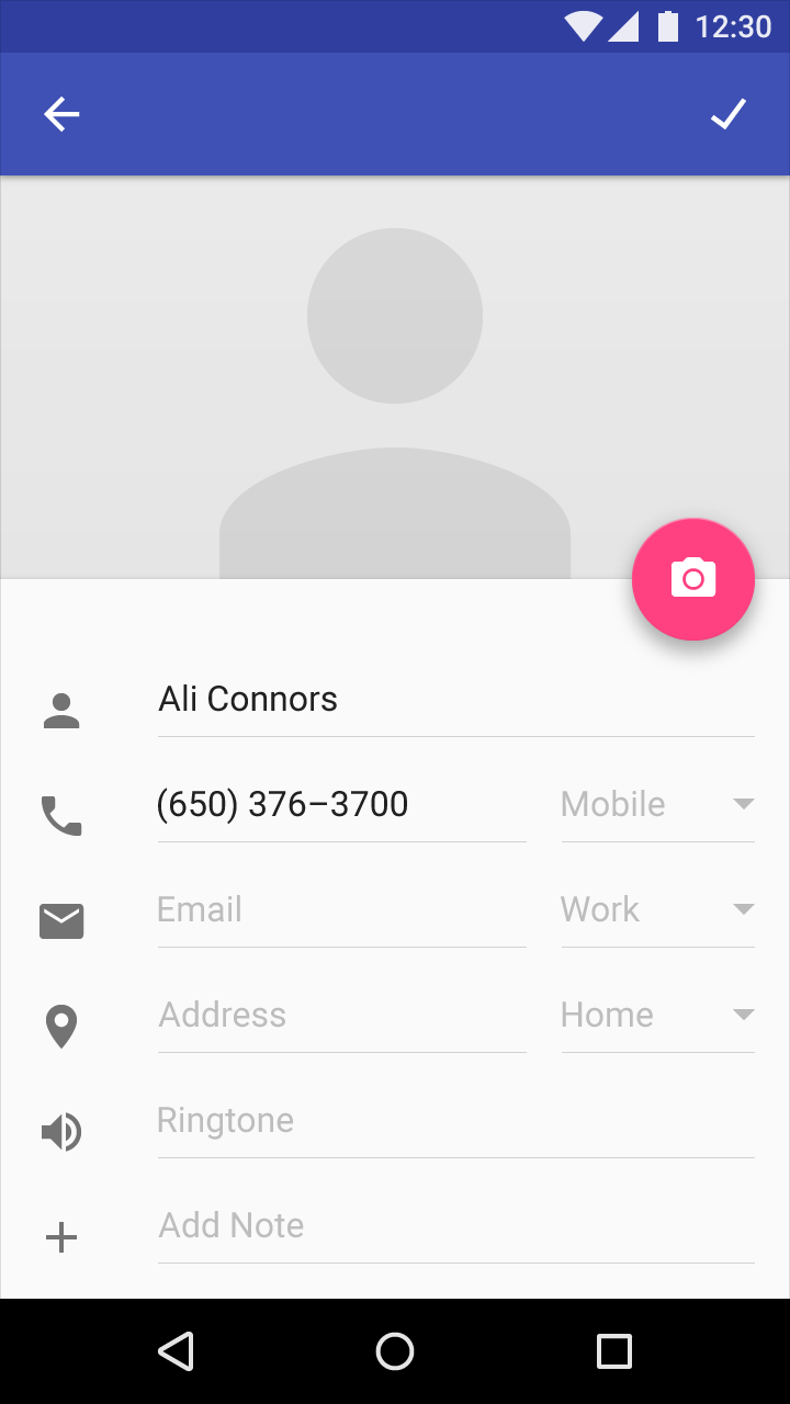
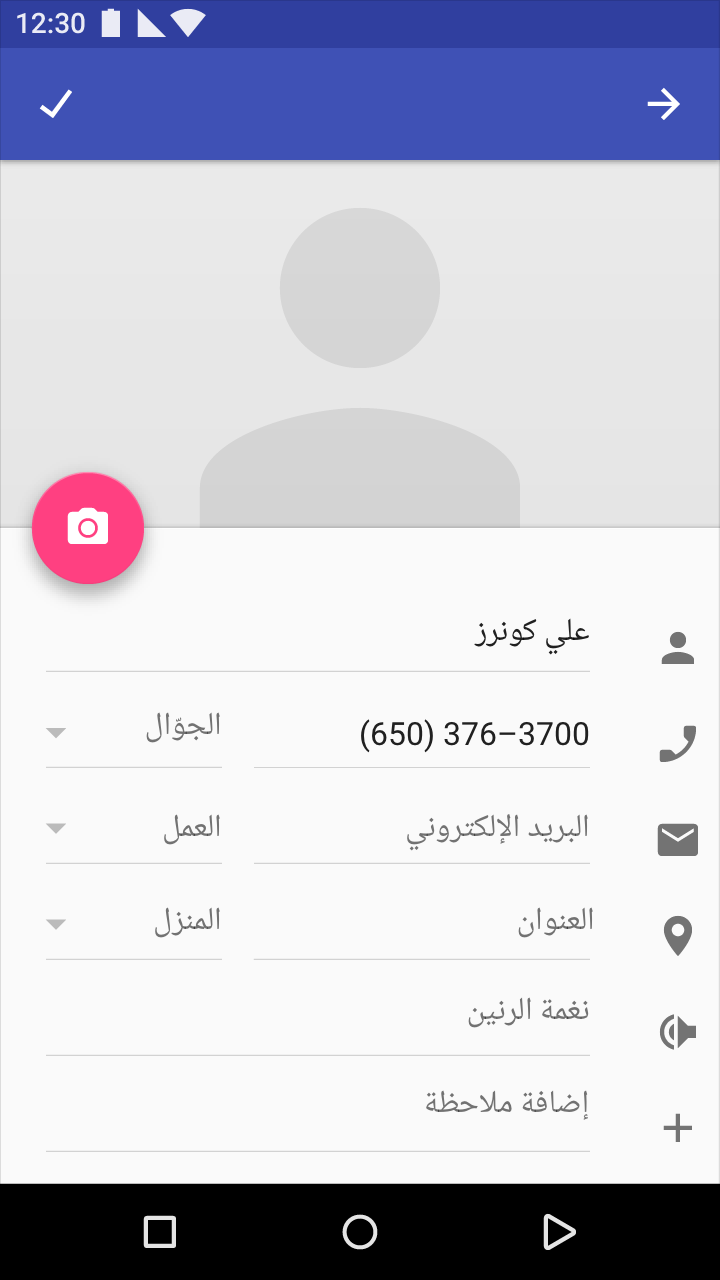


1. Icons related to bidirectionality are mirrored to reflect the start and end of a line of text
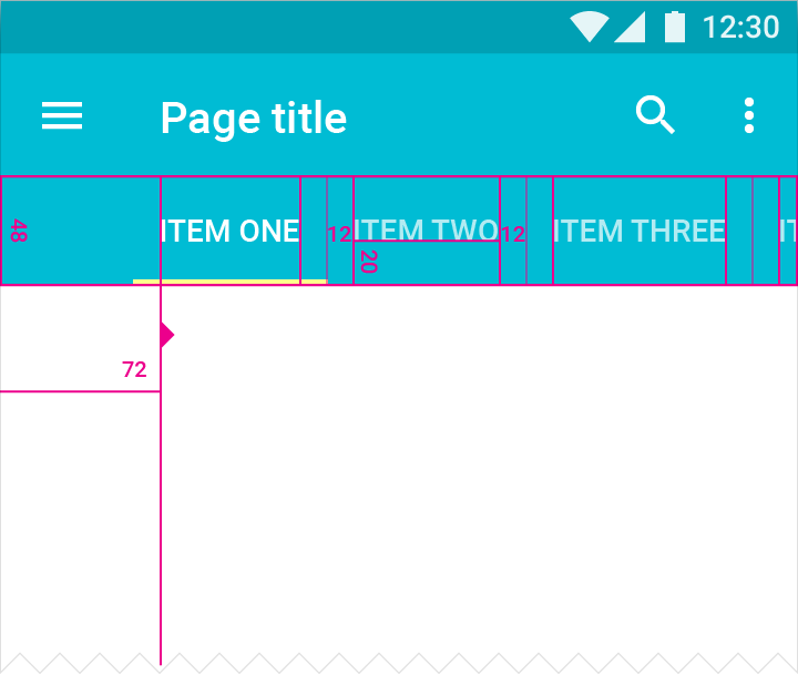
On an LTR screen, the tab for “Item One” is aligned to the left, and users swipe to the left to see more tabs.
Touch target height: 48dp
Screen edge margin before first tab: 72dp
Tab labels bottom padding: 20dp
Tab labels right and left padding: 12dp
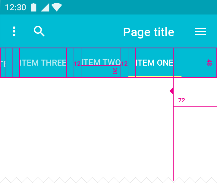
On an RTL screen, the tab for “Item One” is aligned to the right, and users swipe to the right to see more tabs.
Touch target height: 48dp
Screen edge margin before first tab: 72dp
Tab labels bottom padding: 20dp
Tab labels right and left padding: 12dp
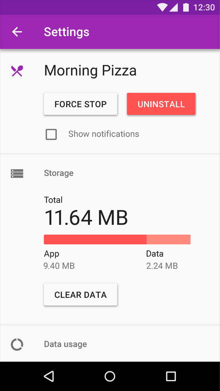
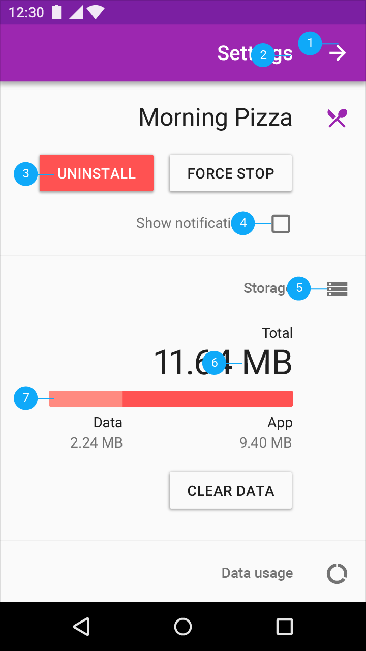
Title, icons, and UI elements are displayed flowing from right to left
1. Back button points to the right
2. Text is right-aligned
3. Primary and secondary buttons are mirrored to match reading direction
4. Checkbox appears to the right of text
5. Icons that do not communicate direction are not changed
6. Placement of units may vary across languages
7. Progress bars fill in the same direction as content is read
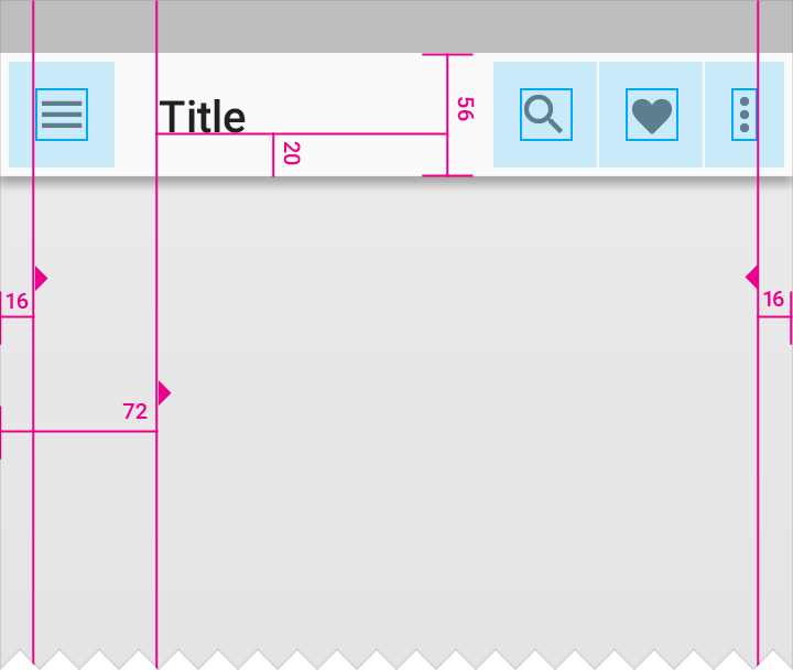
Navigation, overflow menu, and icons displayed left-to-right
Icon padding from screen edge: 16dp
Title distance from screen edge: 72dp
Padding below title: 20dp
Navigation bar height: 56dp
Overflow menu padding: 16dp
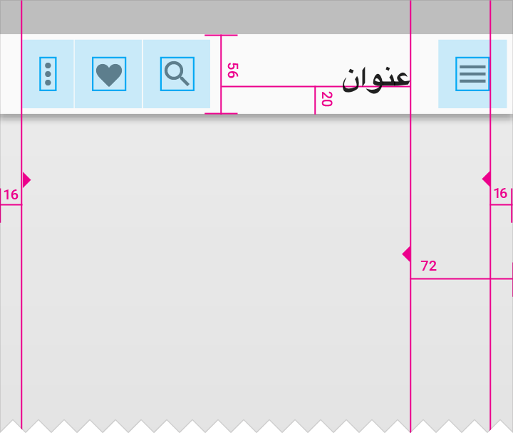
Navigation, overflow menu, and icons switch sides in the RTL layout
Icon padding from screen edge: 16dp
Title distance from screen edge: 72dp
Padding below title: 20dp
Navigation bar height: 56dp
Overflow menu padding: 16dp
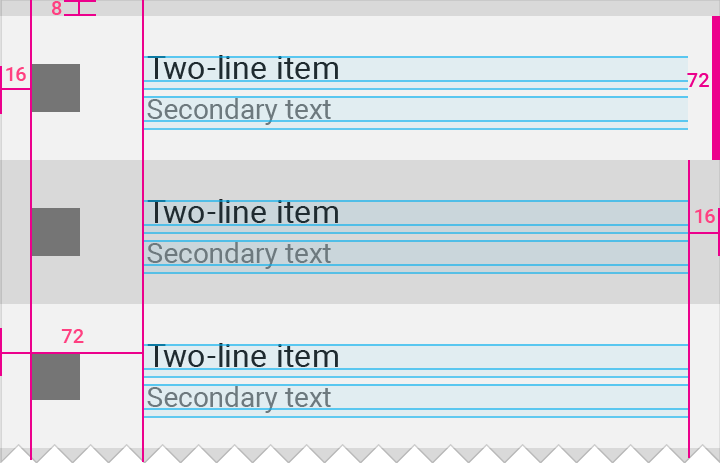
Padding and margin around icons and text for LTR
List item height: 72dp
Icon margin from left screen edge: 16dp
List item distance from left screen edge: 72dp
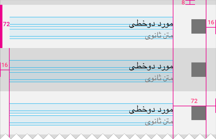
When mirroring the layout, padding and margin around icons and text also switch placement to match RTL layouts.
List item height: 72dp
Icon margin from right screen edge: 16dp
List item distance from right screen edge: 72dp
RTL mirroring guidelines
When text, layout, and iconography are mirrored to support right-to-left (RTL) UIs, most things that relate to time should be depicted as moving from right to left. For example, in an RTL layout, forward points to the left, and backwards points to the right.
For detailed developer guidance on RTL text, check out:
Supporting Different Languages and Cultures
Implement RTL using BidiFormatter
For detailed developer guidance on RTL icons, check out:
RTL Material Design icons guide
See how to mirror icons
RTL Sketch plug-in
Flip existing designs and assets into an RTL format
When to mirror
The most important icons for mirroring are back and forward buttons. Back and forward navigation buttons are reversed.
An icon that shows forward movement should be mirrored.


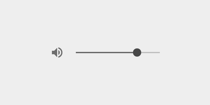
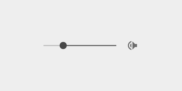
A volume icon with a slider at its right side should be mirrored. The slider should progress RTL, and the sound waves should emerge from the right.
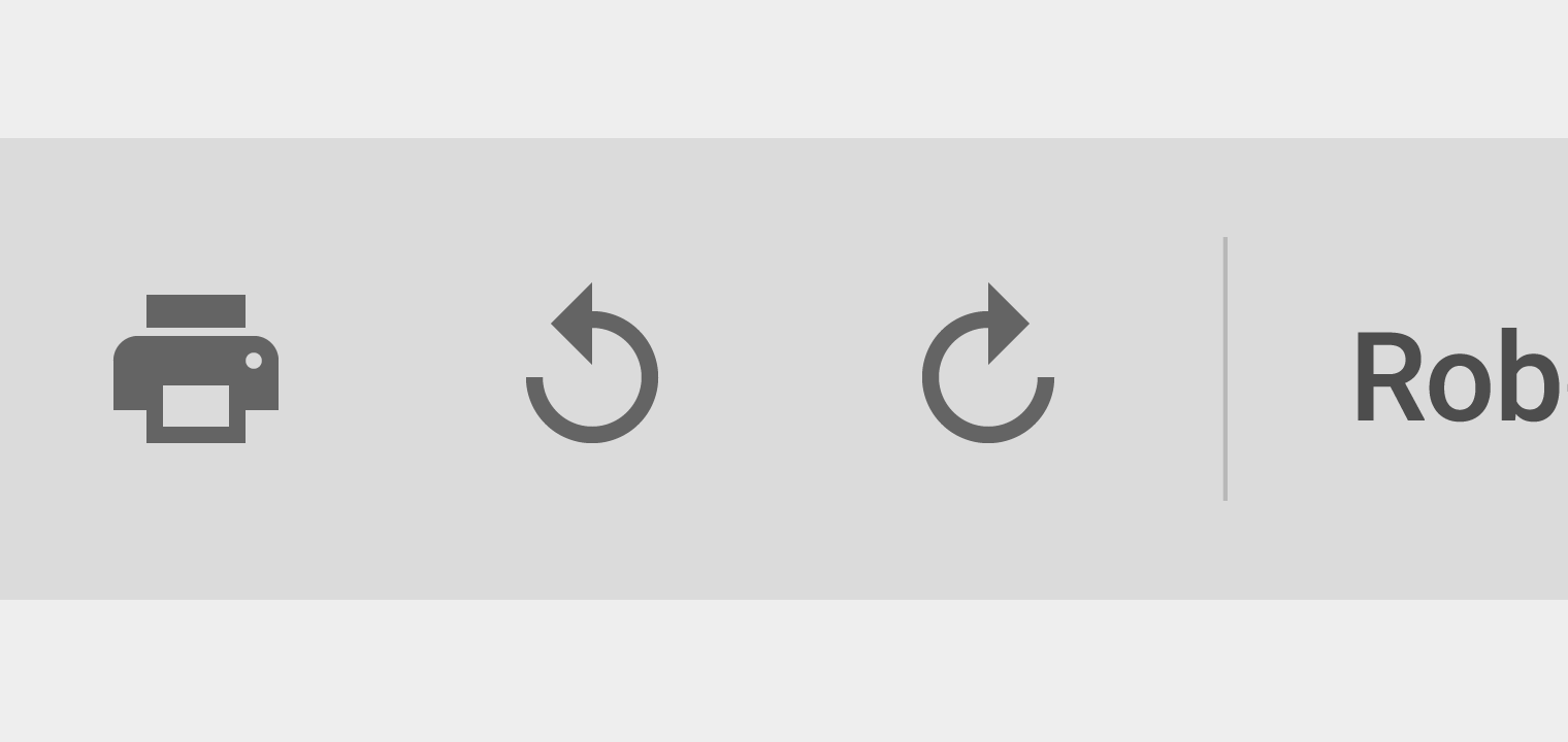
Sometimes, both the horizontal and circular direction of time are implied in an icon. For example, the redo and undo buttons in Google Docs have both a horizontal direction and a circular direction.
In LTR, these point to the same direction in both circular and horizontal representations of time. In RTL, choose whether to show circular or horizontal direction.
Icons that contain representations of text need careful mirroring.
Text is right-aligned in RTL. If there is a paragraph indent at the beginning of a paragraph, an unfinished line at the end of the paragraph, or a ragged right side, the icons need to be mirrored.


When not to mirror
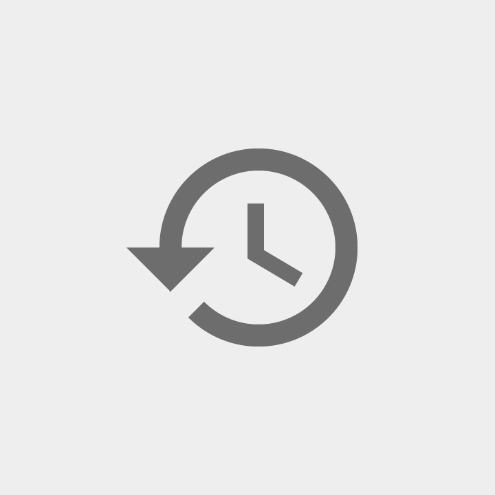
While the linear representation of time is mirrored in RTL, the circular direction of time is not. Clocks still turn clockwise for RTL languages. A clock icon or a circular refresh or progress indicator with an arrow pointing clockwise should not be mirrored.

Some icons refer to physical objects that are not mirrored in the right-to-left world.
For example, physical keyboards and media players look the same everywhere in the world, so they should not be mirrored.


Certain icons might seem directional but they actually represent holding an object with one’s right hand.
For example, the search icon typically has its handle at the bottom right side, because the majority of users are right-handed.
The majority of users in RTL-writing countries are also right-handed, so such icons should not be mirrored.


Most RTL countries do not mirror slashes. Leave images with slashes as-is for RTL locales.
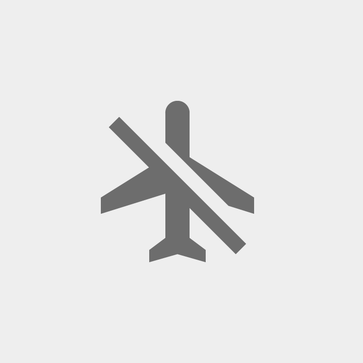
Do.
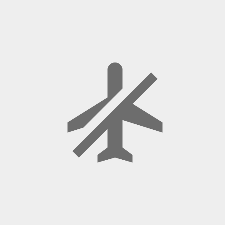
Don’t.
The passage of time
In most cases, an action that happens over time should be mirrored.
To show movement from right to left, an icon of a person walking forward should be facing left.
Display the "next page" on the left and the "previous page" on the right.
A progress bar shows 0% on the right, and 100% on the left, and gets filled in from right to left.
Days in a calendar appear from right to left.
Do not mirror media playback buttons and the media progress indicator as they refer to the direction of the media being played, not the direction of time.
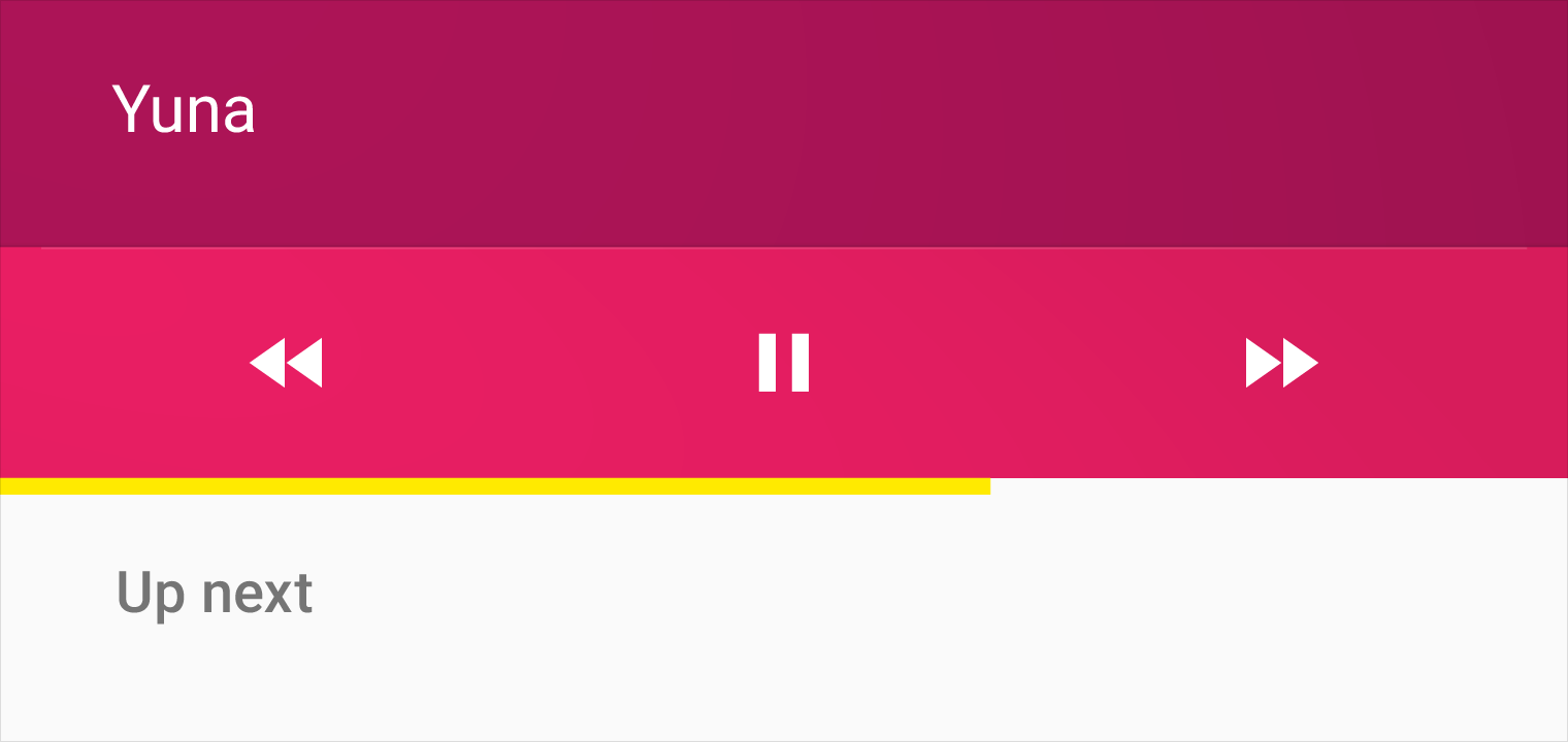
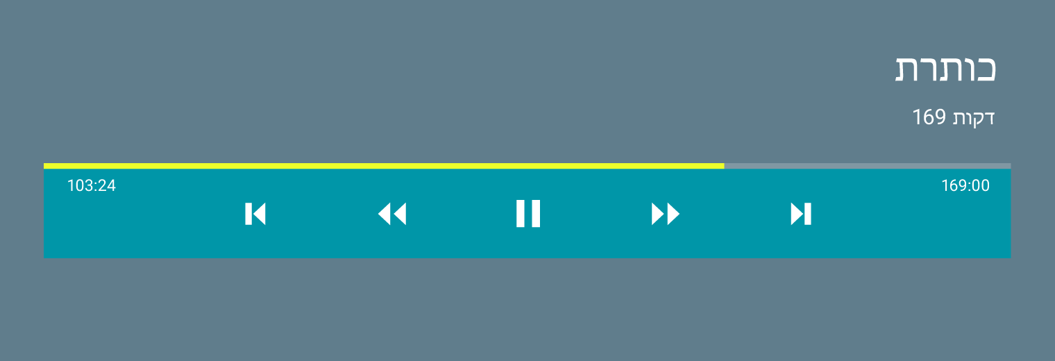
Do.
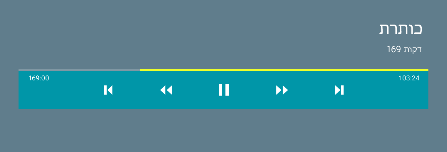
Don’t.
Localization
Text in graphics
Graphics that include text usually require localization.
Numbers
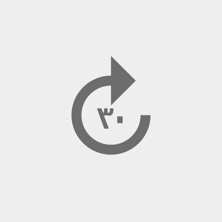
Numbers, including icons containing numbers, must be localized for languages that use different numerals. For example, Bengali, Marathi, Nepali, and some Arabic-speaking locales use different forms of numbers.

Mirroring
Sometimes content may need to be mirrored, even if the UI is not mirrored. For example, when a user edits an RTL paragraph inside an LTR document, the toolbar buttons for the RTL text should be in RTL.
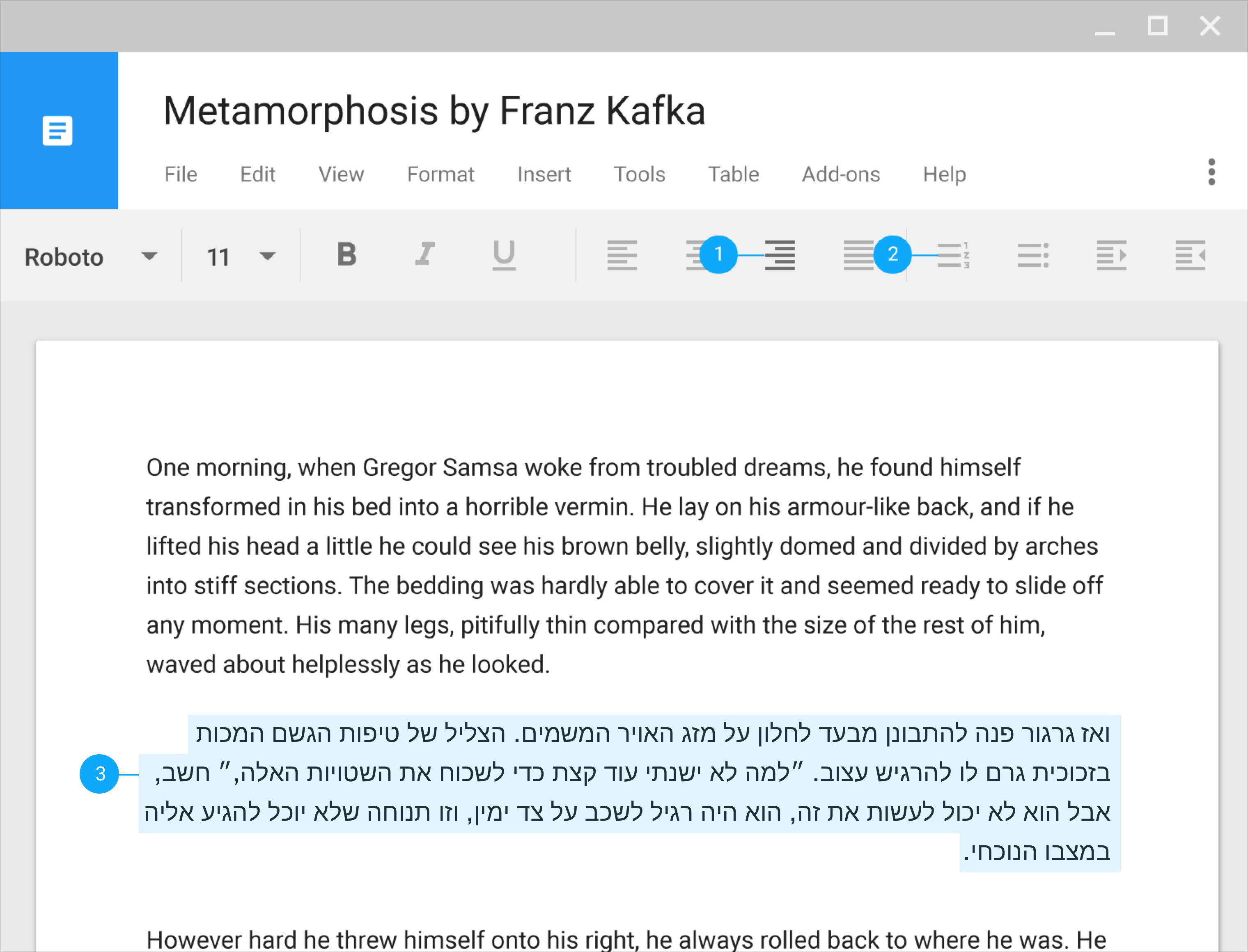
1. Paragraph aligned right
2. Icons flipped
3. Hebrew text direction is RTL