Structure
UI regions
For guidance on arranging elements in z-space to achieve the correct behavior and shadows, see the Environment and Elevations and shadows sections.
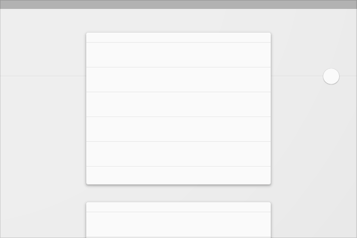
Mobile structure
This structure includes a permanent app bar and floating action button. An optional bottom bar can be added for additional functionality or action overflow. Side nav menus overlay all other structural elements.
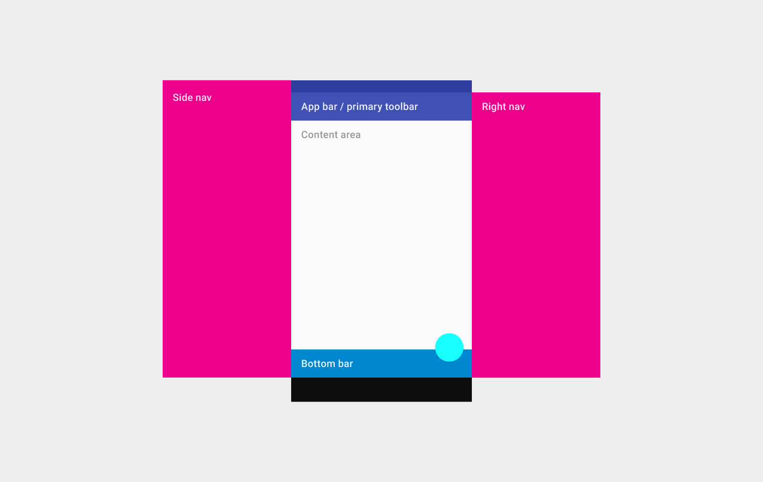
Top left to right: Side nav, app bar/primary toolbar, content area (below the app bar/primary toolbar), and right nav
On the bottom: bottom bar
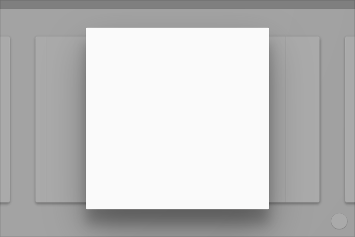
Tablet structure
This structure shows a permanent app bar with a floating action button. The app bar absorbs elements from the tablet and mobile bottom bars. An optional bottom bar can be added for additional functionality or action overflow. A side nav overlays all other structural elements. A right nav menu can be accessed temporarily or pinned for permanent display.
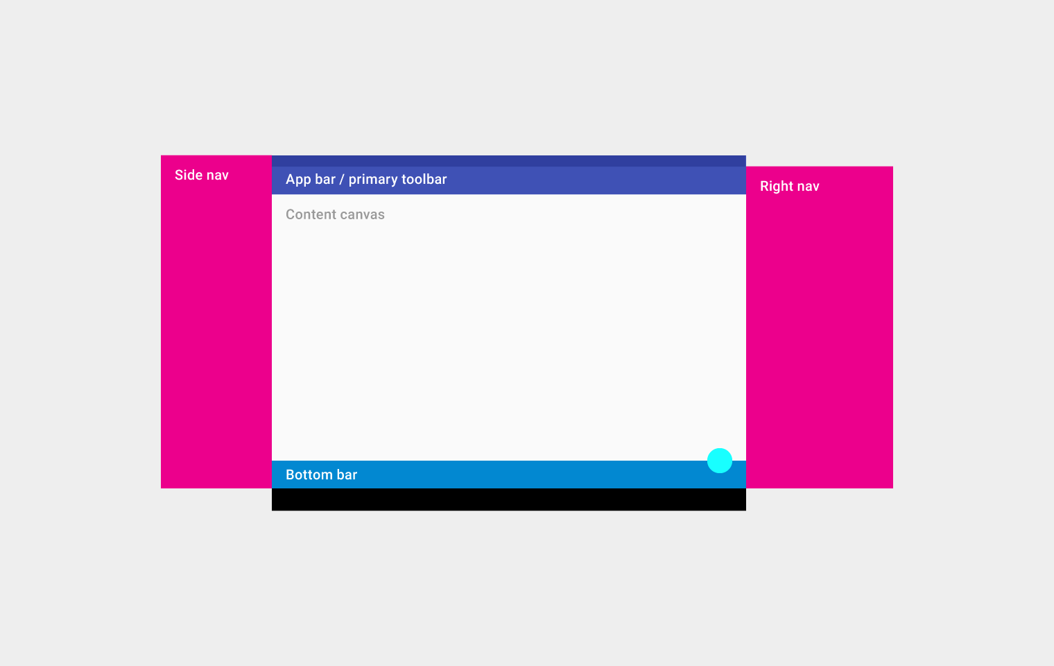
Top left to right: Side nav, app bar/primary toolbar, content canvas (below the app bar/primary toolbar), and right nav
On the bottom: bottom bar
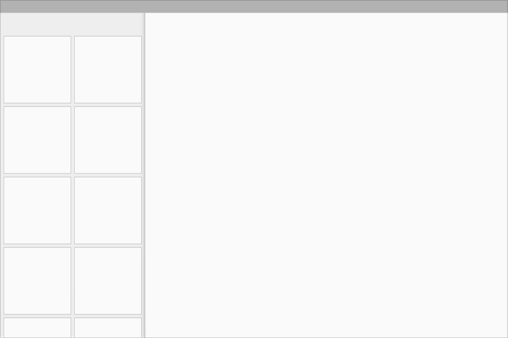
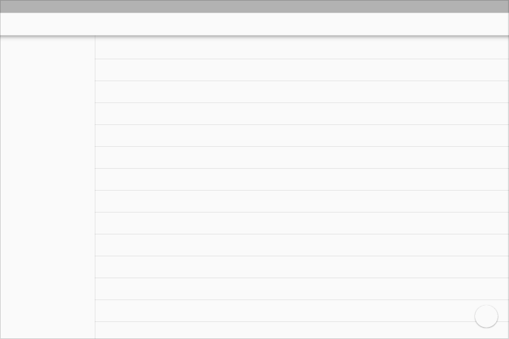
Desktop structure
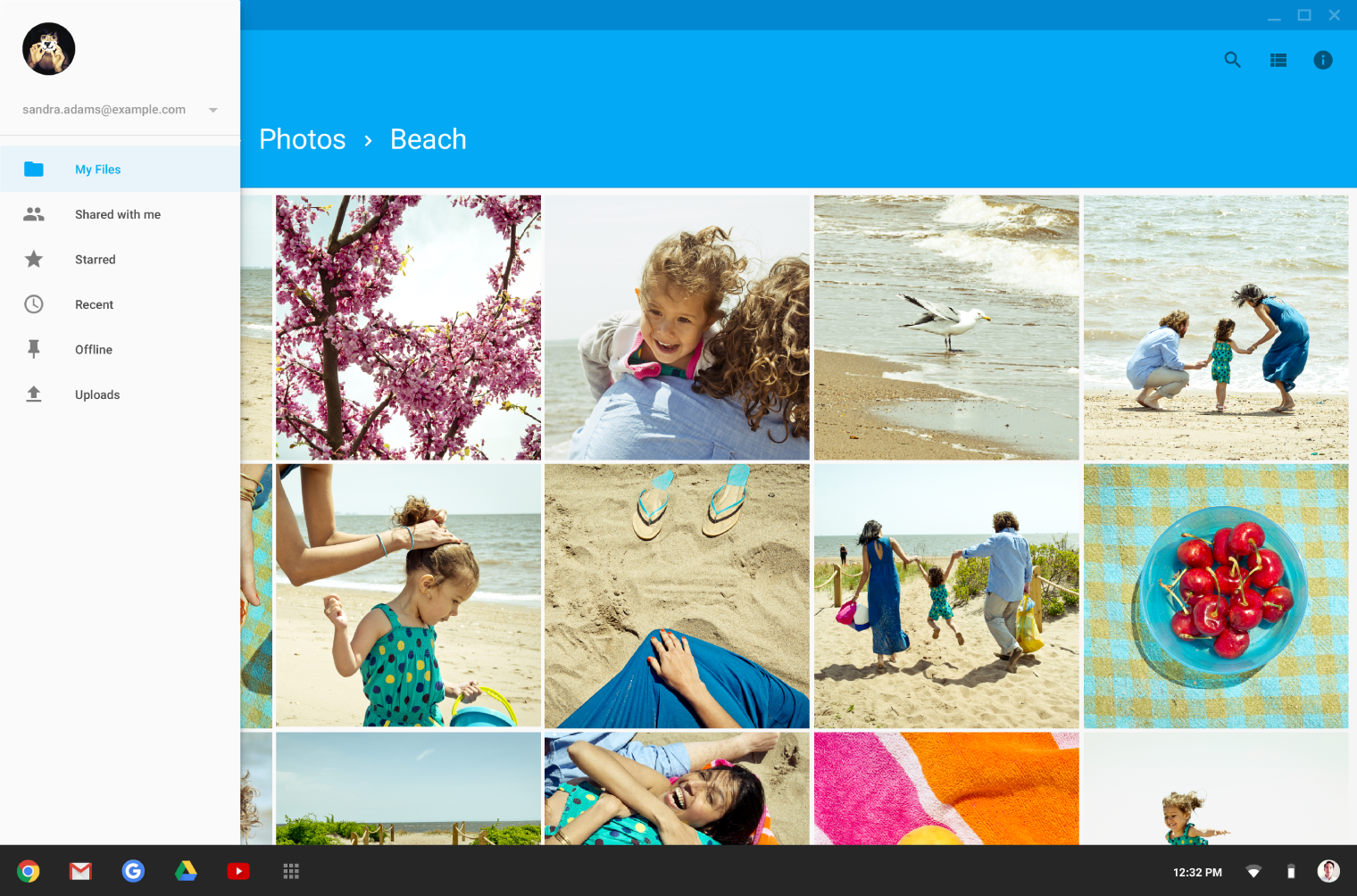
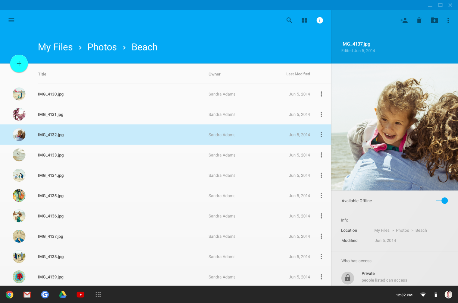
The desktop structure contains a permanent app bar with a floating action button. The app bar absorbs elements from the tablet and mobile bottom bars. Where possible, the window controls are absorbed into the app bar.
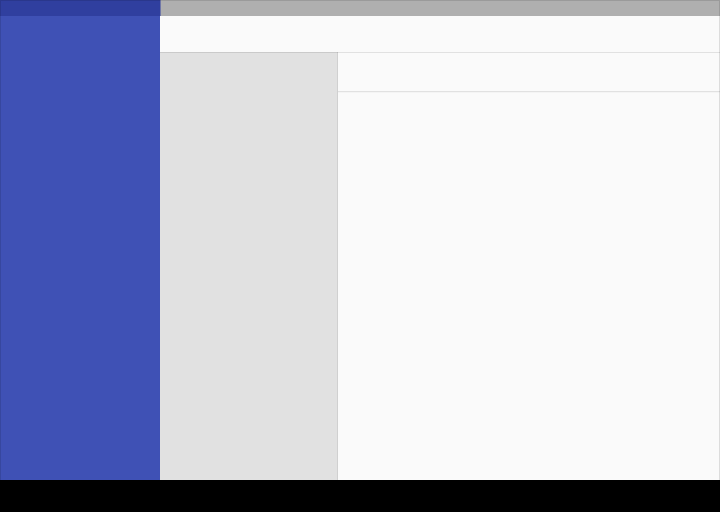
Side navigation menus can take up the full height of the screen size (including under the app bar) and be accessed temporarily or pinned for permanent display. Side nav menus, as well as the content canvas, can have their own secondary toolbars for tabs, palettes, or secondary actions.
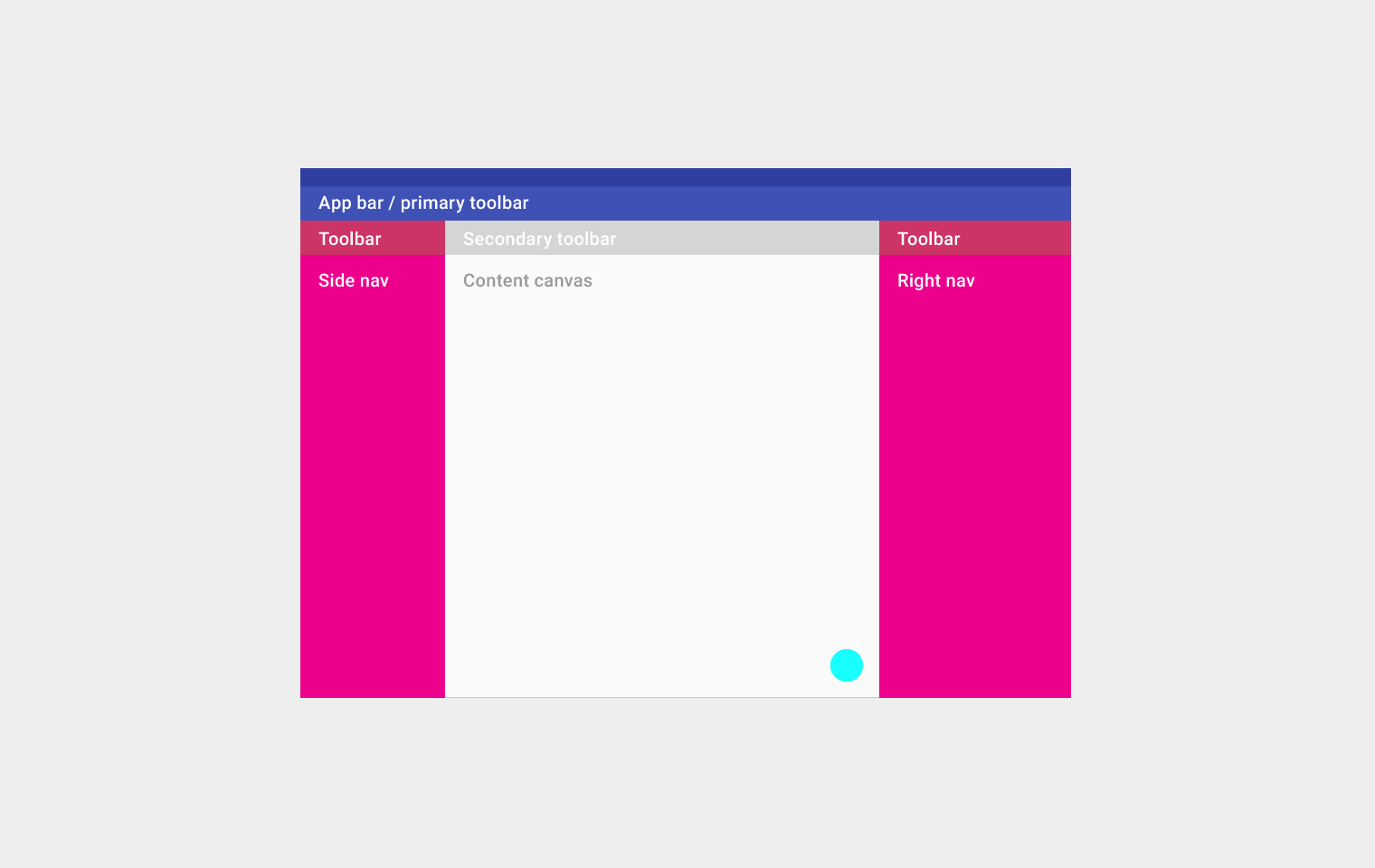
Top left to right: App bar/primary toolbar
Second row from left to right: Toolbar, secondary toolbar, and toolbar
Third row from left to right: side nav, content canvas, and right nav
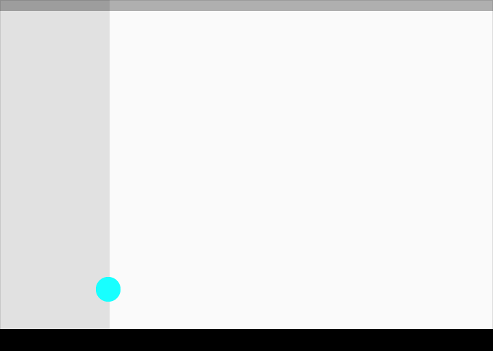
On the bottom: floating action button
UI regions
Define a primary horizontal or vertical divider.
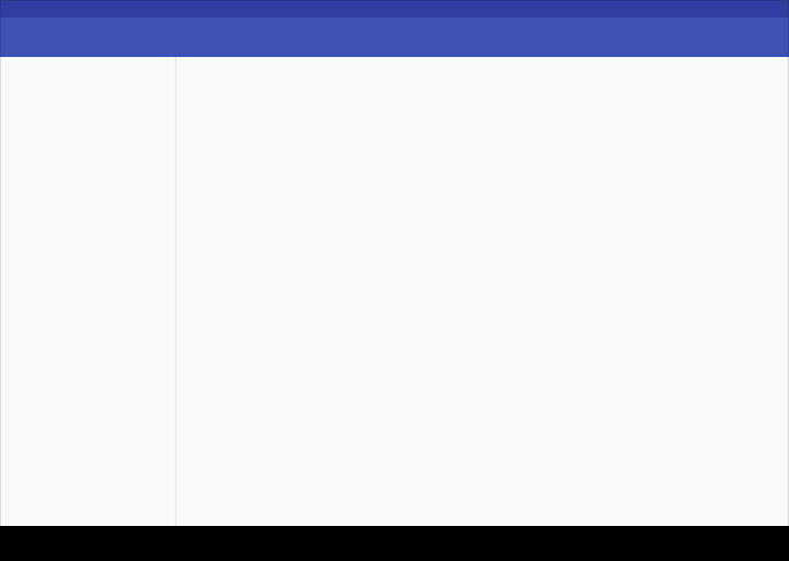
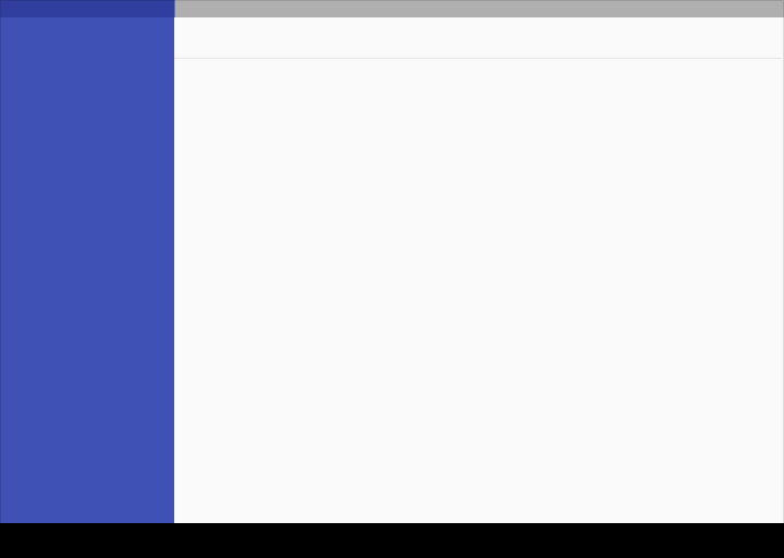
Avoid slicing up the interface into too many regions which can cause L shapes. Instead, use whitespace to delineate secondary areas.
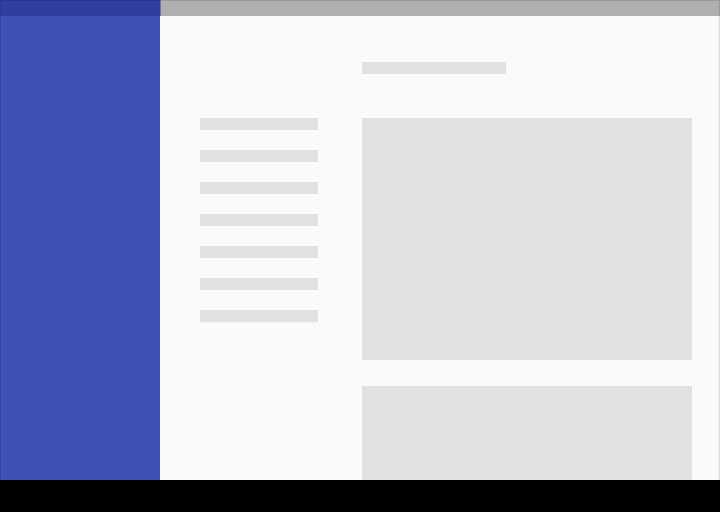
Do.
Don’t.
Break edges with cards and floating action buttons.
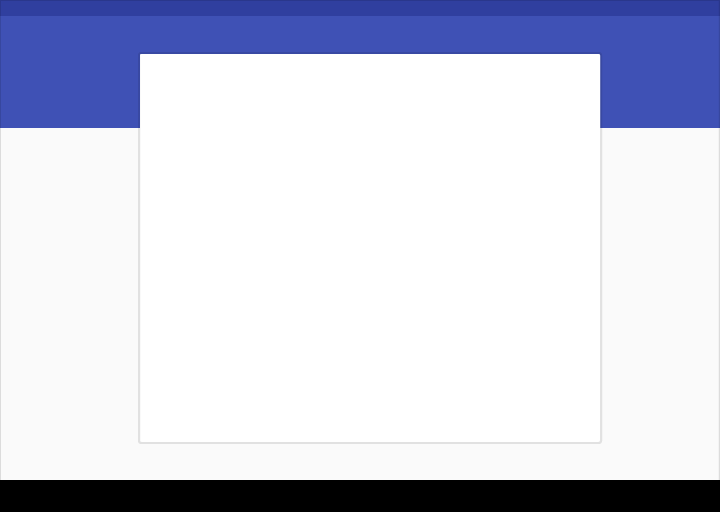
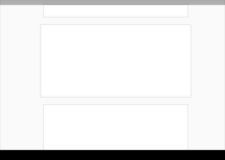
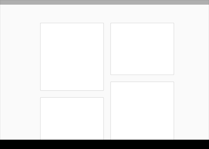
Use cards to organize content when specific behaviors are needed or if groupings of information need more separation than what whitespace or dividers can provide.
Toolbars
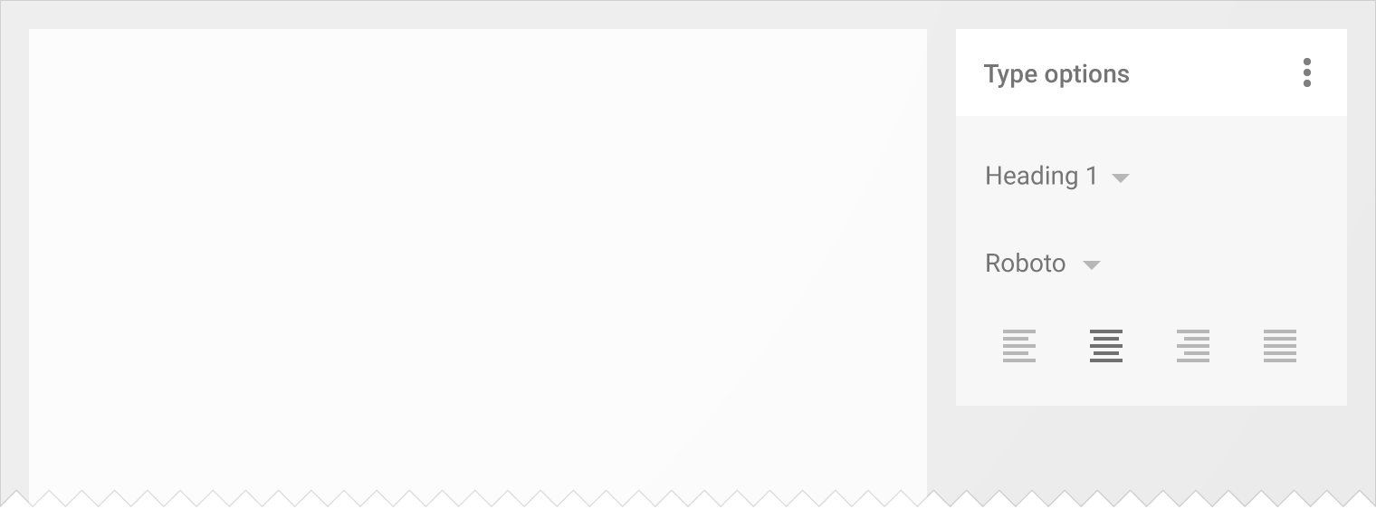
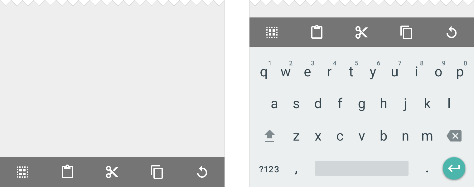
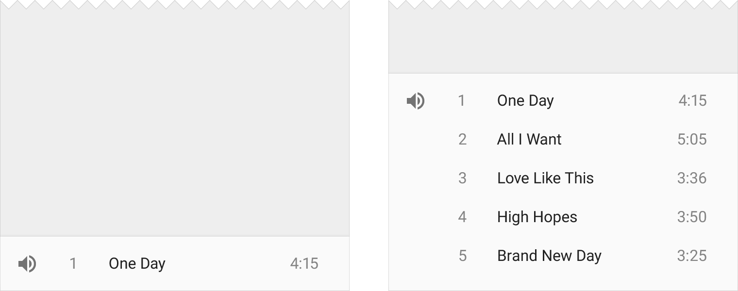
Toolbars are versatile and can be used in many different ways.
App bar
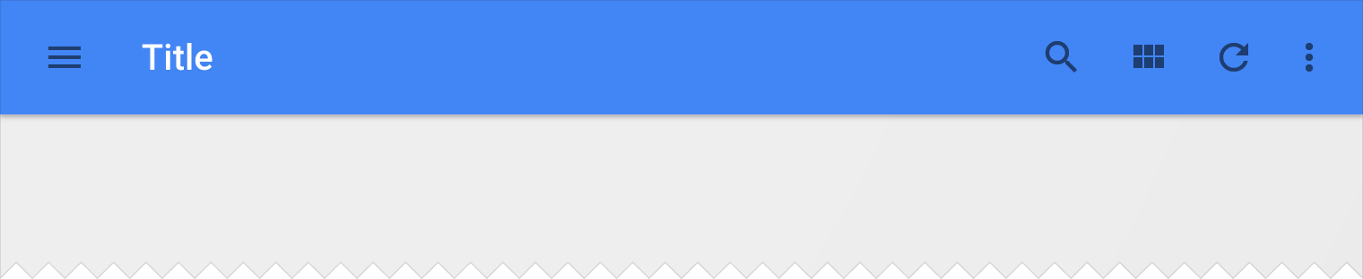
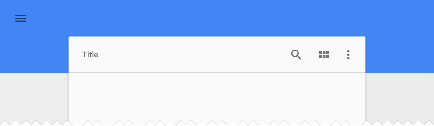
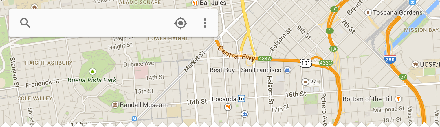
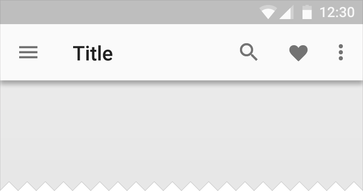
The app bar, formerly known as the action bar in Android, is a special kind of toolbar that’s used for branding, navigation, search, and actions.
The nav icon at the left side of the app bar can be:
- A control to open a navigation drawer
- An up arrow for navigating upward through your app’s hierarchy
- Omitted entirely if no navigation is required from this screen
The title in the app bar reflects the current page. It can be an app title, page title, or a page filter.
Icons on the right side of the app bar are app-related actions. The menu icon opens the overflow menu, which contains secondary actions and menu items like help, settings, and feedback.

On the left: Nav icon, title, and filter icon
On the right: Action and menu icons
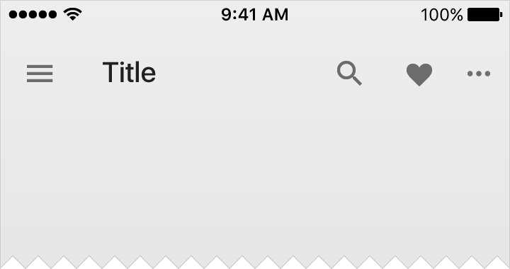
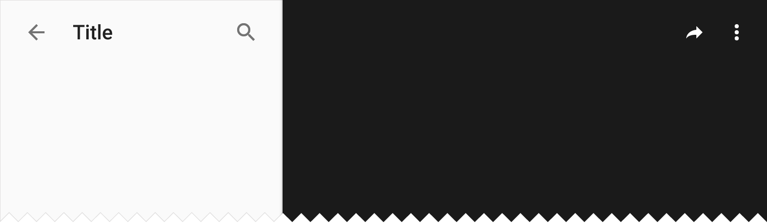
Title color
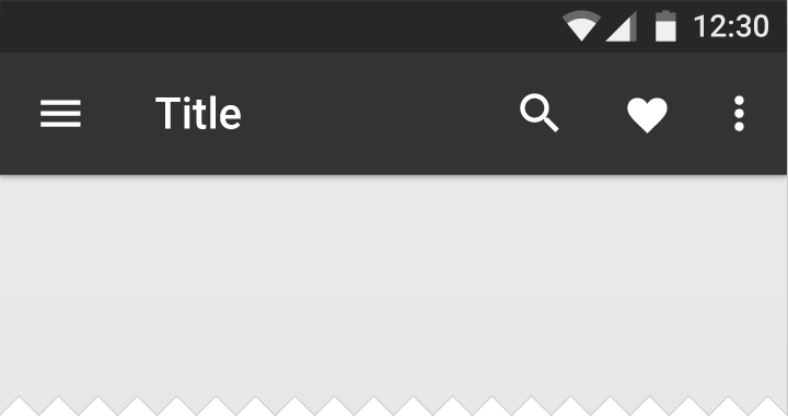
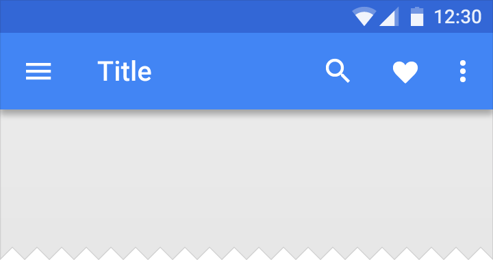
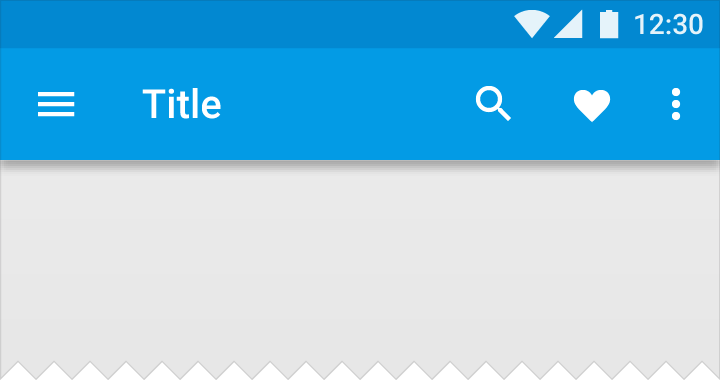
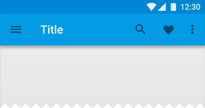
In an app bar, all icons should be the same color.
The title can have a distinct color from the icons if increased visual hierarchy is needed. Distinct title colors work best on backgrounds with enough contrast for both white and black glyphs.
Metrics
Default heights:
Mobile Landscape: 48dp
Mobile Portrait: 56dp
Tablet/Desktop: 64dp
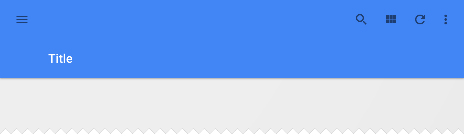
For extended app bars, the height is equal to the default height plus content increment(s).
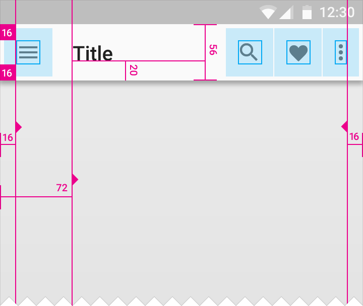
App bar left and right padding: 16dp
App bar icon top, bottom, left padding: 16dp
App bar title left padding: 72dp
App bar title bottom padding: 20dp
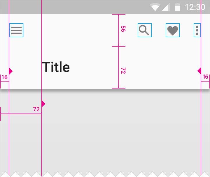
App bar height: 128dp
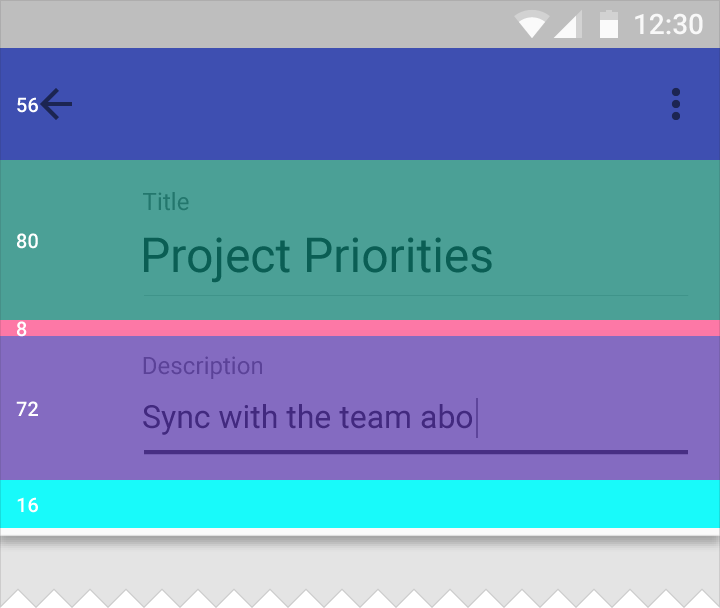
Title area height: 80dp
Title area bottom padding: 8dp
Description area height: 72dp
Description area bottom padding: 16dp
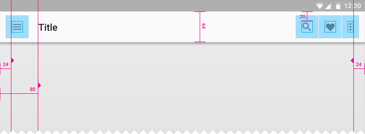
App bar left and right content padding: 24dp
App bar icon top and bottom padding: 20dp
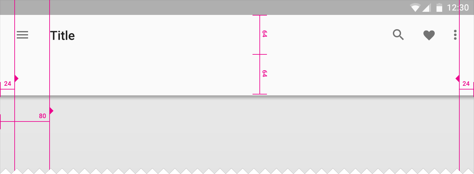
App bar left and right icon padding: 24dp
App bar left content padding: 80dp
Density
When the mouse and keyboard are the primary input methods, measurements may be condensed to accommodate denser layouts.
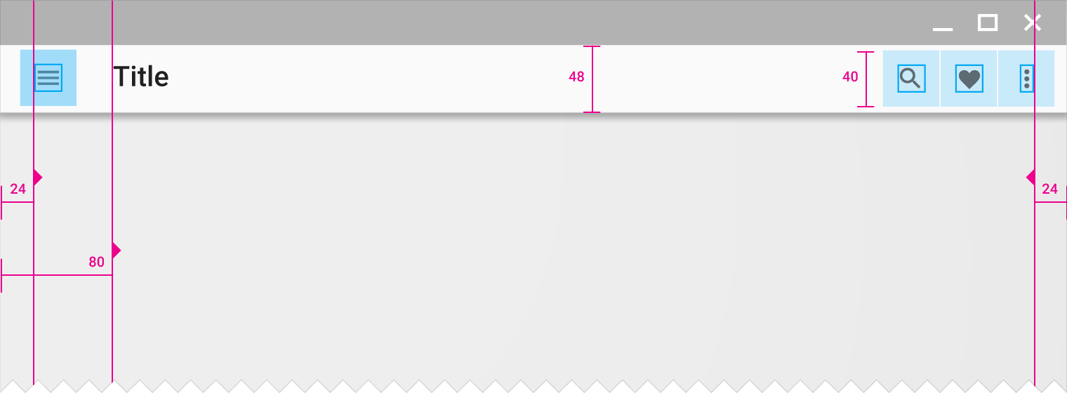
App bar height: 48dp
App bar left and right content padding: 24dp
App bar left content padding: 80dp
Icon height with touch target: 40dp
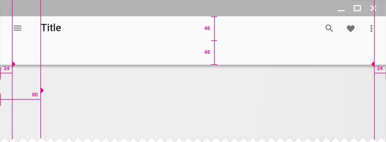
Dense prominent app bar height: 96dp
App bar left and right content padding: 24dp
App bar left content padding: 80dp
Menus
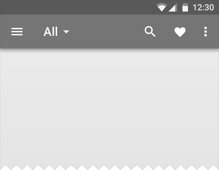
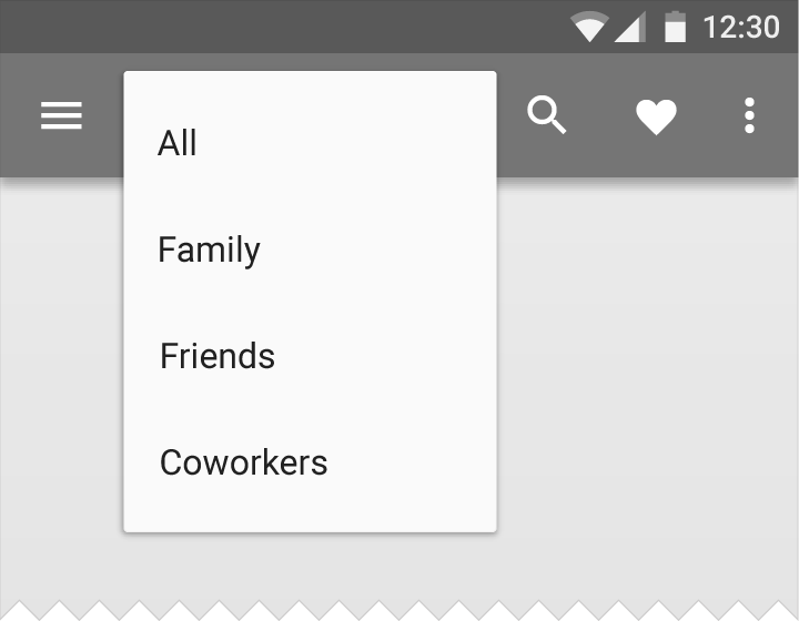
A menu is a temporary sheet of paper that always overlaps the app bar, rather than behaving as an extension of the app bar.
System bars
Status bar/window bar
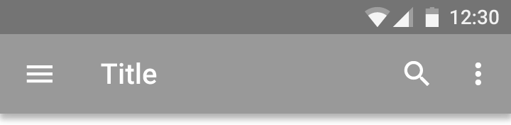
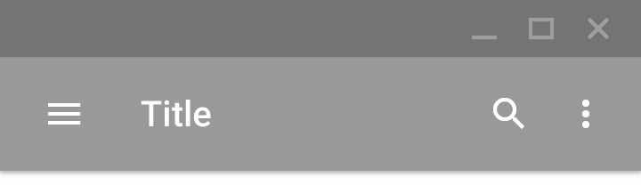
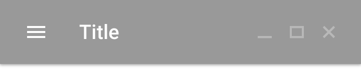
On Android, the status bar contains notification icons and system icons. On Chrome, the top bar contains the window controls: minimize, full screen, and close. In a Chrome app, the top bar can disappear, and the window controls are then brought into the app bar.


Metrics:
Android status bar height: 24dp
Chrome window height: 32dp
Full screen
Some content is best experienced in full-screen mode, such as videos, games, books, and slides. Full-screen mode increases engagement with content by minimizing visual distraction from controls and protecting users from escaping the app accidentally.
Full-screen mode comes in several types:
- Lean back
- Immersive
- Lights Out
Lean back
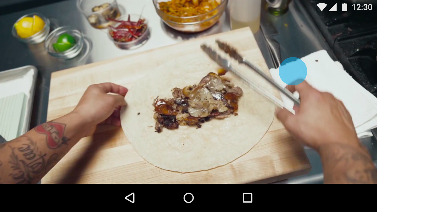
Lean back mode is best suited to watching content with limited screen interaction, such as a video.
Interaction: Touch the screen anywhere to bring back the system bars.
Immersive
Immersive mode is best when users need to interact heavily with the screen, such as playing a game or interacting with an image gallery. You may show and hide your app’s controls along with the system bars as needed.
Interaction: Swipe from any edge of the screen to make the system bars appear. The first time an app goes full-screen, this swipe gesture is explained.
Edge swipe exception: Apps that use the swipe-from-edge gesture to perform actions should also display the system bars when that gesture is used. For example, a drawing app that uses an edge swipe (such as to draw a line) should also display the system bars semi-transparently for a few seconds any time that gesture occurs.

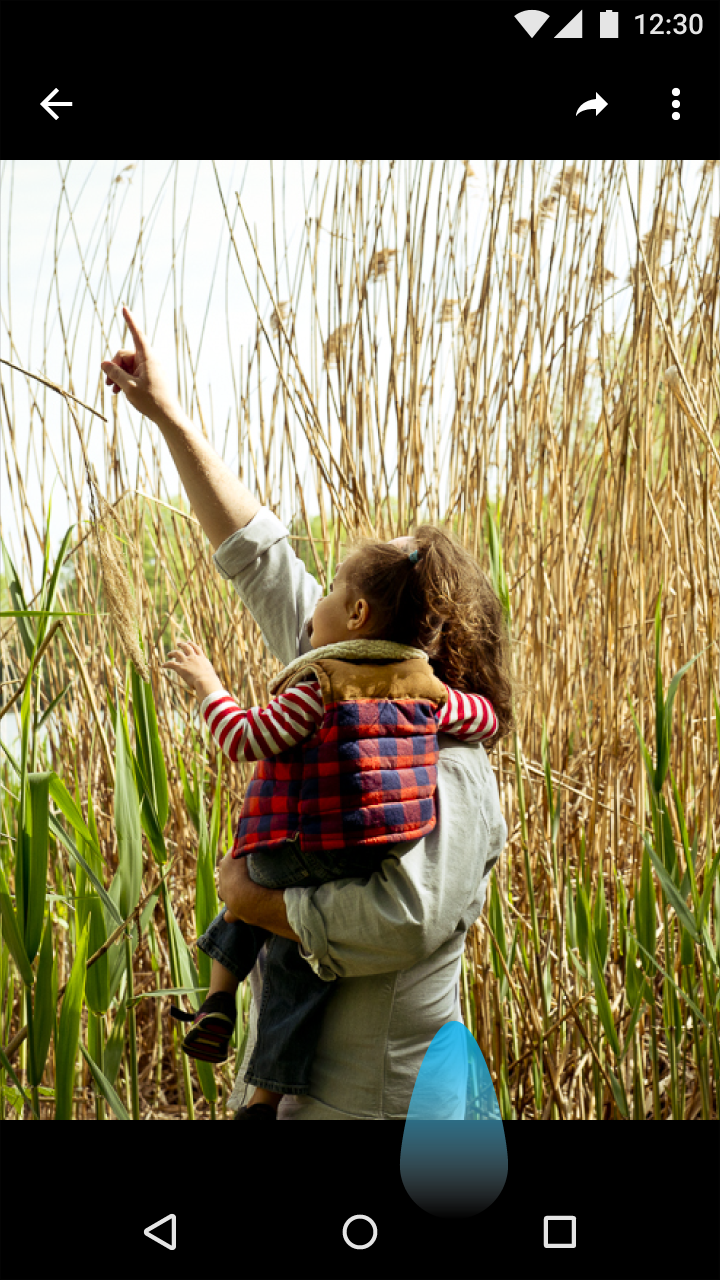
Lights Out
In Lights Out mode, the Action Bar and Status Bar fade away and become unavailable after a few seconds of inactivity. The Navigation Bar is still available and responds to touches but appears dimmed.
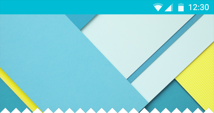
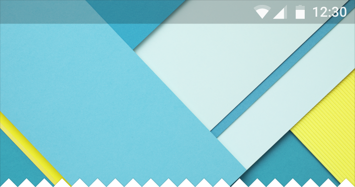
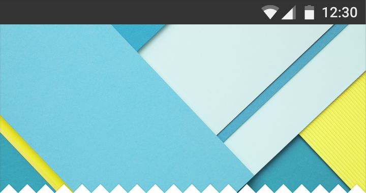
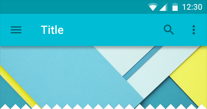
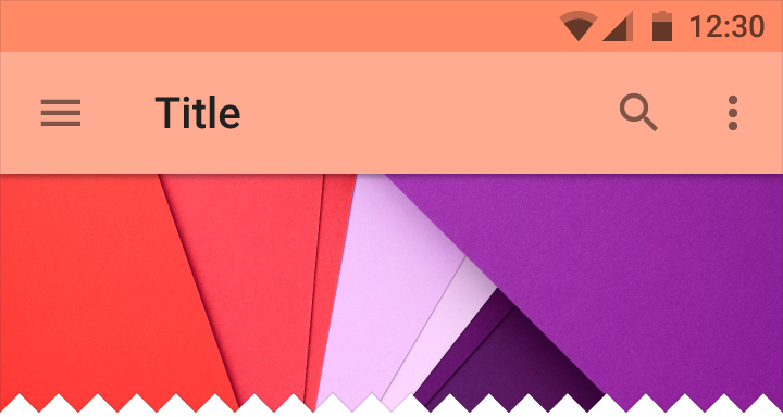
Dark status bar
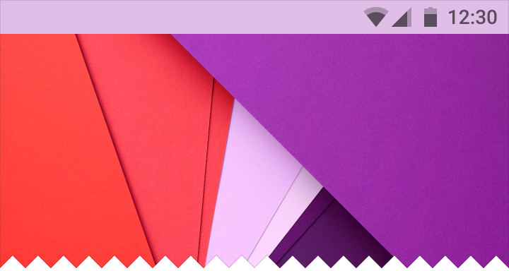
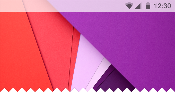
By default, the color of the status or window bar is a darker shade of the app bar color. It can also use color from another element in the layout or be translucent.
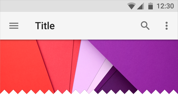
Light status bar
The light status bar, with dark icons, better harmonizes with light content and can be used as an alternative to the dark status bar.
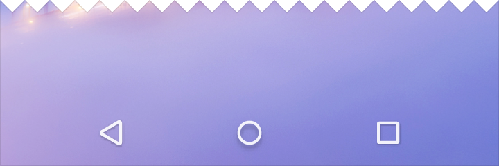
Android navigation bar
The navigation bar in Android houses the device navigation controls: Back, Home, and Overview. It also displays a menu for apps written for Android 2.3 or earlier.
Height: 48dp


Color variants
The navigation bar can be opaque, translucent, or transparent.
Chrome OS shelf
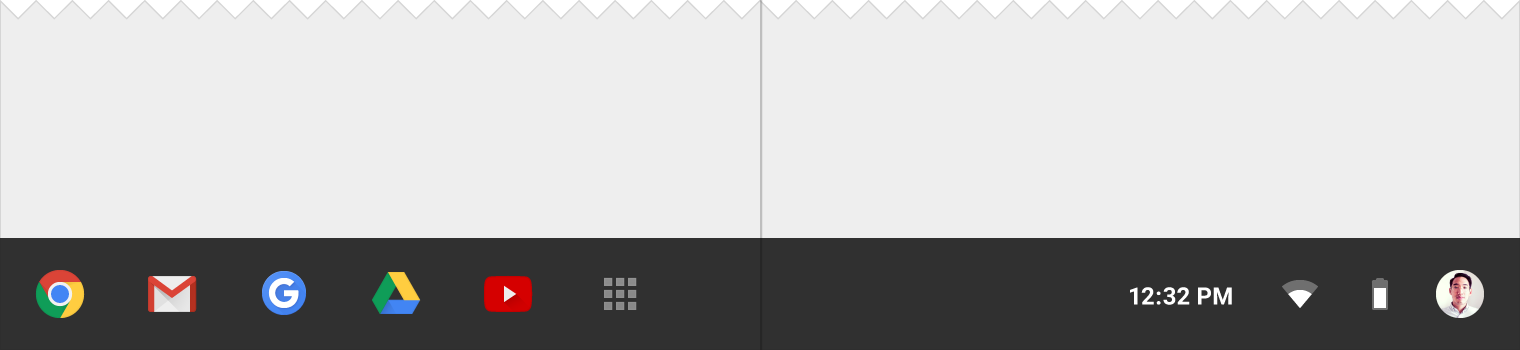
The shelf houses the app launcher, application icons, and system settings on Chrome OS.
Height: 56dp
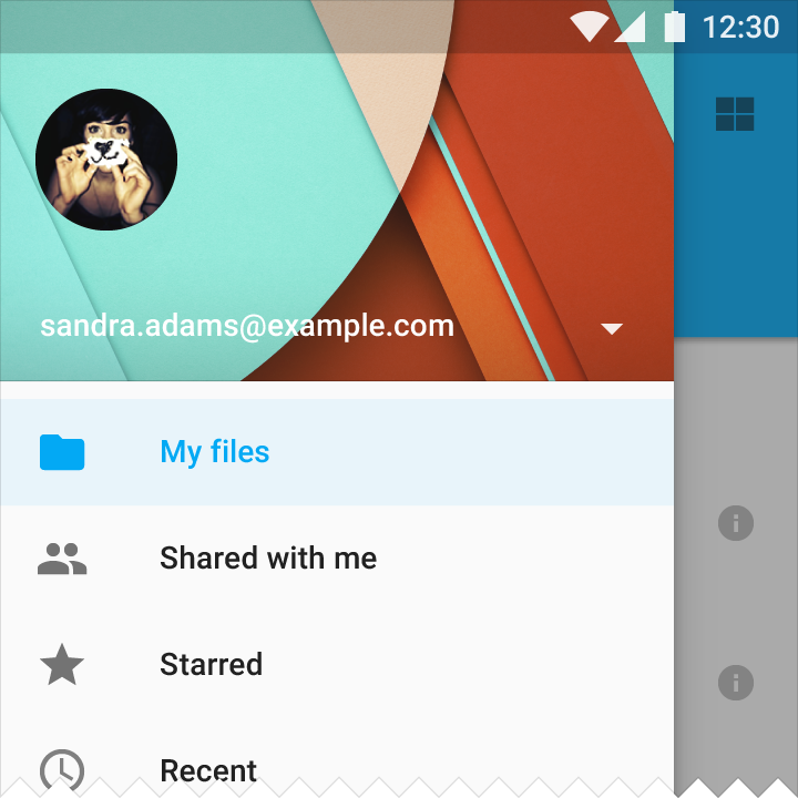
Side nav
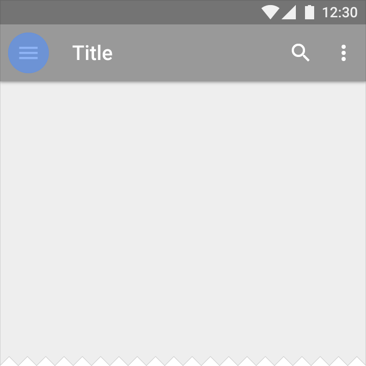
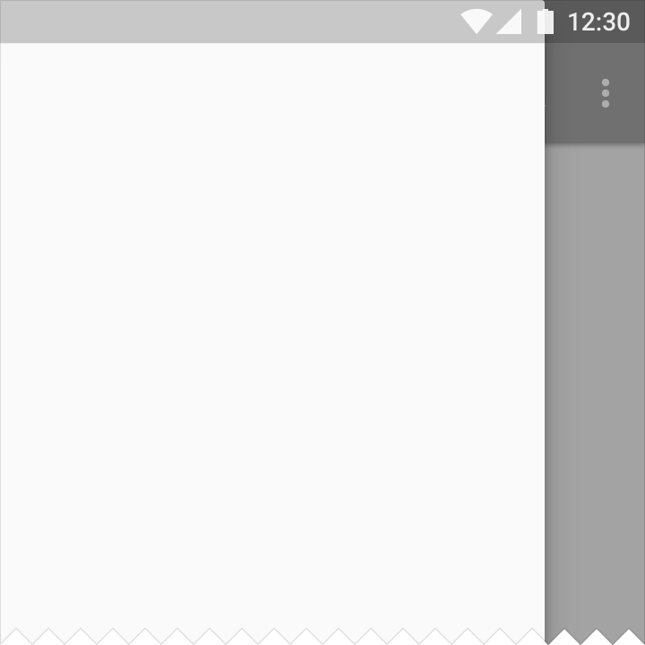
If present, side nav bars can be pinned for permanent display or float temporarily as overlays. Side navs can be positioned on the left or right side of the screen.
The content appearing in the left nav is ideally navigation- or identity-based. Right nav content should be secondary to the main content on a page.
See also Navigation drawer.
Structure
Side nav bars may be pinned for permanent display, or they can float temporarily as overlays. Temporary nav drawers overlay the content canvas; whereas pinned nav panels are situated alongside or below the content canvas.
Screen size can determine whether a panel is pinned or an overlay. With sufficient space, a panel can be pinned and content adjusted responsively. With insufficient space, a panel has to be an overlay.
Metrics
Mobile:
Width = Screen width − 56 dp
Maximum width: 320dp
Maximum width applies only when using a left nav. When using a right nav, the panel can cover the full width of the screen.
Desktop: Maximum width for a left nav is 400dp. The right nav can vary depending on content.
Whiteframes
Whiteframes provide a variety of layout structures using a consistent approach to surfaces, layering, and shadows.
For download and other information about whiteframes, see Resources.