Search
Search allows users to locate app content quickly.
When an app supports large amounts of information, users should be able to quickly locate content by searching for it.
Search options
Voice search
Search suggestions
Autocompletion
Types of search
Persistent search
Expandable search

In-app search
When an app supports large amounts of information, users should be able to quickly locate content by searching.
Basic search involves:
- Opening a search text field
- Entering and submitting a query
- Displaying a set of search results
However, the search experience can be enhanced by providing:
- Voice search
- Historical search suggestions based on recent user queries, before a query is completed
- Auto-completed search suggestions matching actual results in your application data
There are two major patterns for in-app search: persistent search and expandable search.
Persistent search
Use persistent search when search is the primary focus of your app.
Behavior:
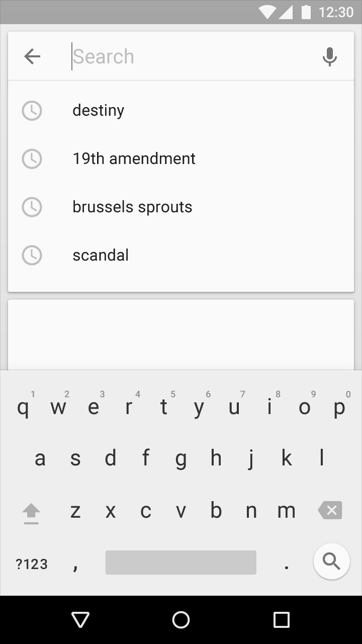
The search text field is presented inside of an inset search box, ready to receive focus. The user can touch the microphone icon to initiate a voice search.
When in focus, the search field expands to show historical search suggestions. If needed, the onscreen keyboard will also appear.
Choosing any of the suggestions submits the search. Touching the up arrow releases the focus from search, dismissing suggestions and the on-screen keyboard.

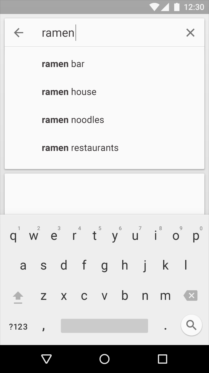
As the user enters a query, the search suggestions shift to auto-completion. As the user types, the suggestions are filtered and sorted. Choosing a suggestion or pressing the return key submits the search.
The X action in the search box clears the query.
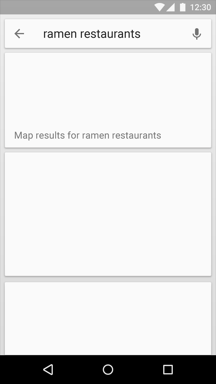
When displaying search results, the search box remains visible, but is not focused by default. The onscreen keyboard is dismissed so more results can be shown.
Search results are formatted as cards to match the inset appearance of the search box and to accommodate different types of results.
Expandable search
Use expandable search when search is not the primary focus of your app.
Behavior:
Display a magnifying glass icon in the toolbar instead of a search text box.
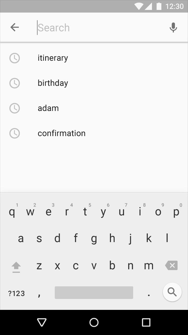
Touching the search icon causes the toolbar to transform, clearing other content and displaying a search text field. If voice search is supported, the microphone icon also appears.
The search text field automatically receives focus, and, if needed, the onscreen keyboard will appear. Historical search suggestions can be shown beneath the toolbar. Choosing any of the suggestions submits the query.
Touching the up arrow closes search and restores the original presentation of the toolbar.

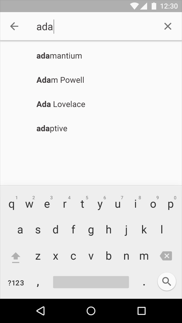
As the user enters a query, the search suggestions shift to auto-completion. As the user types, the suggestions are filtered and sorted. Choosing a suggestion or pressing the return key submits the search.
The X action in the search field clears the query.
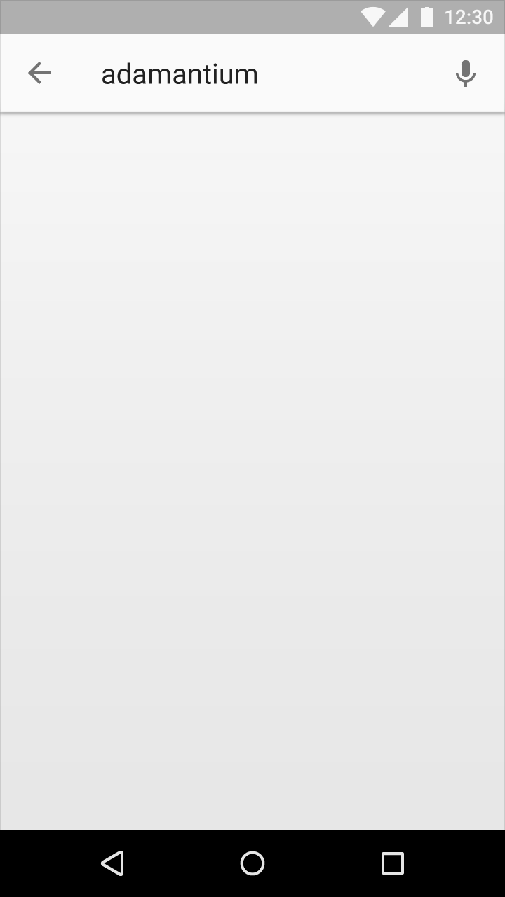
When displaying search results, the search version of the toolbar remains visible, but is not in focus by default. The onscreen keyboard is dismissed so more results can be shown.
Search results are formatted as cards and appear in the main body of the page beneath the toolbar.