Buttons
Buttons communicate the action that will occur when the user touches them.
Material buttons trigger an ink reaction on press. They may display text, imagery, or both. Flat buttons and raised buttons are the most commonly used types.
Additional button types include:
- Persistent footer buttons are flat buttons that may be used in screen footers or dialogs.
- Dropdown buttons display multiple selections.
- Toggle buttons group related options. Icon toggles allow a single choice to be selected or deselected.
Flat buttons
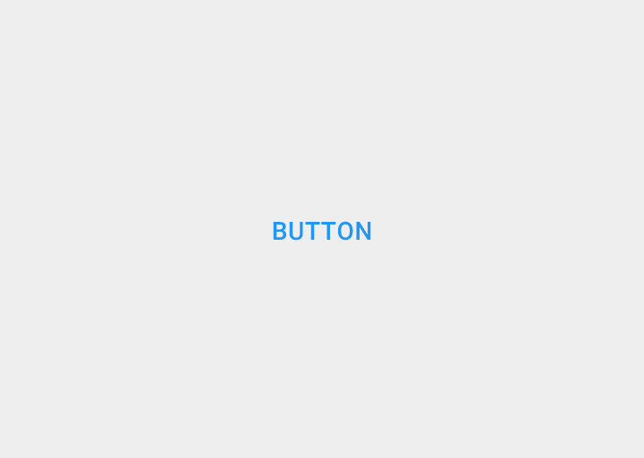
Flat buttons are text-only buttons.
They may be used in dialogs, toolbars, or inline.
They do not lift, but fill with color on press.
Raised buttons
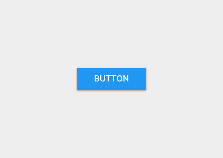
Raised buttons are rectangular-shaped buttons.
They may be used inline.
They lift and display ink reactions on press.
Elevation
Flat buttons: 0dp
Raised buttons: 2dp
Button types
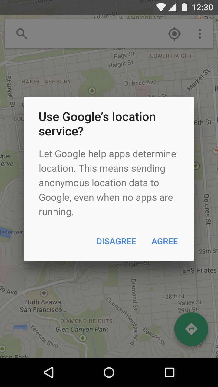
There are three standard types of buttons:
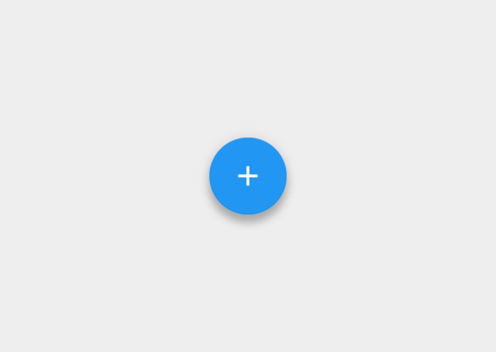
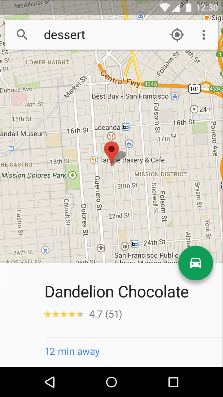
- Floating action button: A circular material button that lifts and displays an ink reaction on press
- Raised button: A typically rectangular material button that lifts and displays ink reactions on press
- Flat button: A button made of ink that displays ink reactions on press but does not lift
Choosing button style
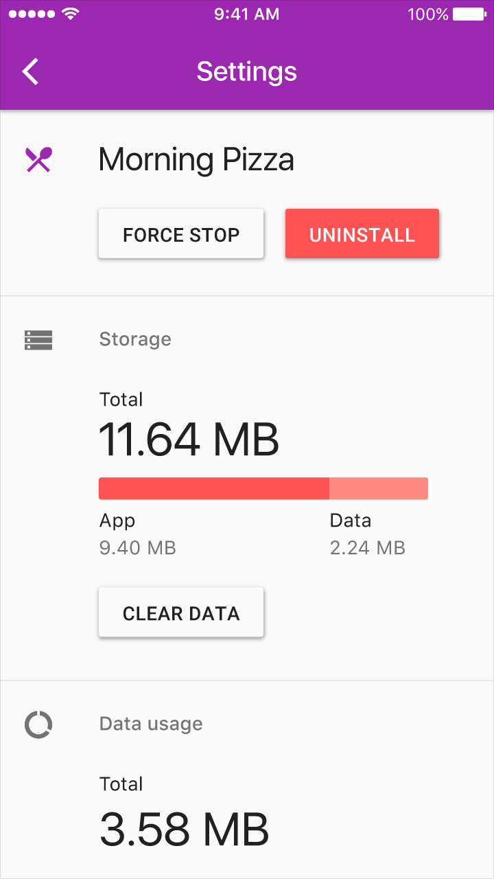
Choosing a button style depends on the primacy of the button, the number of containers on screen, and the screen layout.
Function: Is it important and ubiquitous enough to be a floating action button?
Dimension: Choose raised or flat depending on the container it will be in and how many z-space layers you have on screen. There should not be many layers of objects on the screen.
Layout: Use primarily one type of button per container. Only mix button types when you have a good reason to, such as emphasizing an important function.
Usage
Button types
The type of button used should be suited to the context in which it appears.
Context | Button type |
|---|---|
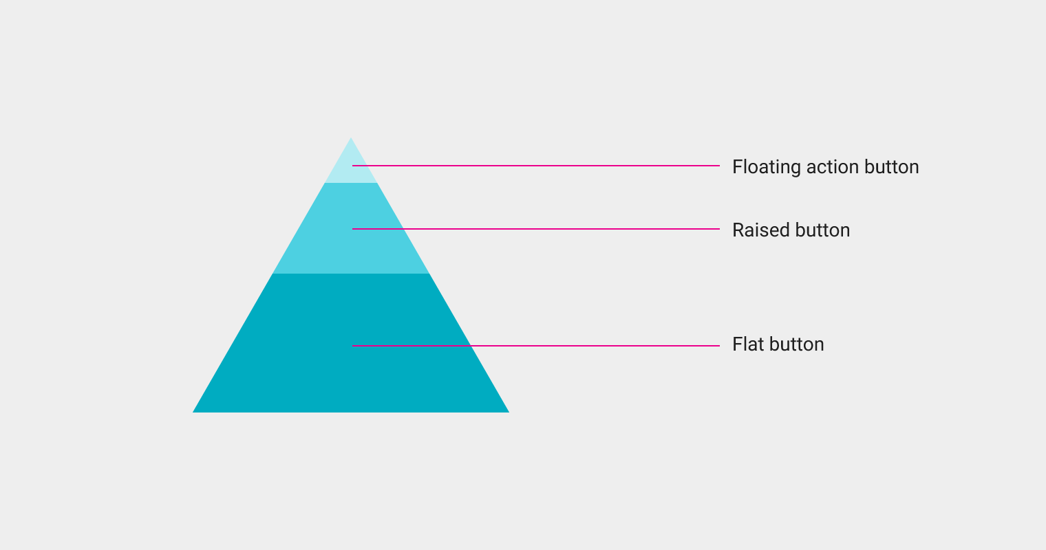
Dialogs | Use flat buttons in dialogs. |
Inline | Raised buttons or flat buttons can be used for inline buttons. |
Always available | If your app requires actions to be persistent and readily available, you can use the floating action button or persistent footer buttons. |
Recommended button placement
Standard dialogs
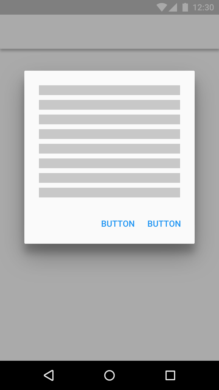
Button alignment on screen: right
Place the affirmative button on the right, the dismissive button on the left.
Forms
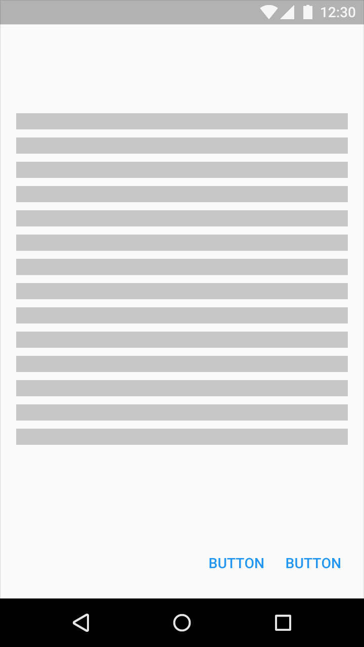
Button alignment on screen: Left
Place the affirmative button on the left, the dismissive button on the right.
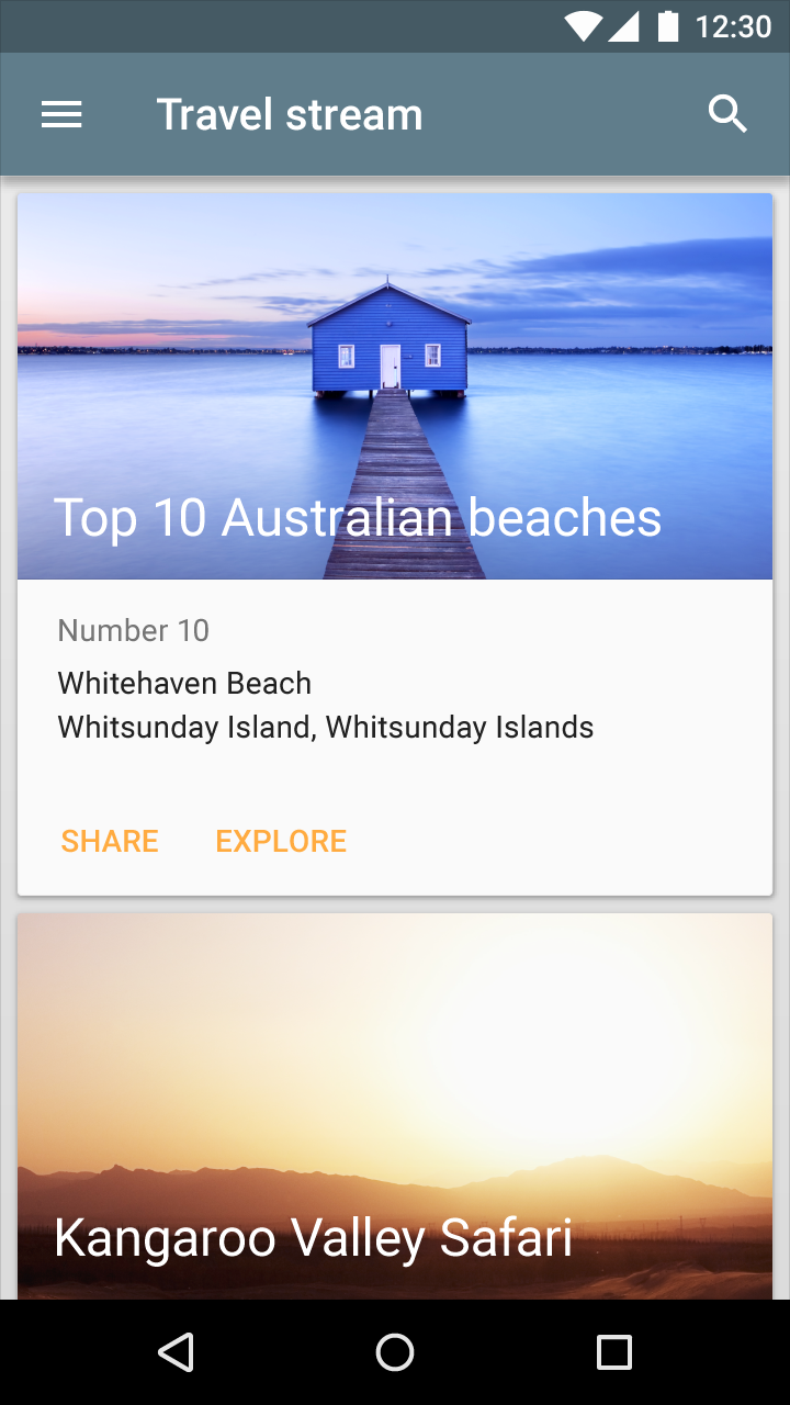
Cards
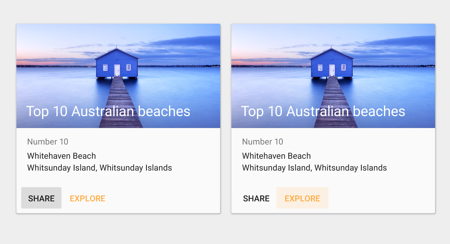
Buttons are best placed on the left side of a card to increase their visibility. However, as cards have flexible layouts, buttons may be placed in a location suited to the content and context, while maintaining consistency within the product.
Non-standard dialogs and modal windows
Button placement in non-standard dialogs and modal windows depends on the complexity of the content they contain.
For dialogs with relatively simple content, it is recommended to place buttons on the right side of a dialog, with the affirmative button to the right of the dismissive button.
For lengthy or complex forms, it is recommended to place buttons on the left of the form, with the affirmative button to the left of the dismissive button.
Style
Typography
Button text should be capitalized in languages that have capitalization. For other languages, colored text on flat buttons distinguishes them from normal text.
Accessibility
To ensure usability for people with disabilities, give buttons a height of 36dp and give touchable targets a minimum height of 48dp.
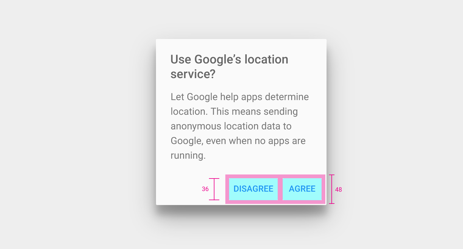
Touchable target height: 48dp
Corner radius
Buttons should have a 2dp corner radius.
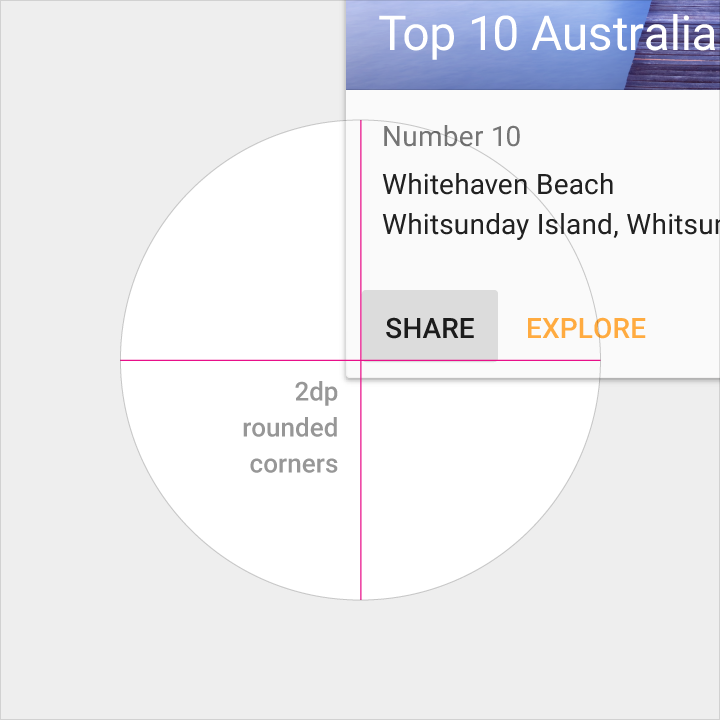
Do.
Density
When mouse and keyboard are the primary input methods, button measurements can be slightly reduced to accommodate dense UIs.
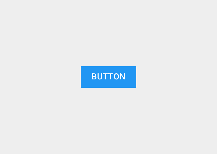
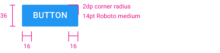
Button height: 36dp
Button text left and right padding: 16dp
Corner radius: 2dp
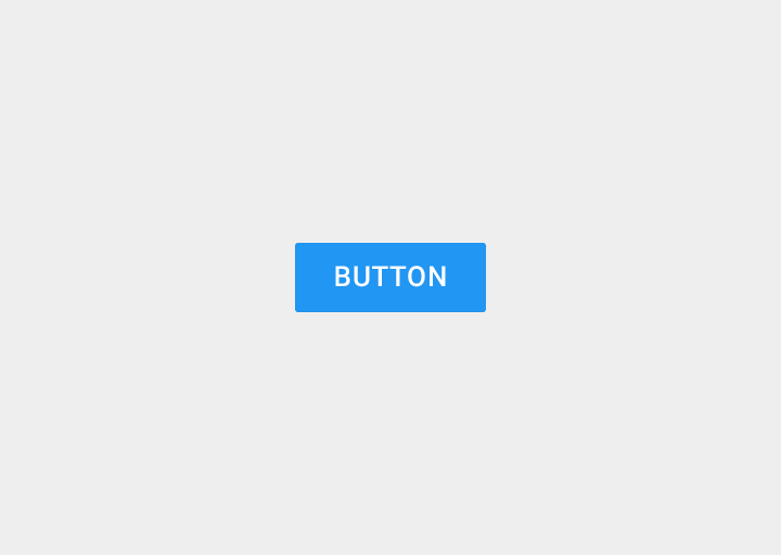
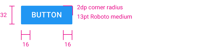
Button height: 32dp
Button text left and right padding: 16dp
Corner radius: 2dp
Size and padding
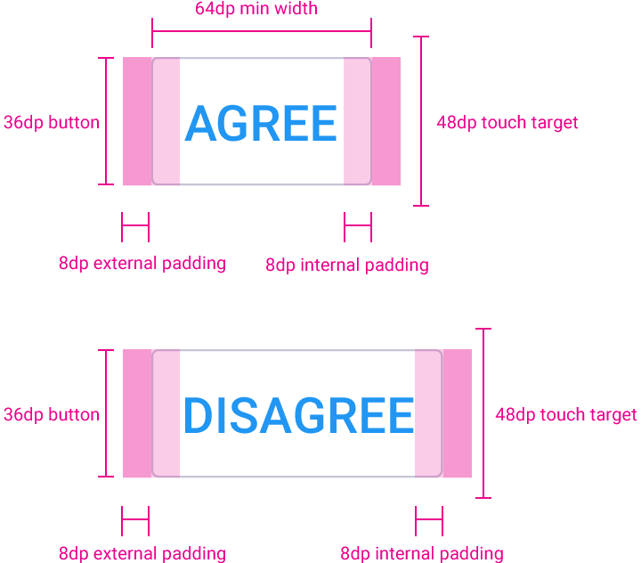
Flat Button
Height: 36dp
Minimum width: 88dp
Touch target height: 48dp
Corner radius: 2dp
Horizontal margin: 8dp
Horizontal padding: 8dp
Flat buttons
Usage
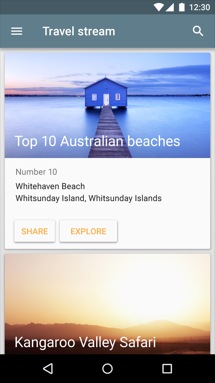
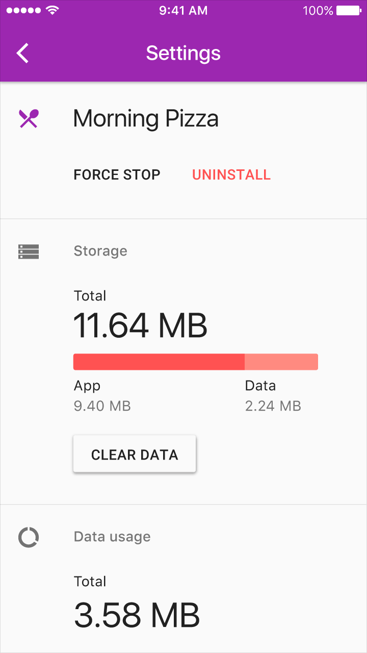
Flat buttons are printed on material. They do not lift, but fill with color on press.
Use flat buttons in the following locations:
- On toolbars
- In dialogs, to unify the button action with the dialog content
- Inline, with padding, so the user can easily find them
Do.
Don’t.
Specs
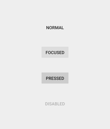
Minimum width: 88dp
Height: 36dp
Corner radius: 2dp
Pressed: 40% #999999
Disabled text: 26% #000000
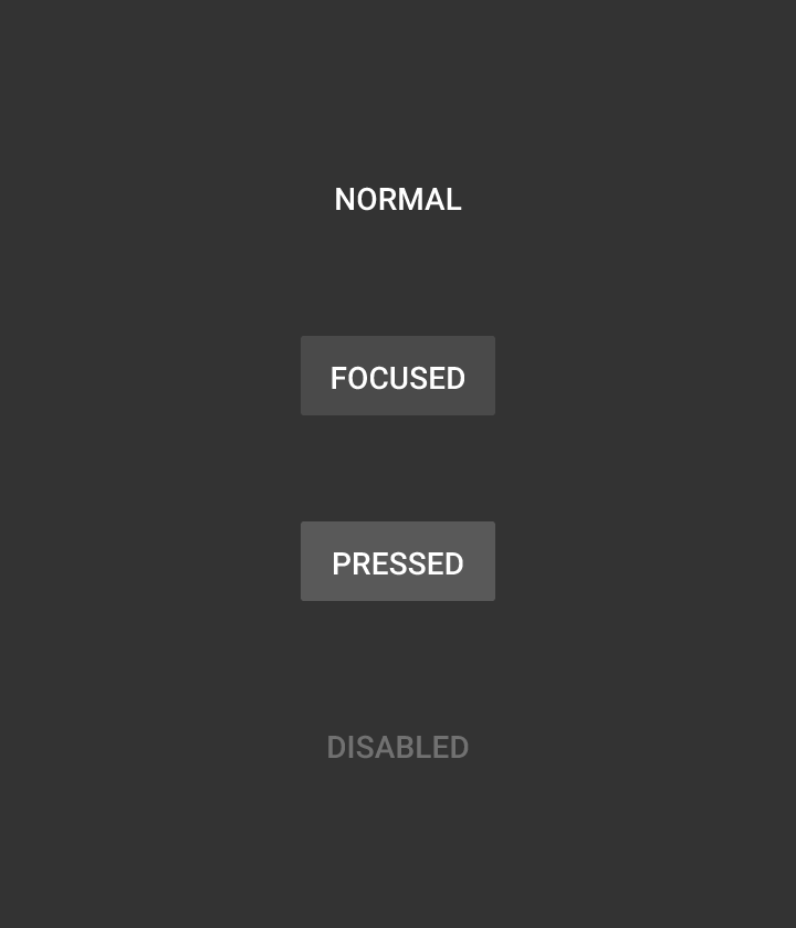
Minimum width: 88dp
Height: 36dp
Corner radius: 2dp
Pressed: 25% #CCCCCC
Disabled text: 30% #FFFFFF
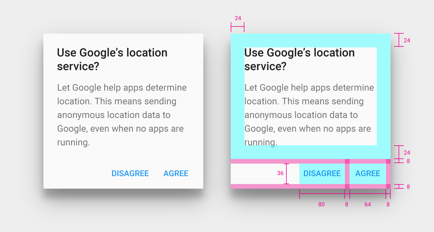
Dialog button container height: 52dp
Dialog buttons: 8dp padding from container edges, aligned to the right of container (for LTR scripts)
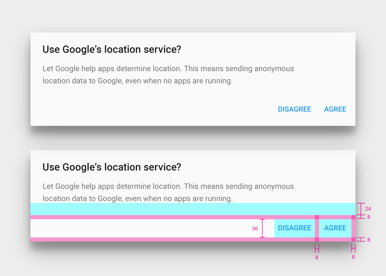
Dialog buttons
Button height: 36dp
Button top margin: 24dp
Button padding: 8dp
Button alignment: Right edge for LTR scripts
Button width: Varies based on button text length
Behavior
Raised buttons
Usage
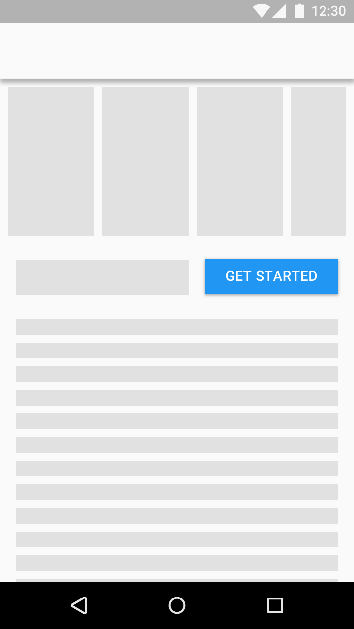
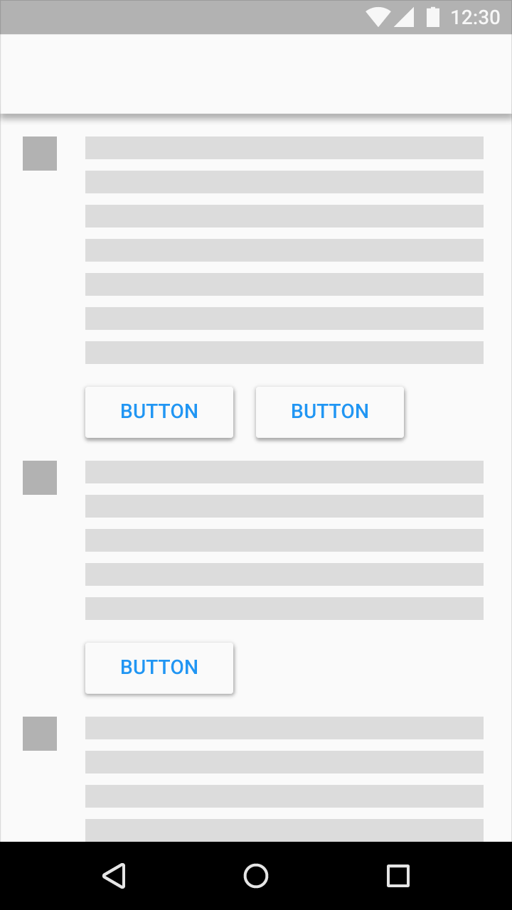
Raised buttons add dimension to mostly flat layouts. They emphasize functions on busy or wide spaces.
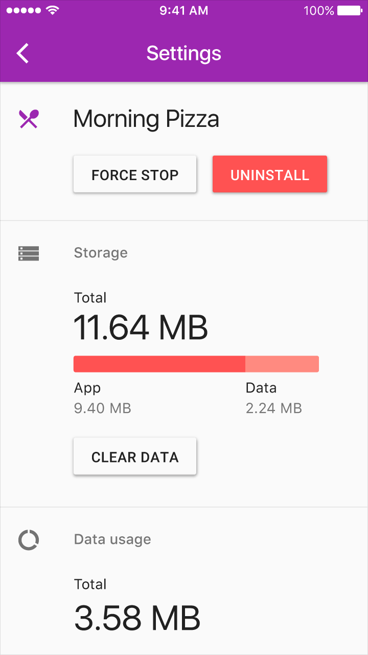
Do.
Don’t.
Raised buttons behave like a piece of material resting on another sheet – they lift and fill with color on press.
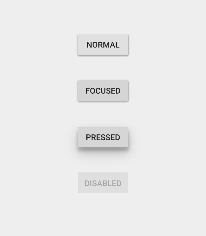
Minimum width: 88dp
Height: 36dp
Corner radius: 2dp
Disabled text: 26% #000000
Disabled button: 12% #000000
Focused:12% #000000 shade over the color
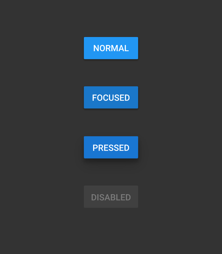
Minimum width: 88dp
Height: 36dp
Corner radius: 2dp
Normal color: 500
Pressed color: 700
Disabled text: 30% #FFFFFF
Disabled button: 12% #FFFFFF
Focused:12% #000000 shade over the color
Button Elevation
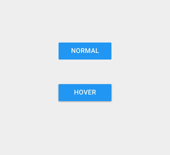
Raised buttons have a default elevation of 2dp.
On desktop, raised buttons can gain this elevation on hover.
Minimum width: 88dp
Height: 36dp
Elevation: 0dp
Disabled text: 30% #FFFFFF
Disabled button: 12% #FFFFFF
Behavior
Persistent footer buttons
If your app requires actions to be persistent and readily available to the user, consider using the floating action button or persistent footer buttons.
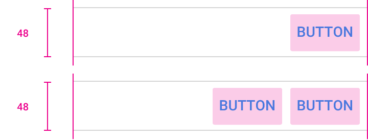
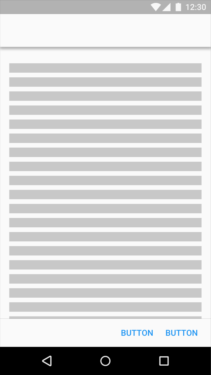
Do not use raised buttons within persistent button areas.

Don’t.
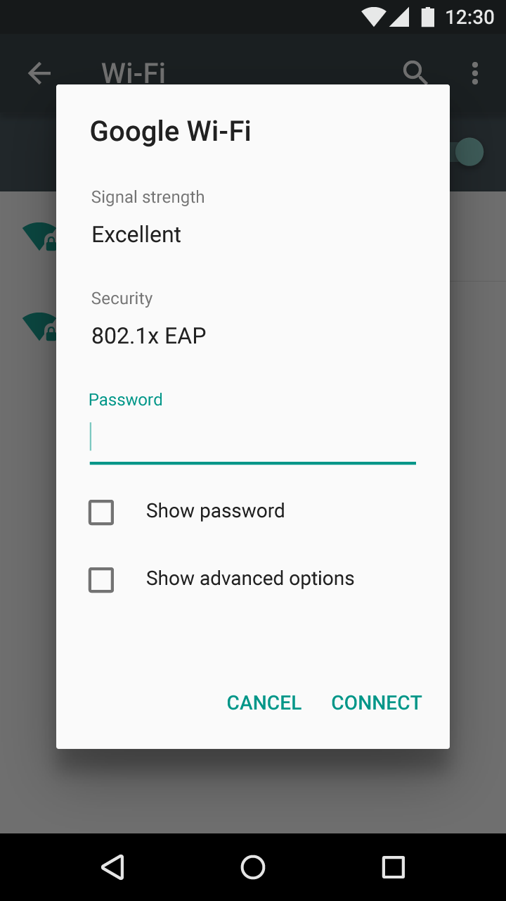
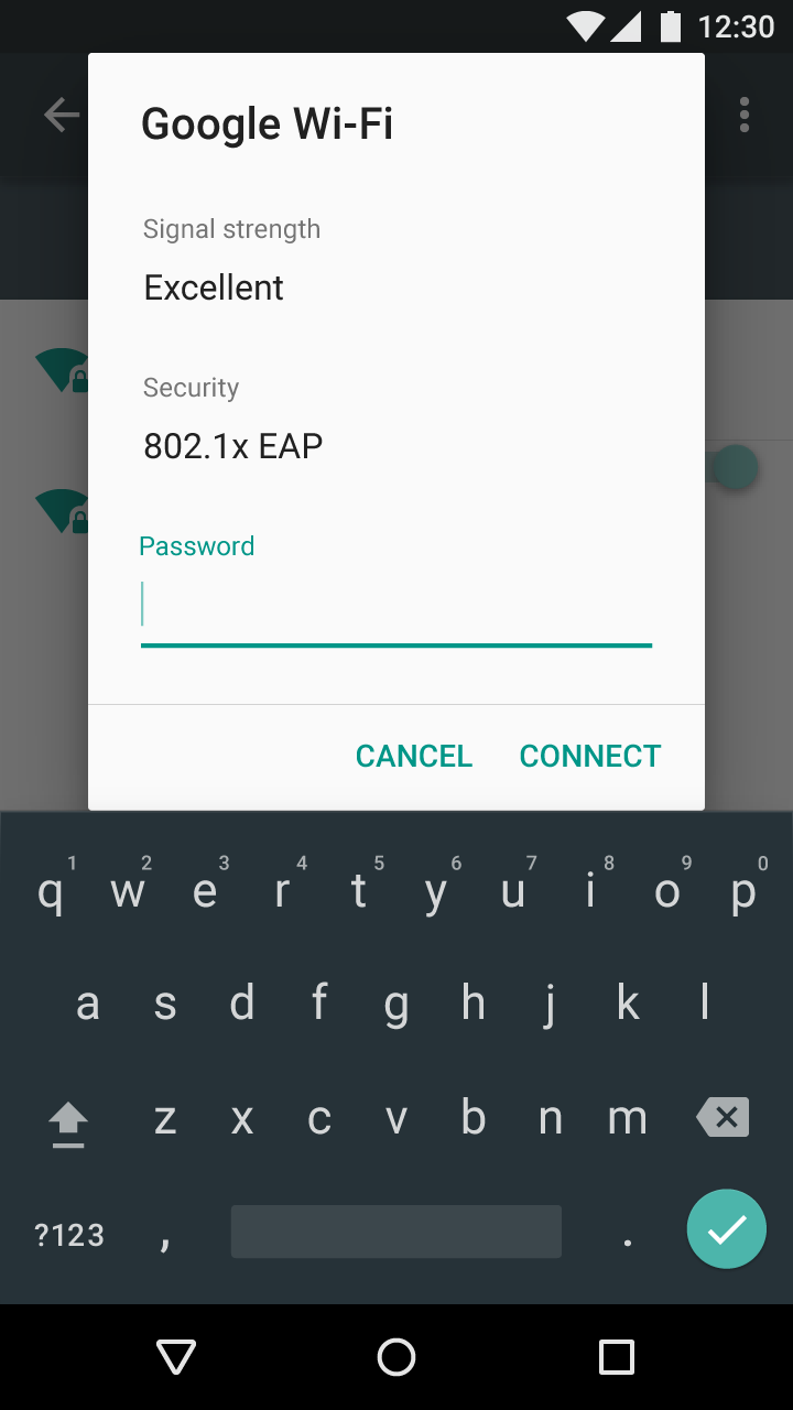
A persistent footer button may be used for scrollable dialogs when a divider is added.
Dropdown buttons
Mobile dropdown buttons
Dropdown button
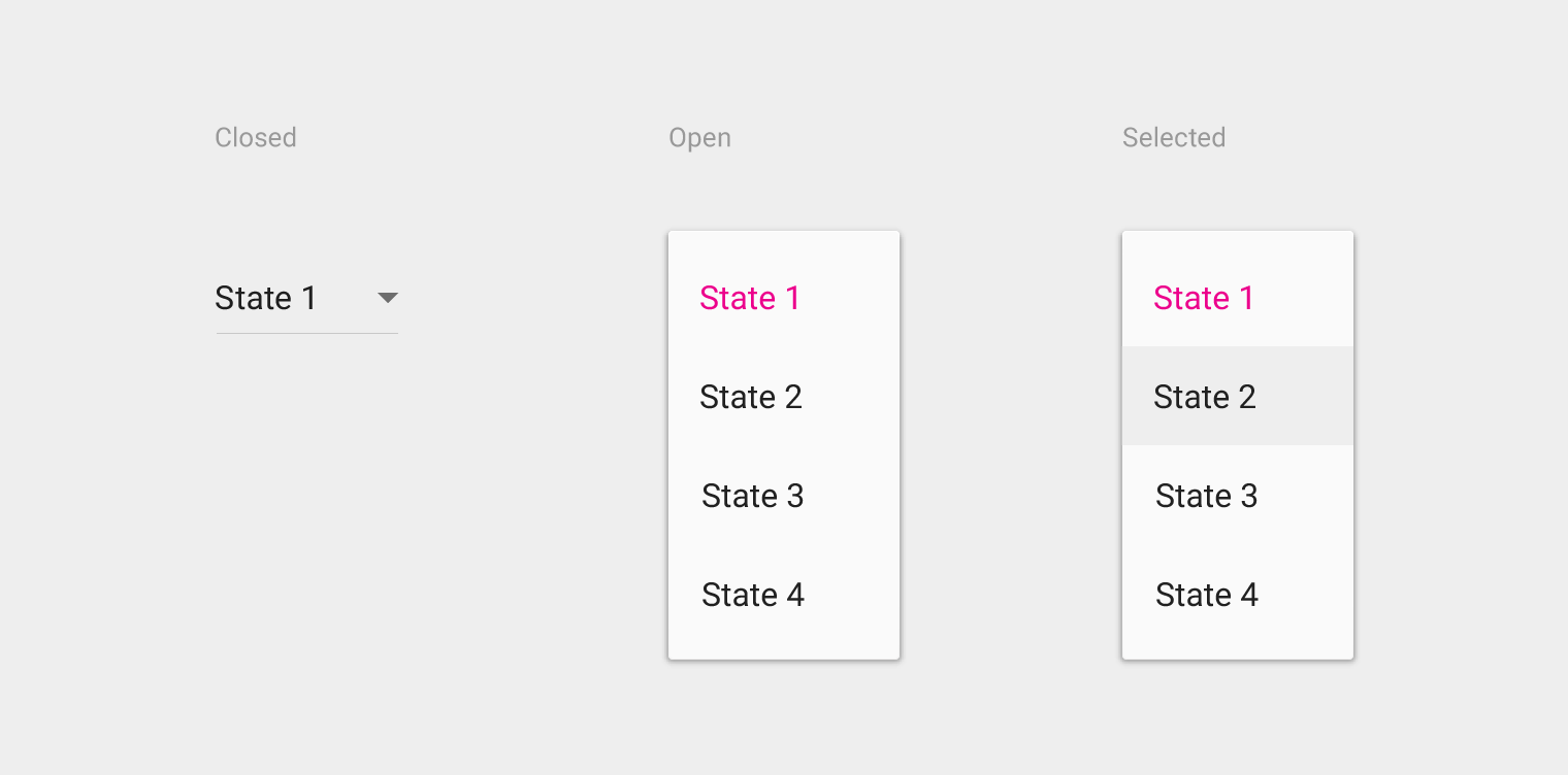
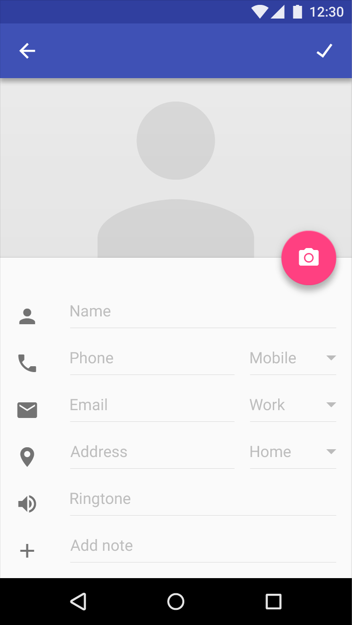
A dropdown button selects between multiple selections. The button displays the current state and a down arrow. Available states may be shown as a list of strings, a palette, or icons, for example.
When a user interacts with the button, a menu covers the button and displays the possible states. Pressing a state dismisses the menu and updates the button to display this new state.
Scrolling within the dropdown behaves the same way a menu scrolls.
Generic overflow dropdown button
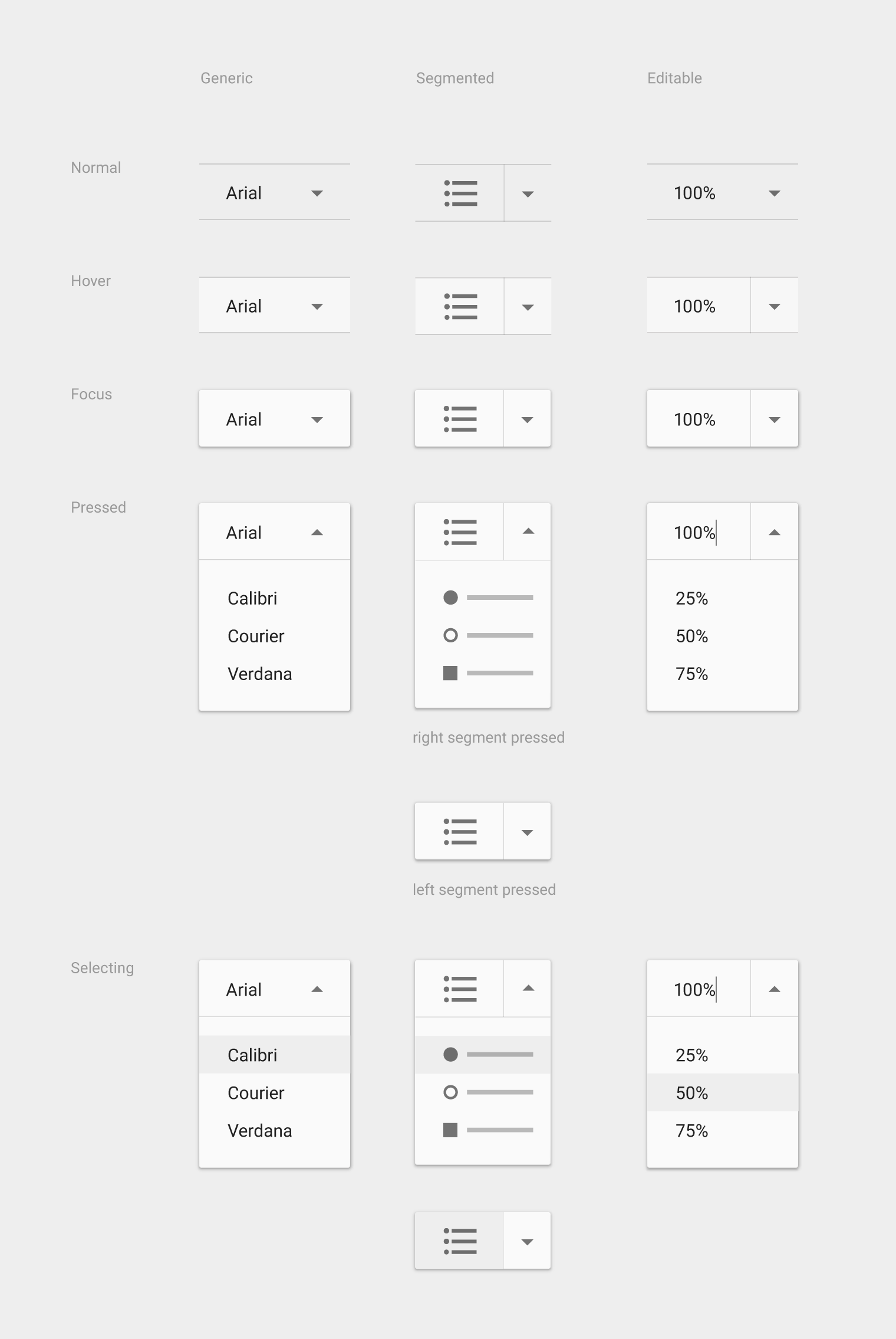
The generic overflow dropdown button displays an arrow or menu button by default. When the button is pressed, the menu appears. Pressing an option on the menu navigates to further settings for that option.
Segmented dropdown button
A segmented dropdown has two sections: the current state and the dropdown arrow icon. Pressing the current state will cause that state’s action to fire within the screen. Pressing the dropdown arrow will display all the state options. Selecting one will change the displayed state.
Editable segmented dropdown button
This button has a segmented dropdown, where the displayed state is text editable, such as a font size picker. Pressing the current state causes both that state’s action to fire and makes the displayed state editable. Pressing the arrow displays all the state options.
Desktop dropdowns
Desktop app bar specs
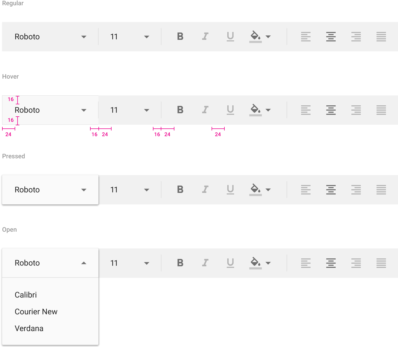
Top and bottom padding: 16dp
Left padding: 24dp
Right margin: 16dp
Horizontal space between font styles: 24dp
Toggle buttons
Toggle buttons may be used to group related options. Arrange layout and spacing to convey that certain toggle buttons are part of a group.
Focus and pressed states may reinforce that toggles are part of a group. For example, when one button segment is focused, focus may be displayed simultaneously on the rest of the segment.
Toggle button requirements:
- Have at least three toggle buttons in a group
- Label buttons with text, an icon, or both
The following combinations are recommended:
- Multiple and unselected
- Exclusive and unselected
- Exclusive only

Text justification toggle buttons present options for left, right, center, full, and justified text with only one item available for selection at a time. Selecting one option deselects any other.


Logically-grouped options, like Bold, Italic, and Underline, allow multiple options to be selected.

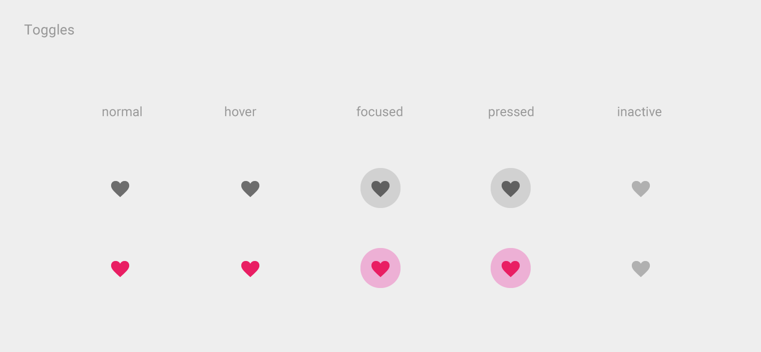
Icon toggles
Icons are appropriate for toggle buttons that allow a single choice to be selected or deselected, such as adding or removing a star to an item.
They are best located in app bars, toolbars, action buttons or toggles.
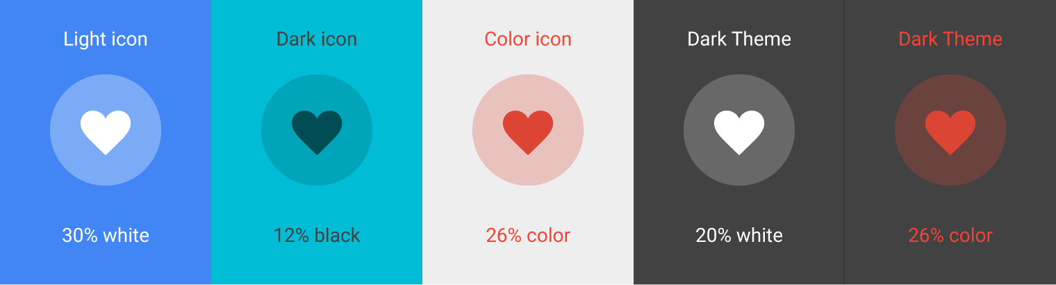
Icon toggles may display bounded or unbounded ink surface reaction ripples beyond their touch-target bounds.