Skip to content
Material Design 1
Main Navigation
v3
v2
v1

English

简体中文
繁體中文
Español
Français
Русский
Português – Brasil
Deutsch
日本語
한국어
Italiano
Polski
Türkçe
čeština
magyar

English

简体中文
繁體中文
Español
Français
Русский
Português – Brasil
Deutsch
日本語
한국어
Italiano
Polski
Türkçe
čeština
magyar

Appearance

Sidebar Navigation

Material Design

Environment

Material properties

Elevation & shadows

What's new

Motion

Material motion

Duration & easing

Movement

Transforming material

Choreography

Creative customization

Style

Color

Icons

Imagery

Typography

Writing

Layout

Principles

Units & measurements

Metrics & keylines

Structure

Responsive UI

Split screen

Components

Bottom navigation

Bottom sheets

Buttons

Buttons: Floating Action Button

Cards

Chips

Data tables

Dialogs

Dividers

Expansion panels

Grid lists

Lists

Lists: Controls

Menus

Pickers

Progress & activity

Selection controls

Sliders

Snackbars & toasts

Steppers

Subheaders

Tabs

Text fields

Toolbars

Tooltips

Widgets

Patterns

Confirmation & acknowledgement

Data formats

Empty states

Errors

Fingerprint

Gestures

Help & feedback

Launch screens

Loading images

Navigation

Navigation drawer

Navigational transitions

Notifications

Offline states

Permissions

Scrolling techniques

Search

Selection

Settings

Swipe to refresh

Growth & communications

Introduction

Onboarding

Feature discovery

Gesture education

Usability

Accessibility

Bidirectionality

Platforms

Platform adaptation

Android

Resources

Color palettes

Devices

Layout templates

Roboto & Noto fonts

Sticker sheets & icons

Shadows

On this page

Loading images ​

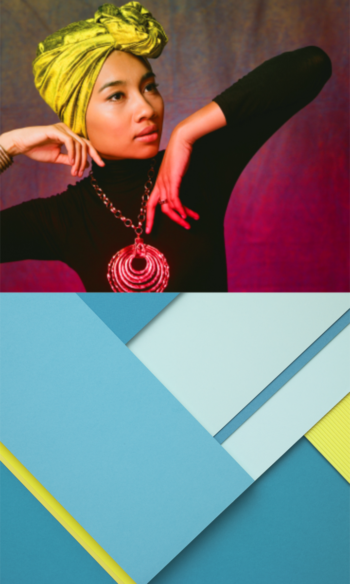
Images, including illustrations and photographs, may load in three phases.

Illustrations and photographs may load and transition in three phases by staggering opacity, exposure, and saturation levels.

Behavior

Progressive fade-in
Duration
Animation


Duration

Use longer durations for loading images, and shorter durations for transitions.

Material Design loading images in three phases

Usage ​

Illustrations and photographs may load and transition in three phases at staggered durations, rather than relying on opacity changes alone. You may combine image opacity, exposure, and saturation changes to suit your needs.

Exposure adjustments

Images should begin loading with low contrast levels and desaturated color. Once image opacity reaches 100%, display the image with full-color saturation.
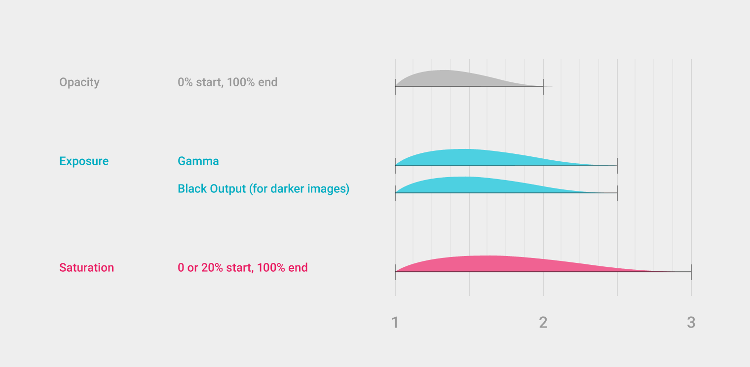
Material Design: Opacity and saturation tips for images
Opacity, exposure, and saturation recommendations for loading images

Opacity: 0% start, 100% end
Exposure: Gamma, Black output (for darker images)
Saturation: 0 or 20% start, 100% end
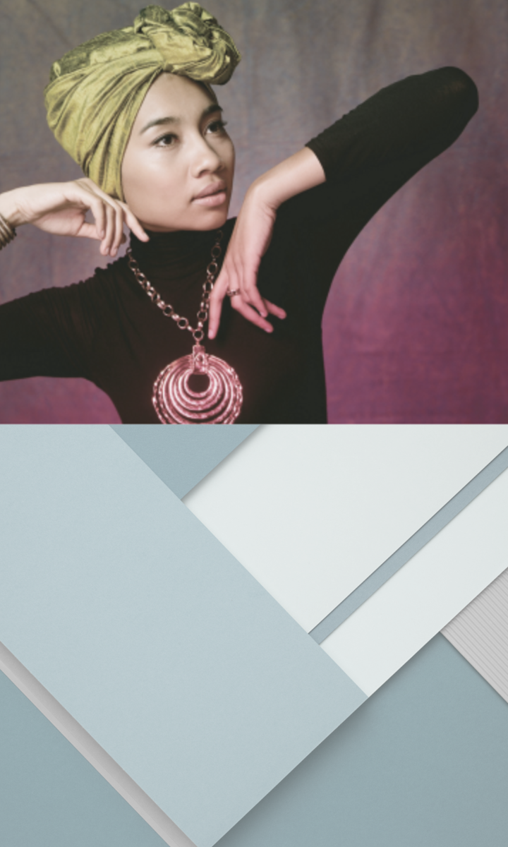
Full opacity exposure in Material Design
Full opacity and exposure
Color saturation in Material Design
Color saturation

Larger screens

This process is ideal for larger screens, such as loading the Chrome OS wallpaper.

Animation showing loading on larger screens for Chrome OS wallpaper

Behavior ​

Progressive fade-in

Visualize the image fading in, like a print during the photo development process.

Don’t adjust the levels in a way that will overexpose the lighter values.

Material Design: Progressive fade-in effect visualization

Do.

Material Design: Progressive fade-in effect visualization

Don’t.

Duration

A longer duration is recommended for loading images, and a shorter duration is recommended for transitions.

Load and transition animation

Animation

Add a small position shift to loading images. The background image shown here in the account switcher animates in horizontally.

Video showing adding animation
Pager
Previous pageLaunch screens
Next pageNavigation

Released under the Apache-2.0

Copyright © 2014-Present Google

https://m1.material.io/patterns/loading-images.html

Released under the Apache-2.0

Copyright © 2014-Present Google