

Data tables
Data tables display sets of raw data. They usually appear in desktop enterprise products.
Data tables may be embedded on a surface, such as a card. They can include:
- A corresponding visualization
- The ability to query and manipulate data
Data tables on cards may display navigation and data manipulation tools at the top and bottom.
Supported interactions
Row hover (desktop)
Row selection
Column sorting
Column hover (desktop)
Long header titles
Text editing
Menus
Related components
Structure
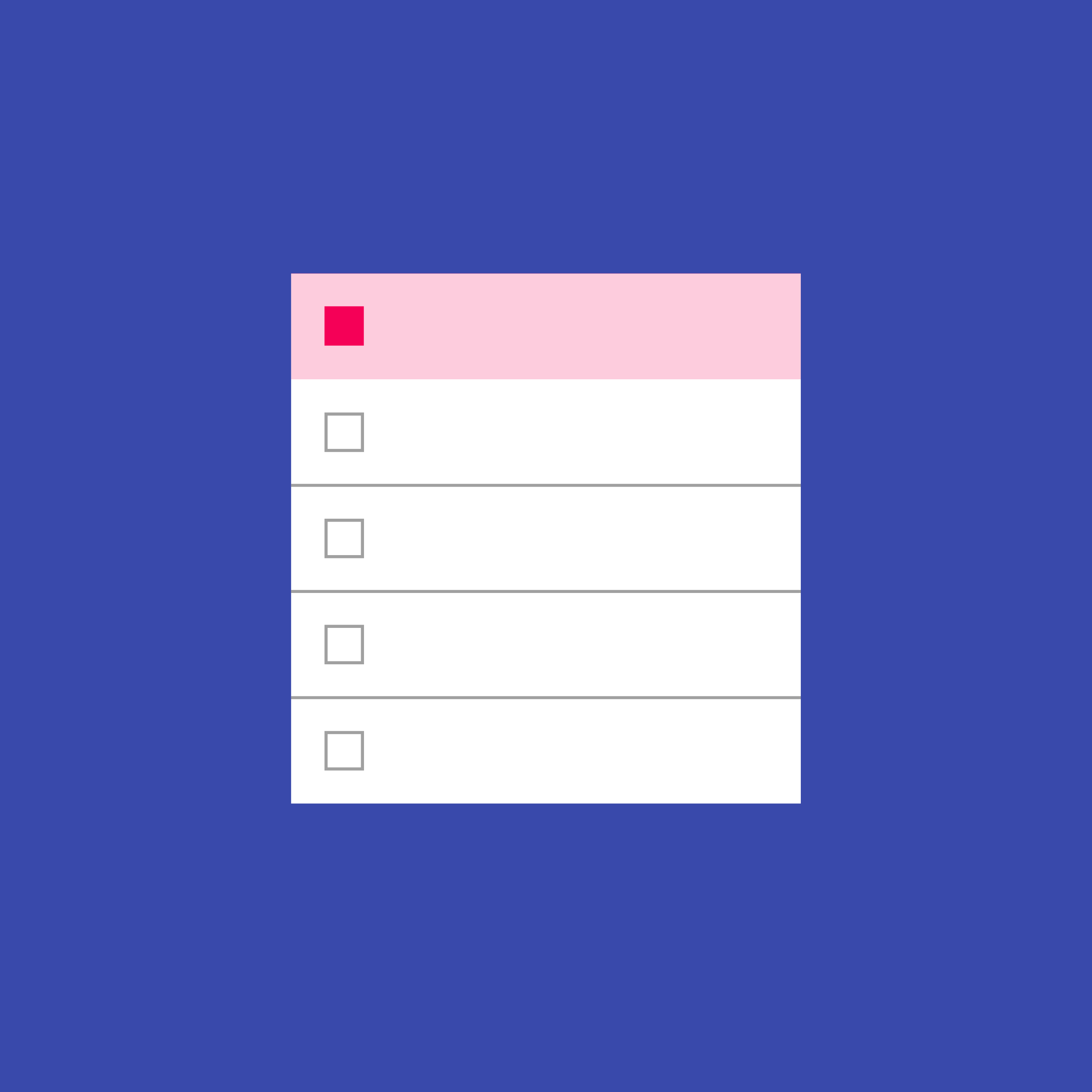
A data table contains a header row at the top that lists column names, followed by rows for data.
Checkboxes should accompany each row if the user needs to select or manipulate data.
Data tables may include:
- Three or more columns of data
- A corresponding visualization
- The ability for users to query and manipulate data
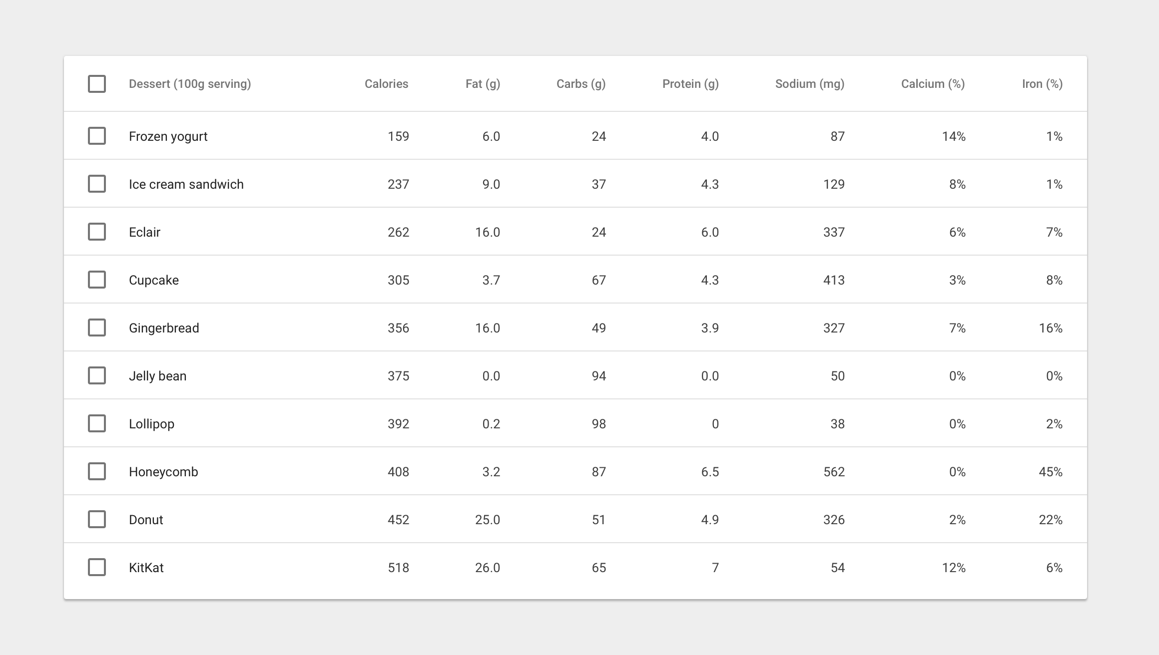
Table content
13sp Roboto Regular
87% black
Column headers
12sp Roboto Medium
54% black
Text alignment
Right-aligned numeric columns
Left-aligned text columns
Interaction
Row hover (Desktop)
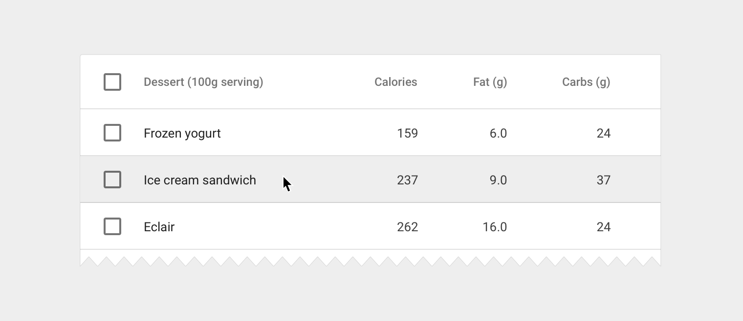
Display a background in a table row if a user hovers over any part of that row. If there are separate hover states on individual table cells, display both the hover state of the cell and row at the same time.
Hover background
- Grey 200 (#EEEEEE)
Row selection
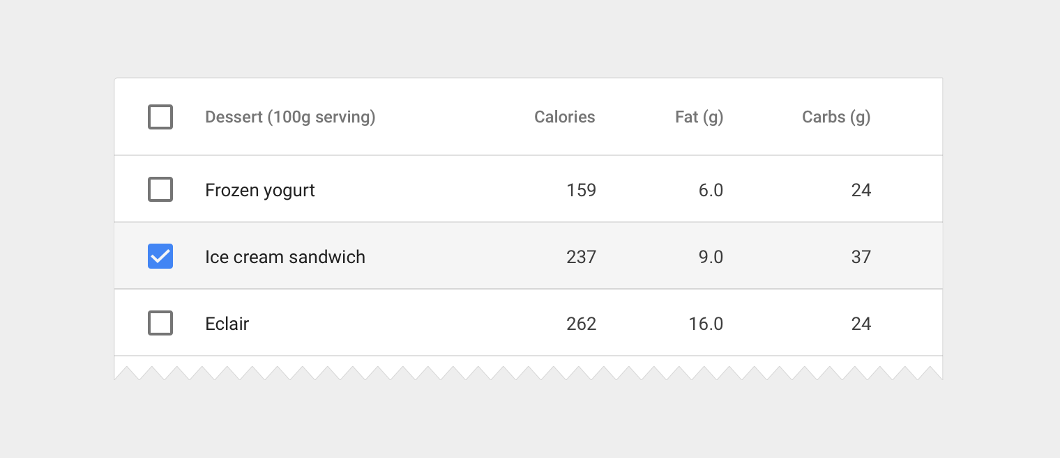
When a row is selected, display a background color on the row.
Selected row background
- Grey 100 (#F5F5F5)
Checkbox
- Use secondary app color
Sorted column
If column sorting is enabled, sort the most important data by default and display a sorted state in the column header. If the user clicks on a column that is already sorted, reverse the sort order and rotate the sort icon.
Sorted column name
- 12sp Roboto Medium
- 87% black
Sort icon
- 16dp container
- 87% black
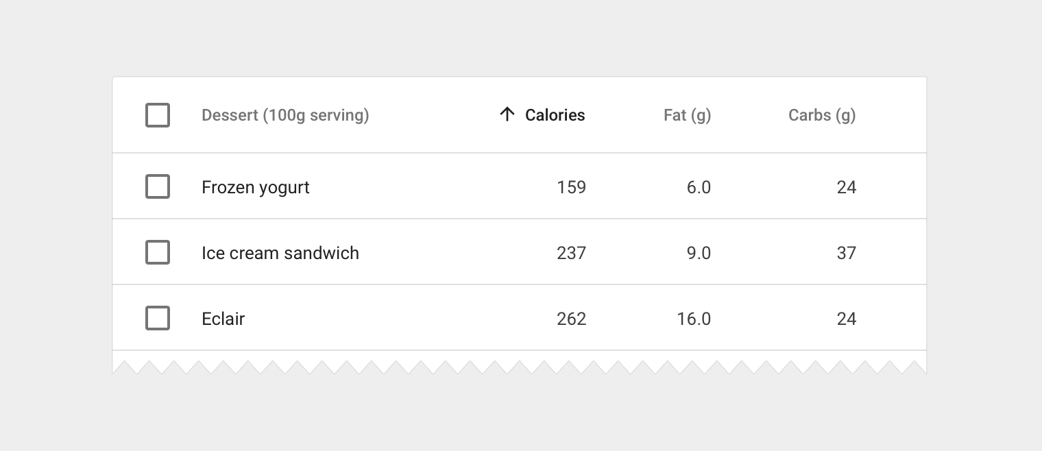
Column name hover (Desktop)
If there is a need to provide definitions to column headers, display a tooltip on hover. If sorting is enabled, display a light sort icon upon hover, which indicates that the column is sortable.
Tooltip
- Follow the guidelines for Tooltips
Sort icon
- 16dp container
- 38% black
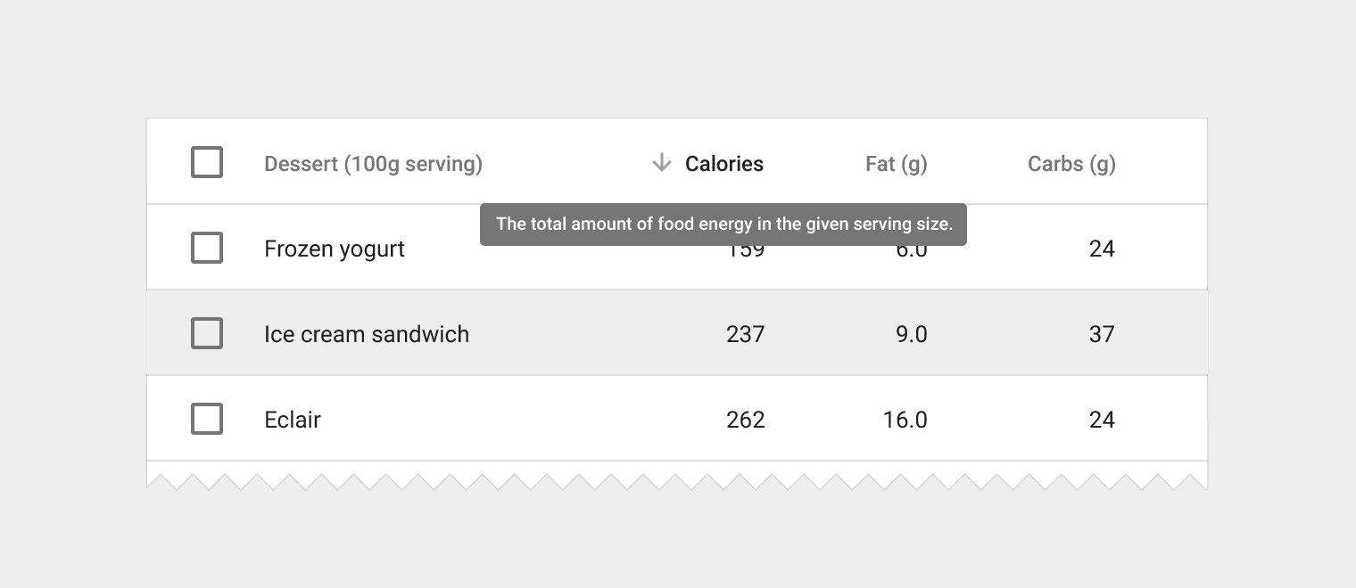
Long header titles
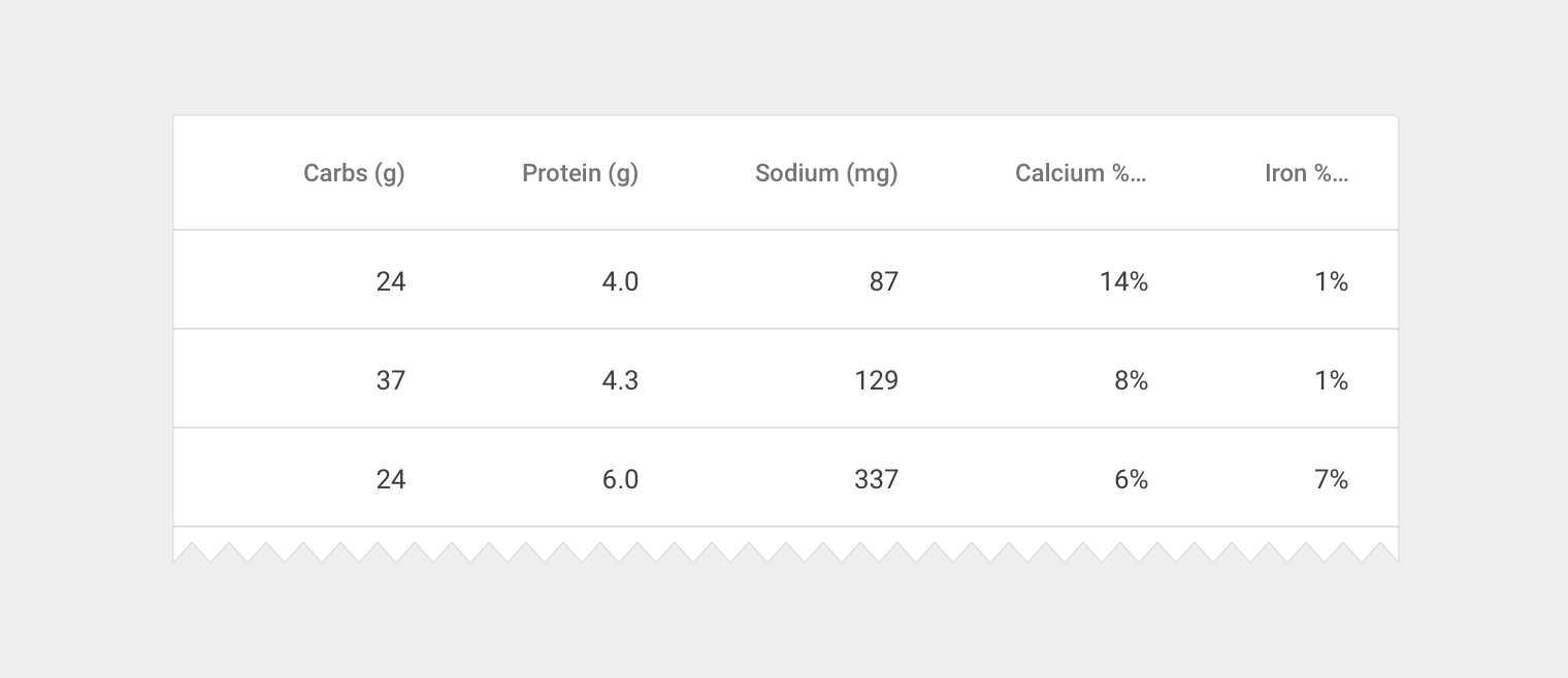
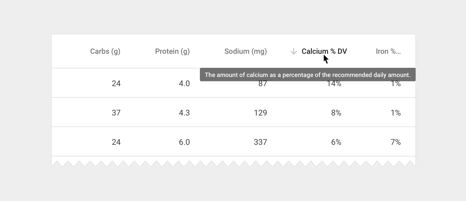
Sometimes, column names don’t fit in a container with the recommended 56dp of padding in between columns. There are two options to handle this:
- Display the full column name and enable horizontal scrolling in the table container
- Shorten the column name and display it in full on hover
Inline text editing
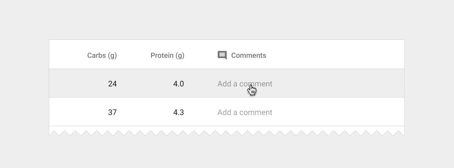
Tables may require basic text editing (e.g. for editing existing text content, or adding comments). Include editable fields within a table and denote them using placeholder text. You can use a simple edit dialog with just a text field, or display a full dialog component on click.
Placeholder text
- 13sp Roboto Regular
- 38% black
- No divider line on text field
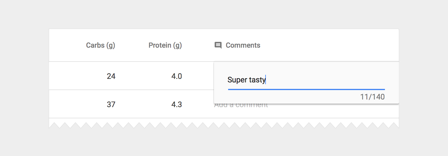
Small edit dialog
- Align edges of dialog with nearest divider lines, or table edges
- 24dp of left and right padding
- Include a single text field, applying the app theme where applicable
- User confirms text by pressing Enter
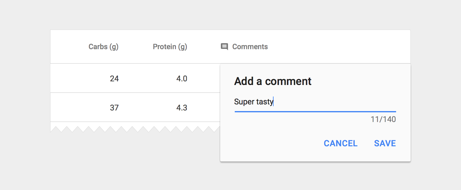
Large edit dialog
- Align edges of dialog with nearest divider lines, or table edges
- Follow the dialog guidelines, applying the app theme where applicable
- User confirms text by clicking the Save button
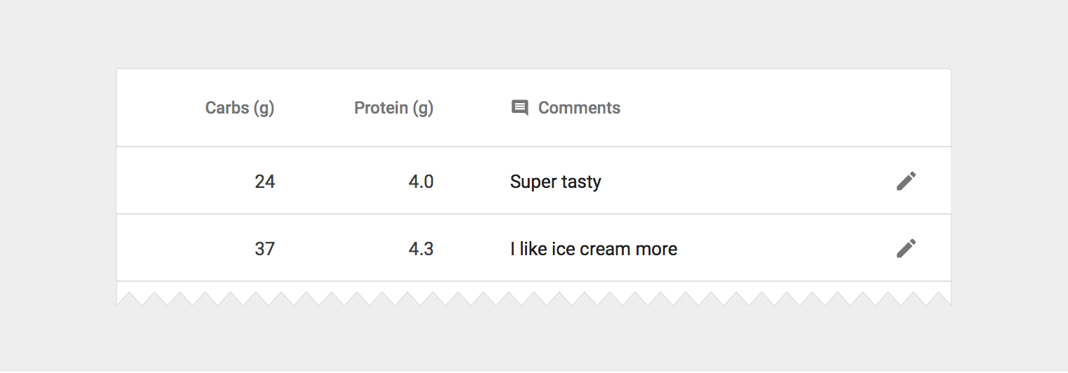
Inline edit icon
- 18dp container
- 54% black
Inline menus
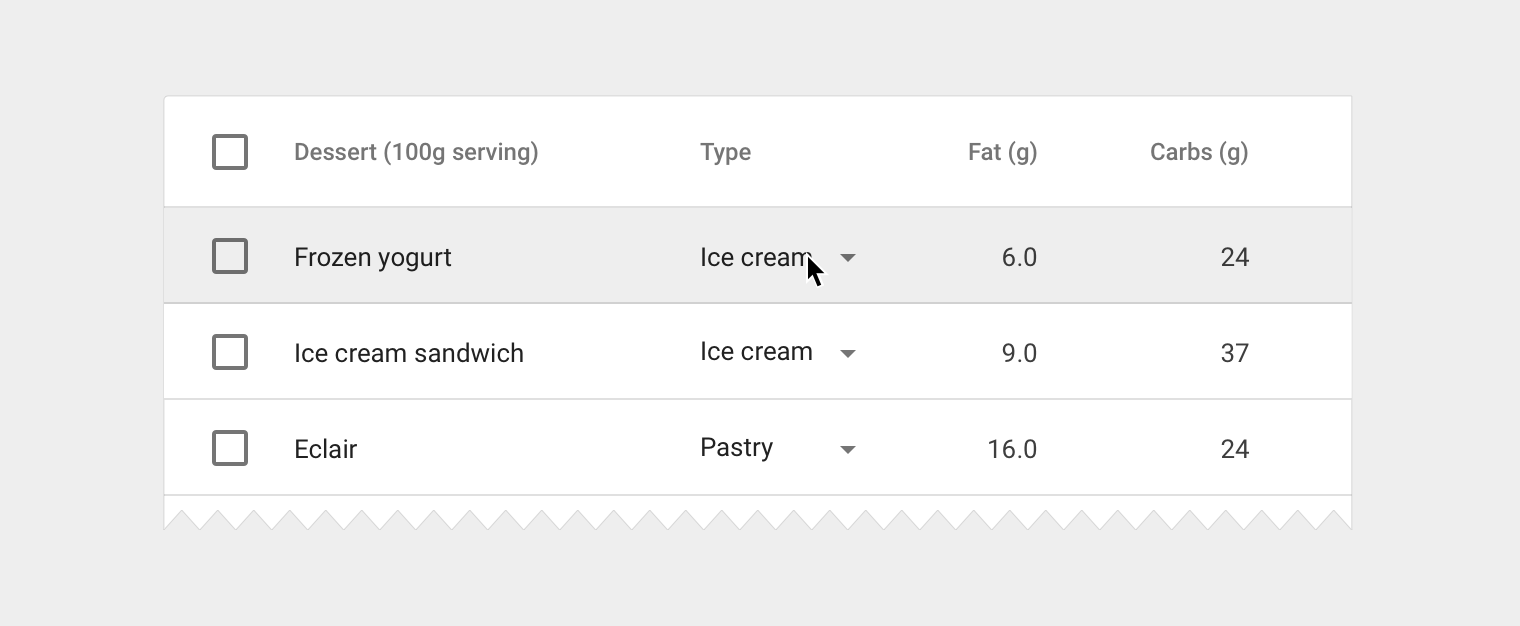
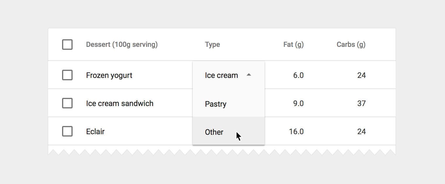
Instead of editing text, users may need to select from a predefined list of options. In this scenario, embed a menu component directly in the table.
Inline menu
- 13sp Roboto Regular
- 87% black
- Follow spacing and sizing guidelines for menus
Tables within cards
Tables may be embedded within a card, with table navigation and data manipulation tools displayed at the top and bottom.
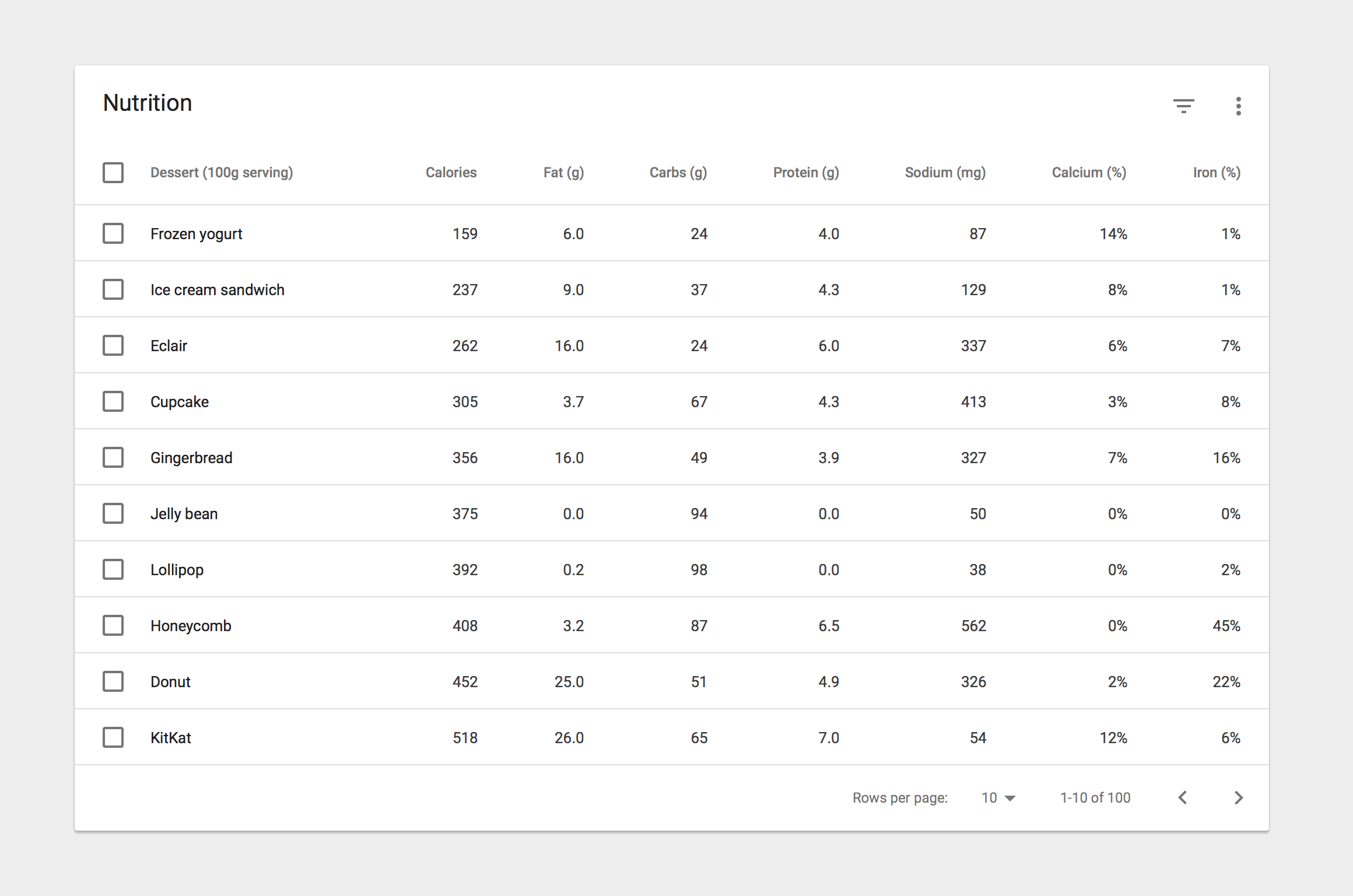
Card title
20sp Roboto Regular
87% black
Card action icons (header and footer)
24dp container
54% black
Footer pagination labels
12sp Roboto Regular
54% black
Alternative headers
Some table cards may require headers with actions instead of titles. In this case you may either:
- Display persistent actions
- Display a contextual header that activates when items are selected
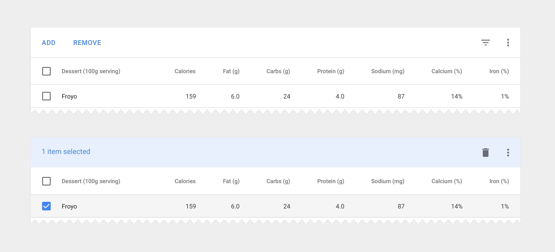
Action buttons
Use borderless buttons
Enable upon item selection
Colored header
Use 50-value of secondary app color for background fill
Display the number of items selected
Display available contextual icons upon item selection
Specs
Vertical spacing
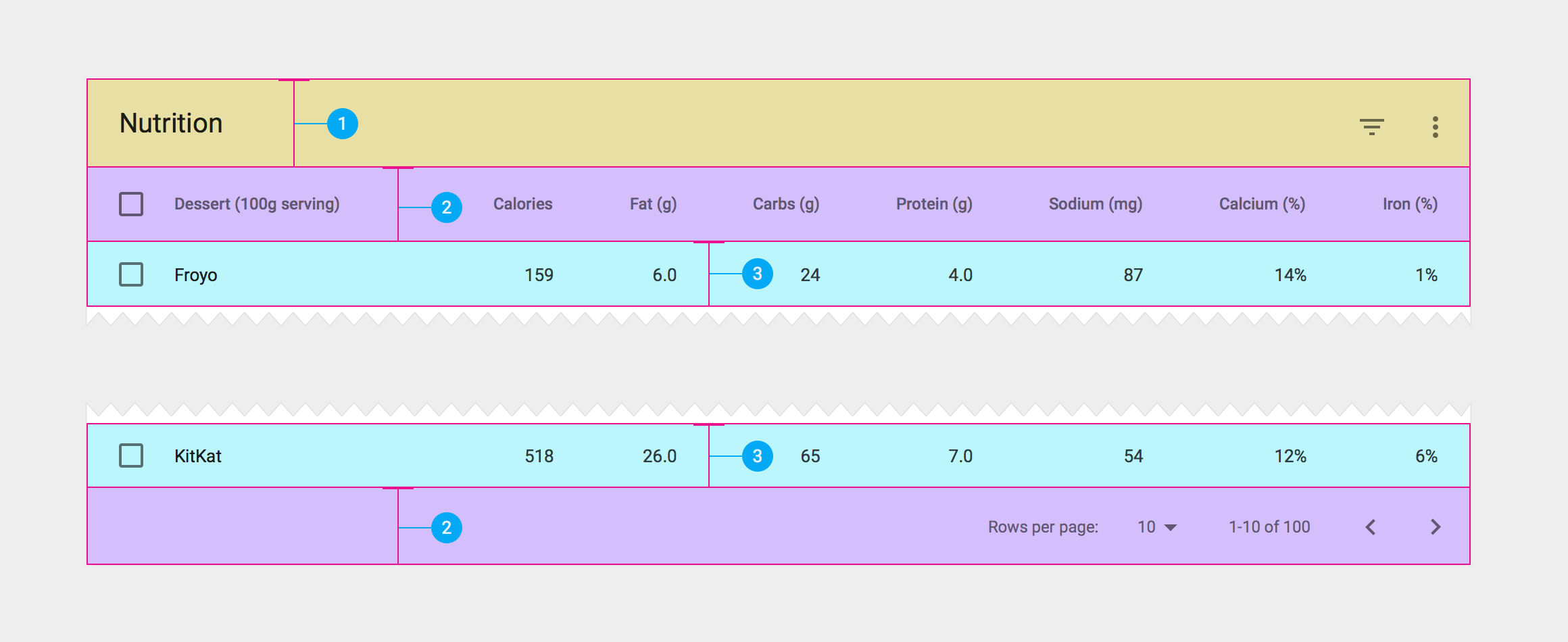
- 64dp card header height
- 56dp height for last row
- 48dp data row height
Header & footer padding
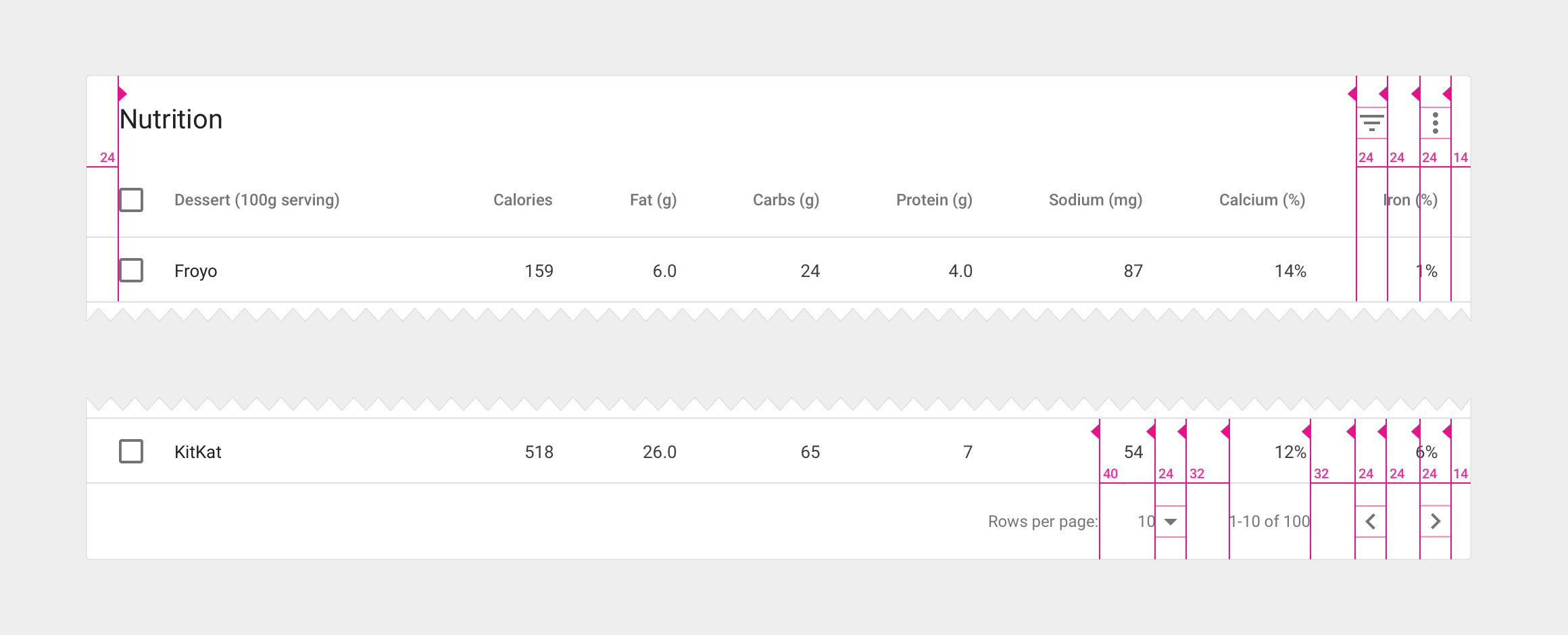
- 24dp of padding around the perimeter of table cards
- 32dp in between footer control sets
- 40dp in between the footer row count and its label
Column padding
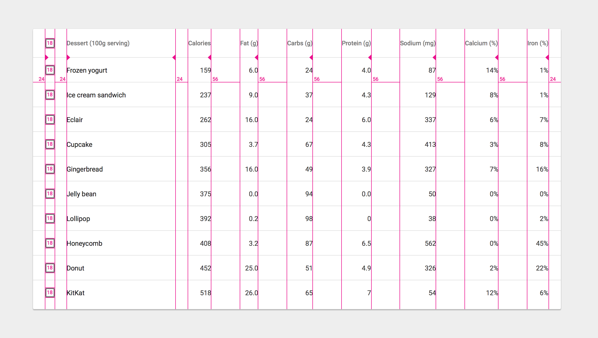
- Use a minimum of 56dp of padding in between columns. The widest item in the column (including data and column name) should delineate the column border.
- Checkbox icons have a width and height of 18dp within a 24dp icon container