Gestures
Mobile only
Gestures include touch mechanics (what your fingers do on the screen) and touch activities (results of specific gestures).
A touch mechanic may cause different outcomes, depending on the context in which it is used. For example, a long press may select an element like a list item.
A touch activity may be achieved through combining multiple touch mechanics. For example, by using the touch mechanics of pinch open, double-touch, or double-touch and dragging, a user may zoom in on a view.
Types of drag, swipe, and fling activities
Scroll
Reveal upon scroll
Pan
Dismiss
Swipe to refresh
Edge swipe
Paging swipe
Overscroll collapse
Menu open
Tilt

Touch mechanics
Touch mechanics refer to what the user's fingers do on the screen.

One-finger press, lift
Example: Select

One-finger press, lift, one-finger press, lift
Example: Zoom in
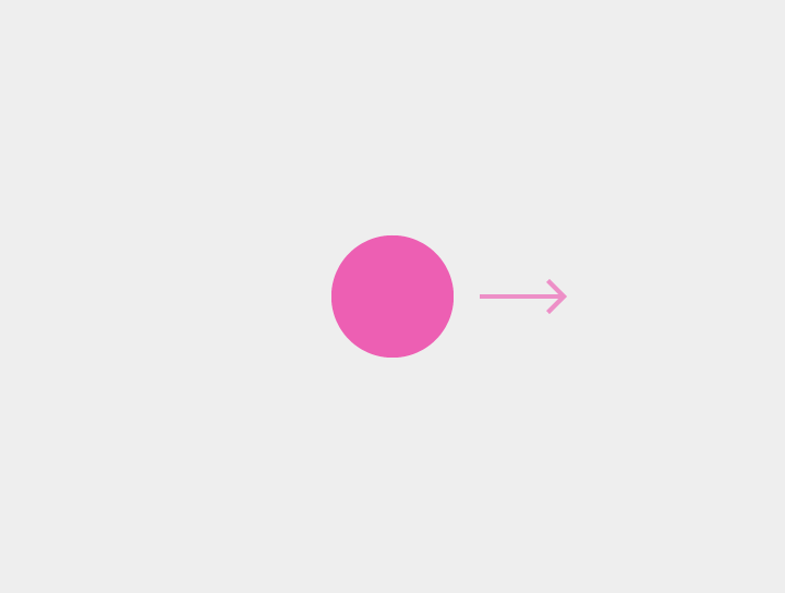
One-finger press, move, lift
Example: Dismiss, scroll, tilt, etc.

One-finger press, wait, lift
Example: Select an element, such as a list item
Long press is not used to display a contextual menu.
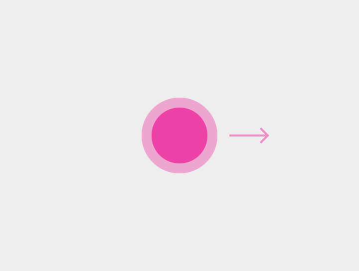
One-finger press, wait, move, lift
Example: Pick up and move, select multiple items
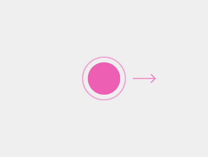
One-finger press, lift, one-finger press, move, lift
Example: Zoom in, zoom out
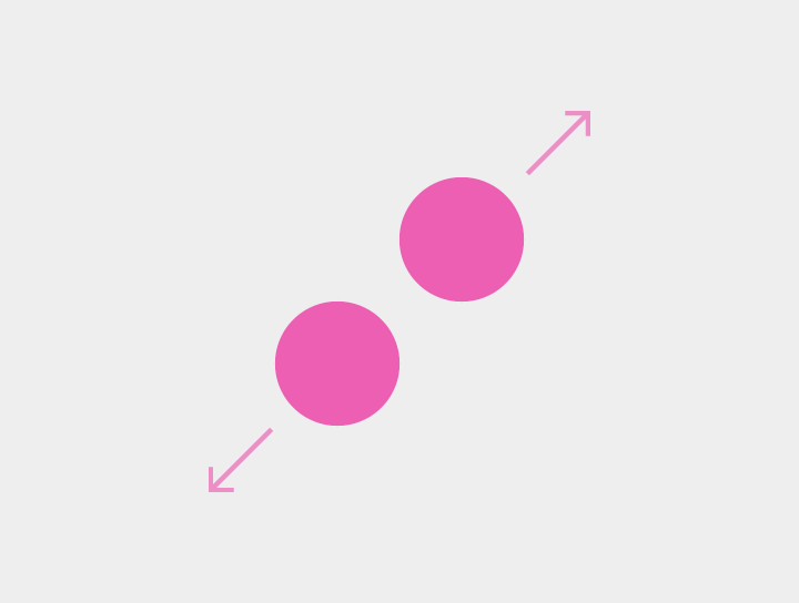
Two-finger press, move outwards, lift
Example: Zoom in
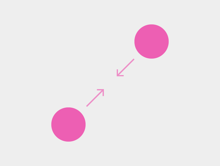
Two-finger press, move inwards, lift
Example: Zoom out

Two-finger press, lift
Example: Zoom out
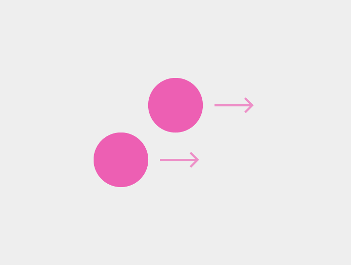
Two-finger press, move, lift
Example: Select multiple items, pan, tilt

Two-finger press, wait, lift
Example: None; this gesture is uncommon.
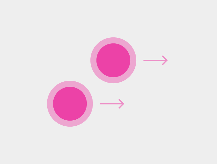
Two-finger press, wait, move, lift
Example: Pick up and move

Two-finger press, lift, two-finger press, lift
Example: Zoom out
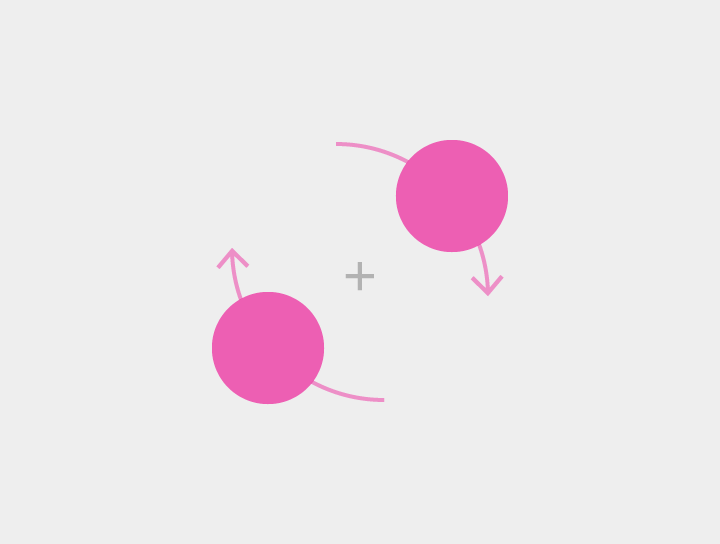
Two-finger press, simultaneously orbit both fingers around the center point, lift
Example: Rotate content, such as a map
Touch activities
Specific gestures and their results, in context.
| Action | Description | Touch mechanics |
|---|---|---|
| Activate | Activates a screen element, like a button | Touch |
| Cancel or Escape | Cancels or escapes out of the current task, as in dialogs or menus | Touch |
| Enable/Disable lights out | Hides or shows a view’s chrome | Touch |
| Drag or Swipe or Fling | See the following section Drag, swipe, or fling details for distinctions between Scroll, Reveal upon scroll, Pan, Dismiss, Swipe to refresh, Edge swipe, Paging swipe, Overscroll collapse, Menu open, and Tilt | Drag, Swipe, or Fling |
| Data selection (when nothing is selected) | Selects a single element | Long press, two-finger touch |
| Data selection (when items are already selected) | Selects additional elements while in selection mode Can use any combination of subsequent one- or two-finger gestures | Touch, two-finger touch |
| Data multi-selection drag | Reveals selection box that originates from point of gesture initiation The height and width can be adjusted based on finger position. The final selection is based on selection box dimensions upon finger(s) lifting. | Two-finger swipe or drag, long-press drag with no items selected |
| Pick up and move | Affects the selected item or items. It can be used to:
| Two-finger long-press drag, long-press drag on selected item |
| Zoom in | Scales up content |
|
| Zoom in to fit | For nested views, scales up the smallest targetable view | Double-touch |
| Zoom out | Scales down content |
|
| Expand | Expands collapsed content | Pinch open |
| Collapse | Collapses expanded content | Pinch closed |
| Rotate | Rotates the targeted content | Rotate |
Drag, swipe, or fling details
Swipe gesture activities vary based on context. The speed at which a gesture is performed is the primary distinction between Drag, Swipe, and Fling.
- Drag: Fine gesture, slower, more controlled, typically has an on-screen target
- Swipe: Gross gesture, faster, typically has no on-screen target
- Fling: Gross gesture, with no on-screen target
Gesture velocity impacts whether the action is immediately reversible.
- A swipe becomes a fling based on ending velocity and whether the affected element has crossed a threshold (or point past which an action can be undone)
- A drag maintains contact with an element, so reversing the direction of the gesture will drag the element back across the threshold
- A fling moves at a faster speed and removes contact with the element while it crosses the threshold, preventing the action from being undone
Scroll
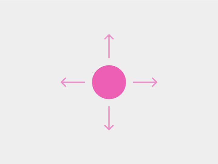
A scroll is a vertical or horizontal swipe in a single direction within the content body.
Usage
- Scroll amount varies based on velocity of gesture: drag (slow) vs. swipe vs. fling (fast)
- Scrolled content should move at the same rate as the gesture being performed. The content should feel "anchored" to the finger or touch device.
Reveal upon scroll
Reveal upon scroll means that reversing the scroll direction in a content area reveals hidden in-app elements. E.g., scrolling up in Chrome shows the Omnibox. To dismiss these in-app elements, resume the original scroll direction.
Pan
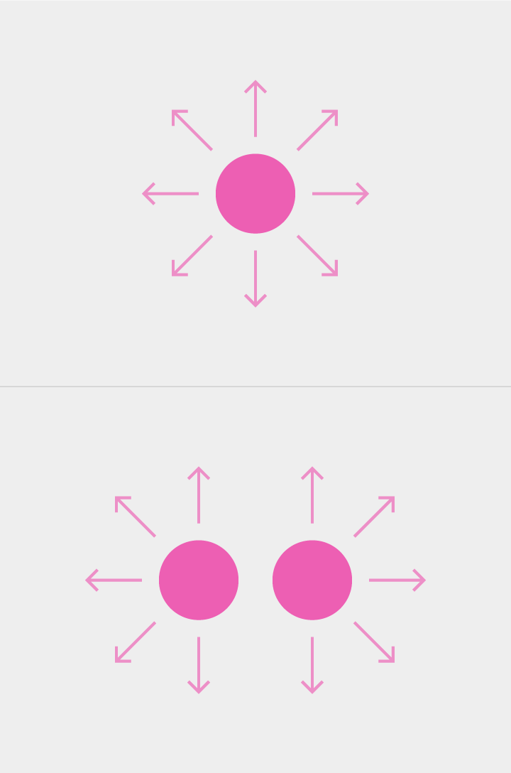
A pan is an omnidirectional one- or two-finger gesture that expands the field of view. Drag is typically used with pan. Fling will maintain gesture velocity, resulting in a significant pan of the content along the direction of the fling gesture.
Pan is applied to:
- Unbounded content (maps)
- Content that is larger than the screen height or width (zoomed in web page or photo)
A two-finger pan occurs when transitioning from another two-finger gesture (e.g., pinch zoom or rotate) such as in Maps. When a gesture begins with a two-finger pan it results in tilt.
Dismiss
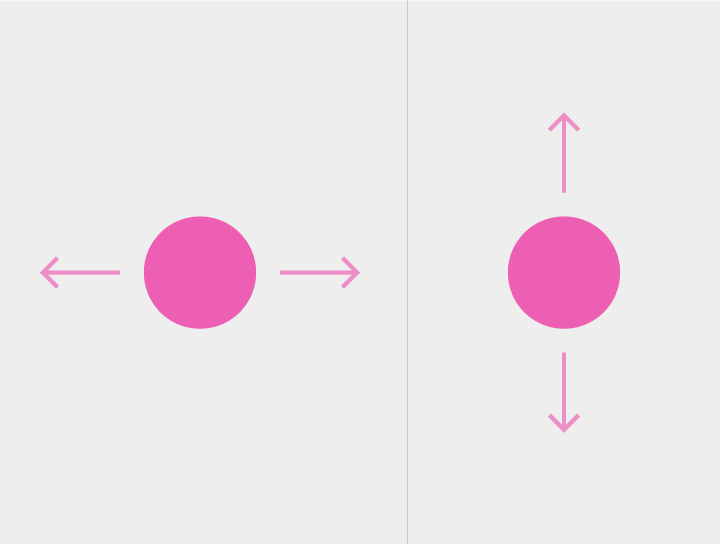
A dismiss gesture originates on a swipeable element, such as a list item or card, orthogonal to the direction of scrolling.
The gesture is typically horizontal.
The dismiss gesture is committed based on crossing a threshold.
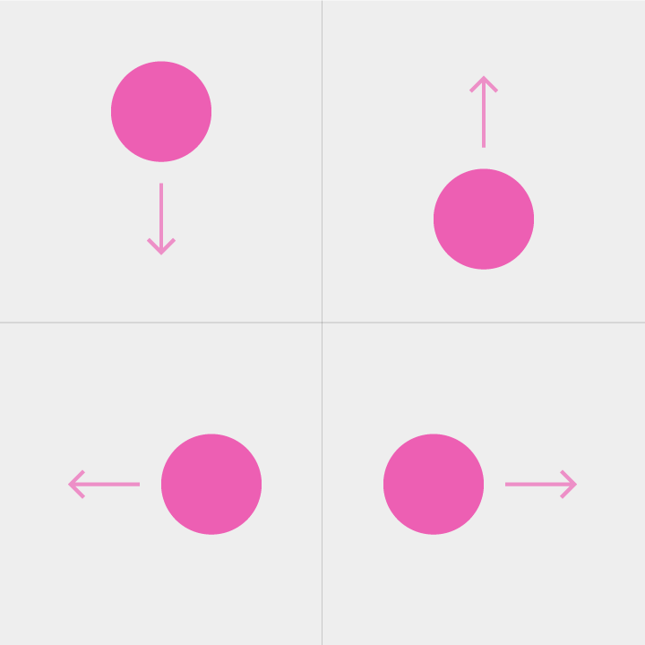
Swipe to refresh
Swipe to refresh usually occurs in a vertical and downward movement. It is available at the top of a list, or at the edge of any card or container where new content surfaces.
Edge swipe
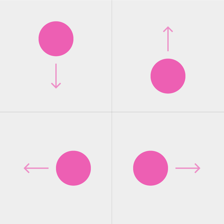
An edge swipe gesture originates outside of the screen to reveal off-screen content. It invokes content separate from the current view.
If no edge swipe action is defined, an edge swipe can default to a paging swipe.
The edge swipe gesture is committed based on crossing a threshold.
Paging swipe
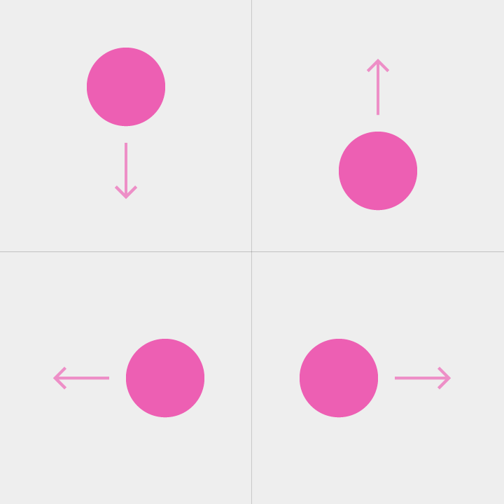
A paging swipe is an on-screen, in-content swipe that reveals related off-screen content. It reveals one page/tab per paging swipe.
If paged content is at >100% zoom, an in-content swipe will Pan to an edge of the content, and an additional in-content swipe will Page.
The Paging swipe gesture is committed based on crossing a threshold.
Don’t use paging swipes when individual elements are swipeable.
See below: Overscroll collapse
Overscroll collapse
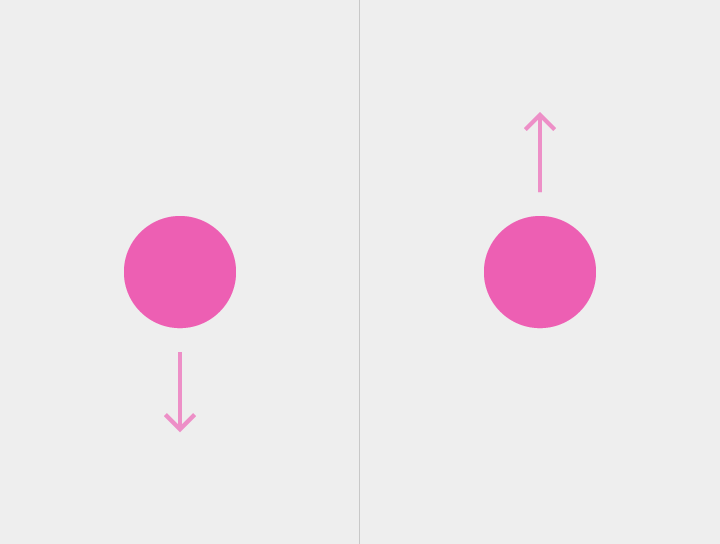
Overscroll collapse navigates up in the content hierarchy via a paging swipe at the top or bottom of scrolling content.
The Overscroll collapse gesture is committed based on crossing a threshold.
Menu open
A drag originating from a menu or picker reveals a menu. Upon lift, the highlighted menu option is selected.
The menu then appears upon touch.
Drag is used with Menu open.
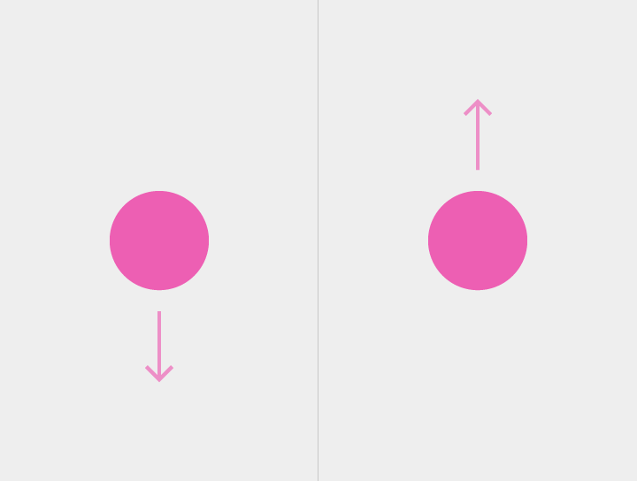
Tilt
Tilt moves 3D content forward or backward.
The transition from another two-finger gesture (e.g., pinch zoom or rotate) such as in Maps, will result in a two-finger pan.
Drag is used with Tilt.