

Buttons: Floating Action Button
A floating action button represents the primary action in an application.
A floating action button is used for a promoted action.
Shaped like a circled icon floating above the UI, it changes color upon focus and lifts upon selection. When pressed, it may contain more related actions.
Usage
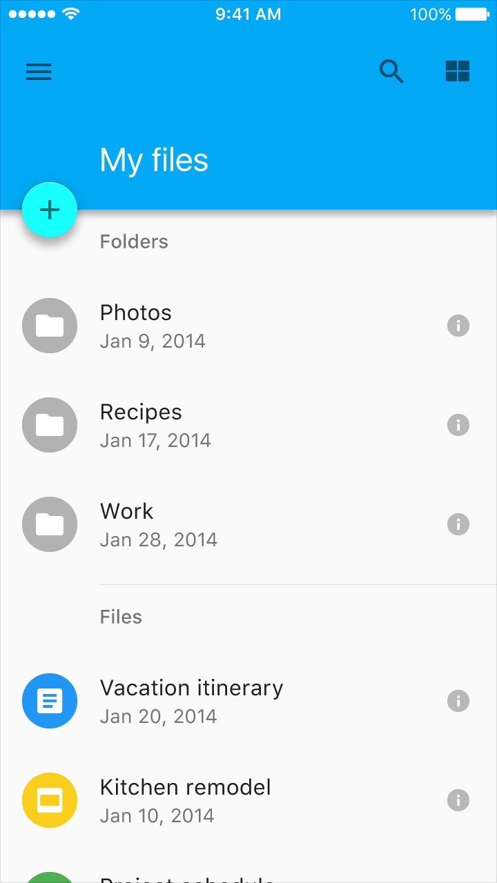
Only one floating action button is recommended per screen to represent the most common action.
Behavior
It animates onto the screen as an expanding piece of material, by default.
Sizes
Default: 56 x 56dp
Mini: 40 x 40dp
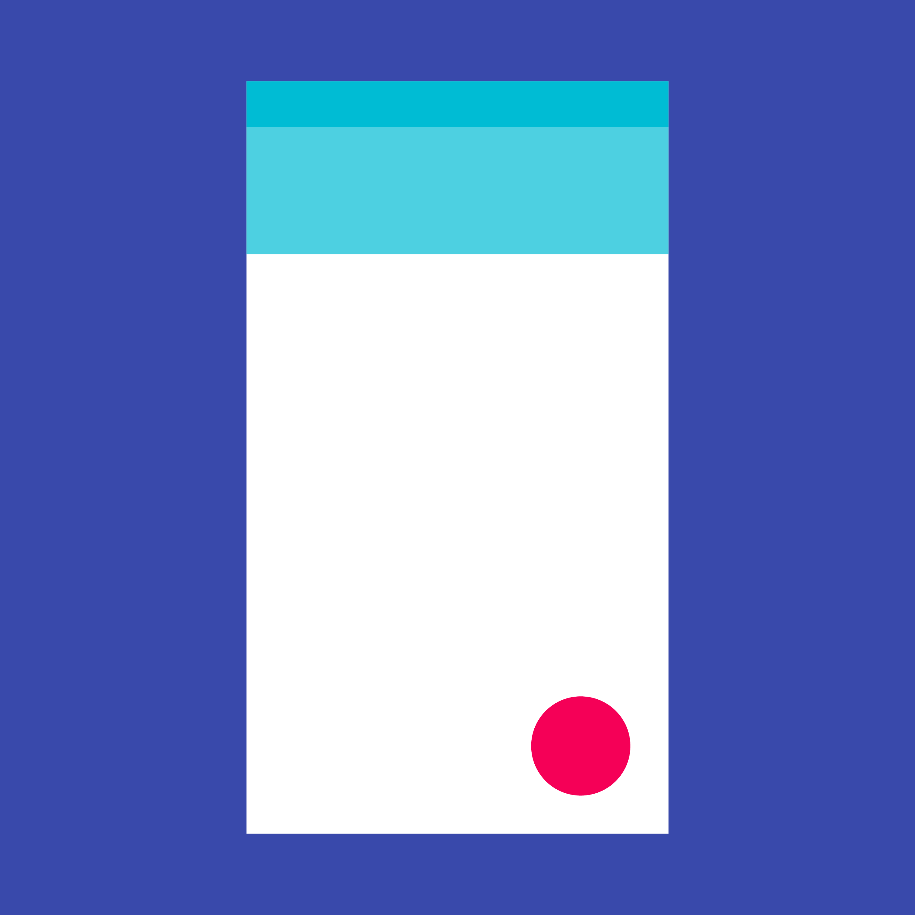
Floating action button
Floating action button
Floating action buttons are used for a promoted action. They are distinguished by a circled icon floating above the UI and have motion behaviors that include morphing, launching, and a transferring anchor point.
Floating action buttons come in two sizes:
- Default size: For most use cases
- Mini size: Only used to create visual continuity with other screen elements
The button size should change from the default (56dp) to the mini size (40dp) when the screen width is 460dp or less.
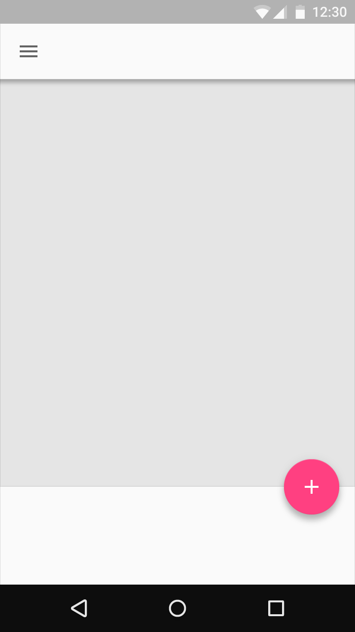
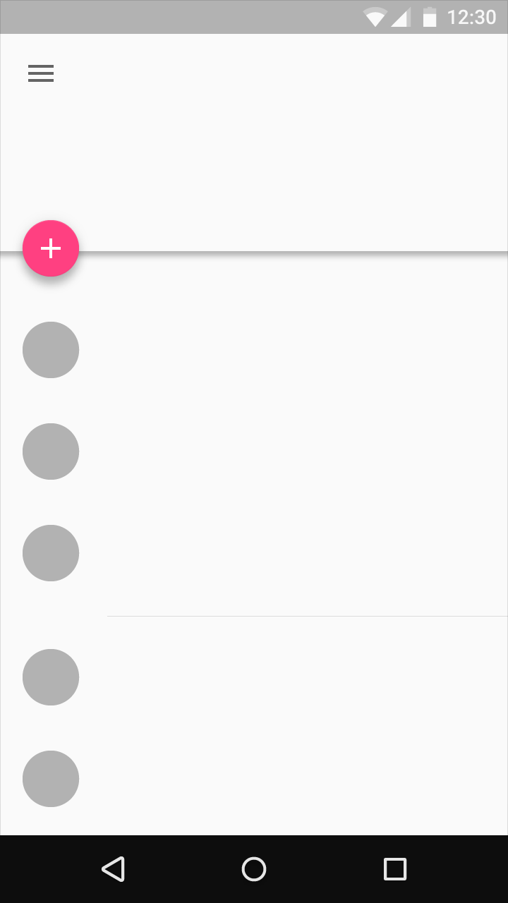
The floating action button should be placed 16dp minimum from the edge on mobile and 24dp minimum on tablet/desktop.
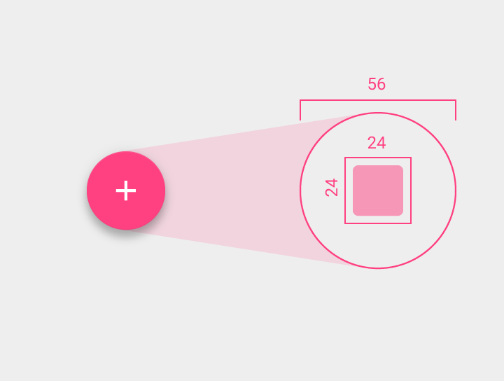
Interior icon: 24 x 24dp
Floating action button circle: 56 x 56dp
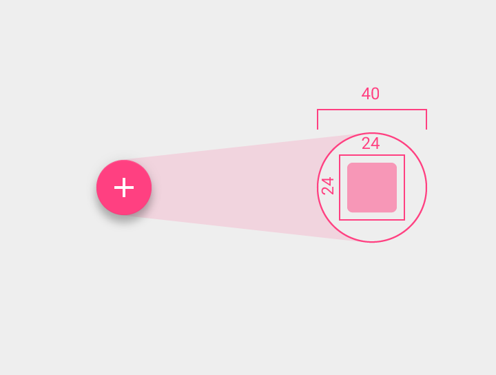
Interior icon: 24 x 24dp
Floating action button circle: 40 x 40dp
The floating action button changes color on focus and lifts upon being selected.
Not every screen needs a floating action button. A floating action button represents the primary action in an application.

Do.
Do.
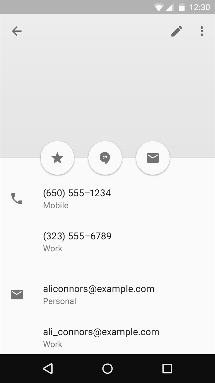
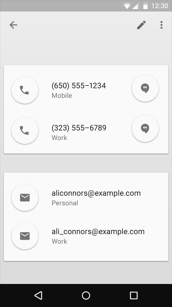
Only one floating action button is recommended per screen to increase its prominence. It should represent only the most common action.
Don’t.
Don’t.
Qualities
Make floating action buttons positive actions like Create, Favorite, Share, Navigate, and Explore.
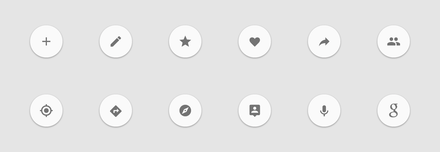
Do.
Avoid using floating action buttons for minor and destructive actions, including the following:
- Archive or Trash
- Nonspecific actions
- Alerts or errors
- Limited tasks like cutting text
- Controls that should be in a toolbar, like volume control or changing a font color
Floating action buttons don’t contain app bar icons or status bar notifications. Don’t layer badges or other elements over a floating action button.
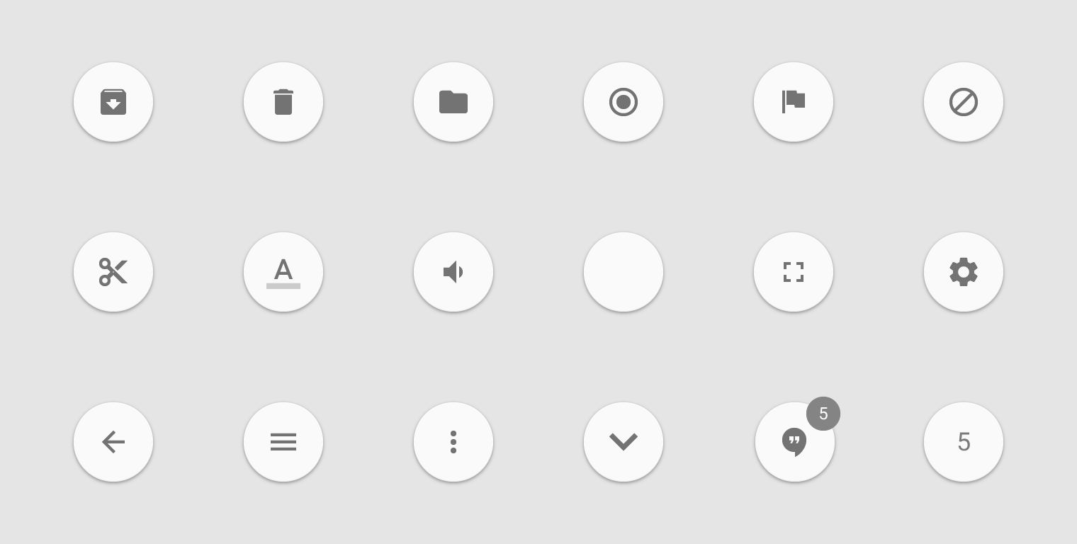
Don’t.
Use the circle-shaped icon consistently to enforce the primary action pattern across apps.
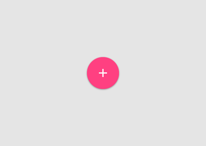
Do.
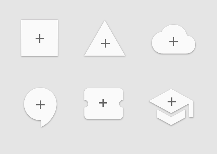
Don’t.
Don’t give the floating action button extra dimension.
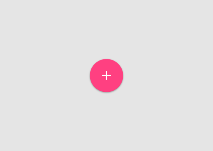
Do.
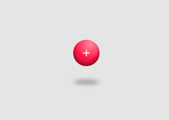
Don’t.
Behavior
The floating action button animates onto the screen as an expanding piece of material, by default. The icon within it may be animated.
Floating action buttons may move differently than other UI elements because of their relative importance.
Lateral screens
A floating action button that spans multiple lateral screens (such as tabbed screens) should briefly disappear, then reappear if its action changes.
The button should stay on screen if its action remains the same across screens (and translate to a new position, if necessary.)
Lists
Lists underneath floating action buttons should have enough padding beneath them so their content isn’t blocked by the button.
Do.
Do.
Tabbed screens
On tabbed screens, the floating action button should not exit the screen in the same direction as the content. This prevents:
- Floating action buttons from appearing functional when they aren’t
- The perception that the floating action button is at the same elevation as the content
Don’t.
Don’t.
Transitions
Transitions
The floating action button is a unique example of a primary use case in an app. Take advantage of its visibility to create delightful transitions for a primary UI element.
Common transitions include Trigger, Toolbar, Speed dial, and Morphing. This is not an exhaustive list. Floating action buttons are designed to be flexible. Experiment with transitions that best suit your app and the screens on which the button sits.
Trigger
The floating action button can simply trigger an action or navigate somewhere. The animation of the touch ripple expands outwards as the force that causes changes to the UI.
Apps typically use a single floating action button. However, this example uses two floating action buttons because they perform equally important yet distinct actions.
Toolbar
The floating action button can transform into a toolbar upon press or from a toolbar upon scroll. The toolbar can contain related actions, text and search fields, or any other items that would be useful at hand.
A toolbar that disappears on scroll is particularly useful for screens where the full toolbar is needed upon initial entry or while at the top or bottom of a long list. This saves screen real estate when the user has signaled through scrolling that they’re interested in looking at the main content.
If a floating action button morphs into a toolbar, that toolbar should contain related actions.
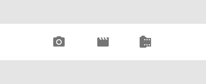
Do.
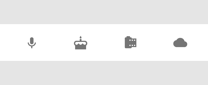
Don’t.
Speed dial
The floating action button can fling out related actions upon press. The button should remain on screen after the menu is invoked. Tapping in the same spot should either activate the most commonly used action or close the open menu.
The floating action button can transform into a single sheet of material which contains all the actions.
As a general rule, have at least three options upon press but not more than six, including the original floating action button target. If you have two options – i.e. your floating action button only flings out one other choice – choose which action is most important. If you have more than six, users may have trouble reaching the furthest option.
Reduce decision fatigue by giving users the best, most distinct, and fewest options.
Don’t.
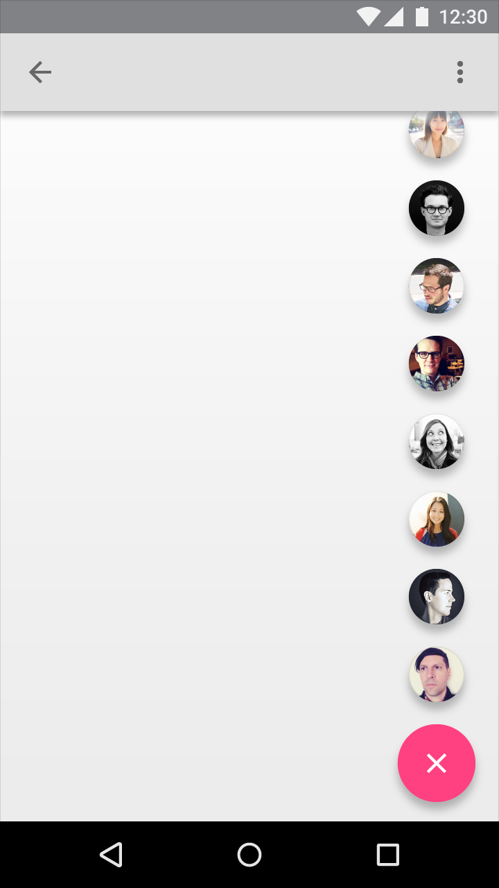
Don’t.
Don’t put overflow menus in the floating action button actions. There should be at most two taps from the initial screen to get to the intended destination.
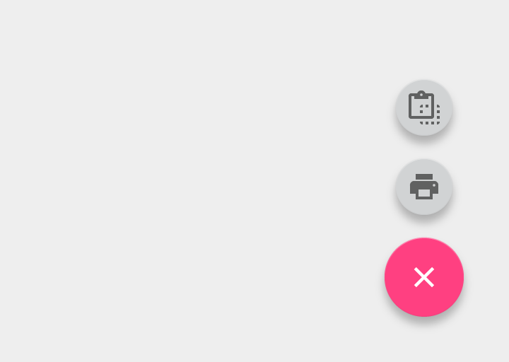
Do.
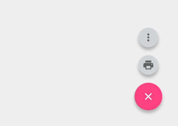
Don’t.
Put overflow actions in the overflow menu in toolbars, not in floating action buttons.
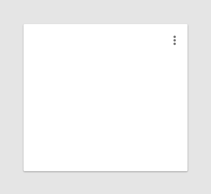
Do.
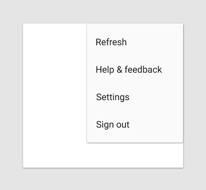
Do.
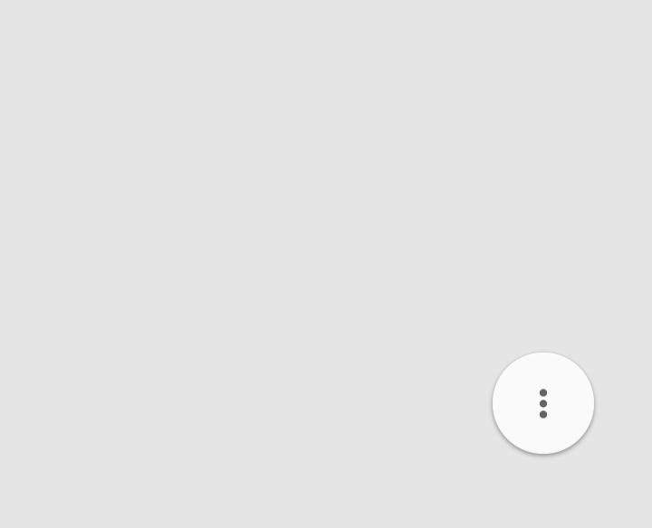
Don’t.
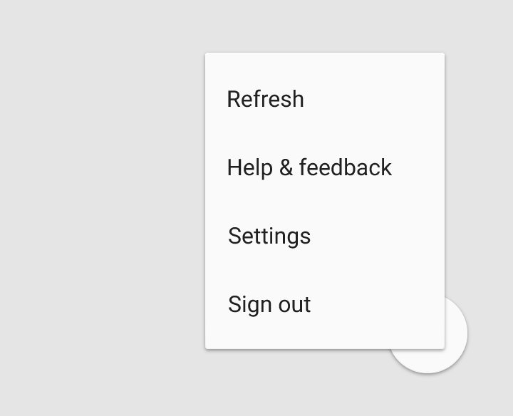
Don’t.
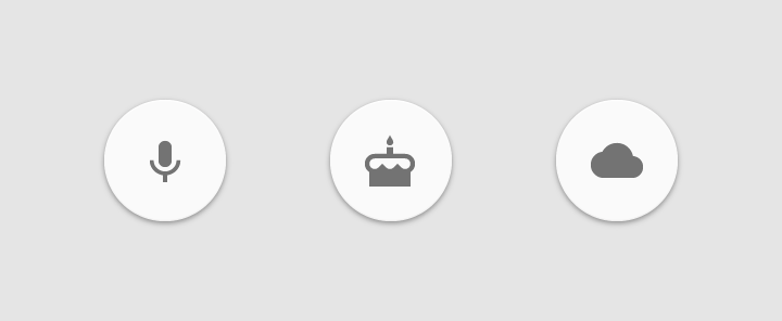
If the hallmark of the app is adding file types, a floating action button can transform into related actions after it is first touched. However, if the actions that appear are unrelated to the button, place the actions into an overflow menu.

Do.
Don’t.
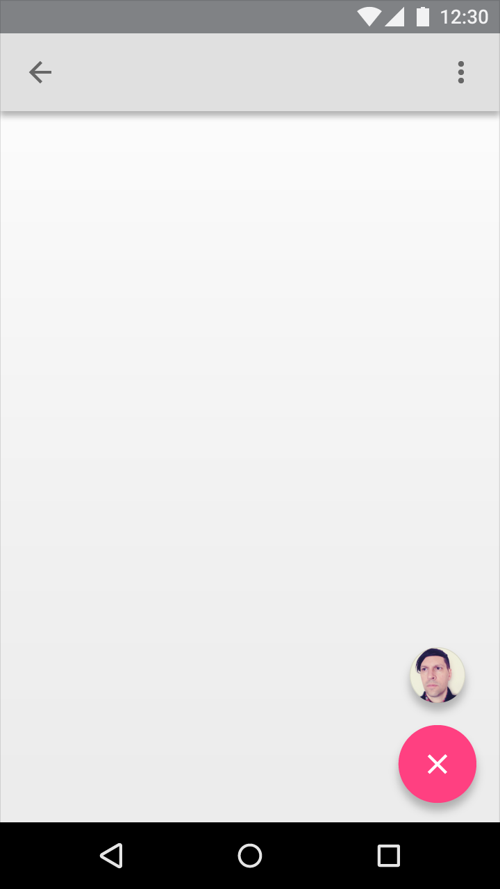
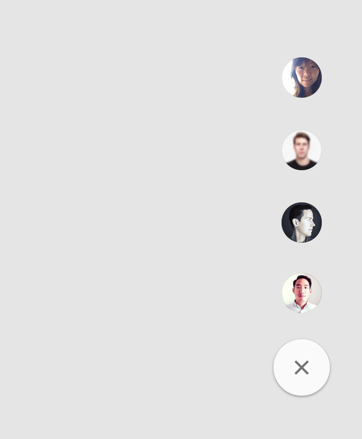
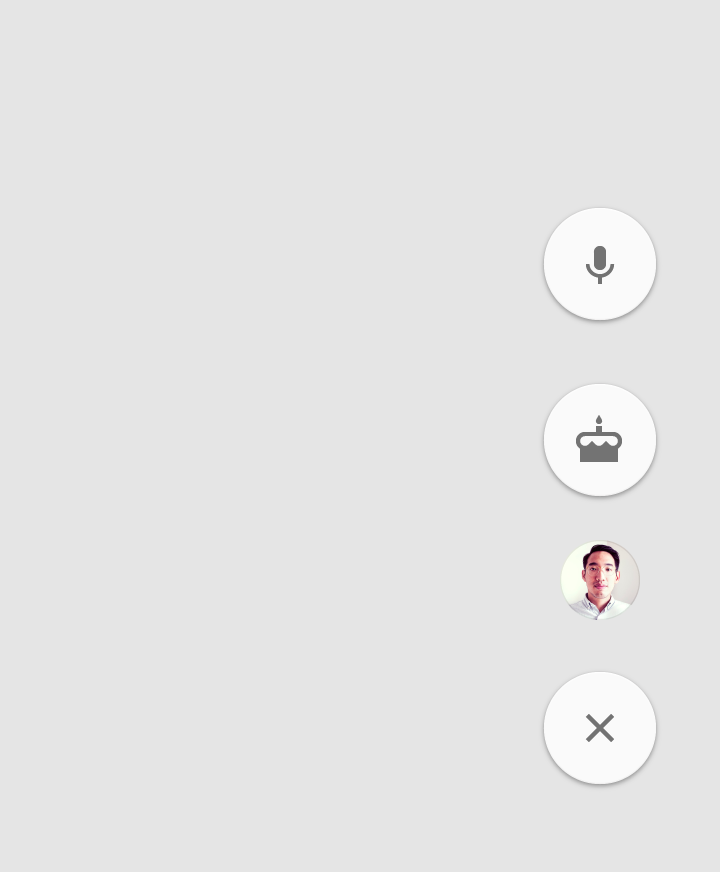
A floating action button can contain a list of contacts. The list shouldn’t contain unrelated actions.
Do.
Don’t.
Morph
The floating action button can transform into sheets of material that are part of the app structure. This dramatic transformation accentuates the action the button enables.
When morphing the floating action button, transition between starting and ending positions in a logical way. For example, do not pass through other sheets of material.
The morph animation should be reversible and transform the new sheet of material back into the floating action button.
Full screen
The floating action button can transform into a new sheet of material that spans the entire screen.
This type of dramatic transformation is typically associated with creating new content. As a result, it does not tend to have a method of undoing the transformation or a reversible animation.
Large Screens
Large screens
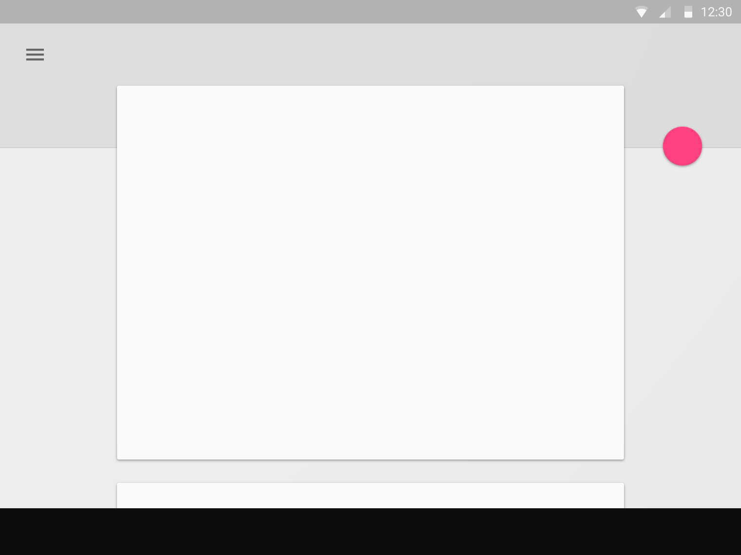
A floating action button can attach to an extended app bar.
Do.
A floating action button can be attached to a toolbar or structural element within a sheet (as long as it’s not blocking other elements).
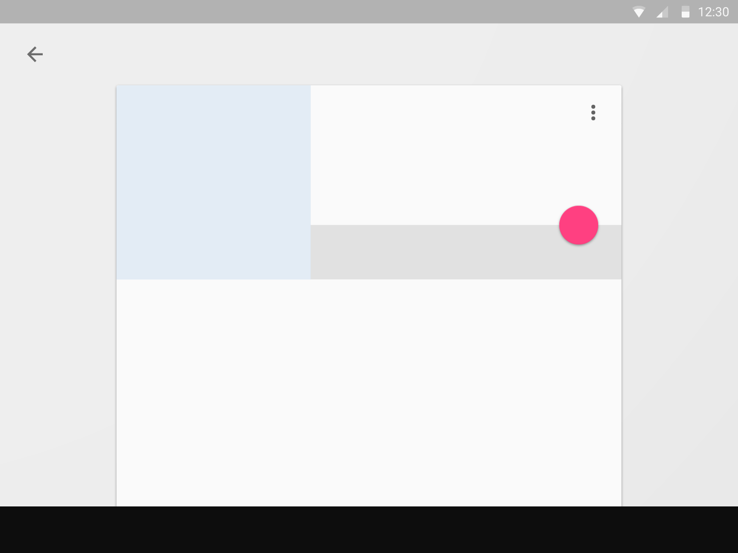
Do.
A floating action button can be attached to the edge of a sheet.
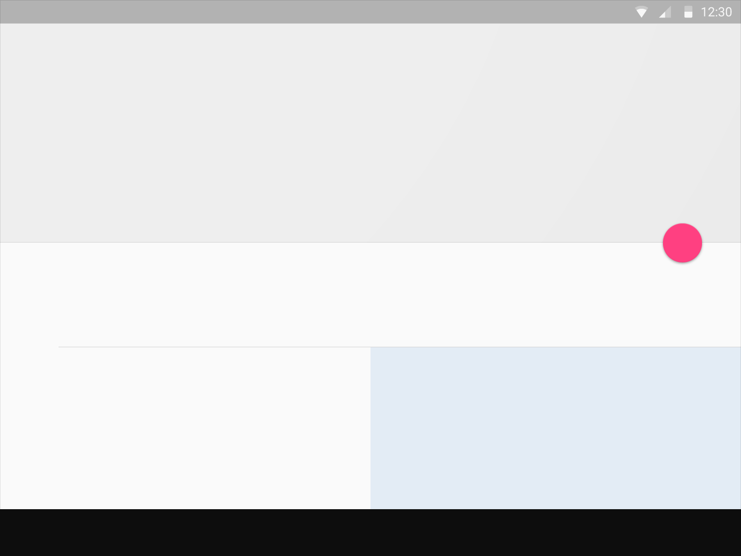
Do.
Don’t have more than one floating action button per screen.
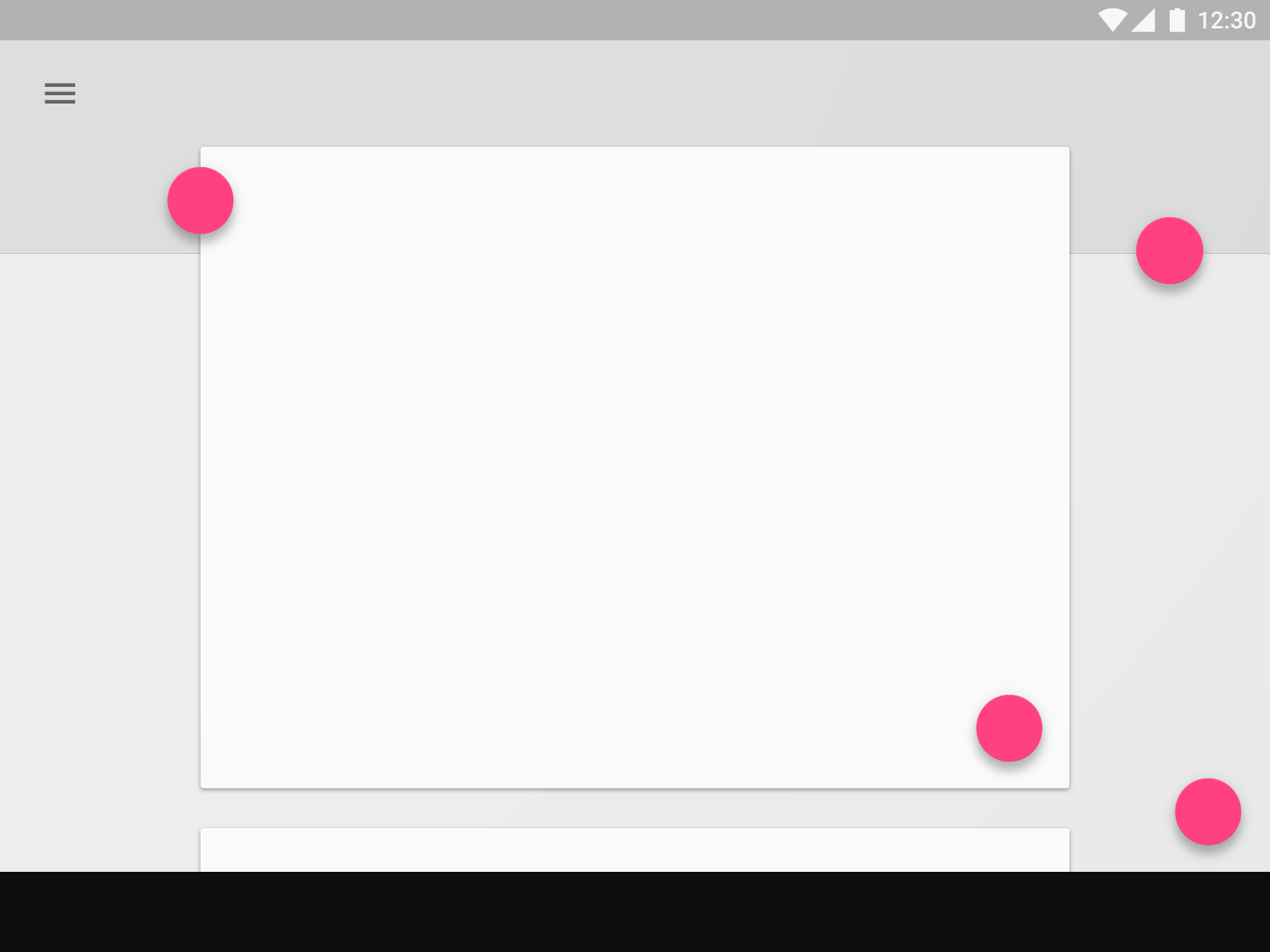
Don’t.
Don’t associate floating action buttons with every element on a screen.
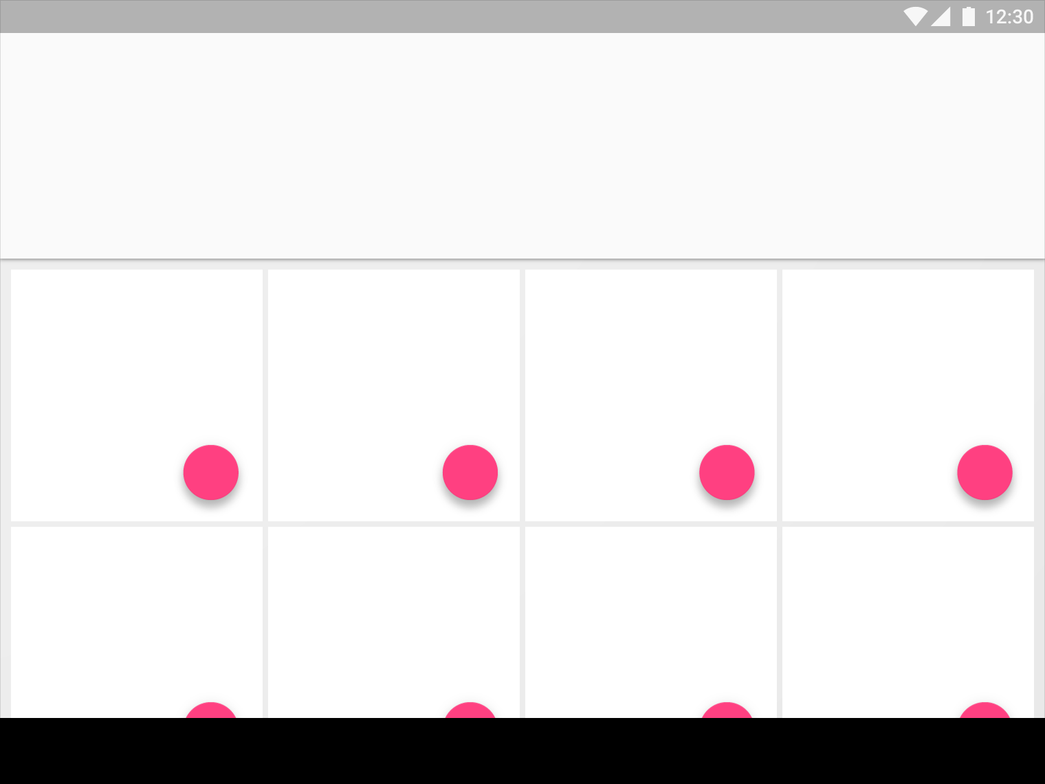
Don’t.