

Menus
Menus display a list of choices on a transient sheet of material.
Menus appear upon interaction with a button, action, or other control. They display a list of choices, with one choice per line.
Menu items may be disabled if not applicable to a certain context. Contextual menus dynamically change their available menu items based on the current state of the app.
Types
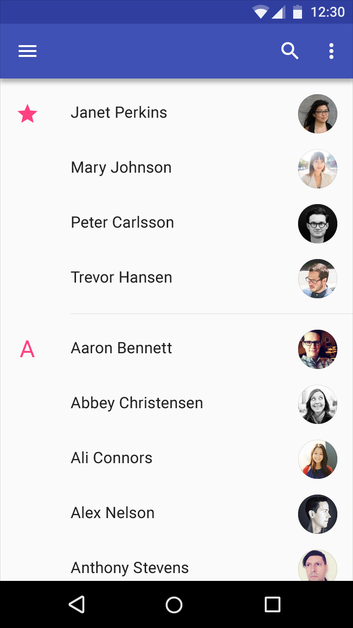
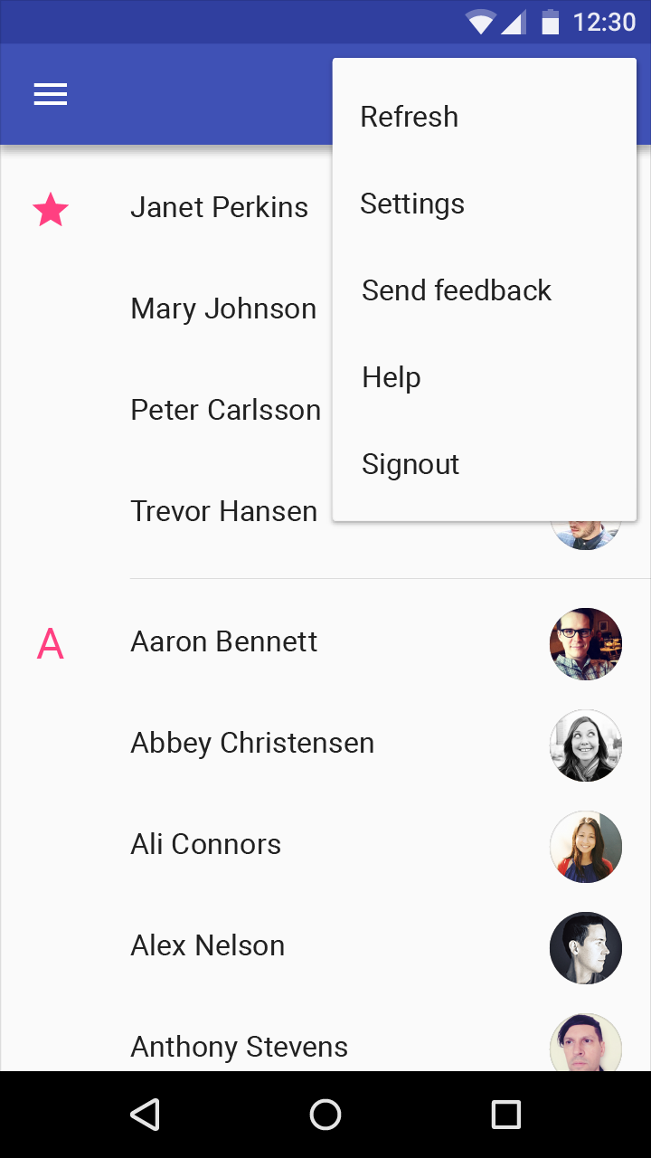
Simple menus (mobile and tablet)
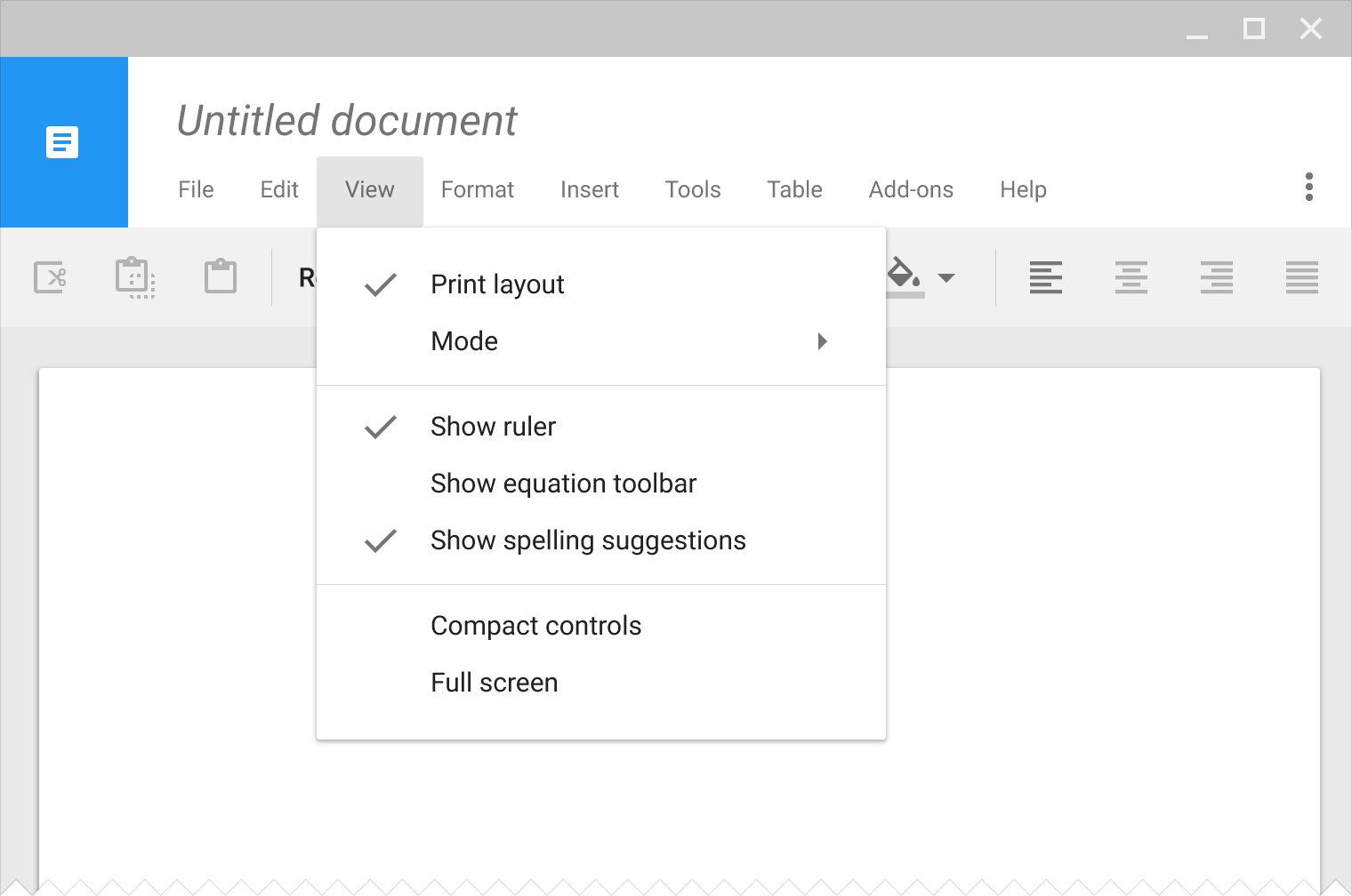
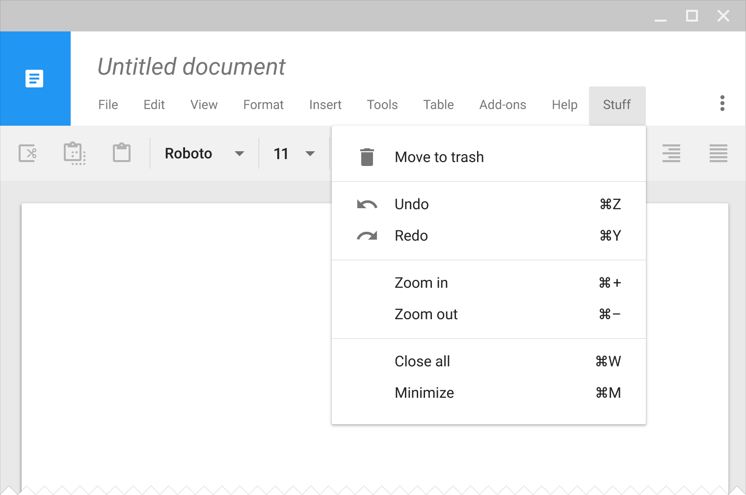
Cascading menus (desktop)
Elevation
Menus appear above other in-app elements.
Behavior
Scrollable
Alternatives

Usage
A menu is a temporary piece of material that appears upon interaction with a button, action, pointer, or other control. It contains at least two menu items.
Each menu item consists of a discrete option or action that can affect the app, the view, or selected elements within a view.
Menus should not be used as a primary method for navigation within an app.
Menu labels
The label of a button or control should concisely and accurately reflect the items within the menu. Menu bars typically use single words as labels, like “file,” “format,” and “edit.” Other contexts may require longer labels.
Disabled menu options
Menus display a consistent set of menu items. A menu item may be enabled or disabled based on the current state of the application.
Do.
Don't.
Contextual menus
Contextual menus dynamically change their available menu items based on the current state of the application.
- Menu items that are irrelevant to the current context may be removed
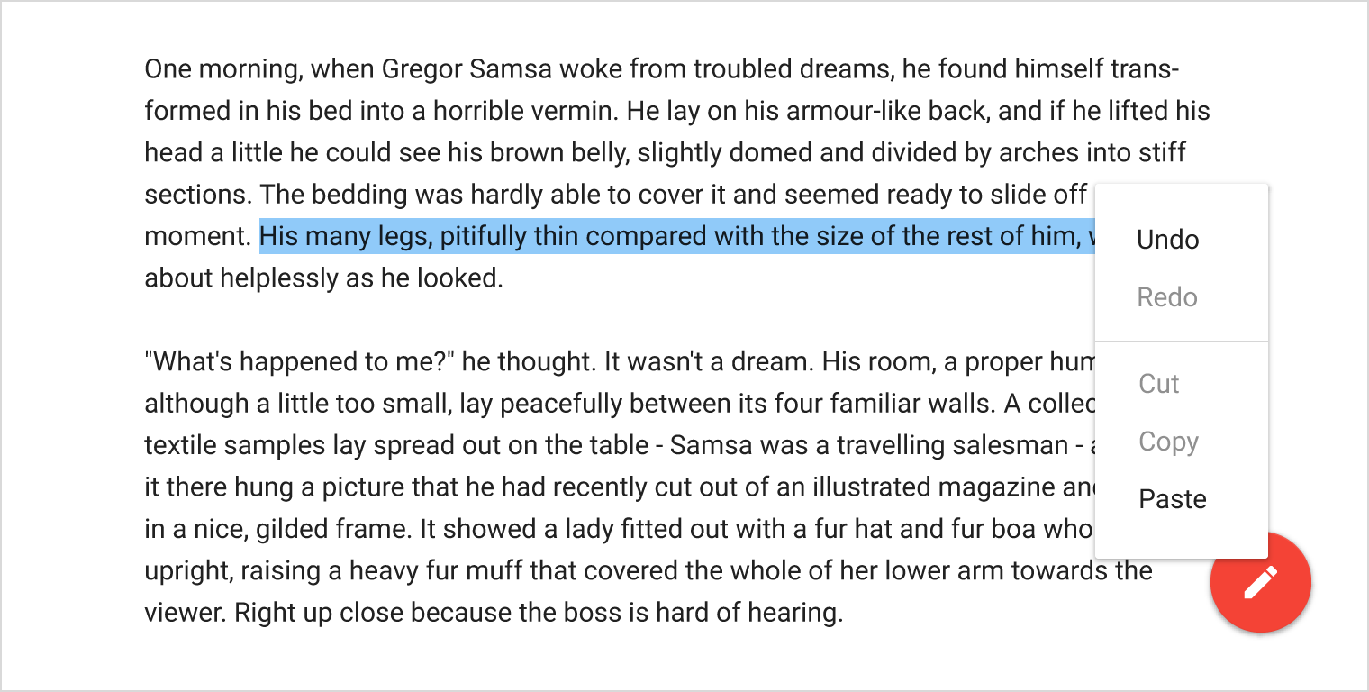
- Menu items which are relevant but need certain conditions to be met may be disabled. For example, the Copy menu option becomes enabled when text is selected.
Single menu-item states
Some app states may result in a contextual menu with only a single menu item. For example, when highlighting text on a web page, Android displays only the Copy menu item, as users cannot cut or paste text.
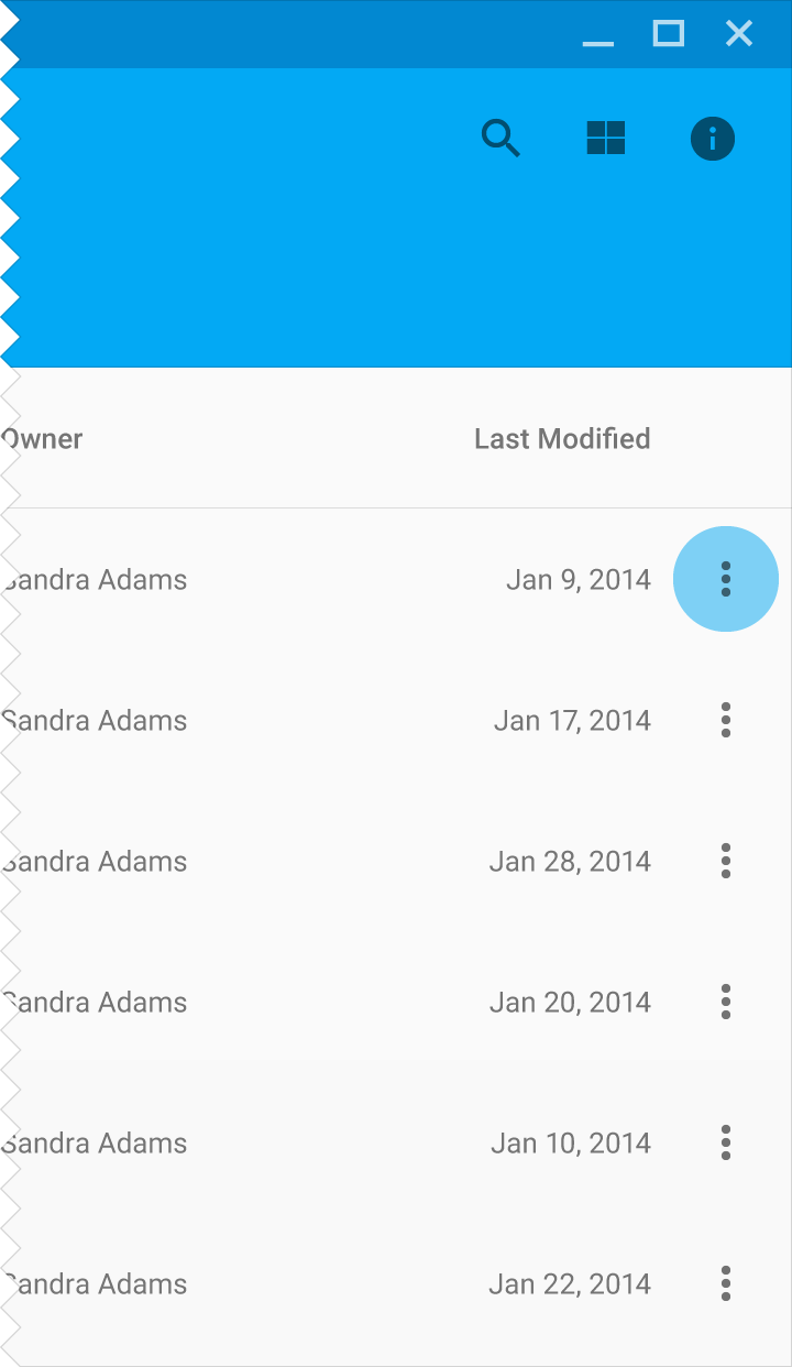
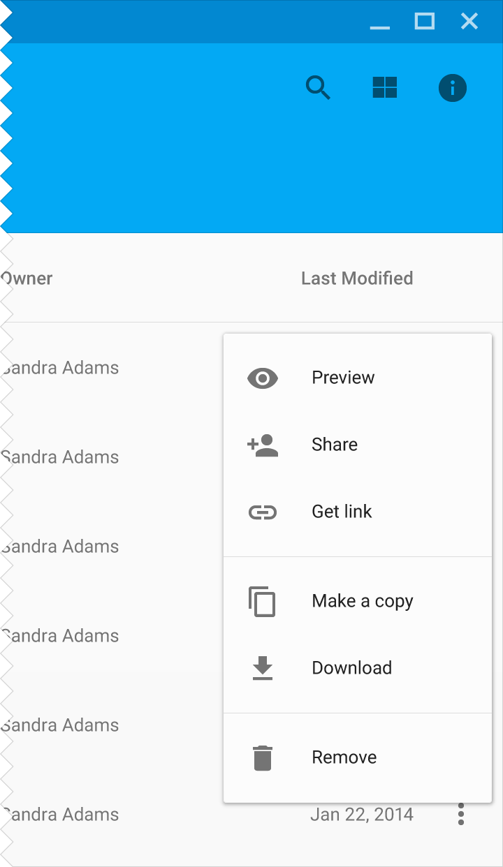
Menus are scrollable
If the height of a menu prevents all menu items from being displayed, the menu can scroll internally. One example is when viewing a menu on a phone in landscape orientation.
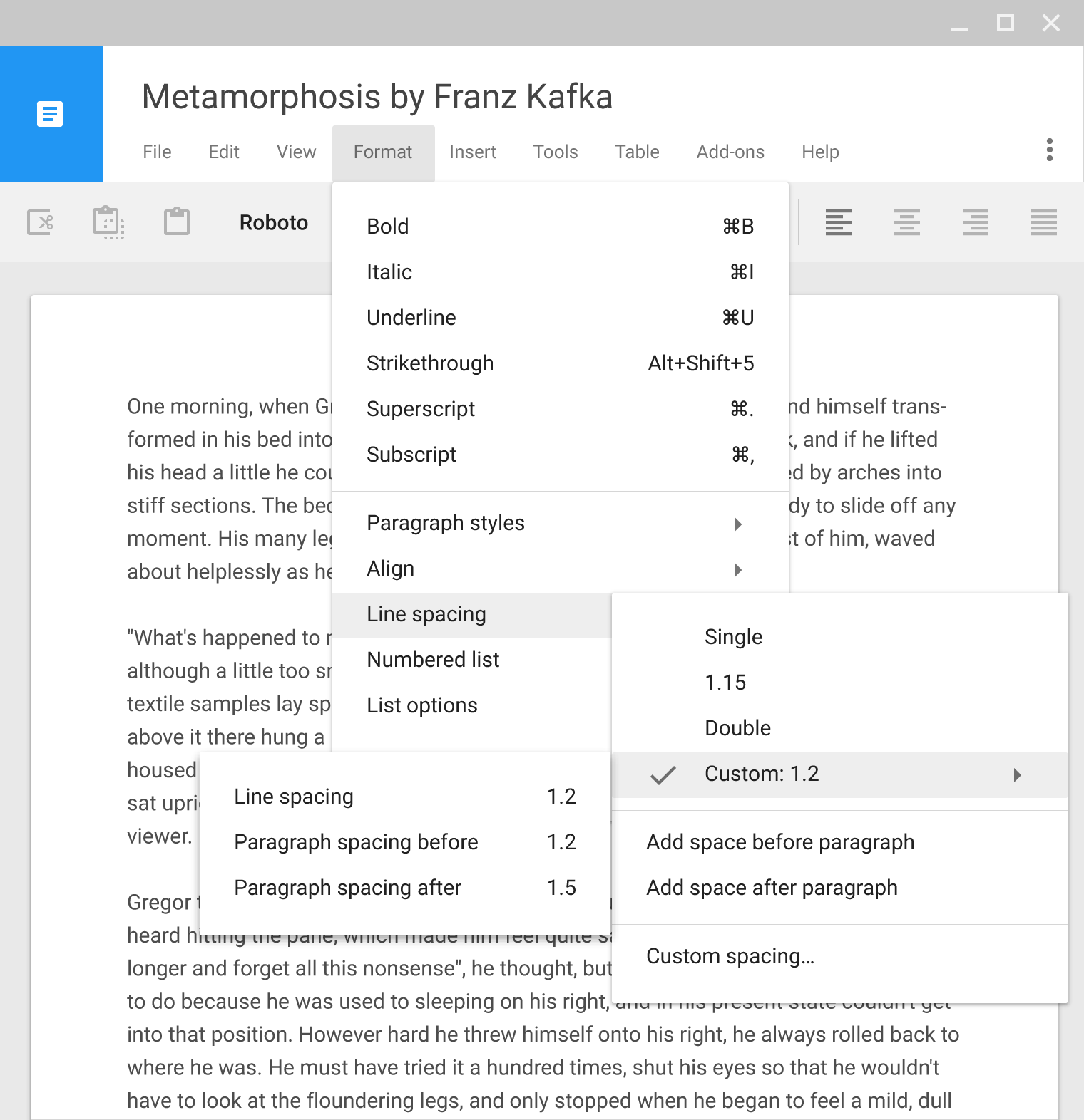
Cascading menus (Desktop only)
For menus that cascade, position the menus vertically and horizontally based on their proximity to screen edges.
Developer note: Implementations of this component may vary by platform. By using standard platform implementations, you will receive any related future improvements.
Menu items
Single-line display
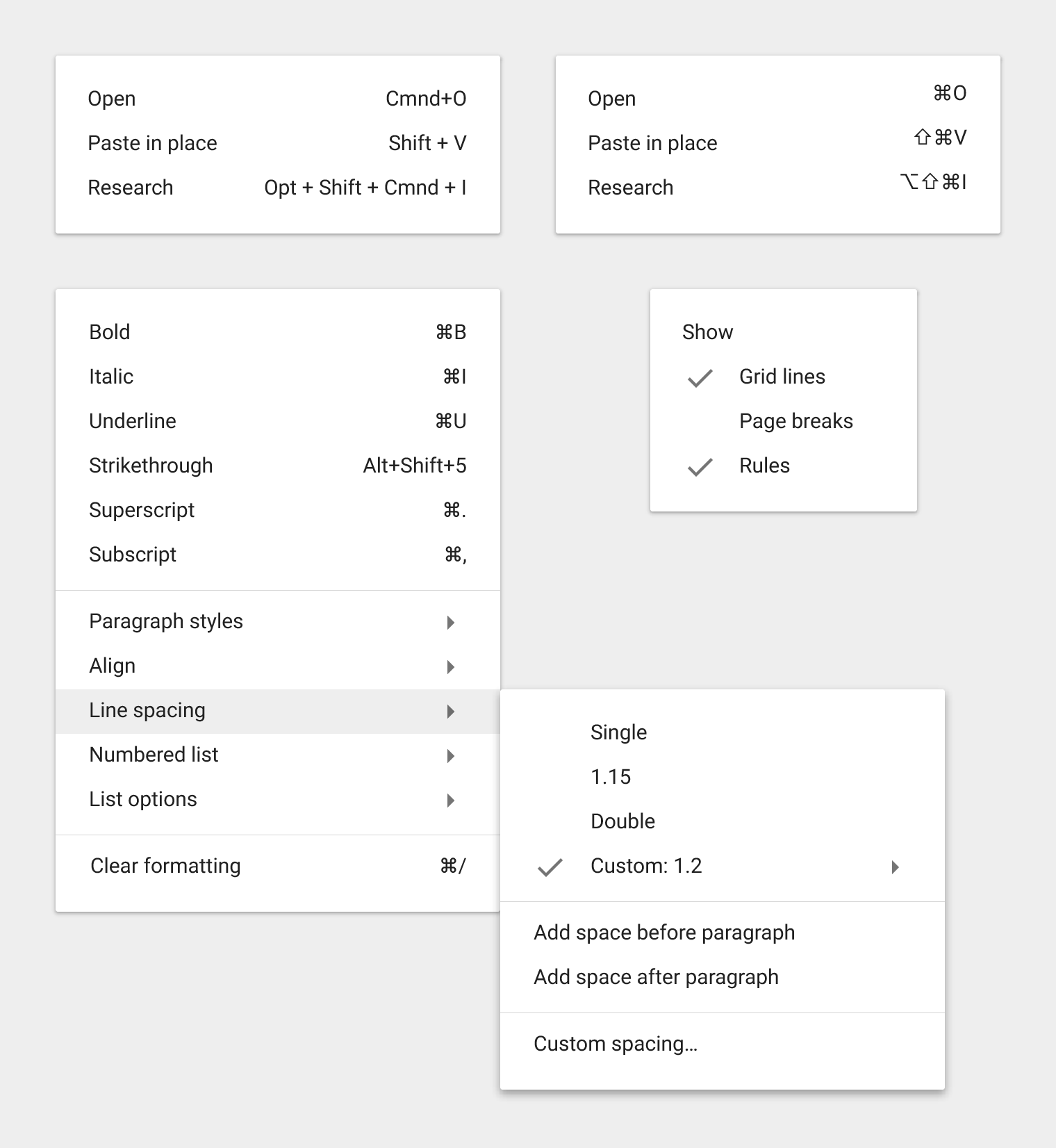
Each menu item is limited to a single line of text (a single word or short phrase) that describes the action it will perform when selected.
Menu items may also contain:
- Icons and helper text, like keyboard shortcuts
- Controls like checkmarks to indicate multiple selected items or states (See List controls)
Menu ordering
Menus with static content should have the most frequently used menu items placed at the top of the menu.
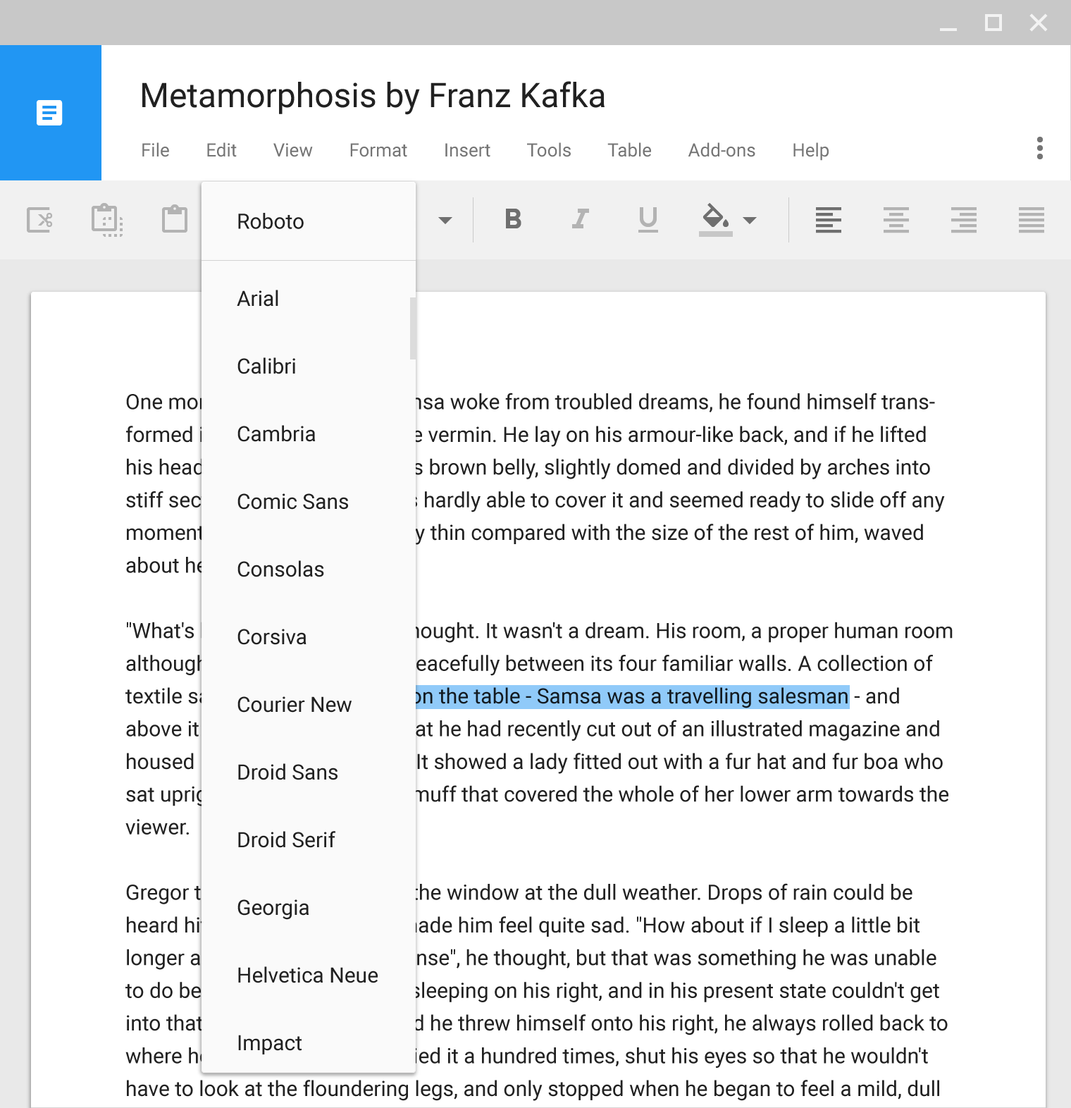
Menus with dynamic content may have other behavior, such as placing previously used fonts at the top of the menu. The order can change based on user actions.
Menu nesting
Menu items can reveal nested submenus. Ideally, limit nesting to one level deep, as it can be difficult to navigate multiple nested submenus.
Disabled actions
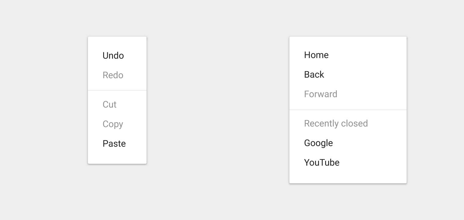
Displaying actions as disabled, rather than removing them, lets the user know they exist under the right conditions.
For example, Redo is disabled when there is nothing to redo. Cut and Copy are disabled until content is selected.
Behavior
Location
Menus appear above all other in-app UI elements.
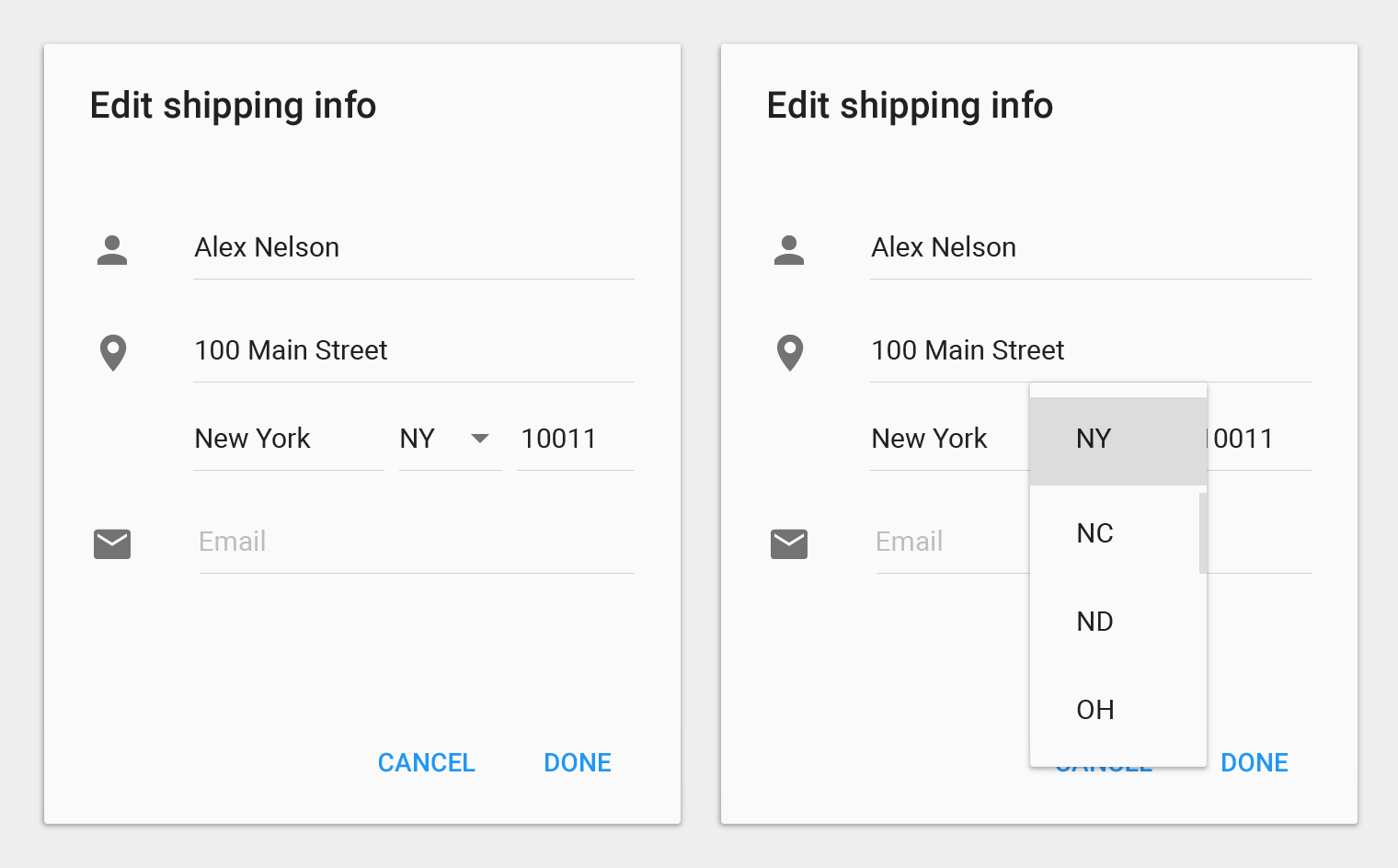
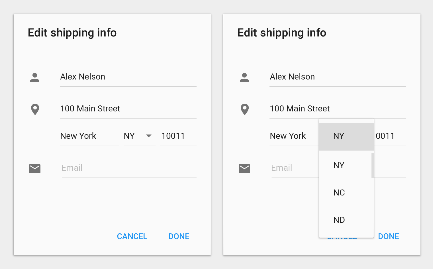
Menus are positioned over their emitting elements such that the currently selected menu item appears on top of the emitting element.
Do.
Do not display a duplicate of the selected menu item.
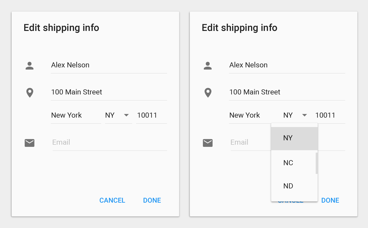
Don't.
Positioning the menu below the emitting element separates it from its context.
Don't.
Dismissing menus
Dismiss a menu by tapping outside of the menu, or by tapping the emitting button (if visible).
Selecting a menu item should also dismiss the menu. An exception is when a menu allows for multiple items to be chosen, for example, by using checkmarks.
Simple Menus
Mobile or tablet
Use simple menus in lists to display the options for a specific list item.
Vertical alignment
When close to a screen edge, simple menus vertically realign so that all menu items are completely visible.
Disambiguation: In contrast to simple menus, simple dialogs can present additional detail related to the options available for a list item or provide navigational or orthogonal actions related to the primary task. Although they can display the same content, simple menus are preferred over simple dialogs because simple menus are less disruptive to the user's current context.
Item selection
Choosing an option immediately commits the option and closes the menu.
Cancelling selection
Touching outside of the menu, or pressing the system Back button, cancels the action and closes the menu.
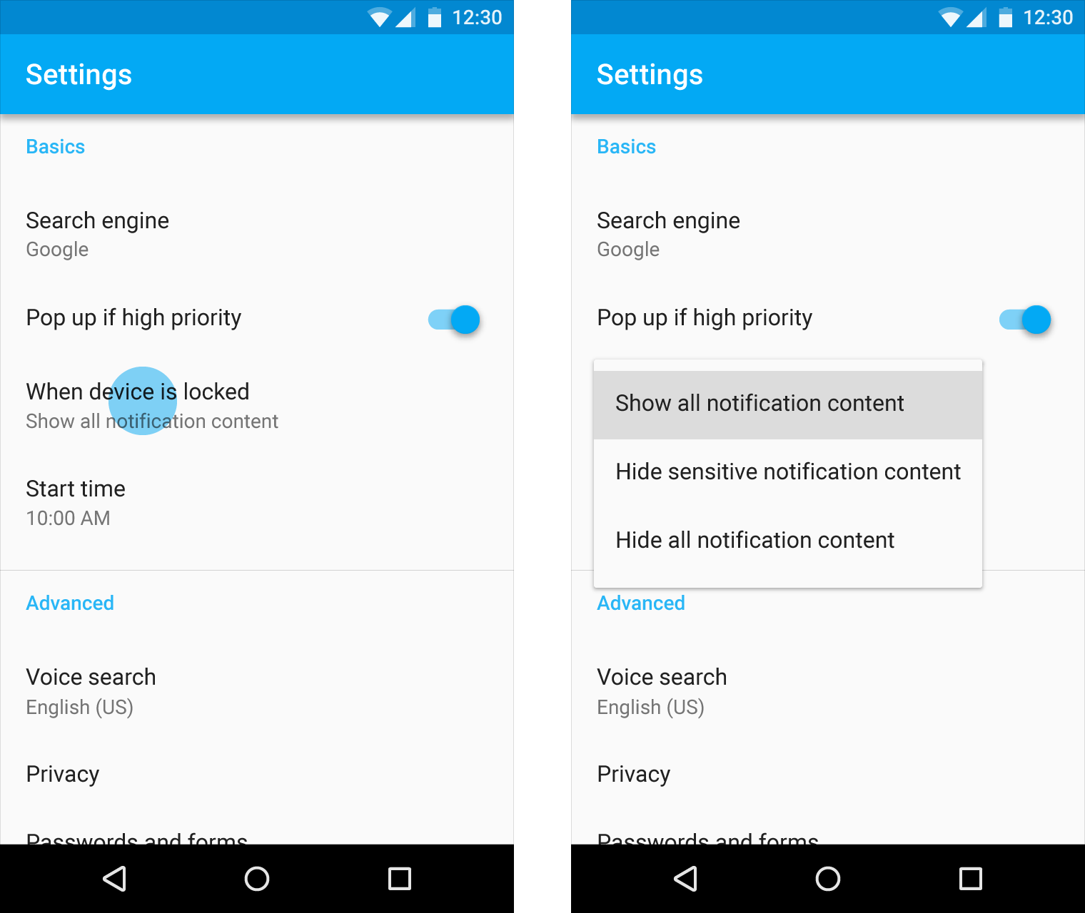
When opened, simple menus attempt to vertically align the currently selected menu item with the list item. The currently selected menu item is highlighted.
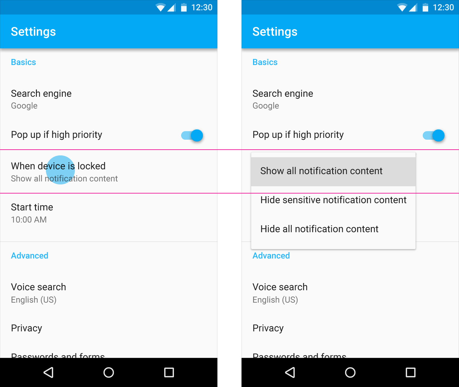
Do.
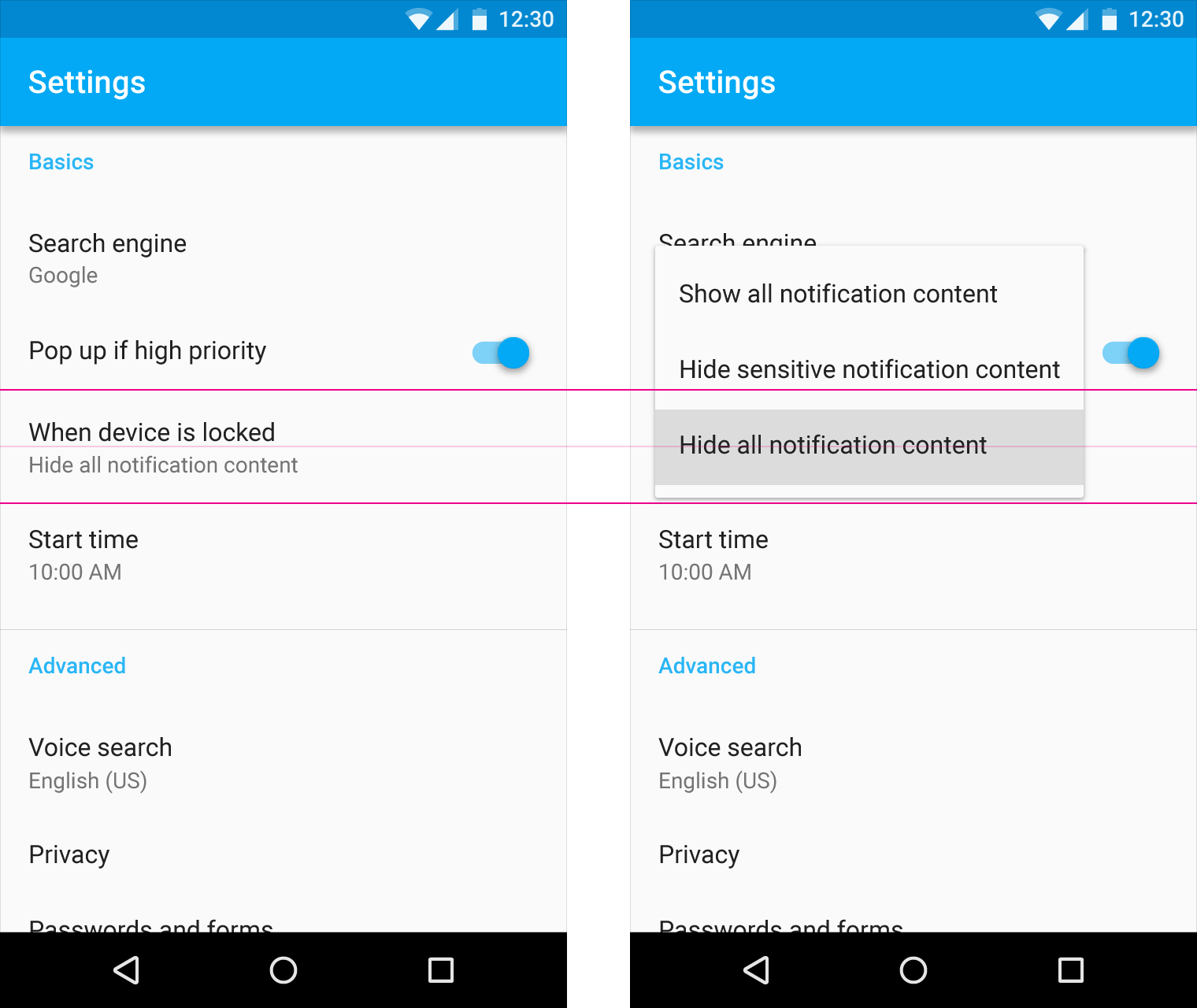
Do.
Do not arbitrarily position the first menu item over the list item.
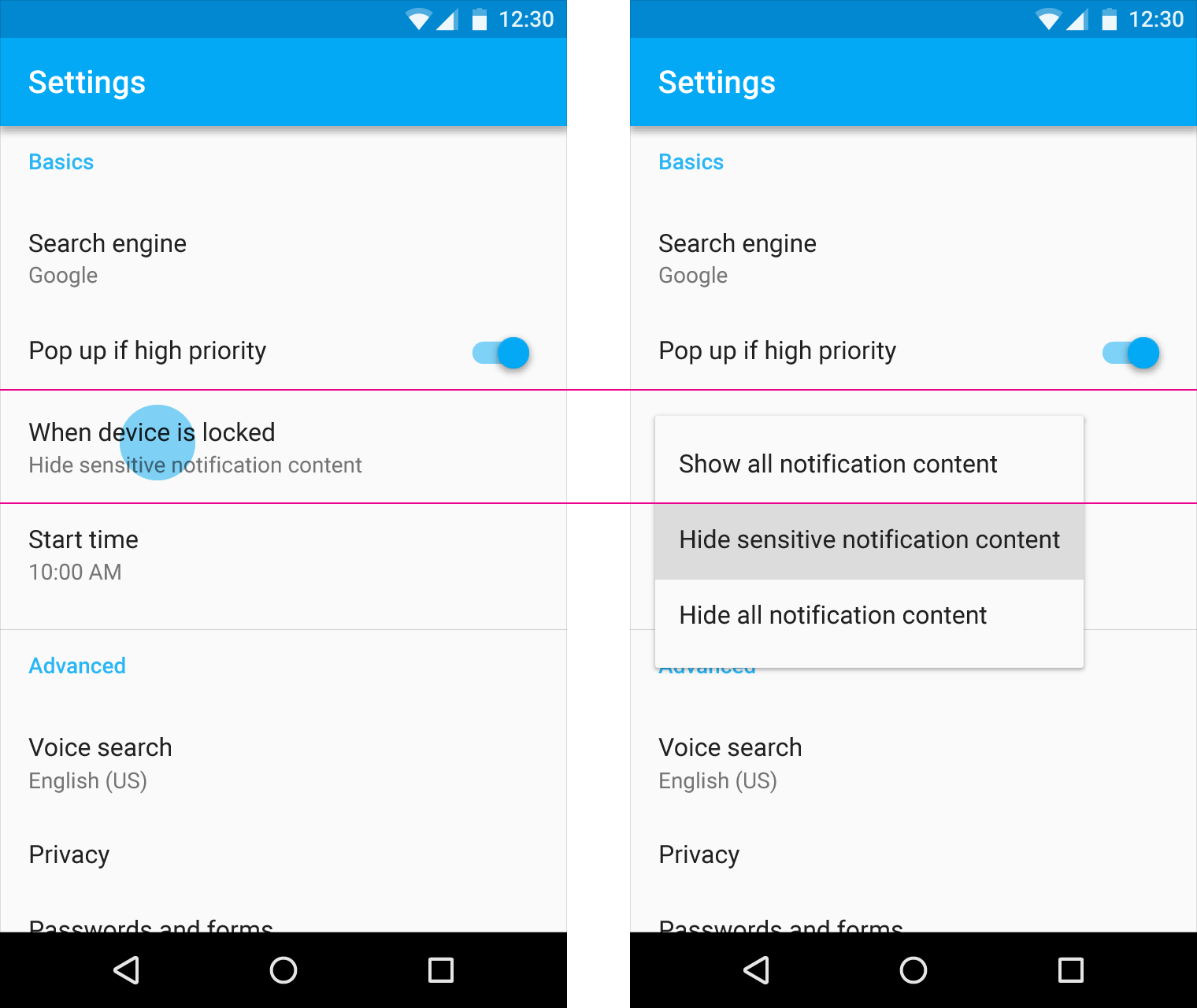
Don't.
When close to a screen edge, simple menus reposition their vertical alignment so that all menu items are completely visible.
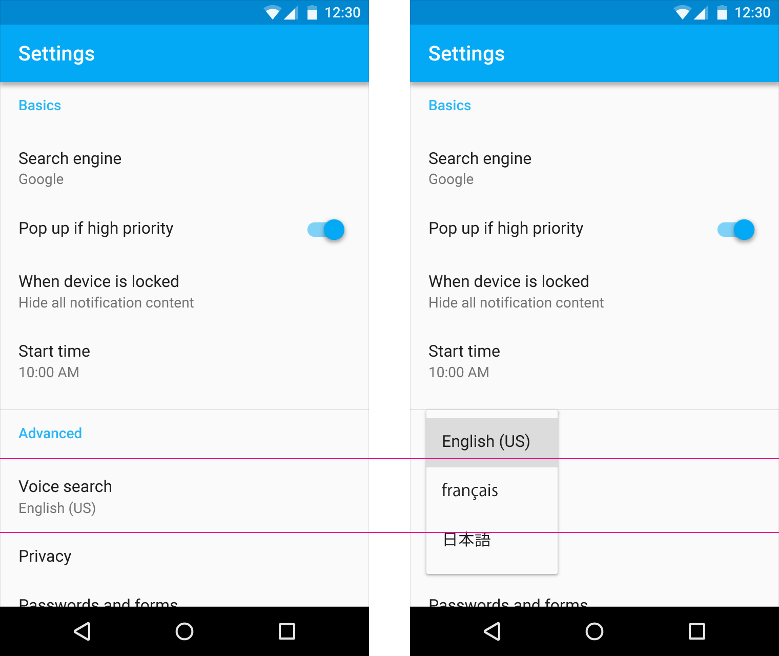
Do.
Simple menus appear over their emitting element, not below.
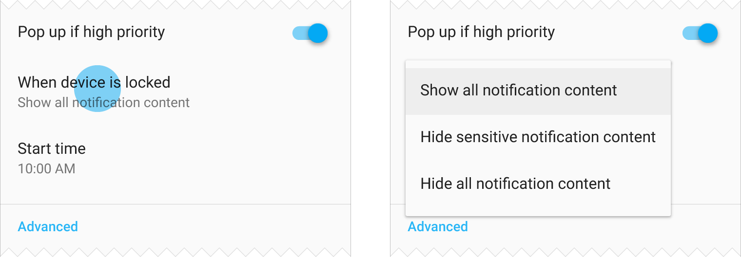
Do.
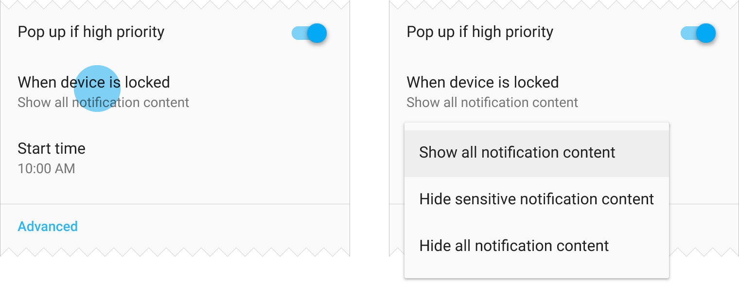
Don't.
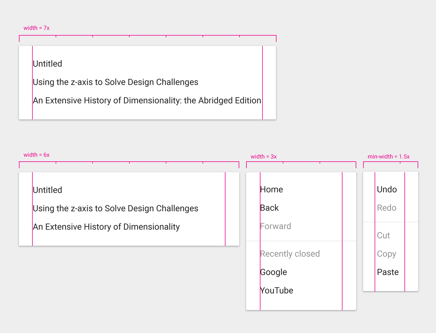
Menu width varies depending on string length, and on mobile is defined as a multiple of a 56dp unit.
Simple menus always maintain a 16dp margin (phone) or 24dp margin (tablet) to the left and right edges of the screen.
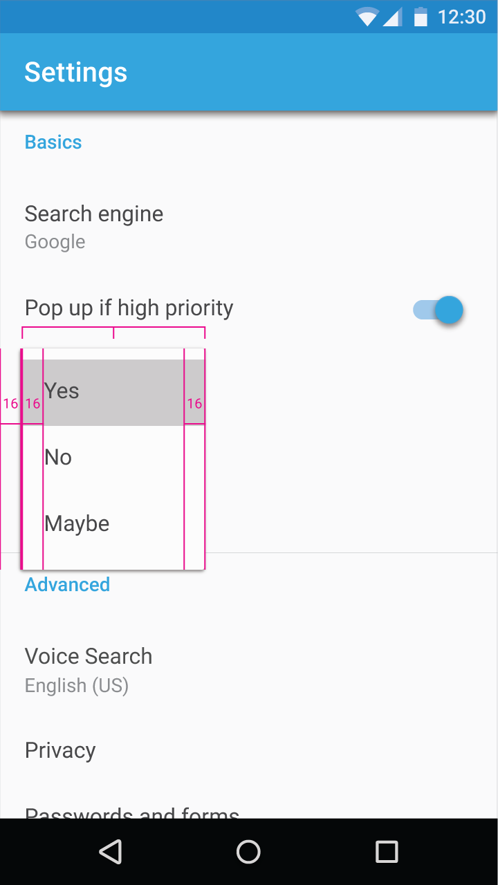
Each unit is 56dp wide.
Minimum width on mobile = 2 * 56dp = 112dp
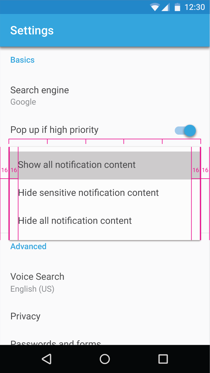
Each unit is 56dp wide.
Maximum width on mobile (in both portrait and landscape) = 5 * 56dp = 280dp
If text in a simple menu wraps to a second line, use a simple dialog instead. Simple dialogs can have rows with varying heights.
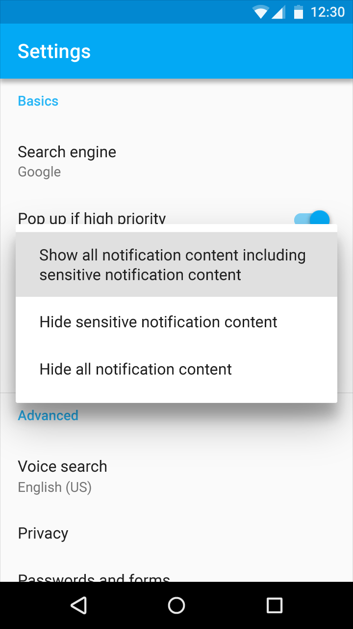
Do.
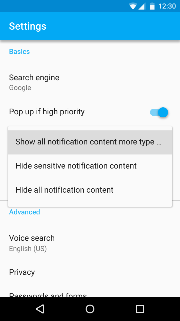
Don't.
Menus show a persistent scroll bar when content is scrollable.
The maximum height of a simple menu should be one or more rows less than the view height. This ensures a tappable area outside of the simple menu with which to dismiss the menu.
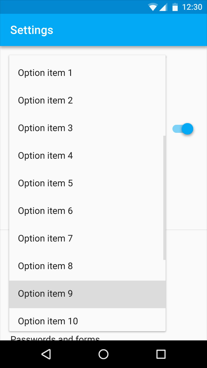
Do.
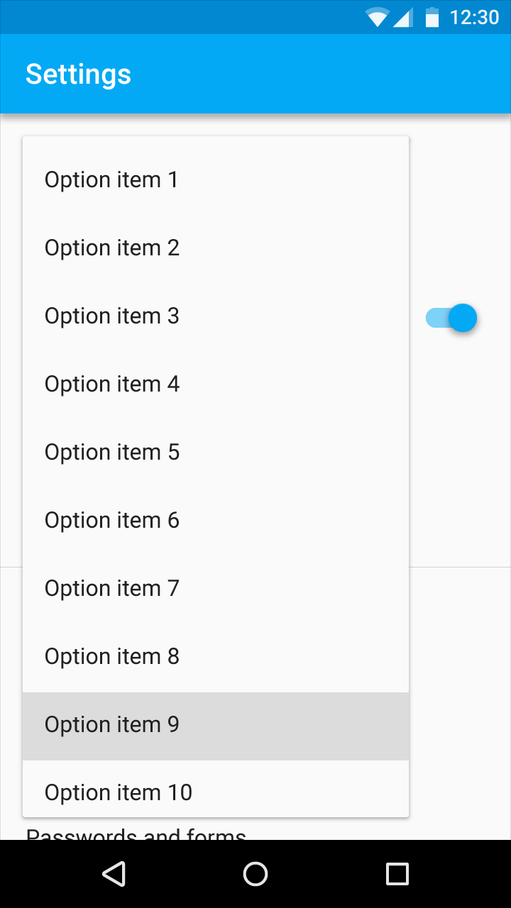
Don't.
Don't duplicate the selected menu item.
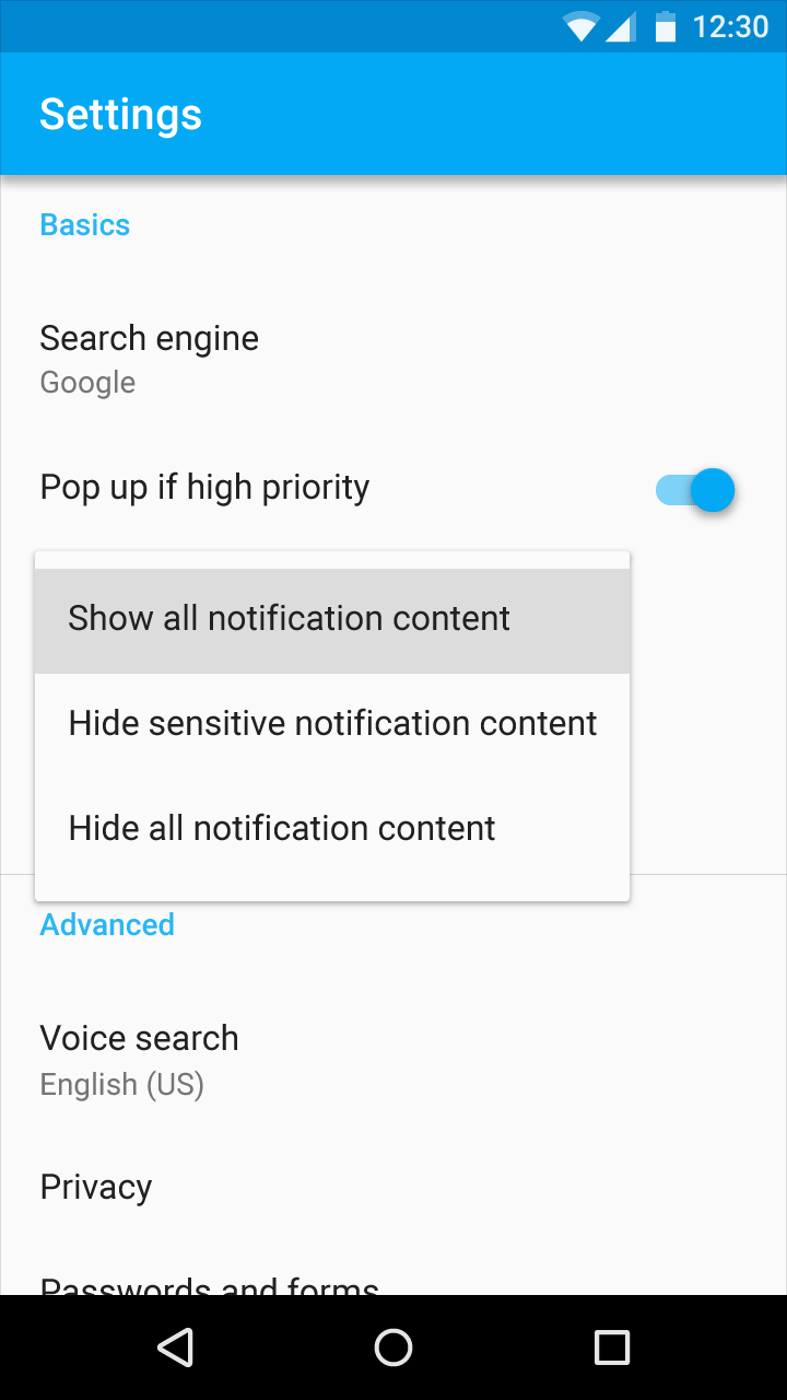
Do.
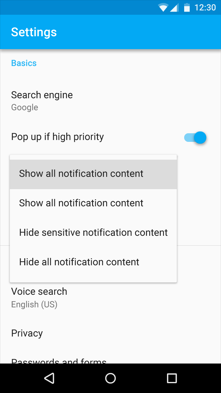
Don't.
Simple menus are always left-aligned with the start of the list item text and do not reposition horizontally based on the touch location.
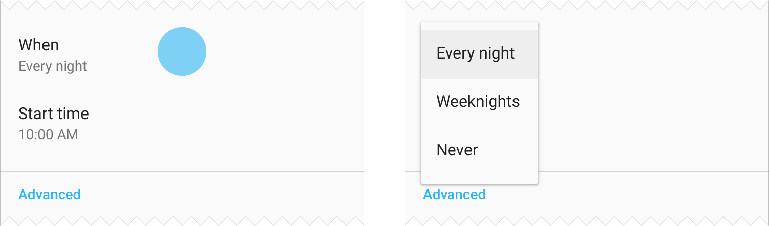
Do.
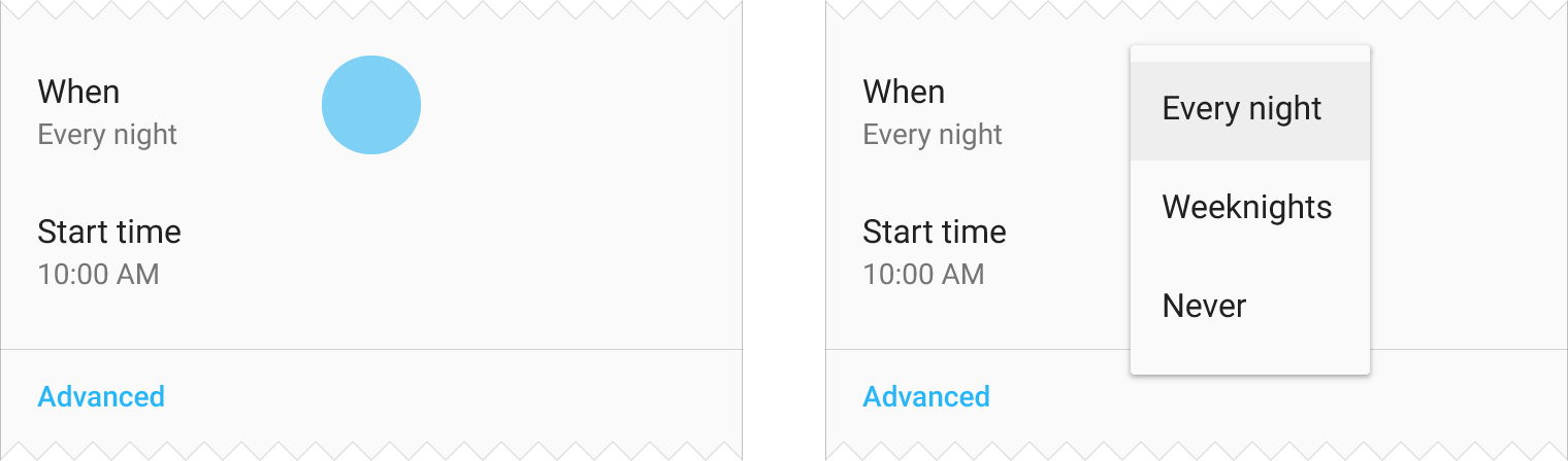
Don't.
Specs
Specs are provided for various sizes and types of menus and for different platforms. Add 8dp padding at the top and bottom of a menu.
The type style used for menus is defined by the Material typographic scale.
By default, menus use: 16sp (mobile devices), 15px (desktop)
Dense interfaces can use: 14sp (mobile devices), 13px (desktop)
Mobile
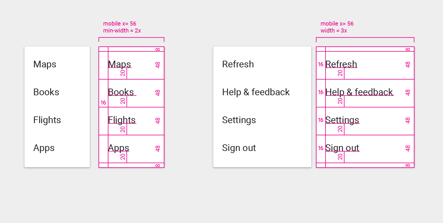
Menu item text left padding: 16dp
Menu item text bottom padding: 20dp
Top padding: 8dp
Bottom padding: 8dp
Typography: 16sp
Various widths
Desktop
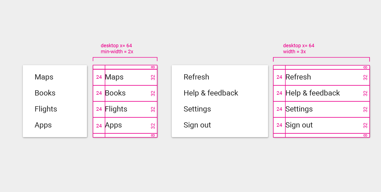
Menu item height: 32px
Menu item text left padding: 24px
Top padding: 8px
Bottom padding: 8px
Typography: 15px
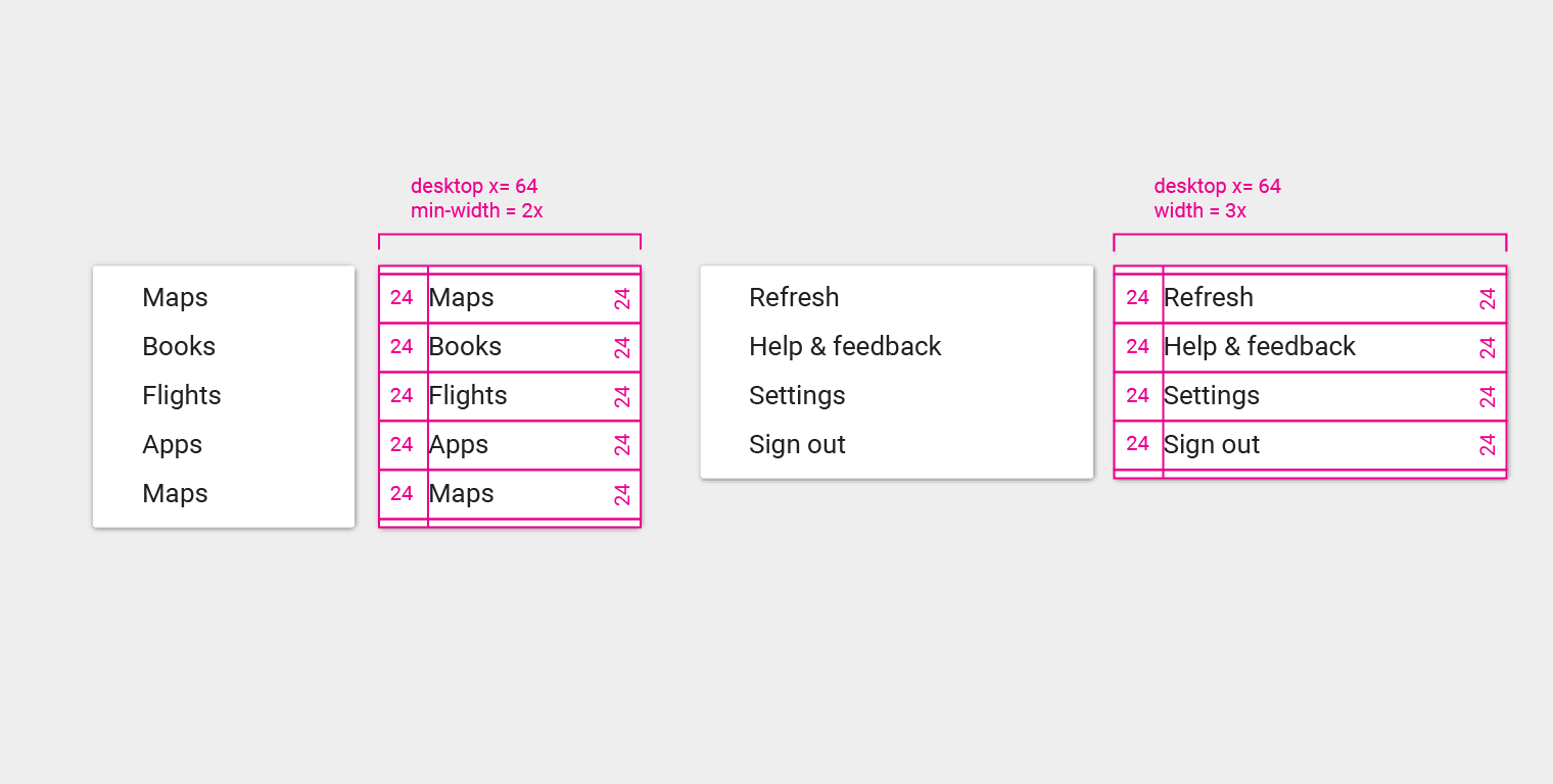
Menu item height: 24px
Menu item text left padding: 24px
Top padding: 4px
Bottom padding: 4px
Typography: 13px
Cascading menu
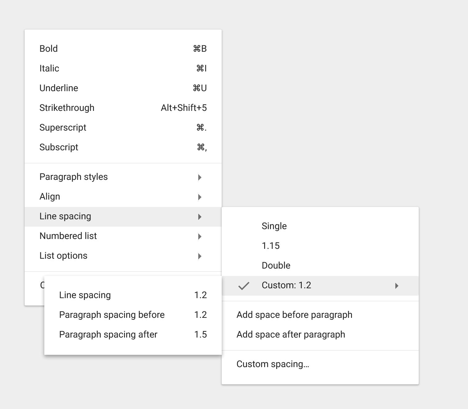
Cascading redlines
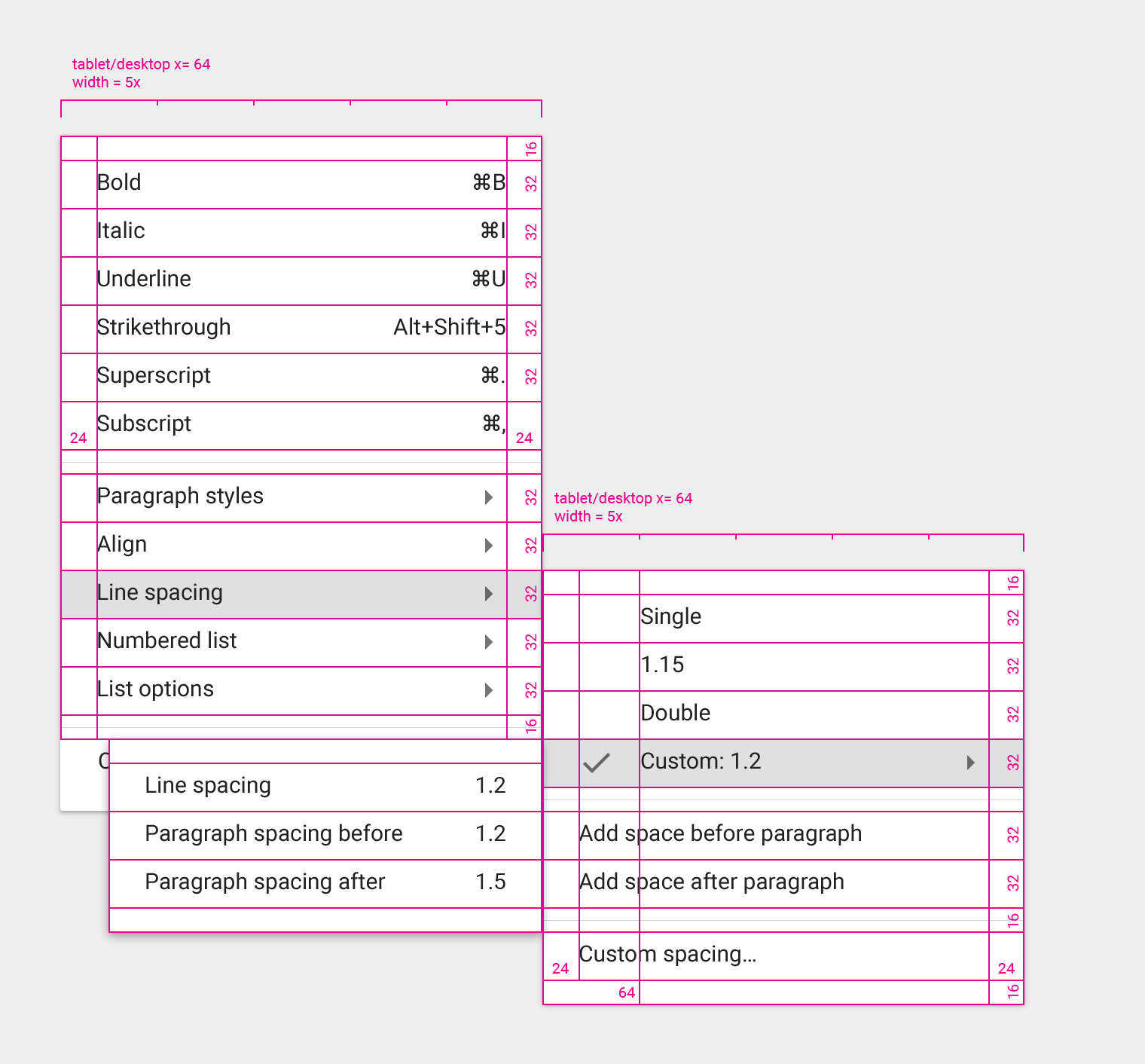
Cascading menu top padding: 16px
Cascading menu left padding: 24px
Cascading menu item height: 32px
Menu item icon right padding: 32px
Menu sub-item left padding: 64px
Typography: 15px
Dense Cascading menus can use 13px typography