

Symbolschaltflächen: Spezifikationen
Symbolschaltflächen ermöglichen Nutzern, Aktionen mit einem einzigen Fingertipp auszuführen.
Varianten

- Standard-Symbolschaltfläche
- Toggle-Symbolschaltfläche
| Variante | M3 | M3 Expressive |
|---|---|---|
| Default | Verfügbar | Verfügbar |
| Toggle (auswählbar) | Verfügbar | Verfügbar |
Konfigurationen
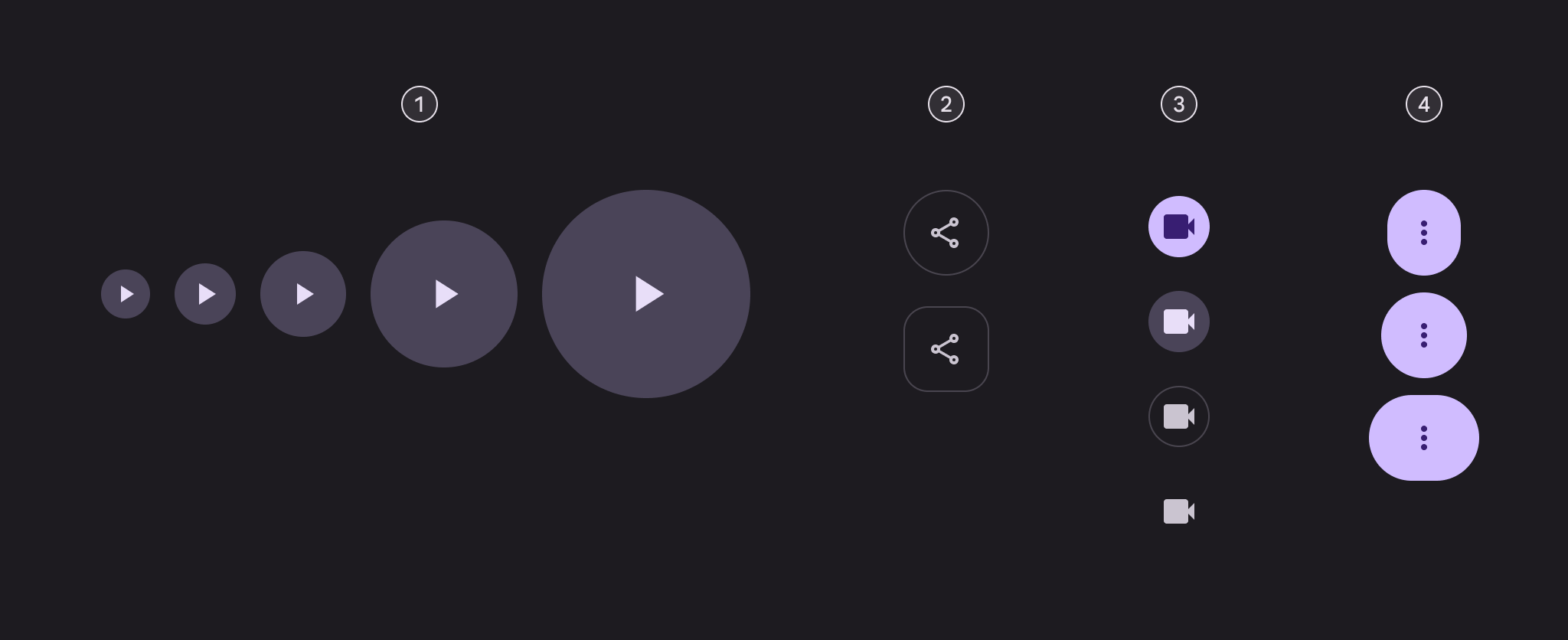
- Fünf Größen
- Zwei Formen
- Vier Farbstile
- Drei Breiten
| Kategorie | Optionen | M3 | M3 Expressive |
|---|---|---|---|
| Größe | Klein (Standard) | Verfügbar | Verfügbar |
| XS, M, L, XL | -- | Verfügbar | |
| Form | Rund (Standard) | Verfügbar | Verfügbar |
| Quadratisch | -- | Verfügbar | |
| Farbe | Filled (Standard), Tonal, Outlined, Standard | Verfügbar | Verfügbar |
| Breite | Standard | Verfügbar | Verfügbar |
| Schmal, breit | -- | Verfügbar |
Tokens und Spezifikationen
Die Token-Sets für Symbolschaltflächen sind in die Kategorien Common Tokens, Farbe und Größe gegliedert. Wählen Sie das gewünschte Token-Set über das Tabellenmenü aus. Weitere Informationen zu Design-Tokens
Symbolschaltfläche - Farbe - Filled
Symbolschaltfläche - Farbe - Tonal
Symbolschaltfläche - Farbe - Outlined
Symbolschaltfläche - Farbe - Standard
Symbolschaltfläche - Größe - Extraklein
| Token | Wert |
|---|---|
| Icon button xsmall container height | 32dp |
| Icon button xsmall icon size | 20dp |
| Icon button xsmall narrow leading space | 4dp |
| Icon button xsmall narrow trailing space | 4dp |
| Icon button xsmall default leading space | 6dp |
| Icon button xsmall default trailing space | 6dp |
| Icon button xsmall wide leading space | 10dp |
| Icon button xsmall wide trailing space | 10dp |
| Icon button xsmall container shape round | Circular |
| Icon button xsmall container shape square | 12dp |
| Icon button xsmall outline width | 1dp |
| Icon button xsmall shape pressed morph | 8dp |
| Icon button xsmall shape spring animation damping | 0.9 |
| Icon button xsmall shape spring animation stiffness | 1400 |
| Icon button xsmall selected container shape round | 12dp |
| Icon button xsmall selected container shape square | Circular |
Symbolschaltfläche - Größe - Klein
| Token | Wert |
|---|---|
| Icon button small container height | 40dp |
| Icon button small icon size | 24dp |
| Icon button small narrow leading space | 4dp |
| Icon button small narrow trailing space | 4dp |
| Icon button small default leading space | 8dp |
| Icon button small default trailing space | 8dp |
| Icon button small wide leading space | 14dp |
| Icon button small wide trailing space | 14dp |
| Icon button small container shape round | Circular |
| Icon button small container shape square | 12dp |
| Icon button small outline width | 1dp |
| Icon button small shape pressed morph | 8dp |
| Icon button small shape spring animation damping | 0.9 |
| Icon button small shape spring animation stiffness | 1400 |
| Icon button small selected container shape round | 12dp |
| Icon button small selected container shape square | Circular |
Symbolschaltfläche - Größe - Mittel
| Token | Wert |
|---|---|
| Icon button medium container height | 56dp |
| Icon button medium icon size | 24dp |
| Icon button medium narrow leading space | 12dp |
| Icon button medium narrow trailing space | 12dp |
| Icon button medium default leading space | 16dp |
| Icon button medium default trailing space | 16dp |
| Icon button medium wide leading space | 24dp |
| Icon button medium wide trailing space | 24dp |
| Icon button medium container shape round | Circular |
| Icon button medium container shape square | 16dp |
| Icon button medium outline width | 1dp |
| Icon button medium shape pressed morph | 12dp |
| Icon button medium shape spring animation damping | 0.9 |
| Icon button medium shape spring animation stiffness | 1400 |
| Icon button medium selected container shape round | 16dp |
| Icon button medium selected container shape square | Circular |
Symbolschaltfläche - Größe - Groß
| Token | Wert |
|---|---|
| Icon button large container height | 96dp |
| Icon button large icon size | 32dp |
| Icon button large narrow leading space | 16dp |
| Icon button large narrow trailing space | 16dp |
| Icon button large default leading space | 32dp |
| Icon button large default trailing space | 32dp |
| Icon button large wide leading space | 48dp |
| Icon button large wide trailing space | 48dp |
| Icon button large container shape round | Circular |
| Icon button large container shape square | 28dp |
| Icon button large outline width | 2dp |
| Icon button large shape pressed morph | 16dp |
| Icon button large shape spring animation damping | 0.9 |
| Icon button large shape spring animation stiffness | 1400 |
| Icon button large selected container shape round | 28dp |
| Icon button large selected container shape square | Circular |
Symbolschaltfläche - Größe - Extragroß
| Token | Wert |
|---|---|
| Icon button xlarge container height | 136dp |
| Icon button xlarge icon size | 40dp |
| Icon button xlarge narrow leading space | 32dp |
| Icon button xlarge narrow trailing space | 32dp |
| Icon button xlarge default leading space | 48dp |
| Icon button xlarge default trailing space | 48dp |
| Icon button xlarge wide leading space | 72dp |
| Icon button xlarge wide trailing space | 72dp |
| Icon button xlarge container shape round | Circular |
| Icon button xlarge container shape square | 28dp |
| Icon button xlarge outline width | 3dp |
| Icon button xlarge shape pressed morph | 16dp |
| Icon button xlarge shape spring animation damping | 0.9 |
| Icon button xlarge shape spring animation stiffness | 1400 |
| Icon button xlarge selected container shape round | 28dp |
| Icon button xlarge selected container shape square | Circular |
Anatomie

- Symbol
- Container
Farbe
Farben werden über Design-Tokens umgesetzt. Designer verwenden Farbwerte, die den Tokens entsprechen; in der Implementierung ist ein Farbwert ein Token, das auf einen konkreten Wert verweist.
Es gibt vier vordefinierte Farbstile: Filled, Tonal, Outlined und Standard. Default- und Toggle-Schaltflächen verwenden je nach Stil unterschiedliche Farbrollen.
TIP
Diese Farbrollen sorgen für Kohärenz und Wiedererkennbarkeit im Design. Andere Farbrollen sind zulässig, sofern Container und Text ein Kontrastverhältnis von 3:1 einhalten, zum Beispiel Tertiary und On Tertiary.
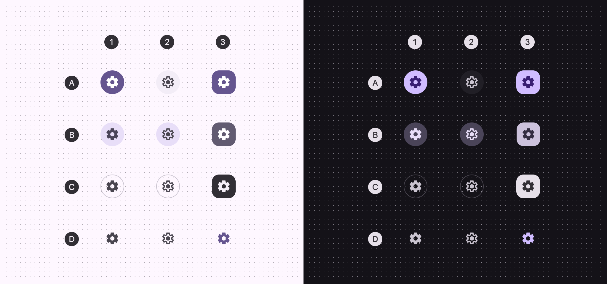
A: Filled, B: Tonal, C: Outlined, D: Standard
- Default
- Toggle, nicht ausgewählt
- Toggle, ausgewählt
| 1. Default | 2. Toggle, nicht ausgewählt | 3. Toggle, ausgewählt | |
|---|---|---|---|
| Filled-Container Filled-Icon | Primary On primary | Surface container On surface variant | Primary On primary |
| Tonal-Container Tonal-Icon | Secondary container On secondary container | Secondary container On secondary container | Secondary On secondary |
| Outlined-Container Outlined-Icon | Outline variant (outline) On surface variant | Outline variant (outline) On surface variant | Inverse surface Inverse on surface |
| Standard-Icon | On surface variant | On surface variant | Primary |
Zustände
Zustände sind visuelle Darstellungen, die den Status einer Komponente oder eines interaktiven Elements kommunizieren. Zustandsebene verändern die Schaltflächenfarbe nur geringfügig. Deaktivierte Zustände verwenden abweichende Basisfarben. Details zu den Tokens ansehenZustände der Filled-Symbolschaltfläche
Default
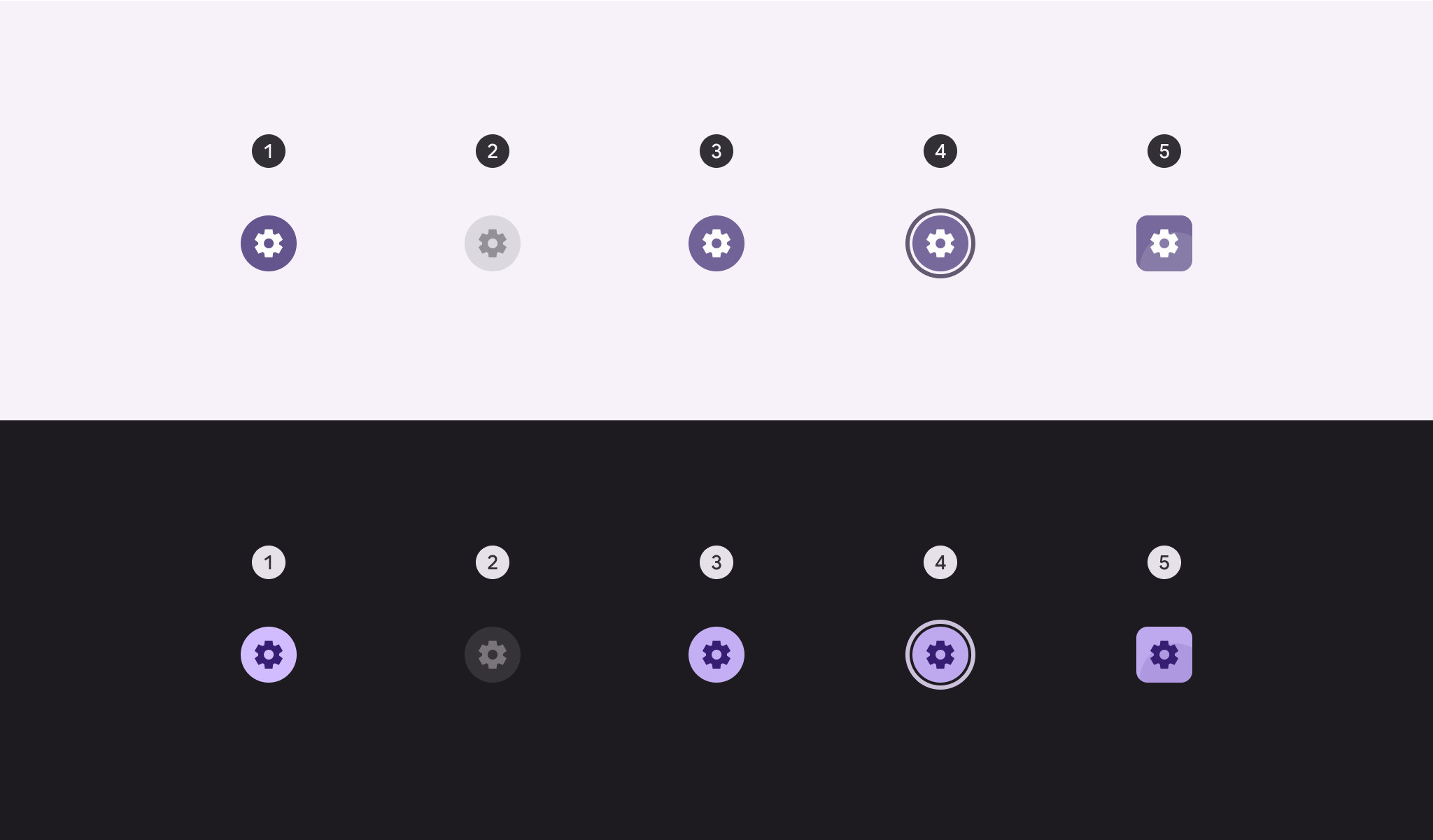
- Aktiviert
- Deaktiviert (10 % Zustandsebene)
- Hover (8 % Zustandsebene)
- Fokussiert (10 % Zustandsebene)
- Gedrückt (10 % Zustandsebene)
Toggle
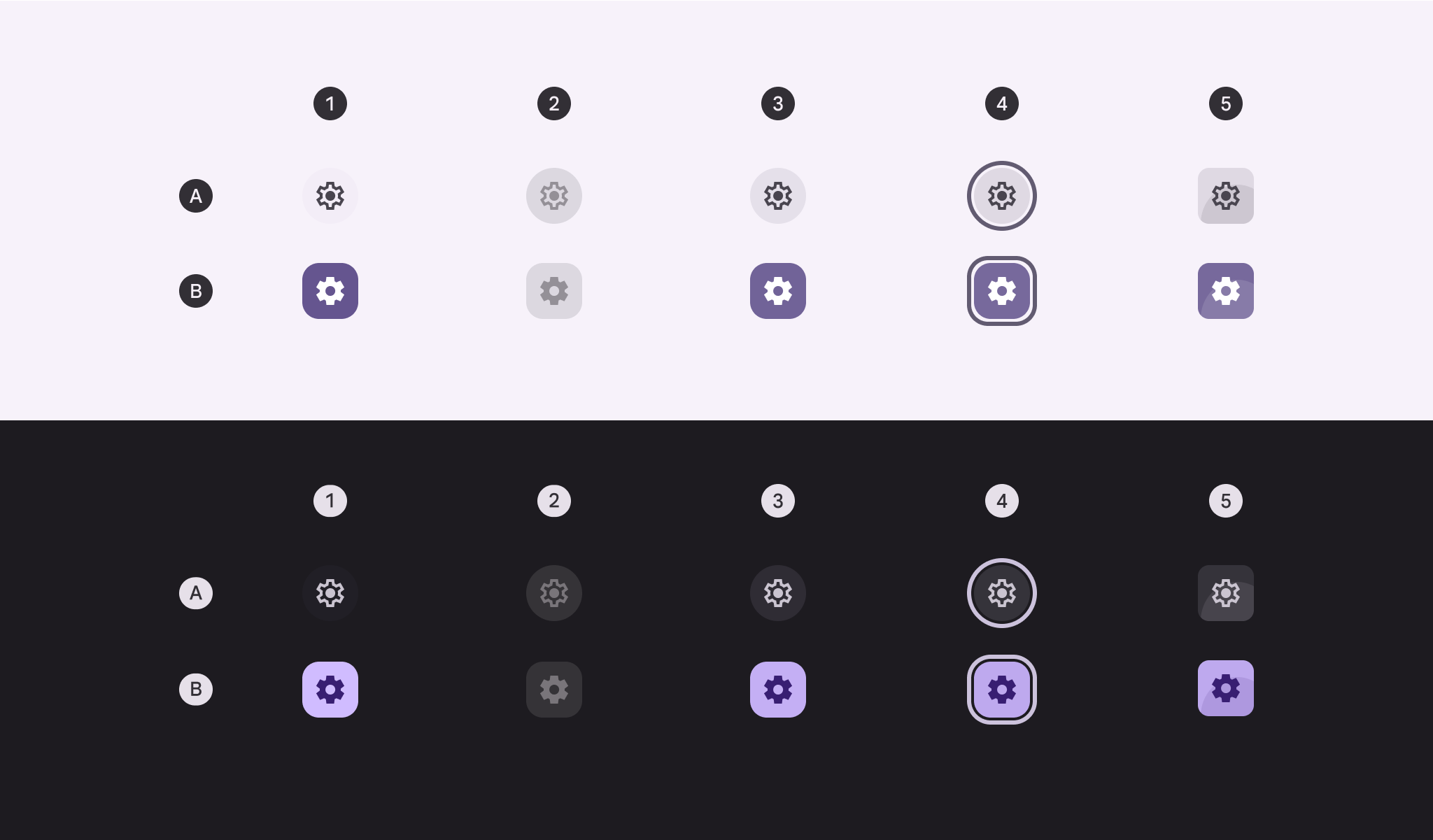
A: Nicht ausgewählt. B: Ausgewählt
- Aktiviert
- Deaktiviert (10 % Zustandsebene)
- Hover (8 % Zustandsebene)
- Fokussiert (10 % Zustandsebene)
- Gedrückt (10 % Zustandsebene)
Zustände der Tonal-Symbolschaltfläche
Default
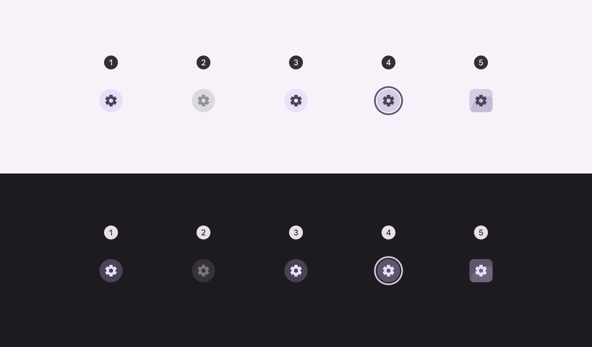
- Aktiviert
- Deaktiviert (10 % Zustandsebene)
- Hover (8 % Zustandsebene)
- Fokussiert (10 % Zustandsebene)
- Gedrückt (10 % Zustandsebene)
Toggle
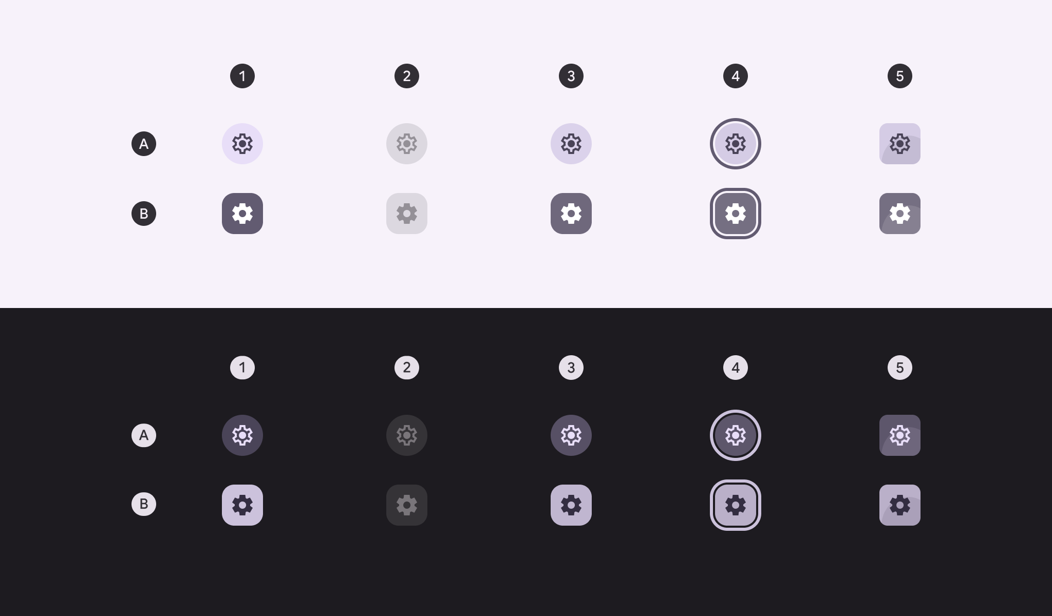
A: Nicht ausgewählt. B: Ausgewählt
- Aktiviert
- Deaktiviert (10 % Zustandsebene)
- Hover (8 % Zustandsebene)
- Fokussiert (10 % Zustandsebene)
- Gedrückt (10 % Zustandsebene)
Zustände der Outlined-Symbolschaltfläche
Default
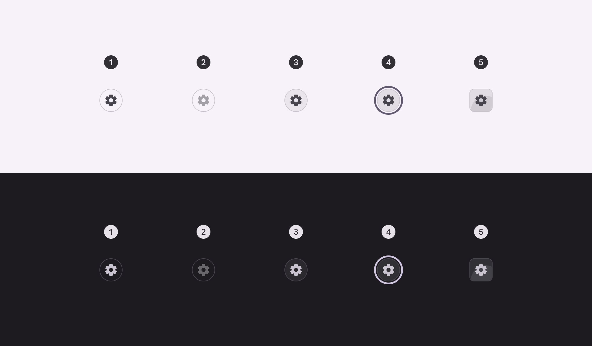
- Aktiviert
- Deaktiviert (10 % Zustandsebene)
- Hover (8 % Zustandsebene)
- Fokussiert (10 % Zustandsebene)
- Gedrückt (10 % Zustandsebene)
Toggle
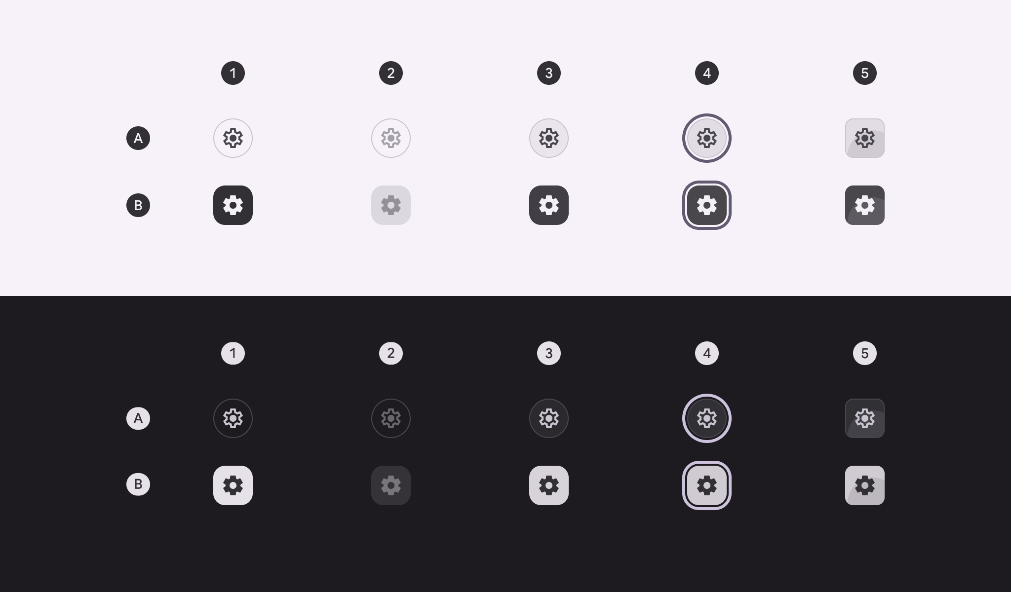
A: Nicht ausgewählt. B: Ausgewählt
- Aktiviert
- Deaktiviert (10 % Zustandsebene)
- Hover (8 % Zustandsebene)
- Fokussiert (10 % Zustandsebene)
- Gedrückt (10 % Zustandsebene)
Zustände der Standard-Symbolschaltfläche
Der Container der Standard-Symbolschaltfläche ist im Ruhezustand unsichtbar und wird erst sichtbar, wenn eine Zustandsebene angewendet wird.
Default
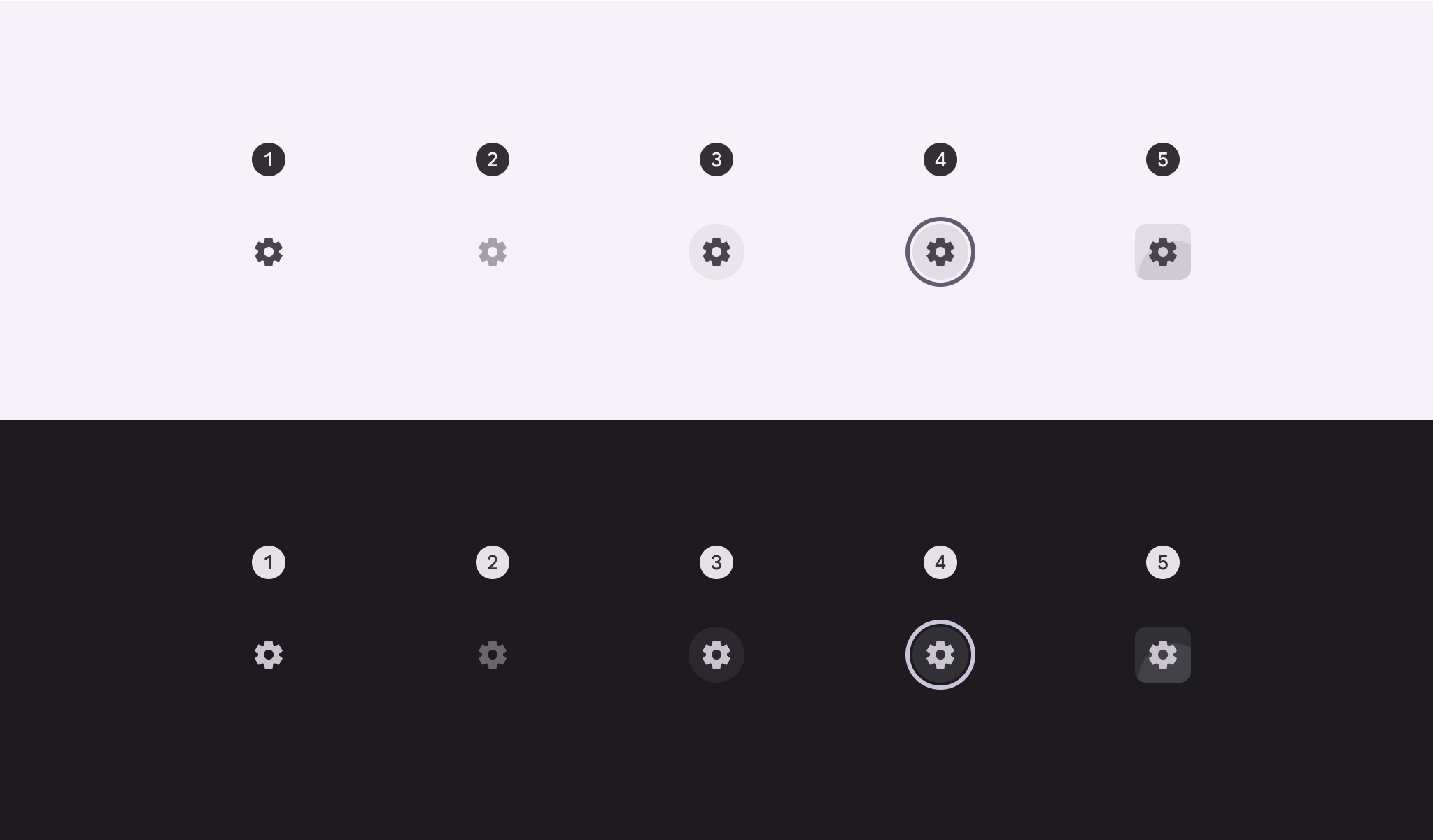
- Aktiviert
- Deaktiviert (10 % Zustandsebene)
- Hover (8 % Zustandsebene)
- Fokussiert (10 % Zustandsebene)
- Gedrückt (10 % Zustandsebene)
Toggle
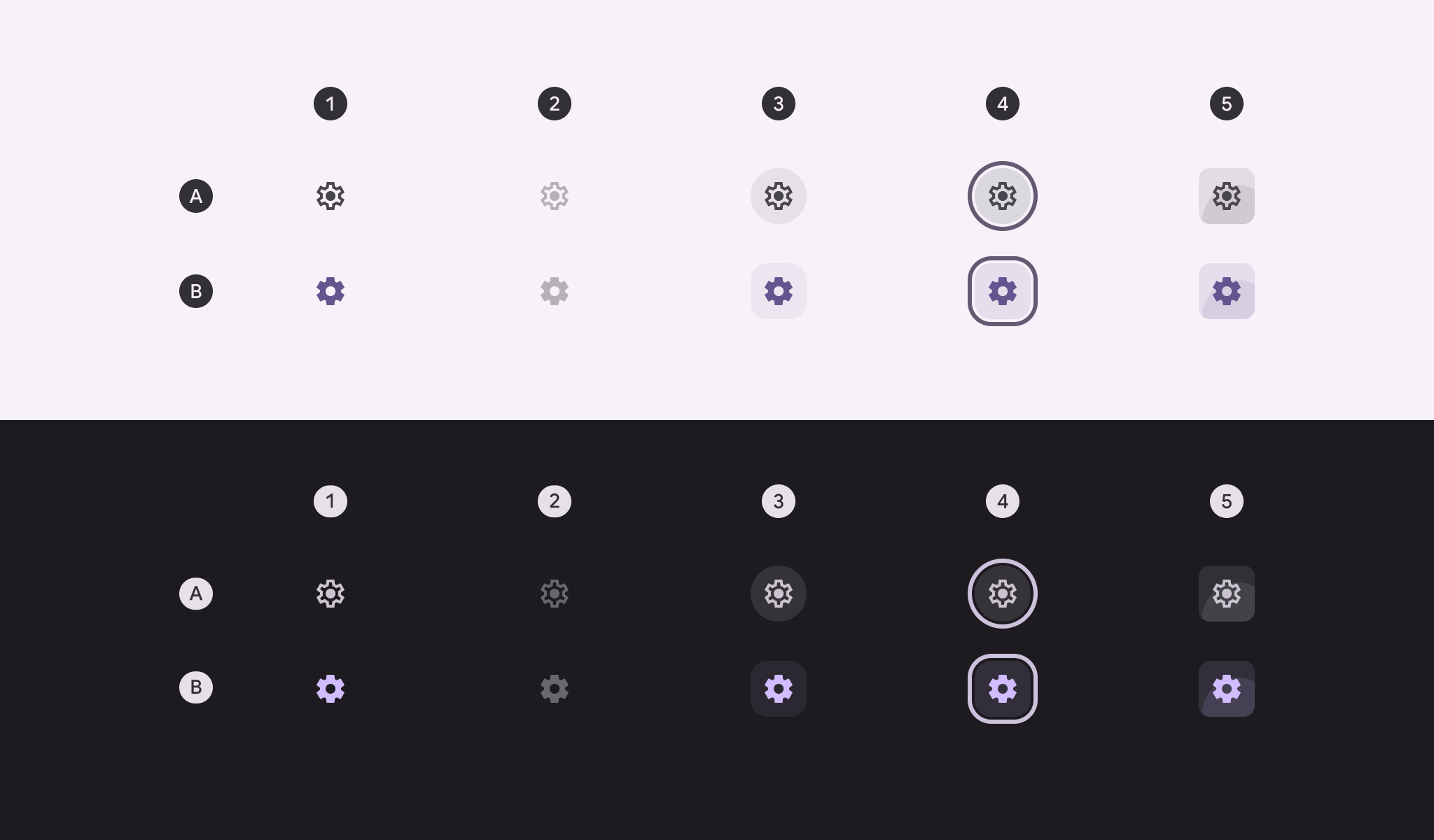
A: Nicht ausgewählt. B: Ausgewählt
- Aktiviert
- Deaktiviert (10 % Zustandsebene)
- Hover (8 % Zustandsebene)
- Fokussiert (10 % Zustandsebene)
- Gedrückt (10 % Zustandsebene)
Formänderung
Gedrückter Zustand
Im gedrückten Zustand können Symbolschaltflächen ihre Form verändern und eckiger werden.
Runde und quadratische Symbolschaltflächen sollten im gedrückten Zustand denselben Eckradius aufweisen.
Der Eckradius hängt von der Schaltflächengröße ab. Vollständige Eckmaße von Symbolschaltflächen anzeigen
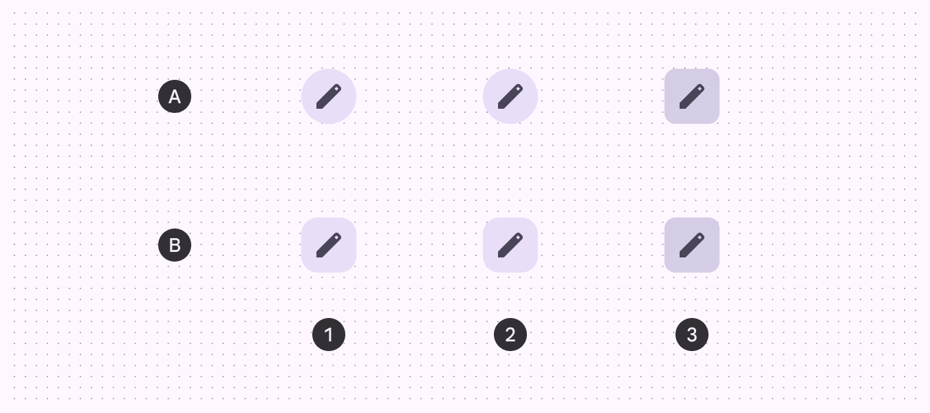
A. Rund, B. Quadratisch
- Aktiviert
- Hover
- Gedrückt
Im ausgewählten Zustand
Neben der Formänderung im gedrückten Zustand wechseln Toggle-Symbolschaltflächen standardmäßig auch im Ruhezustand die Form – von rund (nicht ausgewählt) zu quadratisch (ausgewählt).
Ist die Ruheform quadratisch, sollte die Form im ausgewählten Zustand rund sein.
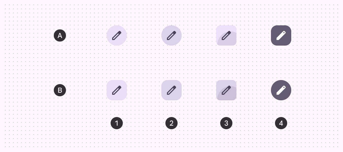
A. Rund, B. Quadratisch
- Aktiviert
- Hover
- Gedrückt
- Ausgewählt
Abmessungen
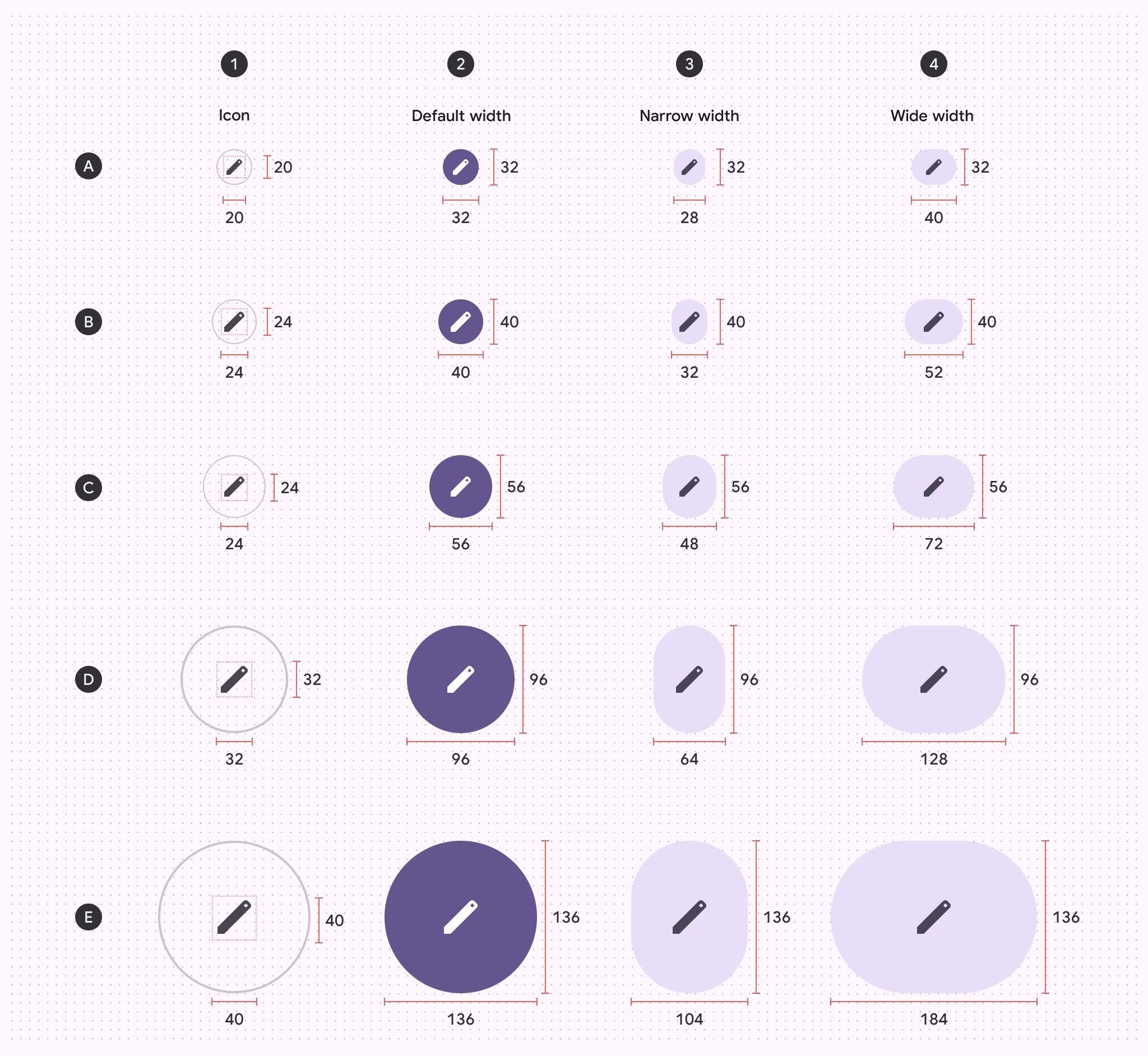
A. Extraklein, B. Klein, C. Mittel, D. Groß, E. Extra-groß
- Symbolgröße
- Breite: Standard
- Breite: Schmal
- Breite: Breit
Zielgrößen
Extrakleine und kleine Symbolschaltflächen müssen eine Zielgröße von mindestens 48 × 48 dp aufweisen, um die Anforderungen an die Barrierefreiheit zu erfüllen.
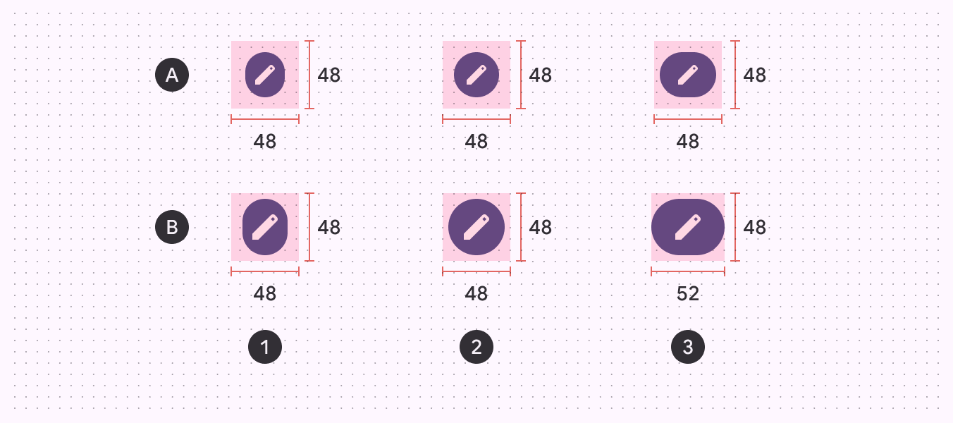
A. Extrakleiner Symbolschaltfläche, B. Kleiner Symbolschaltfläche
- Breite: Schmal
- Breite: Standard
- Breite: Breit
Eckradius der Schaltflächen
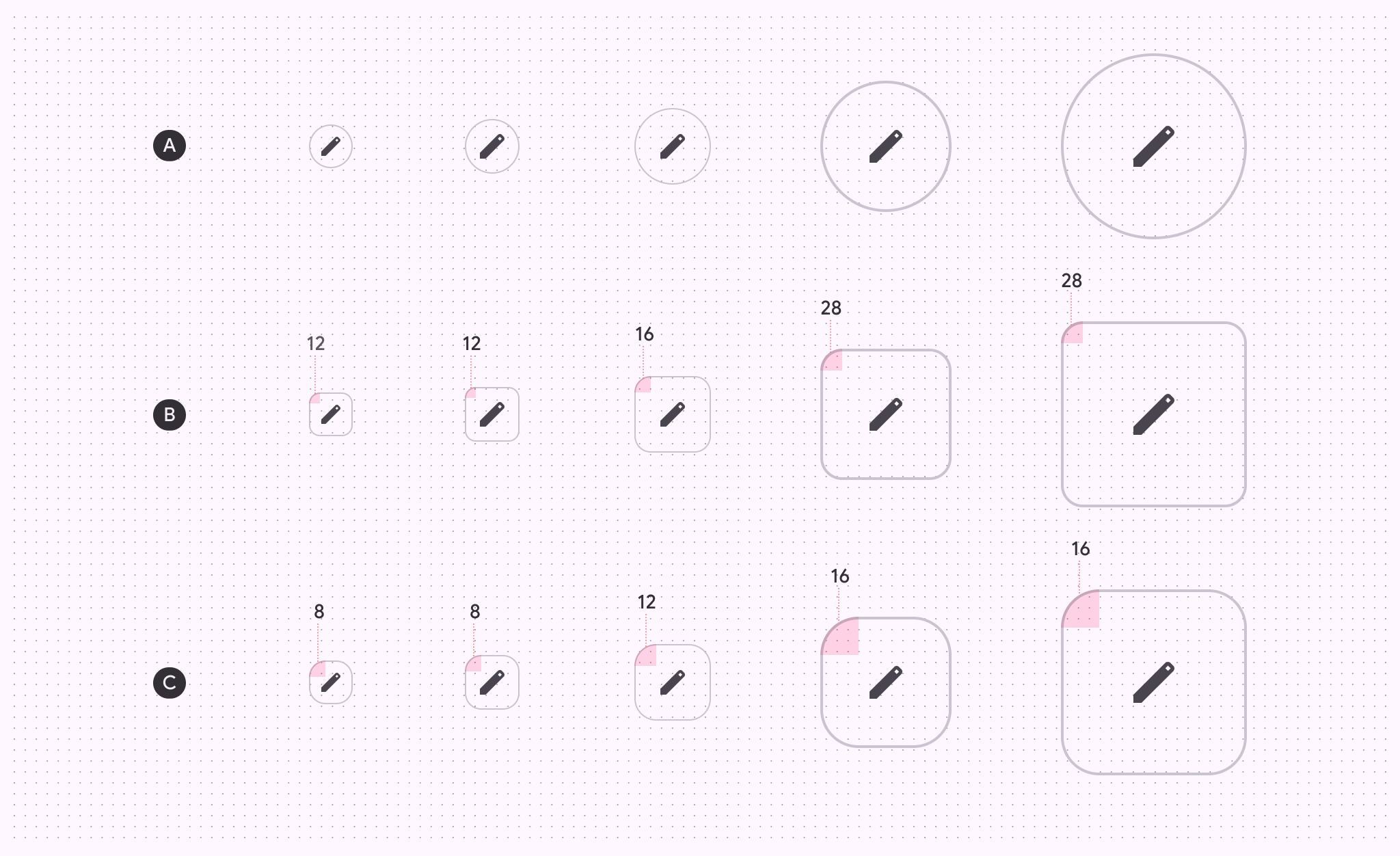
| XS | S | M | L | XL | |
|---|---|---|---|---|---|
| A. Runder Schaltfläche | Voll gerundet | Voll gerundet | Voll gerundet | Voll gerundet | Voll gerundet |
| B. Quadratischer Schaltfläche | 12 dp | 12 dp | 16 dp | 28 dp | 28 dp |
| C. Gedrückter Zustand | 8 dp | 8 dp | 12 dp | 16 dp | 16 dp |
Baseline-Tokens
Wählen Sie das gewünschte Token-Set über das Tabellenmenü aus. Die Tokens für Filled-, Tonal- und Outlined-Symbolschaltflächen gelten mit Einführung der neuen Token-Sets als veraltet. Alle anderen Tokens bleiben im Modul oben auf der Seite verfügbar.