

アイコンボタン:仕様
アイコンボタンは、1回のタップでアクションを実行するためのコンポーネントです。
バリアント

- デフォルトアイコンボタン
- トグルアイコンボタン
| バリアント | M3 | M3 Expressive |
|---|---|---|
| デフォルト | 利用可能 | 利用可能 |
| トグル(選択) | 利用可能 | 利用可能 |
構成
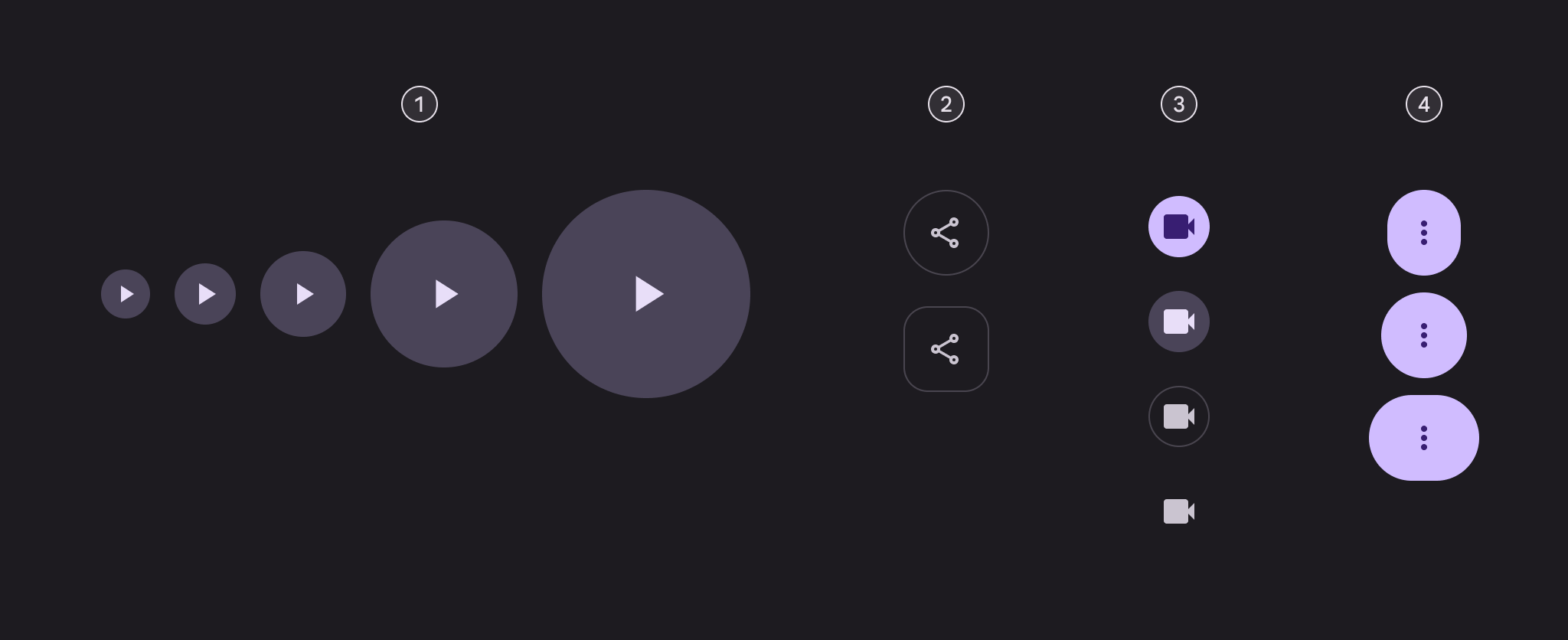
- 5つのサイズ
- 2つのシェイプ
- 4つのカラースタイル
- 3つの幅
| カテゴリ | オプション | M3 | M3 Expressive |
|---|---|---|---|
| サイズ | 小(デフォルト) | 利用可能 | 利用可能 |
| XS、M、L、XL | -- | 利用可能 | |
| シェイプ | 丸型(デフォルト) | 利用可能 | 利用可能 |
| 角型 | -- | 利用可能 | |
| カラー | 塗りつぶし(デフォルト)、トーナル、アウトライン、スタンダード | 利用可能 | 利用可能 |
| 幅 | デフォルト | 利用可能 | 利用可能 |
| ナロー、ワイド | -- | 利用可能 |
トークンと仕様
アイコンボタンのトークンセットは、共通トークン、カラー、サイズごとに整理されています。表内のメニューからトークンセットを選択してください。デザイントークンについて学ぶ
アイコンボタン - カラー - 塗りつぶし
アイコンボタン - カラー - トーナル
アイコンボタン - カラー - アウトライン
アイコンボタン - カラー - スタンダード
アイコンボタン - サイズ - 極小
| Token | 値 |
|---|---|
| Icon button xsmall container height | 32dp |
| Icon button xsmall icon size | 20dp |
| Icon button xsmall narrow leading space | 4dp |
| Icon button xsmall narrow trailing space | 4dp |
| Icon button xsmall default leading space | 6dp |
| Icon button xsmall default trailing space | 6dp |
| Icon button xsmall wide leading space | 10dp |
| Icon button xsmall wide trailing space | 10dp |
| Icon button xsmall container shape round | Circular |
| Icon button xsmall container shape square | 12dp |
| Icon button xsmall outline width | 1dp |
| Icon button xsmall shape pressed morph | 8dp |
| Icon button xsmall shape spring animation damping | 0.9 |
| Icon button xsmall shape spring animation stiffness | 1400 |
| Icon button xsmall selected container shape round | 12dp |
| Icon button xsmall selected container shape square | Circular |
アイコンボタン - サイズ - 小
| Token | 値 |
|---|---|
| Icon button small container height | 40dp |
| Icon button small icon size | 24dp |
| Icon button small narrow leading space | 4dp |
| Icon button small narrow trailing space | 4dp |
| Icon button small default leading space | 8dp |
| Icon button small default trailing space | 8dp |
| Icon button small wide leading space | 14dp |
| Icon button small wide trailing space | 14dp |
| Icon button small container shape round | Circular |
| Icon button small container shape square | 12dp |
| Icon button small outline width | 1dp |
| Icon button small shape pressed morph | 8dp |
| Icon button small shape spring animation damping | 0.9 |
| Icon button small shape spring animation stiffness | 1400 |
| Icon button small selected container shape round | 12dp |
| Icon button small selected container shape square | Circular |
アイコンボタン - サイズ - 中
| Token | 値 |
|---|---|
| Icon button medium container height | 56dp |
| Icon button medium icon size | 24dp |
| Icon button medium narrow leading space | 12dp |
| Icon button medium narrow trailing space | 12dp |
| Icon button medium default leading space | 16dp |
| Icon button medium default trailing space | 16dp |
| Icon button medium wide leading space | 24dp |
| Icon button medium wide trailing space | 24dp |
| Icon button medium container shape round | Circular |
| Icon button medium container shape square | 16dp |
| Icon button medium outline width | 1dp |
| Icon button medium shape pressed morph | 12dp |
| Icon button medium shape spring animation damping | 0.9 |
| Icon button medium shape spring animation stiffness | 1400 |
| Icon button medium selected container shape round | 16dp |
| Icon button medium selected container shape square | Circular |
アイコンボタン - サイズ - 大
| Token | 値 |
|---|---|
| Icon button large container height | 96dp |
| Icon button large icon size | 32dp |
| Icon button large narrow leading space | 16dp |
| Icon button large narrow trailing space | 16dp |
| Icon button large default leading space | 32dp |
| Icon button large default trailing space | 32dp |
| Icon button large wide leading space | 48dp |
| Icon button large wide trailing space | 48dp |
| Icon button large container shape round | Circular |
| Icon button large container shape square | 28dp |
| Icon button large outline width | 2dp |
| Icon button large shape pressed morph | 16dp |
| Icon button large shape spring animation damping | 0.9 |
| Icon button large shape spring animation stiffness | 1400 |
| Icon button large selected container shape round | 28dp |
| Icon button large selected container shape square | Circular |
アイコンボタン - サイズ - 特大
| Token | 値 |
|---|---|
| Icon button xlarge container height | 136dp |
| Icon button xlarge icon size | 40dp |
| Icon button xlarge narrow leading space | 32dp |
| Icon button xlarge narrow trailing space | 32dp |
| Icon button xlarge default leading space | 48dp |
| Icon button xlarge default trailing space | 48dp |
| Icon button xlarge wide leading space | 72dp |
| Icon button xlarge wide trailing space | 72dp |
| Icon button xlarge container shape round | Circular |
| Icon button xlarge container shape square | 28dp |
| Icon button xlarge outline width | 3dp |
| Icon button xlarge shape pressed morph | 16dp |
| Icon button xlarge shape spring animation damping | 0.9 |
| Icon button xlarge shape spring animation stiffness | 1400 |
| Icon button xlarge selected container shape round | 28dp |
| Icon button xlarge selected container shape square | Circular |
構造

- アイコン
- コンテナ
カラー
カラー値はデザイントークンによって実装されます。デザイナーは各トークンに対応するカラー値を使用し、実装ではカラー値は値を参照するトークンになります。
組み込みのカラースタイルは、塗りつぶし、トーナル、アウトライン、スタンダードの4種類です。デフォルトアイコンボタンとトグルアイコンボタンでは、スタイルごとに異なるカラーロールを使用します。
TIP
これらのカラーロールは、デザインの一貫性と親しみやすさを生み出すために選ばれています。コンテナとテキストのコントラスト比が3:1以上であれば、他のカラーロールも使用できます。たとえば、ターシャリとオンターシャリの組み合わせです。
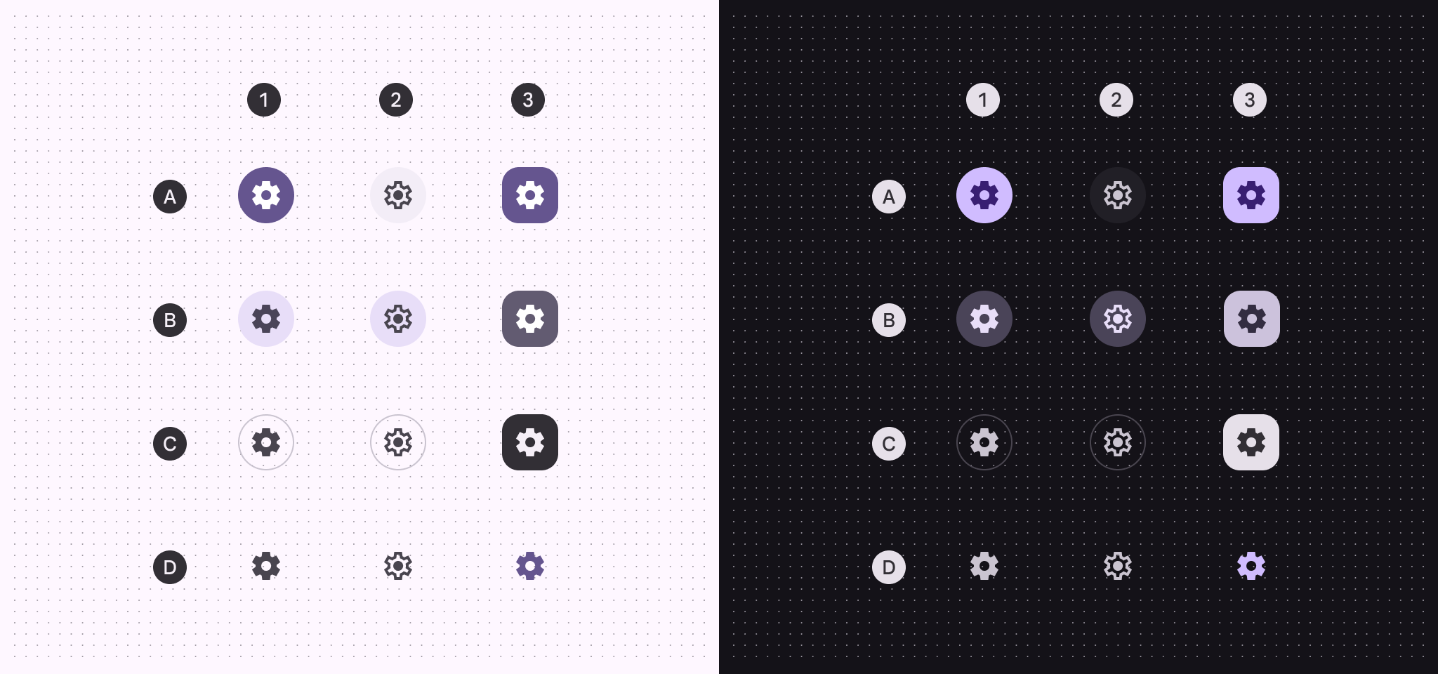
A:塗りつぶし、B:トーナル、C:アウトライン、D:スタンダード
- デフォルト
- トグル、未選択
- トグル、選択済み
| 1. デフォルト | 2. トグル、未選択 | 3. トグル、選択済み | |
|---|---|---|---|
| 塗りつぶしコンテナ 塗りつぶしアイコン | プライマリ オンプライマリ | サーフェスコンテナ オンサーフェスバリアント | プライマリ オンプライマリ |
| トーナルコンテナ トーナルアイコン | セカンダリコンテナ オンセカンダリコンテナ | セカンダリコンテナ オンセカンダリコンテナ | セカンダリ オンセカンダリ |
| アウトラインコンテナ アウトラインアイコン | アウトラインバリアント(アウトライン) オンサーフェスバリアント | アウトラインバリアント(アウトライン) オンサーフェスバリアント | インバースサーフェス インバースオンサーフェス |
| スタンダードアイコン | オンサーフェスバリアント | オンサーフェスバリアント | プライマリ |
状態
状態とは、コンポーネントやインタラクティブ要素のステータスを伝える視覚的表現です。ステートレイヤーはボタンの色をわずかに変化させます。無効状態では、ベースカラーが異なります。トークンの詳細を見る塗りつぶしアイコンボタンの状態
デフォルト
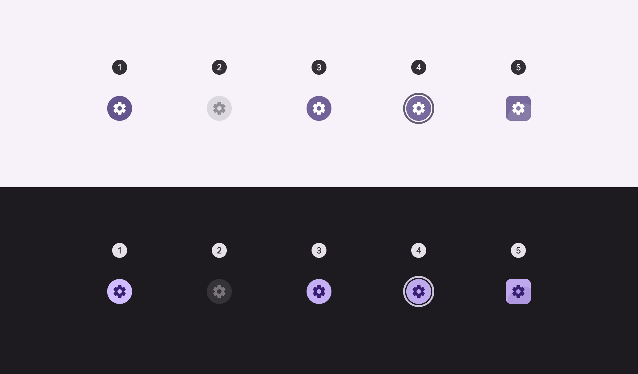
- 有効
- 無効(10%ステートレイヤー)
- ホバー(8%ステートレイヤー)
- フォーカス(10%ステートレイヤー)
- 押下(10%ステートレイヤー)
トグル
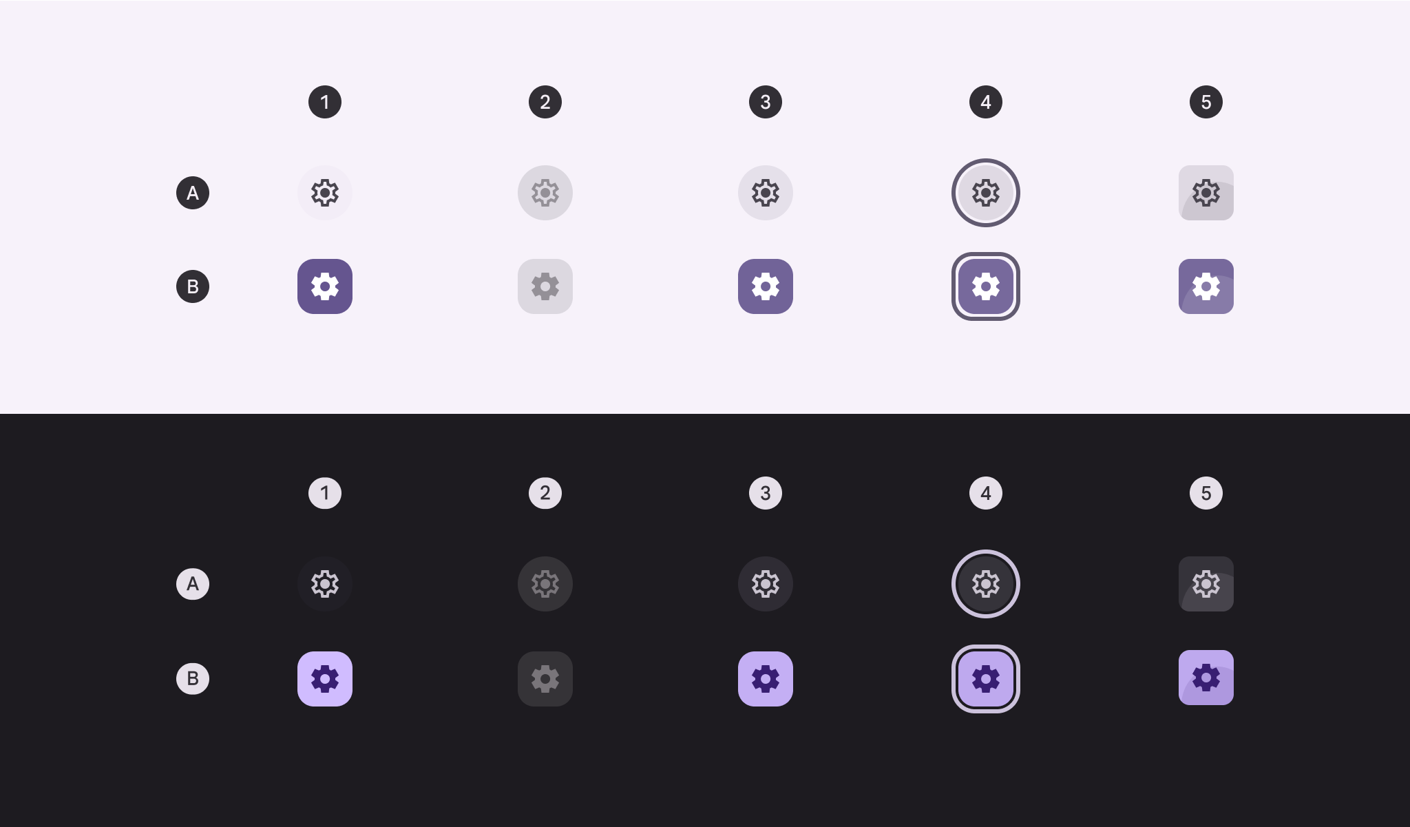
A:未選択、B:選択済み
- 有効
- 無効(10%ステートレイヤー)
- ホバー(8%ステートレイヤー)
- フォーカス(10%ステートレイヤー)
- 押下(10%ステートレイヤー)
トーナルアイコンボタンの状態
デフォルト
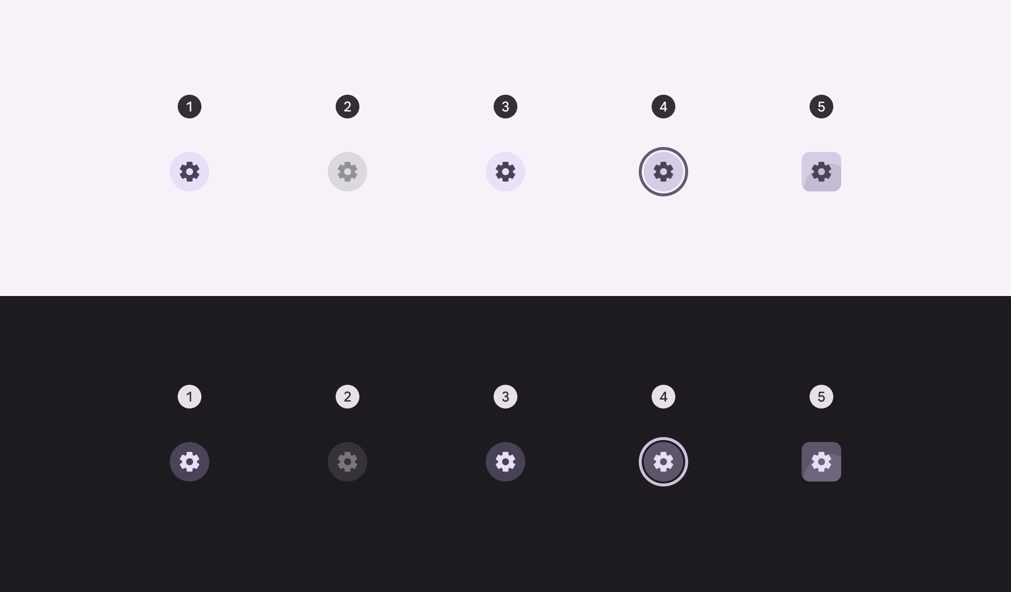
- 有効
- 無効(10%ステートレイヤー)
- ホバー(8%ステートレイヤー)
- フォーカス(10%ステートレイヤー)
- 押下(10%ステートレイヤー)
トグル
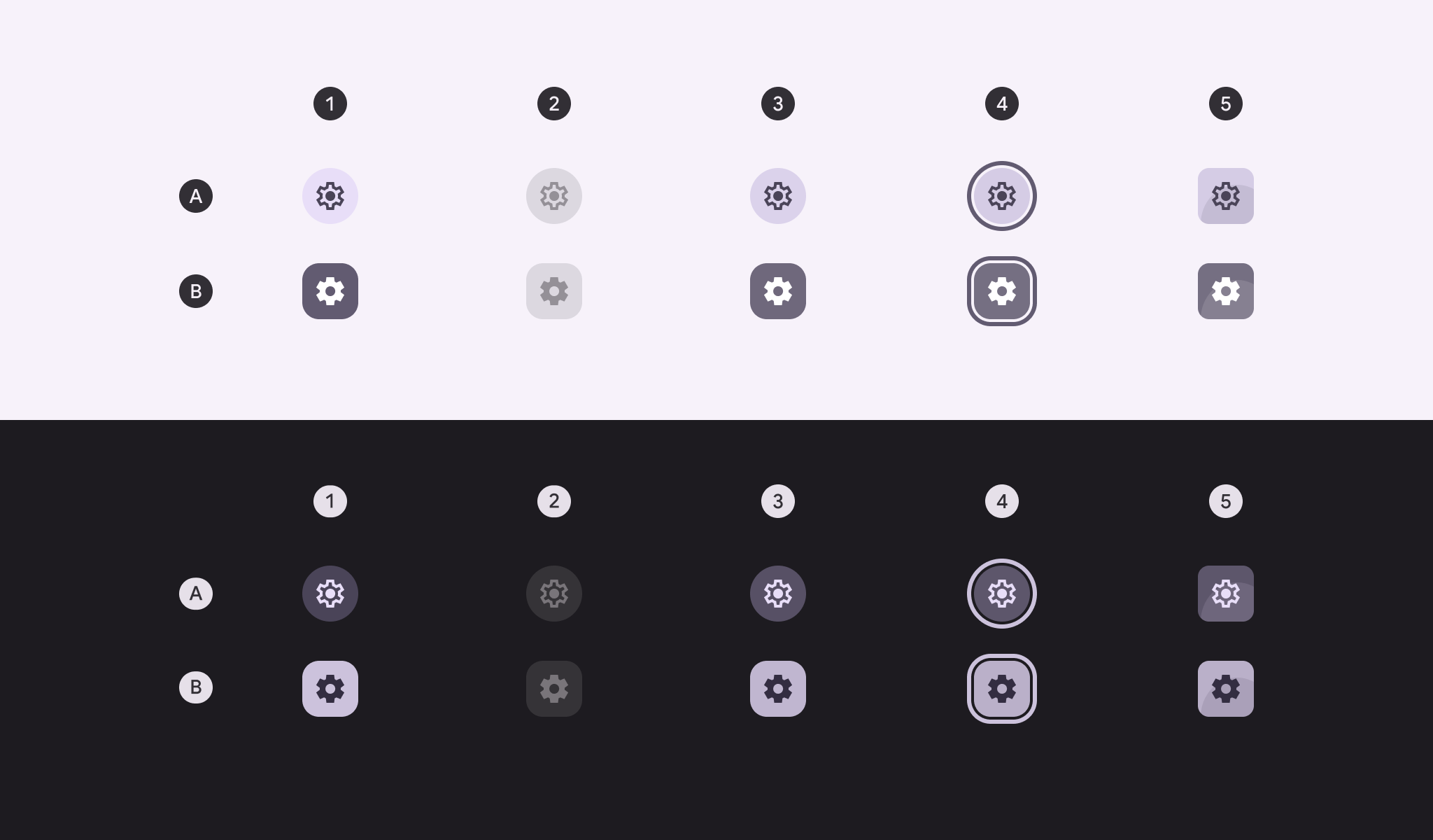
A:未選択、B:選択済み
- 有効
- 無効(10%ステートレイヤー)
- ホバー(8%ステートレイヤー)
- フォーカス(10%ステートレイヤー)
- 押下(10%ステートレイヤー)
アウトラインアイコンボタンの状態
デフォルト
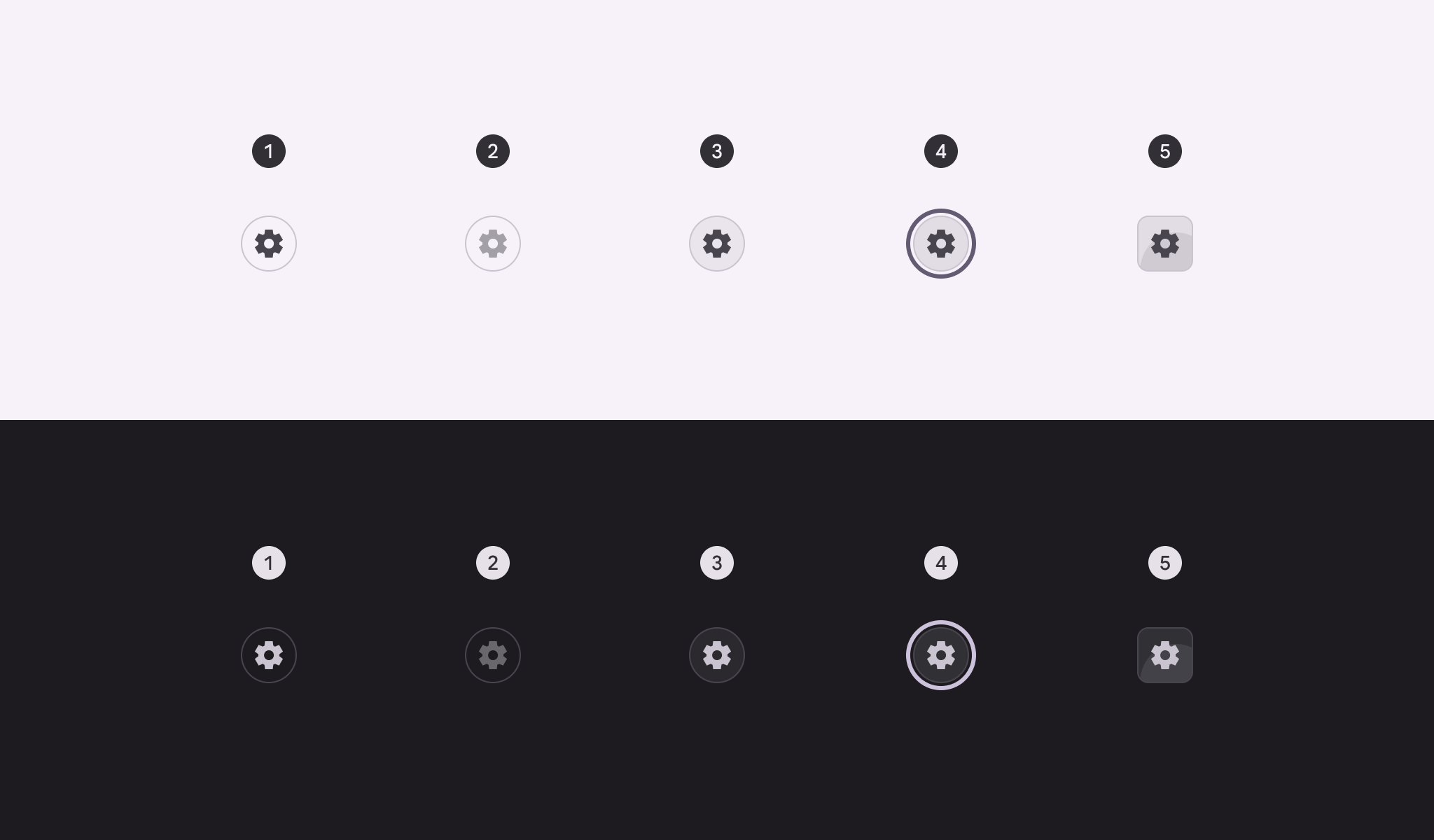
- 有効
- 無効(10%ステートレイヤー)
- ホバー(8%ステートレイヤー)
- フォーカス(10%ステートレイヤー)
- 押下(10%ステートレイヤー)
トグル
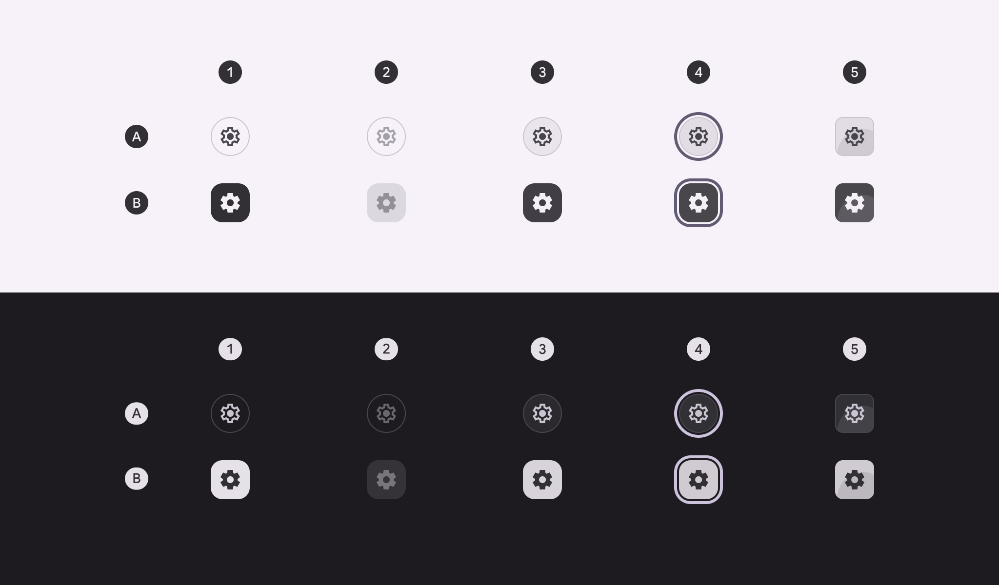
A:未選択、B:選択済み
- 有効
- 無効(10%ステートレイヤー)
- ホバー(8%ステートレイヤー)
- フォーカス(10%ステートレイヤー)
- 押下(10%ステートレイヤー)
スタンダードアイコンボタンの状態
スタンダードアイコンボタンのコンテナは、静止状態では非表示ですが、ステートレイヤーが適用されると表示されます。
デフォルト
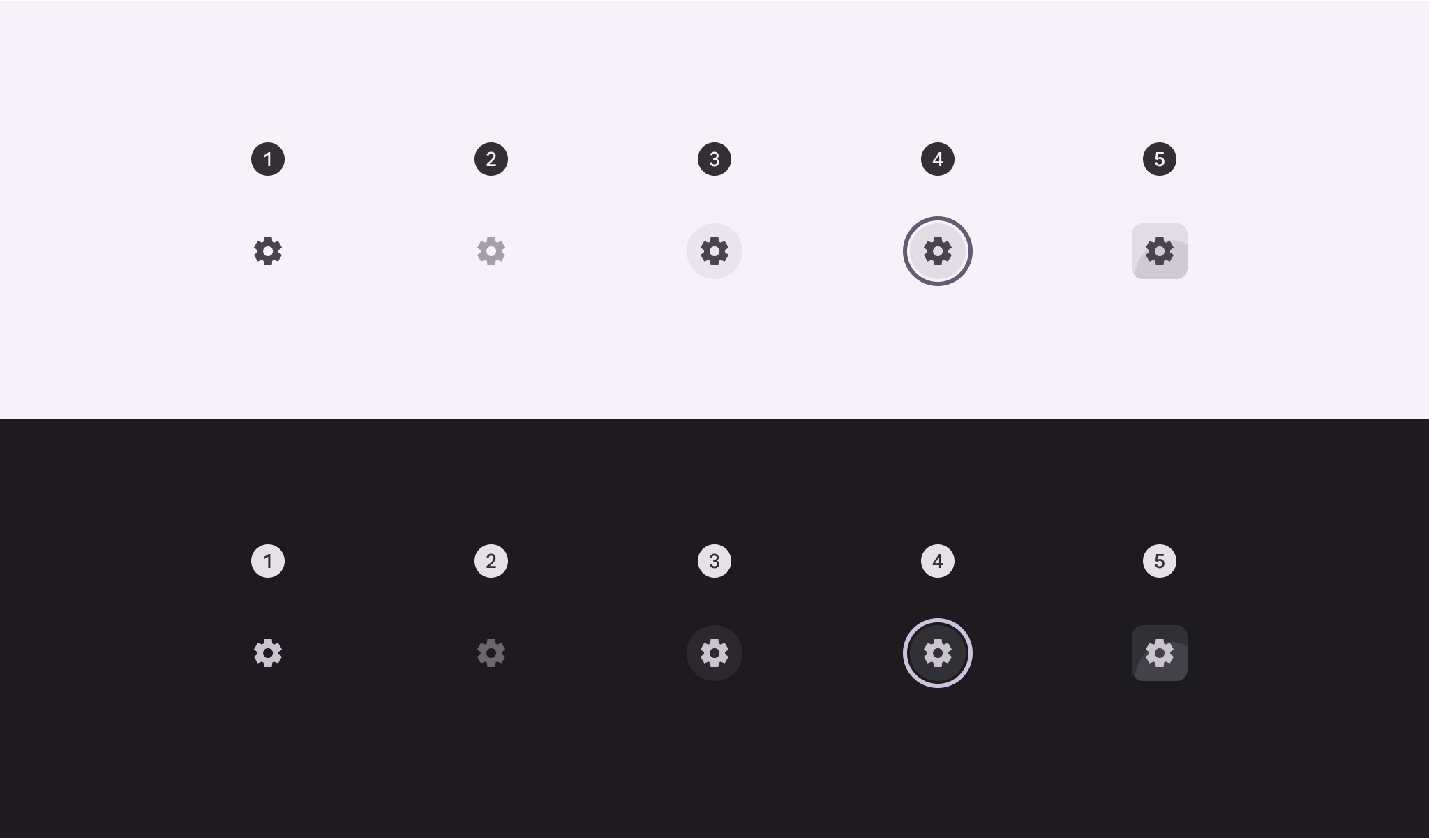
- 有効
- 無効(10%ステートレイヤー)
- ホバー(8%ステートレイヤー)
- フォーカス(10%ステートレイヤー)
- 押下(10%ステートレイヤー)
トグル
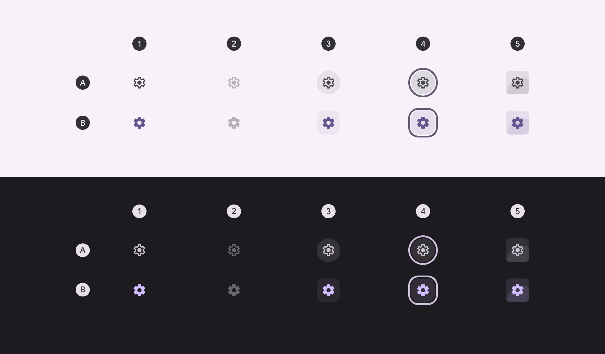
A:未選択、B:選択済み
- 有効
- 無効(10%ステートレイヤー)
- ホバー(8%ステートレイヤー)
- フォーカス(10%ステートレイヤー)
- 押下(10%ステートレイヤー)
シェイプ変化
押下状態
押下中、アイコンボタンをより正方形に近い形状に変化させることができます。
丸型と角型のアイコンボタンでは、押下時のコーナー半径を同じ値にする必要があります。
コーナー半径の値はボタンサイズによって異なります。アイコンボタンのコーナー寸法の一覧を見る
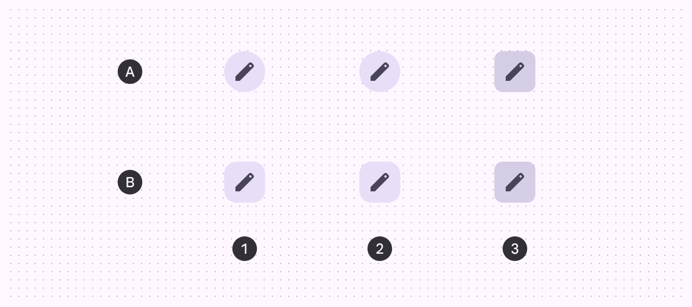
A:丸型、B:角型
- 有効
- ホバー
- 押下
選択時
トグルアイコンボタンは、押下時にシェイプが変化するだけでなく、デフォルトでは、選択によって静止時のシェイプが丸型(未選択)から角型(選択済み)に変わります。
静止時のシェイプを角型にする場合、選択時のシェイプは丸型にする必要があります。
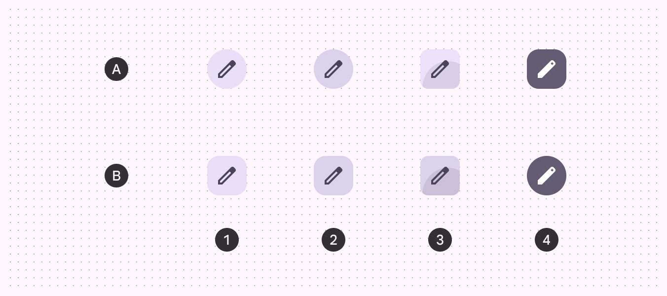
A:丸型、B:角型
- 有効
- ホバー
- 押下
- 選択済み
寸法
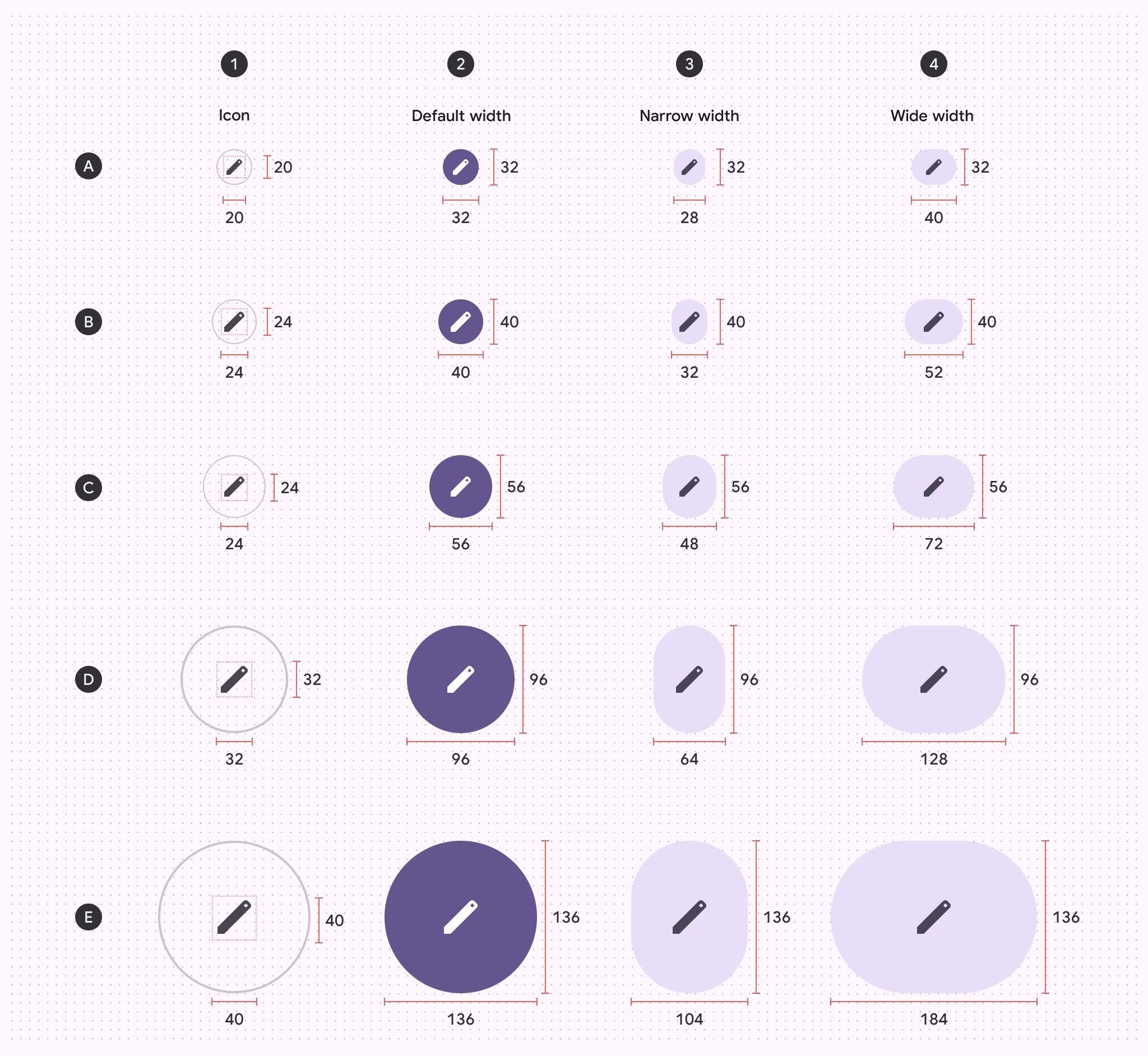
A:極小、B:小、C:中、D:大、E:特大
- アイコンサイズ
- デフォルト幅
- ナロー幅
- ワイド幅
ターゲットサイズ
極小および小のアイコンボタンでは、アクセシビリティ確保のため、48×48dp以上のターゲットサイズが必要です。
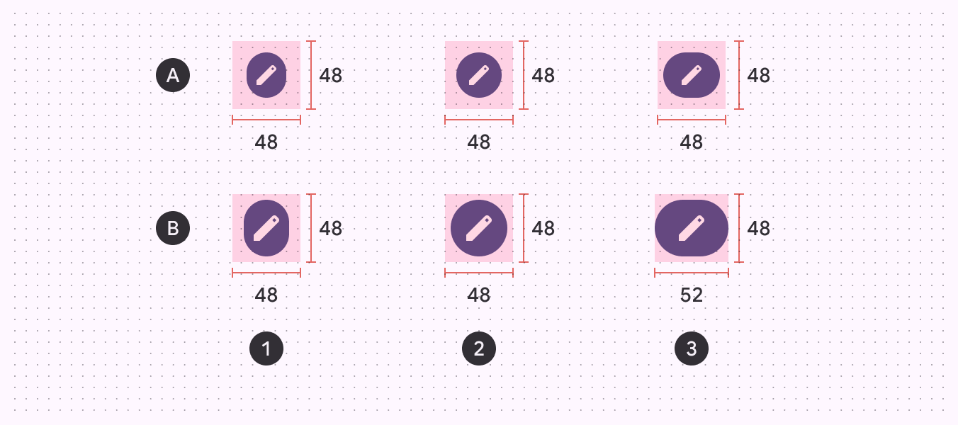
A:極小アイコンボタンサイズ、B:小アイコンボタンサイズ
- ナロー幅
- デフォルト幅
- ワイド幅
ボタンのコーナー半径
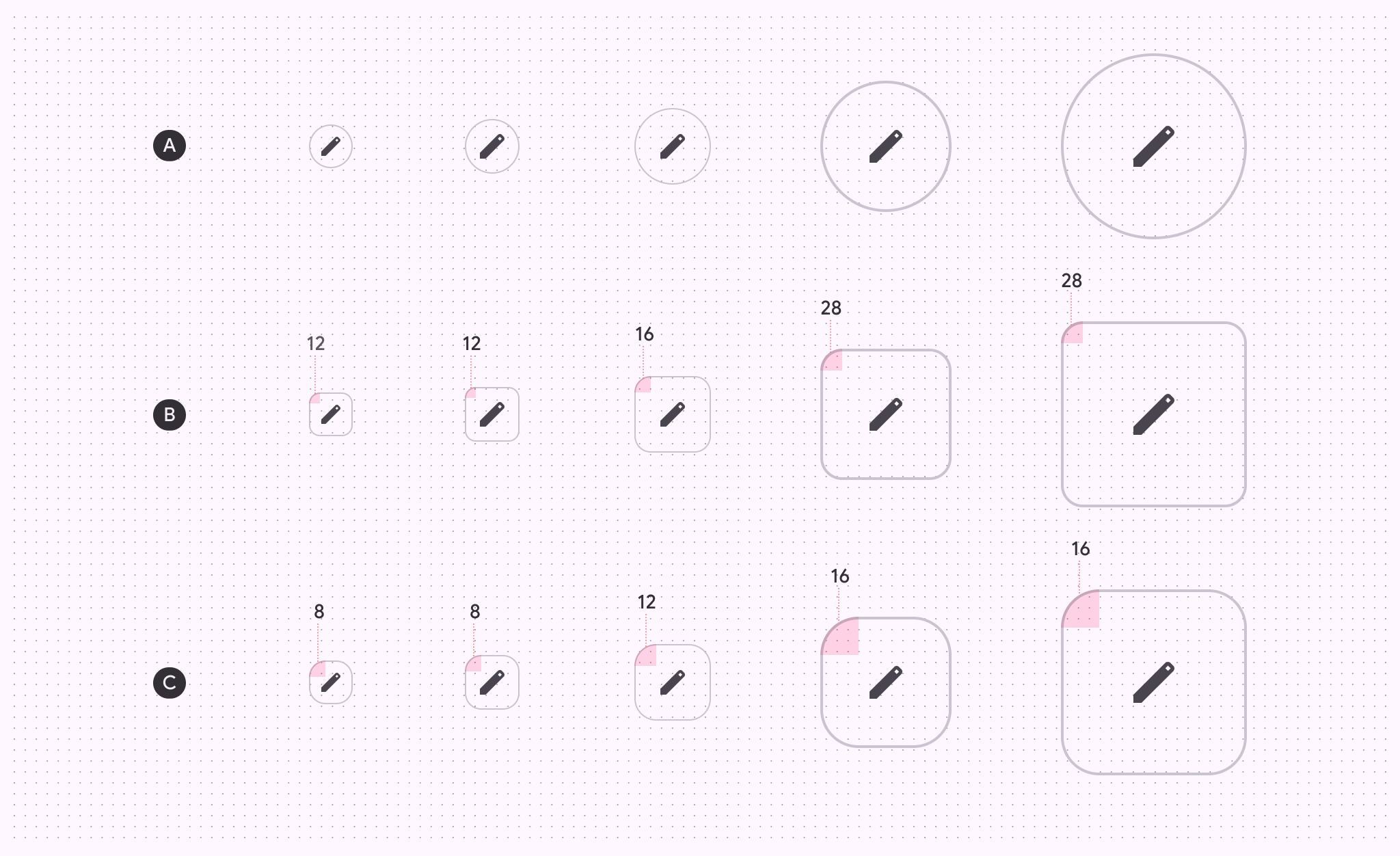
| XS | S | M | L | XL | |
|---|---|---|---|---|---|
| A. 丸型ボタン | 完全な円形 | 完全な円形 | 完全な円形 | 完全な円形 | 完全な円形 |
| B. 角型ボタン | 12dp | 12dp | 16dp | 28dp | 28dp |
| C. 押下状態 | 8dp | 8dp | 12dp | 16dp | 16dp |
ベースライントークン
表内のメニューからトークンセットを選択します。新しいトークンセットが提供されたことに伴い、塗りつぶし、トーナル、アウトラインのアイコンボタントークンは非推奨になりました。その他のトークンはすべて、ページ上部のモジュールで引き続き利用できます。