

按鈕:規格
按鈕可用於觸發 UI 中的大多數操作。
變體
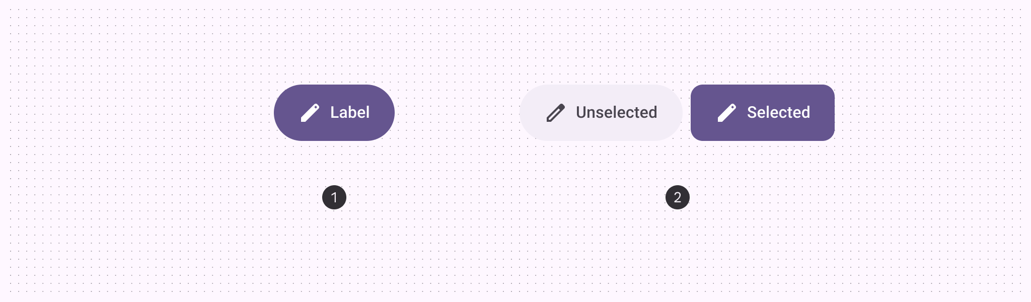
- 預設按鈕
- 切換按鈕
| 變體 | M3 | M3 Expressive |
|---|---|---|
| 預設 | 可用 | 可用 |
| 切換(選取) | -- | 可用 |
配置
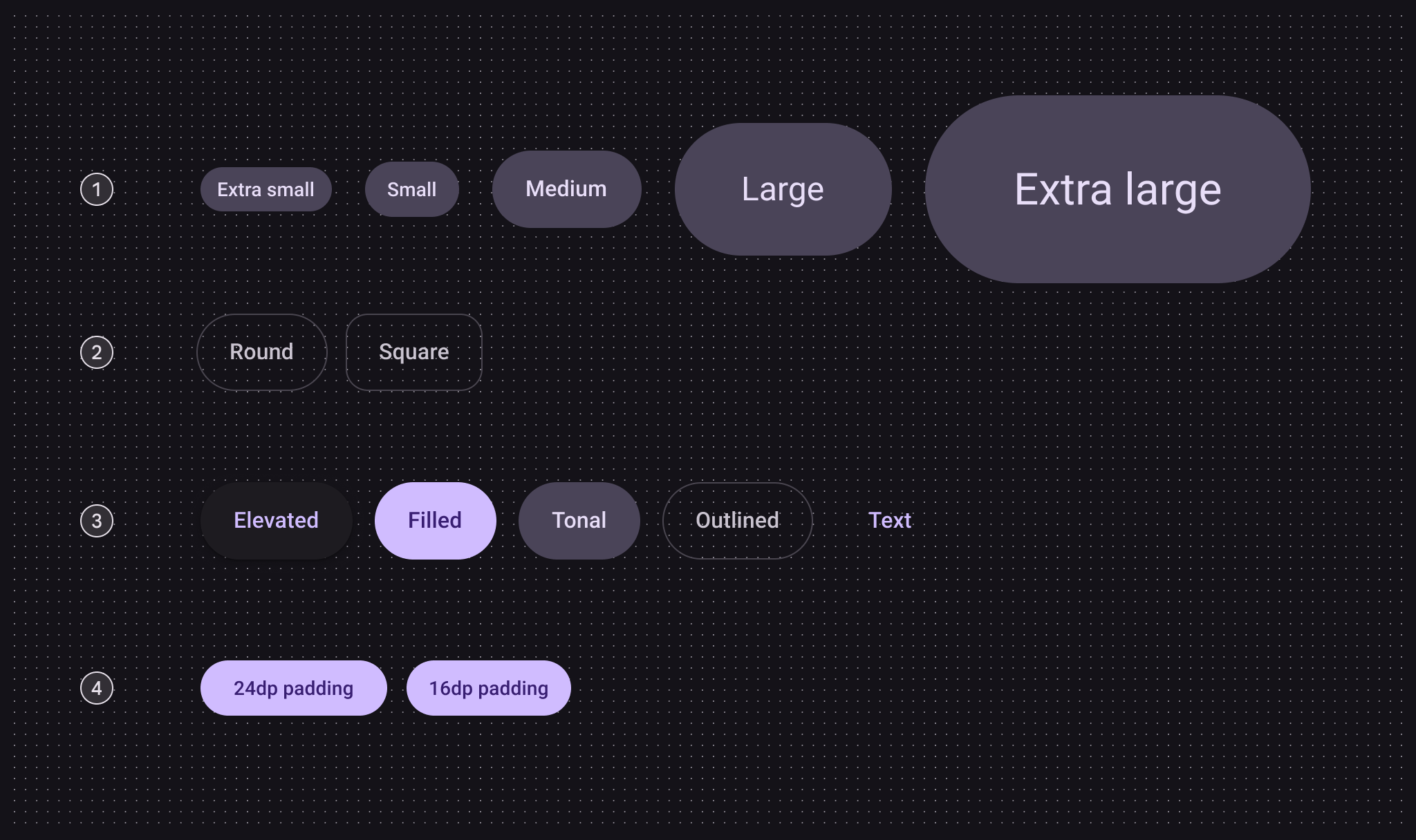
- 尺寸
- 形狀
- 色彩
- 小尺寸按鈕內距
| 類別 | 配置 | M3 | M3 Expressive |
|---|---|---|---|
| 尺寸 | 小型(預設) | 可用 | 可用 |
| XS、M、L、XL | -- | 可用 | |
| 形狀 | 圓形(預設) | 可用 | 可用 |
| 方形 | -- | 可用 | |
| 色彩 | 浮起、填滿(預設)、色調、外框、文字 | 可用 | 可用 |
| 小尺寸按鈕內距 | 24dp | 可用 | 不建議使用,請改用 16dp |
| 16dp | -- | 可用 |
token 與規格
使用下方表格中的選單來選取 token 集。按鈕 token 集分為通用 token、色彩與尺寸。檢視基準 token
按鈕 - 色彩 - 浮起式
按鈕 - 色彩 - 填滿式
按鈕 - 色彩 - 色調式
按鈕 - 色彩 - 外框式
按鈕 - 色彩 - 文字
按鈕 - 尺寸 - 超小型
| Token | 取值 |
|---|---|
| Button xsmall container height | 32dp |
| Button xsmall outline width | 1dp |
| Button xsmall label font | Roboto |
| Button xsmall label line height | 20pt |
| Button xsmall label size | 14pt |
| Button xsmall label weight | 500 |
| Button xsmall label tracking | 0.1pt |
| Button xsmall icon size | 20dp |
| Button xsmall shape round | Circular |
| Button xsmall shape square | 12dp |
| Button xsmall leading space | 12dp |
| Button xsmall between icon label space | 4dp |
| Button xsmall trailing space | 12dp |
| Button xsmall shape pressed morph | 8dp |
| Button xsmall shape spring animation damping | 0.9 |
| Button xsmall shape spring animation stiffness | 1400 |
| Button xsmall selected container shape round | 12dp |
| Button xsmall selected container shape square | Circular |
按鈕 - 尺寸 - 小型
| Token | 取值 |
|---|---|
| Button small container height | 40dp |
| Button small outline width | 1dp |
| Button small label font | Roboto |
| Button small label line height | 20pt |
| Button small label size | 14pt |
| Button small label weight | 500 |
| Button small label tracking | 0.1pt |
| Button small icon size | 20dp |
| Button small shape round | Circular |
| Button small shape square | 12dp |
| Button small leading space | 16dp |
| Button small between icon label space | 8dp |
| Button small trailing space | 16dp |
| Button small shape pressed morph | 8dp |
| Button small shape spring animation damping | 0.9 |
| Button small shape spring animation stiffness | 1400 |
| Button small selected container shape round | 12dp |
| Button small selected container shape square | Circular |
按鈕 - 尺寸 - 中型
| Token | 取值 |
|---|---|
| Button medium container height | 56dp |
| Button medium outline width | 1dp |
| Button medium label font | Roboto |
| Button medium label line height | 24pt |
| Button medium label size | 16pt |
| Button medium label weight | 500 |
| Button medium label tracking | 0.15pt |
| Button medium icon size | 24dp |
| Button medium shape round | Circular |
| Button medium shape square | 16dp |
| Button medium leading space | 24dp |
| Button medium between icon label space | 8dp |
| Button medium trailing space | 24dp |
| Button medium shape pressed morph | 12dp |
| Button medium shape spring animation damping | 0.9 |
| Button medium shape spring animation stiffness | 1400 |
| Button medium selected container shape round | 16dp |
| Button medium selected container shape square | Circular |
按鈕 - 尺寸 - 大型
| Token | 取值 |
|---|---|
| Button large container height | 96dp |
| Button large outline width | 2dp |
| Button large label font | Roboto |
| Button large label line height | 32pt |
| Button large label size | 24pt |
| Button large label weight | 400 |
| Button large label tracking | 0 |
| Button large icon size | 32dp |
| Button large shape round | Circular |
| Button large shape square | 28dp |
| Button large leading space | 48dp |
| Button large between icon label space | 12dp |
| Button large trailing space | 48dp |
| Button large shape pressed morph | 16dp |
| Button large shape spring animation damping | 0.9 |
| Button large shape spring animation stiffness | 1400 |
| Button large selected container shape round | 28dp |
| Button large selected container shape square | Circular |
按鈕 - 尺寸 - 超大型
| Token | 取值 |
|---|---|
| Button xlarge container height | 136dp |
| Button xlarge outline width | 3dp |
| Button xlarge label font | Roboto |
| Button xlarge label line height | 40pt |
| Button xlarge label size | 32pt |
| Button xlarge label weight | 400 |
| Button xlarge label tracking | 0 |
| Button xlarge icon size | 40dp |
| Button xlarge shape round | Circular |
| Button xlarge shape square | 28dp |
| Button xlarge leading space | 64dp |
| Button xlarge between icon label space | 16dp |
| Button xlarge trailing space | 64dp |
| Button xlarge shape pressed morph | 16dp |
| Button xlarge shape spring animation damping | 0.9 |
| Button xlarge shape spring animation stiffness | 1400 |
| Button xlarge selected container shape round | 28dp |
| Button xlarge selected container shape square | Circular |
結構

- 容器
- 標籤文字
- 圖示(選用)
色彩
色彩值是透過 設計 token 實作。對設計師而言,這表示應使用與 token 相對應的色彩值;在實作時,這些色彩值會以參照特定值的 token 形式存在。
- 按鈕有五種內建色彩樣式:浮起、填滿、色調、外框與文字
- 預設按鈕與切換按鈕使用不同的色彩
- 切換按鈕不使用文字樣式
TIP
選擇這些色彩角色是為了建立設計的一致性與熟悉感。只要容器與文字之間具有 3:1 的對比度,也可以使用其他色彩角色。例如:tertiary 與 on tertiary。
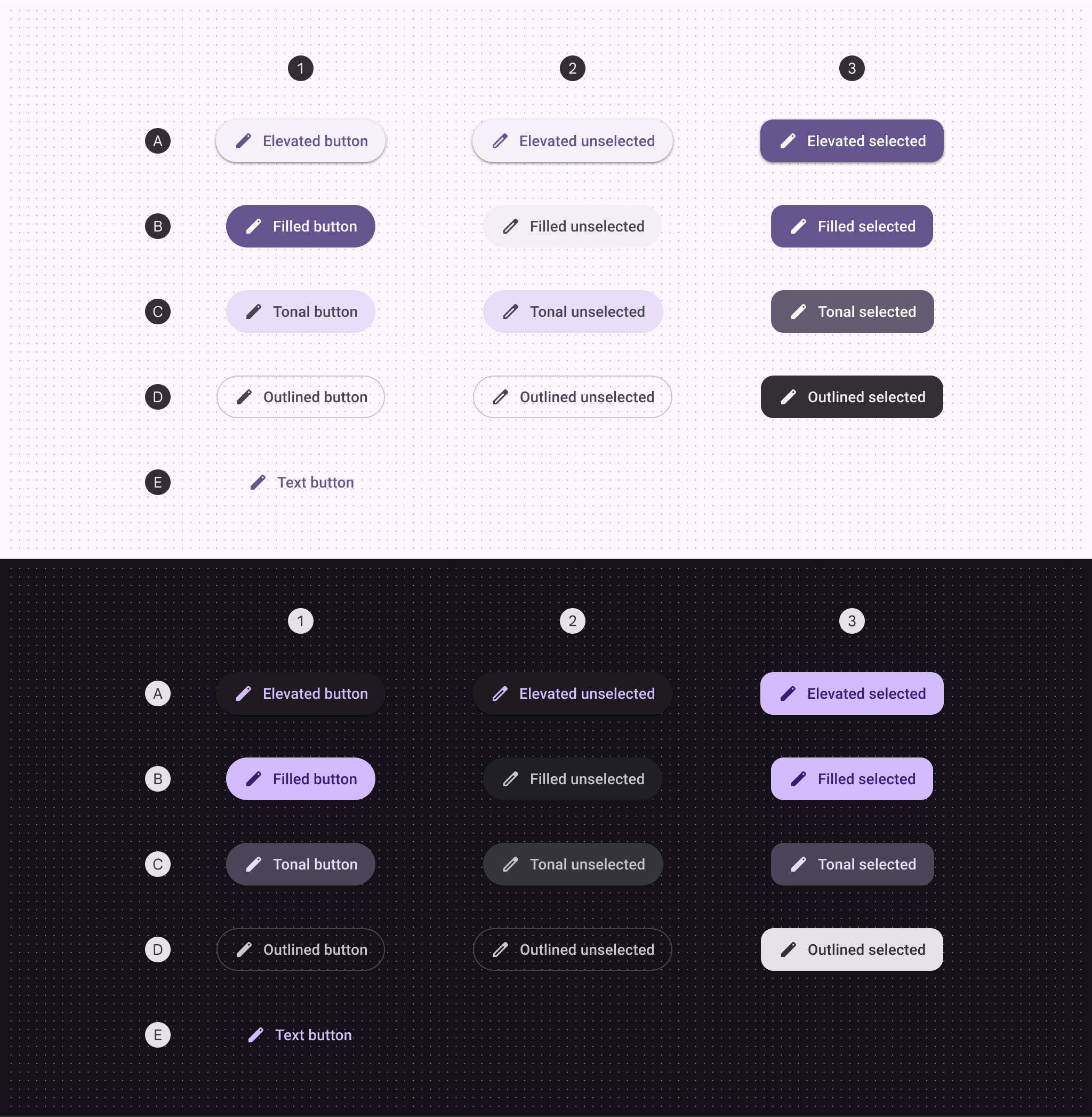
A. 浮起、B. 填滿、C. 色調、D. 外框、E. 文字
- 預設
- 切換:未選取
- 切換:已選取
| 1. 預設 | 2. 切換未選取 | 3. 切換已選取 | |
|---|---|---|---|
| 浮起式容器 浮起式圖示與標籤 | 低階表面容器色 主要色 | 低階表面容器色 主要色 | 主要色 主要色上的內容 |
| 填滿容器 實心圖示與標籤 | 主要色 主要色上的內容 | 表面容器色 表面變體上的內容 | 主要色 主要色上的內容 |
| 色調容器 色調圖示與標籤 | 次要容器色 次要容器上的內容 | 次要容器色 次要容器上的內容 | 次要色 次要色上的內容 |
| 外框容器 外框圖示與標籤 | 外框色變體 表面變體上的內容 | 外框色變體 表面變體上的內容 | 反轉表面色 反轉表面色上的內容 |
| 文字按鈕的圖示與標籤 | 主要色 | -- | -- |
狀態
狀態 是用來傳達元件或互動元素狀態的視覺呈現。浮起式按鈕狀態
浮起式按鈕樣式的預設高度(elevation)為 1,停用時為 0。
預設
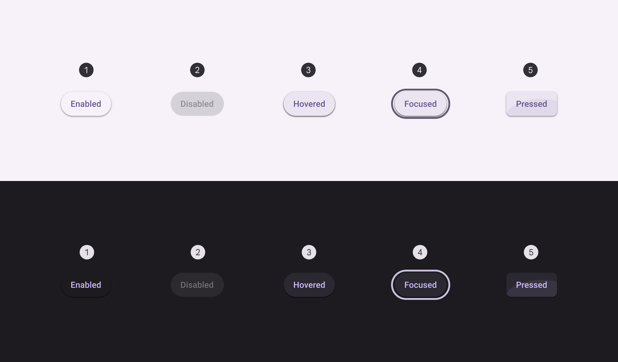
- 啟用
- 停用
- 懸停
- 聚焦
- 按下
切換
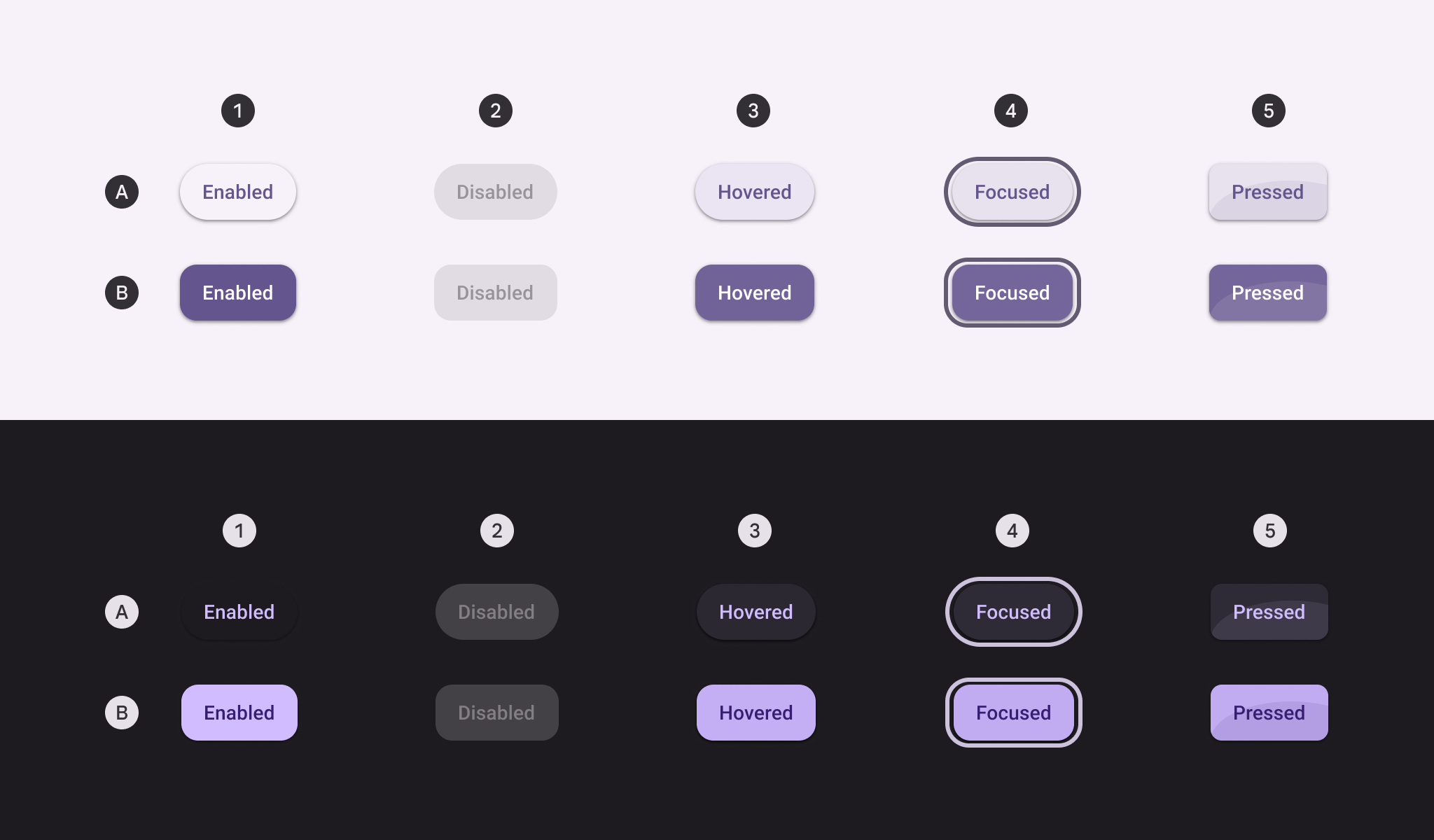
A. 未選取、B. 已選取
- 啟用
- 停用
- 懸停
- 聚焦
- 按下
填滿按鈕狀態
預設
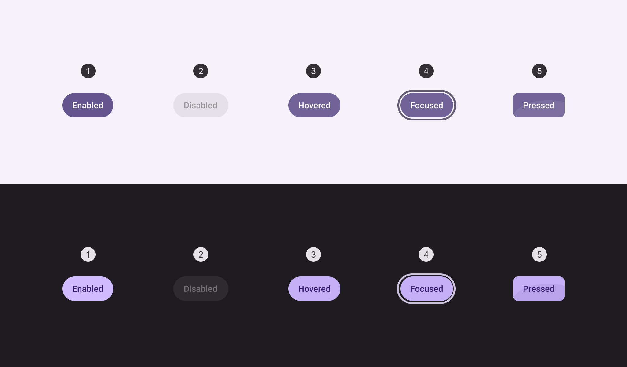
- 啟用
- 停用
- 懸停
- 聚焦
- 按下
切換
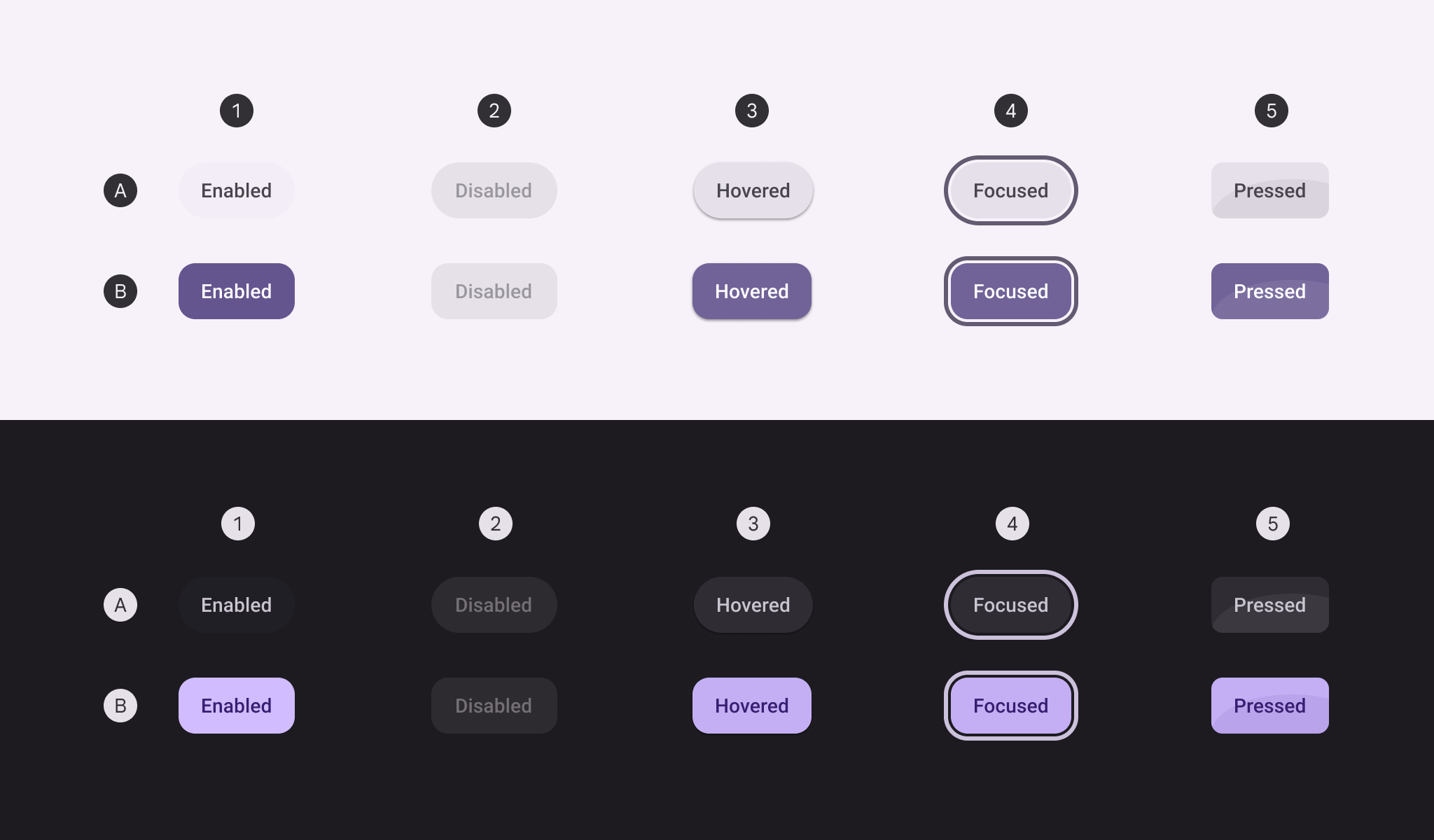
A. 未選取、B. 已選取
- 啟用
- 停用
- 懸停
- 聚焦
- 按下
色調按鈕狀態
預設
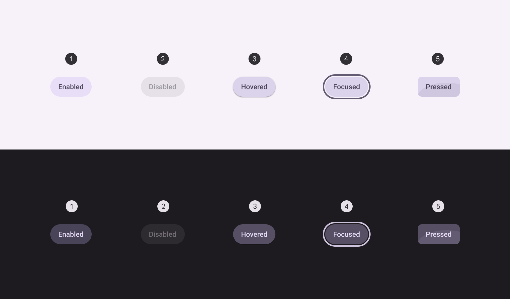
- 啟用
- 停用
- 懸停
- 聚焦
- 按下
切換
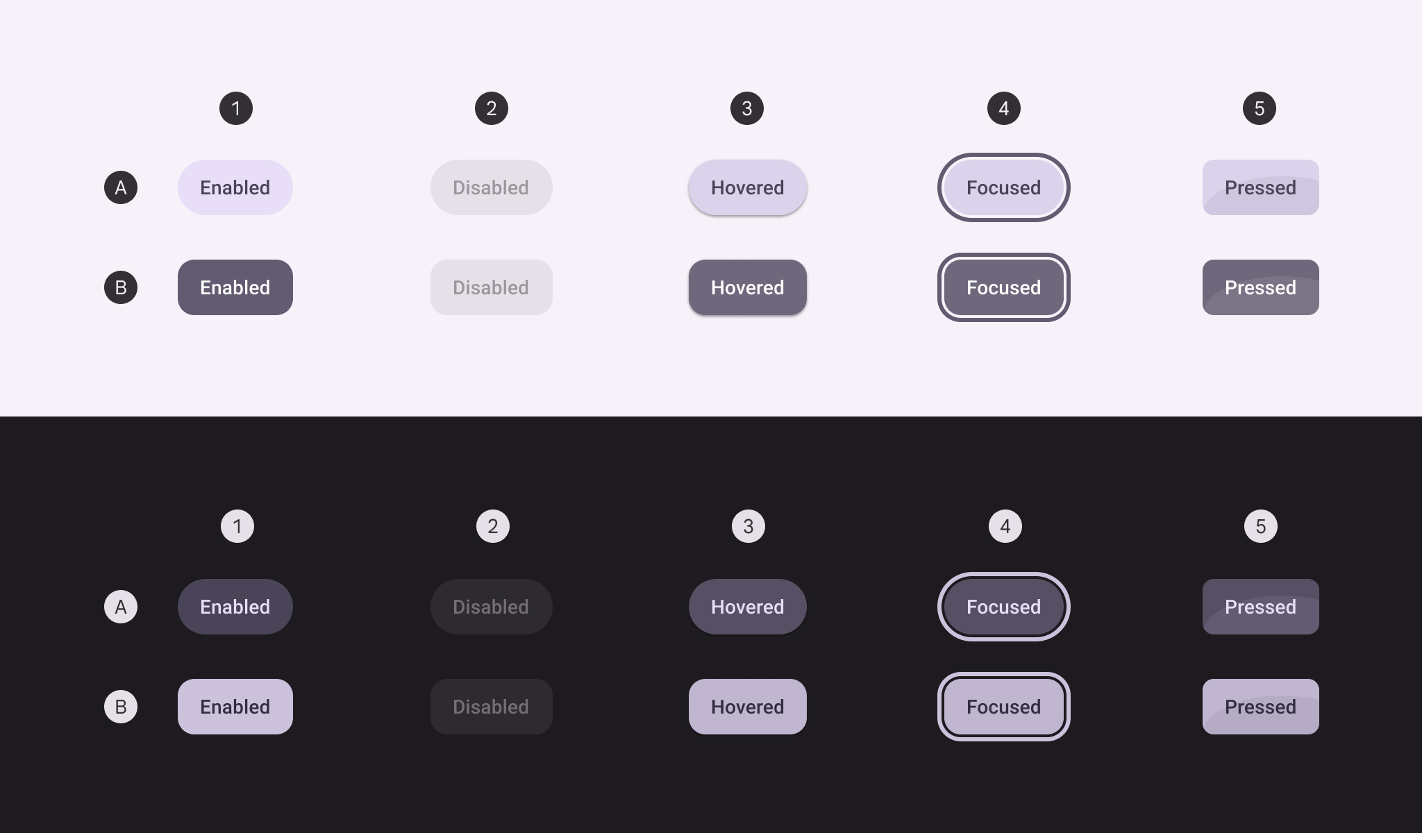
A. 未選取、B. 已選取
- 啟用
- 停用
- 懸停
- 聚焦
- 按下
外框按鈕狀態
外框按鈕的容器填色在靜置狀態下不可見;但在停用、懸停、聚焦或按下時,其不透明度與狀態層行為與其他按鈕樣式相同。
預設
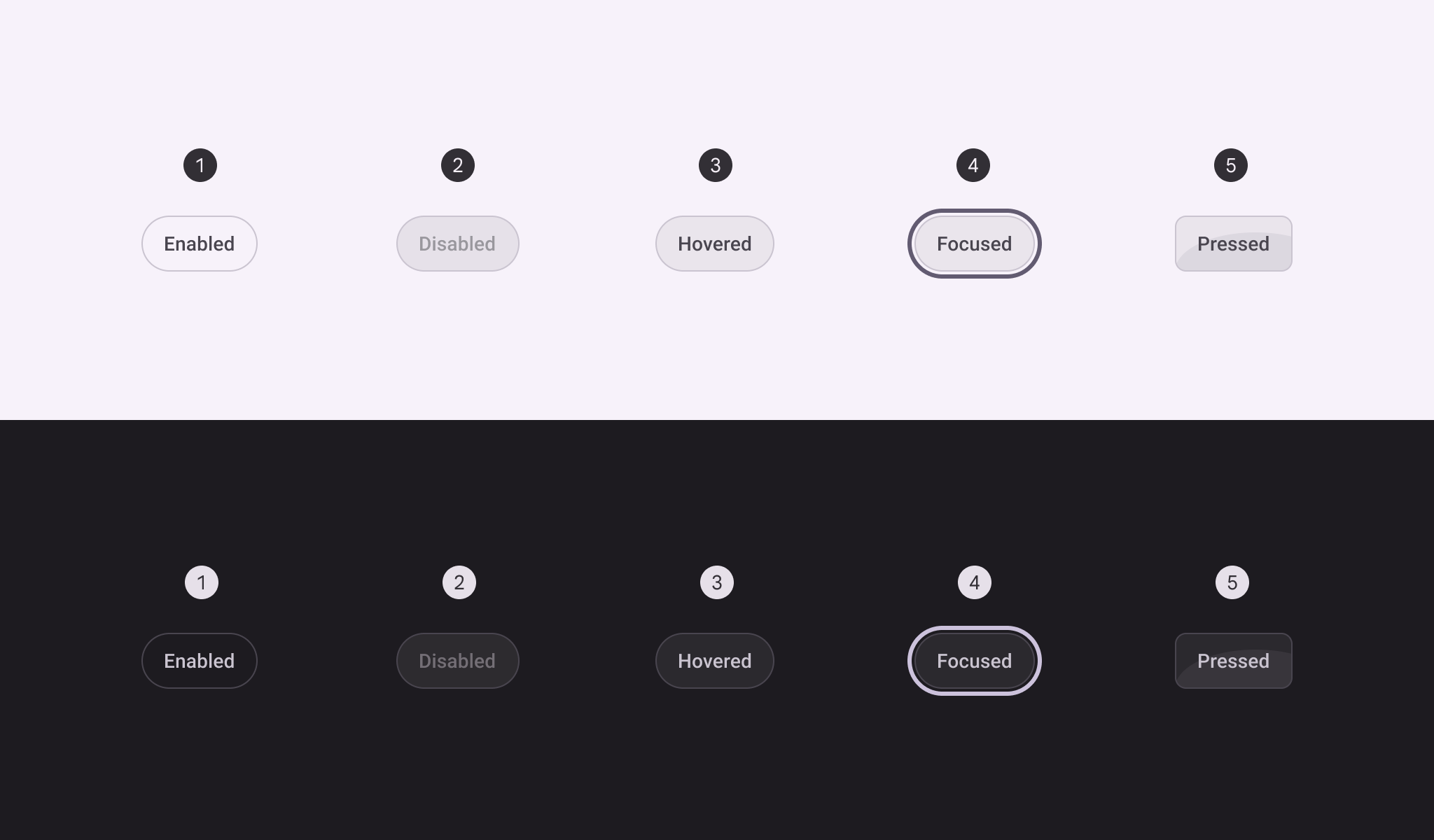
- 啟用
- 停用
- 懸停
- 聚焦
- 按下
切換
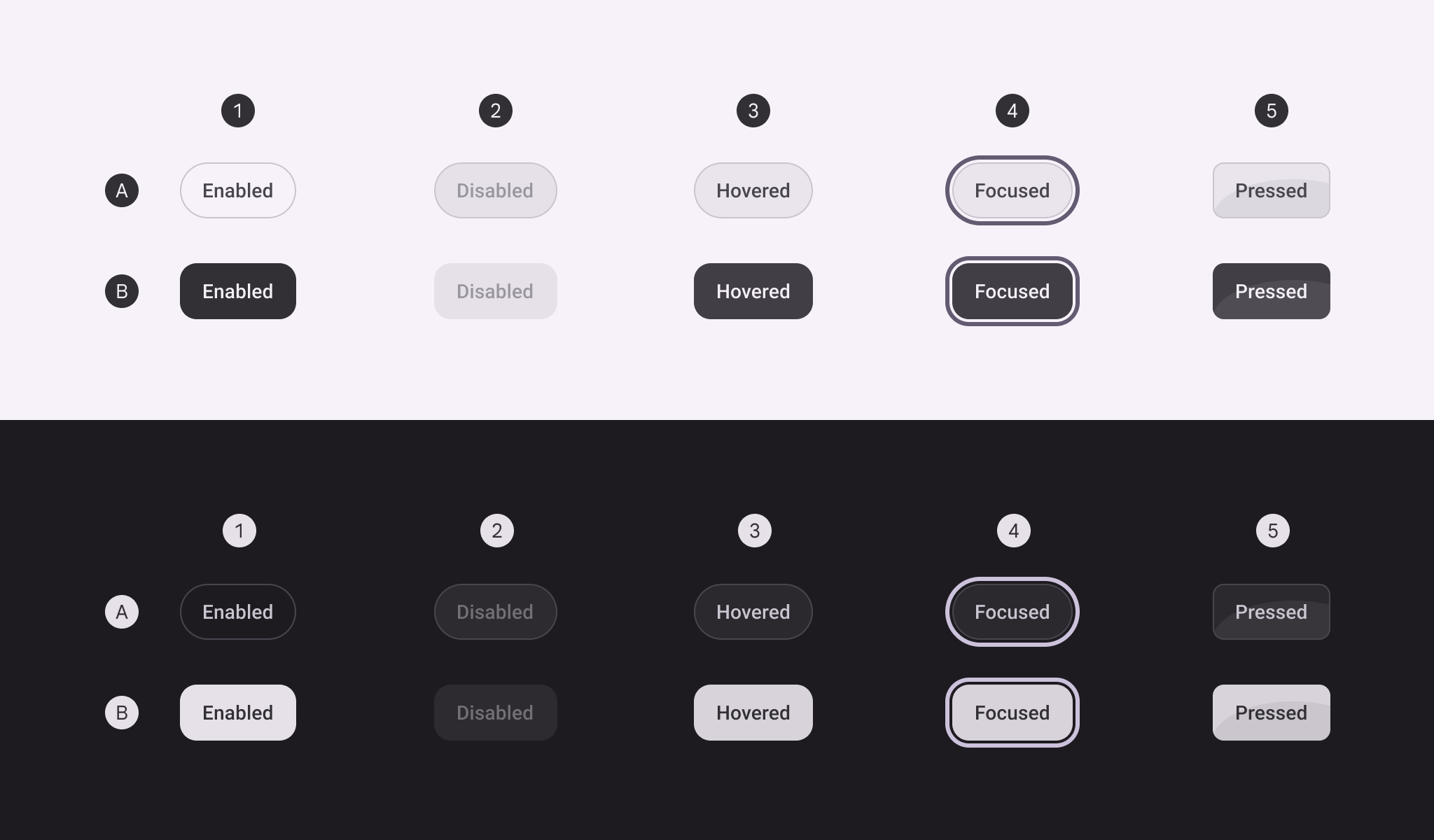
- 啟用
- 停用
- 懸停
- 聚焦
- 按下
文字按鈕樣式狀態
文字按鈕的容器在靜置狀態下不可見;但在停用、懸停、聚焦或按下時,其不透明度與狀態層行為與其他按鈕樣式相同。沒有文字切換按鈕。
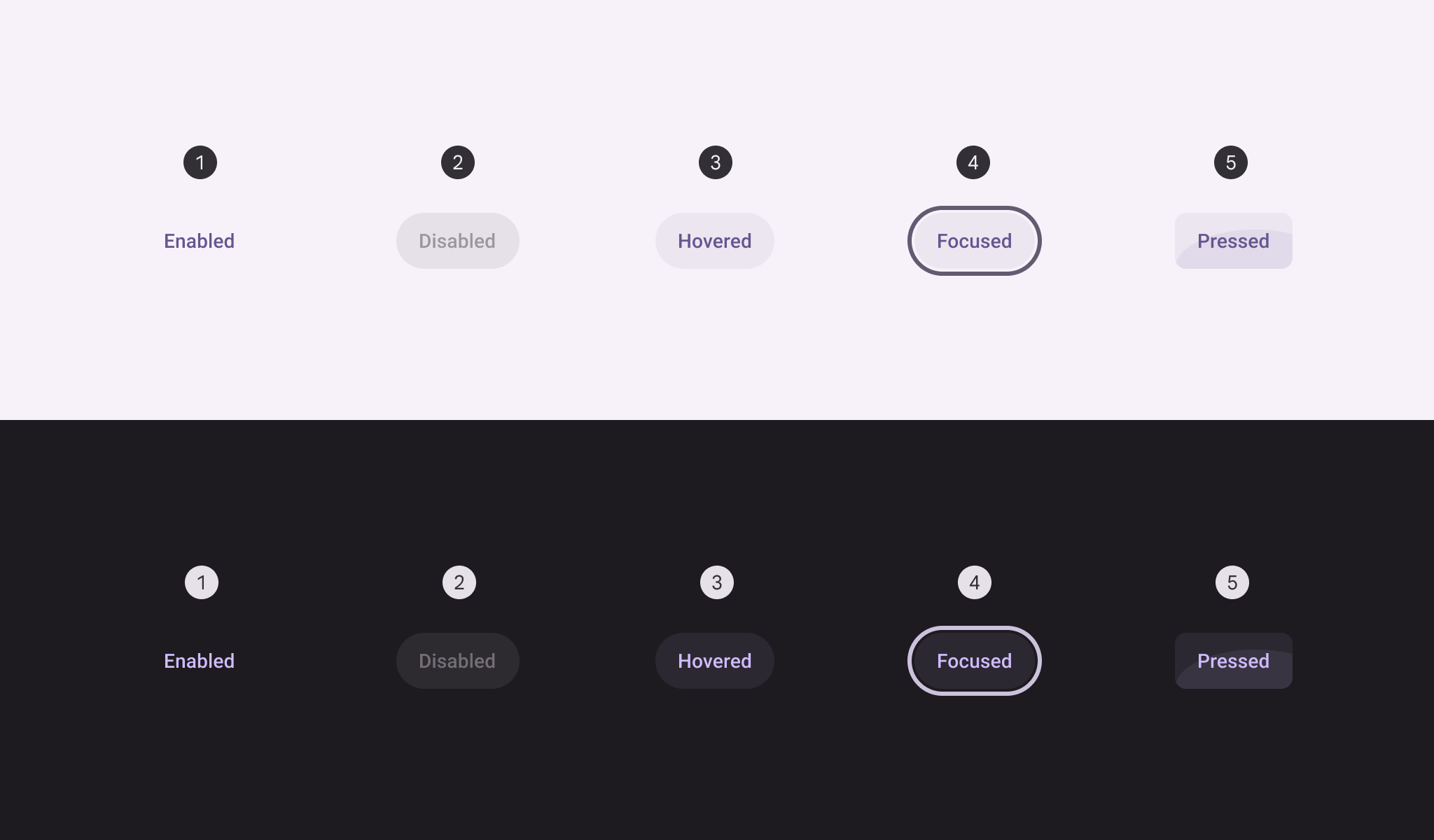
- 啟用
- 停用
- 懸停
- 聚焦
- 按下
形狀變形
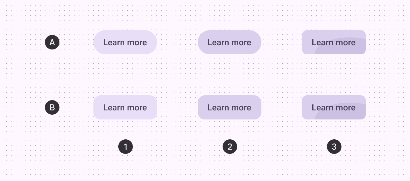
A. 圓形按鈕、B. 方形按鈕
- 啟用
- 懸停
- 按下
選取時
除了按下時會改變形狀外,切換按鈕在選取狀態改變時,其靜置形狀也會從圓形(未選取)變為方形(已選取)。
若未選取時的靜置形狀為方形,則選取後的形狀應為圓形。
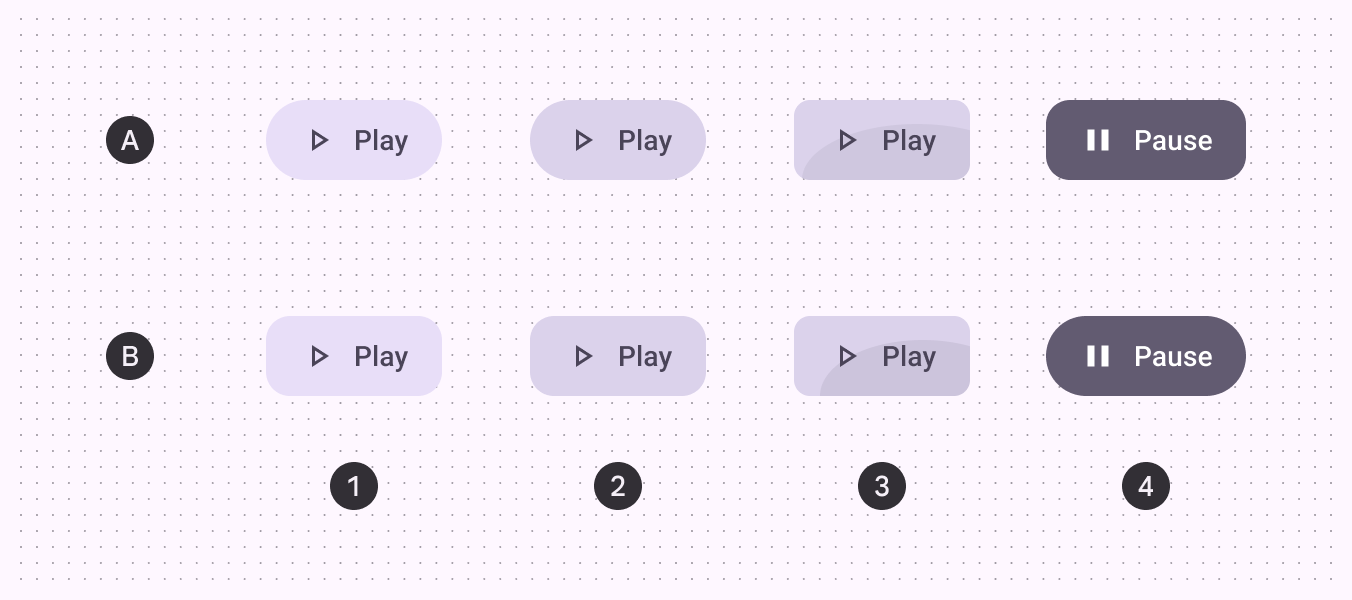
A. 圓形按鈕、B. 方形按鈕
- 啟用
- 懸停
- 按下
- 已選取
尺寸
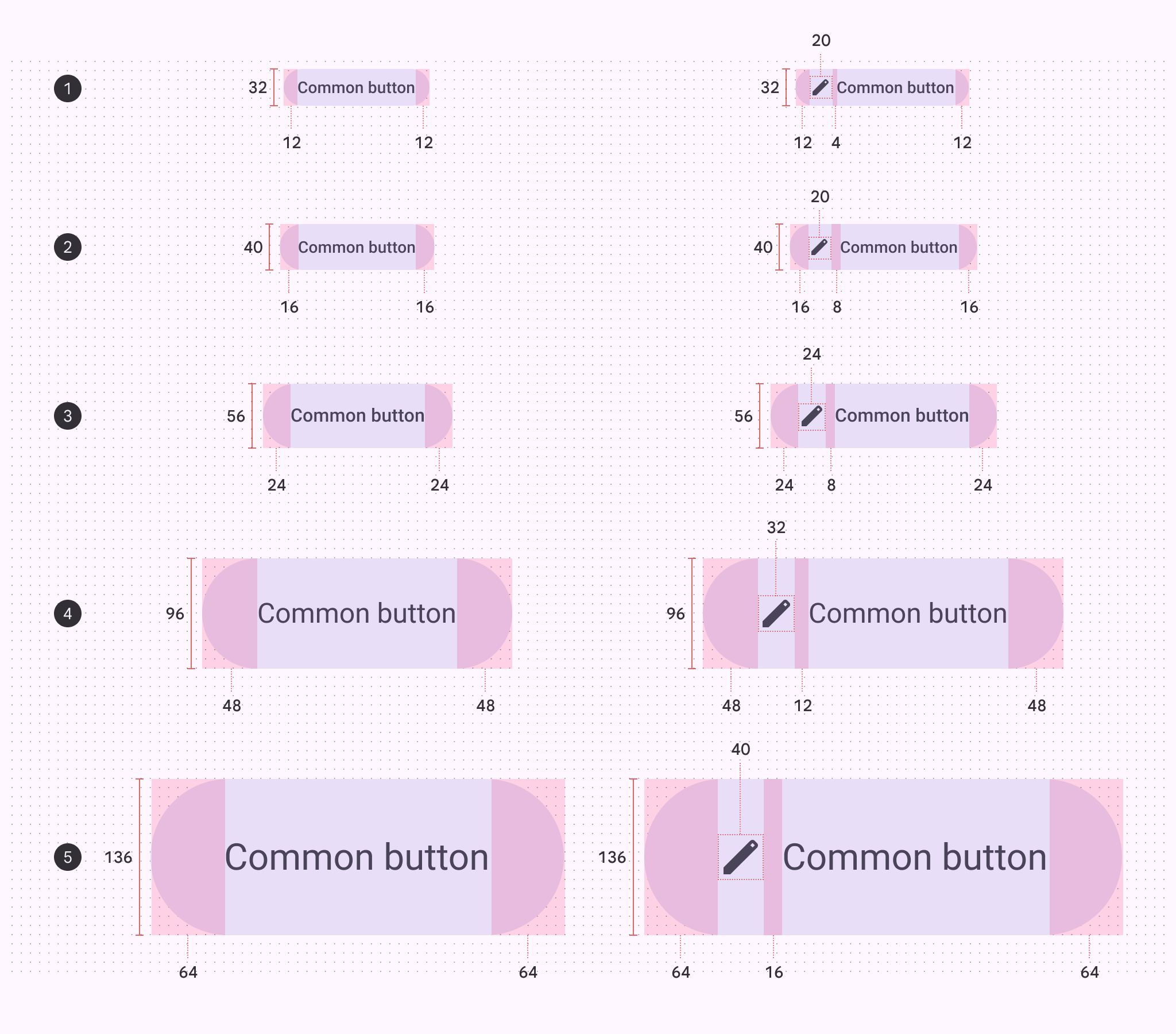
各按鈕尺寸的內距與大小量測
- 超小型
- 小型
- 中型
- 大型
- 超大型
觸控目標區域
超小型與小型圖示按鈕的觸控目標尺寸必須為 48×48dp 或更大,才能符合無障礙需求。
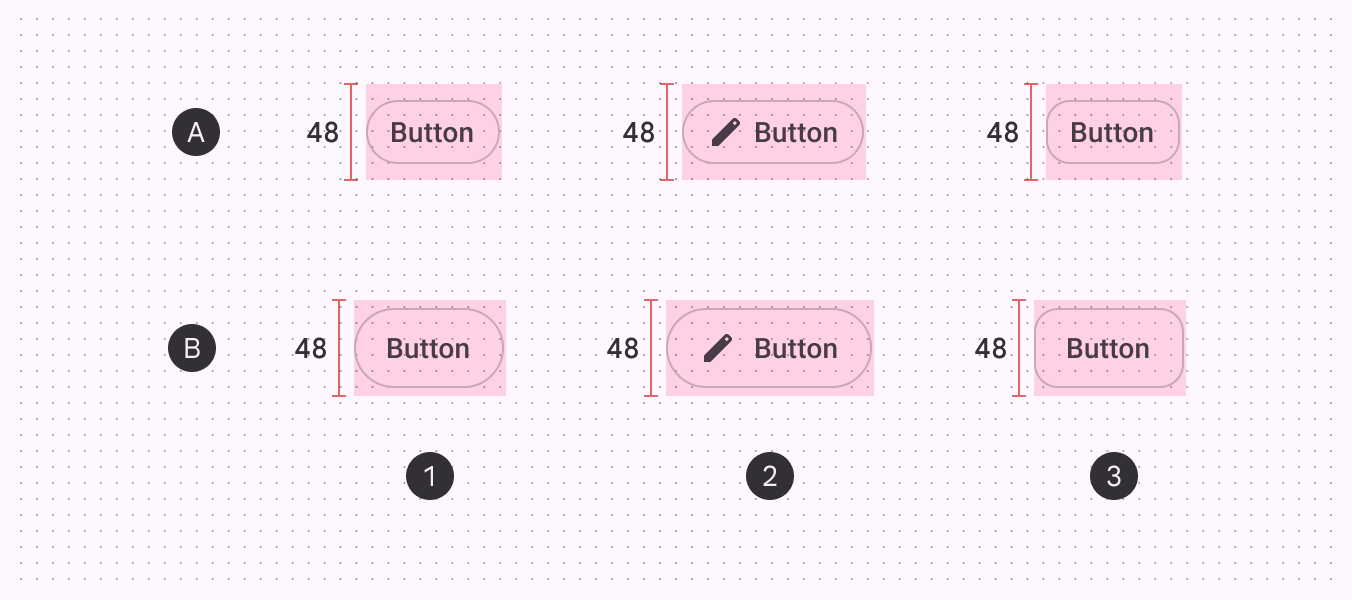
A. 超小型 B. 小型
- 圓形按鈕
- 附圖示按鈕
- 方形按鈕
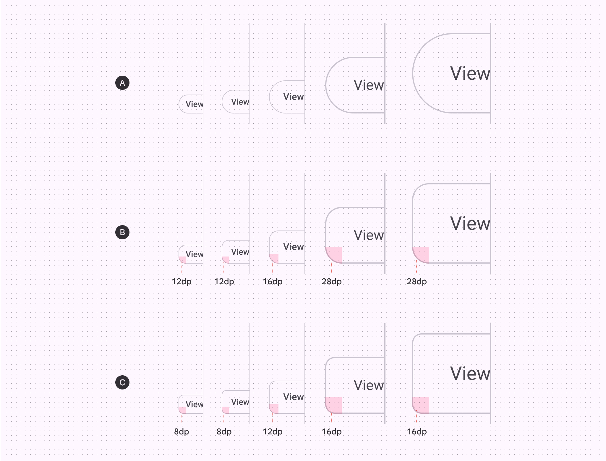
圓角半徑
| XS | S | M | L | XL | |
|---|---|---|---|---|---|
| A. 圓形按鈕 | 全圓角 | 全圓角 | 全圓角 | 全圓角 | 全圓角 |
| B. 方形按鈕 | 12dp | 12dp | 16dp | 28dp | 28dp |
| C. 按下狀態 | 8dp | 8dp | 12dp | 16dp | 16dp |
基準 token
使用下方表格中的選單來切換 token 集。基準按鈕 token 集依色彩分類。