

Buttons: Specs
Buttons prompt most actions in a UI.
Variants
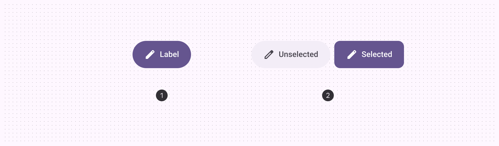
- Default button
- Toggle button
| Variant | M3 | M3 Expressive |
|---|---|---|
| Default | Available | Available |
| Toggle (selection) | -- | Available |
Configurations
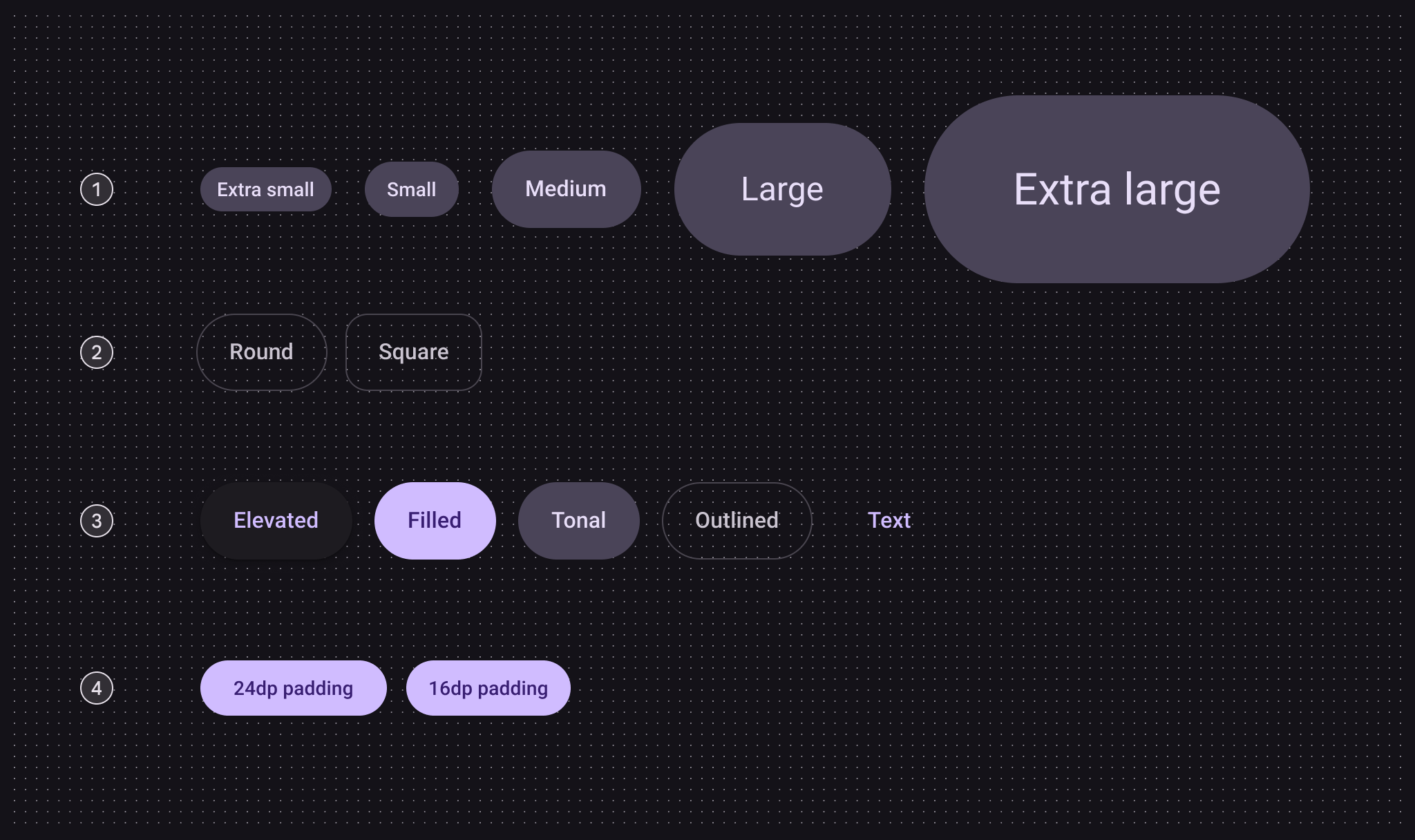
- Size
- Shape
- Color
- Small button padding
| Category | Configuration | M3 | M3 Expressive |
|---|---|---|---|
| Size | Small (default) | Available | Available |
| XS, M, L, XL | -- | Available | |
| Shape | Round (default) | Available | Available |
| Square | -- | Available | |
| Color | Elevated, filled (default), tonal, outlined, text | Available | Available |
| Small button padding | 24dp | Available | Not recommended. Use 16dp |
| 16dp | -- | Available |
Tokens & specs
Use the table's menu to select a token set. Button token sets are separated into common tokens, color, and size. View baseline tokens
Button - Color - Elevated
Button - Color - Filled
Button - Color - Tonal
Button - Color - Outlined
Button - Color - Text
Button - Size - Xsmall
| Token | Value |
|---|---|
| Button xsmall container height | 32dp |
| Button xsmall outline width | 1dp |
| Button xsmall label font | Roboto |
| Button xsmall label line height | 20pt |
| Button xsmall label size | 14pt |
| Button xsmall label weight | 500 |
| Button xsmall label tracking | 0.1pt |
| Button xsmall icon size | 20dp |
| Button xsmall shape round | Circular |
| Button xsmall shape square | 12dp |
| Button xsmall leading space | 12dp |
| Button xsmall between icon label space | 4dp |
| Button xsmall trailing space | 12dp |
| Button xsmall shape pressed morph | 8dp |
| Button xsmall shape spring animation damping | 0.9 |
| Button xsmall shape spring animation stiffness | 1400 |
| Button xsmall selected container shape round | 12dp |
| Button xsmall selected container shape square | Circular |
Button - Size - Small
| Token | Value |
|---|---|
| Button small container height | 40dp |
| Button small outline width | 1dp |
| Button small label font | Roboto |
| Button small label line height | 20pt |
| Button small label size | 14pt |
| Button small label weight | 500 |
| Button small label tracking | 0.1pt |
| Button small icon size | 20dp |
| Button small shape round | Circular |
| Button small shape square | 12dp |
| Button small leading space | 16dp |
| Button small between icon label space | 8dp |
| Button small trailing space | 16dp |
| Button small shape pressed morph | 8dp |
| Button small shape spring animation damping | 0.9 |
| Button small shape spring animation stiffness | 1400 |
| Button small selected container shape round | 12dp |
| Button small selected container shape square | Circular |
Button - Size - Medium
| Token | Value |
|---|---|
| Button medium container height | 56dp |
| Button medium outline width | 1dp |
| Button medium label font | Roboto |
| Button medium label line height | 24pt |
| Button medium label size | 16pt |
| Button medium label weight | 500 |
| Button medium label tracking | 0.15pt |
| Button medium icon size | 24dp |
| Button medium shape round | Circular |
| Button medium shape square | 16dp |
| Button medium leading space | 24dp |
| Button medium between icon label space | 8dp |
| Button medium trailing space | 24dp |
| Button medium shape pressed morph | 12dp |
| Button medium shape spring animation damping | 0.9 |
| Button medium shape spring animation stiffness | 1400 |
| Button medium selected container shape round | 16dp |
| Button medium selected container shape square | Circular |
Button - Size - Large
| Token | Value |
|---|---|
| Button large container height | 96dp |
| Button large outline width | 2dp |
| Button large label font | Roboto |
| Button large label line height | 32pt |
| Button large label size | 24pt |
| Button large label weight | 400 |
| Button large label tracking | 0 |
| Button large icon size | 32dp |
| Button large shape round | Circular |
| Button large shape square | 28dp |
| Button large leading space | 48dp |
| Button large between icon label space | 12dp |
| Button large trailing space | 48dp |
| Button large shape pressed morph | 16dp |
| Button large shape spring animation damping | 0.9 |
| Button large shape spring animation stiffness | 1400 |
| Button large selected container shape round | 28dp |
| Button large selected container shape square | Circular |
Button - Size - Xlarge
| Token | Value |
|---|---|
| Button xlarge container height | 136dp |
| Button xlarge outline width | 3dp |
| Button xlarge label font | Roboto |
| Button xlarge label line height | 40pt |
| Button xlarge label size | 32pt |
| Button xlarge label weight | 400 |
| Button xlarge label tracking | 0 |
| Button xlarge icon size | 40dp |
| Button xlarge shape round | Circular |
| Button xlarge shape square | 28dp |
| Button xlarge leading space | 64dp |
| Button xlarge between icon label space | 16dp |
| Button xlarge trailing space | 64dp |
| Button xlarge shape pressed morph | 16dp |
| Button xlarge shape spring animation damping | 0.9 |
| Button xlarge shape spring animation stiffness | 1400 |
| Button xlarge selected container shape round | 28dp |
| Button xlarge selected container shape square | Circular |
Anatomy
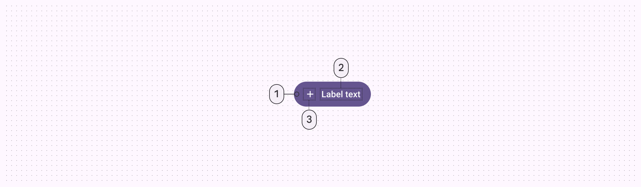
- Container
- Label text
- Icon (optional)
Color
Color values are implemented through design tokens. For designers, this means working with color values that correspond with tokens. In implementation, a color value will be a token that references a value.
- There are five built-in button color styles: elevated, filled, tonal, outlined, and text
- The default and toggle buttons use different colors
- Toggle buttons don't use the text style
TIP
These color roles were chosen to create design coherence and familiarity. Other color roles can be used as long as the container and text have a 3:1 contrast ratio. For example, tertiary and on tertiary.
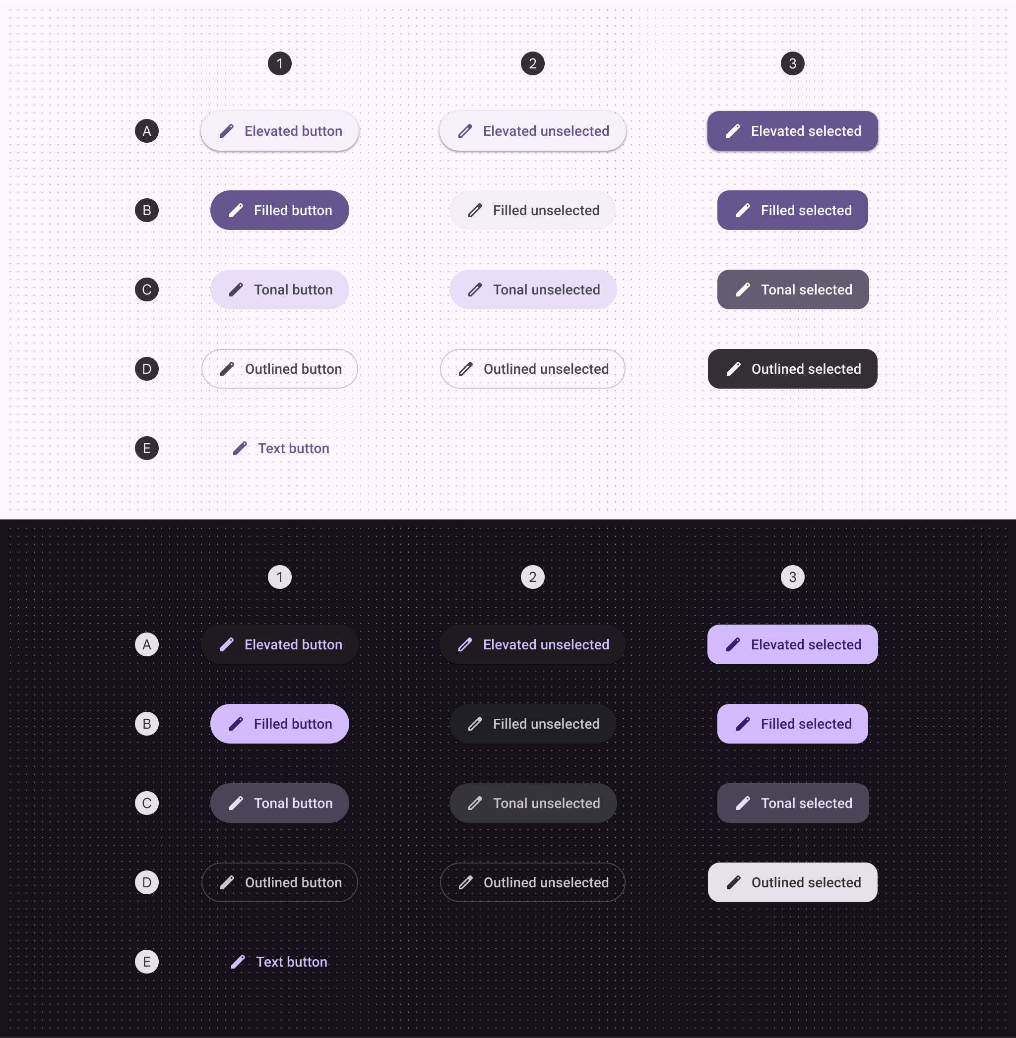
A. Elevated, B. Filled, C. Tonal, D. Outlined, E. Text
- Default
- Toggle: unselected
- Toggle: selected
| 1. Default | 2. Toggle unselected | 3. Toggle selected | |
|---|---|---|---|
| Elevated container Elevated icon & label | Surface container low Primary | Surface container low Primary | Primary On primary |
| Filled container Filled icon & label | Primary On primary | Surface container On surface variant | Primary On primary |
| Tonal container Tonal icon & label | Secondary container On secondary container | Secondary container On secondary container | Secondary On secondary |
| Outlined container Outlined icon & label | Outline variant (outline) On surface variant | Outline variant (outline) On surface variant | Inverse surface Inverse on surface |
| Text icon & label | Primary | -- | -- |
States
States are visual representations used to communicate the status of a component or interactive element.Elevated button states
The elevated button style has an elevation of 1 by default and 0 when disabled.
Default
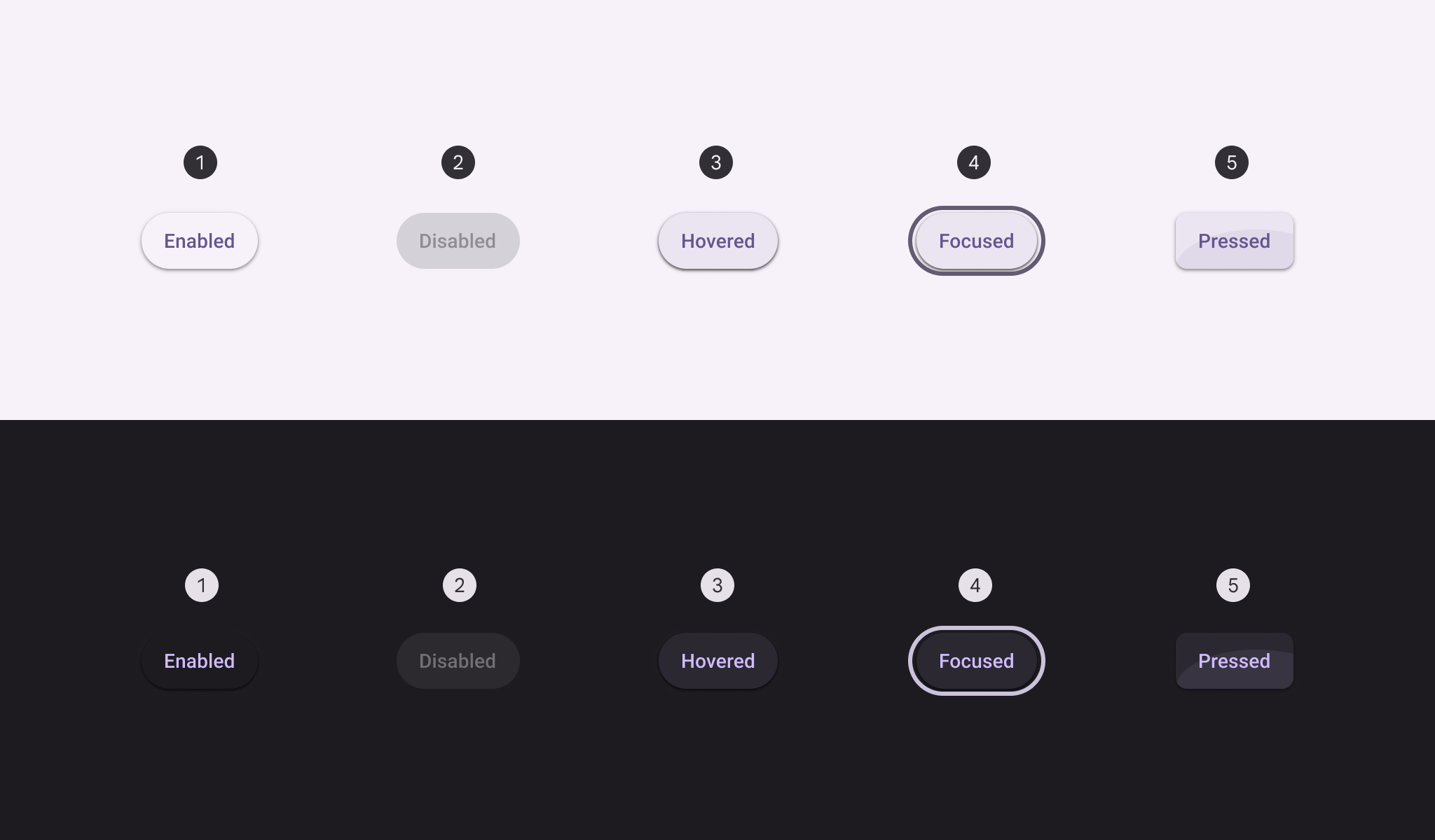
- Enabled
- Disabled
- Hovered
- Focused
- Pressed
Toggle
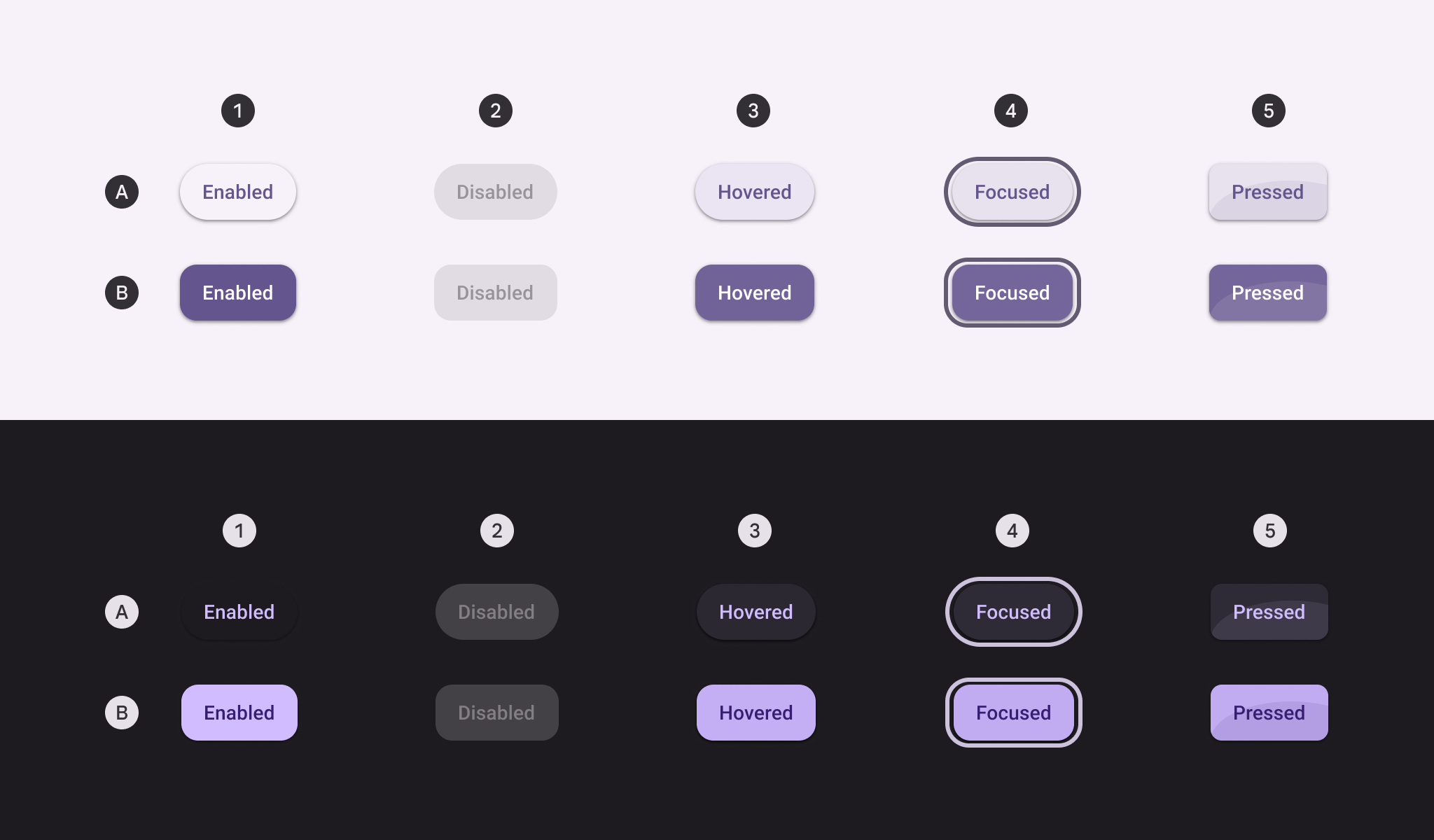
A. Unselected, B. Selected
- Enabled
- Disabled
- Hovered
- Focused
- Pressed
Filled button states
Default
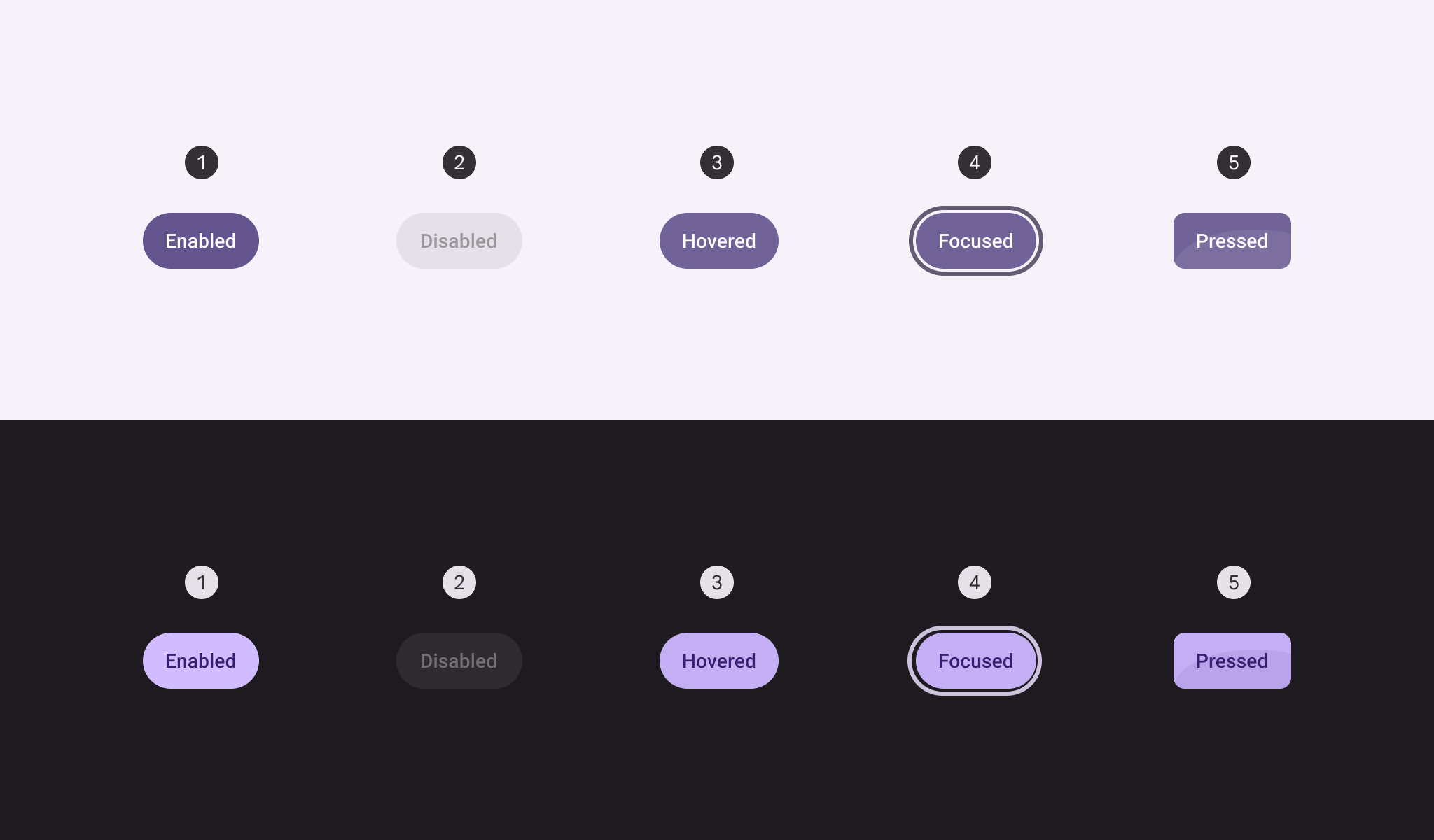
- Enabled
- Disabled
- Hovered
- Focused
- Pressed
Toggle
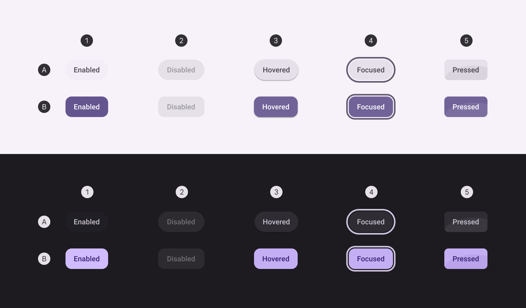
A. Unselected, B. Selected
- Enabled
- Disabled
- Hovered
- Focused
- Pressed
Tonal button states
Default
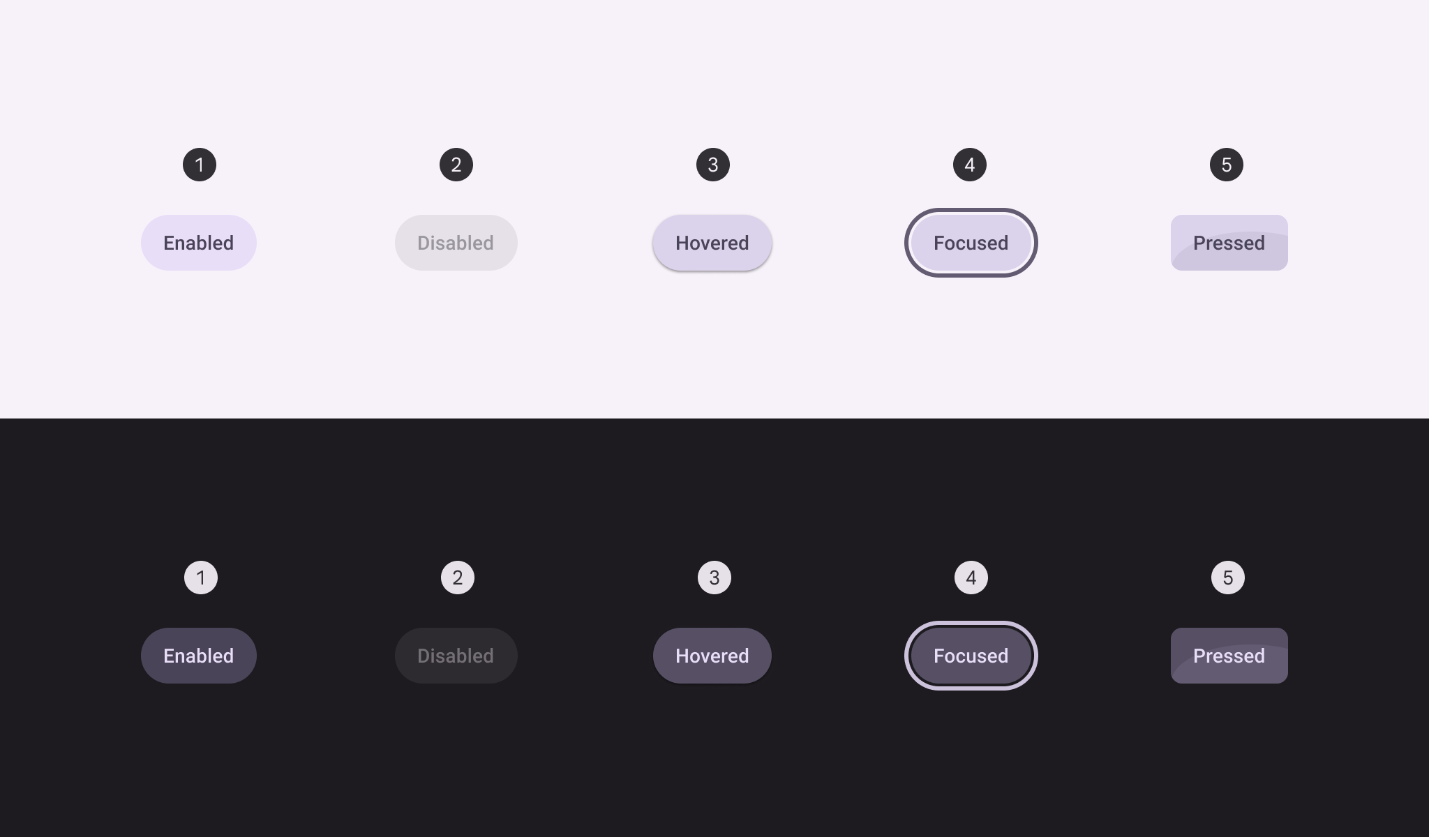
- Enabled
- Disabled
- Hovered
- Focused
- Pressed
Toggle
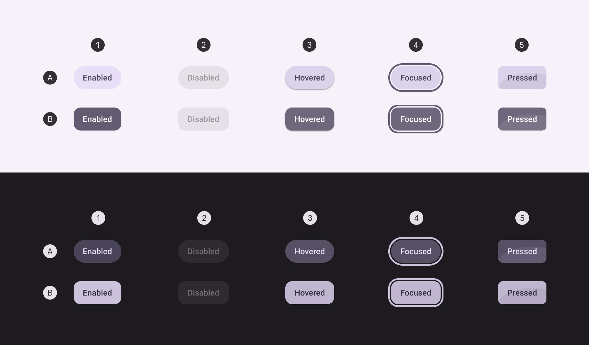
A. Unselected, B. Selected
- Enabled
- Disabled
- Hovered
- Focused
- Pressed
Outlined button states
The outlined button's container fill is invisible at rest, but the opacity and state layers behave the same as other button styles when disabled, hovered, focused, or pressed.
Default
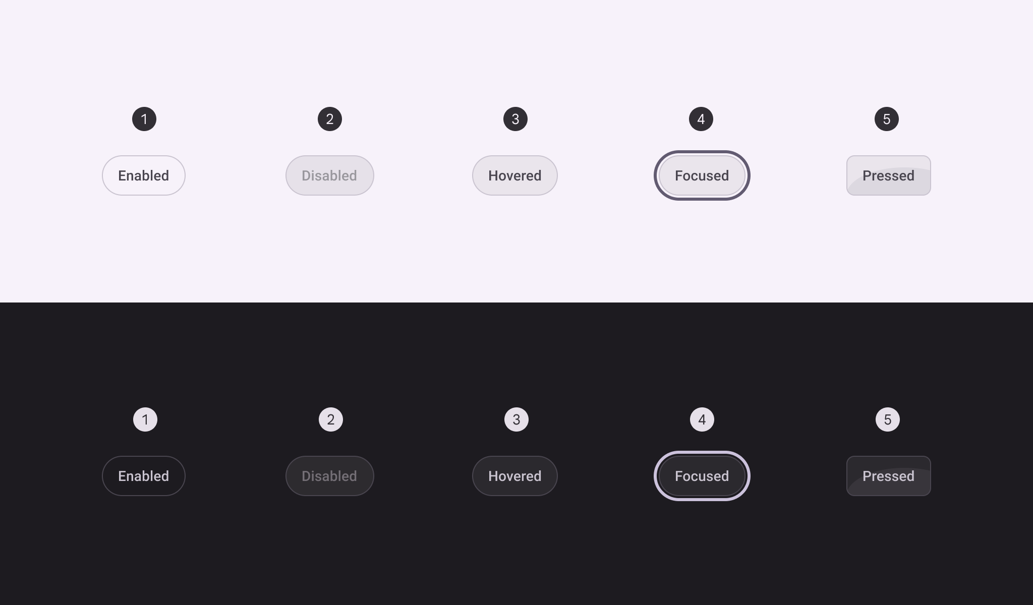
- Enabled
- Disabled
- Hovered
- Focused
- Pressed
Toggle
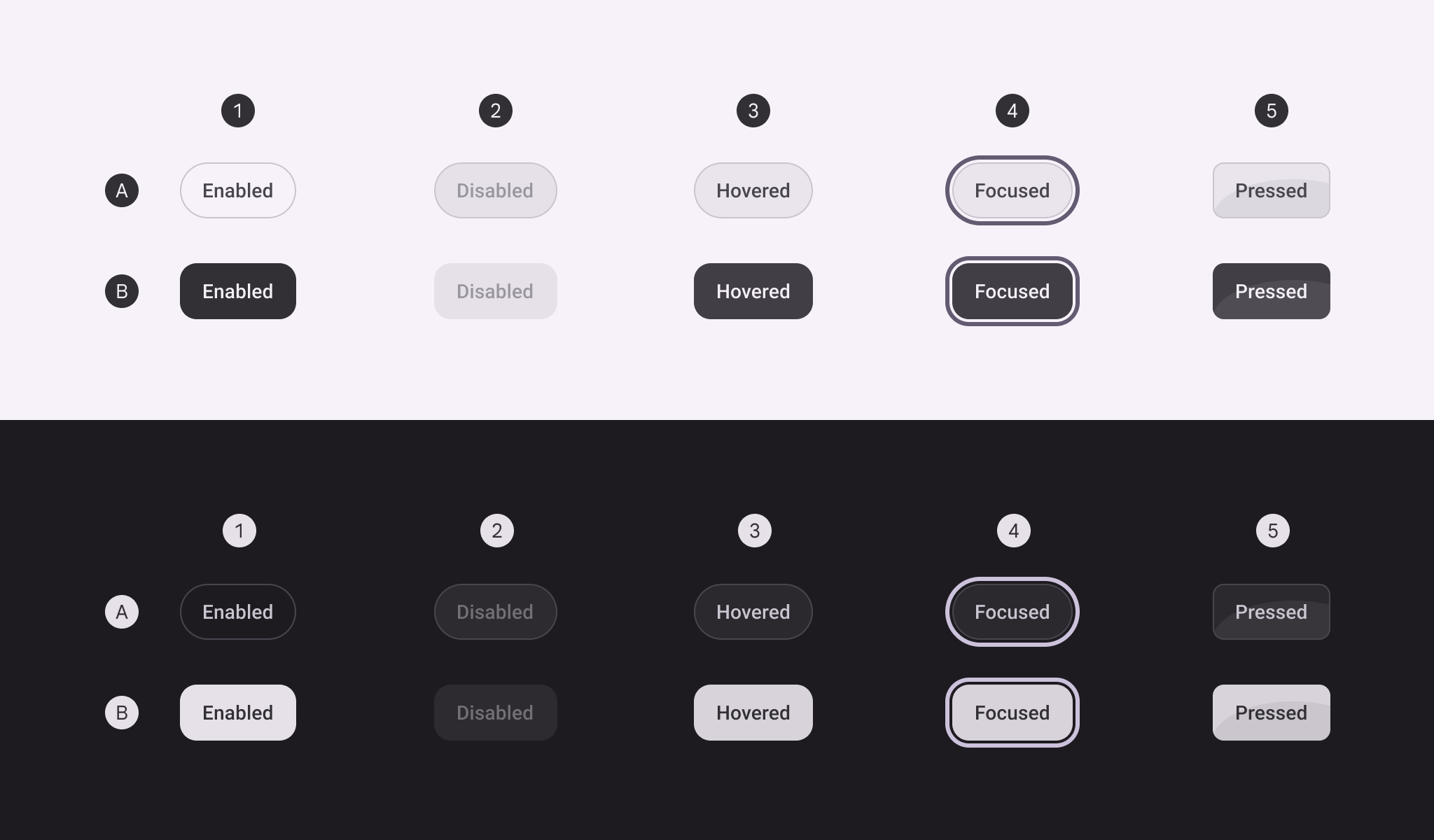
- Enabled
- Disabled
- Hovered
- Focused
- Pressed
Text button style states
The text button's container is invisible at rest, but the opacity and state layers behave the same as other button styles when disabled, hovered, focused, or pressed. There is no toggle text button.
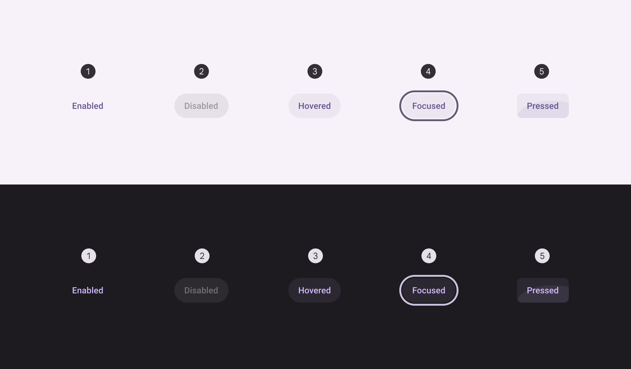
- Enabled
- Disabled
- Hovered
- Focused
- Pressed
Shape morph
Pressed state
When pressed, buttons can morph to become more square. Both round and square buttons should have the same pressed shape.
The corner radius value differs for each button size. See full button corner measurements
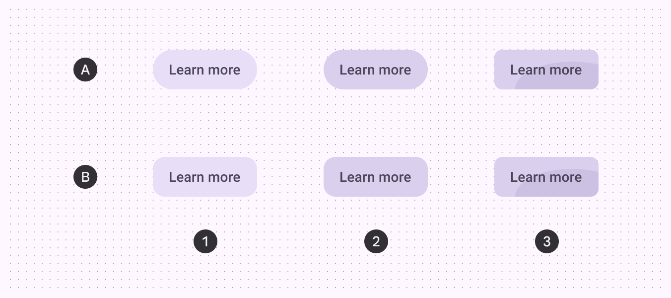
A. Round button, B. Square button
- Enabled
- Hovered
- Pressed
When selected
In addition to changing shape when pressed, toggle buttons also change the resting shape from round (unselected) to square (selected).
If the resting unselected shape is square, the selected shape should be round.
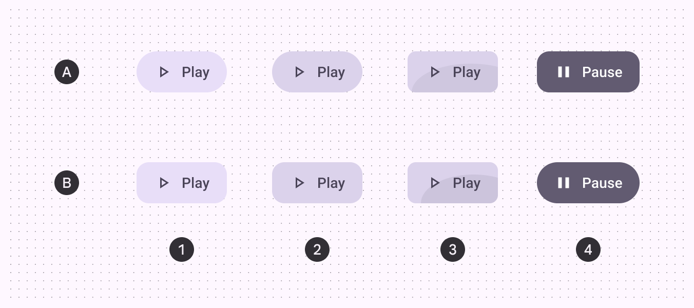
A. Round button, B. Square button
- Enabled
- Hovered
- Pressed
- Selected
Measurements
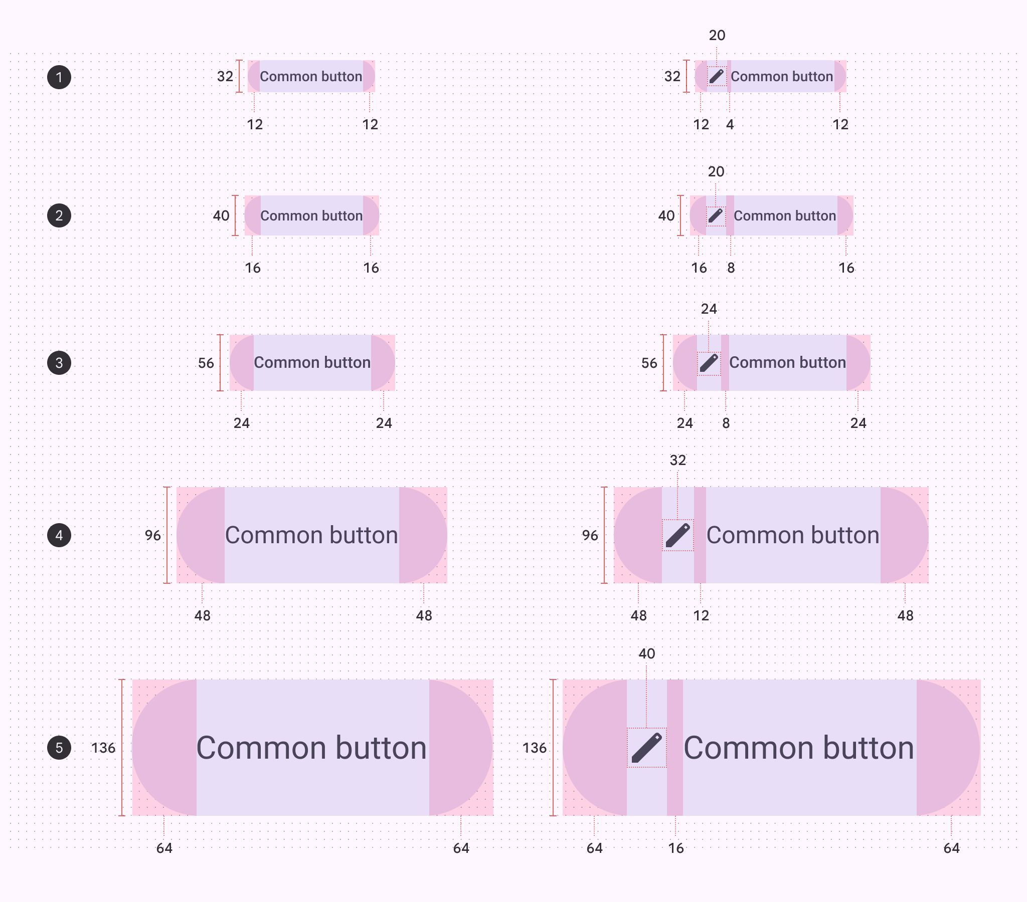
Padding and size measurements of each button size
- Extra small
- Small
- Medium
- Large
- Extra large
Target areas
Extra small and small icon buttons must have a target size of 48x48dp or larger to be accessible.
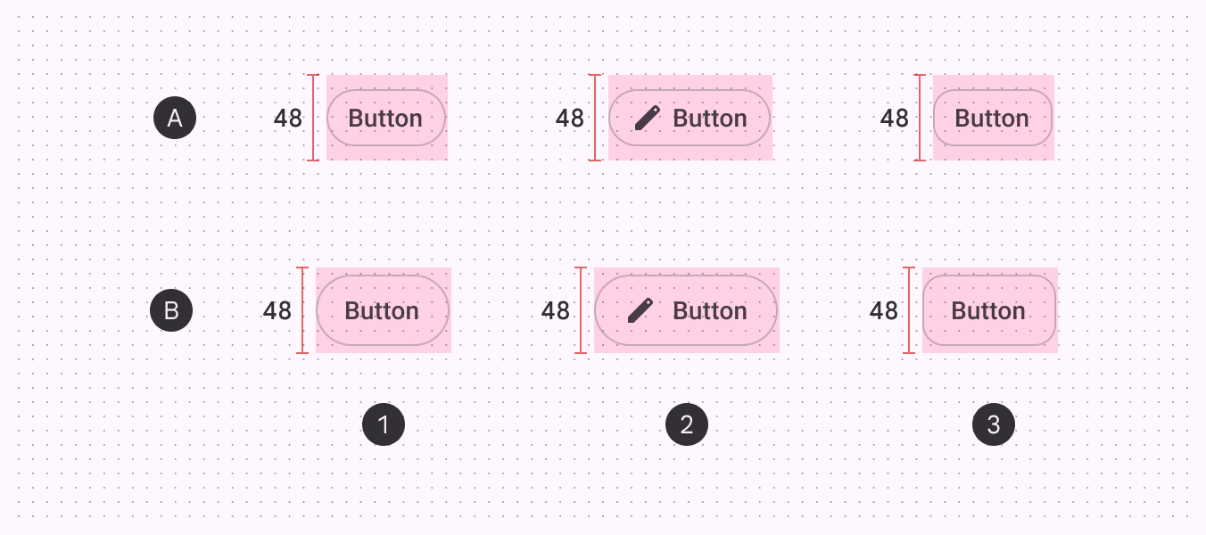
A. Extra small B. Small
- Round button
- Button with icon
- Square button
Corner sizes
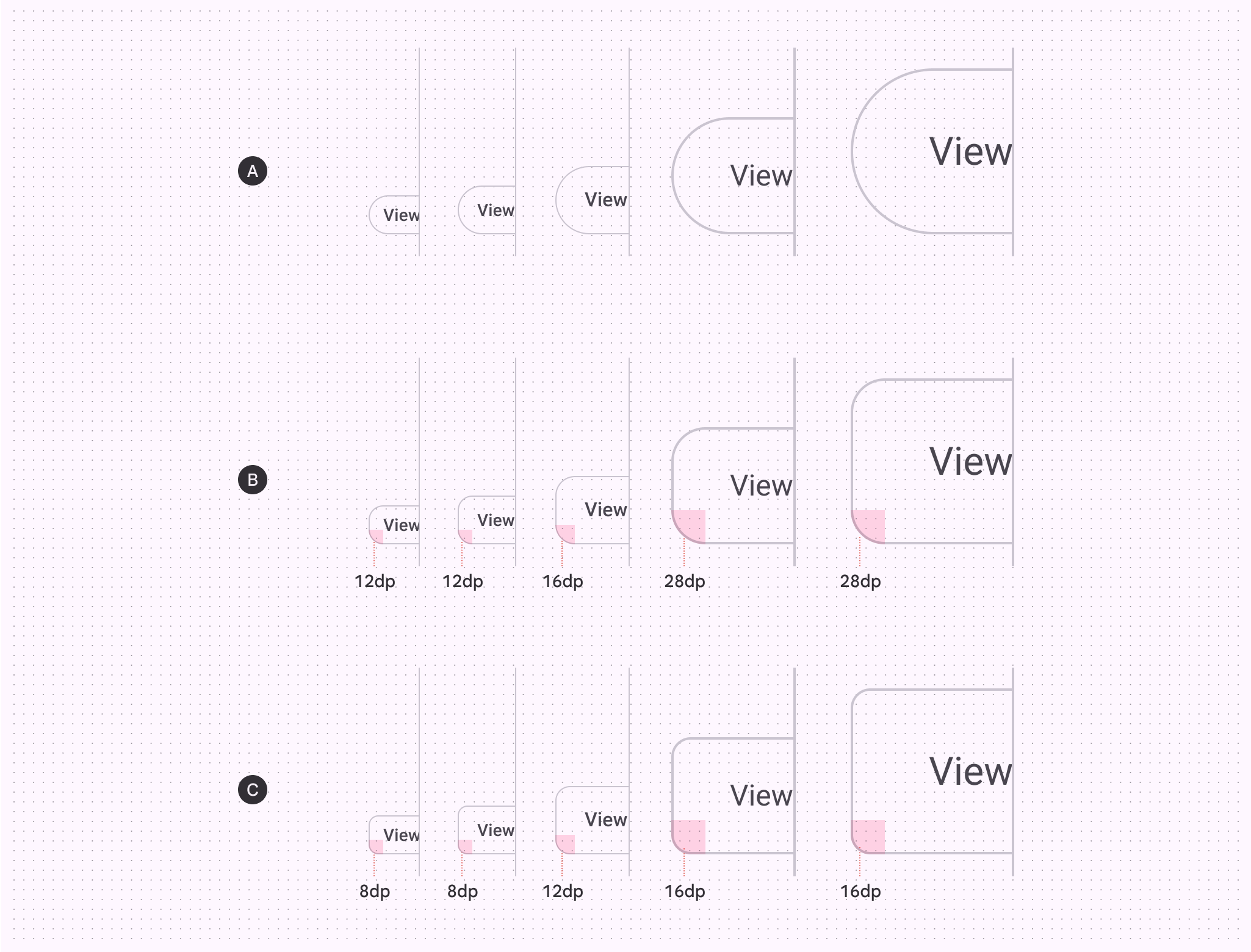
| XS | S | M | L | XL | |
|---|---|---|---|---|---|
| A. Round button | Full | Full | Full | Full | Full |
| B. Square button | 12dp | 12dp | 16dp | 28dp | 28dp |
| C. Pressed state | 8dp | 8dp | 12dp | 16dp | 16dp |
Baseline tokens
Use the table's menu to switch token sets. The baseline button token sets are organized by color.