Skip to content
Material Design 2
Main Navigation
v3
v2
v1

English

简体中文
繁體中文
Español
Français
Русский
Português – Brasil
Deutsch
日本語
한국어
Italiano
Polski
Türkçe
čeština
magyar

English

简体中文
繁體中文
Español
Français
Русский
Português – Brasil
Deutsch
日本語
한국어
Italiano
Polski
Türkçe
čeština
magyar

Appearance

Sidebar Navigation

Material System

Introduction

Material studies

About our Material studies

Basil

Crane

Fortnightly

Owl

Rally

Reply

Shrine

Material Foundation

Environment

Surfaces

Elevation

Light and shadows

Layout

Understanding layout

Pixel density

Responsive layout grid

Spacing methods

Component behavior

Applying density

Navigation

Understanding navigation

Navigation transitions

Search

Color

The color system

Applying color to UI

Color usage

Text legibility

Dark theme

Typography

The type system

Understanding typography

Language support

Sound

About sound

Applying sound to UI

Sound attributes

Sound choreography

Iconography

Product icons

System icons

Animated icons

Shape

About shape

Shape and hierarchy

Shape as expression

Shape and motion

Applying shape to UI

Motion

Understanding motion

The motion system

Speed

Choreography

Customization

Interaction

Gestures

Selection

States

Communication

Confirmation & acknowledgement

Data formats

Data visualization

Empty states

Help & feedback

Imagery

Launch screen

Onboarding

Offline states

Writing

Machine learning

Machine learning patterns

Object detection: live camera

Object detection: static image

Barcode Scanning

Material Guidelines

Material Theming

Overview

Implementing your theme

Usability

Accessibility

Bidirectionality

Platform guidance

Android bars

Android fingerprint

Android haptics

Android icons

Android navigating between apps

Android notifications

Android permissions

Android slices

Android split-screen

Android swipe-to-refresh

Android text selection toolbar

Android widget

Cross-platform adaptation

Components

App bars: bottom

App bars: top

Backdrop

Banners

Bottom navigation

Buttons

Buttons: floating action button

Cards

Checkboxes

Chips

Data tables

Date pickers

Dialogs

Dividers

Image lists

Lists

Menus

Navigation drawer

Navigation rail

Progress indicators

Radio buttons

Sheets: bottom

Sheets: side

Sliders

Snackbars

Switches

Tabs

Text fields

Time pickers

Tooltips

On this page

Light and shadows ​

Material surfaces cast shadows when they obstruct light sources.

Light ​

Light and shadows ​

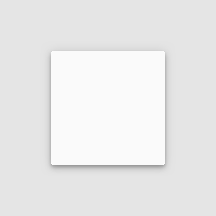
In the Material Design environment, virtual lights illuminate the UI. Key lights create sharper, directional shadows, called key shadows. Ambient light appears from all angles to create diffused, soft shadows, called ambient shadows.

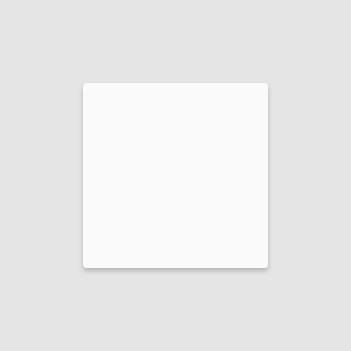
Shadow cast by a key light
Shadow cast by ambient light

Combined shadow from key and ambient lights
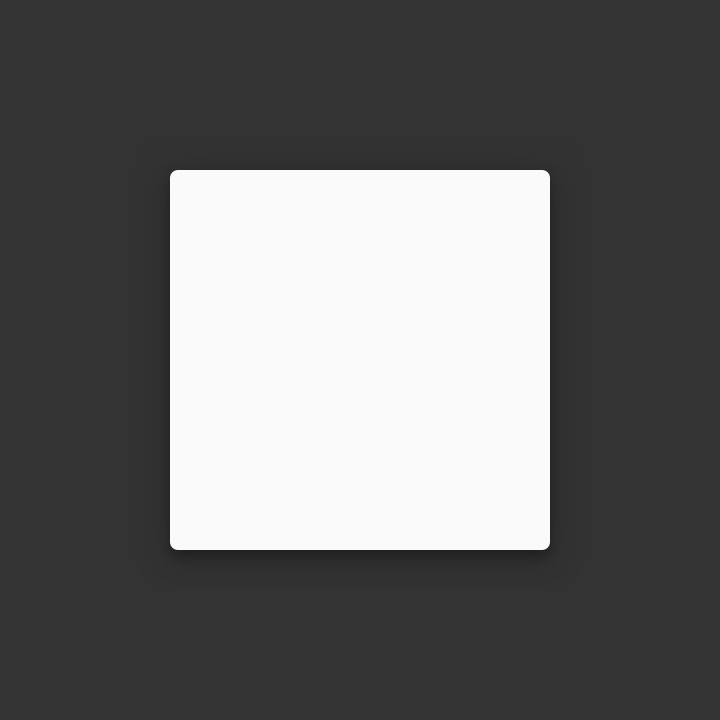
Elements use shadows on dark surfaces, even if they are less visible
Elements use shadows on dark surfaces, even if they are less visible.

Light sources ​

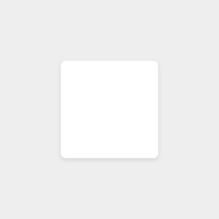
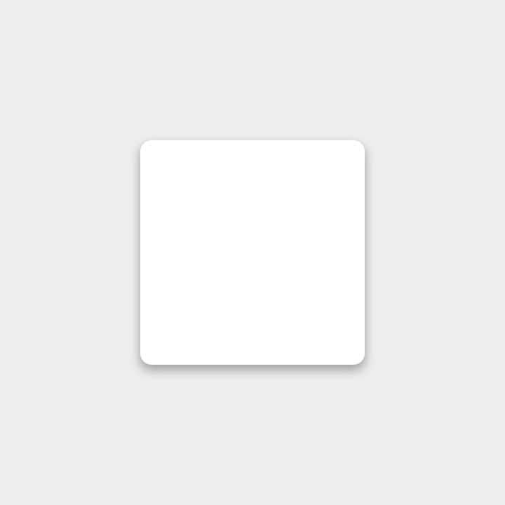
Shadows in the Material environment are cast by a key light and ambient light. In Android and iOS development, shadows occur when light sources are blocked by Material surfaces at various positions along the z-axis. On the web, shadows are depicted by manipulating the y-axis only. The following example shows a card with an elevation of 6dp.
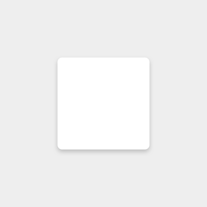
Don't: shadow cast by key light

Don't

Shadow cast by key light
Don't: shadow cast by ambient light

Don't

Shadow cast by ambient light
Do: combined shadow from key and ambient lights

Do

Combined shadow from key and ambient lights

Shadows ​

Shadows provide cues about depth, direction of movement, and surface edges. A surface’s shadow is determined by its elevation and relationship to other surfaces.


Depicting elevation

Elevation is the relative distance between two surfaces along the z-axis.

Related article

Usage ​

Because shadows express the degree of elevation between surfaces, they must be used consistently throughout your product.
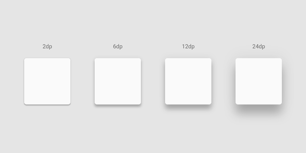
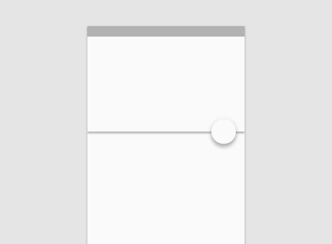
Elevation is depicted by consistent use of shadow
Elevation is depicted by consistent use of shadow.

Shadow size reflects elevation
Shadow size reflects elevation. Surfaces at higher elevations have larger shadows, while those at lower elevations have smaller shadows.

Caution

If your product doesn’t use shadows, convey elevation in other ways, such as through parallax motion.

Do

The appearance of a shadow indicates the list item has been picked up and can move in front of its peers during this reorder interaction.

Shadows & Motion ​

Shadows provide useful cues about a surface’s direction of movement and whether the distance between surfaces is increasing or decreasing.

When a surface changes shape or scale, but its elevation remains the same, its shadow should not change.

When a surface changes its elevation, its shadow should change.

Research ​

Material Design conducted 36 interviews with fifteen low-vision participants to better understand how shadows and outlines impact an individual’s ability to identify and interact with a component.

Research findings included:

  • Shadows and outlines are just one of many attributes of an element that impacts a user’s ability to identify it. Other attributes that affect the ability to identify an element include font characteristics, elevation, color, layout among surrounding elements, and context of use.
  • Using shadows and outlines increases the ease and speed of finding a component when scanning pages.
  • Using a shadow or stroke outline around a component improves one’s ability to determine whether or not it can be interacted with.
Pager
Previous pageElevation
Next pageUnderstanding layout

Released under the Apache-2.0

Copyright © 2018-Present Google

https://m2.material.io/design/environment/light-shadows.html

Released under the Apache-2.0

Copyright © 2018-Present Google