Skip to content
Material Design 2
Main Navigation
v3
v2
v1

English

简体中文
繁體中文
Español
Français
Русский
Português – Brasil
Deutsch
日本語
한국어
Italiano
Polski
Türkçe
čeština
magyar

English

简体中文
繁體中文
Español
Français
Русский
Português – Brasil
Deutsch
日本語
한국어
Italiano
Polski
Türkçe
čeština
magyar

Appearance

Sidebar Navigation

Material System

Introduction

Material studies

About our Material studies

Basil

Crane

Fortnightly

Owl

Rally

Reply

Shrine

Material Foundation

Environment

Surfaces

Elevation

Light and shadows

Layout

Understanding layout

Pixel density

Responsive layout grid

Spacing methods

Component behavior

Applying density

Navigation

Understanding navigation

Navigation transitions

Search

Color

The color system

Applying color to UI

Color usage

Text legibility

Dark theme

Typography

The type system

Understanding typography

Language support

Sound

About sound

Applying sound to UI

Sound attributes

Sound choreography

Iconography

Product icons

System icons

Animated icons

Shape

About shape

Shape and hierarchy

Shape as expression

Shape and motion

Applying shape to UI

Motion

Understanding motion

The motion system

Speed

Choreography

Customization

Interaction

Gestures

Selection

States

Communication

Confirmation & acknowledgement

Data formats

Data visualization

Empty states

Help & feedback

Imagery

Launch screen

Onboarding

Offline states

Writing

Machine learning

Machine learning patterns

Object detection: live camera

Object detection: static image

Barcode Scanning

Material Guidelines

Material Theming

Overview

Implementing your theme

Usability

Accessibility

Bidirectionality

Platform guidance

Android bars

Android fingerprint

Android haptics

Android icons

Android navigating between apps

Android notifications

Android permissions

Android slices

Android split-screen

Android swipe-to-refresh

Android text selection toolbar

Android widget

Cross-platform adaptation

Components

App bars: bottom

App bars: top

Backdrop

Banners

Bottom navigation

Buttons

Buttons: floating action button

Cards

Checkboxes

Chips

Data tables

Date pickers

Dialogs

Dividers

Image lists

Lists

Menus

Navigation drawer

Navigation rail

Progress indicators

Radio buttons

Sheets: bottom

Sheets: side

Sliders

Snackbars

Switches

Tabs

Text fields

Time pickers

Tooltips

On this page

States ​

States are visual representations used to communicate the status of a component or interactive element.

Usage ​

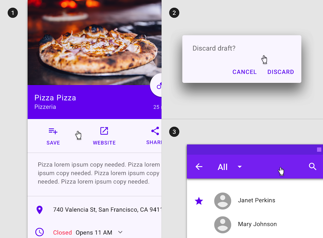
States communicate the status of UI elements to the user. Each state should be visually similar and not drastically alter a component, but must have clear affordances that distinguish it from other states and the surrounding layout.
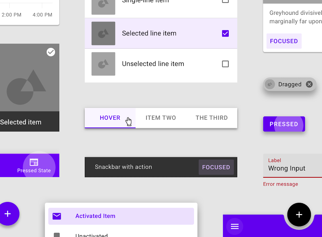
States must have clear affordances that distinguish them from one other
States must have clear affordances that distinguish them from one other.

Principles ​


State principle: distinct

Distinct

States must have clear affordances distinguishing them from one other and the surrounding UI, emphasized according to their priority levels.
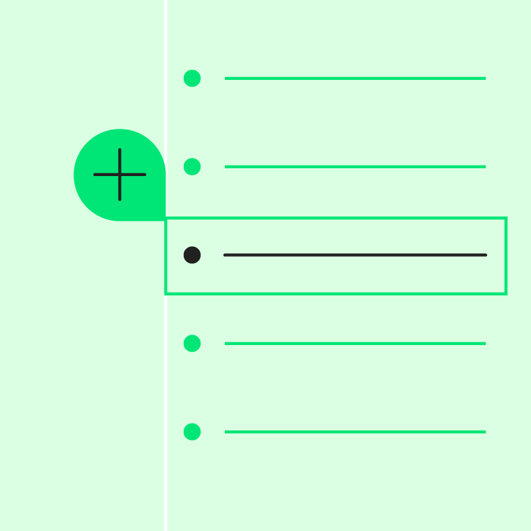
State principle: additive

Additive

When multiple states occur at once, such as selection and hover, both state indicators should be displayed.
State principle: consistent

Consistent

States should be applied consistently across components in order to increase usability.

Types of states ​
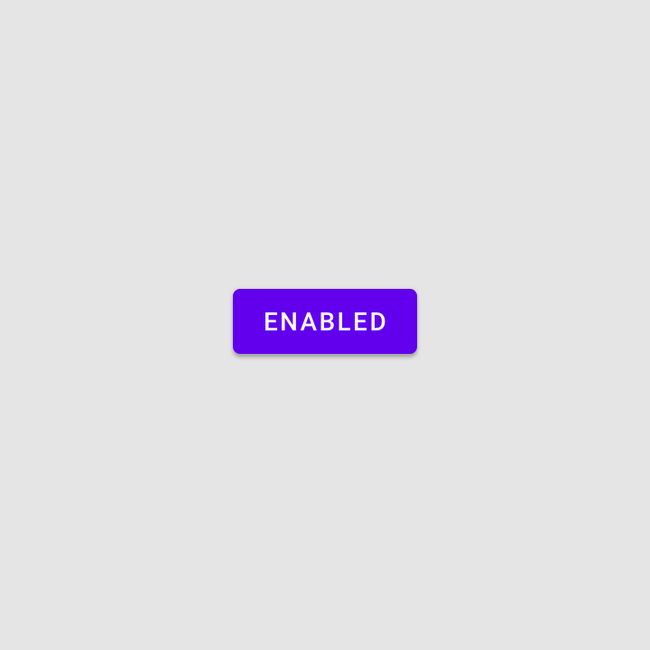

An enabled state communicates an interactive component or element
Enabled
An enabled state communicates an interactive component or element.

A disabled state communicates a noninteractive component or element
Disabled
A disabled state communicates a noninteractive component or element.
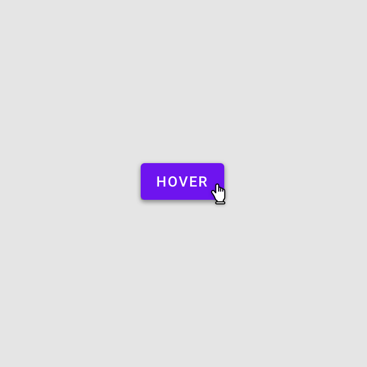
A hover state communicates when a user has placed a cursor above an interactive element
Hover
A hover state communicates when a user has placed a cursor above an interactive element.
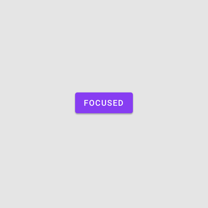
A focused state communicates when a user has highlighted an element, using an input method such as a keyboard or voice
Focused
A focused state communicates when a user has highlighted an element, using an input method such as a keyboard or voice.
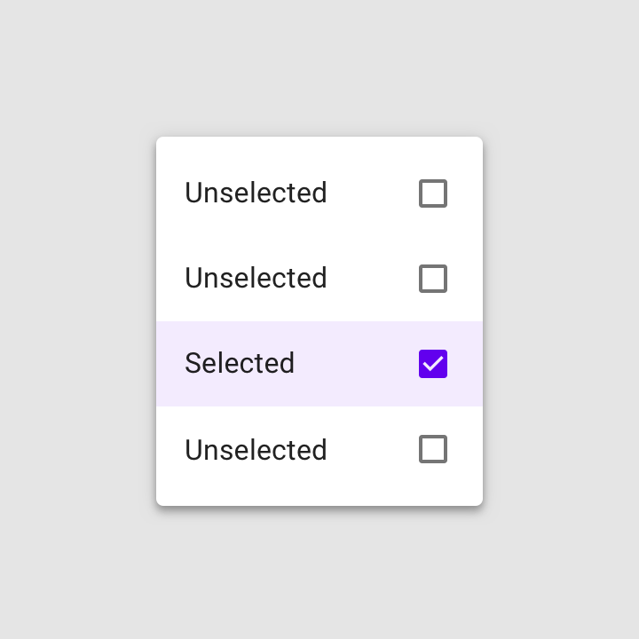
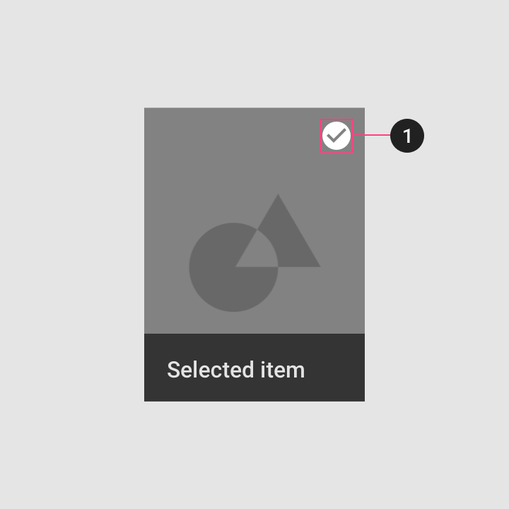
A selected state communicates a user choice
Selected
A selected state communicates a user choice.
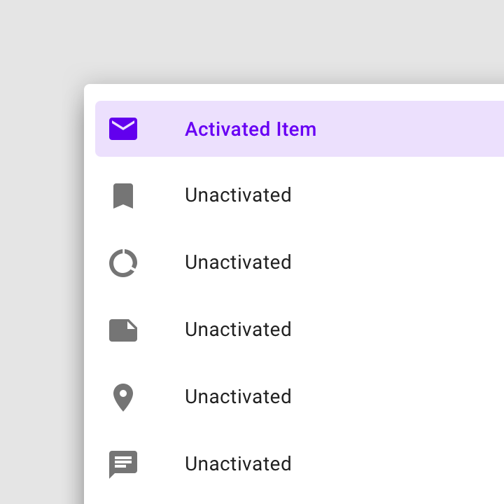
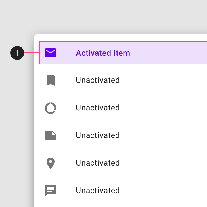
An activated state communicates a highlighted destination, whether initiated by the user or by default
Activated
An activated state communicates a highlighted destination, whether initiated by the user or by default.
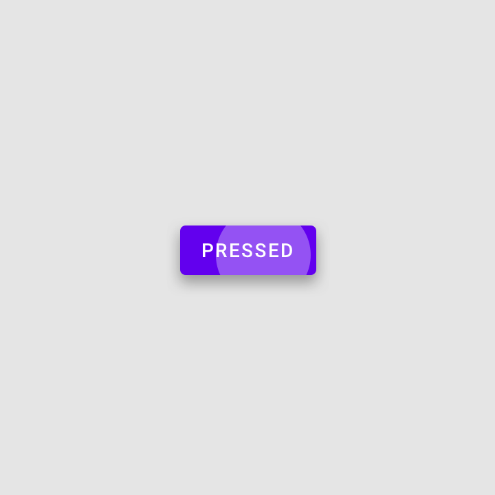
A pressed state communicates a user tap
Pressed
A pressed state communicates a user tap.
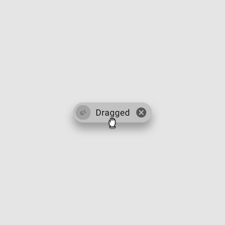
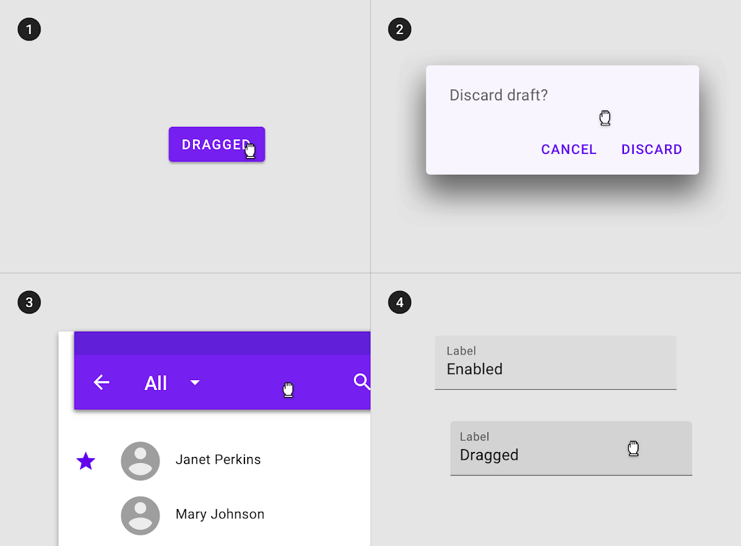
A dragged state communicates when a user presses and moves an element
Dragged
A dragged state communicates when a user presses and moves an element.
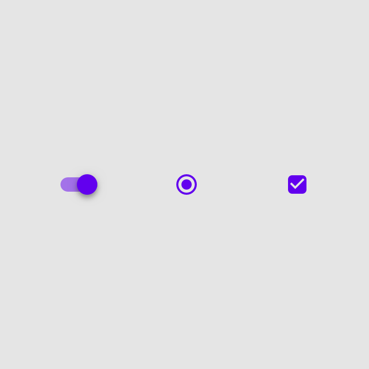
An on state communicates a toggle between two options
On
An on state communicates a toggle between two options.
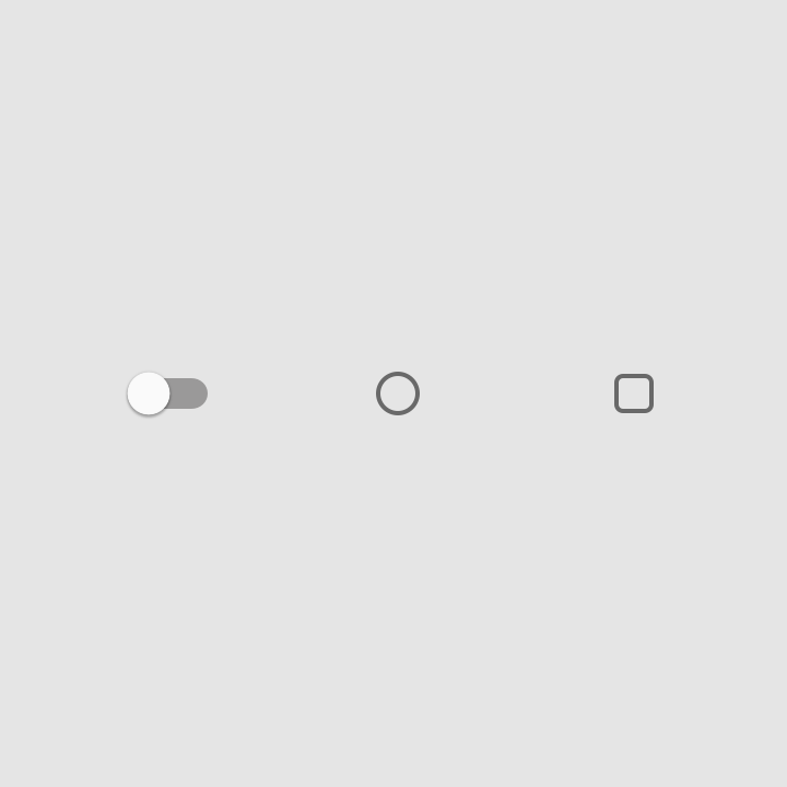
An off state communicates a toggle between two options
Off
An off state communicates a toggle between two options.
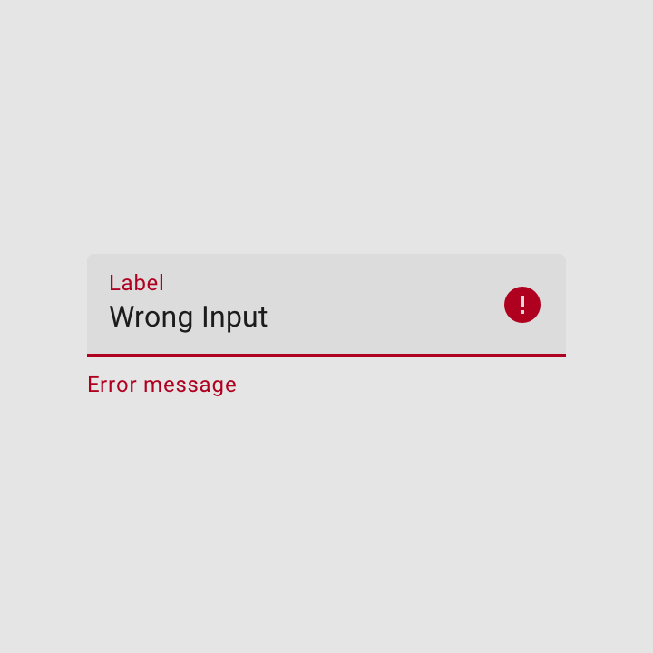
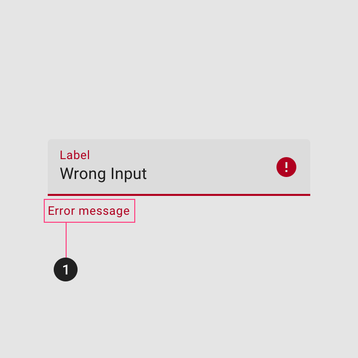
An error state communicates a user or system mistake
Error
An error state communicates a user or system mistake.

Anatomy ​

Overlay ​

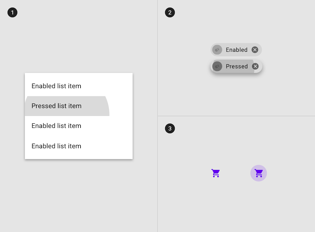
An overlay is a semi-transparent covering on an element that indicates its state. Overlays provide a systematic approach to visualizing states by using opacity. An overlay can be applied to an entire element or in a circular shape.

The overlay color matches the color of the text or icon on the element that it’s applied to. If the text or icon changes color during a state change, the overlay should match the end state's color.

Only one state layer is applied at a time. For example, if an element is first focused and then hovered, the hover state layer will be shown only until the hover is complete, then returning to the focus state layer if the element is still focused.
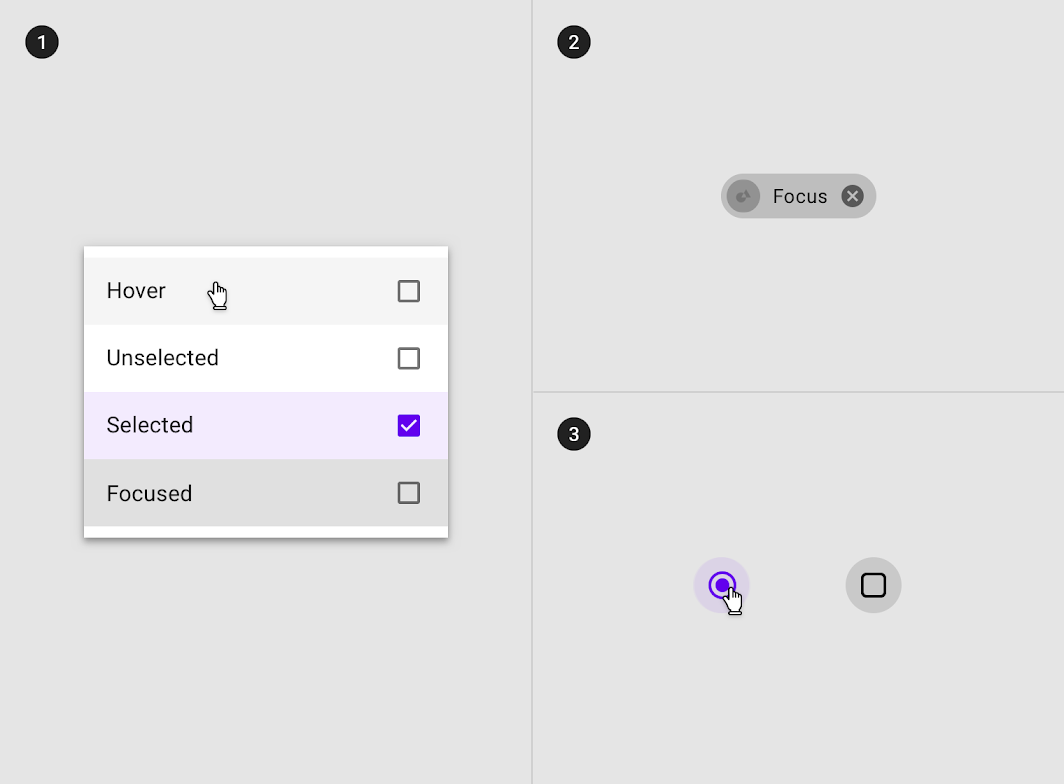
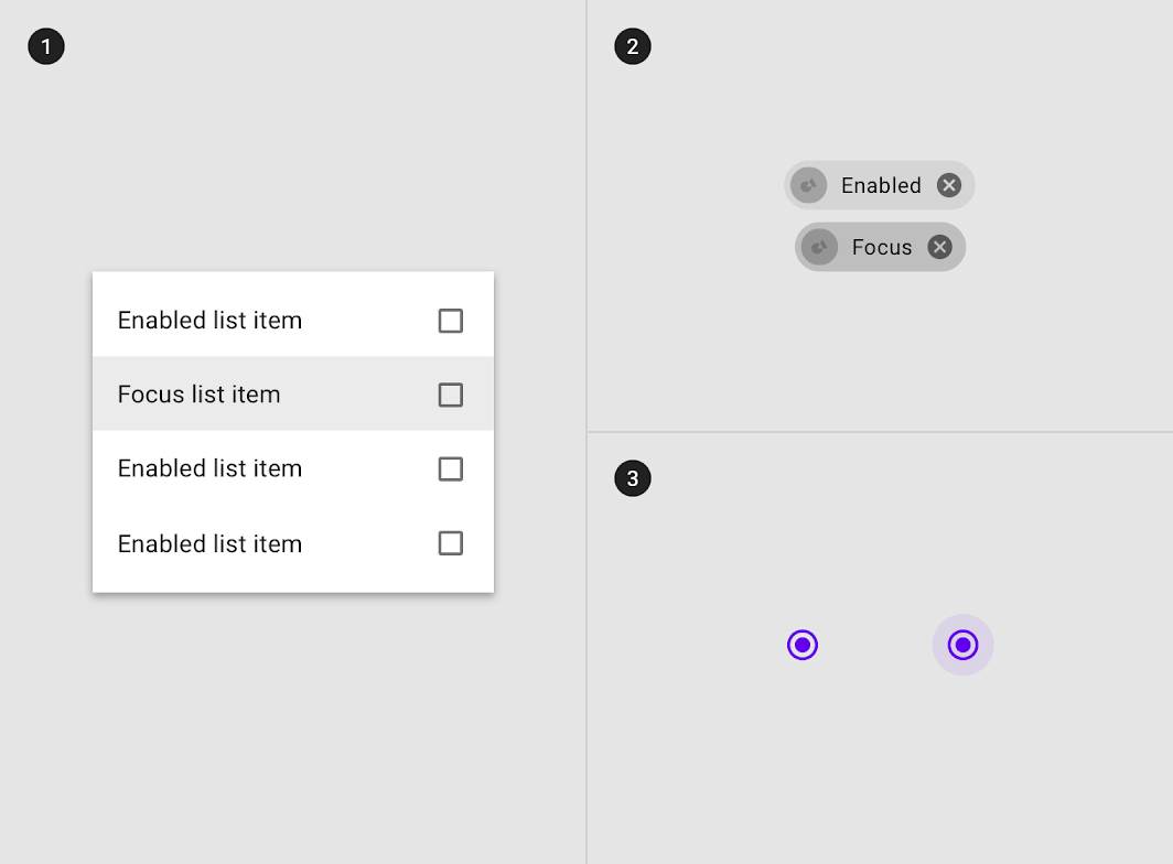
Diagram of overlay on line items, overlay on chip, overlay on selection controls
(1) Overlay on line items
(2) overlay on chip
(3) overlay on selection controls.
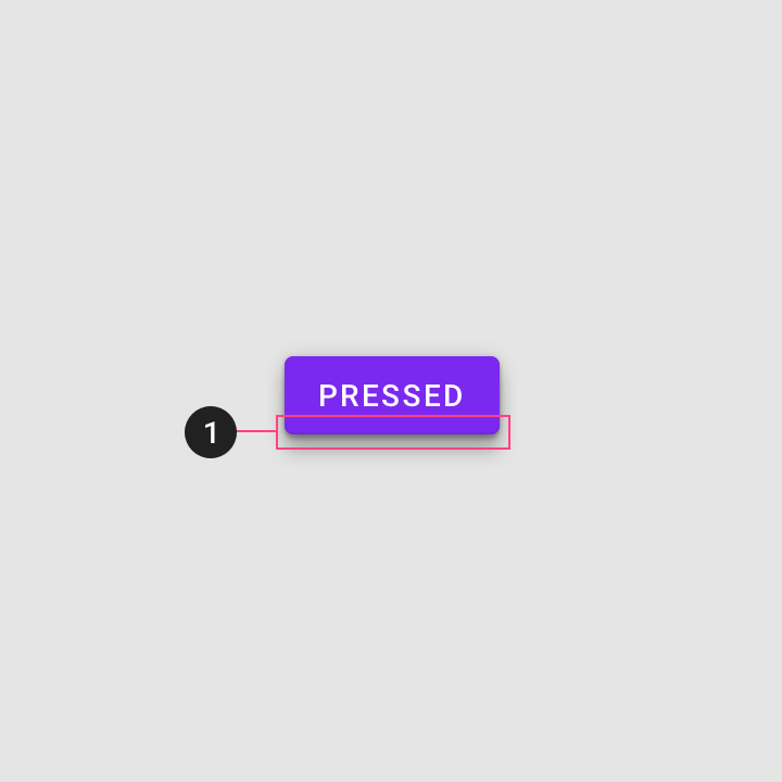
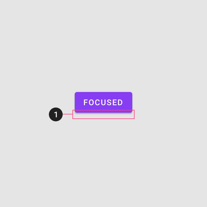
Elevation, combined with an overlay, can signify state on some components
(1) Elevation, combined with an overlay, can signify state on some components.
Color change may signify state
(1) Color change may signify state.

Iconography, combined with an overlay, can signify state on some components
(1) Iconography, combined with an overlay, can signify state on some components.
Messaging may be additional signifiers of state
(1) Messaging may be additional signifiers of state.

Overlay opacity values ​

To ensure proper visibility and color contrast accessibility, the opacity value of overlays should be adjusted for every different combination of text on a surface.
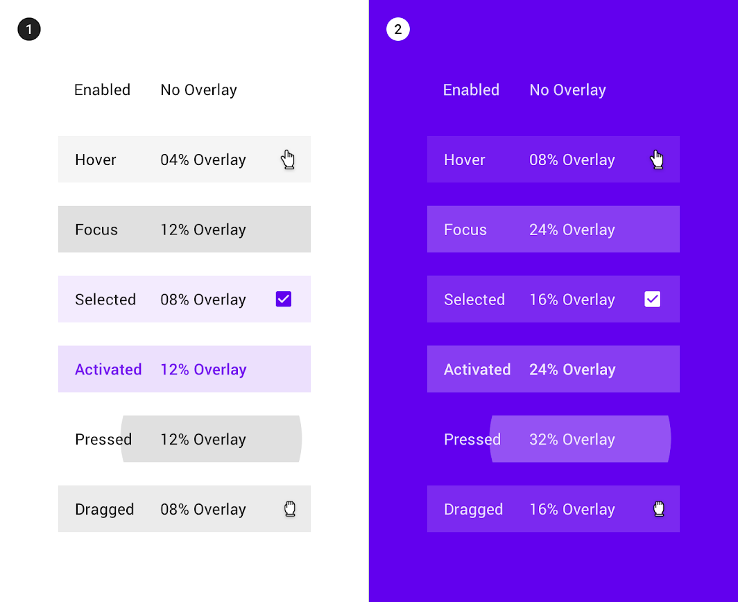
Overlay opacity values on #FFFFFF on a white surface
(1) Overlay opacity values on #FFFFFF on a white surface.
(2) Overlay opacity values on #6200EE on a surface colored with a primary color.

Disabled ​

Usage ​

A disabled state communicates when a component or element isn’t interactive, and should be deemphasized in a UI. Disabled states are displayed at 38% opacity of the enabled state.

Disabled states can also indicate they are not interactive through color changes and reduced elevation.
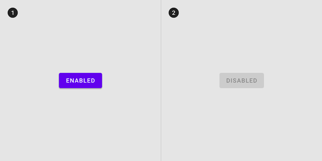
Usage: enabled
(1) Enabled and (2) disabled buttons differentiate through color and elevation changes.

Disabled state inheritance ​

Components can inherit a disabled state, such as toggle buttons, selection controls, text fields, icons, grid and list items, cards, chips, and buttons.
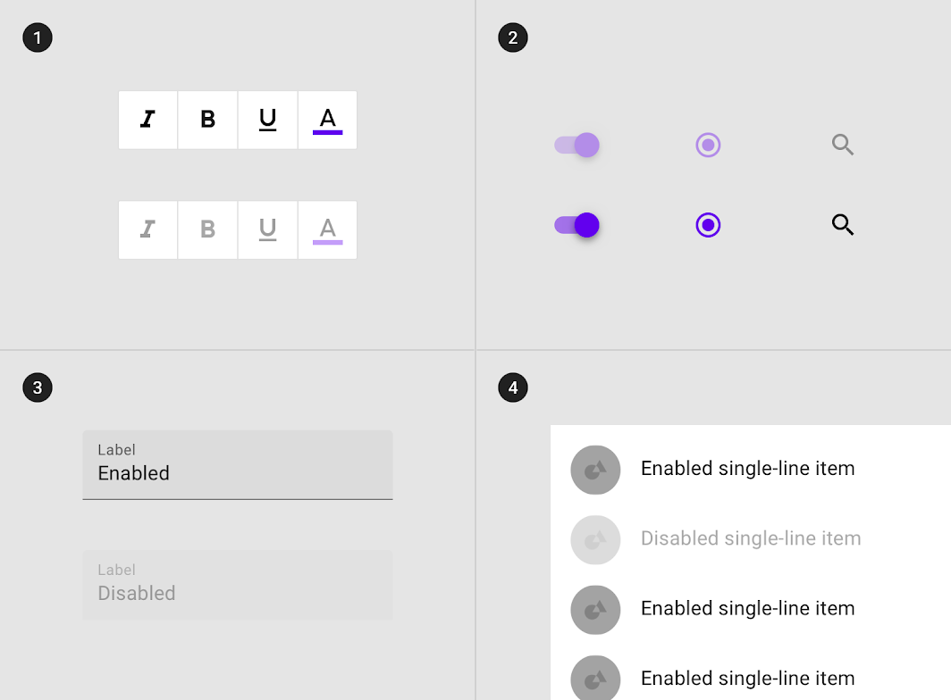
Diagram of toggle buttons, selection controls, text fields and a, list item inheriting a disabled state
(1) Toggle buttons, (2) selection controls, (3) text fields and a (4) list item inheriting a disabled state.

Disabled states cannot be inherited by: floating action buttons (FABs), bottom and side sheets, dialogs, menus, tooltips, and alerts, or navigational components (such as app bars, tabs, bottom navigation and steppers). If the action represented in the FAB is unavailable, the FAB should not appear in the composition.
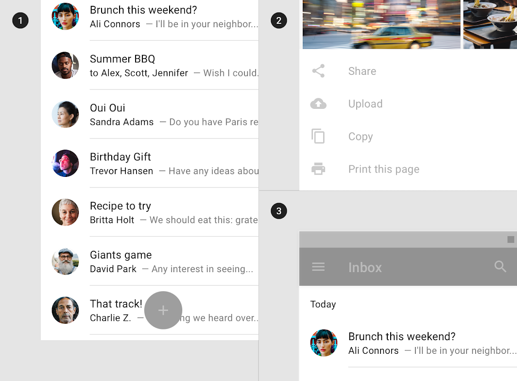
Diagram of fABs, bottom sheets and, app bars cannot inherit a disabled state

Don't

(1) FABs (2) bottom sheets and (3) app bars cannot inherit a disabled state.

Behavior ​

Disabled components don’t change state when tapped or hovered over.
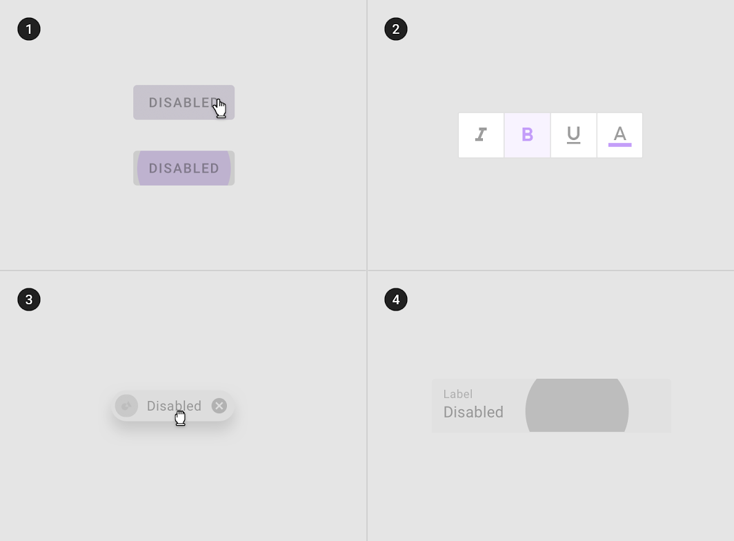
Disabled components can be hovered over, but won’t display state changes to the component or cursor.
Disabled components don’t change state when tapped.

Don't: disabled components cannot be (1) hovered, (2) focused, (3) dragged or (4) pressed

Don't

Disabled components cannot be (1) hovered, (2) focused, (3) dragged or (4) pressed.

There may be zero, one, or multiple disabled components in a composition.
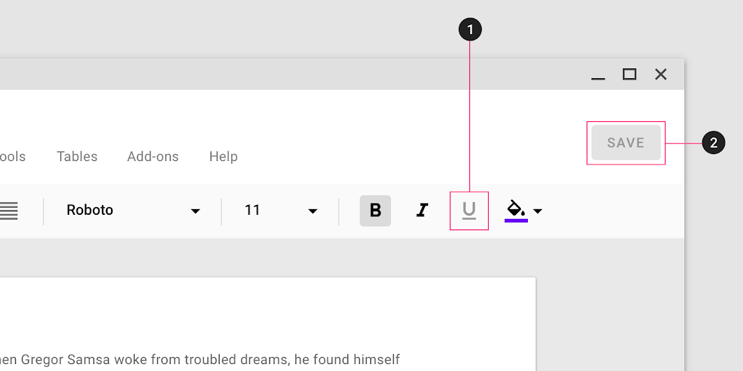
Diagram of disabled toggle button, disabled button in one layout
(1) Disabled toggle button, (2) Disabled button in one layout

Hover ​

Usage ​

Hover states are initiated by the user pausing over an interactive element using a cursor. They can be applied to all interactive components, and should be deemphasized to avoid distracting from content.

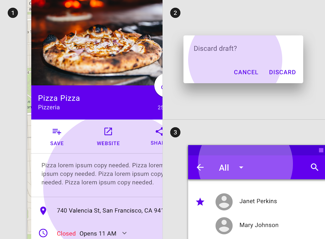
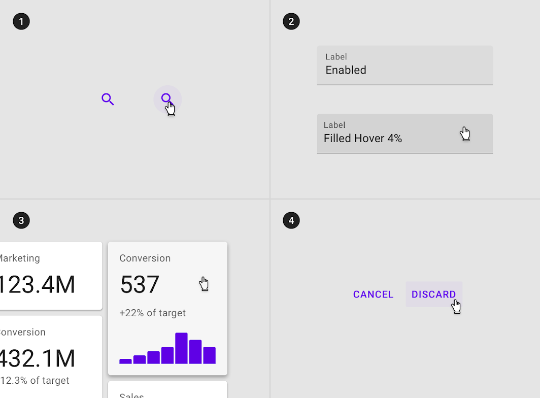
An overlay signifies a hover state. It can be applied to the entire component, elements within a component, or as a circular shape over part of the component.
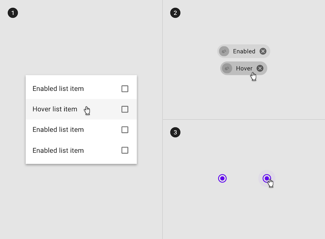
Overlay applied to (1) certain elements in a component, (2) the component as a whole, or (3) in circular form
Overlay applied to (1) certain elements in a component, (2) the component as a whole, or (3) in circular form.

Some components, such as buttons or cards, can inherit (1) elevation to signify a hover state
Some components, such as buttons or cards, can inherit (1) elevation to signify a hover state.
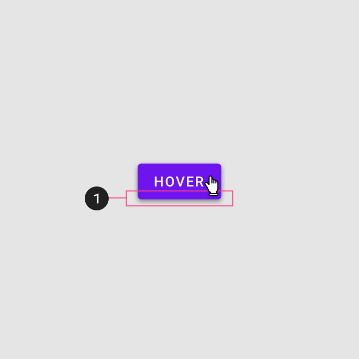
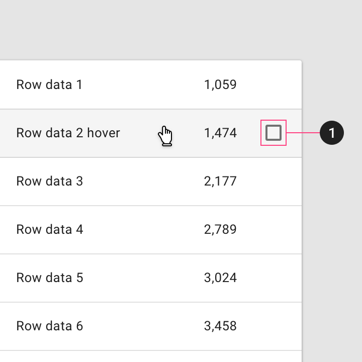
Additional controls can appear on hover
(1) Additional controls can appear on hover.

Hover inheritance ​

Hover states can be inherited by the following components: buttons, FABs, toggle buttons, selection controls, grid list items, list items, cards, chips, text fields, and icons.

Whole components such as (1) icons, (2) text fields, (3) cards and (4) buttons can inherit a hover state
Whole components such as (1) icons, (2) text fields, (3) cards and (4) buttons can inherit a hover state.

Interactive elements can inherit a hover state.

Hover states can be inherited by interactive elements or segments within components such as (1) app bars icons
Hover states can be inherited by interactive elements or segments within components such as (1) app bars icons, (2) actions in sheets, (3) tabs items and (4) list items.

Hover states cannot be inherited by: app bars, tabs, bottom navigation, sheets, dialogs, alerts, menus and steppers.

Diagram of sheets, app bars or, dialogs cannot inherit a hover state

Don't

(1) Sheets, (2) app bars or (3) dialogs cannot inherit a hover state.

Behavior ​

Hover states are initiated by the user pausing over an interactive element using a cursor.

Hover states appear and disappear using a low-emphasis animated fade.

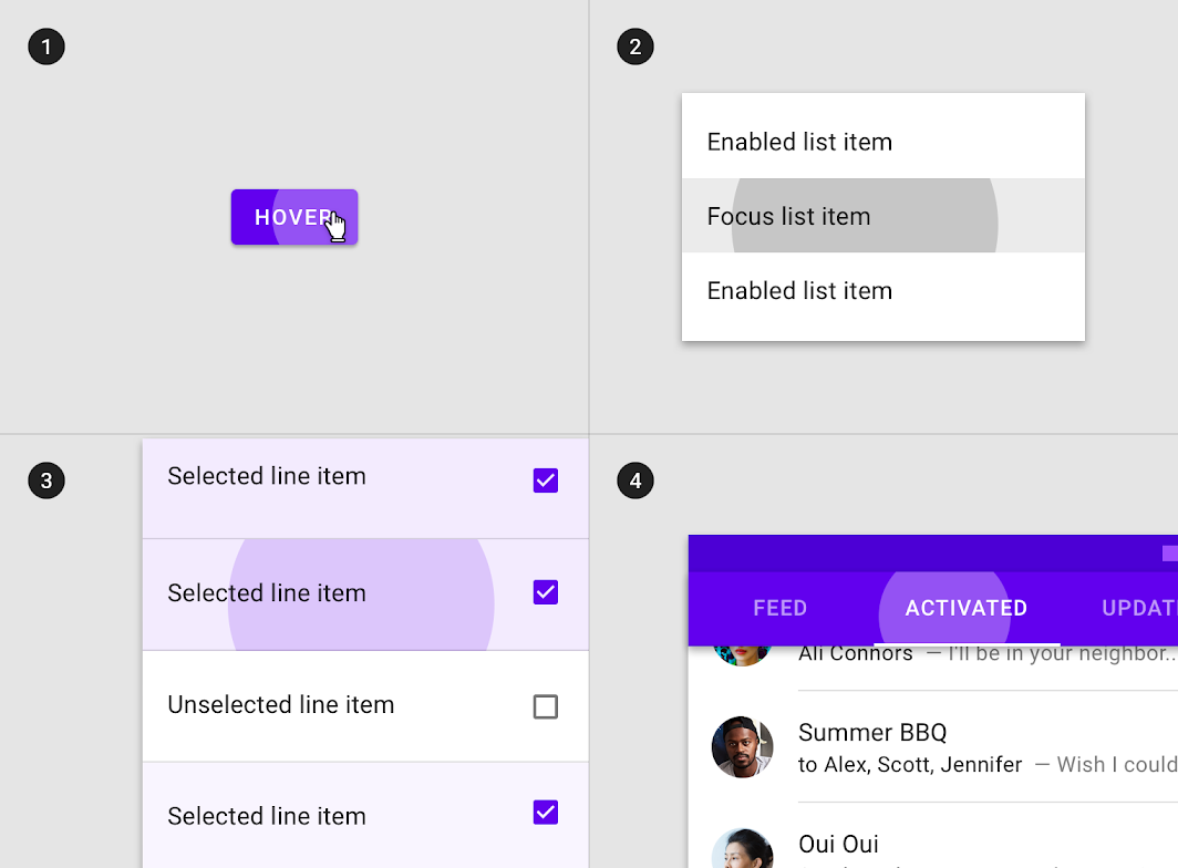
Hover states can be combined with focused, activated, selected, or pressed states.

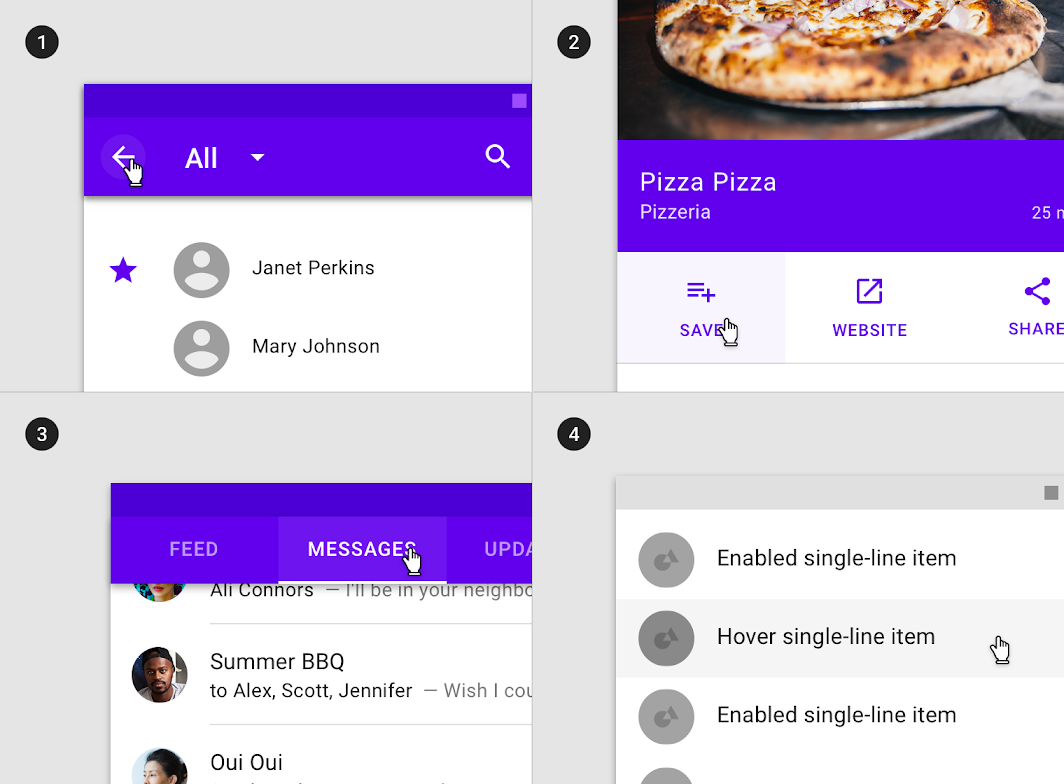
Hover state in combination with (1) focused, (2) activated, (3) selected and (4) pressed states
Hover state in combination with (1) focused, (2) activated, (3) selected and (4) pressed states.

There can only be one hover state at a time in a layout.

Hover state can only be on one element at a time based on cursor position.

Overlay opacity values ​

The opacity value of the overlay should be adjusted for each different combination of text on surface in order to ensure proper visibility and color contrast accessibility. Hover overlays should be at lower opacities to avoid distracting from content.

Diagram of surface: 100% #FFFFFF, surface: 100% #6200EE, surface: Image
(1) Surface: 100% #FFFFFF
Ink: 100% #000000
Overlay: 4% #000000

(2) Surface: 100% #6200EE
Ink: 100% #FFFFFF
Overlay: 8% #FFFFFF

(3) Surface: Image
Overlay: 12% #000000

Focus ​

Usage ​

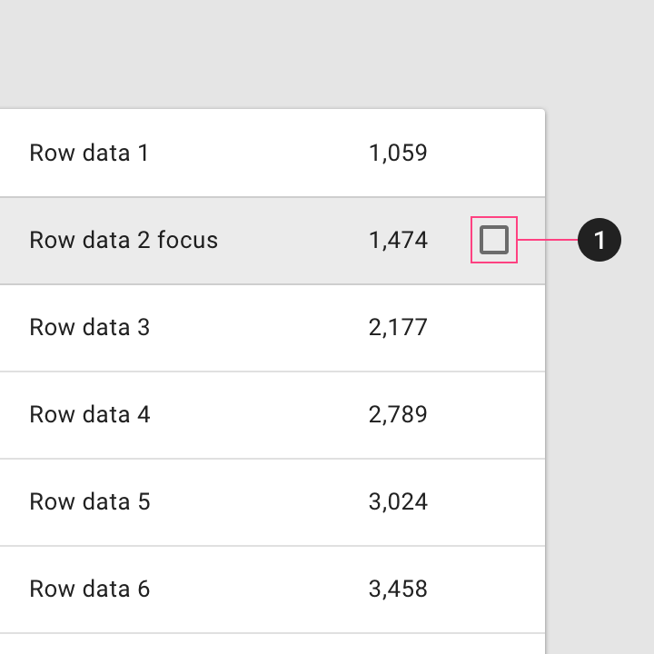
A focused state communicates when a user has highlighted an element using a keyboard or voice. Focus states apply to all interactive components.

They should receive high emphasis, as they are not indicated by other visual cues.

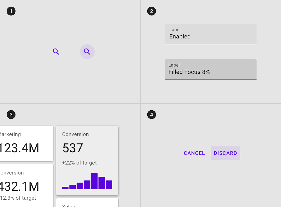
An overlay signifies a focus state. It can be applied to an entire component, elements within a component, or as a circular shape covering part of a component.

Overlays can be applied (1) to certain elements in a component, (2) to the component as a whole, or (3) in circular form
Overlays can be applied (1) to certain elements in a component, (2) to the component as a whole, or (3) in circular form.

Some components, such as button, chips or cards, can inherit (1) elevation to signify a focus state
Some components, such as button, chips or cards, can inherit (1) elevation to signify a focus state.
Controls can appear on focus
(1) Controls can appear on focus.

Focus state inheritance ​

Components that can inherit focus states include: buttons, FABs, toggle buttons, selection controls, grid list items, list items, cards, chips, text fields, and icons.

Components such as (1) icons, (2) text fields, (3) cards and (4) buttons can inherit focus states
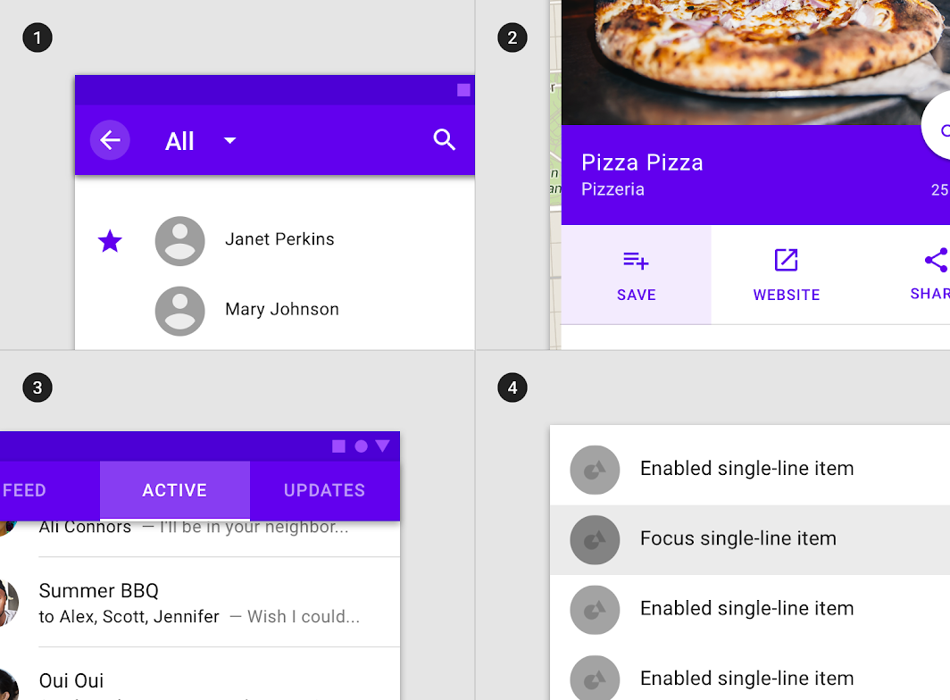
Components such as (1) icons, (2) text fields, (3) cards and (4) buttons can inherit focus states.

Interactive elements within components can inherit a hover state, such as (1) app bars icons
Interactive elements within components can inherit a hover state, such as (1) app bars icons, (2) actions in sheets, (3) tabs items and (4) list items.

Don't: components that can’t inherit a focus state include: (1) whole sheets, (2) whole app bars or (3) whole dialogs

Don't

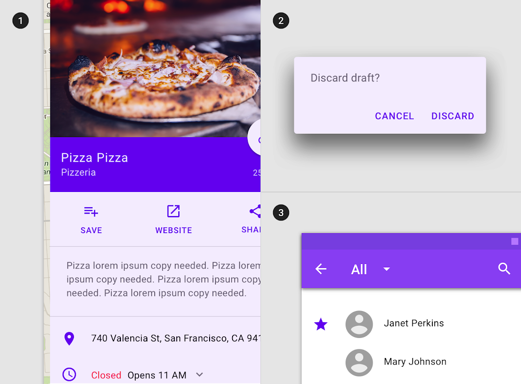
Components that can’t inherit a focus state include: (1) whole sheets, (2) whole app bars or (3) whole dialogs.

Behavior ​

Focus states are initiated by user keyboard or voice input on an interactive element, until the user completes the audio or keyboard action.

Focus states appear and disappear using a fade animation.
Focus states appear in a read order specific to the composition.

Focus states can be represented in combination with hover, activated, or selected states.

Focus state in combination with (1) hover, (2) activated and (3) selected states
Focus state in combination with (1) hover, (2) activated and (3) selected states.

Only one focus state may exist at a time on a screen.

A focus state can only be on one element at a time.

Overlay opacity values ​

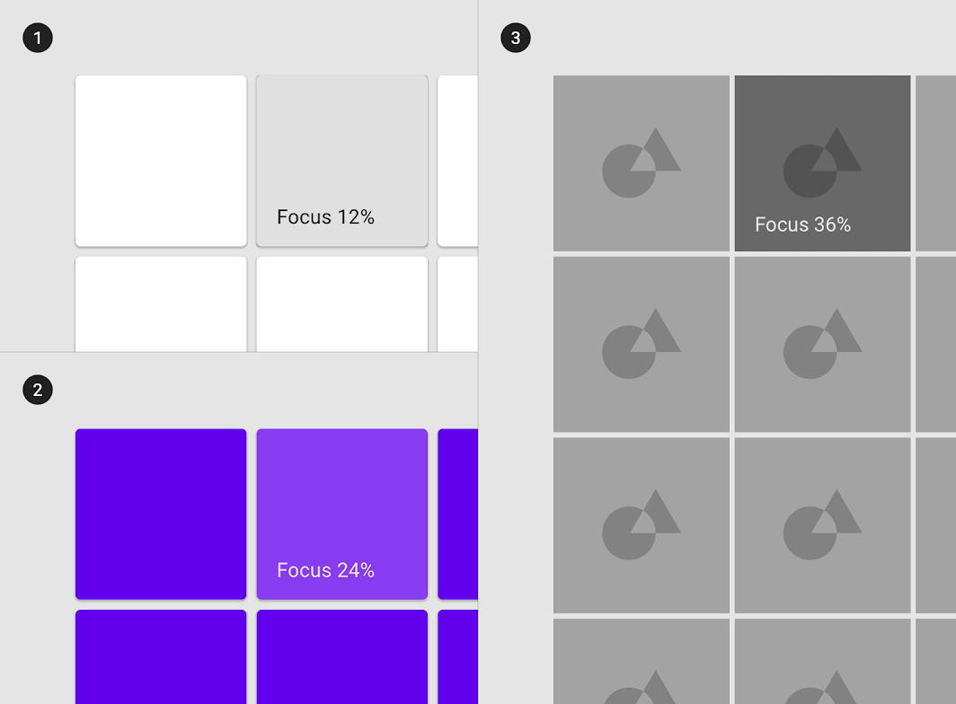
To ensure proper visibility and color contrast accessibility, the overlay’s opacity value should be adjusted for every different combination of text on surface. Focus overlays should be at higher opacities as they are not indicated otherwise by visual cues.

Diagram of surface: 100% #FFFFFF, surface: 100% #6200EE, surface: Image
(1) Surface: 100% #FFFFFF
Ink: 100% #000000
Overlay: 12% #000000

(2) Surface: 100% #6200EE
Ink: 100% #FFFFFF
Overlay: 24% #FFFFFF

(3) Surface: Image
Overlay: 36% #000000

Selected ​

Usage ​

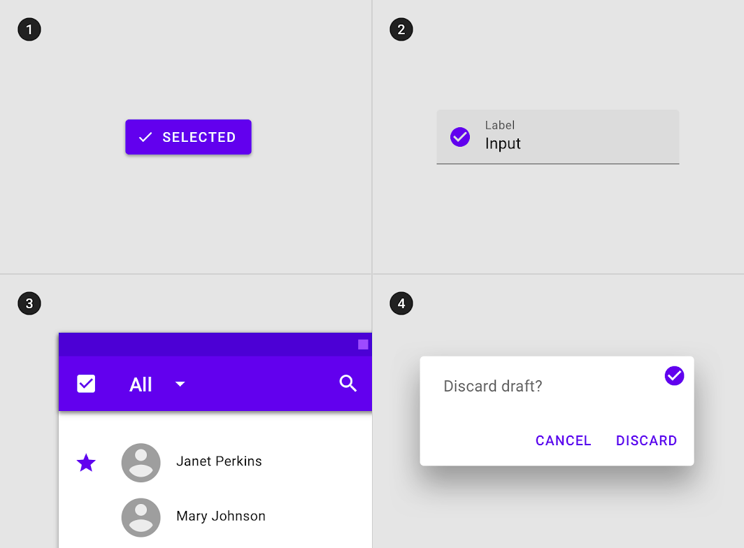
A selected state indicates user selection of options using one of the following input methods: tap, cursor, keyboard, or voice. Selected states should receive medium emphasis so they are easily identifiable, but not distracting.

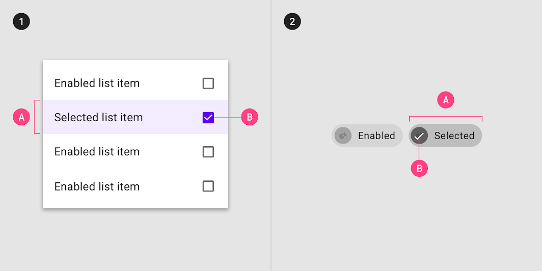
An overlay signifies a selection state. It can be applied to elements within a component or to the entire component.

The overlay can be applied to (1) certain elements in a component, (2) the component as a whole
The overlay can be applied to (1) certain elements in a component, (2) the component as a whole. Selection can be signified by an (A) overlay and (B) iconography.

Selected state inheritance ​

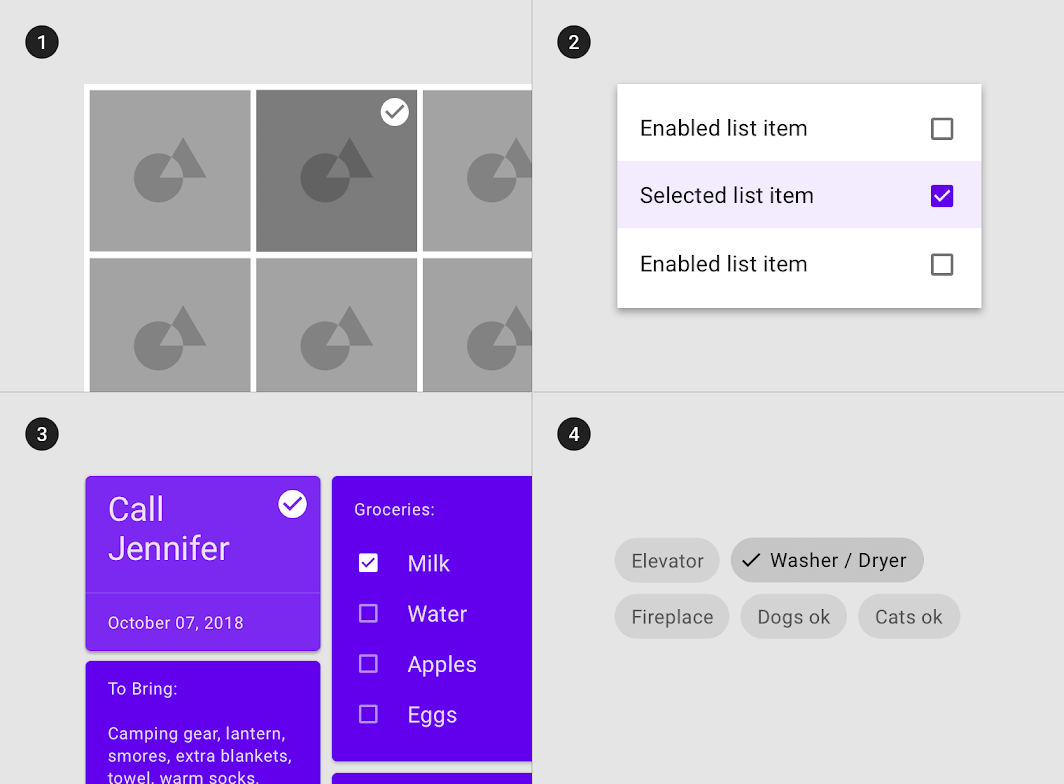
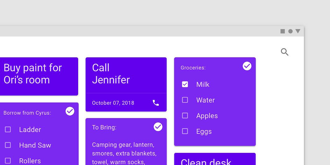
Components that can inherit selected states include: image list items, list items, chips, cards, data tables, menu items, and pickers.

Diagram of grid list items, list items, cards, and, chips can inherit a selected state
(1) Grid list items, (2) list items, (3) cards, and (4) chips can inherit a selected state.

Components that cannot inherit selected states include: app bars, backdrop, bottom navigation, sheets, buttons, dialogs, dividers, expansion panels, alerts, snackbars, tabs, text fields, or tooltips.

Diagram of buttons, text fields, app bars, and, dialogs can’t inherit a selected state

Don't

(1) Buttons, (2) text fields, (3) app bars, and (4) dialogs can’t inherit a selected state.

Behavior ​

Selected states are initiated when users select one or more options.

Selected states appear and disappear using a fade animation.
Selected states appear in user-initiated order.

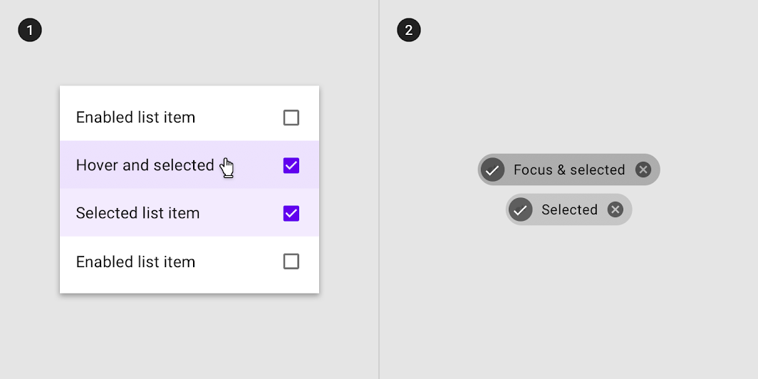
Selected states can be represented in combination with hover, focus, pressed or dragged states.

Selected state in combination with (1) hover and (2) focus states
Selected state in combination with (1) hover and (2) focus states.

Multiple selected states may exist at a time in a layout.

Behavior: multiple selected states
Multiple selected states

Overlay opacity values ​

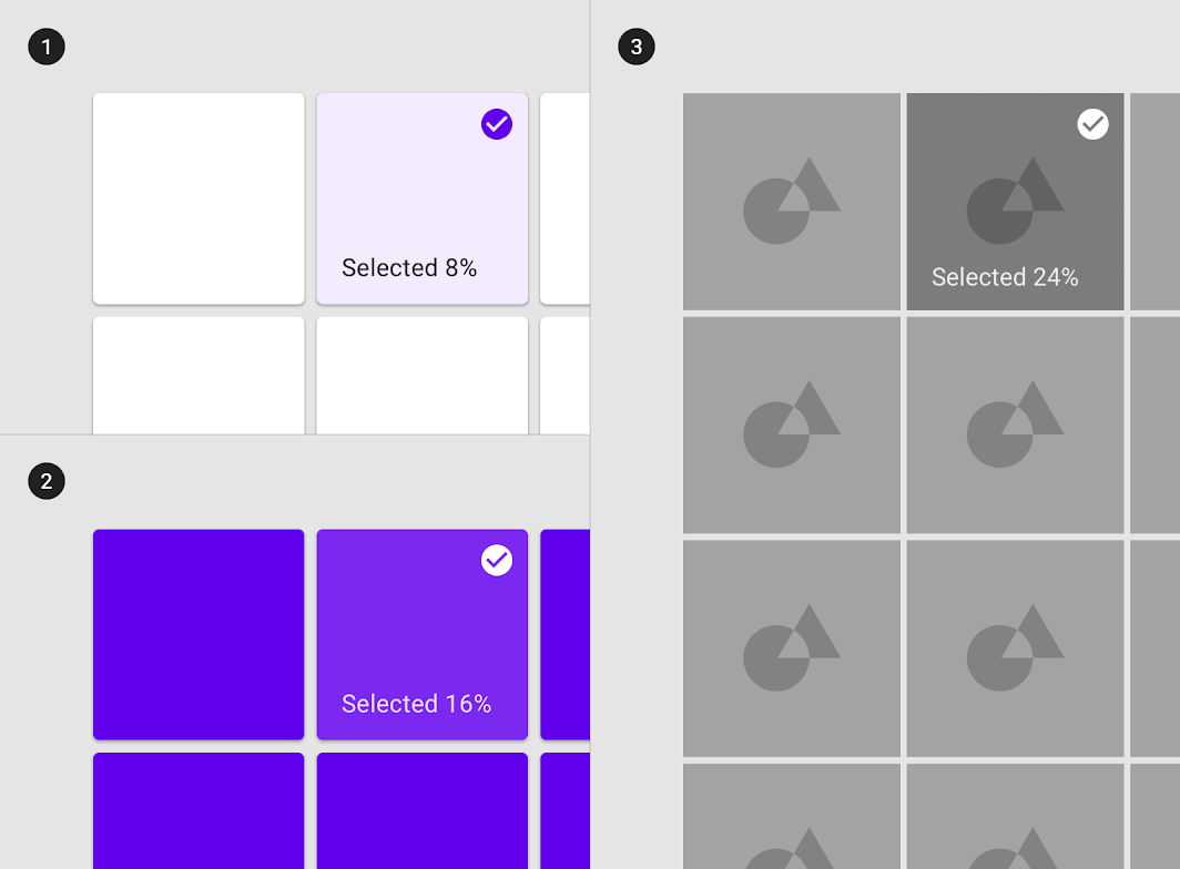
To ensure proper visibility and color contrast accessibility, the overlay’s opacity should be adjusted for every different combination of text on surface. Selection overlays should be at medium emphasis so they are easily identifiable, but not distracting.

Diagram of surface: 100% #FFFFFF, surface: 100% #6200EE, surface: Image
(1) Surface: 100% #FFFFFF
Ink: 100% #6200EE
Overlay: 8% #6200EE

(2) Surface: 100% #6200EE
Ink: 100% #FFFFFF
Overlay: 16% #FFFFFF

(3) Surface: Image
Overlay: 24% #000000

Activated ​

Usage ​

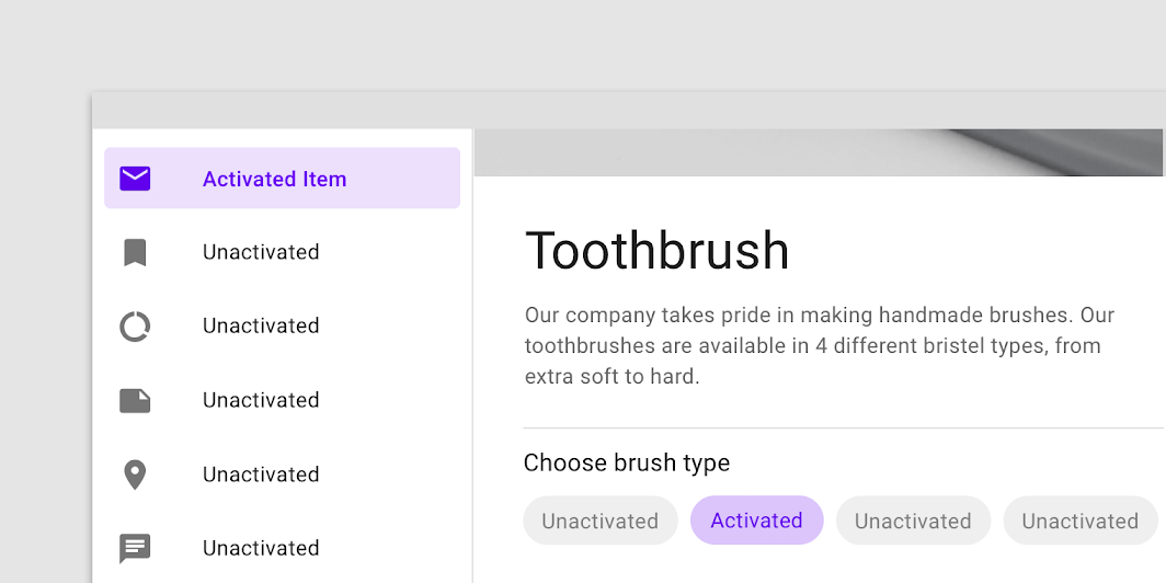
Activated states indicate which item from a set of options is currently being viewed. They are initiated either by default or user choice, using input methods such as a tap, cursor, keyboard, or voice input. This state should be highly emphasized.

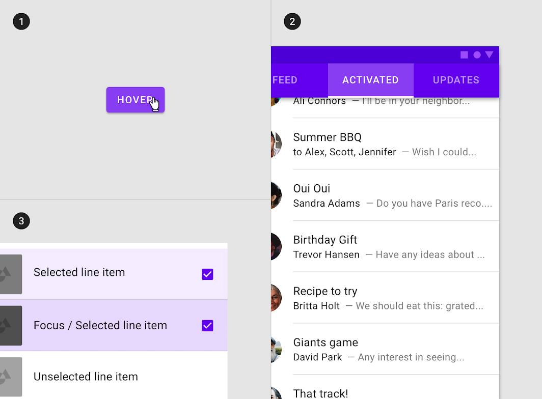
Activated states are signified by an overlay, color change, or other visual treatments applied to elements or segments within a component.

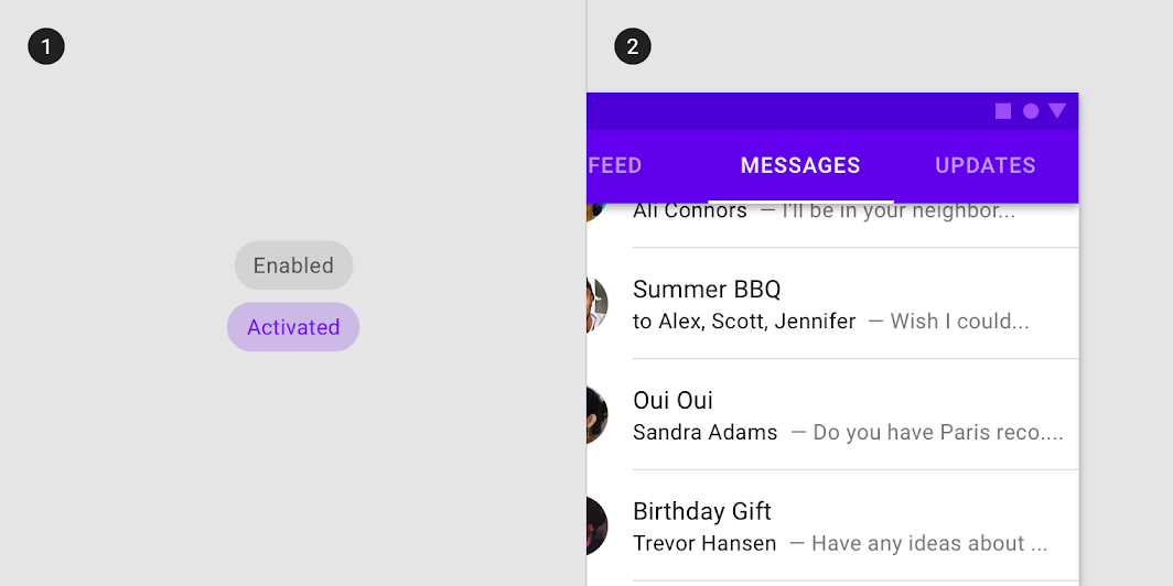
Diagram of overlays as activated state signifier, line element as activated state signifier
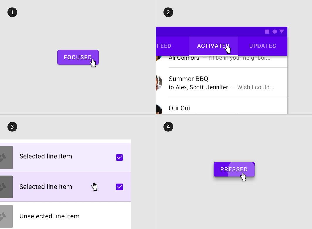
(1) Overlays as activated state signifier. (2) Line element as activated state signifier.

Activated state inheritance ​

An activated state differs from a selected state because it communicates a highlighted destination.

Components that can inherit activation states include: navigation list items, tab items, bottom navigation items, stepper items, choice chips, or toggle buttons.

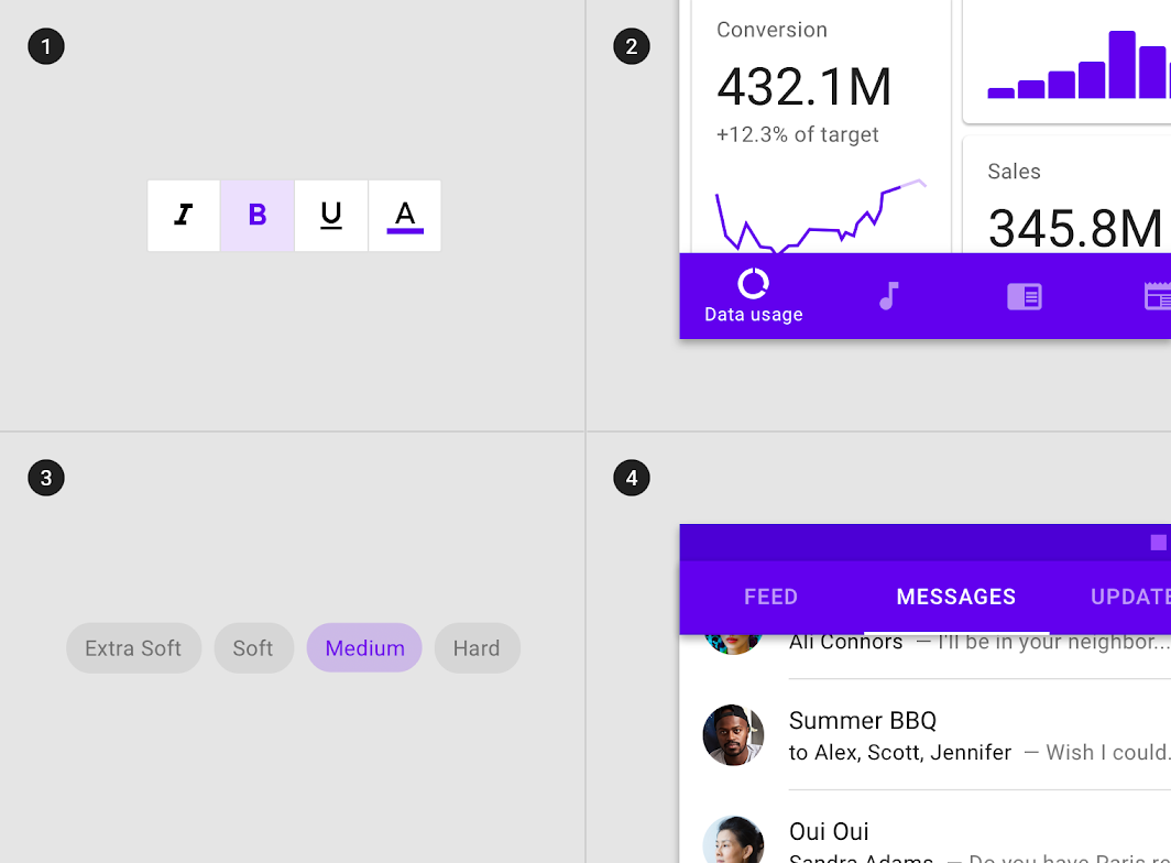
Diagram of toggle buttons, bottom navigation items, choice chips and, tab items can inherit an activated state
(1) Toggle buttons, (2) bottom navigation items, (3) choice chips and (4) tab items can inherit an activated state.

Components that cannot inherit activation states include: buttons, floating action buttons, selection controls, sliders, app bars, bottom and side sheets, dialogs, or alerts.

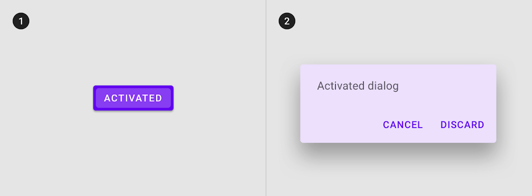
Diagram of buttons and, dialogs cannot inherit an activated state

Don't

(1) Buttons and (2) dialogs cannot inherit an activated state.

Behavior ​

Activated states are initiated either by default or user choice.

Activated states appear and disappear using a fade animation.
Activated states appear in user-initiated order.

Activated states can be represented in combination with hover and focus states.

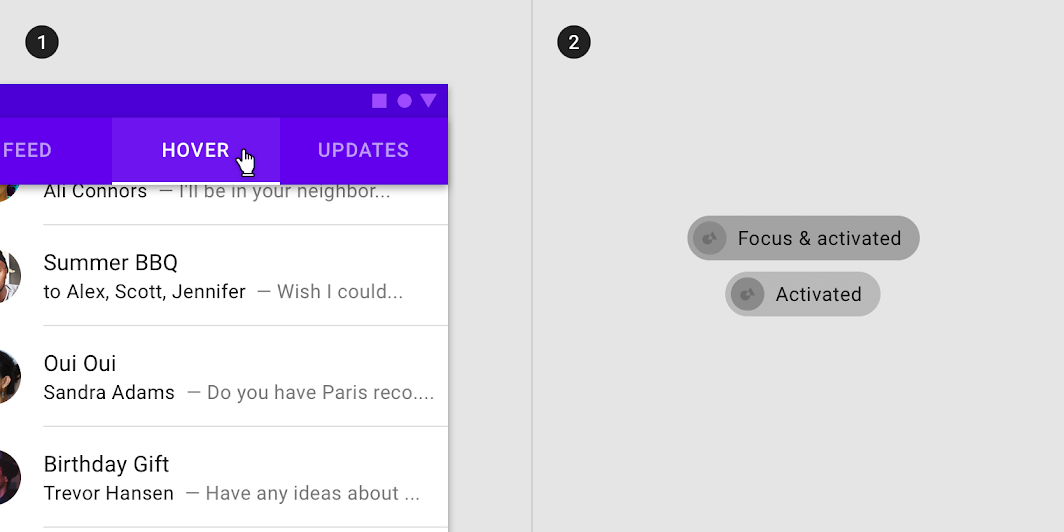
Activated states can be represented in combination with (1) hover and (2) focus
Activated states can be represented in combination with (1) hover and (2) focus.

Within a single set of options, only one activated state may be present at a time.

This navigational list has an activated item in the same layout as a choice chip with an activated item
This navigational list has an activated item in the same layout as a choice chip with an activated item.

Overlay opacity values ​

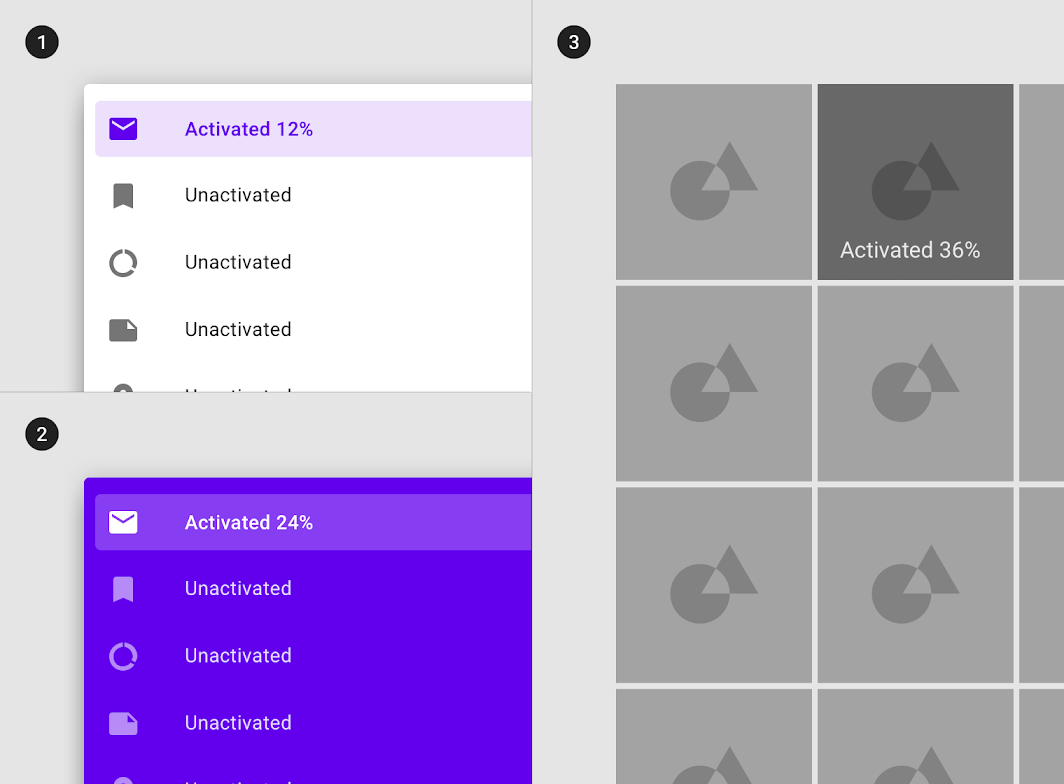
To ensure proper visibility and color contrast accessibility, the overlay’s opacity should be adjusted for every different combination of text on surface. Activation overlays should be at higher opacities since they are not always user-initiated.

Diagram of surface: 100% #FFFFFF, surface: 100% #6200EE, surface: Image
(1) Surface: 100% #FFFFFF
Ink: 100% #6200EE
Overlay: 12% #6200EE

(2) Surface: 100% #6200EE
Ink: 100% #FFFFFF
Overlay: 24% #FFFFFF

(3) Surface: Image
Overlay: 36% #000000

Pressed ​

Usage ​

A pressed state communicates a user-initiated tap or click by a cursor, keyboard, or voice input method. This state applies to all interactive components.

Pressed states trigger a change in composition and should be high-emphasis.

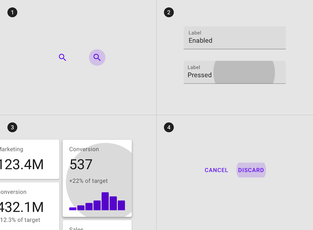
A ripple overlay signifies a pressed state. It can be applied to an entire component or elements within a component, or as a circular shape over part of the component.
A ripple overlay applied to (1) elements in a component, (2) the component as a whole, or (3) in circular form
A ripple overlay applied to (1) elements in a component, (2) the component as a whole, or (3) in circular form.

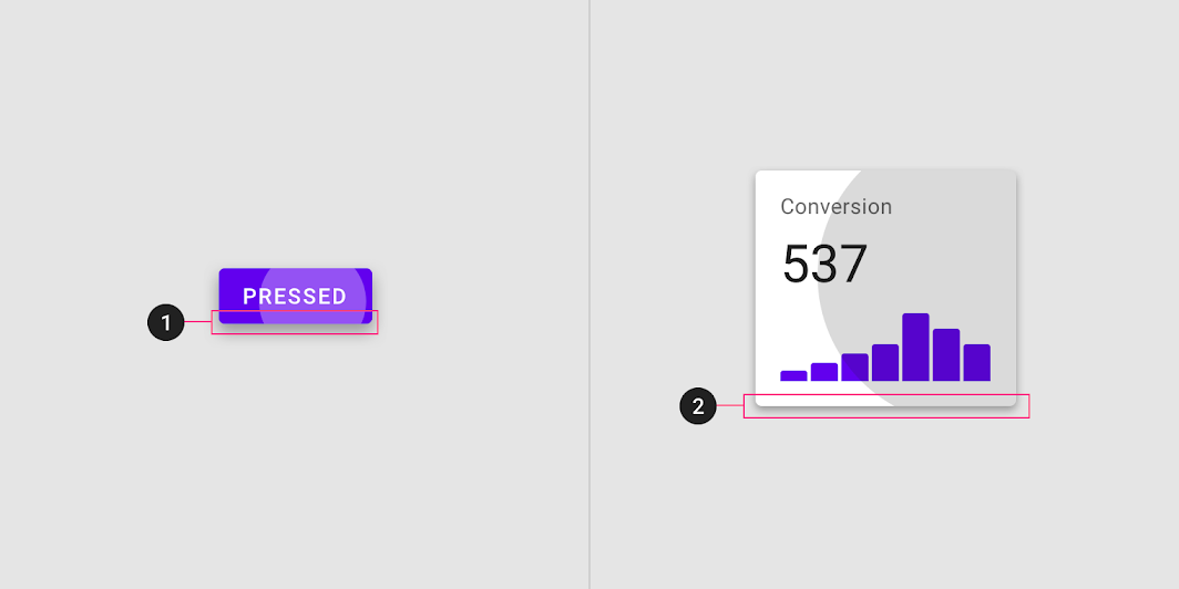
Some components, such as buttons or cards, can inherit elevation to signify a pressed state.

Elevation applied to a pressed (1) button and (2) card
Elevation applied to a pressed (1) button and (2) card.

Pressed inheritance ​

Pressed states can be inherited by the following components: buttons, FABs, toggle buttons, selection controls, grid list items, list items, cards, chips, text fields, and icons.
Entire components such as (1) icons, (2) text fields, (3) cards, and (4) buttons can inherit a pressed state
Entire components such as (1) icons, (2) text fields, (3) cards, and (4) buttons can inherit a pressed state.

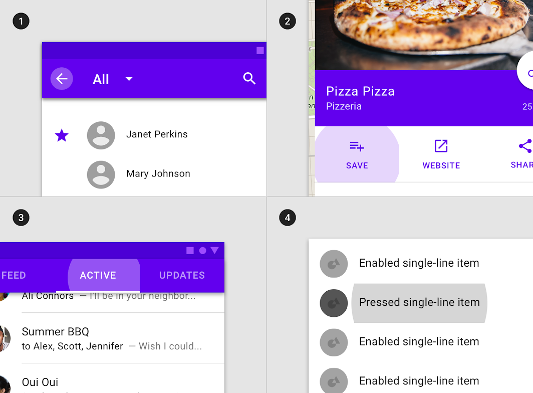
Interactive elements can inherit a pressed state.

Interactive elements or segments within components such as (1) app bars icons
Interactive elements or segments within components such as (1) app bars icons, (2) actions in sheets, (3) tabs items, and (4) list items can inherit a pressed state.

Pressed states cannot be inherited by: app bars, tabs, bottom navigation, sheets, dialogs, alerts, menus, and steppers.

Don't: components such as (1) sheets, (2) app bars, or (3) dialogs cannot inherit a pressed state

Don't

Components such as (1) sheets, (2) app bars, or (3) dialogs cannot inherit a pressed state.

Behavior ​

Pressed states are initiated by user keyboard or voice input on an interactive element.

Pressed states appear and disappear using a ripple animation.

Pressed states can be combined with hovered, focused, activated, or selected states.

Pressed state in combination with (1) hover, (2) focus, (3) selected, and (4) activated states
Pressed state in combination with (1) hover, (2) focus, (3) selected, and (4) activated states.

There may only be a single pressed state at a time in a layout.

Overlay opacity values ​

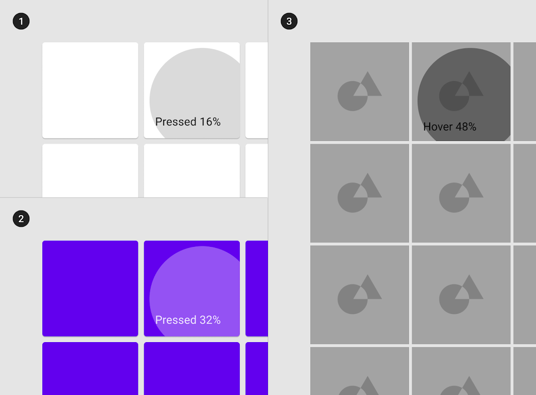
To ensure proper visibility, an overlay’s opacity should be adjusted for every different combination of text on surface. Pressed overlays should be at higher opacities since they trigger a change in layout.

Diagram of surface: 100% #FFFFFF, surface: 100% #6200EE, surface: Image
(1) Surface: 100% #FFFFFF
Ink: 100% #000000
Overlay: 16% #000000

(2) Surface: 100% #6200EE
Ink: 100% #FFFFFF
Overlay: 32% #FFFFFF

(3) Surface: Image
Overlay: 48% #000000

Dragged ​

Usage ​

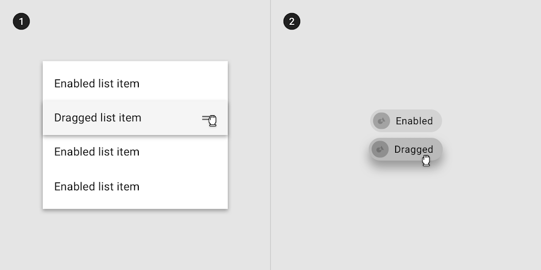
A dragged state occurs when a user presses and moves an element or component. Dragged states should be low emphasis, to avoid distracting users from their task.

An overlay signifies a dragged state. It can be applied to the entire component or to elements within a component.

An overlay applied to (1) elements in a component or (2) the component as a whole
An overlay applied to (1) elements in a component or (2) the component as a whole.

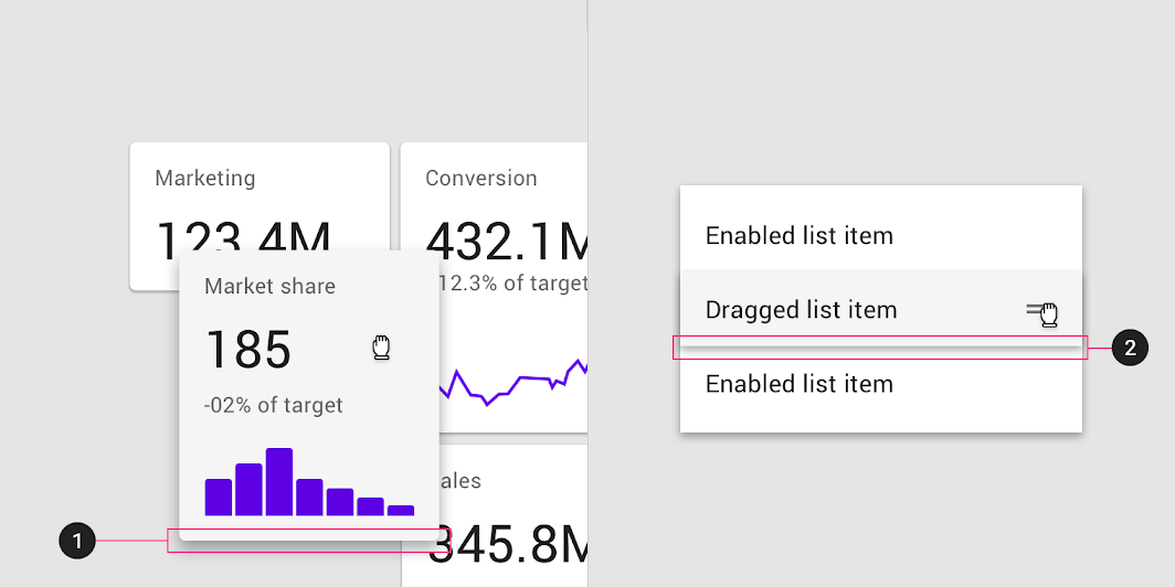
Some components, such as list items, chips, or cards, can inherit elevation to signify a dragged state.

Elevation applied to (1) card and (2) list item

Dragged inheritance ​

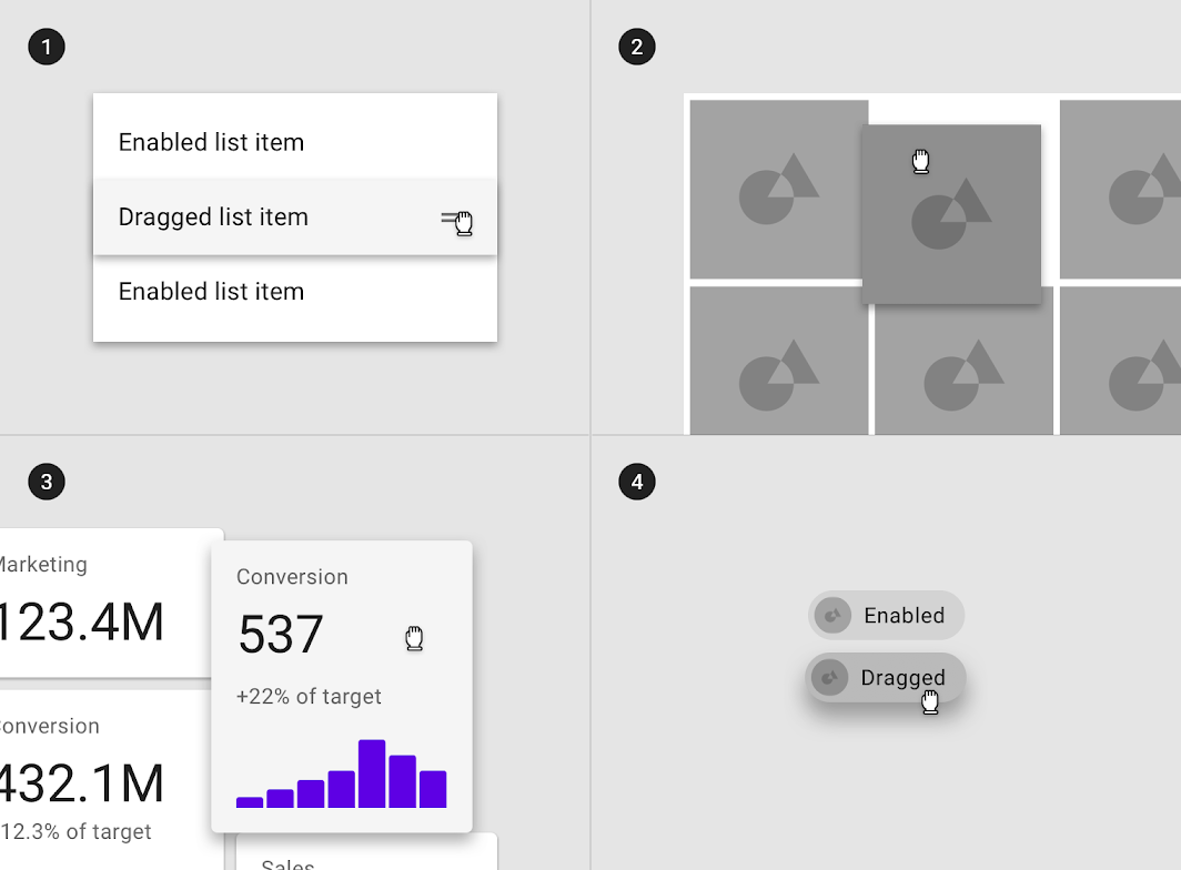
Dragged states can be inherited by the following components: grid list items, list items, cards, and chips.

Diagram of list items, grid list items, cards, and, chips can inherit a dragged state
(1) List items, (2) grid list items, (3) cards, and (4) chips can inherit a dragged state.

Dragged states cannot be inherited by: app bars, buttons, bottom navigation, dialogs, alerts, menus, or steppers.

Don't: components such as (1) buttons, (2) app bars, (3) dialogs, or (4) text fields cannot inherit a dragged state

Don't

Components such as (1) buttons, (2) app bars, (3) dialogs, or (4) text fields cannot inherit a dragged state.

Behavior ​

Dragged states are initiated when users touch and hold elements, using an input method such as a tap or click.

Dragged states occur after a pressed state and appear and disappear using a fade animation.
The user’s touch should directly control the movement of the dragged element.

There may only be a single dragged state at a time within a layout.

A single dragged state

Overlay opacity values ​

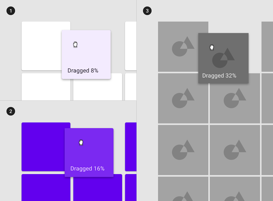
To ensure proper visibility, an overlay’s opacity should be adjusted for every different combination of text on surface. Dragged overlays should be at lower opacities to avoid distracting from content.
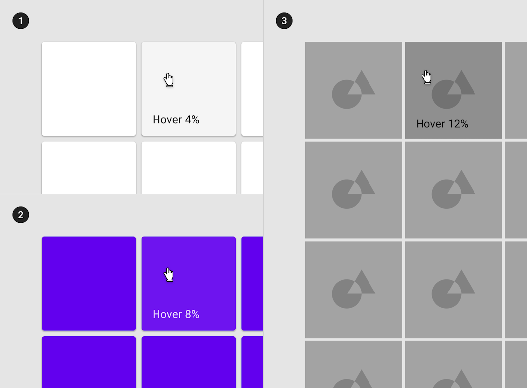
Diagram of surface: 100% #FFFFFF, surface: 100% #6200EE, surface: Image
(1) Surface: 100% #FFFFFF
Ink: 100% #000000
Overlay: 8% #000000

(2) Surface: 100% #6200EE
Ink: 100% #FFFFFF
Overlay: 16% #FFFFFF

(3) Surface: Image
Overlay: 32% #000000
Pager
Previous pageSelection
Next pageConfirmation & acknowledgement

Released under the Apache-2.0

Copyright © 2018-Present Google

https://m2.material.io/design/interaction/states.html

Released under the Apache-2.0

Copyright © 2018-Present Google