Skip to content
Material Design 2
Main Navigation
v3
v2
v1

English

简体中文
繁體中文
Español
Français
Русский
Português – Brasil
Deutsch
日本語
한국어
Italiano
Polski
Türkçe
čeština
magyar

English

简体中文
繁體中文
Español
Français
Русский
Português – Brasil
Deutsch
日本語
한국어
Italiano
Polski
Türkçe
čeština
magyar

Appearance

Sidebar Navigation

Material System

Introduction

Material studies

About our Material studies

Basil

Crane

Fortnightly

Owl

Rally

Reply

Shrine

Material Foundation

Environment

Surfaces

Elevation

Light and shadows

Layout

Understanding layout

Pixel density

Responsive layout grid

Spacing methods

Component behavior

Applying density

Navigation

Understanding navigation

Navigation transitions

Search

Color

The color system

Applying color to UI

Color usage

Text legibility

Dark theme

Typography

The type system

Understanding typography

Language support

Sound

About sound

Applying sound to UI

Sound attributes

Sound choreography

Iconography

Product icons

System icons

Animated icons

Shape

About shape

Shape and hierarchy

Shape as expression

Shape and motion

Applying shape to UI

Motion

Understanding motion

The motion system

Speed

Choreography

Customization

Interaction

Gestures

Selection

States

Communication

Confirmation & acknowledgement

Data formats

Data visualization

Empty states

Help & feedback

Imagery

Launch screen

Onboarding

Offline states

Writing

Machine learning

Machine learning patterns

Object detection: live camera

Object detection: static image

Barcode Scanning

Material Guidelines

Material Theming

Overview

Implementing your theme

Usability

Accessibility

Bidirectionality

Platform guidance

Android bars

Android fingerprint

Android haptics

Android icons

Android navigating between apps

Android notifications

Android permissions

Android slices

Android split-screen

Android swipe-to-refresh

Android text selection toolbar

Android widget

Cross-platform adaptation

Components

App bars: bottom

App bars: top

Backdrop

Banners

Bottom navigation

Buttons

Buttons: floating action button

Cards

Checkboxes

Chips

Data tables

Date pickers

Dialogs

Dividers

Image lists

Lists

Menus

Navigation drawer

Navigation rail

Progress indicators

Radio buttons

Sheets: bottom

Sheets: side

Sliders

Snackbars

Switches

Tabs

Text fields

Time pickers

Tooltips

On this page

Onboarding ​

Onboarding is a virtual unboxing experience that helps users get started with an app.

Usage ​

Your onboarding should have specific goals suited to the user’s level of familiarity with the app.

User contextOnboarding goals
  • The user has already installed the app and doesn’t need to see more marketing for it
  • The user may be eager to try the app without reading an instruction manual
  • The user is not yet familiar with the app’s UI or ready to learn about it
  • Welcome users and excite them about the experience ahead
  • Help users implicitly or explicitly understand how the app can be used in their lives
  • Drive users to take actions that increase engagement and retention in the first seven days

Onboarding is one point in a longer journey that begins in the app store and ends with the user taking the first key retention-correlated action in your app.

When designing your onboarding, consider the screens that came before it and those that will come after it.

Show onboarding to first-time users. Don’t show it to returning users.

Types ​

There are three onboarding models: self-select, quickstart, and top user benefits.
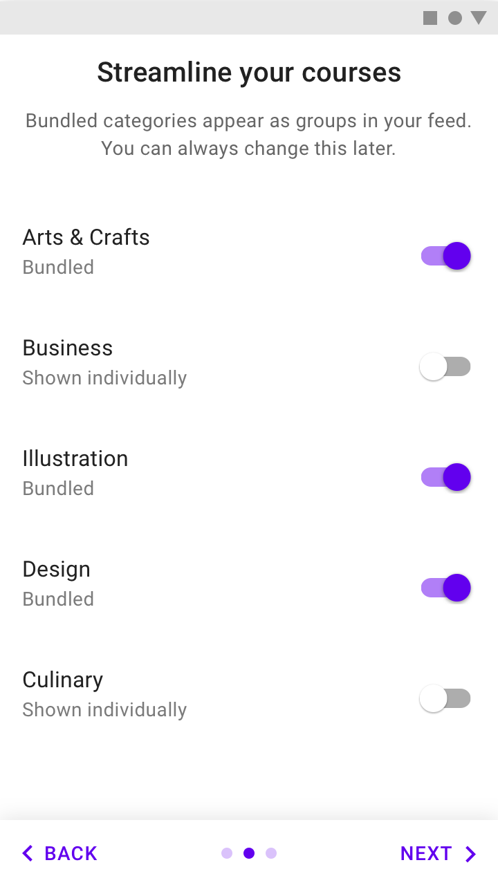
Self-select: Allow users to customize their experiences
Quickstart: Start the user directly in the app

Top user benefits: Display a carousel or a brief animation highlighting benefits of using the app

The onboarding best suited to your app depends on if your app uses a common, recognizable UI style and how easy it is to set up.

UsageSelf-SelectQuickstartTop User Benefits
When to use
  • The UI can be customized
  • Your app has setup and consent requirements
You’ve already identified the behaviors that correspond to increased engagement (in the first session) or increased retention (in the first seven days)
  • Your app is tackling a new challenge or providing a new kind of benefit
  • To announce new uses or major UI changes
When not to use
  • Your app is tackling a new challenge or providing a new kind of benefit
  • To announce new uses or major UI changes
Your app is tackling a new challenge or providing a new kind of benefit
  • Your app’s UI and benefits use patterns familiar to most users
  • Your app has no major changes
CombinationsDon’t combine Self-Select with Top User BenefitsOk to include setup before first-run experience
  • Don’t combine Top User Benefits with Self-Select
  • It’s okay for your app to show setup after or as part of onboarding

Self-select model ​

The Self-Select model allows users to customize their first-run experience by making a short series of choices.

This experience provides implicit education, giving the user a sense of control and vested interest in the screens to come.
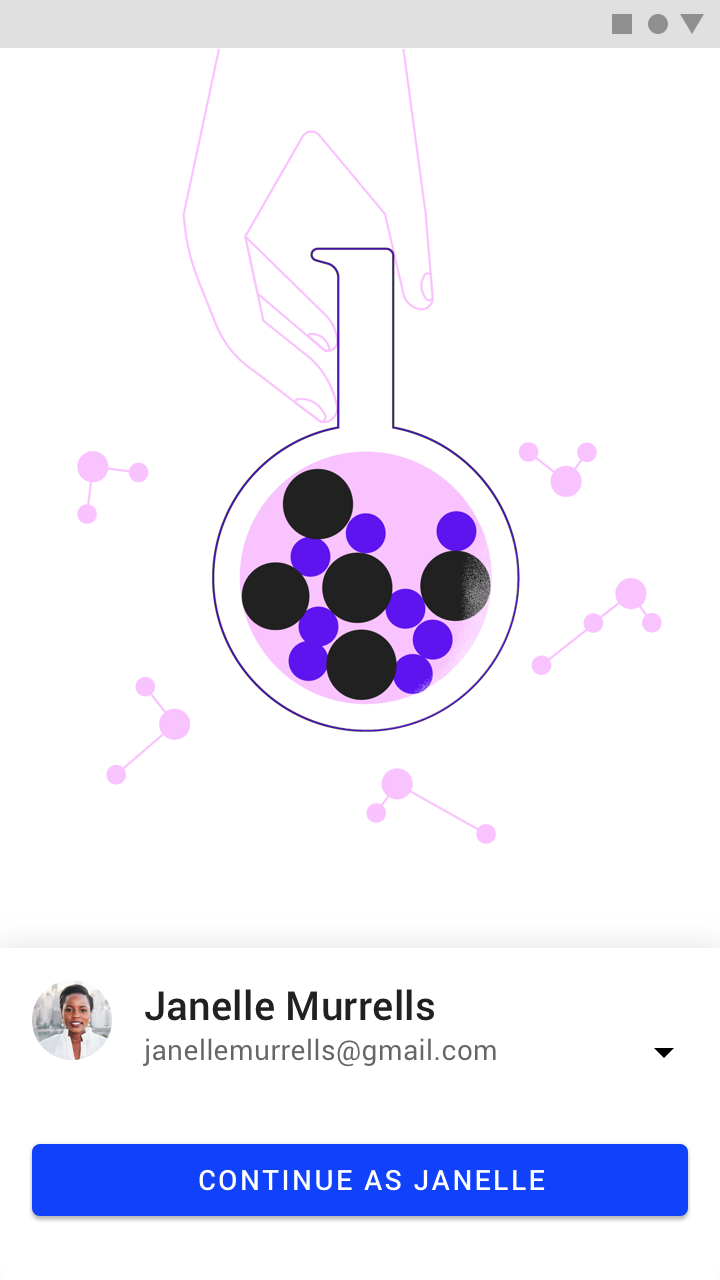
Self-select model: sign-in screen
Sign-in screen
Onboarding self-Select model
Self-Select model

Present the right choices ​

The choices you give users affect the success of your onboarding.

Choices should:

  • Be meaningful and noticeable
  • Provide new information
  • Be short

Meaningful and noticeable ​

Offer choices that have a meaningful and noticeable impact on the user experience. These implicitly teach users how to interact with your UI.
Do: asking how a user wishes to be notified by the app during onboarding will have a meaningful impact on the user

Do

Asking how a user wishes to be notified by the app during onboarding will have a meaningful impact on the user experience.
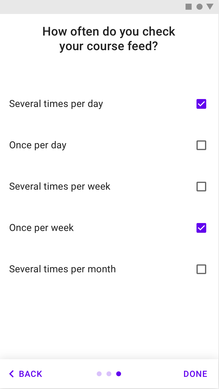
Don’t include selections that have no impact on their experience

Don't

Don’t include selections that have no impact on their experience. While it may interest app makers how often a user checks their feed, it doesn’t impact the user’s experience.

Ask what you don’t know ​

Don’t ask for preferences that can be garnered from normal usage.
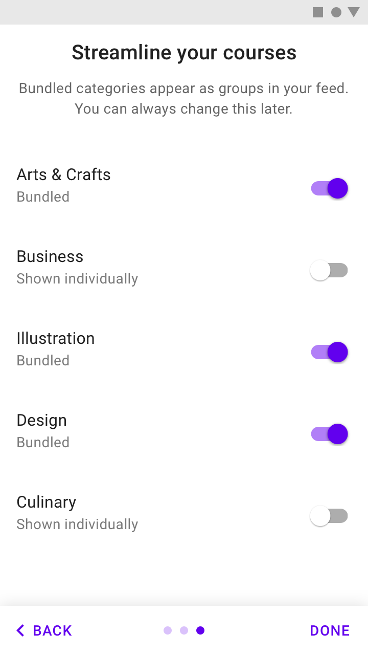
Do: normal usage won’t easily clarify what a user wants to bundle

Do

Normal usage won’t easily clarify what a user wants to bundle. It is valuable to ask the user their preferences.
Don't ask users to make selections that will become evident with normal use of the app and that won't meaningfully

Don't

Don't ask users to make selections that will become evident with normal use of the app and that won't meaningfully change the first-run experience.

Keep it short ​

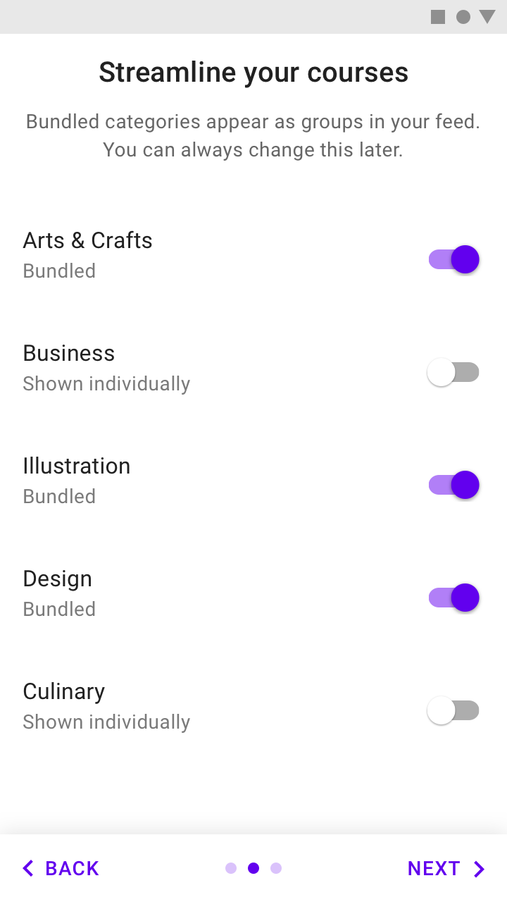
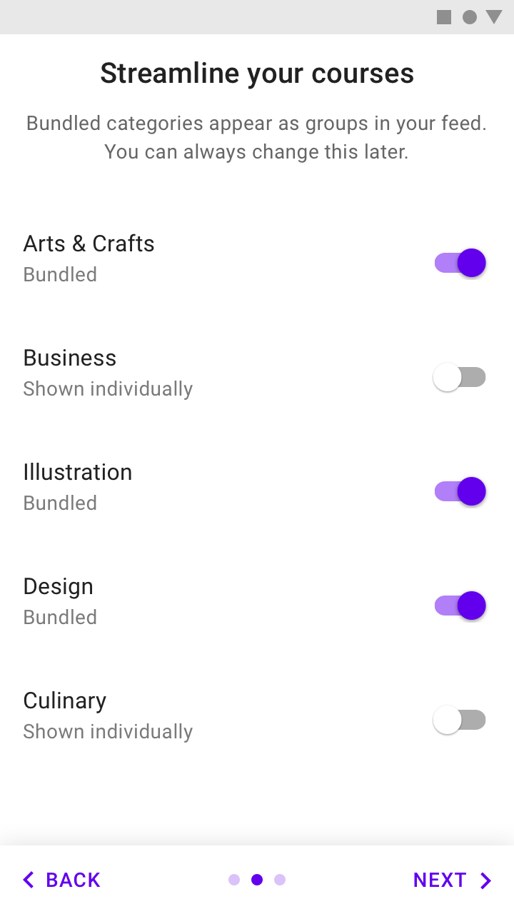
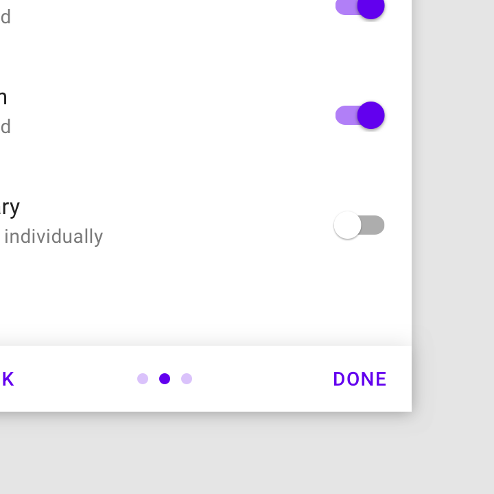
Limit choices to one screen, or make multiple screens feel connected to each other.

Each screen should have fewer than ten choices.
Do: a single Self-Select screen

Do

A single Self-Select screen
Don't: many Self-Select screens

Don't

Many Self-Select screens

When designing onboarding, think about how the onboarding process connects to a user’s first-run experience. After onboarding, the users should land on a screen that makes it easy to act on what they just learned.

Design ​

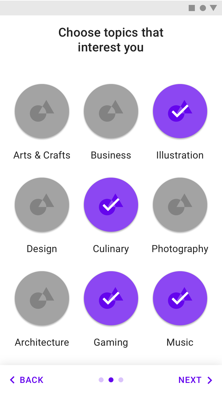
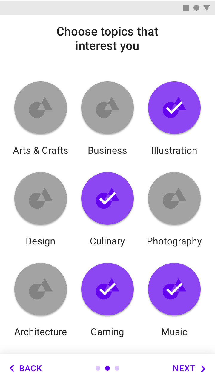
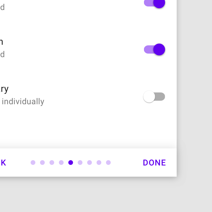
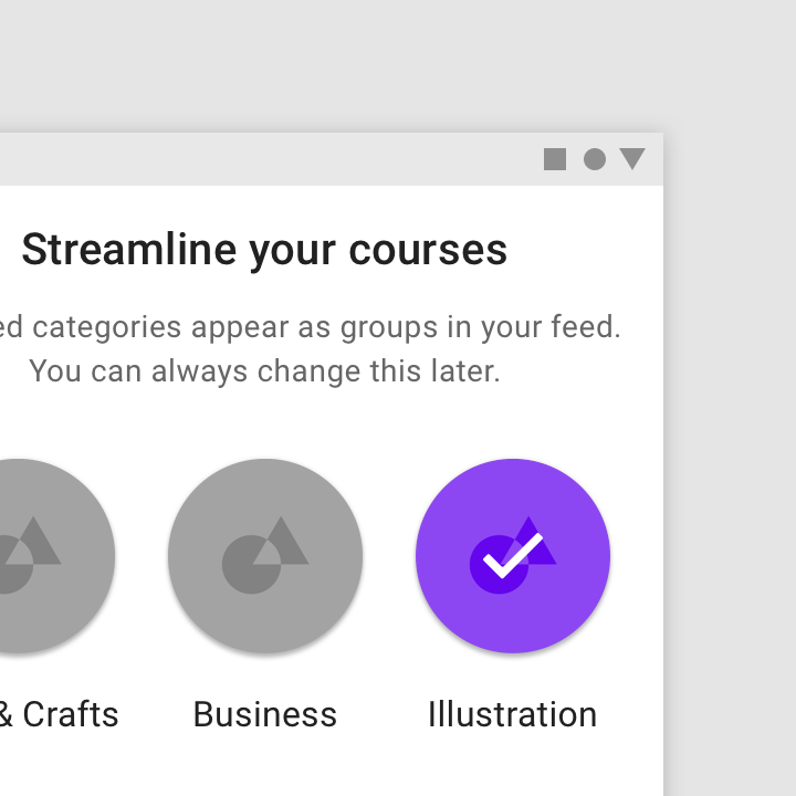
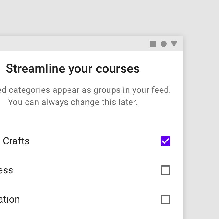
Design your Self-Select screens to relate to what your app does. Apps focused on content consumption may ask for topics of interest, whereas apps with feeds may ask which topics to bundle.

Some common Self-Select design patterns include:
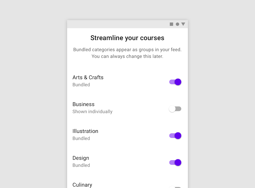
Design: bundled List
Bundled List

Design: grid View
Grid View
Design: list
List

Quickstart model ​

In the Quickstart model, users land directly in the UI without any onboarding model shown (other than sign in and setup).

The Quickstart model:

  • Enables users to quickly get started with the core functionality of the app
  • Often prioritizes the first key action
  • Can also provide an optional way to learn more or ask for help

Best practices ​

Give users something to do ​

Rather than leaving users on a blank screen, your UI should encourage interaction.
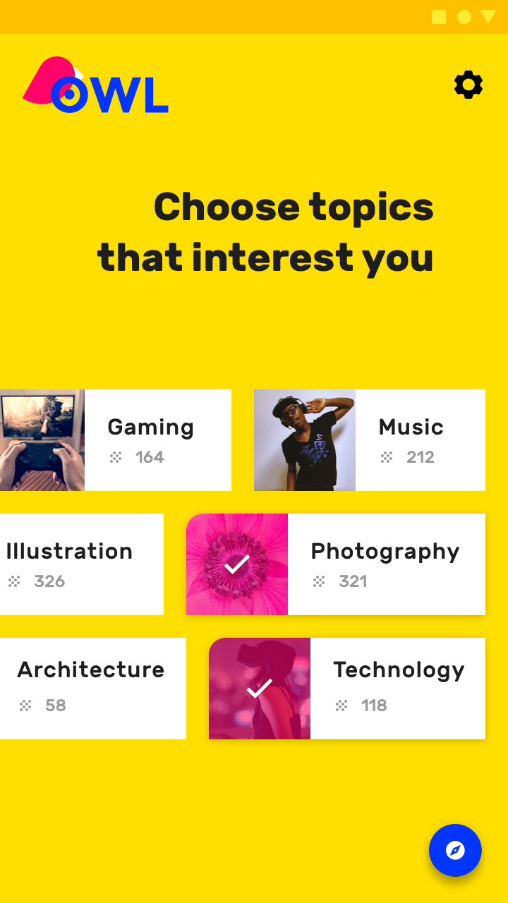
Do: provide options to get the user started

Do

Provide options to get the user started.
Don’t leave users with nothing to do

Don't

Don’t leave users with nothing to do.

Offer education ​

If it appears as though the user is unclear how to use the app towards the end of the average first-run experience (90% of the way through the first session), display a UI prompt offering the opportunity to learn how to use the app.
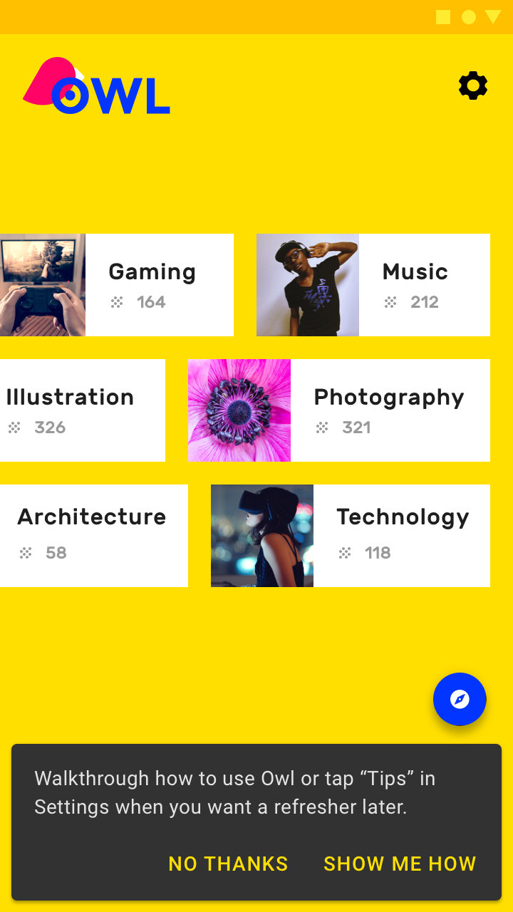
Do: offer the user the opportunity to learn more about the app

Do

Offer the user the opportunity to learn more about the app.
Don’t force education upfront

Don't

Don’t force education upfront.

Prioritize the first key action ​

Choose the action most closely linked to engagement in the first seven days. Alternatively, introduce core functionality as tips for actions that a user hasn’t tried.
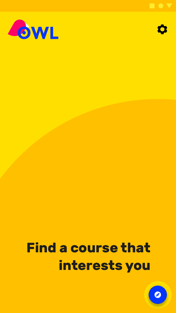
Do: nudge users to take the first key action

Do

Nudge users to take the first key action.
Don’t leave users with nothing to do

Don't

Don’t leave users with nothing to do.

Top user benefits model ​

The Top User Benefits onboarding model contains a brief autoplay carousel, or animated storyboard, that highlights the primary benefits from using an app.

Choosing the right benefits ​

The Top User Benefits model should demonstrate up to three primary benefits from using the app. These benefits should position the app as relevant and personal during a moment that matters, rather than give instructions or describe features.

When identifying which benefits to present, consider:

  • Problems that the app solves
  • The primary benefits the app creates
  • The app’s “toothbrush features” (meaning, a feature you would use once or twice a day)

Integration options ​


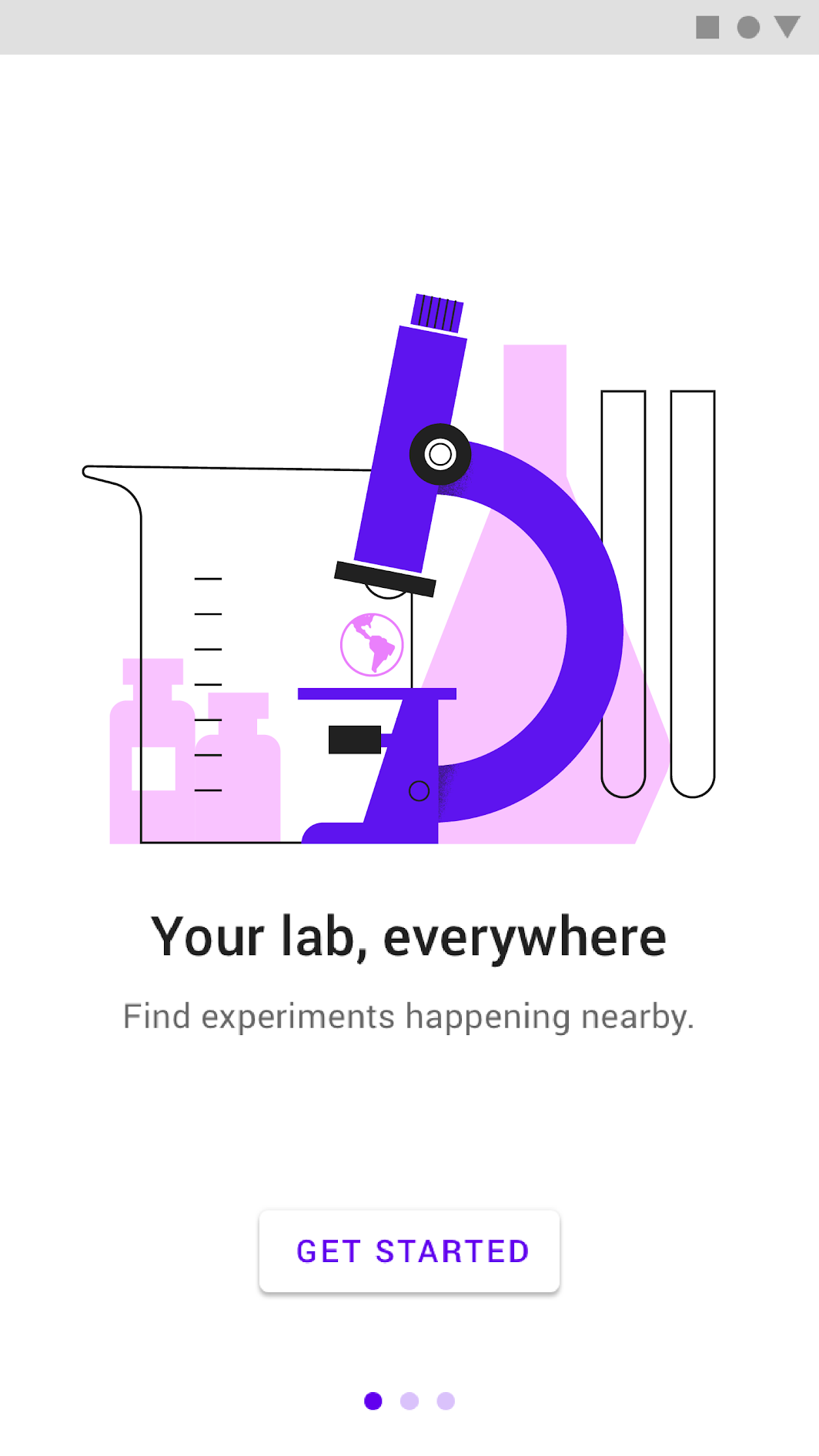
Auto-rotating carousel

A maximum of three illustrations should auto-rotate every two to three seconds and display pagination navigation. Auto-advance the first screen more quickly so that it’s clear this isn’t a single screen. The auto-advance feature should be disabled if the user touches the carousel.

Display a “Get Started” button throughout the animation, and loop through the animation continuously until the “Get Started” action is tapped.

The screen should be swipe-enabled, either in a forward or backward direction.

The button and pagination navigation are fixed. The typography is dynamic and on a separate field than the illustration, but at the same elevation.

Video

Another option for Top User Benefits is a video.

This should include a “Get Started” button, without pagination circles.

Video implementation

Best practices ​

Maintain visual continuity ​

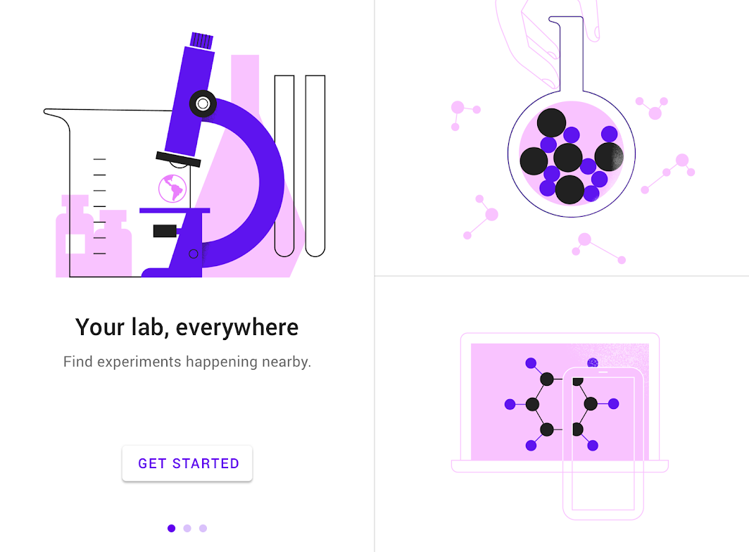
Maintain visual continuity throughout characters, environments, style, typography, and button colors.
Do: using consistent visuals and colors throughout the experience unify the story by creating a uniform canvas

Do

Using consistent visuals and colors throughout the experience unify the story by creating a uniform canvas for the button and circles.

Simplify ​

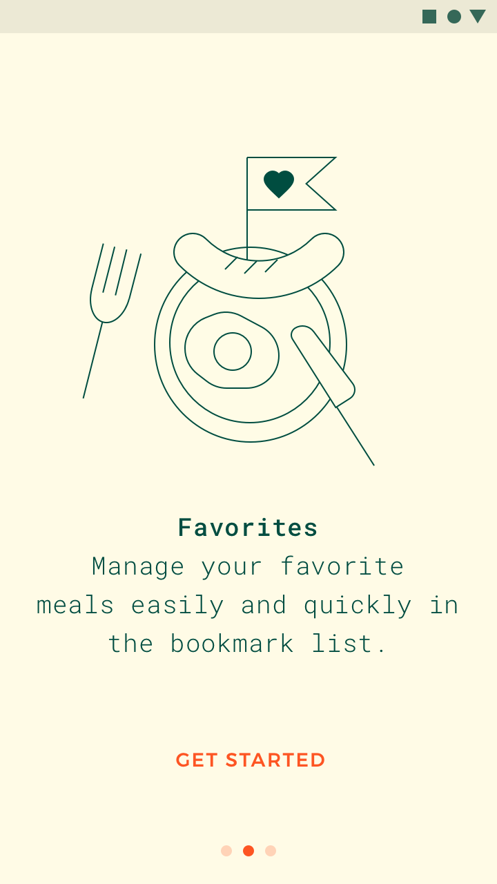
Simplify the visuals to the essentials needed to convey a concept.
Do: simplify text and imagery to focus on the essential concept

Do

Simplify text and imagery to focus on the essential concept.
Don't: there is no point of focus in this image

Don't

There is no point of focus in this image.

Don’t be UI literal ​

Don’t show app UI if users haven't experienced it yet. Show the user benefit first.

You may display education about the specific UI in a later context.
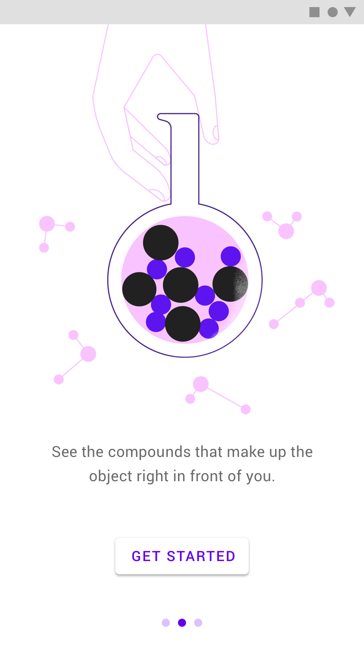
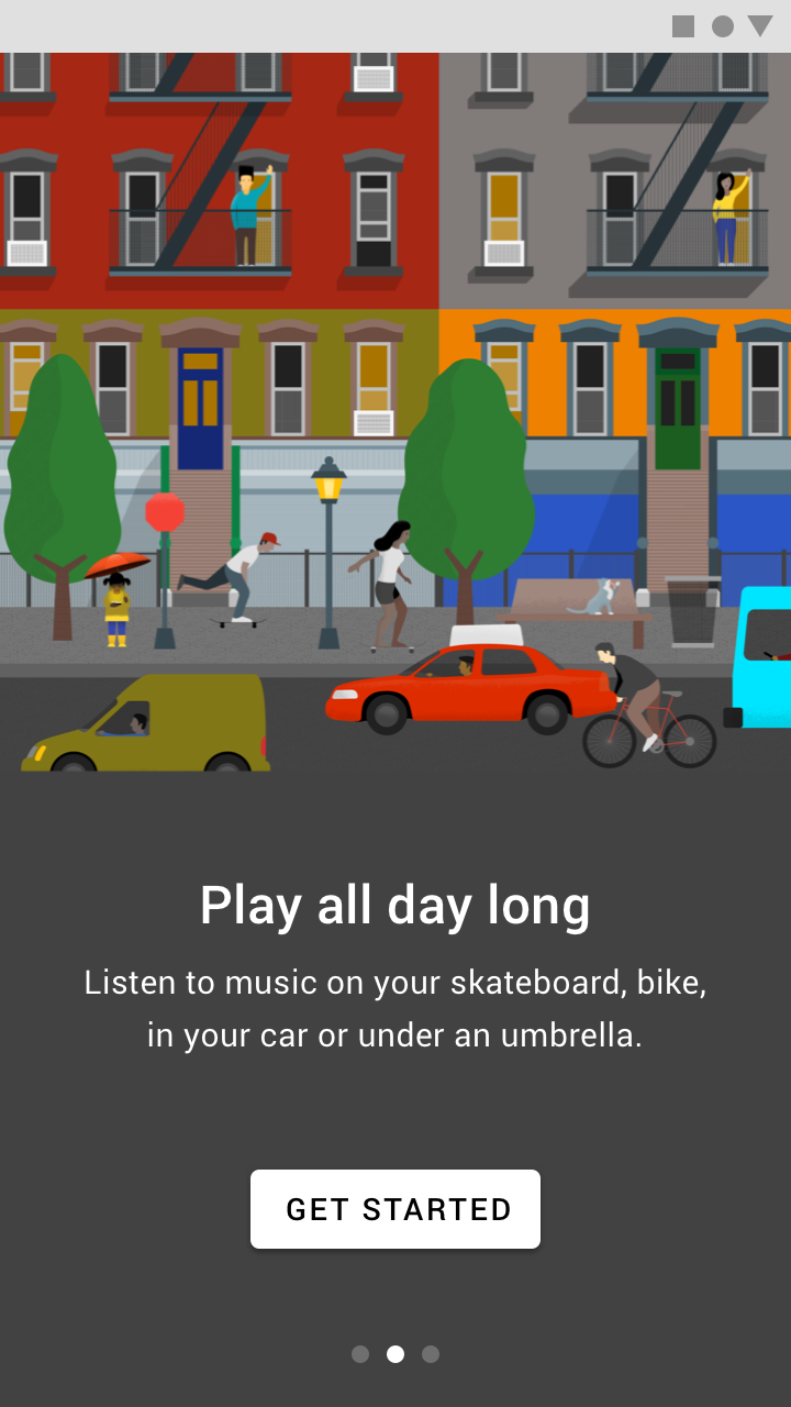
Do: this illustration helps convey the benefits of the app

Do

This illustration helps convey the benefits of the app.
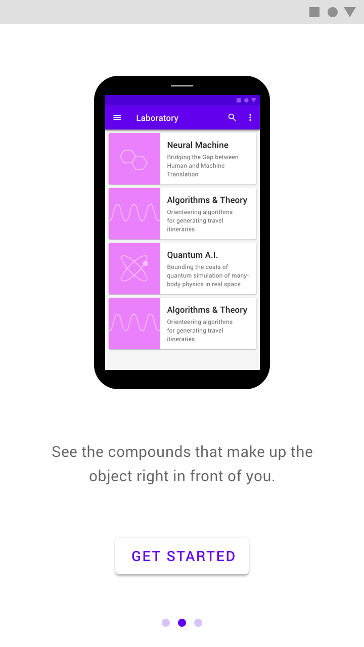
Don't: showing the actual app’s UI makes it unclear if the images are an illustration or an interactive element

Don't

Showing the actual app’s UI makes it unclear if the images are an illustration or an interactive element.

Design onboarding that connects to a first-run experience. The UI seen after onboarding should make it easy for users to act on what they just learned.

Design ​

The design of Top User Benefits should compliment the writing. If there’s an idea that can be better expressed through words, use text rather than imagery.

These layouts are designed to allow an illustration with a 1:1 aspect ratio to consistently fit on screens across all platforms. Ensure that the background and text color meet minimum contrast ratios for accessibility.

Mobile and tablet portrait ​

Place center-aligned copy and interactions beneath the illustration.
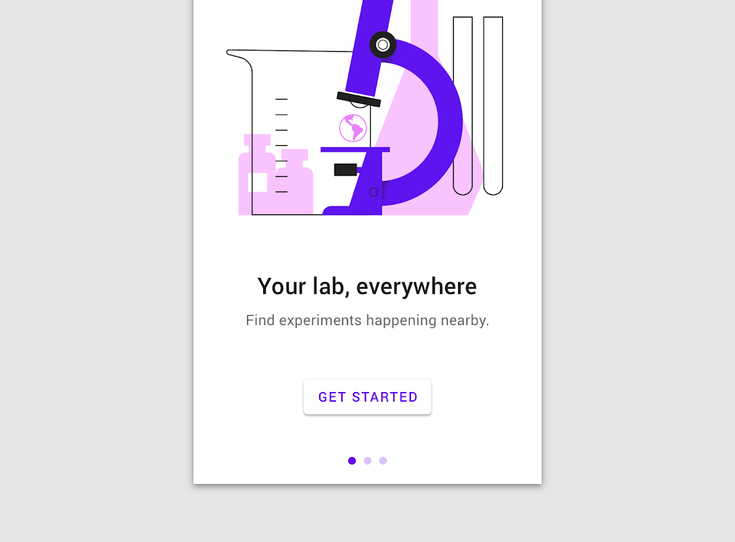
Mobile portrait
Mobile portrait

Mobile and tablet portrait: tablet portrait
Tablet portrait

Mobile and tablet landscape ​

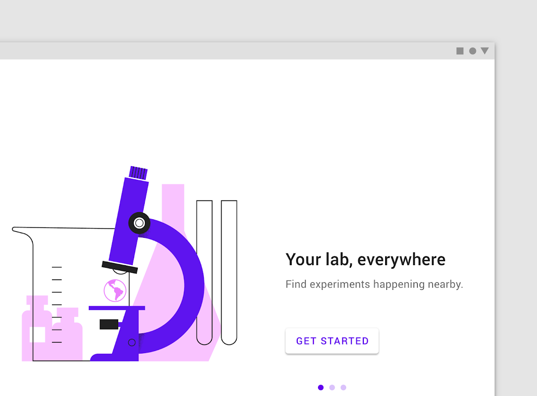
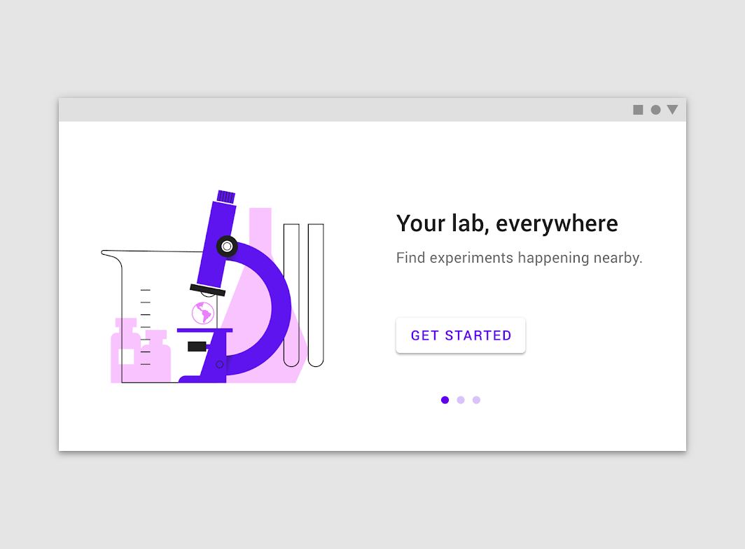
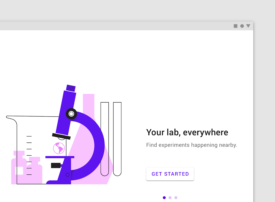
Place left-aligned copy and interactions against the right edge of the illustration, vertically centered.
Mobile landscape
Mobile landscape

Mobile and tablet landscape: tablet landscape
Tablet landscape

Desktop ​

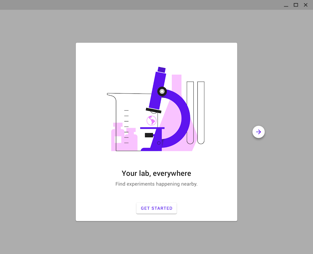
Place illustration, copy, and interactions in a centered card. Display “Next” and “Previous” buttons beside this card and pagination indicators beneath it.
Desktop
Desktop

Onboarding experiences for wearables and TV use different methods of interaction, and should be treated differently.

Specs ​

Mobile and tablet portrait ​


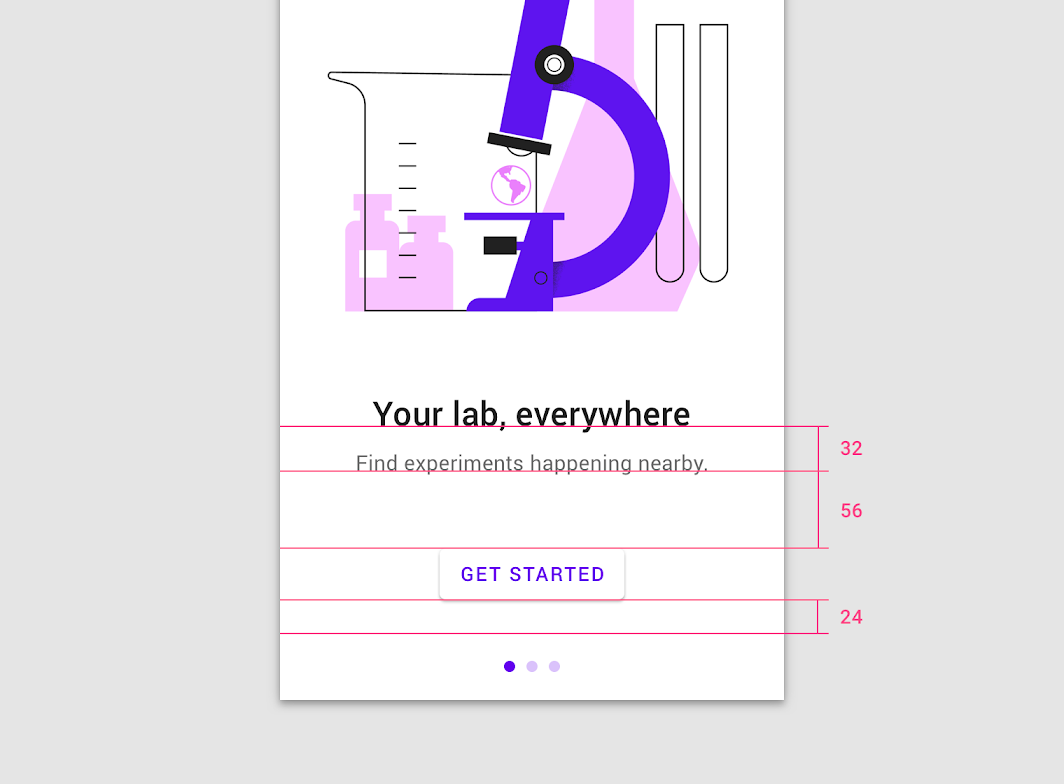
Copy and UI are center-aligned on the screen and built from the bottom of the screen upward with 24dp padding
Copy and UI are center-aligned on the screen and built from the bottom of the screen upward with 24dp padding.
Headline: Type 24sp, Leading 32sp
Subhead 1: Type 15sp, Leading 24sp
32sp line height
56dp padding between the top of button and the center of copy (allowing room for 1-3 lines of text)
24dp vertical padding

Mobile and tablet landscape ​

Align copy and UI to the left edge of the illustration, vertically centered
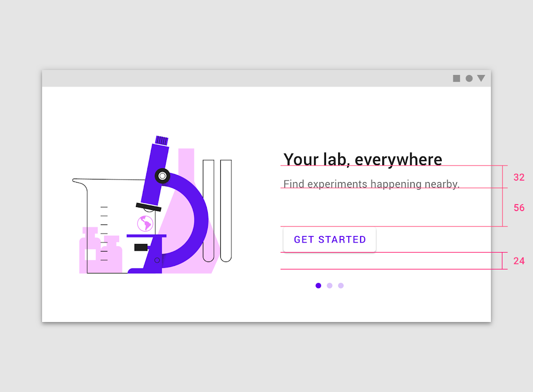
Align copy and UI to the left edge of the illustration, vertically centered.
Headline: Type 24sp, Leading 32sp
Subhead 1: Type 15sp, Leading 24sp
32sp line height
56dp padding between the top of the button and the center of copy (allowing room for 1-3 lines of text)
24dp vertical padding

Desktop ​
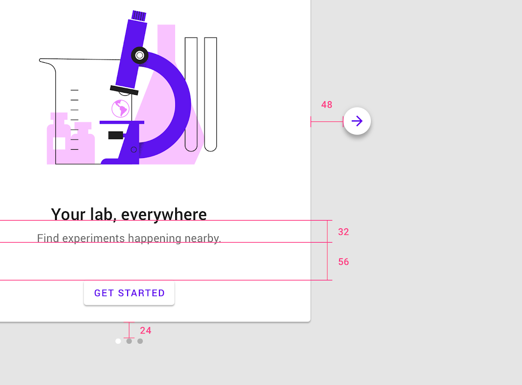

Headline: Type 24sp, Leading 32sp Subhead: Type 16sp
Headline: Type 24sp, Leading 32sp
Subhead: Type 16sp, Leading 24sp
Line Height: 32sp
Padding between top of button and center of copy: 56dp (allowing for 1-3 lines of text)
Vertical padding from image to pagination dots: 24d
Horizontal spacing from image to arrow: 48dp
Pager
Previous pageLaunch screen
Next pageOffline states

Released under the Apache-2.0

Copyright © 2018-Present Google

https://m2.material.io/design/communication/onboarding.html

Released under the Apache-2.0

Copyright © 2018-Present Google