Skip to content
Material Design 2
Main Navigation
v3
v2
v1

English

简体中文
繁體中文
Español
Français
Русский
Português – Brasil
Deutsch
日本語
한국어
Italiano
Polski
Türkçe
čeština
magyar

English

简体中文
繁體中文
Español
Français
Русский
Português – Brasil
Deutsch
日本語
한국어
Italiano
Polski
Türkçe
čeština
magyar

Appearance

Sidebar Navigation

Material System

Introduction

Material studies

About our Material studies

Basil

Crane

Fortnightly

Owl

Rally

Reply

Shrine

Material Foundation

Environment

Surfaces

Elevation

Light and shadows

Layout

Understanding layout

Pixel density

Responsive layout grid

Spacing methods

Component behavior

Applying density

Navigation

Understanding navigation

Navigation transitions

Search

Color

The color system

Applying color to UI

Color usage

Text legibility

Dark theme

Typography

The type system

Understanding typography

Language support

Sound

About sound

Applying sound to UI

Sound attributes

Sound choreography

Iconography

Product icons

System icons

Animated icons

Shape

About shape

Shape and hierarchy

Shape as expression

Shape and motion

Applying shape to UI

Motion

Understanding motion

The motion system

Speed

Choreography

Customization

Interaction

Gestures

Selection

States

Communication

Confirmation & acknowledgement

Data formats

Data visualization

Empty states

Help & feedback

Imagery

Launch screen

Onboarding

Offline states

Writing

Machine learning

Machine learning patterns

Object detection: live camera

Object detection: static image

Barcode Scanning

Material Guidelines

Material Theming

Overview

Implementing your theme

Usability

Accessibility

Bidirectionality

Platform guidance

Android bars

Android fingerprint

Android haptics

Android icons

Android navigating between apps

Android notifications

Android permissions

Android slices

Android split-screen

Android swipe-to-refresh

Android text selection toolbar

Android widget

Cross-platform adaptation

Components

App bars: bottom

App bars: top

Backdrop

Banners

Bottom navigation

Buttons

Buttons: floating action button

Cards

Checkboxes

Chips

Data tables

Date pickers

Dialogs

Dividers

Image lists

Lists

Menus

Navigation drawer

Navigation rail

Progress indicators

Radio buttons

Sheets: bottom

Sheets: side

Sliders

Snackbars

Switches

Tabs

Text fields

Time pickers

Tooltips

On this page

Pixel density ​

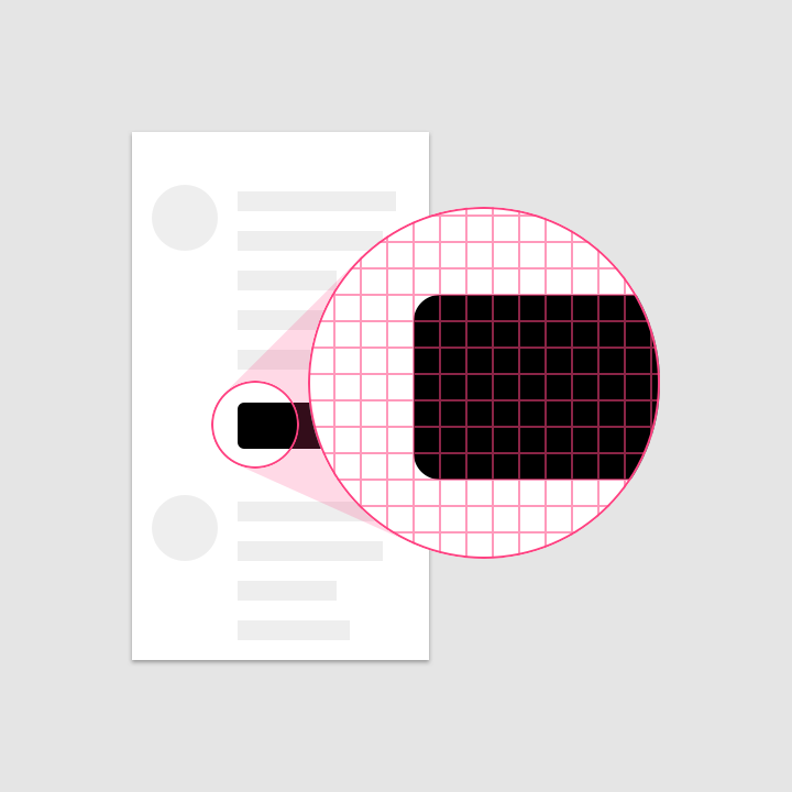
Screen pixel density and resolution vary depending on the platform.

Pixel density ​

The number of pixels that fit into an inch is referred to as pixel density.


Compatibility

An article on making apps accessible by ensuring compatibility with different devices.

Related link

Screen density variations ​

High-density screens have more pixels per inch than low-density ones. As a result, UI elements of the same pixel dimensions appear larger on low-density screens, and smaller on high-density screens.

Calculating pixel density ​

To calculate screen density, you can use this equation:

Screen density = Screen width (or height) in pixels / Screen width (or height) in inches
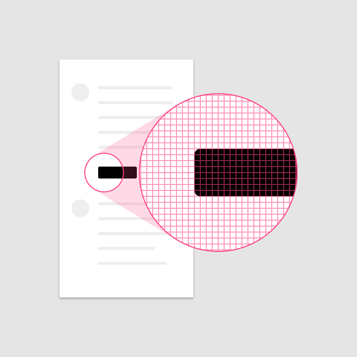
Calculating pixel density: high-density display
High-density display
Calculating pixel density: lower density display
Lower density display

Density independence ​

Density independence refers to the uniform display of UI elements on screens with different densities.

Density-independent pixels ​

Density-independent pixels, written as dp (pronounced "dips"), are flexible units that scale to have uniform dimensions on any screen. They provide a flexible way to accommodate a design across platforms.

Material UIs use density-independent pixels to display elements consistently on screens with different densities.
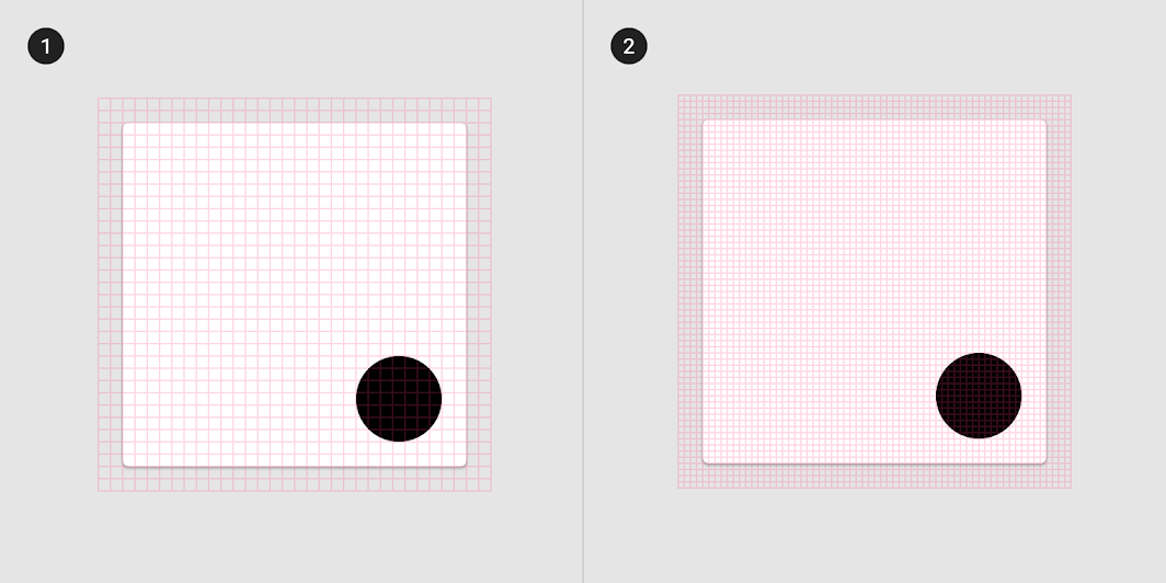
Low-density screen displayed with density independence
1. Low-density screen displayed with density independence
2. High-density screen displayed with density independence

Pixel density on Android ​

When developing an Android app, use dp to display elements uniformly on screens with different densities.

Dps and screen density ​

A dp is equal to one physical pixel on a screen with a density of 160.

To calculate dp:

dp = (width in pixels * 160) / screen density

Screen physical widthScreen densityScreen width in pixelsScreen width in dps
1.5 in
1.5 in
1.5 in
120
160
240
180 px
240 px
360 px
240 dp

Scalable pixels (sp) ​

Scalable pixels (sp) serve the same function as density-independent pixels (dp), but for fonts. The default value of an sp is the same as the default value for a dp.

The primary difference between an sp and a dp is that sp's preserve a user's font settings. Users who have larger text settings for accessibility will see font sizes match their text size preferences.

Pixel density on iOS ​

iOS determines density using logical resolution, which measures its units in points.

Logical resolution ​

With logical resolution, points are scaled using a Native Scale factor, which map to a device's native resolution (in pixels).

For example, when designing for the iPhone X, you would design for a logical resolution of 375 x 812 points. When rendered, elements are processed by the graphics hardware to fill the iPhone X's 1125 x 2436 pixel screen.


Displays

Apple's documentation on display sizes and resolutions for iOS devices.

Related link

Paintcode

A guide to iPhone screen resolutions.

Related link

Units for iOS ​

When designing for iOS, use points (pts).

Learn more:

  • Apple iOS' Documentation on Displays
  • PaintCode's Guide to iPhone Resolutions

Pixel density on the web ​

Logical resolution ​

Use the device's logical resolution, which scales to the device's screen resolution.

Units for the web ​

When designing for the web, replace dp with px (for pixel).

Pager
Previous pageUnderstanding layout
Next pageResponsive layout grid

Released under the Apache-2.0

Copyright © 2018-Present Google

https://m2.material.io/design/layout/pixel-density.html

Released under the Apache-2.0

Copyright © 2018-Present Google