Backdrop
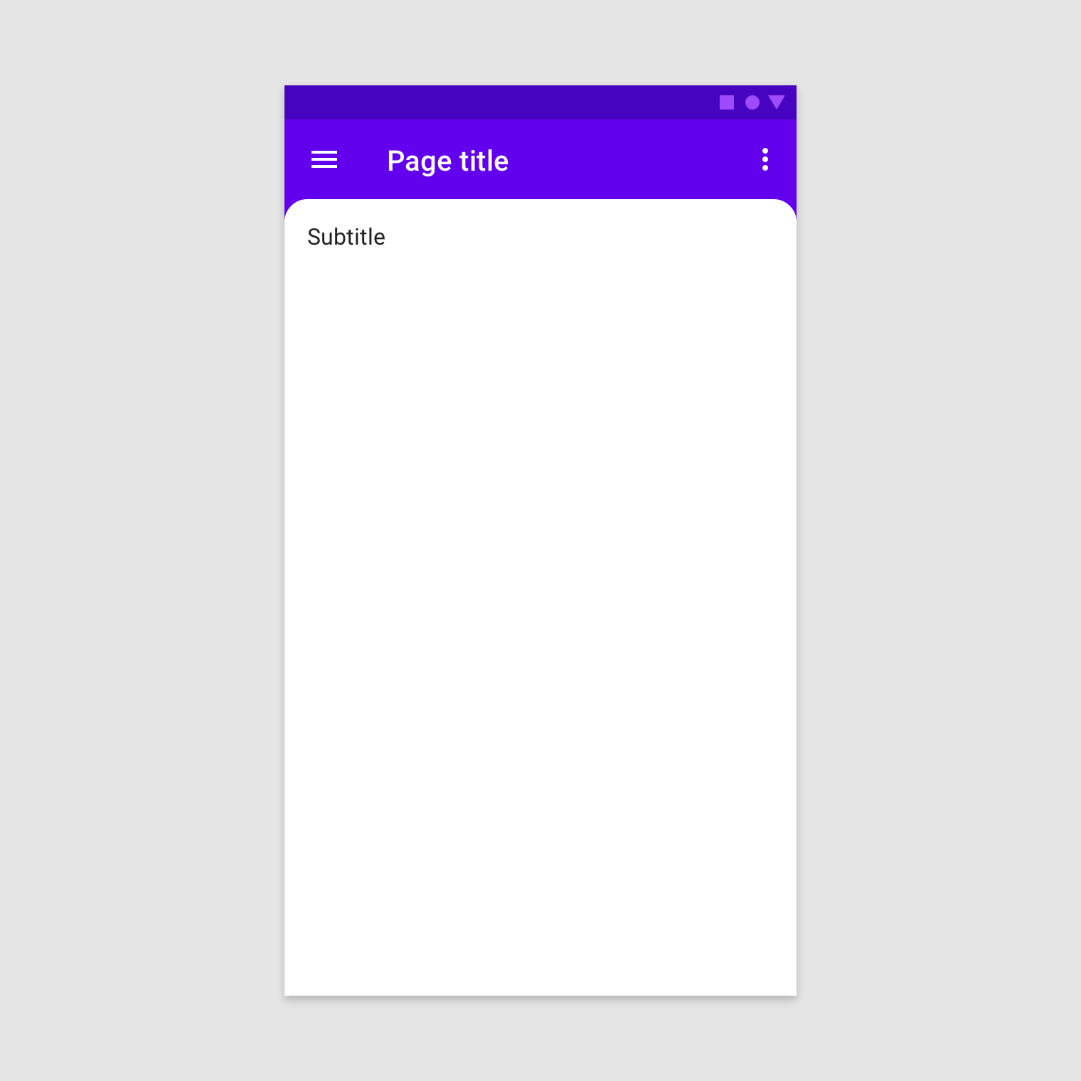
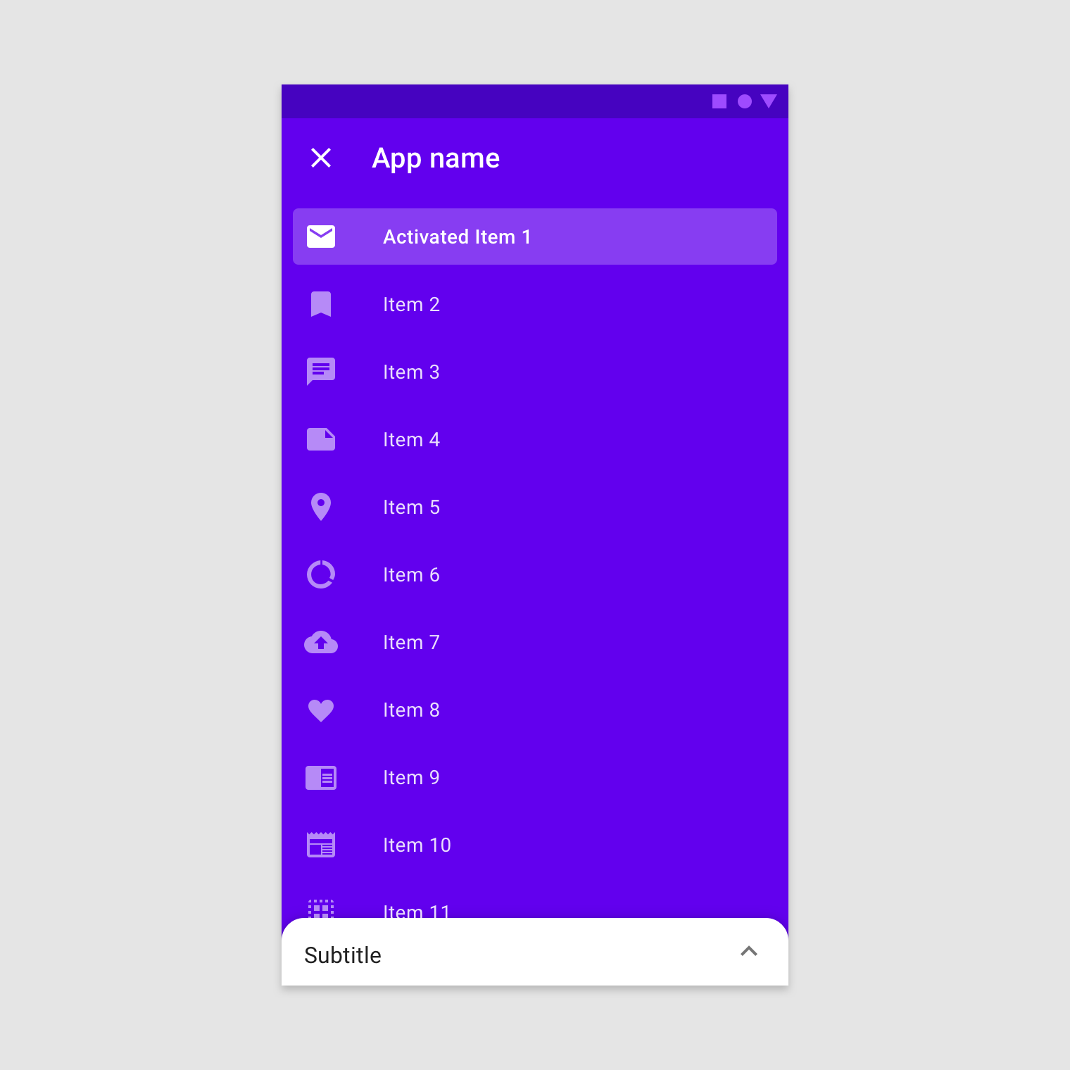
A backdrop appears behind all other surfaces in an app, displaying contextual and actionable content.
Usage
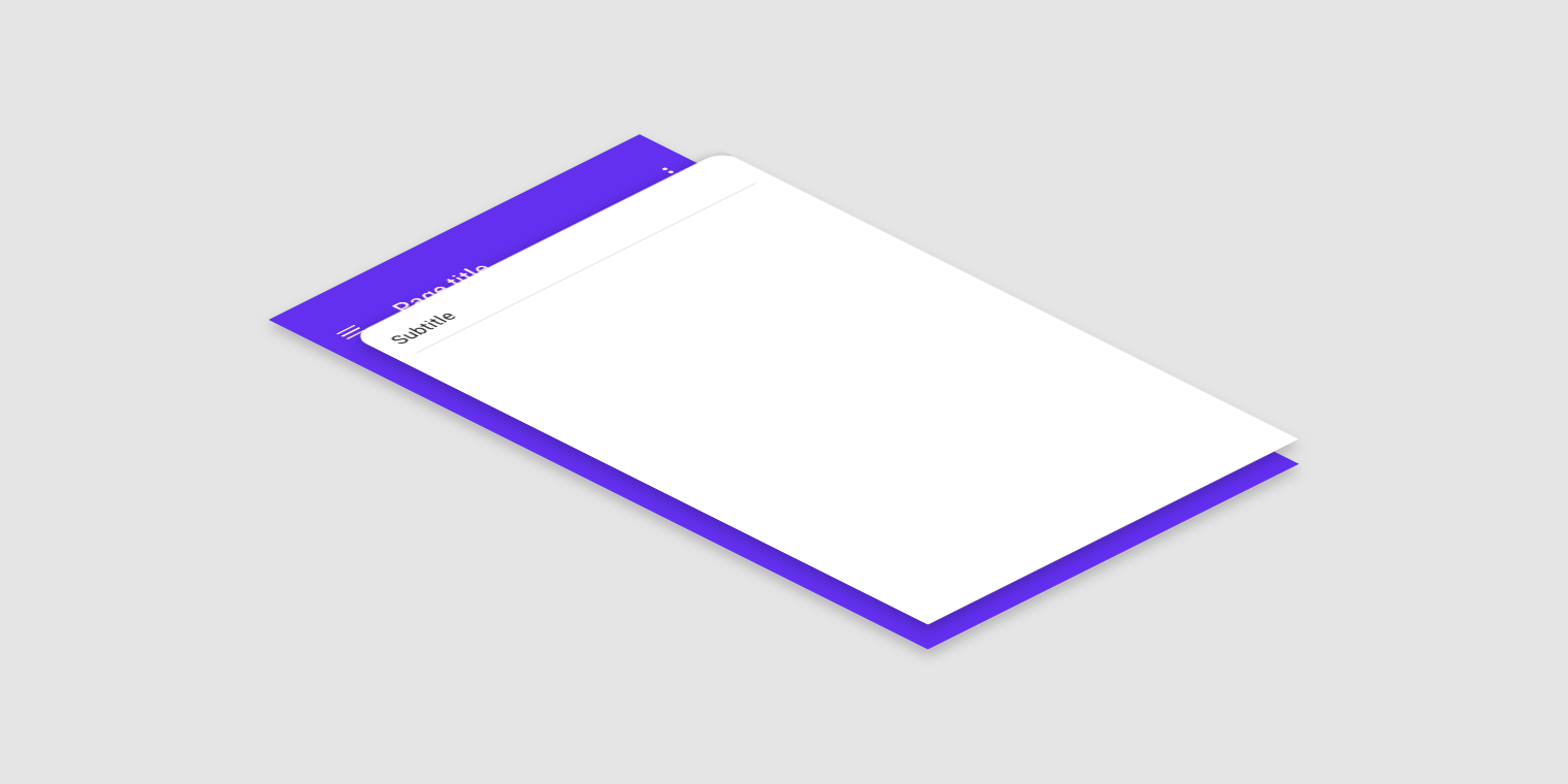
A backdrop is composed of two surfaces: a back layer and a front layer. The back layer displays actions and context, and these control and inform the front layer's content.
2. Front layer
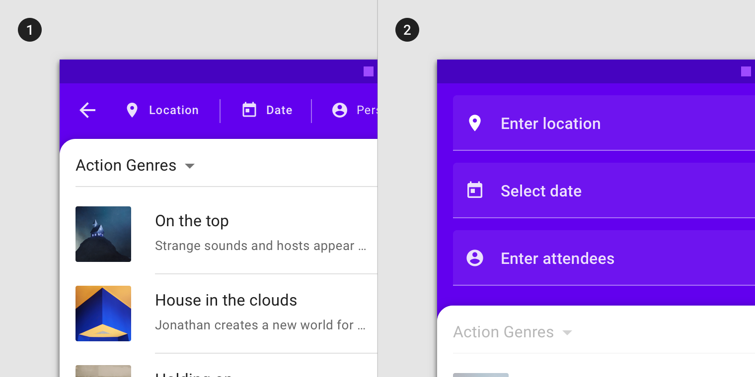
2. When revealed, the back layer displays contextual controls that relate to the front layer.
Principles
Relevant
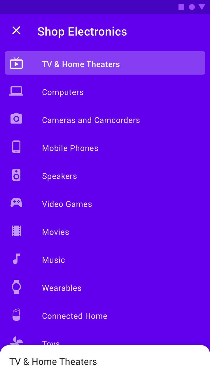
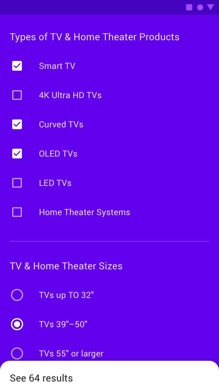
The backdrop's back layer is persistent, displaying controls and content that relate to the front layer.
Immediate
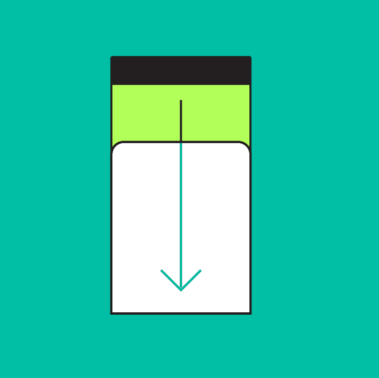
The backdrop's back layer can be accessed from any scroll position.

Contextual
The backdrop focuses attention on one layer at a time.
Anatomy
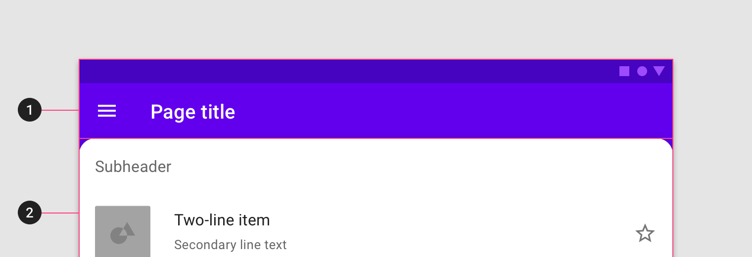
A backdrop consists of a back layer, a front layer, and an optional subheader. Either the back layer or the front layer can be active at a time.
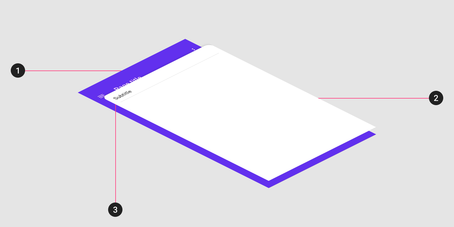
2. Front layer
3. Subheader (optional)
Active front layer
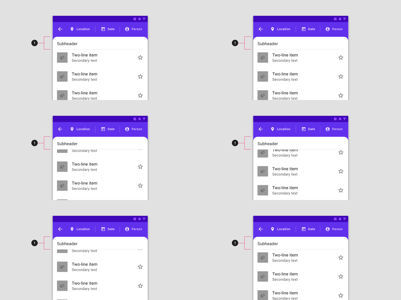
The front layer always appears in front of the back layer. It is displayed at full width and holds primary content.
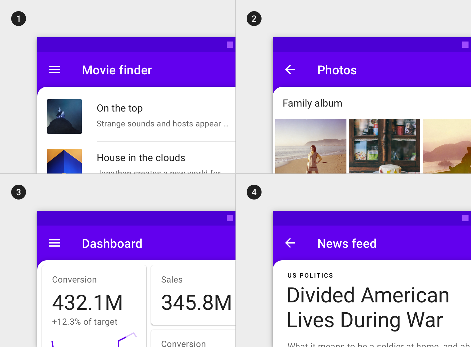
1. Text lists
2. Image lists
3. Cards
4. Text
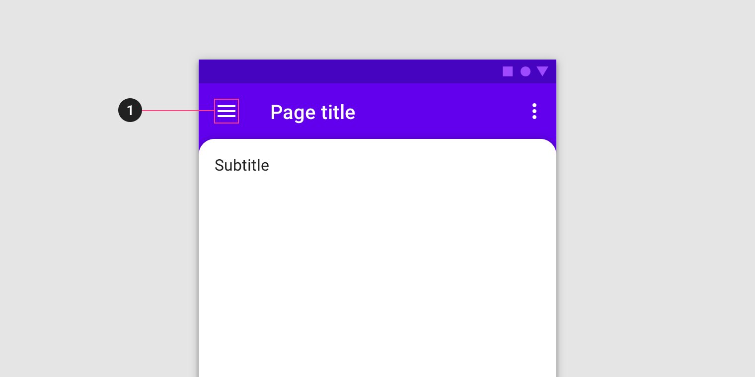
Subheader (Optional)
The subheader is a fixed area on the front layer that contains a title and optional iconography.
Active back layer
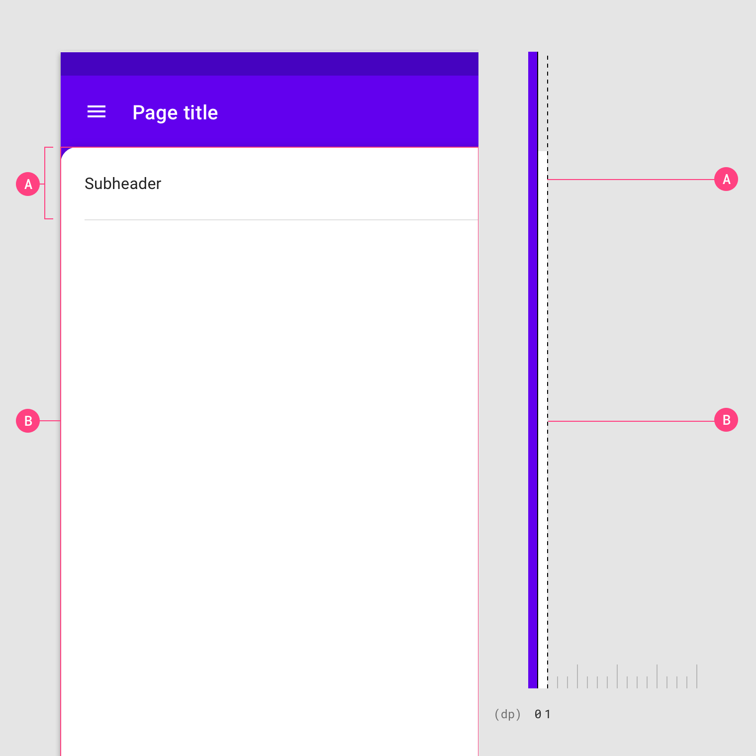
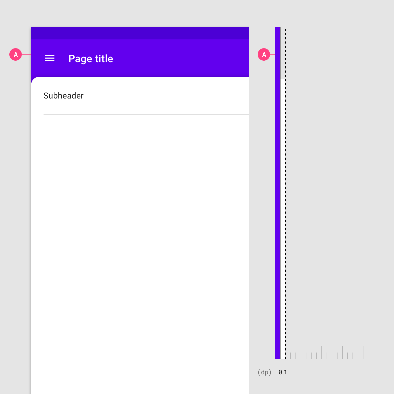
The back layer appears at the lowest elevation (0dp) in an app, filling the entire background. It holds actionable content that is relevant to the front layer.
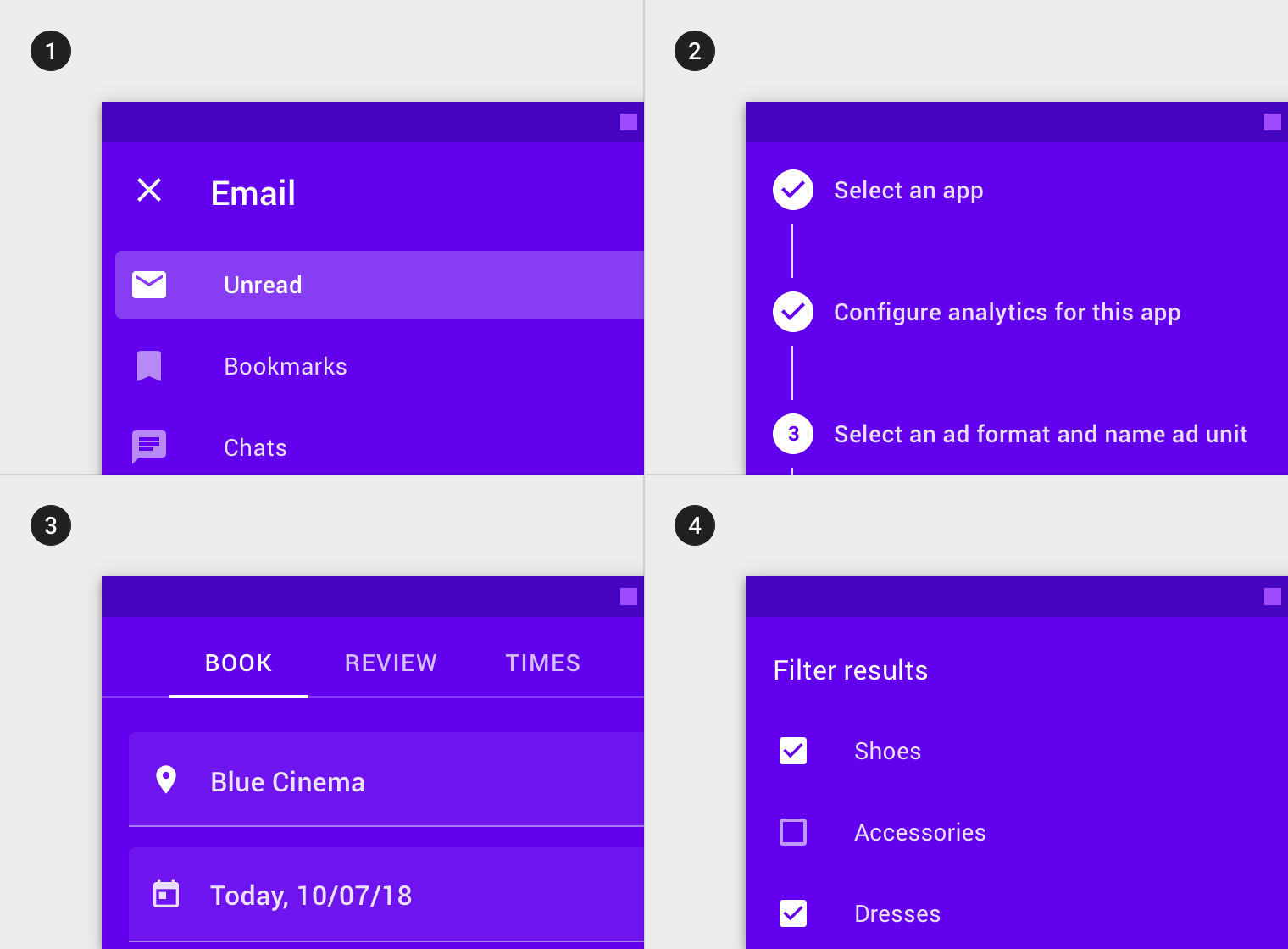
1. Navigation
2. Steppers
3. Text fields
4. Selection controls
These components affect content on the front layer.
When the back layer is active, the front layer can contain text and iconography, or a scrim, as affordances that provide a way to conceal the back layer.
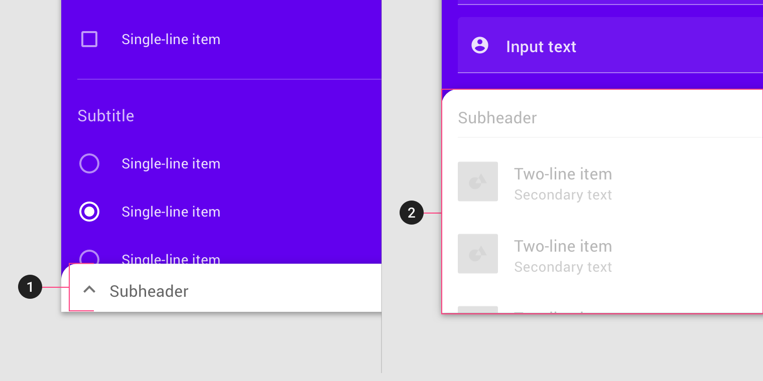
2. Scrim
Behavior
Revealing the back layer
To reveal the back layer, interact with any actions that appear on it.
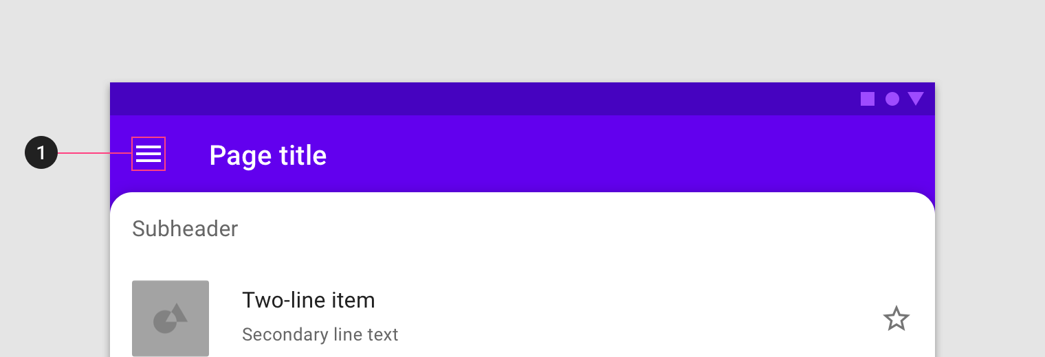
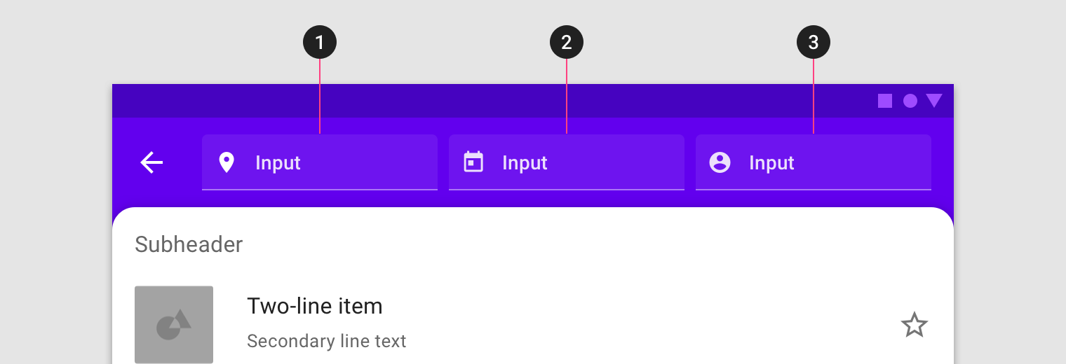
Don't
Concealing the back layer
The back layer can be concealed by either interacting with the front layer or tapping a conceal affordance on either layer.
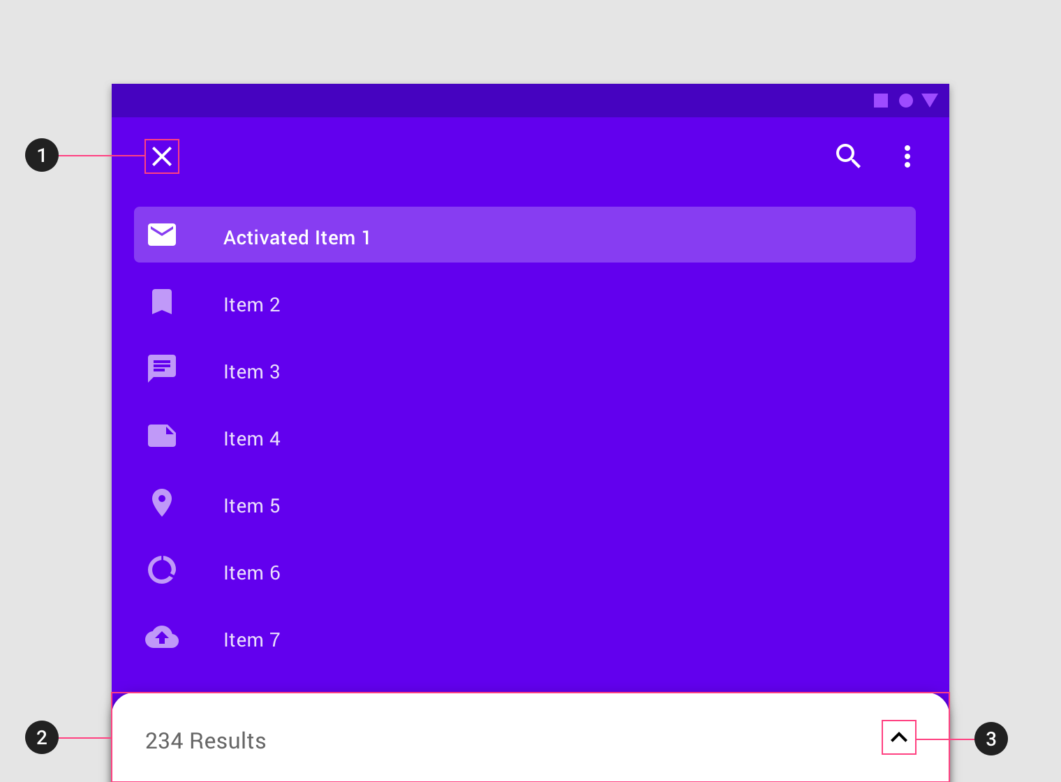
Content scrolling
Content on the front layer has different scrolling behaviors (and restrictions) than content on the back layer.
Do
Don't
Do
Caution
Theming
Crane Material theme
This travel app's backdrop has been customized using Material Theming. Areas of customization include color and shape.
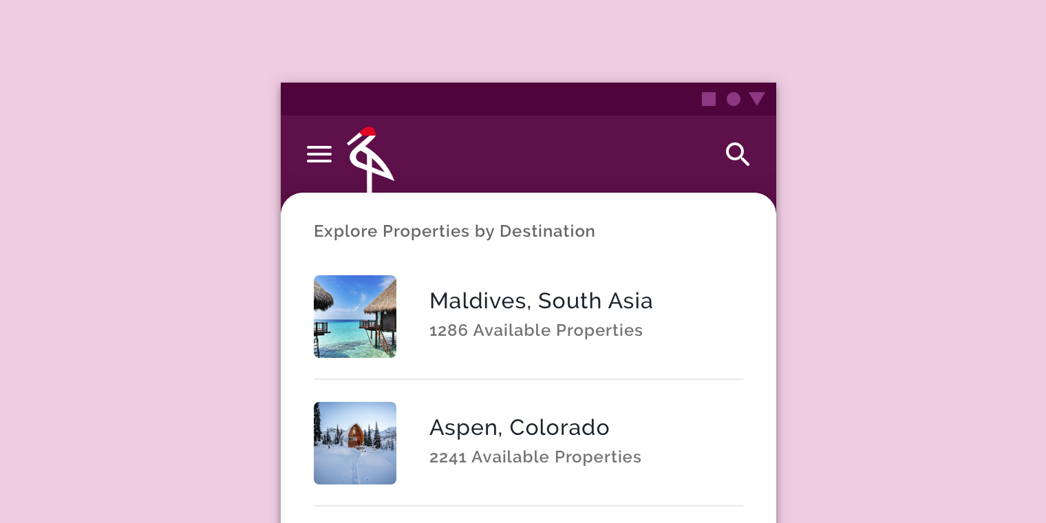
Color
Crane's backdrop uses custom color on four elements: the back layer, the front layer, back layer icons, and front layer text.
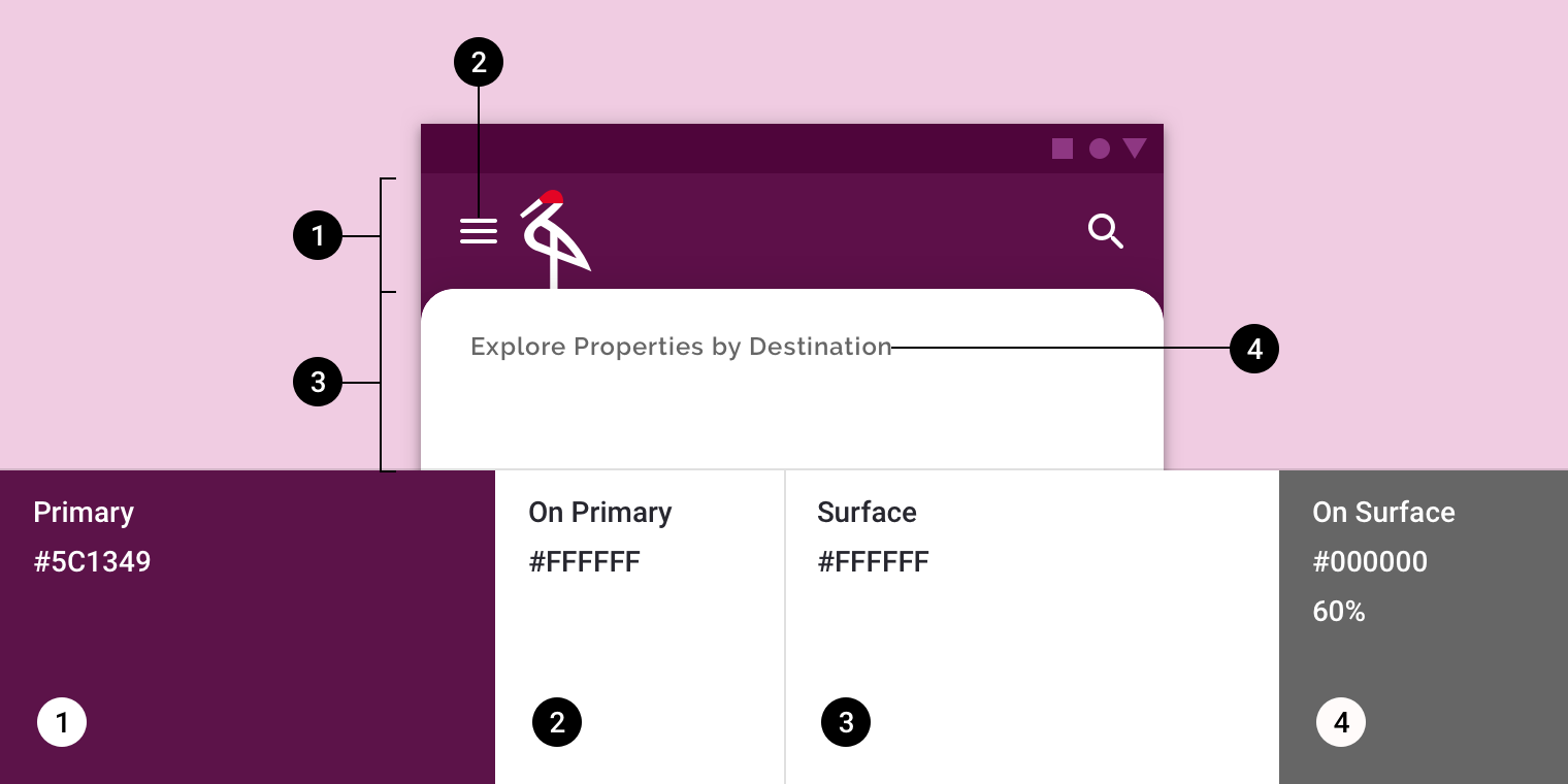
| Element | Category | Attribute | Value |
|---|---|---|---|
| Back layer | Primary | Color Opacity | #5C1349 100% |
| Back layer icons | On Primary | Color Opacity | #FFFFFF 100% |
| Front layer | Surface | Color Opacity | #FFFFFF 100% |
| Front layer text | On Surface | Color Opacity | #000000 60% |
Shape
Crane's backdrop uses custom shapes on the top corners of the front layer. *The backdrop can only be shaped on the top left and top right corners.
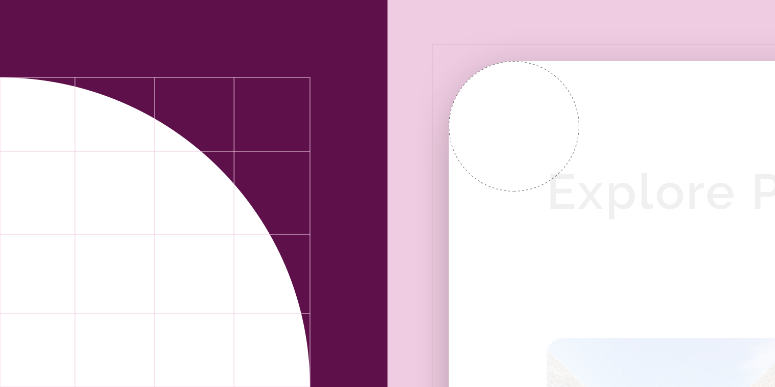
| Element | Category | Attribute | Value |
|---|---|---|---|
| Front layer | Large component | Family Size | Rounded 16;16; n/a; n/a dp* |
Shrine Material theme
Shrine is a retail app, and its backdrop has been customized using Material Theming. Areas of customization include color and shape.
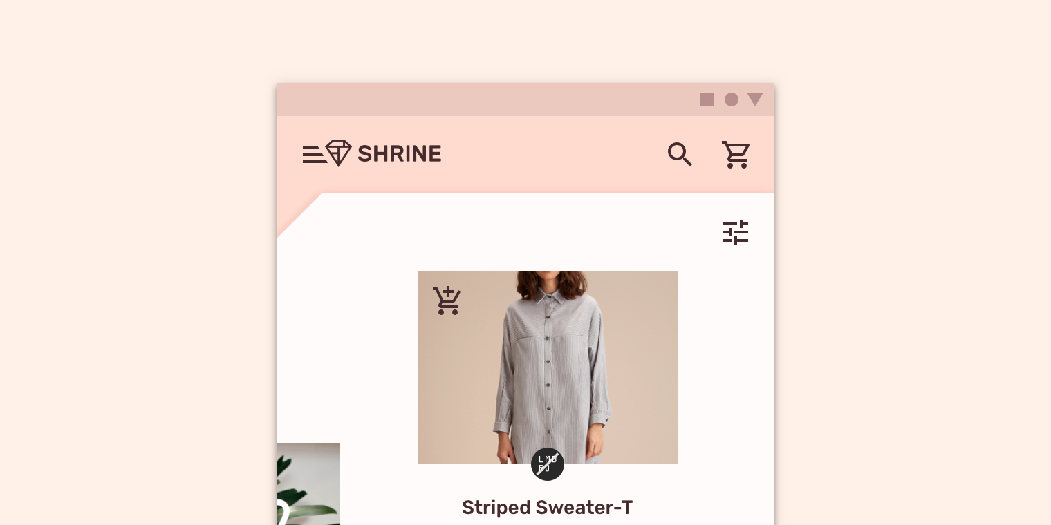
Color
Shrine's backdrop uses custom color on four elements: the back layer, back layer icons, the front layer, and front layer icons.
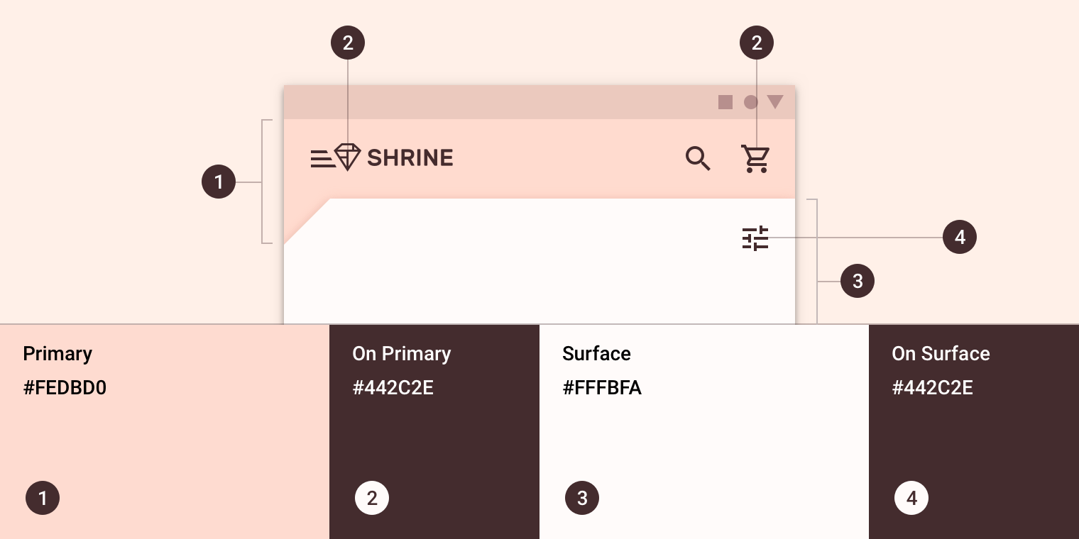
| Element | Category | Attribute | Value |
|---|---|---|---|
| Back layer | Primary | Color Opacity | #FEDBD0 100% |
| Back layer icons | On Primary | Color Opacity | #442C2E 100% |
| Front layer | Surface | Color Opacity | #FFFBFA 100% |
| Front layer icons | On Surface | Color Opacity | #442C2E 100% |
Shape
The front layer of Shrine's backdrop uses a custom cut corner on the top left, giving the backdrop an asymmetrical shape. *The backdrop can only be shaped on the top left and top right corners.
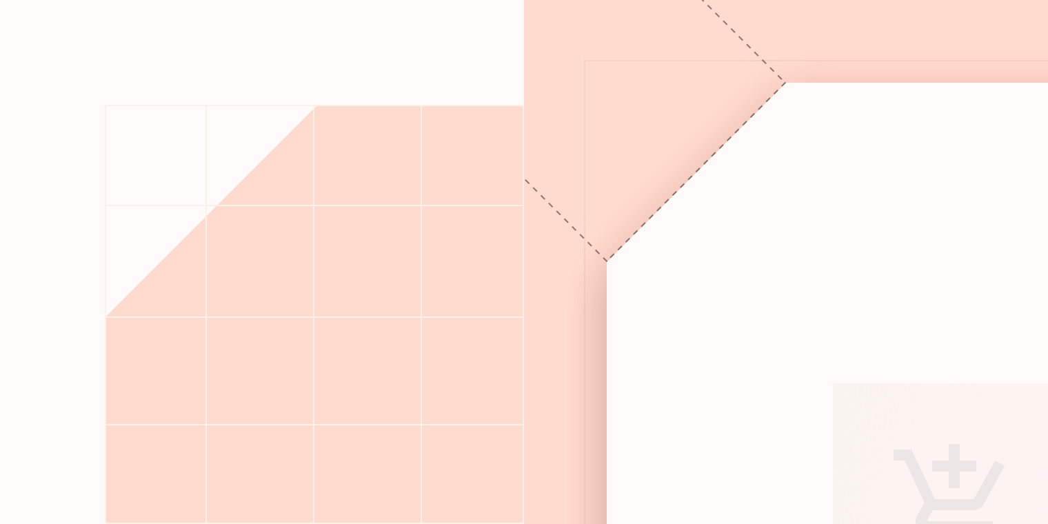
| Element | Category | Attribute | Value |
|---|---|---|---|
| Front layer | Large component | Family Size | Cut 24;0; n/a; n/a dp* |
Specs
Mobile