Skip to content
Material Design 2
Main Navigation
v3
v2
v1

English

简体中文
繁體中文
Español
Français
Русский
Português – Brasil
Deutsch
日本語
한국어
Italiano
Polski
Türkçe
čeština
magyar

English

简体中文
繁體中文
Español
Français
Русский
Português – Brasil
Deutsch
日本語
한국어
Italiano
Polski
Türkçe
čeština
magyar

Appearance

Sidebar Navigation

Material System

Introduction

Material studies

About our Material studies

Basil

Crane

Fortnightly

Owl

Rally

Reply

Shrine

Material Foundation

Environment

Surfaces

Elevation

Light and shadows

Layout

Understanding layout

Pixel density

Responsive layout grid

Spacing methods

Component behavior

Applying density

Navigation

Understanding navigation

Navigation transitions

Search

Color

The color system

Applying color to UI

Color usage

Text legibility

Dark theme

Typography

The type system

Understanding typography

Language support

Sound

About sound

Applying sound to UI

Sound attributes

Sound choreography

Iconography

Product icons

System icons

Animated icons

Shape

About shape

Shape and hierarchy

Shape as expression

Shape and motion

Applying shape to UI

Motion

Understanding motion

The motion system

Speed

Choreography

Customization

Interaction

Gestures

Selection

States

Communication

Confirmation & acknowledgement

Data formats

Data visualization

Empty states

Help & feedback

Imagery

Launch screen

Onboarding

Offline states

Writing

Machine learning

Machine learning patterns

Object detection: live camera

Object detection: static image

Barcode Scanning

Material Guidelines

Material Theming

Overview

Implementing your theme

Usability

Accessibility

Bidirectionality

Platform guidance

Android bars

Android fingerprint

Android haptics

Android icons

Android navigating between apps

Android notifications

Android permissions

Android slices

Android split-screen

Android swipe-to-refresh

Android text selection toolbar

Android widget

Cross-platform adaptation

Components

App bars: bottom

App bars: top

Backdrop

Banners

Bottom navigation

Buttons

Buttons: floating action button

Cards

Checkboxes

Chips

Data tables

Date pickers

Dialogs

Dividers

Image lists

Lists

Menus

Navigation drawer

Navigation rail

Progress indicators

Radio buttons

Sheets: bottom

Sheets: side

Sliders

Snackbars

Switches

Tabs

Text fields

Time pickers

Tooltips

On this page

Owl ​

Owl is an educational app that uses Material Design components and Material Theming to create an energetic, motivational brand experience.
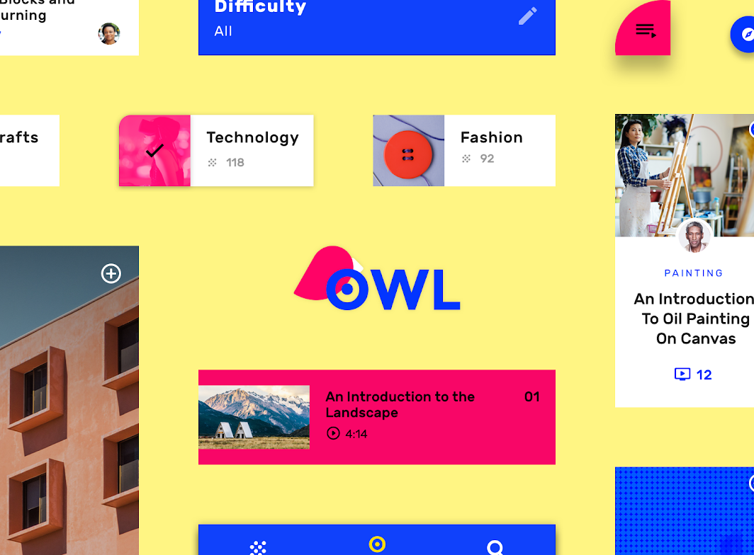
Owl hero image

About Owl ​

Owl is an educational app that provides courses for people who want to explore and learn new skills in design, art, architecture, and fashion. The Owl brand uses bold color, shape, and typography to express its brand attributes: energy, daring, and fun.
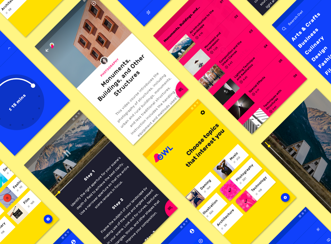
About Owl

Bold aesthetic ​

Owl’s design reflects the energy and excitement of learning a new skill, using a bold aesthetic that expresses exploration and growth. Its UI contains unfilled shapes that invite the user to populate them with new content and courses. Its copywriting speaks with an inviting, can-do tone of voice.

Product architecture ​
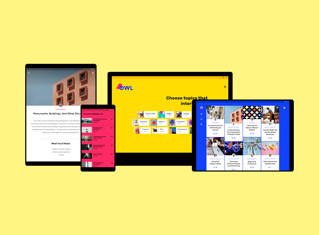
Product architecture: devices

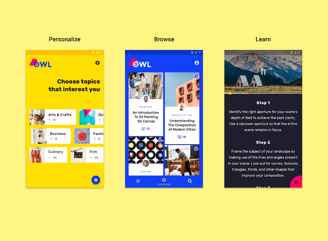
Owl is divided into three sections, each with their own color theme and interaction model:

  • Personalize (yellow)
  • Browse (blue)
  • Learn (magenta)
Scaled down to 50%
Scaled down to 50%

Hub and spoke structure ​

The information architecture of the app uses a hub and spoke structure.

The Browse section serves as a “hub,” where various “spokes,” or child nodes, are available to users in the form of instructional classes. After a class is chosen and the user enters the Learn section, the class becomes a hub, with each section of the class becoming a spoke.

This structure applies to the Browse and Learn sections of the app, while the Personalize section is an onboarding section.

Section 1: Personalize ​


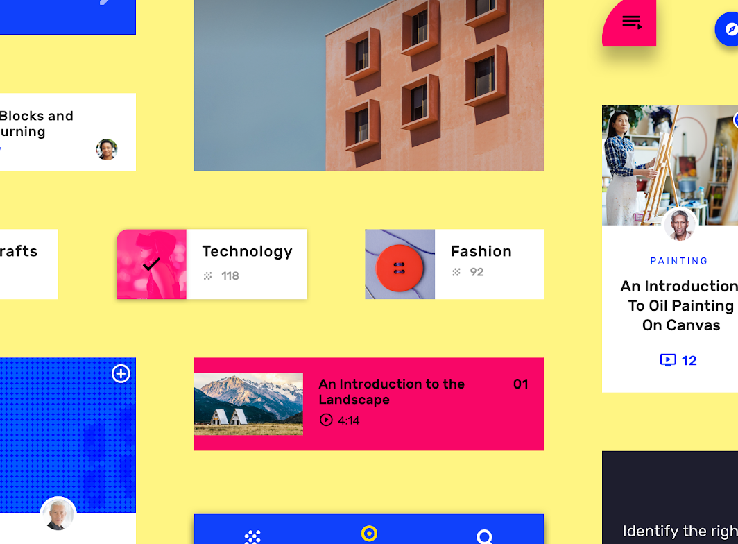
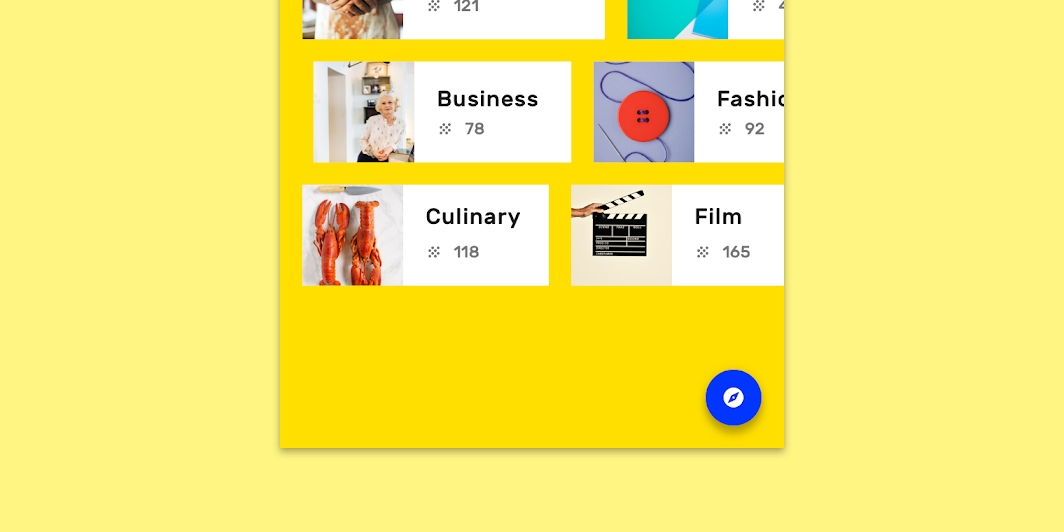
The Personalize section is dedicated to selecting areas of interest. It’s characterized by a yellow theme. This section is a form of onboarding, where customized chips represent selectable course subjects.

Navigation

Navigation can be accessed by tapping the blue floating action button in the lower right corner. Settings can be accessed through the settings icon.
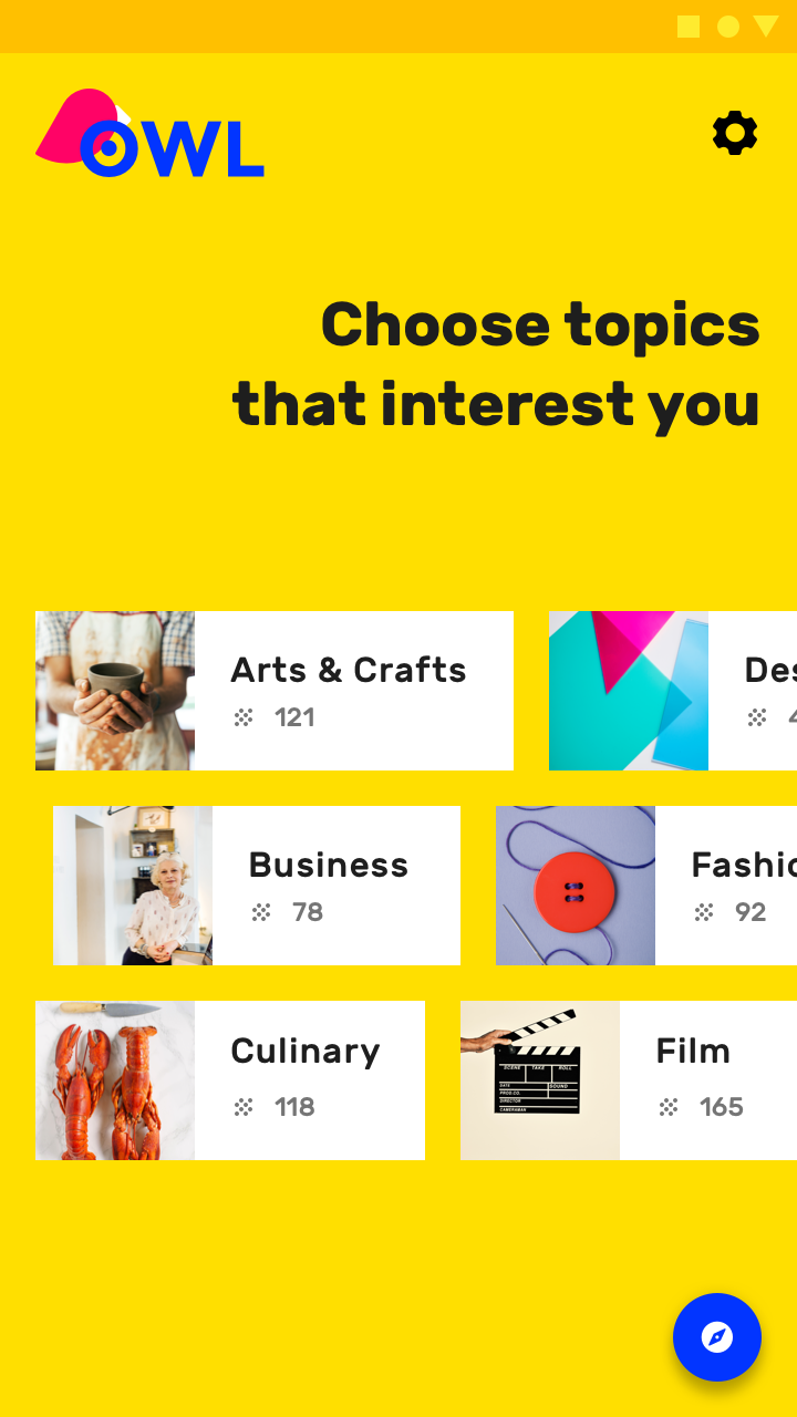
The Personalize section of Owl on mobile

Section 2: Browse ​


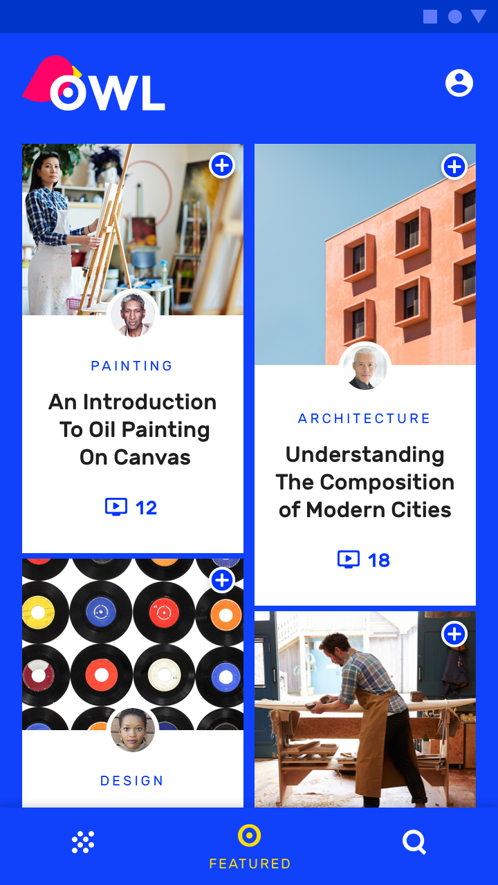
The Browse section is a hub for the user’s areas of interest. It’s characterized by a blue theme.

Navigation

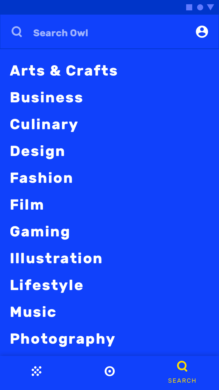
This section contains three top-level navigation destinations:

  • My Courses
  • Featured
  • Search

On mobile, Owl uses a bottom navigation bar to access these sections.
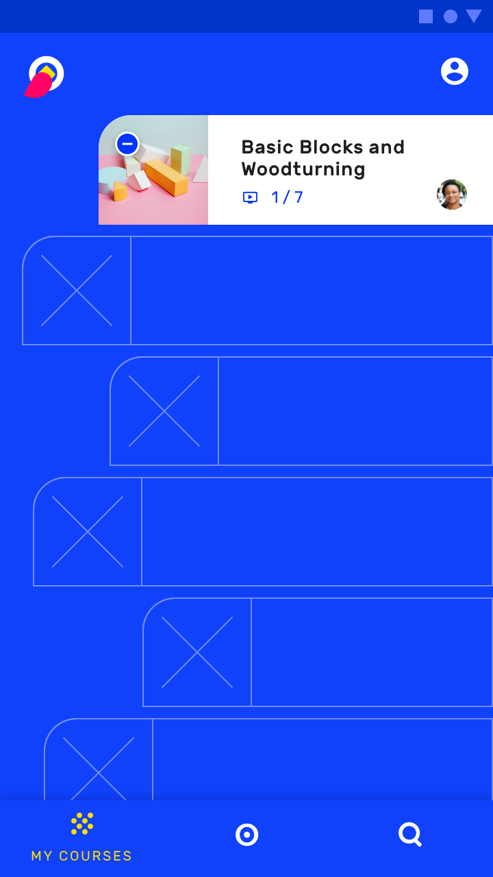
Use the bottom navigation to visit the My Courses page on mobile

On mobile, use the bottom navigation to visit the Featured page
On mobile, use the bottom navigation to visit the Featured page.
On mobile, use the bottom navigation to access the Search page
On mobile, use the bottom navigation to access the Search page.

On tablet and desktop, rail navigation provides access to the three destinations.
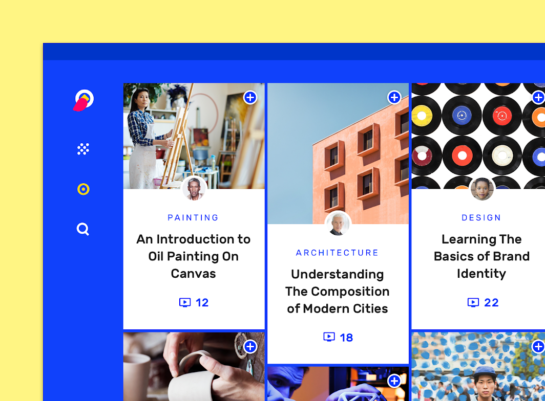
Owl’s rail navigation on desktop

Floating Action Button

A floating action button (FAB) represents the primary action of a screen.

Related article

Bottom sheets

Bottom sheets are surfaces containing supplementary content that are anchored to the bottom of the screen.

Related article

Bottom navigation

Bottom navigation bars allow movement between primary destinations in an app.

Related article

Section 3: Learn ​


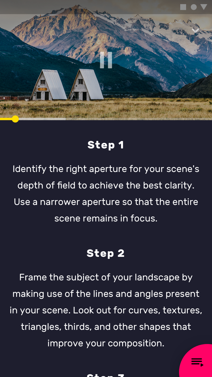
This section is a hub for course content. Each course has an overview screen that contains tutorial videos.

Navigation

To access the tutorial videos for a course, tap the curved shape in the bottom right of the screen. To navigate back to the Browse section, tap the back arrow (in the top left of the screen).
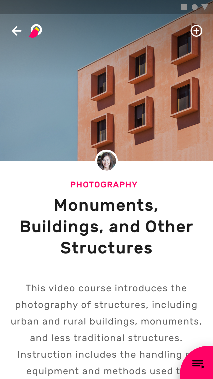
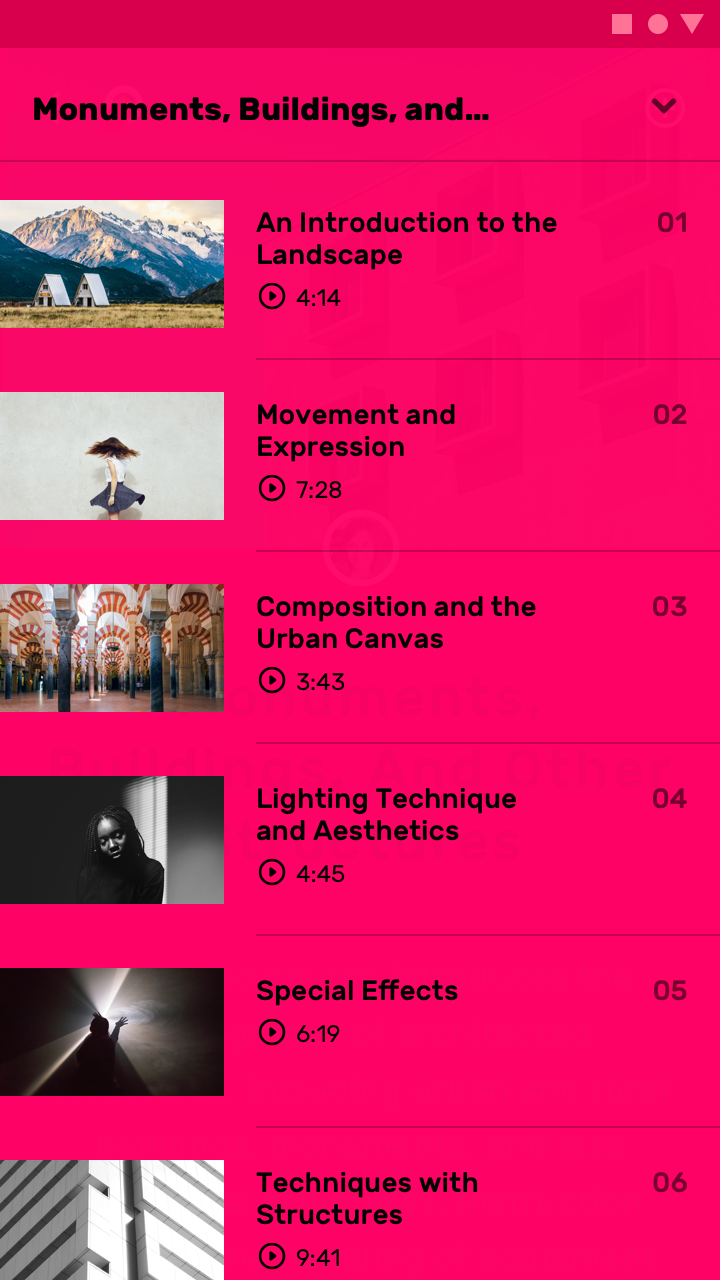
A course landing page on mobile

When the sheet is tapped, it expands full screen to show a list of tutorial videos
When the sheet is tapped, it expands full screen to show a list of tutorial videos.
It can be played full screen in landscape mode, or viewed with step-by-step content in portrait mode
When a tutorial video is tapped, it can be played full screen in landscape mode, or viewed with step-by-step content in portrait mode.

On desktop and tablets in landscape orientation, there is enough screen space to show both the course overview content and videos.
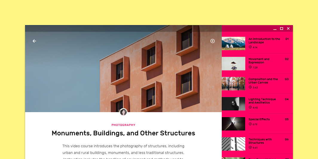
Scaled down to 50%
Scaled down to 50%

On smaller desktop views and tablets in portrait orientation, videos are hidden by default, but they can be revealed by accessing a side sheet.
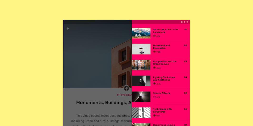
Scaled down to 50%
Scaled down to 50%

Imagery in UI

Imagery communicates and differentiates a product through visuals.

Related article

Side sheets

Side sheets are surfaces containing supplementary content that are anchored to the left or right edge of the screen.

Related article

Lists

Lists are continuous, vertical indexes of text or images.

Related article

Layout ​

Grid system ​

Owl uses a responsive grid system, which has flexible columns and padding that can resize depending on the screen width (such as mobile, tablet, or desktop).

Owl’s grid system, scaled down to 50%

Color ​

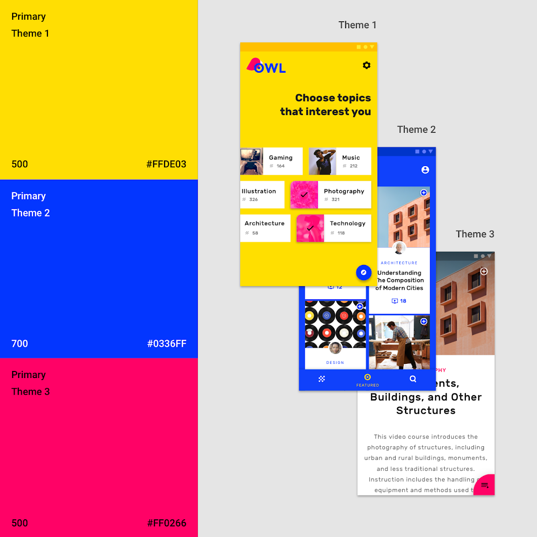
Owl has three primary colors. Each color is used to create a distinct visual theme for each section.
Section 1: Personalize: color

The color system

The Material Design color system can help you create a color theme that reflects your brand or style.

Related article

Applying color to UI

Color is applied to UI elements and components in consistent and meaningful ways.

Related article

Imagery in UI

Imagery communicates and differentiates a product through visuals.

Related article

Theme 1 ​

For the Personalize section, yellow is the primary color, and blue is the secondary color.
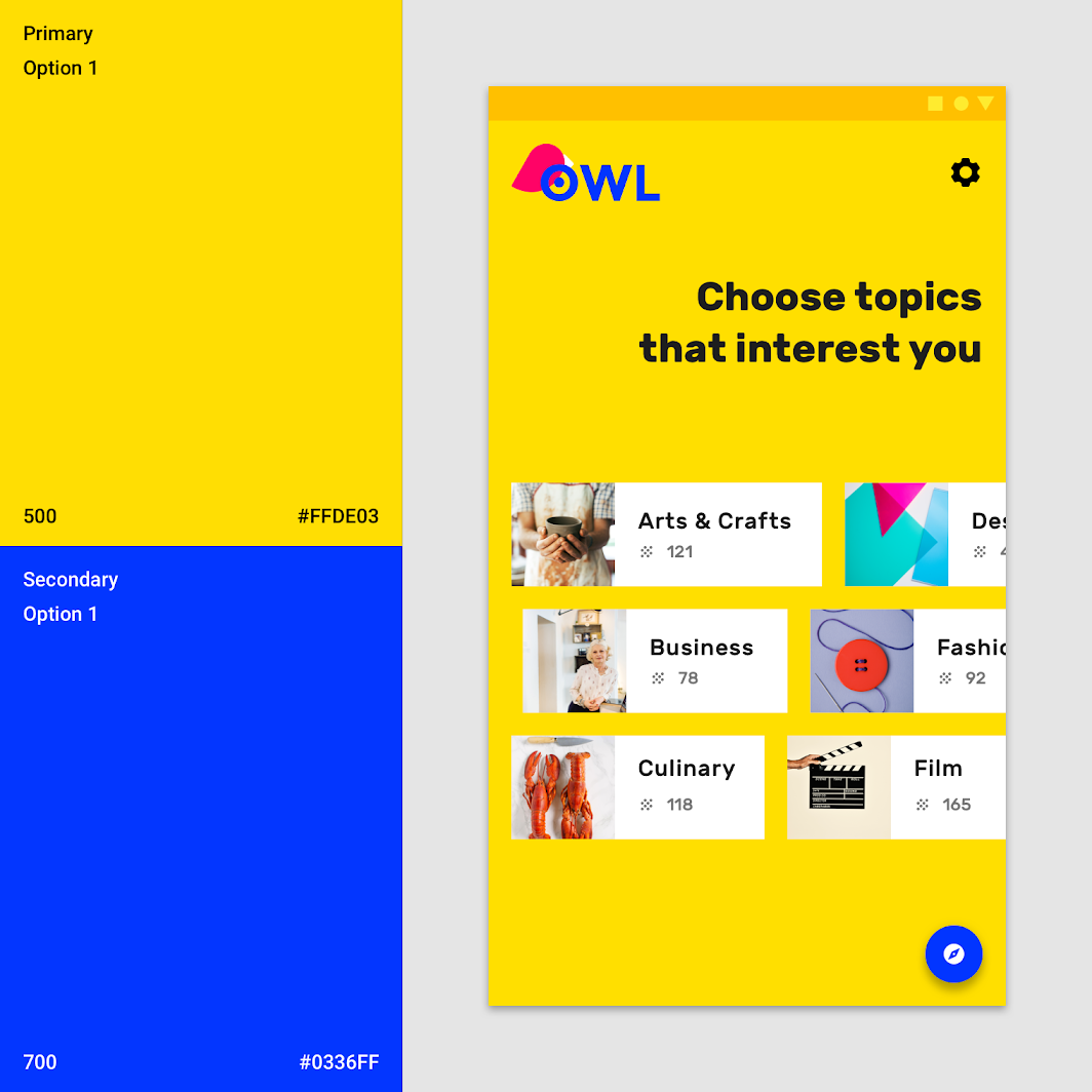
Theme 1

Theme 2 ​

For the Browse section, blue is the primary color, and yellow is the secondary color.
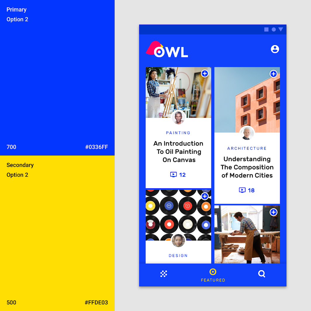
Theme 2

Theme 3 ​

For the Learn section, pink is the primary color.
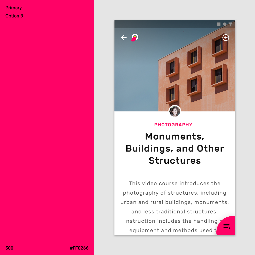
Theme 3

Typography ​

Type scale ​

Owl’s type scale provides the typographic variety necessary for the app content. All items in the type scale use Rubik as the typeface, and make use of the variety of weights available by using Rubik Regular, Medium, and Bold.
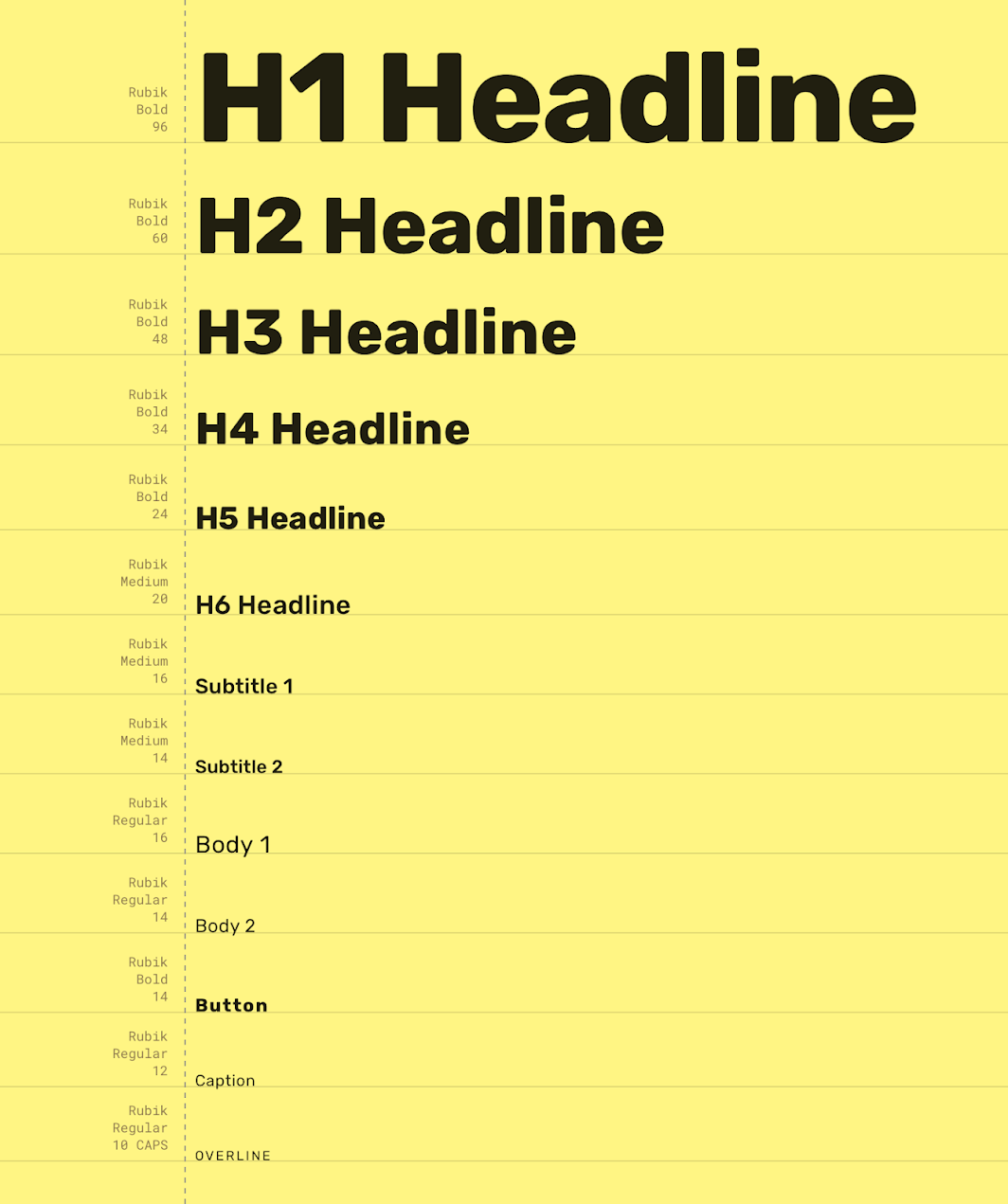
Owl’s type scale
Owl’s type scale

The type system

Use typography to present your design and content as clearly and efficiently as possible.

Related article

Rubik

A typeface available on Google Fonts.

Related link

Understanding typography

Typography expresses hierarchy and brand presence.

Related article

Rubik ​

Owl uses the Rubik typeface. Rubik is sans serif, with slightly rounded corners, and has many font weights.
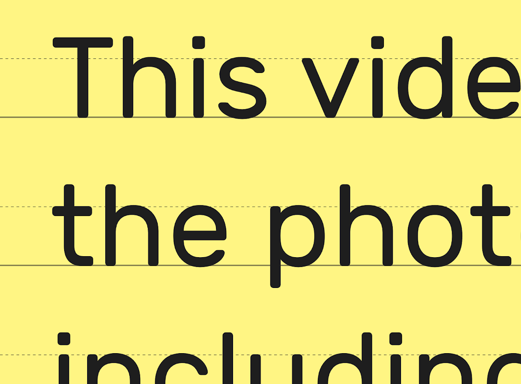
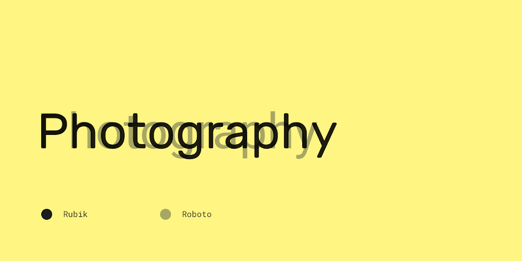
Rubik’s letterforms
Rubik’s letterforms

Rubik compared to Roboto

Iconography ​

Owl’s iconography reflects the curved shape and style of its brand typeface Rubik.
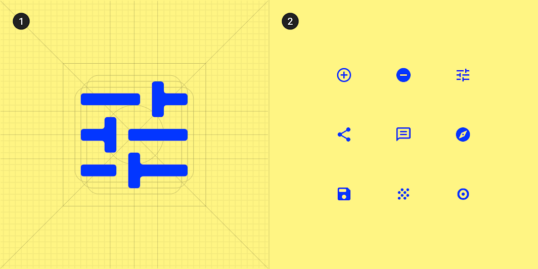
To create consistency, all of Owl’s icons share the same underlying grid structure
1. To create consistency, all of Owl’s icons share the same underlying grid structure
2. A collection of Owl’s icons.

Shape ​

Categories ​

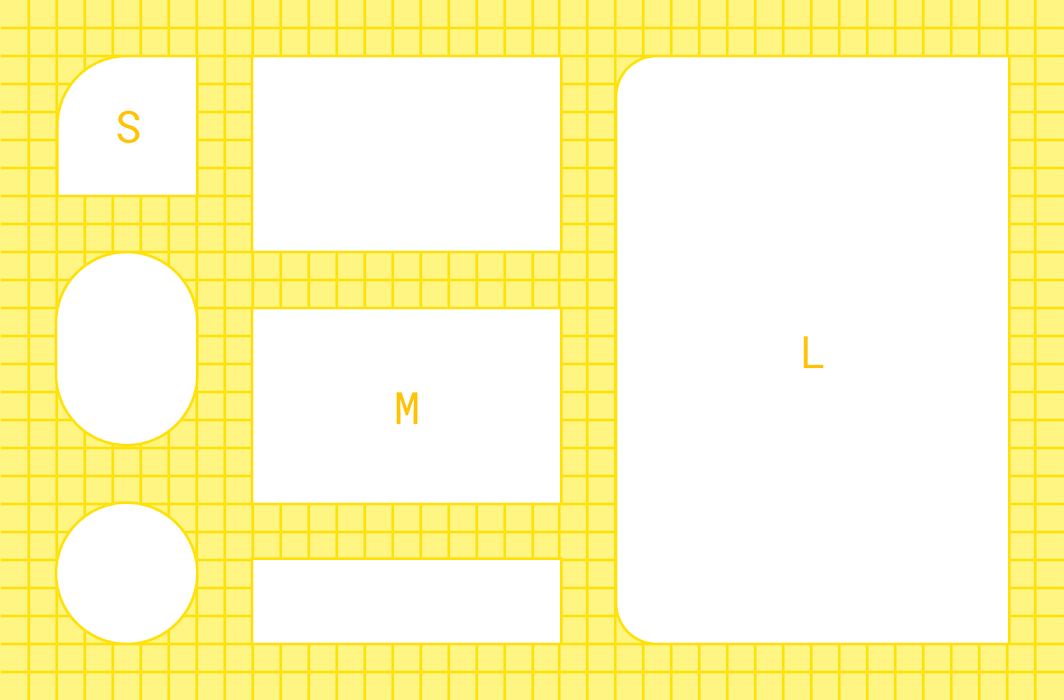
Components are grouped into shape categories based on their size. Shape categories let you set multiple component values at once. Shape categories include:

  • Small components
  • Medium components
  • Large components
Owl’s shape categories

Diagram of small components, medium components, large components
1. Small components
2. Medium components
3. Large components

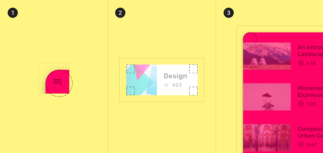
Small components ​

Expanding bottom sheets are in the small shape category. In their collapsed state, they have a rounded corner with a 50% corner radius.
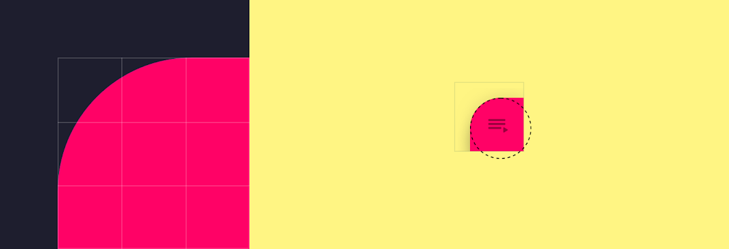
Scaled up (left) and actual size (right) views of an expanding bottom sheet
Scaled up (left) and actual size (right) views of an expanding bottom sheet. Rounding is applied to the component’s top leading corner.
ComponentCategoryAttributeValue
Expanding bottom sheetSmall componentsFamily
Size
Rounded
50%

Medium components ​

Cards are in the medium shape category. Their corners are rounded, with a 0dp corner radius.
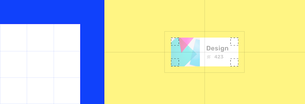
Scaled up (left) and actual size (right) views of a card with square corners
Scaled up (left) and actual size (right) views of a card with square corners.
ComponentCategoryAttributeValue
CardsMedium componentsFamily
Size
Rounded
0dp;0dp;0dp;0dp

Large components ​

Side sheets are in the large shape category. The corners on their leading side are rounded, with a 16dp corner radius.

Shape can be applied to a side sheet’s top-left and bottom-left corners. For right-to-left languages, the opposite corners are shaped.
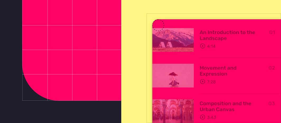
Scaled up (left) and actual size (right) views of a side sheet with rounding applied to its leading corners
Scaled up (left) and actual size (right) views of a side sheet with rounding applied to its leading corners.
ComponentCategoryAttributeValue
Side sheetsLarge componentsFamily
Size
Rounded
16dp;n/a;n/a;16dp

Components ​

Components

Chips ​


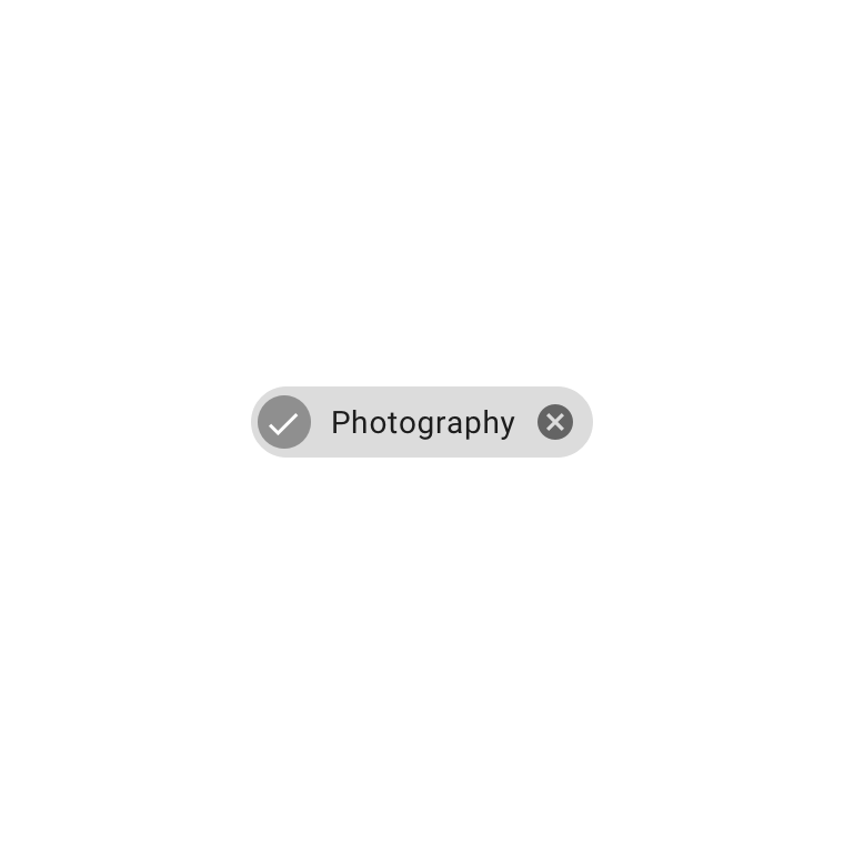
Owl uses customized choice chips, allowing the user to personalize their browsing experience
Owl uses customized choice chips, allowing the user to personalize their browsing experience.

A baseline choice chip
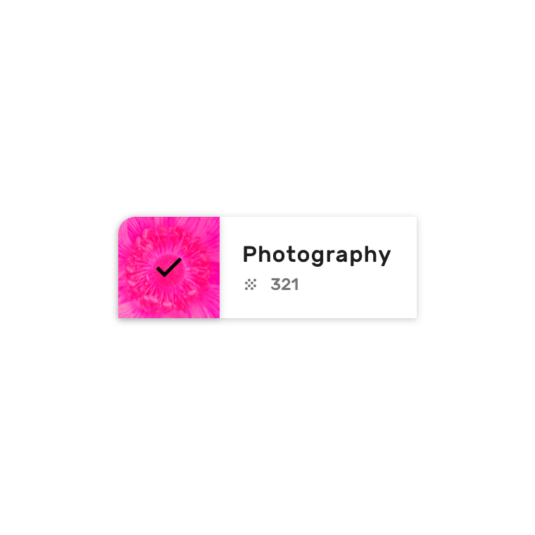
Owl choice chips use custom size, shape, typography, color, and elevation, with an image treatment to indicate selection
Owl choice chips use custom size, shape, typography, color, and elevation, with an image treatment to indicate selection.

Lists and dividers ​


Owl uses the list component in a variety of ways.

This list shows results, using custom typography, color, iconography, and imagery. Inset dividers separate items.
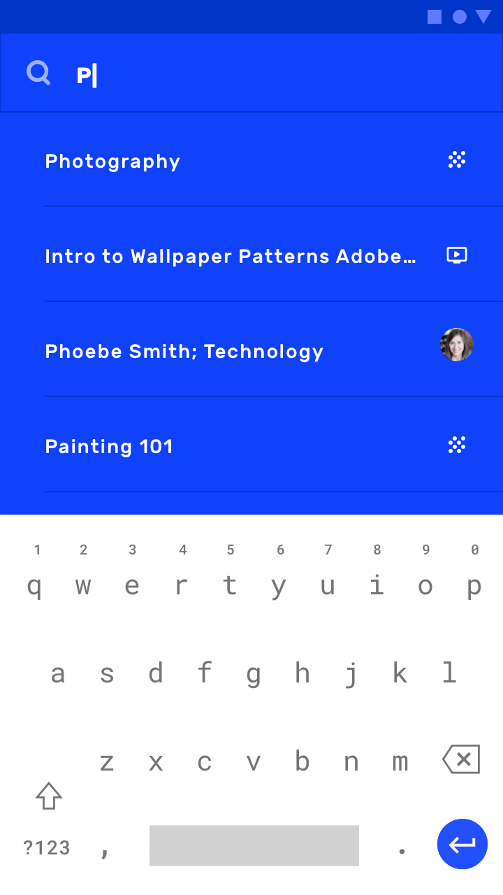
Lists and dividers
Lists and dividers

This list contains custom imagery, various typographic styles, and an action to play a tutorial video. List items are separated by inset dividers.
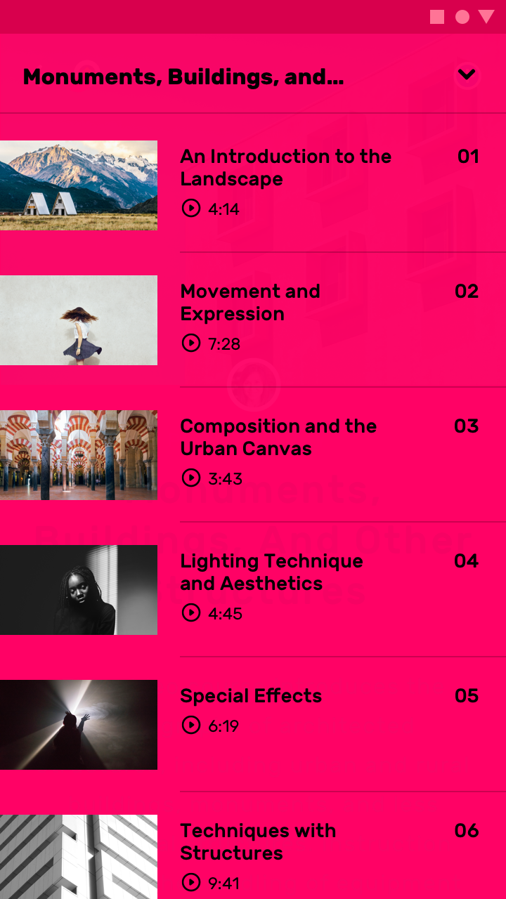
List with imagery and actions to play videos

The width of each list item is determined by copy length, with generous padding between each list item. Each item includes inline actions, multiple image types, and typographic styles.
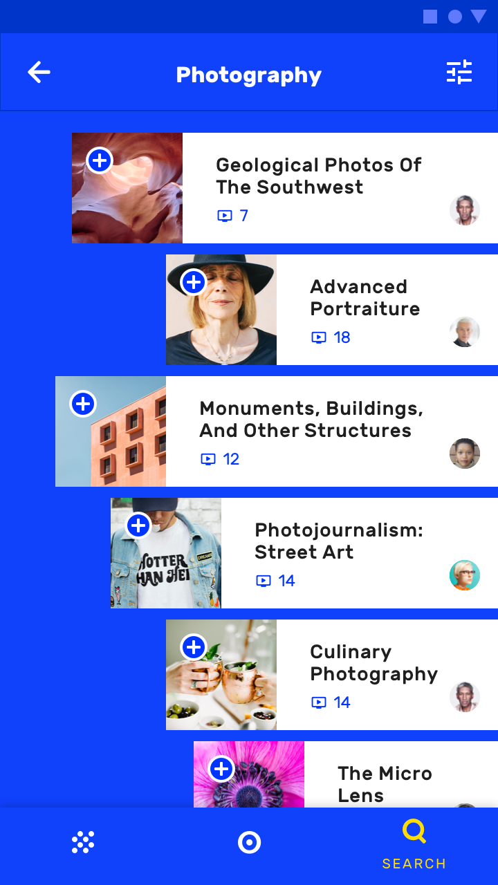
Items in the list have images, inline actions, and various widths
Items in the list have images, inline actions, and various widths.

Chips

Chips are compact elements that represent an input, attribute, or action.

Related article

Lists

Lists are continuous, vertical indexes of text or images.

Related article

Dividers

A divider is a thin line that groups content in lists and layouts.

Related article

Cards ​

Owl featured courses are presented using a card collection. They have custom shape, color, typography, and iconography, with center-aligned content. There is little padding between cards, and the collection uses a masonry pattern (where cards have varying heights).
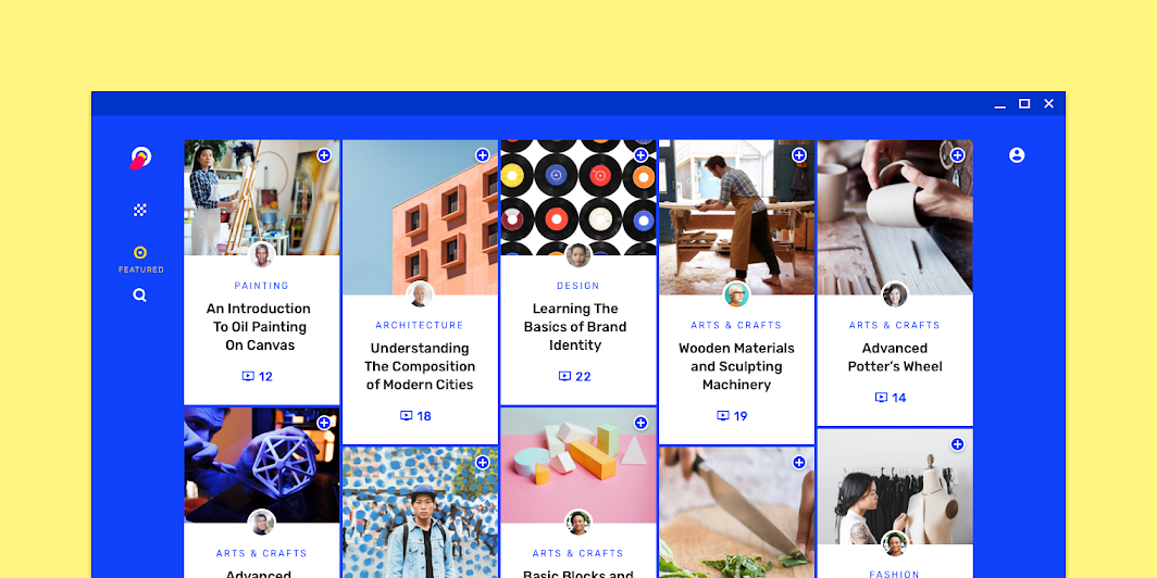
Owl’s customized card collection, scaled down to 50%

Sheets ​

Owl uses sheets to present course tutorial videos. On desktop and tablet, these videos can be found in a side sheet customized with the Learn section’s primary color: pink.
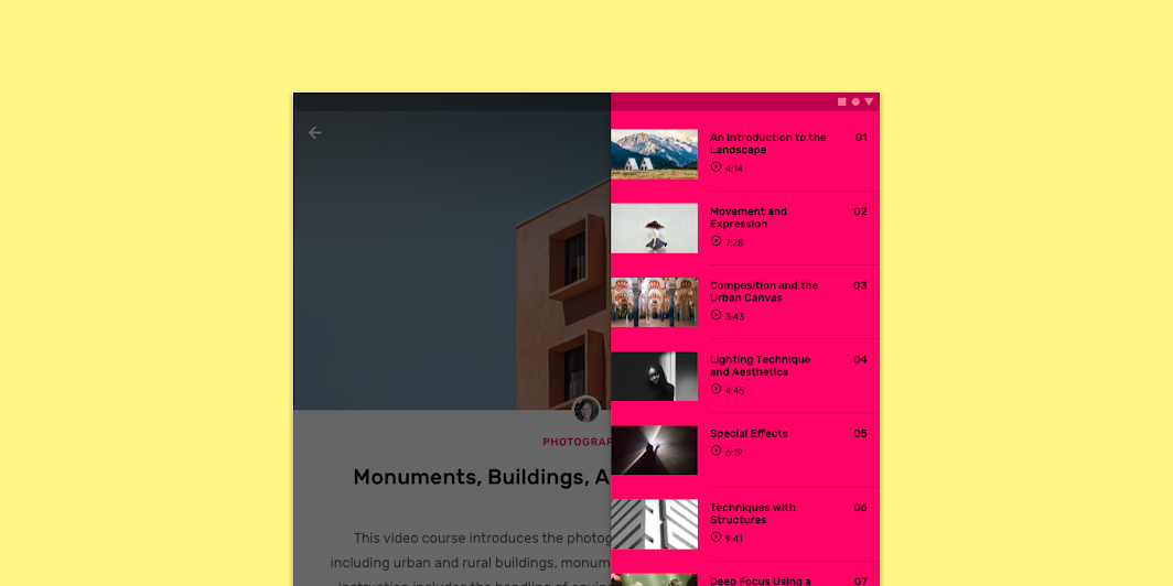
Scaled down to 50%
Scaled down to 50%

On mobile, Owl uses a sheet to present course tutorial videos. Tapping the minimized sheet on the bottom right causes the sheet to expand to full-screen.

The minimized sheet expands to full-screen.

Cards

Cards contain content and actions about a single subject.

Related article

Side sheets

Side sheets are surfaces containing supplementary content that are anchored to the left or right edge of the screen.

Related article

Bottom navigation

Bottom navigation bars allow movement between primary destinations in an app.

Related article

Bottom navigation ​

Owl’s bottom navigation component has custom color, typography, and iconography.
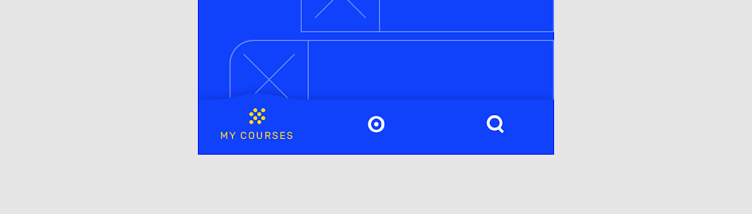
Owl’s bottom navigation

Motion ​

Launch screen ​

Owl’s launch screen displays a character animation (an animation that brings animated characters to life) to give the app a playful quality.

Owl’s launch screen

Icons & illustrations

Motion can be customized to express your brand's style.

Related article

Product icons

Product icons are the visual expression of a brand's products, services, and tools.

Related article

Animated icons

Animation reflects the action an icon performs in a way that adds polish and delight.

Related article

Animated icons ​

Owl’s icon animations are inspired by both its logo and loading state animations.

1. Icon animations
2. Logo animation
3. Loading animation

Speed

Motion can be customized to express your brand's style.

Related article

Sequencing

Motion can be customized to express your brand's style.

Related article

System icons

System icons symbolize common actions, files, devices, and directories.

Related article

Navigation transitions ​

Top-level transitions ​


Owl’s bottom navigation transitions use stagger and overshoot motion to express an energetic style.

Parent-child transitions


The image on the card is a focal element that enhances continuity. Linear motion produces a simple movement, making the transition easy to follow.

Sheets transitions


Arc motion is used to transform the sheets fluidly into a list.

Navigation transitions

Navigational transitions occur when users move between screens, such as from a home screen to a detail screen.

Related article

Using a focal element

Transition choreography is a coordinated motion sequence that holds the user's focus while an interface adapts.

Related article

Movement

Motion can be customized to express your brand's style.

Related article

Oscillation ​

Selecting and scrolling chips display an oscillation effect, creating a quirky and playful vibe.

Oscillation

Loading ​

Loading is expressed using a pattern image treatment that is animated. The dotted pattern reflects the shape of the circular brand elements, such as the logo and icons.

Animated loading screen
Pager
Previous pageFortnightly
Next pageRally

Released under the Apache-2.0

Copyright © 2018-Present Google

https://m2.material.io/design/material-studies/owl.html

Released under the Apache-2.0

Copyright © 2018-Present Google