Skip to content
Material Design 2
Main Navigation
v3
v2
v1

English

简体中文
繁體中文
Español
Français
Русский
Português – Brasil
Deutsch
日本語
한국어
Italiano
Polski
Türkçe
čeština
magyar

English

简体中文
繁體中文
Español
Français
Русский
Português – Brasil
Deutsch
日本語
한국어
Italiano
Polski
Türkçe
čeština
magyar

Appearance

Sidebar Navigation

Material System

Introduction

Material studies

About our Material studies

Basil

Crane

Fortnightly

Owl

Rally

Reply

Shrine

Material Foundation

Environment

Surfaces

Elevation

Light and shadows

Layout

Understanding layout

Pixel density

Responsive layout grid

Spacing methods

Component behavior

Applying density

Navigation

Understanding navigation

Navigation transitions

Search

Color

The color system

Applying color to UI

Color usage

Text legibility

Dark theme

Typography

The type system

Understanding typography

Language support

Sound

About sound

Applying sound to UI

Sound attributes

Sound choreography

Iconography

Product icons

System icons

Animated icons

Shape

About shape

Shape and hierarchy

Shape as expression

Shape and motion

Applying shape to UI

Motion

Understanding motion

The motion system

Speed

Choreography

Customization

Interaction

Gestures

Selection

States

Communication

Confirmation & acknowledgement

Data formats

Data visualization

Empty states

Help & feedback

Imagery

Launch screen

Onboarding

Offline states

Writing

Machine learning

Machine learning patterns

Object detection: live camera

Object detection: static image

Barcode Scanning

Material Guidelines

Material Theming

Overview

Implementing your theme

Usability

Accessibility

Bidirectionality

Platform guidance

Android bars

Android fingerprint

Android haptics

Android icons

Android navigating between apps

Android notifications

Android permissions

Android slices

Android split-screen

Android swipe-to-refresh

Android text selection toolbar

Android widget

Cross-platform adaptation

Components

App bars: bottom

App bars: top

Backdrop

Banners

Bottom navigation

Buttons

Buttons: floating action button

Cards

Checkboxes

Chips

Data tables

Date pickers

Dialogs

Dividers

Image lists

Lists

Menus

Navigation drawer

Navigation rail

Progress indicators

Radio buttons

Sheets: bottom

Sheets: side

Sliders

Snackbars

Switches

Tabs

Text fields

Time pickers

Tooltips

On this page

Chips ​

Chips are compact elements that represent an input, attribute, or action.
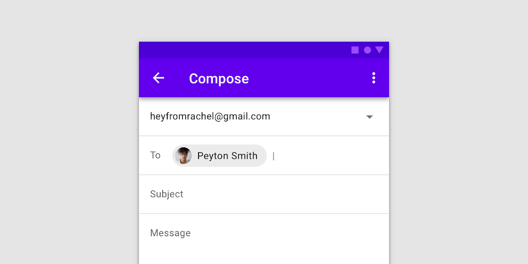
Chips hero image

Usage ​

Chips allow users to enter information, make selections, filter content, or trigger actions. While buttons are expected to appear consistently and with familiar calls to action, chips should appear dynamically as a group of multiple interactive elements.

Principles ​
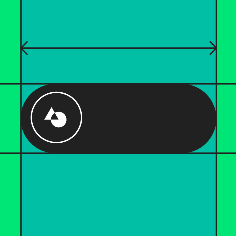

Chip principle: compact

Compact

Chips are compact components that represent discrete information.
Chip principle: relevant

Relevant

Chips should have a clear and helpful relationship to the content or task they represent.
Chip principle: focused

Focused

Chips should make tasks easier to complete, or content easier to sort.

Types ​
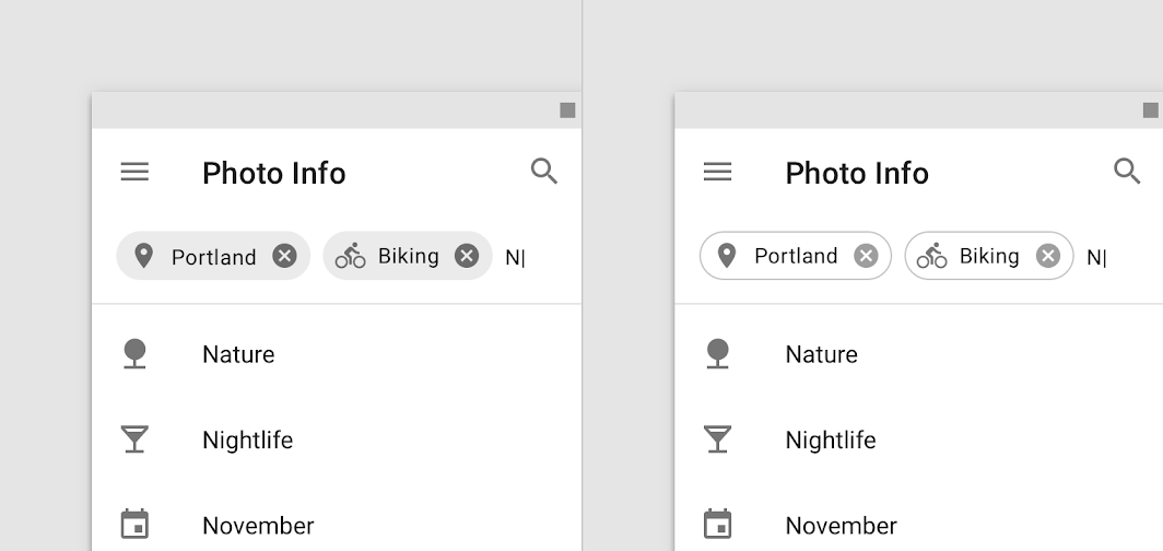

Input chips represent information used in fields, such as an entity or different attributes
Input chips
Input chips represent information used in fields, such as an entity or different attributes.
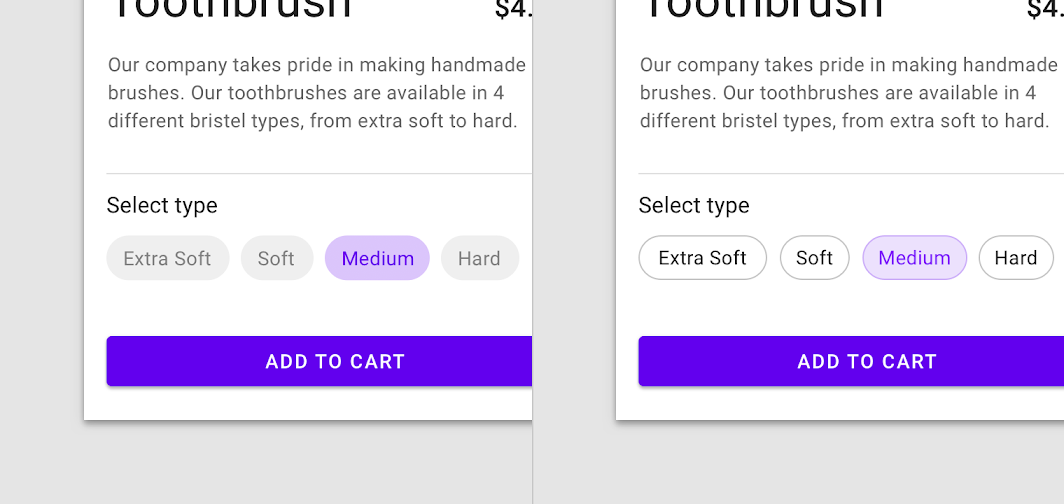
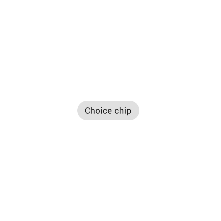
In sets that contain at least two options, choice chips represent a single selection
Choice chips
In sets that contain at least two options, choice chips represent a single selection.
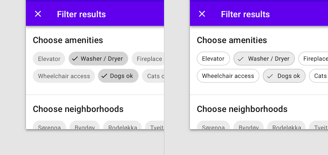
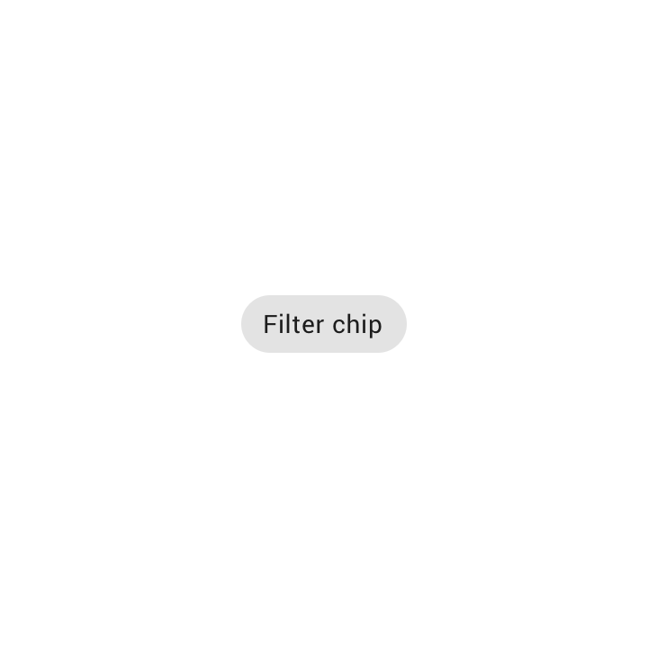
Filter chips represent filters for a collection
Filter chips
Filter chips represent filters for a collection.
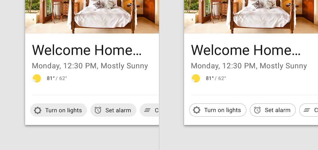
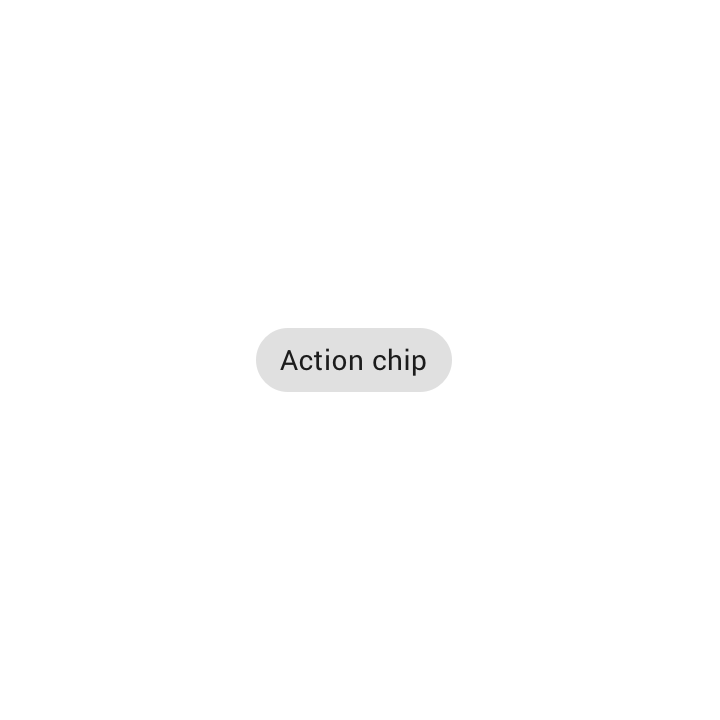
Action chips trigger actions related to primary content
Action chips
Action chips trigger actions related to primary content.

Anatomy ​
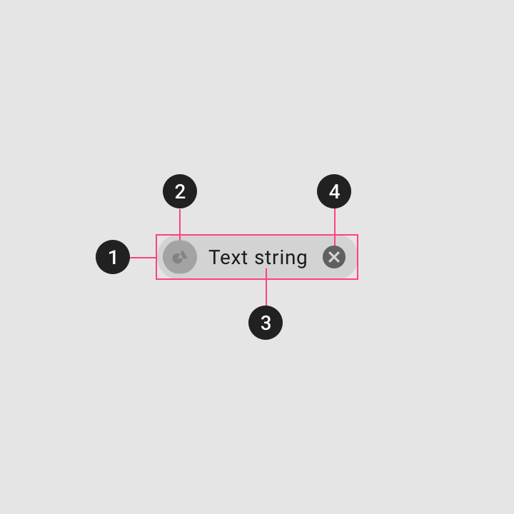
Chips anatomy

1. Container
Chip containers hold all chip elements, and their size is determined by those elements. A container can also be defined by a stroke.

2. Thumbnail [optional]
Thumbnails identify entities (like individuals) by displaying an avatar, logo, or icon.

3. Text
Chip text can be an entity name, description, tag, action, or conversational.

4. Remove icon [optional]
Input chips can include a Remove icon.

Input chips ​

Usage ​

Input chips represent a complex piece of information in compact form, such as an entity (person, place, or thing) or text. They enable user input and verify that input by converting text into chips.
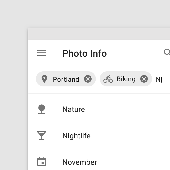
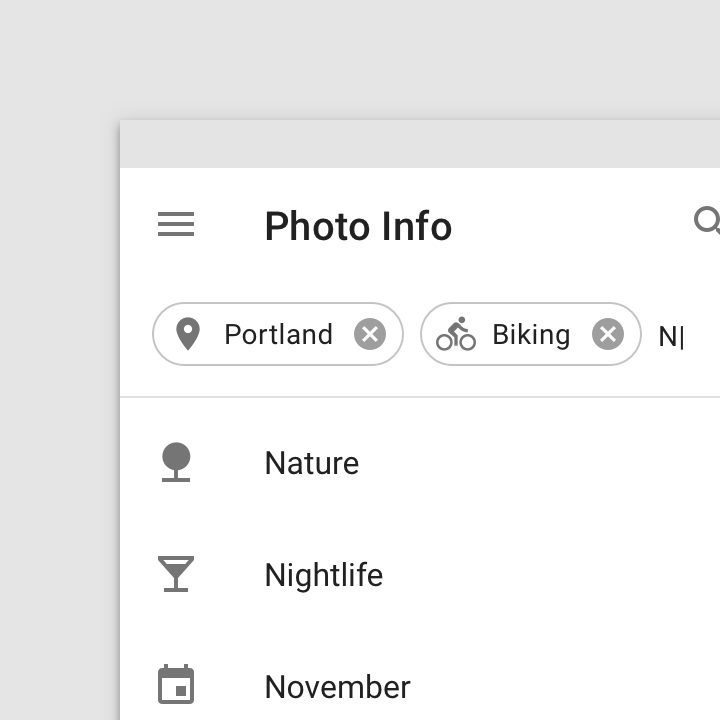
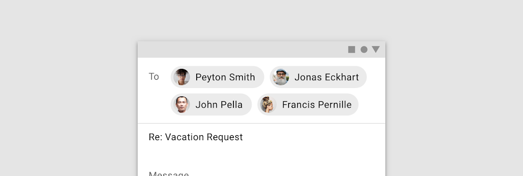
An input chip used to show an entity
An input chip used to show an entity.
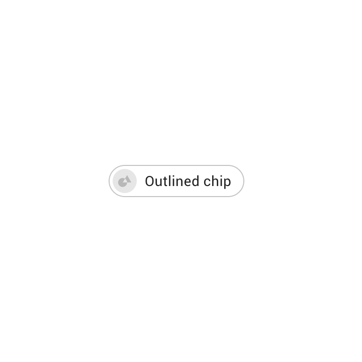
An outlined input chip used to show an entity
An outlined input chip used to show an entity.

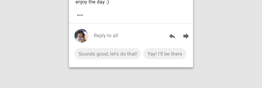
Input chips can provide suggested responses
Input chips can provide suggested responses.

Behavior ​

Transformative ​

Input chips transform text based on user input.

Text transforming into an input chip.

Editable ​

An input chip’s text is editable until the user takes an action with the chip, such as sending an email. To edit an input chip’s text, tap the chip.

Input chips become editable when tapped.

Informational ​

If text input is not recognized by the system, input chips can display an error state.
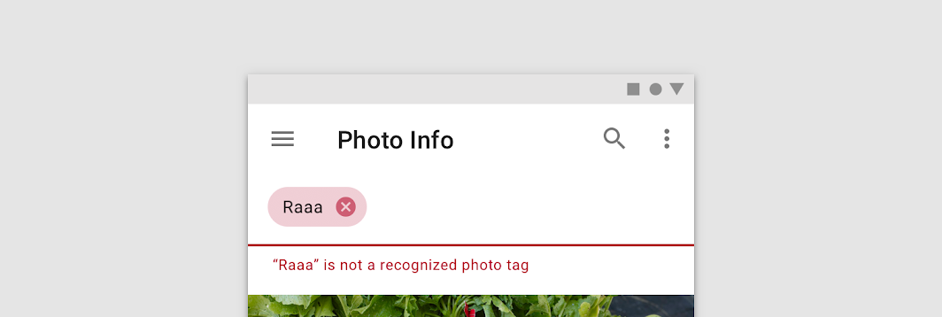
Input chips can represent an error state
Input chips can represent an error state.

Multiple

A single field can contain multiple input chips.

Multiple entry chips

Movable

Input chips can be reordered or moved into other fields.

Movable entry chips

Expandable ​

Input chips can expand to show more information or options. A container transform transition pattern is used to reveal additional content.

Expandable entry chips

Container transform

For transitions between UI elements that include a container

Related article

Placement ​

Input chips can be integrated with other components. They can appear:

  • Inline with the text input cursor in a field
  • In a stacked list
  • In a horizontally scrollable list
Input chips can wrap to a new row if all of the chips need to be visible
Input chips can wrap to a new row if all of the chips need to be visible.

Input chips that horizontally scroll.

Anatomy

An overlay is a semi-transparent covering on an element indicating state. Overlays allow for a systematic approach to visualizing states through opacity values.

Related link

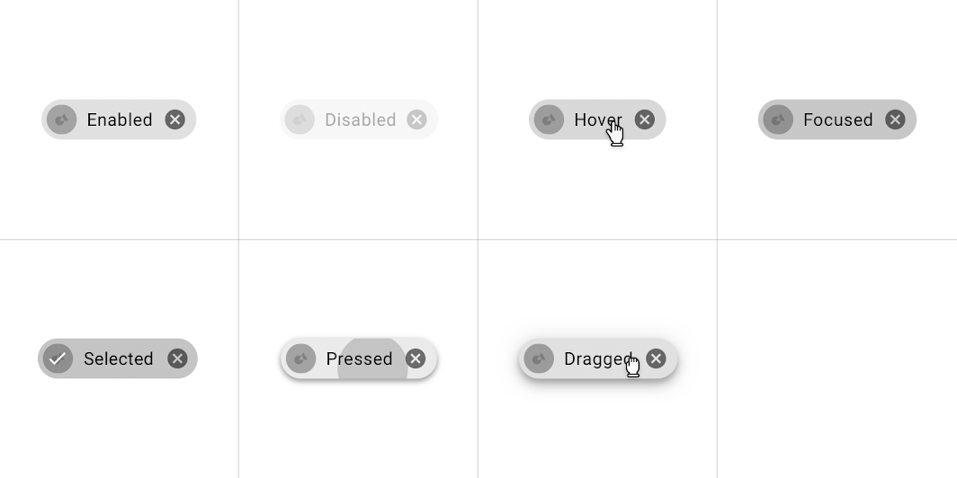
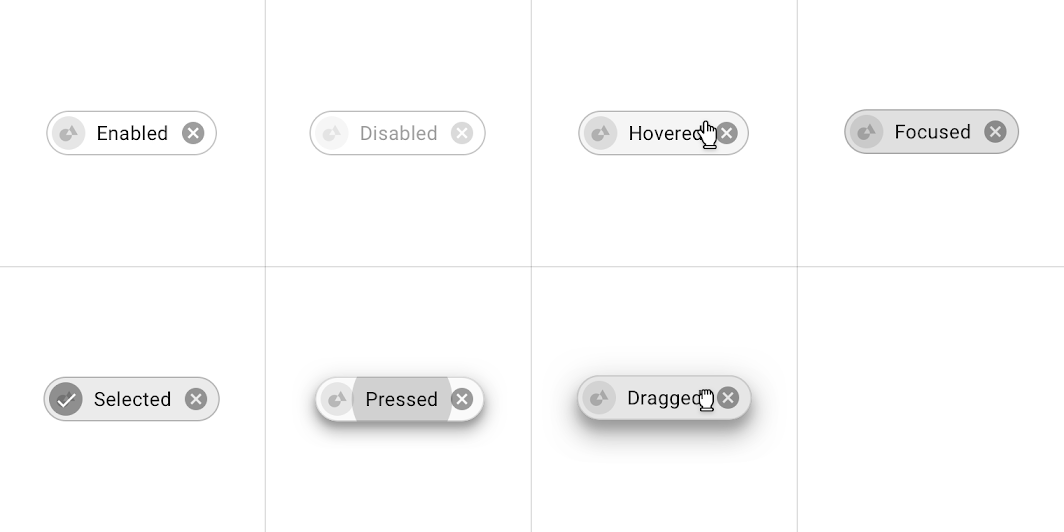
States ​


Placement: input chip

Input chips states
Input chips states

Choice chips ​

Usage ​

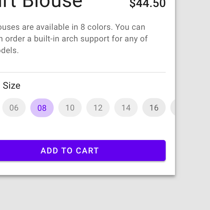
Choice chips allow selection of a single chip from a set of options.

Choice chips clearly delineate and display options in a compact area. They are a good alternative to toggle buttons, radio buttons, and single select menus.
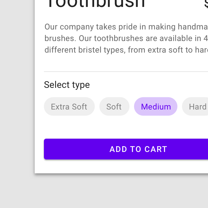
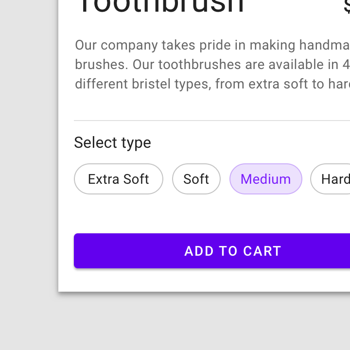
A set of choice chips
A set of outlined choice chips

Toggle button

Buttons allow users to take actions, and make selections, with a single tap.

Related article

Radio buttons

Radio buttons allow the user to select one option from a set.

Related article

Menus

Menus display a list of choices on temporary surfaces.

Related article

Behavior ​

Selecting a single choice chip automatically deselects all other chips in the set.

Selecting a choice chip deselects the other chips

Placement ​

Choice chips appear as part of a series of other choice chips. They are typically displayed horizontally and sequentially.
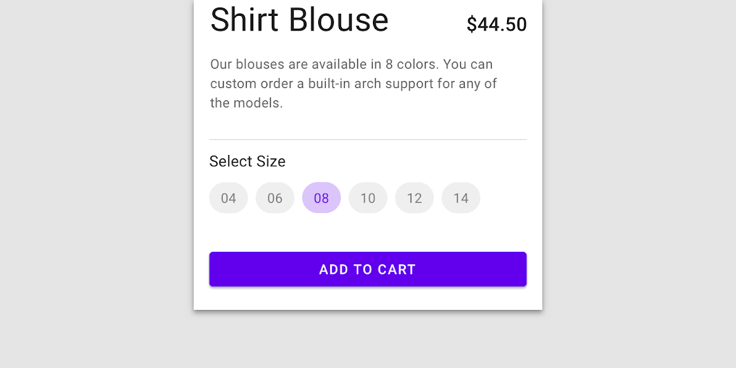
Do: horizontal placement of choice chips

Do

Horizontal placement of choice chips

Do: choice chips can scroll horizontally

Do

Choice chips can scroll horizontally.
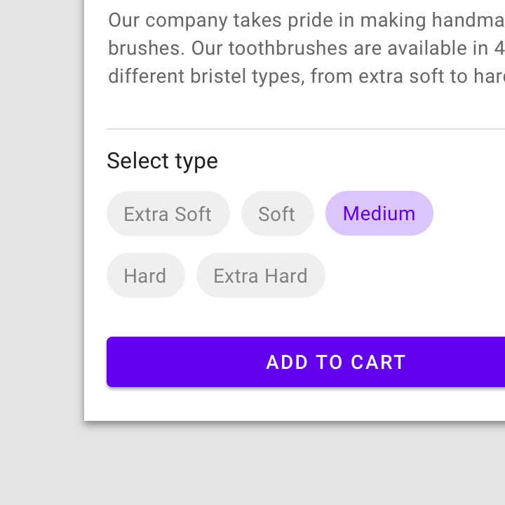
Caution: choice chips can wrap to a new row

Caution

Choice chips can wrap to a new row. However, using two or more rows of choice chips can make each chip harder to scan.

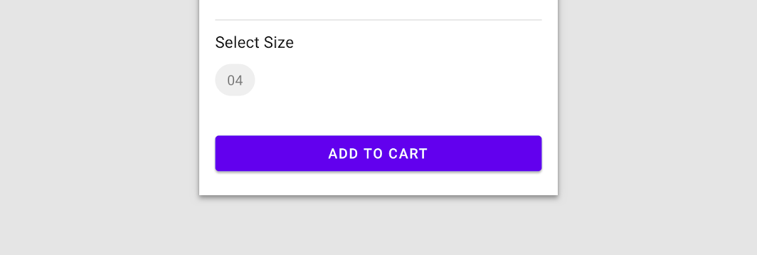
Don't: choice chips shouldn’t present only a single option

Don't

Choice chips shouldn’t present only a single option.

Anatomy

An overlay is a semi-transparent covering on an element indicating state. Overlays allow for a systematic approach to visualizing states through opacity values.

Related link

States ​


Placement: choice chip

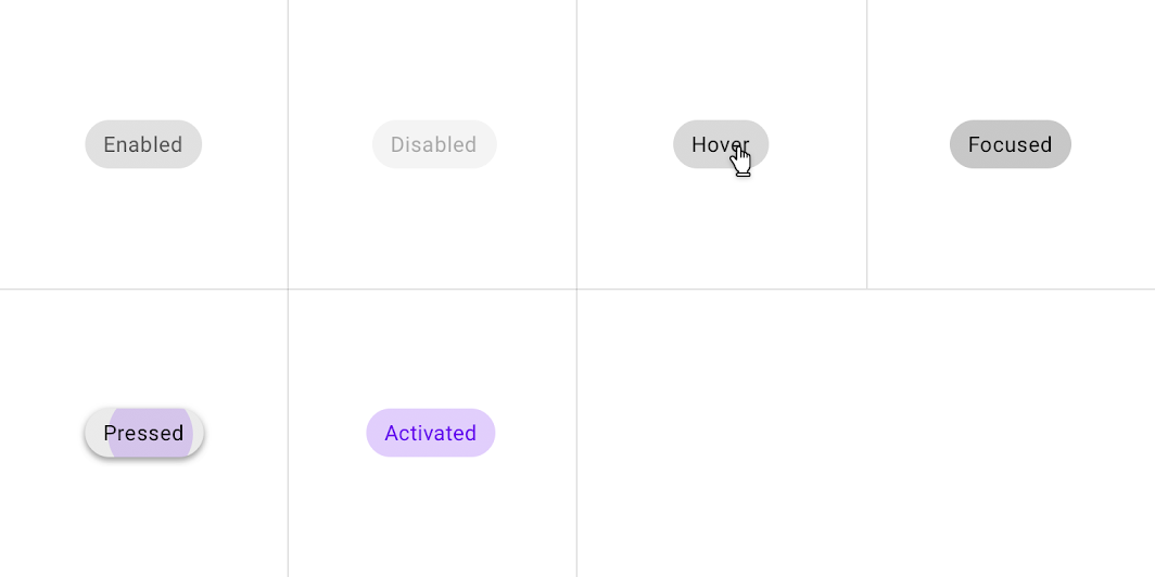
Choice chips states
Choice chips states

Filter chips ​

Usage ​

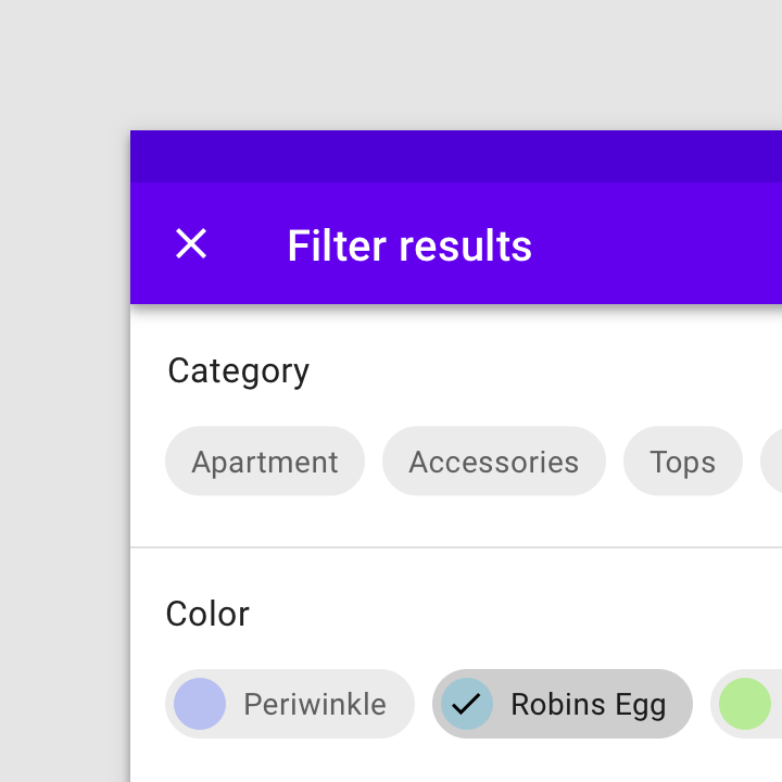
Filter chips use tags or descriptive words to filter content.

Filter chips clearly delineate and display options in a compact area. They are a good alternative to toggle buttons or checkboxes.
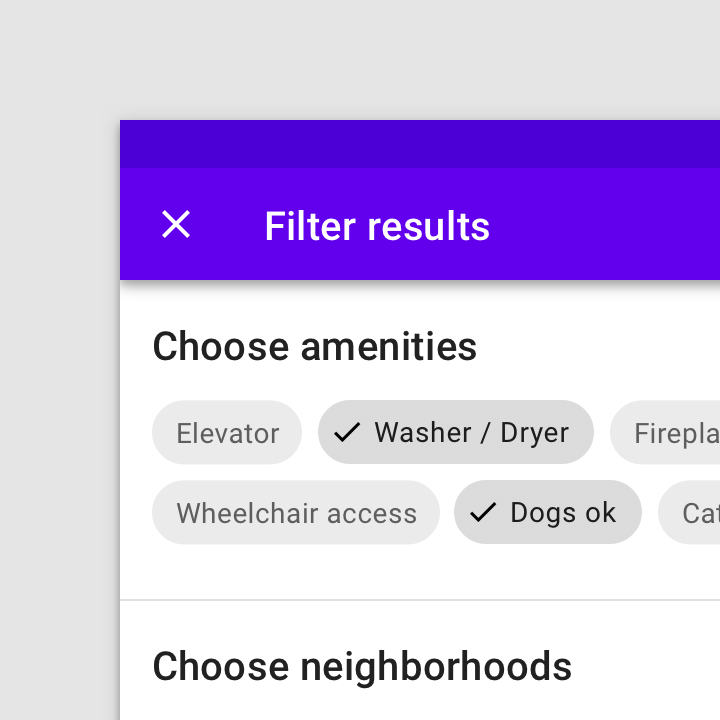
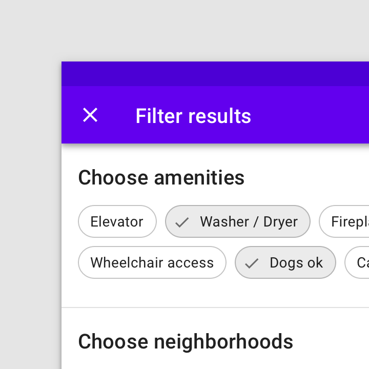
Usage: a filter chip
A filter chip
An outlined filter chip

Toggle button

Buttons allow users to take actions, and make selections, with a single tap.

Related article

Checkboxes

Checkboxes allow the user to select one or more items from a set.

Related article

Behavior ​

Tap a chip to select it. Multiple chips can be selected or unselected.

An icon can be added to indicate when a filter chip is selected.

Filter chip suggestions can dynamically change as users start to select filters.

Placement ​


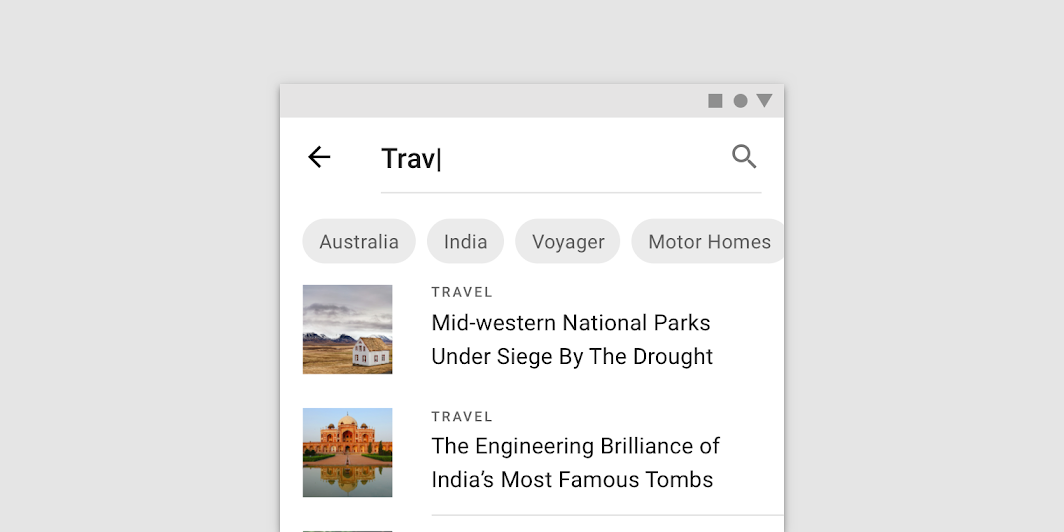
Filter chips can be shown underneath a search field
Filter chips can be shown underneath a search field.

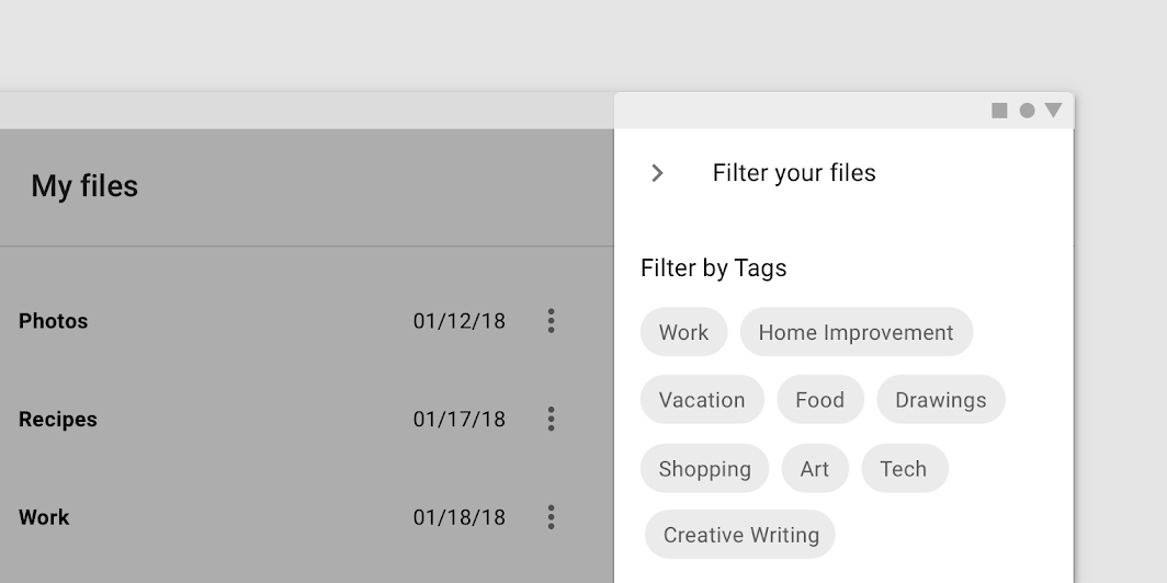
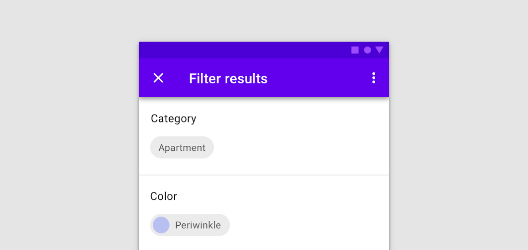
Display multiple sets of filters in a side sheet
Display multiple sets of filters in a side sheet.

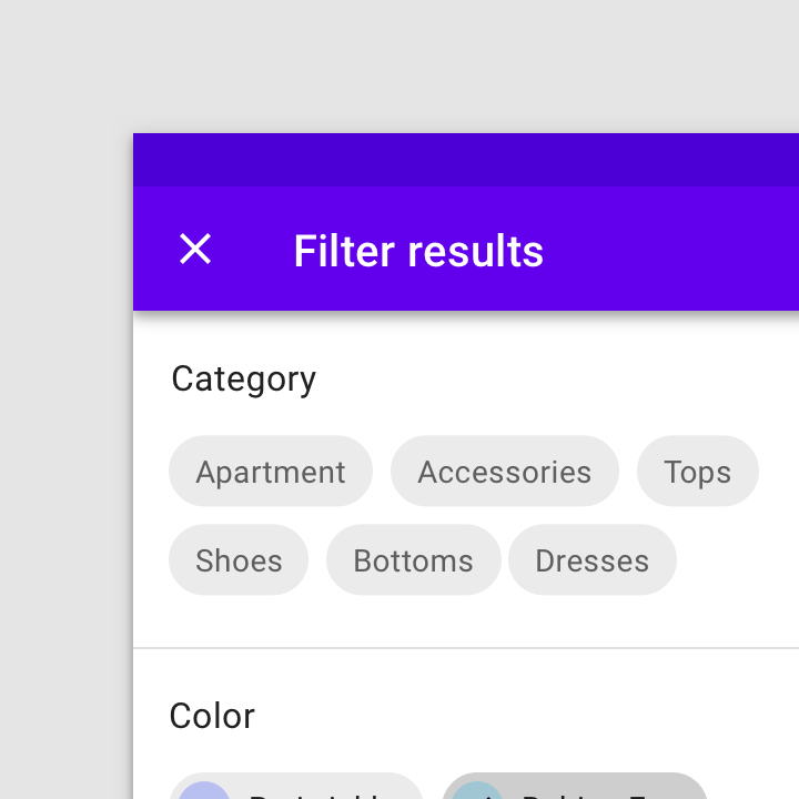
Filter chips can wrap to a new row
Filter chips can wrap to a new row. If there are more than two rows, consider using horizontal scrolling to access them all.
Filter chips can horizontally scroll to show unlimited options
Filter chips can horizontally scroll to show unlimited options.

Don't: filter chips should not present only a single option

Don't

Filter chips should not present only a single option.

Side sheets

Surfaces containing supplementary content that are anchored to the left or right edge of the screen.

Related article

States

Visual representations used to communicate the status of a component or interactive element.

Related article

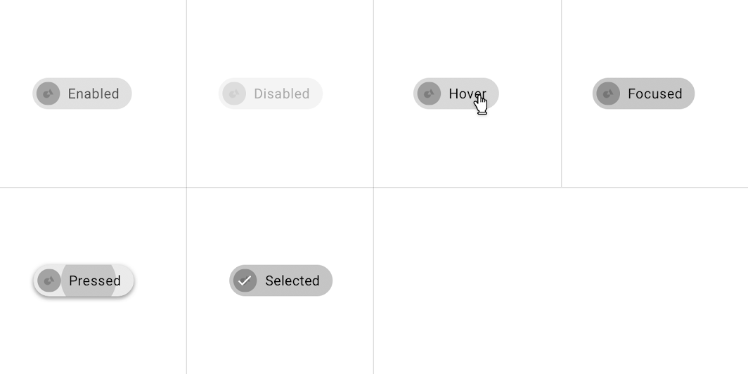
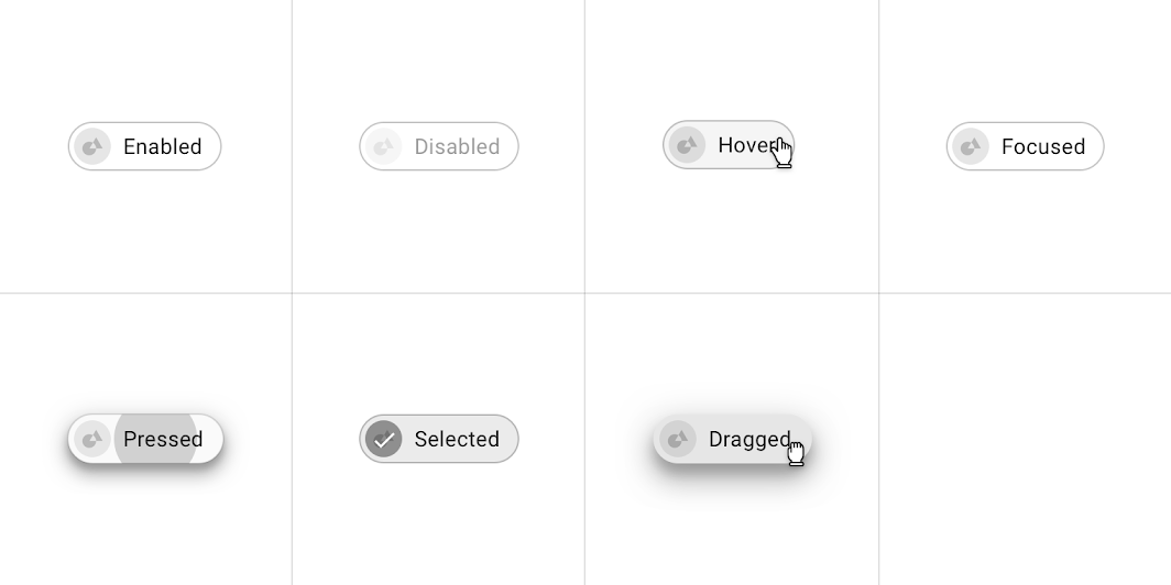
States ​


Placement: filter chip

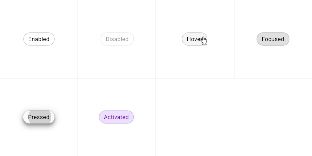
Filter chips states
Filter chips states

Action chips ​

Usage ​

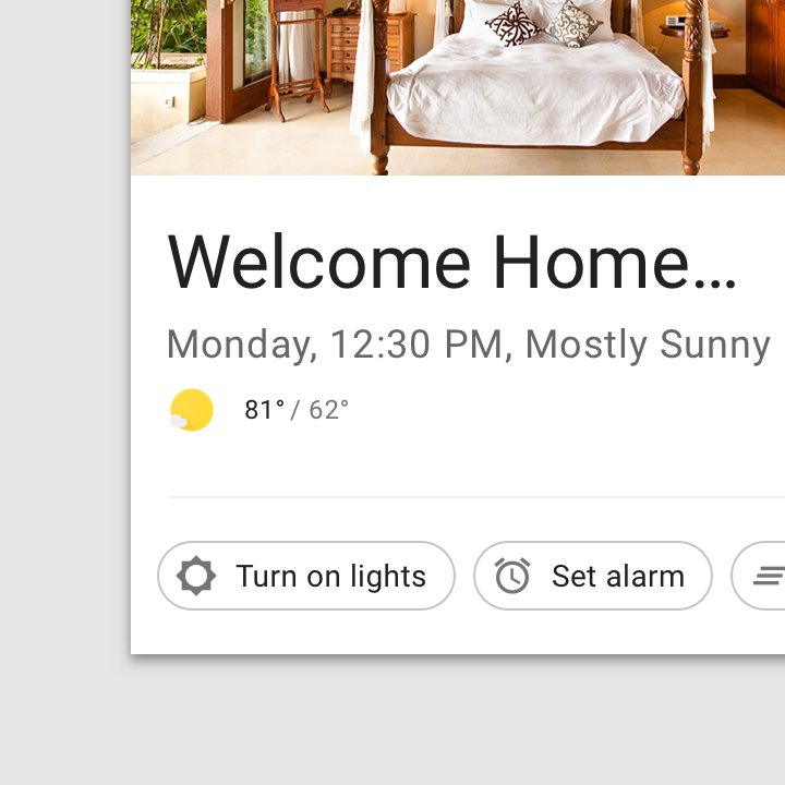
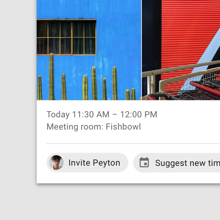
Action chips offer actions related to primary content. They should appear dynamically and contextually in a UI.

An alternative to action chips are buttons, which should appear persistently and consistently.
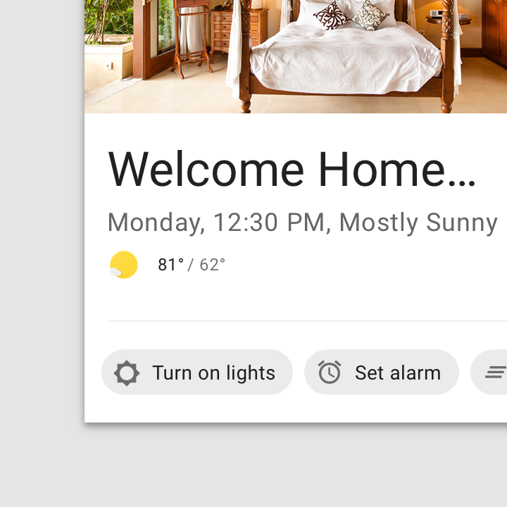
Usage: an action chip
An action chip
An outlined action chip

Contained button

Buttons allow users to take actions, and make selections, with a single tap.

Related article

Behavior ​

Action chips can trigger an action or show progress and confirmation.

Tapping an action chip triggers a contextual action.

Action chips can show progress and confirmation feedback.

Placement ​

Action chips are displayed after primary content, such as below a card or persistently at the bottom of a screen.
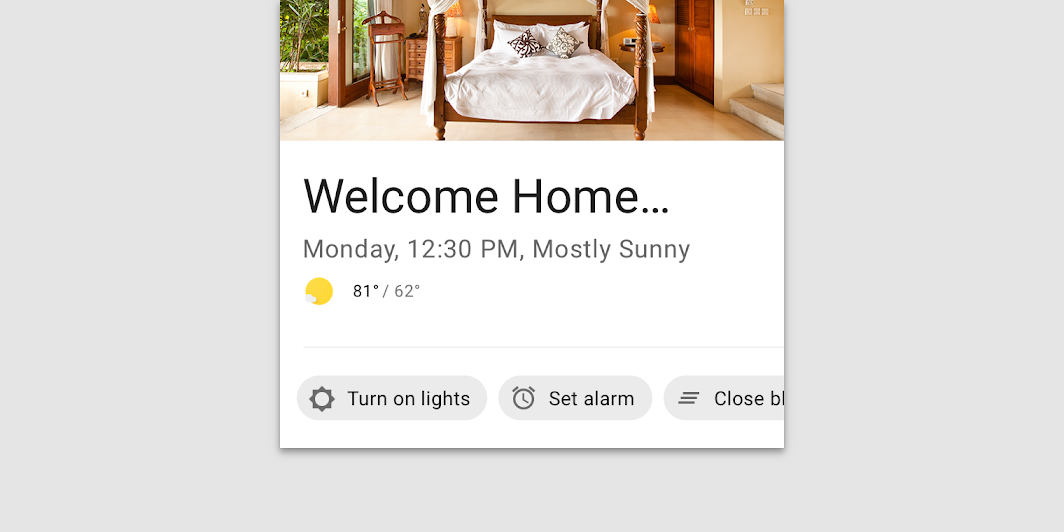
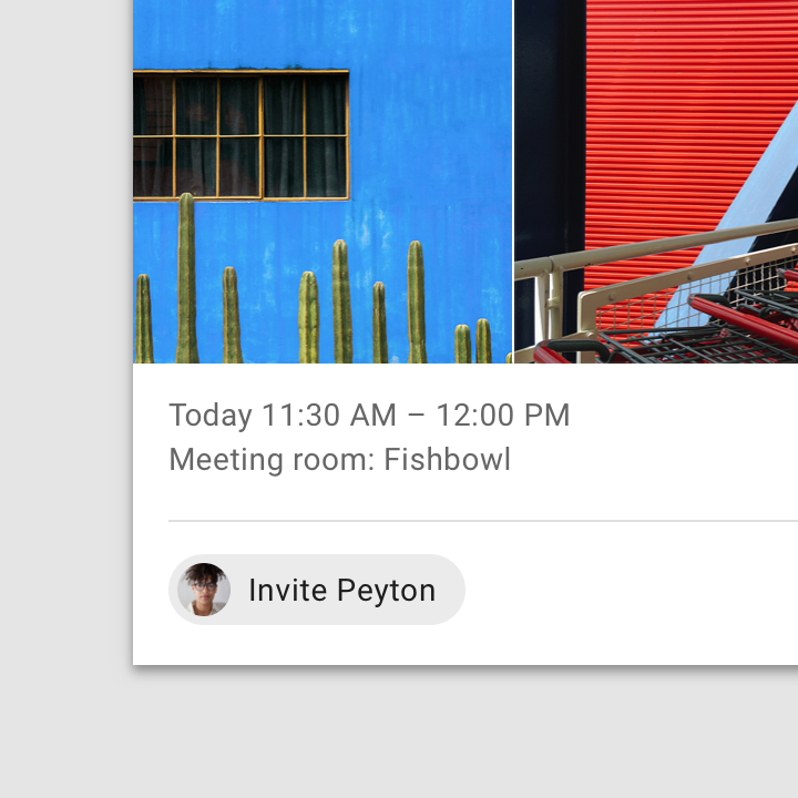
Action chips should be shown underneath primary content
Action chips should be shown underneath primary content.

Caution: action chips should appear in a set

Caution

Action chips should appear in a set.
Do: action chips can be horizontally scrollable

Do

Action chips can be horizontally scrollable.

Buttons

Buttons allow users to take actions with a single tap.

Related article

States

Visual representations used to communicate the status of a component or interactive element.

Related article

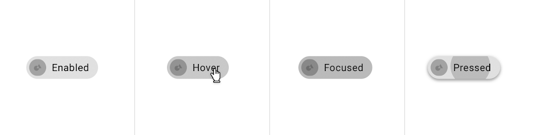
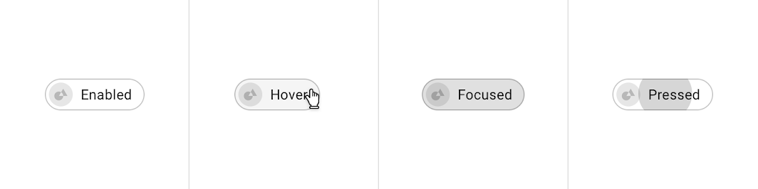
States ​


Placement: action chip

Action chips states
Action chips states

Theming ​

Reply Material theme ​

This email app’s input chips have been customized using Material Theming. Areas of customization include color, typography, and shape.
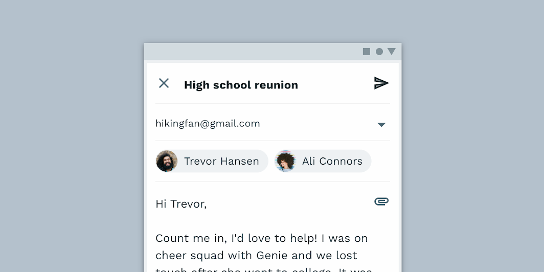
Reply’s customized input chips

Reply

Reply is an email app that uses Material Design components and Material Theming to create an on-brand communication experience.

Related article

The color system

Create a color theme that reflects your brand or style

Related article

Applying color to UI

In a UI, color has a variety of roles: from containing meaning, to expressing a look and feel.

Related article

Color ​

Reply’s input chips use custom color on two elements: text, container.
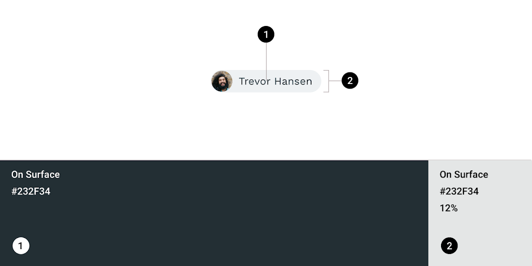
Reply Material theme: color
ElementCategoryAttributeValue
TextOn SurfaceColor
Opacity
#232F34
100%
ContainerOn SurfaceColor
Opacity
#232F34
12%

Understanding typography

Typography is critical in establishing hierarchy and expressing brand presence that supports an effective digital experience.

Related article

Typography ​

Reply’s input chips use custom typography for the text.
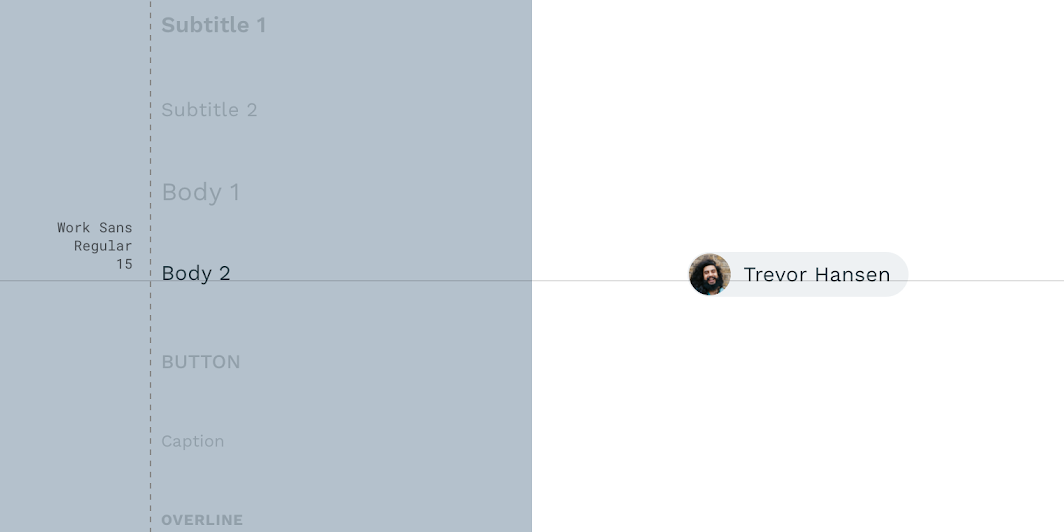
Reply Material theme: typography
ElementCategoryAttributeValue
TextBody 2Typeface
Font
Size
Case
Work Sans
Regular
15
Sentence case

About shape

Direct attention, identify components, communicate state, and express brand

Related link

Shape ​

Reply’s input chip containers have custom corner shapes.
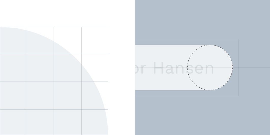
Reply Material theme: shape
ElementCategoryAttributeValue
ContainerSmall componentFamily
Size
Rounded
50%

Shrine Material theme ​

This retail app’s choice chips have been customized using Material Theming. Areas of customization include color, typography, and shape.
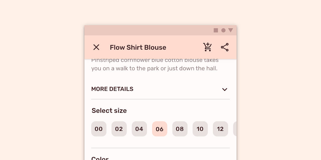
Shrine’s customized choice chips

Shrine

Shrine is a lifestyle and fashion brand that demonstrates how Material Design can be used in e-commerce.

Related article

The color system

Create a color theme that reflects your brand or style

Related article

Applying color to UI

In a UI, color has a variety of roles: from containing meaning, to expressing a look and feel.

Related article

Color ​

Shrine’s choice chips use custom color on four elements: selected container, selected text, unselected container, and unselected text.
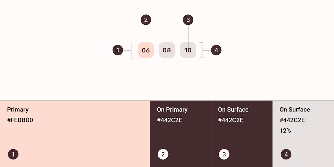
Shrine Material theme: color
ElementCategoryAttributeValue
Selected containerPrimaryColor
Opacity
#FEDBD0
100%
Selected textOn PrimaryColor
Opacity
#442C2E
100%
Unselected textOn SurfaceColor
Opacity
#442C2E
100%
Unselected containerOn SurfaceColor
Opacity
#442C2E
12%

Understanding typography

Typography is critical in establishing hierarchy and expressing brand presence that supports an effective digital experience.

Related article

Typography ​

Shrine’s choice chips use custom typography for the text.
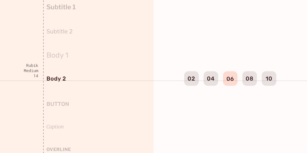
Shrine Material theme: typography
ElementCategoryAttributeValue
TextBody 2Typeface
Font
Size
Case
Rubik
Medium
14
Sentence case

About shape

Direct attention, identify components, communicate state, and express brand

Related link

Shape ​

Shrine’s choice chip containers have custom corner shapes. Shrine’s chips use an override of the small component shape category family and size values.
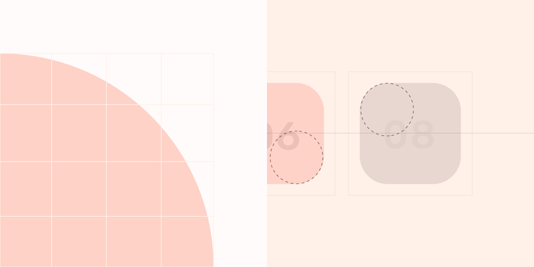
Shrine Material theme: shape
ElementCategoryAttributeValue
ContainerOverride*Family
Size
Rounded
4dp;4dp;4dp;4dp

Fortnightly Material theme ​

This news app’s filter chips have been customized using Material Theming. Areas of customization include color, typography, and shape.
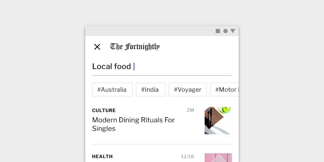
Fortnightly’s customized filter chips
Fortnightly’s customized filter chips.

Fortnightly

A news app that uses Material Design components and Material Theming to create an on-brand, content-focused experience.

Related article

The color system

Create a color theme that reflects your brand or style

Related article

Applying color to UI

In a UI, color has a variety of roles: from containing meaning, to expressing a look and feel.

Related article

Color ​

Fortnightly’s filter chips use custom color on two elements: text, and container stroke.
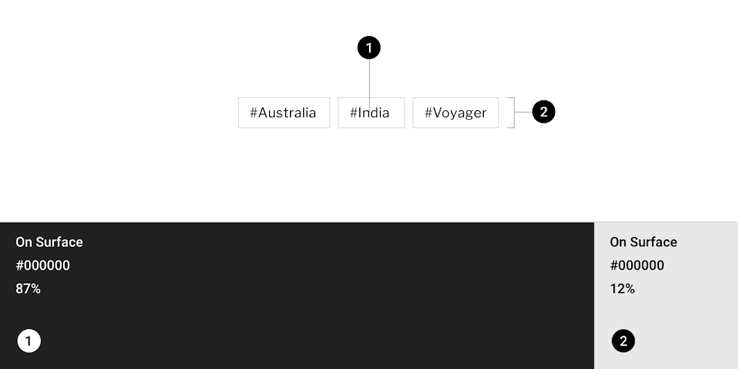
Fortnightly Material theme: color
ElementCategoryAttributeValue
TextOn SurfaceColor
Opacity
#000000
87%
Container strokeOn SurfaceColor
Opacity
#000000
12%

Understanding typography

Typography is critical in establishing hierarchy and expressing brand presence that supports an effective digital experience.

Related article

Typography ​

Fortnightly’s filter chips use custom typography for the text.
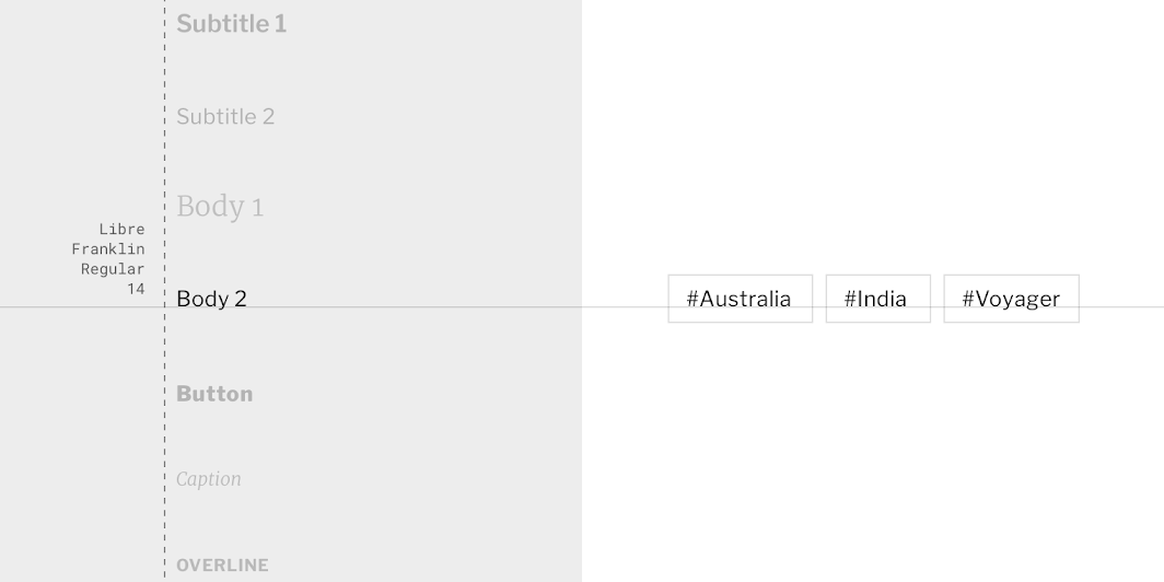
Fortnightly Material theme: typography
ElementCategoryAttributeValue
TextBody 2Typeface
Font
Size
Case
Libre Franklin
Regular
14
Title case

About shape

Direct attention, identify components, communicate state, and express brand

Related link

Shape ​

Fortnightly’s filter chip containers have custom corner shapes, with 0dp cut corners.
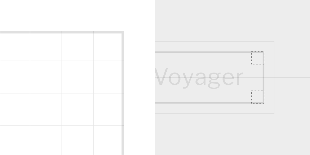
Fortnightly Material theme: shape
ElementCategoryAttributeValue
ContainerSmall componentFamily
Size
Cut
0dp;0dp;0dp;0dp

Specs ​


Action chip


321212C

Outlined action chip


412813224C

Choice chip


121232C

Filter chip


12C3212

Input chips


4dp8832C24188

Chips in groups


8
Pager
Previous pageCheckboxes
Next pageData tables

Released under the Apache-2.0

Copyright © 2018-Present Google

https://m2.material.io/components/chips

Released under the Apache-2.0

Copyright © 2018-Present Google