Skip to content
Material Design 2
Main Navigation
v3
v2
v1

English

简体中文
繁體中文
Español
Français
Русский
Português – Brasil
Deutsch
日本語
한국어
Italiano
Polski
Türkçe
čeština
magyar

English

简体中文
繁體中文
Español
Français
Русский
Português – Brasil
Deutsch
日本語
한국어
Italiano
Polski
Türkçe
čeština
magyar

Appearance

Sidebar Navigation

Material System

Introduction

Material studies

About our Material studies

Basil

Crane

Fortnightly

Owl

Rally

Reply

Shrine

Material Foundation

Environment

Surfaces

Elevation

Light and shadows

Layout

Understanding layout

Pixel density

Responsive layout grid

Spacing methods

Component behavior

Applying density

Navigation

Understanding navigation

Navigation transitions

Search

Color

The color system

Applying color to UI

Color usage

Text legibility

Dark theme

Typography

The type system

Understanding typography

Language support

Sound

About sound

Applying sound to UI

Sound attributes

Sound choreography

Iconography

Product icons

System icons

Animated icons

Shape

About shape

Shape and hierarchy

Shape as expression

Shape and motion

Applying shape to UI

Motion

Understanding motion

The motion system

Speed

Choreography

Customization

Interaction

Gestures

Selection

States

Communication

Confirmation & acknowledgement

Data formats

Data visualization

Empty states

Help & feedback

Imagery

Launch screen

Onboarding

Offline states

Writing

Machine learning

Machine learning patterns

Object detection: live camera

Object detection: static image

Barcode Scanning

Material Guidelines

Material Theming

Overview

Implementing your theme

Usability

Accessibility

Bidirectionality

Platform guidance

Android bars

Android fingerprint

Android haptics

Android icons

Android navigating between apps

Android notifications

Android permissions

Android slices

Android split-screen

Android swipe-to-refresh

Android text selection toolbar

Android widget

Cross-platform adaptation

Components

App bars: bottom

App bars: top

Backdrop

Banners

Bottom navigation

Buttons

Buttons: floating action button

Cards

Checkboxes

Chips

Data tables

Date pickers

Dialogs

Dividers

Image lists

Lists

Menus

Navigation drawer

Navigation rail

Progress indicators

Radio buttons

Sheets: bottom

Sheets: side

Sliders

Snackbars

Switches

Tabs

Text fields

Time pickers

Tooltips

On this page

System icons ​

System icons symbolize common actions, files, devices, and directories.

Design principles ​

Concept ​

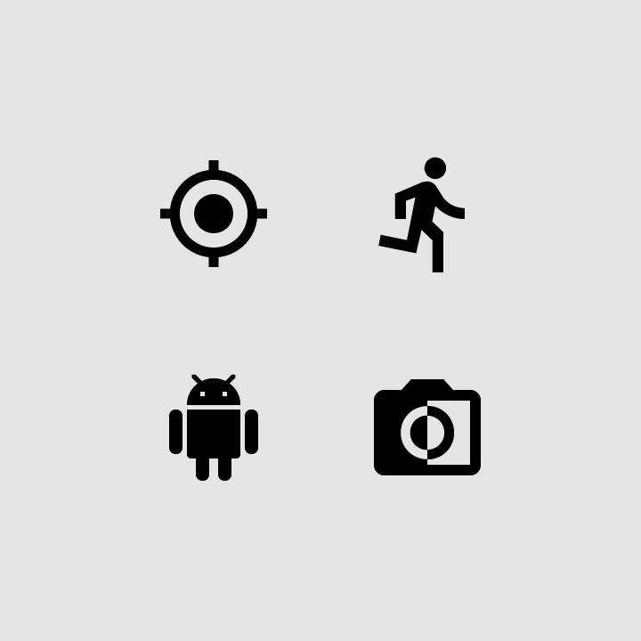
System icons are designed to be simple, modern, friendly, and sometimes quirky. Each icon is reduced to its minimal form, expressing essential characteristics.

Concept: set material

Icon shapes are bold and geometric. They have a symmetrical and consistent look, ensuring readability and clarity, even at small sizes.


Do: make icons graphic and bold

Do

Make icons graphic and bold.
Don’t use delicate, thin stroke weights

Don't

Don’t use delicate, thin stroke weights.

Do: use geometric, consistent shapes

Do

Use geometric, consistent shapes.
Don’t use gestural or loose organic shapes

Don't

Don’t use gestural or loose organic shapes.

Material Icons

A collection of icons available on Google Fonts.

Related link

Grid and keyline shapes ​

Icon design templates ​

Create your own system and product icons with these Adobe Illustrator files including the 24dp icon grid.

DOWNLOAD ICON DESIGN TEMPLATES

Available under Apache 2.0. By downloading this file, you agree to the Google Terms of Service. The Google Privacy Policy describes how data is handled in this service.

Icon sizes ​

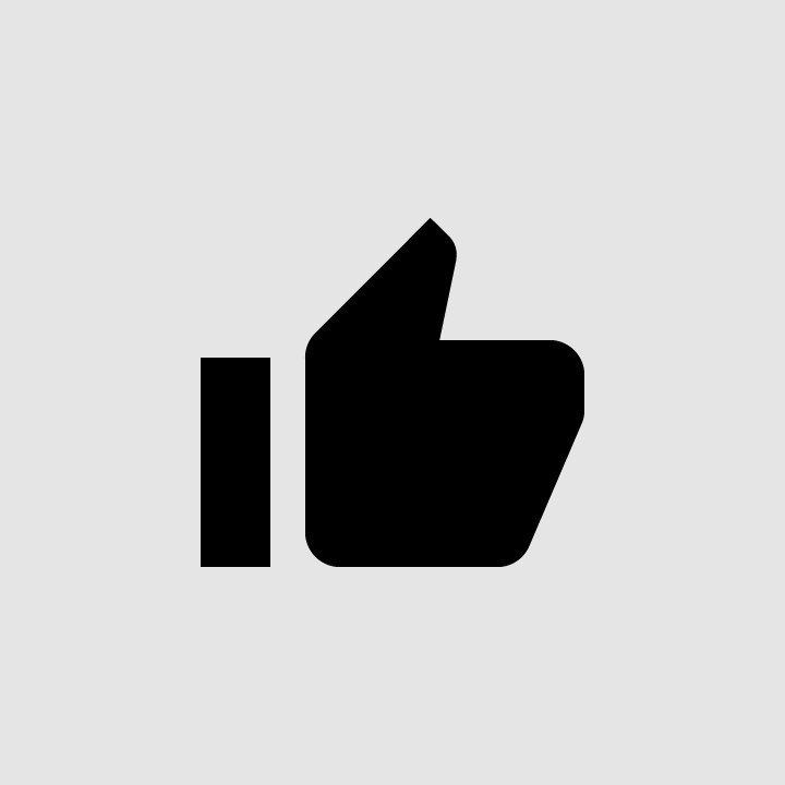
System icons are displayed as 24 x 24 dp. Create icons for viewing at 100% scale for pixel-perfect accuracy.
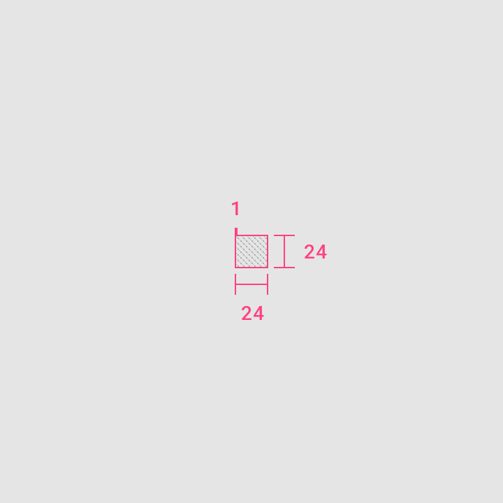
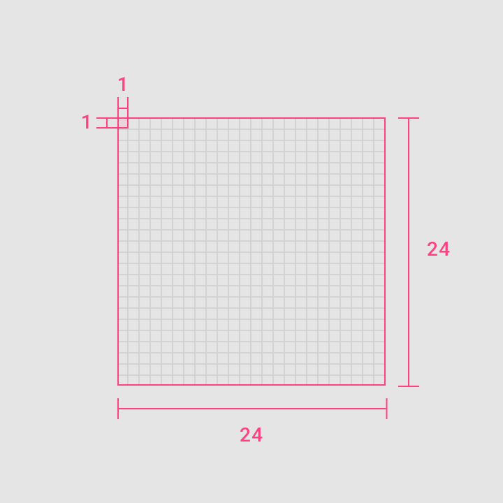
Icon sizes: 100% scale
100% scale
Icon sizes: 1000% scale
1000% scale

Dense layouts ​

On desktop, when the mouse and keyboard are the primary input methods, measurements may be scaled down to 20dp.
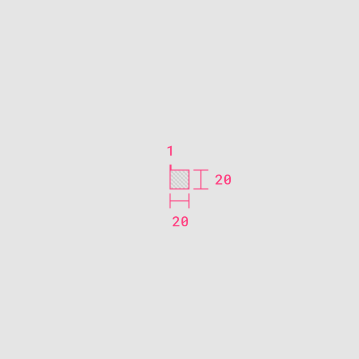
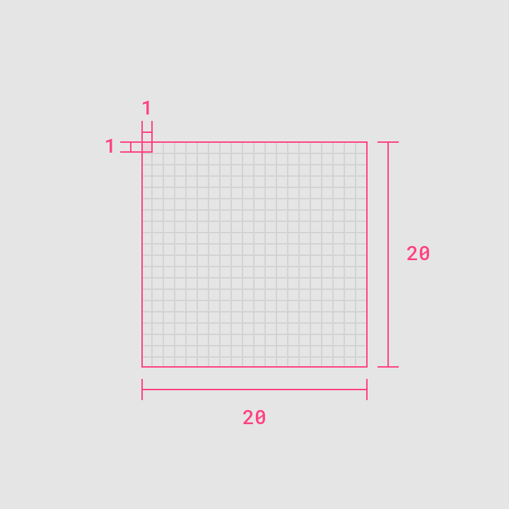
Dense layouts: 100% scale
100% scale
Dense layouts: 1000% scale
1000% scale

Layout ​

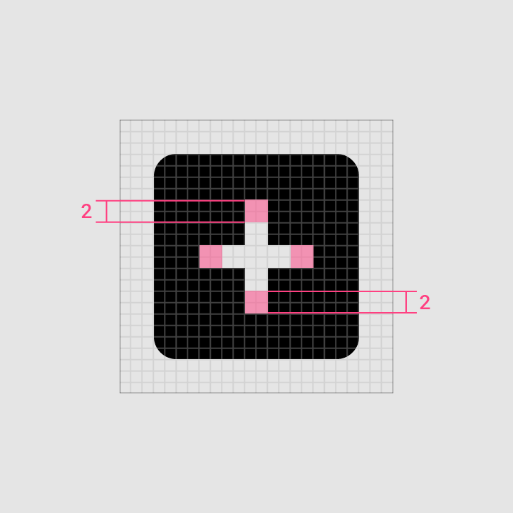
Icon content should remain inside of the live area, which is the region of an image that is unlikely to be hidden from view (such as when sidebars appear upon scrolling).

If additional visual weight is needed, content may extend into the padding between the live area and the trim area (the complete size of a graphic). No parts of the icon should extend outside of the trim area.
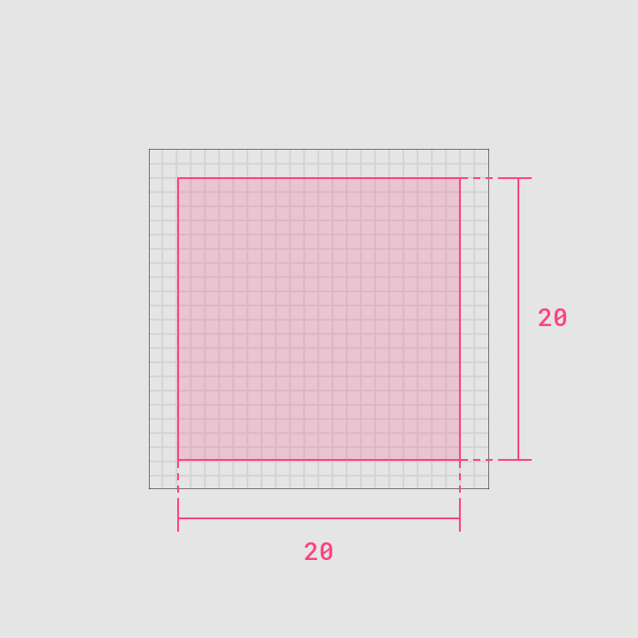
Icon content is limited to the 20dp x 20dp live area, with 2dp of padding around the perimeter
Live area
Icon content is limited to the 20dp x 20dp live area, with 2dp of padding around the perimeter.
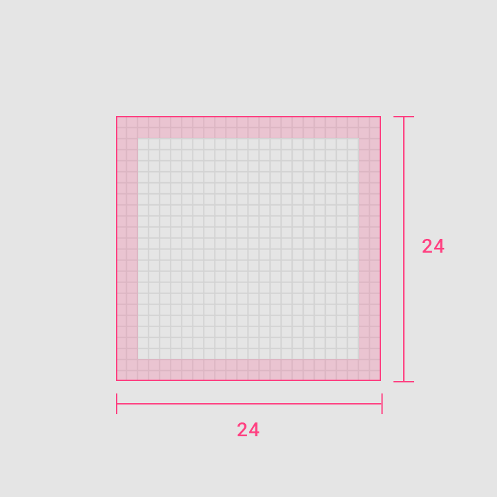
2dp of padding surrounds the live area
Padding
2dp of padding surrounds the live area.
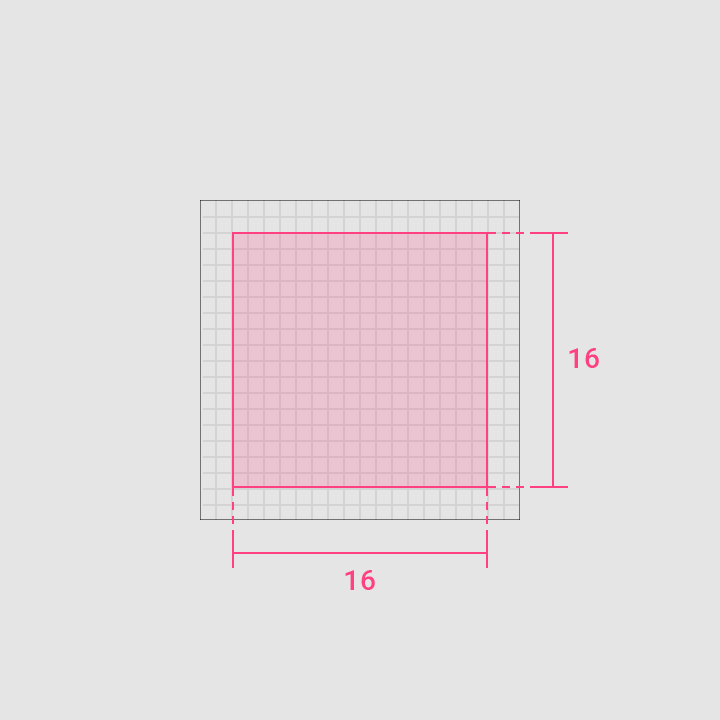
Icon content is limited to the 16dp x 16dp live area, with 2dp of padding around the perimeter
Dense live area
Icon content is limited to the 16dp x 16dp live area, with 2dp of padding around the perimeter.
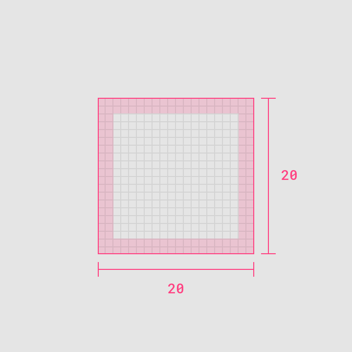
2dp of padding surrounds the live area
Dense padding
2dp of padding surrounds the live area.

Keyline Shapes ​

Icon grid and keyline ​

The icon grid establishes clear rules for the consistent, but flexible, positioning of graphic elements.

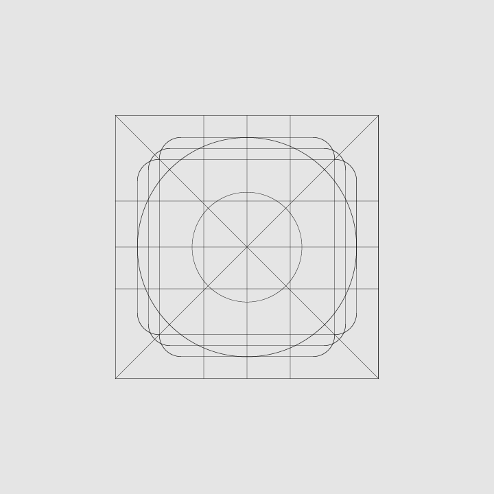
Keyline shapes are the foundation of the grid. By using these core shapes as guidelines, you can maintain consistent visual proportions across system icons.

Basic shapes ​

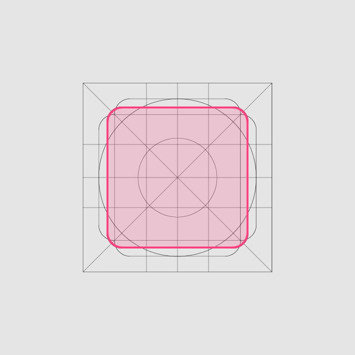
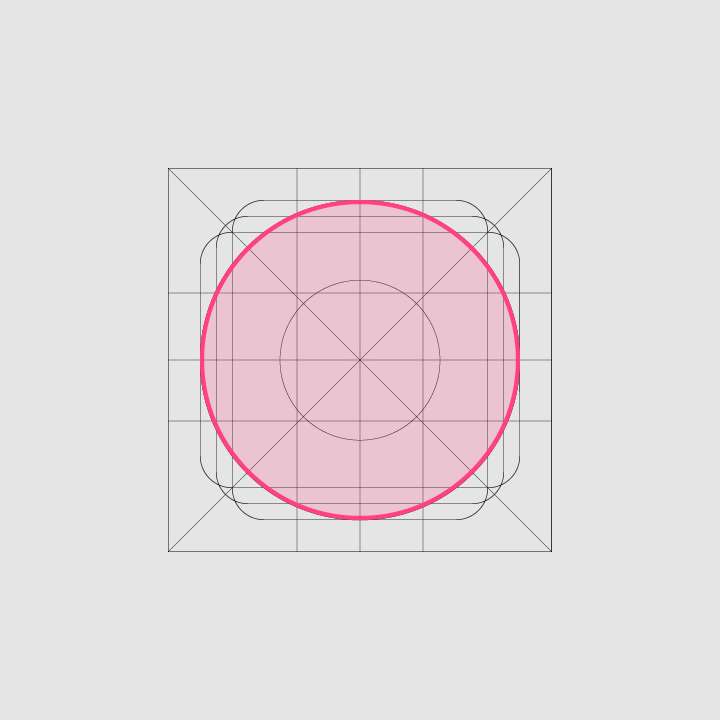
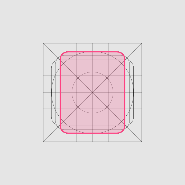
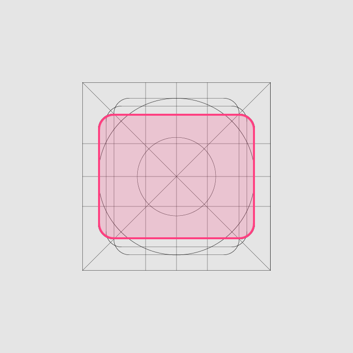
Specific keylines are present for certain shapes: circle, square, rectangle, orthogonals, and diagonals. These basic shapes help unify Google system icons and regulate their placement on the icon grid.
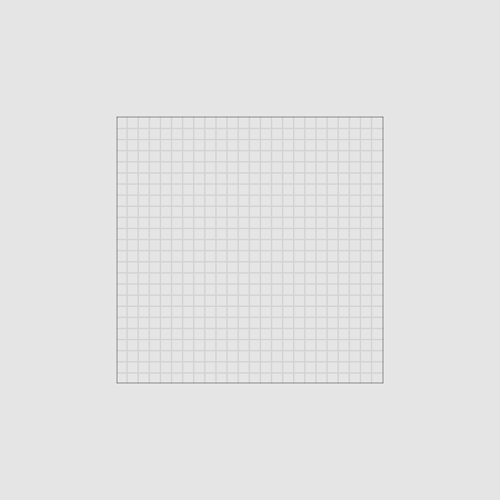
Basic shapes: grid
Grid
Basic shapes: keyline
Keyline

Square, Height: 18dp, Width: 18dp
Square
Height: 18dp
Width: 18dp
Basic shapes: circle, Diameter: 20dp
Circle
Diameter: 20dp

Vertical Rectangle, Height: 20dp, Width: 16dp
Vertical Rectangle
Height: 20dp
Width: 16dp
Horizontal Rectangle, Height: 16dp, Width: 20dp
Horizontal Rectangle
Height: 16dp
Width: 20dp

Geometry ​

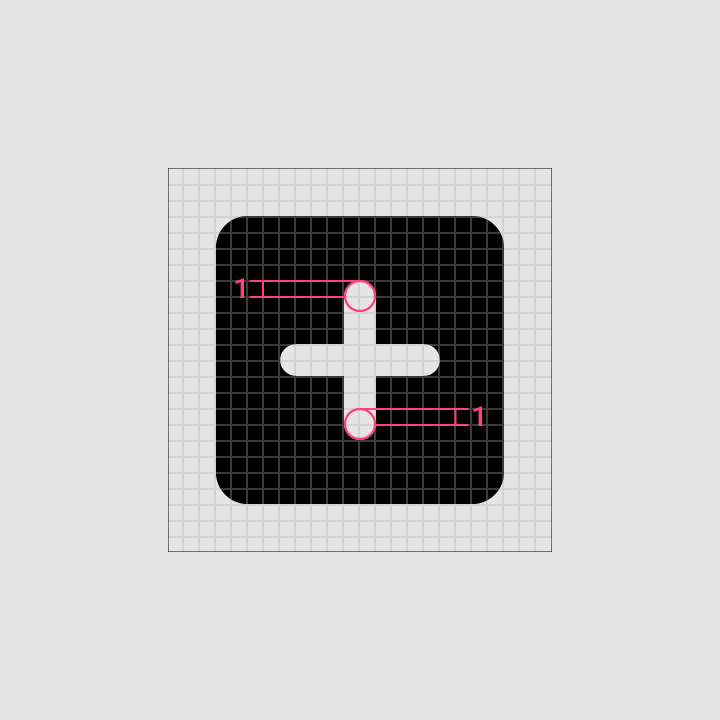
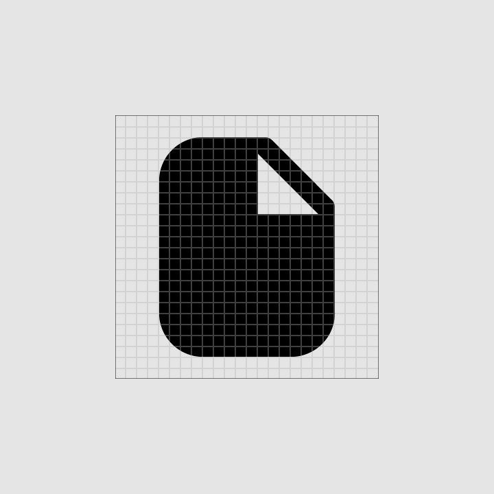
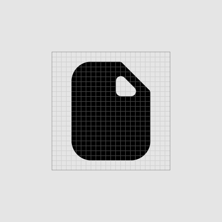
Preset standards have been determined for specific keylines: the circle, square, rectangle, orthogonals, and diagonals. These universal and simple elements have been developed to unify Google system icons and systemize their placement on the icon grid.
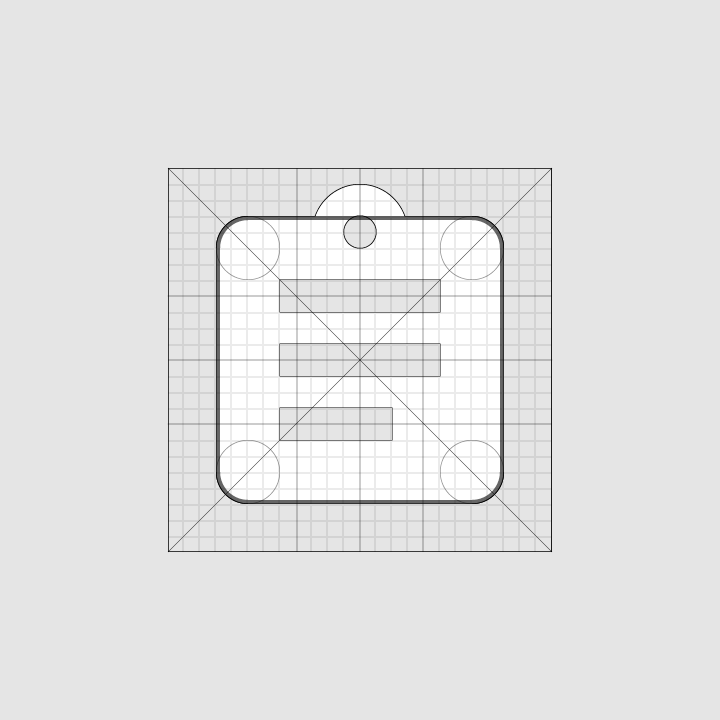
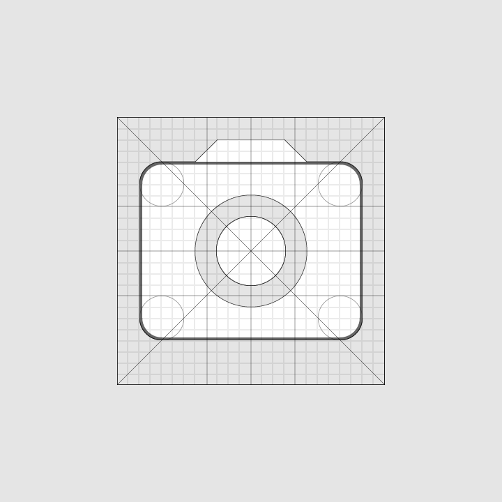
Geometry: clipboard icon
Clipboard icon
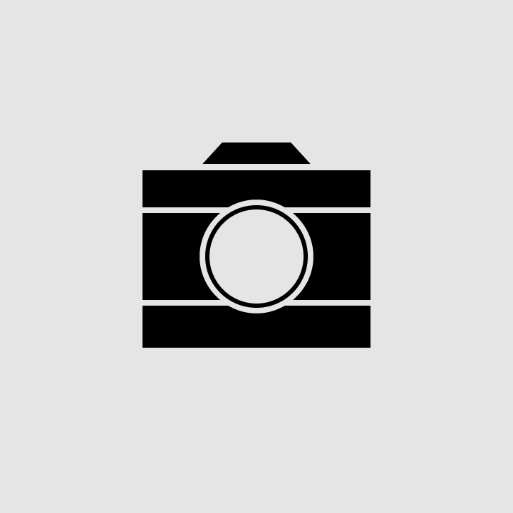
Geometry: camera icon
Camera icon

Clarity (Pixel perfection) ​

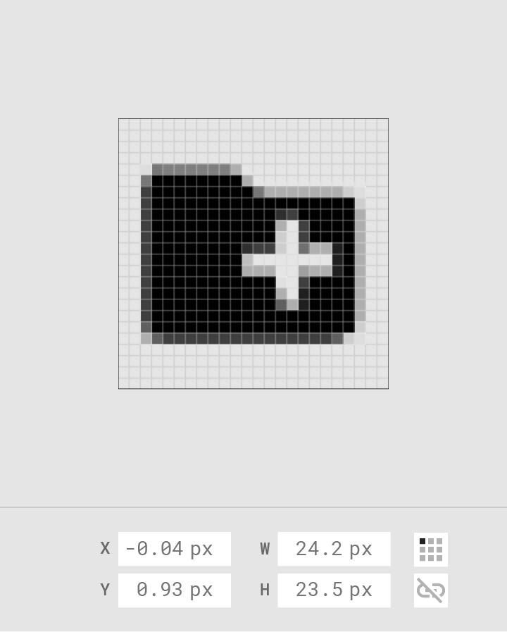
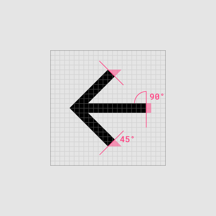
To avoid distorting an icon, position icons “on pixel” by making the X and Y coordinates into integers, without decimals.
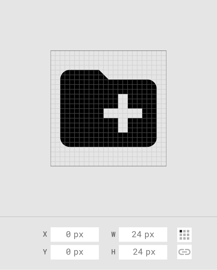
Do: position icons “on pixel.”

Do

Position icons “on pixel.”
Don’t place the icon on a coordinate that isn’t “on pixel”

Don't

Don’t place the icon on a coordinate that isn’t “on pixel”.

Cross-platform adaptations ​


The up button contains a thin arrow with a stem
Android
The up button contains a thin arrow with a stem.
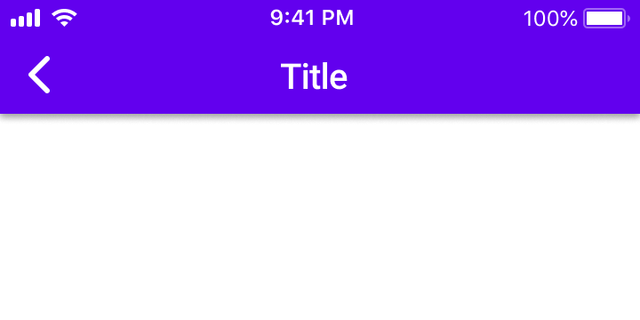
On iOS, the back arrow is thicker and doesn’t have a stem
iOS
On iOS, the back arrow is thicker and doesn’t have a stem.
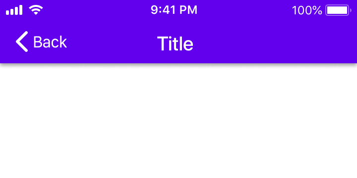
On iOS, the back arrow may also include a label for the associated destination
iOS
On iOS, the back arrow may also include a label for the associated destination.
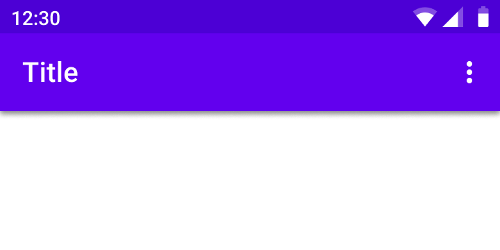
The action overflow menu icon (indicated by the “More…” symbol) contains three vertical dots
Android
The action overflow menu icon (indicated by the “More…” symbol) contains three vertical dots.
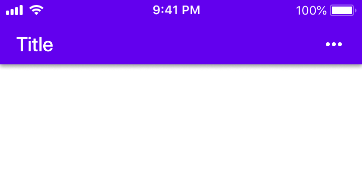
The action overflow menu icon (indicated by the “More…” symbol) contains three horizontal dots
iOS
The action overflow menu icon (indicated by the “More…” symbol) contains three horizontal dots.

System icon metrics ​

Anatomy ​


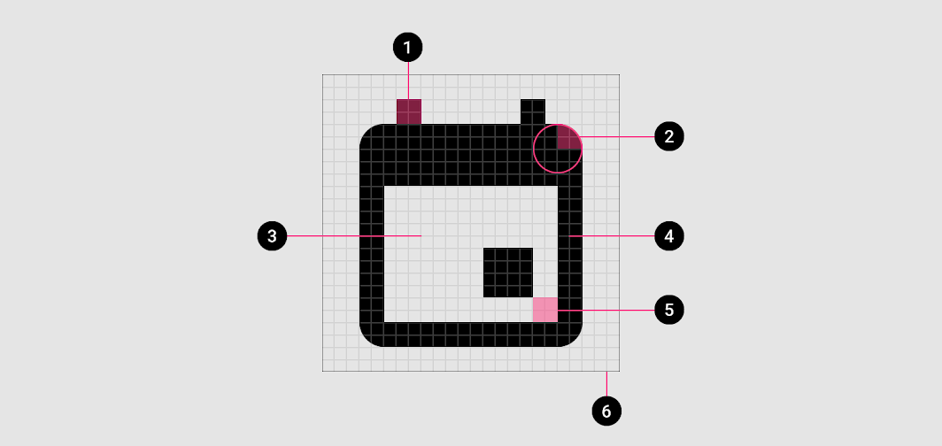
Diagram of stroke terminal, corner, counter area, stroke, counter stroke, bounding area
1. Stroke terminal
2. Corner
3. Counter area
4. Stroke
5. Counter stroke
6. Bounding area

Corners ​

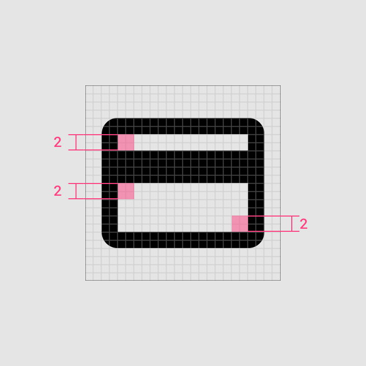
Corner radiuses are 2dp by default. Interior corners should be square, not rounded. For shapes 2dp wide or less, stroke corners shouldn’t be rounded.
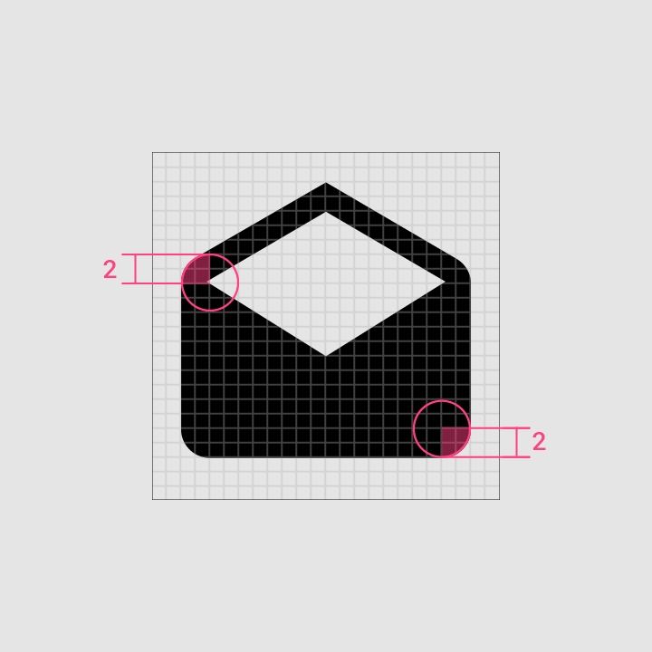
Exterior corners with 2dp corner radii
Interior corners
Interior corners

Stroke ​

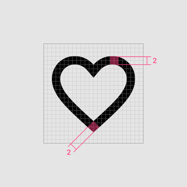
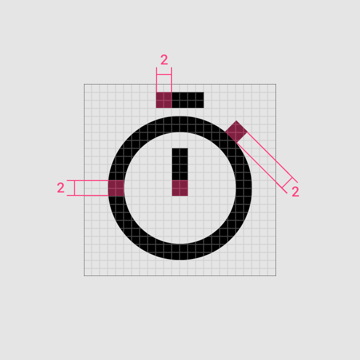
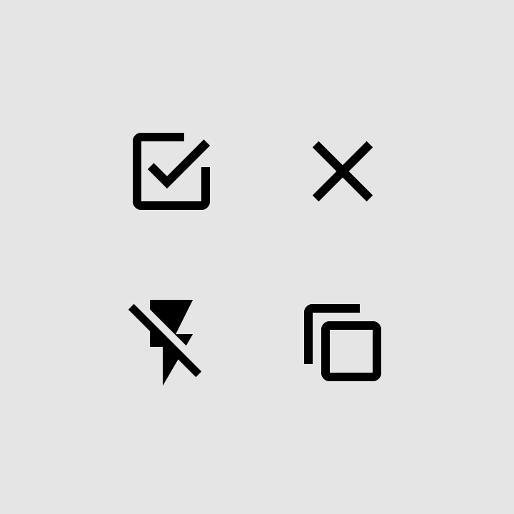
System icons use a consistent stroke width of 2dp, including curves, angles, and both interior and exterior strokes.
2dp stroke
2dp stroke
Stroke: consistency
Consistency

Stroke terminal
Stroke terminal
Counter stroke
Counter stroke

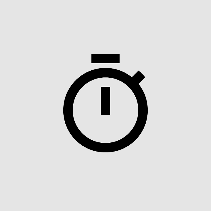
Do: use consistent stroke weights and squared stroke terminals

Do

Use consistent stroke weights and squared stroke terminals.
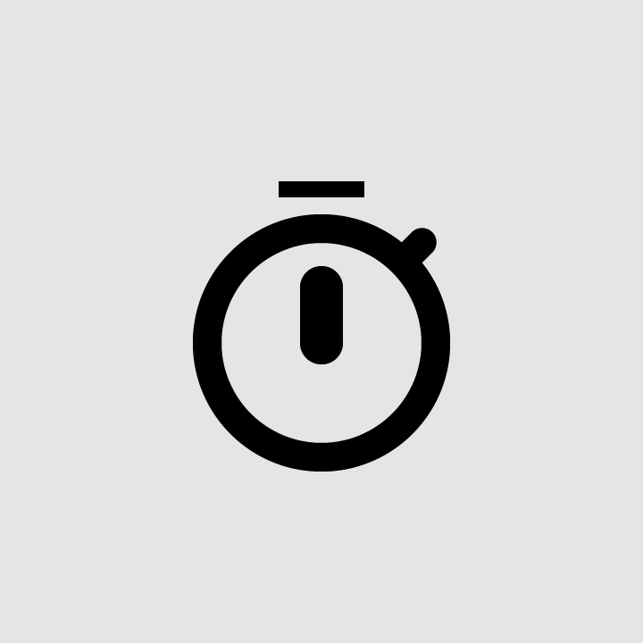
Don’t use inconsistent stroke weights or rounded stroke terminals

Don't

Don’t use inconsistent stroke weights or rounded stroke terminals.

Complex icon shapes ​

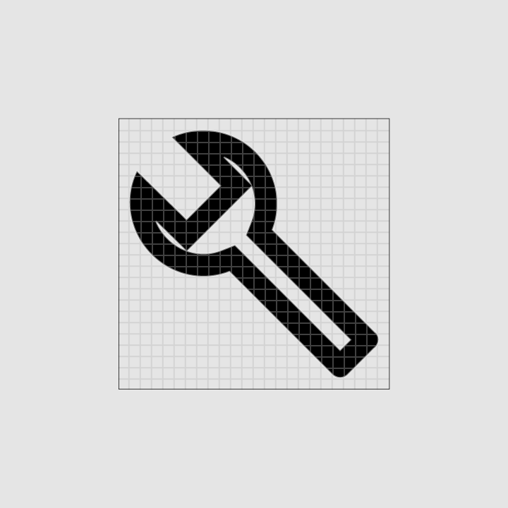
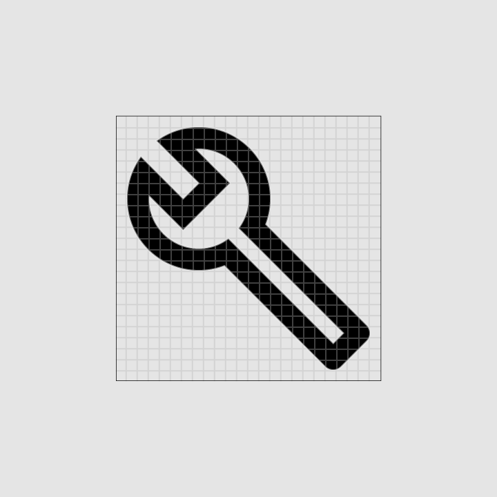
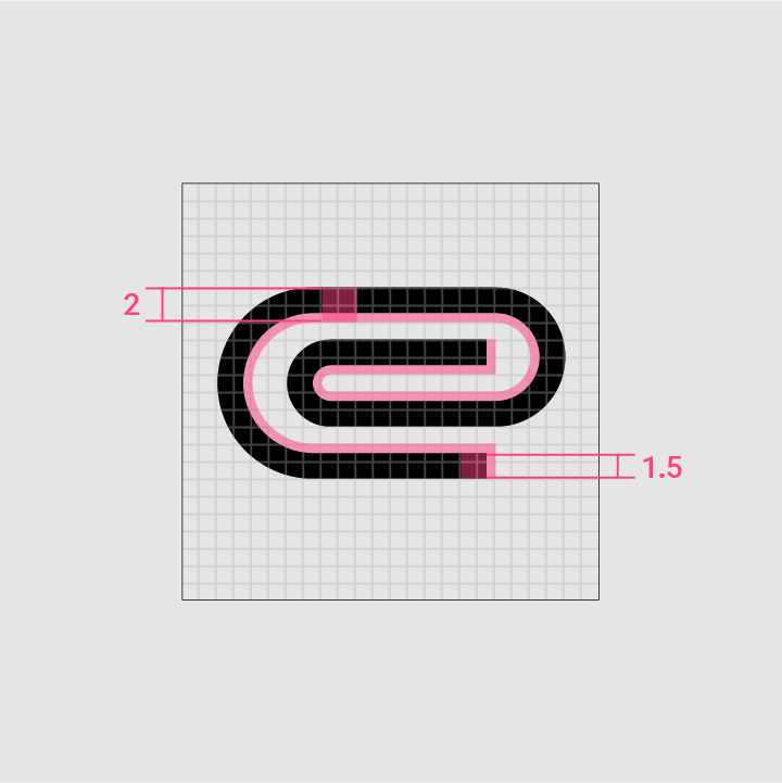
If a system icon requires complex details, subtle adjustments can be made to improve its legibility. These adjustments are referred to as optical corrections. Any optical corrections should use the geometric forms on which all other icons are based, without skewing or distorting those shapes.
The paperclip icon uses 1.5dp of the possible 2dp stroke area to fit multiple curves within the 24 x 24dp icon space
Complex adjustments
The paperclip icon uses 1.5dp of the possible 2dp stroke area to fit multiple curves within the 24 x 24dp icon space.
This icon uses a 1.5dp stroke to show waves within the 24 x 24dp icon space
Small scale
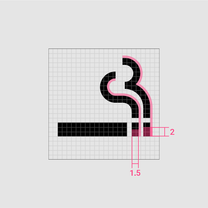
This icon uses a 1.5dp stroke to show waves within the 24 x 24dp icon space.
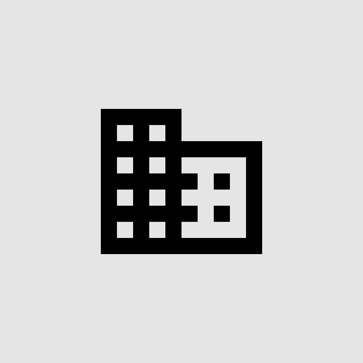
Do: make icons face forward

Do

Make icons face forward.
Don’t tilt, rotate, or make icons appear dimensional

Don't

Don’t tilt, rotate, or make icons appear dimensional.

Do: simplify icons for greater clarity and legibility

Do

Simplify icons for greater clarity and legibility.
Don’t be overly literal

Don't

Don’t be overly literal. Avoid complex icons.

Space ​

Adequate space should surround system icons to allow legibility and touch. Icons of 24dp can use a touch target of 48dp.
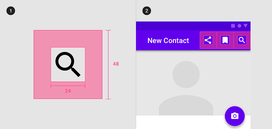
Diagram of clearance area, placement
1. Clearance area
2. Placement

Dense layouts (Desktop) ​

When a mouse and keyboard are the primary input methods, measurements may be condensed to accommodate denser layouts. Dense icons of 20dp can use a touch target of 40dp.
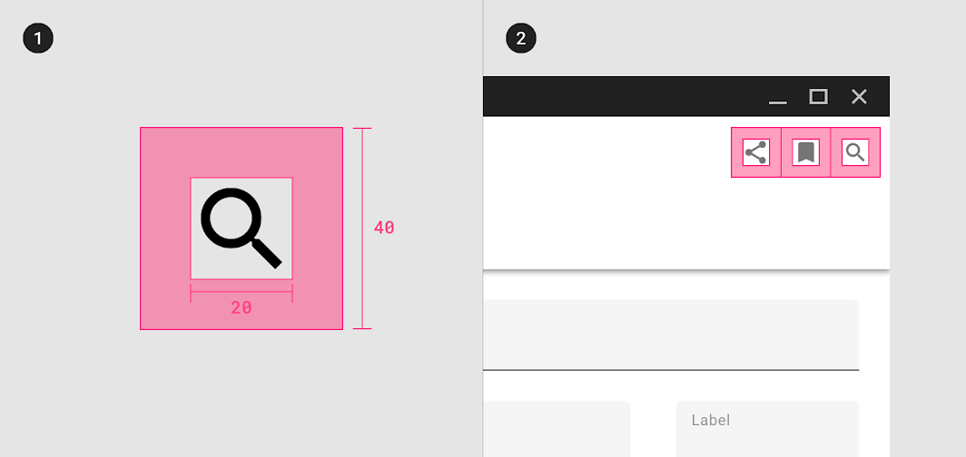
Diagram of clearance area, placement
1. Clearance area
2. Placement

Color ​

Icons on light backgrounds ​

Active icon

The standard opacity for an active icon with focused state on a light background is 87% (#000000). An active with unfocused state is 54%.

Inactive icon

An inactive icon, which is lower in the visual hierarchy, should have an opacity of 38% (#000000).
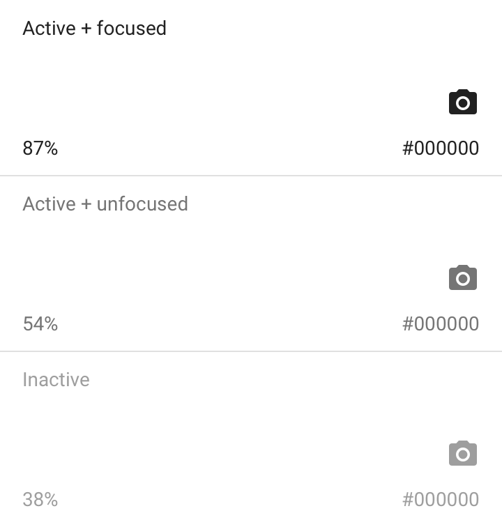
Icons on light backgrounds: opacity

Applying color to UI

Color is applied to UI elements and components in consistent and meaningful ways.

Related article

Icons on dark backgrounds ​


Active icon

The standard opacity for an active icon with focused state on a dark background is 100% (#FFFFFF). An active with unfocused state is 70%.

Inactive icon

An inactive icon, which is lower in the visual hierarchy, should have an opacity of 50% (#FFFFFF).
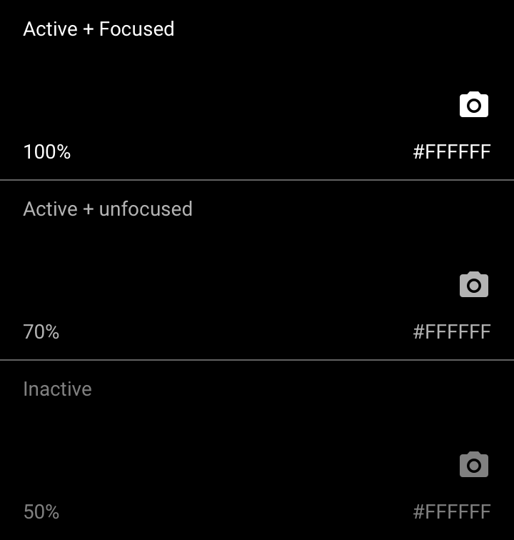
Icons on dark backgrounds: opacity

Icon themes ​

Three attributes of system icons can be customized in order to create custom system icons: stroke and fill, corner radius, and color.

The following four preset custom icon sets are created by adjusting these attributes.

Outlined icons ​

Outlined icons customize stroke and fill attributes for a light, clean style that works well in dense UIs. The stroke weight of outlined icons can be adjusted to complement or contrast the weight of your typography.

Stroke and fill ​

When system icons are unfilled, they are defined by their stroke. A thicker stroke adds a sense of heaviness and mass, making filled icons feel heavier. A thinner stroke implies lightness, giving unfilled icons a lighter style.
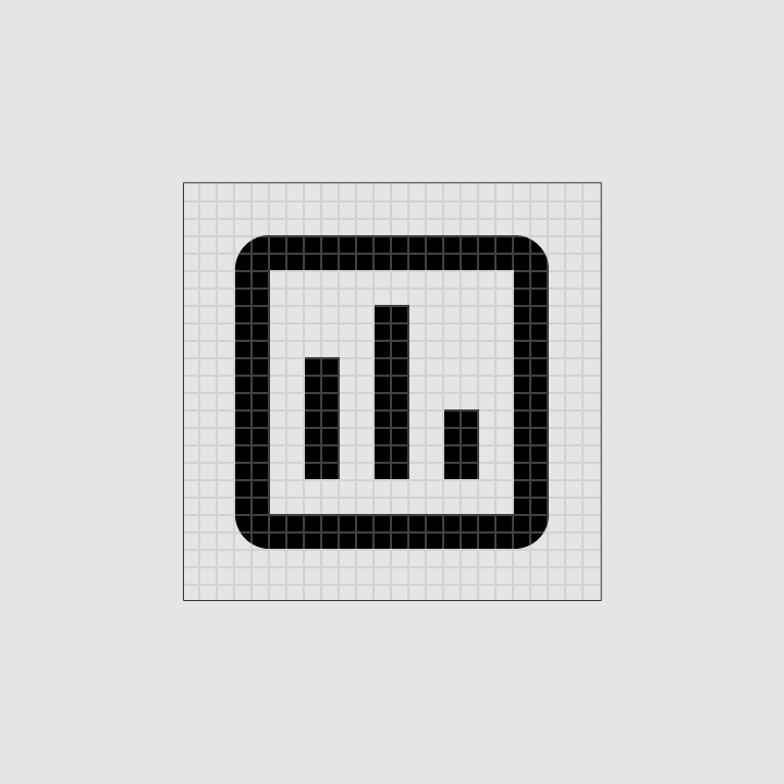
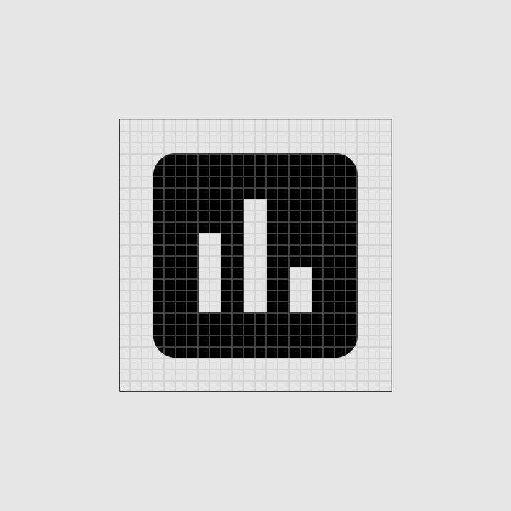
Stroke and fill: unfilled icon
Unfilled icon
Stroke and fill: filled icon
Filled icon

To maintain legibility, the recommended stroke weight is 2dp for most icons
To maintain legibility, the recommended stroke weight is 2dp for most icons.
2dp outlined icons remain readable across sizes and applications
2dp outlined icons remain readable across sizes and applications.

Stroke alignment ​

Stroke placement affects an icon’s overall appearance, depending on whether the stroke is placed on the inside, center, or outside of a shape. In most cases, the stroke is best aligned with the inside of a shape.
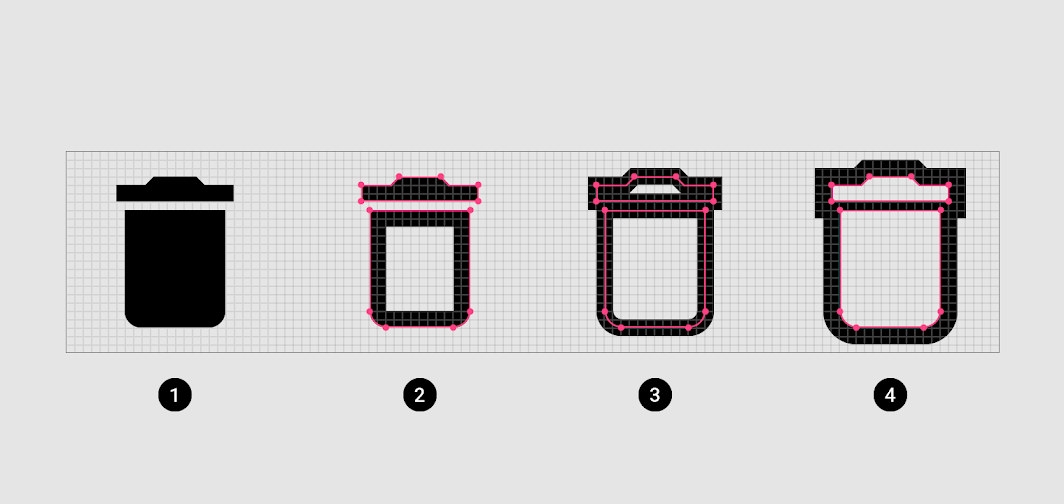
Diagram of standard Material icon, inside stroke alignment, center stroke alignment, outside stroke alignment
1. Standard Material icon
2. Inside stroke alignment
3. Center stroke alignment
4. Outside stroke alignment
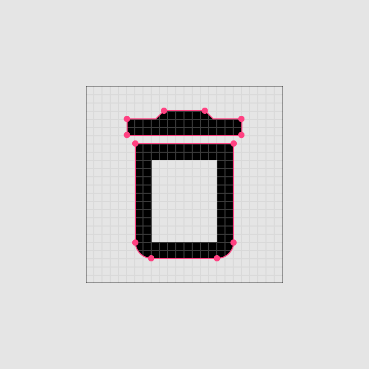
Aligning the stroke to the shape interior produces a legible icon with a consistent stroke weight
Aligning the stroke to the shape interior produces a legible icon with a consistent stroke weight.
For optimal legibility and recognition, the standard Material icon style should be retained in some cases
For optimal legibility and recognition, the standard Material icon style should be retained in some cases, such as full body human icons or proprietary icons.

Caution: in most cases, the stroke is best aligned inside of a shape

Caution

In most cases, the stroke is best aligned inside of a shape. Occasionally, aligning the stroke to the center or outside of the shape works better for an icon.
Do: adjust shapes appropriately for your design and brand when customizing an icon’s stroke and alignment

Do

Adjust shapes appropriately for your design and brand when customizing an icon’s stroke and alignment.

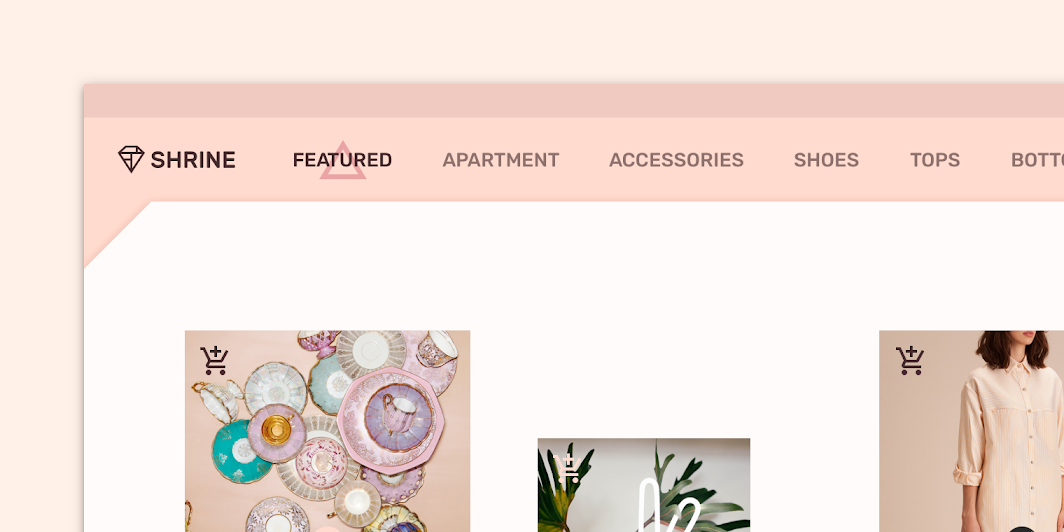
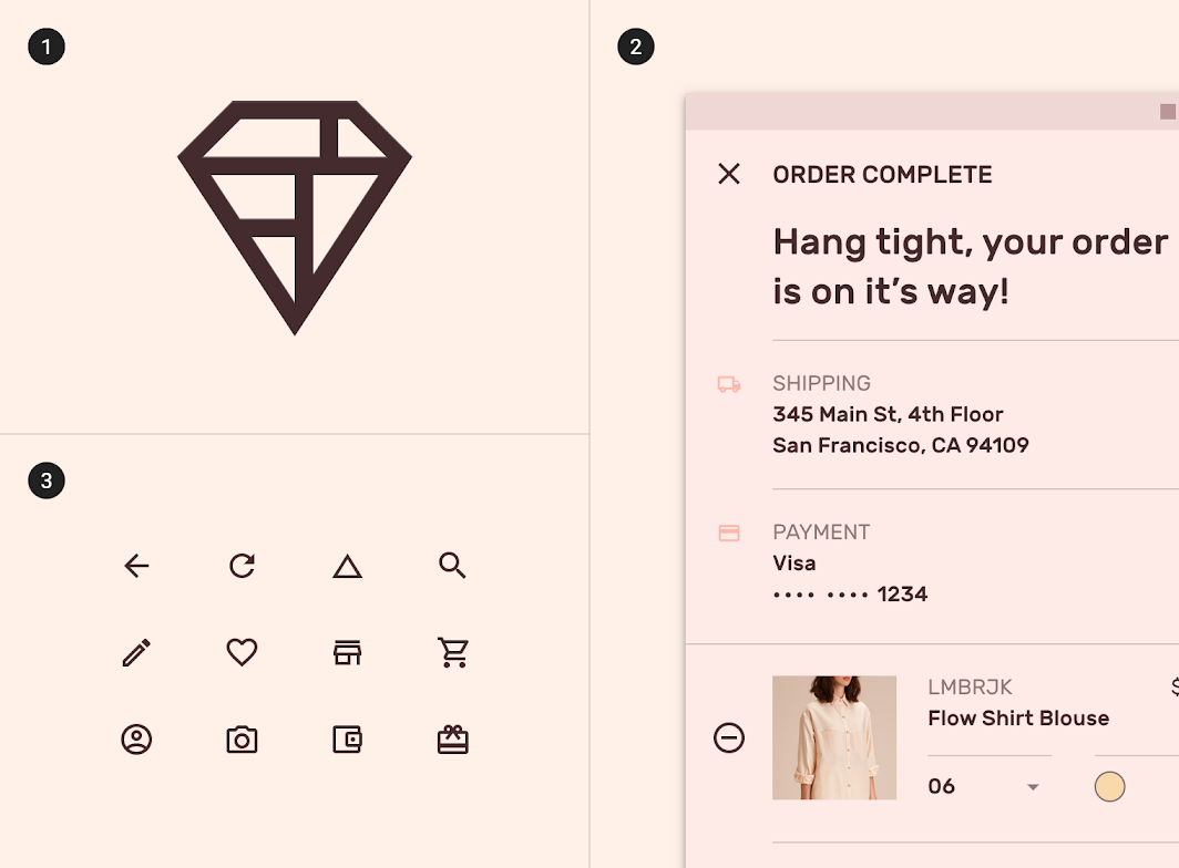
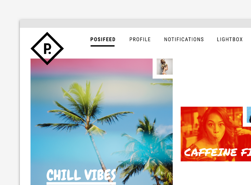
The lighter stroke weight of these outlined icons mimics the thin lines of the app’s brand
The lighter stroke weight of these outlined icons mimics the thin lines of the app’s brand.

Diagram of brand logo, outlined icons in the app, outlined icons
1. Brand logo
2. Outlined icons in the app
3. Outlined icons

Sharp and rounded icons ​

Sharp icons ​

Sharp icons display corners with straight edges, for a crisp style that remains legible even at smaller scales. These rectangular shapes can support brand styles that aren’t well-reflected by rounded shapes.

Rounded icons ​

Rounded icons use a corner radius that pairs well with brands that use heavier typography, curved logos, or circular elements to express their style.

Corner radius ​

An icon’s corner radius consists of curved exterior corners. Icons can be are characterized by a larger corner radius or a smaller one.
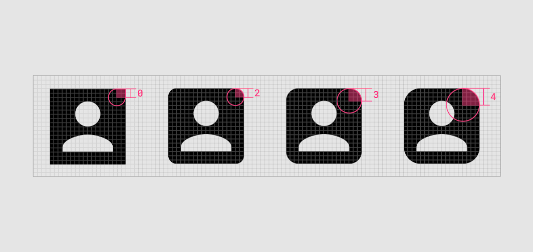
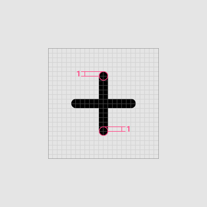
The recommended corner radius values are between 0dp and 4dp
The recommended corner radius values are between 0dp and 4dp.

If the stroke is 2dp or less, the corner radius must be 1dp
If the stroke is 2dp or less, the corner radius must be 1dp.
Adjust the icon’s interior corners and counter area to match the corner radius
Adjust the icon’s interior corners and counter area to match the corner radius.

Do: customize the corner radius to remain legible while reflecting your product’s style

Do

Customize the corner radius to remain legible while reflecting your product’s style.
Don’t round interior corners if it reduces the icon’s legibility

Caution

Don’t round interior corners if it reduces the icon’s legibility.

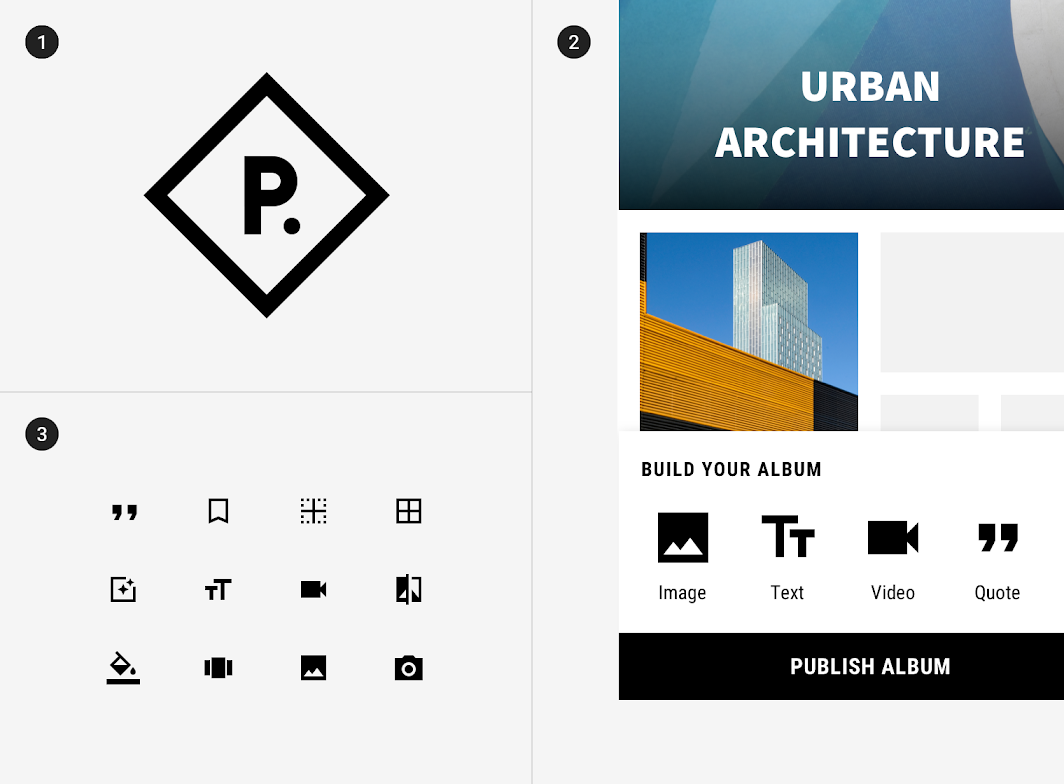
The 0dp corner radius of the sharp icon set echoes this app’s rectangular design details
The 0dp corner radius of the sharp icon set echoes this app’s rectangular design details.

Diagram of brand logo, sharp icons, sharp icons in the app
1. Brand logo
2. Sharp icons
3. Sharp icons in the app
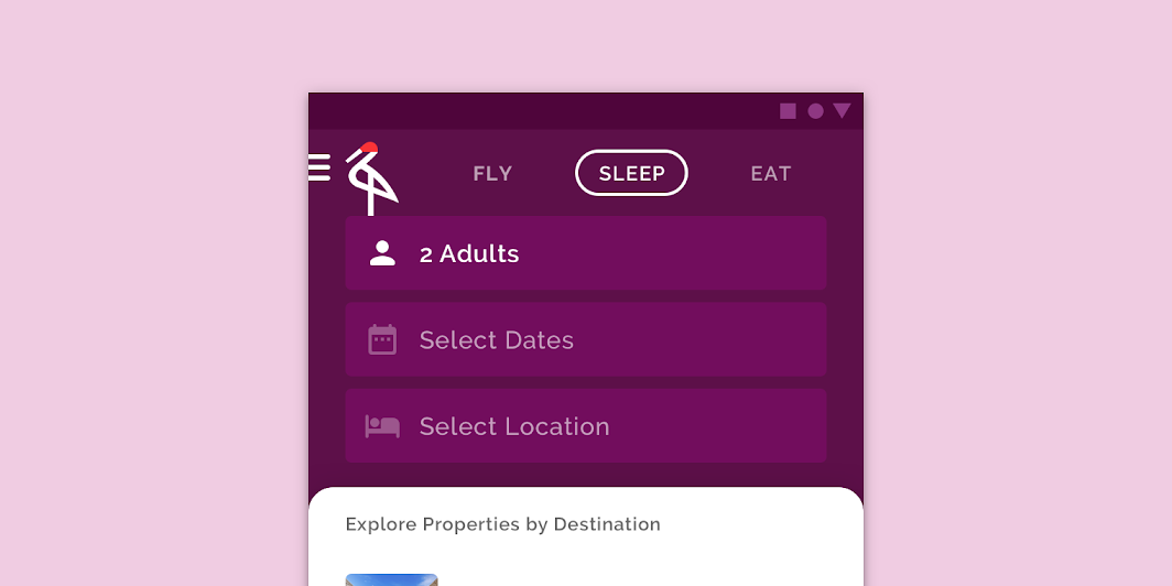
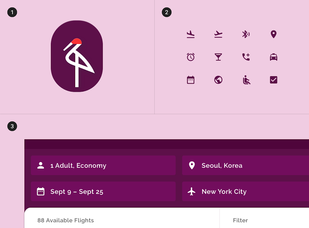
This app uses rounded buttons and a line-drawn logo
This app uses rounded buttons and a line-drawn logo.

Diagram of brand logo, rounded icons, rounded icons in the app
1. Brand logo
2. Rounded icons
3. Rounded icons in the app

Two-tone icons ​

Two-tone icons have added dimension, using the attributes of stroke, fill, and color. Contrasting stroke and fill colors enables the use of multiple brand colors and can improve legibility.
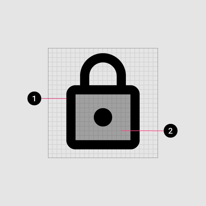
The recommended stroke weight for two-tone icons is 2dp
1. Stroke
2. Transparent fill

The recommended stroke weight for two-tone icons is 2dp.
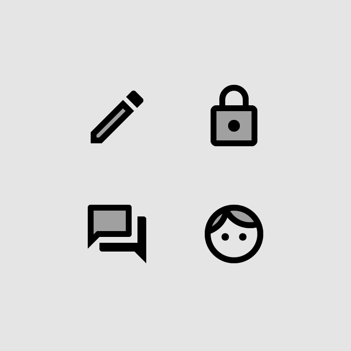
Transparency should only be applied to the fill of two-tone icons
Transparency should only be applied to the fill of two-tone icons.

Two-tone icons can use different colors for an icon’s stroke and fill. The fill’s transparency can be adjusted to improve legibility and align with your brand.

Icon strokes must be 87% on light backgrounds and 100% on dark backgrounds. Fill color can vary depending on the tone of the background.

Light backgroundDark background
Stroke87% solid100% solid

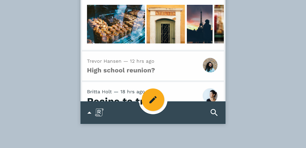
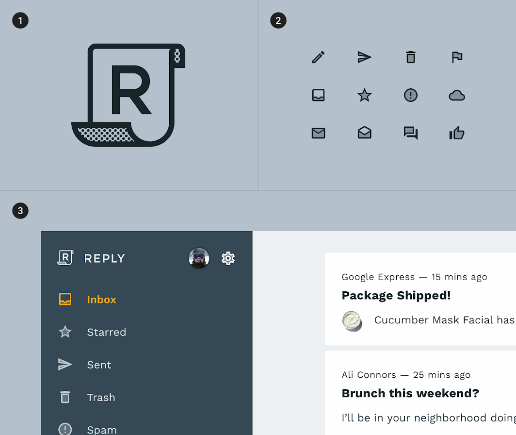
This email app uses two-tone brand elements, such as its logo
This email app uses two-tone brand elements, such as its logo.

Diagram of brand logo, two-tone icons, two-tone icons in the app
1. Brand logo
2. Two-tone icons
3. Two-tone icons in the app
Pager
Previous pageProduct icons
Next pageAnimated icons

Released under the Apache-2.0

Copyright © 2018-Present Google

https://m2.material.io/design/iconography/system-icons.html

Released under the Apache-2.0

Copyright © 2018-Present Google