

Implementing your theme
The following techniques can be used to customize and apply color, typography, and shape. Iconography is provided with five unique sets to choose from.
Color
The color system supports 12 categories of color that can be applied to components, text, icons, and surfaces.
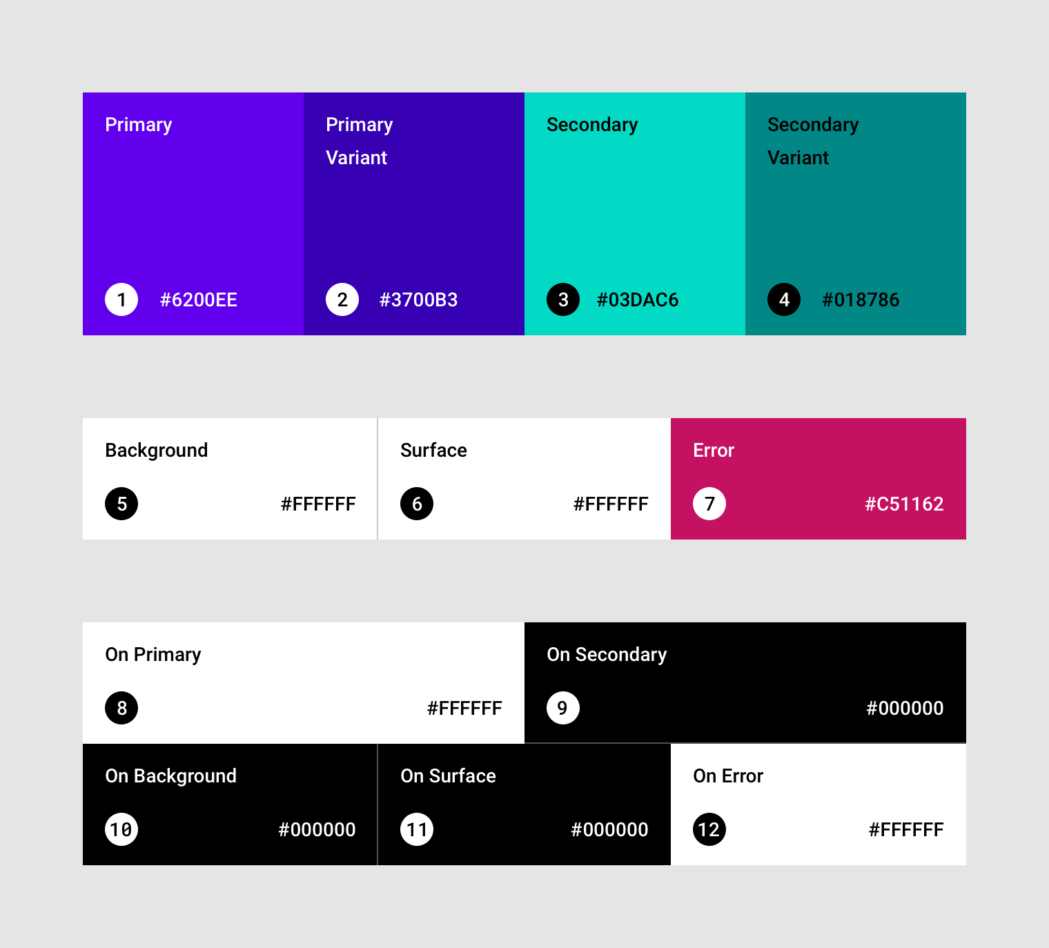
2. Primary Variant
3. Secondary
4. Secondary Variant
5. Background
6. Surface
7. Error
8. On Primary
9. On Secondary
10. On Background
11. On Surface
12. On Error
Theming with color
To use Material Theming with color, start by choosing suitable colors to apply to your UI.
Color can be selected in several ways:
- Generate colors with the inline tool in the Color section
- Select colors from the Material Palettes’ harmonious colors schemes
Primary and secondary colors
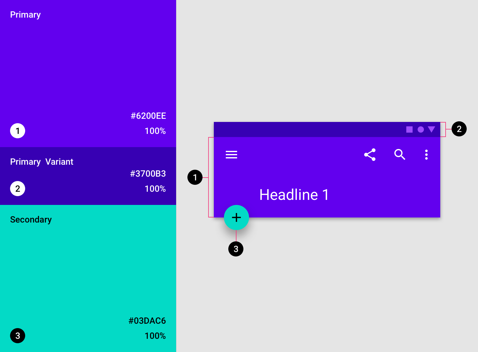
Primary and secondary colors are applied sparingly to strategic parts of your UI. They are typically chosen for their ability to represent your brand.
Primary colors map to components and elements, like app bars and buttons. Secondary colors are most often used as accents on components, such as FABS and selection controls.
Finally, color variants can also be used to complement and provide accessible options for your primary and secondary colors.
Surface, background, and error colors
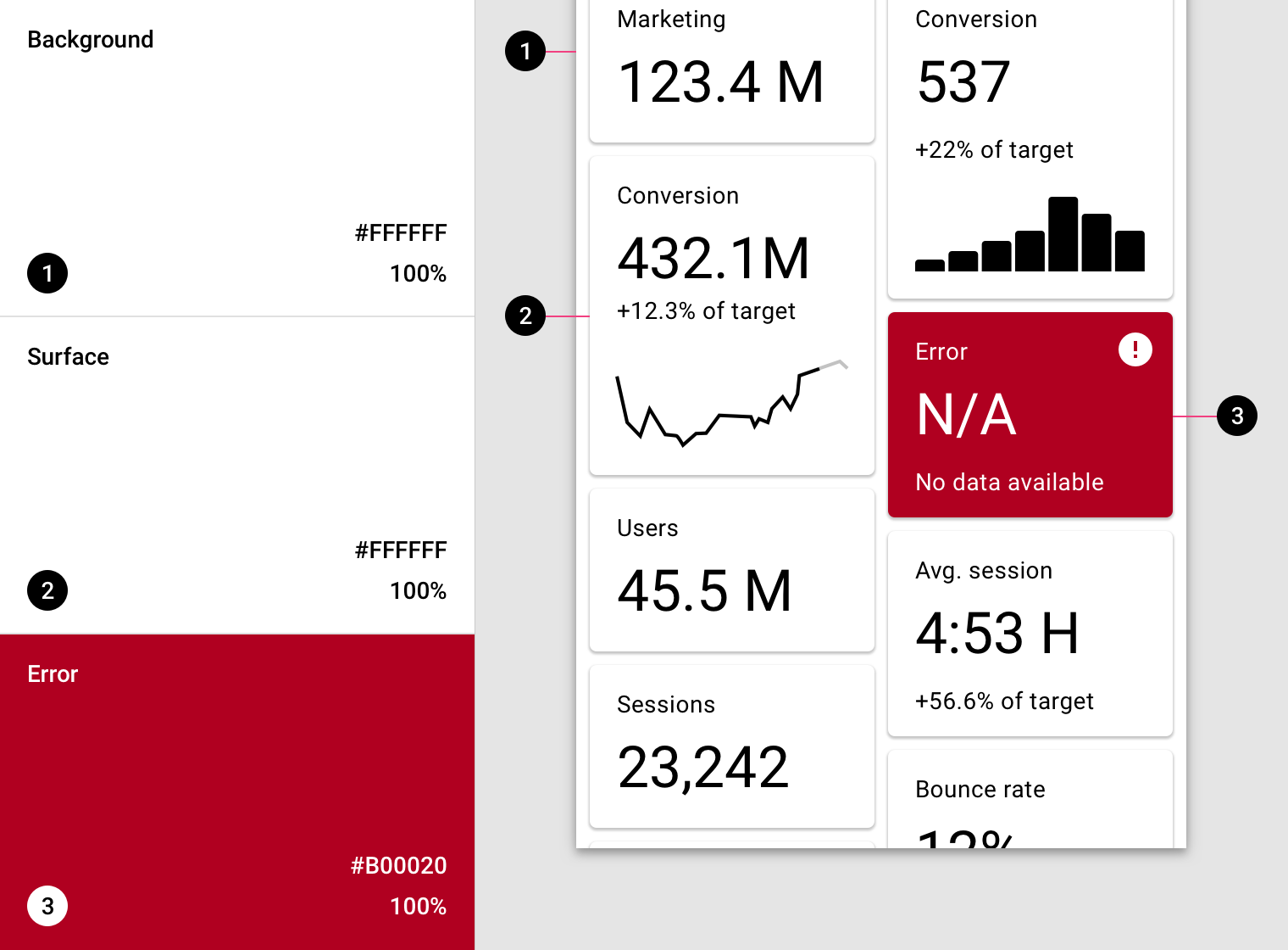
Surface, background, and error colors typically don’t represent brand.
In general, they occupy the following areas of the UI:
- Surface colors map to components such as cards, sheets, and menus
- Background color is found behind scrollable content
- Error color indicates errors in components, such as text fields
“On” colors
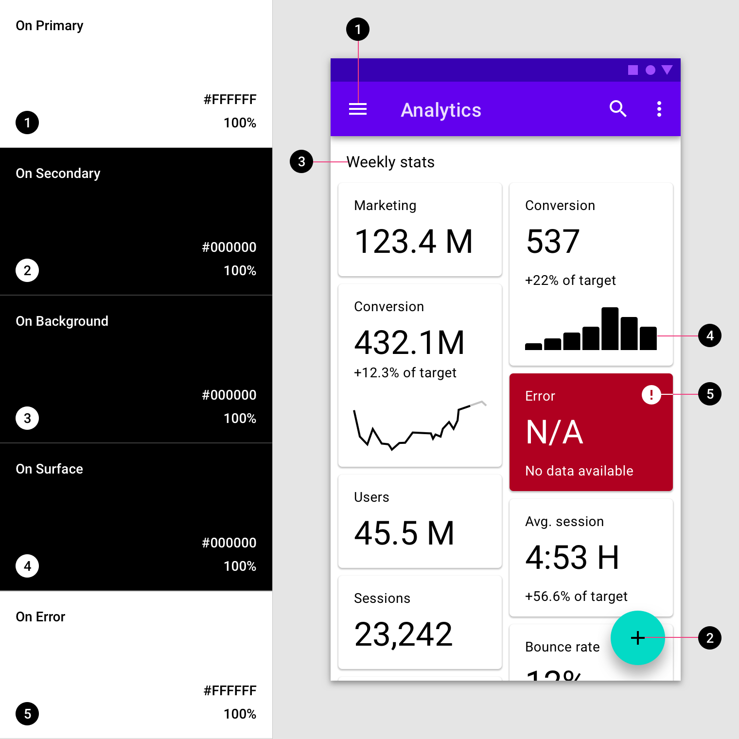
The elements in an app use colors from specific categories in your color palette, such as a primary color. Whenever other screen elements, such as text or icons, appear in front of surfaces using those colors, those elements should use colors specifically designed to appear clearly and legibly against the colors behind them.
This category of colors is called “on” colors, referring to the fact that they color elements that are sometimes placed “on” top of key surfaces that use a primary color, secondary color, surface color, background color, or error color. These are labelled using the original category name (such as primary color) with the prefix “on”.
“On” colors are primarily applied to text, iconography, and strokes. Sometimes, they are also applied to surfaces.
“On” color naming
| Category | “On” category |
|---|---|
| Primary | On Primary |
| Secondary | On Secondary |
| Surface | On Surface |
| Background | On Background |
| Error | On Error |
The colors in the “on” category are applied to text and icons (and sometimes surfaces) that appear in front of areas colored using: a primary color, secondary color, surface color, background color, or error color.
Typography
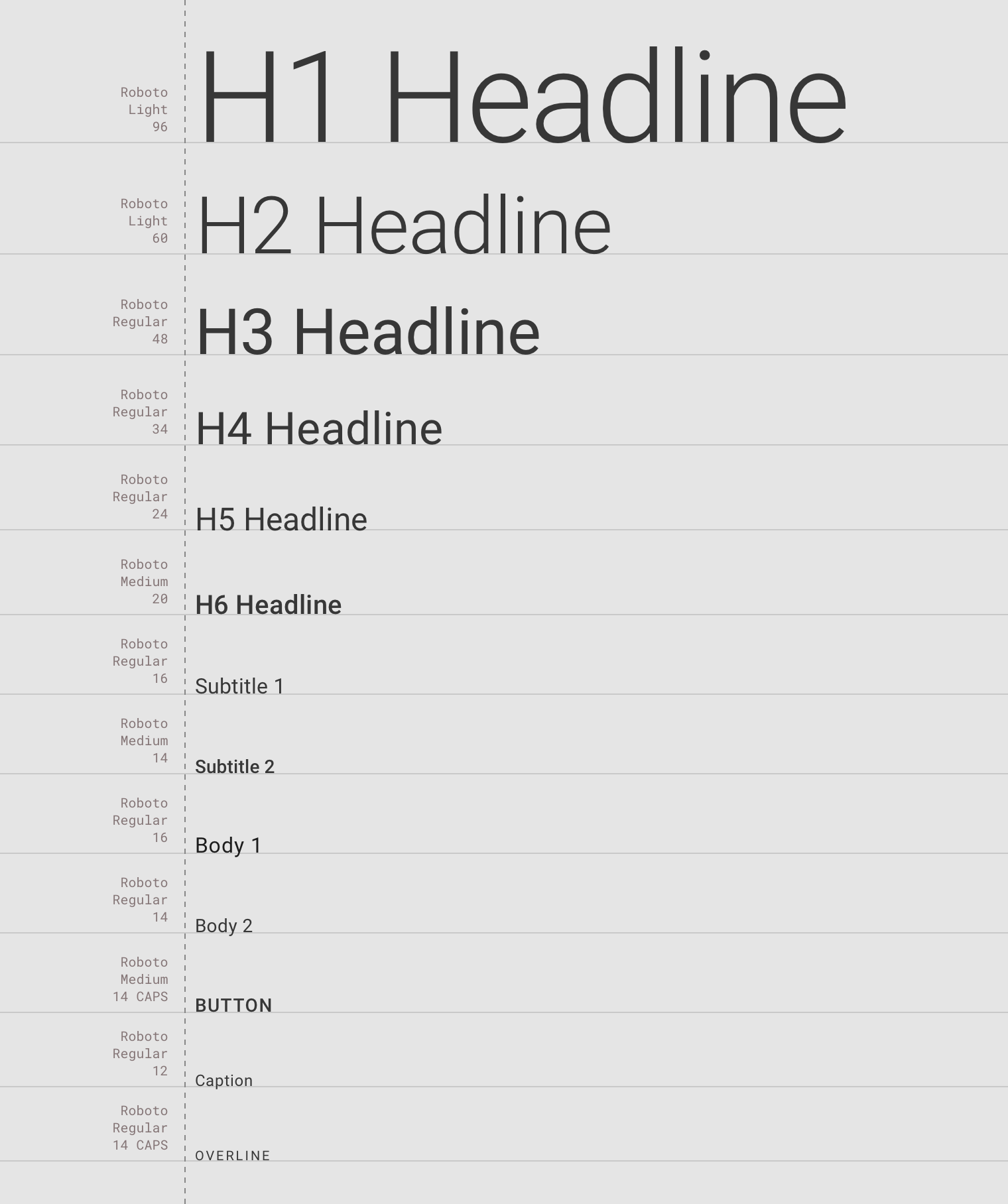
The type system supports 13 categories that, when combined, form the typescale. This typescale is evident in the variety of text styles and sizes that appear on screen, ranging from body copy to buttons. Type appears across the UI, in places such as in components and on surfaces.
Type attributes are controlled by values that can be customized for the type family, font, case, size, and tracking.
Theming methods
Customize and apply typography
There are multiple ways to choose typography:
- Use our type scale generator to select styles for headline and body text, and see them automatically resized and optimized for readability. Then copy the code for your platform.
- Pick a typeface from Google Fonts that reflects your product.
Headings
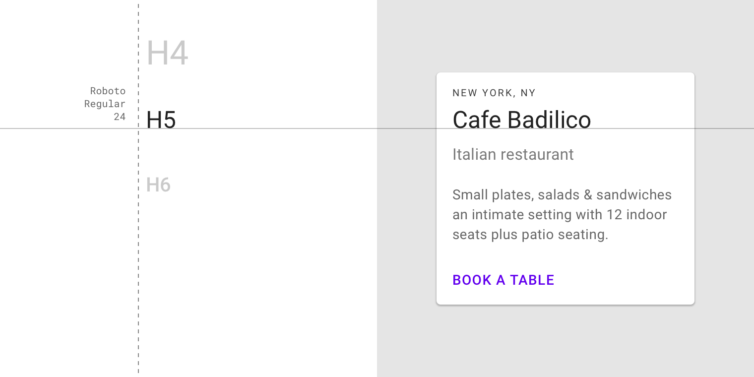
Headlines 1-6 are the largest sizes in the typescale. They are reserved for short, but impactful, moments of text. They are also used for numerals.
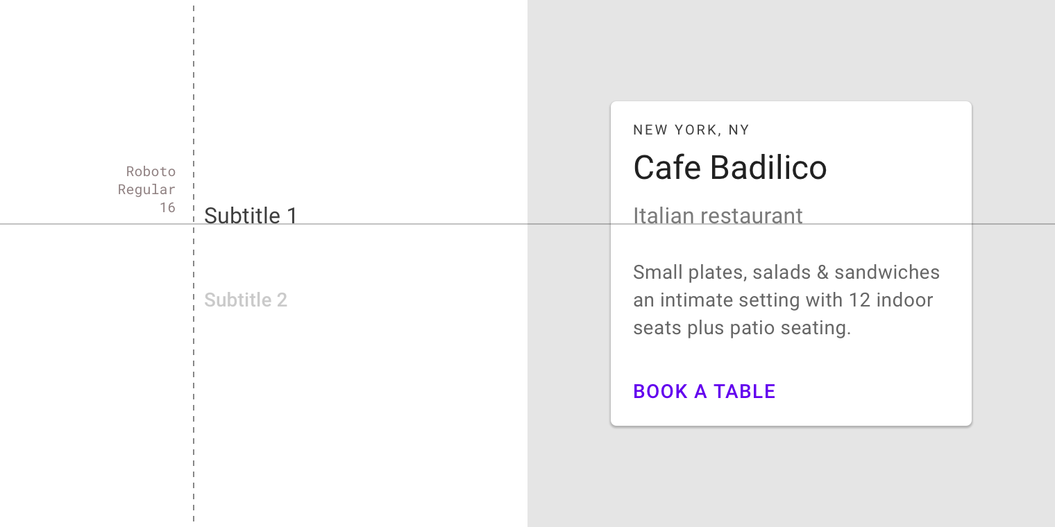
Subtitles are smaller than headlines. They are typically reserved for medium-emphasis text used in shorter text strings.
Body and smaller text
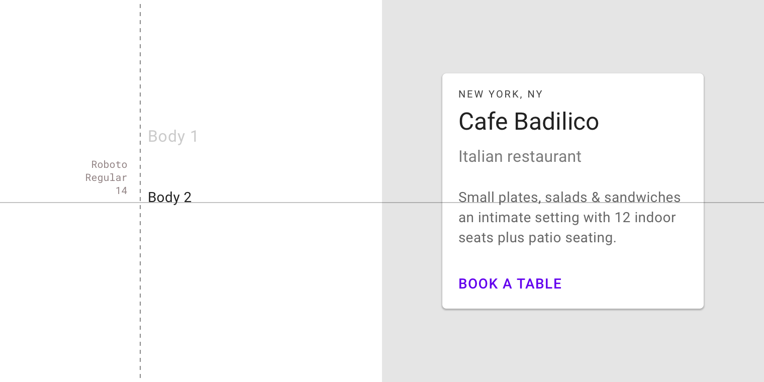
Body text 1-2 is typically used for longform writing. It should be optimized for small text sizes.
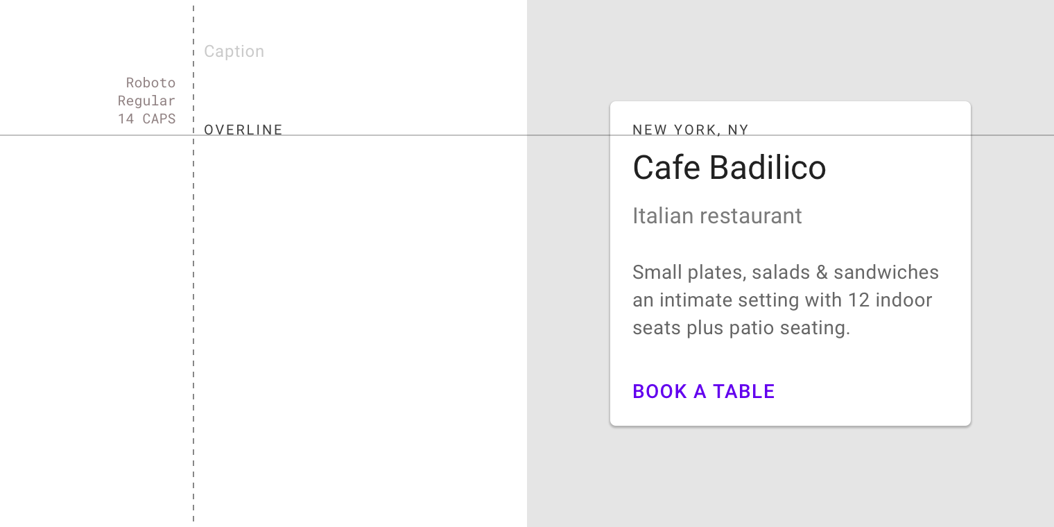
Caption and overline text are the smallest font sizes. They are used sparingly to annotate imagery or to provide a brief introduction to a headline.
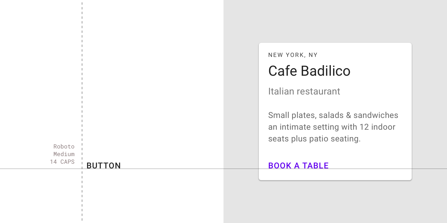
Button text is typically used in text buttons, outlined buttons, and contained buttons.
Shape
The shape system supports two types of shapes that can be applied to component corners to suit your brand and app: rounded shapes and cut shapes.
- Rounded shapes have curved corners
- Cut shapes have angled corners
These shapes can be applied to corners of a component, to create either a symmetrical (all corners use the same shape) or asymmetrical effect (not every corner uses the same shape). Corners can customize their size and shape type.
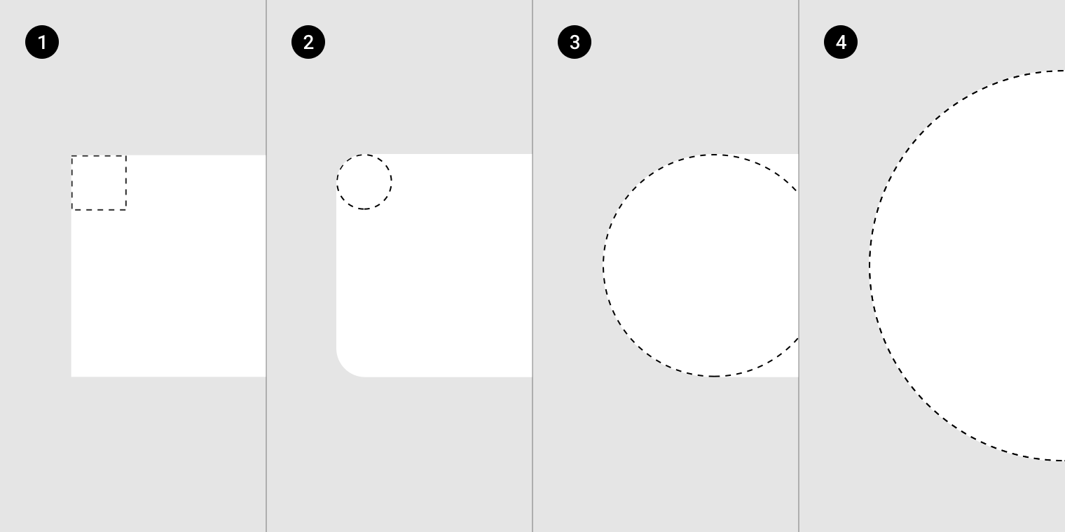
Scaled to 500%. The height of the shapes in images 1-3 is 36dp. The height of the shape in image 4 is 64dp.
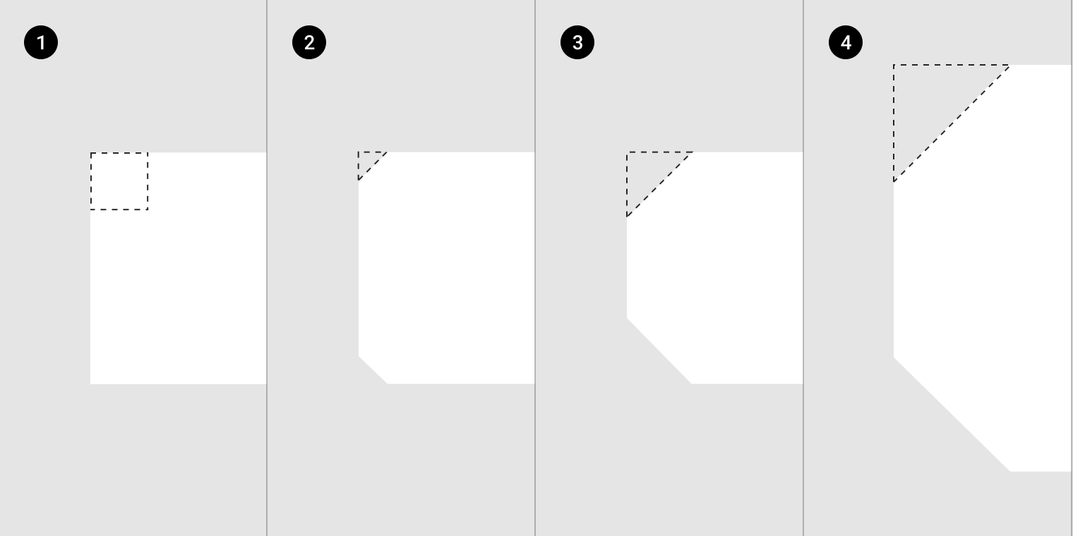
Scaled to 500%. The height of the shapes in images 1-3 is 36dp. The height of the shape in image 4 is 64dp.
Theming with shape
Play with the shapes of small, medium, and large components using the shape customization tool.
Shape categories and overrides
Components are grouped into categories based on their size. Changes made to a category’s values (rather than a specific component) are applied to all components in that category.
Changes made to a specific component’s values override values inherited from that shape’s category, enabling individual components to use different shapes than the category’s values.
Rounded shapes
Components such as cards, menus, snackbars, tooltips, dialogs, and buttons all use 4dp rounded corners as part of the baseline Material theme.
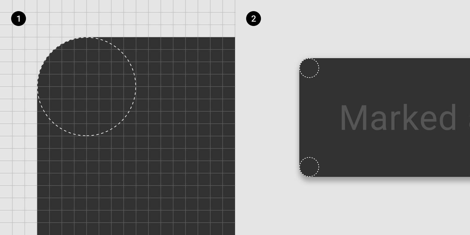
2. Zoomed at 400%
The roundest components have a baseline radius of 50%, such as pill-shape chips and circular floating action buttons.
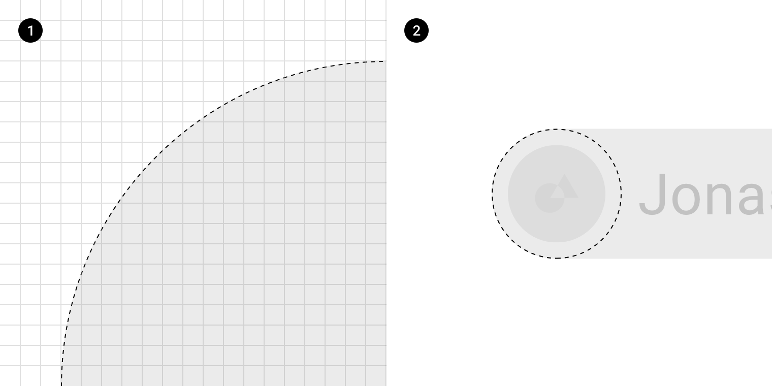
2. Zoomed at 400%
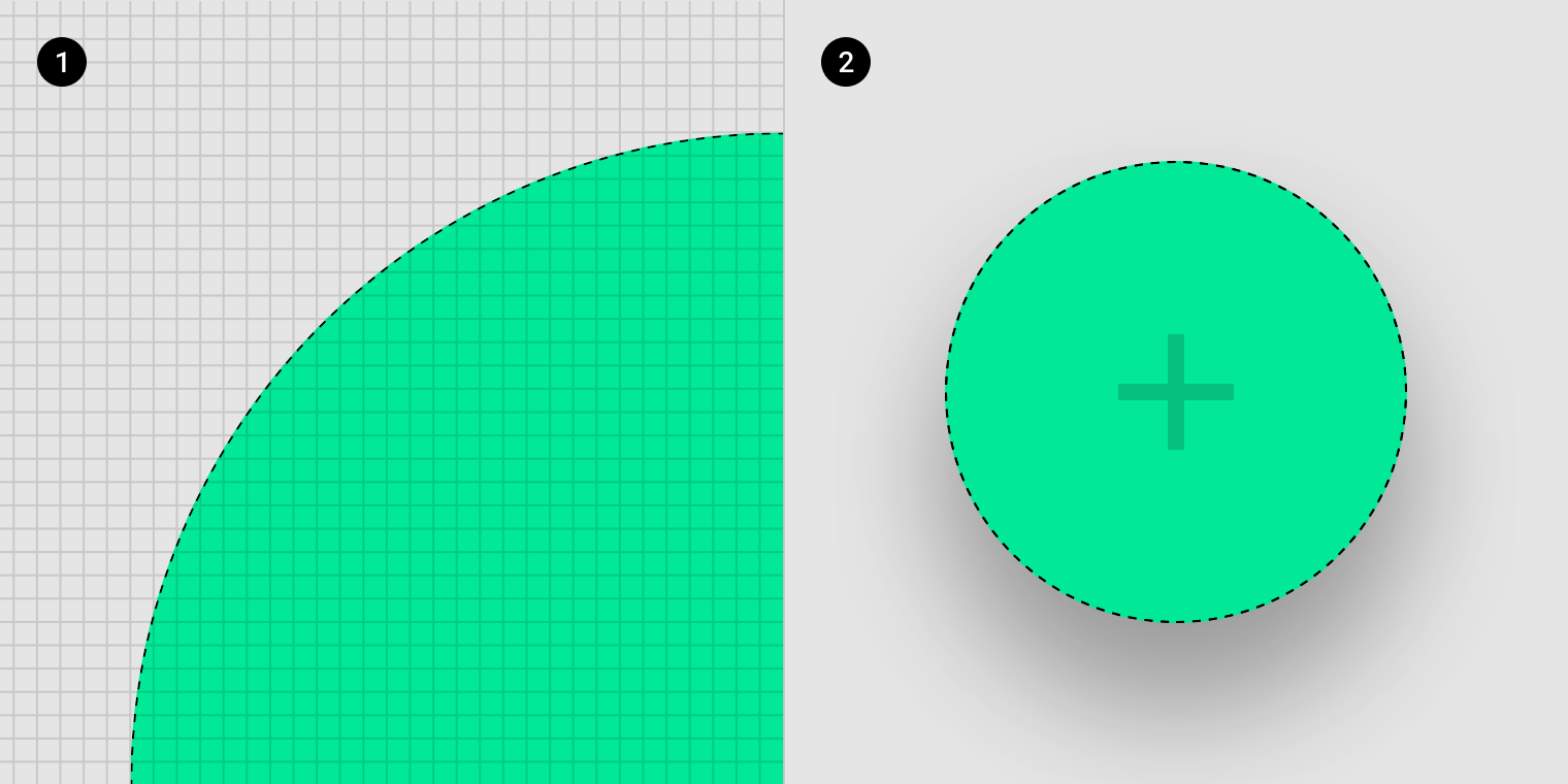
2. Zoomed at 400%
Square shapes
Components with square shapes have 0dp rounded corners in the baseline Material theme, such as full-screen bottom sheets with square, or 90-degree angle, corners.
Cut 0dp corners and rounded 0dp corners are the same square shape and can be used interchangeably.
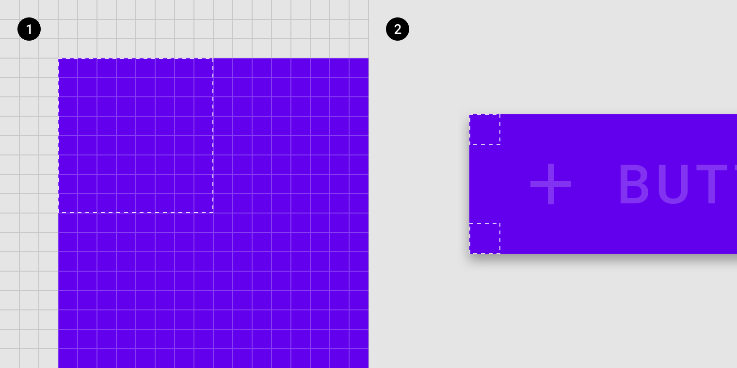
2. Zoomed at 400%
Cut shapes
Component corners can be straight cut shapes which are always at a 45-degree angle. These corners can be different lengths, measured from the 0dp rounded corner, going along the outline of the shape.
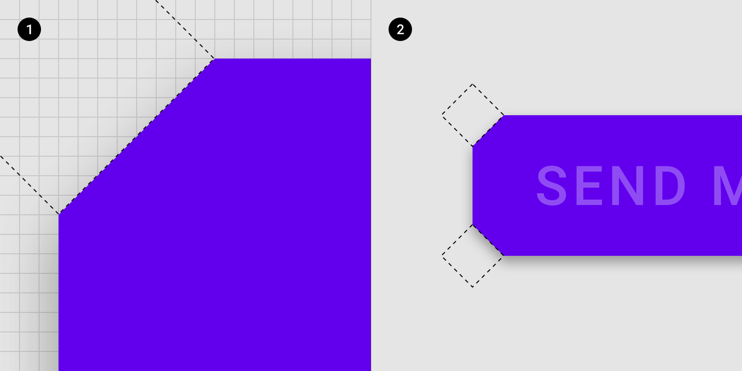
2. Zoomed at 400%
For example, larger surfaces like cards can have larger cuts, while buttons can have smaller cuts. Determine the best size for each component by considering your brand, component size, and amount of legible area required.
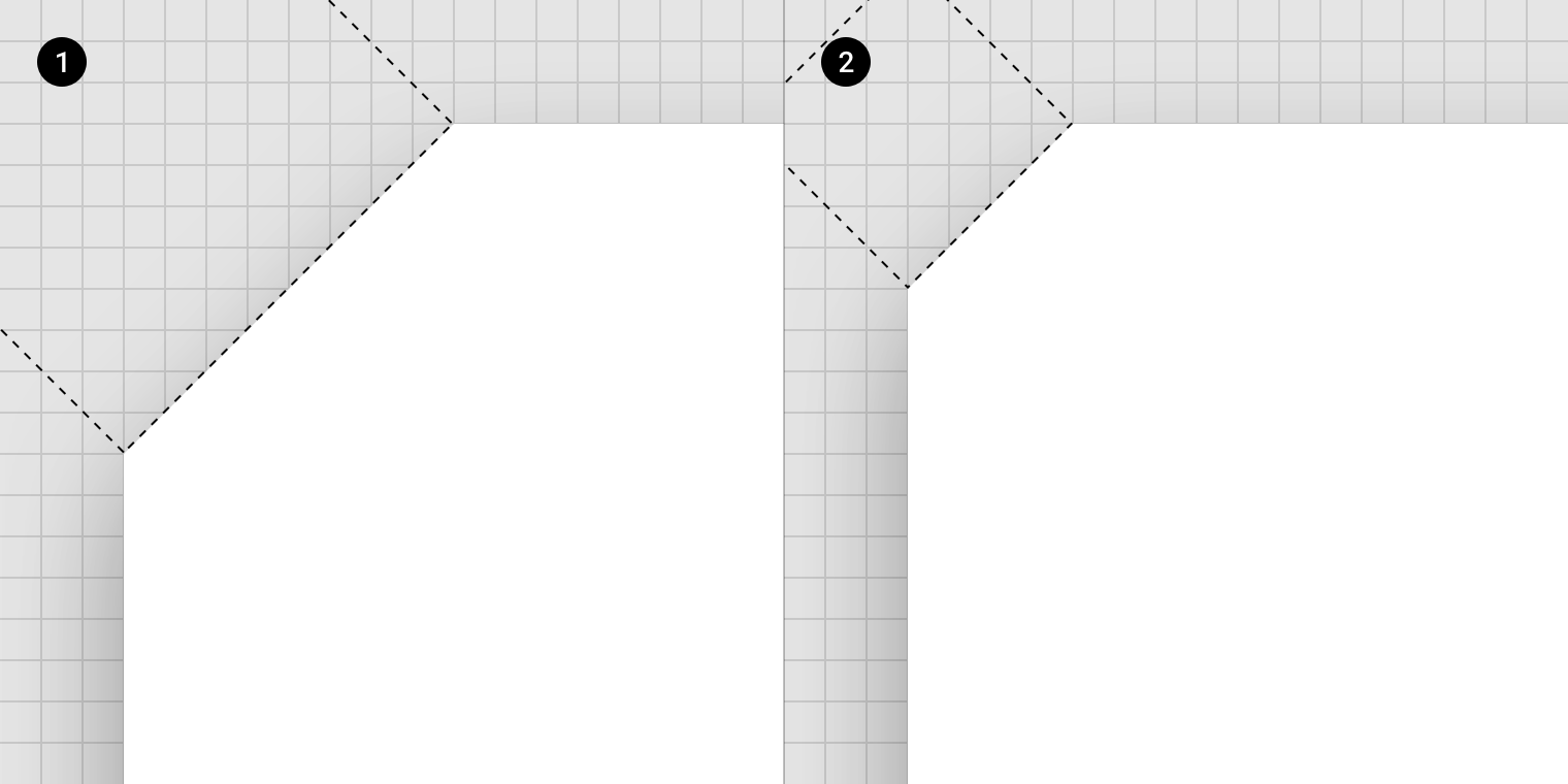
2. Small cut zoomed at 2000%
Icons
2. Sharp
3. Rounded
4. Outlined
5. Two-Tone
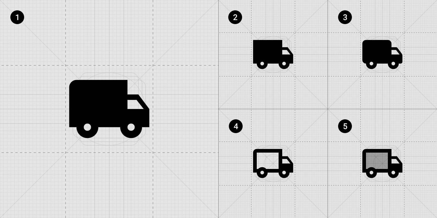
In addition to the original filled Material Design Icons, four additional icon themes are available. Each icon set should be used consistently across an app to maintain visual consistency, without mixing multiple icon sets in a single UI.
Theming with icons
Select an icon set from five different themes:
- Filled icons
- Sharp icons
- Rounded icons
- Outlined icons
- Two-tone icons
Icon types
Filled icons
The filled icon set is the original set of Material icons.
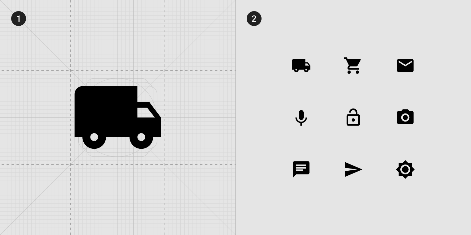
2. Filled set samples
Sharp icons
The sharp icon set has eliminated the corner radius from the filled icons.
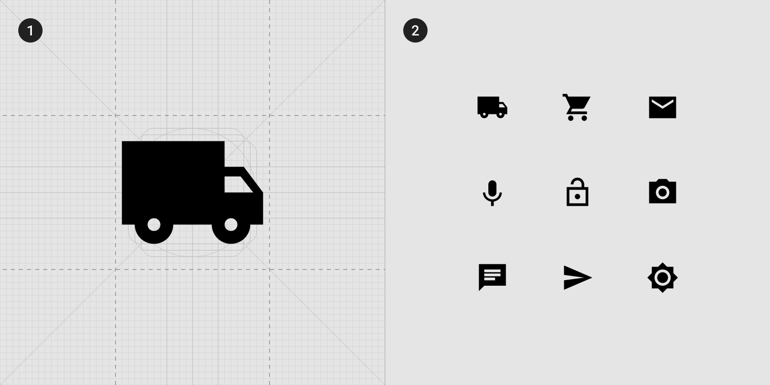
2. Sharp set samples
Rounded icons
The rounded icon set shares the same 2dp radii with the filled set for its exterior corners. There is an additional 1dp radii for strokes, the interior corners, and counter area.
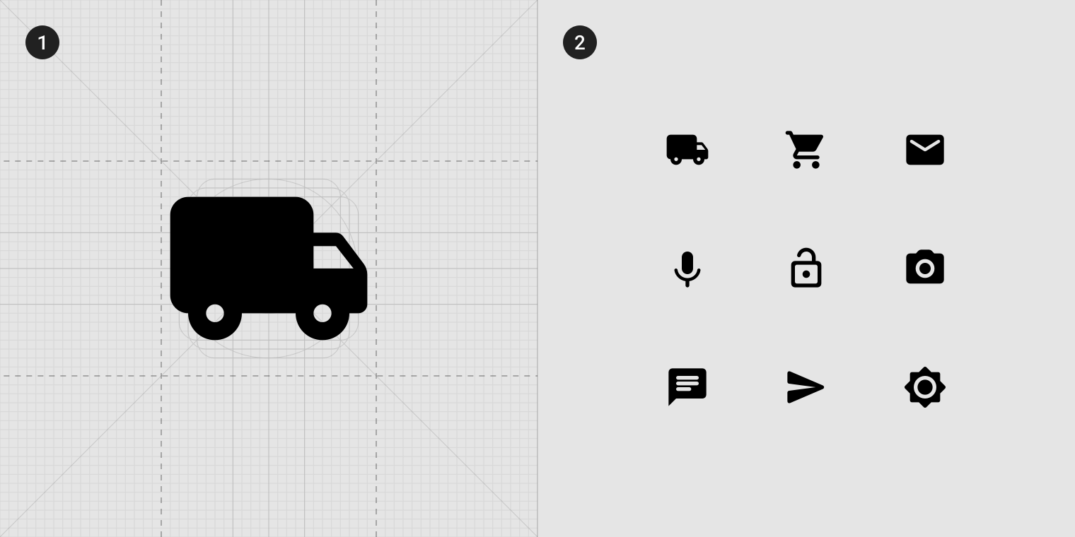
2. Rounded set samples
Outlined icons
The outlined icon set eliminates a majority of fills, converting most icons to 2dp strokes, reducing their visual weight. These can also be used to represent state, such as combining them with filled icons to show a selected state.
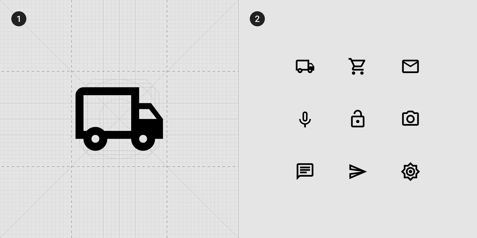
2. Outlined set samples
Two-tone icons
The two-tone icon set uses the same color at varying opacities for the stroke and fill.
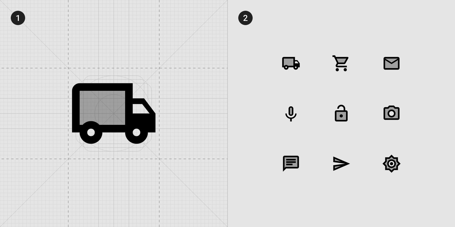
2. Two-Tone set samples