Skip to content
Material Design 2
Main Navigation
v3
v2
v1

English

简体中文
繁體中文
Español
Français
Русский
Português – Brasil
Deutsch
日本語
한국어
Italiano
Polski
Türkçe
čeština
magyar

English

简体中文
繁體中文
Español
Français
Русский
Português – Brasil
Deutsch
日本語
한국어
Italiano
Polski
Türkçe
čeština
magyar

Appearance

Sidebar Navigation

Material System

Introduction

Material studies

About our Material studies

Basil

Crane

Fortnightly

Owl

Rally

Reply

Shrine

Material Foundation

Environment

Surfaces

Elevation

Light and shadows

Layout

Understanding layout

Pixel density

Responsive layout grid

Spacing methods

Component behavior

Applying density

Navigation

Understanding navigation

Navigation transitions

Search

Color

The color system

Applying color to UI

Color usage

Text legibility

Dark theme

Typography

The type system

Understanding typography

Language support

Sound

About sound

Applying sound to UI

Sound attributes

Sound choreography

Iconography

Product icons

System icons

Animated icons

Shape

About shape

Shape and hierarchy

Shape as expression

Shape and motion

Applying shape to UI

Motion

Understanding motion

The motion system

Speed

Choreography

Customization

Interaction

Gestures

Selection

States

Communication

Confirmation & acknowledgement

Data formats

Data visualization

Empty states

Help & feedback

Imagery

Launch screen

Onboarding

Offline states

Writing

Machine learning

Machine learning patterns

Object detection: live camera

Object detection: static image

Barcode Scanning

Material Guidelines

Material Theming

Overview

Implementing your theme

Usability

Accessibility

Bidirectionality

Platform guidance

Android bars

Android fingerprint

Android haptics

Android icons

Android navigating between apps

Android notifications

Android permissions

Android slices

Android split-screen

Android swipe-to-refresh

Android text selection toolbar

Android widget

Cross-platform adaptation

Components

App bars: bottom

App bars: top

Backdrop

Banners

Bottom navigation

Buttons

Buttons: floating action button

Cards

Checkboxes

Chips

Data tables

Date pickers

Dialogs

Dividers

Image lists

Lists

Menus

Navigation drawer

Navigation rail

Progress indicators

Radio buttons

Sheets: bottom

Sheets: side

Sliders

Snackbars

Switches

Tabs

Text fields

Time pickers

Tooltips

On this page

Android icons ​

Android O icons represent your app on a device's Home and All Apps screens.

Usage ​

The following guidelines describe how icons can receive unique visual treatments, animations, and behaviors.

Providing icons ​

Launcher icons are provided to the Google Play store, with the following requirements:

  • Icon drawables in a PNG or vector format
  • Background and foreground layers without mask or background shadows
  • All layers must exceed the base icon shape by 50%

The OEM requirements include:

  • One shape for masking any icons that are displayed on an OEM’s platform
  • An outer shadow (optional)

Keyline shapes ​

Keyline shapes ​

Keyline shapes are used across all app icons to maintain consistent visual proportions.
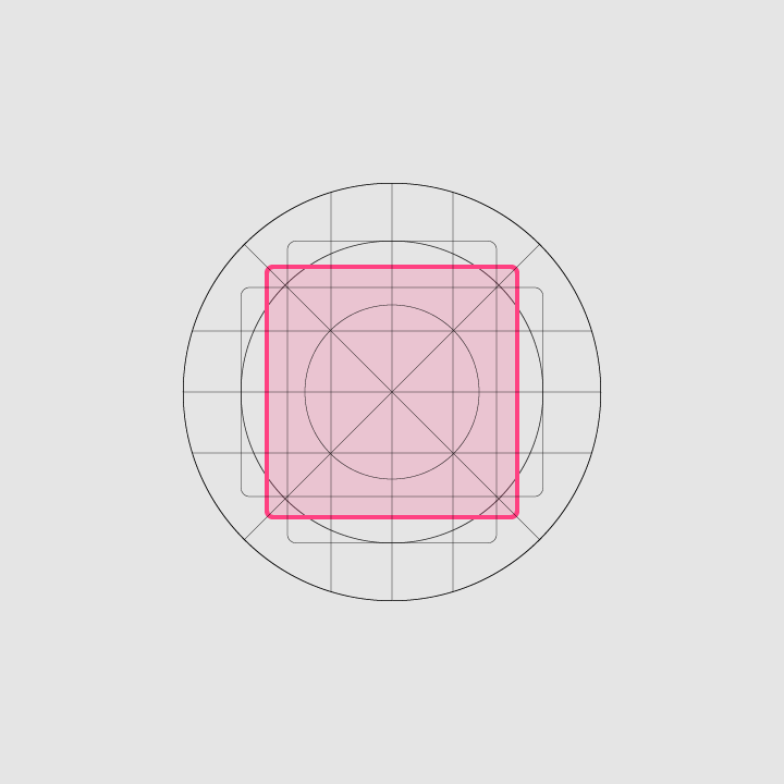
Square, Height: 44dp, Width: 44dp, Corner radius: 4dp
Square
Height: 44dp
Width: 44dp
Corner radius: 4dp
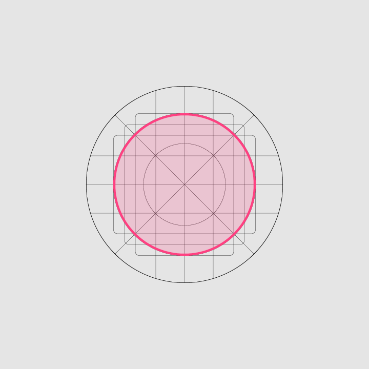
Keyline shapes: circle, Diameter: 52dp
Circle
Diameter: 52dp

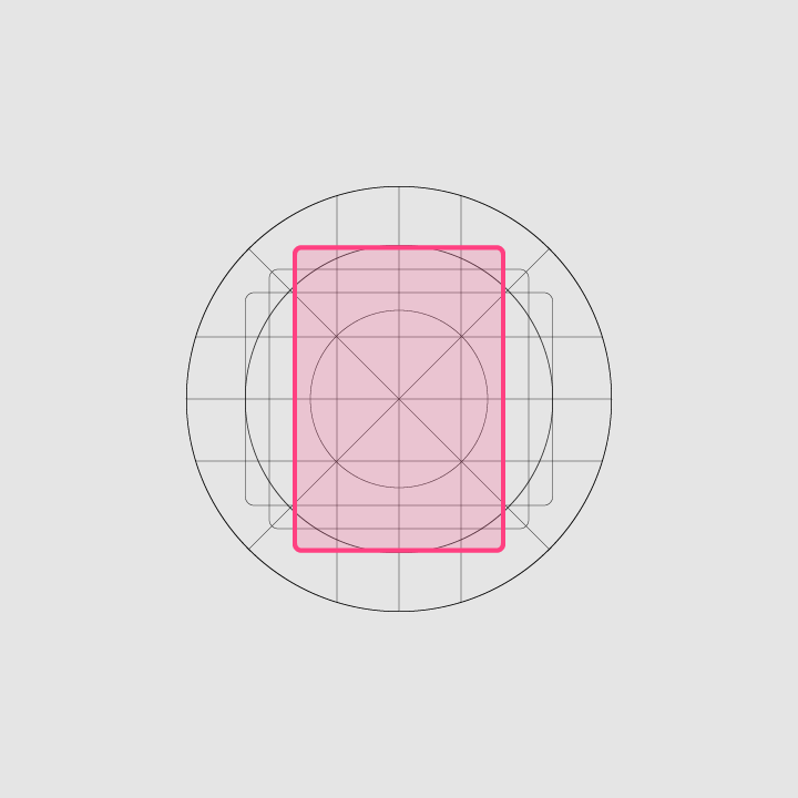
Vertical rectangle, Height: 52dp, Width: 36dp, Corner radius: 4dp
Vertical rectangle
Height: 52dp
Width: 36dp
Corner radius: 4dp
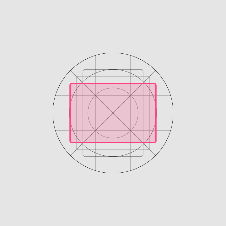
Horizontal rectangle, Height: 36dp, Width: 52dp, Corner radius: 4dp
Horizontal rectangle
Height: 36dp
Width: 52dp
Corner radius: 4dp

Specs ​

Layers ​

Icons consist of two layers: a foreground and a background. Each layer can animate and receive treatments independently from the other layer.
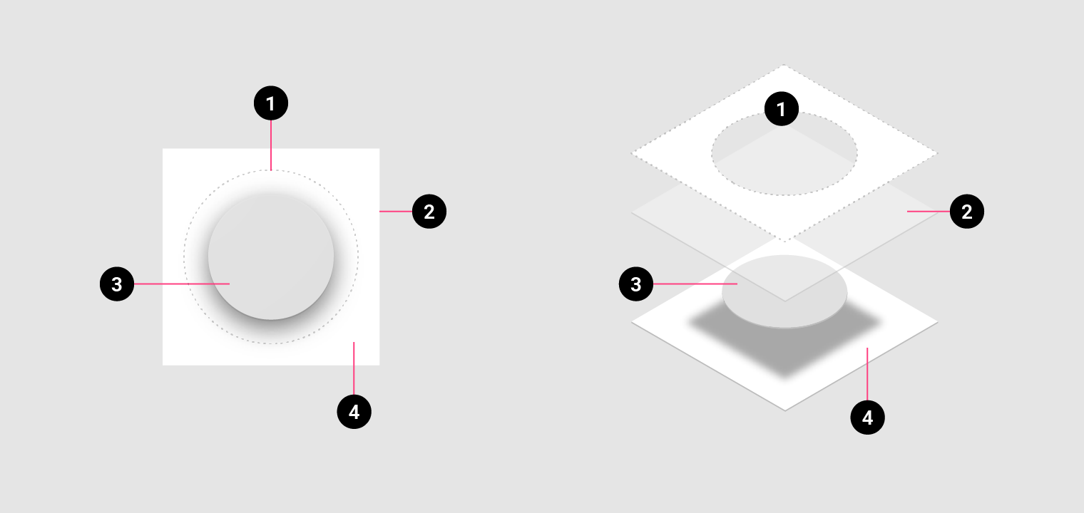
Layers: oEM Mask
1. OEM Mask
2. Finishing layer
3. Foreground (App icon); 108 x 108 dp; 72dp masked section; Transparency optional
4. Background (Icon shadow); 108 x 108 dp; 72dp masked section; Must be Opaque

Shadows ​

When designing new icons, lighting and shadow effects should be consistent with other icons on the platform. Contact shadows are placed on elements to make them stand out from the background.

Illustrator mode: Normal
Opacity: 20%
X Offset: 0dp
Y Offset: 4dp
Blur: 4dp
Color: Refer to tint, shade and shadow values
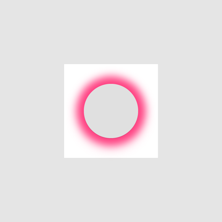
A contact shadow is a soft shadow surrounding an element
A contact shadow is a soft shadow surrounding an element.

Edge tint and shade ​

To provide a sense of depth, treatments are applied to the top and bottom edges of elements.

  • Tinted edges highlight the top edge of elements (the left, right, and bottom edges are not tinted)
  • Shaded edges display dark bottom edges on elements (the left, right, and top edges are not shaded)

Tinted edge, Height: 1dp, Opacity: 20%, Color: White (#FFFFFF)
Tinted edge

Height: 1dp
Opacity: 20%
Color: White (#FFFFFF)
Shaded edge, Height: 1dp, Opacity: 20%, Color: See tint, shade, and shadow values
Shaded edge

Height: 1dp
Opacity: 20%
Color: See tint, shade, and shadow values

Finishing layer ​

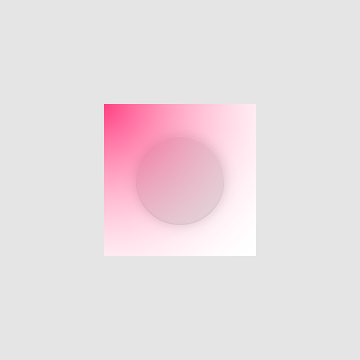
A finishing layer is placed above the foreground layer.

Specs

  • Angle: 45º
  • Midpoint: 32%
  • Color: Refer to tint, shade and shadow values
Illustrator gradient toolOpacityLocation
Slider 110%0%
Slider 20%100%
Finishing layer above foreground layer

OEM masks ​

Without affecting icon layout, OEMs can apply their own custom masks to icons using a 72 x 72 dp masked area. The convex shapes include both a circular mask and a square mask.

OEM mask shapes
Final icon shapes
Pager
Previous pageAndroid haptics
Next pageAndroid navigating between apps

Released under the Apache-2.0

Copyright © 2018-Present Google

https://m2.material.io/design/platform-guidance/android-icons.html

Released under the Apache-2.0

Copyright © 2018-Present Google