Skip to content
Material Design 2
Main Navigation
v3
v2
v1

English

简体中文
繁體中文
Español
Français
Русский
Português – Brasil
Deutsch
日本語
한국어
Italiano
Polski
Türkçe
čeština
magyar

English

简体中文
繁體中文
Español
Français
Русский
Português – Brasil
Deutsch
日本語
한국어
Italiano
Polski
Türkçe
čeština
magyar

Appearance

Sidebar Navigation

Material System

Introduction

Material studies

About our Material studies

Basil

Crane

Fortnightly

Owl

Rally

Reply

Shrine

Material Foundation

Environment

Surfaces

Elevation

Light and shadows

Layout

Understanding layout

Pixel density

Responsive layout grid

Spacing methods

Component behavior

Applying density

Navigation

Understanding navigation

Navigation transitions

Search

Color

The color system

Applying color to UI

Color usage

Text legibility

Dark theme

Typography

The type system

Understanding typography

Language support

Sound

About sound

Applying sound to UI

Sound attributes

Sound choreography

Iconography

Product icons

System icons

Animated icons

Shape

About shape

Shape and hierarchy

Shape as expression

Shape and motion

Applying shape to UI

Motion

Understanding motion

The motion system

Speed

Choreography

Customization

Interaction

Gestures

Selection

States

Communication

Confirmation & acknowledgement

Data formats

Data visualization

Empty states

Help & feedback

Imagery

Launch screen

Onboarding

Offline states

Writing

Machine learning

Machine learning patterns

Object detection: live camera

Object detection: static image

Barcode Scanning

Material Guidelines

Material Theming

Overview

Implementing your theme

Usability

Accessibility

Bidirectionality

Platform guidance

Android bars

Android fingerprint

Android haptics

Android icons

Android navigating between apps

Android notifications

Android permissions

Android slices

Android split-screen

Android swipe-to-refresh

Android text selection toolbar

Android widget

Cross-platform adaptation

Components

App bars: bottom

App bars: top

Backdrop

Banners

Bottom navigation

Buttons

Buttons: floating action button

Cards

Checkboxes

Chips

Data tables

Date pickers

Dialogs

Dividers

Image lists

Lists

Menus

Navigation drawer

Navigation rail

Progress indicators

Radio buttons

Sheets: bottom

Sheets: side

Sliders

Snackbars

Switches

Tabs

Text fields

Time pickers

Tooltips

On this page

Shape as expression ​

Shape can communicate an element’s state or help express a brand.

Communicating state ​

Shape and meaning ​

Shape can communicate many things about an element, including its current state, the result of a user interaction, or other changes in an app. When used in these ways, shape should be used consistently across the same state and interactions, so that a specific shape means the same thing every time it’s encountered.

Shape and interaction ​

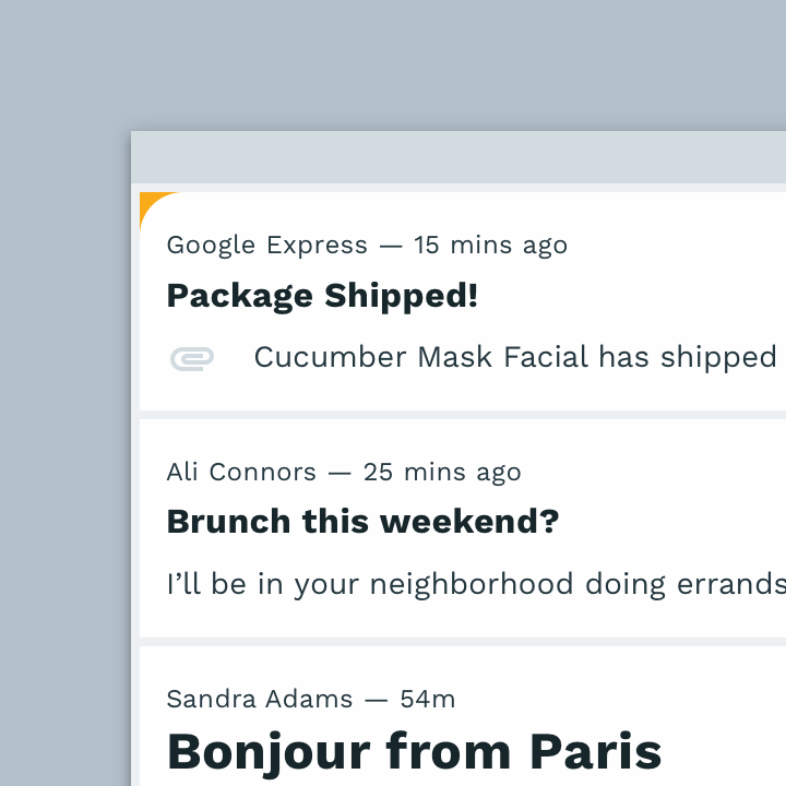
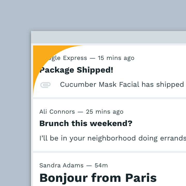
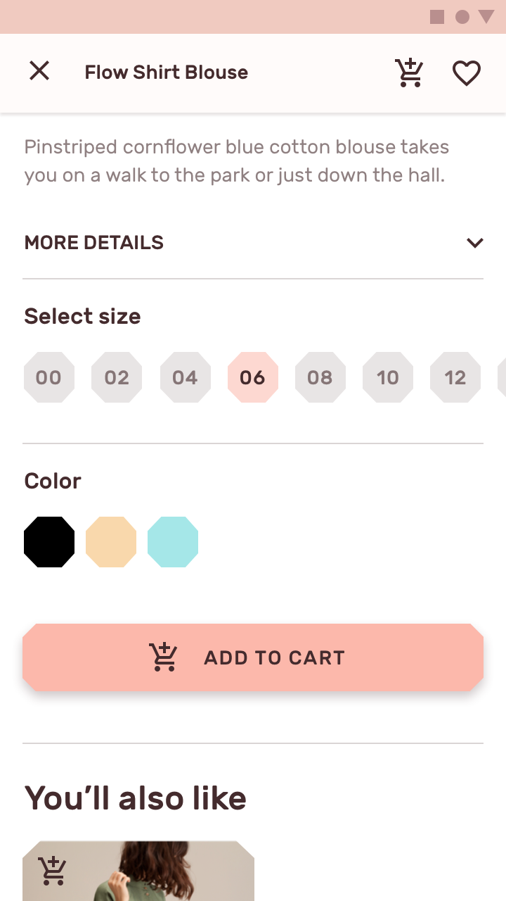
To attach meaning to a specific shape, shape changes can be expressed in tandem with a user-initiated action or state change. For example, morph a shape upon selection, or introduce the shape with an icon or other indicator, to reinforce a shape’s meaning.

Non-interactive shapes ​

If a shape isn’t interactive, avoid using shapes with sizes large enough to appear interactive. For example, a small triangular shape on a card shouldn’t be large enough to be mistaken for a tap target if it’s not one.

Do
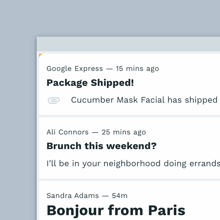
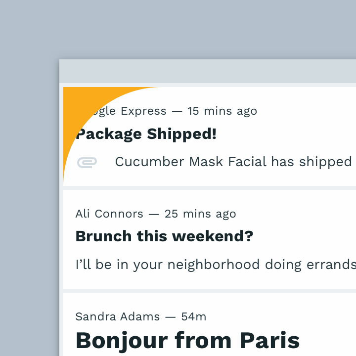
Shape changes should be clearly linked to a user interaction or other obvious cause. This list item’s shape changes upon passing a gesture threshold, eventually giving its left edge a rounded corner.

Don’t communicate state with shapes that are too small to be noticeable

Don't

Don’t communicate state with shapes that are too small to be noticeable.
Don’t communicate state with a shape large enough to provide a tap target if it’s not interactive

Don't

Don’t communicate state with a shape large enough to provide a tap target if it’s not interactive.

Caution: a shape can be used in ways that make it unclear whether it’s expressing a state or branding

Caution

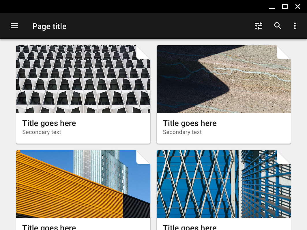
A shape can be used in ways that make it unclear whether it’s expressing a state or branding. These folded card corners don’t make it clear if the cards are selected, favorited, or simply expressing brand – because cards can express all of these states. To make meaning clearer, either:

• Clearly connect the change of the corner shape with a user action, like selection or favoriting
• Remove the folded shape, but keep the corner angle, to reduce the appearance that the folded shape is interactive
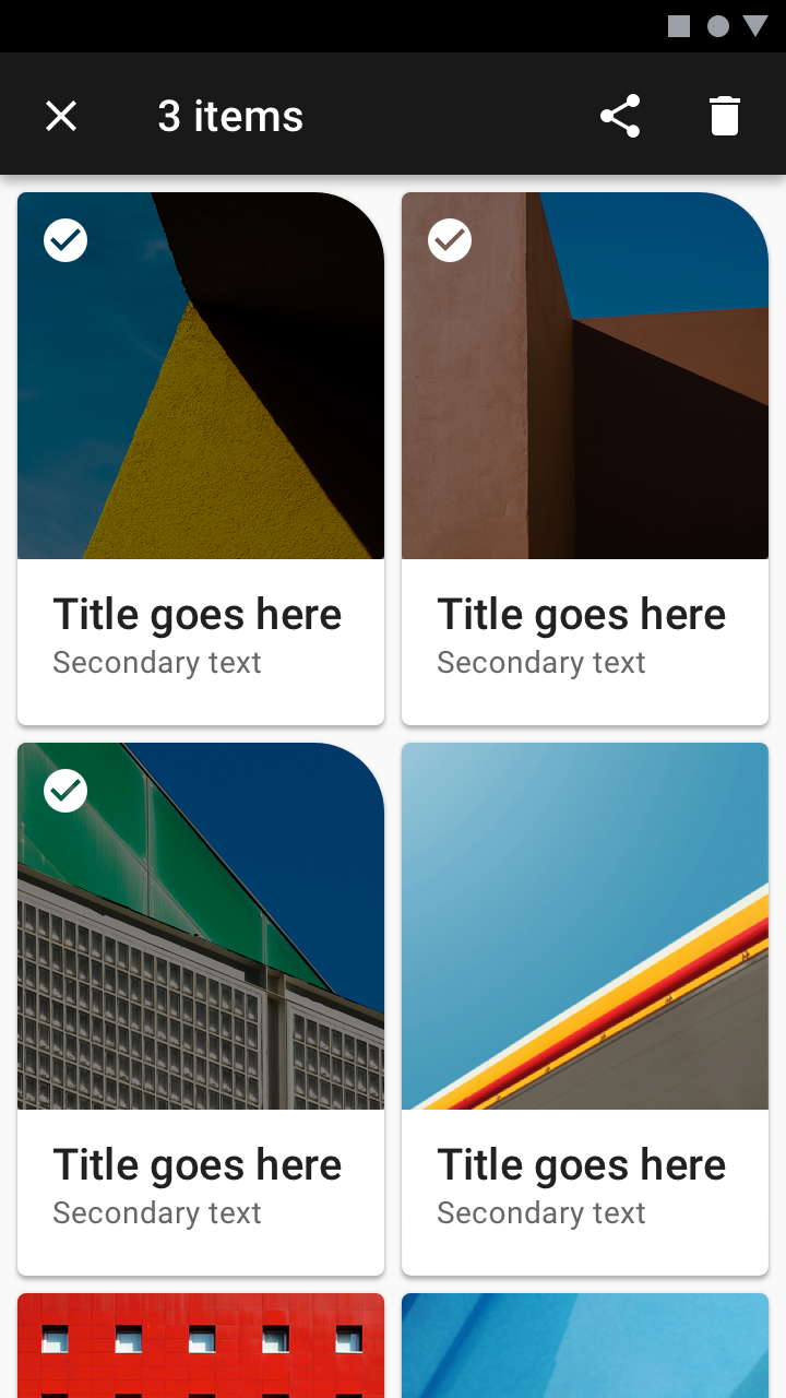
Do: use shape consistently, so that each shape expresses a single meaning

Do

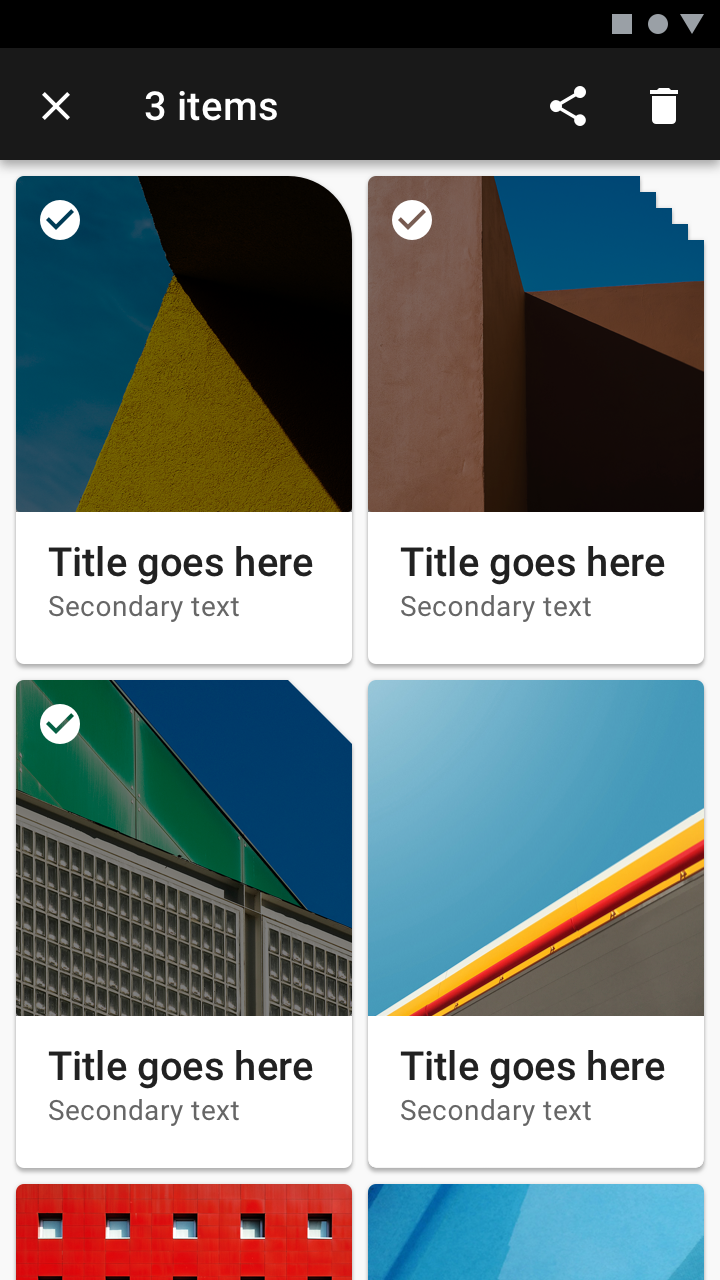
Use shape consistently, so that each shape expresses a single meaning. The rounded corner on selected cards helps the shape develop meaning.
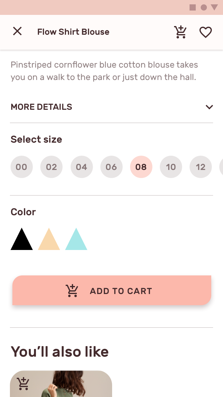
Caution: the inconsistent shapes on the corners in this card collection make it unclear if each shape represents something

Caution

The inconsistent shapes on the corners in this card collection make it unclear if each shape represents something different (such as distinct groupings) or is simply brand expression.

Expressing brand ​

Shape and brand expression ​

Branding with shape ​

Use shape in combination with other customizations, like color and typography, to develop your brand’s visual language. Similar, related shapes help unify brand expression across your app. Your app can use a shape family – a set of similar shapes such as oval variations of a circle, or the same angled corner at different scales – across its surfaces, components, and elements. The style of shapes in a shape family, such as organic or geometric forms, should match your brand.

Mixing shapes ​

When expressing brand with shape, avoid shapes that:

  • Imply interactivity
  • Inaccurately express state
  • Interfere with usability

Mixing both different shape styles, and different shapes altogether, can make it difficult to associate particular shapes with a brand.

Shape overuse ​

Overuse of a shape for branding purposes can make it less meaningful because that shape becomes common and less noticeable.
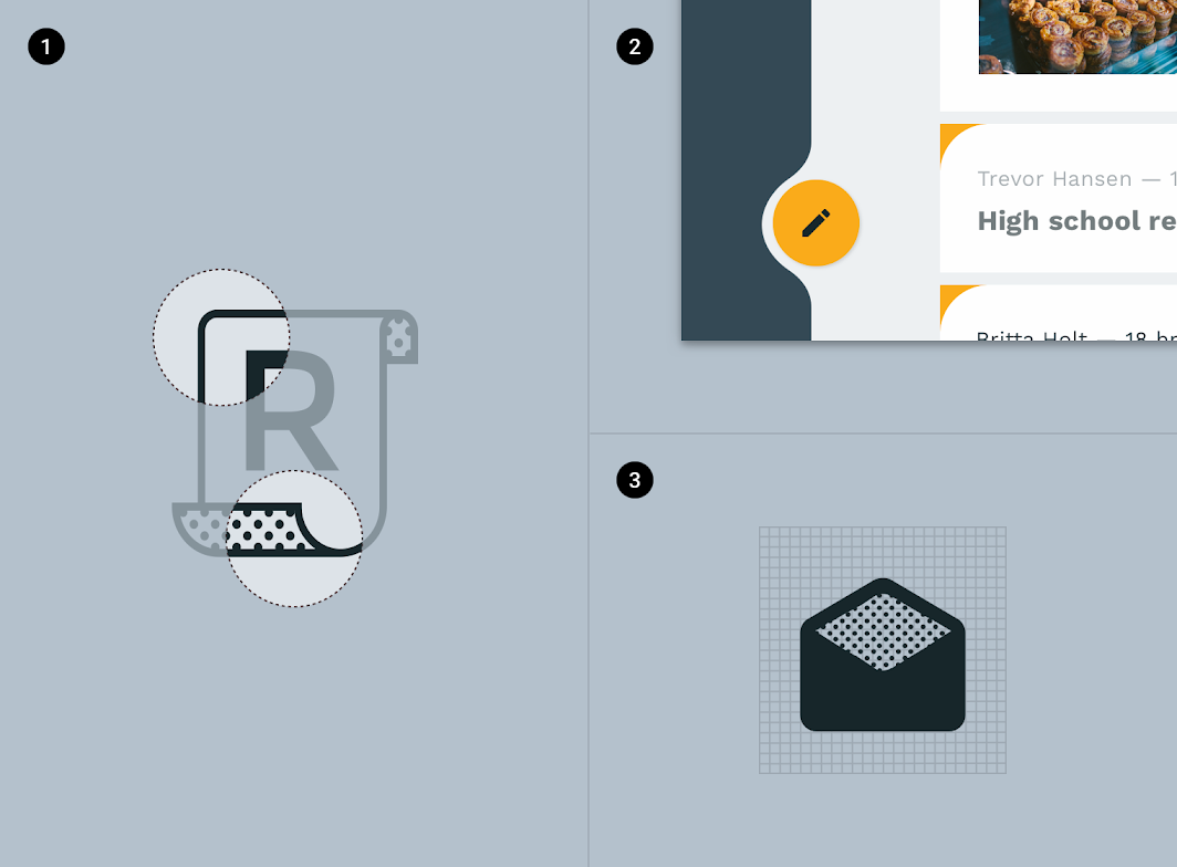
Do: consistent use of shape throughout a product contributes to a brand’s visual language

Do

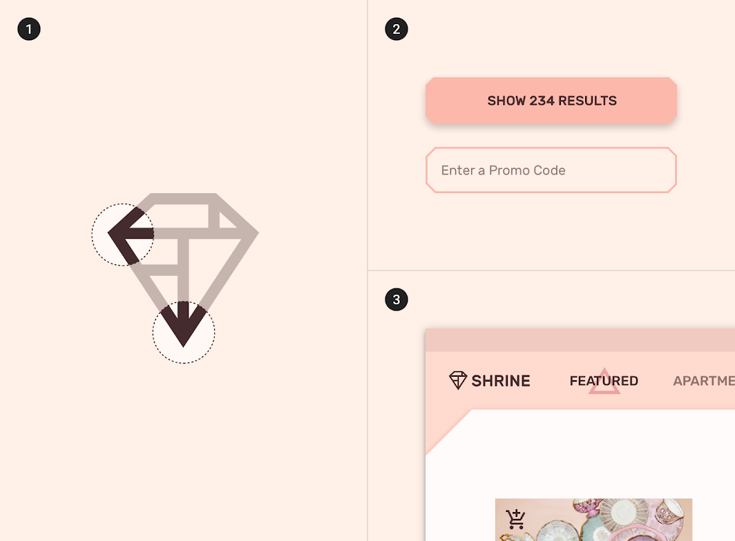
Consistent use of shape throughout a product contributes to a brand’s visual language. This product’s components use a shape based on its logo (1, 2).

Do: this product’s components use a geometric shape based on its logo (1, 2, 3)

Do

This product’s components use a geometric shape based on its logo (1, 2, 3).

Do: the curve of the corner reflects the color and curved edge of the logo, without affecting usability

Do

The curve of the corner reflects the color and curved edge of the logo, without affecting usability.
Don’t reduce the usability of a component when using shape to express brand

Don't

Don’t reduce the usability of a component when using shape to express brand. The size of this shape interferes with the usability of the list.

Caution: overuse of a single shape makes that shape common, and thus less noticeable, which reduces its impact on branding

Caution

Overuse of a single shape makes that shape common, and thus less noticeable, which reduces its impact on branding.
Don’t use shapes that don’t reflect a product’s shape family

Don't

Don’t use shapes that don’t reflect a product’s shape family.

Shape

Shrine is a retail app that uses Material Design components and Material Theming to express branding for a variety of fashion and lifestyle items.

Related article

Crane

Crane is a travel app that uses Material Design components and Material Theming to create a personalized, on-brand experience.

Related article

Reply

Reply is an email app that uses Material Design components and Material Theming to create an on-brand communication experience.

Related article

Fortnightly

Fortnightly is a news app that uses Material Design components and Material Theming to create an on-brand, content-focused experience.

Related article

Pager
Previous pageShape and hierarchy
Next pageShape and motion

Released under the Apache-2.0

Copyright © 2018-Present Google

https://m2.material.io/design/shape/shape-as-expression.html

Released under the Apache-2.0

Copyright © 2018-Present Google