

Responsive layout grid
Material Design's responsive layout grid adapts to screen size and orientation, ensuring consistency across layouts.
Columns, gutters, and margins
The responsive layout grid is made up of three elements: columns, gutters, and margins.
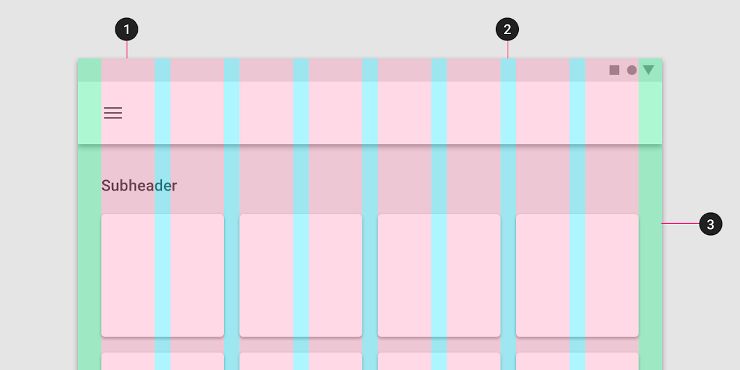
2. Gutters
3. Margins
Columns
Content is placed in the areas of the screen that contain columns.
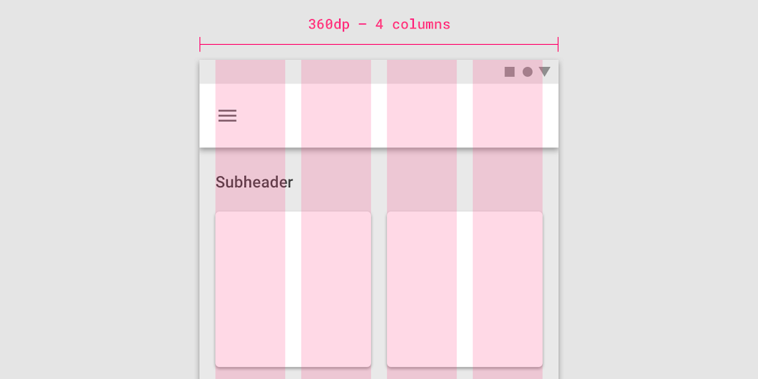
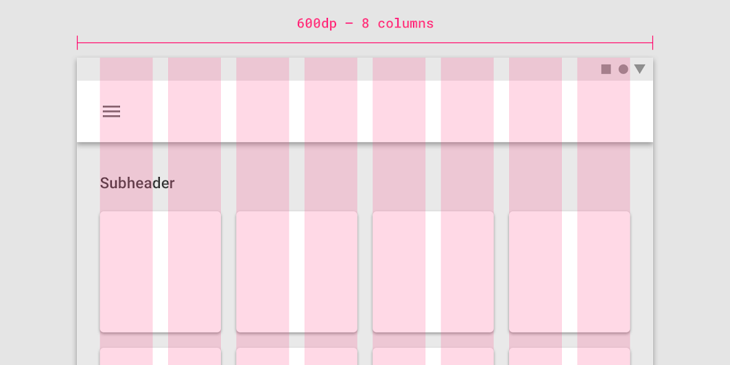
In responsive layouts, column width is defined with percentages, rather than fixed values. This allows content to adapt to any screen size. The number of columns displayed in the grid is determined by the breakpoint range, a range of predetermined screen sizes. A breakpoint can correspond with mobile, tablet, or other screen type.
Gutters
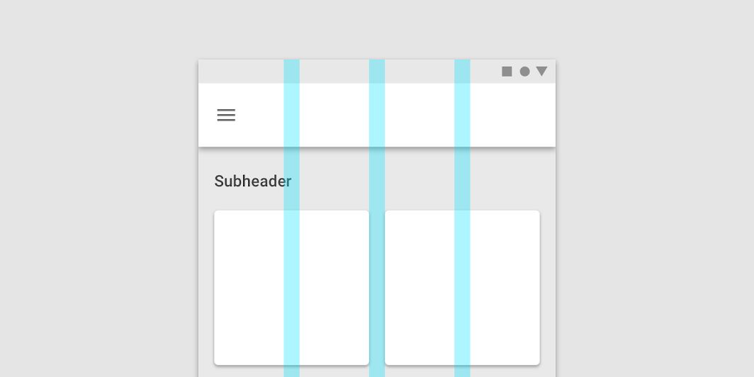
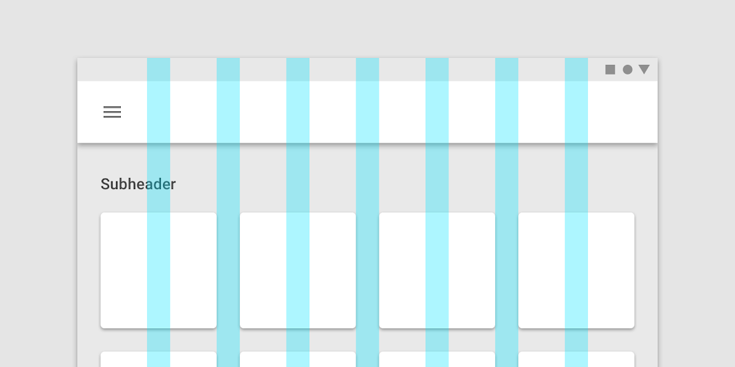
A gutter is the space between columns that helps separate content.
Gutter widths are fixed values at each breakpoint range. To better adapt to a given screen size, gutter widths can change at different breakpoints.
Wider gutters are more appropriate for larger screens, as they create more open space between columns.
Margins
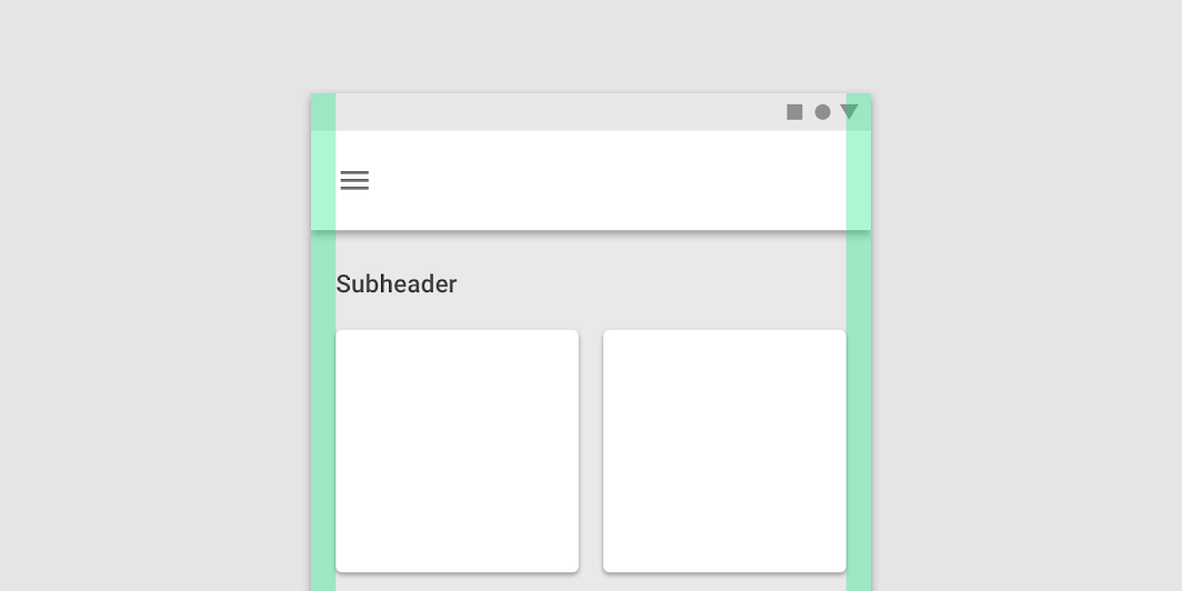
Margins are the space between content and the left and right edges of the screen.
Margin widths are defined using fixed or scaling values at each breakpoint range. To better adapt to the screen, the margin width can change at different breakpoints. Wider margins are more appropriate for larger screens, as they create more whitespace around the perimeter of content.
Grid customization
The layout grid can be adjusted to meet the needs of both your product and multiple device sizes.
Customizing gutters
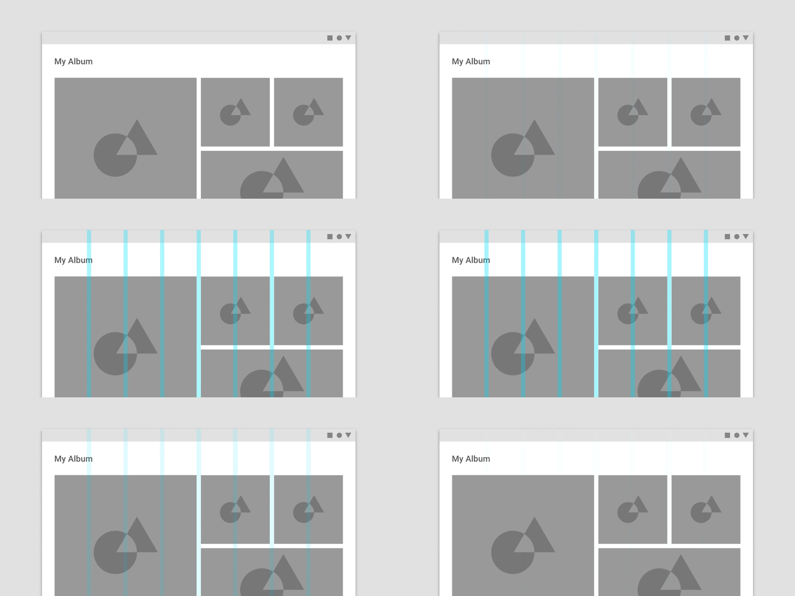
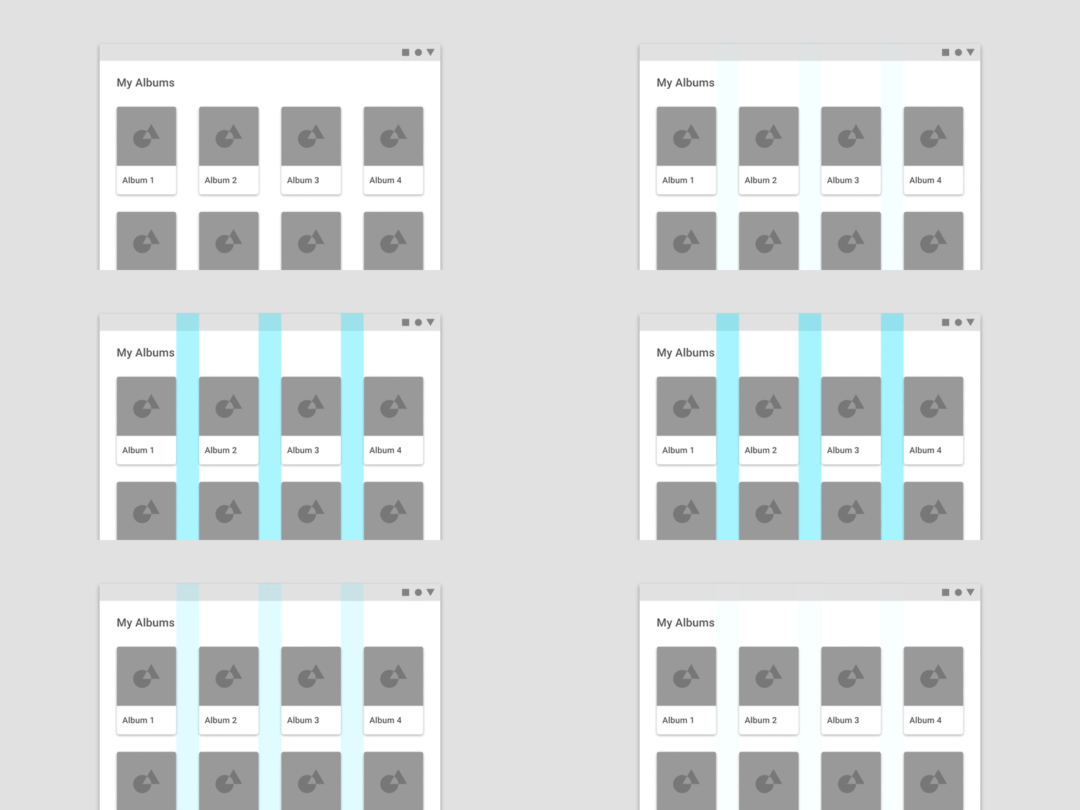
Gutters can be adjusted to create more or less space between the columns of a layout.
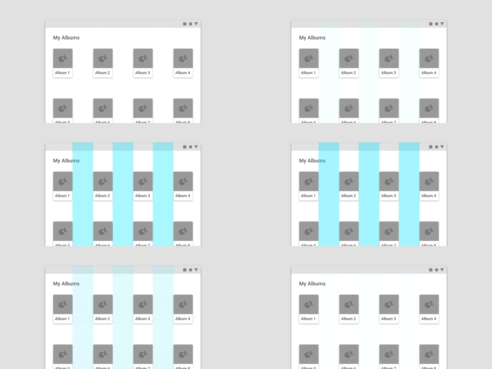
Don't
Gutters and margins
Within the same breakpoint, gutter and margin widths can be different from each other.
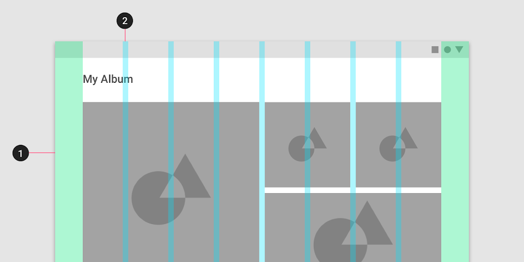
2. 8dp gutters
Horizontal grids
The Material Design layout grid can be customized for touch UIs that scroll horizontally. Columns, gutters, and margins are laid out from left to right, rather than top to bottom. The height of the screen determines the number of columns in a horizontal grid.
Horizontally scrolling UIs are uncommon on non-touch and web platforms.
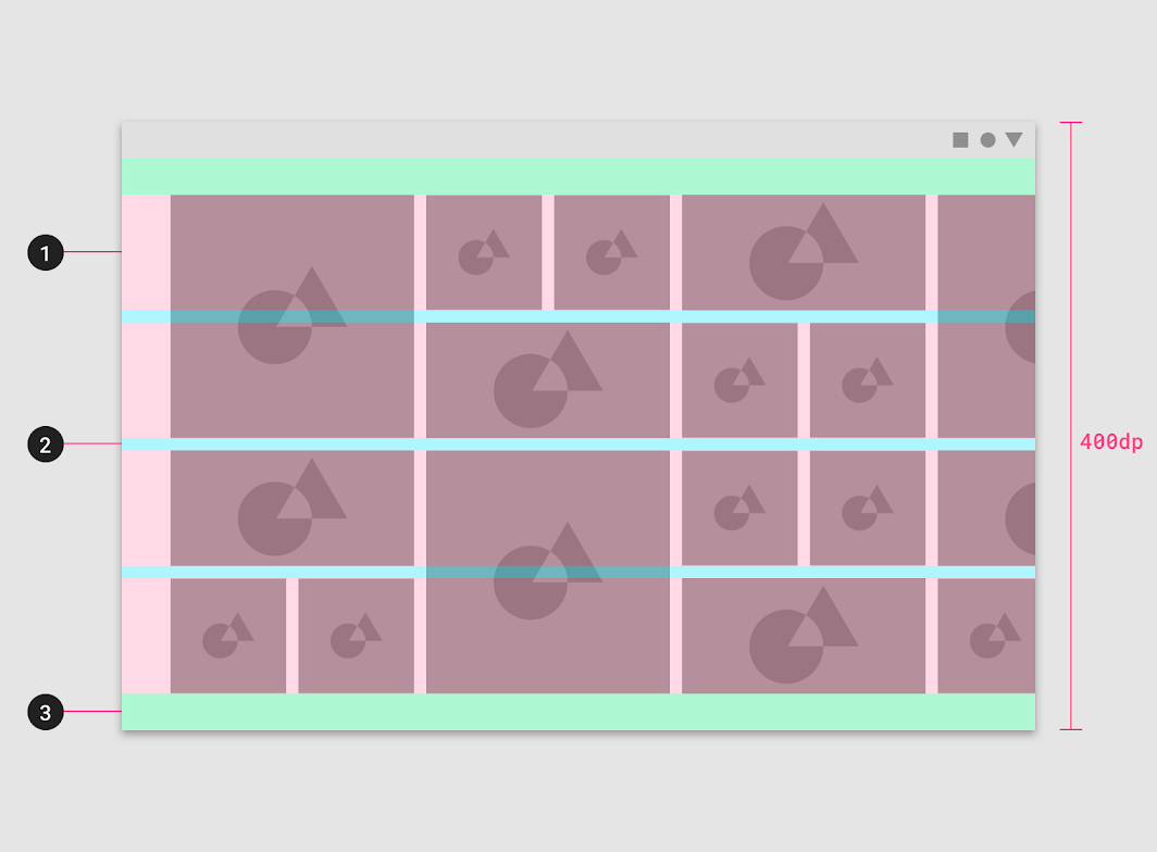
1. Columns
2. Gutters
3. Margins
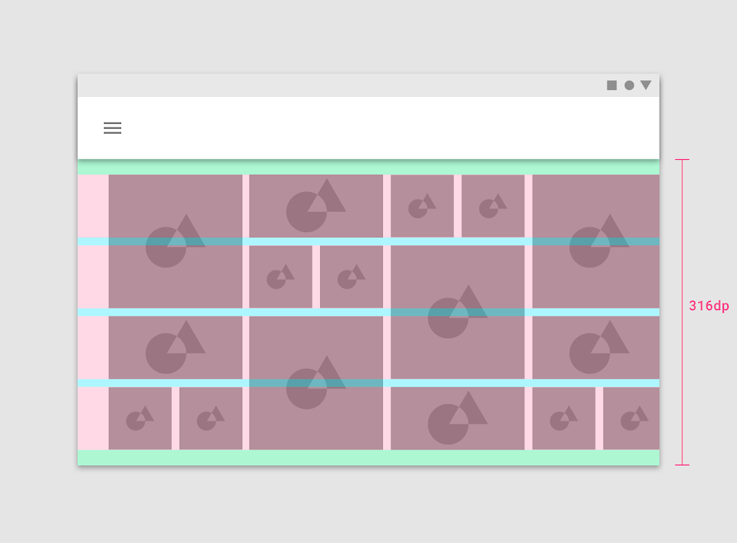
Horizontal grids can be positioned to accommodate different heights, allowing space for app bars or other UI regions at the top.
Breakpoints
A breakpoint is the screen size threshold determined by specific layout requirements. At a given breakpoint range, the layout adjusts to suit the screen size and orientation.
Material Design provides responsive layouts based on 4-column, 8-column, and 12-column grids, available for use across different screens, devices, and orientations.
Each breakpoint range determines the number of columns, and recommended margins and gutters for each display size.
Breakpoint system
The responsive layout grid is primarily used to organize content and components in a layout's body region. Layout regions are described in detail in the Understanding layout guidance.
When scaling a layout for different screen sizes or orientations, the responsive grid adjusts margin and body widths as well as the number of columns in the layout.
| Screen size | Margin | Body | Layout columns |
|---|---|---|---|
| Extra-small (phone) | |||
| 0-599dp | 16dp | Scaling | 4 |
| Small (tablet) | |||
| 600-904 | 32dp | Scaling | 8 |
| 905-1239 | Scaling | 840dp | 12 |
| Medium (laptop) | |||
| 1240-1439 | 200dp | Scaling | 12 |
| Large (desktop) | |||
| 1440+ | Scaling | 1040 | 12 |
At extra small breakpoints, margins have a baseline value of 16dp. The body remains responsive to increases in size. Upon reaching the next larger breakpoint, small (at 600dp wide), the margin increases to 32dp.
When the width of the body reaches 840dp, the margins become flexible and increase up to a maximum margin width of 200dp. After the maximum width is reached, the body region once again becomes responsive, continuing to scale horizontally. At large breakpoints, the body region can maintain a maximum width while margins again scale horizontally.
Layout anatomy
Layout regions are the foundation for a composition. They're building blocks for a layout and are composed of elements and components that share similar functions. Layout regions can also be composed of other smaller containers as well.
A large screen layout structure is based on three main elements:
- Body
- Navigation
- App bars
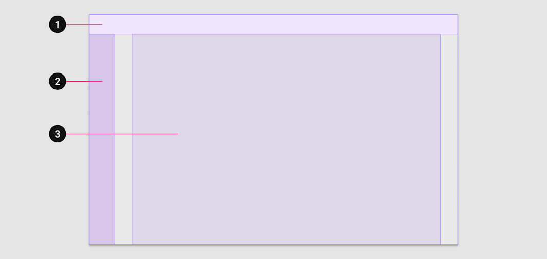
2. Navigation
3. Body
Material Design's responsive layout grid primarily informs the layout's body region. Each of the three layout regions are described in detail in the Understanding layout guidance.