

Shrine
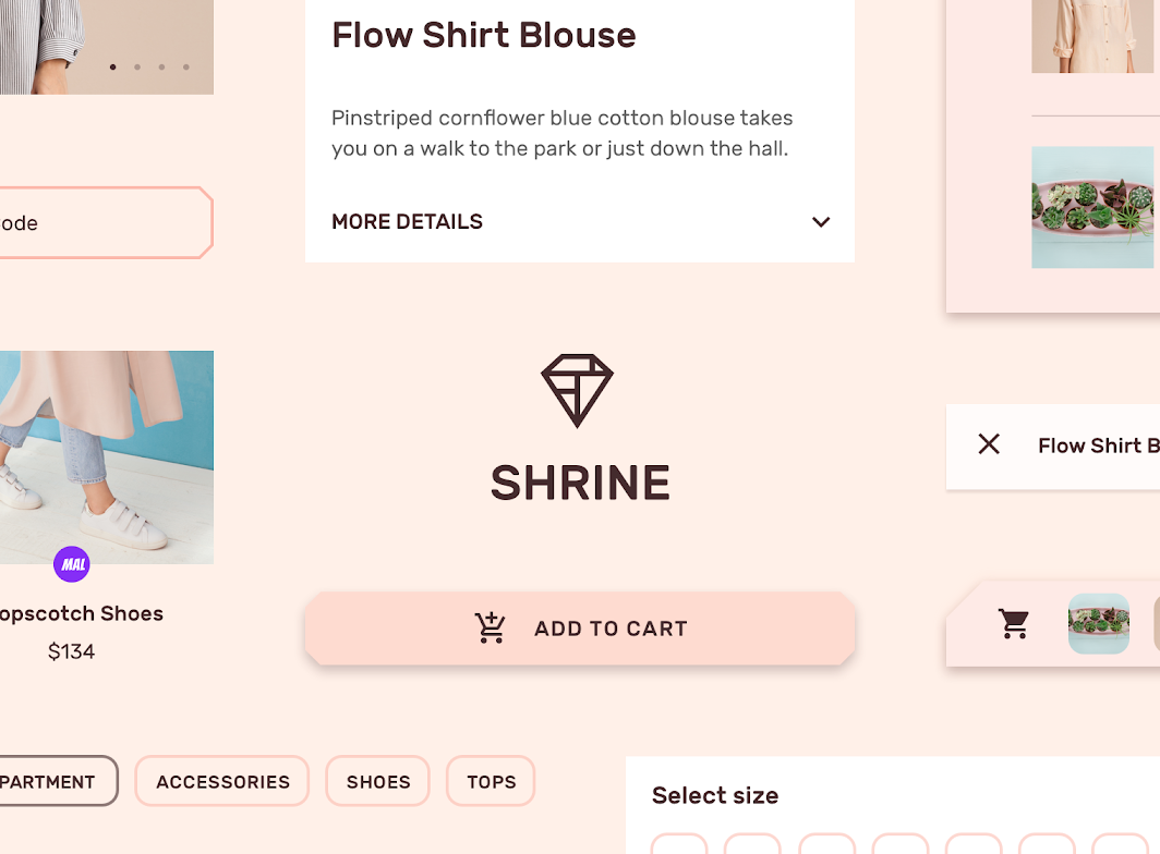
Shrine is a retail app that uses Material Design components and Material Theming to express branding for a variety of fashion and lifestyle items.
About Shrine
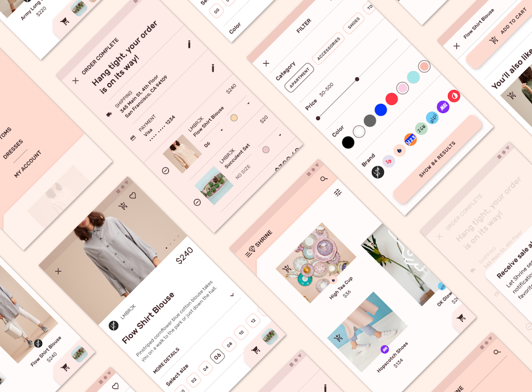
The Shrine app provides an online marketplace featuring lifestyle and fashion items from promoted labels. Shrine’s brand aesthetic is modern, elegant, and sophisticated. Shrine is the unifying concept behind the various brands and products showcased.
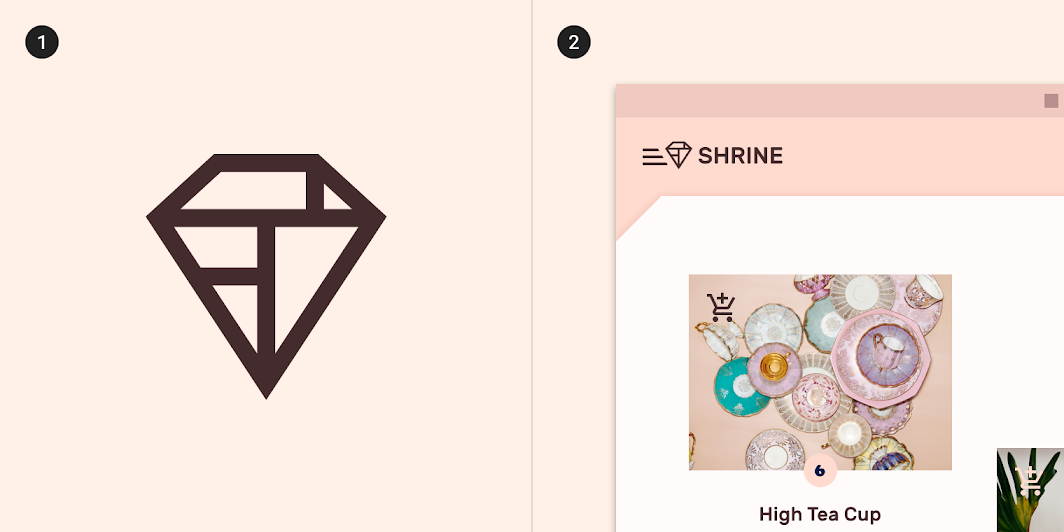
Minimal aesthetic
Shrine uses a minimalist aesthetic, creating an experience where content and actions take the forefront of the user experience. Shrine’s brand plays an important role as the central, unifying scaffolding for the variety of products and brands showcased.
Visual themes
Angled cuts
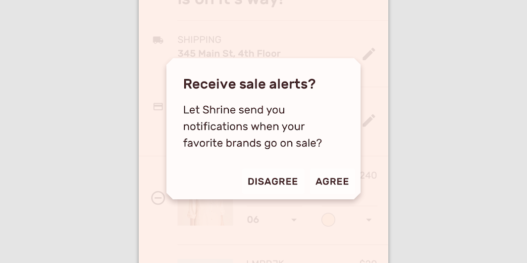
Angled cuts are a visual theme in the Shrine app, and are used on various components and elements. They reflect the shape of the Shrine logo, and act as an extension of the Shrine brand.
Overlapping sheets
The underlying theme of Shrine’s interaction model is that of three overlapping sheets. The bottom sheet has the navigation and branding elements; the middle sheet has the main content; and the top sheet has the shopping cart.
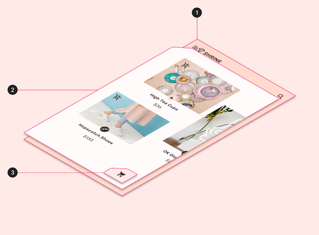
2. Middle sheet
3. Top sheet
Product architecture
The Shrine app’s information architecture has a catalog structure. A catalog contains categorized data, with a top level consisting of peers which may contain subordinate items. Shrine’s top level categories group types of items (shoes, accessories, dresses), so they can be seen in relation to each other.
Adopting a catalog structure allows users to browse an area of interest, compare items to each other, and view the details of a specific item.
Navigation
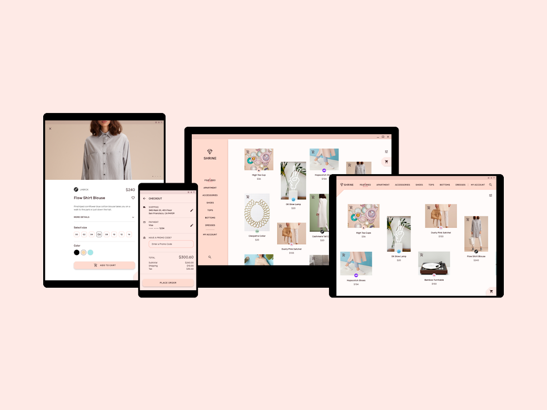
Shrine uses different types of navigation for mobile, tablet, and desktop.
- Mobile places navigation items in the back layer of a backdrop component
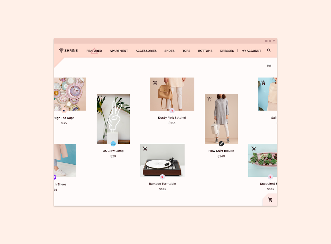
- Tablet uses tabs for navigation
- Desktop uses a standard navigation drawer
Selection indicators
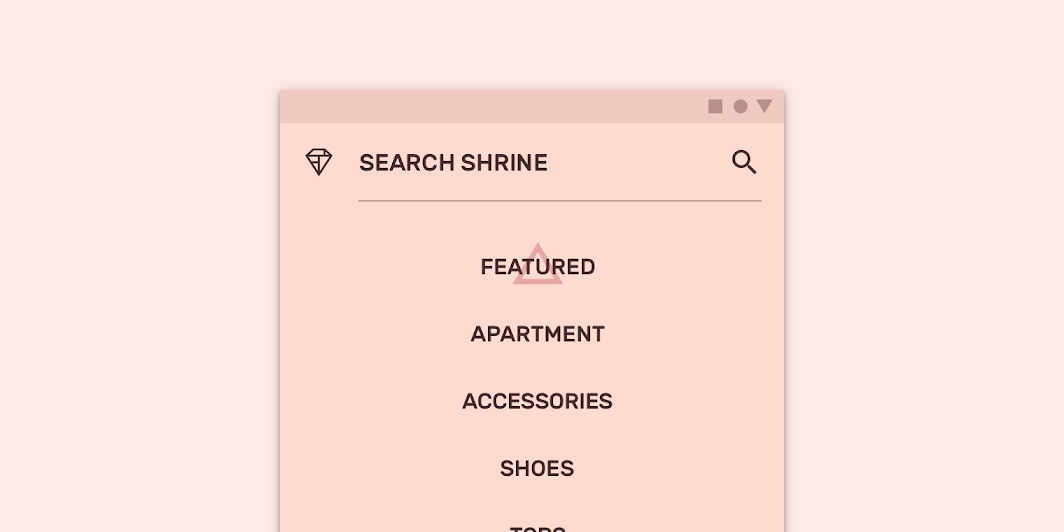
All navigation patterns share the same selected state: when a navigation item is selected, a triangular shape appears behind it. These selection indicators ensure the user knows which section they are in.
Shopping cart
The shopping cart can be accessed through a sheet found at the bottom right of the screen. As items are added or removed from the cart, the sheet dynamically updates to reflect the changes.
This sheet can expand to show its content, or take the user to the shopping cart screen by clicking the cart icon.
Layout
Grid system
Shrine uses a responsive grid system, allowing padding and column size to change between mobile, tablet, and desktop.
Horizontal grid
Shrine’s mobile and tablet layout grid is customized to scroll horizontally. Columns, gutters, and margins are laid out from left to right, rather than top to bottom.
Color
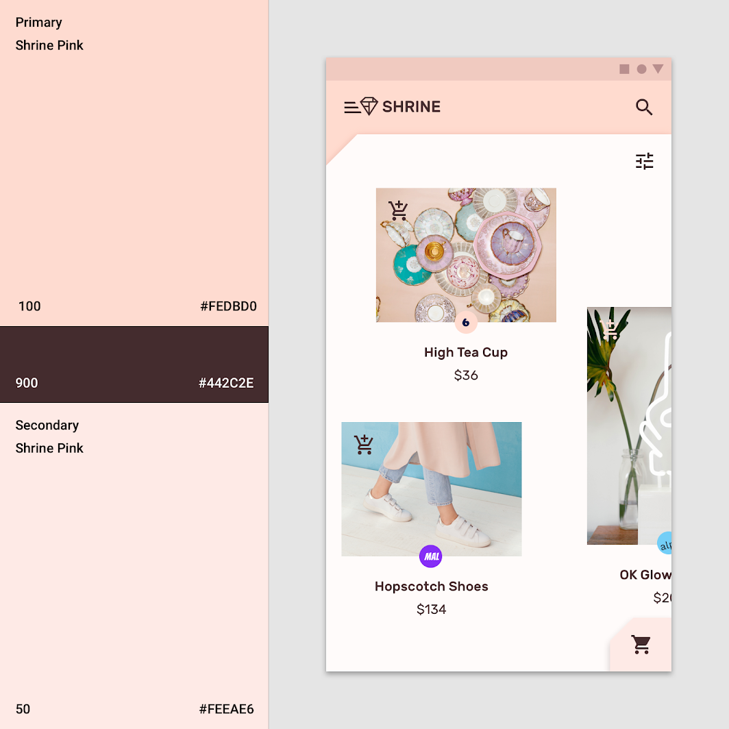
Shrine’s color theme is monochromatic, using light and dark variations of the primary color Shrine Pink. Shrine’s primary color (Shrine Pink 100) fills the back layer, and the secondary color (Shrine Pink 50) fills the bottom sheet. The main content is on white, and the dark Shrine Pink 900 is used for typography and iconography.
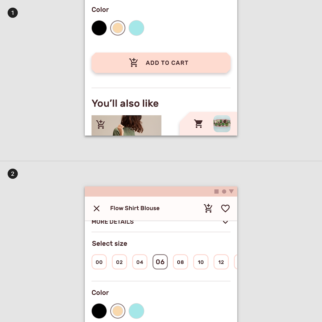
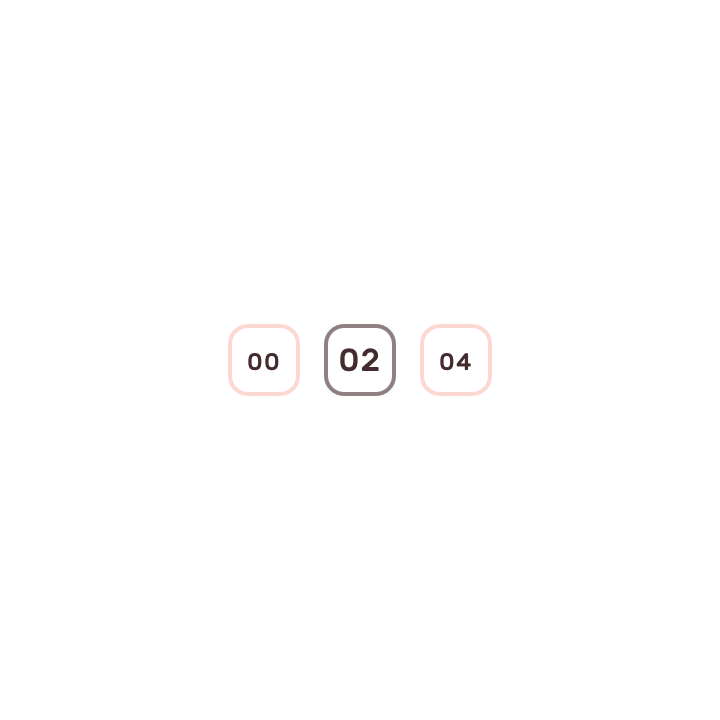
2. Shrine Pink 100 is used to outline unselected chips, 900 is used for selected chips.
Color and image
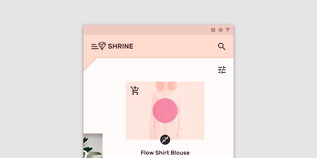
Shrine uses image treatments to indicate a change of state (such as selection), or as a scrim. Custom image treatments are a way of reinforcing the Shrine brand.
Typography
Type scale
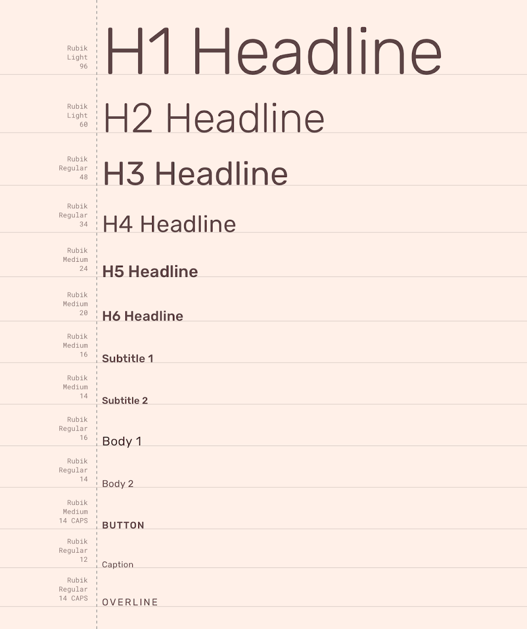
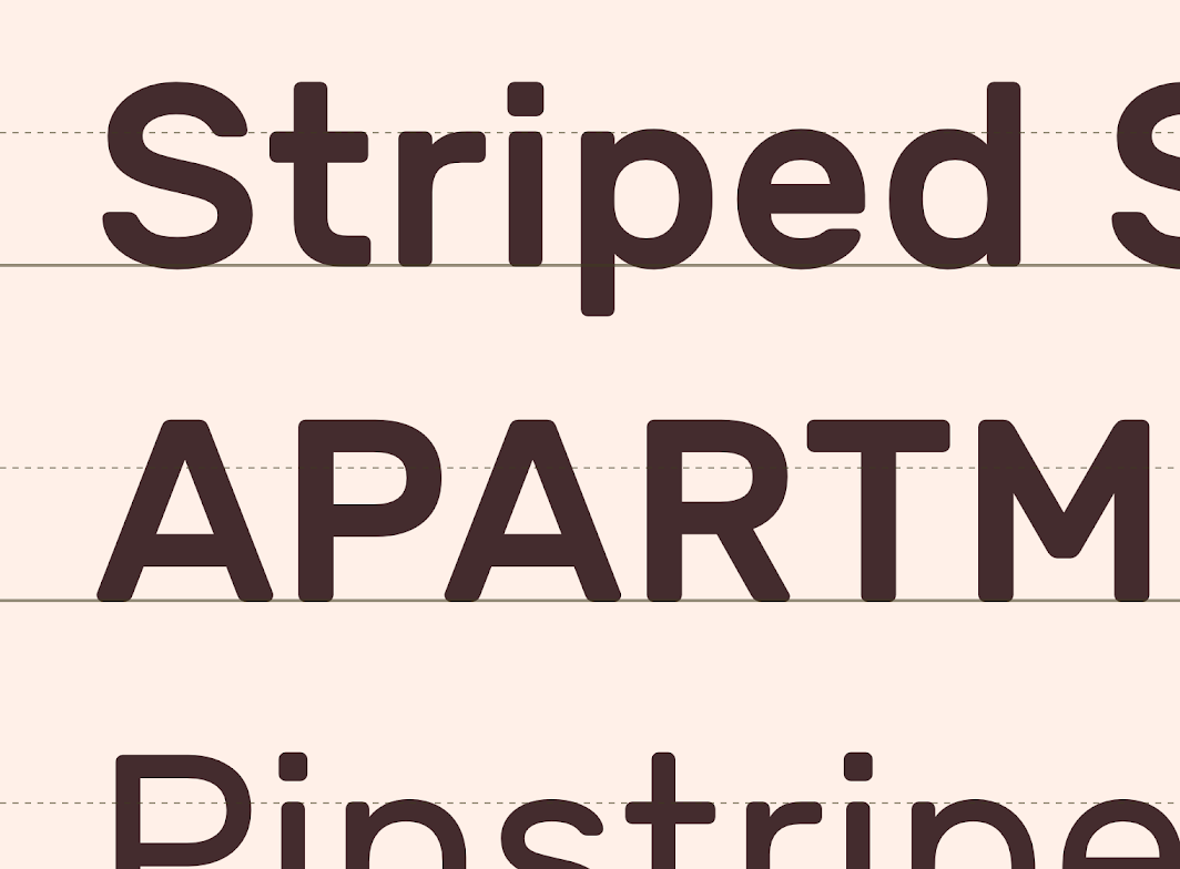
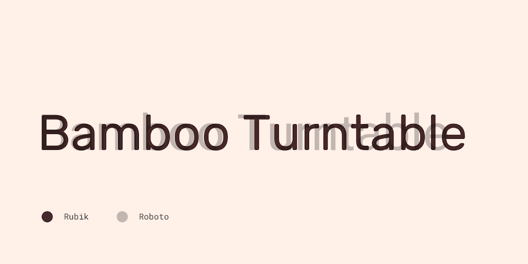
Shrine's type scale provides the typographic variety necessary for the app content. All items in the type scale use Rubik as the typeface, including Rubik Light, Regular, and Medium.
Rubik
Shrine uses Rubik for its typeface. Rubik is a sans serif typeface with slightly rounded corners and many weights to choose from. Rubik is a good fit for Shrine because it is a legible, stylish, contemporary typeface, with rounded corners that give it a warm, friendly, and fun character.
Iconography
Shrine uses Material Design’s default iconography system. These icons are constructed to remain legible and clear at small sizes.
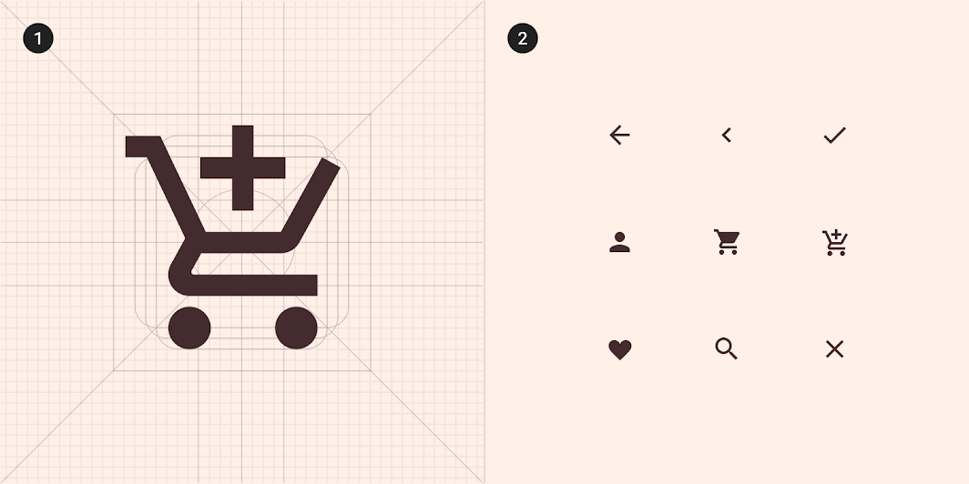
2. A collection of Shrine’s icons.
Shape
Components are grouped into shape categories based on their size. Shape categories let you set multiple component values at once. Shape categories include:
- Small components
- Medium components
- Large components
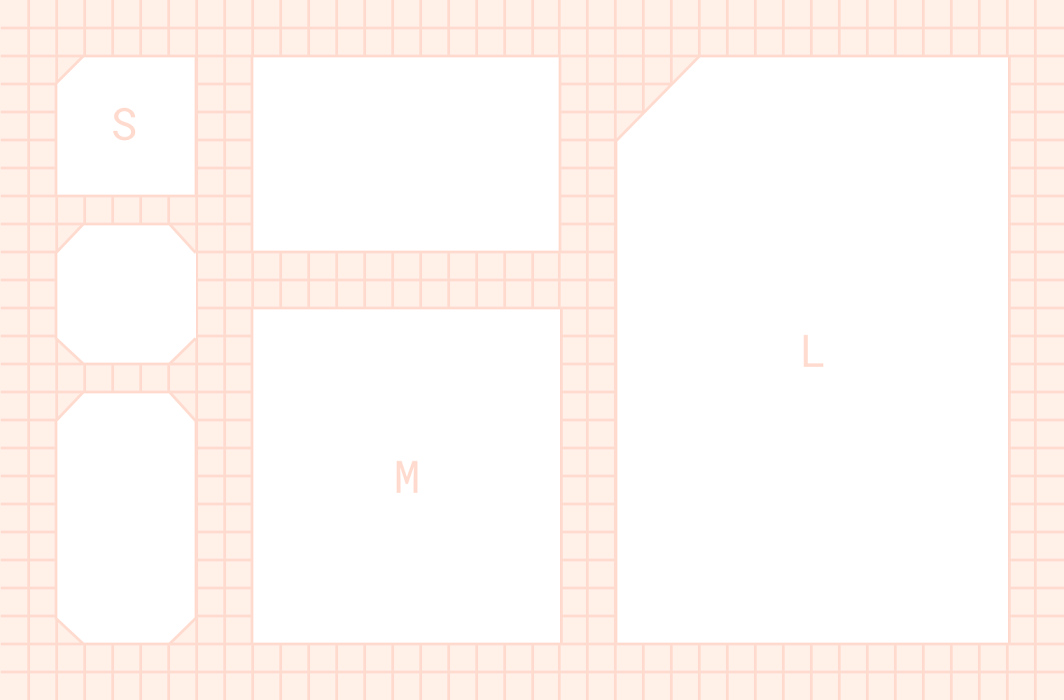
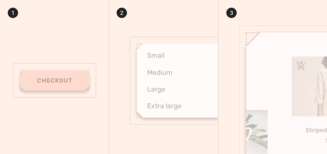
2. Medium components
3. Large components
Small components
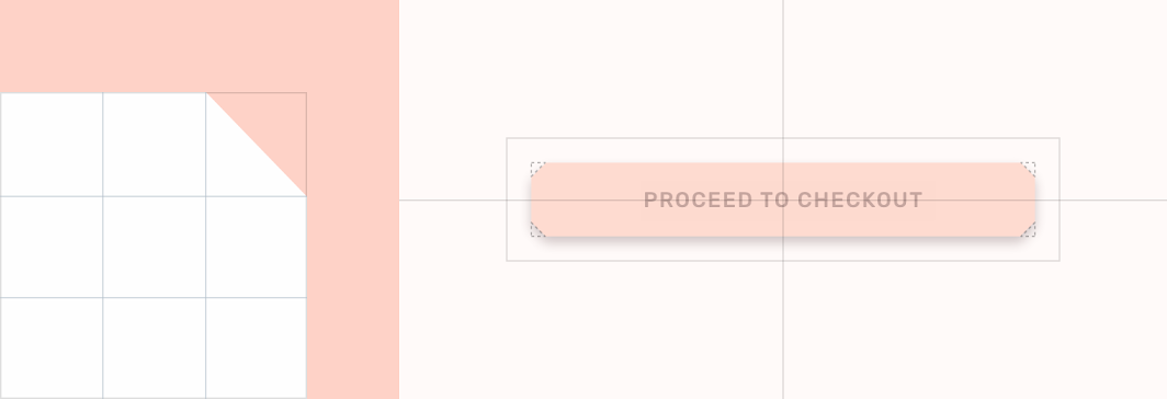
| Component | Category | Attribute | Value |
|---|---|---|---|
| Extended FAB | Small components | Family Size | Cut 4dp;4dp;4dp;4dp |
Medium components
Menus have cut corners that are 8dp long.
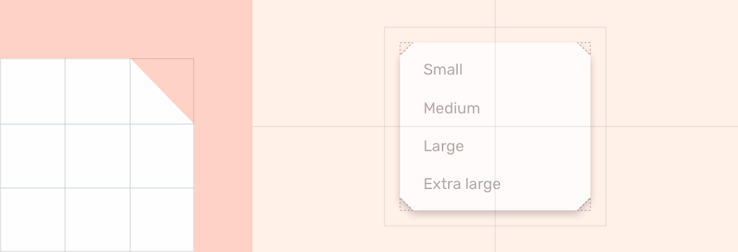
| Component | Category | Attribute | Value |
|---|---|---|---|
| Menus | Medium components | Family Size | Cut 8dp;8dp;8dp;8dp |
Large components
The backdrop has an asymmetrical shape, as it has a single cut corner.
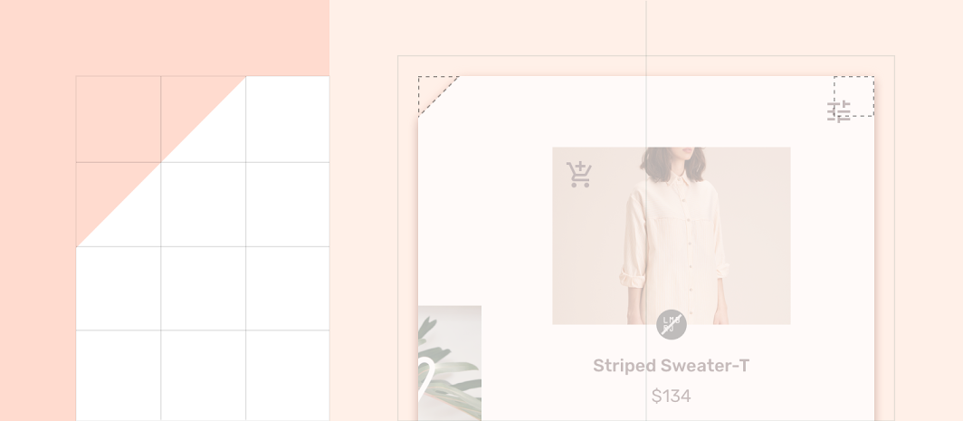
| Component | Category | Attribute | Value |
|---|---|---|---|
| Backdrop | Large components | Family Size | Cut 24dp;0dp;n/a;n/a* |
*Bottom sheets can only shape the top-left and top-right corners.
Components
Buttons
Text buttons
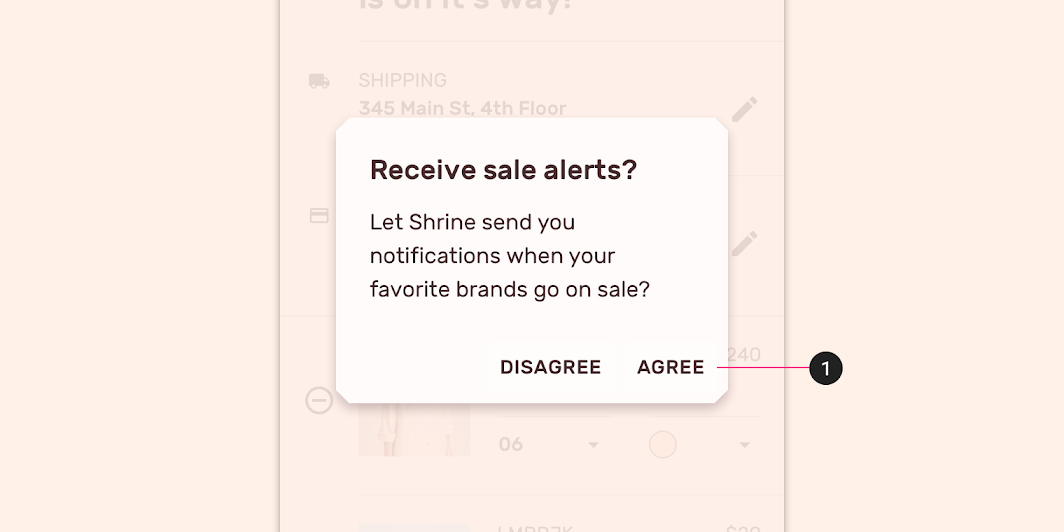
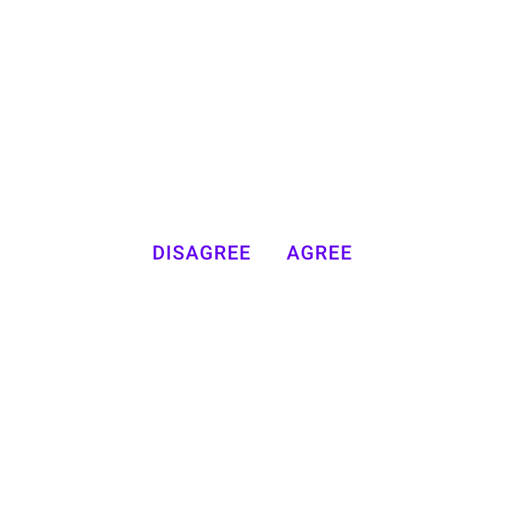
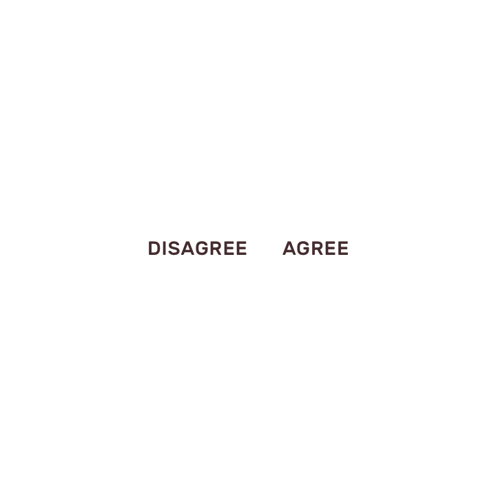
Shrine’s text buttons adopt the background color of the screen and have no elevation.
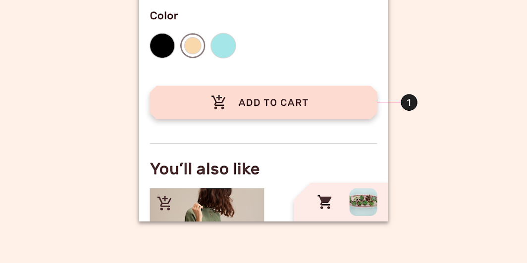
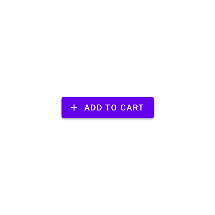
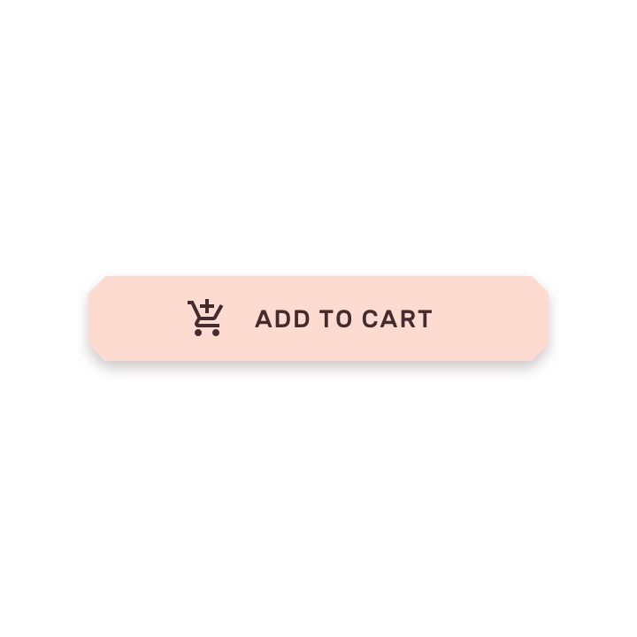
Contained buttons
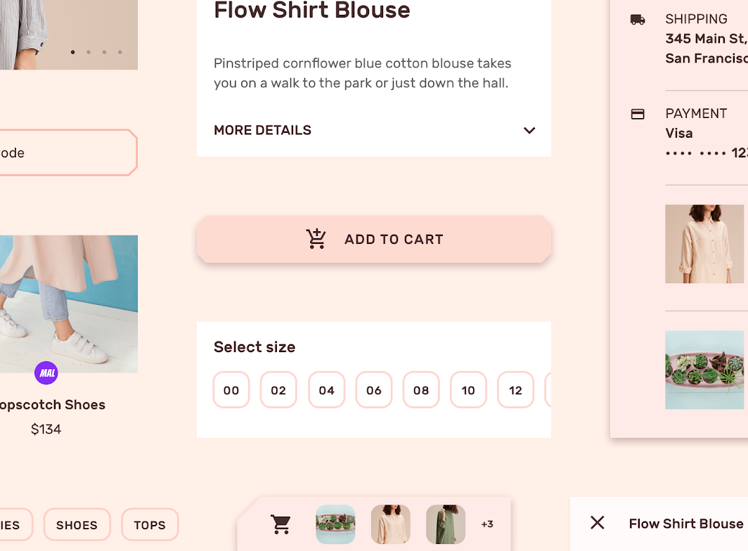
Shrine’s contained buttons use custom color and typography. They’ve been modified to include:
- Angled corners
- Elongated width
Chips
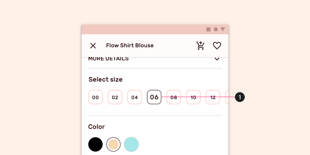
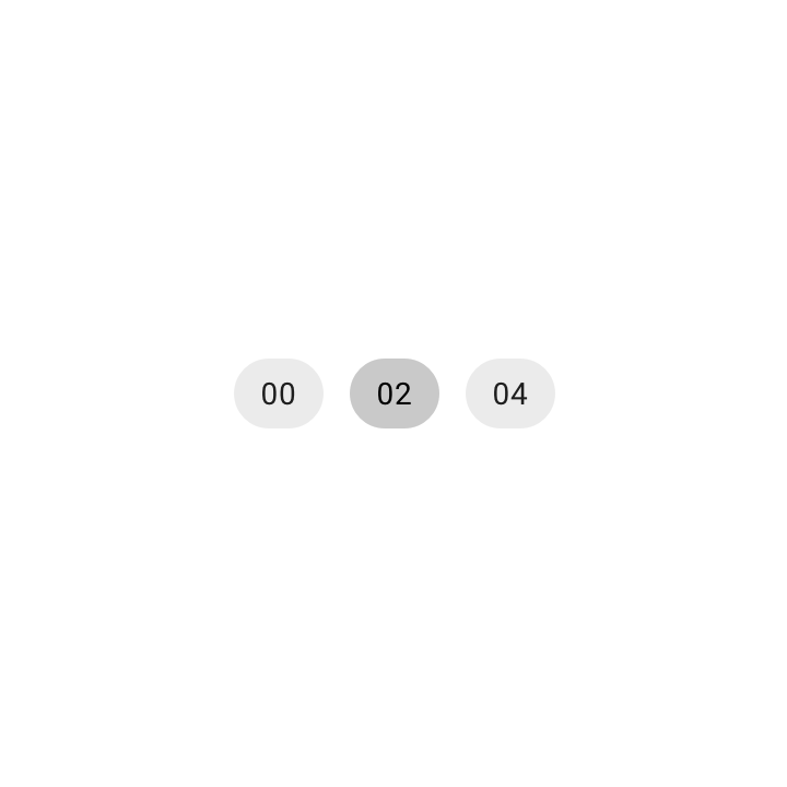
Shrine uses choice chips on product detail pages. These chips remain distinct from buttons by always having rounded edges.
Tabs
Shrine uses tabs for navigation on desktop and tablet. They use custom color, typography, and states.
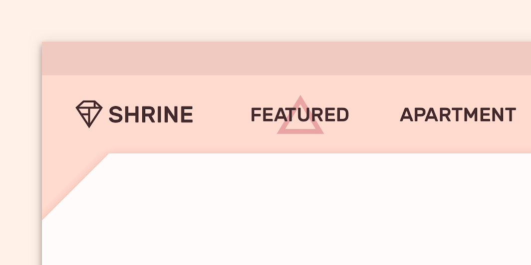
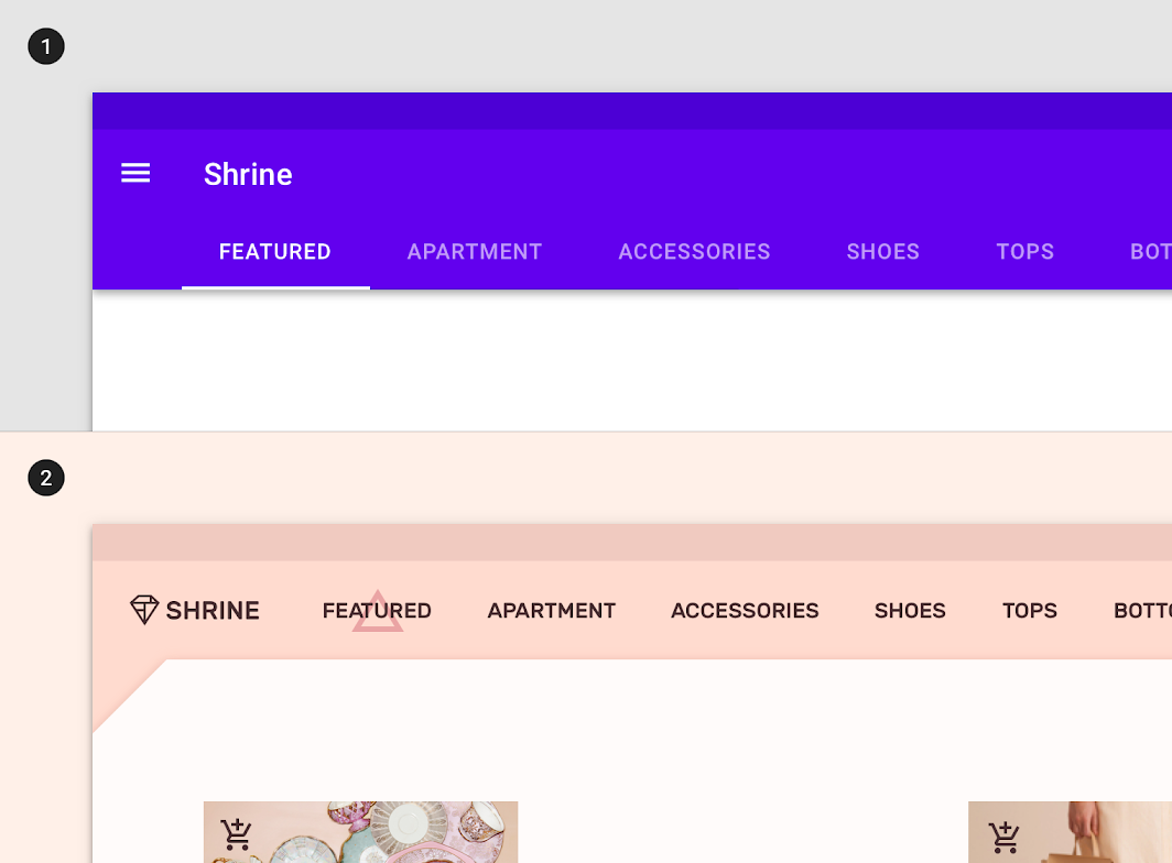
2. Shrine’s tabs use custom shape, color, typography, and states.
Navigation drawer and backdrop
Shrine uses a customized navigation drawer on mobile. It can be accessed by tapping the back layer of the backdrop component.
Shrine’s navigation drawer uses custom typography, color, and states. The center-aligned type is another custom feature.
Shrine’s backdrop uses custom color and shape. The back layer uses the app’s primary color; and the front layer’s top left corner has a custom angle cut.
Image list
Weaved image list
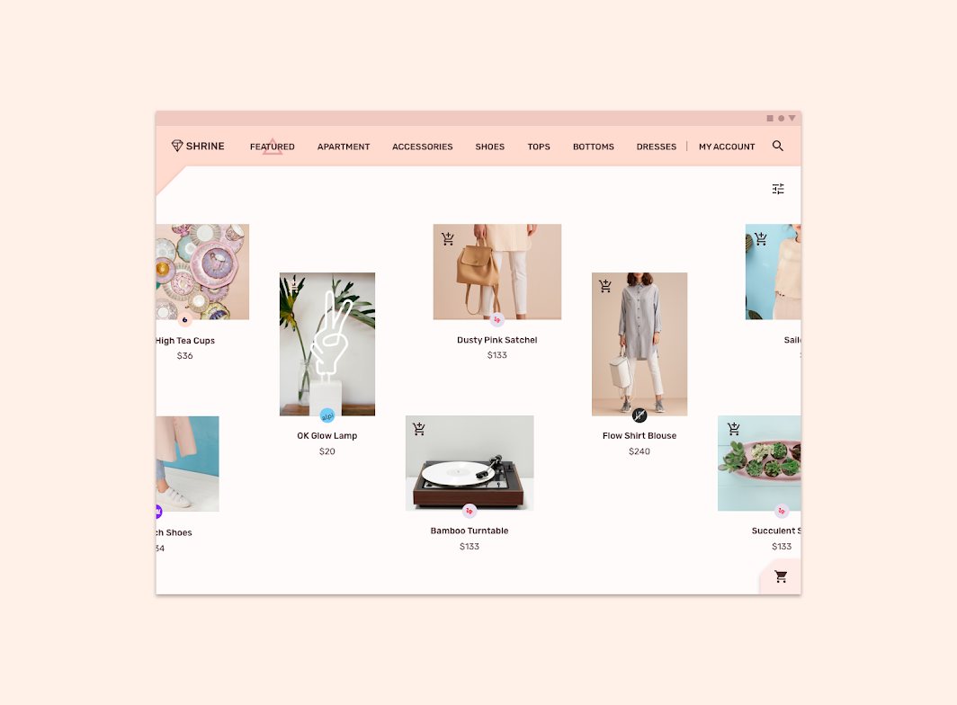
Shrine uses a weaved image list to showcase content. Weaved image lists use alternating container sizes (at specific ratios) to create a rhythmic layout, and are best suited to casual browsing of peer content.
A weaved image list is ideal for Shrine’s content because it heightens the focus and novelty of each item, keeping the user from scanning content too quickly.
Sheet
Shrine uses an expanding bottom sheet for easy access to the shopping cart.
Motion
Shrine’s motion design uses emphasized easing, longer durations, and staggering to establish an elegant and delightful tone.
Launch screen
Shrine’s product icon animation plays off the geometric forms of its logo.
Animated icons
Animated icons add delight while also guiding the user’s journey.
Navigation transitions
Shrine’s navigation transitions use emphasized easing and long durations to achieve a relaxed and elegant tone. Temporal offsets are used to call attention to important elements like the cart and checkout button. A staggered fade is used on back layer content to create a cascading effect.
User education
When adding an item to the cart for the first time, an educational animation displays the location of items in the cart.