Skip to content
Material Design 2
Main Navigation
v3
v2
v1

English

简体中文
繁體中文
Español
Français
Русский
Português – Brasil
Deutsch
日本語
한국어
Italiano
Polski
Türkçe
čeština
magyar

English

简体中文
繁體中文
Español
Français
Русский
Português – Brasil
Deutsch
日本語
한국어
Italiano
Polski
Türkçe
čeština
magyar

Appearance

Sidebar Navigation

Material System

Introduction

Material studies

About our Material studies

Basil

Crane

Fortnightly

Owl

Rally

Reply

Shrine

Material Foundation

Environment

Surfaces

Elevation

Light and shadows

Layout

Understanding layout

Pixel density

Responsive layout grid

Spacing methods

Component behavior

Applying density

Navigation

Understanding navigation

Navigation transitions

Search

Color

The color system

Applying color to UI

Color usage

Text legibility

Dark theme

Typography

The type system

Understanding typography

Language support

Sound

About sound

Applying sound to UI

Sound attributes

Sound choreography

Iconography

Product icons

System icons

Animated icons

Shape

About shape

Shape and hierarchy

Shape as expression

Shape and motion

Applying shape to UI

Motion

Understanding motion

The motion system

Speed

Choreography

Customization

Interaction

Gestures

Selection

States

Communication

Confirmation & acknowledgement

Data formats

Data visualization

Empty states

Help & feedback

Imagery

Launch screen

Onboarding

Offline states

Writing

Machine learning

Machine learning patterns

Object detection: live camera

Object detection: static image

Barcode Scanning

Material Guidelines

Material Theming

Overview

Implementing your theme

Usability

Accessibility

Bidirectionality

Platform guidance

Android bars

Android fingerprint

Android haptics

Android icons

Android navigating between apps

Android notifications

Android permissions

Android slices

Android split-screen

Android swipe-to-refresh

Android text selection toolbar

Android widget

Cross-platform adaptation

Components

App bars: bottom

App bars: top

Backdrop

Banners

Bottom navigation

Buttons

Buttons: floating action button

Cards

Checkboxes

Chips

Data tables

Date pickers

Dialogs

Dividers

Image lists

Lists

Menus

Navigation drawer

Navigation rail

Progress indicators

Radio buttons

Sheets: bottom

Sheets: side

Sliders

Snackbars

Switches

Tabs

Text fields

Time pickers

Tooltips

On this page

Dividers ​

A divider is a thin line that groups content in lists and layouts.
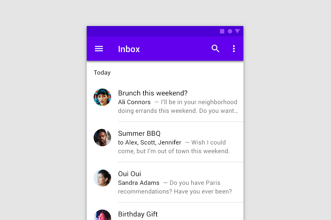
Dividers hero image

Usage ​

Dividers separate content into clear groups.

Principles ​
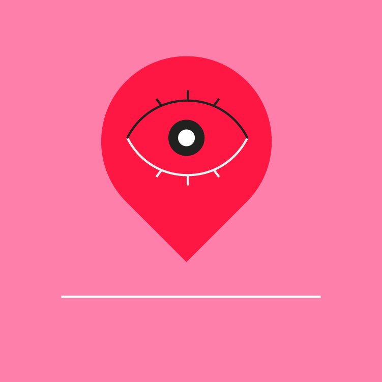

Divider principle: subtle

Subtle

Dividers should be noticeable in a layout, but not jarring.
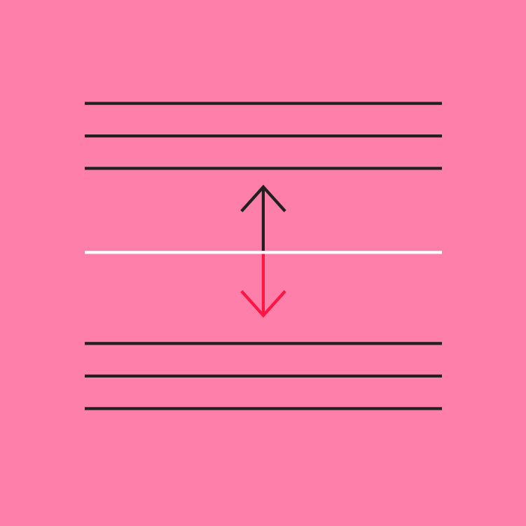
Divider principle: secondary

Secondary

Dividers should only be used if elements cannot be separated using white space.
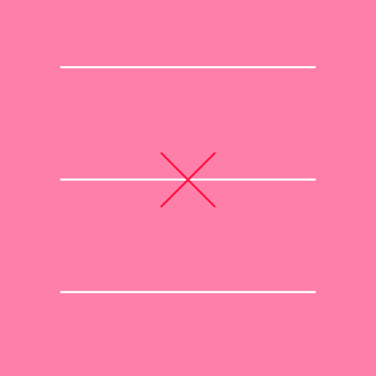
Divider principle: infrequent

Infrequent

Use dividers sparingly, to create groupings rather than separate items.

Types ​
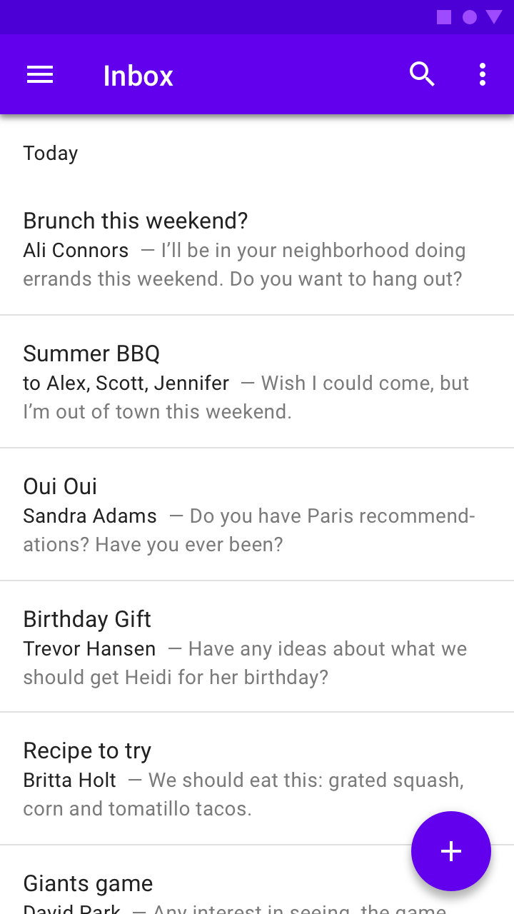

Full-bleed dividers separate content into sections and span the entire length of a layout
Full-bleed dividers
Full-bleed dividers separate content into sections and span the entire length of a layout.
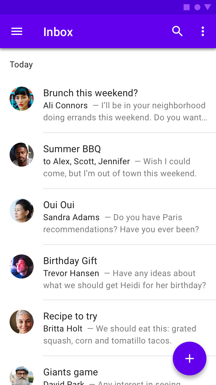
Inset dividers separate related content, anchored by elements that align with the app bar title
Inset dividers
Inset dividers separate related content, anchored by elements that align with the app bar title.
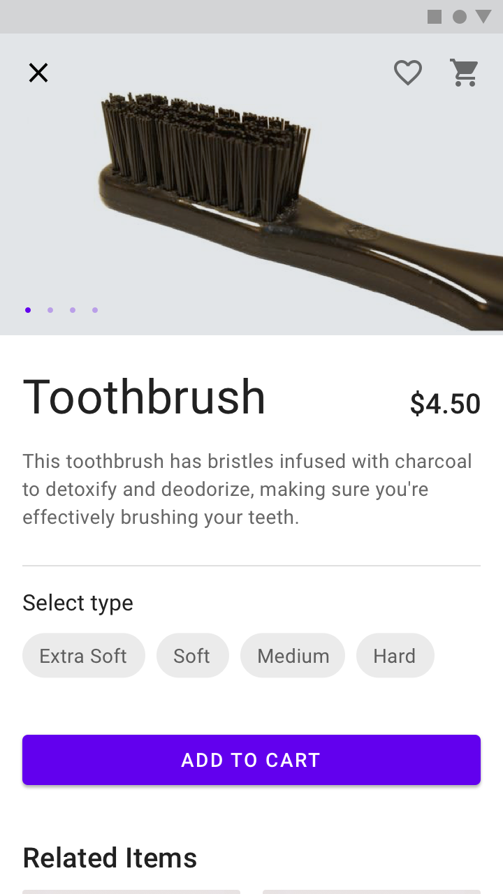
Middle dividers space related content and are centered in a layout or list
Middle dividers
Middle dividers space related content and are centered in a layout or list.
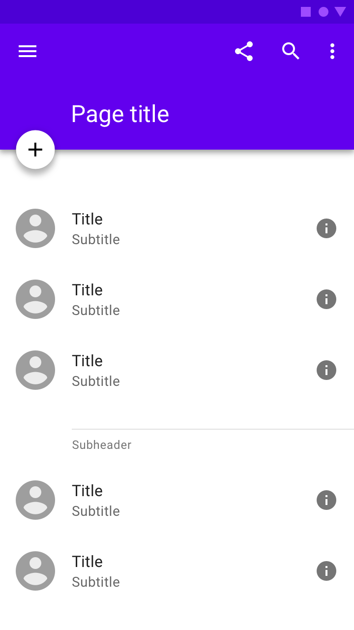
Dividers can be paired with subheaders to help define content groupings
Dividers with subheaders
Dividers can be paired with subheaders to help define content groupings.

Types ​

Full-bleed dividers ​

Full-bleed dividers separate content into sections, such as:

  • Separating list and layout elements
  • Indicating where an element may expand
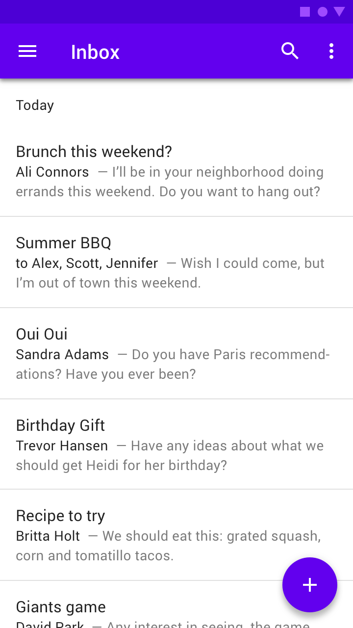
When lists don’t have an anchoring element (such as an icon), spacing may not be enough to separate content
When lists don’t have an anchoring element (such as an icon), spacing may not be enough to separate content. Full-bleed dividers can help separate individual tiles.
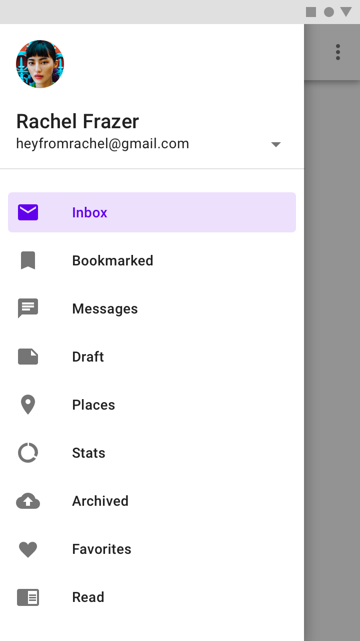
A full-bleed divider in a navigation drawer

Inset dividers ​

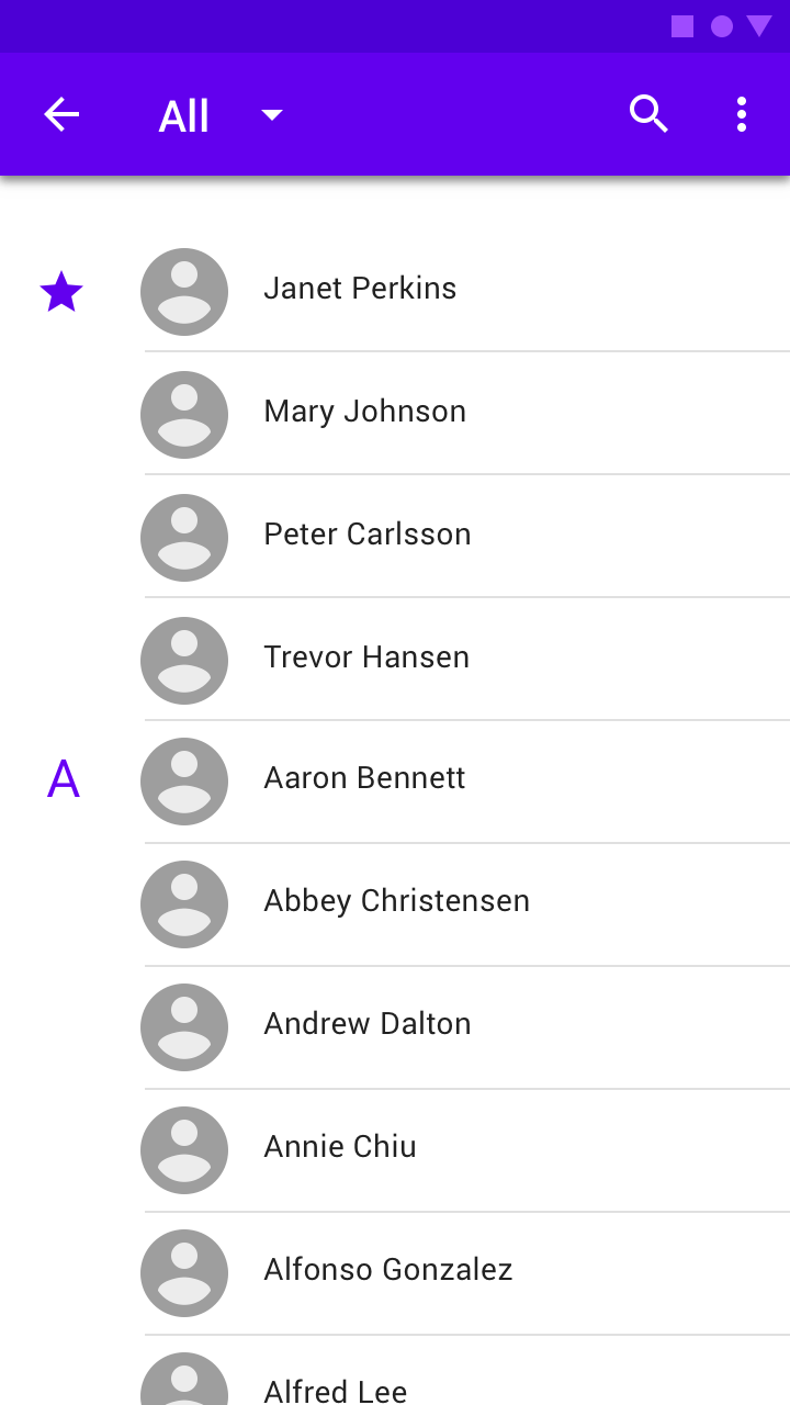
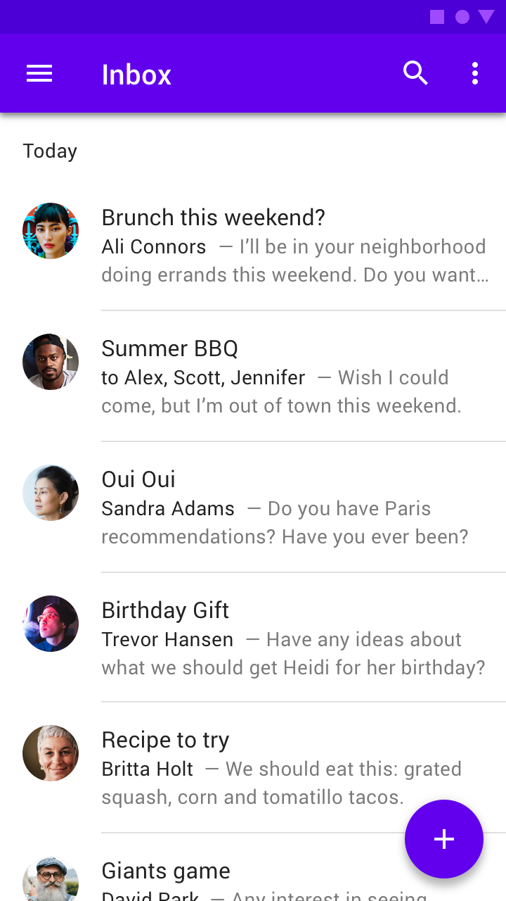
Inset dividers separate related content, such as emails in an email thread. They should be used with anchoring elements such as icons or avatars, and left-aligned with the app bar title.
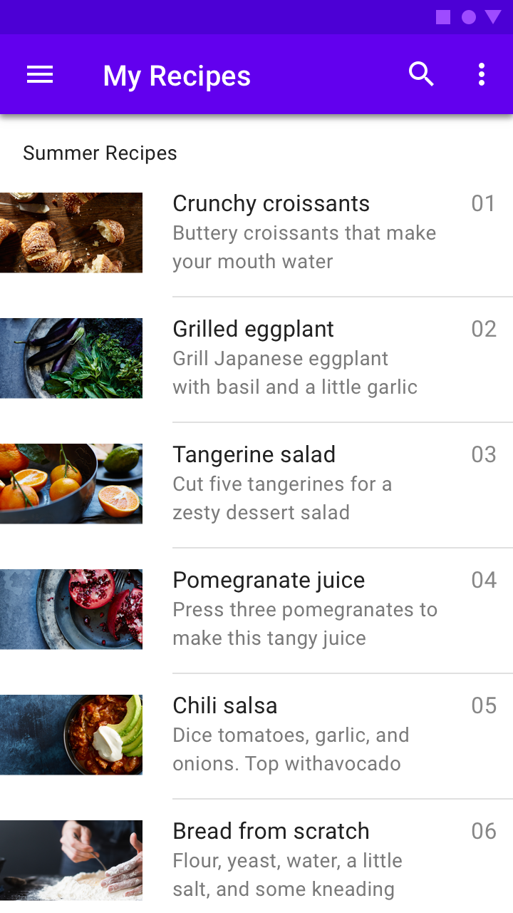
Inset dividers
Inset dividers
Use inset dividers when there are anchoring elements such as an icon or avatar
Use inset dividers when there are anchoring elements such as an icon or avatar.

Do: use inset dividers to group items

Do

Use inset dividers to group items.
Don’t use dividers to separate individual items

Don't

Don’t use dividers to separate individual items.

Middle dividers ​

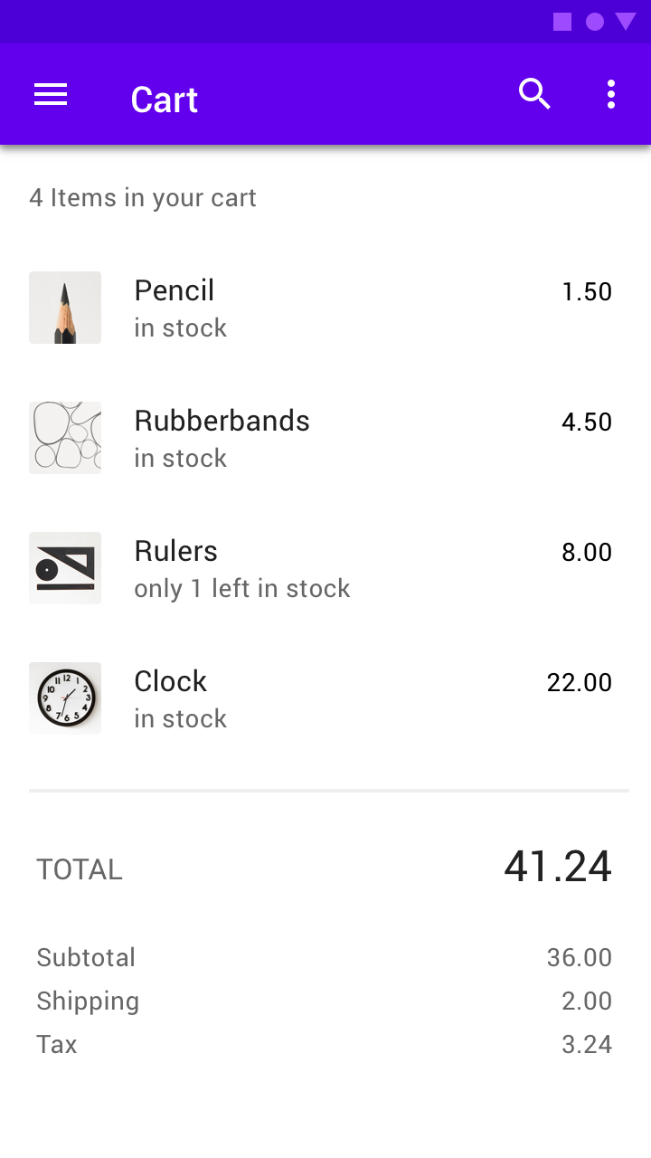
Dividers can also be placed in the middle of a layout. They are best for separating related content, such prices on a receipt.
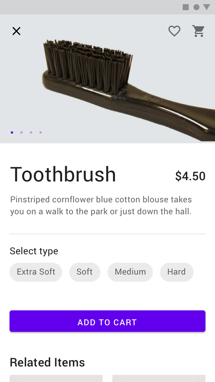
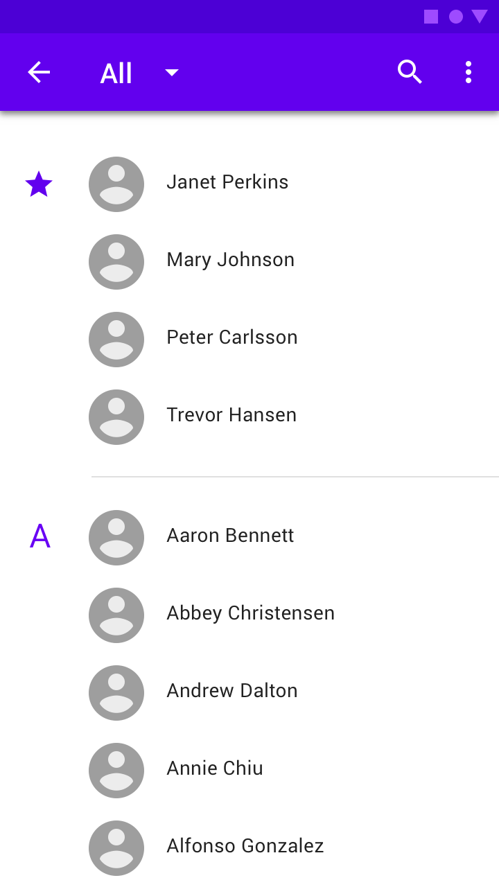
An inset divider above a subheader
A full divider above a subheader

Dividers with subheaders ​

Dividers can be paired with subheaders to identify grouped content. Place dividers above subheaders to reinforce the subheader’s connection to content.
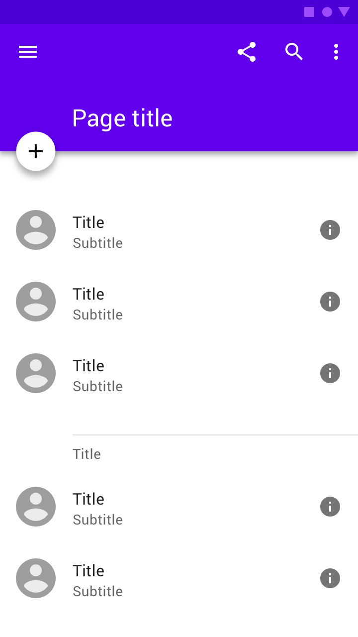
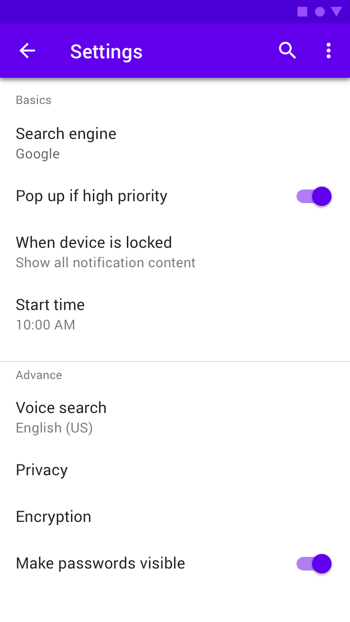
An inset divider above a subheader
A full-bleed divider above a subheader

Theming ​

Fortnightly Material Theme ​

This news app’s divider color has been customized using Material Theming.
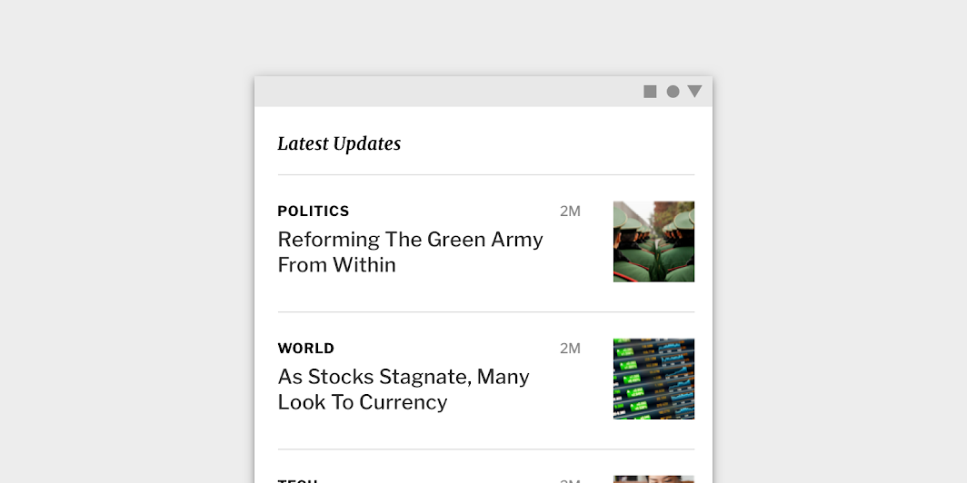
Fortnightly’s customized divider

Fortnightly

A news app that uses Material Design components and Material Theming to create an on-brand, content-focused experience.

Related article

The color system

Create a color theme that reflects your brand or style

Related article

Applying color to UI

In a UI, color has a variety of roles: from containing meaning, to expressing a look and feel.

Related article

Color ​

Fortnightly’s divider uses custom color
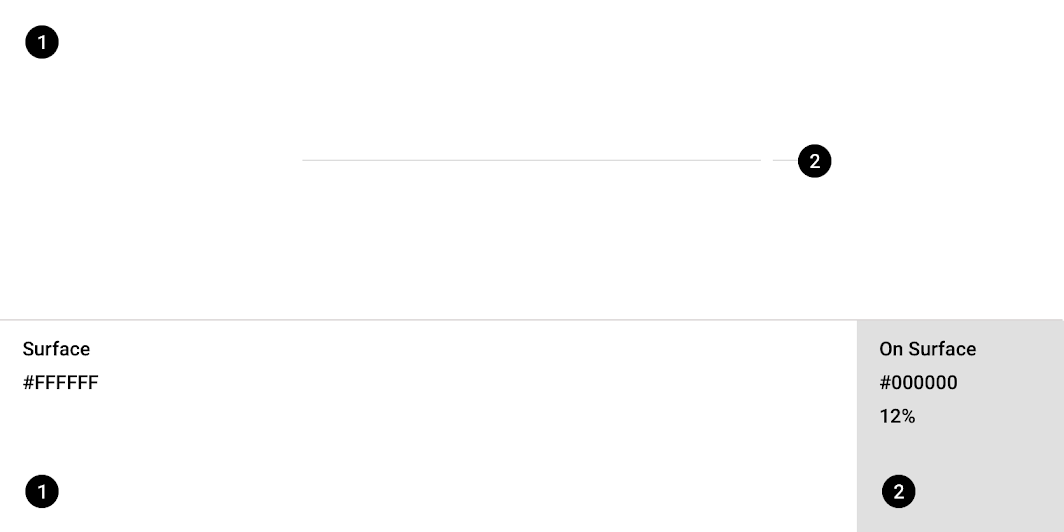
Fortnightly Material theme: color
ElementCategoryAttributeValue
SurfaceSurfaceColor
Opacity
#FFFFFF
100%
DividerOn SurfaceColor
Opacity
#000000
12%

Owl Material Theme ​

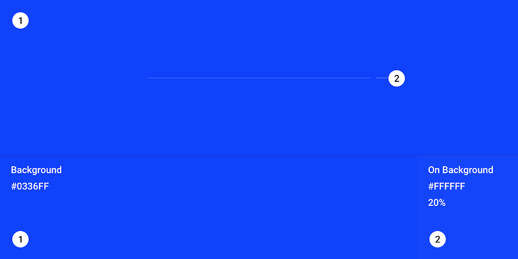
This educational app’s divider color has been customized using Material Theming.
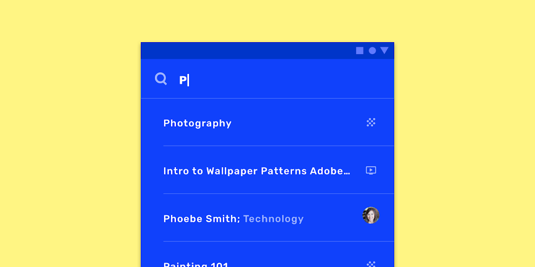
Owl’s customized divider

Owl

Owl is an educational app that provides courses for people who want to explore and learn new skills.

Related article

The color system

Create a color theme that reflects your brand or style

Related article

Applying color to UI

In a UI, color has a variety of roles: from containing meaning, to expressing a look and feel.

Related article

Color ​

Owl’s divider uses custom color

Owl Material theme: color
ElementCategoryAttributeValue
BackgroundBackgroundColor
Opacity
#0336FF
100%
DividerOn BackgroundColor
Opacity
#FFFFFF
20%

Specs ​


1
Pager
Previous pageDialogs
Next pageImage lists

Released under the Apache-2.0

Copyright © 2018-Present Google

https://m2.material.io/components/dividers

Released under the Apache-2.0

Copyright © 2018-Present Google