

Applying density
Material Design offers guidance on high-density spacing for use cases where increased density improves the user experience.
Usage
These guidelines describe how and when to apply density.
Principles
Scannable
Dense UIs improve the ease of viewing and navigating large amounts of content.
Prioritized
Dense UIs help users focus by reducing the space between actions.
Visible
Increasing density allows more content and actions to fit on a single screen.
Density guidelines
How to apply
Material density guidelines are a resource for understanding when and why applying density can improve user experiences. Supported by code, Material Component density can be adjusted cohesively on a scale. Guidance on using the density scale is explained in component density and platform support can be found in implementation.
When to apply
How users interact with a component should determine whether or not you increase the density in a UI. When users view and interact with large amounts of information, high density components can improve the experience.
By making more content available on-screen, increasing the density of lists, tables, and long forms makes information easier to scan, view, and compare.
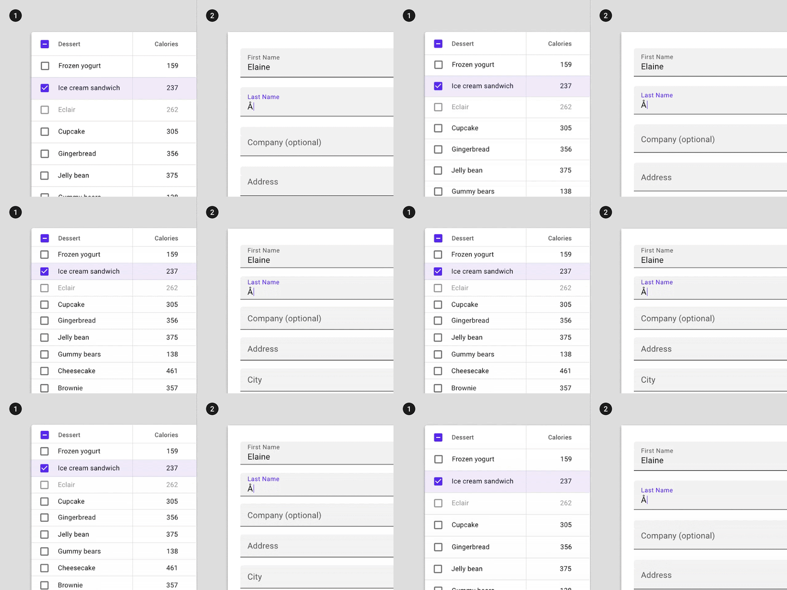
2. Increasing the density of a form
When not to apply density
Tasks and alert-based components should not increase density.
Focused tasks
Don't increase the density of components that involve focused tasks, such as interacting with a dropdown menu or picker. Increasing density on components such as date pickers reduces usability by limiting tappable space.
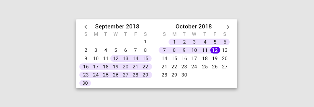
Don't
Alerts and messaging
Don't increase the density in components that alert the user of changes, such as snackbars or dialogs. Increasing the density of alerts makes them less effective at attracting user attention. In the example of dialogs, readability and prominence of a message are compromised when density increases.
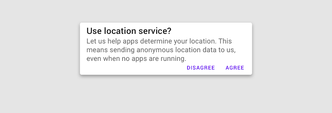
Don't
Layout
Grid and component density
Maintain balance between component density and the grid layout.
To create scannable groups of content, use a less-dense grid layout in combination with high-density components. The denser your components become, the larger the margins and gutter widths should be. Combining a dense layout grid with dense components can make differentiating groups of content harder for users.
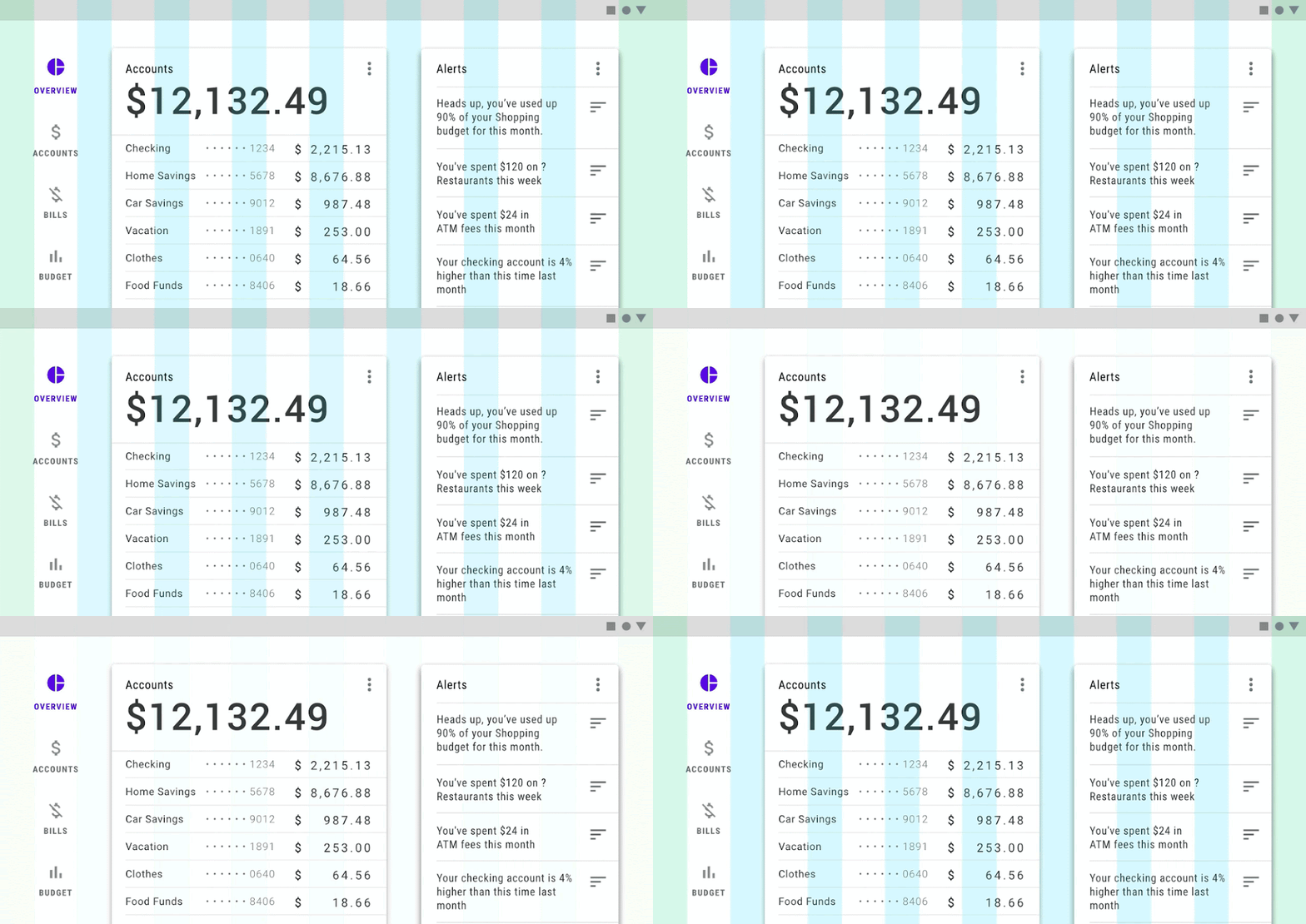
Do
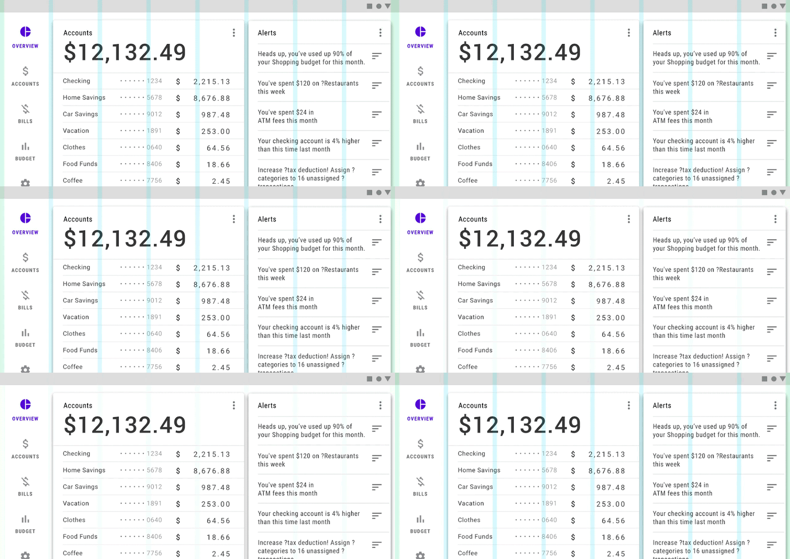
Don't
Components
Applying density to components
Component density should not be adjusted in isolation. Instead, apply density consistently to create a cohesive component set. When you adjust one component's density, consider how that change will affect other components in your app.
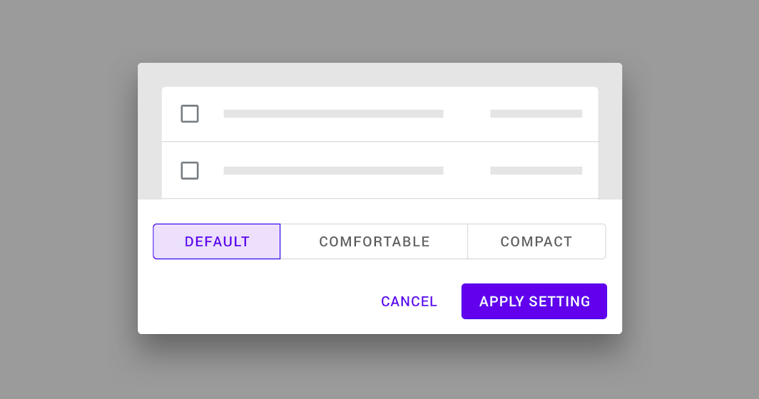
The tool below illustrates Material Components changing in coordination with three density settings: default, comfortable, and compact.
Interactive demo
Different densities across a set of Material Components.
Density scale
The density scale allows you to control the density of individual components when needed.
The density scale is numbered, starting at 0 for a component's default density. The scale moves to negative numbers (-1, -2, -3) as space decreases, creating higher density. Each increment represents a decrease in the height of a component by 4dps.
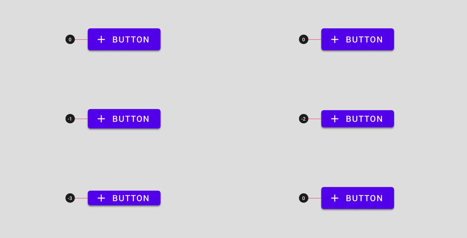
Don't select a number from the density scale that breaks your component.
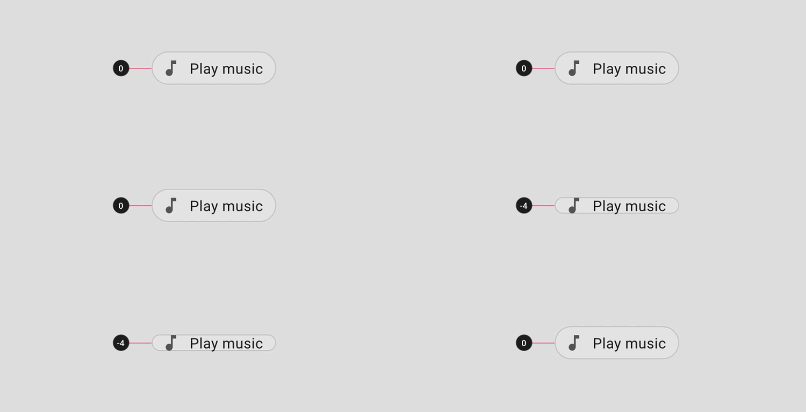
Don't
Spacing methods
When a component's density increases, the padding and alignment remains consistent, but the dimension changes.
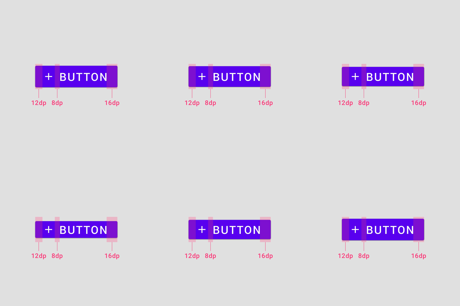
Padding
Do not change the padding of a component when increasing its density. Component padding affects height and reducing padding can affect user interactions negatively.
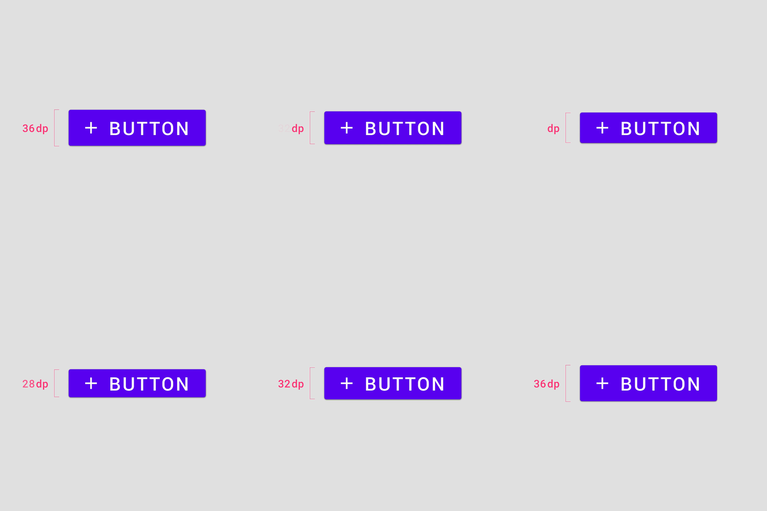
Dimensions
Change dimensions when increasing the density of components. Component dimensions affect the length and height of the component or element.
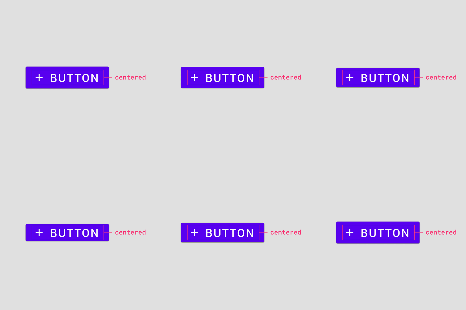
Alignment
Use a center specification to align elements within component containers. Center aligning elements allows component heights to be adjusted without additional alignment of elements.
Spacing multiple elements
When multiple elements are stacked vertically within a component, use 4dp increments to separate them. Center the grouped element within the component container.
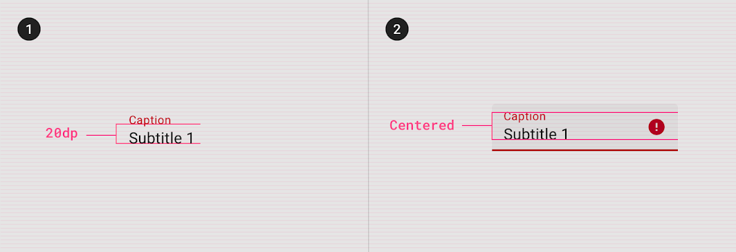
2. Element group centered within the component container vertically.
Accessibility
Touch targets
Touch targets apply to any device that receives both touch and non-touch input. To balance information density and usability, the touch target for default density components should be at least 48 x 48 dp, with at least 8dp of space between each target. Note: on iOS, 44 x 44 dp is the recommended touch target.
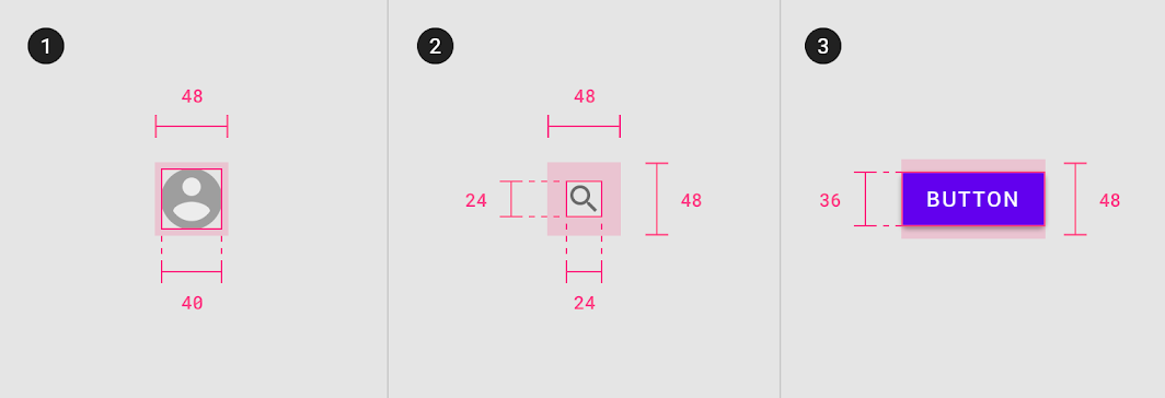
1. 40dp element, 48dp touch target
2. 24dp element, 48dp touch target
3. 36dp element, 48dp touch target
48 x 48 dp minimum touch targets should be the default experience in your product, with the exception of iOS products. Users must opt in to high density component experiences because higher density components do not meet accessibility requirements.
Typography
Line height
Line height is the space between lines of text. Line height can be used as a way to create density in typographic layouts.
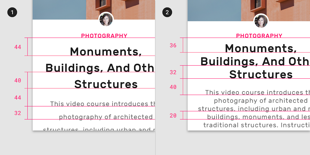
2. Smaller line height: 36dp, 32dp, 40dp, 20dp
Implementation
Density support for each platform is indicated below.
| Platform | Status |
|---|---|
| Android | Planned |
| iOS | Planned |
| Web | Available |
| Flutter | Planned |