Skip to content
Material Design 2
Main Navigation
v3
v2
v1

English

简体中文
繁體中文
Español
Français
Русский
Português – Brasil
Deutsch
日本語
한국어
Italiano
Polski
Türkçe
čeština
magyar

English

简体中文
繁體中文
Español
Français
Русский
Português – Brasil
Deutsch
日本語
한국어
Italiano
Polski
Türkçe
čeština
magyar

Appearance

Sidebar Navigation

Material System

Introduction

Material studies

About our Material studies

Basil

Crane

Fortnightly

Owl

Rally

Reply

Shrine

Material Foundation

Environment

Surfaces

Elevation

Light and shadows

Layout

Understanding layout

Pixel density

Responsive layout grid

Spacing methods

Component behavior

Applying density

Navigation

Understanding navigation

Navigation transitions

Search

Color

The color system

Applying color to UI

Color usage

Text legibility

Dark theme

Typography

The type system

Understanding typography

Language support

Sound

About sound

Applying sound to UI

Sound attributes

Sound choreography

Iconography

Product icons

System icons

Animated icons

Shape

About shape

Shape and hierarchy

Shape as expression

Shape and motion

Applying shape to UI

Motion

Understanding motion

The motion system

Speed

Choreography

Customization

Interaction

Gestures

Selection

States

Communication

Confirmation & acknowledgement

Data formats

Data visualization

Empty states

Help & feedback

Imagery

Launch screen

Onboarding

Offline states

Writing

Machine learning

Machine learning patterns

Object detection: live camera

Object detection: static image

Barcode Scanning

Material Guidelines

Material Theming

Overview

Implementing your theme

Usability

Accessibility

Bidirectionality

Platform guidance

Android bars

Android fingerprint

Android haptics

Android icons

Android navigating between apps

Android notifications

Android permissions

Android slices

Android split-screen

Android swipe-to-refresh

Android text selection toolbar

Android widget

Cross-platform adaptation

Components

App bars: bottom

App bars: top

Backdrop

Banners

Bottom navigation

Buttons

Buttons: floating action button

Cards

Checkboxes

Chips

Data tables

Date pickers

Dialogs

Dividers

Image lists

Lists

Menus

Navigation drawer

Navigation rail

Progress indicators

Radio buttons

Sheets: bottom

Sheets: side

Sliders

Snackbars

Switches

Tabs

Text fields

Time pickers

Tooltips

On this page

Offline states ​

Offline states allow users to interact with an app without internet access.

Principles ​
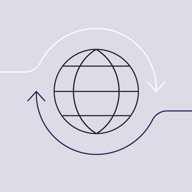

Offline state principle: adapt to connection

Adapt to connection

Adapt how your feature or app behaves when the user has a slow, intermittent, or no connection at all.
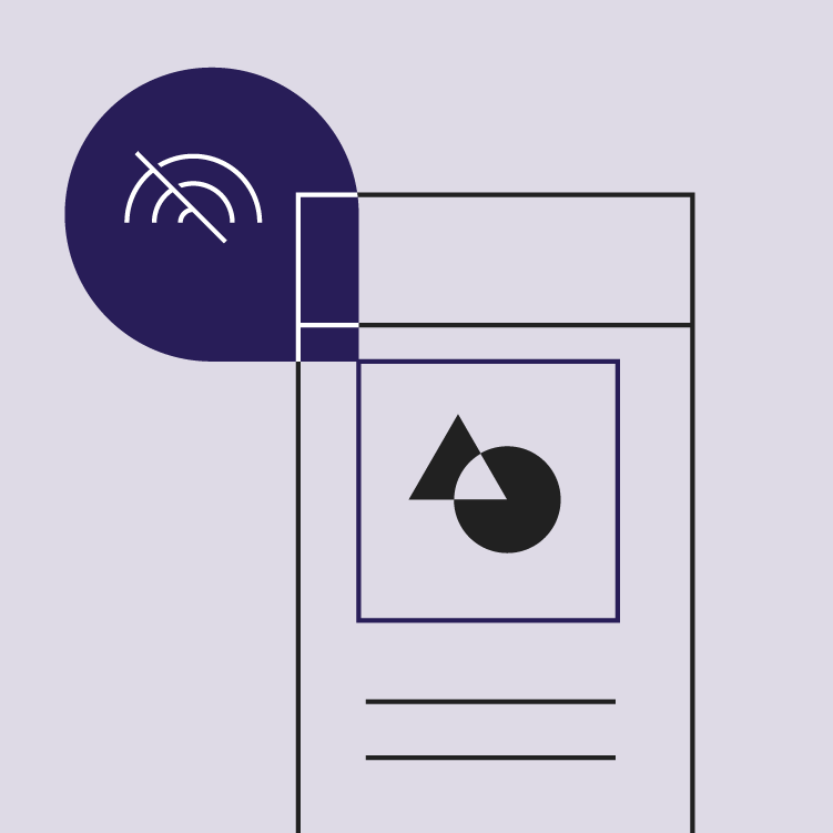
Offline state principle: illustrate functionality

Illustrate functionality

Use the UI design to illustrate how an offline feature works and communicate its intended purpose.
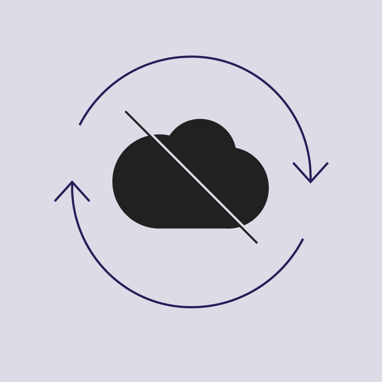
Offline state principle: display available content

Display available content

Load available content when the connection is limited, rather than not loading any content.

Offline functionality ​

If your app has features that are available when offline, and other features that aren’t, it should indicate whether it’s current state is offline or online.

For example, offline files can be managed from an offline state.


Make your app usable offline

Cache data locally and simplify network requests

Related link

Connectivity

Connectivity design

Related article

Cost transparency

Related article

Functionality while offline ​

To communicate that an action in your app is working offline, display the offline pin icon with the text label “offline.”
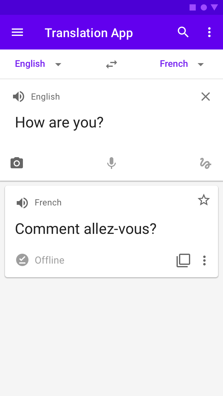

The app shows an offline badge when the user performs an action offline
The app shows an offline badge when the user performs an action offline.
The app shows an offline icon next to the URL when a website is being accessed offline
The app shows an offline icon next to the URL when a website is being accessed offline.

No functionality while offline ​

When features are not available offline, indicate them using the cloud off icon. Only show this icon when the product is offline. When possible, use the text label “offline” along with the icon.
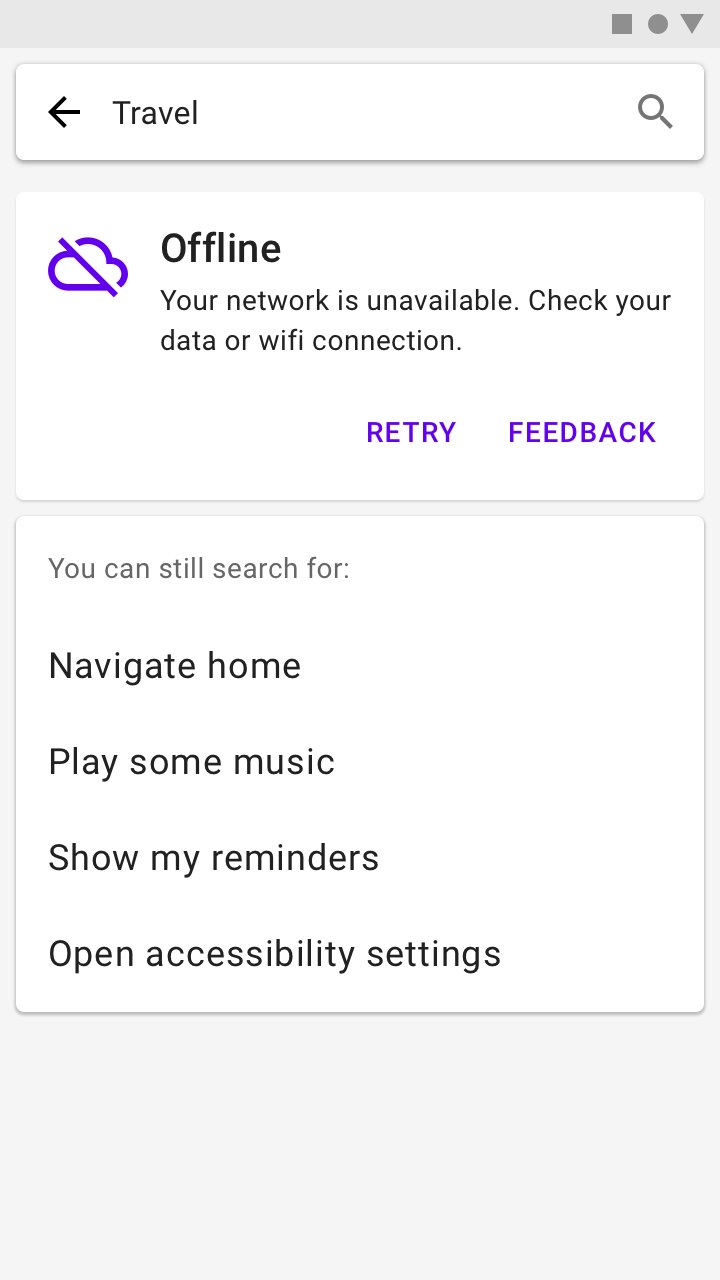
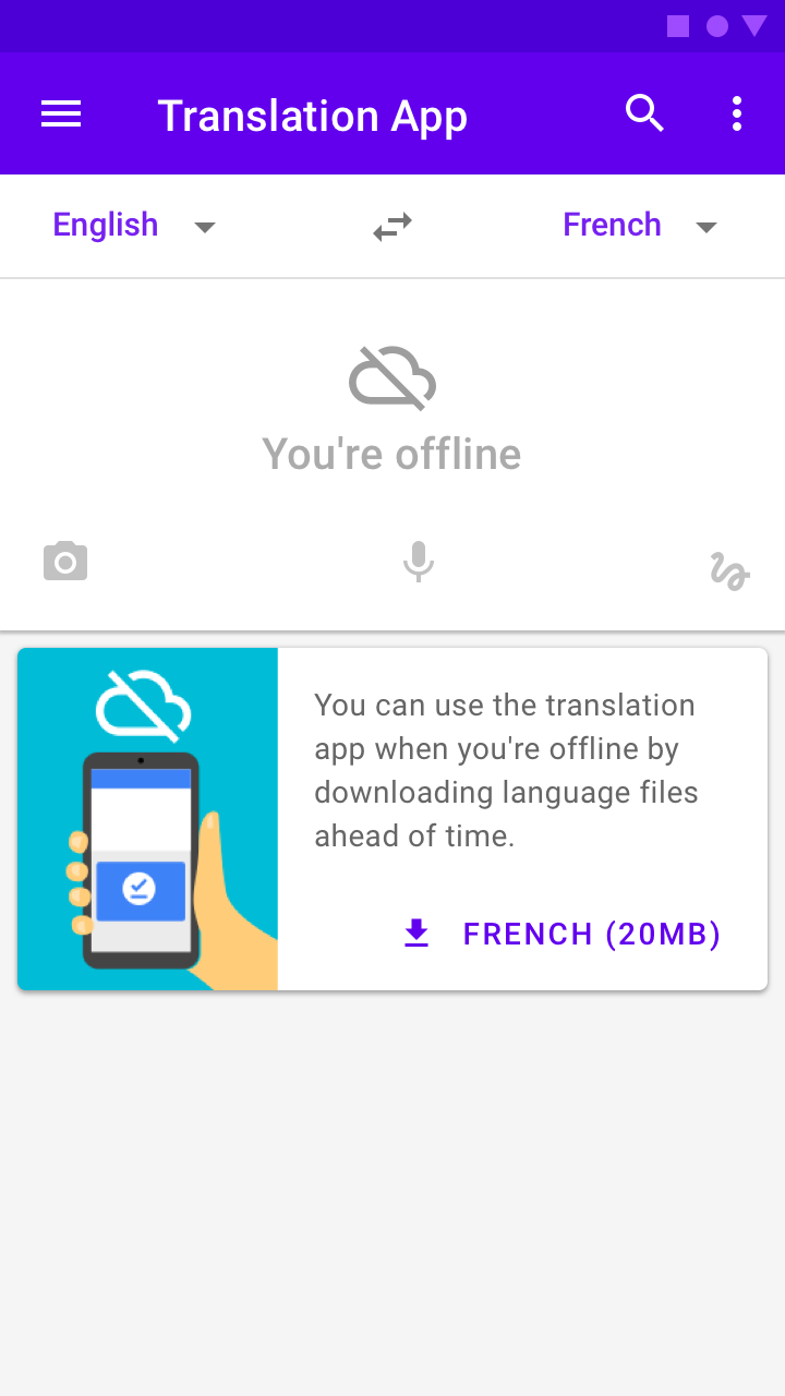
The app indicates when you’re offline and provides helpful tips of what the user can do while offline
The app indicates when you’re offline and provides helpful tips of what the user can do while offline.
The app offers the user to download an offline dictionary when the user is connected again to the internet for future
The app offers the user to download an offline dictionary when the user is connected again to the internet for future offline use.

Offline settings ​

Provide a place for users to manage their offline settings. If you use icons in your app, mark this destination with the offline pin icon.
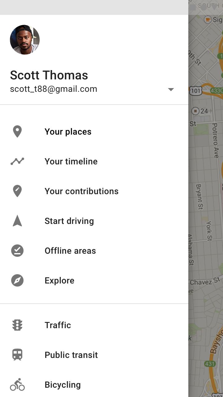
The navigation menu item “Offline areas” (5th in the list) indicates information saved for offline use
The navigation menu item “Offline areas” (5th in the list) indicates information saved for offline use.

Offline interactions ​

Downloading a file ​

Offline functionality gives users access to files they’ve previously downloaded, such as videos and websites. To access them offline, users must download files onto their devices when they have an internet connection.

Download text ​

To indicate a file can be downloaded, display both the download icon and the word “download.” Include the file size to help users decide if it’s too large.

When offline, allow users to select files to be downloaded when connected to the internet.

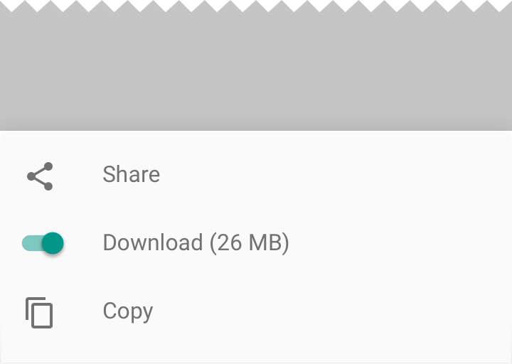
Do: pair the download icon with the word “Download.”

Do

Pair the download icon with the word “Download.”
Don’t use a toggle control for downloading a single file

Don't

Don’t use a toggle control for downloading a single file. Toggles indicate whether a state is “on” or “off,” rather than a one-time download.

Iconography ​

After a file has been downloaded, indicate that it’s available offline by displaying the offline pin icon.

The download and offline pin icons are available in the Material icon library
The download and offline pin icons are available in the Material icon library.

Animation ​

To indicate that downloaded items can be accessed offline, show an animation of the download icon transforming into an offline pin icon. See progress indicators for guidelines.

A progress indicator transitions between the two icons.

Removing downloaded content ​

To make space, users may delete files on their devices. Your app should allow users to delete any downloaded files.
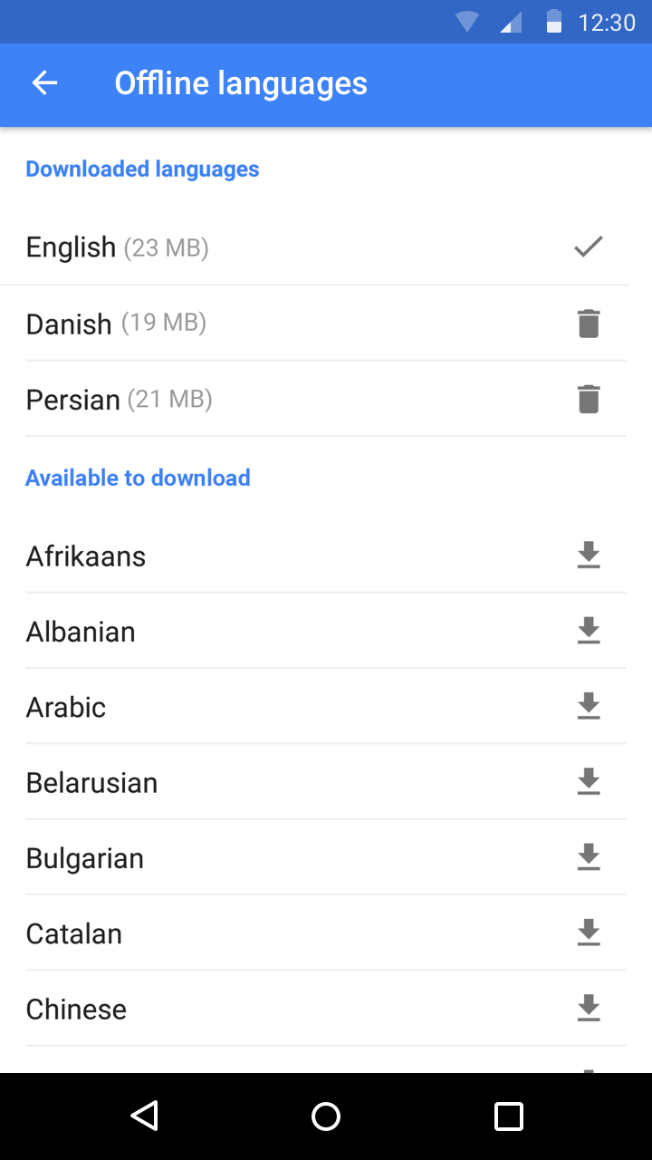
Display a remove action with a delete icon for downloaded files
Display a remove action with a delete icon for downloaded files.
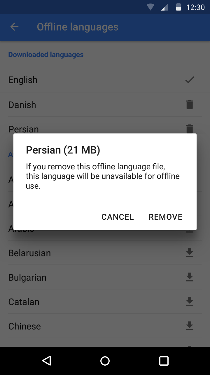
Show how much space will be saved by removing a file
Show how much space will be saved by removing a file.
Pager
Previous pageOnboarding
Next pageWriting

Released under the Apache-2.0

Copyright © 2018-Present Google

https://m2.material.io/design/communication/offline-states.html

Released under the Apache-2.0

Copyright © 2018-Present Google