Skip to content
Material Design 2
Main Navigation
v3
v2
v1

English

简体中文
繁體中文
Español
Français
Русский
Português – Brasil
Deutsch
日本語
한국어
Italiano
Polski
Türkçe
čeština
magyar

English

简体中文
繁體中文
Español
Français
Русский
Português – Brasil
Deutsch
日本語
한국어
Italiano
Polski
Türkçe
čeština
magyar

Appearance

Sidebar Navigation

Material System

Introduction

Material studies

About our Material studies

Basil

Crane

Fortnightly

Owl

Rally

Reply

Shrine

Material Foundation

Environment

Surfaces

Elevation

Light and shadows

Layout

Understanding layout

Pixel density

Responsive layout grid

Spacing methods

Component behavior

Applying density

Navigation

Understanding navigation

Navigation transitions

Search

Color

The color system

Applying color to UI

Color usage

Text legibility

Dark theme

Typography

The type system

Understanding typography

Language support

Sound

About sound

Applying sound to UI

Sound attributes

Sound choreography

Iconography

Product icons

System icons

Animated icons

Shape

About shape

Shape and hierarchy

Shape as expression

Shape and motion

Applying shape to UI

Motion

Understanding motion

The motion system

Speed

Choreography

Customization

Interaction

Gestures

Selection

States

Communication

Confirmation & acknowledgement

Data formats

Data visualization

Empty states

Help & feedback

Imagery

Launch screen

Onboarding

Offline states

Writing

Machine learning

Machine learning patterns

Object detection: live camera

Object detection: static image

Barcode Scanning

Material Guidelines

Material Theming

Overview

Implementing your theme

Usability

Accessibility

Bidirectionality

Platform guidance

Android bars

Android fingerprint

Android haptics

Android icons

Android navigating between apps

Android notifications

Android permissions

Android slices

Android split-screen

Android swipe-to-refresh

Android text selection toolbar

Android widget

Cross-platform adaptation

Components

App bars: bottom

App bars: top

Backdrop

Banners

Bottom navigation

Buttons

Buttons: floating action button

Cards

Checkboxes

Chips

Data tables

Date pickers

Dialogs

Dividers

Image lists

Lists

Menus

Navigation drawer

Navigation rail

Progress indicators

Radio buttons

Sheets: bottom

Sheets: side

Sliders

Snackbars

Switches

Tabs

Text fields

Time pickers

Tooltips

On this page

Text legibility ​

Color plays an important role in text legibility.

Legibility standards ​


Accessibility

Accessibility in design allows users of diverse abilities to navigate, understand, and use your UI.

Related article

Understanding contrast

Guidance on ensuring adequate color contrast for accessibility.

Related link

WCAG standards ​

All text should be legible and meet accessibility standards. The Web Content Accessibility Guidelines (WCAG 2.0) level AA requires a 4.5:1 color contrast between text and background for normal text, and 3:1 to large text.

To learn more about color, contrast, and accessibility design, read Material Design Accessibility.

Text backgrounds ​

Text on colored backgrounds ​

Black text is recommended for use on light backgrounds, and white text on dark backgrounds. If your app has both light and dark themes, make sure the text is available in a contrasting color against each theme.

Colored backgrounds or typography additionally change the rules regarding text opacity and different states of text.

Using text opacity ​

Instead of using grey text and icons on top of colored backgrounds, create better contrast by displaying white or black text with reduced opacity.

For example, black text displayed at 75% opacity on a green background gives the text an appearance of black, with a hint of green.

Alternatively, you can calculate the color of text by doing the following:

  • Place the color black at reduced opacity in front of a green background
  • Identify the hex value of the resulting darkened green color
  • Use that hex value of that color for your text

In this case, if the surface behind the text changes color, you must update the hex color as well.
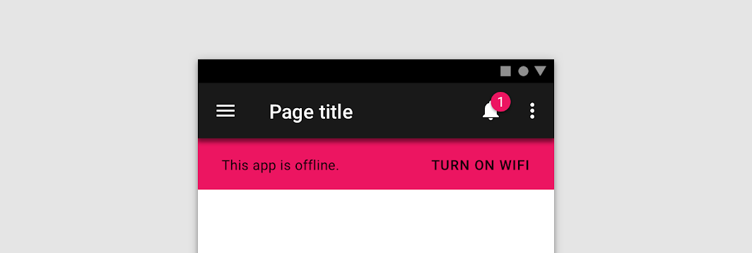
Do: use a transparent version of black on a colored surface to preserve legibility

Do

Use a transparent version of black on a colored surface to preserve legibility.

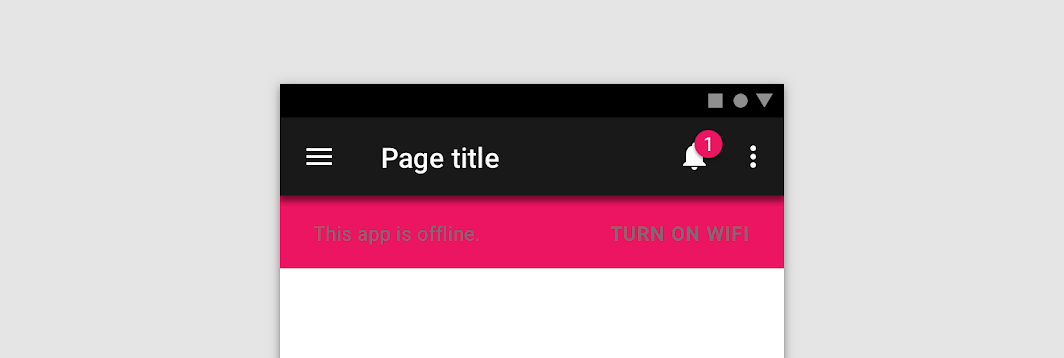
Don't: avoid using opaque grey text that isn’t legible on colored surfaces

Don't

Avoid using opaque grey text that isn’t legible on colored surfaces.

Dark text on light backgrounds ​


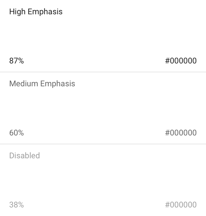
Dark text on light backgrounds (shown here as #000000 on #FFFFFF) applies the following opacity levels:

  • High-emphasis text has an opacity of 87%
  • Medium-emphasis text and hint text have opacities of 60%
  • Disabled text has an opacity of 38%
Dark text on light backgrounds: opacity

Colored text and backgrounds ​

Colored text should be used sparingly to draw attention and apply selective emphasis. Ideally colored text should be reserved for text elements such as headlines, buttons, and links.
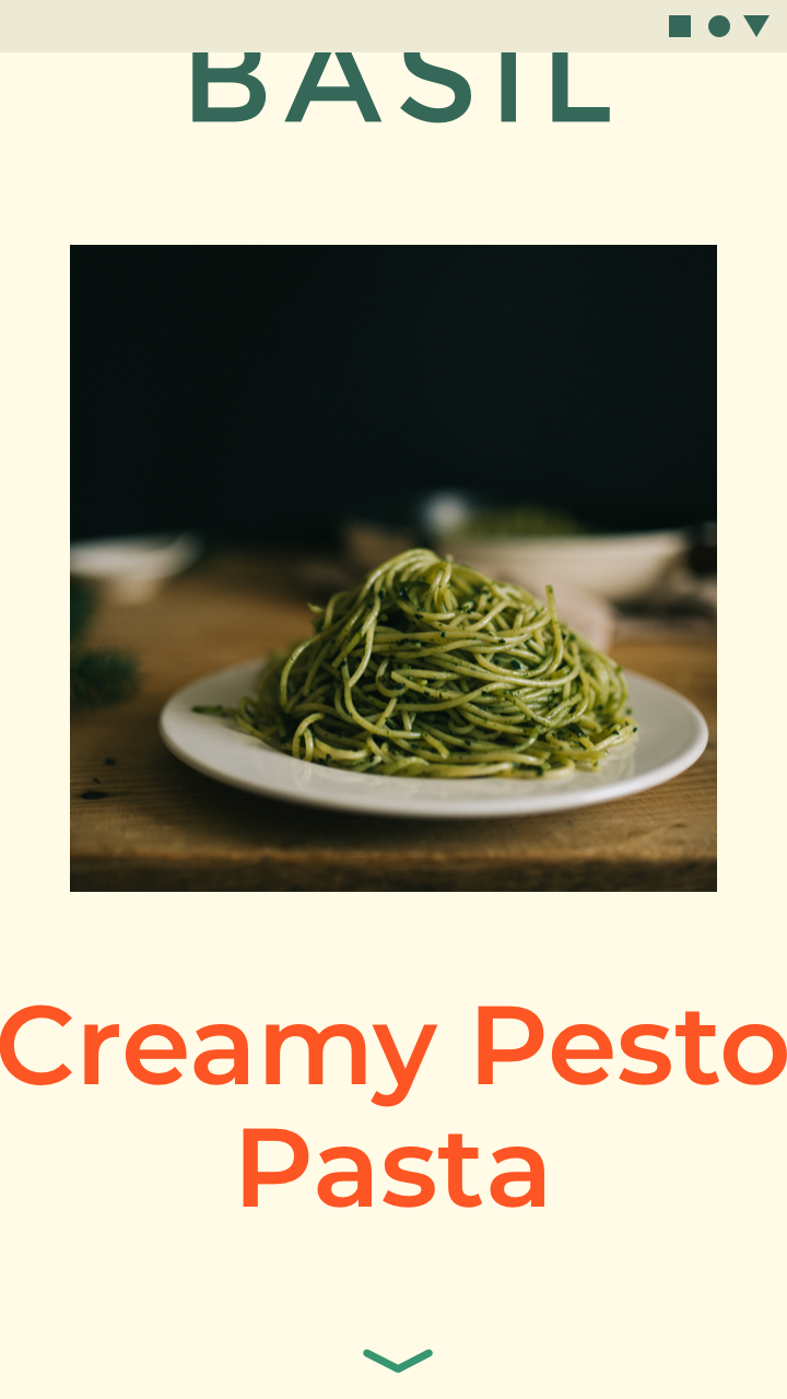
Do: large headlines and short text snippets are best for colored text

Do

Large headlines and short text snippets are best for colored text.
Caution: it can be hard to read long body copy that is colored

Caution

It can be hard to read long body copy that is colored.

Tools for picking colors

The Material Design color system can help you create a color theme that reflects your brand or style.

Related article

Text types ​

Helper Text ​


Helper text gives context about a field’s input, such as how the input will be used. It can adopt brand colors, but should be legible as determined by WCAG standards.

For example, helper text on light backgrounds could apply the following opacity levels and default hexes:

  • High emphasis helper: This text uses a hex value #000000 at 87% opacity
  • Default color helper text: This text uses a hex value of #000000 at 60% opacity
  • Default error helper text: This text uses a hex value of #B00020 at 100% opacity
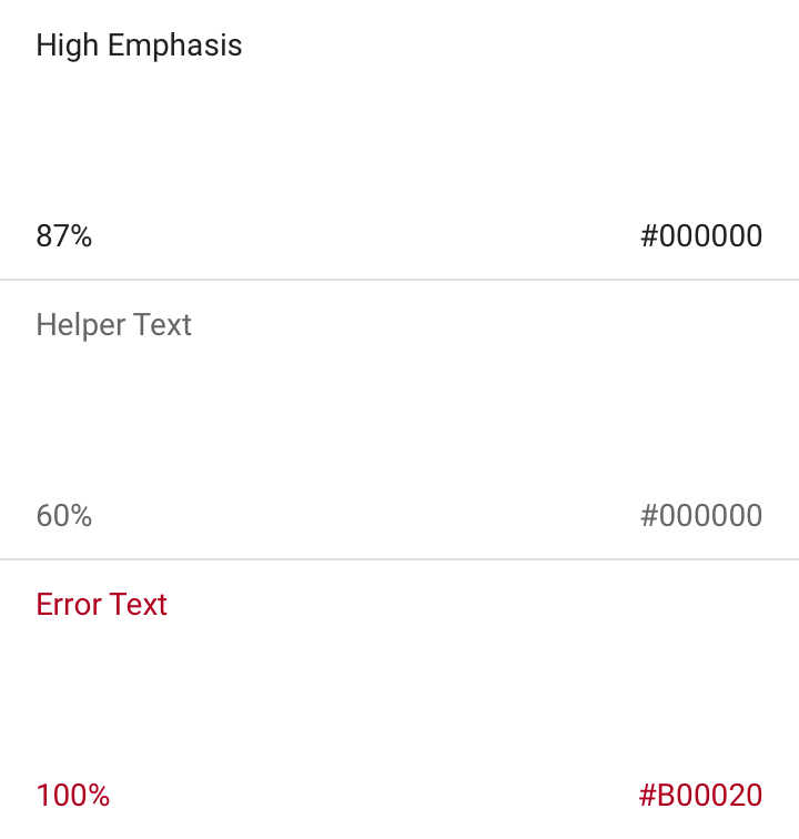
Helper Text: opacity

Selected Text ​

To reflect brand, text selection can use an accent of your primary or secondary color.

Selected text should be legible against the selection color, and the selection color should contrast the background color. Alternatively, you can display outlines, motion, checkmark icons, or other text treatments to indicate selected text.

Learn more about contrast (or try a color contrast analyzer) at webaim.org.
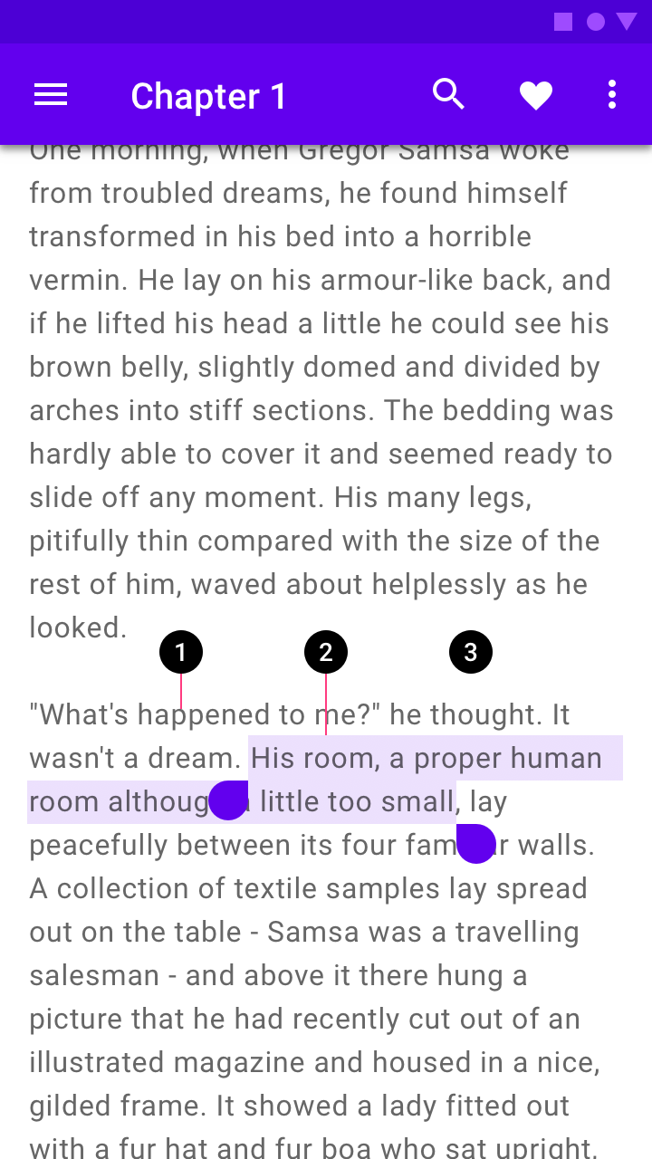
Diagram of text, text selection color, background
1. Text
2. Text selection color
3. Background
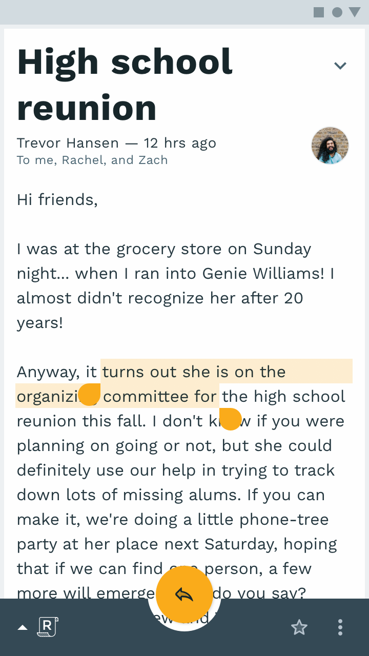
Text selection can be customized using your palette accent color
Text selection can be customized using your palette accent color.

Icons and Other symbols ​


Icons and other elements don’t need to meet WCAG legibility standards, but should be as visible as possible to indicate function or communicate information.

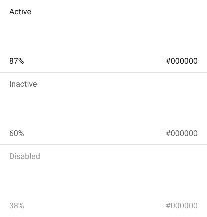
For example, dark icons (#000000) or other elements on light backgrounds (#FFFFFF) could apply the following opacity levels:

  • Active icons have an opacity of 87%
  • Inactive icons have an opacity of 60%
  • Disabled icons have an opacity of 38%
Icons and Other symbols: opacity
Pager
Previous pageColor usage
Next pageDark theme

Released under the Apache-2.0

Copyright © 2018-Present Google

https://m2.material.io/design/color/text-legibility.html

Released under the Apache-2.0

Copyright © 2018-Present Google