Cards
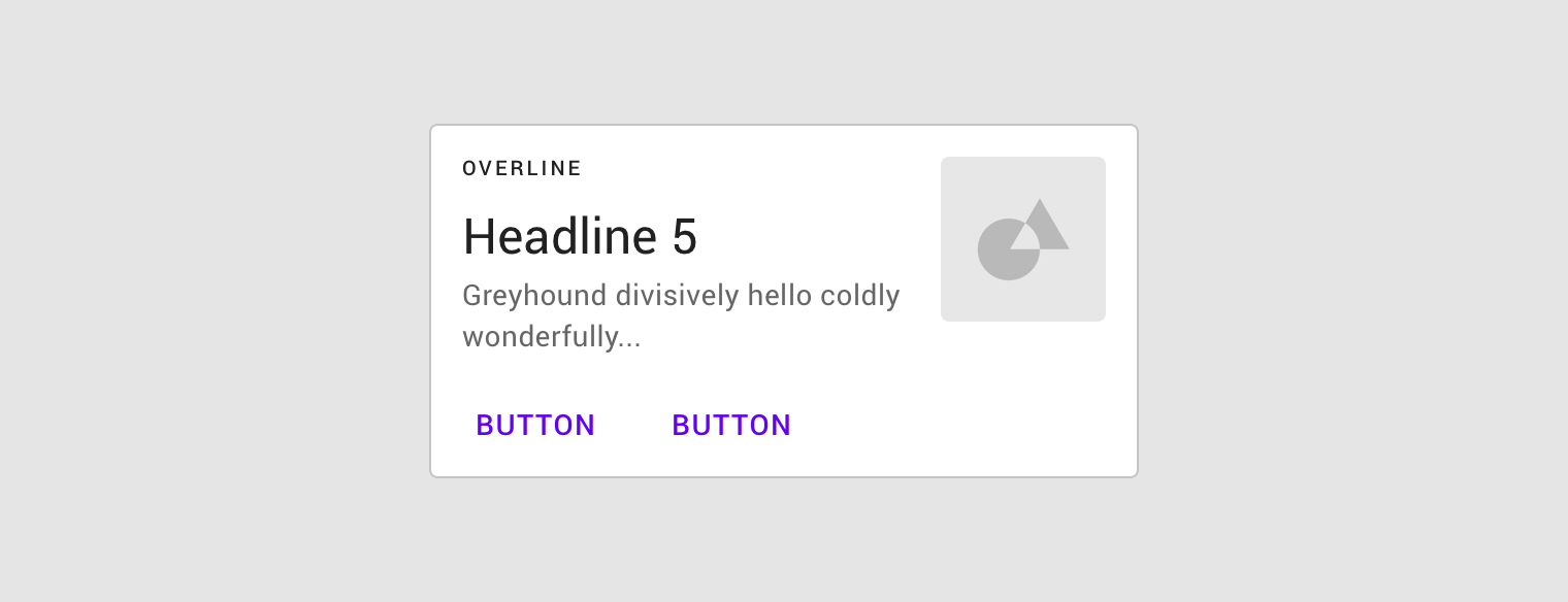
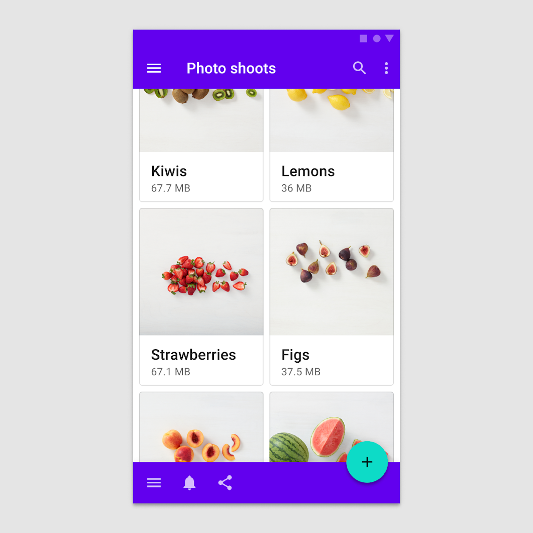
Cards contain content and actions about a single subject.
Interactive demo
This demo lets you preview the card component, its variations, and configuration options. Each tab displays a different type of card.
Usage
Cards are surfaces that display content and actions on a single topic.
They should be easy to scan for relevant and actionable information. Elements, like text and images, should be placed on them in a way that clearly indicates hierarchy.
Principles

Contained
A card is identifiable as a single, contained unit.

Independent
A card can stand alone, without relying on surrounding elements for context.

Individual
A card cannot merge with another card, or divide into multiple cards.
Anatomy
The card container is the only required element in a card. All other elements shown here are optional.
Card layouts can vary to support the types of content they contain. The following elements are commonly found among that variety.
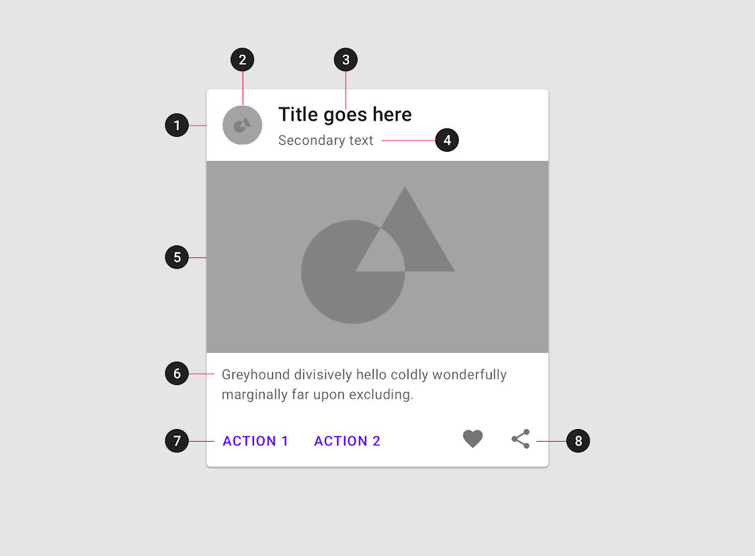
Card containers hold all card elements, and their size is determined by the space those elements occupy. Card elevation is expressed by the container.
2. Thumbnail [optional]
Cards can include thumbnails to display an avatar, logo, or icon.
3. Header text [optional]
Header text can include things like the name of a photo album or article.
4. Subhead [optional]
Subhead text can include text elements such as an article byline or a tagged location.
5. Media [optional]
Cards can include a variety of media, including photos, and graphics, such as weather icons.
6. Supporting text [optional]
Supporting text include text like an article summary or a restaurant description.
7. Buttons [optional]
Cards can include buttons for actions.
8. Icons [optional]
Cards can include icons for actions.
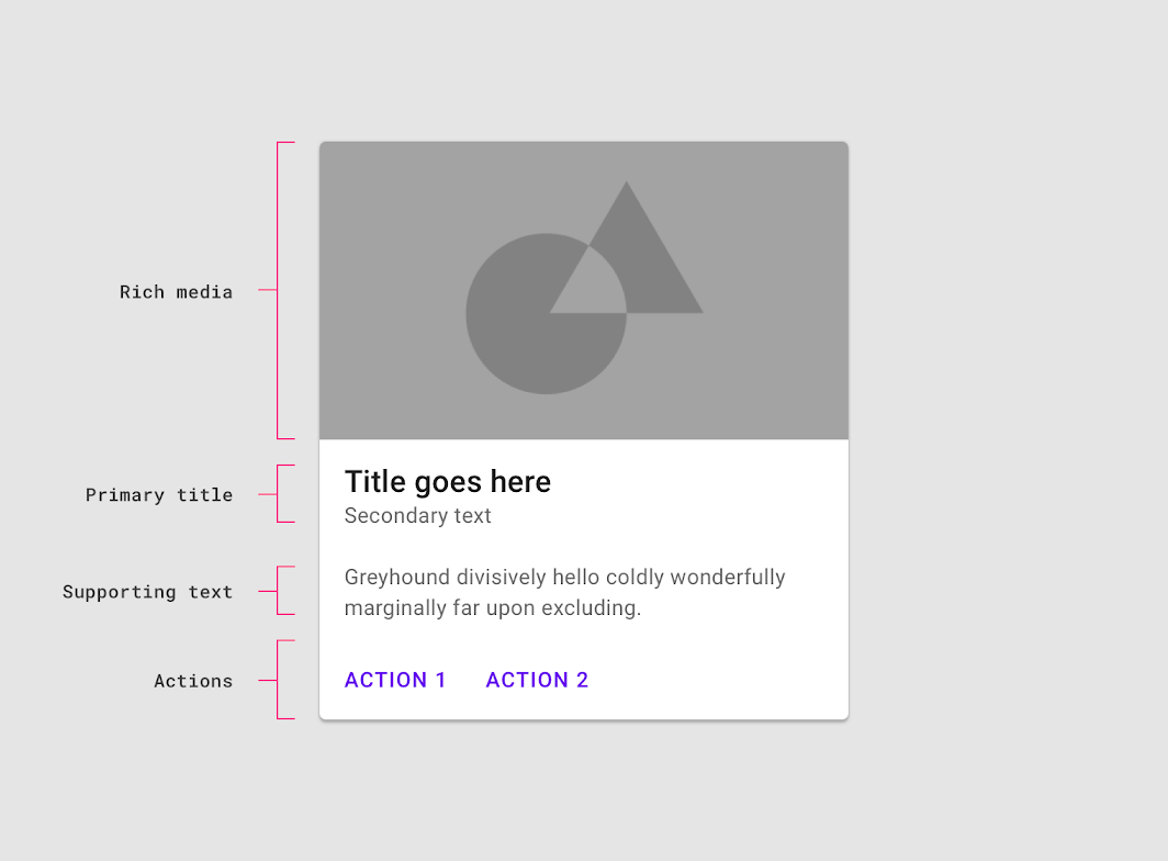
Each card is made up of content blocks. All of the blocks, as a whole, are related to a single subject or destination. Content can receive different levels of emphasis, depending on its level of hierarchy.
Containment
Implicit containment
An implicit container groups content or elements and may appear to have no edges, creating an implied boundary. Use implicit containment to group content and subtly reinforce the cohesion of a contained unit.
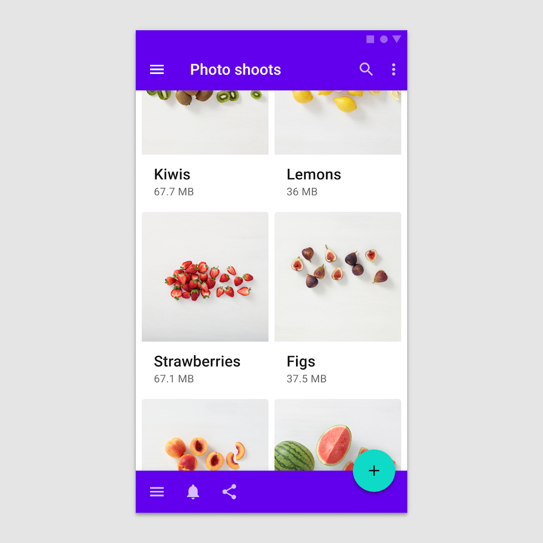
Explicit containment
An explicit container shows clear, visible boundaries. It can be tappable, and can be used to provide emphasis.
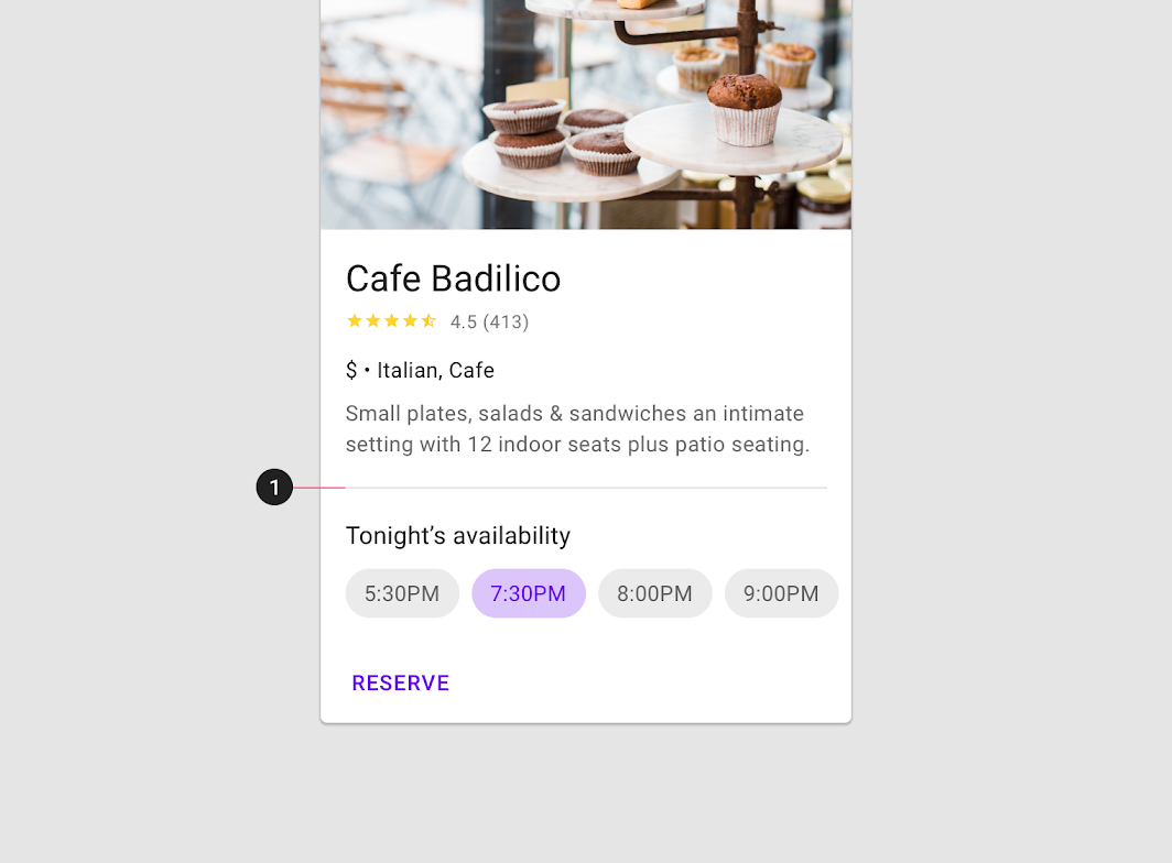
Dividers
Dividers can be used to separate regions in cards or to indicate areas of a card that can expand.
Behavior
Transitions
Cards use a container transform transition pattern to reveal additional content.
Do
Don't
Elevation
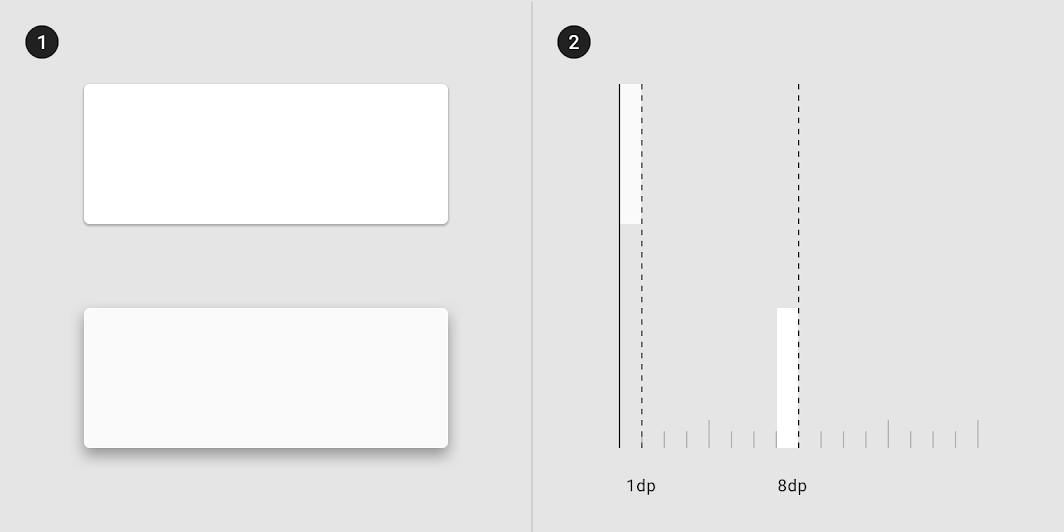
On mobile, a card’s default elevation is most often 1dp, but can be 0dp in order to have fewer shadows on denser screens. In either case, the card's raised dragged elevation is 8dp.
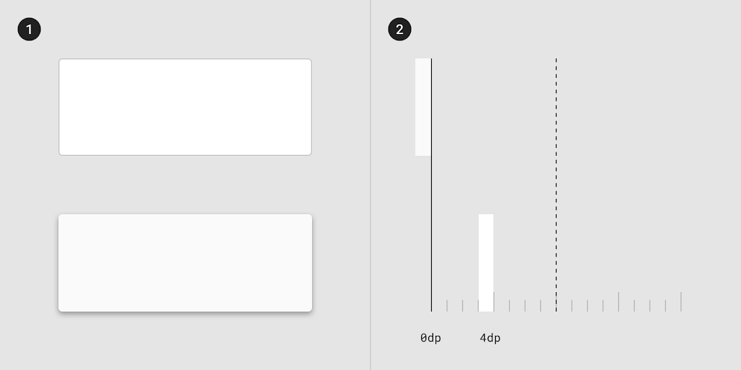
On desktop, cards have a default resting elevation of 0dp and elevate to 4dp on hover.
Gestures
Gestures should be implemented consistently within a card collection. Frequently used gestures on cards include swipe, pick up and move, and scrolling.
Swipe
A swipe gesture can be performed on a single card at a time, anywhere on that card.
It can be used to:
- Dismiss a card
- Change the state of a card (such as flagging or archiving it)
Do
Don't
Pick up and move
The pick up and move gesture allows users to move and re-order cards in a collection.
Do
Don't
Don't
Scrolling
Card content that is taller than the maximum card height is truncated and does not scroll, but can be displayed by expanding the height of a card. A card can expand beyond the maximum height of the screen, in which case the card scrolls within the screen.
Do
Don't
Do
Scaling and adaptation
As cards scale to adapt to different screen sizes, their position and alignment can also change.
Cards and their elements can align left, right, or center as the layout scales. They can also have a fixed position, like FABs or navigation drawers.
Ergonomics
Adjust the layout of components to meet the ergonomic needs of large screen devices. For example, a horizontally oriented card on a mobile screen may become a larger, vertically-oriented card on larger screens, lending more space to imagery and typography to fit the larger form factor.
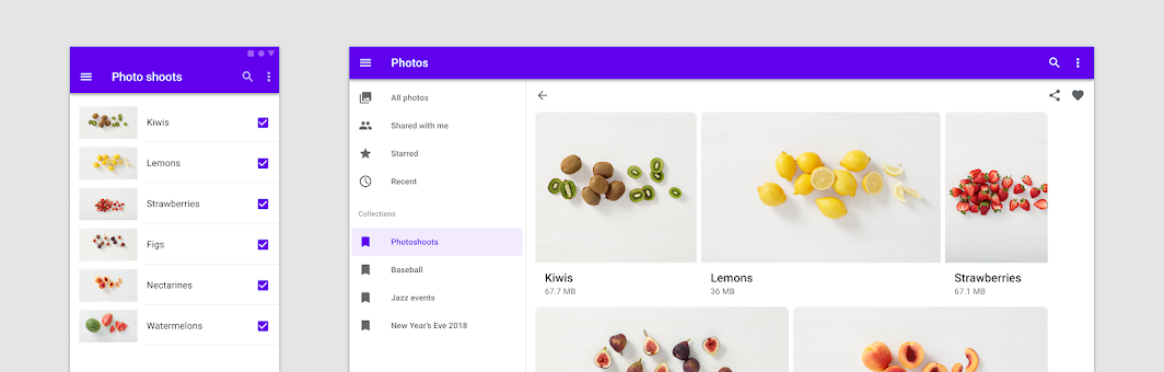
Adapting presentation
When a component switch isn’t needed, varying the presentation of the same content-focused component can also help serve a given context, such as making a card horizontally oriented on desktop screens. Use caution to avoid confusing user expectations for how the component behaves.
Visual presentation
To adjust the presentation of content-focused components, begin with spacing. Allow components like lists, cards, and images to optimize space while filling the region of a screen that suits a device breakpoint’s ergonomic needs.
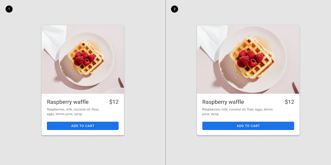
The internal composition of a card can adjust for large screens.

Column-based layouts
In mobile layouts, components such as lists or cards are stretched to fit the full width of the screen without compromising visual or ux qualities. When designing for large screens, use multiple columns to display content. Avoid extending UI elements across the screen whenever possible. Groups of related cards can be rearranged to become horizontal rows or carousels, allowing for better content organization on larger screens.
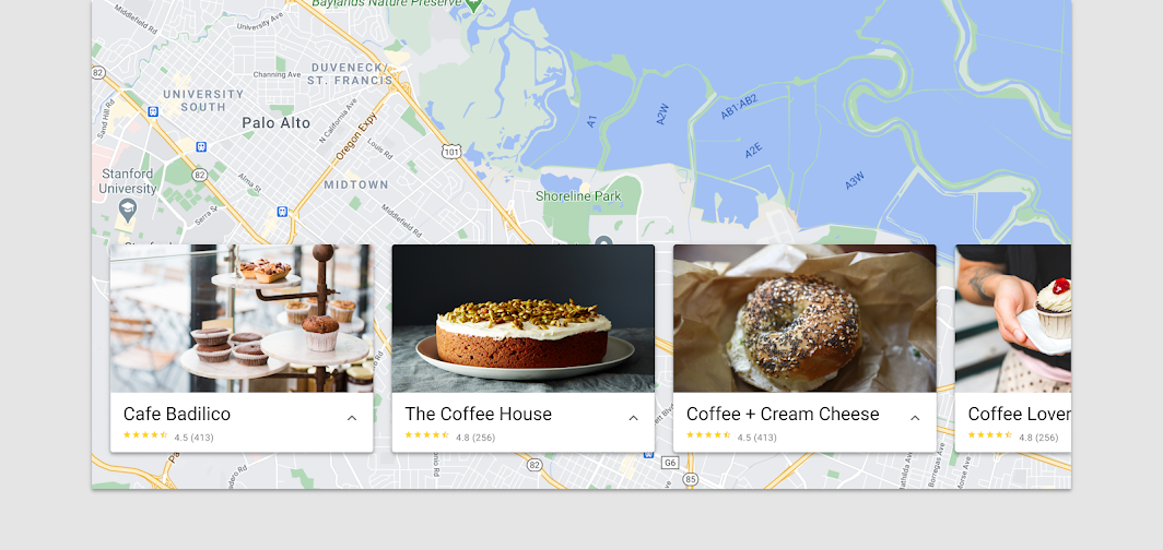
Component swapping
Component swapping means that functionally equivalent components can be swapped to make larger-scale changes to the ergonomic and functional qualities of an interface.
Device breakpoints are the primary indicators for an interface to trigger a component swap that will better match the device or user context. Certain devices or user contexts require different components to meet platform expectations, device constraints, or ergonomic concerns. When swapping components, ensure that each component’s function is clear and aligns with user expectations for the given context.
As screen sizes increase, there are new opportunities for text and image compositions; in large screens you can use more space for images and text. Given the flexibility needed for these components to support multiple types of content, lists and cards can be swapped when scaling to larger screens, but use caution that list controls and other component-specific elements can be maintained.
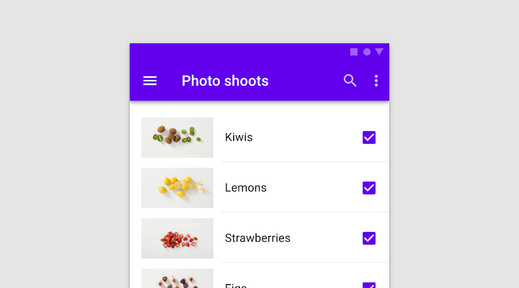
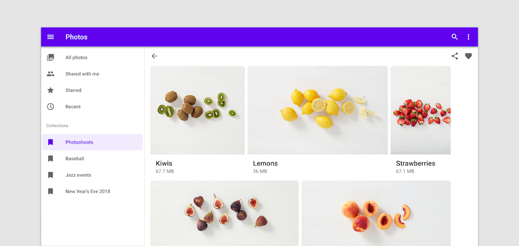
Actions
Primary action
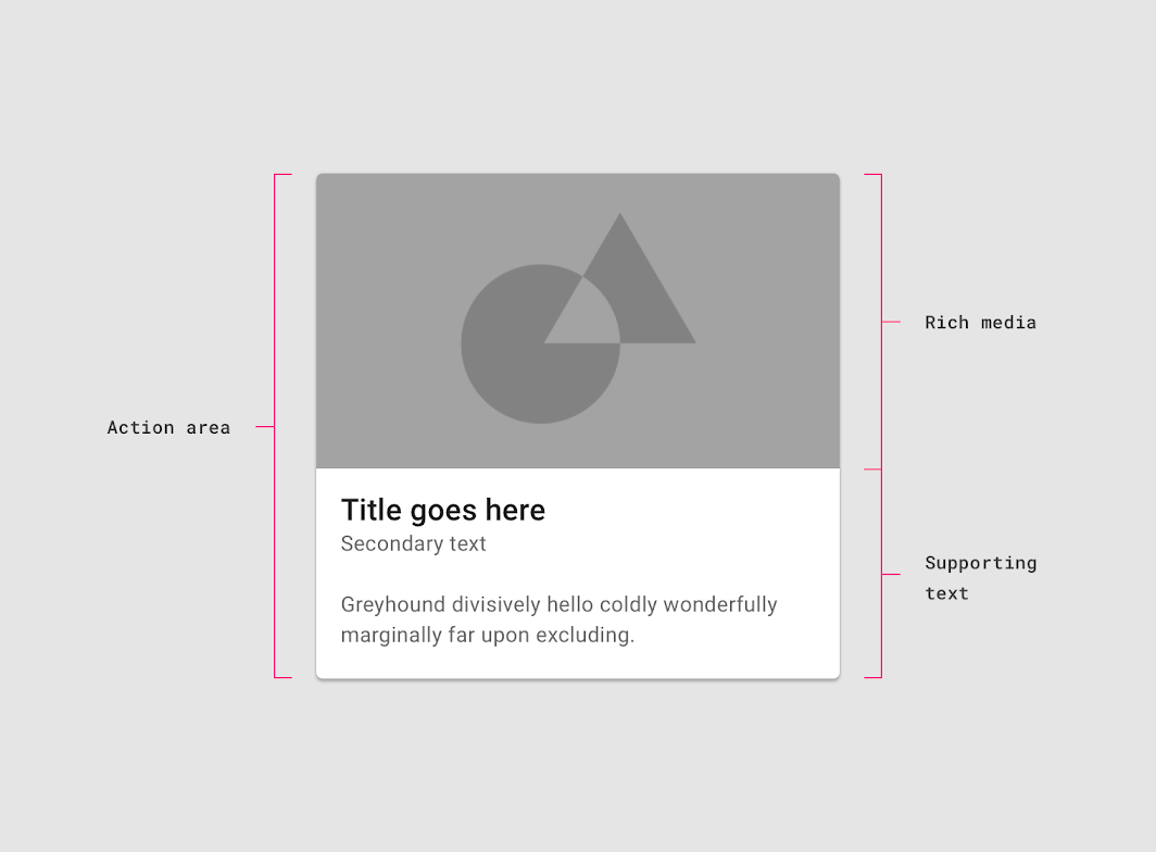
The primary action area of a card is typically the card itself. Often cards are one large touch target to a detail screen on a subject.
Supplemental actions
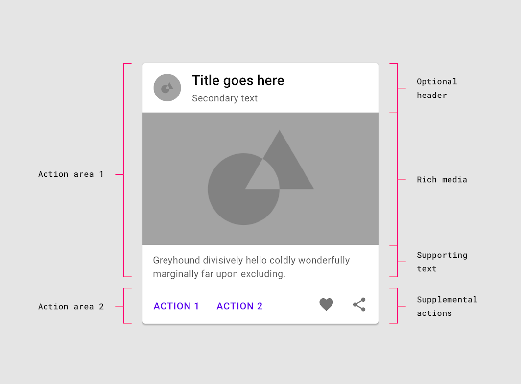
Supplemental actions are represented by icons, text, and UI controls on cards. They are typically placed at the bottom of the card.
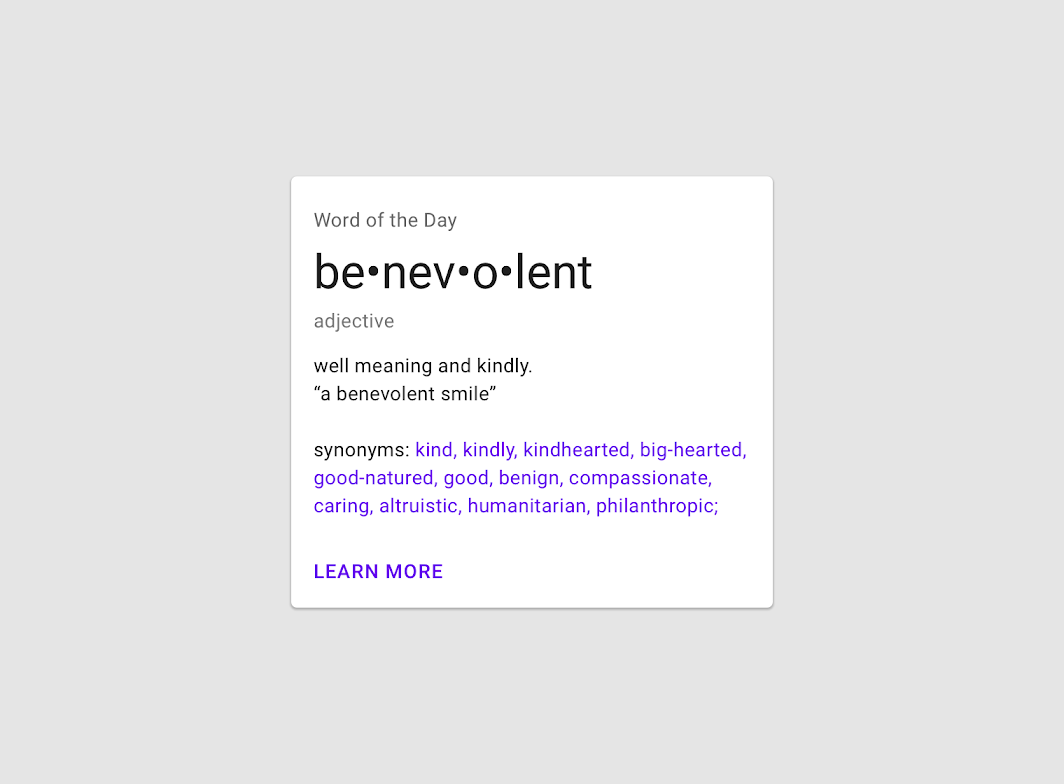
For more than two supplemental actions, use an overflow menu instead.
Overflow menu
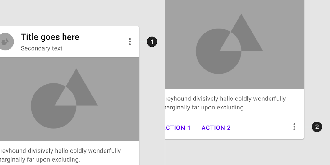
Overflow menus contain related actions. They are typically placed in the upper-right or lower-right corner of a card.
UI controls
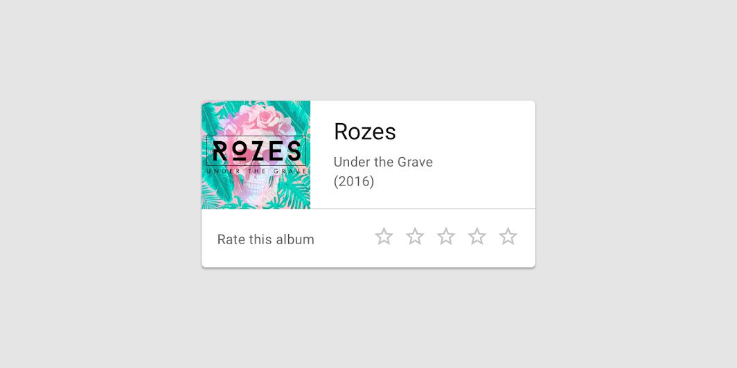
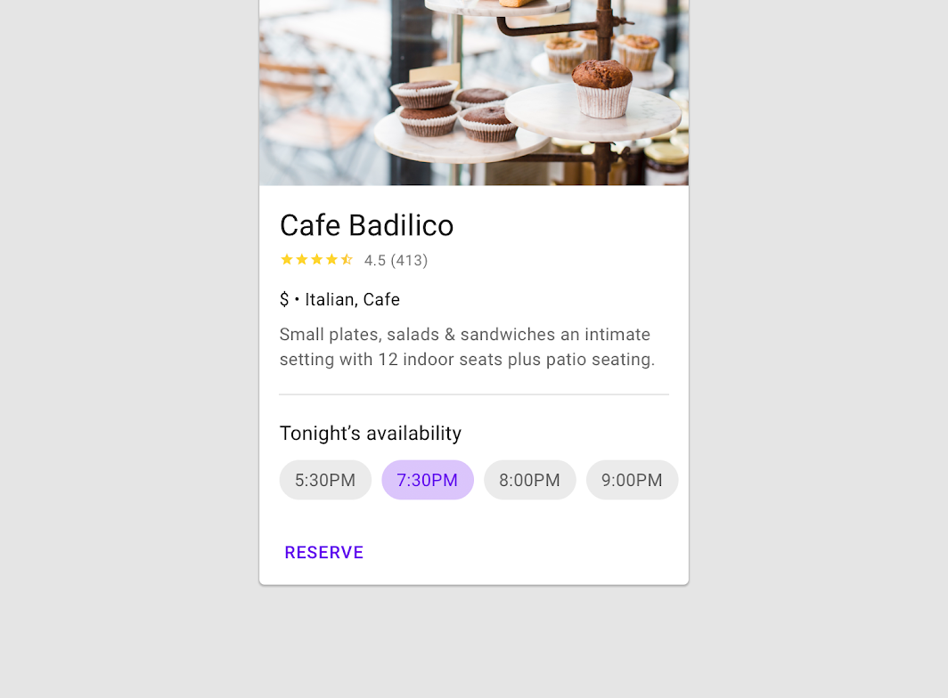
UI controls can be included within a card to allow the user to interact with a card’s content. UI controls may be in the form of a slider, stars to rate content, chips, or buttons.
Additional actions
Cards can support multiple actions, such as UI controls and an overflow menu. Because cards are entry points to more detailed information, they should contain a limited number of actions.
Caution
Focus
When traversing through focus points on a card, visit each focused element before moving to the next card.
For users that navigate solely using focus traversal (using a D-pad and keyboard), cards should have either a primary action or open a new screen containing primary and supplemental actions.
Card collections
Usage
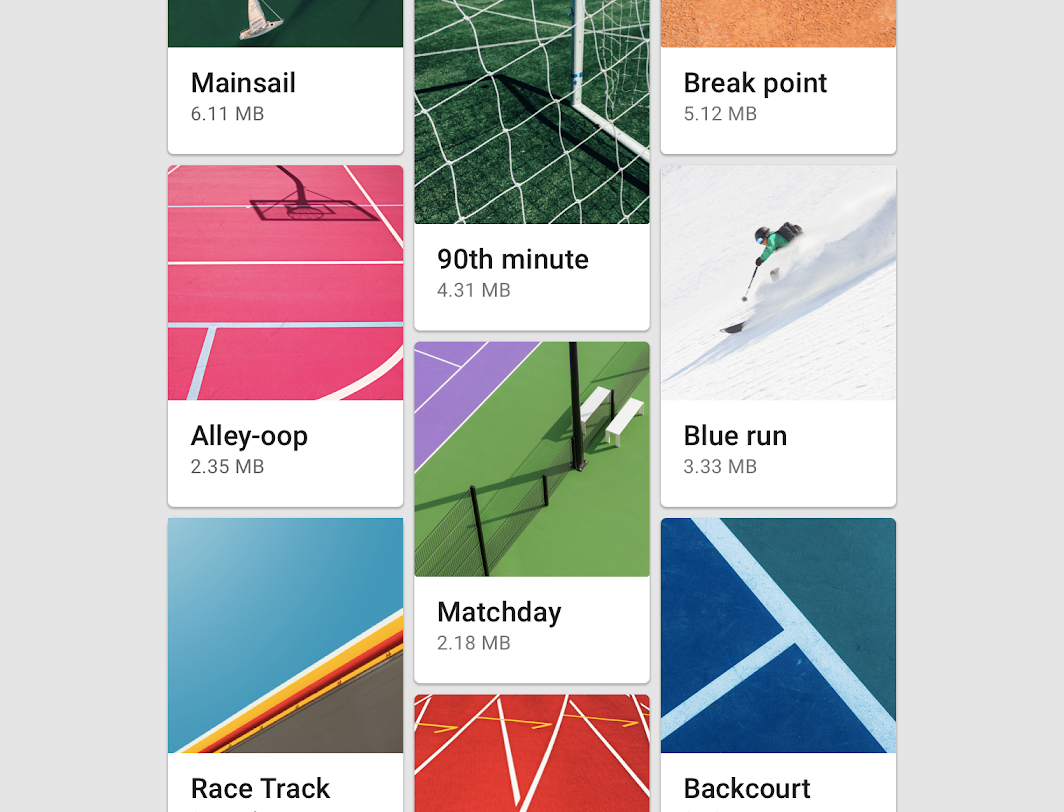
When multiple cards are present, they are grouped together into one or more collections. By default, cards in a collection are coplanar, sharing the same resting elevation unless they are picked up or dragged.
Layout
Organize card collections so that they are easy to use. Their layout affects how they are perceived.
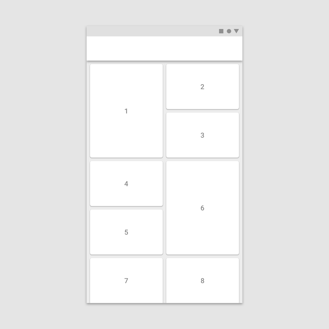
Scannable
To make a collection of cards scannable, place them in a consistent pattern.
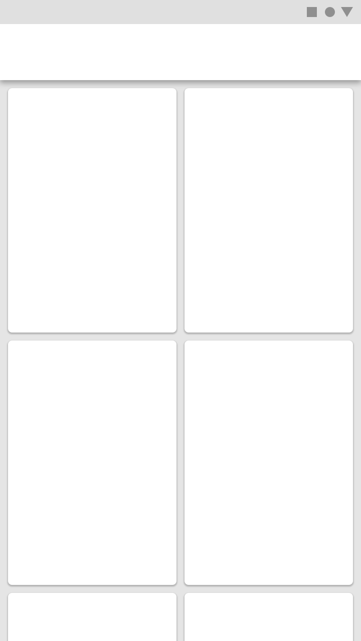
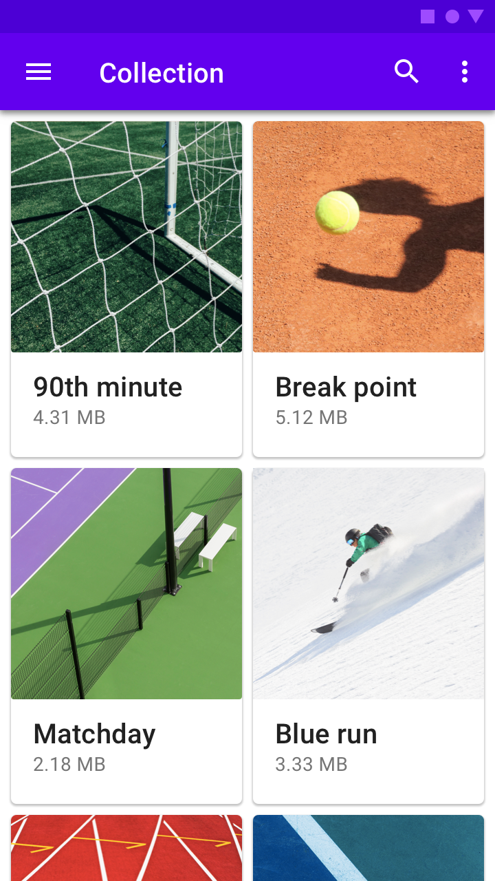
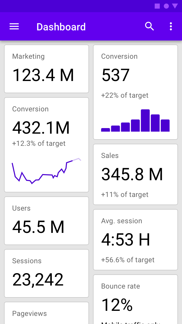
Dashboard
To display multiple subject matters and functions on a screen, use a dashboard-style card collection.
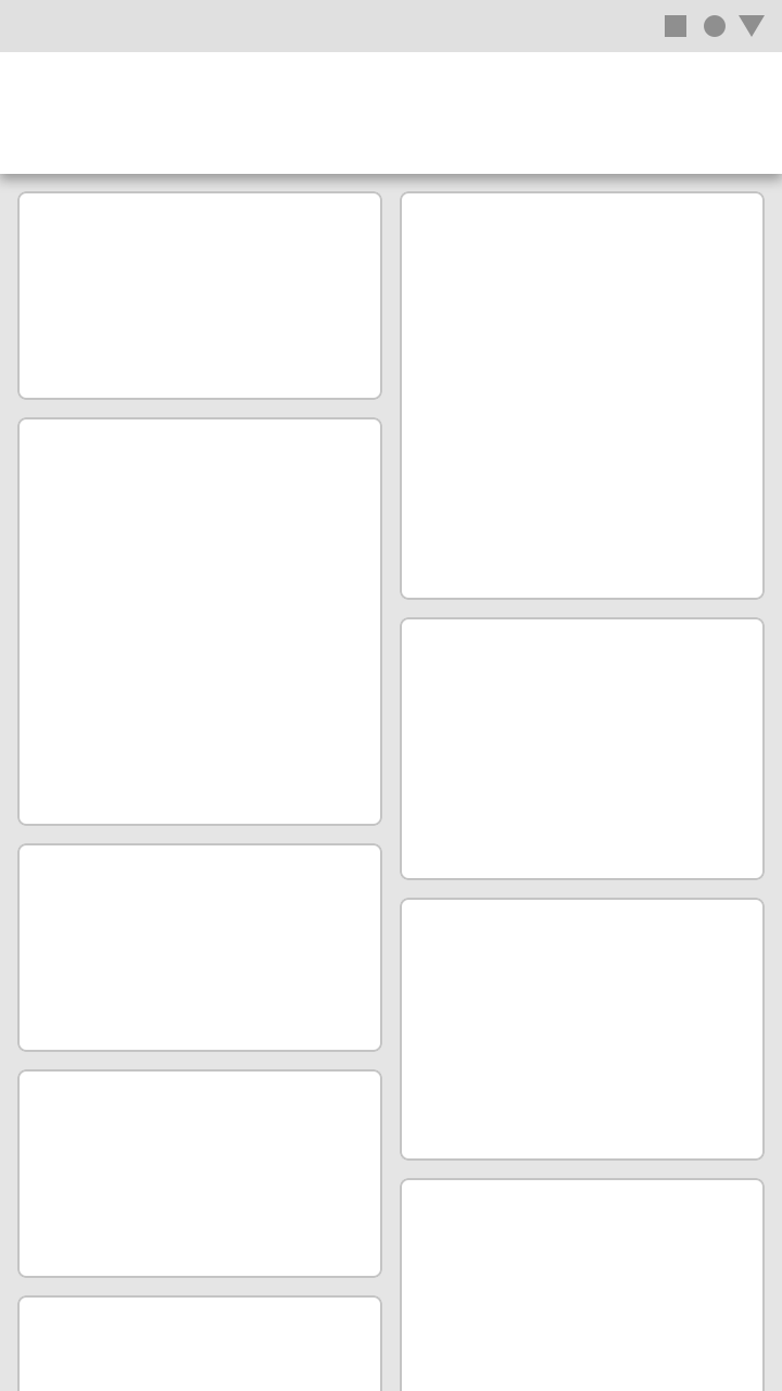
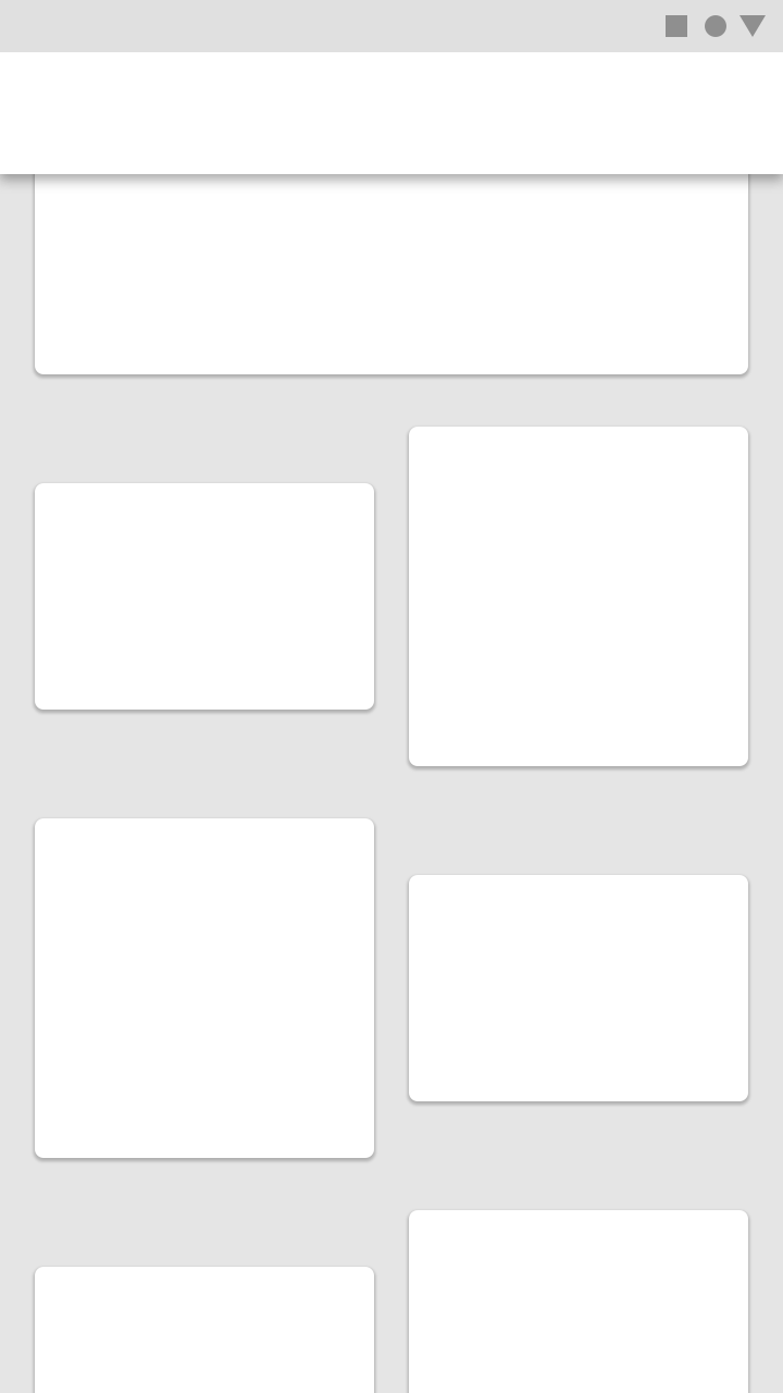
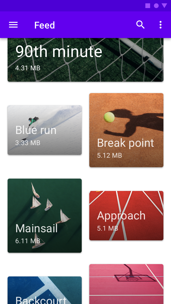
Distinction
To highlight each card’s individuality, style, or novelty, use a card collection with an asymmetric grid.
Contained collections
Card collections can be placed within a container, and be scrolled within it.
Do
Don't
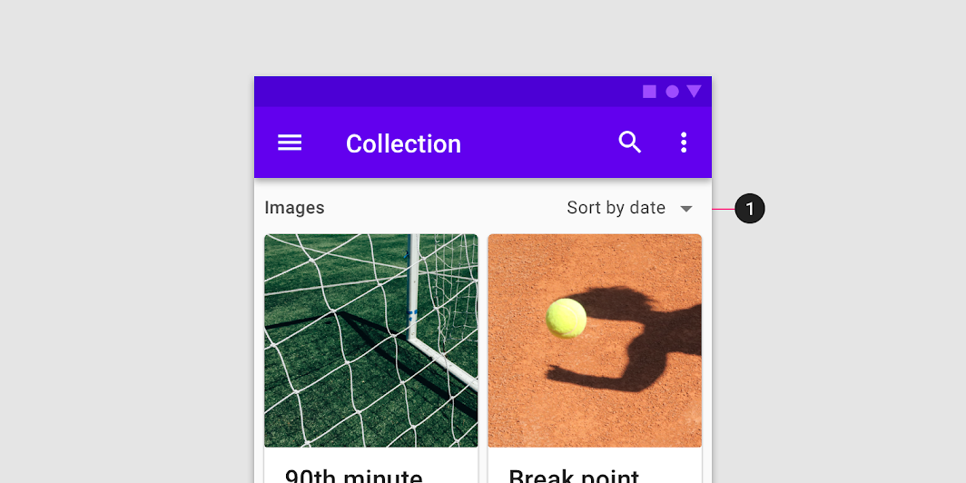
Filtering and sorting
Card collections can be filtered in a variety of ways, including by date or alphabetical order. If a collection can be filtered, the filter must apply to each card in the collection.
Theming
Owl Material theme
This educational app’s cards have been customized using Material Theming. Areas of customization include color, typography, and shape.
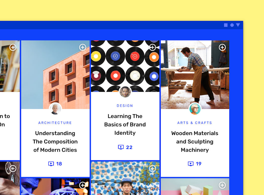
Color
Owl’s cards use custom color on three elements: the container, text, and icon.
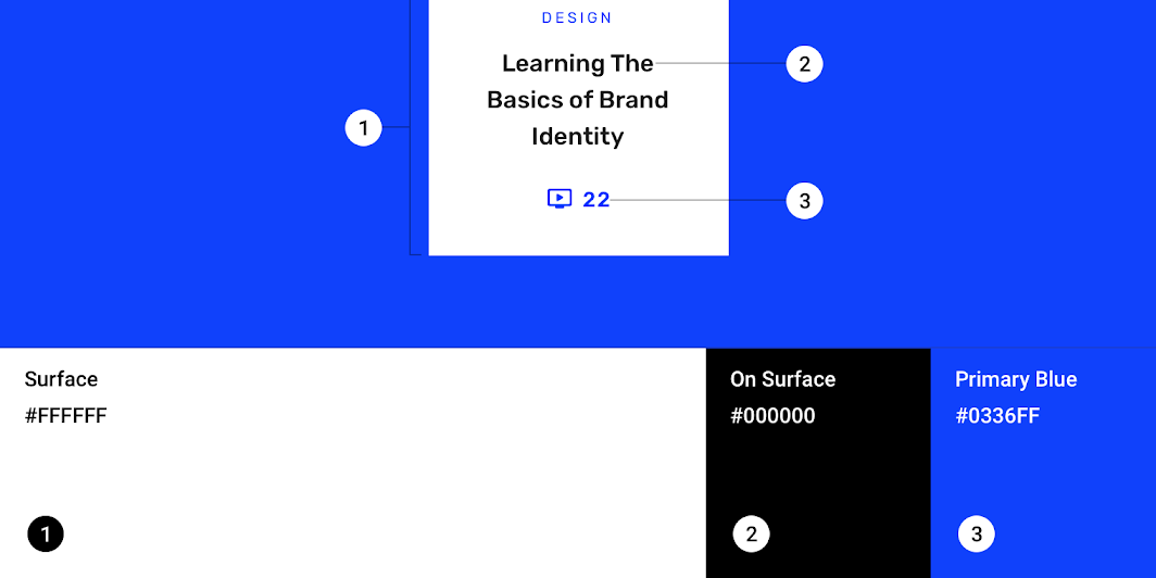
| Element | Category | Attribute | Value |
|---|---|---|---|
| Container | Background | Color Opacity | #0336FF 100% |
| Text, Icons | On Background | Color Opacity | #FFFFFF 100% |
Typography
Owl’s cards use custom typography for the card title, number, and category text.
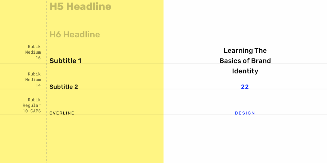
| Element | Category | Attribute | Value |
|---|---|---|---|
| Title | Subtitle 1 | Typeface Font Size Case | Rubik Medium 16 Title case |
| Number | Subtitle 2 | Typeface Font Size Case | Rubik Medium 14 Title case |
| Category | Overline | Typeface Font Size Case | Rubik Regular 10 All caps |
Shape
Owl’s cards use a custom container shape, with a 0dp corner radius.
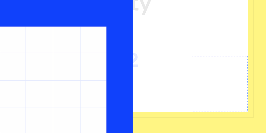
| Element | Category | Attribute | Value |
|---|---|---|---|
| Container | Medium component | Family Size | Rounded 0dp; 0dp; 0dp; 0dp |
Reply Material theme
This email app’s cards have been customized using Material Theming. Areas of customization include color, typography, and shape.
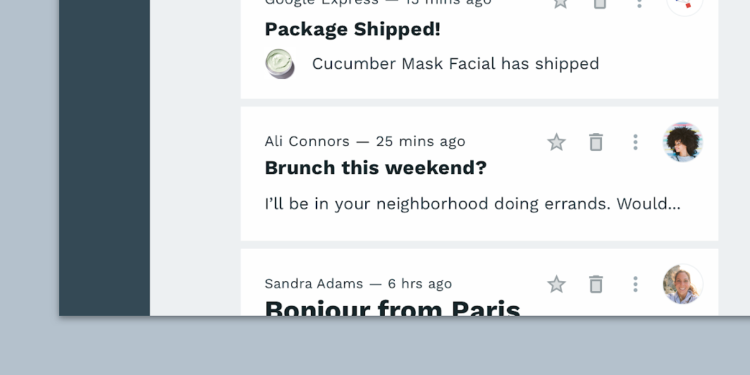
Color
Reply’s cards use custom color on six elements: the container, metadata text, title text, body text, icon, and icon fill.
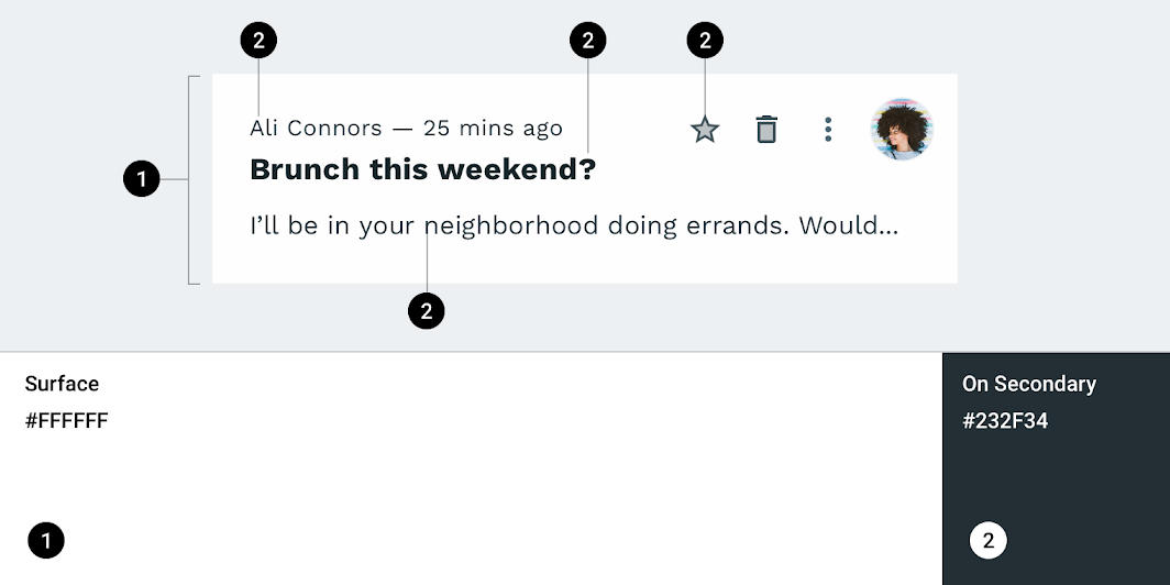
| Element | Category | Attribute | Value |
|---|---|---|---|
| Container | Surface | Color Opacity | #FFFFFF 100% |
| Metadata text | On Secondary | Color Opacity | #232F34 100% |
| Title text | On Secondary | Color Opacity | #232F34 100% |
| Body text | On Secondary | Color Opacity | #232F34 100% |
| Icon | On Secondary | Color Opacity | #232F34 100% |
| Icon fill | On Secondary | Color Opacity | #232F34 30% |
Typography
Reply’s cards use custom typography for the card title, body, and metadata text.
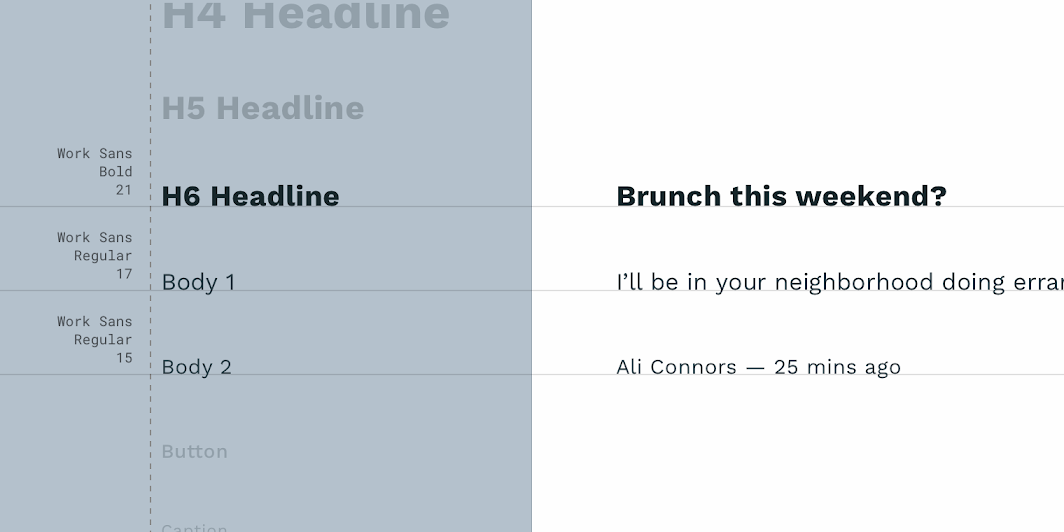
| Element | Category | Attribute | Value |
|---|---|---|---|
| Title | H6 | Typeface Font Size Case | Work Sans Bold 21 Sentence case |
| Body | Body 1 | Typeface Font Size Case | Work Sans Regular 17 Sentence case |
| Metadata | Body 2 | Typeface Font Size Case | Work Sans Regular 15 Sentence case |
Shape
Reply’s cards use a custom container shape, with a 0dp corner radius.
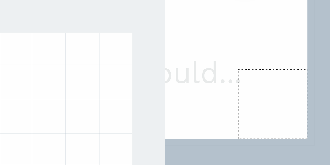
| Element | Category | Attribute | Value |
|---|---|---|---|
| Container | Medium component | Family Size | Rounded 0dp; 0dp; 0dp; 0dp; |
Specs
This section should not be read as prescriptive or exhaustive. Cards have no singular layout, typographic, or image size. All cards should be designed to meet the needs of the content they present. This section shows a variety of card layouts to help showcase that variety.
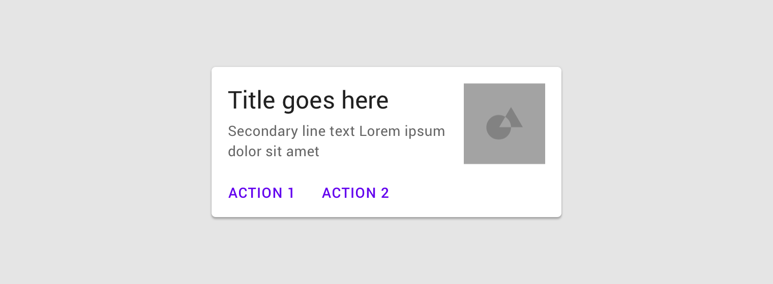
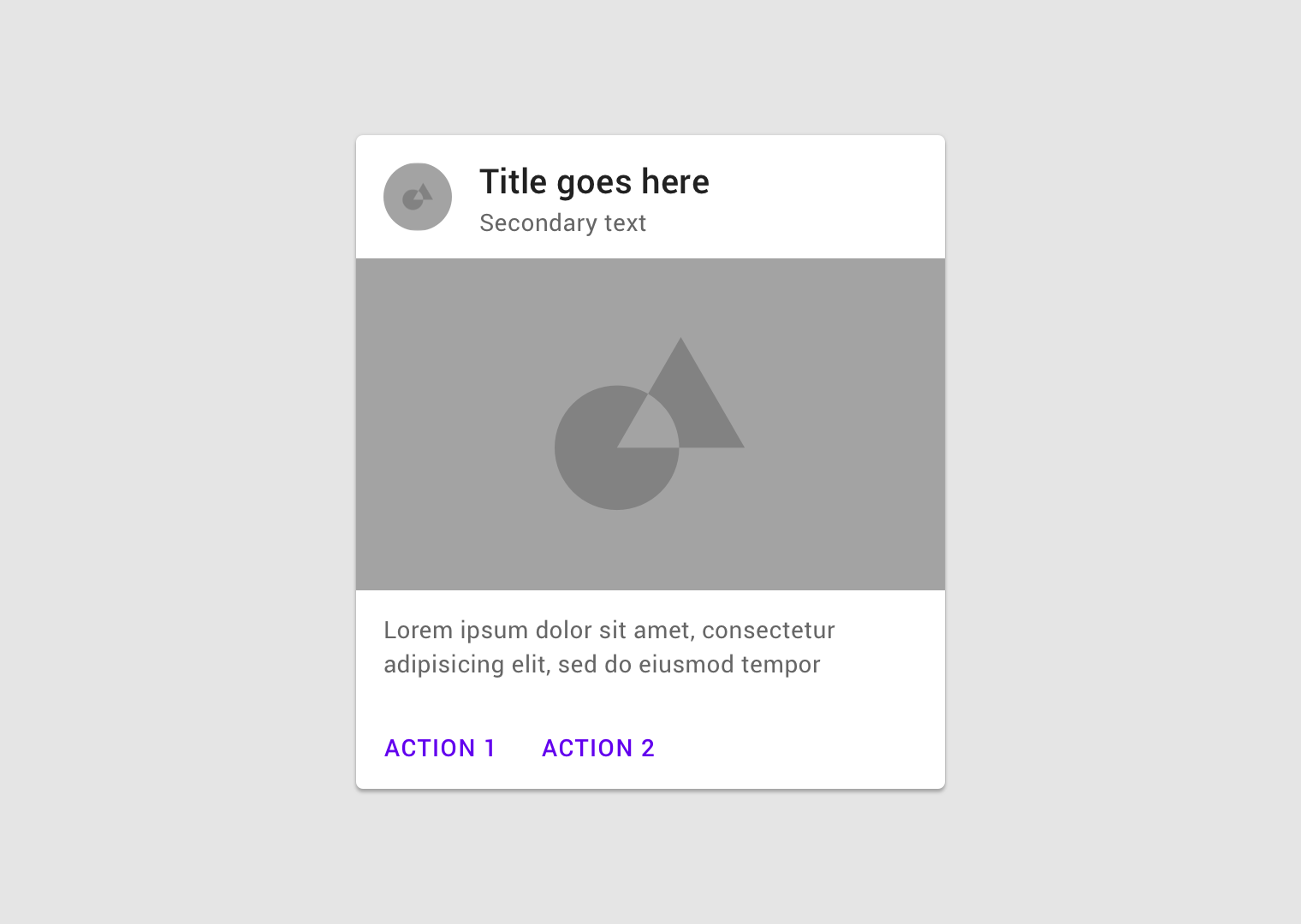
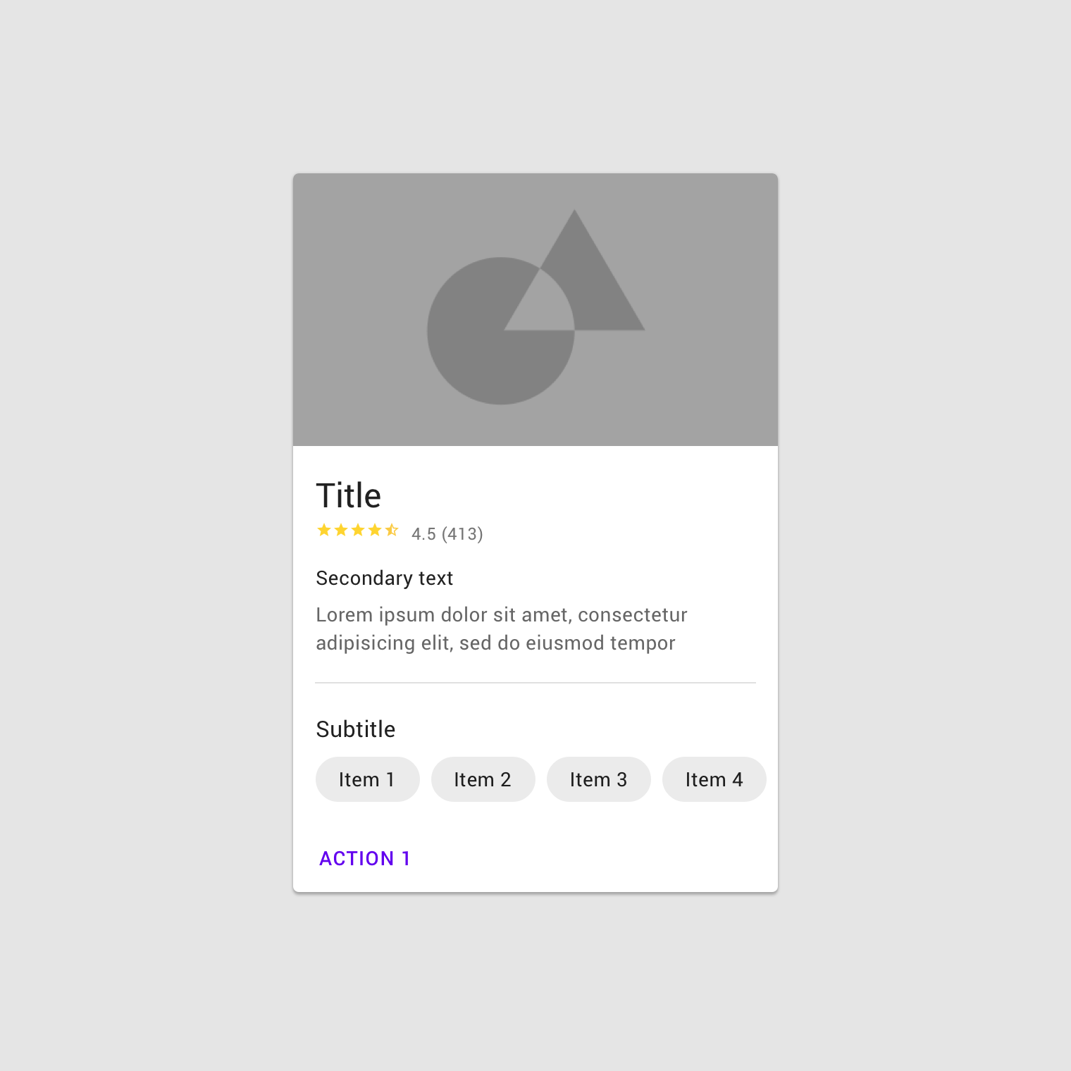
Elevated cards
Outlined cards